#Carol twombly
Explore tagged Tumblr posts
Text
Carol Twombly
Carol Twombly is an American designer who worked at Adobe Systems designing fonts for them. She contributed to the design of some of the most popular typefaces still in use today such as Myriad, Adobe Caslon and Trajan.
Below are a few examples of her font designs:

0 notes
Text
Carol Mancusi-Ungaro X Ben Fino-Radin
An extra amazing episode of the Art & Obsolescence podcast, a conversation with conservator Carol Mancusi-Ungaro about Rothko, Cy Twombly, the Menil, Barnett Newman, Replication, and on and on.
https://www.artandobsolescence.com/episodes/063-carol-mancusi-ungaro
#art & obsolescence#conservation#carol-mancusi-ungaro#ben fino-radin#cy twombly#barnett newman#the menil#the rothko chapel#chop shop
0 notes
Text
What Fonts are used for the Mass Effect franchise Logos and Menu Texts? (Gaming) (Mass Effect) (What Fonts) (Fonts Blog)
add logos here


Logos ©EA BioWare
Article by @warrenwoodhouse #warrenwoodhouse
The fonts that are used are:
The font used for the original released trilogy logo for the Mass lettering is called Sui Generis Condensed by Typodermic Fonts ( @nagoyish )
The font used for the original released trilogy logo for the Effect lettering is called Snasm Regular by Typodermic Fonts ( @nagoyish )
The fonts used for the menu texts in the original released trilogy are called BioMass by EA BioWare and Tigensu by developer
No font link available for BioMass
No font link available for Tigensu
The font used for the menu texts in the legendary edition is called Myriad Pro by Adobe
The font used for the legendary edition logo for the Mass lettering is called Sui Generis Condensed by Typodermic Fonts ( @nagoyish )
The font used for the legendary edition logo for the Effect lettering is called Korataki Regular by Typodermic Fonts ( @nagoyish )
#warrenwoodhouse#2024#gaming#masseffect#mass effect#me1#me2#me3#me4#mea#mass effect 2#mass effect 3#mass effect: andromeda#mass effect 4#fontsblog#whatfonts#what fonts#mass effect legendary edition#mass effect trilogy#mass effect andromeda#n7#spectreacquisition#spectre acquisition#logos that use the sui generis condensed font#logos that use the snasm regular font#logos that use the korataki regular font#n7day
4 notes
·
View notes
Text


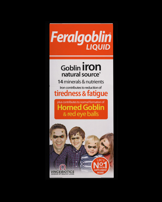
Consuming. Endless scroll. Depths of internet. Cursed. Dark web. Humour, the alleviator of all. Breaking awkwardness. Breaking tension. Breaking. Breaking. Down. Downers. Uppers. T-Total. What is the supplement to your life?
𝙁𝙚𝙧𝙖𝙡𝙜𝙤𝙗𝙡𝙞𝙣
[DIGITAL ARTWORK, 2023]
‘Existing product imagery, digital manipulated.’
IMAGE SOURCES: Dad & Child 1: Pixabay 557078 by White77. Mum & Child 2: Pixabay 286834 by White77.
TYPEFACES: ‘Myriad Pro’ (various Weights) by Robert Slimbach & Carol Twombly.
IMAGE DESCRIPTION: A portrait image depicting a box of iron supplements titled ‘Feralgoblin’ which has multiple lines of text detailing the supplements in a Black and Red Sans-serif font. Towards the bottom is an image of a caucasian family, that have had their eyes turned to Red and horns added. All on a Black background.
1 note
·
View note
Text
Carol's favorite abstract artist is Cy Twombly. She identifies heavily with his art and even more so later in her marriage despite giving up doing her own art.
Examples under cut of some of her faves:


1 note
·
View note
Text
Who I Write For/Pour Qui J'écris

Stranger Things
Eddie Munson
Steve Harrington
Chrissy Cunningham
Robin Buckley
Teen Wolf
Stiles Stilinski
Kira Yukimura
The Vampire Diaries
Stefan Salvatore
Katherine Pierce
Supernatural
Dean Winchester
Sam Winchester
Bridgerton
Benedict Bridgerton
Anthony Bridgerton
Marvel
Kate Bishop
Carol Danvers
Bucky Barnes
Steve Rogers
Sam Wilson
MCU!Peter Parker
TASM!Peter Parker
Steve Grant
Marc Spector
Criminal Minds
Emily Prentiss
Spencer Reid
Derek Morgan
The Maze Runner
Thomas
Newt
Top Gun
Bradley "Rooster" Bradshaw
Jake "Hangman" Seresin
Natasha "Phoenix" Trace
Heartstopper
Nick Nelson
Charlie Spring
Tori Spring
Tara Jones
Darcy Olsson
Tao Xu
Elle Argent
Isaacs Henderson
Outer Banks
JJ Maybank
The Internship
Stuart Twombly
Celebrities
Shawn Mendes
Dylan O'Brien
Dove Cameron
⚠️Please read this post to check some specifics rules for some characters/Merci de lire ce post pour certaines règles spécifiques pour certains personnages
Characters I might write for/Personnages pour qui je pourrais écrire
Stranger Things
Max Mayfield
Lucas Sinclair
Dustin Henderson
Mike Wheeler
Nancy Wheeler
Will Byers
Jonathan Byers
Teen Wolf
Scott McCall
Derek Hale
The Vampire Diaries
Klaus Mikaelson
Supernatural
Castiel
Jack Kline
Marvel
Natasha Romanoff
Yelena Belova
⚠️This list might change in the future/Cette liste peut changer plus tard
0 notes
Text
anne carson wrote an article abt cy (?)* twombly and catullus for the latest issue of arion and i am SO excited to read it
*it just says 'twombly' but i am reasonably sure it's abt cy (the abstract expressionist) and not carol (the typographic designer)
1 note
·
View note
Text
Carol Twombly
Carol Twombly (born 1959) is an American designer, best known for her type of design. She worked as a type designer at Adobe Systems from 1988 through 1999, during which time she designed, or contributed to the design of, many typefaces, including Trajan, Myriad, and Adobe Caslon. Twombly retired from Adobe and from type design in early 1999, to focus on her other design interests, involving textiles and jewellery. American calligrapher and type designer, a graduate of Rhode Island School of Design where her professor was Charles Bigelow. Joined the digital typography program at Stanford University, also under Bigelow. Working from the Bigelow & Holmes studio she designed Mirarae, which won her the 1984 Morisawa gold prize. Since 1988 she has been a staff designer at Adobe.


0 notes
Text
Carol Twombly
Carol Twombly (born 1959) is an American designer, best known for her type design. She worked as a type designer at Adobe Systems from 1988 through 1999, during which time she designed, or contributed to the design of, many typefaces, including Trajan, Myriad and Adobe Caslon.
Twombly retired from Adobe and from type design in early 1999, to focus on her other design interests, involving textiles and jewelry. American calligrapher and type designer, a graduate from Rhode Island School of Design where her professor was Charles Bigelow. Joined the digital typography program at Stanford University, also under Bigelow. Working from the Bigelow & Holmes studio she designed Mirarae, which won her the 1984 Morisawa gold prize. Since 1988 she has been a staff designer at Adobe.

0 notes
Text
Carol Twombly

Carol Twombly (born 1959) is an American designer, best known for her type design. She worked as a type designer at Adobe Systems from 1988 through 1999, during which time she designed, or contributed to the design of, many typefaces, including Trajan, Myriad and Adobe Caslon. Twombly retired from Adobe and from type design in early 1999, to focus on her other design interests, involving textiles and jewelry. American calligrapher and type designer, a graduate from Rhode Island School of Design where her professor was Charles Bigelow. Joined the digital typography program at Stanford University, also under Bigelow. Working from the Bigelow & Holmes studio she designed Mirarae, which won her the 1984 Morisawa gold prize. Since 1988 she has been a staff designer at Adobe.
I am a little indecisive on my opinion of her fonts. Personally I don't see them as anything amazing but I also don't dislike them. I think it's cool how they are all unique and you could almost use each one for different time periods
0 notes
Text
What Font is used for The Light in the Darkness Logo? (Gaming) (Fonts Blog) (What Fonts)

Logo ©Arcade Distillery
Article by @warrenwoodhouse #warrenwoodhouse
The font that is used for the logo is called Trajan Pro 3 Regular by Adobe
#warrenwoodhouse#2024#gaming#the light in the darkness#fontsblog#what fonts#whatfonts#logos that use the trajan font#The Light in the Darkness#thelightinthedarkness
0 notes
Text
Google is not to be trusted!
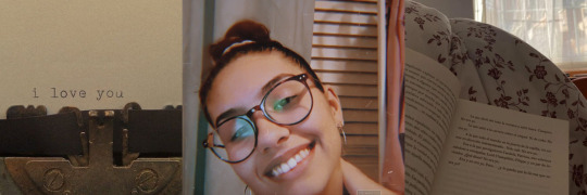
I decided to choose another image of Carol Twombly because it would be less time-consuming compared to editing the photo. so I chose a new photo, edited it, and put it in place. I am only now realizing (after a conversation with a lecturer and after having already submitted my physical version of my work) that the image of Carol isn't in fact her. I did skim the website when I chose it but on deeper inspection of the site, I was wrong. The Website referred to a "cy twombly" foundation and a supporter of that foundation was Carol Mancusi-Ungaro (The woman in the photo used). Clearly, google got the word Carol and the word Twombly and assumed it was what I was looking for. In my defence they do look somewhat similar-ish. This is a good lesson for the future. Investigate everything, google is a damn liar and not to be trusted!

Original Image (correct person)

Image used for Final (incorrect)
0 notes
Text
artists research and images

Joseph Churchward - https://www.the10sonsofmanu.com/tag/joseph-churchward/

Tobias Frere Jones- https://frerejones.com/about

Verena Gerlach - https://www.fraugerlach.de/contact

Dr Nadine Chahine - https://www.eyemagazine.com/feature/article/reputations-nadine-chahine

Carol Twombly - https://www.thebookdesigner.com/carol-twombly-an-extraordinary-type-designer/?channel=Organic&medium=Google%20-%20Search

Veronika Burian - https://www.granshan.com/veronika-burian

Jessica Hische - https://jessicahische.is/bloggable

Johnson Witehira - https://semipermanent.com/profiles/johnson-witehira
Some of these images do need to altered so it looked like the same scale and colour as everyone else. i do think they all do have similar postures, just need to crop it so its the same sizes.
Everyone is looking at the camera, except for Joseph Churchward
0 notes
Text
Work in progress and note - Parent page and decoration
The meaning of selected alphabet and opacity
The parent page is a function similar to the paragraph style and helps manage the page background even though we only have two pages maximumly according to this project. There is a point out for the parent page on the brochure side. I played the contrast with Graphite Std and picked letters in each sub-page. These letters only remain in around 30~60% of opacity to prevent it will affect the displaying of content, which act as the supporting role at this stage. They are all containing meaning for content accordingly like below:
The reading order from up-left to right:
C and E for Conference pages.
J for Joseph Churchward.
T for Tobias Frere Jones.
V for Verena Gerlach.
N for Nadine Chahine.
C for Carol Twombly
V for Veronika Burian
J for Jessica Hische
J for Johnson Witehira
Double T for Timetable
M for Map

The actual view after applied the parent page
I lay out these selected letters backwards the images and contents and only play some overlay to others for the gradient differentiate with background colours. The advantage of Graphite Std is it contains some liner strokes for each letter and emphasises the grid at this stage. I randomly select the font size and opacity, then make them align to something and get involved in the entire brochure.

0 notes


