#Camera APp
Explore tagged Tumblr posts
Text
Open Camera App
A follow-up to this post from last night.
In my reblog I said I'd installed the app, so I went out today with both cameras and did a test shot.
The subject is firethorn blossom in our hedge, time 18:34 / 6.34PM, sky almost-cloudless blue, lighting optimal.
First, a Nokia G21 (released February 2022): here's a shot with its native camera app, and a crop for close-up detail.


Here's a shot with the Open Camera app with installation-default settings, and a crop.


IMO, Open Camera makes a serious improvement.
Now an HTC U11+ (November 2017). I bought this older phone last year, old stock NIB, just for the sake of its camera, after seeing the quality pix @dduane was getting from hers.
First, the native app and a crop.


Next, Open Camera at installation default settings, and a crop.


It looks to me as if Open Camera works best when installed in a phonecam whose native app runs excessive image processing as a matter of course.
The Nokia pics are a case in point, while the HTC, a far better native camera app (and I suspect a far better camera full stop) shows much less improvement.
Now I get to find out what happens with Open Camera in the HTC once I start tweaking settings. That, however, is for later.
Meanwhile, two thumbs up and a big thank-you to @shelandsorcery for putting me onto this app!
104 notes
·
View notes
Text
webgbcam 4.2 now has 1bpp mode with atkinson dithering


https://maple.pet/webgbcam have fun
34 notes
·
View notes
Text
Cyclops Furby accidente.
5 notes
·
View notes
Text
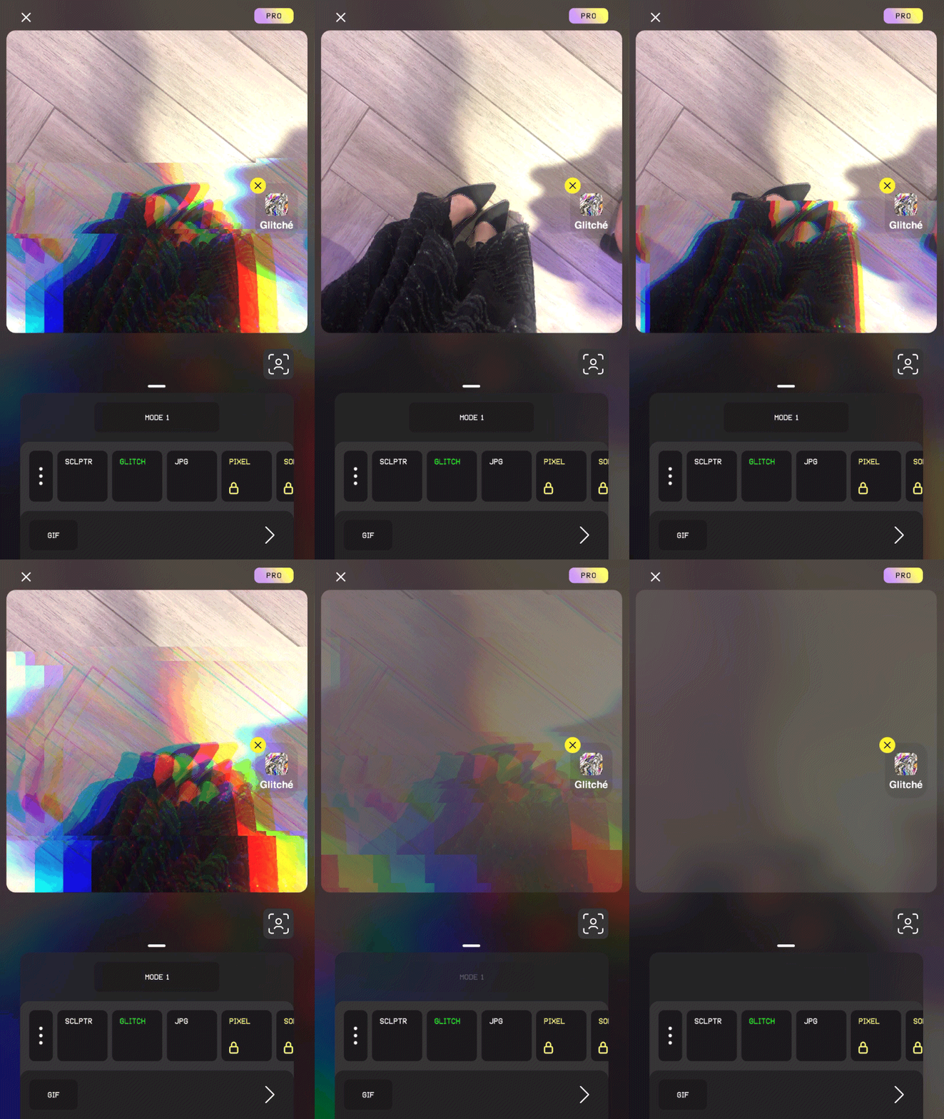
Top Filter App Glitché
It’s such a cool app, It’s my ultimate tool for expressing current moods and style. Totally suggest it
#FavoriteApps#app recommendations#applove#application#app logo#appobsession#musthave#musthaveapps#topaddict#appdiscoveries#appfavotires#app reviews#mobilephotography#mobile photo editing#photoediting#camera app#photo filter#editing tools#photography#photography community#photo artistry#glitch#glitches#glitche#fashion blog#personal style#personal blog#girl blogger#filter
3 notes
·
View notes
Text
The Android “Open Camera” app has several grid overlays as options:
3x3 - helps with applying the rule of thirds.
Phi 3x3 - 3x3 grid with ratios 1:0.618:1.
4x2
Crosshair
Golden - displays a Golden spiral (technically, a Fibonacci spiral).
Golden Triangles
Diagonals
This app was mentioned a couple of weeks ago, first by @shelandsorcery on this post, and then by me on this one.
It’s a really good app, especially in a phonecam with over-aggressive processing in the native camera app.

This article was written by Phil Straub back in 2005, and it is as fresh and vital today as it was then. Phil’s tips and trick are timeless, and can help you make your images pop!
Composition is everything! No amount of detail in an illustration or Concept Painting will be successful without a strong composition foundation.
Composition in Environment Concept painting can be quite difficult since your focal point usually isn’t as obvious as in a character piece. In this introduction to Composition we will explore the fundamentals used to create exciting and functional compositions along with a variety of composition techniques. Initially I will show some successful examples of iconic composition, formal composition, the rule of 3rds, the golden rule, etc. There will be a discussion on what makes each piece successful and an explanation on why the artist chose to describe the scene using a particular form of composition.

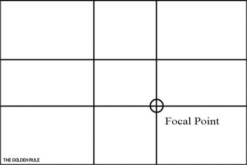
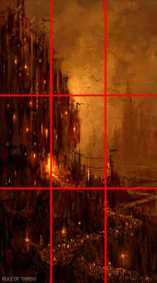
When you take the canvas area and divide it into ‘thirds’ Horizontally and Vertically, where the lines cross in the picture area is a ‘Golden Mean’, or the best spot in which to place your Main Subject or Object of Interest as it is the Focal Point of your picture. The golden rule originates from the Ancient Greeks, since they were great mathematicians as well as artisans, they came to the conclusion that there needed to be a certain balance in composition for it to be pleasing to the eye. They further developed this theory and defined what they called “power points,” Power points are located at the point where the lines used in the golden rule intersect. By placing a main subject on a power point, it further defined that subject as the focal point.
The golden rule can and usually is applied to a paintings canvas proportions. As you read through the following text you’ll notice that most of the imagery presented utilizes similar dimensions and almost all of them fall into the “golden rectangle.” Today you can find the Golden Rectangle almost everywhere: from credit cards to phone cards to book covers, all are shaped with its proportions. The Golden Ratio (the ratio of the longer and shorter sides of the Golden Rectangle) also appears in many natural phenomena. The ratio between the length of your nose and the distance from the bottom of the chin to the bottom of the nose is the golden ratio. The spiral growth of crustaceans follows the golden spiral. The divine proportions are an in-built (or in-grained) aesthetic parameter we judge beauty by.
The imagery [above] represents the division of space when the “golden rule” is applied to a blank canvas. Basically it is the division of a line in two sections, where the ratio between the smallest section and the largest section is identical to the ratio between the largest section and the entire length of the line. In other words A/B = B/(A+B). The ratio is about 1/1.618. Honestly, I’m still not exactly sure what that all means? but, I do know that I used this grid layout a-lot when I first started painting and found it helpful. I still do.
In the beginning you may find it useful to use this as an overlay for every concept piece you do. Having this grid float over your imagery as a reminder of where to place the objects of importance in the scene may help you as your develop your composition.
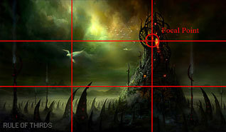
From the golden rule came the “rule of thirds” which is virtually the same concept but slightly altered to fit photographic proportions.I find it a bit easier to follow since it’s very simple in its origin.Here we have a look at the rule of thirds in action.
Notice that the main focal point sits right almost directly over one of the “golden means.” Additionally, other objects are placed near the other converging lines (the bird, for example) but, not directly on them, since that would create competition for the focal point.
There are Four Spots where these lines cross the Upper Left the Lower Left, the Upper Right and the Lower Right. Please note that all the “hotspots” are away from the center position in the picture frame.
The two best “power points” are the Upper Right and the Lower Right because the eye enters the picture frame at the lower left hand corner of the picture frame, travels to the center of the picture area and then reaches the right hand ‘Golden Mean’ position where it stops to look at the ‘Center Of Interest’.
The reason the eye enters a picture at the lower left side is because we are taught to read from Left to Right. This is a psychological fact that has been proven over the years. Next time you’re in an art gallery or art museum that shows the Old Masters paintings, notice how many have the Center Of Interest in the “Golden Rule” positions.

‘Implied Forms’ are a combination of ‘Implied Lines’ and they help to hold a painting together. The eye enjoys these interesting forms and will stay in the picture area to examine each one of them, if they are present. The following text and sample imagery will demonstrate a variety of implied forms and composition approaches.

The Circle is made up of a continuous ‘Curve’ and it’s circular movement keeps the eye in the picture frame. There are many circles in nature and man made objects. You can use the circle in a very obvious way in your composition or simply suggest it.
The image [below] is a very obvious and deliberate usage of circular composition. Notice how the circular shapes created by the dragons also follow a path that leads your eye towards the focal point.
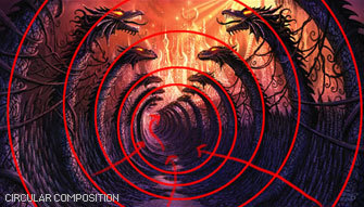
Another example of circular composition! Again, I chose this type of composition to enhance the feeling of motion in the piece. You can see how the eye follows the circular shapes across the picture plane to the focal point. Something interesting to note with this image, it actually uses two composition approaches at one time; circular composition and iconic composition.


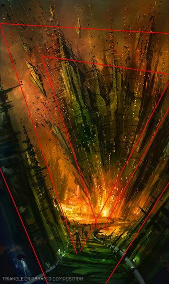
This has a ‘solid base’ and will show Stability. It also has Height and Strength. The Pyramids of Egypt have survived for thousands of years while other types of solid buildings have crumbled in to dust in less time. With the image below I was very deliberate with my arrangement of shapes so the triangle or pyramid composition is obvious. When I began this piece I simply started with a triangle shape as my starting point…nothing more than an abstract composition. I just let everything flow from there….and very quickly the painting began to take shape.

Is a connection of ‘Lines’ meeting in the Center and an expansion of ‘Lines’ leaving the Center. The Radii is usually found in Nature Subjects. The best example of the man made Radii is the spokes of a wheel.
The eye has two ways to go when it comes upon the Radii. It can either be drawn in to the picture area or it can be led out of the picture area. You must be careful how you used the Radii and try to have the eye led into the picture.


A showing of ‘Opposing Force’ that will give the picture a feeling of Cohesion and Relationship. The horizontal bar of the Cross will act as a “stopper’ while the vertical pole can act as a leading line. The windows in a large skyscraper will form crosses and will keep your interest in the building. The Cross also has religious meaning and the subtle use of the Cross can give hidden significance to an image.
In the painting below Hong Kuang uses the cross composition subtly. One could argue this piece is also using an “L Composition.” The strong line across the horizontal center that’s being formed by the characters body suggests “The Cross.” The somber facial expression and subject matter demonstrate an experienced artist’s ability to use symbolic composition to help tell a narrative.
To the right of that is Daryl Mandryk’s work which successfully combines a Cross composition with iconic composition. This is common composition choice for themes of heroism or comics. Fantasy artists like Brom and Frazetta use this type of composition in their work regularly.


This makes an attractive ‘frame’. It can be used to accentuate important subjects. Many times it is a ‘frame’ within a ‘frame’.
A tree with an overhanging branch at the ‘right’ side of the picture area will form a ‘Rectangle’ and help frame the Main Subject in the picture. By doing this you will make the Center of Interest stand out and be noticed clearly.


Some Art theorists contend that the most important information in the image should be placed near the center of the picture plane. This may seem confusing to some students since this contradicts many of the major principles of the “golden rule.” In general iconic composition should and can be used to describe a subject in a certain way. Iconic Composition or “Formal Subdivision” applies best to subjects of a dignified or religious nature. This style of composition was the approach of choice in earlier times and many excellent compositions have been made with it. Usually Iconic composition is used to describe symbolic subjects, heroic subjects, or religious subjects.
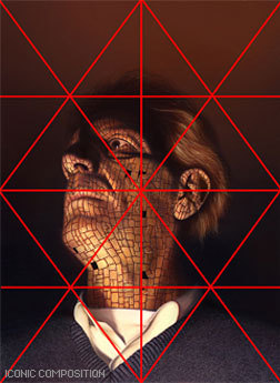
I’ve taken the liberty of drawing over this imagery to demonstrate the division of space in iconic composition. This is a technique used by many illustrators to help define the division of space and focal point when creating an iconic illustration. Well know and renowned illustrator Andrew Loomis used this technique extremely well and his book “Creative Illustration” to demonstrate this further.
Notice, that while the focal point is slightly off center, all the converging lines lead to the center point of interest. Additionally, notice how the figures head sits directly in the diamond shape of the overlay lines I’ve created. It should also be noted that I chose this composition to further enhance the regal and heroic appearance of the character.

Tong Wu uses Iconic composition perfectly here! Notice how the character again falls nearly at center of the canvas. I’ve taken the division of space a bit further on this imagery and have broken down the image into smaller segments so you can so how the artist balances everything in the piece.
Notice how the top right corner is almost a mirror image of the top left corner. In fact, look at almost any opposing segment in the painting, they are very similar! When creating iconic composition, it’s not necessary to duplicate each side exactly, but there should be a feeling of complete equalization of the units or masses, the line and spaces of one side with the other.

So, there you have it, a variety of ways to deal with division of space when you first begin visualizing a painting or drawing. At the end of the day, theses approaches to composition are guides and simply a place to start. Once you become more comfortable with composing a scene you can begin to push the boundaries of formal composition.
Since most Environment Concept Artists work in the entertainment industries, its expected you will be asked to create cinematic moments or “memorable moments” utilizing the environment as a stage.
You’ll want to use your mastery of composition to lead the viewer’s eye and really make the viewer feel like they’re in the scene. The single most important thing you simply must have in any Environment Concept Painting is a clear and dynamic focal point.
Without a place for the viewer’s eye to rest, the painting will lack impact and won’t hold the attention of your audience. It’s the job of the Concept Artist to visualize what can’t be visualized in reality. Concept Artists are the first step in every production and therefore must create dynamic imagery that the rest of the team will be excited to build. There are a few cinematic tricks that you can use as a Concept Artist to make things appear more dynamic.

Sometimes all it takes to add an extra bit of drama to your composition is a simple tilt of the camera. In the image to the right the viewer really feels like they are part of the action, simply by slanting the camera a bit. This approach is especially useful when you are trying to depict action in your environment.


Many Concept Artists today, myself included, use perspective as a tool to create dynamic compositions that appear to have motion and lead the eye to the focal point clearly and concisely.
In the painting below you will notice I’ve used many of the objects that appear in the painting as opportunities to further guide the viewer to the “payoff.” Additionally, I tilted the camera a bit to add to the action.

http://www.cgsociety.org/index.php/CGSFeatures/CGSFeatureSpecial/phil_straub_composition_tutorial
15K notes
·
View notes
Text
Inqmega camera app
Introducing the Inqmega camera app Solar Powered Wildlife Surveillance Hunting Trail Camera, the perfect companion for all your outdoor monitoring needs. With cutting-edge solar power technology, this camera ensures uninterrupted performance even in remote locations. Enhance your hunting experience with this advanced trail camera.
Visit us at https://www.noveldale.com/products/inqmega-8mp-4g-wifi-solar-powered-wildlife-surveillance-hunting-trail-camera
1 note
·
View note
Text
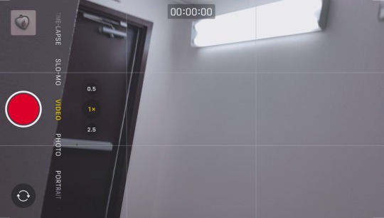
#aesthetic#2024#january#winter#hallway#stairwell#hotel#california#united states#west coast#left coast#photographers on tumblr#camera#camera app
0 notes
Text
Mirrorless Camera Lenses
Best Camera Lenses in India
Explore unparalleled optical excellence with ZEISS, the authority in lens technology. Our commitment to delivering the best camera lenses in India ensures that photographers and enthusiasts alike can capture moments with unmatched clarity, precision, and artistic expression. Elevate your photography experience with ZEISS lenses, where innovation meets perfection.
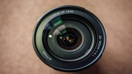
Digital Camera Lenses
Immerse yourself in the world of digital photography with ZEISS’s state-of-the-art digital camera lenses. Crafted with precision and technological innovation, our lenses redefine the boundaries of image quality. Discover a range of options that cater to diverse photographic needs, allowing you to capture every detail with unparalleled clarity and brilliance.
Camera Lenses
we are synonymous with excellence in camera lenses. Our legacy in lens technology is a testament to our commitment to providing photographers with the tools they need to achieve their creative vision. Whether you’re a professional or an enthusiast, trust ZEISS to deliver superior optical solutions that transcend expectations.
Photography Cameras
Step into the world of visionary photography with ZEISS. Our expertise extends beyond lenses to encompass a range of cutting-edge photography cameras designed to elevate your shooting experience. Immerse yourself in innovation, precision, and unparalleled image quality with ZEISS photography cameras.

Mirrorless Camera Lenses
Experience the future of photography with ZEISS’s cutting-edge mirrorless camera lenses. Designed for the next generation of imaging devices, our lenses combine compactness with uncompromised optical performance. Capture moments with precision and style, as ZEISS lenses redefine the possibilities of mirrorless photography.
Binoculars vs Camera Lens
Uncover the nuances of observation with ZEISS, where we delve into the comparison of binoculars vs camera lenses. Our expert insights guide you through the unique attributes of each, helping you make informed choices for your specific needs. Explore the worlds of photography and observation with ZEISS, where precision knows no bounds.
Binocular Scope
Embark on a journey of visual discovery with ZEISS’s advanced binocular scope technology. Our binocular scope redefine clarity, offering a panoramic and immersive viewing experience. Whether you’re a nature enthusiast or a seasoned explorer, trust ZEISS to bring distant worlds into sharp focus.
Best Professional Binoculars in India
Witness unparalleled optics with ZEISS, presenting the best professional binoculars in India. Our binoculars are crafted to meet the demands of professionals, delivering exceptional clarity, durability, and ergonomic design. Elevate your observation experience with ZEISS, where precision and professionalism converge.
0 notes
Text

glorious day, i have met John Revelator

(and this guy too i suppose)
#chris dunne#will wood#@will’s girlfriend chris i’m sorry i presented you with my locked phone and disco elysium wallpaper#i did mean to open the camera app honest#lovely evening lovely peoole would rockaway again
562 notes
·
View notes
Text
#video#tiktok#videos#meme#tiktoks#no cc#shaky camera#dan and phil#gravity falls#undertale#Opening the app to this was a genuine jumpscare
1K notes
·
View notes
Text


Cat stickers from the Line Camera app ♡
#I bought so many sticker packs back in like 2015 for this app to make cute pictures lol#they don’t sell as many stickers anymore :(#cute#pink#kawaii#aesthetic#line camera#pink aesthetic#cute aesthetic#my edit
2K notes
·
View notes
Text
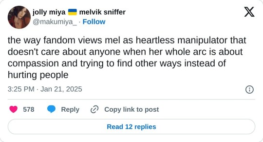
Mel Medarda they could never make me hate you

#someone said that she was too soft for noxus & too hard for piltover so she’s truly never been accepted anywhere 😣💔 my shayla#mel medarda arcane#mel medarda#arcane mel medarda#arcane#arcane league of legends#league of legends#arcane mel#mel arcane#bird app#彡: lights cameras action!#my beautiful soleil
774 notes
·
View notes
