#CARTOONS ARE MEANT TO BE CARTOONY
Explore tagged Tumblr posts
Text
When people pause an animated tv show during movement and say ‘eew why does it look like shit’
I’M COMING INTO YOUR HOUSE WITH A POWER POINT PRESENTATION ABOUT SMEAR FRAMES TO SHOW YOU AFTER I WHACK YOU WITH A STICK
When people zoom in on a character in the background ‘eww why do they look like that. L this animated TV show is so low quality and bad’
I’M IN YOUR FLOOR BOARDS AND CLIMBING IN ABOUT TO TELL YOU ABOUT A THING CALLED ‘WHY FUCKING BOTHER TO DRAW A CHARACTER WHOSE 3 PIXELS WIDE CORRECTLY ON SCREEN YOU AREN’T SUPPOSED TO ZOOM IN AND IF YOU ZOOM OUT YOU’LL SEE EVERYTHING ELSE IS FINE’
#Im so annoyed by people thinking smear frames is bad animation#CARTOONS ARE MEANT TO BE CARTOONY#Impossible things happen and if you didn’t notice it happen until you paused it and slowed it down#Then that’s not an issue with the animation#That’s an issue with you#sizzle rambles
109 notes
·
View notes
Text
Okay I'm still thinking about the Amity Park in Ohio thing so here's my proposal for this idea:
Reasons That Amity Park Should Be in Ohio (By Someone Who's Lived In Ohio For 2+ Years)
#1 It's Definitely A Great Lake State

Amity Park has never been stated to be officially in one specific state, just vaguely central United States, possibly somewhere around the Great Lakes area. That specific area is often referenced by other characters in the show. Urban Jungle shows Undergrowth's roots stretching out from this general area, and the Lake Eerie mentioned in the show might just literally be Lake Erie.

Of course it's kinda cartoony and I honestly have no idea if those mountains in the bottom right corner are meant to be the Appalachia area or not but it vaugely looks like the Great Lakes area
Because of this screenshot, I think most of the fandom headcanons Amity Park to be somewhere in Illinois, possibly close to Chicago, but we can basically point at any Great Lakes state and say "yeah that fits".
For my non-American friends, it's this general area of America (specifically Minnesota, Wisconsin, Illinois, Michigan, Indiana, and Ohio)

But I'd also like to say that cartoons do have a tendency to fudge some details about geography (or completely change the states a la Steven Universe) so the map might not be 100% accurate. But with the map, it could technically be any Great Lakes State, so why not OHIO?
Which btw I'm going to be counting as a Midwest state for this analysis. Some people can argue it isn't, but from my experience living here in Ohio there are a lot of Midwestern tendencies. It's more like Ohio is the border state between the Eastern states and the Midwest, so it gets a mix of both.
B*tch H*rtman (as much as we don't like to talk about him) was also born in Michigan, which is a state in the Midwest, so some of Amity Park could be based (consciously or not) on the towns he grew up in there. But because of him I'm ruling out Michigan the state as a whole and Wisconsin for states Amity Park could be in.
#2 It Takes Four Days To Get To Wisconsin, Apparently?

In Season 1, Episode 7, when they travel to Vlad's mansion in Wisconsin, Jazz says it will take "four days" to get from Amity Park to Vlad's Mansion (Somewhere in the middle of nowhere Wisconsin, basically). The geography is a little off for every midwestern/Great Lakes state except maybe New York if you're gonna count that but Amity Park does not feel like it'd be in New York state.
Ohio is the furthest Midwest Great Lakes state from Wisconsin. Case closed there. Of course, it doesn't take four days to get from Ohio to Wisconsin. It can roughly vary from 10 to 15 hours, depending on route options (such as avoiding highways and stuff), but still.
It's a road trip, so it makes more sense that they'd take longer to get there-- plus realistically people don't tend to drive 10 hours on a road trip, they probably stopped through the trip and spent the night in their RV.
#3 They Got Beaches?

Amity Park does exist near a body of water. It isn't clear if it's a lake, river, or ocean in the show. It could be a lake. There's also the area in Frightmare, where Nocturne literally takes up space in some sort of port building/factory that gives the audience the assumption that it's on a pier/port. So they're really next to a body of water.
There is also the summer camp that Danny and his friends attend in Claw of the Wild which is said to be on Lake "Eerie". Which could easily just be Lake Erie, the lake that Ohio is on.

Also Camp Skull and Crossbones?? What an iconic camp name. You could say the name is pretty,,,,,, camp (ba dum tss).
#4 Ohio's Just Like... Very Haunted

Ohio has kinda become a meme recently. Not just one specific part of Ohio, but the entire state. The memes are mostly good fun-- like how the state is mostly just corn -- but I think some of the ~vibes~ of Ohio just fit right.
Like, there's no definite way to say which U.S. State is the most haunted (I think either the New England area or maybe Louisiana could take the #1 spot) but Ohio is definitely something else. Of course, we have the baby bridges and the haunted penitentiaries like Ohio State Penitentiary, but there are some interesting places that could be played with, too.
For one, there's an entire abandoned town called Helltown, Ohio, where rumors are cultists perform Satantic rituals, mutant creatures roaming the city created by an oil spill, and even a giant snake? There's also a place literally called the Gateway to Hell, too, which is right behind a Tim Horton's (oddly fitting).

Bobby Mackey's is also in Ohio! If you've ever seen Buzzfeed Unsolved, you know what I'm talking about.

There are also less hell-related spooky things in Ohio. Like, Lake Erie has its own Monster! We call her Bessie. Danny could definitely befriend Bessie!!!
#5 It'd Be Funny

It'd be funny for Amity Park to be in Ohio. The Most Haunted Place in America to be in Ohio is just kinda funny. With how "cursed" of a reputation Ohio seems to have in a larger cultural context, doesn't it kinda just fit?
TLDR:
Ohio is a very cursed state, has a lot of supernatural lore to it, and I think Amity Park would fit in both thematically and almost geographically. Of course, other Midwestern States like Illinois do fit the bill, too, in this argument. But I am a firm "Amity Park is in Ohio" supporter.
#danny phantom#dp#ominous writing#kinda?? i guess????#analysis#ominous posts#all my DP fics are now set in ohio#i'd honestly put amity park to be central ohio just based off vibes but for some reason they're like next to a huge lake/body of water??#so i guess somewhere on the lake. maybe between cleveland and toledo#again i've only been here for two years. so keep that in mind#Amity Park could also be by a river but being by a lake makes more sense to me. idk#also let me know if i should add a read more to this it feels kinda long
81 notes
·
View notes
Note
I love your AU so much, it's so cute!
I need to know what kinds of adventures Adeuce gets up to with their caterpillar. The name Absolem comes to mind (or perhaps Alistair?) just because that's what the caterpillar from Tim Burton's Alice is named, if you're wanting to keep with that theme.
I'd love to see what Octavinelle looks like in your AU (they're my favorites!!!) but take your time, and make it how you want it to be. You're doing wonderful work!
im shocked i actually forgot about there being a caterpillar in alice in wonderland. absolem sounds a bit too serious imo, i was imaging a cutesy name to match his appearance lol. im considering "fozzy" like fozzy the bear.
putting this under the cut for those who want to read my very sane ramblings
I imagine A+D adventures would be very much in the vein of the original AT episodes with every one having a new storyline and introducing new characters, and then later episodes having those characters come back and revealing more backstory/becoming more involved in the overall plot (ie magic man, slime princess, etc). and then ofc a more "core" cast with more frequently occurring characters like heartslabyul and maybe some other first years. It would definitely be ace and deuce-centric with them driving most of the interactions and then gradually having more and more episodes that arent just about them.
in my head riddle introduction goes like this: A+D are native to the garden kingdom and are doing their regular stupid shit. that day it just happens to be doing parkour in the royal gardens. riddle comes along and is ofc furious and being the overreactive little freak that he is, banishes them from the kingdom. that's how they meet cater, who introduces them to trey, and they eventually kick riddles ass and its revealed he has a very controlling mother who influences his behavior. riddle realizes the error of his ways and they all team up and usurp her. riddle takes over the kingdom and is now mostly an ally.
trust me i love riddle and a lot of other characters but almost everyone would start out as being a cartoon villain bc that's just the nature of AT. leona is a prince but has no real political power so spends his days bullying civilians. epel has been enslaved by an evil witch (vil) and needs the help of A+D to beat him up, but after vil's defeat epel understands him better and becomes his apprentice by choice. jack the wolf seems hostile at first but they learn he is actually a human who has been cursed and he spends like the entire series trying to break the curse and you only get to see him human in the very last episode lol. everyone will be a silly character with silly problems but overall still sympathetic and relatable. it will have some sad and heartfelt moments but mostly remain lighthearted (just like AT). these are cartoony, oversimplified representations of canon twst, not meant to be realistic takes or a deep dive into mental illness.
i'll be working on octavinelle once i finish savanclaw (they will all be in order) but azul is going to be the octopus wizard and he has 2 evil henchmen. they run a successful seafood restaurant as a front for their magical crime ring. or maybe A+D defeat them and convince them to go into the food business instead of organized crime and they find out they are really good at it lol
92 notes
·
View notes
Text

art summary through the years! i saw this going around and i wanted to play too, i always love doing these summaries.. template 🌹
my art became "i discovered the joy of drawing drapery and fabric in 2021 and never looked back" HAHA
looking at the early stuff, sometimes i really miss stylizing and drawing cartoons!! 2015 was the first year i started drawing cartoony stuff, pre-2015 was purely anime style. an updated art summary from 2010+ for me would be fun.
going back to the 1st sentence, stylizing just doesn't give me what i want from art anymore, it doesn't satisfy my art hunger haha (dungeon meshi joke.. iykyk). although it's still fun to experiment once in a while (e.g. merch). even if my current personal art is not very animation industry friendly or "hireable", i think i have a stronger notion of my "artistic" voice now more than before. (again, at least for personal art)
2020-2022 were rough years during the pandemic... i wanted to stop drawing so many times. i always say this, but during that time i went back and touched base with things i used to love as a teen, such as old anime (fma, pandora hearts, etc) that inspired me to pick up a pencil in the first place, and it helped to revitalize my love for art. and then i discovered drawing and studying fabric and i could never go back! i think my art is now more inspired by fine art history than cartoons hence the more realistic drapery...
one reason why i always change up my art style or technique every 2 ish years is that i kinda get bored of the same brushes easily... ive worried that using the same brushes gets boring and stale to people, but i think my art values are more or less consistent with how it was 3 years ago. i cycle through a set of like, 3 different brush sets (watercolour, pastel/lineless, and regular shading) depending on the mood of the drawing. different drawings call for different techniques you know?? and i think it's okay to use different tools for each drawing, art isn't meant to all be the same.
#art summary#bit early for art summary but a half year/through the ages one is fun once in a while#my art
100 notes
·
View notes
Text
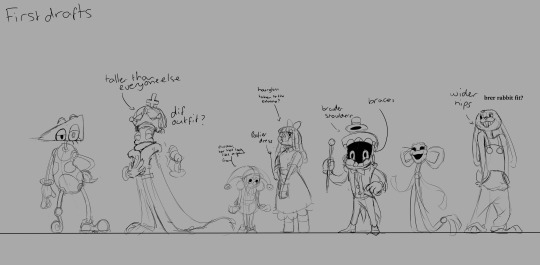
Thought I'd share my first drafts of all the characters!
Don't know what I was thinking with the braces on Caine, lol. I guess i just wanted a way to connect his upper and lower jaw.
Zooble was BY FAR the most difficult to design, since they're already so insanely cartoony. I actually tried making them a robot at one point!
I settled with a devil because a lot of old cartoons would have stuff like devils as their antagonist, and I didn't think that a robot would fit the era of animation I was going for.
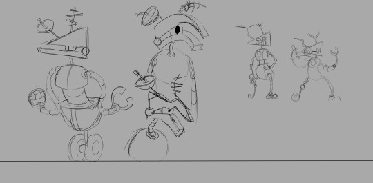
An alternate colour scheme for Zooble. It was way too generic in my opinion.
Looks like they were also meant to have whiskers at some point.

The first ever sketches I did for this au!
The pose in the middle was inspired by a Christma comic I was going to make as an introduction to the au. Create some intrigue, y'know?
I've definitely had the most fun drawing caine's expressions!
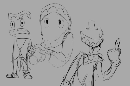
More caine!
I focused a lot less on keeping entirely to proportions and more on the line of action, akin to the rubberhose style of animation.

First sketches of Jax and Ragatha. I love drawing anthropomorphic charcters, so Jax was naturally my second choice to draw!
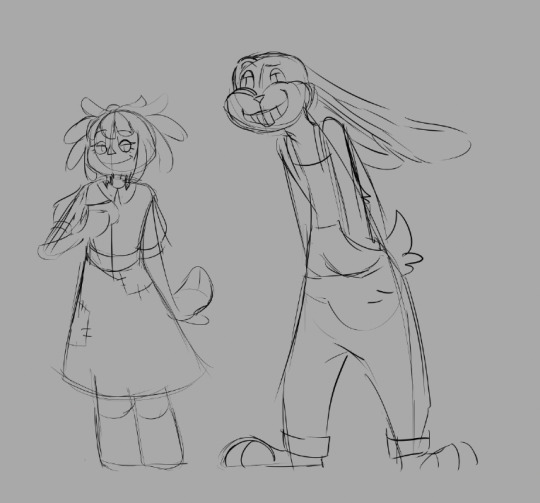
I then played around with all the possible hairstyles Ragatha could have. I didn't want the design to be too similar to other aus, while also conveying her kind demeanor. A lot of aus end up tying her hair back!
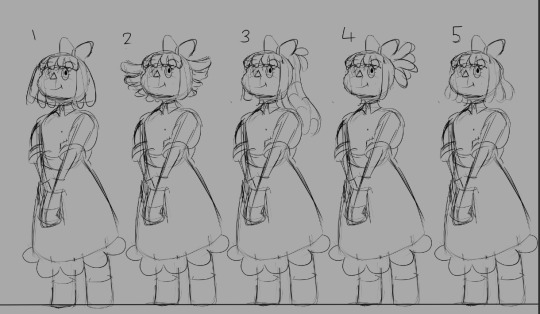

More Caine! again, the one in the middle is a pose I would have used for the Christmas comic! I was still figuring out how many restrictions the toons would have, so I'm glad I scrapped it. Wouldn't want to set anything in stone that early in development.
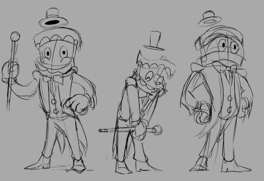
Some other poses for the early designs of the characters! Jax was definitely my favourite of these!
I never went for Kinger's upside down cross because I'm pretty certain that an animation studio in the 50s wouldn't allow a symbol of Satan on a character that wasn't pure evil.
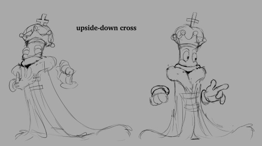


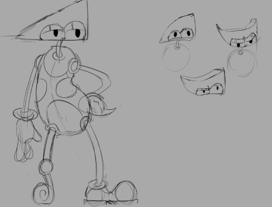
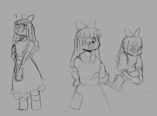
That's it! I hope the next time we meet, I have some new work to show you!
#the amazing digital circus#toon au#toon pomni#toon jax#toon ragatha#toon gangle#toon caine#First Draft
123 notes
·
View notes
Note
I LOOOVE, just ADORE the way you draw turbo n king candy!! The stylisation?! SO GOOD!!
Would you give any tips for stylising more cartoon-y / in the similar style of cartoons you went for?
Also loove the sketch of Candy being help like a cat who’s done something they’re not meant to, just fabulous!
Ok so I don’t wanna turn this into a long ass ramble post about my favourite cartoons, so I think the best advice I can give is to USE SHAPES! Shapes will be your best friend. Here’s some of my own original(and fan made) designs as as example

Each of them are constructed and drawn differently from one another. Different sizes, different ages, different colours, everything is filled with lots of variety (excuse me for bragging)


Even when boiled down to their absolute essence, it’s clear what shapes are mainly used to construct them. Some just use one or two while other’s are a little more complex. In this case, for myself, I use a lot of round, organic, crescent-like shapes for a good majority of them. But of course that doesn’t mean you have to purely rely on shapes in order to get that cartoony look. They can be used as a base/body for your character, but the rest of the details are up to you. Your shapes are only there to help define your silhouette.
If you need a brief rundown on some of the cartoons/films that influenced my style here’s some of the few (Alt text describes what I like most about it)


I like to refer to Preston’s Blaire’s book on drawing/animating cartoons if you want a more in depth explanation on how older, classic cartoons are drawn :)
https://archive.org/details/advancedanimation/mode/2up
Hope this gives you a bit of an idea!
41 notes
·
View notes
Text
Dance with the Moon

I don't normally draw this sort of thing but like I said before, I think it would be interesting with these two as a duo regardless of being friends or more.
In this case, you can consider this a more romantic view of it.
I see people point out about Hoppy's cardboard cutout voice lines and how it's moon related which has relation to Catnap. Some argue that this relation might prove that Catnap had involvement in her death(and so does Bobby as she too mentions the moon) which might very well be the case but the way Hoppy's voicelines seems to function is that she's not running away but trying to reach for the moon, trying to get to it.
It strikes me as interesting though about subtle connections the two characters might have for example the moon and Hoppy's desire to jump to it but ultimately dies failing to reach it. The moon could potentially represent Catnap as his charm is literary a crescent moon, it's what he specifically is associated with as well as sleep. Another thing about this is not only Hoppy is trying to reach for the moon but in the show itself(teacher/cartoon for Catnap and the Smiling Critters show), Catnap appears through a storm and what's Hoppy's charm? A lightning bolt. Then in Sleep Well, we see a Hoppy toy looking up at Catnap and Catnap reaches an arm out to help which is odd based on the chosen smiling critter that it could've been displayed(though they could've just randomly selected one). Lastly, although Catnap and Dogday are meant to be polar opposites with the sun and moon, Catnap and Hoppy are opposites in their own ways as well. Catnap represents sleep and rest while Hoppy represents energy and play.
Now back to the actual image instead of possibly(if not probably) overanalyzing certain details. I tried a different approach in drawing this with a more sketched line art for Catnap and Hoppy mixed with slight color alterations and low shading. For the background I did a mix of a cartoony yet vibrant night sky with a more "galaxy" look. For the dashes throughout the background, that sort of background was based off another artist with a cool background artstyle.
Overall, it was just fun to make though being different.
#poppy playtime 3#digital art#catnap#fanart#smiling critters#poppy playtime fanart#poppy playtime#poppy playtime hoppy#hoppy hopscotch#the smiling critters
44 notes
·
View notes
Note
I saw someone refer to luz as a "terrorist". I am. so. goddam tired.
Lemme guess, cause she brought fireworks to school in the first episode?
Mfw a cartoony scenario happens in a Disney Channel cartoon meant for kids
54 notes
·
View notes
Note
in the name of practice for your tablet, may I humbly request some Captain Rex? 🩵
Yes you may, thank you so much for your request! Sorry for the wait, it took me too many attempts to get something that felt like Rex! But here you are, at last:

That's the flat version, two different shading styles and ramblings below the cut:

^ This is the way I've been doing my Tem-referenced drawings

^ This is more of a cartoon-style shading (I used a reference for the shading but it was from Pinterest so I don't know the original artist unfortunately)
This is all a massive artistic journey for me. I was already experimenting when I was still drawing with my mouse, but now that the possibilities are endless and there are no boundaries left, I'm finally able to explore to the fullest. Which makes me struggling at the moment, because I want to create my own art style. But where do I settle: towards cartoony, towards realistic (I love using Tem references), or somewhere in between? And how do I integrate things like details and shading/highlighting in it, how far do I go? What will work for a (semi) cartoony style? I'm sorry I'm just rambling here, I have to find those answers for myself whilst practicing and experimenting and exploring and continuing on this journey. I'm also aware I don't have to settle on one style, and that one's style (and also skills) are always prone to improvement (at least, I hope so), but I just need some consistency in my art. There's also so many artists out there which I really admire, and when I see their art, I'm like: I want to integrate this into my style, but then there's so so many different styles I like and my brain just-
I AM SO SORRY for all the rambling this was not meant directly to you @aknightreaderr or to anyone else, I was just writing down my thoughts. I will go to bed now since it's past 01:00AM and I need to get some rest so I can draw again tomorrow.
Mimi, thank you so much for your request! Feel absolutely free to shoot another one (also for everyone else, if you've come this far reading my ramblings). I'll have more free time to practice drawing tomorrow (and partly Monday as well)!
Taglist: @ghostymarni
18 notes
·
View notes
Text
Hey guys!
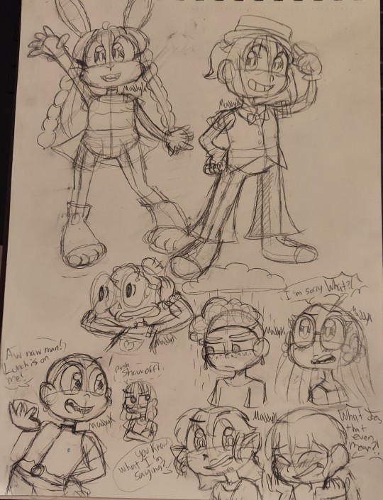
Trying something new with my art style!
Had to copy some disney cartoon ref sheets and old cartoon artwork as an illustration class assignment and it made me realize something.
One thing I always disliked about my art style was how it made certain poses look weird. I always wondered how cartoons made things look not uncanny with their wacky proportions.
Was also thinking A LOT about Looney Tunes and Tom and Jerry today. I absolutely loved watching cartoons on Boomerang growing up- ANYWAY
I thought: Maybe I'm pushing the realism in my style a bit too hard? What if I try pulling out some more inspiration from the cartoons I loved growing up. My art style is inspired by a mix of vintage cartoons, anime, and video games after all!
So I decided to stare at some more old cartoon ref sheets and watch some old looney tunes clips and more! The point is I realized these guys aren't anime characters or meant to be realistic in any way, so why should the art style be? I'm so glad I decided to do this omg I've always loved the goofiness of old cartoons. I've been thinking for a while now I want to incorporate more cartoony silliness into my work because there really isn't enough of it in the world nowadays.
One of the most uncanny things before was when I tried to draw a character with their arms up in any way or with their hands anywhere near their head so I did a couple of doodles to see if this looks better. I think it does, how about you?
I will never say old cartoons weren't flawed, but they certainly do have a certain charm that we seem to have forgotten. Anyway what I'm saying is my recent art assignments made me want to draw more silly shapes in my characters and make them more cartoonish.
Moving on... I gave Bonnie a more bunny-shaped face. I exaggerated the shapes of Marcus's design to pop more. Eleanor I literally just felt like drawing that.
I ended up also wanting to doodle how Drake loves to treat his friends (and he has the money to since he works multiple small side hustles with his friends and is REALLY good with money and accounting). He doesn't like to brag about it but he really is proud of his money-making skills. He'd probably be rich if he wasn't always spending his money on his friends, family, and the community he cares about. ^^
I wanted to doodle an idea I had regarding Alex's weather-themed patterns. Controlling the actual weather is kind of boring but I thought being able to summon rainclouds and stuff is pretty cool. Also he got a slight redesign ^^
Decided to make Abby's glasses a part of her eyes like glasses often are in old cartoons (it looks so cute ^^)
Finally, a little slight redesign of Emmet to incorporate multiple lucky charms into his design rather than just four leaf clovers and black cats. I also for some reason when drawing him I decided that he was Australian and moved to NGG's version of the US in his twenties. (For the record, technically this world has it's own made up countries instead of real ones, but the cultures and stuff are based on real countries soo.... for simplicity sake at the moment, and because it doesn't technically impact the lore that much, I'll just name the countries that inspire the countries they are from for now 0o 0 )
#original characters#art#original character#oc lore#art style#art study#art practice#drawing#sketch#artwork#sketches#traditional art#doodle#original story#maddykart#maddykpost#there are no good guys#no good guys#tangg#ngg#bunny girl#rabbit girl#kawaii#looney tunes#tom and jerry#cartoon style#character sketch#cartoon art#old cartoons#character design
7 notes
·
View notes
Text
so... joker 2 was not great. i wasn't expecting it to be. it's a very good looking movie, and you can tell a lot of intentionality went into shot composition. i also didn't realize that these movies were meant to take place in the late 70s. like '78 or '79. all of the music the characters sing and listen to is from the 70s (there isn't original music in this). the tech and the vehicles are all from the 70s. the characters talk about this being the first nationally televised trial, so it's pre-OJ at the very least. maybe this was obvious in the first movie and i wasn't paying that close attention. oh well.
this is going to sound very weird, but if you do end up seeing the movie, you'll understand exactly what i mean. now. i cannot prove this. there is absolutely no verify whether this is true or not. however. WB was supposed to release this movie called "coyote vs acme" last summer. they ended up pulling this from the release schedule and replacing it with barbie. it was a whole ~thing~ and it's currently stuck in distribution purgatory. it's probably going to stay there. but like. i swear to god. it seems like elements of that script ended up in this movie. it opens with a looney tunes style cartoon. looney tunes cartoons are featured pretty prominently in the movie. arthur/the joker does this strange accented voice in the courtroom, which is where most of the movie takes place. just the way it plays with unreality in general. it sort of has that cartoony vibe to it in some of its scenes.
another thing the movie is trying to do is play with how, when the first movie came out, there was this weird thing that happened where a ton of journalists said that this was going to inspire, like, incel mass shooters, based on... i don't even know. and nothing ended up coming of that. that whole thing was very strange. i don't think it entirely works in this movie, though. and the ending is rough.
i went to this thinking to myself "i don't what this is going to be about." turns out todd phillips and scott silver didn't know either. thumbs down. i don't regret going to see it, but it's not good.
14 notes
·
View notes
Text
Pizza Tower/Evil dead crossover Peppino
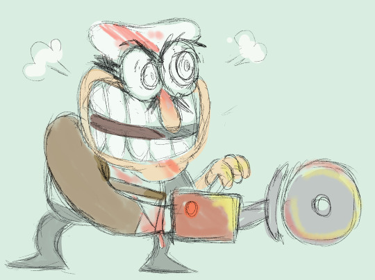

He had to cut off his own hand to stop from turning into a pizza monster, and he’s mad as hell about it. Also I decided to give him a sleeve harness for his BIG HONKIN PIZZA CUTTER BUZZSAW cus it looked strange on the end of his more noodle looking arm. And this gives him more heft and motion. I’ll put what I’ve got so far about the au under a readmore.
So a chain restaurant opens in a historic landmark, the tower, where during renovation they accidentally unearth an ancient spooky power. Which gets harnessed by the human who would soon become PizzaHead.
Setting off a very monkey's paw be careful what you wish for situation, cus the guy basically wanted a “pizza empire”. He meant that in terms of creating a huge and wealthy corporation, but the tower magic took it literally. So now not only is it spawning armies of pizza monsters, but Pizzahead has the power to turn humans into more pizza monsters.
So he starts by inviting all the owners of the local businesses to the restaurant part of the tower for a little get together before the grand opening.Targeting them first to cut down the competition and ensure the maximum amount of customers would instead be visiting his restaurant. This being the moment that first gets everyone scared, as a 6+ foot tall man made out of cheese with a pizza for a face bursts into the restaurant. Acting like some kind of unhinged cartoon clown, and trying to get the people who haven't eaten the free pizza yet to try some. Though it seems like his presence speeds up the pizza monster transformations. As the ones who were infected start to turn, while Gustavo, Mr. stick, and Peppino escape into the tower.
So in this instance, the bosses are other humans who showed up to the party and got turned into pizza monsters as part of Pizzaheads army. Like pepperman used to be the owner of an arts and crafts store. Vigilante was a farmer who restaurants would sometimes buy meat and veggies from locally. Noise and Noisette were a young couple involved in journalism who were covering the opening of the new restaurant. And some of the other one-off monsters could be other local business owners.
Peppino never ate any of the pizza, but he did get a slice of it shoved into his hand by pizzahead when he showed up and terrified everyone by being an unhinged pizza monster, and it took him a moment before dropping it. So after a bit of adventuring, it turns out his hand is infected, and he's gotta cut it off to keep the pizza transformation from spreading. As his screaming and comically slamming his cheese and pepperoni hand on various walls does little more than stun the cheese hand in a cartoony sorta way (Like with stars spinning over it’s head).
After a building of panic as the cheese starts to spread over his wrist, he cuts it off in a grocery store-like location within the tower with a industrial strength pizza cutter, that is really more like a big buzzsaw, splattering himself with his own blood. Though the pizza monsters are threatening to break in, so he attaches the big buzzsaw to his stump arm, and goes on a blind rage chainsaw massacre style rampage. Eventually collapsing from blood loss and overexertion in the abandoned looking Bruno's pizza when it looks like he’s killed all the monsters nearby.
He wakes up with something trying to force his mouth open, and it's his severed cheese hand. He tries to kill it, but it tricks him into screaming and it's able to get into his mouth. He tries to puke it out, but instead he pukes out a whole grey shirt Peppino clone, which he screams at, it screams back, and it melts into inert goo. He vomits a few more times, with a similar outcome of spawning a short lived lumpy looking clone of himself, and he's able too look inside his mouth in a reflective surface, and his mouth and throat is full of goopy hands. No longer made of cheese, but more looking made out of melty rubber skin. So he quickly boils a pot of water and drinks the boiling water while screaming and swearing much like how it goes down in army of darkness, with the clones screaming as the boiling water hits them. A very brief moment for Peppino to catch his breath, hoping it's over, but then stuff starts growing under his skin, and he undergoes a rapid, but disturbing mitosis.
The two Peppinos pulling apart and falling to the ground. With Peppino having a moment of excitement as his hand has grown back
But he spots his doppelganger and scrambles to his feet, fake Peppino currently being a perfect mirror of him. Matching Peppino’s looks and movements exactly. Peppino takes a moment to process how weird this is, doing stuff like moving his arm and hand, with Fake Peppino mirroring the motion, before trying to back away slowly. But when he takes a step back, fake pep steps forward. And again. Before Peppino tries to book it, and fake pep lunges after him, causing him to scream, and fake pep screams back, revealing himself as a warped goo monster, and the chase is on. And that’s as far as I’ve got with the au so far. Can let me know if you have any ideas to expand on the au with.
335 notes
·
View notes
Text
Fantasy Month :My Little Pony Escape from Katrina

So I had a really fun idea for today,do a Saturday Morning Cartoon bonanza ,look at a bunch of random episodes of Fantasy themed animated shows and at Noon review all I watched .....SO I ended up sleeping in and had to make brekfast and by the time noon rolled along ,I had only watched one cartoon ....A cartoon that thankfully I do have some things to talk about but is held back by the style of the time
So lets talk My Little Pony . I did watch and enjoy a few seasons of My Little Pony Friendship is Magic ,but OG MLP ,is both before my time and wasnt the sort of thing I watched though I have seen the original special that started the franchise .So why did I check this out:Soley cause Tammy Grimes AKA Molly Gru from Last Unicorn plays the villain ,and I love her vocal performance there so I wanted to hear her here
The plot of this 1985 Special is Katrina (Tammy Grimes) has grown dependent on a Witch Weed ,which she needs a machine and slave labor to produce ,and she seeks to enslave the ponies
So this might come as a surprise,cause I love 80's pop culture and I love animation.....Im not that into 80's cartoons.80's cartoon are in a weird spot for me because there so limited ,the writers clearly wanna tell good stories but what stories they can tell are limited by toysellers,and parent groups and ccensors .There are ones I like (He Man and the Masters of the Universe , Teenage Mutant Ninja Turtles and I got a soft spot for Transformers ) .I call 80's cartoons Toyetic cartoons,cause at the end of the day....Thats their job .They are trying to get little Susie and little Bobby to convince mom and dad to get them these characters they like .I will not judge these shows for being commercials ,no I would never do that cause the best toyetic properties make you forget that .Hell the reason we HAVE the toyetic boom of the 80's is Star WArs ,which happens to be one of the toys I collected a lot as a kid......Because I adored the story and characters ,and I wanted to show I liked the characters,that the character meant something to me.The best toyetic stuff be it Star Wars or X Men or He Man have something that pulls you in and makes you wanna celebrate these characters .I also think this is why My Little Pony Friendship is Magic was so sucessful ,all the characters where distinct and likeable and people responded to that....OK you might be wondering why I am rambling like this ...Well cause I wanna make clear my issue is not its a commercial......Its that its a BAD commercial at least to me .....Cause ICANT TELL WHOSE WHO .My biggest issue with this special was I legit couldnt tell which pony was who ,theres a lot of them ,alot sound a like and look alike so if I was little Susie ....Who do I get ??As a commercial as a failing but more seriously as a story thats a failing ....Which is a shame cause there are some cool elements.....And its all on the guest villains
Katrina and her lizard henchman(Im not looking it up)played by Paul Williams are legit interesting ,but kind of held back by the fact its a My Little Pony special .Katrina is basically addicted to this witch weed ,but she has to exploit people in order to get access to it and improve her powers .Throughout the thing Paul William lizard talks about how she used to be kind but the dependance on the machine and the jusice of the weed has turned her cold and cruel .I also really love the implication that her and the lizard are romatically connected .I love her design too ,this feline almost faded diva look (In fact her and the liazrd dynamic reallly reminds me of Norma and Max from Sunset Boulevard ).Tammy Grimes does a marvelous job ver intimidating and cruel but with a sadness and it kind of fun to hear Paul Williams do a more cartoony voice.Im also glad they get a happy ending even if the method they got there is a little suspicious .I honestly love these two characters and wish the whole special was just them and not the ponies
I love the villains,theres some interesting stuff there but this was just not my thing .One can do a commercial better
@theancientvaleofsoulmaking @ariel-seagull-wings @the-blue-fairie
@themousefromfantasyland @countesspetofi @amalthea9
@princesssarisa @filmcityworld1 @barbossas-wench
5 notes
·
View notes
Note
Hello Stiff,
I have been a long time fan of your art. I followed you a while back when I first saw your art pop up on my dashboard. Your art was always wonderful to me, and you had such interesting and new ideas for your Scar designs. I mean, four ears? That was so cool! And who doesn't love a good trans Scar?
Recently, there's been a change in your art that I (along with several others) have noticed. It's something you often point out as a "good" thing, but frankly, it's quite hurtful. You've been drawing Scar with a very large nose, and good on you! You're very right in saying that the hermit and traffic communities have a tendency to not draw more marginalized or "uncommon" body types. We love seeing more diverse bodies and features in art! I myself have a bigger nose and have longed for people with my features to be shown in media.
I say this with the utmost kindness and respect for your art, as a longtime fan: The way you draw Scar's nose is like a caricature. I don't understand, whenever I see your art pop up onto my dashboard, how you cannot see it. As an artist, I assume you know more about correct proportions and such than I, but this just feels (and I hate to use such strong language here) absurd. Drawing large noses is a great thing, but this feels like something I would see in an old, racist cartoon.
And it's just Scar, as well! You draw everyone else wonderfully, but you give Scar such a disproportionately large nose! At this point, it feels like you're patting yourself on the back for drawing racist caricatures. I have never seen people be drawn like this otherwise. Please, look at images of people with larger noses. Look at their proportions. Compare this to your art. You will see the difference!
I say this not as someone who wants to bring you down, but as a fan who is concerned about the way your art has been going. I'm a little surprised you haven't had people point this out to you before, frankly. I hope you take this not as something meant to insult you, but as something meant to educate and bring to light something that you may have overlooked in the name of doing something good.
Please take time to think on this and reflect. While I'd appreciate a response, one isn't necessary, as long as you do something to change. Apologies for sending this on anonymous, but I don't wish to possibly put myself under attack for saying something I truly believe in.
I hope you have a wonderful day.
I feel like some of the art I drew could come off as a caricature but the most recent one with pizza genuinely just looks like a cartoony drawing to me? Like this just looks like a character I'd see in a cartoon? I can see why some of my other pieces may have come off as a caricature even tho that was not my intention.
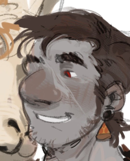
Obviously I don't want to make something hurtful or racist in nature so I'm genuinely sorry if anything I drew came off that way.
I'm not gonna be drawing his nose this way anymore and I'll probably lay off from posting art for now
#asks#i dont know what to tag this#its 3 am i dont have a better response rn maybe in the morning idk#genuinely sorry if i hurt anyone by my art
19 notes
·
View notes
Note
The fact that a minor likes Vivziepop's stuff proves how absolutely juvenile her content is.I mean it doesn't look like an adult show,it doesn't "feel" like an adult show in comparison to King Of The Hill or Aqua Teen Hunger Force does.it looks like a regular cartoon come to think of it.there's really nothing 'adult' in her shows other than those rancid unfunny jokes.
Viv seems to be the under the impression that the only way to make an "adult" animated series is by adding in a bunch of dick and fart jokes.
What makes shows like Bojack Horseman stand out from the rest is that, it tackles adult themes in an adult manner. You're meant to feel uncomfortable when you see Bojack's parents arguing in flashbacks, when Princess Carolyn breaks down in her car, it hits hard because we don't get to see her be vulnerable all that much before that moment.
Bojack's self destructive nature is shockingly realistic, it isn't cartoony or melodramatic.
Helluva Boss on the other hand fails miserably at balancing its comedy and drama. Because the writing is just so surface level.
One minute Loona is having a heart to heart conversation with Octavia about how she shouldn't be too hard on her dad, and in the very next scene she's kicking Blitzo (her adoptive father) in the crouch because Viv and her team don't want to treat their audience like adults, they have to thrown in a dick and fart joke every couple of seconds because the audience apparently needs to be constantly reminded that this is an "adult" animated show.
It's no surprise that kids are watching Viv's shows, as the art style is appealing enough when compared to other shows that are aimed at adults, and the writing is very basic.
60 notes
·
View notes
Note
I love Popeye so much— the franchise is my current special interest, but I love the 1980 movie in particular. I get really pleased whenever you post about Popeye (partially because you're the only one really active in the tag) so if you could continue to post Popeye loud and proud that would be cool as hell
THIS IS SO SWEET OH MY GOSHHHHH!!! i saw this yesterday when you sent it in and meant to answer earlier, but i have to say i’ve spent both yesterday and today thinking about it because THIS MAKES ME SO HAPPY TO HEAR!! THANK YOUUUUUUUU!! i also had no idea i was really the only one active HAHA, amazing!! i assure you, the Popeye posting will always continue! i LOVE Popeye, and i’ve actually only seen a fraction of the shorts compared to those i haven’t. i’m so protective of the 1935-1938 sweet spot with Jack Mercer, Mae Questel and Gus Wicke that it’s really hard for me to move onto the shorts post-Miami move… but i gotta! because more great cartoons await! and so i’m sure i’ll be gushing about those when i discover them more and more :)
SPEAKING OF 1980 POPEYE!! i know i’ve had some followers curious about my opinion on it! I FINALLY WATCHED IT FOR THE FIRST TIME BACK IN JULY! i admittedly forget if i said my piece on it or not, but i will here anyway!
is it good? in an objective sense? probably not. did i absolutely love it and have an absolute blast watching it regardless? ABBBBBSOOOOLLLUUUUUUTELYYYYY!! i had so much fun watching it!! as a fan of physical slapstick, anything “cartoony” translated into live action, Popeye (of course), and many other specifics i’m forgetting but know the film included, i really enjoyed it. the almost obligatory physical slapstick and sheer amount of stupid pratfalls was giving me so much joy. i’m genuinely impressed at Robin Williams’ muttering and him keeping his one eye squinted the entirety of the film. Shelley Duvall is PERRERRRFECT as Olive Oyl! she was the best part of the film for me, she was so darling 🥺 and the songs were cute, VERY AMUSING, very campy, some i liked better than others but they were very catchy. the sound design was very baffling as well but i kinda loved it
i said this when streaming the film in a groupwatch and i still stand by it:

also, evidently copious amounts of cocaine were involved in the production of the film and i can absolutely believe it. SUCH A FUN WATCH THOUGH, very cheesy in the absolute best way! thank you to all who encouraged me to watch it, i’m really glad i did and will probably rewatch it again at some point :) but yes, that’s all to say that the Popeye posting will absolutely continue and i am SO GLAD to hear you enjoy it so much!! that seriously makes my day!! Popeye is really the cure for happiness in cartoon form
13 notes
·
View notes