#Brause steno
Explore tagged Tumblr posts
Visit Tumblr Blog
Explore Tumblr blogs with no restrictions, modern design and the best experience.
Last Seen Tumblr Blogs


Fun Fact
69% of Tumblr users are millennials.
Text
Day 14: jasmine. I got a new iPhone and I'm not sure I've fully figured out the camera yet. Anyone else have any tips for the iPhone 14 pro? The footage just doesn't look quite as good but I'm not sure why...
🖋@jetpens Brause 361 Steno Blue Pumpkin Nib
@speedball_calligraphy Oblique Nib Holder
🎨 @drphmartins Nickel ink
📜 @cansonusa Marker XL
#calligraphy#satisfying#lettering#handwriting#ink#dippen#pointed pen#Brause steno#blue pumpkin#drphmartins
6 notes
·
View notes
Text

Ink test....
75 notes
·
View notes
Text
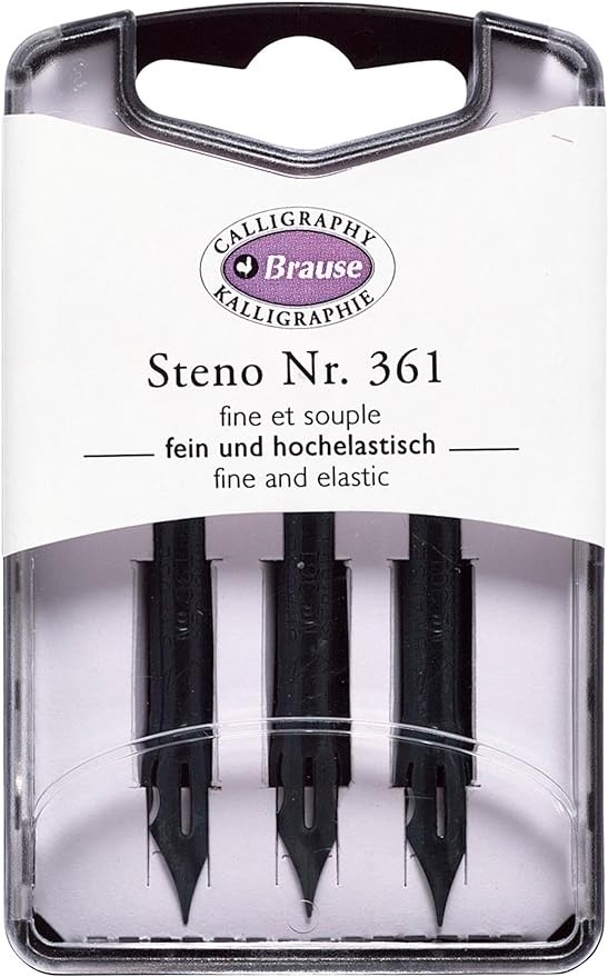
The famous Brause 361 Steno ‘Blue Pumpkin’ for use with dip pens. On their way!
2 notes
·
View notes
Note
Please tell us about your fountain pen(s)
!!!!!!!! so my regular On The Go fountain pen is just the LAMY safari pen in the umbra/charcoal grey color. i had to swap some default pieces for it out so I could have an extra fine nib + black ink as per the pillars of Being Goth dictate, but i use it a lot for writing notes or sometimes drawing if i need a thicker line... i think i impressed my date last night because our waitress only brought one pen out with the checks and I got to be like '💅✒️ watch this 20% tip babe' with a fountain pen flourish....
anyways, for illustrations I'll typically use a brause 361 steno blue pumpkin nib in this like... beat to shit bamboo penholder that I've had since my freshmen year of college? its nearly trash, I ought to get a new one but I AM poor rn. but I really adore the blue pumpkin nibs, they've got such a nice variety of lineweight u can make with pretty minimal pressure, and they're sturdy enough to last a long time. mwah.
4 notes
·
View notes
Video
FYI this is a dip pen, not a fountain pen! This particular nib is a Brause 361 Steno, a popular nib for pointed pen calligraphy. It's inexpensive and fun to play with.
Most fountain pens don't flex. They'd be damaged if you tried. I have a few that do, all of them very old gold-nibbed pens. But as cool as they are, dip nibs have superior flex. They're disposable, so you can put all the engineering into a nice, crisp springy action and not worry about wear and tear.
#dip pen#dip nib#brause nib#pointed pen calligraphy#calligraphy#the other great thing about dip nibs is you can use anything for ink#india ink watercolor gouache high-flow acrylics#even blood if you so desire#reblog
235K notes
·
View notes
Text
Dip Pen Experiments!

So part of my Christmas present to myself this year was an order from Jetpens.com, which included a Brause 361 Steno dip pen nib + a Tachikawa T-40 nib holder. I've messed around with dip pens before, but it has been multiple years since I've done so.
Initially, I really struggled with making marks, until I realized that my ancient bottle of Speedball India ink (black) was too thickened by age to come off the nib. I then switched to a bottle of fountain pen ink (pinkish orange) that had been part of my JetPens order. This worked beautifully! I was experimenting with rendering via hatching (something I've never been good at), and made some progress until I erased some pencil lines underneath ink that hadn't yet fully dried -- hence the smear. Also, I managed to spill ink onto my phone when I had it lying next to my sketchbook, but fortunately caught that as it happened and wiped it all away. No harm done!
1 note
·
View note
Text
Blackletter Calligraphy Skills: Master the Medieval Art

Blackletter Calligraphy Skills: Unlock the Secrets to Mastering Medieval Art
Welcome to the world of Blackletter Calligraphy, a captivating art form that traces its roots back to the medieval era. With its ornate and intricate letterforms, Blackletter Calligraphy offers a unique and timeless style that can add a touch of medieval elegance to your projects. Whether you're a calligraphy enthusiast or a beginner looking to explore this fascinating craft, this article will guide you through the essential skills and techniques needed to master the art of Blackletter Calligraphy. Key Takeaways: - Blackletter Calligraphy is a traditional form of calligraphy that originated in the 12th century. - Mastering Blackletter Calligraphy requires basic calligraphy tools such as a broad-edge nib, straight holder, and calligraphy ink. - Using guidelines can help you create consistent and well-proportioned letters in Blackletter Calligraphy. - Understanding basic letterforms and flourishing techniques is crucial in developing your Blackletter Calligraphy skills. - Practice and dedication are key to becoming a skilled Blackletter Calligrapher.
The Origins of Blackletter

Blackletter, also known as Gothic script or Germanic script, is a unique style of calligraphy that originated in the 12th century to meet the increasing demand for books. This distinctive script allowed for more words to be written on a single page, making book production more efficient and cost-effective. Over time, blackletter has evolved into various variations such as Fraktur, Rotunda, and Schwabacher. One particular script within the blackletter family is known as Textura Quadrata, which is commonly used for blackletter calligraphy. Understanding the origins of blackletter is essential to appreciating and mastering this medieval art form. The evolution of blackletter demonstrates its enduring popularity and the unique aesthetic it brings to written communication. By delving into the history of blackletter, aspiring calligraphers can gain valuable insights to inform and inspire their own blackletter calligraphy endeavors. Blackletter Variation Description Fraktur A highly ornamental and decorative form of blackletter, often associated with German-speaking regions. Rotunda A more rounded and flowing variation of blackletter, commonly used in Italy and England. Schwabacher A simplified and more legible blackletter script, commonly used in Germany for printing purposes. Textura Quadrata The most commonly recognized and widely used blackletter script, characterized by its vertical strokes and angular letterforms. By exploring the origins and variations of blackletter, calligraphers can gain a deeper appreciation for this unique script and its rich historical significance. This understanding can influence their artistic style, allowing them to create authentic and visually captivating blackletter calligraphy pieces.
The Tools Needed to Begin
If you're ready to embark on your blackletter calligraphy journey, it's essential to have the right tools at your disposal. Here are the must-have tools that will set you up for success: 1. Broad-Edge Nib: The broad-edge nib is the primary writing tool used in blackletter calligraphy. It allows you to create the thick and thin strokes characteristic of this style. Consider investing in a high-quality nib like the Brause Steno or the Mitchell Roundhand nib. 2. Straight Holder: A straight holder is used to hold the nib securely in place while you write. Look for a holder that is comfortable to grip and allows for easy maneuverability. The Tachikawa T-40 holder and the Speedball Standard Pen Holder are popular choices among calligraphers. 3. Calligraphy Ink: The right ink can make a significant difference in the quality of your calligraphy. Opt for a high-quality calligraphy ink that flows smoothly and dries quickly. Higgins Eternal Black Ink and Dr. Ph. Martin's Bombay India Ink are reliable options. 4. Paper That Doesn't Bleed: Choosing the right paper is crucial to prevent ink bleeding and feathering. Look for a smooth and heavyweight paper specifically designed for calligraphy. Brands like Rhodia, Strathmore, and Clairefontaine offer excellent options. 5. Ruler, Pencils, and Eraser: A ruler and pencils will help you create guidelines for consistent letter heights and spacing. With practice, you'll be able to freehand guidelines, but starting with a ruler is highly recommended. An eraser will come in handy for any mistakes or adjustments you need to make along the way. With these essential tools in your arsenal, you're ready to dive into the world of blackletter calligraphy and begin honing your skills.
Using Guidelines for Perfect Letters Every Time

Guidelines are an essential tool in blackletter calligraphy, helping you achieve consistent letter sizes and spacing. By following guidelines, you can create evenly proportioned letters that maintain a uniform appearance. In blackletter calligraphy, guidelines are used to keep the x-height, ascenders, and descenders of letters consistent. Textura Quadrata, for example, typically requires 4-5 nib widths for the x-height and 6-7 nib widths for the ascenders and descenders. Ruling horizontal lines can help you maintain consistent letter heights, while ruling vertical lines can assist in creating straight, vertical strokes. When using guidelines, it's important to pay attention to the spacing between letters, ensuring they are evenly placed and proportioned. Properly utilizing guidelines can significantly enhance the overall appearance and readability of your blackletter calligraphy. Vertical Lines for Straight Strokes Vertical lines play a crucial role in blackletter calligraphy, as they help create the characteristic tight and vertical strokes. Ruling vertical lines can guide you in maintaining straight and consistent lines throughout your letterforms. These vertical lines serve as a reference point for constructing the letters and assist in achieving a uniform and professional look. “Using guidelines is like having a roadmap for your calligraphy. They provide structure and ensure your letters are consistent and visually appealing.” Horizontal Lines for Uniform Size Ruling horizontal lines is another essential aspect of using guidelines in blackletter calligraphy. These lines help maintain consistent letter heights, ensuring each letter is proportionate to the others. By ruling horizontal lines, you can achieve uniformity in the size and spacing of your letters, resulting in a harmonious and visually pleasing composition. Remember to use guidelines as a reference, but don't be afraid to experiment and add your personal style to your blackletter calligraphy. The guidelines provide a foundation, but your creativity and flourishes will make your work stand out. With practice and the proper use of guidelines, you can create stunning and consistent blackletter calligraphy pieces.
Understanding Basic Letterforms in Blackletter Calligraphy

Mastering the art of blackletter calligraphy starts with a solid understanding of basic letterforms. In blackletter script, vertical lines play a crucial role, creating the distinct and condensed appearance of this medieval writing style. When constructing letters, it's important to pay attention to stroke consistency, ensuring that vertical lines are straight and well-defined. This attention to detail helps maintain the unique aesthetic of blackletter calligraphy. Another important element of blackletter letterforms is the creation of diamond serifs. These pointed shapes at the top and bottom of the vertical strokes give the letters a distinct and decorative look. By mastering the art of creating diamond serifs, you can add an extra level of elegance and sophistication to your blackletter calligraphy. When practicing blackletter letterforms, it's recommended to start with easier letters such as b, c, e, f, h, i, j, l, o, p, q, r, t, and u. These letters provide a good foundation for understanding stroke consistency and creating well-proportioned forms. As you gain confidence, you can progress to more challenging letters and expand your repertoire of blackletter calligraphy. Table: Basic Letterforms and Tips for Blackletter Calligraphy Letter Description Tips b Uppercase B Pay attention to the diamond serif at the top. c Uppercase C Create a smooth curve for the top part of the letter. e Lowercase e Ensure the middle horizontal line is consistent in thickness and length. h Lowercase h Focus on the vertical line and maintain a consistent stroke width. m Lowercase m Pay attention to the angles and spacing of the three vertical strokes. t Lowercase t Ensure a straight vertical line and a well-formed diamond serif. By practicing these basic letterforms and mastering stroke consistency, you can develop a strong foundation in blackletter calligraphy. Remember to experiment and add your own creative flair while staying true to the unique characteristics of this captivating medieval art form.
Basic Flourishing

Flourishing is an essential aspect of blackletter calligraphy that allows you to add decorative elements and personal style to your lettering. Ascender spikes are a popular form of flourish that can be added to the ascenders of your letters. They can range from full and heavy spikes to delicate hairline spikes, depending on the aesthetic you want to achieve. Ascender flourishes can also be incorporated to enhance the visual appeal of your blackletter calligraphy. When adding flourishes, it's important to maintain balance and create harmonious compositions. This means that the flourishes should complement the letterforms without overpowering them. Experiment with different styles and lengths of flourishes to find what works best for your personal taste. Practice and repetition will help you develop a sense of balance and create visually stunning blackletter calligraphy pieces. “Flourishing is the art of adding unique, decorative touches to your blackletter calligraphy. With practice and experimentation, you can create visually appealing compositions that showcase your personal style.” Examples of Blackletter Flourishing Flourish Type Description Ascender Spikes Spikes added to the ascenders of letters for added visual interest Curling Flourishes Curled or looped flourishes that extend from the ends of letters Swashes Flowing, elegant flourishes that extend from the entry or exit strokes of letters Border Flourishes Flourishes that create decorative borders around the main body of the text Remember that flourishing is a creative process, and there are no strict rules. Feel free to experiment with different styles and techniques to find your unique voice in blackletter calligraphy. With time and practice, you'll be able to create balanced and visually striking flourishes that enhance your lettering.
Let's Get Started!
https://www.youtube.com/watch?v=qIedVud5Ei4 Now that you have a basic understanding of blackletter calligraphy, it's time to get started! The best way to improve your skills is through practice, and there are various resources available to help you on your journey. One valuable resource is practice sheets, which can provide you with exercises to hone your blackletter calligraphy skills. Calligraphers like Edgar Villa offer free practice sheets that you can print out and use to practice your letterforms and flourishing. These sheets usually include guidelines and letter templates to help you achieve consistent and beautiful lettering. In addition to practice sheets, you can also benefit from a study guide or workbook specifically designed for blackletter calligraphy. These study guides provide step-by-step instructions and examples to guide you through the learning process. They often cover topics such as letter construction, flourishing techniques, and historical context. By following a structured study guide, you can ensure that you are building your skills systematically and efficiently. Lastly, consider joining a calligraphy community or online forum. Engaging with other calligraphers can provide you with support, feedback, and inspiration. You can share your work, ask questions, and learn from more experienced calligraphers. Participating in a community can help you stay motivated and connected to other passionate individuals who share your love for blackletter calligraphy. Tips for Getting Started - Set aside dedicated time for practice every day or every week. Consistency is key in improving your calligraphy skills. - Start with basic letterforms and gradually progress to more complex ones. Mastering the fundamentals will provide a solid foundation for your calligraphy journey. - Experiment with different types of paper and ink to find what works best for you. Each calligrapher has their own preferences, and it's important to find the tools that suit your style and needs. - Don't be afraid to make mistakes. Calligraphy is a continuous learning process, and even experienced calligraphers make errors. Embrace the imperfections and use them as opportunities to grow and improve. - Take breaks when needed. Calligraphy can be mentally and physically demanding, so it's important to rest and recharge to avoid burnout. Table: Recommended Resources for Starting Blackletter Calligraphy Resource Description Free Practice Sheets Printable exercises and templates to practice letterforms and flourishing. Blackletter Calligraphy Study Guide A comprehensive guide with step-by-step instructions and examples for learning blackletter calligraphy. Online Calligraphy Communities Platforms where you can connect with other calligraphers, share your work, and learn from experienced practitioners. Calligraphy Workshops In-person or online workshops led by professional calligraphers to help you develop your skills. Calligraphy Forums and Blogs Online platforms where you can engage in discussions, ask questions, and find inspiration and resources. By utilizing these resources and committing to regular practice, you can embark on your journey to becoming a skilled blackletter calligrapher. Remember to be patient with yourself and enjoy the process of learning and creating beautiful lettering art.
Recommended Calligraphy Resources
Enhance your blackletter calligraphy skills with these recommended resources. Whether you're a beginner or an experienced calligrapher, these tools and references will provide you with inspiration and guidance to take your artistry to the next level. Procreate Brushes For those who enjoy digital calligraphy, Procreate brushes can be a game-changer. These brushes allow you to create stunning blackletter calligraphy on your iPad or tablet. Experiment with different brush styles, textures, and effects to bring your designs to life. Lettering Planner Stay organized and motivated with a lettering planner specifically designed for calligraphy enthusiasts. Plan your practice sessions, set goals, and track your progress on a daily, weekly, and monthly basis. A lettering planner can help you stay focused and committed to improving your blackletter calligraphy skills. Printables and Worksheets Printable calligraphy worksheets and practice sheets are invaluable resources for honing your skills. These resources provide drills, exercises, and lettering guides to help you practice various blackletter letterforms, strokes, and flourishes. They are an excellent complement to your regular practice routine. Resource Description Procreate Brushes Various brush styles, textures, and effects for digital calligraphy. Lettering Planner A planner to set goals and track progress in your calligraphy journey. Printables and Worksheets Drills, exercises, and lettering guides for practicing blackletter calligraphy. Explore these resources to expand your repertoire, gain new insights, and find inspiration in your blackletter calligraphy endeavors. Remember, practice and dedication are key to becoming a skilled calligrapher. Enjoy the journey and let your creativity flourish!
Conclusion
Mastering the art of blackletter calligraphy requires practice, dedication, and an understanding of the techniques and tools involved. By delving into the origins of blackletter and learning to use guidelines for precise letters, you can develop the skills necessary to create stunning calligraphic pieces. Basic letterforms provide a foundation for your work, while flourishing adds personal style and flair. Embrace the learning process and start with easy letters before progressing to more challenging ones. With time and perseverance, you can become a skilled blackletter calligrapher and bring this medieval art form to life. Remember that blackletter calligraphy is not just about replicating tradition but also about showcasing your own unique style and creativity. As you continue to practice, don't be afraid to experiment with different techniques and explore additional resources. Online tutorials, workshops, and communities can offer valuable guidance and inspiration to help you further enhance your blackletter calligraphy skills. Whether you aspire to create intricate manuscripts, design striking logos, or simply enjoy the meditative practice of calligraphy, blackletter calligraphy is a captivating art form that invites you to dive into history and express your creativity. So, pick up your calligraphy tools, embark on this journey, and let your imagination flourish with every stroke. Resources and References - "The Historical Sourcebook for Scribes" by Michelle Brown and Patricia Lovett - "Medieval Calligraphy" by Marc Drogin - "Italic and Copperplate Calligraphy" by Eleanor Winters These books provide valuable insights into the history, techniques, and variations of calligraphy scripts. Additionally, exploring online tutorials, workshops, and communities can further enhance your understanding of calligraphy and support your journey of mastering blackletter calligraphy skills. Remember, the art of calligraphy is an ongoing learning process, and with patience and perseverance, you can continue to refine and expand your skills in this beautiful and timeless craft.
About the Author
Meet Edgar Villa, a talented calligraphy artist also known as Made by Edgar. Hailing from Jersey City, Edgar is a Mexican calligrapher with a deep passion for the art of blackletter calligraphy. With his vast knowledge and expertise, Edgar aims to assist beginners in learning and improving their skills in this unique form of lettering art. Edgar offers a wealth of resources and tutorials for aspiring calligraphers on his website, www.madebyedgar.art. Whether you're looking to explore the basics of blackletter calligraphy or delve into more advanced techniques, Edgar's guidance and inspiration are invaluable. Read the full article
0 notes
Text
Sorry for propagating misinfo, it was not a fountain pen, it was a nib pen, likely specifically a “Brause Dip Pen Nib - 361 Steno Blue Pumpkin”
1 note
·
View note
Note
Lots to dig into here! So get ready, because these answers are going to be long.
The Collector's Catalyst
My dip pen craze started back in art school thanks to a helpful recommendation from a friend. They suggested dip pens as a solution to my awkwardly static linework, and I was instantly hooked on their amazing line variation. I signed up for a pen and ink class the next semester, switched almost entirely to working in ink, and started collecting dip pens wherever I could find them.

Evidence of how I use my dip pens
Over the years, I amassed enough of a collection that I owned most of the readily available nibs. When I discovered vintage nibs, the horizon broadened again! I wish I could say I slowly collected these discontinued nibs by finding them at estate sales or befriending antique shop owners, but truthfully I bought most of them at once from an online shop.
Line Style: A Mystery
You can't tell how a nib will write by looking at it. There are only 3 ways to know:
1. Write with it yourself. The best way, but it's probably not going to happen until after you buy it. Unless you have a friend that also hoards dip pens! (I don't, it's not that common apparently.)
2. Test the nib against your thumbnail (for brick and mortar shops). Watching how the tines spread, and feeling how springy the nib is will give you a good idea of how it will write.
3. Check the product description for notes on nib flexibility and line width (online shops). If you're lucky, they might even have writing samples!
Okay there is a fourth option, which is to search the internet and hope someone has made a writing sample. I remember finding this blog pretty useful.
For a long time I was on a mission to find the finest, most flexible nibs. It wasn't really until I started buying vintage nibs that I stopped looking up how each one might write. Though I find my curiosity still gets the better of me.
Identifying the Nib of Your Dreams Without Ink


You've picked up a dip pen nib in a shop, and you want to know how it might write. What can you puzzle out?
Left: A very stiff nib. Those tines are staying put—this nib will have no line variation. You can see it scratches the paper a bit, but not very much. Stiff nibs tend to be scratchier, but the end of these tines bend up a bit, which softens it. This means it should glide smoothly across the page. The bend at the end, which is not common, makes this nib great for casual writing. (J.B. Mallat No.110 Manifold)
Middle: A very flexible nib, and a fan favorite. The tines spread far out, meaning this nib will have good line variation. Though it's flexible, you can tell that it's still a stiff nib. A stiff nib can scratch up your paper, but is easier to control (read: beginner friendly), and will last longer. (Brause 361 Steno "Blue Pumpkin")
Right: Another very flexible nib! But this time, it's also a very soft nib. These are often referred to as being 'brush like'. This doesn't change the look of your lines as much as the experience of creating them. It hardly scratches the paper at all, but it is one of the most finicky nibs to work with. It's so mushy that the tines tend to start splaying almost immediately. Tines that are splayed, even a little, have trouble getting the ink to start transferring to the paper. But once you get them going, they are a dream to draw with! (Joseph Gillot 290 Lithographic)
Keeping Things Tidy and Safe

On the left are my modern nibs, the right my vintage nibs, and the bottom duplicate nibs. The baggy holds nibs that have rust damage.
I store most of my nibs in Art Bin nib cases. Up until recently they were organized by tip size and flexibility as follows: top row-inflexible, bottom row-flexible, arranged thinnest lines to thickest lines from left to right. This was the perfect system until I dumped them all out of the case and forgot the order.
Before this they were all just floating around an altoids tin. Nibs are pretty tough and they can handle it.
An Ocean of Inks

A drawer full of ink. I was not shy about collecting ink from my old job's unsellable products pile.
Your sneaky feeling about ink is completely correct! There are several kinds of ink and they can be VERY different. The good news is, dip pens are compatible with all inks! Some might flow better than others, but they won't destroy your nib as long as you clean up in a timely manner.
Note: This is not true with fountain pens. Fountain pens get fountain pen ink only! And even then you can still clog your pen. This post isn't about fountain pens, but that felt like an important distinction to make.
The two basic ink categories are India ink and water based ink. I might switch between them depending on my project, but I almost always use India ink. Then again, I almost always use dip pens for drawing.
India Ink & Acrylic: Make That Art Waterproof!

A series of India and Acrylic inks. Bombay India ink is my favorite.
Both India ink and acrylic ink are waterproof. India ink for being shellac based, and acrylic ink for being, well, acrylic. They're ideal for drawing with, especially if you plan to paint over your lines. These inks sit on top of your paper and will dry raised. Because of this, the type of paper you use isn't as big a deal (for the ink! not necessarily the nib). I use either Bristol board or very smooth hot press watercolor paper.
If you stay on top of rinsing your nib as you work, you can keep them clean with just water. Most likely though, you'll need to clean off your nib with alcohol. If you want to keep your nibs looking new and shiny forever, stay away from India and acrylic inks.

The future look of your favorite nibs, thanks to India ink
Water Based Ink: Calligraphy Central

A few examples of drawing ink (left) and fountain pen ink (right)
Water based inks are easy to clean off your nibs, and generally thinner than India ink. I'm going to split them off into two more groups: water based drawing inks, and fountain pen ink.
While fountain pen inks do work with dip pens, you have to keep in mind that they are much wetter inks (less viscous) and you are more likely to come across a situation where your ink, nib, and/or paper combo refuses to work for you. This will look like an ink that balls up on your nib and won't flow towards the paper, or an ink that flows too freely off the end of your nib and creates thick or feathery lines. Fountain pen inks come in a huge variety of colors, often featuring special effects like dual tones, shading, sheening, and glitter. This makes it very fun for calligraphy!
Water based drawing inks include sumi ink, manga ink, and what is sometimes just called 'calligraphy ink'. These are made to use with dip pens so they shouldn't cause you any trouble! While they're made to draw with, I personally prefer India ink since no water based ink is perfectly waterproof.
Water based inks will sink into your paper, making the paper you choose much more important. Fountain pen paper and manga paper are safe bets.
Note: Some of these inks advertise themselves as being waterproof. They aren't! What they mean is water won't make the bulk of your line disappear. The ink will probably still lift, if only a smidge.
The Importance of Paper
Paper WILL affect how your nib writes, though it affects water based ink the most.

Here we have 2 fountain pen inks (top: Diamine River of Fire, middle: De Atramentis Document Blue Gray) and an India ink (bottom: Bombay Van Dyke Brown) on several different kinds of paper.
You can see how poorly the water based ink reacts to the two papers on the bottom, and even starts to feather on the Bristol board (circled). But Rhodia is a fountain pen friendly paper, you cry, why doesn't it work? This is true, and it works with fountain pen ink in fountain pens, but dip pens put out a LOT more ink than fountain pens do, and not all papers can handle it.
American notebook papers aren't made to handle anything heavier than a highlighter, so they're automatically out—though you can see the India ink doesn't seem to mind. Japanese and German notebooks tend to be fountain pen friendly, so they're worth experimenting with. So are smooth, ink friendly art papers like Bristol and hot pressed watercolor paper.
I also wanted to point out an example of how ink affects your line widths. If you look carefully, you can see that the hairlines circled on the right side of the picture are thicker in the middle swatch than the top. That's because the middle ink is much wetter!

Since this post is getting a little out of hand, I will wrap up with one last picture showing off the different textures of the inks. River of Fire (top) is a sheening ink! This feature—that red sheen—shows up best on paper where the ink can pool and dry slowly on top of the page. Here we can also see how 3-dimensional and glossy India ink is. Keep in mind the India ink I used had started to dry out, so it's even blorbier than usual.
Still Interested?
Here's where you can go to start your very own nib collection!
Dip pens can be found at art stores, stationery shops, and online stores. I've also seen some vintage nibs on etsy, though the prices can be inflated. These are some online shops I've come across that I trust:
Paper & Ink Arts (I bought most of my nibs here! They even have some vintage ones. US based shop)
St. Louis Art Supply (US based shop selling vintage nibs)
Kallipos (German shop selling an extensive supply of vintage nibs. I got most of my vintage nibs here!)
JetPens (Begrudgingly adding them because they have very useful writing samples for both dip pens and fountain pens. I know because I created them for several years before they laid me off.)
Could you please (if you haven’t before) do pics of what each of your vintage pen nibs’ writing style look like, if they are different widths/create unique lines?
Oh absolutely!! I've been looking for an excuse to do this for ages. Their writing styles are as varied and unique as their shapes.
Here they are on Midori MD paper written with Rohrer & Klingner's Iron gall Salix ink. I photoshopped the pen nibs next to each writing sample so it's easy to tell what's what.

Now you can't tell from the writing sample, but two of these nibs have ball pointed tips! This is a feature you'll find on fountain pen nibs, but seems to have disappeared from modern dip pen nibs. Instead of coming to a sharp point, a ball pointed nib has a little round nubbin on the end that is much smoother to write with.

Because of this, the Perry & Co Glideaway and the R. Esterbrook & Co Oval Point are extra nice to write with! Though ball pointed nibs do come at the price of flexibility.
#a LOT more info about dip pens ft. some satisfying gifs#long post warning#always happy to share what I know with anyone interested! (time and energy allowing)#dip pens#ask
104 notes
·
View notes
Photo

✒Esta plumilla se llama #Steno y tiene la característica de ser flexible, como podéis ver en el vídeo si deslizais la imagen. Me venía en el pack que veis en la última imagen. Es la plumilla que más me gusta de todas las que he probado porque al ser flexible puedes hacer trazos finos y gruesos según la presión que ejerzas al escribir. O sea es la típica plumilla que puedes elegir para practicar la típica caligrafía inglesa antigua. Os la recomiendo si os gusta este tipo de caligrafía. . . . #brause #brausenib #calligraphy #nib #flexynib #stenographer #stenonib #plumilla #plumilla https://www.instagram.com/p/Bxh0tbcoi5w/?igshid=bbhr68hwbk2f
1 note
·
View note
Photo


Sometimes you get a dip pen nib that flexes so good!! (https://shop.stlartsupply.com/products/brause-361-steno-pen-nib?variant=42683502821634&gclid=CjwKCAiAjs2bBhACEiwALTBWZfXrGt5KTPuEKVhw9LzrA0qxb9UA02CsIalLTiMRawnbLClwktagRxoC-zwQAvD_BwE)
Doodled a little Amalthus.
2 notes
·
View notes
Text
To whoever asked for the nibs i use for my dip pen its really just a shitty starter pack nib that i got from the store. Dont get it, it doesn't hold ink well and it blots alot. Im getting a brause steno soon to replace it. My ink is tge faber castell turkis torquise and parker quink. Peace n love
10 notes
·
View notes
Photo

The Brause 361 nib is a nib I like to recommend for beginners and I use it regularly in my workshops. It’s sturdy but still gives nice hairlines, lasts quite a while and will work well with a wide variety of inks (including gouache and metallics). Also you can get pretty thick swell strokes without it being too difficult for the more heavy-handed! It made me smile when I first heard this nib called a »Blue Pumpkin« in English! Probably because its blue dye and round and rather big form? :: Did you know that another name for the nib in German is »Steno Feder«? Stenography or Shorthand is used to write quicker than with regular script – using abbreviated signs and / or symbols. Some can be written more than 10 times faster than writing alphabetically, so people in court for example are able to record someone’s speech in real time! I did some online research, it’s a fascinating topic – alone in Germany existed over the centuries about 800 to 900 different shorthand systems! The first ones were used already in Antique Greece, and also many non-Western writing systems have their shorthands – on the Wikipedia entry you’ll find (among others) pictures of Hebrew and Chinese shorthands (I’m attaching here German, Hebrew, English and Chinese examples). :: Back to my humble Brause Steno nib – the reason it’s a flexible nib is because line pressure indicates meaning in the German shorthand it is meant to be used for. Apparently most modern day practitioners use pencils to make these pressured strokes – but isn’t it nice we can use this practical nib to write calligraphy too ☺️? :: #calligraphy #kalligraphie #kalligrafie #caligrafia #nib #feder #brausefeder #stenofeder #brausenib #bluepumpkin #shorthandnib #historyofwriting #stenografie #shorthand #stenography #calligraphytools #handwerkszeug #flourishforum #federflugcalligraphy https://www.instagram.com/p/CO7sDaAgp81/?igshid=6myfp7huxaqr
#calligraphy#kalligraphie#kalligrafie#caligrafia#nib#feder#brausefeder#stenofeder#brausenib#bluepumpkin#shorthandnib#historyofwriting#stenografie#shorthand#stenography#calligraphytools#handwerkszeug#flourishforum#federflugcalligraphy
21 notes
·
View notes
Photo


New Art Supplies
Finally got around to getting some new art supplies. Mostly things that I haven’t been able to find in New Zealand. I’m so very excited to use all of these!
From Paper & Ink Arts:
Dinky Dips
Nibs: Nikko G, Brause Rose, Brause Steno (Blue Pumpkin)
Gum Arabic
Pearl Ex Pigments (Pink Gold and Antique Gold)
From Blick Art Materials:
Dr. Ph. Martin’s Bleedproof White
Rhodia Pad (A4, blank)
Pentel Pocket Brush pen
Princeton Brushes (Multipack of 6 Golden Taklon)
Princeton Glacier 4 Round Brush
Princeton 12/0 round mini detailer brush
Lefranc & Bourgeois Linel Gouache (Red Vermilion, Prussian Blue, Burnt Umber, Olive Green)
Holbein Acryla Gouache (Yellow Orange, Jaune Brilliant, Pale Lavender, Misty Blue, Magenta, Neutral Grey No.3)
103 notes
·
View notes
Note
do you have any calligraphy flex nib and italic nib recommendations?
i actually don’t rlly have any recommendations bc i don’t use them often enough to rlly know what’s good and what’s bad. if it helps, i used jetpens beginner nib page to start me off?
i currently have 3 flex nibs: the brause blue steno pumpkin nib, brause 66 extra fine arrow nib, and another nib that i just cannot remember the name of djkskdjsd
all of them ?? seem relatively the same? the extra fine arrow nib is super flexy (?? is that a word i don’t think that’s a word) so i’ve been using that + finetec lately
sorry ;; hope that helped a little bit tho?
3 notes
·
View notes
Video
instagram
Quick lil inking demo with a Brause Steno #dippen #inktober #inkingdemonstration #inkingwithanib This Denik paper doesn't seem to like nibs
4 notes
·
View notes