#Art Colortone
Explore tagged Tumblr posts
Visit Tumblr Blog
Explore Tumblr blogs with no restrictions, modern design and the best experience.
Last Seen Tumblr Blogs


Fun Fact
The total number of visits Tumblr.com received during January 2021 is 327 million.
Text
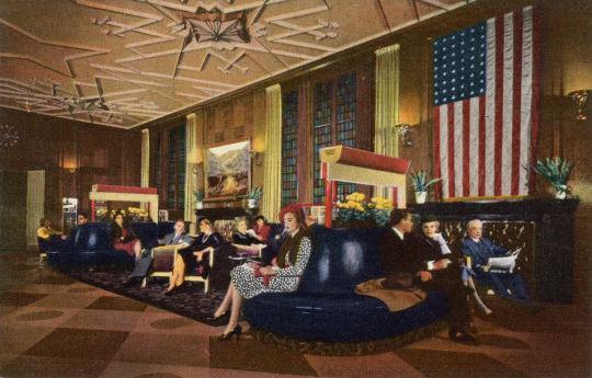
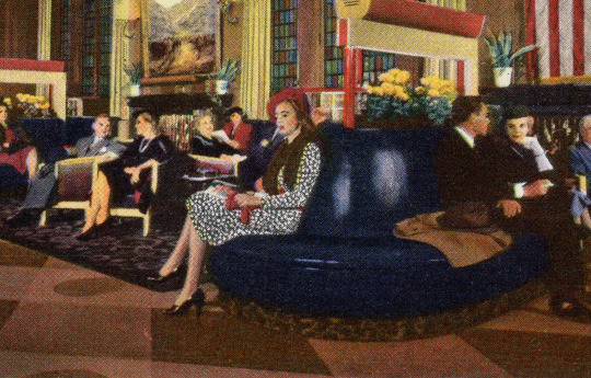

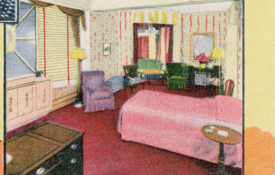
Ansichtskarte / Vintage Postcard
BISMARCK HOTEL RANDOLPH AT LA SALLE CHICAGO 1, ILL. Known the world over for its excellent food. Located in the heart of the city, it is next door to the shopping, theatrical and financial districts. The friendliness, beauty and charm of the Bismarck is best typified by its lobby. The famous Palace Theater and Metropolitan Building are also part of the Eitel Block.
GENUINE CURTTEICH-Chicago "C.T. ART-COLORTONE" POST CARD ( REG. U.S. PAT. OFF.)
A NATURAL COLOR REPRODUCTION FROM KODACHROME
6B-H861
#Curt Teich#Chicago#Linen Era#Linen Postcard#Art Colortone#Design#Hotel#Hotel Lobby#Philokartie#USAPhilokartie#akChicago#Ansichtskartendesign#PostcardDesign#CurtTeichChicago#BismarckHotel#Innenarchitektur#Architekturgeschichte#deltiology#USA
10 notes
·
View notes
Text
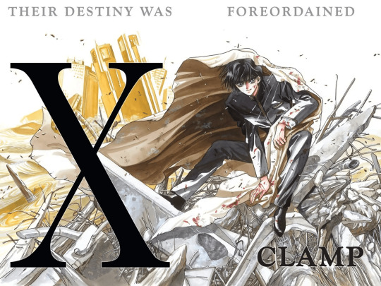
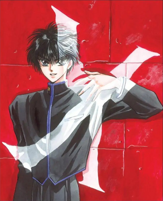
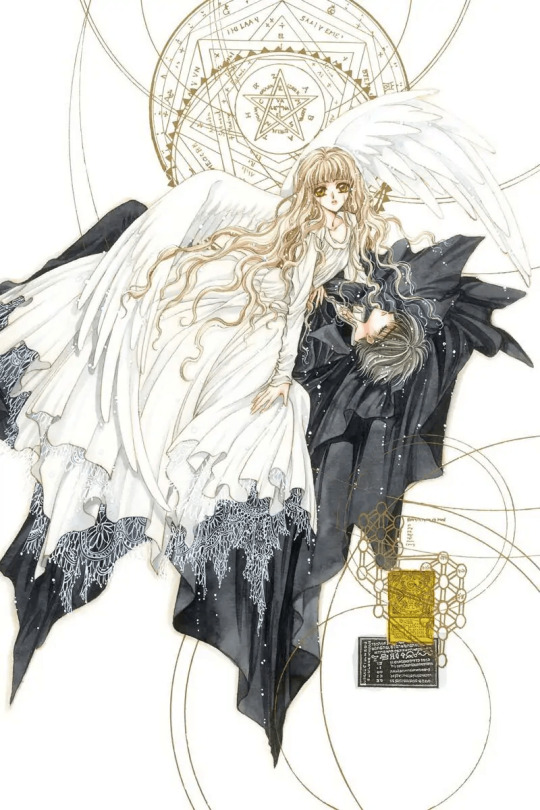
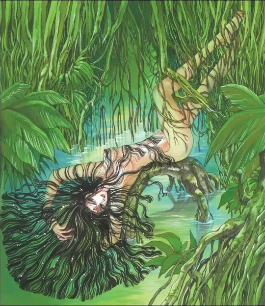
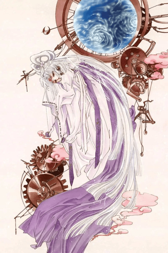
Clamp Art Style Analysis: Part 2: Series styles and Compare and Contrast
Series Styles
Over the years the Clamp art style changes constantly depending on the series, and the art direction always changes depending on the work and magazine. Clamp’s art style always changes to suit the genre of the magazine the work is running in. When I researched I noticed when I look at their earlier works and recently it's in that their art style changed over the years I saw that the art of these series improved due to different works' sterilization and the hiatus this is seen in a few series that I am going to talk about. I am not going to go over all of their works just choose these series and discuss them in this segment, I am going to be heavily biased and choose this series to talk about the art style, lines, and materials used while drawing the series
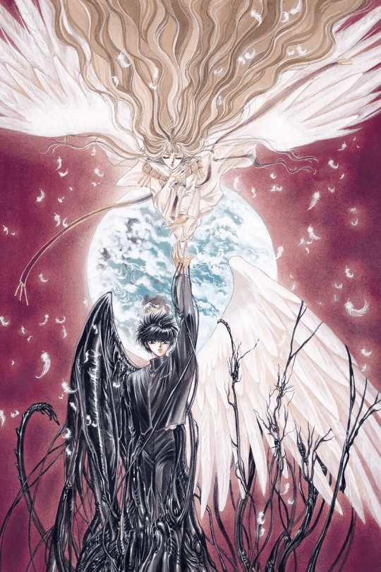
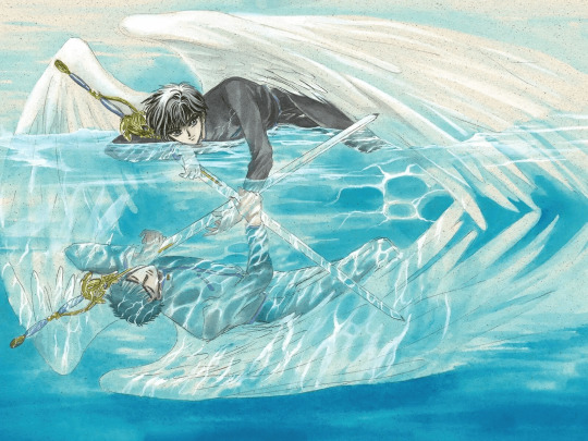
X1999
I don’t know the art style with x as I did with the other series since there wasn’t much to talk about in the interviews.
Mostly I think this is the beginning of Clamp’s early years when the art style looked this way. The art style Clamps early years as artists. The one in charge of X's art direction is Nekoi, Nekoi is in charge of the art direction of x with Igarashi assisting, The art in X changed with the art shifted to Nekoi’s delicate style.
The art of X changed expeditiously compared to how the art looked in the first chapter,
The art at the beginning of X had thick ink lines and more dramatic shading in the early volumes and is more or less gone. X is drawn in a more ornate style characteristic of shoujo manga, noting that x is a series intended for a female audience. X takes on a shojo style bolder and more intense art for drawing X there is a heavy use of screen tone. While drawing X, they used straight lines they drew with Thick lines in the beginning, X had a lot of colored backgrounds in the illustrations, and manga X is one of the series in that they had trouble applying screentone.
If you compare x it has changed a lot due to Clamp working on other series though mostly it's because it ran the longest in the magazine. X was sterilized during Wish, Card Captor Sakura, Chobits, Magic Knight Rayearth,Suki, Legal Drug, Legend of Chun Hyang and Angelic Layer.
When it came to creating for x it was the original character profile, Clamp drew all the aspects they wanted to include in the final character in a bulletin-type chart they drew it like a New Year's greeting card.
Unlike with other sterilization, they didn’t decide on the materials they would be using so X doesn’t have any specific material for drawings. Nekoi and Mokona did a lot of experimenting with materials in x. Clamp used many different materials and a variety of techniques when drawing X the colors in x they painted with a lot of new materials and a lot of contrasting colors. There was a lot of experimenting with materials with x. You can see it in the illustrations.
The materials that are used for x are color screentone. Colortone is a type of colored screentone called overlay, their usual color ink, gash, and pastel products X has many different kinds of illustration paper used for coloring from wrapping paper and cardboard to tea wrappers.
I am going to go over the materials they used in their color illustrations from 1992-1996 and 1997-2004
1992-1997
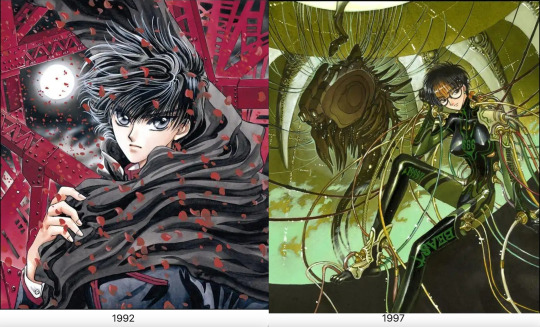
Paper: Kent Block, BB Kent, BB Kent rough surface, Kent paper, sand textured paper, Shinden shi paper, Feather Waltz, Arches, parchment paper, manuscript paper, Watson paper, wood free paper
Lines: Holbein Color Ink (Special black), Photocopied pencil lines, Pigma Graphic pen, Pigma Graphic ink pen, color pencil, pencil, Holbein Color Ink (sepia), poster color, color pencil, Winsor and Newton Drawing Ink (nut brown), Dr. Ph. Martins Sepia Ink
Color: Dr. Ph. Martain’s Color Ink, Acrylic, airbrush, modeling paste, gouache, color tone, poster color, Liquitex, Acrylic gouache, color tone, white out, Copic markers, Lumocolor Ink pen, Lumocolor
1998-2003
Paper: Watson paper, BB Kent, copy paper, Sheet of paper with a light brown color, hotel stationery paper,
Lines: Pigma Graphic ink pen, India ink, Ballpoint pen, Sepia black ink,
Color: Lumocolor ink pen, modeling paste Lumocolor, sepia, copic marker, airbrush, poster, Acrylic gouache, airbrush, color ink, Liquitex, Dr. Ph. Martains Color Ink, Gold brown Ink, Poster color, color ink,
If you looked at the materials and techniques in the comments used for drawing the illustrations of x they
put a lot of work in the color illustrations for x. The materials used in the illustration change the impression.
For the illustrations, There were a few comments about it, A 2002 comment that Fuuma's head looks a little big; this is a drawing habit they had while working on Chobits at the time.
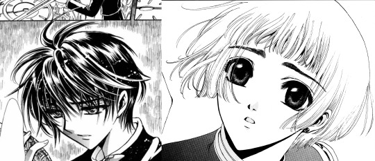
When it came to illustrations sepia ink was used for outlines of characters with pale color profiles since the lines stand out too much in black in illustrations sepia ink was used for characters with pale color profiles. Hinoto, Kakyou, and Kotori have Saphia outlines. Yuto is the only exception. He has a light color profile but looks good with crisp outlines so he is drawn with black ink. When Clamp drew Kotori they always made sure to draw her with a very faint and soft touch when it came to drawing her in illustrations they used Sephia instead of black for her lines.
X is a shoujo manga that ran in Asuka for some time. It has a lot of action scenes that attracted male readers, Asuka gave the team the freedom to create what they saw fit.
There is a difference in colors between the first and subsequent printings as seen in the volumes of X. The volumes up to 4 were a lot tidier but on volume 5. Clamp started to get busier and messier.
Everything in X is written by script, even the details of the collapsing and the destruction of the buildings look like the destruction of the buildings is written from the script from Ohkawa. The backgrounds and destruction of the city were mentioned by Ohkawa. While Clamp is drawing the destruction of the buildings they have reference photos taken beforehand which Igarashi finds tiring and painful.
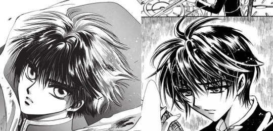
In Kamui’s character design, Kamui has Tsuri-me-type eyes like Ashura from RG Veda Clamp considered Kamui's hairstyle and uniform average.
The character that Clamp had a hard time drawing appearance-wise is Kotori, Kotori was the character that Clamp found trouble with drawing. When Ohkawa looked at the manuscript copy of chapter one Ohkawa was a little shocked at the drawing of Kotori even considered her like udon. Mokona did her in pencil in the rough draft, Kotori looked soft and sort of limp when she added a pen she looked thicker by thinning down the lines her body became less solid making her float around she became lighter and more impermanent so they used the tip of the pens instead when inking her.
Another one of the difficulties that came with drawing X was drawing all the characters from the dragons of heaven and the dragons of the earth in one picture in the same illustration. They are parts of the character that give you trouble that you confuse with others but individually they are easy.
Clover
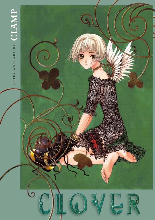
Clover has a different sense of atmosphere and techniques. The art in Clover has a feeling of decadence or nostalgia, the wing design looks like older Mecha Ohkawa was influenced by the movie “1984” she made Mokona watch it to recapture its mood. The buildings in Clover reference old movies made to resemble German and European countries. They also used European photographs as references, like photos of German factories.
Ohkawa made modifications to Clovers' art style since it ran in a magazine for young girls the intended audience for Clovers was older so the art style is made to look prettier since it's for girls.
Mokona is in charge of the art in Clover even the story paneling was planned out by her Both Mokona and Ohkawa planned the panels in the manga Clover. The distinctive layouts and layouts of the panels are created with music videos and movies in mind. The panels in Clover look like frames from a movie. Ohkawa had a hand in it with half having to plan the width of each panel. It wasn't easy and took more time. Clamp found the layout the most challenging and most fun they had in the series, for Clover has dialogue or scenes with big spaces between sentences. Clamp used thinner frames to look pretty.
The art material they used is gayoushi paper which is used to emphasize the bounciness of Sue's hair. Gayoushi paper is a type of cartridge paper in Japanese. They used drawing paper for clover the drawing paper here is contrasted with other, more common media. Clamp used different paper for clover which is cartridge paper or gayoshi paper for drawing the manga but the screentone kept slipping off and was annoying to Clamp. They used the copy machine to give Clover a picture book blurred look they had a hard time getting it right and tried many times.
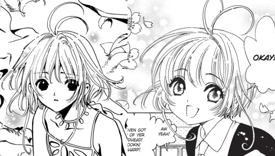
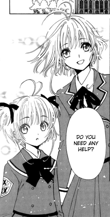
Card Captor Sakura
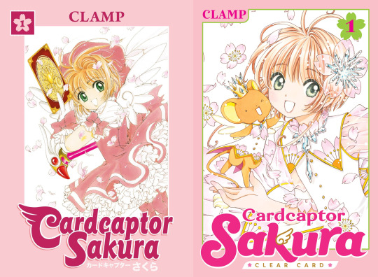
For the art style of Card Captor Sakura, Clamp wanted to create something really cute.
It focuses on the cute factor so the lines and use of ink are to give it a soft and cute feel Card Captor Sakura uses thin, curved lines the manga Mokona the one who makes the lines thin in Sakura and doesn’t use a lot of ink making the pages light and to make it look soft feel. It is a shoujo manga with a magical girl genre so it would make sense that the series would look soft. Card Captor Sakura uses color ink for the illustrations the color ink is used to create a clear image. For materials Card Captor Sakura and clear card Arc used copic markers and modeling paste in the illustrations.
For designing the Clow cards, the design of borders of the cards was created first. Mokona filled in the illustrations, and the rest determined the card name and functions in the story. Clamp didn’t have problems with designing characters but the expressions changed from the plan.
Chobits
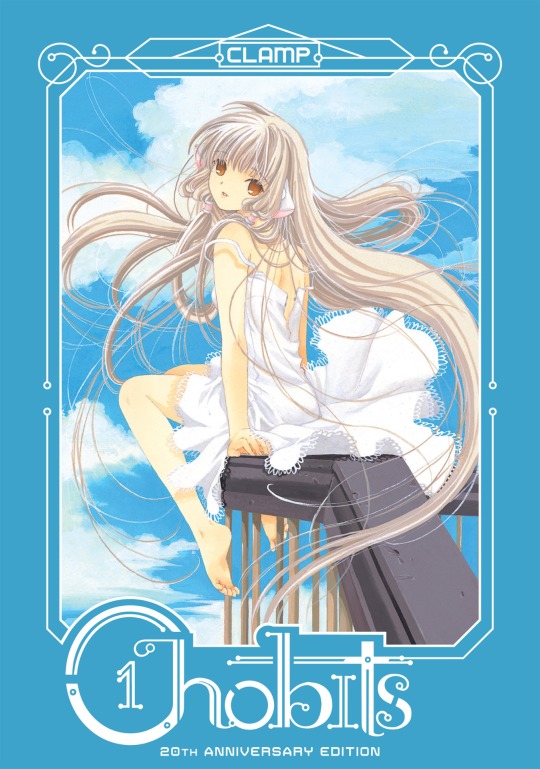
The materials of Chobits are based on Ohkawas decisions for materials. Clamp uses ball pens for drawing. They used ball pens since they wanted something drawn by pencil. The illustrations for Chobits have Clamp use acrylic gouache and more gouache.
In Chobit's art style the character has shorter arms and legs and the shoulders aren't wide. the character designs for chobits for Chi, Chi’s design is the most detailed one.
Legal Drug

Legal Drug came after Suki, Clamp was into underground crime dramas so the manga has serious and dark tones. The series went on a hiatus so the art style changed compared to when it was first run making the art style similar to XXXHolic.
Clamp used digital computer equipment for Legal Drug, Legal Drug is the first series that Clamp drew colored digital for the first time. Clamp drew all the CG color illustrations for Legal Drug. They wanted to use CG as a tool so they learned how to use CG from Katsuya, Okazaki Takeshi, and Takashi Yamazaki. Clamp struggled using the computer for the first time they ran into problems like the power ran out of the computer before saving.
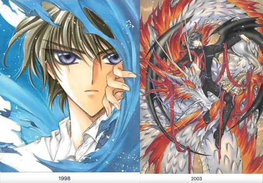
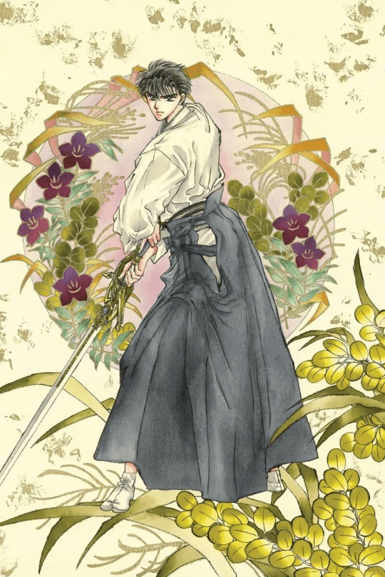
Tsubasa Reservoir Chronicle
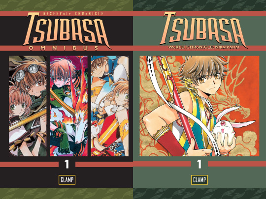
The drawing methods changed with Tsubasa and XXXHolic, two series that worked in tandem; this goes with the drawing style of both series since the art style has been changing. Both scripts of XXXHolic and Tsubasa have a lot of difficulty, Tsubasa was supposed to be for a younger audience which caused it to increase complexity but it gave the team complete creative freedom. Clamp didn’t want to make the pacing too complicated due to being about a young man's journey.
Tsubasa had thicker lines and simple page layouts, Clamp used a marker with thick lines that could be drawn while printing on rough paper since the frames did not work well the fine lines looked blurred Clamp had a problem making the lines too thin, and didn’t have the impact they needed to stand out the lines need to be bold and popped out since it's a weekly manga series said readers tend to forget. The thick lines in Tsubasa are to make the art be seen in the magazine printings since thin lines are too delicate and will make scenes hard to see in the printing of the magazine
Since Tsubasa is running a weekly magazine the thickness of the lines affects the visibility of the magazine printing.
Tsubasa started the trend of drawing thin vertical borders and thick horizontal ones, the difference between the panel borders Clamp separating the panel in the layouts to link it to XXXHolic.
The art style of Tsubasa was based on a suggestion from the editor The editor asked the group to make the drawing style attractive to readers of Shonen magazine Tsubasa is a shone manga drawn to fit that genre Clamp already had design decided and materials prepared.
For materials they are seen using when drawing, Tsubasa is a monograph mechanical pencil used for pencil drafting in their manga. The Clamp uses a marker with which thick lines can be drawn to make it pop out on rough paper in printing the ink markers they use to fill in the large spaces. Clamps have Copic markers for colored illustration in Tsubasa.
Ohkawa directs the art style of Tsubasa, she tells the members to draw the male characters with vigor and take more care of the female characters. Mokona is the artist who crafts the characters and storyboards she draws most of the characters in Tsubasa, female characters have soft fluffy hair and look like they are drawn with soft touches, and male characters are drawn with a rougher touch. Ashura wasn’t easy to draw since they have a feminine beauty and it wasn’t easy to draw those with loose eyelashes. They decided not to draw lower lashes which made the faces stiff, evident with Emeraude they changed her hair and put curls in her hair to make her more graceful. They used their normal style to get the readers to pick up the story. When accustomed to the new style they thought of slowly returning to their art style during the country of Oto.
The script of Tsubasa takes 5 hours, the storyboard 10, and the drawing for the manuscript takes two days for 20 pages. If not going well, it could take three days.
XXXHolic
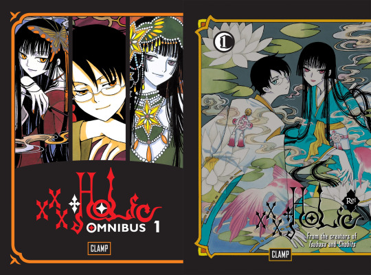
The drawing methods changed with Tsubasa and XXXHolic Two series worked in tandem compared to the two series XXXHolic was the series that Clamp found was easy to draw.
The characters of XXXHolic are drawn to be very tall and have long limbs; they are thinner and longer in the drawing. It makes characters more expressive in the manga. XXXHolic and Tsubasa have similar proportions for characters The reason is that they cross over Tsubasa is linked to XXXHolic the proportions of the characters are similar to be meant to cross over to Tsubasa.
The materials for XXXHolic they use for drawing are felt tip pens since human characters are drawn by 2 people if they used a regular pen the brushstroke strengths would be uneven Clamp members have strong drawing pressure so having the same pen can even it out. Clamp decided not to use screen tones for xxHolic, XXXHolic is drawn without screen tone to give more of an impression of occultism.
They used mechanical pencils for the drafting stage when drawing in xxxHolic and inking markers to fill in large spaces.
There are a lot of Japanese and Chinese in XXXHolic The style Clamp uses for XXXHolic is similar to traditional Japanese Ukiyo-e paintings, a Ukiyo-e art style that dictates longer proportions for the characters. The character looks tall and lean. xxHolic looks more like a wood block painting and has Japanese prints and Alphonse Mucha with an art nouveau in it. The female characters in XXXHolic are drawn by Mokona and the male characters are drawn by Nekoi who are also Yokai and spirits that aren't in human shape and animals.
The covers and color pages are drawn by Nekoi and Mokona together, the base colors of the covers are never white, gold, or silver then color printed over it.
The storyboard for XXXHolic takes 6 to 8 hours done by Saturday.
Kobato
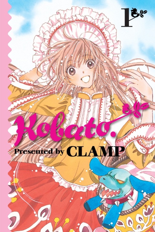
Kobato's art style is similar to Card Captor Sakura’s. The lines used in Kobato are similar to the lines in Card Captor Sakura, and the lines in the manga are thin, like a shoujo manga. The colors of the illustration are pale with a touch of watercolor.
Kobato was made into a brighter series since Tsubasa was heading into a dark development, Kobato's story is loose and not too dark and is meant to be more relaxing.
Comparing and Contrasting the panels of these series
X/1999 & Clover
Clover and X are two old shoujo manga done by Clamp though Clover was drawn during the run of X
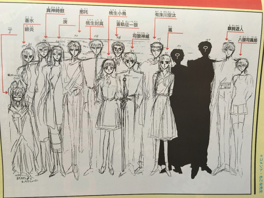
making X the longest-running series. Each of the members of Clamp is in charge of the art direction of the manga
with Nekoi in charge of the art direction of x and Mokona in charge of the art direction for Clover.
The lines that are used to ink and the line thickness in the two series are different along with the amount of pen pressure seen in the manga. The members of Clamp have strong drawing pressure. You can see it in the way they drew the lines in the ink and the line weight in the ink in the manga. You can tell the amount of pen pressure used in both the manga series is a testament to how strong the drawing pressure is.
For the line thickness for both series, the lines in X have straight bold thicker lines. The lines in Clover are thin and along with the panels the lines have thin frames.
X uses a heavy amount of screen tone whereas Clover doesn’t use too much screen tone.
They use a different sort of paper for clover that is gayoushi paper which is used to emphasize the bounciness of Sue’s hair.
These are two styles. The art style for Clover is made to look pretty since it's for girls and drawn with an air of decadence to give people old-fashioned feelings when they read it. The style of Clover stands out due to how it's drawn. The frames of Clover are supposed to look more like a movie. The art style of X went through huge changes due to a long year run so its art style changed to be more defined and detailed.
Both manga series have different art styles to suit the atmosphere of the manga X used a heavy atmosphere where Clover has some sort of emptiness that the characters in the manga face to symbolize how bleak their situation is though someone pointed out that a large amount of negative space for clover is drawn to emphasize for the characters loneliness. The atmosphere of X gives a more foreboding sort of feel since it's near the end of the world.
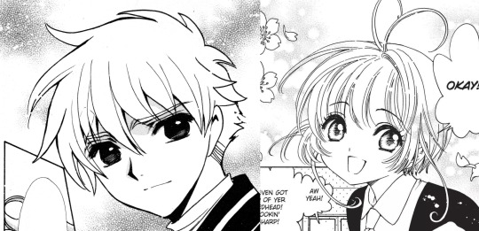
Tsubasa and Card Captor Sakura
These two manga series went through two second series there is major art development compared to how it was first runned here to properly focus on the current art style.
When you put the two together they are radically different.
The art styles for the two series are created to fit the genre with Card Captor Sakura being a shoujo manga and Tsubasa being a shonen manga.
For the lines of the series, Card Captor Sakura is thin curved lines and doesn’t use a lot of ink The lines in Tsubasa are bolder and thicker with simple page line art.
The materials used when drawing Tsubasa for which thick lines can be drawn is a marker with thick lines as stated before the impre.ssion of the series can change depending on the materials used this is true for Tsubasa and Card Captor Sakura
The characters in Tsubasa are drawn differently by different artists the female characters have soft fluffy hair drawn with soft delicate touches and the male characters are drawn with a rougher touch to emphasize masculinity.
The eyes of both series are different. The eyes in both series have different textures in the irises with the upper eyes in Card Captor Sakura being thin and dark. The eyes of Tsubasa are angular and thick there are no lashes in the eyes of Tsubasa
Sakura and Syaoran

If you need to compare the series the styles would be seen best in the designs of the two characters of Sakura and Syaoran. Looking at them together the impressions of these two characters do change depending on the art style of the series they are drawn in. Sakura and Syaoran are drawn differently in Tsubasa than they were in Card Captor Sakura Even though Sakura and Syaoran are drawn the same there are a few differences that set them apart seen in the hair and eyes.
The designs of Sakura and Syaoran are re-used in Tsubasa in designs. I would notice a lot of small details in their designs that make them different and stand out as their hairstyles and eyes differed when you put the two of them together. The new designs of the characters convey the impression of their characters.
There a different impressions of the two characters when you look at the art style how they are drawn with thin lines and how they are drawn with thick lines the impression of the two characters are There different when looking at the different art style and how differences there are in their designs
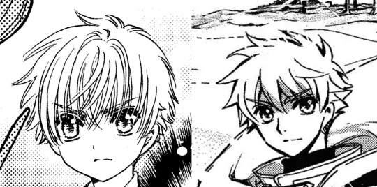
In the Card Captor Sakura Syaoran looked more like a boy fitting since he is in elementary school so he's drawn to be much younger. The syaoran in Tsubasa gives an image of a young man between boyhood and manhood Tsubasa’s syaoran design highlights maturity in contrast to Card Captor Sakura Syaoran. The height is obvious in the designs drawn with the Tsubasa design.
If I compare the two Syaoran together their expressions are different, Card Captor’s Syaoran looked dour and moody
whereas Tsubasa’s Syaoran spots a determined, serious look. Card Captor’s Syaoran looks like a little kid while Tsubasa’s Syaoran looks like a bright honest, sincere young man. The only difference between the designs of syaorans would be their expressions conveying their overall look and personality in their design. Syaoran is designed based on a shonen protagonist it answered with what would happen if Card Captor Syaoran is the shounen protagonist with Tsubasa Syaoran as the answer.
For Syaoran’s hair: Syaoran’s hair is a crew cut with the end shaved. Both Syaorans have the same hairstyle drawn differently from the series. In Card Captor Sakura there are a lot of lines and details in the hair of Syaoran’s with his bangs being thin lines. Tsubasa’s Syaoran hair is simplified and doesn’t have too many lines his hair and bangs are drawn simply and look blocky and rough he is drawn with rough edges as seen with his hair that emphasizes masculinity.
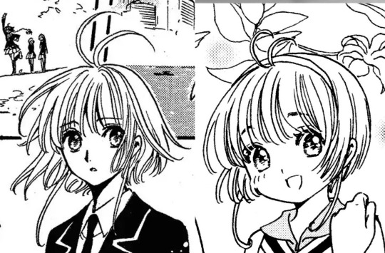
For Sakura's hair, both the Card CAptor and Tsubasa have short hair. She does have the same short hairstyle; there are a few noticeable differences. Card Captor Sakura’s hair looked straighter in the art, Tsubasa’s Sakura hair has soft fluffy hair and looks bouncy and floofy. her hair moves in different directions to emphasize the bounciness aspect and there are a lot of strands in Sakura's hair.
Card Captor’s sakura is designed based on one of Clamps nieces and Despite them being designed as normal girls, they have this cuteness to them that makes them appealing with Tsubasa sakura designs being reused but still have an image of cuteness like with card captor’s sakura still retains her cheerful and lively personality as she had in Card Captor Sakura.
Card Captor Sakura and Kobato
The two of them are both shoujo mangas but have different audiences with Card Captor Sakura created for a younger audience and Kobato for an older audience in mind.
The two series have different tones Kobato is focused on drama and is more serious but light and loose. Card Captor Sakura is a lighter series than Kobato but is drawn with a soft cute-like feel in mind with Kobato being a focus of reality and the supernatrual in the manga.
The amount of lines when inking at Kobato has a similar style to Card Captor Sakura with the series both using thin lines The lines in Kobato are thin and shojo manga like Card Captor Sakura use curved thin lines and don’t have a lot of of of ink. There are different textures in eyes when inked, Kobato has a lot of lashes in her eyes Sakura has a few lashes
Card Captor Sakura and Chobits

Card Captor Sakura is a shojo manga intended for a younger audience in mind, Chobits is an ecchi manga drawn for an older male audience in mind the art style is appealing to a male audience.
Though the genre of the two series has different art styles they are both drawn with the same thin lines the series are drawn with the use of thin lines and both look soft. Card captor Sakura Doesn’t use a lot of ink and has thin curved lines.
The difference is the materials that are used for the series Chobits uses different materials from Card captor Sakura, for materials for Chobits Clamp use ballpoint pens to make it look to be drawn by pencil The thickness in the eyes of Chobits have a thin line drawn, the ballpoint pen has something to do with it changing the thickness in the eyes.
Tsubasa and xxxHolic

Tsubasa and xxxHolic are both manga series that are drawn in tandem so it wouldn’t be a surprise they have a similar art style. Holic and Tsubasa have similar proportions for the characters this is supposed to show they are both linked. The characters in Holic are drawn tall and have long limbs which are thinner and longer in the manga.
Holic is styled as more of a woodblock painting. Holic art style resembles Japanese ukiyo-e paintings with ukiyo-e longer proportions. Holic is drawn without screentone to give more of an occult feeling.
Clamp uses different materials for the two series, Holic has members draw the characters they use felt tip pens to match Clamps' strong drawing style and use an inking marker to fill large spaces. For Tsubasa the materials they use are a marker with thick lines they used a marker with thick lines to make it pop. Since Tsubasa is more action-oriented since it is a shounen the art needs to pop.
Comparing the thickness of the lines in the series, I would say that Holic has thin lines to contrast with Tsubasa's thick bold lines The eyes of Holic look like there drawn using thin lines and the eyes of Tsubasa have heavy lines in them.
Prev/Next
#clamp#card captor sakura#card captor clear#tsubasa reservoir chronicle#x/1999#clover clamp#kobato#xxxholic#meta#legal drug#drop and drug#chobits#mokona#tsubaki nekoi#nanase ohkawa#Satsuki Igarashi#my meta
59 notes
·
View notes
Text
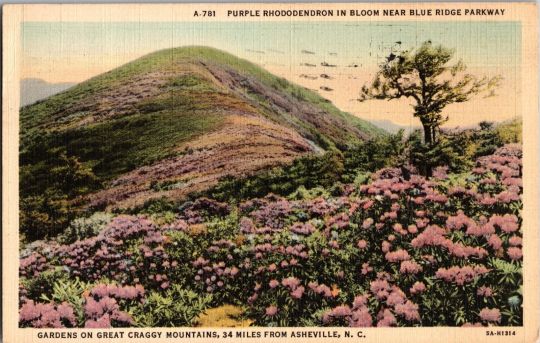
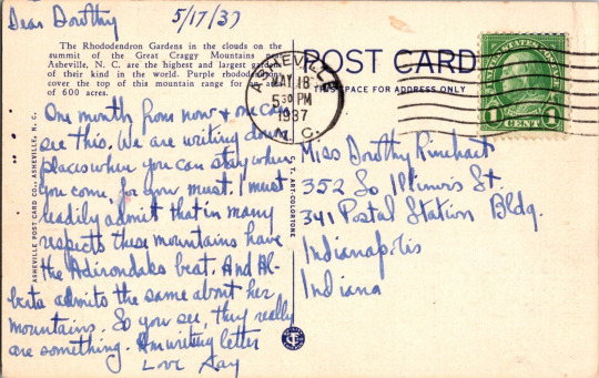
5/17/37 Dear Dorothy, One month from now + one can see this. We are writing down places where you can stay when you come, for you must. I must readily admit that in many respects these mountains have the Adirondaks beat. And Abreta admits the same about her mountains. So you see, they really are something. Am writing letter Love Kay Gardens on Great Craggy Mountains, 34 Miles From Ashville, N.C.; Vintage Linen-Type Postcard, C.T. Art Colortone Series.
#North Carolina#Vintage postcard#landscape#vintage art#fields#mountains#rhododen#found images#postcard#vintage postcard#1930s#1930s art#antiques#flowers#sapphic art#found poems
20 notes
·
View notes
Text

Pennsylvania Lodge by Ashtabula Archive
Via Flickr:
Pera & Pera, Geneva-On-The-Lake, Ohio Curt Teich Genuine Curteich-Chicago "C.T.-Art-Colortone" Post Card 1947
0 notes
Video

flickr
Empire State Building At Night postcard by totallymystified Via Flickr: “Genuine Curteich-Chicago ‘C.T. Art-Colortone’ Post Card (Reg. U.S. Pat. Off.)”
#postcard#New York#retro#vintage#nostalgia#Empire State Building#at night#nighttime#Fifth Avenue#flickr
1 note
·
View note
Link
Check out this listing I just added to my Poshmark closet: Postcard Vintage Boulder Dam and Lake Mead in Black Canyon Linen 0514.
0 notes
Text
Im old now btw
3 notes
·
View notes
Text
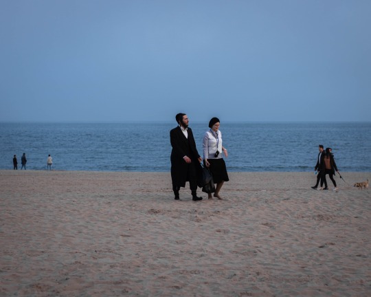
Love on Coney Island
#love#coney island#new york city#art#photagraphy#light#shadows#water#beach#blue#yellow#black#colortones
4 notes
·
View notes
Text
Buy Cubic Zirconia Square Shape Yellow Gold Plated Over Brass Three Stone Rings Online at Amazon USA

Cubic Zirconia Square Shape Yellow Gold Plated Over Brass Three Stone Rings Online at Best Affordable Amazon.com
Featured/Specifications : Metal : Yellow Gold Plated Over Brass Finish : High Polish Stone : Cubic Zirconia, Stone Size : 5x5mm Square, 4x4mm Square ,
Perfect For Any Gift Giving Occasion, Great Gift For Girlfriend, Wife, Daughter, Mom Or Friends On Christmas Day, Birthday, Valentines Day, Anniversary, Thanksgiving Day, Etc. Treat Yourself Or Someone Special With This Pendant.
This Gorgeous Ring Promises A Carefree And Comfortable Wear. This Ring Is Truly A Gorgeous Piece That Deserves A Spot In Every Jewelry Collection. Jewelry Are The Symbol Of A Love And Bond Everlasting And Prosperous. You Owe It To You And Your Lover To Give Them Something Beautiful To Strengthen That Bond.
This Design Is Sleek And Modern Yet Classic And Elegant Style. Fit For Any Occasion As Daily Wearing Home And Office. Absolutely A Great Gift To Express Your Love For Your Mother, Girlfriend, Fiancee, Wife, Valentine, Family Or Just A Friend,Etc. Great Gifts On Mother 'S Day , Wedding , Anniversary Day ,Valentine'S Day Or Christmas Day.
This Jewelry Piece Is Design By Precious Jewelry USA INC..
Product description SKU No : CJ-R001WCZ_BR/14KYG Metal : Yellow Gold Plated Over Brass Finish : High Polish Stone : Cubic Zirconia, Stone Size : 5x5mm Square, 4x4mm Square ,
#jewelry#jewelry designer#jewelry making#jewelry for sale#jewelry art#jewelry bloger#jewelry show#Gold#Colortone#Precious Jewelry#Cubic Zirconia#Gemstone#Rings#Engagement Rings#Free Shipping#Amazon USA#Amazon Jewelry#Solitaire Rings#Fashion#Elegant#Ring#Show me your rings#jewelry sale#jewelry lovers#jewelry gifts
1 note
·
View note
Text

1 note
·
View note
Text
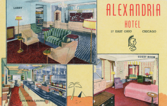
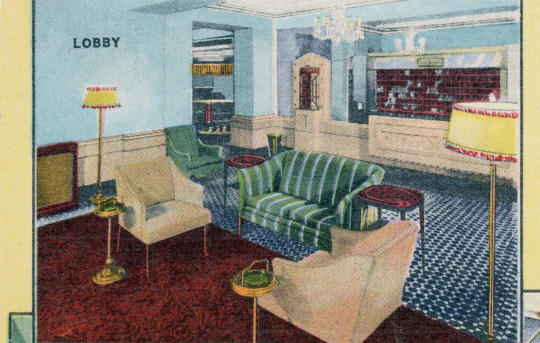
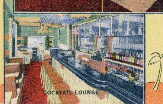
Ansichtskarte / Vintage Postcard
ALEXANDRIA HOTEL 57 EAST OHIO CHICAGO
300 Rooms of Hospitality One Block West of Michigan Avenue Walking Distance to Loop Ideal near North Side Location Convenient to Finest Restaurants and Smart Shops Excellent Transportation and Parking Facilities Moderate Daily and Weekly Rates
GENUINE CURTTEICH-CHICAGO "C.T. ART-COLORTONE" POST CARD ( REG. U.S. PAT. OFF.)
6B-H809
#Chicago#Alexandria Hotel#Hotel#Linen Era#Curt Teich#USA#Illinois#Philokartie#USAPhilokartie#akChicago#Ansichtskartendesign#PostcardDesign#CurtTeichChicago#deltiology#Innenarchitektur#PostcardAmerica
5 notes
·
View notes
Text
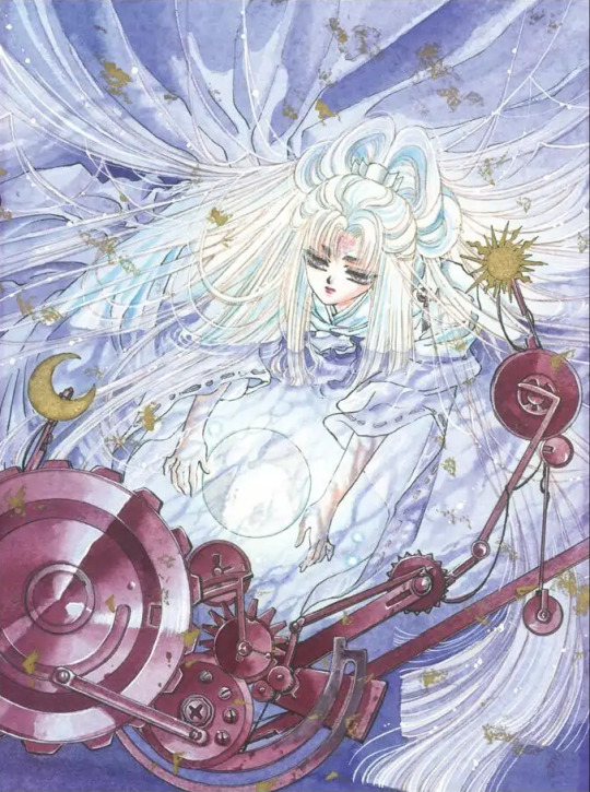
X/1999 Volume 1 Illustration Comments
1992 Monthly Asuka May Issue, Title Page Illustration
Paper: Kent Paper
Lines: Holbein Color Ink (Special Black)
Color: Dr. Ph. Martin's Color Ink, modeling paste
This was a two-page spread for the title page of the very first chapter of the series. The desertification of Tokyo is an important theme which is why the opening scene starts with it. I removed the outlines of the background art to convey the strength of the harsh sunlight.
1992 Monthly Asuka September Issue, Announcement illustration
Paper: Kent
Lines: Photocopied pencil lines
Color: Dr. Ph. Martin's Color Ink, Colortone
The background of the previous announcement illustration was red. so I decided to go with white for this one. To make the "X," I pasted strips of Colortone over the image.
[Ed. Note: Colortone is a type of colored screentone; it's also sometimes called "overlay."]
1993 Monthly Asuka March Issue, Jigsaw Puzzle Illustration
Paper: Sand-textured paper
Lines: Photocopied pencil lines
Color: Acrylic gouache, Dr. Ph. Martin's Color ink, poster color
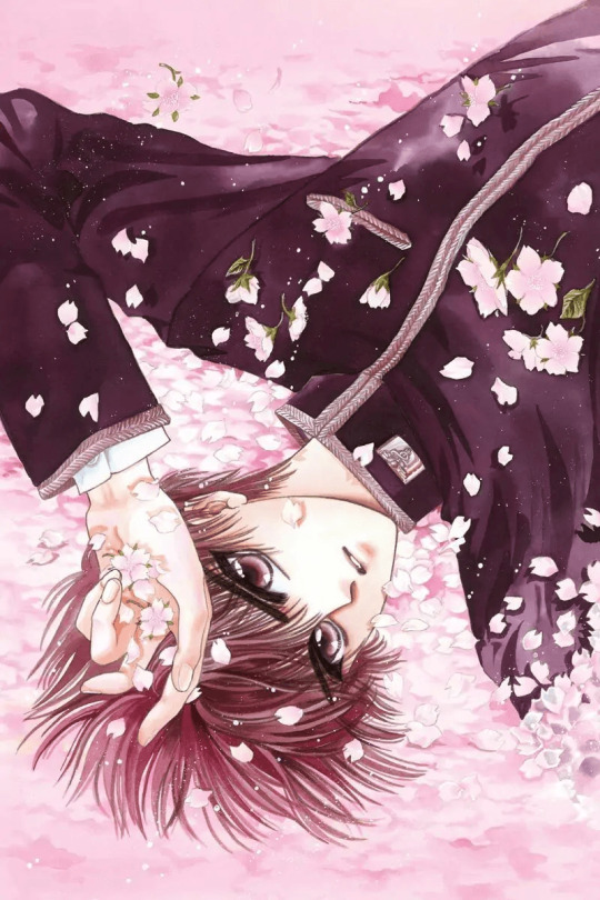
Since this image was for a jigsaw puzzle that was a bonus giveaway in the magazine, I created distinct areas of different colors and even embedded small pieces of glass in it (laughs]. The theme is cherry blossoms, and the base colors are pink and purple.
[Ed. Note: Poster color is also known as "poster paint" or "tempera paint."]
1992 Monthly Asuka July Issue, Announcement Illustration
Paper: Kent Block
Lines: Holbein Color Ink (Special Black)
Color: Dr. Ph. Martin's Color Ink
The thematic colors of the announcement illustrations back then were red and black. I wanted to make the "X" look like a slide image being projected on Kamui
1992 Monthly Asuka May Issue, Cover Illustration
Paper: Kent Paper
Lines: Holbein Color Ink (Special Black)
Color: Dr. Ph. Martin's Color Ink
The color theme for this illustration is pink. X began serialization during cherry blossom season, and I had an image in my mind of Kamui together with the cherry blossoms, so that's why I drew it. He still looks naive and naughty in this [laughs.]
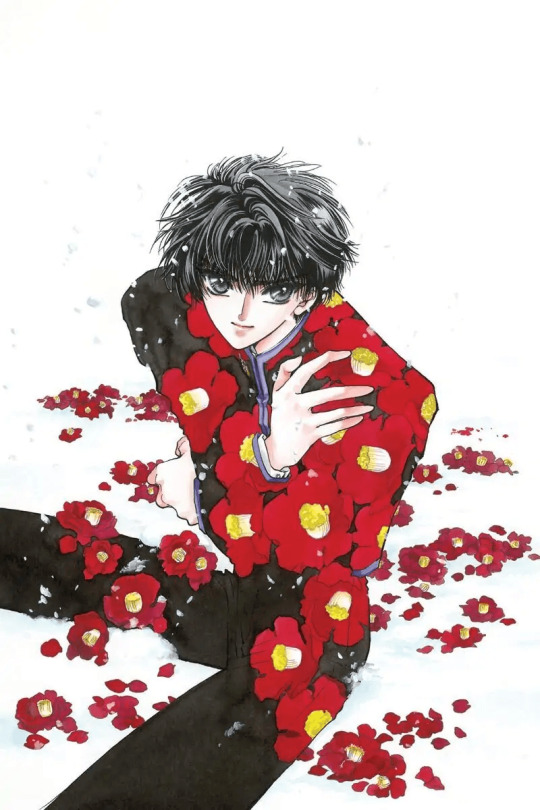
1993 Monthly Asuka March Issue, Cover Illustration
Paper: Kent Paper
Lines: Holbein Color Ink (Special Black)
Color: Dr. Ph. Martin's Color Ink
More flowers again after page 2 Kamui is out in the snow in this illustration, so the flowers are winter camellias. I drew the camellias in two separate styles: the ones on his clothes look flat, while the ones in the background look three-dimensional.
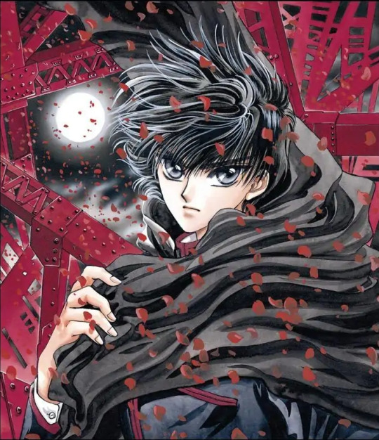
1992 July, X Volume 1, Cover illustration
Paper: BB Kent
Lines: Holbein Color Ink (Special Black)
Color: Acrylic gouache, airbrush, Dr. Ph. Martin's Color Ink
Red is the color theme for volume 1, so for this image, I used red and black which is a typical color combination for X. Since this illustration was for the first volume of the series, I made it a straightforward archetypal one.
1995 Monthly Asuka June Issue, Title Page Illustration
Paper: Parchment paper
Lines: Dr. Ph. Martin's Color Ink (Sepia)
Color: Dr. Ph. Martin's Color Ink, poster color
Parchment paper is interesting to use because the color of the stock shows through in the finished piece. Kamui and Kotori hardly have any scenes together, so I tried to at least let them be together in the illustration [laughs].
1992 Monthly Asuka October Issue, Bonus Poster Illustration
Paper: BB Kent (Rough Surface)
Lines: Holbein Color Ink (Special Black, Gray)
Color: Acrylic gouache, Dr. Ph. Martin's Color Ink, poster. color, Liquitex
This image was drawn to be printed upon a rather unique type of paper; I hope it comes through in the actual printed illustration. I love drawing Kamui and Kotori together.
1993 Monthly Asuka January Issue, Title Page Illustration
Paper: Sand-textured paper
Lines: Photocopied pencil lines
Color: Or. Ph. Martin's Color ink
This one is the result of a bold challenge (laughs). Ohkawa brought up the idea of drawing the illustration as if it were a reflection upon the water, so I did it. The texture of the paper made it fun to color the piece.
1993 Monthly Asuka December Issue, Cover Illustration
Paper: BB Kent
Lines: PIGMA Graphic ink pen
Color: Dr. Ph. Martin's Color Ink, poster color, Liquitex
The pattern on Arashi's obi was far more difficult to do than the kimono itself (laughs). But it was fun to work on. It's a pseudo-Japanese fantasy look, I guess (laughs).
1993 January, X Volume 3, Cover Illustration
Paper: BB Kent
Lines: PIGMA Graphic ink pen
Color. Dr. Ph. Martin's Color Ink
Since green was the color selected to be the theme for this illustration I immediately decided to draw a jungle [laughs]. I had this image in my head of Kanoe as queen of the jungle.
1993 X Calendar Illustration
Paper: Shindanshi paper
Lines: PIGMA Graphic ink pen, brush pen
Color: Dr. Ph. Martin's Color Ink, poster color
Fuma's in the kendo club, so he's wearing a hakama. But he's holding a the Sacred Sword laughs!! I used the texture of the paper to create a kimono-like pattern in the background.
[Ed. Note: Shindanshi is a type of paper created to have the same roughened surface texture as traditional, handmade Japanese washi paper.]
1996 Monthly Asuka February Issue. Cover Illustration
Paper: Watson Paper
Lines: Holbein Color Ink (Special Black)
Color. Dr. Ph. Martin's Color Ink, Copic marker, Liquitex.
The main outline is drawn in aqueous ink, which I diluted with water before using. The background tone is a mixture of yellow and orange; because this is an illustration of Kotori I wanted it to have a warm and cute feeling
[Ed. Note: Watson is a brand of Japanese paper good for watercolor use.]
1993 X Calendar Illustration
Paper: BB Kent
Lines: Color pencil, pencil
Color: Dr. Ph. Martin's Color Ink
The illustration concept is the birds and Kotori together. [Ed. Note: Kotori's name means "little bird.”] Most of the illustrations for this calendar were created specifically for it, so I remember drawing this in a hurry (laughs).
1993 X Calendar Illustration
Paper: Feather Waltz
Lines: Holbein Color Ink (Special Black)
Color: Airbrush, Dr. Ph. Martin's Color Ink, Liquitex
My image of Hinoto. I've included all the familiar motifs in this. The colors of the illustration have been slightly altered to fit the base tone of the paper
[Ed. Note: Feather Waltz is a brand of Japanese paper that has little, feathery white flecks embedded in it.]
1992 October, X Volume 2, Cover illustration
Paper: BB Kent
Lines: Holbein Color Ink (Special Black), PIGMA Graphic ink pen
Color: Dr. Ph. Martin's Color Ink, poster color
An image of Hinoto trying to scoop up the moon from water. The color scheme is purple, so I gave her eyes a tint of purple too.
3 notes
·
View notes
Photo


A couple of commissions that I just finished! Witch Mercy from Overwatch L from Death Note
#commissions#witch mercy#L#death note#commissioned art#commissioned artwork#overwatch#fanart#ink#sketch#color#markers#copics#chameleon colortones
50 notes
·
View notes
Text

Year: approx. 1941
Front of Card:
1042. BLACKFEET INDIAN WOMEN LIGHTING UP, GLACIER NATIONAL PARK, MONTANA. PHOTO BY HILEMAN. 6A-H902.
Back of Card:
POST CARD
"C.T. ART-COLORTONE" (REG. U.S. PAT. OFF.) ROBBINS-TILLQUIST CO., SPOKEANE, WASH.
PLACE ONE CENT STAMP HERE
Status:
Unsent
#post cards#postcards#vintage#vintage postcards#history#american history#native americans#indigenous americans#first nations#blackfeet#smoking#photography#1940s#1941#1940s postcard#.jpeg
3 notes
·
View notes
Link
Check out this listing I just added to my Poshmark closet: Postcard Yosemite National Park Big Trees Lodge in the Mariposa Grove 0535.
0 notes
Photo

#hutheesingcollection #handwork #handcrafted #handembroidery #art #fashiondesigner #fashionphotography #fashionphotoshoot #royality #royalcouture #royalart #elegance #magnificent #toneontone #colortone #offwhite #silkfabric #puresilk #revivalist #ancient #art #culture #textiles #legacy #vintage #floramotif #detailings #finishing #rhytm. https://www.instagram.com/p/BsLHlyIHkX4/?utm_source=ig_tumblr_share&igshid=u4xt8jdz0dy9
#hutheesingcollection#handwork#handcrafted#handembroidery#art#fashiondesigner#fashionphotography#fashionphotoshoot#royality#royalcouture#royalart#elegance#magnificent#toneontone#colortone#offwhite#silkfabric#puresilk#revivalist#ancient#culture#textiles#legacy#vintage#floramotif#detailings#finishing#rhytm
0 notes