#Animation comics and manga
Explore tagged Tumblr posts
Text


We're being followed by a mysterious mustachio'd man!
#dungeon meshi#dunmeshi#chilchuck#mario#chilchuck dungeon meshi#delicious in dungeon#laois dungeon meshi#laois touden#senshi dungeon meshi#senshi#frogsuit#frogskin#anime#manga#fanart#comic#chilchuck tims#marcille dungeon meshi#marcille donato#marcille dunmeshi#marcille#laois
22K notes
·
View notes
Text
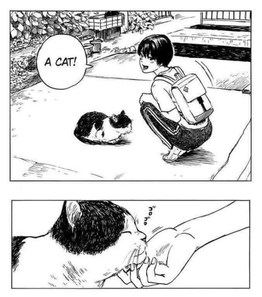
#funny#lol#haha#humor#meme#memes#animal#animals#cat#cats#kitty#kittens#pet#pets#caturday#cats of tumblr#baby animals#cute animals#catblr#anime#anime and manga#artists on tumblr#comics
13K notes
·
View notes
Text
me tweaking out trying to find that one good fanfic
#percy jackson#angst#bruce wayne x reader#damian wayne x reader#dc comics#dick grayson#draco malfoy x reader#geto suguru x reader#gojo satoru x reader#haikyuu#tomoe kamisama#haikyu x reader#batman x reader#anime#overwatch#creepypasta x reader#jjk x reader#horimiya x reader#romance#tweaking#fanfic#headcanon#percy jackson x reader#arkham knight x reader#dc x reader#marvel x reader#anime and manga#kageyama x reader#supernatural x reader#haikyuu x reader
5K notes
·
View notes
Text
From the chapter The Strange Family ^^


#digital aritst#medibang#my art <3#brightbill#dreamworks animation#dreamworks fanart#roz the wild robot#fanart#artists on tumblr#the wild robot#the wild robot book#comics#manga panel#mangacap#taniart
3K notes
·
View notes
Text


Happy Reigen Day to all who celebrate!!
#mob psycho 100#mp100#arataka reigen#reigen arataka#kageyama shigeo#shigeo kageyama#kageyama ritsu#ritsu kageyama#katsuya serizawa#serizawa katsuya#shou suzuki#serirei#mp100 mob#mp100 ritsu#mp100 reigen#mp100 serizawa#anime#manga#anime fanart#comics#cartoon
3K notes
·
View notes
Text

It's crazy how Dungeon Meshi's manga can feel more cinematic and emotional than the anime to me, even when they're practically the same. Compared to the anime, this moment is such a heartbreaking gut-drop. The way Kui uses negative space and flat compositions to create a sense of horrific stillness is so key.
The way the text (Senshi's monologue) is sequestered to an empty corner of a panel or huddled away from the edge of its text box is not only a great way of showing Senshi's headspace (fearful, isolated, dissociating), but creates a visual representation of pause, as if you hold your breathe after each line. The first panel puts us directly in Senshi's perspective too (compared to in the anime, which puts us as an outside observer over Senshi's shoulder). The detail of the door and bricks so effectively implies that he stared at it for so long, waiting and hoping, that its image is burned in his memory. The wood grain, the brick arch, the number of rivets. The lack of dialogue in the second panel shows a moment of realization too –– "he's dead" (also a great example of the Kuleshov effect). And it's that pause that creates a beat and sets a great rhythm to his headspace, like a music rest: "He never came back." (oh god.) "I'm all alone." Finally, the third panel's negative space, cropping Senshi, shows how truly alone he feels. Without his family, the world ceases to exists. Under shock, he traps himself in a 1-foot radius, too scared to even perceive a world outside its boundaries; a world that can hurt him, kill him, make him disappear with it. There is only his body, the stone beneath his feet and against his back, his thoughts, and that awful bowl of soup.
Even though they're a series of flat images, there's an implicit reading of silence in Senshi's realization and horror. Kui influences your experience to slow down and take your time.
Compare this to the anime, which fills every shot with dialogue. The pacing is fast; we never get to sit in silence like we do with the manga. The horizontal frame allowed the boarders to add Senshi, turning the composition into an over-the-shoulder shot, which takes us out of Senshi's POV. They also added a zoom-out in shot one, which adds unnecessary energy to a very somber scene. The tightening on Senshi as a close-up reaction shot also dulls the moment. In the original panel, Senshi stares ahead at the empty space to his left as a shadow surrounds his mind. It not only shows how Senshi's senses are dulling and his world is shrinking (setting up panel three), but shows how terrified Senshi is of what's in front of him, how the air itself becomes pitch black and opaque, how Senshi is surrendering himself to fear. The pacing is understandable and necessary; this episode packed a lot of story content together. It's just a shame because it really (imo) deflated one of the most nauseating moments in Dungeon Meshi.
#dungeon meshi#senshi#analysis#personal#long post#not art#because comics are inherently more abstract and rule-breaky the format thrives off show don't tell#i think trigger is doing a great job overall but they missed the mark on this scene#for me cinematic storytelling will prioritize rhythm; tension; and silence over plot. that's why the manga feels more “cinematic”#if you've been enjoying the anime i cannot recommend also reading the manga enough. it's a completely different experience with much more#subtext and emotion to draw from
4K notes
·
View notes
Text
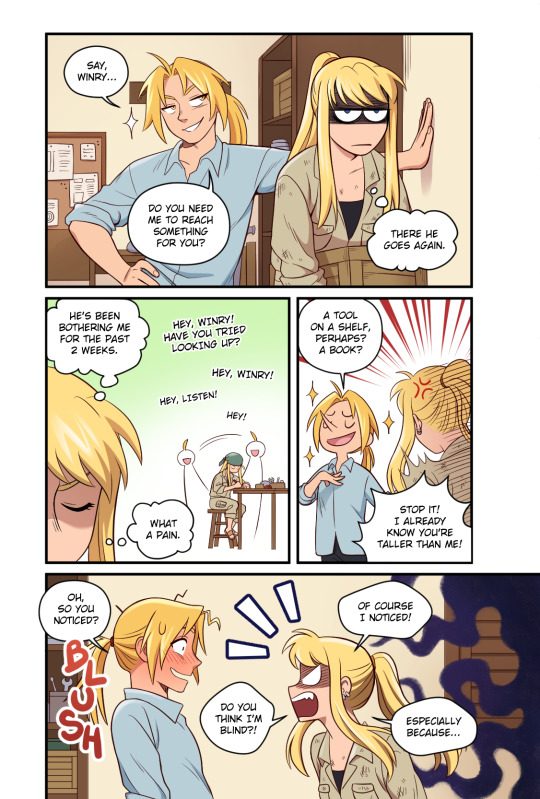
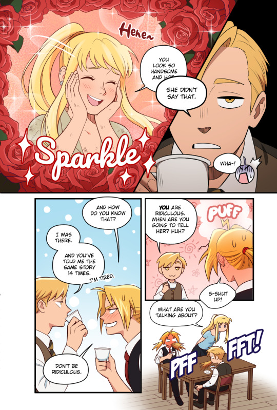
The comic I did for @fmatriozine !! I hope you like it! 😍
Leftover sales are currently open until April 1st! If you love FMA you can't possibly miss this, go check them out!! 😍
When I drew this I thought Al was still taller than him, but after re-reading the manga, it turns out Ed surpassed him!! I was so shocked, I forgot that detail 😂 He's still a shrimp in my heart 🤣
#fma#fmab#fullmetal alchemist#fullmetal alchemist fanart#fma fanart#fullmetal alchemist brotherhood#edward elric#alphonse elric#winry rockbell#edwin#elric brothers#anime#manga#fanart#comic#otp#ship#fanzine#zine#artists on tumblr
4K notes
·
View notes
Text
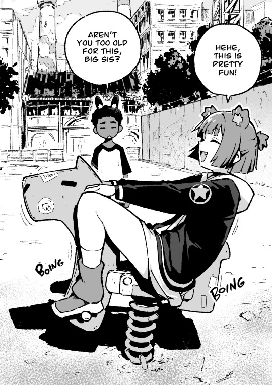
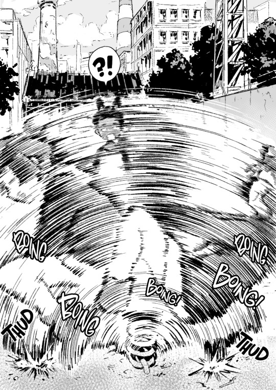

You're never too old for fun
3K notes
·
View notes
Text
Manga page redraw

How I love being a traditional artist
The original page:

#artists on tumblr#jjba#jojo#traditional art#stardust crusaders#manga panel#manga art#anime and manga#retro anime#80s aesthetic#inktober#comic art#comic books
2K notes
·
View notes
Text

i'm kind of wilding over twiyor right now 😭😳 (wip)
#a wip of page 3 out of 4 that i noticed kinda stands on it's own HAHA#spy x family#loid forger#yor forger#twiyor#spy x family comic#spy x family fanart#anime#manga#my art#heh... lol#this comic is the bane of existence but also my own favorite so far#and i'm coloring it too 🤭#help
1K notes
·
View notes
Text

#gay#men#man#muscles#size differences#anime#manga#comic#drawings#lgbt#gay hot#ai gay#gay ai#ai generated#muscular#ai#ai muscle#ai muscle growth#male muscle growth#muscle#muscle men#musclegrowth#stable diffusion#sexy hunk#hunky guy#ai hunk#bearded hunk
2K notes
·
View notes
Text
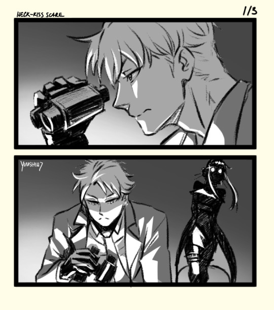
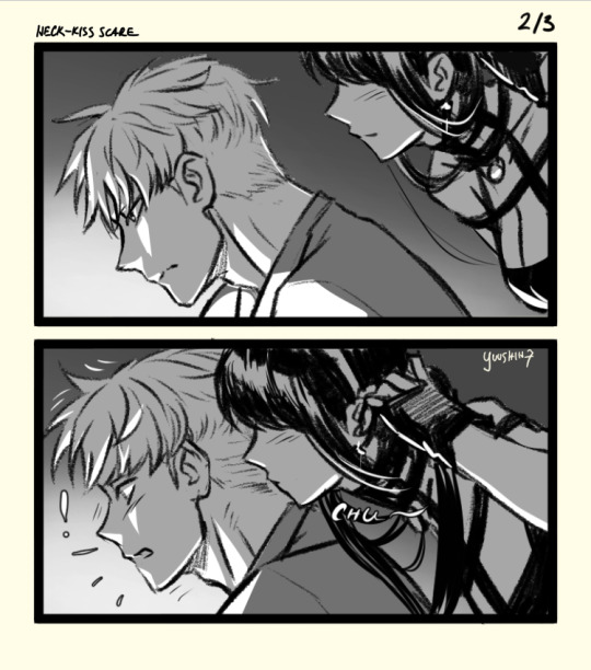
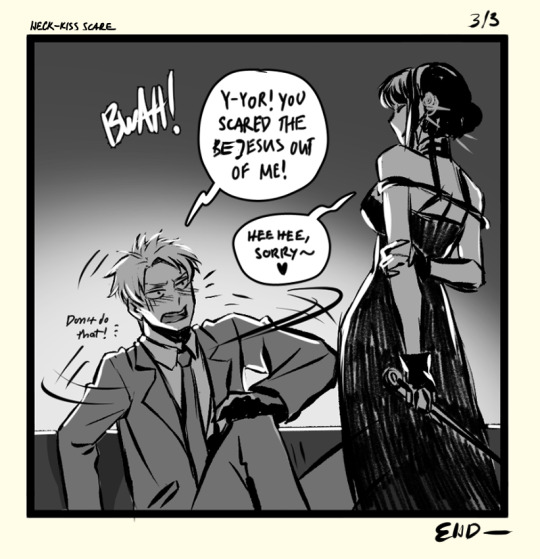
Back on my TwiYor brainrot shoit again .😅 We really need Yor using her stealth to spook unflappable Twilight more. I know he's stressed enough as is, but it's too funny.
#spy x family#twiyor#agent twilight#tasogare#thorn princess#yor forger#yor briar#loid forger#fan comic#fanart#spy x family fanart#loidyor#loid x yor#spook#assassin stealth#anime#manga#post reveal scanario#fun fact(?): i think anya said bejesus once....i think#I know someone did! and it's sounds like such Anya thing to say
21K notes
·
View notes
Text
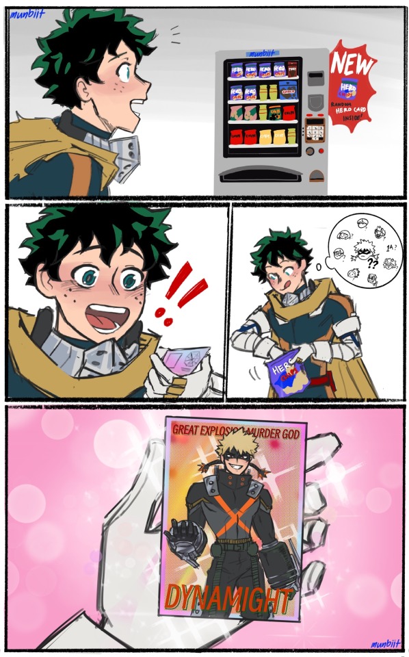
[BKDK] Hero Card part 1
read from right to left !
#bkdk#bakudeku#my hero academia#mha#bnha#bakugou katsuki#midoriya izuku#deku#dynamight#pro hero au#comic#fanart#bkdk comic#bkdk fanart#bkdk canon#anime#manga
6K notes
·
View notes
Text
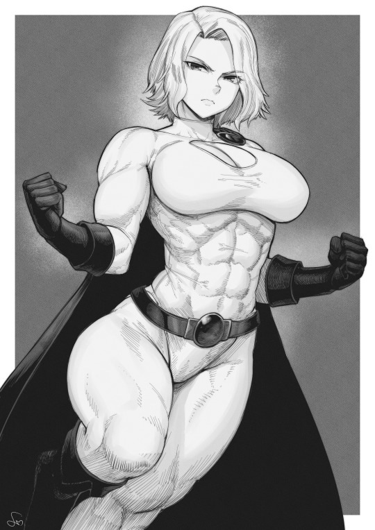
Power Girl
You can support me here: Patreon
#muscular girl#musculargirl#musclegirl#muscles#muscular#muscle#anime art#digital art#art#tomboy#illustration#patreon#manga art#anime and manga#manga panel#manga#power girl#dc comics#dc fanart#dc universe
3K notes
·
View notes
Text


That time Umemiya ended up on the cover of a local gardening magazine.
#Wind breaker#hajime umemiya#nirei akihiko#suo hayato#sakura haruka#kyotaro sugishita#winbre#windbreaker#wbk#my art#sd art#artists on tumblr#manga#drawing#art#anime#illustration#draw#my comic#It started as a joke with the illustration and i ended up drawing a small comic
1K notes
·
View notes
Text
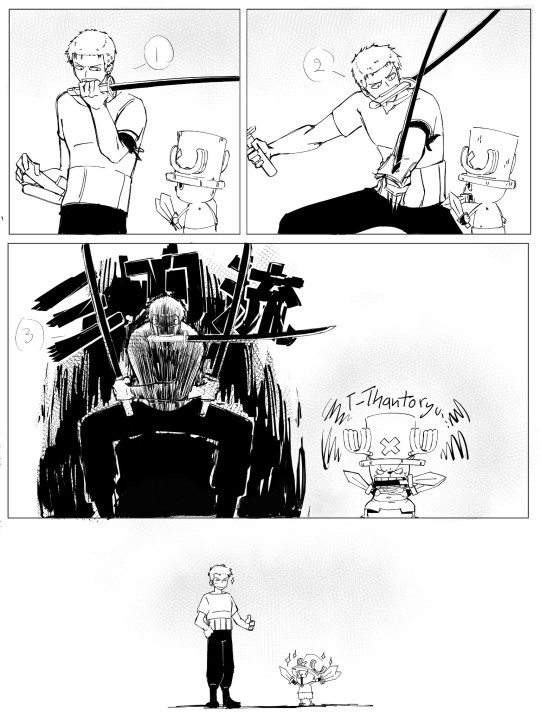
chopper wants to be cool like zoro, which leads to zoro have his first disciple.
sorry i just like their dynamic sm xjdhdkdb <333
#artists on tumblr#art#fanart#cool art#small artist#sannuizart#anime and manga#one piece#one piece zoro#zoro#roronoa zoro#one piece tony tony chopper#chopper#tony tony chopper#comic art
5K notes
·
View notes