#Also I downloaded a new brush on csp and just.
Explore tagged Tumblr posts
Text
Completely correct itfs fan: Oh neat an itafushi art blog.
The blog:
*terrorizing a different fandom* Look at my son! Look at my son the background character who I have to take screenshots of MYSELF because there are NONE!

I promise I've got itfs in the works I just need to get this out of my sytem
#Also I downloaded a new brush on csp and just.#I didn't realize how much my og set would FIGHT me I thought that was just how it be transitioning to digital art#But this new brush is like using copic markers and digital still has loads of challenges you don't get with traditional#but im having way more fun now that ive found something more comfortable to use#tsukasa takanashi#takanashi tsukasa#make my baby famous#make his tags popular#winbre#wind breaker#wind breaker satoru nii#citycrows.art#wbk
54 notes
·
View notes
Note
hi! im sure youve been asked this plenty, but what brushes and softwares do you use? thanks! <3
Hello! I mainly use Clip Studio and Krita (switch between what i feel like lol)
As for brushes, In csp, I have some favorites:
for lineart: Tsuki Fude
for shading: the default chalk brush
In krita..I use / experiment with a lot more
rough brushes
crayon brushes

this specific brush from this bundle (which i think are photoshop brushes they recreated for krita)
that forum in general is good for krita brush searching if u want haha
#asks#also I havent actually been asked this question before lol.. i just tell my friends abt finding a cool new brush i like#i rlly like rough brushes#i have a case of downloading brushes.. liking using it once.. then never again bc suddenly feels weird to use/ i forget how i used it#but brushes i linked ive used several times at least haha#esp csp's chalk brush.. i love rendering things with it
4 notes
·
View notes
Text
i need to draw amaranth more tbh
#the last couple times i've tried i've just gotten annoyed with trying to redesign his robes in a way that doesn't piss me off to draw#why did i have to theme him after such a fiddly plant lmao#it would also help if i downloaded some locs brushes but i don't know how to install csp brushes and i get frustrated#but i can still just. draw the hair. it's the robes that are annoying. but themed!!!!!! so it's complicated#maybe i should just make a big change with it. it worked for neil and now i love his new look and color scheme#(obvs cant take away the colors or plants but maybe i could work on accent colors and a new silhouette)
0 notes
Text
My Favorite Cheap Art Trick: Gradient Maps and Blending Modes
i get questions on occasion regarding my coloring process, so i thought i would do a bit of a write up on my "secret technique." i don't think it really is that much of a secret, but i hope it can be helpful to someone. to that end:

this is one of my favorite tags ive ever gotten on my art. i think of it often. the pieces in question are all monochrome - sort of.
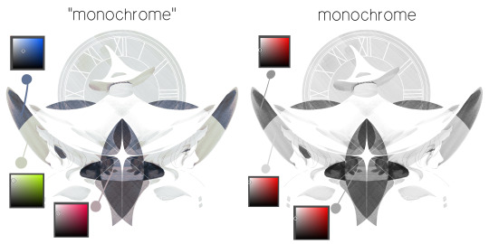
the left version is the final version, the right version is technically the original. in the final version, to me, the blues are pretty stark, while the greens and magentas are less so. there is some color theory thing going on here that i dont have a good cerebral understanding of and i wont pretend otherwise. i think i watched a youtube video on it once but it went in one ear and out the other. i just pick whatever colors look nicest based on whatever vibe im going for.

this one is more subtle, i think. can you tell the difference? there's nothing wrong with 100% greyscale art, but i like the depth that adding just a hint of color can bring.
i'll note that the examples i'll be using in this post all began as purely greyscale, but this is a process i use for just about every piece of art i make, including the full color ones. i'll use the recent mithrun art i made to demonstrate. additionally, i use clip studio paint, but the general concept should be transferable to other art programs.

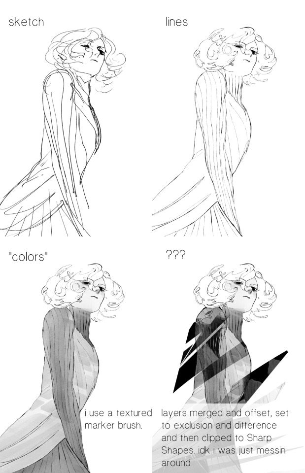
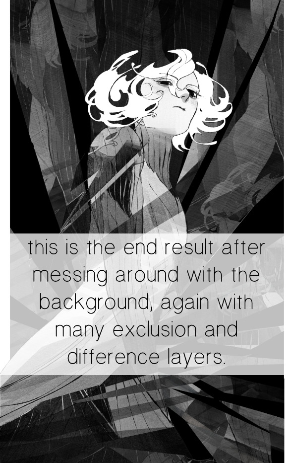
for fun let's just start with Making The Picture. i've been thinking of making this writeup for a while and had it in mind while drawing this piece. beyond that, i didn't really have much of a plan for this outside of "mithrun looks down and hair goes woosh." i also really like all of the vertical lines in the canary uniform so i wanted to include those too but like. gone a little hog wild. that is the extent of my "concept." i do not remember why i had the thought of integrating a shattered mirror type of theme. i think i wanted to distract a bit from the awkward pose and cover it up some LOL but anyway. this lack of planning or thought will come into play later.
note 1: the textured marker brush i specifically use is the "bordered light marker" from daub. it is one of my favorite brushes in the history of forever and the daub mega brush pack is one of the best purchases ive ever made. highly recommend!!!
note 2: "what do you mean by exclusion and difference?" they are layer blending modes and not important to the overall lesson of this post but for transparency i wanted to say how i got these "effects." anyway!
with the background figured out, this is the point at which i generally merge all of my layers, duplicate said merged layer, and Then i begin experimenting with gradient maps. what are gradient maps?
the basic gist is that gradient maps replace the colors of an image based on their value.

so, with this particular gradient map, black will be replaced with that orangey red tone, white will be replaced with the seafoamy green tone, etc. this particular gradient map i'm using as an example is very bright and saturated, but the colors can be literally anything.
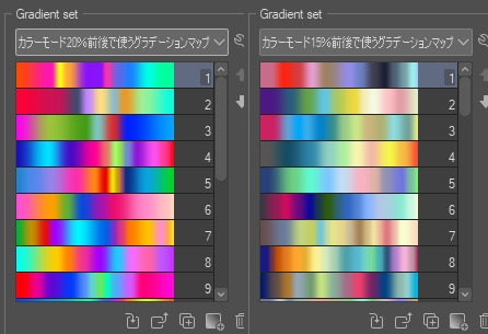
these two sets are the ones i use most. they can be downloaded for free here and here if you have csp. there are many gradient map sets out there. and you can make your own!
you can apply a gradient map directly onto a specific layer in csp by going to edit>tonal correction>gradient map. to apply one indirectly, you can use a correction layer through layer>new correction layer>gradient map. honestly, correction layers are probably the better way to go, because you can adjust your gradient map whenever you want after creating the layer, whereas if you directly apply a gradient map to a layer thats like. it. it's done. if you want to make changes to the applied gradient map, you have to undo it and then reapply it. i don't use correction layers because i am old and stuck in my ways, but it's good to know what your options are.

this is what a correction layer looks like. it sits on top and applies the gradient map to the layers underneath it, so you can also change the layers beneath however and whenever you want. you can adjust the gradient map by double clicking the layer. there are also correction layers for tone curves, brightness/contrast, etc. many such useful things in this program.
let's see how mithrun looks when we apply that first gradient map we looked at.

gadzooks. apologies for eyestrain. we have turned mithrun into a neon hellscape, which might work for some pieces, but not this one. we can fix that by changing the layer blending mode, aka this laundry list of words:

some of them are self explanatory, like darken and lighten, while some of them i genuinely don't understand how they are meant to work and couldn't explain them to you, even if i do use them. i'm sure someone out there has written out an explanation for each and every one of them, but i've learned primarily by clicking on them to see what they do.
for the topic of this post, the blending mode of interest is soft light. so let's take hotline miamithrun and change the layer blending mode to soft light.

here it is at 100% opacity. this is the point at which i'd like to explain why i like using textured brushes so much - it makes it very easy to get subtle color variation when i use this Secret Technique. look at the striation in the upper right background! so tasty. however, to me, these colors are still a bit "much." so let's lower the opacity.
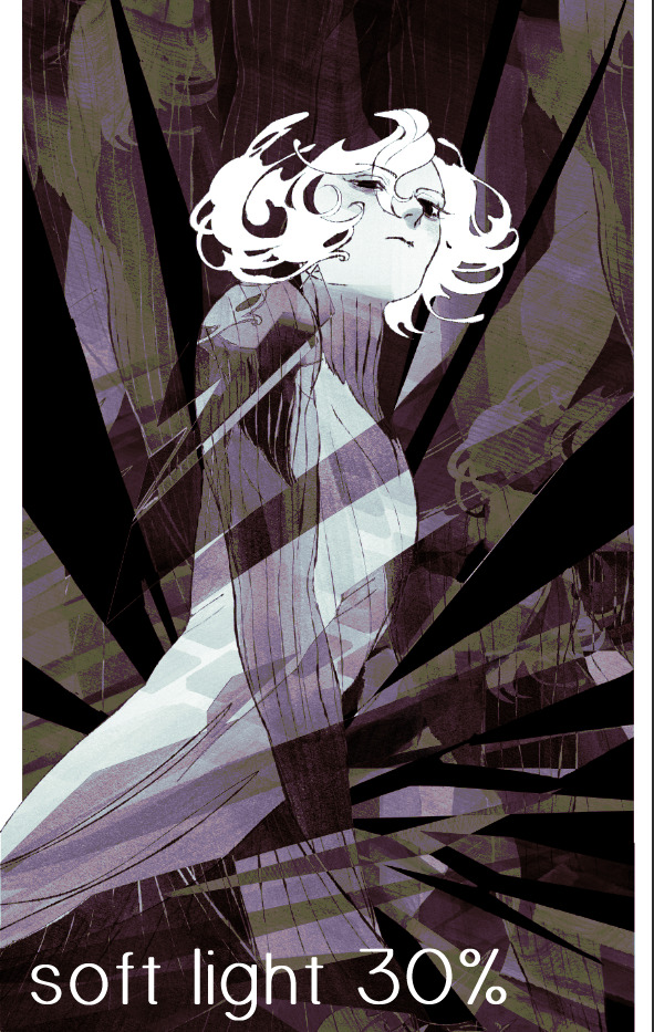
i think thats a lot nicer to look at, personally, but i dont really like these colors together. how about we try some other ones?
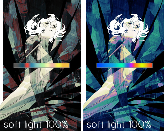
i like both of these a lot more. the palettes give the piece different vibes, at which point i have to ask myself: What Are The Vibes, Actually? well, to be honest i didn't really have a great answer because again, i didn't plan this out very much at all. however. i knew in my heart that there was too much color contrast going on and it was detracting from the two other contrasts in here: the light and dark values and the sharp and soft shapes. i wanted mithrun's head to be the main focal point. for a different illustration, colors like this might work great, but this is not that hypothetical illustration, so let's bring the opacity down again.
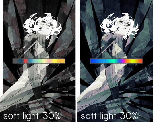
yippee!! that's getting closer to what my heart wants. for fun, let's see what this looks like if we change the blending mode to color.
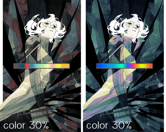
i do like how these look but in the end they do not align with my heart. oh well. fun to experiment with though! good to keep in mind for a different piece, maybe! i often change blending modes just to see what happens, and sometimes it works, sometimes it doesn't. i very much cannot stress enough that much of my artistic process is clicking buttons i only sort of understand. for fun.
i ended up choosing the gradient map on the right because i liked that it was close to the actual canary uniform colors (sorta). it's at an even lower opacity though because there was Still too much color for my dear heart.
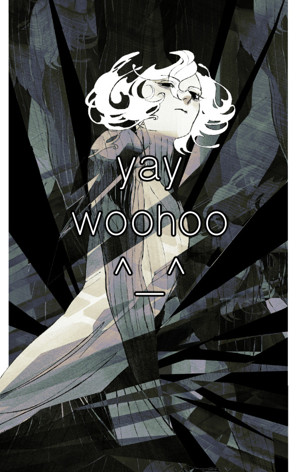
the actual process for this looks like me setting my merged layer to soft light at around 20% opacity and then clicking every single gradient map in my collection and seeing which one Works. sometimes i will do this multiple times and have multiple soft light and/or color layers combined.
typically at this point i merge everything again and do minor contrast adjustments using tone curves, which is another tool i find very fun to play around with. then for this piece in particular i did some finishing touches and decided that the white border was distracting so i cropped it. and then it's done!!! yay!!!!!
this process is a very simple and "fast" way to add more depth and visual interest to a piece without being overbearing. well, it's fast if you aren't indecisive like me, or if you are better at planning.

let's do another comparison. personally i feel that the hint of color on the left version makes mithrun look just a bit more unwell (this is a positive thing) and it makes the contrast on his arm a lot more pleasing to look at. someone who understands color theory better than i do might have more to say on the specifics, but that's honestly all i got.
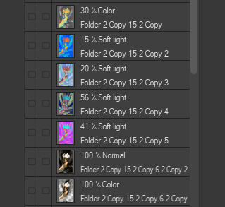
just dont look at my layers too hard. ok?
2K notes
·
View notes
Note
I really love how clean and strong your lineart is! Do you have any tips on how people can get better at their lineart?
Thank you very much! I hope you don't mind me answering this super late asdjhskd I actually held onto this so I could link my brushes!
I use super high stabilization - usually at 90 if not 100%, lineart used to be my worst enemy when drawing (it actually became a joke among my friends how much I hated it) but setting all my brushes to super high stabilization and some post-correction really helped a lot. Also - I think tapered lineart brushes are the devil if you're first starting out. I use a little bit of taper now but definitely ease into this when you're new to it, something to look out for is brushes with tips that aren't super sharp.
Just as an example, the brush I use to do sketching and rough lineart doesn't have a sharp tip - the strokes look like this

but this is it when I am doing lineart:

Don't be afraid to do lineart with brushes that aren't the standard 100% opacity G-pens! Experiment! Download 50 brushes and make a bunch of lines on a blank canvas and narrow down the ones that feel nice - if they arent exactly to your liking, fiddle around with the settings, play around! The pen feeling nice to you is going to make or break your experience with it, always opt for brushes that suit you - not what suits other people.
I just put all my brushes up for free download (I don't believe in charging people for pencils sjfhkjasf) so if you have csp feel free to download and play around with them!
108 notes
·
View notes
Text
hi everyone!! my wrist is too sore to draw today, so instead i thought i'd share some of my favorite csp assets + how i like to use them! i also linked some procreate brushes at the end of the post!!
lineart brushes:
SU-Cream Pencil: i swear by this brush and i use it very often!! if you lower the pen density and use a gradient map over it when coloring your drawing, it has a nice effect. that's what i did in this drawing here! i also use this brush like i would draw on paper, so as a sketching tool. recently i've been enjoying blending it for shading. the pics below are drawn on one layer; left is more manga style while the one on the right is from a WIP of my singer sargent study, so it can be used for more realistic styles pretty well!


Found Pencil: another pencil brush that feels really nice to use, created by @/pigpenandpaper.
PS style brushes: a recreation of photoshop's (i believe) default brush. very versatile and also blends well!
analog wind variant pen: a nice pen that i like to use for lineart that is intended to have a bit of a sketch look.
zakutoro real g-pen: i used it for the lineart of this piece. although, it was drawn before i started using 600dpi in my works, so the lower resolution might make it look a bit unclear.
sets of rough pens: great for manga lineart with a rougher vibe; some of them have varying line weight.
coloring brushes:
zaku brushes: very nice and painterly mixing! i definitely recommend it for those who like to leave their colors a bit unblended.
softie marker: as the name implies, it's very soft! i like to use it for blush in chibi illustrations.
analog watercolor brushes: realistic-looking watercolor brushes. i recommend using it with csp's default paper textures, or those i linked below!
993 coloring pen: it's very soft and watery, though it can be made more solid by adjusting the paint density. i actually think it works very nicely for lineart too.
rock dog pen: another soft marker brush i like, that i once again also use for lineart and doodles.
thick coating brush set: recommended for paintings that show brush strokes.
cartoon cloud: don't let the name narrow your vision!! this has to be one of the BEST brushes for painting in my opinion, and of course it's great for clouds and explosions but so so much more!! and it's FREE try it try it!!
decoration/miscellaneous brushes:
neon pen
paper textures
symmetry move brush
close and fill without gaps
rope brush
sphere fisheye guide
flash balloon
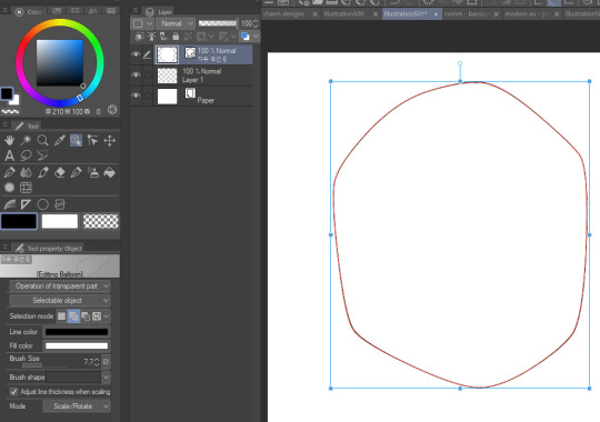
speech bubble set: a lifesaving collection for comic artists!! dimensions and line weight can be adjusted by using the operation tool.
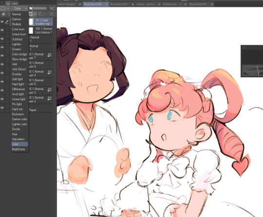
gradient map to use in color mode at 15% and another gradient map to use at 20%: the percentage refers to the opacity of the gradient map layer, but they are just the creator's recommendation and i tend to actually increase it. to use gradient map efficiently, i recommend putting all your colors (and lineart if you want) in a folder. then, right-click the folder, select "new correction layer" and then "gradient map". this allows you to modify the gradient map without worrying about affecting the original colors in case you decide not to use it in the end. to import a gradient map from your downloaded csp assets, click the wrench icon next to the name of the gradient set that's currently in use, then select "add gradient set".


you'll also notice that the creator recommends to use their gradients in "color mode". of course, this is also only a recommendation and i suggest trying as many layer modes as you like! to change a layer's mode, simply highlight the layer and click on "normal" (the default mode) and csp will display the available modes.

fruit ninja gradient map: fun to use if you want really drastic/vibrant colors! the names of the gradients are cute too, as you can see in the above screenshot!
BONUS: jeremy fenske's free photoshop brush pack: these aren't csp brushes per se, but they can be imported into the program! excellent for environments, i recommend watching fenske's video on how he uses the brushes to get a clearer picture since there are so many in this pack!!
BONUS 2: my good friend clem has a few brush packs for procreate that are ideal for painting,decorating drawings, and y2k-inspired illustrations, i definitely recommending checking out her shop!
in conclusion i hope this post can be helpful to you!! i tried to explain how to use the brushes as best as i could, but feel free to let me know if anything is unclear!! i hope you will enjoy using them! :D
#clip studio paint#clip studio paint brushes#csp#csp brushes#procreate#procreate brushes#brushes#tutorial#art tutorial#sort of hehe
97 notes
·
View notes
Note
hey spawn, what software/app do you use for drawing, what brushes do u use, and where do u get them?
just “spawn” this time huh, that’s a new one…. well I use clip studio paint on an ipad. as for brushes…. I gotta be honest, I don’t remember where/how I got most of the brushes I use. I think a couple of em might be default brushes but most of them I downloaded from the clip studio asset store (lotta good free stuff there). I also couldn’t figure out how to display the more in-depth settings of said brushes. I literally have to relearn how to install csp brushes every time I feel like looking for a new one lmao. I understand only the bare minimum about the program I use and how it works 👍
I can show you the names though, if that helps? I’ve used all of these for lines (currently I use Calligraphy 2 at a very small size). I can’t actually read the names but the bottom one I think translates to “kaiju brush��� or something similar iirc? and I remember the thumbnail having a cute little drawing of godzilla against a yellow bg on the asset store. I tried to look for it again but couldn’t find it.

and I use this for coloring. I have absolutely no recollection of where it came from or even if it’s a default brush or I downloaded it somewhere because I’ve been using this same brush since I started using csp like……. six years ago

this will not be helpful and I apologize
#asks#honestly I dont think specific brushes really matter that much when youre using a program with literally thousands of options#just find one that feels good and Go
26 notes
·
View notes
Note
hi! how are you doing?
(love those pitch & jack dolls btw (theyre so squishable!!)
I just got myself CSP bcuz of the discount. I've been wondering, what brushes do you use for your artworks? the lineart and colour?? apologies if this has been asked before, but i rlly wanna know ^^''
hav a nice day!
Hey!! I am still. In the stress. But I am alive. (and thank you so much!!!)
I hope you’re enjoying CSP so far!!! The asset store is my favorite part of it so I definitely encourage you to shop around and try a ton of brushes until you find the ones you like! But, here are the ones that I use:

This is my go-to as of late. It’s the PERFECT digital pencil imo, I haven’t found any others that capture the same sketchy roughness of traditional pencil on paper. The line variation is vast even on the same brush size, and depends on tilt & pressure and I’m kind of obsessed lol. I use it for sketching and doing lineart.

If I’m looking for lineart that’s less sketchy/pencil-y, the mechanical pencil of this set is my go-to. The marker I tend to use on larger sizes for things like blush or large areas of shadow when I’m rendering - anything with a semi-soft edge I want to lay down pretty quick. (Fair warning, I think this brushset has been updated since I downloaded but I assume the new versions are good as well)

These are my more painterly rendering brushes. I’ll use the mechanical and marker brushes from the previous set in tandem with these when I’m doing a more blended & detailed colored piece. But I’ve also used them for sketching and lineart in the past - my Danny Phantom art was largely done with these two brushes.
Other than that, I use the lasso fill tool to quickly lay down large areas of color, and for more gradual gradients I use a mix of the soft airbrush and blend tools. Also I use liquify, like……a lot……
52 notes
·
View notes
Text
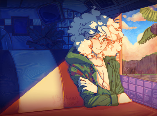
Nagito Color Study | Please do not repost, reblogs are welcome though! Brushes & Techniques & a progress pic below the cut
Uhhhh okay, how to explain this one. I was rereading “Logically Lucky” by PinkSweetSmoke and some of the visuals in the earlier chapters really struck me. The way that they write this relationship is pretty dynamic, and I wanted to see if I could use colors to talk about how Hajime and Nagito feel for each other and what they’re going through emotionally? So this is fanart for that fic, directly inspired by that fic based on the established vista(s) and also the style of writing their relationship, but it doesn’t really make sense unless I say all of that lol? But it wouldn’t exist if not for that fic, so I’d feel weird not mentioning it.
Brushes used (Clip Studio, Free):
Main: “ラフペン” from gyuukotu’s “Fill Set (塗りセット)”, content ID 1695210 Fill: Default India Ink brush pen - the rough pen is a little unpredictable, so I used this to flat the image and make sure that there were no gaps Cloud Flat: "荒筆" from gyuutoku's “Fill Set (塗りセット)”, content ID 1695210 Cloud Blender: I downloaded it from the internet instead of the app 2 years ago and cannot find, with certainty, where it came from, since I get rid of everything on my hard drive that's not art every year :( there are lots of good cloud blending brushes out there for free, though, and I typically use the gouache blender Misc. Techniques: Screen Distortion: I used CSP's free cloth texture clipped above the "blue" layers and then liquified it in places for the screen distortion effect Gradient Mapping: I cannot overstate how helpful gradient maps were for minor color corrections, you guys PLEASE try them on a finished piece of your own if you haven't used them yet. Click Layers > New Correction Layer > Gradient Map and then choose from the premade gradients before adding your own so you can see how they worked. I used a few different ones clipped to specific areas w/ lowered opacity & hard/soft light settings where I felt like the color was falling flat and it was SO helpful at giving it just that little bit more depth. Hearts: I've discovered that you can cheat at hair and clothing rendering by just making hearts. Try and see how many you can find lol Color Theory in General: The whole point of this piece, after it stopped being fanart (lol rip), was to be a color study focusing on the contrast between shadow and light and what I could do within the blues & the yellows to make them appear as if they're actually different colors. In the blue section, everything is p much blue, nothing is any other color. In the sunny section, a lot of the stuff is warmer variations of the standard colors, since I wanted it to be more vibrant and didn't feel like I could achieve that if everything was shades of yellow and orange. That being said, I stuck as closely to that as possible. But ANYWAY, juxtaposing the two starkly different color profiles also helps the blues in the blue side read as colors that they aren't, which was part of why I did this study. Sneaky sneaky: I just modified the diner a bit in order to get the colors I wanted, i.e closing the blinds bc I can. As an artist it's important to remember that YOU have full control over every single part of the piece, you just should ideally have a reason to create inaccuracies/ break rules or else it can end up being a bit messy and disorganized & details/ your vision can get lost.
Aaaand finally, the sketch from TWO AND A HALF MONTHS AGO:
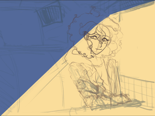
#trusttheprocess 😭😭😭
#nagito komaeda#sdr2#color study#super danganronpa 2#nagito fanart#my art#october 2023#jesus I started in july#but I also like let it sit for a good 2 months after the mockup#so shhhh#fav#komaeda nagito#character study#fanart
73 notes
·
View notes
Note
Hello! I saw the disco elysium painting you did. The one that took 8 months? I'm new to digital painting and was wondering what downloaded brushes/ settings you used! Do you have progress pictures you'd be willing to share? The piece is really good!
Ah, thank you!
I'll do my best. I wish I had time lapses to show y'all, but I paint so sporadically I've never felt like doing that. A lot of that painting started out as drawings (it was originally meant to be a drawing collage) that I ended up painting over because I honestly don't like my drawings very much.

This was my initial concept; I obviously changed a lot. (It's really bad; I know xD)
As for brushes, my absolute favorite brush to use is called susu pen. I probably use it for 98 percent of everything. ....Although I'm a little bit confused because now that I look it up in the CSP store, it says I haven't downloaded it, so I'm wondering if the original that I have was deleted off and there's a new version. Here's what the strokes look like, though:

Here is what my other favorite brushes look like. Unfortunately, many brushes in the CSP store are in Japanese or Korean and I rename them, and I'm not sure which of these have been renamed and which are original. Some might also just be CSP standard brushes. I believe the ones called "guts" though really are called that; I use those for tentacles and layering onto anything shiny.


I sure hope this helps!
22 notes
·
View notes
Note
Do you think Clip Studio is worth the payments? ( asking for a friend/j ) And do the pros outway the cons or is it the other way around? Also, do you use custom brushes? And one last question.. Do you just draw on your laptop? Like, do you use a mouse, touchscreen or maybe a drawing tablet?
I've never seen anybody ask these questions and I'm curious, you don't have to answer though! Have a bagel 🥯🤲 and if you don't like bagels... 🥪🤲 Have a sammich.. and.. if you don't like either uhmm- Have a whole damn cake 🎂🤲 happy birthday [/silly], or hell, take all three! Have a wonderful day ❤️ [/gen]
Do you think Clip Studio is worth the payments?: When it comes to payments, I think it's always better to get it when it's on sale (which do come every now and then), it is a onetime payment and it's better to get it when the price is as low as it can be For pros and cons, the biggest pro of the program is you can get new brushes, blenders, erasers, tools, etc (anything that will help you with drawing easier) from the programs own little assets store (and majority of the brushes are free to download). And it's also easy to import brushes you get from other places (ex: you buy a brush from Kofi made by another artist). Meaning you have options in CSP's own brush store, and also other places on the internet, you aren't stuck with just using the default brushes you're given when you start the program That's the biggest pro to me, besides that you have everything else that comes with your average art program,
I will also mention that clipstudio also has it's own 3D modeler program, like you can import 3D figures and use them as your reference if you can't find one on pinterest. Though I've haven't used it myself so I do not know how easy it is or what the features are, so I can't comment much.
I think the last biggest pro is that if you program crashes (not often, but the chances are never low unfortunately), clip studio will restore your drawing for you and your drawing won't be sent to the shadow realm meaning you don't lose progress. I compare it to dropping your phone and you slowly pick it up out of fear that theres a crack in it only to find out oh there's not one it's fine.
Now for the cons, the biggest is the definitely the price, which is why I recommend getting it while it's on sale while it's at it's lowest. The program is insanely pricey. I also recommend the PRO ver instead of the EX ver. The PRO ver is cheaper and it's main focus is illustrations which is all you need if you're only planning on drawing. The EX ver is both for drawing and animation, while you can still animate on the PRO ver, it limits you insanely, like you can only make 25 second long animations and refuses to let you do more unless you pay for the EX ver. Now I have the EX ver and I'm learning animation, I will say Clip Studio's animation set up and layout is very confusing and tedious to beginners (I had to watch a good amount of tutorials to understand the features and everything), I believe some people compared it to animating on Photoshop, so if you haven't animated on Photoshop before, good luck. I'd say just use another animation program for animating (Flipaclip, ibispaint etc), the only reason why I'm sticking to animating to ClipStudio is because I'm stubborn and don't like switching programs. Clip Studio also has a free trial feature (which I believe lasts for 3 months), now this is good yes, but the problem is that the program refuses you to save your drawings with the free trial. I don't know if this was changed or not since it's been a while when I used the free trial, but if you want to get a hang of the program and test it out, there is a free trial, just be aware that it won't let you save your progress at all which is bull.
Those are my pros and cons, I have a lot more pros than cons but I tried to sum it up as best as I could. It's really your choice to decide if the program is worth it or not (again there is a free trial, and if you do plan on buying it, get it while it's on sale) The assets store with all the downloadable brushes is my biggest pro, but I'm aware other programs like IbisPaint also have that. I think that's all I have to say now for ClipStudio, i've yapped alot gulps.
---- do you use custom brushes?:
A good handful of the brushes I use are brushes I bought from other artists:


These brushes from PharanBrush on Kofi , I'm someone who likes to experiment with alot of brushes, so I often download/buy from other artists (I also have no self control). The EnpitsuP set comes with 100 brushes, alot I know, but your options are endless. The Krupuk set comes with 160 brushes, and alot of them are similar to like copic markers but for digital art. And the last one is BōrupenP sets, these are free and mimic school supplies, if you miss the feeling of drawing on your school books with pens, this one is also neat (plus it's free) Another brushpack I have is Cole's Pencil Pack , it comes with 19 brushes, of all kinds of taste and texture. I use this set alot, especially the "Cream Sketch 2" pencil as it's fun for lineart or sketching.

(Can you tell I like supporting artists) next set I have is Brush Box Vol.1 Markers by Olguioo this set mimics the feel of traditional art and even has a brush that makes your canvas look like paper!! It's very neat
Now of course I do have brushes that are free from the assets store, like these, which you can easily find by searching up their content ID codes:


Ofc there's more, but these are just some I use which I find neat!
---- Do you just draw on your laptop? Like, do you use a mouse, touchscreen or maybe a drawing tablet?:
I use a laptop and a drawing tablet! I specifically use the VEIKK Studio VK1200 pen display, my brother bought me it as a birthday gift this year, but before I had that one, I used the beginners One by Wacom tablet for like 4 years or more, I still use it sometimes, but only when i'm on vacation somewhere I can't bring my main one
OKAY I think that's about everything!!! Very long post so apologies if there are any typos or misspells or repeats! And thank you for the food, in return I will share the food with you because sharing is caring (ALSO if anyone elses wants to add something like other pros or cons about ClipStudio, or other brushes or anything like that, please feel free to leave it in the replies!!!)
#My ass yapped a whole essay here#mono ask#clip studio paint#again sorry for any typos/misspells/repeats LMAO
9 notes
·
View notes
Text
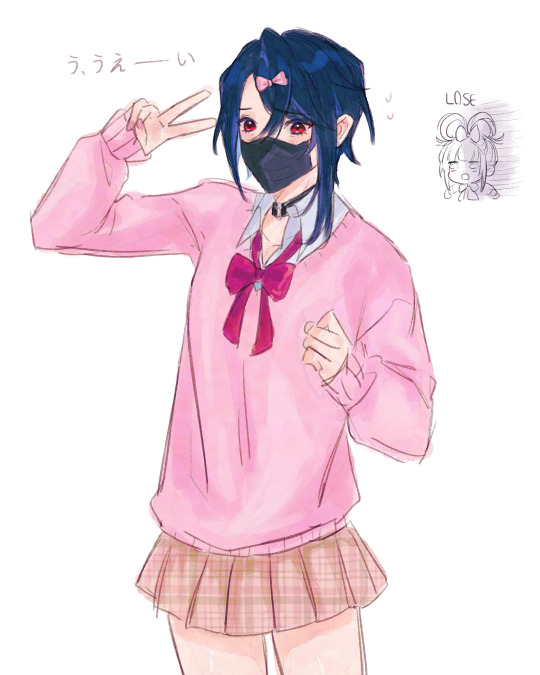
I tested out my friend @/ poritora's new brush by drawing alcryst 😳
OH ALSO idk if anyone will have trouble with this bc the brush doesnt immediately go into ur assets but just in case:
go to your downloads
right click and press extract all on the torapaint zip file
go to CSP and right click any brush (it doesn't affect/delete the brush dw)
click import sub tool
select the torapaint brush and there you have it !
you can drag the torapaint brush from your uploaded brushes into your CSP downloaded assets too if you want
#its such a good brush everyone download it rn#fire emblem engage#alcryst fire emblem#sorry for making alcryst babygirl at every second. i have to
60 notes
·
View notes
Photo
Saturn’s Free CSP Brush Recommendations, Across the Web Edition
I may sell (sorry, obliged to shill) brushes now, but I still love me some free brushes & love to share them with people. These are a bunch of cool brushes made by other people that you can use to build up a nice library of tools without having to spend any cash on, perfect if you’re new to CSP or are on a budget. If you do download these, be sure to like them & give some love to the artist if you enjoy them. :D
All of these are on different sites, like Gumroad, Deviantart, Artstation, etc.. They’ll be organized by source on this post since most brushes posted are general packs with multiple different types of brushes (very nice). Feel free to reblog this with your own suggestions, there’s many brushes out there I missed. :D Check defsiarte’s suggestions too, and if you want to see my recommendations for stuff on the Clip Studio Asset Store or other places, check this tag.
Gumroad
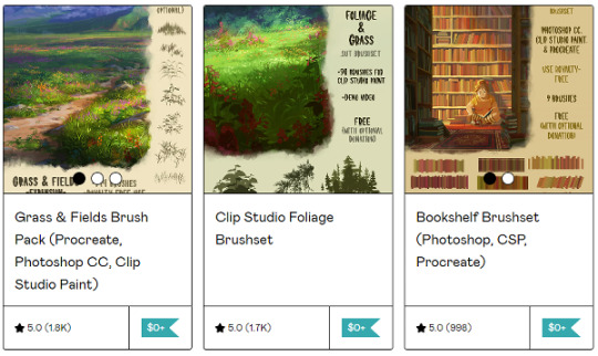
Tamberella’s Brushes - Fur, Foliage, Bookshelves, & northern lights, all nicely formated and easy to use for CSP. Good variety.
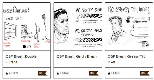
Ronchan’s Brushes - he makes a lot of neat little brushes, great for illustrations, sketching, & art in general. High recommend!
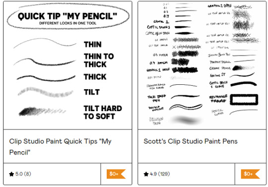
Scott’s Clip Studio Brushes - I mostly use the grease pencil from the big pack, but all of them are pretty good if you’re looking for a more traditional inking experience.
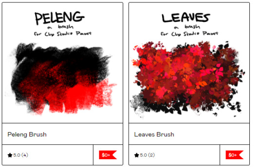
Cae’s Brushes - they’ve released a variety of cute painterly brushes that are fun to use. You can either download the ones you want or all of them at once. :)
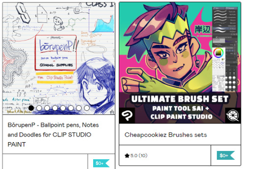
@pharanbrush‘s BorupenP - a really nice set for doodling. If you enjoy the free set, check out their pencils & other sets if you have the spare cash. :D
Cheapcookiez Brushes Sets - I really like the blender in this set. Comes with Sai brushes as well.
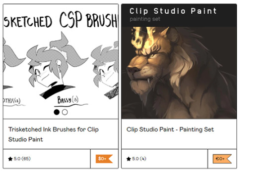
Trisketched Ink Brushes - 3 fun rough inkers for inky pieces.
CSP Painting Set - I like the gentle use of texture on the painting & sketching tools. A real nice rounded out basic set.
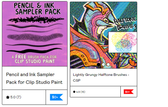
Jason Piperberg’s Free Samples - It’s a nice sample pack of his bigger pack. He likes using a lot of halftones in his art and it gives a fun bold look to his illustrations. If you like drawing comics, I do suggest checking out his paid sets too.
Vierdz’s Brushes - I like the Halftone, clouds, & fish brushes the best, but all their brushes are nice.
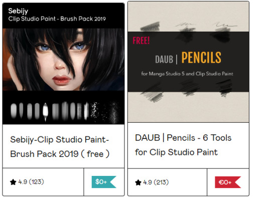
Sebijy’s Clip Studio Paint Brush pack 2019 - It’s been a bit since I downloaded this pack but I remember I really enjoyed using the airbrushes. Has some good painters & textures. Also has a nice paid set if you enjoy the sample.
DAUB Pencils - A decent set of pencils.

Scrapefiend’s Free Brushes - There’s some real cool inkers Scrape released for free, I used them a bunch even before I purchased his bigger pack (also recommend). Great ink looks that are fun to use & whip around!
“...Of the Wild” - A brushset based of the Breath of the Wild/Tears of the Kingdom Legend of Zelda games. Great for copying the style or just painting in general (then again I might be biased because they used my public domain textures, bless).
Art Station
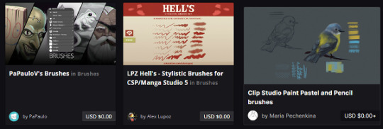
PaPauloV’s Brushes - he was nice enough to optimize his brushes for both Photoshop & Clip Studio, as CSP sometimes has a weird time importing PS settings. Another nice basic set!
LPZ Hell’s Stylistic Brushes - Fun for messy looks! IIRC you can also find it in the Asset store.
Maria Pechenkina/ Mothka's Brushes: Artstation | DA - I love the pastels in this set. Lovely little dry set.
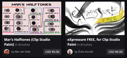
Mar’s Halftones ( & other brushes!) - Halftones with fun textures, now avaliable away from the CSP Asset store too!
Expressure Free Sample Sets: ArtStation | Gumroad | Ko-Fi - ZH has put a ton of effort into his sets, both the first & second. Worth a try & even the free brushes are full of effort!
Deviantart

Awanndus Brushes: Oil Metal Painting, Indian Ink, Fantasy Background, & Pencils - all neat brushes that are worth a look if you need any of these.

Roastedstix's Painting Sets - Really enjoy the green Goauche Brush Set. Great addition to the already lovely CSP default Gouache.
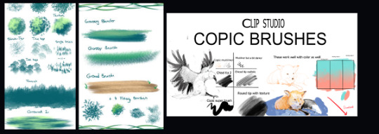
Yettyen’s Sets - All her free Enviormental & decoration sets are great. I also like her painters & scale Sets. She has a Gumroad she releases brush sets for a dollar for, they’re also worth checking out along with her Ko-Fi!
Clip Studio Copic Brushes: Deviantart | Google Drive - These are some of my favorite marker painters out there. Nice and easy to use with wonderful results, good blending.
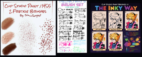
Freckle Brushes - A nice varied set for freckle lovers.
The Inky Way’s Sets - TIW has been making brushes for clip for years & they’re all nice, honed sets that are fun to use. Very high recommendation!

SerketXXI’s big set & their Danganronpa/Hetalia Brushes - A nice basic set with some nice decorators, as well as two good sets for making Danganronpa & Hetalia styled illustrations (obviously). The brushes are also good for general useage.
FnF Brushes - For those who need a Friday Night Funkin’ Style Brush!
Hearts Emoji Brush - something I forgot to get a preview for, just a fun brush taking basic emojis and scattering them around. Always need a few fun brushes here and there. :)
General Around the Web (twitter, tumblr, ko-fi, etc)

Pufuu’s Splatoon Brushes (Imported to CSP) - Splatoon artstyle lovers rejoice!
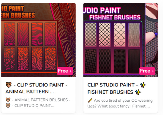
Rai’s CSP brushes - Currently releasing a bunch of pattern brushes, but she has a lot planned in the future brushes. Try ‘em out!
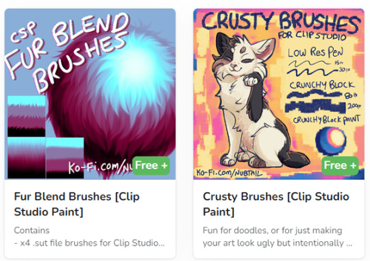
@nubtail ‘s CSP brushes - The fur blender brush is fantastic! And the crusty brushes are a nice crunchy organic look. :)

@kriztelpixel’s Brushes - She explains the instructions in English in the linked tumblr post, some lovely oil brushes.

Bunabi’s Brushes - She’s got some really great decorating brushes, I’m very fond of the fun arcade rug decorators! And of course, since it’s patreon, you can always donate to support her or unlock more from her if you enjoy her stuff.
A few others I forgot the preview for:
Palette Knife - swoosh around some fake palette knives with this set!
Timcanpy-shaped brush - A cute D. Gray Man themed brush c:
Xerox Pencil - a pencil with a bold texture that’s fun for recreating old lineart.
Again, feel free to respond with some of your recommendations & favs as well, free or paid for. :)
#clip studio#clip studio paint#clip studio paint brushes#clip studio paint brush#csp#recommended brushes for csp
126 notes
·
View notes
Note
happy talk shop tuesday!! ヾ('▽') what are your go to materials for drawing (physical: paper/pen preferences, digital: brushes/textures)? any new techniques or tools you've been using or would like to pick up in the future?
im quite basic in both digital and traditional drawing, so i tend to stick to 2-3 things that i got used to
my go to brush in Clip Studio is Mameo Pen, just such a good ink-like brush for sketching and lineart, i think it's my staple now. another one is the flat marker which is one of the default brushes in CSP, i also like it for sketching but especially for character drawings where i want it to have a lighter tone.


[id: two screenshots of brushes mentioned above: Mameo and Flat marker in clip studio pain interface./end id] i tried downloading other brushes but since i don't paint, i stick to ones that are the best for sketching and lineart. and when i do end up painting i use default brushes as well.
in traditional i use a bunch of sketchbooks for different purposes/topics/styles of drawing. i used to see this advice quite often and about 2 years ago i picked it up as well. as for materials: mechanic pencil with 2B lead and an eraser. for inking i used to use Winsor&Newton inks but they are so overrated compared to Speedball ink, truly the best one out there.
recently i tried using textures to add depth to some of my recent digital pieces, as well as was doing some illustrations with dot patterns. not sure i'll keep using them, but i enjoy them in the moment
8 notes
·
View notes
Note
Your art is very beautiful! May I ask what brushes you use? I'd love to get the same effect with my art! (Oh, and I use Clip Studio Paint! Not sure which you use, but hopefully I can still find the same or similar brushes. Lol)
thank you very much!! Yeah for sure, here's pretty much all of the main brushes I use. I also use clip studio paint!
lineart/sketch brushes:


firstly, most of my stuff uses cy's grease pencil from this pack. it's funny bc i downloaded it years ago and didnt really like it at first. but when i tried it again a couple years ago i was like wait... this is SO good. i use it for sketching and lineart (first image). there's also csp's default "flat marker" which im apparently obsessed with (second image here). it's good for shading too! lastly (third image) i'll use the stumpy pencil pack here, this one i pretty much just use for lineart but it's by far my favorite clean lineart brush. i'll be honest i had to do weird conversion to get it to work in csp and i have no idea what i did at this point BUT ! if u search up how to convert it im sure The Internet can aid you as well. i think
Coloring:


when it comes to coloring i mainly use this water color pack and then this gouache pack (which doubles as what i use for my semi-lineless painting style- the second row here). if you see any coloring that looks more painter-like and textured it's most likely me using the gouache pack. sometimes i like to do the solid/base colors with an opaque brush and then use the water color to shade bc i like the textured look :P
side note: when i shade using another layer set to multiply, i'll either use the flat marker or cy's watercolor brush (both in the entry above this one)
Additional Stuff:
both of these for certain background help
this set of overlays (not a brush, but i figured i'd add it since it definitely helps adding texture to my work)
these textures (again, not a brush. i use these so that my backgrounds arent just Blinding White- mostly for myself bc plain white is hard on my eyes lol)
-
As You Can See I'm like. constantly messing around with new brushes. I actually have well over a hundred that I've downloaded LMAO. If you ever see a piece by me and want to know what I used, please let me know!! I'm usually able to remember the brushes I used, at least some of them :P especially more recent stuff, I've been experimenting a lot with painting methods and various new brushes
7 notes
·
View notes
Note
I love your artwork, it's so cool! I'm an amateur in art, do you have any tips? Thank you!
Thank you so much! 💕 And sure! (Have you seen my other posts as well?) It’s a bit easier when it’s more specific >< But I’ll try my best;
- Keep notes about the things you want to learn as you draw! Someone gave me a tip to have an art-goal so you know what to work on and then improve these particular things as you go, but for some reason I found it really hard to set these goals? (Am I the only one?) I kept thinking I just wanted to ‘improve’ everything, but that’s not very tangible and I can’t effectively measure whether I’ve succeeded… (it’s also not always easy to see your own improvements… at least I rarely can ><)
But when you draw and you come across these little things that make you go “hm, I wish this was easier” or “I really love this sketch I made, but I’m not sure how to go about coloring it”, anything like that— then your desires regarding your art or your process become a lot more specific, right? Write these down! What specifically would you like to improve on?
I’ve noticed for myself and many others talked about it as well that once a piece is done, it’s like you forget a lot about the process and your mind is set on a new project. (Also, yay! You were in the zone~) You can either use your current project as practice (all of them are in a sense, really) or start a new one later, research what you need (on YouTube, books, or perhaps a course from an artist you really like if you can afford it) and work on your goal!
- Also keep notes for any ideas you may have. We always think we’ll remember something and then we don’t. These sudden, often spontaneous glimpses you receive seemingly out of nowhere can be some of your best and it’s a shame if they fade back into the void. This also applies to anything that inspires you.. it can really be anything. I think I’ve said this before, but if you do this, try and organize a bit. Otherwise you’ll end up with a bunch of notes that’s more overwhelming than anything else.
You can use folders to keep images, notes, a dedicated Notion page perhaps or if you can afford it, keep an extra external SSD for this.
- Well, this also applies to research or video’s you’d like to watch. If you end up with too many tutorials or books, or they aren’t goal-oriented specific to your art desire, it may get really hard to get you started on something. If you’re like me and it’s hard to focus, I’d highly recommend taking some time to sit back, think about the thing you really want, organize and structure a way towards it and go. That way you don’t have to make all these decisions along the way— you know what to do already, it’s written right there!
- And that also applies to tools and brushes xD I know it’s really fun to download all of it because many are free and what if there’s ever a time you may need this specific texture on a brush? What if you can’t get this style that inspired you with the brushes you already have? But truth is, you don’t need them all and if you do, you’ll notice there are many you won’t even touch. And well… as you can see in my art as well, apart from the pencil ones, it doesn’t necessarily encourage consistency if that’s what you strive for. If you want to practice, most often the basic round brush will do, the less opacity or blend, the more you can practice shapes and clarity. In that case I’d stay away from the airbrush whenever possible.
- Depending on the program you use (CSP has their own), you can use these to help you with facial angles, or this if you rather prefer a basic skull. You can use the site if you can’t get the angles quite right for many things.
- For coloring I highly recommend James Gurney’s articles or book ‘color and light a guide for the realistic painter’, even if you’re not a realistic painter, it still contains most (all?) of what you need to know about color.
- A great way to experiment is to just… open a blank document and do whatever. I know it often feels like you have to draw something (preferably something good), but you can actually learn a lot by just scrabbling away. Here’s also often where you find the things you feel like you need to improve. Certain angles are especially hard for me, but I hadn't known that if I didn't try >< Oh, I also found this site by accident and I haven't read it all, but it covers many subjects! Hope these are helpful! 🌷
14 notes
·
View notes