#AMP JavaScript
Explore tagged Tumblr posts
Visit Tumblr Blog
Explore Tumblr blogs with no restrictions, modern design and the best experience.
Last Seen Tumblr Blogs


Fun Fact
The total number of visits Tumblr.com received during January 2021 is 327 million.
Text
AMP (Accelerated Mobile Pages) Nedir ve Nasıl Kullanılır?
AMP (Accelerated Mobile Pages) Nedir ve Nasıl Kullanılır? AMP (Accelerated Mobile Pages) Nedir: Mobil cihazlar, internete erişim için giderek daha fazla kullanılmaktadır. Ancak, bazen yavaş internet bağlantıları veya ağır web sayfaları nedeniyle kullanıcılar hızlı bir web deneyimi yaşayamayabilirler. İşte bu noktada AMP (Accelerated Mobile Pages) devreye girer. Bu makalede, AMP’nin ne olduğunu ve…

View On WordPress
#Önbellekleme#Accelerated Mobile Pages nedir#AMP (Accelerated Mobile Pages) Nedir#AMP CSS#AMP HTML#AMP JavaScript#AMP nedir#AMP teknolojisi#AMP uyumluluğu#Arama motoru sonuçlarındaki AMP işareti#Google AMP#Hızlı sayfa yüklemeleri#Hızlı web deneyimi#Kullanıcı deneyimi iyileştirme#Mobil kullanıcı deneyimi#Mobil kullanıcılar için optimize edilmiş sayfalar#Mobil sayfa hızı#Mobil SEO#SEO optimizasyonu için AMP kullanımı#Web hızı optimizasyonu#Web sayfası optimizasyonu
0 notes
Text
What on Earth is the `types` Descriptor in View Transitions?
New Post has been published on https://thedigitalinsider.com/what-on-earth-is-the-types-descriptor-in-view-transitions/
What on Earth is the `types` Descriptor in View Transitions?
Have you ever stumbled upon something new and went to research it just to find that there is little-to-no information about it? It’s a mixed feeling: confusing and discouraging because there is no apparent direction, but also exciting because it’s probably new to lots of people, not just you. Something like that happened to me while writing an Almanac’s entry for the @view-transition at-rule and its types descriptor.
You may already know about Cross-Document View Transitions: With a few lines of CSS, they allow for transitions between two pages, something that in the past required a single-app framework with a side of animation library. In other words, lots of JavaScript.
To start a transition between two pages, we have to set the @view-transition at-rule’s navigation descriptor to auto on both pages, and that gives us a smooth cross-fade transition between the two pages. So, as the old page fades out, the new page fades in.
@view-transition navigation: auto;
That’s it! And navigation is the only descriptor we need. In fact, it’s the only descriptor available for the @view-transition at-rule, right? Well, turns out there is another descriptor, a lesser-known brother, and one that probably envies how much attention navigation gets: the types descriptor.
What do people say about types?
Cross-Documents View Transitions are still fresh from the oven, so it’s normal that people haven’t fully dissected every aspect of them, especially since they introduce a lot of new stuff: a new at-rule, a couple of new properties and tons of pseudo-elements and pseudo-classes. However, it still surprises me the little mention of types. Some documentation fails to even name it among the valid @view-transition descriptors. Luckily, though, the CSS specification does offer a little clarification about it:
The types descriptor sets the active types for the transition when capturing or performing the transition.
To be more precise, types can take a space-separated list with the names of the active types (as <custom-ident>), or none if there aren’t valid active types for that page.
Name: types
For: @view-transition
Value: none | <custom-ident>+
Initial: none
So the following values would work inside types:
@view-transition navigation: auto; types: bounce; /* or a list */ @view-transition navigation: auto; types: bounce fade rotate;
Yes, but what exactly are “active” types? That word “active” seems to be doing a lot of heavy lifting in the CSS specification’s definition and I want to unpack that to better understand what it means.
Active types in view transitions
The problem: A cross-fade animation for every page is good, but a common thing we need to do is change the transition depending on the pages we are navigating between. For example, on paginated content, we could slide the content to the right when navigating forward and to the left when navigating backward. In a social media app, clicking a user’s profile picture could persist the picture throughout the transition. All this would mean defining several transitions in our CSS, but doing so would make them conflict with each other in one big slop. What we need is a way to define several transitions, but only pick one depending on how the user navigates the page.
The solution: Active types define which transition gets used and which elements should be included in it. In CSS, they are used through :active-view-transition-type(), a pseudo-class that matches an element if it has a specific active type. Going back to our last example, we defined the document’s active type as bounce. We could enclose that bounce animation behind an :active-view-transition-type(bounce), such that it only triggers on that page.
/* This one will be used! */ html:active-view-transition-type(bounce) &::view-transition-old(page) /* Custom Animation */ &::view-transition-new(page) /* Custom Animation */
This prevents other view transitions from running if they don’t match any active type:
/* This one won't be used! */ html:active-view-transition-type(slide) &::view-transition-old(page) /* Custom Animation */ &::view-transition-new(page) /* Custom Animation */
I asked myself whether this triggers the transition when going to the page, when out of the page, or in both instances. Turns out it only limits the transition when going to the page, so the last bounce animation is only triggered when navigating toward a page with a bounce value on its types descriptor, but not when leaving that page. This allows for custom transitions depending on which page we are going to.
The following demo has two pages that share a stylesheet with the bounce and slide view transitions, both respectively enclosed behind an :active-view-transition-type(bounce) and :active-view-transition-type(slide) like the last example. We can control which page uses which view transition through the types descriptor.
The first page uses the bounce animation:
@view-transition navigation: auto; types: bounce;
The second page uses the slide animation:
@view-transition navigation: auto; types: slide;
You can visit the demo here and see the full code over at GitHub.
The types descriptor is used more in JavaScript
The main problem is that we can only control the transition depending on the page we’re navigating to, which puts a major cap on how much we can customize our transitions. For instance, the pagination and social media examples we looked at aren’t possible just using CSS, since we need to know where the user is coming from. Luckily, using the types descriptor is just one of three ways that active types can be populated. Per spec, they can be:
Passed as part of the arguments to startViewTransition(callbackOptions)
Mutated at any time, using the transition’s types
Declared for a cross-document view transition, using the types descriptor.
The first option is when starting a view transition from JavaScript, but we want to trigger them when the user navigates to the page by themselves (like when clicking a link). The third option is using the types descriptor which we already covered. The second option is the right one for this case! Why? It lets us set the active transition type on demand, and we can perform that change just before the transition happens using the pagereveal event. That means we can get the user’s start and end page from JavaScript and then set the correct active type for that case.
I must admit, I am not the most experienced guy to talk about this option, so once I demo the heck out of different transitions with active types I’ll come back with my findings! In the meantime, I encourage you to read about active types here if you are like me and want more on view transitions:
#almanac#amp#animation#app#Articles#attention#change#classes#code#Conflict#content#CSS#direction#documentation#earth#event#Experienced#framework#Full#github#how#HTML#it#JavaScript#Learn#Link#list#media#navigation#One
0 notes
Text
AMP is an open source HTML framework developed by the AMP Open Source Project. It was originally created by Google as a competitor to Facebook Instant Articles and Apple News. AMP is optimized for mobile web browsing and intended to help webpages load faster. Trioticz, one of the best Website Development Company in Chennai we will help you in building the best Accelerated Mobile Pages for your website.
#Accelerated Mobile Pages#AMP#Fox News#HTML#JavaScript#Mobile Browser#Mobile Web Browsing#Web Design Company#Web Development Company#Web Pages
0 notes
Text
The Ultimate Guide to Technical SEO: Best Practices for Website Optimization
Learn how to improve your website's visibility in search engine results pages with these ten essential technical SEO best practices. From optimizing site speed and using SSL to fixing broken links and optimizing meta descriptions, this comprehensive guide will help you outrank your competitors and establish a strong online presence. Don't miss out on these crucial tips for improving your website's search engine rankings.
#Structured Data#Mobile-First Indexing#Core Web Vitals#Page Speed Optimization#JavaScript SEO#Accelerated Mobile Pages (AMP)#Search Console#Server-Side Rendering#Canonical Tags#XML Sitemap#Hreflang#Duplicate Content#HTTPS#Robots.txt#Noindex Tag#Crawl Budget#URL Parameters#Rich Snippets#Breadcrumbs#Pagination#Schema Markup#Internal Linking#Content Optimization#Voice Search Optimization#Image Optimization.
1 note
·
View note
Text
Javascript Async & Await with Examples
#javascript #javascripts #javascriptlibraries #javascript30 #javascriptengineer #javascripting #javascript3 #javascriptdeveloper #javascriptiskillingmysoul #javascriptbasics #javascriptdevelopers #javascriptlover
Javascript is a high-level, dynamic, and interpreted programming language that is widely used for developing web applications and creating interactive effects on the web. Async and Await are two powerful features of Javascript that make it possible to write asynchronous code in a way that is much more readable and manageable. In this article, we will discuss what Async and Await are, how they…

View On WordPress
#async#async & await#async and await#Asynchronous programming#await#fetch api#Javascript#json#Readable code#Synchronous code
1 note
·
View note
Text
A Step-by-Step Guide: How to Optimize Your Website Speed for a Perfect 99/100 Score
🚀 Boost Your Website Speed with This Step-by-Step Guide! 🚀Hey everyone! Are you ready to supercharge your website? 🌐 In today's digital world, having a lightning-fast website is crucial for success. That's why I'm excited to share a step-by-step guide on optimizing your website speed and achieving a perfect 99/100 score! 📈
1. Start with a Speed Test: Use tools like Google PageSpeed Insights or GTmetrix to analyze your website's current speed performance. This will give you a baseline to work from.
2. Optimize photos: To minimize file size without compromising quality, compress and resize photos. This may have a major effect on loading times.
3. Minify JavaScript and CSS: To minimize file sizes, eliminate extraneous characters and spaces from your code. This might enhance user experience and speed up the loading of your website.
4. Turn on Browser Caching: Use browser caching to save static files, including CSS and graphics, so that a visitor to your site doesn't have to reload them.
5. Content Delivery Network (CDN): Consider using a CDN to distribute your website's files across multiple servers worldwide. This can dramatically decrease load times for users across different locations.
6. Make Use of Accelerated Mobile Pages (AMP): AMP may be used to make mobile-friendly versions of your website that load more quickly, increasing both user engagement and overall speed.
7. Reduce Server Response Time: Optimize your server's performance and eliminate any bottlenecks that could slow down your website.
8. Monitor and Test Regularly: Monitor your website's speed performance and adjust as needed. Testing and continuous optimization are vital to maintaining a fast-loading website.
By taking these simple measures, you can dramatically increase the speed of your website and give users a flawless surfing experience. Recall that a quicker website can improve your search engine rankings and increase user satisfaction! 🌼
So, what are you waiting for? Let's optimize those websites and aim for that perfect 99/100 speed score! Feel free to share your tips and experiences in the comments below. Together, let's speed up the web!
#seo optimization#off page seo#local seo#seo expert#seo company#seo marketing#seo agency#digital marketing#seo services#seo
2 notes
·
View notes
Text
SEO for AMP (Accelerated Mobile Pages)

As mobile usage continues its upward trend, it's crucial for businesses and digital marketers to ensure a seamless browsing experience across all devices – especially on mobile. One solution to achieve this is implementing Accelerated Mobile Pages (AMP), developed to provide lightning-quick load times and a superior mobile browsing experience. In this blog post, we will explore the benefits and SEO best practices for AMP, and how it can help boost your website's mobile search performance
What is AMP?
Accelerated Mobile Pages is an open-source project launched by Google in 2015 aimed at improving the mobile web experience. AMP enables content to load almost instantaneously, providing a smooth and user-friendly browsing experience on mobile devices. AMP accomplishes this by using a simplified version of HTML, CSS, and JavaScript to ensure fast loading and rendering, prioritizing text content and eliminating elements that might slow down a webpage.
Benefits of AMP for SEO
Implementing AMP for your website has several potential benefits for SEO: Improved Mobile User Experience: A faster loading website increases user satisfaction, which can directly impact metrics like click-through rates (CTR), session durations, and bounce rates. Increased Visibility in Google SERP: Google shows an AMP icon next to pages in search results, which can boost click-through rates by reassuring users of a fast loading experience. Support for Google's Mobile-First Indexing: With mobile-first indexing, Google predominantly uses the mobile version of your content for indexing and ranking. AMP can ensure your mobile version is fast-loading and user-friendly. Potential Impact on Search Rankings: Although AMP isn't a direct ranking factor, it positively influences site speed and user experience, which are essential factors in Google's algorithm.
SEO Best Practices for AMP Implementation
To get the most from your AMP implementation, consider these SEO best practices:
1. Maintain Content Parity
Ensure the content on your AMP and non-AMP pages is consistent. Google may not display your AMP page if it detects significant content disparities between the two versions. Ensuring content parity also contributes to a positive user experience by providing consistent information across different devices.
2. Refrain from Blocking Resources
Avoid disallowing or blocking resources that are required for Google to crawl and render your AMP content. Avoid hiding content behind tabs, accordions, or other interactive elements that require user interaction.
3. Use Structured Data
Implement structured data markup in compliance with Google's guidelines. Properly formatted structured data helps Google better understand your content and may qualify your content to appear as rich results in the SERPs.
4. Maintain Canonical Links
Ensure AMP pages feature a canonical link to the non-AMP version of the existing content. The non-AMP version should also feature a link identifying its AMP counterpart using the `amphtml` attribute.
5. Optimize Images
Compress images and use the appropriate file format, like `WebP` to reduce loading time. Consider using the `amp-img` tag for better image optimization and a faster-loading AMP page.
6. Analyze Performance
Use analytics tools such as Google Search Console and Google Analytics to monitor your AMP performance. Regularly track key metrics, identify areas of improvement, and ensure your AMP pages are indexed correctly.
Conclusion
Integrating AMP for your website can significantly improve the mobile browsing experience, potentially boosting your SEO performance as a result. By focusing on user experience, content parity, structured data, and other best practices highlighted in this blog, you could harness the benefits AMP offers and boost your mobile search presence. Keep in mind that AMP should be one part of your overall SEO strategy, and it should be integrated alongside other crucial mobile optimization techniques.
#BrandAwareness#EngageYourAudience#SocialStrategy#SEO#SearchEngineOptimization#KeywordResearch#OnPageSEO#LinkBuilding
6 notes
·
View notes
Text
Navigating the Mobile-First Indexing Revolution in 2023: You’re Definitive Guide

The digital landscape is an ever-evolving realm, and in 2023, one thing is abundantly clear – mobile is king. With the advent of Mobile-First Indexing, the way websites are ranked by search engines has undergone a profound transformation. In this comprehensive guide, we'll explore the Mobile-First Indexing landscape, provide you with a "mobile-first indexing checklist," delve into "mobile SEO best practices," and uncover the critical "mobile ranking factors." Along the way, we'll add a dash of human touch to help you truly grasp the significance of this seismic shift.
The Mobile-First Indexing Revolution
What is Mobile-First Indexing?
Mobile-First Indexing is Google's response to the mobile-centric digital age. Traditionally, Google primarily crawled and indexed desktop versions of websites, using that data to determine rankings for both desktop and mobile searches. However, the rise of mobile usage led to a fundamental change – Google began prioritizing the mobile version of a website for indexing and ranking. This means that a website's mobile version now takes precedence in search results, making mobile optimization more critical than ever.
Why Does Mobile-First Indexing Matter?
Mobile-First Indexing matters for several compelling reasons:
User-Centric Approach: It aligns with the user-centric trend, as more people access the internet via mobile devices than ever before.
Improved User Experience: Mobile-First Indexing encourages website owners to enhance the mobile experience, resulting in faster-loading pages and improved usability.
Better Rankings: Websites that perform well on mobile devices are more likely to rank higher in search results, increasing organic traffic.
Mobile-First Indexing Checklist
Embarking on a Mobile-First Indexing journey requires a meticulous approach. Here's a checklist to help you navigate this transformative process:
1. Mobile-Friendly Design:
Ensure your website employs a responsive design that adapts seamlessly to various screen sizes, from smartphones to tablets.
2. Speed Matters:
Optimize your site's loading speed on mobile devices. Compress images, minify CSS and JavaScript, and leverage browser caching to reduce load times.
3. Mobile SEO Best Practices:
Implement on-page SEO techniques tailored for mobile devices, including optimizing title tags, meta descriptions, and headers for mobile users.
4. Mobile Content:
Make sure your mobile site contains the same valuable content as the desktop version, including text, images, videos, and infographics.
5. Structured Data:
Use schema markup to provide search engines with structured data, helping them understand your content and display rich snippets.
6. Test on Mobile Devices:
Regularly test your website's performance on various mobile devices and browsers to identify and rectify any issues promptly.
7. Mobile Sitemaps:
Create and submit a mobile sitemap to Google Search Console to ensure all mobile pages are indexed correctly.
8. Optimize for Local Search:
If you have a physical location, optimize your site for local search, ensuring mobile users can easily find your business.
9. Monitor Mobile Usability:
Keep a close eye on Google Search Console for mobile usability issues and resolve them promptly.
Mobile SEO Best Practices
To excel in the era of Mobile-First Indexing, you need to embrace these Mobile SEO best practices:
1. Mobile-Responsive Design:
Invest in a mobile-responsive design that automatically adjusts to different screen sizes. This ensures a consistent user experience across devices.
2. AMP (Accelerated Mobile Pages):
Consider implementing Accelerated Mobile Pages to create faster-loading, streamlined versions of your content, ideal for mobile users.
3. Optimize Images:
Compress and optimize images for mobile devices to reduce page load times without compromising quality.
4. Mobile-Friendly Navigation:
Simplify navigation menus and use mobile-friendly navigation elements, such as hamburger menus, to enhance user experience.
5. Local SEO Optimization:
If you have a physical business presence, optimize your website for local search by including location-specific keywords and information.
6. Voice Search Optimization:
As voice search becomes more prevalent, optimize your content for natural language queries and long-tail keywords.
7. User Experience Matters:
Prioritize a seamless user experience on mobile devices. Ensure that buttons are easily clickable, fonts are legible, and pop-ups are minimal.
Critical Mobile Ranking Factors
Understanding the key factors that influence mobile rankings is essential. Here are some critical mobile ranking factors to consider:
1. Page Speed:
Fast-loading pages are paramount. Google prioritizes websites that load quickly on mobile devices to improve user experience.
2. Mobile-Friendly Design:
Websites with responsive designs that adapt to different screen sizes are favored by search engines.
3. Mobile Usability:
User-friendly mobile experiences, including easy navigation and legible text, contribute to better rankings.
4. Quality Content:
High-quality, relevant content that satisfies user intent is crucial for mobile rankings.
5. Mobile-Friendly Pop-Ups:
Avoid intrusive pop-ups that can disrupt the user experience on mobile devices.
6. Mobile Crawlability:
Ensure that Googlebot can crawl your mobile website without issues, including access to CSS and JavaScript files.
7. Mobile Interstitials:
Limit the use of interstitials or pop-ups that cover the main content, as these can negatively impact rankings.
As we delve into the intricacies of Mobile-First Indexing, it's vital to remember that behind the algorithms and data points are real people – your audience. The shift towards mobile-centric indexing is driven by the evolving habits and preferences of users who rely on mobile devices for information, entertainment, and connection.
Imagine a user on a busy morning commute, searching for a nearby coffee shop to grab a quick cup of joe. Your website, optimized for Mobile-First Indexing, loads swiftly, provides clear directions, and displays enticing images of steaming coffee cups. In this scenario, Mobile-First Indexing isn't just an algorithmic change; it's an opportunity to connect with users when they need you the most.
In 2023, your website's success hinges on its mobile performance. By following the Mobile-First Indexing checklist, embracing Mobile SEO best practices, and understanding the critical mobile ranking factors, you can position your site at the forefront of the mobile revolution. It's not just about appeasing algorithms; it's about delivering an exceptional mobile experience to the people who matter most – your audience. So, get ready to conquer Mobile-First Indexing, and let your website shine in the mobile spotlight!
4 notes
·
View notes
Text
Detalhes do Projeto: Desenvolvimento do site da Ponte São João Odontologia Estética A Ponte São João Odontologia Estética está localizada em Jundiaí, no estado de São Paulo. A clínica odontológica é especializada em odontologia estética, que incluem tratamentos de clareamento dental, lentes de contato dental, restaurações estéticas, entre outros. Através de seu sócia a Dra. Regina de Almeida Fernandes, o número de pacientes teve um aumento considerável desde que assumiu a clínica e ela busca ver a transformação através da autoestima e da qualidade de vida de seus pacientes. Este projeto foi desenvolvido em parceria com a JHT Solutions - Agência Web. Jay Toschi, sócio proprietário da agência, conta com mais de 10 anos de experiência em Marketing Digital, atuando principalmente em Campanhas Ads do Google, Facebook Ads e Instagram Ads. Com essas informações sobre a empresa em mãos, desenvolvemos o site seguindo os seguinte padrões: Website Responsivo. O site conta com slide em 2K na home page, que se adapta a qualquer tipo de tela, tanto do computador ou notebook, quanto do celular e tablet e até na sua Smart TV. Após a conclusão do site, ele foi otimizado tanto na parte de velocidade do site, trocando as imagens que ficaram mais pesadas por arquivos menores e também todos os scripts do site foram otimizados, estilos CSS e JavaScript. Quando um navegador lê uma folha de estilo CSS, ele formata o documento de acordo com ela. Nossa equipe comprime esse arquivo e cria uma folha de estilo externa, deixando apenas um link no código fonte da sua página. Com isso seu site abre mais rápido e apenas quando houver necessidade o navegador fará a leitura. Este procedimento também é direcionado para arquivos em JavaScript, que é uma linguagem de programação interpretada. Ela é utilizada para controlar o HTML e o CSS para manipular comportamentos na página. SEO, ou Search Engine Optimization, é o conjunto de técnicas e estratégias utilizadas para otimizar a visibilidade e o posicionamento de um site nos resultados de pesquisa dos motores de busca, como o Google. O objetivo principal do SEO é aumentar a qualidade e a quantidade do tráfego orgânico de um site, ou seja, o tráfego que é gerado a partir dos resultados de pesquisa naturais, não pagos. Foram efetuadas otimizações em SEO, todas as páginas contém palavras-chave, títulos e descrições personalizadas. Foi incluído um script do Google Analytics com o novo padrão GA4 para fornecer estatísticas detalhada sobre o número de visitantes, o tempo que durou as visitas ao site, os termos mais buscados, as cidades de quais partiram os acessos e mais uma infinidade de dados. Foi feita a inclusão de um Certificado SSL protegendo o site e as pessoas que o acessarem através de um criptografia extremamente segura, protegendo assim seu acesso, sua privacidade e seus dados. Também foi incluído o recurso AMP, onde as postagens serão aceleradas em dispositivos móveis, gerando assim maior relevância aos mais diversos buscadores. As novidades para o projeto foram a utilização de uma linha de comando em nosso servidor para regenerar as miniaturas. Isto significa reinicializar as dimensões das imagens nas configurações centrais do nosso tema e assim fazer com que as imagens sejam exibidas corretamente e no tamanho certo. Outra novidade foi a introdução da imagens no formato WebP em nossos projetos. Este formato representa imagens com a mesma qualidade em um tamanho menor. Ou seja, economiza espaço, aumenta a velocidade de uma página e não perde em qualidade. Para se ter uma ideia da sua eficiência, as imagens WebP reduzem, em média, de 45% a 60% do tamanho de arquivos em PNG e entre 25% e 34% em comparação com figuras em JPEG de mesma qualidade. A otimização da velocidade de um site é fundamental para melhorar sua classificação nos resultados de pesquisa do Google. Isso ocorre porque o Google considera a experiência do usuário como um fator importan
te na classificação dos sites. Um site rápido é uma das principais maneiras de melhorar a experiência do usuário, reduzindo o tempo de carregamento das páginas e aumentando a interatividade. Nossa equipe finalizou a otimização com um resultado de 98% em performance e 96% na parte estrutural do site, resultando em um excelente desempenho. As métricas foram auditadas pelo GTmetrix, confira aqui o teste. Agora chegou a hora da segurança. Instalamos um pacote de soluções completas incluindo Firewall, proteção contra hackers e bots maliciosos, de todos os tipos. Limitamos as tentativas de login, bloqueamos ataques de força bruta e evitamos spam de comentários de bots, solicitações maliciosas, solicitações excessivas de sites e abuso de recursos, agentes de usuário inválidos e muitos outros sinais que nossa equipe de segurança identificou. E para finalizar a otimização do site, foi enviado um Sitemap do site ao Search Console do Google para detalhar o conteúdo do site e aumentar ao máximo sua indexação no Google. Com isso, vai sendo gerado tráfego para o site e como consequência, ele vai dia a dia subindo de posição nas buscas do Google. Clique aqui e conheça o Site da Ponte São João Odontologia Estética. Escrito por: André Rodrigues Desenvolvedor web Vamos tomar um café. Se você quer resultados diferentes, precisa de uma agência que pense diferente. Faça o orçamento do seu site ou Campanha Ads e agende hoje mesmo seu atendimento. Na Mundo Digital web e design o seu site já é criado de forma responsiva, atendendo os padrões do Google e otimizados para diminuir o tempo de carregamento do site e facilitar sua indexação e também executamos todos os procedimentos no Search Console do Google. Todo o site também é oferecido com SEO completo e contamos com hospedagem de sites com servidores de última geração com discos SSD, 32 Giga de memória e 32 cores de processamento. Seu site nas primeiras páginas do Google. Atendemos as cidades de Itupeva, Valinhos, Grande ABC, Jundiaí, Indaiatuba, Louveira, Campinas, Itatiba, Vinhedo, Cabreúva, Sorocaba, Guarulhos e São Paulo. Também contamos com o atendimento online todo o Brasil. Sinta-se a vontade para conhecer as nossas soluções em internet. Tags #bing #curiosidades #desenvolvimento-de-sites #design #estrategias-de-anuncios #otimizacao-de-sites #produtividade #projetos #tecnologia #wordpress #blog #criacao-de-sites #fotografia #google #hospedagem-de-sites #imagens #internet #landing-page #marketing #schema-markup #seo #sites-responsivos #webdesign #websites #wordpress
2 notes
·
View notes
Text
Detalhes do Projeto: Desenvolvimento do site da Ponte São João Odontologia Estética A Ponte São João Odontologia Estética está localizada em Jundiaí, no estado de São Paulo. A clínica odontológica é especializada em odontologia estética, que incluem tratamentos de clareamento dental, lentes de contato dental, restaurações estéticas, entre outros. Através de seu sócia a Dra. Regina de Almeida Fernandes, o número de pacientes teve um aumento considerável desde que assumiu a clínica e ela busca ver a transformação através da autoestima e da qualidade de vida de seus pacientes. Este projeto foi desenvolvido em parceria com a JHT Solutions - Agência Web. Jay Toschi, sócio proprietário da agência, conta com mais de 10 anos de experiência em Marketing Digital, atuando principalmente em Campanhas Ads do Google, Facebook Ads e Instagram Ads. Com essas informações sobre a empresa em mãos, desenvolvemos o site seguindo os seguinte padrões: Website Responsivo. O site conta com slide em 2K na home page, que se adapta a qualquer tipo de tela, tanto do computador ou notebook, quanto do celular e tablet e até na sua Smart TV. Após a conclusão do site, ele foi otimizado tanto na parte de velocidade do site, trocando as imagens que ficaram mais pesadas por arquivos menores e também todos os scripts do site foram otimizados, estilos CSS e JavaScript. Quando um navegador lê uma folha de estilo CSS, ele formata o documento de acordo com ela. Nossa equipe comprime esse arquivo e cria uma folha de estilo externa, deixando apenas um link no código fonte da sua página. Com isso seu site abre mais rápido e apenas quando houver necessidade o navegador fará a leitura. Este procedimento também é direcionado para arquivos em JavaScript, que é uma linguagem de programação interpretada. Ela é utilizada para controlar o HTML e o CSS para manipular comportamentos na página. SEO, ou Search Engine Optimization, é o conjunto de técnicas e estratégias utilizadas para otimizar a visibilidade e o posicionamento de um site nos resultados de pesquisa dos motores de busca, como o Google. O objetivo principal do SEO é aumentar a qualidade e a quantidade do tráfego orgânico de um site, ou seja, o tráfego que é gerado a partir dos resultados de pesquisa naturais, não pagos. Foram efetuadas otimizações em SEO, todas as páginas contém palavras-chave, títulos e descrições personalizadas. Foi incluído um script do Google Analytics com o novo padrão GA4 para fornecer estatísticas detalhada sobre o número de visitantes, o tempo que durou as visitas ao site, os termos mais buscados, as cidades de quais partiram os acessos e mais uma infinidade de dados. Foi feita a inclusão de um Certificado SSL protegendo o site e as pessoas que o acessarem através de um criptografia extremamente segura, protegendo assim seu acesso, sua privacidade e seus dados. Também foi incluído o recurso AMP, onde as postagens serão aceleradas em dispositivos móveis, gerando assim maior relevância aos mais diversos buscadores. As novidades para o projeto foram a utilização de uma linha de comando em nosso servidor para regenerar as miniaturas. Isto significa reinicializar as dimensões das imagens nas configurações centrais do nosso tema e assim fazer com que as imagens sejam exibidas corretamente e no tamanho certo. Outra novidade foi a introdução da imagens no formato WebP em nossos projetos. Este formato representa imagens com a mesma qualidade em um tamanho menor. Ou seja, economiza espaço, aumenta a velocidade de uma página e não perde em qualidade. Para se ter uma ideia da sua eficiência, as imagens WebP reduzem, em média, de 45% a 60% do tamanho de arquivos em PNG e entre 25% e 34% em comparação com figuras em JPEG de mesma qualidade. A otimização da velocidade de um site é fundamental para melhorar sua classificação nos resultados de pesquisa do Google. Isso ocorre porque o Google considera a experiência do usuário como um fator importan
te na classificação dos sites. Um site rápido é uma das principais maneiras de melhorar a experiência do usuário, reduzindo o tempo de carregamento das páginas e aumentando a interatividade. Nossa equipe finalizou a otimização com um resultado de 98% em performance e 96% na parte estrutural do site, resultando em um excelente desempenho. As métricas foram auditadas pelo GTmetrix, confira aqui o teste. Agora chegou a hora da segurança. Instalamos um pacote de soluções completas incluindo Firewall, proteção contra hackers e bots maliciosos, de todos os tipos. Limitamos as tentativas de login, bloqueamos ataques de força bruta e evitamos spam de comentários de bots, solicitações maliciosas, solicitações excessivas de sites e abuso de recursos, agentes de usuário inválidos e muitos outros sinais que nossa equipe de segurança identificou. E para finalizar a otimização do site, foi enviado um Sitemap do site ao Search Console do Google para detalhar o conteúdo do site e aumentar ao máximo sua indexação no Google. Com isso, vai sendo gerado tráfego para o site e como consequência, ele vai dia a dia subindo de posição nas buscas do Google. Clique aqui e conheça o Site da Ponte São João Odontologia Estética. Escrito por: André Rodrigues Desenvolvedor web Vamos tomar um café. Se você quer resultados diferentes, precisa de uma agência que pense diferente. Faça o orçamento do seu site ou Campanha Ads e agende hoje mesmo seu atendimento. Na Mundo Digital web e design o seu site já é criado de forma responsiva, atendendo os padrões do Google e otimizados para diminuir o tempo de carregamento do site e facilitar sua indexação e também executamos todos os procedimentos no Search Console do Google. Todo o site também é oferecido com SEO completo e contamos com hospedagem de sites com servidores de última geração com discos SSD, 32 Giga de memória e 32 cores de processamento. Seu site nas primeiras páginas do Google. Atendemos as cidades de Itupeva, Valinhos, Grande ABC, Jundiaí, Indaiatuba, Louveira, Campinas, Itatiba, Vinhedo, Cabreúva, Sorocaba, Guarulhos e São Paulo. Também contamos com o atendimento online todo o Brasil. Sinta-se a vontade para conhecer as nossas soluções em internet. Tags #bing #curiosidades #desenvolvimento-de-sites #design #estrategias-de-anuncios #otimizacao-de-sites #produtividade #projetos #tecnologia #wordpress #blog #criacao-de-sites #fotografia #google #hospedagem-de-sites #imagens #internet #landing-page #marketing #schema-markup #seo #sites-responsivos #webdesign #websites #wordpress
2 notes
·
View notes
Link
0 notes
Text
ACCELERATED MOBILE PAGES

Introduction
AMP is Accelerated Mobile Pages is a technique that is used in mobile browsers. This coding is to optimize the mobile browsing. This is same as HTML. On the base of HTML AMP is implemented. To show the variations AMP coding will have AMP-HTML intended to the webpages. So this technique will help the loading of the results very quickly and efficiently. Third –party AMP plugins are used by many different content management systems and the JavaScript library is provided for developers by AMP while third party JavaScript is restricted. This service was implemented in February 2016. AMP is implemented currently in various Television channels like CNN, ABC, Fox News and The Washington Post. The editor and publisher of CNN says that AMP and Facebook are the two excellent tools to explore the vibrant ecosystem and competitive signs. CNN is Google AMP’s launch partner so, the articles are published instantly on facebook after deciding about the strategies, timing and workflow. Thus AMP brings the importance and prioritize the TV channels or the products where it is used. Hence, the same technology is used for ABC, Fox News and The Washington Post TV Channels.
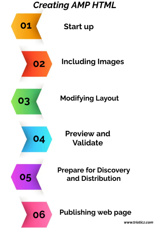
Creating AMP HTML
Start up: The document should start up with . The coding consists of top-level tags like and . The tags like are optional in HTML but here in AMP HTML these two are mandatory. will be the first child of tag and the second child is tag. This portion will let this webpage to access the JavaScript Library. The very next part of AMP HTML is to link the exact HTML version file if any of the HTML file should be linked with this as a support. If no HTML file is needed to support this then this file will point to itself. Then the head tag consists of animation properties, embedding any multimedia file. Certain format is followed for such embedding. The other important property is Schema.org defined on the head tag. Schema.org is not mandatory for AMP but still it helps in content distribution and will result well while surfing the internet.
Including Images: The method of including images in HTML is followed here also with small variation
Modifying Layout: The layout can be modified using CSS properties. The same is embedding in the tag. Every AMP page shall have only one embedded stylesheet with some restrictions and elements to have explicit size set from get-go.
Preview and Validate: Preview can be done as usual HTML file. To validate, the file can be opened directly in the browser using open menu. Sometimes XML Http request does not allow certain elements to work. The other way of validating this page is to use local web server like Apache 2 or Nginx. AMP HTML file is validated by opening it in the browser. Then the developer should add “#development=1” to the URL. Then open the Chrome Dev Tools console and after that validation errors are checked.
Prepare for Discovery and Distribution: In some situations both AMP and non-AMP versions of the same article is needed to avoid situational technical pull downs. To pair the non-AMP and AMP files together, tag in the section is used. This is done to share the non AMP information to AMP page and vice versa. If no non AMP file is available then the link should be given it the file itself named as canonical link.
Publishing web page: After testing the whole file, it should be published. This makes the file to view in the internet and become useful.
Conclusion:
Thus these are the simple methods to develop the websites. The technically stuffed employers of the Website Development Company in Coimbatore will know all these technical updates and are well versed in developing efficient websites. Small and strong techniques like AMP are gained by the developers of Web designing companies in Coimbatore. Hence, the web development companies in Coimbatore will produces many websites that are competitive all over the country.
Trioticz, one of the best Website Development Company in Chennai we will help you in building the best Accelerated Mobile Pages for your website. We are also here to support your business digitally you can definitely contact us for all your one business needs.
#Accelerated Mobile Pages#AMP#Fox News#HTML#JavaScript#Mobile Browser#Mobile Web Browsing#Web Design Company#Web Development Company#Web Pages
0 notes
Text
Optimizing Your Website for Mobile Search: A Comprehensive Guide

In today’s digital landscape, mobile devices account for more than half of all internet traffic. Optimizing your website for mobile search is not just a trend but a necessity to ensure accessibility, enhance user experience, and improve your search engine rankings. Here’s a step-by-step guide to effectively optimize your website for mobile search.
1. Implement Responsive Design
Why It Matters: Responsive design ensures that your website automatically adjusts its layout and content to fit various screen sizes and devices, providing a seamless user experience.
How to Achieve It:
Flexible Grids and Layouts: Use fluid grids that adapt to different screen widths.
Media Queries: Apply CSS media queries to adjust styles based on device characteristics.
Flexible Images: Ensure images scale appropriately without losing quality or affecting load times.
2. Enhance Mobile Page Speed
Why It Matters: Mobile users expect fast-loading pages. Slow load times can lead to higher bounce rates and lower search rankings.
How to Achieve It:
Optimize Images: Compress images using tools like TinyPNG or ImageOptim without compromising quality.
Minify CSS, JavaScript, and HTML: Remove unnecessary code to reduce file sizes.
Leverage Browser Caching: Enable caching to store static resources locally on users’ devices.
Use a Content Delivery Network (CDN): Distribute your content across multiple servers to decrease load times.
3. Ensure Mobile-Friendly Navigation
Why It Matters: Easy navigation is crucial for user experience on smaller screens. Complicated menus can frustrate users and deter them from exploring your site.
How to Achieve It:
Simplify Menus: Use hamburger menus or other collapsible menu styles to save space.
Clear Hierarchy: Organize content in a logical manner with clear categories and subcategories.
Clickable Elements: Ensure buttons and links are large enough to be easily tapped without accidental clicks.
4. Optimize Content for Mobile
Why It Matters: Readable and accessible content keeps users engaged and reduces bounce rates.
How to Achieve It:
Readable Font Sizes: Use fonts that are legible on small screens, typically 16px or larger.
Shorter Paragraphs: Break content into digestible chunks to enhance readability.
Bullet Points and Lists: Utilize lists to make information scannable.
Avoid Pop-Ups: Intrusive pop-ups can hinder user experience and may be penalized by search engines.
5. Utilize Mobile-Friendly Formats
Why It Matters: Certain content formats are more suited to mobile devices and can improve user engagement.
How to Achieve It:
Responsive Images and Videos: Ensure media adapts to different screen sizes without loss of quality.
Accelerated Mobile Pages (AMP): Implement AMP to create lightweight, fast-loading pages for mobile users.
Touch-Optimized Elements: Design interactive elements that are easy to use on touchscreens.
6. Optimize for Local Search
Why It Matters: Many mobile searches are location-based. Optimizing for local search can drive relevant traffic to your business.
How to Achieve It:
Google My Business: Claim and optimize your Google My Business listing with accurate information.
Local Keywords: Incorporate location-specific keywords into your content and meta tags.
Consistent NAP: Ensure your Name, Address, and Phone number are consistent across all online platforms.
7. Implement Structured Data
Why It Matters: Structured data helps search engines understand your content better, potentially leading to rich snippets in mobile search results.
How to Achieve It:
Schema Markup: Use schema.org vocabulary to annotate your content, such as articles, products, and reviews.
Validate Structured Data: Use Google’s Structured Data Testing Tool to ensure accuracy and compliance.
8. Conduct Mobile SEO Audits Regularly
Why It Matters: Regular audits help identify and fix issues that may hinder your mobile performance and search rankings.
How to Achieve It:
Use SEO Tools: Utilize tools like Google Search Console, Lighthouse, and SEMrush to assess mobile performance.
Check for Crawl Errors: Identify and resolve issues that prevent search engines from indexing your mobile site correctly.
Monitor Analytics: Track mobile user behavior using Google Analytics to understand and improve user engagement.
9. Optimize Meta Tags for Mobile
Why It Matters: Meta tags influence how your website appears in search results, affecting click-through rates.
How to Achieve It:
Title Tags: Keep them concise (50-60 characters) and include relevant keywords.
Meta Descriptions: Write compelling descriptions (150-160 characters) that encourage users to click.
Viewport Meta Tag: Ensure the viewport is set correctly to control layout on mobile browsers.
10. Prioritize HTTPS and Security
Why It Matters: Secure websites are trusted more by users and are favored by search engines in rankings.
How to Achieve It:
SSL Certificate: Implement HTTPS by obtaining and installing an SSL certificate.
Secure Data Transmission: Ensure all data is encrypted and securely transmitted between the user and server.
Regular Security Audits: Protect your site from vulnerabilities and maintain user trust.
Conclusion
Optimizing your website for mobile search is essential for reaching a broader audience, enhancing user experience, and improving your search engine rankings. By implementing responsive design, improving page speed, ensuring easy navigation, and following the steps outlined above, you can create a mobile-friendly website that meets both user expectations and search engine requirements.
1 note
·
View note
Text
Top Tools for Shopify Performance Optimization: Must-Have Apps and Plugins
Introduction
In the world of e-commerce, speed is crucial. Shopify store owners know that a slow-loading site can harm the user experience, hurt conversions, and even affect SEO rankings. However, optimizing Shopify site speed requires more than just reducing image sizes and simplifying code. It involves using the right tools and plugins to ensure your store performs at its best.
Whether you are just starting or managing an established Shopify store, Shopify performance optimization is key to staying competitive. In this article, we will introduce some of the best apps and tools to help you optimize your Shopify page speed, optimize website speed, and overall Shopify site speed optimization. Let's dive into the must-have tools for Shopify optimization services that will take your Shopify store’s performance to the next level.
1. Plug in Speed
When it comes to Shopify site speed optimization, Plug in Speed is an essential tool that every store owner should consider. It helps you identify and resolve performance issues with a single click, speeding up your Shopify store.
Key Features:
Automatically optimizes images for faster load times.
Helps you reduce code size, improving overall website performance.
Provides a real-time analysis of the store’s speed and what needs to be fixed.
This tool is user-friendly and works well for beginners who want to understand how to optimize website speed without requiring technical knowledge.
2. TinyIMG Image Optimizer
Images are often one of the largest factors affecting site speed. The TinyIMG Image Optimizer app is designed to reduce image size without compromising quality, ensuring your Shopify store loads faster.
Key Features:
Automatically compresses images to improve load times.
SEO-optimizes images for better ranking.
Offers a bulk optimization feature for faster performance on larger stores.
Optimizing images is a key aspect of Shopify page speed optimization, and TinyIMG is one of the best tools for this task.
3. Booster: SEO & Speed Optimizer
The Booster: SEO & Speed Optimizer is an all-in-one app designed to improve both SEO and performance optimization for Shopify stores. This app tackles many aspects of your site’s speed and search rankings, making it a comprehensive tool for online store optimization.
Key Features:
Combines SEO and site speed optimization into one easy-to-use platform.
Automatically compresses images, reduces JavaScript, and optimizes code to enhance load times.
Regular updates to ensure ongoing improvements to speed and performance.
For store owners looking to improve their Shopify site speed optimization while also boosting their SEO, Booster is an ideal choice.
4. PageSpeed Guru
One of the top apps for Shopify performance optimization, PageSpeed Guru provides an in-depth analysis of your store’s performance and offers actionable insights on how to improve your website’s speed.
Key Features:
Detailed speed reports, including recommendations to improve load times.
Helps you prioritize improvements based on the impact they have on performance.
Allows you to measure before and after results for continuous improvements.
PageSpeed Guru is perfect for those who want to take a more granular approach to Shopify optimization services and make data-driven decisions.
5. Shopify Speed Optimizer
The Shopify Speed Optimizer app focuses on improving the performance of your store by minimizing code bloat and ensuring faster load times across all devices.
Key Features:
Reduces unnecessary JavaScript and CSS files.
Helps you optimize liquid code, which is a key part of Shopify theme customization.
Ensures your site is mobile-optimized, which is essential for enhancing user experience.
Optimizing your code can have a huge impact on your store’s performance, making this app an excellent option for Shopify store owners looking to achieve Shopify page speed optimization.
6. AMP by Shop Sheriff
AMP (Accelerated Mobile Pages) is a technology that makes mobile pages load faster. The AMP by Shop Sheriff app integrates this technology with your Shopify store, ensuring that mobile users experience lightning-fast load times, which is crucial in today’s mobile-first world.
Key Features:
Converts your product pages to AMP versions for faster mobile performance.
Reduces page loading times for mobile users, improving the shopping experience.
Can lead to higher conversion rates and reduced bounce rates on mobile.
With mobile e-commerce on the rise, AMP by Shop Sheriff is a must-have for any store that wants to improve its Shopify performance optimization for mobile shoppers.
7. SEO Booster
If you’re serious about both SEO and site speed optimization, then SEO Booster is a great app to consider. It works to ensure your store is optimized for both speed and search engine rankings.
Key Features:
Offers image compression and lazy loading for faster page load times.
Automatically generates meta tags and alt texts for better SEO.
Reduces unneeded scripts to improve overall performance.
By using SEO Booster, you not only improve Shopify site speed optimization but also enhance your chances of ranking higher on Google.
8. GTM (Google Tag Manager)
For more advanced Shopify performance optimization, Google Tag Manager (GTM) helps manage and deploy marketing tags (like Google Analytics, Facebook Pixel) without slowing down your store.
Key Features:
Streamlines the process of managing tags without requiring code changes.
Ensures that tracking scripts do not negatively affect site performance.
Provides real-time data about your site’s performance, helping you make informed optimization decisions.
GTM is a powerful tool for Shopify store owners who want to balance performance with advanced tracking and marketing needs.
9. Yotpo: Reviews & UGC
While primarily focused on collecting user-generated content (UGC) and reviews, Yotpo also helps with Shopify performance optimization by allowing you to embed reviews and ratings on your product pages without slowing down your site.
Key Features:
Displays customer reviews and ratings in a manner that doesn’t impact page speed.
Improves trust and conversion rates, indirectly enhancing the overall performance of your Shopify store.
Increases social proof, encouraging more sales and better user engagement.
Although Yotpo’s primary focus is reviews, it also plays a role in Shopify site speed optimization by keeping the user experience intact while offering valuable content.
10. Shopify Analytics & Speed Test Tools
One of the best ways to gauge whether your optimization efforts are working is by using Shopify’s built-in analytics tools and third-party speed test tools like Google PageSpeed Insights or GTMetrix. These tools provide detailed feedback on the performance of your store and suggest areas for improvement.
Key Features:
Monitor page load times, bounce rates, and other key performance indicators (KPIs).
Use data to track the impact of your speed optimization efforts.
Identify performance bottlenecks and areas needing attention.
These tools can guide your Shopify performance optimization strategy and ensure you continue to improve over time.
Conclusion:
Optimizing your Shopify store’s performance is essential for improving user experience, boosting conversions, and enhancing your SEO. By leveraging the right tools and apps, you can ensure your store loads faster, runs smoother, and delivers a seamless shopping experience to customers.
Whether you’re focusing on Shopify site speed optimization, improving mobile performance, or enhancing SEO, the tools mentioned above provide a comprehensive suite of solutions. With the help of these must-have apps and plugins, Shopify store owners can achieve faster page load times, better performance, and increased customer satisfaction.
#how to optimize website speed#shopify site speed optimization#shopify performance optimization#shopify page speed optimization#shopify optimization services#meroxio
0 notes
Text
AMP: Hướng dẫn tối ưu di động cho website của bạn

AMP là gì? AMP (Accelerated Mobile Pages) là một dự án mã nguồn mở do Google khởi xướng nhằm cải thiện tốc độ tải trang trên các thiết bị di động. Công nghệ này cho phép các trang web tải nhanh hơn và cung cấp trải nghiệm tốt hơn cho người dùng, đặc biệt trong bối cảnh ngày càng nhiều người truy cập internet qua điện thoại di động.
AMP hoạt động bằng cách tối giản mã HTML và JavaScript, đồng thời sử dụng AMP Cache để lưu trữ và phân phối nội dung nhanh chóng. Điều này giúp trang web của bạn không chỉ nhanh hơn mà còn dễ dàng được Google ưu tiên hiển thị trên các kết quả tìm kiếm di động.
Lợi ích của AMP trong SEO
1. Tăng tốc độ tải trang
Điểm nổi bật: AMP loại bỏ các thành phần không cần thiết trên trang, giúp giảm thời gian tải xuống còn vài giây hoặc thậm chí mili giây.
Tác động đến SEO: Tốc độ tải trang là một yếu tố xếp hạng quan trọng của Google. Một trang tải nhanh sẽ được Google đánh giá cao hơn trong kết quả tìm kiếm.
2. Cải thiện trải nghiệm người dùng
Thực tế: 53% người dùng sẽ rời bỏ một trang nếu mất hơn 3 giây để tải.
Lợi ích của AMP: Giao diện tải nhanh và mượt mà giữ chân người dùng lâu hơn, giúp giảm tỷ lệ thoát trang và tăng thời gian trên trang.
3. Ưu tiên hiển thị trên Google
Điểm cộng: Các trang AMP thường được ưu tiên hiển thị trong mục "Top Stories" hoặc kết quả nổi bật.
Hiệu quả: Điều này tăng khả năng nhấp chuột và lưu lượng truy cập từ công cụ tìm kiếm.
4. Tiết kiệm băng thông
Lợi ích: AMP giảm dung lượng trang, giúp người dùng tiết kiệm dữ liệu di động. Điều này đặc biệt hữu ích ở những khu vực có kết nối internet yếu.
Kết quả: Trang web của bạn trở nên thân thiện hơn với người dùng toàn cầu.
5. Tăng tỷ lệ chuyển đổi
Thực tế: Các trang tải nhanh thường có tỷ lệ chuyển đổi cao hơn do giảm sự khó chịu của người dùng.
Kết quả: Doanh thu hoặc mục tiêu kinh doanh trực tuyến của bạn có thể được cải thiện đáng kể.
Cách triển khai AMP hiệu quả cho website của bạn
1. Kiểm tra tính tương thích của trang web
Trước khi triển khai AMP, hãy kiểm tra xem trang web của bạn có thể tương thích với công nghệ này hay không. Sử dụng các công cụ như:
Google AMP Validator
Google Search Console
2. Cài đặt AMP trên nền tảng CMS
Nếu bạn đang sử dụng CMS như WordPress, việc triển khai AMP khá đơn giản. Chỉ cần cài đặt các plugin như "AMP for WP" hoặc "Official AMP Plugin by Automattic".
3. Tối ưu hóa nội dung AMP
Sử dụng HTML AMP: Đảm bảo mã HTML của bạn tuân thủ các quy chuẩn của AMP.
Tránh JavaScript tùy chỉnh: Thay vào đó, sử dụng các thành phần AMP đã được định nghĩa sẵn như <amp-img>, <amp-video>.
Tối ưu hình ảnh: Sử dụng hình ảnh nén và định dạng phù hợp để giảm thời gian tải.
4. Kết hợp AMP với Analytics
Theo dõi hiệu suất của các trang AMP bằng cách tích hợp Google Analytics. Điều này giúp bạn hiểu rõ hơn về hành vi người dùng và tối ưu hóa chiến lược.
5. Thử nghiệm và tối ưu liên tục
Sử dụng các công cụ như PageSpeed Insights để kiểm tra hiệu suất.
Tinh chỉnh nội dung và thiết kế để đảm bảo tốc độ và trải nghiệm tốt nhất.
Những lưu ý khi triển khai AMP
Không phù hợp cho mọi loại trang web: Các trang web thương mại điện tử hoặc những trang cần nhiều tương tác có thể gặp khó khăn khi triển khai AMP.
Giảm khả năng tùy chỉnh giao diện: Do hạn chế về mã JavaScript và CSS, trang AMP có thể không đạt được thiết kế như mong muốn.
Yêu cầu bảo trì định kỳ: Cần đảm bảo các trang AMP luôn tuân thủ các tiêu chuẩn cập nhật của Google.
Tương lai của AMP trong SEO
Với sự gia tăng của tìm kiếm di động, AMP đang ngày càng trở thành một yếu tố quan trọng trong chiến lược SEO. Mặc dù không phải là giải pháp phù hợp cho mọi loại trang web, nhưng với các doanh nghiệp tập trung vào nội dung tin tức, blog, hoặc trang thông tin, AMP mang lại lợi ích đáng kể. Hãy cân nhắc áp dụng AMP nếu bạn muốn tăng tốc độ tải trang và cải thiện trải nghiệm người dùng.
Kết luận
AMP không chỉ là một công cụ, mà còn là một chiến lược toàn diện giúp tối ưu hóa hiệu suất trang web trên di động. Nếu bạn đang tìm cách cải thiện thứ hạng SEO, giảm tỷ lệ thoát và tăng lưu lượng truy cập, hãy triển khai AMP ngay hôm nay.
Bạn đã thử sử dụng AMP chưa? Hãy chia sẻ kinh nghiệm của bạn hoặc để lại câu hỏi nếu cần tư vấn thêm! 🌟
Công ty TNHH Lê Khang Digital Địa chỉ: 69/19/10 Đường 138, Tân Phú, TP Thủ Đức, TP Hồ Chí Minh. Điện thoại: 0906273102 Email: [email protected] Mã số thuế: 0317438032
0 notes
Text
How to Improve Your Website Speed for Better SEO Rankings
Improving your website speed is crucial for achieving better SEO rankings and ensuring a seamless user experience. Among the Top seo companies in pune, osumare.com stands out for providing expert guidance on optimizing website performance. A fast-loading website not only improves your rankings on search engines but also enhances user satisfaction, reducing bounce rates.
Why Website Speed Matters
Website speed plays a pivotal role in SEO. Search engines like Google prioritize websites that load quickly, as they aim to deliver the best experience to their users. If your website takes too long to load, visitors are likely to leave, which can hurt your rankings and overall credibility.
Key Factors Affecting Website Speed
Server Response Time: A slow server response can drastically affect your site’s loading time.
Image Optimization: Large, uncompressed images can slow down your website.
Browser Caching: Lack of caching mechanisms can lead to slower repeat visits.
Unoptimized Code: Bulky code and excessive scripts can delay page rendering.
Steps to Improve Website Speed
1. Optimize Images
Use tools to compress and resize images without compromising quality. Formats like WebP can also reduce file sizes significantly.
2. Use a Content Delivery Network (CDN)
A CDN distributes your website’s content across multiple servers, reducing load times for users across different locations.
3. Minify CSS, JavaScript, and HTML
Remove unnecessary characters and spaces from your code to make it leaner and faster to load.
4. Enable Browser Caching
Set up browser caching to store static files, allowing returning visitors to load your site faster.
5. Choose a Fast and Reliable Hosting Provider
Invest in a hosting plan that matches your website’s requirements. Top SEO companies in Pune, such as osumare.com, often recommend hosting providers that ensure optimal performance.
6. Implement Lazy Loading
Lazy loading ensures that images and videos load only when they come into the user’s viewport, reducing initial load time.
7. Use Accelerated Mobile Pages (AMP)
AMPs are lightweight pages designed to load quickly on mobile devices, improving both speed and SEO.
Tools to Analyze and Improve Website Speed
Google PageSpeed Insights: Provides suggestions to enhance website performance.
GTmetrix: Offers detailed insights and recommendations for speed optimization.
Pingdom Tools: Monitors your site’s speed and provides actionable reports.
Conclusion
Optimizing your website speed is a continuous process that requires regular monitoring and adjustments. By partnering with Top SEO companies in Pune like osumare.com, you can ensure your website is optimized for both speed and search engine performance. Implement the steps above to not only boost your rankings but also provide a better experience for your audience.
0 notes