#ALSO i started messing around w the pixel brush and i really like how it looks w these colors
Explore tagged Tumblr posts
Text

This isn't my art, (it's made by @ TheHearthFox over on Twitter) but I wanted to make a long post about why this work in particular speaks to me so goddamn much. I think such a massive part of the queer experience -- and also the furry experience -- is about the abstract. This can be seen in so many different aspects of furry "culture," from the concept of fursonas to kink and and other fetish content. You and I will never know what it's like to be a werewolf and transform under the full moon into the form of a big hulking furry beast. However, us furries create art and other works about the idea of it anyway. We never will be able to be our fursonas -- our often idealized and "perfect" versions of ourselves -- and part of that really hurts. It hurts so bad honestly, to the point where I can't quite put it into words. In terms of queer culture, I will never know what it is like to be a cis woman, and that also messes with me a lot. Yet, I'm still trans, my identity can change, I can perceive myself as whatever I damn well please. Identity allows you to shape yourself and the world around you in your own image, even if not everyone can see its beauty.
We have ways to get at least somewhat close to how we feel in our abstraction. VRChat allows you to make an avatar of what ever you want, whether it's your fursona or just an ideal version of you. Hell, it doesn't even have to be you, it could be anyone or anything really. We have a whole industry based around creating big ass costumes that allow people to at least look something like their desired character. But it's not enough. It's never enough. I ain't religious, but sometimes I feel like I've bitten the apple, been kicked out of the garden, and now I'm left to fend for myself with an identity that my physicality will never match. When I made my fursona using an avatar base in vrchat and configured it to match my real world body scales and looked down, I honestly started crying. I take the headset off, and I'm still me. Everyone takes the headset or fursuit off and they're still the body they were given, not what they would choose. Our reality is objective, and there's no way to really change that. We can act like animal people online all day, but the moment that screen shuts off, the moment we walk away, that warm, fuzzy feeling (hehe) fades.
To think abstract is to think beyond what you can normally sense. You will never get to brush the knots out of your fur in the morning, or play with your antennae while anxious (I see you bug people). We can still have those ideas, however. I know I'm on the third goddamn paragraph and I'm just now talking about the artwork I linked but this is an important concept to me. Usually, when I think of the abstract, it feels unreal, "fuzzy" so to speak. However, in HearthFox's piece, the objective reality appears out of focus and pixelated. It feels like even if we are unable to fully embrace the abstract, we can still embrace what we can of it, and bring some sort of color to a world that doesn't feel like it is made for us. The colors being outside of the lines could suggest that our abstract perception is maybe just "painted on" to the world around us, but is that a bad thing? Is it bad to take things in from the world around you, but still look at it all in your own unique way? I think not. This also isn't only about therian identity, or furry identity, or even queer identity -- it's also about neurodivergence. You are never in the wrong for thinking about the world in a way that is viewed as "non-standard" by the rest of the world. If you see yourself as a wolf, bee, fox, bear, raccoon, a fucking plane, it's not a bad thing. We can still identify however we want, and this modern way of looking at identity is the best way for us to embrace the abstract.
Go wild, go fucking stupid. Love yourself, if you're a fox, be a fox, there are ways you can feel that way, even if it's not all of the time. We can fight, we can love, we can still find ways to elation, even if sometimes existence itself feels wrong to you. This work is but one side of abstract thinking. Look at the color the fox has compared to the objective. Look how the fur drapes, how it runs down the body, or how the snout expresses emotion. Sometimes it feels melancholic, but you cannot tell me that trying your absolute damnedest to live your identity doesn't at least bring some color to your otherwise dreary and unfocused world.
Stay safe, love yourself no matter what.
528 notes
·
View notes
Text
Character Illustration: Class 1 Homework
I decided that since I had the day off on Wednesday I would make another illustration. I chose to re illustrate a drawing I had previous done on procreate.
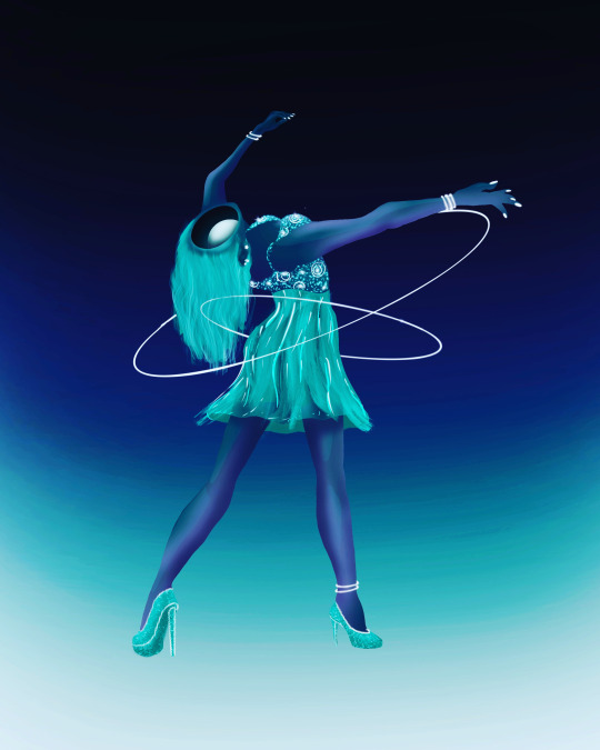
I plan to simplify it slightly as I have never drawn on PhotoShop before this week so I can't expect the same level of detail.
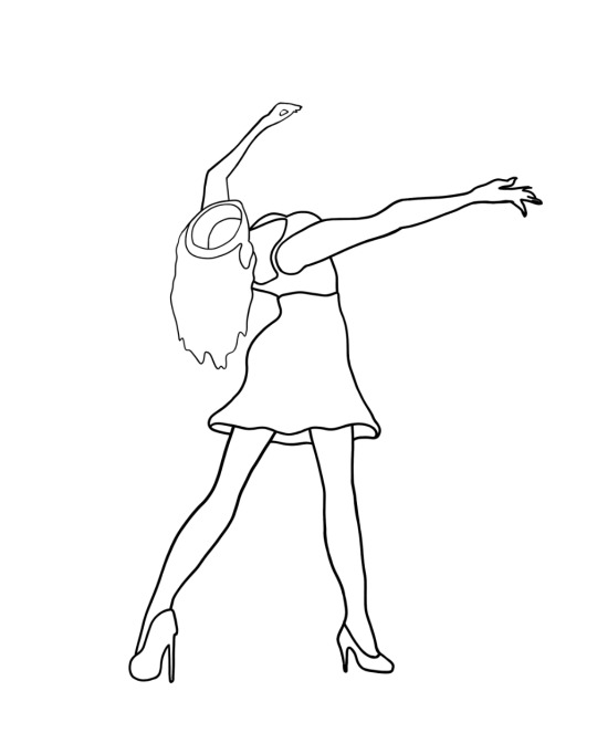
I started by creating the outline of the lady. I decided I wanted to use the brush tool again rather than the pen tool. I really want to get better at using the wacom tablet and I think this will be good practice. It was quite difficult to get a lot of the lines as some of them were very curvy. It was hard to stay on track while also keeping my hand steady and the line smooth. This was the outline I ended up with. I didn't mean to but when I was tracing the shape of her hair, face and left arm, I didn't press as hard so the lines are a bit thinner. It is annoying but it shouldn't matter massively one I add colour.
I then added a greyscale so I could see where I wanted the light to hit and what the illustration would look like in terms of shadows. I added the grey by using the magic wand tool (W). I clicked the area I wanted to change the colour of and this selected the section. I then chose the grey tone that I wanted in the colour palette before clicking option + delete to fill the selected area.
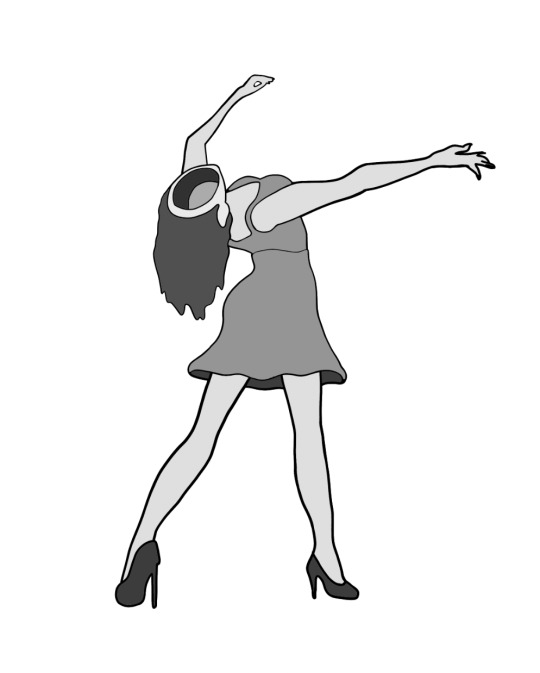
When I originally selected the sections, the selection only goes to the inside edge of the black outline so a small white edge is kept around the grey. To erase this I needed to expand the selection before colouring it. So after using the magic wand tool, I clicked Select, Modify, and then expand. I could choose how many pixels I wanted to explain the selected area by. I went with a value around 5 pixels.
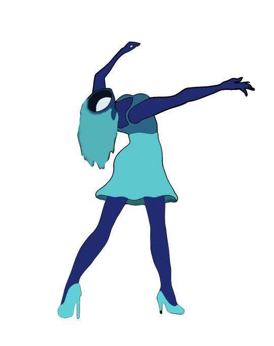
I then moved on to adding base colours instead of the grey. I used the eyedropper tool to sample colours from the original drawing. I followed the same steps as adding the grey tones but instead chose a colour.
I then moved on to adding shading to the figure. This was definitely the most difficult part of the illustration. It took a lot of time to get use to the brush tool in terms of shading. I used the first brush tool and played around with the size and opacity of the brush. I used a lot of layers so I could shade each section differently and not have to worry about messing up the other sections. I did find that the longer I coloured in the figure it became easier to control and I developed a system of doing a rough base before making my brush smaller and fixing some details. Once I was done, I combined all of the layers.
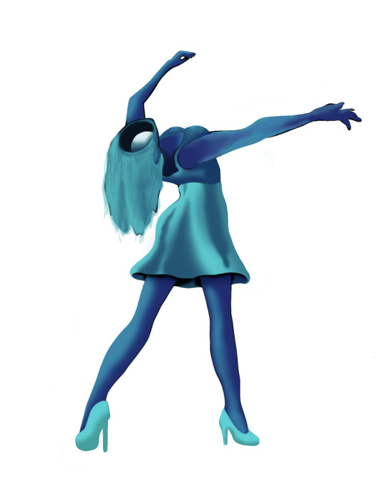
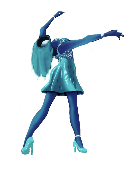
I then moved on to adding the highlights on the top, skirt and heels. For this I tried out a few different brushes. I found there was one that was really good for making the stars on the top. I used the second solid brush for the rest and just drew on the features roughly.
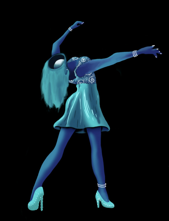
I then added a black background so that the colours would really stand out.
0 notes
Text
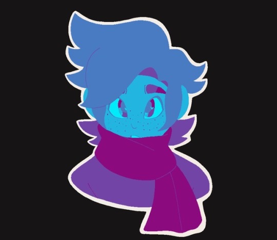
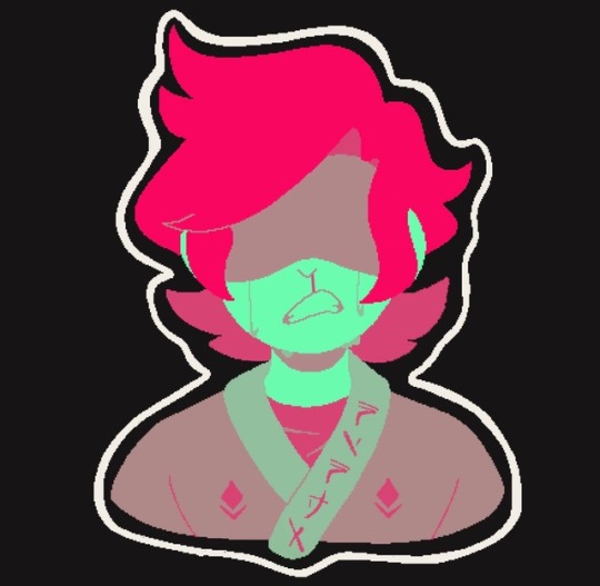
i started messing around w some palettes and it is HARD to just use five colors wow
#motormouth#ninjago#ninjago fanart#lloyd garmadon#jay walker#i use like seven colors just on eyes alone on my usual drawings#anyways this is fun and i might do more of them#ALSO i started messing around w the pixel brush and i really like how it looks w these colors#reminds me of old gameboy stuff w like a limited color palette u know ?#my carpel tunnel kicked in while i was doing the jay one and by the time i finished lloyd i felt like my wrist was gonna fall off#so i think im gonna take a lil break LMAO#o why cant i post a read more on mobile anymore um excuse me#i wanted to add my jay thumbnails ???#eugh thanks tumblr
51 notes
·
View notes
Text
gif cut-out tutorial
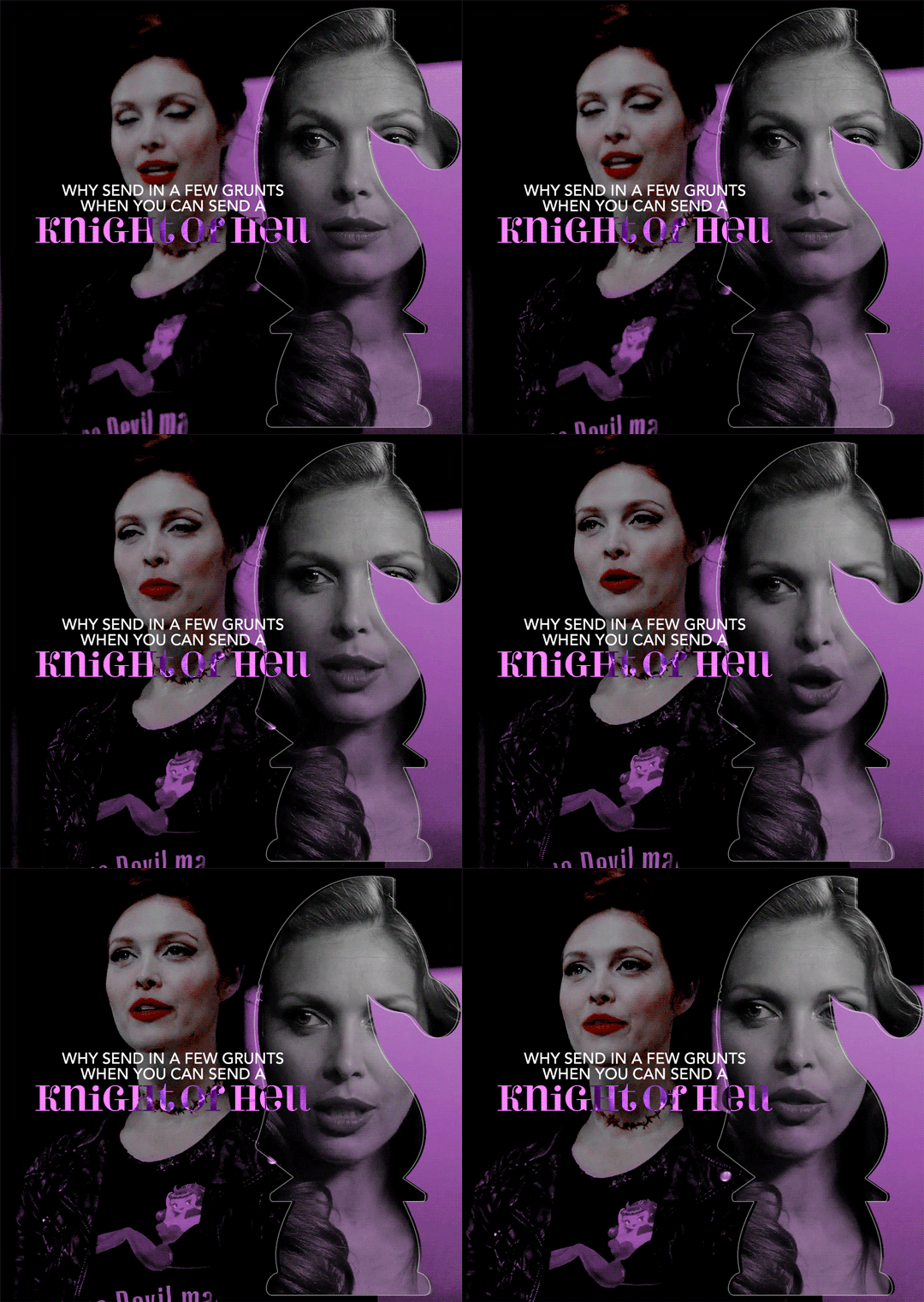
ok ok so @subtledean requested a tutorial on how to do stuff like this post with the gif cutouts and the text effects. hopefully this helps aria ;w; i’m not the best at explaining things but i included some screencaps for clarity. i’ve tried to compress all the sample gifs and screenshots down to under 3mb to avoid tunglr compression on mobile so if they look a little different from the actual gifset, that’s probably why!
what you’ll need:
photoshop, i’m using PS 2021 but any version of photoshop will work out
a basic knowledge of gif-making (i’m assuming you already know how to make a gif and color it).
step 0: storyboard
this isn’t strictly necessary but i HIGHLY HIGHLY recommend it. you don’t have to do any photoshopping this first step, but it’s really important to check out your footage and the shots you have gathered to see what works, especially if you’re trying to combine three or more gifs onto the same canvas. like literally take a piece of paper and draw out where you want the character’s faces to be, where you want the cutouts to be in relation to their faces, and think about whether or not there’s enough empty space to the right or left of characters heads for a cutout to be placed. is there too much movement that would be distracting or messy in an already busy gif?
things like that really help, and it also makes you double check on your footage quality and feasibility. if you end up making a gif where you want one character’s face to be on the left side of the gif but it turns out there’s not enough empty space on the right side of their face to place a cutout and you then have to hunt for new footage or start all over, it’s kind of a trainwreck and you just waste another hour of your time as you deepen your procrastination hellhole. that’s not a real story—
step 1: make the base gif
i’m assuming you know how to color it already. and aria i KNOW you know how to color already so :) size it accordingly to your desired dimensions.
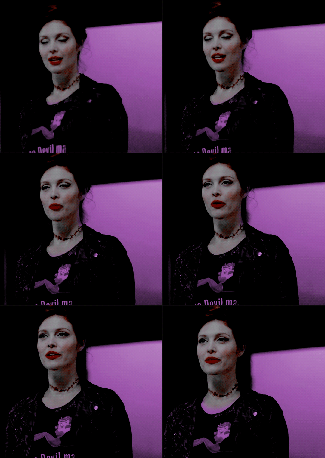
as you can see, i left enough space on the right side of abaddon for the knight cutout to be placed.
save this as a .psd file. you don’t actually have to sharpen and do everything that comes at the end of making a gif right away, but make sure your layers are clearly labeled. do NOT convert to video timeline/smart object just yet.
step 2: make the cutout gif
this is critical: make absolutely certain your cutout gif has the same number of frames as your base gif. otherwise it could get really messy! abaddon has 20 frames, so the cutout will also have 20 frames. again, do not convert the cutout gif to a video timeline/smart object. just keep it as a frame animation. here’s my cutout gif. it’s just a simple b&w gif but i added a touch of purple for color consistency sake whatnot.
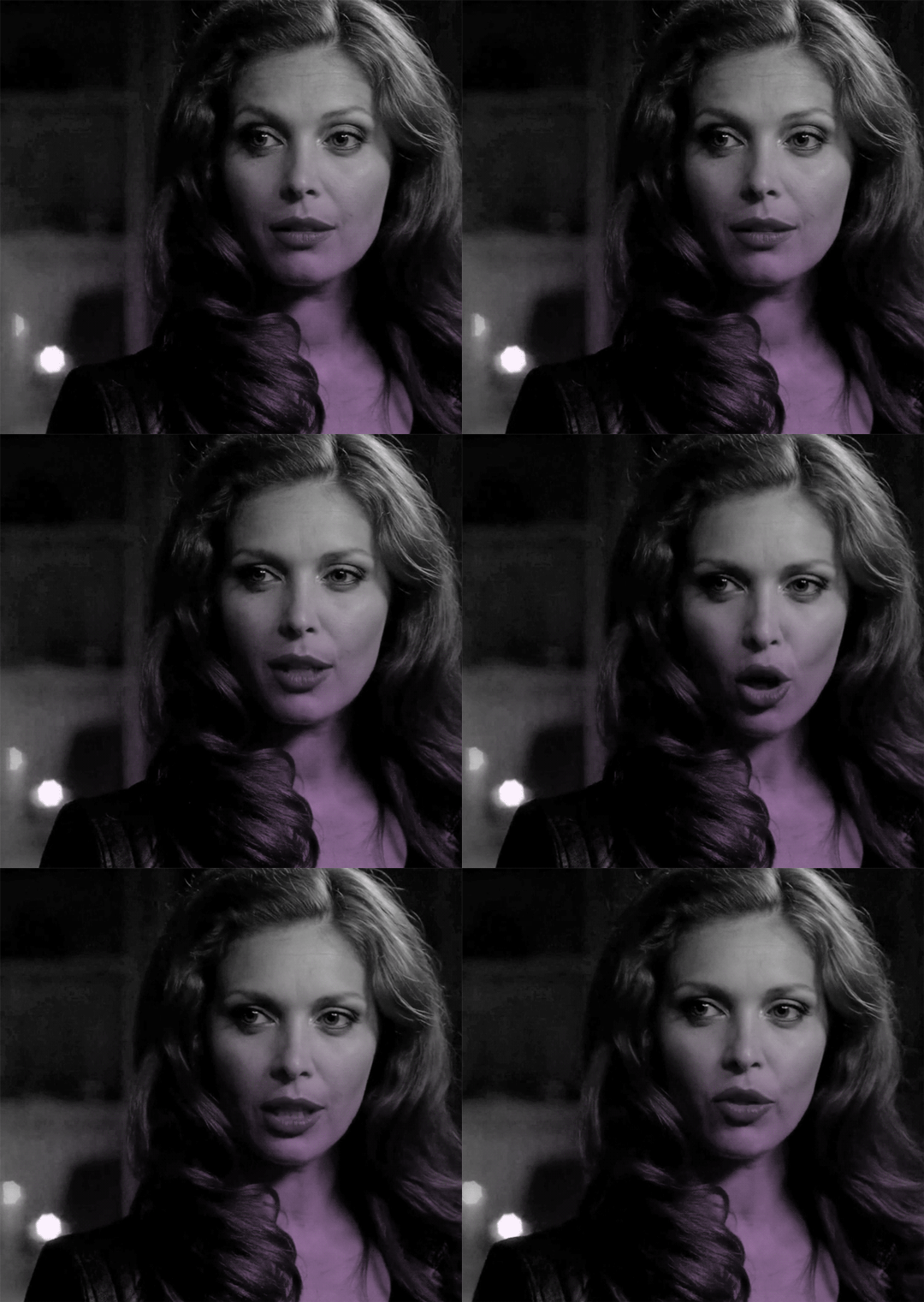
now for this particular gif i’ve actually cropped abaddon to be roughly exactly where i would want her face to be in relation to the first gif, but that is unnecessary. helpful, but unnecessary. you do NOT need the cutout gif to be cropped exactly perfect in order to make this work.
step 3: combining the two gifs
there are many different ways to combine two gifs onto the same canvas. some people like to do it via video timeline. i prefer to do it by frames and convert everything to a video timeline only at the end (it’s just a personal preference). here’s a tutorial if you prefer working with timelines, but i’m gonna go over how to do it by frames.
first group everything in your base gif into one folder. then group everything in your cutout gif into one folder as well. you can name them however you want to keep track of things.
then, select all of the frames in your cutout gif. in this case, all 20 of b&w abaddon get selected. make sure its not just frames 4-20 or whatever, but all the frames you made. you can click frame one and then shift-click your last frame to double check.
click the timeline tab group options bar and then go to options > copy frames
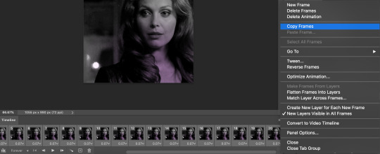
now go to your base gif canvas. select ALL the frames of your base gif as well (it’s critical that all of them are selected).
now do options > paste frames.
a popup should appear and you’re going to select the “paste over selection” option. do not link layers.
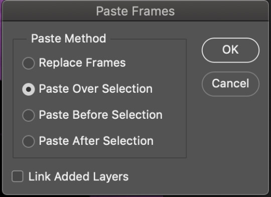
your cutout gif should now be completely or partially obscuring your base gif. however, now you should see two groups on your sidebar of layers. one for the base, one group for the cutout. if you labelled them with names you can tell which one is which.
step 4: creating the cutout
in order to create the cutout, we use my favorite thing in the whole world of photoshop. layer masks.
to make a layer mask, you simply select a layer or group you want to mask and then click this little icon on the row of icons at the bottom of your layers panel.
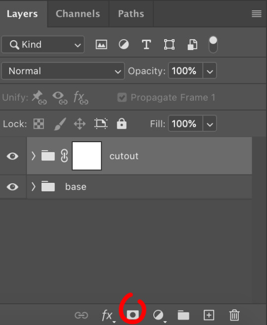
white on a layer mask means whatever group or layer is getting masked is completely visible. black on a layer mask means that the group or layer is invisible. if there is 50% gray on a layer mask, then its 50% visible. so on and so forth.
i love these so much i abuse them on the daily. i’ve made a few gifs where i’ve masked every frame one by one because i wanted to get some cool effects. admitting that kind of embarrasses me but oh well.
anyway this is simple though. just find a picture or an outline of a knight. i used these boyes:
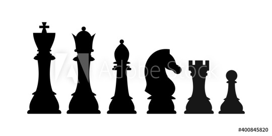
obviously i cropped out the knight of the bunch, got rid of the watermark, and then i placed it on the canvas where i wanted it to go.
select the interior of the knight with the magic wand tool. should be pretty simple since it’s all black.
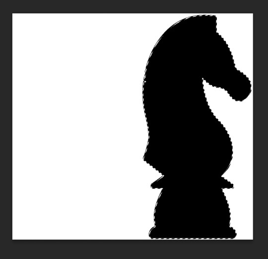
now click over to your layer mask. make sure you have selected the mask and not the group. you can tell you have selected the mask when a little white rectangle pops up on it.
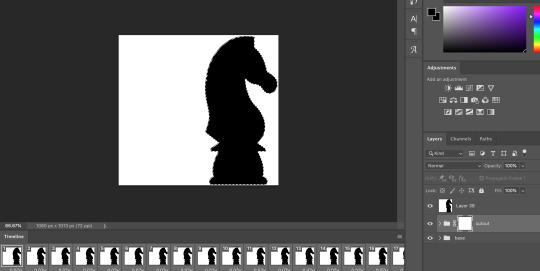
when you know you have the mask selected, click command+i or control+i to invert. if for some reason you do not have this keyboard shortcut, just take a brush tool and color over the area in complete black. as long as the magic wand tool is still selecting just the interior of the knight, it should be fine.
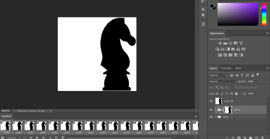
now once again, black means a layer will NOT be showing, white means a layer will be showing. so right now after i disable the visibility of the top layer we used as a reference for the silhouette, it looks like:
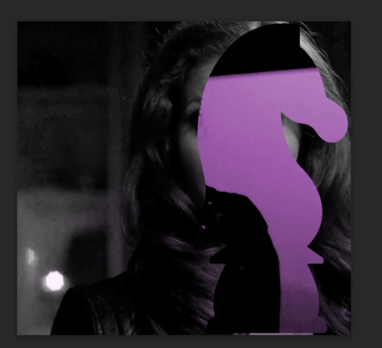
do not fear the clownery. layer masks are great because they are always non-destructive. meaning that even if you somehow mess up and your canvas is showing something completely gross, you can always go back and edit your layer mask and your original gif would be unharmed as long as you did not touch any layers in the group, only the mask. simply invert the mask (again, make sure your mask is selected and then command+i or image > adjustments > invert) to get:
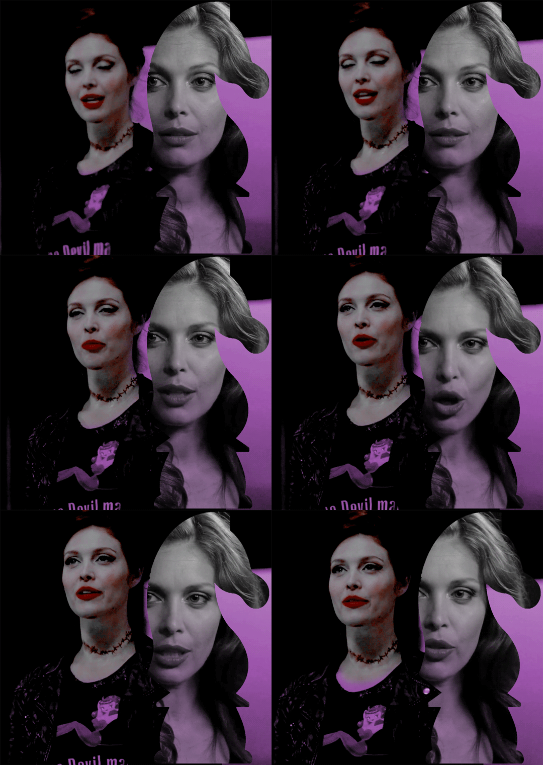
for a layer mask that looks like:
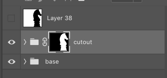
you could have also just made a black layer mask to begin with and then inverted the knight outline to be white. many different ways to do the same thing.
another tip: if you select your outline and then click layer mask upon a group or layer with no mask at the current moment, it will automatically make a layer mask with your selection as white and the unselected pixels as black. this is normally how i do my cutouts, because it’s a time-saver even if it like. saves a few seconds max. but i typed out the above for explanation and clarity, so hopefully i didn’t just make anyone more confused.
anyway.
now say you don’t like where the cutout abaddon is positioned. layer masks can also be linked or unlinked, depending on the little link icon you see between the group and the layer mask in the image above. if the icon is visible, the layer mask and the group are linked. if you cannot see the link icon, they are unlinked.
linked layer masks will move in conjunction with the group if any type of transform is done upon them. if the group moves, the layer mask also moves. but if a layer mask is unlinked, you can move the mask and the group independently of one another. for instance, i can change where the cutout is located on the overall canvas of the gif by simply moving ONLY the layer mask (and thereby changing where the blacks and whites of the layer mask occlude the cutout gif contents). but i can also transform the cutout gif layers without changing where the overall outline is located relative to the canvas itself. basically, i can transform the interior contents of the cutout independently. so here (make sure all of your frames are selected):

group unlinked. i’m also making sure that now i am selecting the GROUP (ie. the frames of the layers you are actually going to move) and not the layer mask. you can tell because the little white rectangle around the layer mask can no longer be seen.
now i can transform/adjust the contents of the cutout solely “within” the cutout, and i don’t have to worry about changing where the cutout is located in relation to the overall gif. when transforming, make sure all the frames of your gif are selected. like select the whole group and not just an individual layer, basically.
i’ve seen a lot of how to combine and cut out gifs tutorials on this website, and here is a really good one that i know sully also used <3 big shoutout to all the photoshop queens being inspired by each other!! however i haven’t seen anything that mentioned the linked vs. unlinked layer masks, which i really feel like deserves a shoutout. you don’t have to crop your gifs out perfectly every time, you can always adjust them later. for demonstration, i’ve positioned abaddon in a few different positions with an unlinked layer mask.
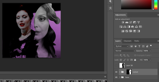
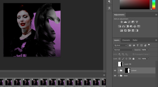
step 5: creating the outline
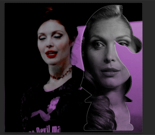
so in order to emphasize the shape of the cutout (the knight), i simply delete the white space surrounding the picture of the knight in the original silhouette that i used. magic wand tool + delete. you can also make a new layer, then paint bucket tool it. many ways to do the same thing.
now with only the knight on a transparent background, i double click the layer to pull up the effects. select outer glow. i used these settings:
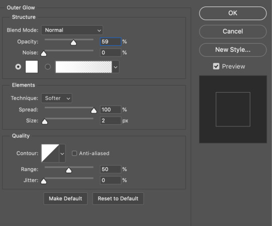
when you are doing this, make sure you are on frame one of the frame animation and the “propagate frame one setting” is selected, otherwise you might end up only applying the effect to one out of your many frames, which blows.
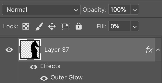
then i go change the fill setting to 0%, BUT i leave opacity at 100%. fill is basically like opacity, but it doesn’t affect layer effects (whereas opacity does). so you basically get only the outline but not the black. you can also set the blending mode of the layer to screen and get the same effect, etc, etc. feel free to adjust however you see fit, in addition to the outer glow settings.
i move this layer over a couple pixels to give it the little offset effect, but you don’t have to.
step 6: adding the text
okay the two fonts i used are avenir and perla. i think a LOT of gifmakers use them because they’re really pretty.
i make TWO different text layers, one with avenir in a smaller size and one with perla in a bigger size. this is because for the perla one, i’m going to be changing the blending mode whereas i don’t want to be changing the blending mode for the smaller text. i position the text where i want it to be and make sure the perla font is in the color i like:
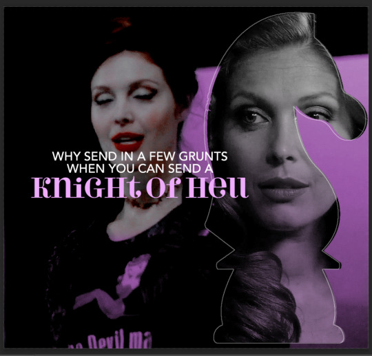
then i change the blending mode of the fancy text (perla) to difference. ONLY that layer, and again make sure to check “propagate frame 1″ and make changes on the first frame to apply the change to all of your frames.

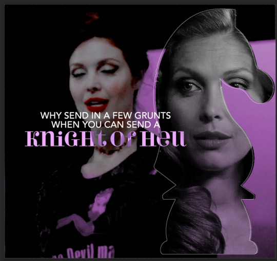
but i still don’t think it produces enough of a difference. so i right click on the text layer for knights of hell, and then go to: select pixels.
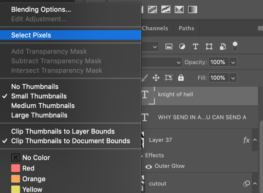
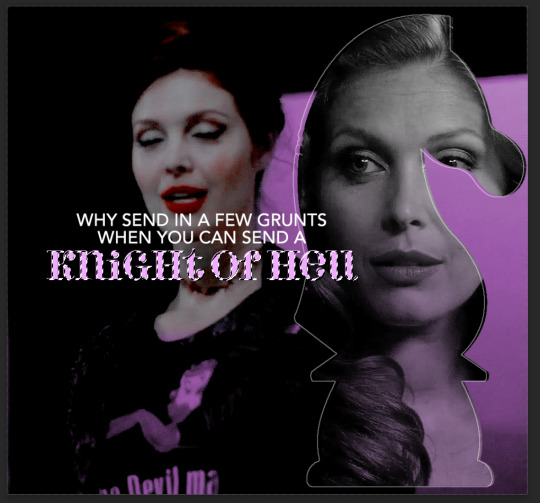
then i click the curves adjustment layer. this will automatically make a curves layer with a layer mask that occludes everything BUT the area you selected. beautiful. i drag the curves around until i get enough of a difference that i like. normally i make the lights lighter and the darks darker. yeehaw.

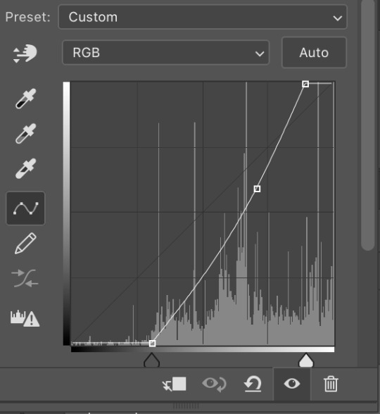
again there are sooooo many different ways to achieve the same effect on photoshop. this is just want comes easiest to me, and it’s totally okay if you find a different way that works better for you at producing the contrast you want or the colors you want.
step 7: export and cry
NOW you can convert everything to a video timeline, put your video frame layers to smart objects, and then apply your finishing sharpening filters. export, cry, and hope tumblr compression doesn’t screw you over.
hopefully this was helpful! pls like... idk support my edits if you found this helpful or reblog this post. feel free to dm me about how u do some of the text effects as well bc i’m always trying to learn new things and i am by no means an expert on like. any of this.
aria please go write your fucking thesis before i delete this entire tutorial challenge. :D
#subtledean#THIS IS FOR YOU#I FEEL LIKE THIS TUTORIAL HAS MORE WORDS THAN UR THESIS ATM SO!!!#tutorials#mine#idk what to tag this but PLS pls pls feel free to talk to me abt ph*toshop#or ask for help or point me towards other tutorials <3#shoutout to sully too its in there somewhere#resources#100n#ps
190 notes
·
View notes
Note
i love ur colored panels so much and im considering taking it up myself 🧍🏻do u have any advice or anything :000
AUGH thank u sm🥺🥺🥺 I do all mine on ibis so like my advice might be dif than how it would be on other art programs but!
50% opacity on your shading layers (PLEASE separate the shading and base colors omg you will regret it if you don't) and use a blur tool also at 50 % (altho I do sometimes blur more or less depending, and same w layer opacity but that's normally what i do)
If you are struggling w a color palette, coolors.co will be ur best friend forever, it even has hex codes and stuff! I try and keep my color palette on the panel (altho I normally ajdjfj forget if I'm not doing one from this site but it's a godsend for blushing and stuff!)
If ur doing a chapter cover, go to the file page on the Jojo wiki and find the highest quality one! You can also like def do normal panels that way but I normally have multiple scans I check to get the best quality (I find the shonen jump app is normally the highest quality ones? Esp w smaller panels!)
Big big one (esp bc I struggle w shading), but having the official colors pulled up, it can help a lot, esp if you're staring at an area and have NO idea what the section is!
I uh? Overuse layers a lot (the foolymes one was like 50 layers before I merged) but I keep each color on a different layer so I can rly easily adjust it if I don't like it (I believe you can do this all on the same layer and select w medibang but this is what I do w ibis!) And then merge when I've finished literally everything
I normally just like use my default brush (in ibis it's Dip pen (hard)) to color and sometimes with shading I'll use a watercolor or pastel brush although I normally use the same brush for everything!
For like eyeshines and details that are painted black (ie the baseball threads on the foolymes one were black) you just add a layer on top of your panel and color over so if it messes up you can really really easily just erase it and it doesn't ruin progress!
Also for face shading I normally look at makeup contour guides! It helps to know where exactly everything goes!
Also def start w smaller panels! The chapter covers can get rly rly long and maybe a bit overwhelming so like finding a panel that's just like a face can make it a lot easier (at least from experience!)
Oh also w face shading I normally have it layered with the bottom layer being the shading, middle layer being highlight, and top being blush! I color pick from the base skin and adjust until it works right but it's also def some trial and error! I also like don't blend those layers until they're all down just to make sure I have stuff in the right place!
I don't have a like particular method to coloring overall other than I normally save the big areas for last so I can have a layer underneath and just hit it with a big brush and not have to worry about going around a million things! (I normally use the felt tip pen (hard) brush for this as it goes up to 1000 pixels!)
Shading legit is soooo important tho, like flat colors can def look good (and I do always pass my flats to a friend to make sure the colors work before I start shading, it helps to have a second pair of eyes esp when you've been working on SMTH for so long) but shading adds so much dimension and highlighting can be so so so good too! I think it just like depends on what you're going for but shading is so helpful in the long-run esp when i get the hang of it!
12 notes
·
View notes
Text
The Boyfriend Phenomenon
The Boyfriend Phenomenon states when a girl starts dating a boy who emphasizes all the best and attractive qualities about her, other males start to take notice of her attractiveness as well.
When Marinette hurried her way to school, the last thing she expected to see was Luka Couffaine himself. He was leaning against the wall right next to the doors with his eyes closed, seemingly meditating. Marinette couldn’t help the little giggle that escaped her. The second time they met was much like the first. But when she saw those teal eyes open and focus on her, her heart immediately did summersaults.
“Hey Marinette,” the guitarist greeted her with a boyish smile.
The young designer blushed and shifted on one foot. “H-h-hey Luka! How’s day going? I-I mean how hanging? No, I mean! …Hi.”
Luka smiled and chuckled softly. “Funny as always.” Marinette’s blush darkened with the compliment. “So listen, I got these tickets to the next Jagged Stone concert happening at the Eiffel Tower this Saturday.” He dipped his hand into the back pocket of his ripped jeans and pulled out two tickets, each decorated with the Rock Giant Logo on them. “I was wondering if you wanted to go with me? Like a date?”
In that moment all the blood rushed to Marinette’s face that she was worried all the pressure would make her head pop. But she quickly shook herself out of her shock in fear that her silence would be taken as a rejection. The blunette rapidly nodded her head—she tried to play it down some so she wouldn’t look like a bobblehead—and took one of the tickets. “Y-yeah! Amazing that sound! I m-mean, that sounds amazing! I’d love to do you! GO! I’d love to go with you!”
“Awesome, so it’s a date,” Luka romantically said, taking Marinette’s delicate hand and pulling it up to his lips and then placing a gentle kiss on the back of it. “I’ll come by your house around 6. Sound good?”
“Sounds great…” Marinette dreamily replied, the soft pink on her cheeks still present.
“See you then,” the blue-haired boy said and walked away, giving what Marinette could swear was a smoldering gaze before disappearing from sight.
Marinette smiled softly down at the ticket and held it to her chest for a moment. Then she put in it her pocket and sped off to class. Meanwhile, neither of them noticed the young blonde not too far away from the scene. He was scratching at his chest like there was an itch he couldn’t get rid of or a pain he couldn’t soothe.
Marinette nervously played with her pigtails when Luka and his mom came around to get her Saturday evening. She smiled when she saw the van that Anarka Couffaine loved to steer almost as much as her house boat. It was definitely a creative mess, with Victory spray-painted across the left side of the vehicle in a curly font that gave off a very pirate vibe. From Juleka’s stories, she helped paint the scenery of the ocean that was on the van too. And just like the outside, the inside screamed Anarka. There weren’t any food scraps or anything like that, but there were old drawings, random toys from Juleka’s younger days, and even Luka’s skateboard lounging on the front passenger seat.
Marinette shot up, almost hitting her head on the ceiling, when Luka’s fingers brushed against hers not long after she laid her hand between them on the car seat. She slowly relaxed and moved her hand closer. Maybe…this wasn’t so bad. Maybe what she said about her and Adrien being like compass and statue was true. She wasn’t the one who drove Adrien crazy in the way she wanted to. He saw her as a friend. But Luka…Luka obviously showed interest. Otherwise he wouldn’t have asked her out to this concert…right? Perhaps it was time the compass pointed in a new direction…
When they got to the Eiffel Tower, Marinette was confused when Luka passed so many rows of seats, his hand holding her as he guided to the very front. The young designer gawked and double-checked her ticket only for her jaw to fall in shock. How the heck did Luka score front row seats?! And yet, there they were, hand in hand, as Jagged Stone entered the stage with the smoke machine blasting to make the entrance grander. Marinette relaxed with a smile, getting pumped up from listening to Jagged Stone’s music from up close. Yes, she experienced it once with all her friends after dealing with Pixelator but reminding herself that this was a date made the experience feel newer. She peeked at the blue-haired boy from under her eyelashes and gasped when she saw he was looking at her with an intense expression.
“I really like you Marinette!” Luka yelled over the rock music. “Will you go out with me?”
“I-I thought that’s w-what this was!” Marinette yelled back, blushing crimson.
Luka chuckled with a hand to his mouth and shook his head. “I meant on more dates!”
Marinette smiled softly, the resolve she previous made clear. It was time to put her feelings for Adrien on the backburner and be the friend to him that he could lean on. “I’d love to! This was the best date I’ve ever been on!” Well, okay, the Evillustrator was more like a fake date and the movies with Adrien that one time was more hiding out than a date since he didn’t invite her. So there weren’t many date to compare to, thus the bar not being set very high…until now.
When the concert ended, and Mrs. Anarka drove them back to the Dupain-Cheng Bakery, Luka opened the door for Marinette and helped her out of the van. He smiled as she looped her arm around his when he offered it and led her to the door.
“I had a fun time,” the guitarist suddenly said.
“Y-yeah, me too,” Marinette stuttered, tucking a loose strand of hair behind her ear with a shy smile.
“I wanted to ask again before I left.” Luka took Marinette’s hands in his and stared into her bluebell eyes. “Will you be my girlfriend, Marinette?”
“M-m-me?!” Marinette’s face turned the reddest shade it has ever been as she heard those five very important words. Honestly, she always thought she’d be hearing them from Adrien’s mouth. She was so in shock that she blurted out the dumbest thing that popped into her head. “Why?”
“You’re an amazing girl, Marinette. You’re unbelievably brave. You alerted Ladybug when we were captured by Captain Hardrock; you basically saved us. You’re also funny. And you’re beautiful, especially when you’re blushing like right now. So…what do you say Marinette?”
The young designer’s eyes pricked with tears. But Luka didn’t think he upset her based on the happy grin that spread across her lips. No one besides Alya and her parents ever told her these things. But this was a situation of romantic interest. She hadn’t known Luka for very long, but he had seen all her best qualities in that small window of time, and he was attracted to them.
“Yes,” Marinette answered, her tears never falling as Luka wiped them away with his thumb.
Adrien thought he was sick at first. His heart was beating faster than normal and his head was starting it hurt. It all started when he saw Marinette talking to Luka, which his hand holding hers. Adrien had only met Luka once, but he was pretty cool. So why did it feel like both his brain and heart were gonna explode because Luka was in so close a proximity to his pigtailed friend? It only got worse when the blue-haired guitarist planted a kiss on the back on Marinette’s hand and she blushed. That was a Chat Noir thing! Only Chat could kiss Marinette’s hand! The blonde scratched at his chest, feeling a burning sensation bubble up. He itched at it, hoping it would disappear, but it didn’t.
The burning only escalated in the time leading up to the weekend. Marinette had a lost in thought expression on her face as she doodled in her notebook. The blush he saw on her face would return whenever Luka came around for Juleka or to say hi to everyone, especially Marinette. Over the weekend, Adrien had a sense of restlessness wash over him unlike anything he ever felt before. For whatever reason, Marinette kept popping to the forefront of his mind. Was he concerned about her? Why? It was just Luka… Just Luka… Adrien suddenly jerked his leg forward in a kicking motion but ended up stubbing his toe against the wall and biting back the yelp of pain. What the heck was going on with him?
Marinette was a smart girl; and sweet, and funny, and a natural born leader. The young model shook his head. The point he was so vehemently tried to make to himself was that Marinette has proven herself to be a good judge of character and would always be nice to anyone who was equally nice back. He shouldn’t let her interacting with Luka get to him like it was. To let out his unknown frustration, Adrien ended up doing anything to relieve aggression; slamming his fingers against the piano keys to create a dark tone that very much contrasted his sunshine personality, wadding up piece of paper and shooting them into the trash can, and furiously playing foosball against himself. The weekend couldn’t be over sooner.
Monday morning was the worst day of them all. He had arrived the school on time, the itch in his chest still present but he had grown a little numb to it. He greeted Nino at the stairs as per usual and the two walked into the main area. Class wasn’t beginning for another 20 minutes, so the two friends decided to hang out on the steps.
Suddenly, Adrien heard a familiar giggle that had his head shooting up and searching around the room. Nino didn’t seem to notice as he was looking down and browsing the music on his phone. The blonde’s lips turned up into a smile as he spotted the familiar pigtails bouncing as the girl attached to them giggled at something. The world seemed a little brighter, that beam of light highlighting Marinette like she was an angel sent from above. But that glorious feeling immediately plummeted to the Earth’s core as she saw who she was giggling with; the infamous Luka Couffaine. What made it even worse was Marinette had her arm looped around Luka’s as the two smiled at each other. The horror-ridden cherry on top of the nightmare sundae was when Luka leaned down and kissed Marinette’s cheek, and she blushed!
Adrien was at a loss for words. Luckily, his friend wasn’t. The blonde tapped Nino’s shoulder and pointed to the entrance. Regaining his voice, he asked, “Um, what’s that?”
Nino was very aware of Marinette’s crush on Adrien. He also heard the detailed news from Alya who heard from Marinette what transpired over the weekend. The DJ also knew of Adrien’s “she’s a good friend” line and his lack of romantic interest (at least on the surface) towards the pigtailed girl. Maybe this ordeal was a good thing.
“Marinette and Luka?” Nino asked, to which Adrien nodded. “Luka asked Marinette out this weekend. Looks like it went well.”
Adrien’s mind drove itself into a crashing realization and plots of murder using a guitar. Oh my god, I’m jealous of Luka…because he’s dating Marinette.
#miraculous ladybug#luka couffaine#marinette dupain-cheng#adrien agreste#adrienette#lukanette#jealousy#cute dates#story time
930 notes
·
View notes