#1080px
Explore tagged Tumblr posts
Visit Tumblr Blog
Explore Tumblr blogs with no restrictions, modern design and the best experience.
Last Seen Tumblr Blogs


Fun Fact
In 2020, Tumblr had 29.4 million users in the US.
Text
Goodyear 1080P Dual Lens Car DVR Front and Rear Camera Video Dash Cam Recorder
Think Price CUSTOMER SUPPORT: Mon – Fri 10am to 6pm Same Day Dispatch when ordered before 14:00 Free Mainland UK Delivery Shop Menu Home Categories Home & Garden Other Electronics, Sound & Vision Tools, Motoring & DIY Party & Wedding Holiday & Travel Furniture Fitness Fashion & Beauty Toys & Games Outdoor Stationery About Us Contact Us Returns Policy Terms. & Co. Deals and Offers Subscribe to…
1 note
·
View note
Text


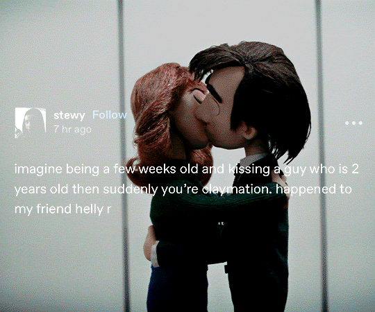


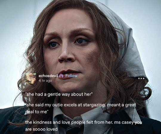
SEVERANCE #02.01 + TUMBLR TEXT POSTS/TAGS
#severance#apple tv#severanceedit#appletvedit#tvedit#televisiongifs#tvarchive#cinematv#tvandfilm#userstream#chewieblog#dailyflicks#filmtvtoday#appletvdaily#appletvgifs#filmtvcentral#usersameera#useranimusvox#bladesrunner#*#don't you hate it when 4k is actually so much better than 1080px -_-
4K notes
·
View notes
Text

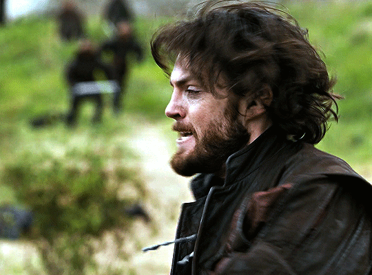


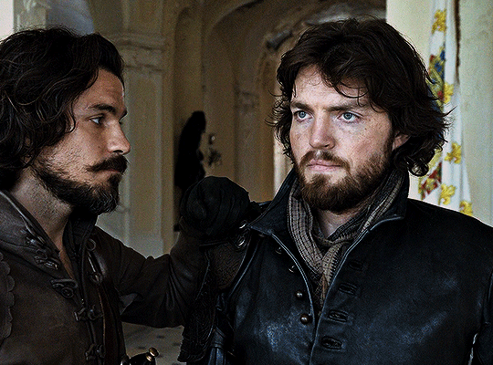

TOM BURKE as Athos The Musketeers #02.01 (2014 - 2016)
#bbc musketeers#the musketeers#the three musketeers#musketeers#athos#tom burke#themusketeersedit#musketeersedit#perioddramaedit#athosedit#tomburkeedit#tburkeedit#flawlessgentlemen#dilfsource#dilfgifs#tusercarol#ohmovie#*#gif#constance#i have directly skipped s1 to gif s2 because the episodes are 1080px lmao
1K notes
·
View notes
Text

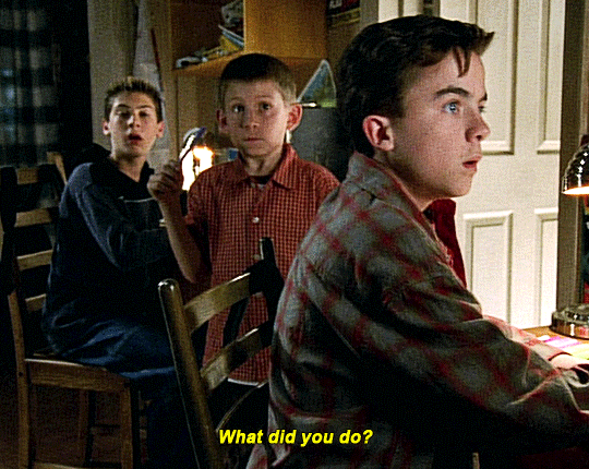
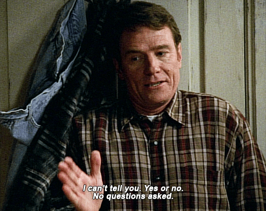
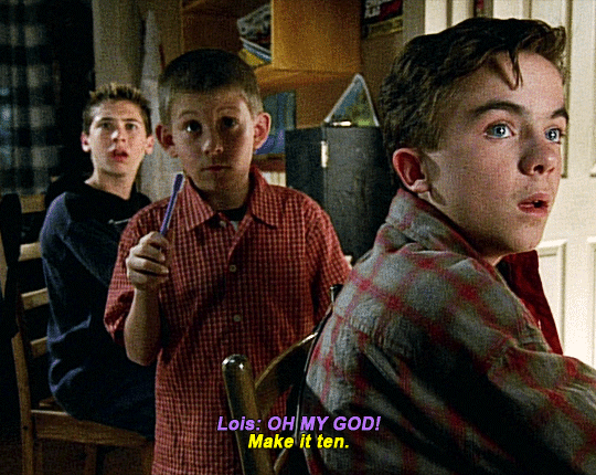

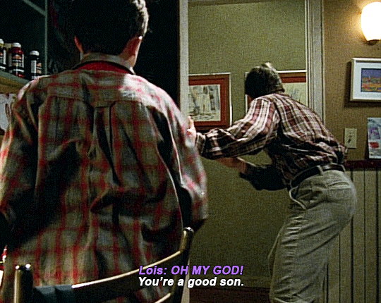

Malcolm in the Middle (2000-2006) S1 E16 - Water Park
#mitmedit#userbbelcher#chewieblog#tvandfilm#cinematv#userstream#usersugar#usersavana#useryusi#userkraina#usersnat#usersaoirse#*#malcolm in the middle#this is 1080px and still looks like shit
2K notes
·
View notes
Text


XIAOJUN IN EVERY MV ✦ 10. 'KICK BACK'
#wayv#nct#nctinc#wayvnet#xiao dejun#xiaojun#useroro#maretag#ninqztual#eritual#tuseral#dearestmillie#rhitag#aleksbestie#userbexrex#higabi#erigifs#eri.wayv#eseries:xjeverymv!#dejun. ✈️💫#this mv only being in 1080px i fear even handbrake couldnt save us
167 notes
·
View notes
Text


Someone asked for some top downs of the hill house, so here they are, and also I can't stress enough how room hiders r your friends.
122 notes
·
View notes
Text
:)
#Nothing to say. A good episode. A good season.#I love Oda. I love his voice perhaps even more lol#I should look for an improvement of the video quality... To say it's 1080px mkv :/ But the latest upload on N/yaa is too heavy#The op visuals of the untold origins arc are very good. The songs are good too#Although I suppose I may just be nostalgic ahah#I like fuku/fuku... Especially this young bittersweet flavour#Fuku/fuku have so many “couple who for some reason broke up but who still love each other more than anyone else” in this episode.#What do you mean they keep calling each other.#What do you mean Fukuchi won't hesitate to help Fukuzawa even after he refused to join his group.#Mmmmhhh... One more thing#There's so much emphasis on Christianity in bsd. It makes sense for Atsushi and Dostoyevsky I suppose due to the irl authors‚ but...#Why was Oda handed a Bible in this episode? Why was Ango carrying a Bible with him in the Beast movie?#When you take into account that Christianity only makes for 1.5% of religious believers in Japan‚ it's just curious.#But maybe I'm missing something? Was Oda-author Christian too?#Then again I can really feel this wider underlying pattern which... Exceeds the characters in a way?#It's mostly details so it'd be hard to list them but... Idk.#Why was there a cross behind Kunikida when he witnessed the little child die.#🤔#That would be all. This season is very beautiful and I love Mushitarou but can't WAIT to get back to Atsushi I miss him 🥺🥺🥺#random rambles
10 notes
·
View notes
Text
decided that 2024 is about effing time to create an art-ish-adjacent piece, so I sat down to make myself an original logo type thing
I decided to go for a cat face (for, well, obvious reasons), but with a twist - half of it is made with only neat, straight lines, while the other half is much more chaotic. So far I only got the draft of the first half:

and for now I'm still wondering what do I want for the other half. So far I'm thinking about much less grid-dependant outline, that will probably be drawed with a crimson red graffitti styled brush
#of course that's only a very rough draft lacking background texture and brush gradients and a lot of other stuff#I basically made it in an hour or two using GIMP and spamming Image Guides every 27 pixels (2.5% of 1080px canvas)#but honestly? this feels like a right way to go from here#and if you're wondering “why split this in half and have those two halves contradict so much?”#...that's symbolism for you.#and why crimson red? because I love crimson red! it's my favourite colour after all
19 notes
·
View notes
Text


HEX × Five Nights At Freddy's Plushies
Cuddly • Keychains • Fanverse • Puppet's Gift • Golden Bonnie
#hex#hex brand#fnaf#fnac#popgoes#stuffed toys#plushies#freddy fazbear#bonnie#chica#foxy#fredbear#spring bonnie#candy the cat#popgoes the weasel#transparent png#1080px#not upscaled#my pngs#foxyfatality
22 notes
·
View notes
Text
Tutorial: Manga Banners
Basic Manga Text Change/Coloring/GIF creation in PS
Hey, so as promised making a very basic tutorial for making banner gifs in photoshop for fics/drabbles/layouts, etc.
I'm going to keep things super simple here for beginners.
END RESULTS↴

(NOTE: This gif I made will be used for an unreleased story of mine so please don't use this exact gif/images but you are free to follow the tutorial to create your own).
All I ask is if you find this helpful to REBLOG! :) No need to credit me.
For this tutorial you will need ↴
Photoshop
At least 2 manga panel images (non-transparent*)
Optional: Manga fonts. I mostly use CC Wild words (speech bubbles) & Manga Temple (narrator boxes)
Basic knowledge of photoshop layout/where tools are.
*this tutorial is essentially the same if working with transparency but if you do work with transparency you will need to have knowledge of clipping masks which i do not cover here.
Tutorial ↴
(optional) Prepwork: so i didn't think to include this do this but you are going to need to crop and resize your image. make sure the width is either 540 or 1080px. This is the recommended width for pictures in tumblr. Height can be what you want it to be. This is done image > image size (make sure the link-chain is pressed for aspect ratio)
Step 1
This is what you want your setup to look similar to. Delete locked background layer.

Steps 2 & 3
Make a new layer. It might be helpful for beginners to re-name all their layers so instead of "Layer 2" you might name this ⇢ "White fill layer or Text cover up". (doubletap layer name to change it).
Use rectangular marquee to select text you want to change. If you are just replacing a word or two you dont need to white out everything. But you could choose to cover up all if you wish. I just wanted to remove "senpai".

Steps 4 & 5
Use Paint Bucket Tool to fill in selection area with white (make sure the new layer you made is selected when you do this).
Select Text Tool. There is no need to make a new layer as once you are done typing it will become a text layer. I used CC Wild Words bold font for this for emphasis. If you do multiple lines of text use a new text layer for each line.

Step 6 - Optional Step - Highly recommended if you did multiple lines of text.
Rasterize Type by right clicking the layer. This is an optional step. I tend to do it out of habit and rasterizing lets you use the move tool to give you exact px distances between other rasterized elements but nothing we are doing requires this tbh and if you do decide to do it you can't go back and edit text.
If you did multiple text layers you cause space them out evenly using the move tool (zoom into 200%-400% if necessary to get exact pixel distances). Tip: Manga text is centered in the bubble and leaves a good distance away from the edge.
When you are done ctrl/cmd to select all text layers then right click and merge the layers. This is so incase you have to move the text layer for whatever reason they are all on one layer now, evenly spaced and you won't accidentally mess that up.

Step 7
Create an exposure layer (half filled in circle in layer bar for menu). This is important as it can lighten/darken image to make the colors we will add later pop by playing with the sliders for each setting.

Step 8
Apply exposure settings. On the right-hand side there will be 3 slider bars. The screenshot shows my settings but your settings will vary depending on the image. The one that gives the biggest benefit for manga is Gamma Correction which affects the midtones to make them lighter/darker and adds better contrast to the image so it doesn't look as muddy, often in black and white images it is easy for midtones to look muddy. Offset affects mid to dark tones of an image. Exposure affects midtones to highlights to make brighter or darker, overall use this the least. TIP: If you want to make an image brighter or darker you usually want this to apply equally to the overall image so then you would create a brightness/contrast layer instead. most manga images skew muddy and need a midtone and dark adjustment rather than highlights. the better the manga scan images the less adjustments you will need.

Step 9 - Optional
Apply a gradient map (half filled in circle in layer bar for menu). This is optional. a Gradient map adds gradient but preserves the shading in the image so essentially adds a gradient to the shading. I do this in black and white. But if you are happy with how it came out in the exposure phase you don't need to.

Step 10 & 11 -
Apply a gradient (half filled in circle in layer bar for menu). So when you add a gradient there are a ton of preset color combos you can use or you can create your own. I think this one is a preset but can't remember. I like a diagonal gradient from light to dark depending on where the light source on the image is but it is completely up to you. I tend to set the gradient angles near these 4 settings: -145, -45, 45, 145 depending on what corner I want the lighter part in.
One thing to note is brighter colors work better with a darker background. Lighter backgrounds can get washed out. One you add this as you can see it will be solid color.
*note* once this layer is applied any edits such as moving text, etc. around you want to do to the lower layers beneath it click the "eye" button to hide the gradient (same for the map) or there's a good chance it will move the gradient layers around and not the layer you want.
Change layer blending mode. By default it's set to "normal". You can play around with these. Depending on the effect you want and whether the image has darker or lighter colors will decide the blending mode. My typical blending modes are screen, overlay, hard light, vivid light or pin light. You can duplicate this gradient layer and play around with multiple settings and opacities to create something you like.

Step 12 - Optional
Add a Brightness/Contrast layer (half filled in circle in layer bar for menu). Brightness/Contrast on this step will look wildly different than if you added it right after the exposure step. It's not necessary but if you want more overall contrast or brightness then you can add it.
You can see my settings below on the sliders on the right-hand side.

Step 13
Create new layer for highlights. (also good check point to see how your layers are organized).

Step 14
Select the brush tool and ensure brush settings are a soft round brush with a hardness of 0% for the highlight effect. (if you click the brush image you can see my settings better)


Step 15
Select the dropper tool and pick a color from the gradient image. I usually pick the darkest colors available as it will have the best dodge effect for highlights. Since this is pink/redish I only have one highlight color but if you were doing a green/blue gradient you would pick the darkest from both. (ignore the purple here its not being used)


Step 16
Create highlights with brush tool. Do a few tests placements randomly around the image for positioning and then swap the blend mode to either color dodge or linear dodge. I usually do color dodge. You will get awesome highlights like below. You can play with the sizing of the brushes and opacity to decrease the effect.

Step 17 & 18
Export as PNG. Do this even if you want to make a gif as I always recommend a clean canvas for gif making. If you want to be done here and don't want a gif thats fine too. File > Export > Quick Export as PNG (do not save as jpeg/gif you will lose image quality).
Repeat for second image. You don't need to open a new file unless it helps you to not get confused. You can just make a new layer and paste your new image into that layer (if you just right click copy the file in the window/finder folder you can directly paste it into a layer in PS) and use the transform tool to resize. However you can totally just open the image in PS. The benefit of same canvas is you save yourself some time as you can just duplicate gradient layers/adjustment layers and move them. But this is kinda more advanced so if you aren't comfortable with photoshop just make a new image.

Step 18-19
Create new file/open one of the PNG in PS (more advanced can just create new layer, select image, then copy > copy merged and paste on new file for each. Otherwise open one file, create a new layer then copy the other file. The bottom later will be the first image in the gif.
Create Frame Animation on the timeline window. (if the timeline window does not appear then window > timeline) *note* if this is your first time working with the window it may be set to "create video timeline", if that's the case create it then from the frame menu (in step 23 theres an example of where this is) select "convert to frame animation".
If done correctly your setup should look like the below with two images. One for each layer and one for each frame.
MAKE SURE PROPAGATE FRAME ONE BOX IS CHECKED IN THE LAYERS WINDOW.
lmao, not to be dramatic but this ensures most effects you would add to frame 1 (which corresponds to layer 1) is applied to all frames. I'm not too sure its super vital for this super basic gif I'm showing you but its better to get in the habit of always having it checked. otherwise it will fuck you over later down the line in my next tutorial where I show how to add frames to gifs.

Step 20
Select both layers, then select both frames (ctrl/cmd) and finally select tween from the timeline window. It is the multi-faded dot option on the bar below.

Step 21
Add Frames to Tween. Tween is the fading effect adding more frames is the longer the fading effect is. I added 20 for this step, you can play around and add more or less.
Once you do that you can see 20 new frames being added onto the timeline. This will not automatically add new layers, this is fine. Frames and layers don't need to be a 1-to-1. (Another reason why propagate frame 1 needs to be checked as you can still adjust those layerless frames by adjusting frame 1's layer)

Step 22
Adding delays. Automatically the delay on every frame is at zero. But especially if you have text you want people to be able to read that so you need to add in a delay. Your delays can be in increments of 1/10th of a second. I add a 1 second delay to the first frame only.

Step 23
Select and Copy the first frame and then select the last frame and Paste. A paste window will appear in this case we want to paste after selection. I circled where the menu for frames are. (sorry used a different gif as an example so ignore everything but the circled menu)


Step 24
Adding additional delays. I add a 1 second delay to the last two frames.

Step 25
Add more Tween I added 5 frames this time as we want the transition to be much quicker to reset the image. You can see frame 23 in the previous step are now frame 28.
You can add more images in than 2 and follow these steps to add tweening.

DONE! Now to save.
Step 26
Export your gif. File > Export > Save for Web (Legacy) and the screen below should pop up. Here are the settings I use for gifs. You can play around with it but I really wouldn't lol. (again ignore image size, this is from a different gif) it will also tell you how big in file weight your gif is. This isn't something you have to worry about for something simple but the bigger the image size and the more transitions/images you use the more frames you will have. Reducing image size (make sure chain link is on like in the below) will take off more sizing then removing frames will and I would recommend that. But tumblr allows 10MB MAX per gif so just something to keep in mind.

Let me know how this was! If you have questions just drop me an ask. ❤
#✩𝓀𝒾𝓏𝓏𝒶𝓉•𝔱𝔲𝔱𝔬𝔯𝔦𝔞𝔩𝔰#✩𝓀𝒾𝓏𝓏𝒶𝓉•𝕘𝕗𝕩#gfx#fic banners#tutorials#resources#photoshop tutorial#manga edit#edits#fan fic writing#fic writing#anime edits#manga edits
133 notes
·
View notes
Text


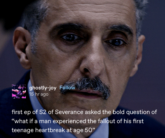
SEVERANCE #02.03 + TUMBLR TEXT POSTS [Episode 1] [Episode 2]
#severance#apple tv#severanceedit#appletvedit#tvedit#televisiongifs#tvarchive#cinematv#tvandfilm#userstream#chewieblog#dailyflicks#filmtvtoday#filmtvcentral#usersameera#useranimusvox#bladesrunner#userclara#usernia#*#couldn't download a 4k version at 5am so we'll have to deal with 1080px lol
4K notes
·
View notes
Text
top tip for new gif people because i've seen a few recently (which is really cool) - tumblr will compress your gif to a width of 540px when you upload it. this compression won't retain as much quality as if you just resize it to 540px across in photoshop/whatever program you use. tumblr will suck the life out of your beautiful crisp 1080px gif whereas photoshop will do its best not to (resizing in vapoursynth or similar is ideal but that's not necessary and often too much effort for adults with real lives)
#i learnt all of this during covid as a teen with a sunday job so that's why i could afford to care#also 540px is if you've got one gif per row#2 gifs per row should be resized to a width of 268px each#and 3 per row is 177px - 178px - 177px#height doesn't matter#you can google tumblr gif dimensions for a diagram but there are a few from before they increased the width in photo posts so lots of#conflicting info there#these are the correct ones#it's personal preference whether to resize ofc but the vast majority of people do#also whilst i'm yapping here#photoshop can do stuff that other software or online platforms can't#obviously use whichever one you prefer or have access to - it really doesn't matter#the more gifs the better#yay#but if there's something you've seen other people do that you can't figure out#and you're not using photoshop#chances are the other person is.#there are good alternatives like photopea but that still doesn't quite match ps#saying this bc i had a small phase of being quite discouraged as a 17yo md/zs fan from looking at all the online options and realising that#none of them had the capabilities to create the kind of gfx that i saw other people making and wanted to try out myself#ofc there's a learning curve too and LOTS to get wrong then try again but there is also the insurmountable difference between ps and#online alternatives. i hope it doesn't put people off from trying#keep at it with whatever program you've got your hands on#and if you really want photoshop. well. cough 🏴☠️🏴☠️🏴☠️🏴☠️ cough#excuse me what was i saying#i cant remember bye have fun
59 notes
·
View notes
Note
i hope this hasn't been asked before. what size do you make your canvas? and do you crop it to fit other socials (like Instagram for example)? i hear that 300 dpi is standard. i never know if it's good to make my canvas big or not.
hi i think this ask is like at least 4 months old but i was scanning my sketchbooks from last year and i abruptly remembered i had gotten this ask because i had made a little chart in my sketchbook trying to figure out how to answer it
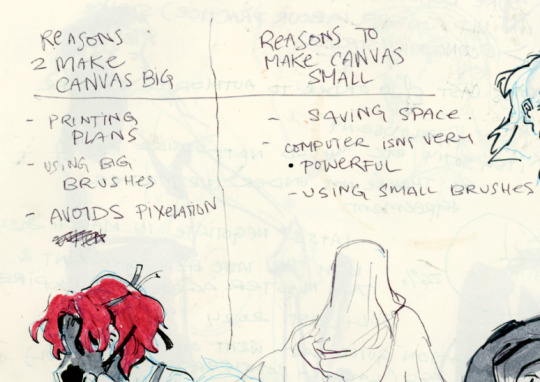
anyways theres pros and cons. and the size of your canvas is really going to depend on personal needs + preference. how good ur computer is, how complicated ur art style, how comfortable drawing feels, how much disk space you have to spare, what youre gonna end up using the art for in the end...300dpi is standard for PRINTING specifically, if you only plan to ever post things online then 72dpi works great and will save you space (fun fact a lot of professional animation files i deal with are 72dpi. and those eventually go on your tv screen). but personally i make everything i draw 300dpi because i am always printing stuff for cons, zines, etc and its nice to have the option even if i dont end up printing.
when I was a teen I used to draw on a rly shitty laptop and i made everything 800x800px 300dpi because big canvases would cause a lot of lag and also the resolution on this laptop was pretty small so 800px was a lot of the screen already. now i have a slightly better laptop with a bigger resolution and i sketch on giant 10000px-40000px canvases with the hard round brush and no shape dynamics or transfer whatsoever to minimize lag. when it comes to making a final illustration when i know ill be using a bunch of layer effects/blending modes/colors/mixing brushes etc etc ill generally crop the canvas down to the 6000px range. most illustrations i try to make sure are comfortably printable on tabloid size paper so thats pretty much anything hovering around or above 3000x5000px w 300dpi (so 11x17in). HOPE THIS HELPS?
EDIT: OH ALSO re: socials. i always ALWAYS size down my art to post on the internet. i think its crazy when other artists dont. because why would i ever let the internet have my hi-res file for free. also in general i think it looks better if you do the resizing yourself because if you don't then many social media sites will compress your file for you! a lot of people will post a hi-res file to twitter and then go "Wow twitter killed the quality of this img!!!" UH YEAH because they have an automatic image compressor. because they need to save space too lol and they dont want your image to take 248263895 years to load. same with instagram and to a lesser extent tumblr. when i post anything on social media i resize it down to 1200px-1600px on the longest side... its a little arbitrary but im kind of basing it on the smallest resolution of widely available screens. mostly because i think it looks stupid when u open up an image file fullsize and u have to scroll to see the whole thing... also iirc instagram only takes images up to 1080px before it resizes them? granted if you upload something smaller than that itll also resize it up which will look worse so I think bumping the numbers just over 1080px is pretty safe.
I should really be bringing the dpi down to 72 too when i post online but often im too lazy to do that. but it will technically help ur image load faster and stuff. and make it less likely for people to yoink it off the web and print it themselves.
149 notes
·
View notes
Text


I LOVE LUCY (1951 - 1957) 3.14 | Ricky Minds The Baby
#tvedit#i love lucy#userbbelcher#chewieblog#userrobin#tvandfilm#usersugar#usersavana#tuserhan#userraffa#usersaoirse#userashe#userlenie#userzo#userbru#userlolo#usercande#*#guess who's been complaining about lack of i love lucy on streaming sites so she downloaded 9 seasons of the show? me!#all in 1080px so more gifsets in the future?!
322 notes
·
View notes
Text

okay, so what was once a simple sidetrack (finding myself on a colour palette generator) turned into me wasting at least 2 hours making a shadamy destop wallpaper. how do i always end up doing this <//3
i thought these colour names were so perfect for them though. couldn't help myself hehe. i just love making edits whenever i feel inspired
free to use !! just credit me if you do ??
(1920px x 1080px)
#ily shadamy nation#this one's for u#shadamy#shadow x amy#dude it should NOT have taken me this long to make this but oh well#i kinda like how it turned out tho
66 notes
·
View notes
Text


Hello everyone! I hope you all had a pleasant holiday season, and I wish you all a happy new year!
To kick 2025 off, I'd like to announce a shiny new(?) project I've been working on very slowly for the last couple of years.
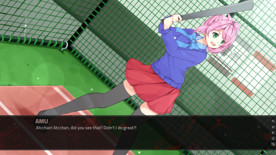
As you might have gathered by the title, I've been cobbling together a remake of the first VN I ever released on Steam: the yandere horror/romance story The Way We All Go! You can find the original game here, and the remake here!
The Way We All Go was my very first commercial VN, and it has a special place in my heart. I'm still very fond of the characters, especially Amu and Noelle (Amu even cameos in some of my newer VNs from time to time haha). During the last few years I started to wonder how the VN would look if I'd released it today.
When I wrote The Way We All Go, I was in my second year of university and I didn't have a job. I was dividing my time between writing essays and working on my horror game, which became quite expansive (somehow it wound up being over 200,000 words long), and I didn't have the budget to make it a big, flashy production.
I was a complete newbie when it came to commercial game dev. I'd made a few short, free VNs in the past, but there were all pretty humble, and I made them with purely free for use assets. I'd never commissioned an artist before when I started The Way We All Go, and I remember I was actually very anxious about the commissioning process in general haha ;;;
Given how small my budget was, it feels lke a miracle I was able to commission the few talented artists that I did for the spites and CGs. I didn't have the funds to give it any additional polish, however, and I had to use photographic backgrounds and stock music to finish it. Compared to my newer titles, it looks a little rogh around the edges, but I did the best I could with the resources I had at the time to make something special! I'm still fond of The Way We All Go and how it turned out, despite all of its early game jank, which is why I decided to remake it! I wanted to pump a bit more money into it, and give it the gloss I couldn't afford when I was starting out. The remake will have completely new character sprites, and some supporting characters who didn't have sprites befoe will get them now, like Noelle's mother and Amu's father. The new backgrounds, meanwhile, are all drawn by hand and commissioned for this project, and the soundtrack will be fully original too. I'm upscaling the game to 1080px, instead of the old postage stamp-sized 800x600, and it has a shiny new UI! I will be releasing the remake in 2025, though I'm not entirely sure when. I was hoping to release the remake on March 24th, to coincide with the release of the original VN on Steam. However, I'm not sure if the remake will be finished by then, as I need to recode the whole thing (the old code was Utterly Terrible lmao it's quite shocking...) You can wishlist the remake on Steam here if you're interested! I'll keep working hard on it. Thank you for all of your support until now; it's appreciated!
#visual novel#anime#anime game#yandere#yandere games#yandere girl#yandere game#horror#horror game#indie horror#indiedev#the way we all go
28 notes
·
View notes