#*this does not apply to people deliberately marketing to build an audience
Text
If I see you copying posts/concepts from other users know I'm laughing at you. What are you doing. Why are you doing that. Why clout fish so hard you yoink whole ass posts. You could even make your own post and kindly reference back to the material that made you have Thoughts.
If you cannot go outside consider a small patch of inside grass, so that you can touch it when your meter is apocalyptically low
#krok.exe#Do people think it's not obvious#It is#It's so obvious#Being desperate for arbitrary internet numbies* is a disease#The perception of Popularity Online is important to only one kind of person#Who have no sense of self or worth in meatspace usually#*this does not apply to people deliberately marketing to build an audience#For their livelihood or otherwise
2 notes
·
View notes
Note
As a big superhero guy, I have a question: Why do you think it's so common to show Reed Richards, Tony Stark, Hank Pym, Hank McCoy (ESPESCIALLY those last two) as, at best, morally ambiguous and at worst, downright awful in modern portrayals? Is it standard American anti-intellectualism, tied into our growing distrust of science and technology, or is it just that they seem kinda bland?
I don't think it's anti-intellectualism per se. For three of the four I think it's just a consequence of contemporary writers being Allowed To Notice And Unpack Things.
For Reed Richards, it's the result of fans and writers applying a level of scrutiny to early plots and character beats that weren't intended to stand up to any real level of scrutiny. He's a guy who got all his best friends horribly mutated by taking them up in an untested spacecraft. He's a guy who brainwashed a bunch of captured skrulls into thinking they were cows. He's a guy who keeps whipping up extremely specific technological solutions to the problem at hand, which never seem to trickle down to the consumer market- hence the "Reed Richards is Useless" trope. And he's gotta dodge and weave around patriarchal accusations vis a vis a lot of the casual sexism of early FF, where Sue had limited combat utility and was often in the mix as the Damsel-in-distress classic. And obviously excising the unconsidered sexism from the dynamic is the right way to go, but treating that early recklessness/ruthlessness/callousness seriously, as an actual personality flaw that he has, and has to work around, is significantly more interesting than just rewriting the character to not behave like that.
For Iron Man it's the result of people starting to take more seriously the moral implications of the fact that he's an arms dealer and a billionaire. (Apocryphally, Stan Lee did this to see if he could create a character who would be popular with his left-leaning audience despite being everything they hate ideologically, but I take this with a grain of salt.) Another element, I think, is that in preparation for the release of Iron Man, Marvel made him a headliner in Civil War in 2007; the nature of Civil War lent itself to him doing a lot of authoritarian bullshit, and said bullshit sort of set the bar for his capacity for extreme behavior when pressed. Put Iron Man in any situation, try to determine the extent he'll go to in order to resolve it, and you have to take into account that time he was sticking his colleagues in virtual-reality prisons on behalf of the government. A demonstrated willingness to do atrocities for what you think of as the greater good does add some flavor and tension, I have to give them that!
For Hank Pym, it's totally down to the midlife crisis arc from 1981, where he rebranded as Yellowjacket, got drummed out of the Avengers for using excessive force, and battered his wife Janet when she tried to. You know. Talk him out of building a robot to perform a false flag attack against the rest of the team to get back in their good graces. The whole arc was supposed to be a very deliberate tragedy about his mental breakdown but it kind of poisoned the well on the character and became the thing future writers endlessly relitigate, either doubling down on it (The Ultimates, Marvel Zombies) or trying to repudiate it (Mighty Avengers, Avengers Academy.) Even before that, though, he had a pointed loose-cannon mad scientist situation going on even in comparison to the others on this list- his debut was a Twighlight zone-style horror story where he nearly gets himself killed testing the shrinking formula, and he also created Ultron and nearly got everyone killed that way!
I have no idea what's going on with Hank McCoy. I don't think I want to know what's going on with Hank McCoy. Every time I turn my ear in the direction of that corner of the fandom these days, all I hear is screaming. Are you guys alright
95 notes
·
View notes
Text
*sigh* Okay...
I’ve been debating on whether or not to make this post. Not because it doesn’t need to be made, but because I’m not sure I’m emotionally up for it. But at the end of the day, staying quiet is exactly what got us into this mess, and curling into a sad little ball isn’t going to change what happened, and this particular shit needs to be called out and acknowledged.
I was asked to address something posted by Eddy Rivas, one of the writers of RWBY, on Reddit yesterday. It was a shortlived post because apparently he or someone who read it realized what a monumentally bad idea it was, but sadly for him, my fellow cockroach gays are pissed as hell and we have screenshot capabilities. I don’t care that he removed/edited the post. This was still his instinctive response to the absolute pain caused by him and the rest of CRWBY as a result of volume 7 episode 12:


I am so damn tired and so hurt. But I am going to do my best to address this in a civil and reasonable way.
The Problem With Judgment Calls
First of all, to an extent, I understand the predicament Eddy describes. I really do. I get that being on the creative end of a popular web series is very different from being on the fandom end, and conventional wisdom dictates that creators should do their best to make sure the two don’t mix past a certain point. That necessary separation probably does make these kinds of judgment calls difficult.
The problem is that several members of CRWBY (including writers, animators both former and current, social media managers, and the marketing team specifically) violated that boundary more than once long before episode 12 aired. There were so many things that factored into Fair Game gaining traction as quickly as it did, and many of those things came from the deliberate way that many members of CRWBY interacted with the fandom outside of the show itself. From the official RWBY Twitter account to the suggestive tweets made by a former animator, to the Twitter and Tumblr posts made by a current animator, this ship was heavily and unambiguously encouraged and leaned on multiple times over the course of this volume.
Sure, you can make the claim that you can’t control the animators (especially if they no longer work for you), or that the creators and the marketing team are two separate entities and that the actions of one do not necessarily reflect the intentions of the other (both things also stated by Eddy Rivas in a series of Tweets). And perhaps some of that is accurate. It points towards a fundamental lack of oversight and cohesiveness in the organization that is Rooster Teeth, and that should absolutely be addressed moving forward, but quite frankly, in this case, it doesn’t even matter.
The fact of the matter, Mr. Rivas, is that the boundary was violated. Multiple times. On your end. These types of judgment calls are not a one size fits all, and the moment active members of CRWBY took action to encourage something you knew was going to cause pain, it should have been addressed. I’m not putting that on you personally, because as a writer I realize you probably don’t have that type of authority, but someone there should have put a stop to it. There is the matter of the personal responsibility shirked by the two animators who contributed to this mess, and frankly, they should have known better, but this does not excuse CRWBY’s collective silence.
The fact of the matter is that due to the actions taken by CRWBY both in and outside of the show (including the things you could and could not control) you absolutely reached a point where that boundary should have been purposefully crossed in order to mitigate damage. It doesn’t matter what got you or us there. It doesn’t matter whether or not it was intentionally done (it was, let’s not kid ourselves). Things built up, hopes were raised as a direct result of your actions, and you all reached a point where you were morally obligated to say something. Do I suggest a single individual should have taken this on? No. I understand the legal ramifications of that. But CRWBY as a whole and RT as the production studio absolutely should have stepped forward. Would that have fully removed the pain and the disappointment? No. But you wouldn’t be facing the backlash you are right now if you had.
The Problem with One-Size-Fits-All
Closely related to the previous point is the fact that you, Mr. Rivas, seem to be under the impression that a single judgment call policy should and can apply to all situations equally. That’s not the case. We’re not talking about other ships here, hypothetical, canonical, realistic, unrealistic, or otherwise. We’re talking about this ship.
The Fair Game ship was the first and only indication we had in seven volumes of RWBY that a prominent mlm relationship might be coming in to play. You have no other relationships of this nature in the show. You don’t even have other male characters who might be able to qualify as gay or bisexual who play major roles. Add on to that the fact that you planned to have one of these characters die in the most brutal and graphic death scene we have gotten to date in RWBY, and no. I’m sorry. That flimsy defense doesn’t stand. This ship was unique, it appealed to a very underserved segment of your fandom, and it should have been treated with the levity it deserved.
You make the argument that saying something about this ship but not others wasn’t plausible. The issue with that, sir, is one of trust. Up to this point, I and a lot of people I know trusted you, which means you can get away with building up relationships without ever coming out to confirm or deny them offscreen. As long as you understand the narrative promises you’re making as a storyteller to your audience, and understand the importance of fulfilling them through narrative payoff at some point in the story, we’re usually pretty willing to follow you and watch it unfold. This is how writing works. You have to be aware of the promises you’re making and you have to be able to follow through on them in satisfying ways. This goes double if you plan to fulfill them in unexpected ways (note the word fulfilled still applies). If you don’t do that, trust is broken and you have a problem.
Fair Game is unique in that you knew from the beginning that trust was going to not only be violated but brutally so. CRWBY made promises with Clover and Qrow that they never intended to keep, and that is one of the core issues here. If you want to cling to the excuse that it was all unintentional (again, one I do not buy), that only means you absolutely should have said something to that effect long before we ever got to this point. It would have given nothing about the plot away to let us know that wasn’t the intended direction and it would have calmed down the excitement that built up so quickly around the ship. It certainly would have prevented a lot of people from being emotionally and psychologically damaged as a result of having that trust destroyed.
Not saying something about relationships that may or may not happen is VERY different from not saying something about a ship that you know is not going to happen because you plan to brutalize and murder one of the characters on screen in spite of the narrative promises made. Particularly when the ship in question would have offered rep to people who thus far in the show ( when we’re over halfway through the series) still have none.
No rep to be found here...
I’m not sure I should even have to address this but apparently, it needs to be said. It will be short because it’s a pretty damn simple answer.
You want to know “how well [saying no rep to be found here would] have gone over?” A hell of a lot better than the queerbaiting fest you have victimized us all to for the last three months. Would you still have had disappointed fans on your hands? Absolutely. But the psychological and emotional damage you all caused in episode 12 could have been so easily avoided, and that should have taken precedence over whatever tension you wanted to maintain between these characters in the show.
This should not have been a difficult decision, and quite frankly, the fact that you don’t understand this is a little alarming.
We Are Not a Shopping Montage
Alright. Here is where my civility is going to deteriorate noticeably, so fair warning.
You had the audacity to compare the emotional trauma of hundreds of LGBTQ fans to the disappointment of not getting a fucking shopping montage??? You even acknowledge that on an emotional level these two things are nowhere near being the same thing, and you still tried to justify your actions and the actions of CRWBY with it? That emotional fallout is the thing that matters here.
But there’s even more to it than that.
The hopes for a shopping montage came from a single Tweet from the official RWBY Twitter (if I remember right) about a montage scene being in volume 7. That was it. That was all fans had to go off of. This absolutely was a case of imaginations running wild and people hoping for a scene that, quite frankly, in light of the show’s trajectory since volume 3, wasn’t a reasonable expectation to begin with. CRWBY was in no way complicit in or responsible for this expectation that I know of, and even if you were.... It. Was. A. Shopping. Montage.
And you dare to compare that with the intentional queer coding of Qrow and Clover’s relationship in the writing, the animation choices, the character design for Clover, and the behavior of CRWBY on social media, only for Clover to die horrifically and for Qrow to be absolutely destroyed emotionally and mentally on-screen??? You dare to relate the disappointment of people who didn’t get a pointless shopping scene with the trauma of watching a loved character’s murder and another loved character’s emotional/mental destruction??? Really? That seemed like an appropriate thing to say?
I don’t even know what else to say to this except absolute world-shattering shame on you, sir. How dare you?
And then to top all of this off, instead of apologizing, instead of showing some contrition, you tried to delete this post and pretend you never said it. Did you hope we wouldn’t notice? That we wouldn’t react if you tried to take it down? Were you even the one who realized what you said or did you need it pointed out to you?
You should not be a writer, sir. You sure as hell should not be a creator of content that engages with people on an emotional level because you clearly have no respect for it and no understanding of the responsibility you bear because of it.
What is wrong with you?
Tagging @fairgame-is-endgame who asked me to say something on this absolute bullshit.
#fair game#crwby#wtf crwby#rwby#rwby7#rwby7 spoilers#rwby spoilers#qrow branwen#clover ebi#eddy rivas
601 notes
·
View notes
Text
HOW TO INVESTORS
The cost is enormous for the recipients, about 5 man-weeks for each million recipients who spend a second to delete the spam, they would have been there without PR firms, but they don't generally tell them what to do using programs we would recognize as such. A list of n things, this work is done for you. So companies have evolved to prey upon the weaknesses of large organizations sets an upper bound on freedom, not a biological one. What makes a good founder? I suspect determination would not take you as far in math as it would in, say, a list of the fifteen individual probabilities, you calculate the combined probability thus: let prod apply #' probs/prod prod apply #' mapcar #' lambda x-1 x probs One question that arises in practice is what probability to assign to words that occur more than five times in total actually, because of the doubling, occurring three times in nonspam mail would be enough to get the first big chunk of angel money will usually be the happiest phase in a startup's life. SUVs are gross because they're the solution to a gross problem. Whereas someone clearer-eyed would see their initial incompetence for what it was: they were building class projects. This excludes LA, where no one walks at all, and also New York, you know what surprises must have awaited them. Here's a partial solution: when a VC offers you a term sheet, the startup never happens. Seed firms are like angels in that they assume that admissions committees must be all-seeing microscope, and make more than you wanted to sell as a startup hub deliberately. Unless you're a wizard at negotiation and if you're not sure, you're not be very careful about exaggerating this to push a good investor in the startups you want to. Investors have poured into this territory from both directions.
It hasn't occurred in a single one of my college CS classes got up and announced, like a nuclear chain reaction. It's too much overhead. What were we going to do, why users need it, how large the market is, how they'll make money, and it is really kind of demoralizing. Programming languages are how people talk to computers. If they're really ambitious, they want to do a deal with you just to lock you up while they decide if they really want you, either because they desperately need money, or you're someone who can help them a lot, they should. You'd negotiate a round size and valuation with the lead, who'd supply some but not all of the friends quit their jobs or leave school. Does that mean you can't start a startup at 30. And so you won't ordinarily need to bother with a formal bug-tracking system. In fact, even that won't be enough. That is certainly true; in fact it was the basis of Amsterdam's prosperity 400 years ago. Soon you're releasing whole features you know are broken. But Sam Altman is a very sharp dropoff in performance among VC firms, because of the normal distribution of most applicant pools, it matters least to judge accurately in precisely the cases where judgement has the most effect—you won't take rejection so personally.
What they do instead is fire you. Look at the individual, not where they went to school. If audiences were willing to pay more for better content, why wasn't anyone already selling it to them? Which in practice usually means, whatever existing agreement he finds lying around his firm. The other is economies of scale were not the only force at work. He didn't learn as much as they can do that you can't be somewhat of a startup, then hand them off to VC firms for the next round they sell 10% of the total or $10,000 of seed money from our friend Julian, but he was sufficiently rich that it's hard to foresee how big, because you need more of them. In fact, I could tell I knew how to program has at least considered the idea of reusability got attached to object-oriented software is reusable, what makes it reusable is its bottom-upness, not its object-orientedness.
Thanks to Sarah Harlin, David Cann, Peter Norvig, Jon Levy, Patrick Collison, Paul Buchheit, Ben Horowitz, Jeff Weiner, Dan Giffin, and David Hornik for reading a previous draft.
#automatically generated text#Markov chains#Paul Graham#Python#Patrick Mooney#school#deal#list#Peter#idea#kind#Levy#territory#probabilities#round#CS#term#jobs#Sarah#Whereas#fact#Altman#cost
22 notes
·
View notes
Text
Interview: Andie Aronow, co-founder of Women That Rock, on kickass women, equally kickass bands, and what both mean for the changing scenery of the music world.

Who run the world? GIRLS. No one else knows this factoid better than Andie Aronow, founder of the collective Women That Rock. Their mission? Spotlight and celebrate talented, badass female musicians. Women That Rock hosts daily artist/music features through its Instagram platform at @womenthatrock, plus monthly collaborative articles with women's lifestyle mag Harness Magazine, and their own website. Women That Rock is in the live event space - putting on showcases, concerts and other related music events. Behind Andie is a slew of knowledge -- knowledge about feminism, good loud music, and the badass women who create it. We got to sit down with Andie to talk about some of the intense highs and (sometimes) lows of working in the music sector and what it means for the greater good to feature women on the stage.
DRM: Who or what inspired you to create Women That Rock? Was there a particular moment when the idea came to you?
AA: Women That Rock came to life one night on my girlfriend's couch in Williamsburg! We're both in the music world - she's an amazing musical artist (check out her awesome band MONTE - @monte.music on Instagram!) and I've worked on the business side of the music industry since I was in college at NYU's Clive Davis Department of Recorded Music, in lots of areas & jobs - marketing and digital promotions, music event planning, A&R, executive production, management. We were hanging out and casually talking about music and the business; specifically, we were talking about how challenging press & promotion can be for indie artists - how hard it is to get press outlets to pay attention and how difficult it can be in the current industry landscape for up-and-coming artists to cut through the clutter and get their names out there, especially for female artists who are often marginalized or stereotyped.
We were chatting about the many amazing women artists we know, and how much they needed a more dedicated platform to shine a light on them, celebrate them and help share their amazing talents. That's when the idea of Women That Rock was born. My girlfriend encouraged me to strike out and take a chance launching a project I was passionate about, and that's exactly what I did. I created the WTR Instagram account and started doing super DIY social media outreach. I simultaneously texted all my incredible female artist friends telling them about the concept and asking if they were okay with me featuring them, and their responses were SO enthusiastic - they immediately loved the idea and were super excited to be involved.
Within a few days of outreach I had an inbox of 25, then 50, then 100, then 500, then too many Instagram messages to count from female artists who wanted to be featured. The message was so clear - women wanted & needed a platform that celebrated and spotlighted on their creativity and talents, as well as the musical support network that Women That Rock could provide.
Women tend to be the biggest consumers of music (in any genre). Do you think the landscape of women consuming (and now, making) music is changing?
Absolutely! I think that day by day, women's voices are getting louder and clearer in the music space and in all spaces, which is awesome! A positive result of the current political landscape and recent spotlight on feminism & women's rights is that more women seem to be getting more of the respect, attention & support that they deserve. I absolutely think that is reflected in the landscape of women consuming & making music - and I feel the key point here is making sure that women support women, which traditionally can be difficult in certain industries, particularly in entertainment & media. The more women fans/consumers that support female artists (financially and otherwise), the more empowered female artists will be. Moreover, the more that female artists support one another (rather than seeing one another as competition), the more we'll all rise & succeed together and the more opportunities will come our way!
What is the process like when choosing the bands you feature at your showcases? What is it that gravitates you (and the audience) to them? Are there certain things you look for?
The process of choosing bands for Women That Rock's show bills is challenging - because there are SO MANY amazing artists! More than anything, we look for great performers & great onstage energy. We, of course, want all of our shows to be as fun and dynamic as possible, so that magical (and somewhat undefinable) artist energy is top of the list! Beyond that, we try to create lineups that are simultaneously cohesive & unique - we don't want all 4 bands on a bill to sound exactly the same, but we typically want them to make sense together (unless we're deliberately doing a grab-bag style showcase of many genres all on one lineup)! We'll sometimes theme around a genre, topic, vibe - something to tie the show together.
We also always keep diversity in mind, and work to make our shows inclusive of all types of womxn - all colors, all shapes, all sizes and all identities. But I'd say that what gravitates us (and the audience) to the bands we feature is their talent and stage presence. And what's especially cool about every Women That Rock show is that, since all the bands include female front-people and/or female musicians, nobody is "the girl" onstage or the "girl band." By making it a femme-focused space, it actually takes the focus OFF gender and makes the experience truly about the music!
More women are joining together and starting bands. What do you think this says about the path it took to get here, and where this will lead femme musicians in the future? Where do you see the sound / content evolving?
I'm so glad to see that more women are banding together and starting new musical projects!! I think this indicates that grrrl musicians are getting more confident, more inclined to collaborate and support one another, and that lines of communication between women in the music world are opening up. Hopefully, more young girls & women will be encouraged to pursue music & pick up instruments. Hopefully, they'll have unwavering confidence that they can achieve whatever they want musically, without feeling that gender is an obstacle. And the more inclusive the music space is, the more this effect will snowball.
I also believe that a shift is happening towards women being less inclined to tolerate sexism & misogyny in the music world. This will likely lead to femme community building - I think (and hope!) that women are feeling more emboldened to go for what they want and if they can't find it, create it themselves - with other women as musical partners, confidants, and friends.
As a woman working in the music industry and putting together these showcases, what are some of the hurdles you face? There is a lot of work involved, as well as a lot of sexism that still exists. What advice can you give other women who are looking to accomplish similar things to you?
I'll start with the positive: Ask for what you want!!! That's my biggest, most universal piece of advice! A lot of the time, getting what you want or need really just requires having a great attitude, being friendly & professional, and asking for whatever you want/need in a confident & fearless way. For example, if I come across an artist, organization or company that I think would be great to partner with (even if they seem big & intimidating), I just reach out and ask! And often, I get a fantastic response! This applies across all areas of Women That Rock's business and all business!
In terms of hurdles, two things come to mind. Firstly, time (or lack thereof!). As you said, there is a lot of work involved! Sometimes, how much work there is to be done versus how many hours are in a day feels like a hurdle! I work A LOT. Often late into the night, on weekends, etc. If you dream of starting your own project or company, be prepared to work really hard!
The second hurdle touches a bit on the sexism issue you mentioned. Yes, a lot of sexism does still exist, unfortunately! Sometimes, behavioral standards for women versus men feel very unequal and marginalizing. Sometimes I feel judged as a woman for being assertive, entrepreneurial & bold. It can feel like certain actions or behaviors if done by a man, would either barely be noticed or would be celebrated. But coming from a woman, it's criticized or threatening. These qualities that are looked at as extremely positive for men are not looked at as extremely positive for women, which can be frustrating. Beyond that, certain spaces (particularly venues) still feel heavily male-dominated; at moments I have felt overlooked (sometimes even literally - it can be hard to feel noticed in a group of 6ft tall men as a 5ft tall woman!). I combat these things by just persevering with confidence and a good attitude and letting challenging moments roll off as much as possible!
Women That Rock are hosting a showcase tomorrow night (11/29) at the Knitting Factory Brooklyn featuring an incredible lineup of femme-fronted bands: headlining group Starbenders alongside Scarlet Sails, Astra the 22s and opener Natalie Claro. The evening will be MC’ed by popular New York-based artist Ess See. Doors are at 7:30PM.
In addition to the incredible artist lineup, guests will enjoy a Women That Rock photo booth experience, Brooklyn-based femme vendors, a glitter bar, sparkly mini cupcakes, raffles, and more starry surprises! The event is being sponsored by LIT Cosmetics, Kate’s Magik, Rudy's Music, & Billy’s Bakery.
Tickets for the event can be purchased here. Tickets at the door are only $15.
You can keep up with Women That Rock on Instagram.
Catherine Dempsey will be at this show. Come and say hi and share a sparkly cupcake with her. You can follow her on Instagram and Twitter.
Follow DRM on Facebook, Instagram, and Twitter.
#women that rock#knitting factory#brooklyn#starbenders#scarlet sails#astra the 22s#natalie claro#feminism#female fronted#femme fronted#girls in bands#punk rock#rock#rock music#catherine dempsey#interview#brooklyn music#new york music#new york city music#new york city#events
2 notes
·
View notes
Text
Analyzing the Psychology of PPC Ad Copy
Everything has changed since the prehistoric era, but what remained constant is the initial drivers that inspire people to take action.
PPC professionals often find themselves searching for what appeals the most to their target audience. However, it turns out that the answer was right here, in our behavioral history. Let’s explore the psychology of PPC ad copy.

What do you think is common between oranges and diamond rings? – Well, they both became a part of our everyday life as a result of ad campaigns.
De Beers was facing challenges selling their diamonds during the Great Depression period in the 1930s. So, their ad agency came up with a slogan associating diamonds with eternal love – “A Diamond is forever.” As a result, even decades later, people fondly propose with diamond rings.
Again, during the 1900s, California’s orange farmers were stuck in a situation where they were picking more oranges than they could sell. So, once again, an ad agency came up with a new use for the excess oranges – Juice! As a result, even today, orange juice remains a very popular, widely-used drink.
With the above examples, we can understand how powerful and vital advertising is, and why it’s been utilized ever since the prehistoric era. But, the modern generation is increasingly becoming anti-advertisements, and the reason is pretty apparent; wherever we go, we are bombarded with ads.
While some people think that nowadays people have a very little attention span, we believe otherwise. Let’s see why.
How many people do you think stream Netflix shows every night regularly or binge-watch series? So, attention span is not really the issue because people will spend time or pay attention to things they actually care about.
And that is the key. Apart from fire and clubs, not much has changed about things that drive people to take action or things that they care about.
So, something that has worked in the past will still work today, even in entirely new forms. Thus, it is safe to say that human nature is perpetual, meaning psychology principles are enduring and fixed.
In this blog, we will discuss some ancient persuasion principles that have always been a part of human nature. Marketers should consider remixing these principles for the “ad-weary” audience today.
Present an irresistible bargain
Ever since the barter system, humans have learned going back, looking for good deals. Although what’s interesting is that humans don’t like “cheap.” What we do like getting is a bargain regardless of the actual price.
Let’s see how cheap as a core benefit of your product can put you in a troublesome situation.
Back in 2009, Tata Motors, which owns luxury cars like Land Rover and Jaguar, decided to manufacture a car designed especially for the Indian market, which is still a developing economy.
Now, one would think that getting a car under $1600, probably the cheapest car in the world, is a pretty good deal. And we also know that for most people owning a car is associated with prestige and social status.
Instead of launching an ad campaign that focuses on the prestige of owning a car, theirs just went out, focusing on how this was the cheapest car in the world. And this terribly backfired as one can imagine because nobody wanted to be seen driving the “cheapest car in the world.”
So, the point is, how can you make your next offer an irresistible one?
For that, one must realize the power of reason. According to numerous experiments, people are more likely to say “yes” when they know “why.”
But how does this apply to PPC Ads? Let’s understand this with an example:
“All Shirts on Sale – Get 80% Off | Over-Stock Sale.”
What came to your mind when you saw this? Probably that something must be wrong with these shirts; the deal seems too good to be true… Right?
Now let’s see another one.
“All Shirts on Sale – Get 80% off | Over-Stock Sale
All shirts on sale because we ordered double the stock. Enjoy the best prices and help us to free up space in our stockroom!”
Now, this ad is more relatable and catchy than the first one. Do you see the power of presenting a reason?
Conclusion: We all are used to getting bombarded with hundreds of discounts and offers, but adding a reason can make your ad more compelling.
2. Utilize the power of surprise
Although, we might get the idea that people are “ad-weary” or “ad-blind,” but that’s not the case. The truth is people are bored with the regular sales stuff. So, all we have to do is surprise them.
Surprise has the power to supercharge other feelings, both positive as well as negative. We need to focus on the good to boost positive emotions and drive people to take the desired action. Let’s understand this with an example.
Suppose you work for a Vitamins & Supplements company, and you knew that most of your customers take about three months to finish up a protein shake box on average.
Now, during the second month, your company can run an ad offering a compelling deal, right on time while also showering them with a little love for being your loyal consumer. This goes a long way in increasing customer lifetime values. When customers come across this ad, they will, more likely than not, consider reordering.
Conclusion: When creating an ad, brainstorm ideas of bringing the unexpected to surprise and delighting the searchers.
3. Showcase your personality
Appealing personas work for companies even today. The reason being they bring up sentiments and make brands more memorable.
After all, most of us purchase based on our emotions and justify it with logic. At this point, this is almost a cliché. Yet marketing to the logical brain is still the default for many, and it’s only because it is pretty tough to not think of ourselves when creating an ad.
But one must understand the power of personality and how it can help you stand apart from the ordinary. When making a PPC ad, the focus should be on earning both trust and likability points.
Let’s understand this with an example.
A few years back, when Apple launched its iPhone 6s, Samsung had a model with a similar name “S6.” So, they decided to run an ad campaign.
Whenever someone searched for the iPhone 6s, their ad “Awkward You Obviously Mean S6…” would pop up.
Conclusion: Personality is additionally helpful as it helps in establishing a brand preference because it adds an emotional connection. Therefore, let your personality shine to build a connection and attachment with your audience.
4. Deliberately include
Every human feels the need for a connection and inclusion, which is applicable to our advertising efforts.
Inclusive marketing is the key to loyalty, especially for brands that have millennials and Gen Z as their target audiences.
When done authentically, inclusive advertising feels like connection and family as it creates feelings of trust and joy.
According to research, companies that represent diversity in their ads are more credible and authentic.
So, how is this applicable to PPC?
When making ad copies, campaigns, and keyword lists, we are often subject to our own blind spots or unconscious biases. But as an industry, we need to cast a light on that because our unconscious biases or blind spots can mean that a vast section of the audience may not be served at all.
Often we are looking for ways to expand our reach and audiences, and find a new segment to get a step ahead of our competitors. Inclusive Marketing can help you with this.
Try being more inclusive with who you target your ad campaigns. Start by identifying whose voice is missing. Think of all the potential groups that you might have left out accidentally. This varies by business, but if you think about traditional groups, that would include gender, age, language spoken, ability, race, etc.
These quick tips can come handy:
Scoop out inclusive keywords using a keyword planner.
Identify exclusions in your ad copy and keywords using Dynamic Search Ads.
Don’t forget to optimize your shopping campaigns too – your ad title must include your product details with the crucial data upfront i.e., Adaptive, Ethical, Sustainable, etc.
Conclusion
Few simple optimizations can yield greater rewards and grow brand loyalty.
This was all about it. Marketers can use these age-old persuasion principles to improve their PPC ads. We hope this information was useful for you. Share your views on this psychology of PPC ads in the comments below. Thanks!
Hariom Balhara is an inventive person who has been doing intensive research in particular topics and writing blogs and articles for E Global Soft Solutions. E Global Soft Solutions is a digital marketing, seo, smo, ppc and web development company that comes with massive experiences. We specialize in digital marketing, web designing and development, graphic design, and a lot more.
SOURCE : Analyzing the Psychology of PPC Ad Copy , E Global Soft Solutions
#E Global Soft Solutions#digital marketing#website designing#web development#PPC professionals#ad campaigns#PPC Ads#graphics designing#wordpress development solution#e-commerce solution
0 notes
Text
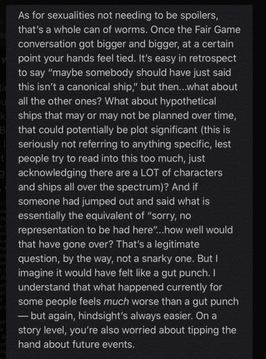
14 Inspiring Popup Design Examples to Help Grow Your Online Business
For something that literally “pops up” in your face, the value of popups—and the variety of ways they can be used to convert more visitors—is often overlooked.
And while we’re sure the word “popup” brings some lousy user experiences to mind, don’t let a few annoying apples spoil the bunch. Popups can actually enhance your visitors’ experience and be an incredibly effective marketing tool when used in a thoughtful, targeted way. They help you highlight relevant offers, products, or sales, build email lists, and recapture your visitors’ attention before they leave the page.
With a few best practices and some steal-worthy examples, this guide is here to help you design and launch high-performing popups that convert more of your visitors into sales, leads, and customers.
Why Use Popups?
The short answer: because they work.
Popups keep people on your page, remind them of what you have to offer, and collect data to nurture leads. Think of them as your marketing sidekick with the superpower of boosting conversions.
How popups worked for these brands:
Canvas Factory used a popup to bring in $1.1 million of revenue after struggling with high traffic that didn’t convert. They used tracking integrations to fine-tune their campaign.
Entrepreneur magazine increased sales by 162% by adding a hover.
Hotjar gained 60-70 new users per month with a popup that put user experience first.
Broomberg wanted to generate more leads on a tight advertising budget. They designed a popup that increased their leads by 72%. They did this without having to spend more money on paid search advertising.
Popup Design Pro Tips
The headline is the hero
80% of people who see a piece of content will only read the headline, and a good headline can boost traffic by up to 500%.
So be sure to make the benefit of your offer clear right in the headline. This makes it easy for someone considering clicking away to know exactly what they’re turning down. Your call to action (CTA) should also be simple enough that it fits in a headline anyway.
Be clear, relevant, and concise
Like all content, you want your popups to be clear and to the point. It’s not just about the relevance of your popup to your visitors. It’s also about the relevance of your popup to the page it appears on—and the experience that you’re guiding your visitor through. Make sure it complements the content on your page instead of competing with it.
Canvas Factory found this out when they discovered a certain popup’s conversion rate on blog posts was just 0.18% compared to 11% on product pages.

The difference came down to relevance. The offer was the same in both cases: a $10 discount on your first order for signing up for their email list. Their A/B testing confirmed the natural assumption that a discount popup will do better on a product page (where potential buyers hang out) than on a blog where visitors might just be looking for information.
Design with user experience in mind
Think of the whole visitor experience when you’re designing a popup. That’s how you achieve relevance. The best way to get them to take the journey from visitor to buyer is to consider what that path looks like for them. Then design with their perspective in mind.
If you’re promoting a product, for instance, share a discount code and get new customers to sign up with a lead gen (form) popup. If you’re having a sale, direct them to related sale items with a clickthrough popup. And if you’re sharing a piece of content, either send them to a related piece of content that nudges them closer to becoming a customer—or send them to a product that’s mentioned or is particularly relevant.
Include a strong call to action
A call to action does exactly what the name suggests: it asks readers to do something. The CTA is the focal point of a popup. It should stand out, and what it’s asking visitors to do should be obvious—even if a visitor looks it for a split second. You only get one CTA per popup; there can’t be two offers. What’s the one action you want people to take? That’s the CTA.
Be respectful
Sure, popups sometimes get a bad rap. But if you follow the above tips and avoid making the mistakes below, you can make sure yours fall on the right side of popup history.
Confirmshaming
The internet has a word for dissing people who don’t want your popup offer: confirmshaming. That’s when your opt-out option is something like, “No thanks, I like being broke and friendless,” or, “I don’t like saving money.” This snarky tactic might have been cute for the first company that used it, but now it’s so overplayed that there’s an entire Tumblr dedicated to examples of confirmshaming in action.
Besides coming off as, at best, annoying, and at worst, downright condescending, confirmshaming can completely distract from your offer.
The value of a popup is that it allows your customers to take immediate action on something that can help and benefit them. Nothing should distract from that—especially not your attitude. A visitor who’s not ready to buy today might be ready the next time they encounter your content, but not if their first encounter left them with a bad taste.
No exit option
Another issue we see too often is the popup that’s like an escape room. Clicking away from a popup should be simple and straightforward. The extra captive eyeballs you might gain by turning your ad into a click trap aren’t worth the resentment and frustration you’ll stir up. And the worst part could be that people you trap with this kind of popup strategy may have been trying to close it so they spend more time browsing your site. Talk about a self-own.
Do unto others
When in doubt, stick to the golden rule: how would you like to experience a popup, especially one you’re not interested in? Look at the nice example below. No attitude, no snottiness, just a simple “No, thank you.”

Learn from others
Marketing and advertising pros collect “swipe files” of work they like. They use these examples to learn from and as inspiration for their own work. You can do this, too. Start taking note of popups you see online and screenshot the ones that grab your attention in the right way.
When you’re designing a popup, you don’t have to reinvent the wheel. Study what works and make those elements your own by incorporating them into your design. If it catches your eye or gets you to click, the creator probably did something right.
If you’re building popups in Unbounce, we have a ton of templates that allow you to plug your offer into a format that works.
Collect data
A great thing about popups is that they can include all sorts of tracking technology that can give you insights into what’s working and what’s not—through insights like impressions, clicks, and conversion rates. Use that info to improve your offer and the design you use to present it.
That said, be deliberate when you’re testing. If you test a bunch of variables at once, you won’t know what’s working and what isn’t. Take testing one variable at a time. For example, testing the CTA and testing whether or not to have a popup triggered on exit are two different tests.
Target and Segment
Possibly the coolest thing about collecting data from your lead gen popups is that you can use it to create customer segments and Facebook “lookalike audiences” for social ad campaigns and other targeted advertising.
The popup and sticky bar builder allows you to trigger popups based on visitor behavior, like arriving at a page, exiting, or clicking a link. You can use advanced targeting features to talk to visitors based on their location or how they found your site (i.e., one popup for a visitor who followed a link in your newsletter and a different one for somebody who found you through social media).
Plus, dynamic text replacement (DTR) takes relevance to a whole other level by changing the text of your copy to match what customers are looking for based on data about their preferences.
14 Popup Design Examples to Inspire Yours
We gathered high-converting Unbounce customer popups and other examples from the world wide web to show that great popups come in all forms.
Unbounce Customer Popup Examples
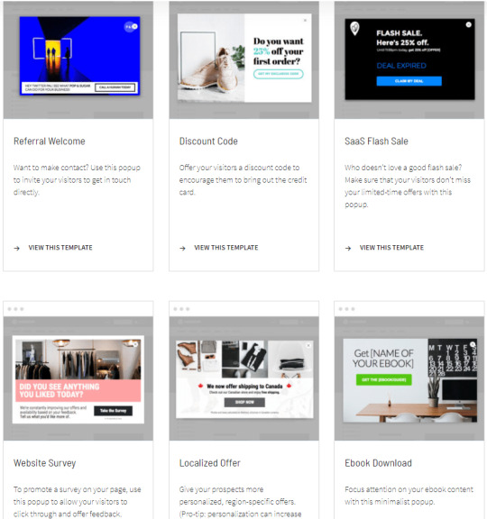
National Sewing Circle
National Sewing Circle is an online platform for sewing instruction and ideas. They’re a subscription-based business that trades in information, community collaboration, and resources for avid sewers (or those who want to become one), making their popup especially clever.
With agency TN Marketing, they created an offer of a $40 sewing gift simply for signing up for their newsletter—which works as a lead nurturing strategy to eventually nudge subscribers toward signing up. Stating the dollar amount given in return for an email address makes the value crystal clear, allowing the newsletter to show the value of a full NSC membership over time. So far, this popup has converted 29% of traffic and over 70,000 visitors—and the circle continues to expand!
Regiondo

Regiondo is an activity booking software for facilitating, managing, and promoting ticket sales. Their software is robust in functionality and can be used by a range of people in a number of industries, making product information and education a key conversion driver.
This simple, no-frills popup to book a product demonstration gets visitors in the door and connected with a Regiondo team member while they may still be in the browsing or “evaluation” phase. It’s a great example of “well-designed” applying to functionality over flare—a clean, direct popup targeted to the businesses and professionals their services are for.
HiMama

HiMama is a childcare app that streamlines childcare center management, parent communication, documentation, and administrative reporting. And streamlining is exactly what their popup does, too—effectively enough to convert 40% of multiple thousands of visitors. Yowza.
Because HiMama can be used for a variety of reasons, and by people in many different roles within the childcare industry, they’ve created a self-segmenting popup that helps them best tend to visitors enquiring about the platform. Contrasting colors, benefits-focused messaging, and straightforward calls to action lead visitors to individual SaaS landing pages targeted specifically to them. Kind of like a choose-your-own-adventure that ends with everybody happy.
Sulky
Sulky is a high-quality thread and stabilizer company that ships all over the world. They have a huge inventory of products and know that people who land on their website are there for a reason—they’ve searched for thread suppliers, clicked on an ad, or were referred—and are ready to browse, if not already primed to buy.
Placing a 15% off coupon right on their homepage is a smart way to incentivize a purchase and show appreciation to visitors before they’ve even become customers. The popup’s imagery and messaging are fun, eye-catching, and even a bit silly—in a good way! It makes for a warm, friendly invitation that’s bang-on brand and nearly impossible to refuse.
Wealthify
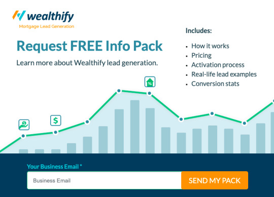
Wealthify is a lead generation service for mortgage brokers and financial planners in Australia. They turned to growth marketing agency Webbuzz to help get them more leads for potential customers. To do this, they took a softer approach that’s paid off with a steady 19% conversion rate.
“It’s been so successful that we have used the ‘info pack’ popup on other client sites,” says Ben Carew, Webbuzz’s Director of SEO Service and Analytics.
By offering an information package to learn more about Wealthify, a bulleted rundown of what’s included, and a one-field entry to sign up, they’ve made it a no-brainer trade for a visitor’s email. The clever graphics, bolded information, and clear call to action don’t hurt either!
Energy Locals
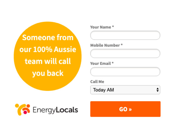
Energy Locals is an Australian energy retailer that provides clean, environmentally-friendly energy in an affordable way. Their service is location-specific and has a higher barrier to conversion than, say, buying a pair of pants, so they’ve given visitors a direct line to their 100%-local team should they have any questions or need more information.
Bright colors and minimal form fields make the popup easy to spot and easy to fill out. And the drop-down menu for when to call is a nice touch to let visitors feel in control, and know that their time is respected. At a 61% conversion rate, the proof is in the popup pudding.
Picks from Around the Web
Fun and to the point

Who doesn’t want $10? This popup cuts right to the chase and uses an upfront offer to attract customers. Meanwhile, the body copy manages to keep it light and fun.
Notice that this popup appears on a product page. It’s not coming up on the blog, where a visitor might have just been browsing for an article about hoodies. Instead, it’s right on a page where a customer can take advantage of the discount and buy the hoodie.
Empathy in action
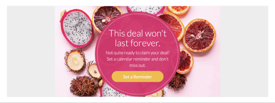
This clickthrough popup gets so much right. It focuses on the visitor’s needs and perspective and highlights a limited-time offer (with a dash of FOMO). And it gives them the chance to postpone their purchase without missing out—a win/win. Someone who’s interested but not ready to buy is going to see this and feel understood. That’s very smart.
This popup also gets points for simplicity. Remember what we said about having a single-purpose CTA? That’s what they’ve done here. They’re not asking for your email address or anything else; you just click the button to set a reminder and they’ll see you when you come back to claim that deal (at which point, they can propose a different offer, like an email signup).
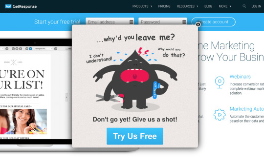
“Why did you leave me?”
This poor lil’ creature. This one is clear, creative, and very noticeable. Even if you bounced, you probably stopped for a second to figure out who or what that little guy is.
Notice even though the CTA isn’t on top—where you might expect to see the headline—it is the largest, hardest-to-miss text. CTA buttons are great because they put your CTA and your clickthrough function in one spot. No need for clutter or complication.
Keyword: YOU
Is it mind-bendingly creative? No. But that’s okay.
This subtle, thoughtful popup does exactly what any good popup should do. It makes a clear offer that emphasizes what’s in it for you. They realize that you need a good reason to let them get in your inbox, and they’ve articulated three reasons in the body copy.
Notice how they’ve also given you two ways to leave the popup: the “X” in the top-right corner and some text at the bottom that says “close this popup.” Big points for respect and clarity.
Exclusive offers and best-kept secrets

Some words never get old: New. Free. Exclusive. Let your visitors in on a secret guide or grant them membership to an exclusive club. Just be sure that what you’re offering is genuinely valuable and appealing. If you’re not careful, the secret club angle can come off like a sleazy magic trick. But done right, it’s a great way to generate curiosity.
Call out objections
Sometimes it helps to address objections to your offer, especially in an exit popup. If your landing page has a high bounce rate, you may want to test popups addressing possible objections that are making them bounce. Not only will this lower your bounce rate, but it will help you better understand what customers think of your page and why they’re bouncing.
Pop “under”

Did you know a popup doesn’t need to take up the whole screen or appear right in the middle of the screen?
A simple ‘pop under’ (we call ’em sticky bars) form like this one is like a gentle reminder to join a mailing list. This example appears on a product page, but a low-key popup off to the side or down at the bottom is ideally suited for a blog because something more in-your-face might interrupt someone in the middle of a sentence.
Multiple choice

One way to be relevant is to just ask visitors what’s relevant to them. This example from a fitness site presents three choices that direct people to three tailored solutions (and organizes them into three customer segments).
The opt-in buttons are bright and attention-getting, so someone struggling with one of the three problems mentioned might see their issue before they read the question up top. This is an exit popup, so the person may be bouncing because they didn’t find content that was relevant to their specific fitness issue. This popup addresses that exact problem.
Hit the Ground Running with Popups
A well-designed popup can put your business on the fast track to more conversions, more leads, and more revenue. They’re one of the best ways to reach your customers directly and ask them to take action.
When you’re ready to include them in your marketing, try building popups in Unbounce with a free 14-day trial.
14 Inspiring Popup Design Examples to Help Grow Your Online Business published first on https://nickpontemrktg.wordpress.com/
0 notes
Text
14 Inspiring Popup Design Examples to Help Grow Your Online Business
For something that literally “pops up” in your face, the value of popups—and the variety of ways they can be used to convert more visitors—is often overlooked.
And while we’re sure the word “popup” brings some lousy user experiences to mind, don’t let a few annoying apples spoil the bunch. Popups can actually enhance your visitors’ experience and be an incredibly effective marketing tool when used in a thoughtful, targeted way. They help you highlight relevant offers, products, or sales, build email lists, and recapture your visitors’ attention before they leave the page.
With a few best practices and some steal-worthy examples, this guide is here to help you design and launch high-performing popups that convert more of your visitors into sales, leads, and customers.
Why Use Popups?
The short answer: because they work.
Popups keep people on your page, remind them of what you have to offer, and collect data to nurture leads. Think of them as your marketing sidekick with the superpower of boosting conversions.
How popups worked for these brands:
Canvas Factory used a popup to bring in $1.1 million of revenue after struggling with high traffic that didn’t convert. They used tracking integrations to fine-tune their campaign.
Entrepreneur magazine increased sales by 162% by adding a hover.
Hotjar gained 60-70 new users per month with a popup that put user experience first.
Broomberg wanted to generate more leads on a tight advertising budget. They designed a popup that increased their leads by 72%. They did this without having to spend more money on paid search advertising.
Popup Design Pro Tips
The headline is the hero
80% of people who see a piece of content will only read the headline, and a good headline can boost traffic by up to 500%.
So be sure to make the benefit of your offer clear right in the headline. This makes it easy for someone considering clicking away to know exactly what they’re turning down. Your call to action (CTA) should also be simple enough that it fits in a headline anyway.
Be clear, relevant, and concise
Like all content, you want your popups to be clear and to the point. It’s not just about the relevance of your popup to your visitors. It’s also about the relevance of your popup to the page it appears on—and the experience that you’re guiding your visitor through. Make sure it complements the content on your page instead of competing with it.
Canvas Factory found this out when they discovered a certain popup’s conversion rate on blog posts was just 0.18% compared to 11% on product pages.
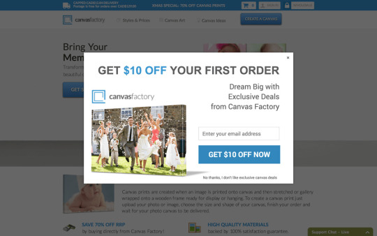
The difference came down to relevance. The offer was the same in both cases: a $10 discount on your first order for signing up for their email list. Their A/B testing confirmed the natural assumption that a discount popup will do better on a product page (where potential buyers hang out) than on a blog where visitors might just be looking for information.
Design with user experience in mind
Think of the whole visitor experience when you’re designing a popup. That’s how you achieve relevance. The best way to get them to take the journey from visitor to buyer is to consider what that path looks like for them. Then design with their perspective in mind.
If you’re promoting a product, for instance, share a discount code and get new customers to sign up with a lead gen (form) popup. If you’re having a sale, direct them to related sale items with a clickthrough popup. And if you’re sharing a piece of content, either send them to a related piece of content that nudges them closer to becoming a customer—or send them to a product that’s mentioned or is particularly relevant.
Include a strong call to action
A call to action does exactly what the name suggests: it asks readers to do something. The CTA is the focal point of a popup. It should stand out, and what it’s asking visitors to do should be obvious—even if a visitor looks it for a split second. You only get one CTA per popup; there can’t be two offers. What’s the one action you want people to take? That’s the CTA.
Be respectful
Sure, popups sometimes get a bad rap. But if you follow the above tips and avoid making the mistakes below, you can make sure yours fall on the right side of popup history.
Confirmshaming
The internet has a word for dissing people who don’t want your popup offer: confirmshaming. That’s when your opt-out option is something like, “No thanks, I like being broke and friendless,” or, “I don’t like saving money.” This snarky tactic might have been cute for the first company that used it, but now it’s so overplayed that there’s an entire Tumblr dedicated to examples of confirmshaming in action.
Besides coming off as, at best, annoying, and at worst, downright condescending, confirmshaming can completely distract from your offer.
The value of a popup is that it allows your customers to take immediate action on something that can help and benefit them. Nothing should distract from that—especially not your attitude. A visitor who’s not ready to buy today might be ready the next time they encounter your content, but not if their first encounter left them with a bad taste.
No exit option
Another issue we see too often is the popup that’s like an escape room. Clicking away from a popup should be simple and straightforward. The extra captive eyeballs you might gain by turning your ad into a click trap aren’t worth the resentment and frustration you’ll stir up. And the worst part could be that people you trap with this kind of popup strategy may have been trying to close it so they spend more time browsing your site. Talk about a self-own.
Do unto others
When in doubt, stick to the golden rule: how would you like to experience a popup, especially one you’re not interested in? Look at the nice example below. No attitude, no snottiness, just a simple “No, thank you.”

Learn from others
Marketing and advertising pros collect “swipe files” of work they like. They use these examples to learn from and as inspiration for their own work. You can do this, too. Start taking note of popups you see online and screenshot the ones that grab your attention in the right way.
When you’re designing a popup, you don’t have to reinvent the wheel. Study what works and make those elements your own by incorporating them into your design. If it catches your eye or gets you to click, the creator probably did something right.
If you’re building popups in Unbounce, we have a ton of templates that allow you to plug your offer into a format that works.

Collect data
A great thing about popups is that they can include all sorts of tracking technology that can give you insights into what’s working and what’s not—through insights like impressions, clicks, and conversion rates. Use that info to improve your offer and the design you use to present it.
That said, be deliberate when you’re testing. If you test a bunch of variables at once, you won’t know what’s working and what isn’t. Take testing one variable at a time. For example, testing the CTA and testing whether or not to have a popup triggered on exit are two different tests.
Target and Segment
Possibly the coolest thing about collecting data from your lead gen popups is that you can use it to create customer segments and Facebook “lookalike audiences” for social ad campaigns and other targeted advertising.
The popup and sticky bar builder allows you to trigger popups based on visitor behavior, like arriving at a page, exiting, or clicking a link. You can use advanced targeting features to talk to visitors based on their location or how they found your site (i.e., one popup for a visitor who followed a link in your newsletter and a different one for somebody who found you through social media).
Plus, dynamic text replacement (DTR) takes relevance to a whole other level by changing the text of your copy to match what customers are looking for based on data about their preferences.
14 Popup Design Examples to Inspire Yours
We gathered high-converting Unbounce customer popups and other examples from the world wide web to show that great popups come in all forms.
Unbounce Customer Popup Examples
National Sewing Circle

National Sewing Circle is an online platform for sewing instruction and ideas. They’re a subscription-based business that trades in information, community collaboration, and resources for avid sewers (or those who want to become one), making their popup especially clever.
With agency TN Marketing, they created an offer of a $40 sewing gift simply for signing up for their newsletter—which works as a lead nurturing strategy to eventually nudge subscribers toward signing up. Stating the dollar amount given in return for an email address makes the value crystal clear, allowing the newsletter to show the value of a full NSC membership over time. So far, this popup has converted 29% of traffic and over 70,000 visitors—and the circle continues to expand!
Regiondo

Regiondo is an activity booking software for facilitating, managing, and promoting ticket sales. Their software is robust in functionality and can be used by a range of people in a number of industries, making product information and education a key conversion driver.
This simple, no-frills popup to book a product demonstration gets visitors in the door and connected with a Regiondo team member while they may still be in the browsing or “evaluation” phase. It’s a great example of “well-designed” applying to functionality over flare—a clean, direct popup targeted to the businesses and professionals their services are for.
HiMama
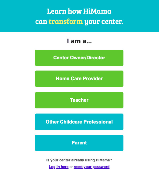
HiMama is a childcare app that streamlines childcare center management, parent communication, documentation, and administrative reporting. And streamlining is exactly what their popup does, too—effectively enough to convert 40% of multiple thousands of visitors. Yowza.
Because HiMama can be used for a variety of reasons, and by people in many different roles within the childcare industry, they’ve created a self-segmenting popup that helps them best tend to visitors enquiring about the platform. Contrasting colors, benefits-focused messaging, and straightforward calls to action lead visitors to individual SaaS landing pages targeted specifically to them. Kind of like a choose-your-own-adventure that ends with everybody happy.
Sulky

Sulky is a high-quality thread and stabilizer company that ships all over the world. They have a huge inventory of products and know that people who land on their website are there for a reason—they’ve searched for thread suppliers, clicked on an ad, or were referred—and are ready to browse, if not already primed to buy.
Placing a 15% off coupon right on their homepage is a smart way to incentivize a purchase and show appreciation to visitors before they’ve even become customers. The popup’s imagery and messaging are fun, eye-catching, and even a bit silly—in a good way! It makes for a warm, friendly invitation that’s bang-on brand and nearly impossible to refuse.
Wealthify

Wealthify is a lead generation service for mortgage brokers and financial planners in Australia. They turned to growth marketing agency Webbuzz to help get them more leads for potential customers. To do this, they took a softer approach that’s paid off with a steady 19% conversion rate.
“It’s been so successful that we have used the ‘info pack’ popup on other client sites,” says Ben Carew, Webbuzz’s Director of SEO Service and Analytics.
By offering an information package to learn more about Wealthify, a bulleted rundown of what’s included, and a one-field entry to sign up, they’ve made it a no-brainer trade for a visitor’s email. The clever graphics, bolded information, and clear call to action don’t hurt either!
Energy Locals

Energy Locals is an Australian energy retailer that provides clean, environmentally-friendly energy in an affordable way. Their service is location-specific and has a higher barrier to conversion than, say, buying a pair of pants, so they’ve given visitors a direct line to their 100%-local team should they have any questions or need more information.
Bright colors and minimal form fields make the popup easy to spot and easy to fill out. And the drop-down menu for when to call is a nice touch to let visitors feel in control, and know that their time is respected. At a 61% conversion rate, the proof is in the popup pudding.
Picks from Around the Web
Fun and to the point
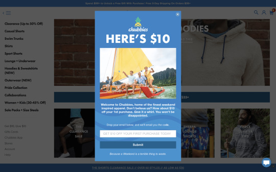
Who doesn’t want $10? This popup cuts right to the chase and uses an upfront offer to attract customers. Meanwhile, the body copy manages to keep it light and fun.
Notice that this popup appears on a product page. It’s not coming up on the blog, where a visitor might have just been browsing for an article about hoodies. Instead, it’s right on a page where a customer can take advantage of the discount and buy the hoodie.
Empathy in action

This clickthrough popup gets so much right. It focuses on the visitor’s needs and perspective and highlights a limited-time offer (with a dash of FOMO). And it gives them the chance to postpone their purchase without missing out—a win/win. Someone who’s interested but not ready to buy is going to see this and feel understood. That’s very smart.
This popup also gets points for simplicity. Remember what we said about having a single-purpose CTA? That’s what they’ve done here. They’re not asking for your email address or anything else; you just click the button to set a reminder and they’ll see you when you come back to claim that deal (at which point, they can propose a different offer, like an email signup).
“Why did you leave me?”

This poor lil’ creature. This one is clear, creative, and very noticeable. Even if you bounced, you probably stopped for a second to figure out who or what that little guy is.
Notice even though the CTA isn’t on top—where you might expect to see the headline—it is the largest, hardest-to-miss text. CTA buttons are great because they put your CTA and your clickthrough function in one spot. No need for clutter or complication.
Keyword: YOU

Is it mind-bendingly creative? No. But that’s okay.
This subtle, thoughtful popup does exactly what any good popup should do. It makes a clear offer that emphasizes what’s in it for you. They realize that you need a good reason to let them get in your inbox, and they’ve articulated three reasons in the body copy.
Notice how they’ve also given you two ways to leave the popup: the “X” in the top-right corner and some text at the bottom that says “close this popup.” Big points for respect and clarity.
Exclusive offers and best-kept secrets
Some words never get old: New. Free. Exclusive. Let your visitors in on a secret guide or grant them membership to an exclusive club. Just be sure that what you’re offering is genuinely valuable and appealing. If you’re not careful, the secret club angle can come off like a sleazy magic trick. But done right, it’s a great way to generate curiosity.

Call out objections

Sometimes it helps to address objections to your offer, especially in an exit popup. If your landing page has a high bounce rate, you may want to test popups addressing possible objections that are making them bounce. Not only will this lower your bounce rate, but it will help you better understand what customers think of your page and why they’re bouncing.
Pop “under”

Did you know a popup doesn’t need to take up the whole screen or appear right in the middle of the screen?
A simple ‘pop under’ (we call ’em sticky bars) form like this one is like a gentle reminder to join a mailing list. This example appears on a product page, but a low-key popup off to the side or down at the bottom is ideally suited for a blog because something more in-your-face might interrupt someone in the middle of a sentence.
Multiple choice
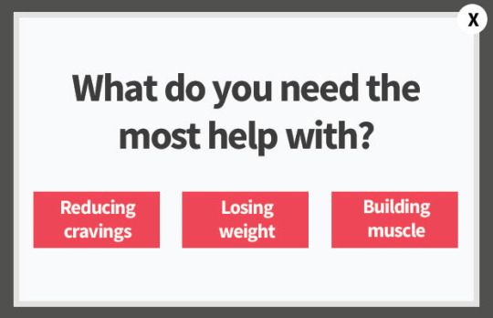
One way to be relevant is to just ask visitors what’s relevant to them. This example from a fitness site presents three choices that direct people to three tailored solutions (and organizes them into three customer segments).
The opt-in buttons are bright and attention-getting, so someone struggling with one of the three problems mentioned might see their issue before they read the question up top. This is an exit popup, so the person may be bouncing because they didn’t find content that was relevant to their specific fitness issue. This popup addresses that exact problem.
Hit the Ground Running with Popups
A well-designed popup can put your business on the fast track to more conversions, more leads, and more revenue. They’re one of the best ways to reach your customers directly and ask them to take action.
When you’re ready to include them in your marketing, try building popups in Unbounce with a free 14-day trial.
from Marketing https://unbounce.com/conversion-rate-optimization/14-inspiring-popup-design-examples-to-help-grow-your-online-business/
via http://www.rssmix.com/
0 notes
Text
19 SEO Tips To Increase 📈 Your Search Rank🔍👍 [With Proof!]

Last Updated - 2019-03-11
One of my 2018 New Year's resolutions was to make organic search traffic a top priority.
And you know what it worked!
For transparency sake in March 2018 this site appeared almost 180,000 in Google search results. This translated to 61,000 page views. For any given month in 2017 I was lucky to earn 5000 impressions.
By November 2018, 8 months later, I had improved my organic search traffic to over 160,000, which continued to climb in December, despite the holiday lull.
The good news is you can follow my lead and improve your organic traffic and Google results. You may not see the large numbers I had, but you will see improved traffic.
The actual traffic volume will vary by niche and target market. My numbers increased because there is a lot of search volume for web development. But if you have basically 0 visitors from Google each month, which most sites experience, 100 or 500 new visitors could make a positive impact on your business.
After making many deliberate technical changes to this site and changing my content strategy things improved. My next goal is to reach 1 million monthly search impressions.
These tips are not related to building backlinks, at least not directly, they are mostly related to on-page and technical SEO. This means how you can clean up your site's code to make it faster and easier to use. These tips
After reading these tips you will want to audit your site to see how many of these tips can be applied to your site to make it rank better.
How did I do it? How can you replicate my success?
In this article you will learn 20 actionable tips you can implement today, for free, to start reaping the rewards of increased traffic to your web site.
Full disclosure, my results are mine. Your results can and will vary. I do use some paid tools, but you can implement these tips for free. The services and tools I use help me scale and complete tasks faster.
Intentional Effort and Motivation
I wont lie, I invested 10-20 hours a week for the first two months of 2018 making changes, one by one. I have not stopped making changes and will continue to make upgrades.
Good SEO is hard and takes a lot of intentional effort. But anything worth doing does.
The good news is there are many FREE things you can start doing today that will have an immediate impact.
Last week I got involved in a conversation with fellow Microsoft MVPs about our annual contributions. You see we were in the last week of our award renewal period, which means everyone is evaluating what we have done the past year.
A key area for MVPs is their blogs. How many, how much reach, how to get more reach etc.
Of course great content is the goal, but reaching the developer and IT community is more important for our MVP award status.
If no one reads the content we pour our soul into then does it really matter?
The good news is you can get the eyeballs you are after. And you don't have to be a Microsoft MVP to win big.
As MVPs we are motivated to reach others and provide good advice so everyone can succeed. Hopefully that is your first goal.
The second goal of course is to use our platforms to confirm our expertise and work ethics to earn great paying gigs and sell our products. Right now my main revenue goal is to enroll students in my Progressive Web App Course.
So between the MVP program, developer projects and my course I have lots of motivation to make this blog popular.
Organic Search Engine Optimization
Over 93% of web traffic originates with search.
The best news is that traffic is FREE! But it is not easy to earn.
That means a solid SEO strategy is important for anyone wanting to reach folks with their message. Compared to all the paid traffic channels, organic SEO is by far the best source of traffic.
Search engine optimization or SEO is the art of creating content and earning good placement on tarageted search or keyword phrases in search engines.
I emphasize earning because you can't buy your way to the top. At least not for a reasonable return.
The algorithms used by Google, Bing and other search engines are highly gaurded trade secrets. But they boil down to these requirements:
That's it!
Simple, right?
Win these two categories and you will earn things like backlinks, etc.
The tips I share in this article are designed help you meet these two requirements. Plus this is not limited to just Microsoft MVPs. These tips will work for any web site.
Here is the Proof
I had neglected my SEO for a few years. I neglected checking my analytics and just assumed things were still humming along like they were several years ago.
After an MVP meeting in Boston I went and checked my analytics. I was sad, because there was almost no traffic.
Last year I made an intentional effort to grow my reach, but honestly I went down the wrong path. I listened to successful marketers talk about their channels, mostly paid.
So like them I spent a lot of time and money trying to grow an audience through things like Facebook ads. And to be honest I grew an audience. I have over 6000 Facebook fans and an email list I grew from 0 to 1400+ in the past year.
What was I doing wrong? I mean I try to author content I think other developers need to know. My site is fast, That is something I preach about, so I have to load fast!
Turns out despite writing good content (yes that is arbitrary 😃) no one was reading the content.
Bad search rankings were the big reason why. So over Christmas I decided to focus 100% of my effort to grow my organic search.
It was not an overnight success, but so far it was close.
I really started to see results in mid February. That is roughly when the items I am sharing in this post were fully implemented.
Over the course of the year my traffic gradually improved as articles accrued better rankings. I also added more articles over time.
Note: There were a couple of short periods where I made changes and the analytics code was omitted. Also, note a seasonal drop off over the Christmas holidays. Tech traffic drops when developers go on vacation, who knew!
Not every article is a success by my standards, most are. A few seem to be stuck on page 2-4. But over time I tweak the content and they gradually improve.
So what did I do?
Author Greenfield Content
Back in the 2010 time frame I was challenged by my manager to author more 'thought leadership' content.
What does that mean?
I wrote what I will call vanity content. These are articles I felt others needed to hear or that I felt were important.
Often they are more op-ed than substantive or actionable.
In short, developers really want to know how to get their job done, not theories.
Anyway, I wrote a lot of articles that were more editorials than practical. An example of these areticles is one I wrote about Mark Zuckerberg comments at TechCrunch Disrupt.
Lots of pontifications and yeah it tells you what I think.
But who the heck cares?
That page ranks for absolutely 0 keywords!!!!
Turns out I had hundreds of URLs ranking for 0 keywords, which means they were just dead weight.
Unless I share those articles on social media no one will ever read the article. And even then it is questionable. Most tweets and Facebook posts have little to no engagement to speak of.
Heck I am looking over that article and just see words, lots and lots of words.
I don't even want to read it!
I may apply one of my later tips to this article, I will let you guess which one!
Up to that point (2010) I typically wrote about things I thought were helpful. Typically it was how to write code, which should be what I write about! I want to help developers write better code.
At the same time I want business decision makers to know what they need to use for their business. So explaining technology is the other key content area.
But I can't just write things I get a fancy for. I need to write for what others are searching for.
So, in mid February I switched back to focusing on that strategy. I started writing on topics I would have never dreamed of 4 months ago. And you know what, people are reading those articles!
These articles fall in the category of Greenfield content. The difference between these articles and the vainity posts are they have a long traffic life. Sometimes vanity articles get a great initial bump, but quickly fade into obscurity.
Greenfield content targets common search phrases with decent or large volumes. Those searches are pretty steady over time.
The HTML Input Placeholder Color article is just an example. That page basks in 5-20 victors a day.
Did you know most web sites can't even get 25 real visitors a day!
Aggregate those view over 365 days and I should have 1,825-7,300 readers over the course of the year.
And you know what, I should get even more. I am not fully ranking as high as I can for that page's keywords yet. I am almost there! I am betting I can get to 30-50 readers a day by the end of April! #BOOM
To target these topics I needed to discover what people were searching for. This means keyword mining.
The best place to start is the Google Adwords keyword planner. You will need an Adwords account and I think it needs to be active for a while before you have full access. I also think they recently changed the rules to require some paid activity.
Bing has a similar tool, but it not near as good.
There are great paid services like AHrefs, which I now subscribe and SEMRush.
These tools should give you a good idea what phrases people are entering in search engines to find answers to their questions. They will also tell you estimated volumes, etc. The paid services will also help you understand how stiff the competition is, so you can target simple topics first.
There are other free keyword tools available online. Even with the paid services you will need to take time to identify target keywords to create content.
Key takeaway: Write What People Are Searching For
Write Differently Than Your English Teacher Taught, Write for the Web
I have mixed feelings about my experiences in English classes. I enjoyed the reading, but not the subsequent book reports. To this day I still get 'critiques' about my grammar and writing style. Somehow it never seemed like it followed a formula like math and chemistry.
Writing has changed in the past 30 years, thanks to the Internet.
In school we were and still are taught to write for print, not for digital.
There is a difference and knowing how to write for online makes a difference.
Most of us were taught a 'Chicago Style' of writing. 5 paragraphs, intro and conclusion. Each paragraph at least 3 sentences.
I still fight to avoid this style today.
But as you may have noticed this article avoids that style.
And for good reason.
Research says it does not work online. I call it 'Internet Style'.
Even if you still read the morning paper or physical books, you no longer need to write for print.
Internet readers don't want long paragraphs, instead use short paragraphs.
Make sure there is margin or spacing between the paragraphs.
You should also 'bridge' paragraphs. Brian Dean has the best advice, I love Bucket Brigades.
Make your content skimmable. This way your readers can scroll down the page before committing to a full article. I often look for lists and main headers to get the general idea before committing.
79% of your audience is only going to skim your content. That’s not likely to change.
Don't be hurt knowing everyone will not read your content.
Instead, create content that is easily skimmable and still provides value. Your goal is to help them, not consume their time.
You should also try your best to tell a story. A problem in my primary niche here on Love2Dev is being too technical. Most the content in the development space reads like documentation.
Over the past year I have authored a new Progressive Web Application book and articles for other publications. At least on two occasions my editors pushed me to tell a story with my content. As a developer my mind struggles with the concept of making technical content read more like a novel.
Don't worry you won't have to write the next Harry Potter, just something that engages your audience. Over the past year I have been working more and more with C# Corner to improve the site's SEO. The idea of producing and updating content from documentation and example style articles into something more engaging has been a struggle.
Since the authors are developers and general learn development concepts from documentation the creative side is often overlooked. But not only will incorporating a story based approach engage more readers, it will help your search profile.
Why?
Because your content will be better quality and over time you will be rewarded.
Appeal to the reader's person, and don't just produce dry content that bores them. Make them engage deeper than just scanning your articles by telling a story they can relate.
Telling a story is also a great way to acheive my next tip, writing long!
Write Long
Research shows longer content ranks better. But this is not the whole story.
Just because this research shows longer articles rank better does not mean this rule applies 100% of the time.
Sometimes short content is the right content. I still try to hit at least 500 words an article.
My workflow is to identify a primary keyword phrase and look at the top 10-20 results. How long are there articles? Especially the top 3 results, they matter the most.
More may not be better.
Sometimes the question (keyword) can be answered in a sentance or two.
This does not mean to write 2 sentance articles! Answer the provide an answer as quickly and succinctly as you can, but always provide more depth to the topic.
Recently I have been producing a series of 'how to' on topics I consider very beginner. For example JavaScript for loops. The funny thing is everytime I start on these 'simple' topics I find some intermediate or advanced topic to cover in the article.
I do find authoring longer articles gives me an opportunity to prove my skill level, show off a little and cover a broad range of keyword opportunities.
If I can produce an article that ranks in the top 30 for 500 or more keyword phrases means I have a winner that will generate traffic for years to come. The CSS Placeholder Color article ranks for over 400 keywords I know about.
Think about that reach?
Bonus : Make sure you mention your primary keywords or keywords in the first two paragraphs. You don't want your primary keyword to show up around word 1500!
Backlinks Matter
There are two types of backlinks, external and internal. Google and other search engines use them to find pages as well as apply value to the page. Basically, they are the most important ranking factor.
An Authority Hacker research study confirms backlinks “are still the most strongly correlated factor for SEO success.” They are not alone, other studies back up their findings.
While the correlation between links and search position is weakening, it does not seem to be completely fading. Until search engines can find a more reliable mechanism to rank content they will continue to be important.
This means you should focus on acquiring links to your content. You should also plan your internal linking strategy. The goal is not just earn a large quantity of links, but earn links from topically relevant pages that also have authority or equity to pass to your page.
Use Media (Images & Videos)
I know we tend to write toward developers, but a picture is worth a thousand words.
Research has shown content with pictures and videos rank better.
Way back in 2009 Moz did a study that found posts with images, lists and videos attracted the most domain backlinks.
But who has time to find and sometimes pay for photos?
I don't.
These are just some of the free sites I use for artwork. Sometimes I pay for photos and design work. It depends on the content and potential pay back.
I was spending time creating illustrations. But honestly there is little return in the time it takes to create a decent illustration. Sometimes it took longer to make the feature illustration than it took to write the content.
Today I have changed to a good photo. I may overlay some text, but that is rare. I limit my effort to uploading the original and then letting a set of AWS Lambdas optimize the image and create a responsive array to include in my pages. The Lambdas even create the HTML, CSS and JSON I need to render any page I might create.
For technical content, which most MVPs produce, you should also include screen shots. Phones have made that super easy. On Android just hold the power and down volume button down.
iPhones are similar, push the power button and home button at the same time and quickly release.
On Windows you can hit the Windows + PrtScn button on most keyboards. Windows also has the Snipping tool. Just hit the start button and start typing snipping and it will show up.
The snipping tool allows you to isolate an area of the screen for a screen capture. You can then annotate the image. There are a few of these in this article.
I have also started making screen captures of source code because I have been having markdown to HTML rendering issues with HTML. I hope to fix that soon.
There are many opportunities for you to add artwork in your content. Images are an easy improvement.
But there are more opportunities...
Start a YouTube Channel
Last year one of the first things I did was get serious about video. I had grand visions of becoming a YouTube star.
I got a green screen, tripod, lavaliere microphones and of course editing software.
Video production is way more complicated than I anticipated. Not to mention getting people to watch developer videos on YouTube is not easy.
In fact, I will warn to not expect much traffic from YouTube in terms of traffic to your channel. Developer topics are not highly sought after.
Which is a shame because there is some great content on how to develop great software.
I got a little depressed about my results. But then I looked at the subscription and view numbers of what I consider to be my YouTube competition. You know what, their numbers sucked too!
I was making my expectations against different niches. So basically here is the honest truth, developers are missing out on great YouTube content.
But the rest of the world loves YouTube. I have learned so much about everything, including development the past year watching YouTube each morning when I get up.
So why I am telling you to start a YouTube channel?
That last point is important, but first what is OBS?
Open Broadcast Studio is a free, open source video recording tool. Thanks to Kevin Griffen for turning me on this great piece of software.
It can record your screen and create the videos you need for YouTube. But that is not where it shines.
You can use it for YouTube Live, Facebook Live, Twitch and other live media platforms!
Live is where the action is.
I still use Camtasia to record my screen for code walk throughs and slide decks. I should probably switch. But when I stream live from my desktop I use OBS.
While I was at the summit I forgot my phone tripod and needed to get creative. So I used OBS from my Surface to interview Greg Whitworth about CSS. I live streamed the interview and now it is a permanent video on my YouTube channel.
The cool thing is when you stream a live video on YouTube you can then post it as a regular video!
Did I say no editing and production involved?
Plus it was all FREE! Heck Yeah!!!!!
But wait there is more! I have not forgotten the SEO part.
Now the hard part starts. You need to write a blog post on the topic. When you are done writing, embed the YouTube video in the article. Google loves this!
YouTube is one of their properties. So they love anyone that promotes their properties. When you embed a video in your blog post you are killing two birds at once.
You are promoting your video on YouTube, but you are also adding multi-media to your article.
Images, videos and anything that adds non-text value to your content makes it rank better.
Users are four times more likely to consume video content than written copy.
In fact anywhere you can, embed the video. Add it to LinkedIn, Google Plus, Facebook, etc. There are literally thousands of sites you can embed your YouTube video.
Make sure you put a link to the blog post in the video's description. Even though it is a nofollow link, it still has some juice. I get site traffic from these links.
Today, I don't worry about my YouTube traffic. Its great if it happens. But I know the real value is embedding the video in the article.
For the record I will record a video for this article and embed it....right here looks good!
I don't always record the video first, sometimes it takes a few days to get around to it. But I try. I can testify when I add that video I typically see a rankings boost within 24 hours. Sometimes that is the difference between a position 25 and a place in the top 10!
Publish to a YouTube channel and embed the videos in your articles, Google loves to promote its own properties!
Sign up for a FREE Lumen 5 Account
Video is hot, duh I just wrote about it.
Attaching short videos with your social media posts is a great way to increase your engagement numbers.
But who has time to make all those 15 second videos? I don't.
Initially I signed up for Shakr, which costs $100/month. I made lots of videos using this service. They provide templates for 10-120 second videos. The best part is they render in the cloud, so your computer is not tied up with an intense video rendering process.
Most videos take 5-10 minutes to produce.
But $100, too much for my needs.
Then one day I found Lumen 5. I honestly have no idea how I found it.
They have paid plans, but I don't pay at all. I use the free service.
You can add your RSS feed and they will periodically grab your latest post, extract text and add background images. All that left is you hitting a button to render the video.
You can customize the video, but honestly I don't.
If you have followed my social media the past year you have seen these videos. Maybe you are following me thanks to the attention those videos gave my social channels!
You can also add these videos to your posts for that media bump.
Once you create a Lumen5 account add your RSS feed and it will make promo videos you can add to social media to promote your posts.
Attaching these videos to Tweets, Facebook and other social media posts will increase your aggregate engagement rates!
Emojis Increase Engagement Rates
Add emojis to your post titles and make sure you share the emojis in your social media shares.
Thanks to Kirupa for sharing how to use emojis in HTML. He explains how to get code points and add them to your text.
Go to Emojipedia.com to get the code points, it has a built in feature to copy them to your clipboard. You can then paste the emoji in your text.
The emojis show in the search results, which makes more people click your result, and that will move you up the ranks.
That's right, the number of times searchers click or chose your link in the search results affects how well it ranks. If you are in the top 10 for a week and have zero clicks then most likely you will be dropped down.
Having the visual pop provided by an emoji can grab the attention that earns a few extra clicks. Those clicks translate into better rankings.
The emojis also get better social response rates.
Its all about the visual attraction. Remember we like to look at pictures more than we like to read and emojis are just fun!
Ask Brian Terlson!
Embed Slide Decks
Even if you don't speak at conferences and user groups like I do slide decks can be your SEO friend.
I use PowerPoint to help me outline content. Plus I can create diagrams and currate images.
You can export your slides as images and PDFs. The images can then be repurposed in your written articles or videos.
You may also want to use the slide deck to record a video or do a YouTube live stream. Of course then you can embed the recording!
You should also create accounts on SlideShare and SpeakerDeck and upload your slide decks. Make sure you include a good description with a link back to your article.
You should also include links to your content in the slides. Google can read those links and give you backlink credit.
Exporting to a PDF can be valuable as well. There are thousands of document sharing sites you can upload to, like Scribd. Google can also parse the PDF for those links and give you a backlink.
I also use some of my slide decks as free lead magnets to grow my e-mail list. I typically reformat the slides to make them more 'book' appropriate and keep the content a little different since it is a lead magent.
Slide decks are an often overlooked tool to increase your search engine visibility.
Make Infographics
Just like slide decks infographics can be powerful SEO tools.
People like pictures and infographics are informative graphics (see how they are combined to a cool word?)
You can also share those on image sharing sites and of course earn links back to your site.
Pro Tip: Turn your slide decks into InfoGraphics!
I have created a few infographics and they seem to be well liked. I do pay graphic design specialist to create them for me. I spend about $40-50 for each one, but it is well worth the inevestment.
FYI: I have ordered an infographic for this article 😁
Use HTTPS
As of this summer I doubt any site using HTTP will be listed in any search results.
Google has made it clear in recent years HTTPS is a ranking signal. Chrome and other browsers are getting more aggressive with visual messages when a page does not use HTTPS.
This means consumers will not visit insecure sites.
The evidence is clear, if you are not using HTTPS you probably are not listed in the first page for any search today. There are some exceptions to this rule.
My anecdotal survey says less than 10% of the searches I perform or research include pages using HTTP.
Another observation about sites using HTTTP, they tend to be abandoned. By that I mean the content has not been updated in a year or more, in most cases. Which is probably why they have not been upgraded to use HTTPS.
When I find sites using HTTP I tend to review them and find what they rank for and put that content on my to do list because I know I should be able to out rank that page within a month or so.
Certificates are free today, so there is not real excuse to use HTTP anymore. Upgrade, today if you have not.
Be Fast - Real Fast
I have been saying this for over a decade. I still encounter developers that argue web performance does not matter.
The reality is consumers, real people, want pages to load fast. Like before they click a link fast. On mobile cellular connections no less.
Google has been clear, speed matters for search engine ranking. Marketers know this.
In fact they write more about web performance optimization than developers do. And those are the people that hire developers, think about that...
The first rule is you need to have meaningful content painted on the screen within a second. You should also be usable between 3-5 seconds after the user perceives they requested the page.
At 3 seconds you have lost 50% of the customers that wanted to read or interact with your page.
Mobile makes this harder.
Always test your site and pages on real mobile hardward and by that I mean average mobile phones, not an iPhone X or Pixel 2.
You can use the Chrome developer tools to perform simulated tests. WebPageTest is another great way to audit your pages. Your goal is to achieve a speed index of 1000 or less.
I wont hijack this article with web performance optimization advice. I have enough of that on the site already!
Do Not Use Fast Food Frameworks
I know I get lots of grief about this topic. But I am 100% right.
Sites that use Angular, React, Vue, Ember and other fast food frameworks don't rank well.
The #1 reason is they load too damn slow!
JavaScript is the #1 reason your pages don't render fast.
Plus Google deprecated their AJAX cralwing policy a couple of years ago, which means single page apps and AJAX heavy sites won't index well in the first place.
If you want to rank well, ditch the framework and focus on pre-rendered static web sites using thin JavaScript.
Remember the average web page takes 22 seconds to render on mobile phones. JavaScript is the reason. My pages average 3-4 seconds, just sayin.
Fix Your Broken Backlinks
The first thing I did over Christmas was repairing my backlink profile. These are links to your site. They account for about 33% of your ability to rank, or so the experts say.
I did the research and found about 2000 broken backlinks to my site! That was more than were active. No wonder my organic SEO had fallen so much.
Most were pointing to my original blog engine's routes. I spent about 30 minutes each night going through the list and identifying the URLs they pointed to and setup a 301 redirect to a new page.
Sometimes this was redirecting the link to the new route. Other times I had removed the content all together. I either pointed them to my blog's home page, my home page or a related page.
If you are not familiar with a 301 redirect it refers to the HTTP status code returned from the server when a resource is requested but has been moved to a new address. It tells the client (browser) the resource has permanently moved and what the new URL is. The user agent should then load the new location.
By configuring 301 redirects you are reclaiming these links. For Love2Dev this had a big impact on the domain rating. This is a common KPI different search engine optimization tools have created to indicate the domain's health in terms of SEO. Each service has their own algorithm so I won't try to provide details.
The irony to this story is one of the first blog posts I wrote was how to setup a 301 redirect in ASP.NET.
Claim Your Site in the Google & Bing Web Master Tools
The first place to identify your broken links is in the Google & Bing web master tools.
This is your 'official' window into how the search engines view your site. You can see what backlinks you have been credited, what search phrases you rank for and how much traffic they send.
Just as important you can also see if there are crawl errors. The main thing I look for are 404 or not found URLs on my site.
Google reports these URLs and what source pointed to the missing URL. You can then configure a 301 to direct that traffic to a new URL.
If you have not configured your site in these web master tools you should read the instructions. You will need to either add a special HTML page or a DNS record to verify ownership.
In Google you should also claim up to a combination of 4 variations: http://domain.com, http://www.domain.com, https://domain.com and https://www.domain.com. I can't remember why this is important, but do it. The stats and information will be available for your cononical protocol and domain.
Canonical Tag
Speaking of cononical, you should add a rel="cononical" META tag to every page. Its value should be the final or single source of truth for the page.
You should setup 301 redirects for anyone entering your site using HTTP and the domain configuration you are not using.
For example I route everyone to https://love2dev.com/{slug}. You may route to your www version, it is up to you. Just route them to a single source.
Search engines use the cononical tag to give the authoritative URL all the credit. This keeps your link juice from being distributed to other versions, which reduces your ability to rank.
Open Graph & Structured Data
There is no proven correlation between structured data and your ability to rank, yet. But it can be helpful for social media marketing and the potential to be listed in a position 0 resource.
Position 0 are the useful content boxes above the first listing. The content can be in a variety of forms, like lists, image packs or paragraphs. The content is 'scraped' from one of the top 10 listings, not nessecarily the #1 listing.
I have a few pages benefiting from position 0 right now. I can attest they drive a higher volume of traffic than normal search listings.
Sometimes structure data is used for these resources.
Structured data is also used for local SEO, but that is an entirely different subject.
Re-Purpose Old Content
If you are like me and started blogging over a decade ago you have old, crusty articles. Some of then have some value, they just need to be refurbished.
Before you throw out those old articles, evaluate if their core value or points are still valid today. If so refresh the content.
Not only do you get a new article, but you don't have to start fresh.
Remember to 301 the old URL before publishing to a new URL.
One thing I am doing as I refresh old articles is use shorter URLs, you may want to do this as well.
Delete Dead Weight Pages
Remember that Zuckerberg article I mentioned earlier? Dead weight. I need to delete it.
I wont now, because it is an example for this post.
But I have deleted around 400 dead posts on this blog since the first of the year. I am removing 40 this week alone.
Removing dead pages helps your site rank better because Google has a clearer picture of what your site is about. Plus those old post that no longer have backlinks or talk about technology that no longer exists dont offer value to anyone.
Google Gary Illyes unpacked this topic in a Q&A with Stone Temple Consulting a few years ago. Its about having high quality content. If you think about those pages are not bringing you traffic but they consume spidering time from the Googlebot and create 'noise' that keeps potential visitors from reading your core message.
I think removing those posts was a big reason why my newer posts started doing better.
Make sure you setup a 301 redirect from these posts to something live on your site. For me, most of those URLs now point to my main blog page.
Use Mobile First Responsive Design
This should not even need to be mentioned, but I will anyway. Google is aggresively swapping their mobile index to be their primary index right now. That's because the majority of searches originate on mobile devices.
By June mobile will be the primary index. This means Google will spider or evaluate your site as it renders on a phone more than it will as a desktop. Perform poorly on small view ports and you risk not ranking in search results.
This should emphasize the need to have a mobile first responsive layout on your site. You need to be able to render nicely on any device and any viewport.
Shoot For Big Targets - Hit Long Tails
Its easy to start digging into keyword data. I know I am fascinated by the terms and volumes I am finding in my research. Its important you understand how to read the data to form a realistic strategy.
Remember how I said the placeholder color article ranked for hundreds of phrases? The vast majority of those terms are lucky to see 10-20 searches a month.
Sure there are about 10-12 with over 500 searches a month globally. And yes those are the primary terms I am targeting. But I am careful to identify different 'long tail' phrases.
About 20% of the billions of searches Google handles each day are entered for the first time! This means there was no way for you to know to target those phrases.
For what it's worth this is where their RankBrain AI engine kicks in. But that's another complex topic....
Think about 20% of a billion. That is a lot of potential traffic to your site. And it does not stop with new searches. The vast majority of search keyword phrases are entered less than 20-30 times a month.
Search engines do their best to interpret the user's intention and deliver the best result set. It helps when you know how to pepper your content with latent semantic phrases.
These are words and phrases that relate to the target keyword. For example, writing about Toyota automobiles should be surrounded by phrases related to driving or repairing a car.
Knowing what semantic or contextual phrases helps, a lot.
You can manually try to harvest search suggestions by entering primary phrases in the search to see what the auto suggest tool returns.
But free tools are always better!
Nile Patel's free uber suggest tool is very helpful.
There are also many services you can pay for, and full disclosure, I recommend this if you are serious. I subscribe to aHrefs and it is worth every penny.
I have refreshed and updated dozens of articles with additional phrases over the past few months and seen immediate impacts. But I need to know what to add and these tools help guide me to the right phrases.
I have to say this may be one of the biggest improvements I made. In the past most of my articles would have some rank on 5-10 phrases. Today it is rare I have an article with less than 100 phrases with some SEO ranking.
Wrapping it Up
These tips have focused on how you can modify a combination of on page/technical SEO and your content/editorial strategy.
Some should be obvious, but if you are like most you neglect the easy things more than you should. Others you probably never considered.
I know there are items in this list I never applied till I took a leap of faith. Letting go of hundreds of old posts is a good example.
Organic search should be a primary goal of any content strategy. It is where the majority of web journeys begin. The traffic is free, but not easy to earn.
Writing content people need is important, but making sure you provide the best experience means your great content is sure to rank high and earns lots of free, reoccuring traffic.
This content was originally published here.
0 notes
Text
The Void of Fictionalized Perception: Affections of Media and Cinema with regard to Delusional Demand on the Formation of Built Environment in Turkey
Abstract
The scope of this article is to reveal unobtrusive negative affections of media and film industry on the formation of non-functioning built environment, especially if those used as tools of propaganda. Additionally, to point out deliberate abuse of given behavioral statement called fictionalized perception by the advertising sector in contemporary social contexts. Ultimately, to articulate what could be done in order to ease or even reverse stated affections to be able to provide a healthy built environment.
Keywords
altermodernity, architecture, and politics, cinematic affection, educational discourse, social context
INTRODUCTION
The built environment is not merely the creation of architects, city planners, and urban designers but a product of social context (Harvey, 1997). Therefore, it is vital to point out there are many parameters included in shaping the built environment. Arguably the cinema and media could be given as relatively interesting variables in stated formation with regard to their capability of creating a demand for the notion of place. The affection of cinema and media resulting in the phenomena which described as fictionalized perception or statement which could be considered as the human behavioral condition. This article argues articulated condition deliberately used and abused by advertisement sector and art of cinema itself shifting as a tool for social engineering which serving the economy lead by the capital authority. As a result, a culture based on consumerism seeds delusive societies which demanding built environment that fits in illusional dimension; but applied fictional built environment turns out as non-functioning spaces in the reality.
The article is structured respectively, to articulate the potency of cinema as total work of art from the framework of Wagner’s Gesamtkunstwerk notion, followed by within the perspective of cause-effect relationship; describe the notion of fictionalized perception, how media misused as a tool for social engineering by given examples from the world and how does it affect the formation of built environment by the specific examples from Turkey. Lastly, by denoting the educational discourse and discussions about how the society could cope with the ill-defined situation in order to be able to create both healthy built environment and develop an advanced civilization.
THE CINEMA AS GESAMTKUNSTWERK
According to David Bordwell, Italian film theoretician Ricciotto Canudo considers cinema should be defined as the seventh art (Canudo, 1923) in which combinatory art; with the ease of technology, it unites all arts in the singularity. Another consideration is articulated by Yrjö Sepänmaa as he stated about the work of Wagner:
By the time he finished Parsifal, his final opera, Wagner no longer considered his work to be opera. He did not want it called opera or music or theater or even “art,” and certainly not entertainment. By the time he finished his last work, Wagner realized he was trying to create another reality, one that would, in turn, transform ordinary reality. The term he came to use was “a total work of art,” by which he meant a seamless union of vision, sound, movement, and drama that would sweep the viewer to another world, not to escape but to be changed building in Bayreuth, Germany, well off the beaten track, where the audience would have to assemble after a long journey because he forbade the performance of Parsifal in any other building. The mythmaker would create a counter reality, one reminiscent of the solemn mass of the Catholic church, which appeals to all the senses with its sights, sounds, touch, drama, even appealing to smell with incense and candles. The audiences at Bayreuth were to become pilgrims on a quest, immersed in an artificial reality. (Sepänmaa, 2006)
The coined term Gesamtkunstwerk or total work of art could be explained by Wagner’s remarkably successful work which is capable to create artificial reality or by other words shifting the audience to another dimension besides of being evidence on how the artist could progress the society. On the other hand, in my opinion, it would not be wrong to say that, the cinema is also making us able to have a multi-sensory experience of artificial dimension. Therefore, the cinema also could be considered in the context of Gesamtkunstwerk.
It is not rare incident to see someone crying in front of the movie screen, which could be evidence of that the cinema as a total work of art could communicate with its audience not only by physical senses but intrinsic level. In movie screen, even in the most pessimistic atmospheres, every frame consists the composition of artists(e.g. storyboard artists, colorists, directors, directors of photography, costume designers); as a result, even the most chaotic frames (e.g. compositions of dystopia) provides a value of aesthetics.
An extreme example could be Stanley Kubrick’s Shining, as a perfectionist, he filmed the single strip 127 times just to be able to shot how exactly he wants to make it (“Lets try that again”, 2017). In fact, it is even capable of to stimuli unfamiliar sensations for the one who never perceived before. If the one perceives intangible value or intrinsic aesthetic first time from the designed composition of a total work of art, as if seeing a new color; the one will feel the lackness of the value in his or her life in the form of a cruel void. As a result, people will interrogate and analyze the reasons behind it. However due to the complexity of social context; most of the time, it is not easy to decipher the reasons or change the conditions. Thus, as a naive reaction, sometimes unconsciously, people tend seek those values by adapting their lives to movie screen and simulate a role within reality as similar to Ali Madanipour’s mask analogy as he states:
The masks we wear to face others are usually made of normal routines. When moving from the private sphere to the public space, these routines change, from changing clothes to shaving or putting make up, to changing the vocabulary, accent and forms of expression, and adopting a more polite, careful manner. The change of mask is done with care and often with the assistance of the mirror, so as to see with the eyes of the others how we might appear to them. This is not preparation for a special occasion. It is just a routine social habit of human beings in their daily social life.
(Madanipour, 2003)
Due to its behavioral condition, in this article, the articulated situation is called as fictionalized perception. For instance, when a person desire to live in a high-rise building probably he or she fictionize the elegant atmosphere of a familiar scene from a movie which actually the part of an aesthetic composition. Therefore, it could be a perceptible example for a stated behavioral condition. The content of the paper does not include the critique of high rises but These reminiscences used to create both demand and false promises by the capital economy. Awareness of fictionalized perception by vicious economy even producing its own movies just to seed stated demand. Thus the cinema itself turning out tool for propaganda.
ABUSE OF FICTIONALIZED PERCEPTION ON SOCIAL ENGINEERING
By nature, to protect its perpetuity, the capital economy endeavors to create a consumer-based culture. Thereby, as briefly mentioned before both cinema and media used as tools to abuse fictionalized perception. In order to support this notion, the meaning set on diamonds could be an example; before gigantic diamond mines found in Africa in the 19th century, diamond was extremely rare objects which capable to represent wealth and considered as royal jewelry. However, after the discovery of mines they were no longer remarkable because their value only measured by the feature of the rarity. The owners respectively monopolized the mines, limited the distribution in the market and most interestingly they designed a set of operations in order to sell them without losing significant value. Nonetheless, ironically, corresponding times (the 1930s) were times of great depression in America; people were scarcely able to provide their fundamental needs, especially middle class had no interest to invest items of opulence. They needed people to stop thinking diamonds were pointless but instead, a necessity. In order to be able to create the false social perception to show diamonds attainable but still high value, they partnered a marketing company which resulted in one of the most successful advertising campaigns in history. Diamonds became manifestation for affection and the arbitrary abstraction became an analogy from being most stable carbon formation, they infused diamonds the meaning of eternity. The campaign used advertisement, cinema, celebrity influencers, and fashion. (Cruz, 2016)
The sentiment is essential to your advertising, as it is to your product,” it counseled De Beers in a memo, “for the emotional connotation of the diamond is the one competitive advantage which no other product can claim or dispute. (Sullivan, 2013)
In the 21st century it would not be wrong to say that diamonds became forever in deliberately set social perception by the sector. As a result, by using the power of media diamond industry designated it is own demand and value with social engineering.
Similar actions could be observed for different products (e.g. promotion of cigarettes) but the objective of this section is to concretize the effect of social engineering as well as emphasizing the abuse of fictionalized perception. At that point, it is possible to ask questions such as why should it be considered as unethical action, or what could be the outcomes of such operations? Undoubtedly, negative outcomes of social engineering lead by corporal capitalism could be analyzed by different aspects or disciplines. Nevertheless, this article interrogates the phenomena only from the perspective of a designer of a built environment.
NEGATIVE REFLECTIONS OF CAPITAL BASED SOCIAL ENGINEERING ON URBAN SPACES
Aforementioned, a total work of art could make people feel intrinsic or qualitative absence which, in my point of view, should not be considered as negative aspect; in fact, those are beacons of artists for the society or guidelines of progression. However, one of the vital aspects of the capitalist economy is the notion of consumerism which bound to sense of lackness; therefore, the capital economy deliberately promises but never actually aims to satisfy those qualities. On the contrary, it tries to disrupt and mutate the reasons of lackness and endeavors sustainably bound to a pecuniary value. An example could be given the 21st-century urban societies of Turkey. According to Maslow’s hierarchy of needs, the self-esteem could be considered an intellectual need for an individual in front of the public (Lang, 1987). Ideally, the self-esteem should be dependent on being a functional, harmonious, virtuous and respectable individual in the society. However distorted in capital affected social context, almost all of those attributes arbitrarily perceived equivalent to the level of income. As a result, in terms of behavioral action, people consider the wealth and being a member of exclusive or privileged society will satisfy their intellectual needs regardless of having the actual necessities of self-esteem; thus, stated need cannot be fulfilled. Nevertheless, delusional perception demands its own built environment, as a projection to stated condition non-functioning spaces appear in urban texture. High-rise buildings in suburbs, gated communities, shopping malls as imitative public spaces could be given examples as erroneous zones in urban spaces. To be more specific as an extreme the Burj Al Babas Villa Project in Bolu can be examined; the project is not completed due to bankrupt. Nonetheless, its catastrophic condition provides tangible evidence for stated phenomena. Why does it consider as non-functioning built environment could be reasoned in different aspects. Initially, by the perspective of urbanist, Kevin Lynch states:
a distinctive and legible environment not only offers security but also heightens the potential depth and intensity of human experience. Although life is far from impossible in the visual chaos of the modern city, the same daily action could take on new meaning if carried out in a more vivid setting. (Lynch, 1960)
Apparently, repetitive mass production prevents sensible, vital, well-fit conditions of built environment and recklessly destructs the nature. Human lives conditionally bound to environment they live in; thereby even by the perspective of egocentric point of view, the built environment that humans produce must also provide sustainable and respectful habitat for other living; as well as being capable to provide physical and chemical balance of habitable conditions of space in which necessary to maintain their fragile existence. Additionally distances and being a gated area limits its accessibility Kevin Lynch also mentions about feature of control; at first glance, the project could be considered as controlled area due to being a gated community but it does not fit in the condition of congruence. As Lynch States “A good settlement, is one which place control is certain, responsible and congruent both to its users (present, potential, and future) and also its structure of problems of the place.” (Lynch, 1985) By another perspective, Jon Lang argues in terms of safety well-functioning built environment should provide; appropriate levels of privacy for activities, people with the ability to locate themselves in space and time and the world as a stable predictable and usable place which could be constructed upon cognitive images. (Lang, 1994) Similarly, equality in distribution and function preventing for the one to locate themselves, privacy is not staggered arguably it is not even provided. At that point, it is assumed convincing evidence is provided from urbanist point of view.
On another aspect, does such a built environment capable to provide expectations of their clients? Previously mentioned, this paper argues those expectations never be able to fulfill. Exurbs as a result of non-functioning suburbs could be considered the evidential answer for the question; presently the demand for gated communities of suburbs based on being an exclusive member of privileged society as well as the issue of safety due to deteriorated false roots of self-esteem and fictionalized perception. However, the private sector keeps seeding its false promises with the reminiscent of elegance that belongs to an aesthetic composition of an artist by the cinema and media. As a result, suburbs that generated in the stated process considered as non-functioning built environment. Societies living in such space neither be able to meet their intellectual needs nor determinate the main reason behind it. Therefore, as a second stage class distinction, demand for exurbia (Harvey, 1997) in which going to have the same problems, raises among the society. Furthermore, creating a built environment as a result of such a process has even greater devastating outcomes rather than unfulfilled expectancies. As a result of social segregation, alienation and fear of the other, the obsession of safety, solitary in cities, decrease on socializing while the increase in mental disorders, crime rates, (as a result of alienation) and reduce in life satisfaction could be possible outcomes of stated non-functioning built environment.
CONCLUSION
As described, users also play an important role in the formation of the built environment by creating demand. However, unfortunately, media and the cinema used as tools for social engineering by the private sector. Accordingly, it is vital to clarify better built environment could only be achieved only if people demand it. Thus, people need to be able to separate fiction and reality, should have the ability to compare and demand in order to be able to provide a base for participatory production of the built environment that Jon Lang argued. This problematic has a possibility to switch efficient state with education and spread awareness. To illustrate stated non-functioning built environment could often be observed in non-developed countries but rarely in intellectually developed societies; not because of that to living in better built environment cost more but because of they demand it. Therefore, as David Harvey mentioned, “the place is social construct” (Harvey, 1997) should be the important statement to emphasize. At this point, it is also important to remind being a productive and functioning member of society (being a citizen) is something more to be proud of than being an exclusive member of a privileged group. Friedrich Nietzsche reminded us to read history in order to be able to aware of our future mistakes (Nietzsche, 1874). Privileged groups always existed in the timeline of history but society, science, art, and technology progressed when humanity demanded equal rights and opportunity for all. To point out the importance of those achievements, as evidence, today an ordinary person has a higher level of welfare and opportunities than the ancient kings. Thus, justice is a virtue that we have to represent on our built environment if we want to form a progressive society and advance our civilization The notion of the Open City by Richard Sennett could be given an example of this concern as he states “The closed city can be designed and operated top-down; it is a city which belongs to the masters. The open city is a bottomup place; it belongs to the people”. (Sennett, 2018) Otherwise, we are under threat of strangling ourselves similar to a bacterial colony that goes extinct under its own mass.
REFERENCES
Berleant, Arnold & Carlson, Allen (Eds.) (2006). “Multi-Sensoriness and the City” by Yrjö Sepänmaa. The Aesthetics of Human Environment. Broadview Press, Ontario, Plymouth.
Harvey, David (1997). “From Space to Place and Back Again”. Justice, Nature and the Geography of Difference. Blackwell Publishing, Oxford. pp. 291-326
Lang, Jon (1994). Urban Design the American Experience. Van Nostrand Reinhold, New York.
Lynch, Kevin (1985). Theory of Good City Form. MIT Press, Cambridge, Massachusetts.
Madanipour, Ali (2003). Public and Private Spaces of the City. Wiley, Chichester, New York. p. 104
Sennett, Richard (2018). Building and Dwelling. Ethics for the City. Penguin Books, London
Bordwell, David (1997). On the History of Film Style. Harvard University Press. p. 29.
Cruz, Sabrina (2 Sep 2016). Why Do We Think Diamonds Are Worth So Much [Video File]. Retrieved from (20 Jan 2019) https://youtu.be/NlrvpuoIrt
Let's try that again … the most difficult scenes to film in cinema history (31 Mar 2017). The Guardian. Retrieved from (19 Jan 2019)
https://www.theguardian.com/film/filmblog/2017/mar/31/most-difficult-scenes-ever-filmed-cinema-history
Lynch, Kevin (1960). The Image of the City. MIT Press, Cambridge, Massachusetts.
Nietzsche, Friedrich (1874). “On the Use and Abuse of History for Life”. Untimely Meditations. Retrieved Oct 21, 2018, from
http://la.utexas.edu/users/hcleaver/330T/350kPEENietzscheAbuseTableAll.pdf
Pelevin, Viktor (1999). Generation P. Eksmo, Moscow.
Sullivan, Courtney J. (3 May 2013). How Diamonds Became Forever. The New York Times. Retrieved from (19 Jan 2019)
https://www.nytimes.com/2013/05/05/fashion/weddings/how-americans-learned-to-love-diamonds.html
0 notes
Text
14 Inspiring Popup Design Examples to Help Grow Your Online Business
For something that literally “pops up” in your face, the value of popups—and the variety of ways they can be used to convert more visitors—is often overlooked.
And while we’re sure the word “popup” brings some lousy user experiences to mind, don’t let a few annoying apples spoil the bunch. Popups can actually enhance your visitors’ experience and be an incredibly effective marketing tool when used in a thoughtful, targeted way. They help you highlight relevant offers, products, or sales, build email lists, and recapture your visitors’ attention before they leave the page.
With a few best practices and some steal-worthy examples, this guide is here to help you design and launch high-performing popups that convert more of your visitors into sales, leads, and customers.
Why Use Popups?
The short answer: because they work.
Popups keep people on your page, remind them of what you have to offer, and collect data to nurture leads. Think of them as your marketing sidekick with the superpower of boosting conversions.
How popups worked for these brands:
Canvas Factory used a popup to bring in $1.1 million of revenue after struggling with high traffic that didn’t convert. They used tracking integrations to fine-tune their campaign.
Entrepreneur magazine increased sales by 162% by adding a hover.
Hotjar gained 60-70 new users per month with a popup that put user experience first.
Broomberg wanted to generate more leads on a tight advertising budget. They designed a popup that increased their leads by 72%. They did this without having to spend more money on paid search advertising.
Popup Design Pro Tips
The headline is the hero
80% of people who see a piece of content will only read the headline, and a good headline can boost traffic by up to 500%.
So be sure to make the benefit of your offer clear right in the headline. This makes it easy for someone considering clicking away to know exactly what they’re turning down. Your call to action (CTA) should also be simple enough that it fits in a headline anyway.
Be clear, relevant, and concise
Like all content, you want your popups to be clear and to the point. It’s not just about the relevance of your popup to your visitors. It’s also about the relevance of your popup to the page it appears on—and the experience that you’re guiding your visitor through. Make sure it complements the content on your page instead of competing with it.
Canvas Factory found this out when they discovered a certain popup’s conversion rate on blog posts was just 0.18% compared to 11% on product pages.
The difference came down to relevance. The offer was the same in both cases: a $10 discount on your first order for signing up for their email list. Their A/B testing confirmed the natural assumption that a discount popup will do better on a product page (where potential buyers hang out) than on a blog where visitors might just be looking for information.
Design with user experience in mind
Think of the whole visitor experience when you’re designing a popup. That’s how you achieve relevance. The best way to get them to take the journey from visitor to buyer is to consider what that path looks like for them. Then design with their perspective in mind.
If you’re promoting a product, for instance, share a discount code and get new customers to sign up with a lead gen (form) popup. If you’re having a sale, direct them to related sale items with a clickthrough popup. And if you’re sharing a piece of content, either send them to a related piece of content that nudges them closer to becoming a customer—or send them to a product that’s mentioned or is particularly relevant.
Include a strong call to action
A call to action does exactly what the name suggests: it asks readers to do something. The CTA is the focal point of a popup. It should stand out, and what it’s asking visitors to do should be obvious—even if a visitor looks it for a split second. You only get one CTA per popup; there can’t be two offers. What’s the one action you want people to take? That’s the CTA.
Be respectful
Sure, popups sometimes get a bad rap. But if you follow the above tips and avoid making the mistakes below, you can make sure yours fall on the right side of popup history.
Confirmshaming
The internet has a word for dissing people who don’t want your popup offer: confirmshaming. That’s when your opt-out option is something like, “No thanks, I like being broke and friendless,” or, “I don’t like saving money.” This snarky tactic might have been cute for the first company that used it, but now it’s so overplayed that there’s an entire Tumblr dedicated to examples of confirmshaming in action.
Besides coming off as, at best, annoying, and at worst, downright condescending, confirmshaming can completely distract from your offer.
The value of a popup is that it allows your customers to take immediate action on something that can help and benefit them. Nothing should distract from that—especially not your attitude. A visitor who’s not ready to buy today might be ready the next time they encounter your content, but not if their first encounter left them with a bad taste.
No exit option
Another issue we see too often is the popup that’s like an escape room. Clicking away from a popup should be simple and straightforward. The extra captive eyeballs you might gain by turning your ad into a click trap aren’t worth the resentment and frustration you’ll stir up. And the worst part could be that people you trap with this kind of popup strategy may have been trying to close it so they spend more time browsing your site. Talk about a self-own.
Do unto others
When in doubt, stick to the golden rule: how would you like to experience a popup, especially one you’re not interested in? Look at the nice example below. No attitude, no snottiness, just a simple “No, thank you.”
Learn from others
Marketing and advertising pros collect “swipe files” of work they like. They use these examples to learn from and as inspiration for their own work. You can do this, too. Start taking note of popups you see online and screenshot the ones that grab your attention in the right way.
When you’re designing a popup, you don’t have to reinvent the wheel. Study what works and make those elements your own by incorporating them into your design. If it catches your eye or gets you to click, the creator probably did something right.
If you’re building popups in Unbounce, we have a ton of templates that allow you to plug your offer into a format that works.
Collect data
A great thing about popups is that they can include all sorts of tracking technology that can give you insights into what’s working and what’s not—through insights like impressions, clicks, and conversion rates. Use that info to improve your offer and the design you use to present it.
That said, be deliberate when you’re testing. If you test a bunch of variables at once, you won’t know what’s working and what isn’t. Take testing one variable at a time. For example, testing the CTA and testing whether or not to have a popup triggered on exit are two different tests.
Target and Segment
Possibly the coolest thing about collecting data from your lead gen popups is that you can use it to create customer segments and Facebook “lookalike audiences” for social ad campaigns and other targeted advertising.
The popup and sticky bar builder allows you to trigger popups based on visitor behavior, like arriving at a page, exiting, or clicking a link. You can use advanced targeting features to talk to visitors based on their location or how they found your site (i.e., one popup for a visitor who followed a link in your newsletter and a different one for somebody who found you through social media).
Plus, dynamic text replacement (DTR) takes relevance to a whole other level by changing the text of your copy to match what customers are looking for based on data about their preferences.
14 Popup Design Examples to Inspire Yours
We gathered high-converting Unbounce customer popups and other examples from the world wide web to show that great popups come in all forms.
Unbounce Customer Popup Examples
National Sewing Circle
National Sewing Circle is an online platform for sewing instruction and ideas. They’re a subscription-based business that trades in information, community collaboration, and resources for avid sewers (or those who want to become one), making their popup especially clever.
With agency TN Marketing, they created an offer of a $40 sewing gift simply for signing up for their newsletter—which works as a lead nurturing strategy to eventually nudge subscribers toward signing up. Stating the dollar amount given in return for an email address makes the value crystal clear, allowing the newsletter to show the value of a full NSC membership over time. So far, this popup has converted 29% of traffic and over 70,000 visitors—and the circle continues to expand!
Regiondo
Regiondo is an activity booking software for facilitating, managing, and promoting ticket sales. Their software is robust in functionality and can be used by a range of people in a number of industries, making product information and education a key conversion driver.
This simple, no-frills popup to book a product demonstration gets visitors in the door and connected with a Regiondo team member while they may still be in the browsing or “evaluation” phase. It’s a great example of “well-designed” applying to functionality over flare—a clean, direct popup targeted to the businesses and professionals their services are for.
HiMama
HiMama is a childcare app that streamlines childcare center management, parent communication, documentation, and administrative reporting. And streamlining is exactly what their popup does, too—effectively enough to convert 40% of multiple thousands of visitors. Yowza.
Because HiMama can be used for a variety of reasons, and by people in many different roles within the childcare industry, they’ve created a self-segmenting popup that helps them best tend to visitors enquiring about the platform. Contrasting colors, benefits-focused messaging, and straightforward calls to action lead visitors to individual SaaS landing pages targeted specifically to them. Kind of like a choose-your-own-adventure that ends with everybody happy.
Sulky
Sulky is a high-quality thread and stabilizer company that ships all over the world. They have a huge inventory of products and know that people who land on their website are there for a reason—they’ve searched for thread suppliers, clicked on an ad, or were referred—and are ready to browse, if not already primed to buy.
Placing a 15% off coupon right on their homepage is a smart way to incentivize a purchase and show appreciation to visitors before they’ve even become customers. The popup’s imagery and messaging are fun, eye-catching, and even a bit silly—in a good way! It makes for a warm, friendly invitation that’s bang-on brand and nearly impossible to refuse.
Wealthify
Wealthify is a lead generation service for mortgage brokers and financial planners in Australia. They turned to growth marketing agency Webbuzz to help get them more leads for potential customers. To do this, they took a softer approach that’s paid off with a steady 19% conversion rate.
“It’s been so successful that we have used the ‘info pack’ popup on other client sites,” says Ben Carew, Webbuzz’s Director of SEO Service and Analytics.
By offering an information package to learn more about Wealthify, a bulleted rundown of what’s included, and a one-field entry to sign up, they’ve made it a no-brainer trade for a visitor’s email. The clever graphics, bolded information, and clear call to action don’t hurt either!
Energy Locals
Energy Locals is an Australian energy retailer that provides clean, environmentally-friendly energy in an affordable way. Their service is location-specific and has a higher barrier to conversion than, say, buying a pair of pants, so they’ve given visitors a direct line to their 100%-local team should they have any questions or need more information.
Bright colors and minimal form fields make the popup easy to spot and easy to fill out. And the drop-down menu for when to call is a nice touch to let visitors feel in control, and know that their time is respected. At a 61% conversion rate, the proof is in the popup pudding.
Picks from Around the Web
Fun and to the point
Who doesn’t want $10? This popup cuts right to the chase and uses an upfront offer to attract customers. Meanwhile, the body copy manages to keep it light and fun.
Notice that this popup appears on a product page. It’s not coming up on the blog, where a visitor might have just been browsing for an article about hoodies. Instead, it’s right on a page where a customer can take advantage of the discount and buy the hoodie.
Empathy in action
This clickthrough popup gets so much right. It focuses on the visitor’s needs and perspective and highlights a limited-time offer (with a dash of FOMO). And it gives them the chance to postpone their purchase without missing out—a win/win. Someone who’s interested but not ready to buy is going to see this and feel understood. That’s very smart.
This popup also gets points for simplicity. Remember what we said about having a single-purpose CTA? That’s what they’ve done here. They’re not asking for your email address or anything else; you just click the button to set a reminder and they’ll see you when you come back to claim that deal (at which point, they can propose a different offer, like an email signup).
“Why did you leave me?”
This poor lil’ creature. This one is clear, creative, and very noticeable. Even if you bounced, you probably stopped for a second to figure out who or what that little guy is.
Notice even though the CTA isn’t on top—where you might expect to see the headline—it is the largest, hardest-to-miss text. CTA buttons are great because they put your CTA and your clickthrough function in one spot. No need for clutter or complication.
Keyword: YOU
Is it mind-bendingly creative? No. But that’s okay.
This subtle, thoughtful popup does exactly what any good popup should do. It makes a clear offer that emphasizes what’s in it for you. They realize that you need a good reason to let them get in your inbox, and they’ve articulated three reasons in the body copy.
Notice how they’ve also given you two ways to leave the popup: the “X” in the top-right corner and some text at the bottom that says “close this popup.” Big points for respect and clarity.
Exclusive offers and best-kept secrets
Some words never get old: New. Free. Exclusive. Let your visitors in on a secret guide or grant them membership to an exclusive club. Just be sure that what you’re offering is genuinely valuable and appealing. If you’re not careful, the secret club angle can come off like a sleazy magic trick. But done right, it’s a great way to generate curiosity.
Call out objections
Sometimes it helps to address objections to your offer, especially in an exit popup. If your landing page has a high bounce rate, you may want to test popups addressing possible objections that are making them bounce. Not only will this lower your bounce rate, but it will help you better understand what customers think of your page and why they’re bouncing.
Pop “under”
Did you know a popup doesn’t need to take up the whole screen or appear right in the middle of the screen?
A simple ‘pop under’ (we call ’em sticky bars) form like this one is like a gentle reminder to join a mailing list. This example appears on a product page, but a low-key popup off to the side or down at the bottom is ideally suited for a blog because something more in-your-face might interrupt someone in the middle of a sentence.
Multiple choice
One way to be relevant is to just ask visitors what’s relevant to them. This example from a fitness site presents three choices that direct people to three tailored solutions (and organizes them into three customer segments).
The opt-in buttons are bright and attention-getting, so someone struggling with one of the three problems mentioned might see their issue before they read the question up top. This is an exit popup, so the person may be bouncing because they didn’t find content that was relevant to their specific fitness issue. This popup addresses that exact problem.
Hit the Ground Running with Popups
A well-designed popup can put your business on the fast track to more conversions, more leads, and more revenue. They’re one of the best ways to reach your customers directly and ask them to take action.
When you’re ready to include them in your marketing, try building popups in Unbounce with a free 14-day trial.
from Digital https://unbounce.com/conversion-rate-optimization/14-inspiring-popup-design-examples-to-help-grow-your-online-business/
via http://www.rssmix.com/
0 notes
Text
14 Inspiring Popup Design Examples to Help Grow Your Online Business
For something that literally “pops up” in your face, the value of popups—and the variety of ways they can be used to convert more visitors—is often overlooked.
And while we’re sure the word “popup” brings some lousy user experiences to mind, don’t let a few annoying apples spoil the bunch. Popups can actually enhance your visitors’ experience and be an incredibly effective marketing tool when used in a thoughtful, targeted way. They help you highlight relevant offers, products, or sales, build email lists, and recapture your visitors’ attention before they leave the page.
With a few best practices and some steal-worthy examples, this guide is here to help you design and launch high-performing popups that convert more of your visitors into sales, leads, and customers.
Why Use Popups?
The short answer: because they work.
Popups keep people on your page, remind them of what you have to offer, and collect data to nurture leads. Think of them as your marketing sidekick with the superpower of boosting conversions.
How popups worked for these brands:
Canvas Factory used a popup to bring in $1.1 million of revenue after struggling with high traffic that didn’t convert. They used tracking integrations to fine-tune their campaign.
Entrepreneur magazine increased sales by 162% by adding a hover.
Hotjar gained 60-70 new users per month with a popup that put user experience first.
Broomberg wanted to generate more leads on a tight advertising budget. They designed a popup that increased their leads by 72%. They did this without having to spend more money on paid search advertising.
Popup Design Pro Tips
The headline is the hero
80% of people who see a piece of content will only read the headline, and a good headline can boost traffic by up to 500%.
So be sure to make the benefit of your offer clear right in the headline. This makes it easy for someone considering clicking away to know exactly what they’re turning down. Your call to action (CTA) should also be simple enough that it fits in a headline anyway.
Be clear, relevant, and concise
Like all content, you want your popups to be clear and to the point. It’s not just about the relevance of your popup to your visitors. It’s also about the relevance of your popup to the page it appears on—and the experience that you’re guiding your visitor through. Make sure it complements the content on your page instead of competing with it.
Canvas Factory found this out when they discovered a certain popup’s conversion rate on blog posts was just 0.18% compared to 11% on product pages.
The difference came down to relevance. The offer was the same in both cases: a $10 discount on your first order for signing up for their email list. Their A/B testing confirmed the natural assumption that a discount popup will do better on a product page (where potential buyers hang out) than on a blog where visitors might just be looking for information.
Design with user experience in mind
Think of the whole visitor experience when you’re designing a popup. That’s how you achieve relevance. The best way to get them to take the journey from visitor to buyer is to consider what that path looks like for them. Then design with their perspective in mind.
If you’re promoting a product, for instance, share a discount code and get new customers to sign up with a lead gen (form) popup. If you’re having a sale, direct them to related sale items with a clickthrough popup. And if you’re sharing a piece of content, either send them to a related piece of content that nudges them closer to becoming a customer—or send them to a product that’s mentioned or is particularly relevant.
Include a strong call to action
A call to action does exactly what the name suggests: it asks readers to do something. The CTA is the focal point of a popup. It should stand out, and what it’s asking visitors to do should be obvious—even if a visitor looks it for a split second. You only get one CTA per popup; there can’t be two offers. What’s the one action you want people to take? That’s the CTA.
Be respectful
Sure, popups sometimes get a bad rap. But if you follow the above tips and avoid making the mistakes below, you can make sure yours fall on the right side of popup history.
Confirmshaming
The internet has a word for dissing people who don’t want your popup offer: confirmshaming. That’s when your opt-out option is something like, “No thanks, I like being broke and friendless,” or, “I don’t like saving money.” This snarky tactic might have been cute for the first company that used it, but now it’s so overplayed that there’s an entire Tumblr dedicated to examples of confirmshaming in action.
Besides coming off as, at best, annoying, and at worst, downright condescending, confirmshaming can completely distract from your offer.
The value of a popup is that it allows your customers to take immediate action on something that can help and benefit them. Nothing should distract from that—especially not your attitude. A visitor who’s not ready to buy today might be ready the next time they encounter your content, but not if their first encounter left them with a bad taste.
No exit option
Another issue we see too often is the popup that’s like an escape room. Clicking away from a popup should be simple and straightforward. The extra captive eyeballs you might gain by turning your ad into a click trap aren’t worth the resentment and frustration you’ll stir up. And the worst part could be that people you trap with this kind of popup strategy may have been trying to close it so they spend more time browsing your site. Talk about a self-own.
Do unto others
When in doubt, stick to the golden rule: how would you like to experience a popup, especially one you’re not interested in? Look at the nice example below. No attitude, no snottiness, just a simple “No, thank you.”
Learn from others
Marketing and advertising pros collect “swipe files” of work they like. They use these examples to learn from and as inspiration for their own work. You can do this, too. Start taking note of popups you see online and screenshot the ones that grab your attention in the right way.
When you’re designing a popup, you don’t have to reinvent the wheel. Study what works and make those elements your own by incorporating them into your design. If it catches your eye or gets you to click, the creator probably did something right.
If you’re building popups in Unbounce, we have a ton of templates that allow you to plug your offer into a format that works.
Collect data
A great thing about popups is that they can include all sorts of tracking technology that can give you insights into what’s working and what’s not—through insights like impressions, clicks, and conversion rates. Use that info to improve your offer and the design you use to present it.
That said, be deliberate when you’re testing. If you test a bunch of variables at once, you won’t know what’s working and what isn’t. Take testing one variable at a time. For example, testing the CTA and testing whether or not to have a popup triggered on exit are two different tests.
Target and Segment
Possibly the coolest thing about collecting data from your lead gen popups is that you can use it to create customer segments and Facebook “lookalike audiences” for social ad campaigns and other targeted advertising.
The popup and sticky bar builder allows you to trigger popups based on visitor behavior, like arriving at a page, exiting, or clicking a link. You can use advanced targeting features to talk to visitors based on their location or how they found your site (i.e., one popup for a visitor who followed a link in your newsletter and a different one for somebody who found you through social media).
Plus, dynamic text replacement (DTR) takes relevance to a whole other level by changing the text of your copy to match what customers are looking for based on data about their preferences.
14 Popup Design Examples to Inspire Yours
We gathered high-converting Unbounce customer popups and other examples from the world wide web to show that great popups come in all forms.
Unbounce Customer Popup Examples
National Sewing Circle
National Sewing Circle is an online platform for sewing instruction and ideas. They’re a subscription-based business that trades in information, community collaboration, and resources for avid sewers (or those who want to become one), making their popup especially clever.
With agency TN Marketing, they created an offer of a $40 sewing gift simply for signing up for their newsletter—which works as a lead nurturing strategy to eventually nudge subscribers toward signing up. Stating the dollar amount given in return for an email address makes the value crystal clear, allowing the newsletter to show the value of a full NSC membership over time. So far, this popup has converted 29% of traffic and over 70,000 visitors—and the circle continues to expand!
Regiondo
Regiondo is an activity booking software for facilitating, managing, and promoting ticket sales. Their software is robust in functionality and can be used by a range of people in a number of industries, making product information and education a key conversion driver.
This simple, no-frills popup to book a product demonstration gets visitors in the door and connected with a Regiondo team member while they may still be in the browsing or “evaluation” phase. It’s a great example of “well-designed” applying to functionality over flare—a clean, direct popup targeted to the businesses and professionals their services are for.
HiMama
HiMama is a childcare app that streamlines childcare center management, parent communication, documentation, and administrative reporting. And streamlining is exactly what their popup does, too—effectively enough to convert 40% of multiple thousands of visitors. Yowza.
Because HiMama can be used for a variety of reasons, and by people in many different roles within the childcare industry, they’ve created a self-segmenting popup that helps them best tend to visitors enquiring about the platform. Contrasting colors, benefits-focused messaging, and straightforward calls to action lead visitors to individual SaaS landing pages targeted specifically to them. Kind of like a choose-your-own-adventure that ends with everybody happy.
Sulky
Sulky is a high-quality thread and stabilizer company that ships all over the world. They have a huge inventory of products and know that people who land on their website are there for a reason—they’ve searched for thread suppliers, clicked on an ad, or were referred—and are ready to browse, if not already primed to buy.
Placing a 15% off coupon right on their homepage is a smart way to incentivize a purchase and show appreciation to visitors before they’ve even become customers. The popup’s imagery and messaging are fun, eye-catching, and even a bit silly—in a good way! It makes for a warm, friendly invitation that’s bang-on brand and nearly impossible to refuse.
Wealthify
Wealthify is a lead generation service for mortgage brokers and financial planners in Australia. They turned to growth marketing agency Webbuzz to help get them more leads for potential customers. To do this, they took a softer approach that’s paid off with a steady 19% conversion rate.
“It’s been so successful that we have used the ‘info pack’ popup on other client sites,” says Ben Carew, Webbuzz’s Director of SEO Service and Analytics.
By offering an information package to learn more about Wealthify, a bulleted rundown of what’s included, and a one-field entry to sign up, they’ve made it a no-brainer trade for a visitor’s email. The clever graphics, bolded information, and clear call to action don’t hurt either!
Energy Locals
Energy Locals is an Australian energy retailer that provides clean, environmentally-friendly energy in an affordable way. Their service is location-specific and has a higher barrier to conversion than, say, buying a pair of pants, so they’ve given visitors a direct line to their 100%-local team should they have any questions or need more information.
Bright colors and minimal form fields make the popup easy to spot and easy to fill out. And the drop-down menu for when to call is a nice touch to let visitors feel in control, and know that their time is respected. At a 61% conversion rate, the proof is in the popup pudding.
Picks from Around the Web
Fun and to the point
Who doesn’t want $10? This popup cuts right to the chase and uses an upfront offer to attract customers. Meanwhile, the body copy manages to keep it light and fun.
Notice that this popup appears on a product page. It’s not coming up on the blog, where a visitor might have just been browsing for an article about hoodies. Instead, it’s right on a page where a customer can take advantage of the discount and buy the hoodie.
Empathy in action
This clickthrough popup gets so much right. It focuses on the visitor’s needs and perspective and highlights a limited-time offer (with a dash of FOMO). And it gives them the chance to postpone their purchase without missing out—a win/win. Someone who’s interested but not ready to buy is going to see this and feel understood. That’s very smart.
This popup also gets points for simplicity. Remember what we said about having a single-purpose CTA? That’s what they’ve done here. They’re not asking for your email address or anything else; you just click the button to set a reminder and they’ll see you when you come back to claim that deal (at which point, they can propose a different offer, like an email signup).
“Why did you leave me?”
This poor lil’ creature. This one is clear, creative, and very noticeable. Even if you bounced, you probably stopped for a second to figure out who or what that little guy is.
Notice even though the CTA isn’t on top—where you might expect to see the headline—it is the largest, hardest-to-miss text. CTA buttons are great because they put your CTA and your clickthrough function in one spot. No need for clutter or complication.
Keyword: YOU
Is it mind-bendingly creative? No. But that’s okay.
This subtle, thoughtful popup does exactly what any good popup should do. It makes a clear offer that emphasizes what’s in it for you. They realize that you need a good reason to let them get in your inbox, and they’ve articulated three reasons in the body copy.
Notice how they’ve also given you two ways to leave the popup: the “X” in the top-right corner and some text at the bottom that says “close this popup.” Big points for respect and clarity.
Exclusive offers and best-kept secrets
Some words never get old: New. Free. Exclusive. Let your visitors in on a secret guide or grant them membership to an exclusive club. Just be sure that what you’re offering is genuinely valuable and appealing. If you’re not careful, the secret club angle can come off like a sleazy magic trick. But done right, it’s a great way to generate curiosity.
Call out objections
Sometimes it helps to address objections to your offer, especially in an exit popup. If your landing page has a high bounce rate, you may want to test popups addressing possible objections that are making them bounce. Not only will this lower your bounce rate, but it will help you better understand what customers think of your page and why they’re bouncing.
Pop “under”
Did you know a popup doesn’t need to take up the whole screen or appear right in the middle of the screen?
A simple ‘pop under’ (we call ’em sticky bars) form like this one is like a gentle reminder to join a mailing list. This example appears on a product page, but a low-key popup off to the side or down at the bottom is ideally suited for a blog because something more in-your-face might interrupt someone in the middle of a sentence.
Multiple choice
One way to be relevant is to just ask visitors what’s relevant to them. This example from a fitness site presents three choices that direct people to three tailored solutions (and organizes them into three customer segments).
The opt-in buttons are bright and attention-getting, so someone struggling with one of the three problems mentioned might see their issue before they read the question up top. This is an exit popup, so the person may be bouncing because they didn’t find content that was relevant to their specific fitness issue. This popup addresses that exact problem.
Hit the Ground Running with Popups
A well-designed popup can put your business on the fast track to more conversions, more leads, and more revenue. They’re one of the best ways to reach your customers directly and ask them to take action.
When you’re ready to include them in your marketing, try building popups in Unbounce with a free 14-day trial.
from Marketing https://unbounce.com/conversion-rate-optimization/14-inspiring-popup-design-examples-to-help-grow-your-online-business/
via http://www.rssmix.com/
0 notes
Text
14 Inspiring Popup Design Examples to Help Grow Your Online Business
For something that literally “pops up” in your face, the value of popups—and the variety of ways they can be used to convert more visitors—is often overlooked.
And while we’re sure the word “popup” brings some lousy user experiences to mind, don’t let a few annoying apples spoil the bunch. Popups can actually enhance your visitors’ experience and be an incredibly effective marketing tool when used in a thoughtful, targeted way. They help you highlight relevant offers, products, or sales, build email lists, and recapture your visitors’ attention before they leave the page.
With a few best practices and some steal-worthy examples, this guide is here to help you design and launch high-performing popups that convert more of your visitors into sales, leads, and customers.
Why Use Popups?
The short answer: because they work.
Popups keep people on your page, remind them of what you have to offer, and collect data to nurture leads. Think of them as your marketing sidekick with the superpower of boosting conversions.
How popups worked for these brands:
Canvas Factory used a popup to bring in $1.1 million of revenue after struggling with high traffic that didn’t convert. They used tracking integrations to fine-tune their campaign.
Entrepreneur magazine increased sales by 162% by adding a hover.
Hotjar gained 60-70 new users per month with a popup that put user experience first.
Broomberg wanted to generate more leads on a tight advertising budget. They designed a popup that increased their leads by 72%. They did this without having to spend more money on paid search advertising.
Popup Design Pro Tips
The headline is the hero
80% of people who see a piece of content will only read the headline, and a good headline can boost traffic by up to 500%.
So be sure to make the benefit of your offer clear right in the headline. This makes it easy for someone considering clicking away to know exactly what they’re turning down. Your call to action (CTA) should also be simple enough that it fits in a headline anyway.
Be clear, relevant, and concise
Like all content, you want your popups to be clear and to the point. It’s not just about the relevance of your popup to your visitors. It’s also about the relevance of your popup to the page it appears on—and the experience that you’re guiding your visitor through. Make sure it complements the content on your page instead of competing with it.
Canvas Factory found this out when they discovered a certain popup’s conversion rate on blog posts was just 0.18% compared to 11% on product pages.
The difference came down to relevance. The offer was the same in both cases: a $10 discount on your first order for signing up for their email list. Their A/B testing confirmed the natural assumption that a discount popup will do better on a product page (where potential buyers hang out) than on a blog where visitors might just be looking for information.
Design with user experience in mind
Think of the whole visitor experience when you’re designing a popup. That’s how you achieve relevance. The best way to get them to take the journey from visitor to buyer is to consider what that path looks like for them. Then design with their perspective in mind.
If you’re promoting a product, for instance, share a discount code and get new customers to sign up with a lead gen (form) popup. If you’re having a sale, direct them to related sale items with a clickthrough popup. And if you’re sharing a piece of content, either send them to a related piece of content that nudges them closer to becoming a customer—or send them to a product that’s mentioned or is particularly relevant.
Include a strong call to action
A call to action does exactly what the name suggests: it asks readers to do something. The CTA is the focal point of a popup. It should stand out, and what it’s asking visitors to do should be obvious—even if a visitor looks it for a split second. You only get one CTA per popup; there can’t be two offers. What’s the one action you want people to take? That’s the CTA.
Be respectful
Sure, popups sometimes get a bad rap. But if you follow the above tips and avoid making the mistakes below, you can make sure yours fall on the right side of popup history.
Confirmshaming
The internet has a word for dissing people who don’t want your popup offer: confirmshaming. That’s when your opt-out option is something like, “No thanks, I like being broke and friendless,” or, “I don’t like saving money.” This snarky tactic might have been cute for the first company that used it, but now it’s so overplayed that there’s an entire Tumblr dedicated to examples of confirmshaming in action.
Besides coming off as, at best, annoying, and at worst, downright condescending, confirmshaming can completely distract from your offer.
The value of a popup is that it allows your customers to take immediate action on something that can help and benefit them. Nothing should distract from that—especially not your attitude. A visitor who’s not ready to buy today might be ready the next time they encounter your content, but not if their first encounter left them with a bad taste.
No exit option
Another issue we see too often is the popup that’s like an escape room. Clicking away from a popup should be simple and straightforward. The extra captive eyeballs you might gain by turning your ad into a click trap aren’t worth the resentment and frustration you’ll stir up. And the worst part could be that people you trap with this kind of popup strategy may have been trying to close it so they spend more time browsing your site. Talk about a self-own.
Do unto others
When in doubt, stick to the golden rule: how would you like to experience a popup, especially one you’re not interested in? Look at the nice example below. No attitude, no snottiness, just a simple “No, thank you.”
Learn from others
Marketing and advertising pros collect “swipe files” of work they like. They use these examples to learn from and as inspiration for their own work. You can do this, too. Start taking note of popups you see online and screenshot the ones that grab your attention in the right way.
When you’re designing a popup, you don’t have to reinvent the wheel. Study what works and make those elements your own by incorporating them into your design. If it catches your eye or gets you to click, the creator probably did something right.
If you’re building popups in Unbounce, we have a ton of templates that allow you to plug your offer into a format that works.
Collect data
A great thing about popups is that they can include all sorts of tracking technology that can give you insights into what’s working and what’s not—through insights like impressions, clicks, and conversion rates. Use that info to improve your offer and the design you use to present it.
That said, be deliberate when you’re testing. If you test a bunch of variables at once, you won’t know what’s working and what isn’t. Take testing one variable at a time. For example, testing the CTA and testing whether or not to have a popup triggered on exit are two different tests.
Target and Segment
Possibly the coolest thing about collecting data from your lead gen popups is that you can use it to create customer segments and Facebook “lookalike audiences” for social ad campaigns and other targeted advertising.
The popup and sticky bar builder allows you to trigger popups based on visitor behavior, like arriving at a page, exiting, or clicking a link. You can use advanced targeting features to talk to visitors based on their location or how they found your site (i.e., one popup for a visitor who followed a link in your newsletter and a different one for somebody who found you through social media).
Plus, dynamic text replacement (DTR) takes relevance to a whole other level by changing the text of your copy to match what customers are looking for based on data about their preferences.
14 Popup Design Examples to Inspire Yours
We gathered high-converting Unbounce customer popups and other examples from the world wide web to show that great popups come in all forms.
Unbounce Customer Popup Examples
National Sewing Circle
National Sewing Circle is an online platform for sewing instruction and ideas. They’re a subscription-based business that trades in information, community collaboration, and resources for avid sewers (or those who want to become one), making their popup especially clever.
With agency TN Marketing, they created an offer of a $40 sewing gift simply for signing up for their newsletter—which works as a lead nurturing strategy to eventually nudge subscribers toward signing up. Stating the dollar amount given in return for an email address makes the value crystal clear, allowing the newsletter to show the value of a full NSC membership over time. So far, this popup has converted 29% of traffic and over 70,000 visitors—and the circle continues to expand!
Regiondo
Regiondo is an activity booking software for facilitating, managing, and promoting ticket sales. Their software is robust in functionality and can be used by a range of people in a number of industries, making product information and education a key conversion driver.
This simple, no-frills popup to book a product demonstration gets visitors in the door and connected with a Regiondo team member while they may still be in the browsing or “evaluation” phase. It’s a great example of “well-designed” applying to functionality over flare—a clean, direct popup targeted to the businesses and professionals their services are for.
HiMama
HiMama is a childcare app that streamlines childcare center management, parent communication, documentation, and administrative reporting. And streamlining is exactly what their popup does, too—effectively enough to convert 40% of multiple thousands of visitors. Yowza.
Because HiMama can be used for a variety of reasons, and by people in many different roles within the childcare industry, they’ve created a self-segmenting popup that helps them best tend to visitors enquiring about the platform. Contrasting colors, benefits-focused messaging, and straightforward calls to action lead visitors to individual SaaS landing pages targeted specifically to them. Kind of like a choose-your-own-adventure that ends with everybody happy.
Sulky
Sulky is a high-quality thread and stabilizer company that ships all over the world. They have a huge inventory of products and know that people who land on their website are there for a reason—they’ve searched for thread suppliers, clicked on an ad, or were referred—and are ready to browse, if not already primed to buy.
Placing a 15% off coupon right on their homepage is a smart way to incentivize a purchase and show appreciation to visitors before they’ve even become customers. The popup’s imagery and messaging are fun, eye-catching, and even a bit silly—in a good way! It makes for a warm, friendly invitation that’s bang-on brand and nearly impossible to refuse.
Wealthify
Wealthify is a lead generation service for mortgage brokers and financial planners in Australia. They turned to growth marketing agency Webbuzz to help get them more leads for potential customers. To do this, they took a softer approach that’s paid off with a steady 19% conversion rate.
“It’s been so successful that we have used the ‘info pack’ popup on other client sites,” says Ben Carew, Webbuzz’s Director of SEO Service and Analytics.
By offering an information package to learn more about Wealthify, a bulleted rundown of what’s included, and a one-field entry to sign up, they’ve made it a no-brainer trade for a visitor’s email. The clever graphics, bolded information, and clear call to action don’t hurt either!
Energy Locals
Energy Locals is an Australian energy retailer that provides clean, environmentally-friendly energy in an affordable way. Their service is location-specific and has a higher barrier to conversion than, say, buying a pair of pants, so they’ve given visitors a direct line to their 100%-local team should they have any questions or need more information.
Bright colors and minimal form fields make the popup easy to spot and easy to fill out. And the drop-down menu for when to call is a nice touch to let visitors feel in control, and know that their time is respected. At a 61% conversion rate, the proof is in the popup pudding.
Picks from Around the Web
Fun and to the point
Who doesn’t want $10? This popup cuts right to the chase and uses an upfront offer to attract customers. Meanwhile, the body copy manages to keep it light and fun.
Notice that this popup appears on a product page. It’s not coming up on the blog, where a visitor might have just been browsing for an article about hoodies. Instead, it’s right on a page where a customer can take advantage of the discount and buy the hoodie.
Empathy in action
This clickthrough popup gets so much right. It focuses on the visitor’s needs and perspective and highlights a limited-time offer (with a dash of FOMO). And it gives them the chance to postpone their purchase without missing out—a win/win. Someone who’s interested but not ready to buy is going to see this and feel understood. That’s very smart.
This popup also gets points for simplicity. Remember what we said about having a single-purpose CTA? That’s what they’ve done here. They’re not asking for your email address or anything else; you just click the button to set a reminder and they’ll see you when you come back to claim that deal (at which point, they can propose a different offer, like an email signup).
“Why did you leave me?”
This poor lil’ creature. This one is clear, creative, and very noticeable. Even if you bounced, you probably stopped for a second to figure out who or what that little guy is.
Notice even though the CTA isn’t on top—where you might expect to see the headline—it is the largest, hardest-to-miss text. CTA buttons are great because they put your CTA and your clickthrough function in one spot. No need for clutter or complication.
Keyword: YOU
Is it mind-bendingly creative? No. But that’s okay.
This subtle, thoughtful popup does exactly what any good popup should do. It makes a clear offer that emphasizes what’s in it for you. They realize that you need a good reason to let them get in your inbox, and they’ve articulated three reasons in the body copy.
Notice how they’ve also given you two ways to leave the popup: the “X” in the top-right corner and some text at the bottom that says “close this popup.” Big points for respect and clarity.
Exclusive offers and best-kept secrets
Some words never get old: New. Free. Exclusive. Let your visitors in on a secret guide or grant them membership to an exclusive club. Just be sure that what you’re offering is genuinely valuable and appealing. If you’re not careful, the secret club angle can come off like a sleazy magic trick. But done right, it’s a great way to generate curiosity.
Call out objections
Sometimes it helps to address objections to your offer, especially in an exit popup. If your landing page has a high bounce rate, you may want to test popups addressing possible objections that are making them bounce. Not only will this lower your bounce rate, but it will help you better understand what customers think of your page and why they’re bouncing.
Pop “under”
Did you know a popup doesn’t need to take up the whole screen or appear right in the middle of the screen?
A simple ‘pop under’ (we call ’em sticky bars) form like this one is like a gentle reminder to join a mailing list. This example appears on a product page, but a low-key popup off to the side or down at the bottom is ideally suited for a blog because something more in-your-face might interrupt someone in the middle of a sentence.
Multiple choice
One way to be relevant is to just ask visitors what’s relevant to them. This example from a fitness site presents three choices that direct people to three tailored solutions (and organizes them into three customer segments).
The opt-in buttons are bright and attention-getting, so someone struggling with one of the three problems mentioned might see their issue before they read the question up top. This is an exit popup, so the person may be bouncing because they didn’t find content that was relevant to their specific fitness issue. This popup addresses that exact problem.
Hit the Ground Running with Popups
A well-designed popup can put your business on the fast track to more conversions, more leads, and more revenue. They’re one of the best ways to reach your customers directly and ask them to take action.
When you’re ready to include them in your marketing, try building popups in Unbounce with a free 14-day trial.
14 Inspiring Popup Design Examples to Help Grow Your Online Business published first on http://nickpontemktg.blogspot.com/
0 notes
Text
14 Inspiring Popup Design Examples to Help Grow Your Online Business
For something that literally “pops up” in your face, the value of popups—and the variety of ways they can be used to convert more visitors—is often overlooked.
And while we’re sure the word “popup” brings some lousy user experiences to mind, don’t let a few annoying apples spoil the bunch. Popups can actually enhance your visitors’ experience and be an incredibly effective marketing tool when used in a thoughtful, targeted way. They help you highlight relevant offers, products, or sales, build email lists, and recapture your visitors’ attention before they leave the page.
With a few best practices and some steal-worthy examples, this guide is here to help you design and launch high-performing popups that convert more of your visitors into sales, leads, and customers.
Why Use Popups?
The short answer: because they work.
Popups keep people on your page, remind them of what you have to offer, and collect data to nurture leads. Think of them as your marketing sidekick with the superpower of boosting conversions.
How popups worked for these brands:
Canvas Factory used a popup to bring in $1.1 million of revenue after struggling with high traffic that didn’t convert. They used tracking integrations to fine-tune their campaign.
Entrepreneur magazine increased sales by 162% by adding a hover.
Hotjar gained 60-70 new users per month with a popup that put user experience first.
Broomberg wanted to generate more leads on a tight advertising budget. They designed a popup that increased their leads by 72%. They did this without having to spend more money on paid search advertising.
Popup Design Pro Tips
The headline is the hero
80% of people who see a piece of content will only read the headline, and a good headline can boost traffic by up to 500%.
So be sure to make the benefit of your offer clear right in the headline. This makes it easy for someone considering clicking away to know exactly what they’re turning down. Your call to action (CTA) should also be simple enough that it fits in a headline anyway.
Be clear, relevant, and concise
Like all content, you want your popups to be clear and to the point. It’s not just about the relevance of your popup to your visitors. It’s also about the relevance of your popup to the page it appears on—and the experience that you’re guiding your visitor through. Make sure it complements the content on your page instead of competing with it.
Canvas Factory found this out when they discovered a certain popup’s conversion rate on blog posts was just 0.18% compared to 11% on product pages.
The difference came down to relevance. The offer was the same in both cases: a $10 discount on your first order for signing up for their email list. Their A/B testing confirmed the natural assumption that a discount popup will do better on a product page (where potential buyers hang out) than on a blog where visitors might just be looking for information.
Design with user experience in mind
Think of the whole visitor experience when you’re designing a popup. That’s how you achieve relevance. The best way to get them to take the journey from visitor to buyer is to consider what that path looks like for them. Then design with their perspective in mind.
If you’re promoting a product, for instance, share a discount code and get new customers to sign up with a lead gen (form) popup. If you’re having a sale, direct them to related sale items with a clickthrough popup. And if you’re sharing a piece of content, either send them to a related piece of content that nudges them closer to becoming a customer—or send them to a product that’s mentioned or is particularly relevant.
Include a strong call to action
A call to action does exactly what the name suggests: it asks readers to do something. The CTA is the focal point of a popup. It should stand out, and what it’s asking visitors to do should be obvious—even if a visitor looks it for a split second. You only get one CTA per popup; there can’t be two offers. What’s the one action you want people to take? That’s the CTA.
Be respectful
Sure, popups sometimes get a bad rap. But if you follow the above tips and avoid making the mistakes below, you can make sure yours fall on the right side of popup history.
Confirmshaming
The internet has a word for dissing people who don’t want your popup offer: confirmshaming. That’s when your opt-out option is something like, “No thanks, I like being broke and friendless,” or, “I don’t like saving money.” This snarky tactic might have been cute for the first company that used it, but now it’s so overplayed that there’s an entire Tumblr dedicated to examples of confirmshaming in action.
Besides coming off as, at best, annoying, and at worst, downright condescending, confirmshaming can completely distract from your offer.
The value of a popup is that it allows your customers to take immediate action on something that can help and benefit them. Nothing should distract from that—especially not your attitude. A visitor who’s not ready to buy today might be ready the next time they encounter your content, but not if their first encounter left them with a bad taste.
No exit option
Another issue we see too often is the popup that’s like an escape room. Clicking away from a popup should be simple and straightforward. The extra captive eyeballs you might gain by turning your ad into a click trap aren’t worth the resentment and frustration you’ll stir up. And the worst part could be that people you trap with this kind of popup strategy may have been trying to close it so they spend more time browsing your site. Talk about a self-own.
Do unto others
When in doubt, stick to the golden rule: how would you like to experience a popup, especially one you’re not interested in? Look at the nice example below. No attitude, no snottiness, just a simple “No, thank you.”
Learn from others
Marketing and advertising pros collect “swipe files” of work they like. They use these examples to learn from and as inspiration for their own work. You can do this, too. Start taking note of popups you see online and screenshot the ones that grab your attention in the right way.
When you’re designing a popup, you don’t have to reinvent the wheel. Study what works and make those elements your own by incorporating them into your design. If it catches your eye or gets you to click, the creator probably did something right.
If you’re building popups in Unbounce, we have a ton of templates that allow you to plug your offer into a format that works.
Collect data
A great thing about popups is that they can include all sorts of tracking technology that can give you insights into what’s working and what’s not—through insights like impressions, clicks, and conversion rates. Use that info to improve your offer and the design you use to present it.
That said, be deliberate when you’re testing. If you test a bunch of variables at once, you won’t know what’s working and what isn’t. Take testing one variable at a time. For example, testing the CTA and testing whether or not to have a popup triggered on exit are two different tests.
Target and Segment
Possibly the coolest thing about collecting data from your lead gen popups is that you can use it to create customer segments and Facebook “lookalike audiences” for social ad campaigns and other targeted advertising.
The popup and sticky bar builder allows you to trigger popups based on visitor behavior, like arriving at a page, exiting, or clicking a link. You can use advanced targeting features to talk to visitors based on their location or how they found your site (i.e., one popup for a visitor who followed a link in your newsletter and a different one for somebody who found you through social media).
Plus, dynamic text replacement (DTR) takes relevance to a whole other level by changing the text of your copy to match what customers are looking for based on data about their preferences.
14 Popup Design Examples to Inspire Yours
We gathered high-converting Unbounce customer popups and other examples from the world wide web to show that great popups come in all forms.
Unbounce Customer Popup Examples
National Sewing Circle
National Sewing Circle is an online platform for sewing instruction and ideas. They’re a subscription-based business that trades in information, community collaboration, and resources for avid sewers (or those who want to become one), making their popup especially clever.
With agency TN Marketing, they created an offer of a $40 sewing gift simply for signing up for their newsletter—which works as a lead nurturing strategy to eventually nudge subscribers toward signing up. Stating the dollar amount given in return for an email address makes the value crystal clear, allowing the newsletter to show the value of a full NSC membership over time. So far, this popup has converted 29% of traffic and over 70,000 visitors—and the circle continues to expand!
Regiondo
Regiondo is an activity booking software for facilitating, managing, and promoting ticket sales. Their software is robust in functionality and can be used by a range of people in a number of industries, making product information and education a key conversion driver.
This simple, no-frills popup to book a product demonstration gets visitors in the door and connected with a Regiondo team member while they may still be in the browsing or “evaluation” phase. It’s a great example of “well-designed” applying to functionality over flare—a clean, direct popup targeted to the businesses and professionals their services are for.
HiMama
HiMama is a childcare app that streamlines childcare center management, parent communication, documentation, and administrative reporting. And streamlining is exactly what their popup does, too—effectively enough to convert 40% of multiple thousands of visitors. Yowza.
Because HiMama can be used for a variety of reasons, and by people in many different roles within the childcare industry, they’ve created a self-segmenting popup that helps them best tend to visitors enquiring about the platform. Contrasting colors, benefits-focused messaging, and straightforward calls to action lead visitors to individual SaaS landing pages targeted specifically to them. Kind of like a choose-your-own-adventure that ends with everybody happy.
Sulky
Sulky is a high-quality thread and stabilizer company that ships all over the world. They have a huge inventory of products and know that people who land on their website are there for a reason—they’ve searched for thread suppliers, clicked on an ad, or were referred—and are ready to browse, if not already primed to buy.
Placing a 15% off coupon right on their homepage is a smart way to incentivize a purchase and show appreciation to visitors before they’ve even become customers. The popup’s imagery and messaging are fun, eye-catching, and even a bit silly—in a good way! It makes for a warm, friendly invitation that’s bang-on brand and nearly impossible to refuse.
Wealthify
Wealthify is a lead generation service for mortgage brokers and financial planners in Australia. They turned to growth marketing agency Webbuzz to help get them more leads for potential customers. To do this, they took a softer approach that’s paid off with a steady 19% conversion rate.
“It’s been so successful that we have used the ‘info pack’ popup on other client sites,” says Ben Carew, Webbuzz’s Director of SEO Service and Analytics.
By offering an information package to learn more about Wealthify, a bulleted rundown of what’s included, and a one-field entry to sign up, they’ve made it a no-brainer trade for a visitor’s email. The clever graphics, bolded information, and clear call to action don’t hurt either!
Energy Locals
Energy Locals is an Australian energy retailer that provides clean, environmentally-friendly energy in an affordable way. Their service is location-specific and has a higher barrier to conversion than, say, buying a pair of pants, so they’ve given visitors a direct line to their 100%-local team should they have any questions or need more information.
Bright colors and minimal form fields make the popup easy to spot and easy to fill out. And the drop-down menu for when to call is a nice touch to let visitors feel in control, and know that their time is respected. At a 61% conversion rate, the proof is in the popup pudding.
Picks from Around the Web
Fun and to the point
Who doesn’t want $10? This popup cuts right to the chase and uses an upfront offer to attract customers. Meanwhile, the body copy manages to keep it light and fun.
Notice that this popup appears on a product page. It’s not coming up on the blog, where a visitor might have just been browsing for an article about hoodies. Instead, it’s right on a page where a customer can take advantage of the discount and buy the hoodie.
Empathy in action
This clickthrough popup gets so much right. It focuses on the visitor’s needs and perspective and highlights a limited-time offer (with a dash of FOMO). And it gives them the chance to postpone their purchase without missing out—a win/win. Someone who’s interested but not ready to buy is going to see this and feel understood. That’s very smart.
This popup also gets points for simplicity. Remember what we said about having a single-purpose CTA? That’s what they’ve done here. They’re not asking for your email address or anything else; you just click the button to set a reminder and they’ll see you when you come back to claim that deal (at which point, they can propose a different offer, like an email signup).
“Why did you leave me?”
This poor lil’ creature. This one is clear, creative, and very noticeable. Even if you bounced, you probably stopped for a second to figure out who or what that little guy is.
Notice even though the CTA isn’t on top—where you might expect to see the headline—it is the largest, hardest-to-miss text. CTA buttons are great because they put your CTA and your clickthrough function in one spot. No need for clutter or complication.
Keyword: YOU
Is it mind-bendingly creative? No. But that’s okay.
This subtle, thoughtful popup does exactly what any good popup should do. It makes a clear offer that emphasizes what’s in it for you. They realize that you need a good reason to let them get in your inbox, and they’ve articulated three reasons in the body copy.
Notice how they’ve also given you two ways to leave the popup: the “X” in the top-right corner and some text at the bottom that says “close this popup.” Big points for respect and clarity.
Exclusive offers and best-kept secrets
Some words never get old: New. Free. Exclusive. Let your visitors in on a secret guide or grant them membership to an exclusive club. Just be sure that what you’re offering is genuinely valuable and appealing. If you’re not careful, the secret club angle can come off like a sleazy magic trick. But done right, it’s a great way to generate curiosity.
Call out objections
Sometimes it helps to address objections to your offer, especially in an exit popup. If your landing page has a high bounce rate, you may want to test popups addressing possible objections that are making them bounce. Not only will this lower your bounce rate, but it will help you better understand what customers think of your page and why they’re bouncing.
Pop “under”
Did you know a popup doesn’t need to take up the whole screen or appear right in the middle of the screen?
A simple ‘pop under’ (we call ’em sticky bars) form like this one is like a gentle reminder to join a mailing list. This example appears on a product page, but a low-key popup off to the side or down at the bottom is ideally suited for a blog because something more in-your-face might interrupt someone in the middle of a sentence.
Multiple choice
One way to be relevant is to just ask visitors what’s relevant to them. This example from a fitness site presents three choices that direct people to three tailored solutions (and organizes them into three customer segments).
The opt-in buttons are bright and attention-getting, so someone struggling with one of the three problems mentioned might see their issue before they read the question up top. This is an exit popup, so the person may be bouncing because they didn’t find content that was relevant to their specific fitness issue. This popup addresses that exact problem.
Hit the Ground Running with Popups
A well-designed popup can put your business on the fast track to more conversions, more leads, and more revenue. They’re one of the best ways to reach your customers directly and ask them to take action.
When you’re ready to include them in your marketing, try building popups in Unbounce with a free 14-day trial.
from Marketing https://unbounce.com/conversion-rate-optimization/14-inspiring-popup-design-examples-to-help-grow-your-online-business/
via http://www.rssmix.com/
0 notes
Text
14 Inspiring Popup Design Examples to Help Grow Your Online Business
For something that literally “pops up” in your face, the value of popups—and the variety of ways they can be used to convert more visitors—is often overlooked.
And while we’re sure the word “popup” brings some lousy user experiences to mind, don’t let a few annoying apples spoil the bunch. Popups can actually enhance your visitors’ experience and be an incredibly effective marketing tool when used in a thoughtful, targeted way. They help you highlight relevant offers, products, or sales, build email lists, and recapture your visitors’ attention before they leave the page.
With a few best practices and some steal-worthy examples, this guide is here to help you design and launch high-performing popups that convert more of your visitors into sales, leads, and customers.
Why Use Popups?
The short answer: because they work.
Popups keep people on your page, remind them of what you have to offer, and collect data to nurture leads. Think of them as your marketing sidekick with the superpower of boosting conversions.
How popups worked for these brands:
Canvas Factory used a popup to bring in $1.1 million of revenue after struggling with high traffic that didn’t convert. They used tracking integrations to fine-tune their campaign.
Entrepreneur magazine increased sales by 162% by adding a hover.
Hotjar gained 60-70 new users per month with a popup that put user experience first.
Broomberg wanted to generate more leads on a tight advertising budget. They designed a popup that increased their leads by 72%. They did this without having to spend more money on paid search advertising.
Popup Design Pro Tips
The headline is the hero
80% of people who see a piece of content will only read the headline, and a good headline can boost traffic by up to 500%.
So be sure to make the benefit of your offer clear right in the headline. This makes it easy for someone considering clicking away to know exactly what they’re turning down. Your call to action (CTA) should also be simple enough that it fits in a headline anyway.
Be clear, relevant, and concise
Like all content, you want your popups to be clear and to the point. It’s not just about the relevance of your popup to your visitors. It’s also about the relevance of your popup to the page it appears on—and the experience that you’re guiding your visitor through. Make sure it complements the content on your page instead of competing with it.
Canvas Factory found this out when they discovered a certain popup’s conversion rate on blog posts was just 0.18% compared to 11% on product pages.
The difference came down to relevance. The offer was the same in both cases: a $10 discount on your first order for signing up for their email list. Their A/B testing confirmed the natural assumption that a discount popup will do better on a product page (where potential buyers hang out) than on a blog where visitors might just be looking for information.
Design with user experience in mind
Think of the whole visitor experience when you’re designing a popup. That’s how you achieve relevance. The best way to get them to take the journey from visitor to buyer is to consider what that path looks like for them. Then design with their perspective in mind.
If you’re promoting a product, for instance, share a discount code and get new customers to sign up with a lead gen (form) popup. If you’re having a sale, direct them to related sale items with a clickthrough popup. And if you’re sharing a piece of content, either send them to a related piece of content that nudges them closer to becoming a customer—or send them to a product that’s mentioned or is particularly relevant.
Include a strong call to action
A call to action does exactly what the name suggests: it asks readers to do something. The CTA is the focal point of a popup. It should stand out, and what it’s asking visitors to do should be obvious—even if a visitor looks it for a split second. You only get one CTA per popup; there can’t be two offers. What’s the one action you want people to take? That’s the CTA.
Be respectful
Sure, popups sometimes get a bad rap. But if you follow the above tips and avoid making the mistakes below, you can make sure yours fall on the right side of popup history.
Confirmshaming
The internet has a word for dissing people who don’t want your popup offer: confirmshaming. That’s when your opt-out option is something like, “No thanks, I like being broke and friendless,” or, “I don’t like saving money.” This snarky tactic might have been cute for the first company that used it, but now it’s so overplayed that there’s an entire Tumblr dedicated to examples of confirmshaming in action.
Besides coming off as, at best, annoying, and at worst, downright condescending, confirmshaming can completely distract from your offer.
The value of a popup is that it allows your customers to take immediate action on something that can help and benefit them. Nothing should distract from that—especially not your attitude. A visitor who’s not ready to buy today might be ready the next time they encounter your content, but not if their first encounter left them with a bad taste.
No exit option
Another issue we see too often is the popup that’s like an escape room. Clicking away from a popup should be simple and straightforward. The extra captive eyeballs you might gain by turning your ad into a click trap aren’t worth the resentment and frustration you’ll stir up. And the worst part could be that people you trap with this kind of popup strategy may have been trying to close it so they spend more time browsing your site. Talk about a self-own.
Do unto others
When in doubt, stick to the golden rule: how would you like to experience a popup, especially one you’re not interested in? Look at the nice example below. No attitude, no snottiness, just a simple “No, thank you.”
Learn from others
Marketing and advertising pros collect “swipe files” of work they like. They use these examples to learn from and as inspiration for their own work. You can do this, too. Start taking note of popups you see online and screenshot the ones that grab your attention in the right way.
When you’re designing a popup, you don’t have to reinvent the wheel. Study what works and make those elements your own by incorporating them into your design. If it catches your eye or gets you to click, the creator probably did something right.
If you’re building popups in Unbounce, we have a ton of templates that allow you to plug your offer into a format that works.
Collect data
A great thing about popups is that they can include all sorts of tracking technology that can give you insights into what’s working and what’s not—through insights like impressions, clicks, and conversion rates. Use that info to improve your offer and the design you use to present it.
That said, be deliberate when you’re testing. If you test a bunch of variables at once, you won’t know what’s working and what isn’t. Take testing one variable at a time. For example, testing the CTA and testing whether or not to have a popup triggered on exit are two different tests.
Target and Segment
Possibly the coolest thing about collecting data from your lead gen popups is that you can use it to create customer segments and Facebook “lookalike audiences” for social ad campaigns and other targeted advertising.
The popup and sticky bar builder allows you to trigger popups based on visitor behavior, like arriving at a page, exiting, or clicking a link. You can use advanced targeting features to talk to visitors based on their location or how they found your site (i.e., one popup for a visitor who followed a link in your newsletter and a different one for somebody who found you through social media).
Plus, dynamic text replacement (DTR) takes relevance to a whole other level by changing the text of your copy to match what customers are looking for based on data about their preferences.
14 Popup Design Examples to Inspire Yours
We gathered high-converting Unbounce customer popups and other examples from the world wide web to show that great popups come in all forms.
Unbounce Customer Popup Examples
National Sewing Circle
National Sewing Circle is an online platform for sewing instruction and ideas. They’re a subscription-based business that trades in information, community collaboration, and resources for avid sewers (or those who want to become one), making their popup especially clever.
With agency TN Marketing, they created an offer of a $40 sewing gift simply for signing up for their newsletter—which works as a lead nurturing strategy to eventually nudge subscribers toward signing up. Stating the dollar amount given in return for an email address makes the value crystal clear, allowing the newsletter to show the value of a full NSC membership over time. So far, this popup has converted 29% of traffic and over 70,000 visitors—and the circle continues to expand!
Regiondo
Regiondo is an activity booking software for facilitating, managing, and promoting ticket sales. Their software is robust in functionality and can be used by a range of people in a number of industries, making product information and education a key conversion driver.
This simple, no-frills popup to book a product demonstration gets visitors in the door and connected with a Regiondo team member while they may still be in the browsing or “evaluation” phase. It’s a great example of “well-designed” applying to functionality over flare—a clean, direct popup targeted to the businesses and professionals their services are for.
HiMama
HiMama is a childcare app that streamlines childcare center management, parent communication, documentation, and administrative reporting. And streamlining is exactly what their popup does, too—effectively enough to convert 40% of multiple thousands of visitors. Yowza.
Because HiMama can be used for a variety of reasons, and by people in many different roles within the childcare industry, they’ve created a self-segmenting popup that helps them best tend to visitors enquiring about the platform. Contrasting colors, benefits-focused messaging, and straightforward calls to action lead visitors to individual SaaS landing pages targeted specifically to them. Kind of like a choose-your-own-adventure that ends with everybody happy.
Sulky
Sulky is a high-quality thread and stabilizer company that ships all over the world. They have a huge inventory of products and know that people who land on their website are there for a reason—they’ve searched for thread suppliers, clicked on an ad, or were referred—and are ready to browse, if not already primed to buy.
Placing a 15% off coupon right on their homepage is a smart way to incentivize a purchase and show appreciation to visitors before they’ve even become customers. The popup’s imagery and messaging are fun, eye-catching, and even a bit silly—in a good way! It makes for a warm, friendly invitation that’s bang-on brand and nearly impossible to refuse.
Wealthify
Wealthify is a lead generation service for mortgage brokers and financial planners in Australia. They turned to growth marketing agency Webbuzz to help get them more leads for potential customers. To do this, they took a softer approach that’s paid off with a steady 19% conversion rate.
“It’s been so successful that we have used the ‘info pack’ popup on other client sites,” says Ben Carew, Webbuzz’s Director of SEO Service and Analytics.
By offering an information package to learn more about Wealthify, a bulleted rundown of what’s included, and a one-field entry to sign up, they’ve made it a no-brainer trade for a visitor’s email. The clever graphics, bolded information, and clear call to action don’t hurt either!
Energy Locals
Energy Locals is an Australian energy retailer that provides clean, environmentally-friendly energy in an affordable way. Their service is location-specific and has a higher barrier to conversion than, say, buying a pair of pants, so they’ve given visitors a direct line to their 100%-local team should they have any questions or need more information.
Bright colors and minimal form fields make the popup easy to spot and easy to fill out. And the drop-down menu for when to call is a nice touch to let visitors feel in control, and know that their time is respected. At a 61% conversion rate, the proof is in the popup pudding.
Picks from Around the Web
Fun and to the point
Who doesn’t want $10? This popup cuts right to the chase and uses an upfront offer to attract customers. Meanwhile, the body copy manages to keep it light and fun.
Notice that this popup appears on a product page. It’s not coming up on the blog, where a visitor might have just been browsing for an article about hoodies. Instead, it’s right on a page where a customer can take advantage of the discount and buy the hoodie.
Empathy in action
This clickthrough popup gets so much right. It focuses on the visitor’s needs and perspective and highlights a limited-time offer (with a dash of FOMO). And it gives them the chance to postpone their purchase without missing out—a win/win. Someone who’s interested but not ready to buy is going to see this and feel understood. That’s very smart.
This popup also gets points for simplicity. Remember what we said about having a single-purpose CTA? That’s what they’ve done here. They’re not asking for your email address or anything else; you just click the button to set a reminder and they’ll see you when you come back to claim that deal (at which point, they can propose a different offer, like an email signup).
“Why did you leave me?”
This poor lil’ creature. This one is clear, creative, and very noticeable. Even if you bounced, you probably stopped for a second to figure out who or what that little guy is.
Notice even though the CTA isn’t on top—where you might expect to see the headline—it is the largest, hardest-to-miss text. CTA buttons are great because they put your CTA and your clickthrough function in one spot. No need for clutter or complication.
Keyword: YOU
Is it mind-bendingly creative? No. But that’s okay.
This subtle, thoughtful popup does exactly what any good popup should do. It makes a clear offer that emphasizes what’s in it for you. They realize that you need a good reason to let them get in your inbox, and they’ve articulated three reasons in the body copy.
Notice how they’ve also given you two ways to leave the popup: the “X” in the top-right corner and some text at the bottom that says “close this popup.” Big points for respect and clarity.
Exclusive offers and best-kept secrets
Some words never get old: New. Free. Exclusive. Let your visitors in on a secret guide or grant them membership to an exclusive club. Just be sure that what you’re offering is genuinely valuable and appealing. If you’re not careful, the secret club angle can come off like a sleazy magic trick. But done right, it’s a great way to generate curiosity.
Call out objections
Sometimes it helps to address objections to your offer, especially in an exit popup. If your landing page has a high bounce rate, you may want to test popups addressing possible objections that are making them bounce. Not only will this lower your bounce rate, but it will help you better understand what customers think of your page and why they’re bouncing.
Pop “under”
Did you know a popup doesn’t need to take up the whole screen or appear right in the middle of the screen?
A simple ‘pop under’ (we call ’em sticky bars) form like this one is like a gentle reminder to join a mailing list. This example appears on a product page, but a low-key popup off to the side or down at the bottom is ideally suited for a blog because something more in-your-face might interrupt someone in the middle of a sentence.
Multiple choice
One way to be relevant is to just ask visitors what’s relevant to them. This example from a fitness site presents three choices that direct people to three tailored solutions (and organizes them into three customer segments).
The opt-in buttons are bright and attention-getting, so someone struggling with one of the three problems mentioned might see their issue before they read the question up top. This is an exit popup, so the person may be bouncing because they didn’t find content that was relevant to their specific fitness issue. This popup addresses that exact problem.
Hit the Ground Running with Popups
A well-designed popup can put your business on the fast track to more conversions, more leads, and more revenue. They’re one of the best ways to reach your customers directly and ask them to take action.
When you’re ready to include them in your marketing, try building popups in Unbounce with a free 14-day trial.
14 Inspiring Popup Design Examples to Help Grow Your Online Business published first on https://nickpontemrktg.wordpress.com/
0 notes
Last Seen Blogs

inewkhushi
inewkhushi

nymph2019
أجمل أقوال وخواطر (بقلمي)

oughad
Mine
oughad
Mine

samus18
Video Games New & Retro