#(what i wanted to do was make it easier for me to colour sketches and not spend so much time agonizing over the colours)
Explore tagged Tumblr posts
Visit Tumblr Blog
Explore Tumblr blogs with no restrictions, modern design and the best experience.
Last Seen Tumblr Blogs


Fun Fact
Forty percent of Tumblr users are between the ages of 18 to 25.
Text
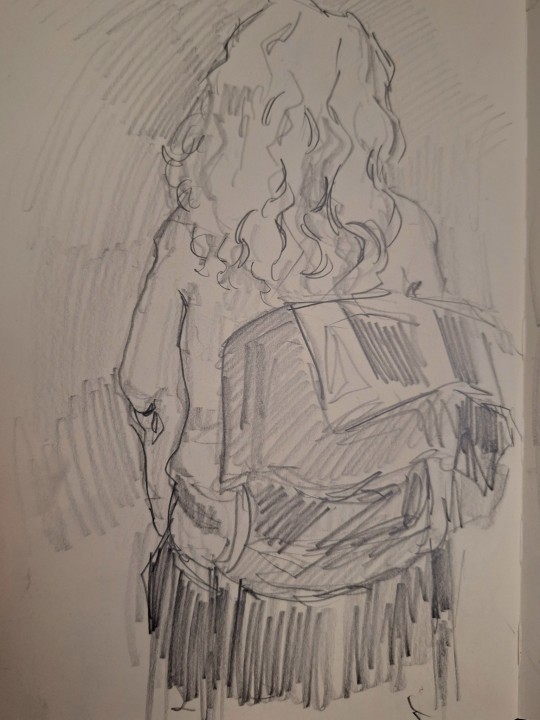
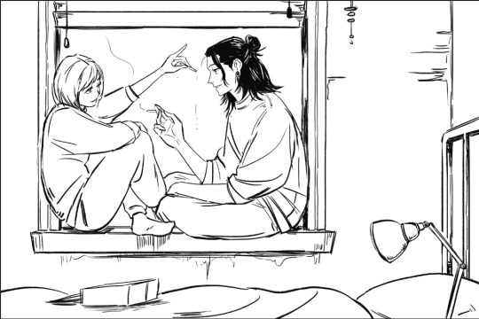
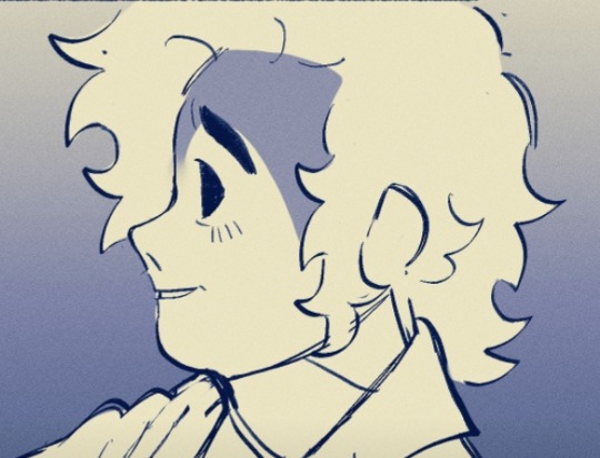
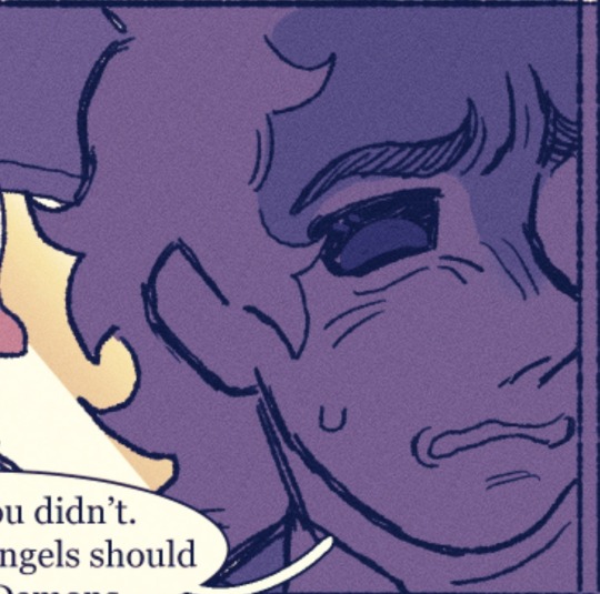
[Day 29] boob window hypno ftw
#nics art#hypnotizd#hypnotizd fanart#am i writing that correctly? genuinely no clue but im not checking now ill do that in the morning#hermitcraft#hermitcraft fanart#hermitcraft s10#hermitaday#hermitadaymay2024#i have achieved what i wanted to do with this challenge#which is amazinv#(what i wanted to do was make it easier for me to colour sketches and not spend so much time agonizing over the colours)
198 notes
·
View notes
Text
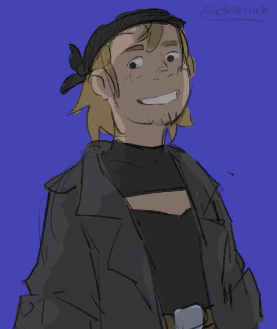
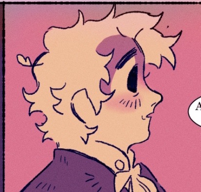
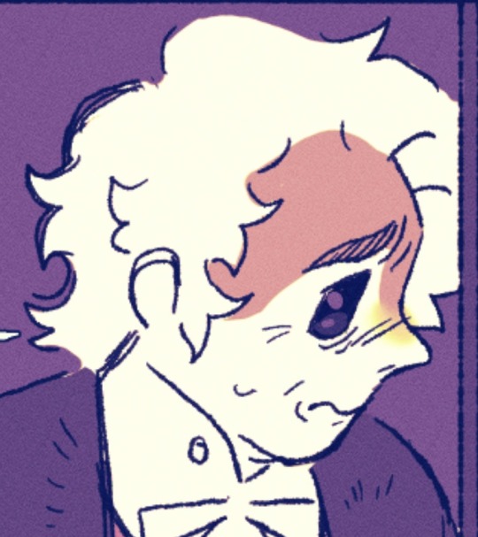
some fanart of THE vampire that owns the night🫰
#my art#noliaert#fanart#artists on tumblr#amc iwtv#iwtv amc#louis de pointe du lac#okay okay so- I kinda really wanted to do his glasses again! And! the E8 coat (& hair)- but what if I did it during the modern day??#incorperating a yellow-green color for the jacket (claudia + his eyes) + a white/pale fishnet shirt AKA getting his pastels back in#and ofc reincoperating the pearl pin from his neckties in S1 as an earring instead#this one's actually... sort of... part of other pieces... not directly#but in that I only meant to try make easier pieces for myself or- pieces that I didn't have to feel so perfectionist about. aka. sketchy#and it lowkey it got to me trying to make a piece based on every colour of the og pride flag#idk if I'll stick to it lol#but practicing with colours and all#so this one majorly got green and purples. though it was meant to be overhwlemingly purple but anyway#also- I'm actually pretty happy with the sketch I made with no ref but since I “finished” it I'm posting this one#ldpdl#ldpdl fanart#amc interview with the vampire#iwtv fanart
140 notes
·
View notes
Text
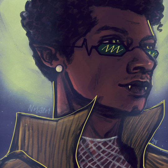
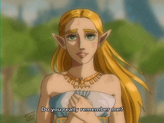
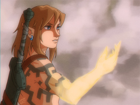
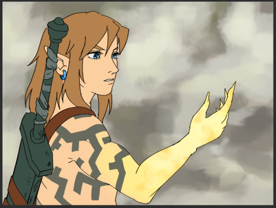
Zelda Osamu Dezaki screenshot redraws.
I am an admirer of Osamu Dezaki's art style. I made a mock screenshot of my OC in his style. Then I thought, what if I did that for my favourite series ever, The Legend of Zelda? I love to imagine a Zelda anime in his style. Well, I ended up drawing three of them.
Note: A lot of people are making ghibli style or whatever choice style art using AI and I'd like to say: F*CK them and F*CK AI. This is the first time I use this kind of language on my blog and I'm sorry if it upsets you, but!!! It has to be said! If you want something from your imagination to become reality you need to make it yourself. Actually APPLY that imagination of yours into hard work and the results will be so worth it. Drawing these takes a lot of time and effort, and it's worth it. People need to understand that they gotta enjoy the process! Nothing is more valuable than what is created by our own human hands. If you want something to exist in this world, then you need to take the time to learn how to do it. You can't take shortcuts all the time. And to that, here are some WIP shots and a speedpaint under the cut.
For all of these, I start by sketching on paper. It's easier for me to find forms this way.
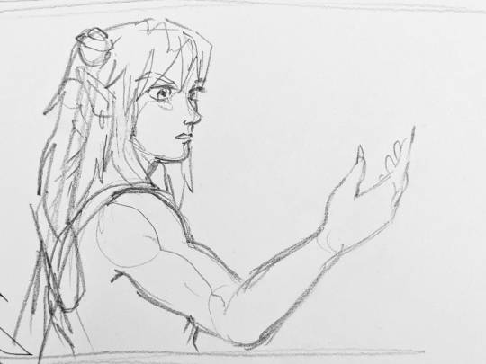
Afterwards, I draw over a photo of the sketch on CSP

Followed by blocking in colours. Afterwards I do shading and post-processing.
Here is a speedpaint:
Here are some screenshots from various Osamu Dezaki animes. He's a great inspiration for me. I'm sure many of you have watched at least one of his works, which include Rose of Versailles, Lupin the 3rd, Black Jack, Treasure Island, Ashita no Joe, and the list goes on.
#loz#legend of zelda#botw#totk#breath of the wild#tears of the kingdom#osamu dezaki#small rant too#process#WIP#I hope you've enjoyed these!#Perhaps more to come???#I want to focus on drawing my OCs more now
338 notes
·
View notes
Note
Hello! Many people have said this but ill say it too, I LOVE YOUR COMIC SO MUCH ( ´ ▽ ` ).。o♡
I really wanted to ask you about how you do the backgrounds? (Something i struggle with) whats the process? Like from start to finish, also, to do the rise backgrounds do you use reference from the show and generally real photo of ny? Or do you come up with them? And last question- The shadow and light on the background- Like HOW
i know it’s a lot of questions but i’m just so curious qwq and wanna learn to be better, thank you again in case you read this and respond, in case you don’t, i hope you have a nice day and a wonderful life uwu keep up the great work! (≧◡≦) ♡
Backgrounds are a really broad subject and I'm always a little overwhelmed when asked this question. Just like drawing the human body, backgrounds take time, repetition, and practice!
My answer got a bit long, so it's going under a read more :) but if you digest info better in video format I found this on youtube
youtube
It pretty much goes over everything I wanted to say, but in a much better way. I wish I had found it before writing all this out lol
ok, first of all, I'm not a teacher nor was I built to be one of those cool helpful art tutorial people who do a full coloured tutorial filled with illustrations. This is just going to be a messy "how I do backgrounds / environment layouts from start to finish." kinda thing.
... lets start with a sight tangent.
Sketch from Life!!!
If you want to get better at backgrounds I recommend doing some sketching out in the real world!
When I was first getting into doing backgrounds I went to cafes and parks to just sketch the buildings and objects. Sketch rocks, flowers, clumps of grass, garbage cans, bottles, tables, street signs, etc. If you are drawing a tree observe how the trunks twist, how the bark flows, or how the leaves are bunched.
If you can't leave the house the same still applies! Sketch the interiors of your house, the walls, or common objects like chairs and bookshelves. How are objects stacked? items on the floor?
If you aren't comfortable with drawing outside or in public you can take some photos to draw from! They are good for practice and you can use them again as references later. Alternatively you can find pictures online of buildings and objects to sketch as practice.
All spaces have objects in them, it becomes easier to draw those kinds of spaces when you already have spent time observing and sketching them.
ALSO! They don't have to be good sketches! It's just to build out your mental catalogue and strengthen your perception of perspective.
now the actual thing...
BACKGROUNDS
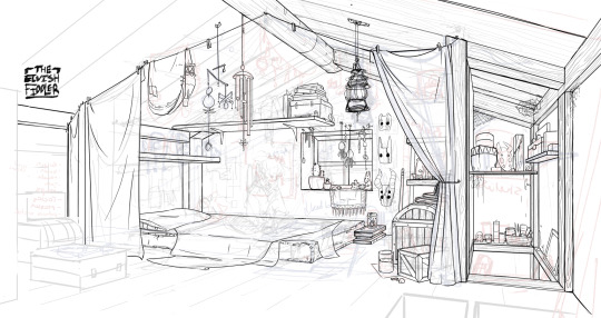
(the pictures used for this are my own. I dug them out of my 2022 folder)
Backgrounds have slightly different rules based on what you are making them for. Videogame Environment Concept Art vs Animation Layouts vs Comic Backgrounds vs Illustration backgrounds.
They all follow the same basics, which I will go over here, but the intention and function of those designs are going to be different. It's all about how you set up the scene and what it's purpose is!
Brainstorming and Thumbnailing
I like to think about a location as though it is a character. An abandoned old house with creaky sagging floorboards is very different from a futuristic space ship with sharp metal floor panels. A gas station has a very different feeling from a library.
I usually start by asking what is this location's story? Why was it built and for what purpose? What kinds of things does this room need to fulfill that purpose? You don’t need solid answers, but its good to be thinking about it while you are working.
Next, sketch some ideas for how this place is going to look. For me, this usually involves drawing the idea from multiple angles and then making lists & small sketches of the objects I think should be filling the space.
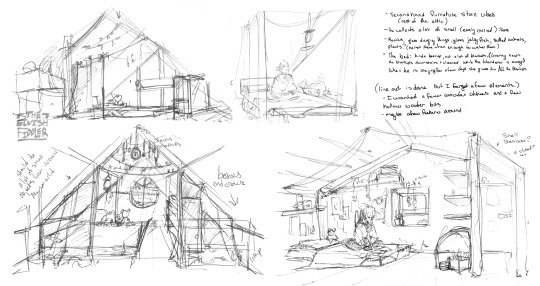
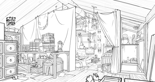
Example: The main character of my original work is a Wanderer. They collect a lot of things on their travels, but those items have to be small enough to be easily carried in a backpack. I wanted his room to be in the corner of an attic, walled off by curtains, and filled with trinkets. You can see some of my brainstorming above.
References
I only look for references after I've done some sketching and planning; this is to solidify my idea first so that I don't accidentally copy anyone else's work. I will make a moodboard with pictures of lighting, colours, items, rooms with specific ceiling beams, old chairs, etc. basically whatever I feel fits the vibe.
Honestly, I don't use references as much as I should. For ROTTMNT fanart I look at backgrounds and screenshots from the series to study the style. I also reference actual photos of NYC to get a feel for how Rise condenses the visual information.
In general, it's good to have references of real life objects/locations, because there are so many details like cracks in pavement, stickers on polls, crowning on buildings, fancy fencing, weird chair legs, etc. that you might not think of. It's the imperfect details that can make a location feel more alive.
Perspective
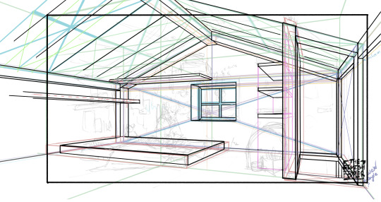
Once you have your chosen sketch we move to.... the infamous perspective boxes. Doing backgrounds is just learning to be comfortable drawing So Many boxes and carving items out of them.
Many better artists than myself have made videos on perspective, vanishing points, and all the technical bits. Videos like THIS ONE and THIS ONE are helpful (this post is great too!!). There are probably a lot of classes to be found on Skillshare or Schoolism. I learned a lot of this in my college art course, so I can't give you a specific video which helped me.
You can get by and be a good artist without learning this stuff. There are quite a few successful artists who have admitted they never bothered to learn perspective (one of these people even made a whole graphic novel series).
I personally avoided properly learning this stuff until I was in my 20s because I thought it would be boring and difficult to do. tbh I really wish I had learned it earlier because it's so much fun to make those silly little boxes imo. It looks scary and complicated but, just like drawing humans, it just takes time, repetition, and practice to develop the knowledge and skills.
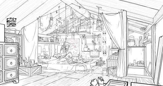
Cleanup
You have your boxes and lines! Cool! Now to make a scene out of it. Fill in the details, get everything placed were you want it! Generally, the lines of each item will point back towards the horizon line, but they can have different perspective points.
Generally you would want to clean it up and get your room completely sketched before doing the lineart. I tend to combine the steps (not recommended)
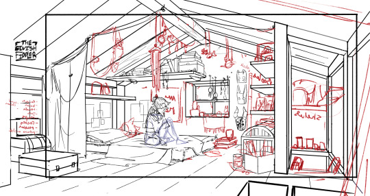
Lineart
I've mentioned how I do this before. Closer objects have thicker lines and more detailed inside. Further objects have thinner lines and less detail. I didn't quite achieve that balance with the image below, but it's close enough.
Colours and Shading will have to be a separate post. In the meantime, I highly recommend the book "Color and Light" by James Gurney. I used to borrow it from my local library and a good chunk of my knowledge was learned from it :)
#Artist's Comic Rambles#asks#art related asks#thank you for the ask!! I'm glad to hear you enjoy the comc :D#i hope this was somewhat helpful...#i get overwhelmed by broad questions very easily haha#if you would me to elaborate on something specific I mentioned feel free to ask#i wrote this all out weeks ago and then forgot about it... I just added a link or two but yeah here it is
311 notes
·
View notes
Text
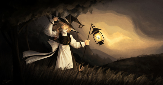
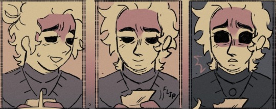
And now we are finally getting to the most recent stuff I've worked on, starting off with my 2025 Marisa redraw! This time I'll actually have some more stuff to say since I can remember my thought process while drawing this yipeeee- (click image for better quality)
Artist's Notes;
So ever since doing these redraws, I've always kinda mourned the loss of the second redraw's dramatic lighting, so I decided to finally bring it back for this one! This one is kind of the melding of a bunch of my favourite aspects of the precious redraws, plus some of the newer stuff I've learned ever sine making them. I also tried out a new style of rendering hair for this piece and I'm really happy with how it looks! Also if you guys are wondering, yes that it s the same lantern from the previous Marisa drawing I did, I copy and pasted it because I was lazy and I just needed it to look consistent, work smarter not harder folks.
So I've been returning to my old favourite brush, the Clip Studio Paint Default Oil Paint brush for this one, and I did a bunch of the rendering for this piece with minimal blending. For the clothing, I wanted to incorperate a technique I did a few years ago, where I added some subsurface scattering to make the lighting feel more dynamic, and I love the effect it gave the white parts of the clothes. For the hair rendering, I did one base layer of shadows on top of my base colour for the hair, then a sort of mid-tone underneath it to add some variety in colour, and then did my highlights underneath all of that. I focused less on rendering every single strand of hair and moreso focused on getting the general shapes down, since I got inspired by some art I saw on Pinterest with a similar rendering style.
Once I finished with the base rendering, I used a multiply layer to create some more prominent shadows and also to give the lighting more direction. I did this with another piece as well and I think it gives me some pretty good results. It helps make the shadows a lot clearer and also gives me some better lighting while also allowing me to do some rendering to flesh it out even further, it's the best of both worlds and I have a lot of fun doing it. Also, what helped me a lot in the compositional stage was making a shitty little stick figure version of the character in the pose that I wanted and then painting in the base pose like a mannequin. I find that just painting in the figure immediately instead of forcing myself to stick to a rigid sketch has helped me out a lot, and here's an example of how the process went below. Later on in the drawing I did flip my canvas and after fixing it, realized that I liked it better flipped so that's why the orientation is slightly different. It also helps to just to some quick linework distinguishing the body parts to it's easier for me to draw the clothes. I do often keep major features of the silhouette in tact during this phase though so I don't forget to include them.


The background was actually pretty fun since it's just a nice outdoors scene. I didn't want there to be too much detail since I am all for creating the illusion of detail than rendering everything in immaculate detail, though I do think I could do just a little bit better, but hey that's why I've mainly been drawing backgrounds nowadays lol.
Overall, I'm really proud of this piece and I had a lot of fun making it. I want to continue experimenting with backgrounds and how to incorporate characters into them, so after my hibernation period you guys can expect to see some more of that.
84 notes
·
View notes
Note
Hii! 🌟
So..i want ask for request about CEO ᕕ( ᐛ )ᕗ
What if one day reader is caught sketching the CEO in some fancy clothes? Would he like to wear this for reader?
(Thank you in advance! Hope u have really good day 👁️〰️👁️)
/// sorry for my English kinda bad at grammar (ง’̀-‘́)ง
He'll wear anything you make.
💌 ⤻ THE CEO, Adrian Houde
—> he's your muse, you're his obsession.
⤻ reader is gender neutral, reader has a crush on Adrian, obsessive behaviour, posessive thoughts, snooping, fluff, red flags but they aren't so apparent.
notes: i altered the prompt a bit, i hope you don't mind but thank you for the ask! i'm glad you like adrian as much as i do. feel free to send in more asks! love the cute emoticons btw <3 did not proofread, we die like men.
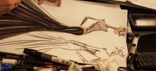
Adrian strolled about the fashion department, his hands raking across the abandoned tables now that everyone had headed home. He rolled up his sleeves to check the time as he walked past the messy and cluttered desks, the heels of his shoes clacking against the floor.
One might ask, what was the CEO of the company doing so late at the fashion department? Everyone had gone home, clocking off early for the holidays — even the ever-busy fashion team — except him. His blue eyes raked across the table as he searched for your table, and finally, he came across it and smiled.
You didn't have a table before, you cramped alongside the lower level employees but well, Adrian pulled some strings here and there for you to get your own table.
It also made it easier for him to look through your belongings.
"Hm?" He hummed when he saw an unfamiliar book on the table. He had memorised every detail of your table, to the point where he knew where you put your emergency snacks — sometimes even refilling them for you anonymously — but this sketchbook was new.
He knew it was wrong to sneak into someone's belongings, and his grandmother would no doubt absolutely pulverise him for such ungentlemanly actions but you already belonged to him. You didn't, but you would soon.
He was slowly cracking you down, he knew. Adrian could still see the blush on your face when you were caught staring at him for too long.
His nimble hands reached for the book and flipped through them. The pages crinkling in his hands as he gazed at all of the different designs. His eyes slowly widened as he recognised the dimples on the model's face, the tousled blonde hair, the dashing pale blue eyes, and the silhouettes you had crafted just for him. The suits, some dresses, some eccentric, some more subdued, and multiple designs made with styles he had a penchant for.
He smiled, knowing that you had to have been observing him rather closely to be able to craft such flattering outfits for him.
"Hah," he breathed out, feeling his cheeks heat up. "You're driving me crazy." He whispered to himself as he felt his entire body grow hot.
He continued to flip through the pages, taking in the sight of him as your muse. He almost wanted to hop in his car and drive off to your house now just to kiss you but he had to restrain himself.
He was a gentleman; even if he snuck into your belongings. He would wait for a while more. His grandmother had always said that a prolonged courting period was needed, filled with flowers, chocolates, gifts, and, of course, polite flirting.
He placed the book on the floor and snapped a few pictures, making sure to make it look accidental, like he had just stumbled across it and sent it to you.
Adrian. H: Stumbled across a cute little thing on the way to a late-night meeting. Mind if I get it privately made? I'd love to wear something you made.
He smirked, knowing that you would fluster. He just wished you were here just so he could see colour fill your face. He made a note to visit the fashion department during lunchtime just to tease you further. Maybe he'd even wear something akin to your designs tomorrow.
He just wanted to get this courting phase over so he could wrap you in his arms like a snake and never let go.
Your sketchbook was practically an invitation for him to do so.

#yandere#yandere oc#yandere male x reader#male yandere x reader#yandere x reader#yandere imagines#yandere drabble#yandere ceo#ask#anon ask#yandere blog
490 notes
·
View notes
Note
I I I I how colour you brush program pretty what translates to "ARGHHHDUDGAIUS I LOVE YOUR ART ITA SO PRETTY TEACH ME YOUR WAYS OF RENDERING"
AAAAAAH I'm actually so flattered rn like, I don't think I have been asked this before??! I'm just going to take your ask literally, and attempt to explain how I render! Okay okay bear with me, I'm going to try my best to go over what happens behind the scenes🗣🗣Putting my teacher hat on, I hope this makes sense and is helpful!
Okay... we are gonna go ahead and spoil one of the art pieces I'm working on! The first part of it, at least!
First: My idea! This usually happens if I hear a really good song or have a scenario in my head that just needs to be drawn so I don't forget, and then I just throw up a sketch! Doesn't have to be perfect or pretty, just my ideas on where characters should be, or what pose, what facial expressions I'm going for, etc.!

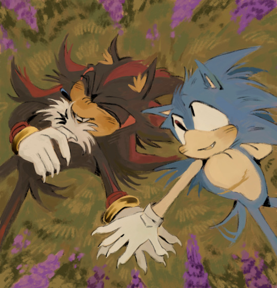
(Facial expressions aside for this one because Sonic looks so goofy on the top left right there lololol)
Next would be finding out what color scheme I want to use for the drawing. So, I throw together some colors and decide if that's the feel I'm looking for! Color can convey alot about a certain mood/tone you're going for in an art piece, so I kinda go with what I think looks good and what will reach the vibe I felt when imagining it! I find myself using warmer colors more often because those colors give me that folk-like, forest fall tone I love! Once you have certain colors you like, just throw them together until it looks good to you and gets you closer to that vibe you want!
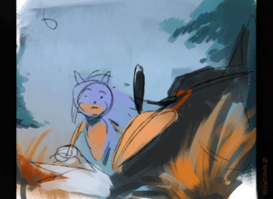
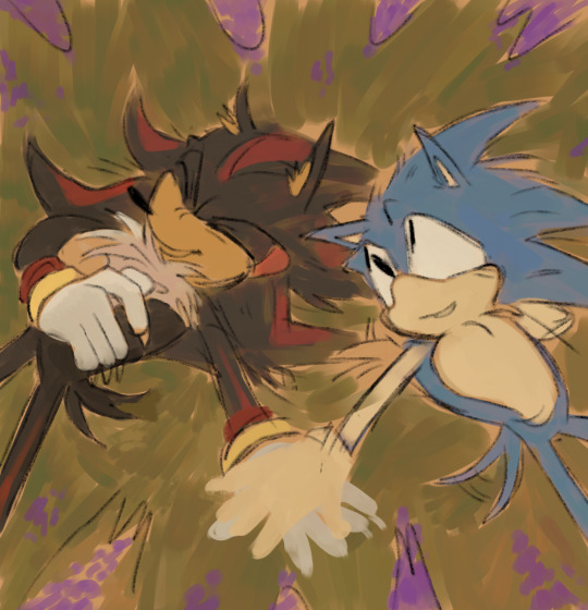
Like here, I'm going for a warm, yet tragic, "melancholy" feel? I heard the song "Little Pistol" by Mother Mother again recently, and the whole song felt tragic, yet powerful and meaningful (such a good song, check it out if you would like!). I wanted to convey sonadow like that too! A scenario where Sonic found Shadow instead of Eggman after he fell to earth, where Shadow is surrounded by old trees and long grass; the environment kind of grew around him and embraced him in a gentle kind of way. (I also just really like nature environments with big trees so I tend to project that in my art herherh☝️)
Usually, I do a sketch, then a cleaner lineart sketch above that layer, and then I color. But here, I switched it around and did color under the sketch layer before I cleaned it up. I wanted to make sure the colors were what I wanted them to be! It's really up to the beholder: what colors do you like? Where would they be good in your eyes? And the pen you use to color/draw definitely has a role to play in it too! I use very grainy brushes; brushes that are not too harsh on each other so they mesh nicely. Example! vv

I find it easier to draw when my pens are messier; I feel less restricted and can be more expressive! So, once you have pens you like and colors you enjoy adding, then it's time to start chipping away and molding the art to your vision! A lot of trial and error, that's for sure,,
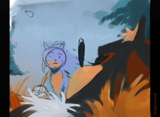
When I render, it's done using either the brush I used for the grainy lineart, or it's another brush meant for color blending/texture. In this case, it was another brush that blends/creates color! For example, if I put red on orange, it makes brown (sometimes, lol) It doesn't make just one color when I use it, as I aim for all sorts of colors in my art! I go over the sketches and fix anything that looks weird and clean up using colors I already planned out on top of the sketch layer. Like here, I removed the guidelines for Shadow's big head and cleaned up his white fur! I also decided that the grass needed to be more defined, so I went to work there. I also added some blue to his muzzle to create a very faint greenish shading, deciding that it needed something more!
I also don't really have a structure for creating new layers. If I feel like starting a new layer to add more rendering, I do! Some drawings have 5 layers, some have 47!)

So really, it's all about what you like as an artist! More shading, go for it! Some blue here? Yes please! Not enough red here? Let's add some!
Here is the almost finished final product, I changed his ear tuft to make it look neater, added more blue to the orange grass to add depth, some small sketchy lineart for definition, and alot of other colors in different spots to give it that messy, painting-like vibe! I made Shadow's nose smaller, and colored over the Sonic scetch using both the lineart pen I use and color blending brushes!
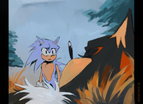
And that's usually how I render! By going layer by layer on what I feel like I need to add to the drawing, and alot of it is trusting the process! Hopefully all that made some sense, and you can find really good Ibispaintx brush QR codes out there if you aren't vibing with the default pens! I also found drawing to be much more fun when I bought a stylus! Sometimes changing your method/approach makes it more fun and engaging, at least for me!
Here's one more example of what my process may look like:

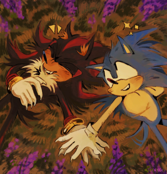
And booyah!! My guide to rendering! A lot of it is messing around and finding out, so hopefully, there's a few takeaways from this essay that was able to show you how I render and do my thing! Thanks so much for the ask, I had tons of fun actually thinking about and writing down my process! 🥺
34 notes
·
View notes
Note
hihi not a creature au ask sorry but do u have any tips to improving art skills? /gen, second question how did u get into digital art?
dont be sorry the asks are for anything really
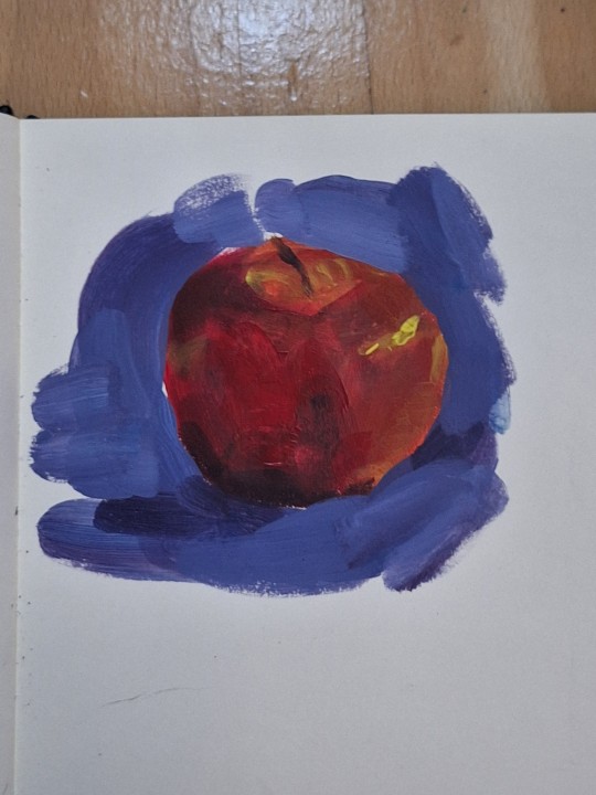
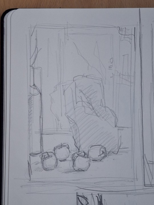
my biggest tip is pretty boring and has been said a billion times probably but you u fortunately need to do the boring basics. you can go anywhere you want from there and its gonna be much easier. ex. - drawing alot of boring 3d shapes in dofferent types of perspective. boom now you can draw backgrounds. drawing from models in realism (live ones are better but photos are great too). boom now you have the skill and knowledge on how the human body works and can play around with it to develop ur own art style. greyscale form practice (like shading cubes or drapery or still life). boom u understand how light and shadow works. the hardest thing really (imo) is learning colour. me personally, traditional painting (acrylic, oil, guache, tempera) helped the most (again ALOT of still life). but learning colour theory, or just fucking around with whatever colour medium you like until it looks good is also very helpful. so again basics are really important.
next thing is, use resources. theres so many free art resources out there and theyre very helpful. my personal fav lately are quickposes and david finch on youtube. use refs, if needed take ur own.
also mindset stuff like being okay with making "bad" drawings. shitty sketches, wierd colour xombinations, wonky perspective. making art is not abt not making mistakes, but abt making them and learning from them cuz if u dont try ull never get it right, even if its bad at first. also always go from overall to detail. make 5 minute sketches, that forces u to focus on form and translatinf the overall idea more than hyperfocusing on detail. and ofc alot of consistent practice. draw every day, whether its a 5 min aketch or something more polished. (im gonna attach some of my oractice sketches so u get the idea of what im talking abt cuz i feel like im not the best at explainin)
as for digital art, i was first drawing on a regular ass samsung tablet with a pen wrapped in tin foil (it makes it work like a stylus fun fact) on ibis paint which is free and honestly it was great. on thing is if ur starting digital get some free simple program cuz if u try to start with something thats "industry standard" its just making ur life harder cuz on top of learning how to draw oj a tablet, you have to learn the software, and u dont need that when u start. i got my actual drawing tablwt after like two years and i was working in krita (also free and really good). now i work in csp and its amazing but theres alot going on and it is pricey (but well worth it imo) digital is easier in alot of ways but i still recommand learning traditionally
sorry for the shitty photo quality im bad at posting traditional art. but thats what im talking abt these are like 10-15 min each, focusing on form and the overall and not going into much detail
47 notes
·
View notes
Text
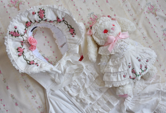
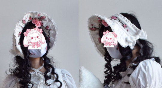
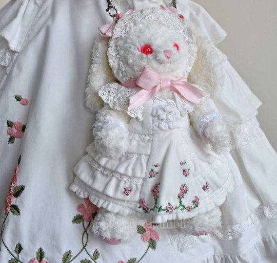
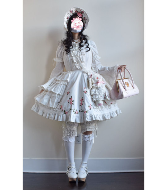
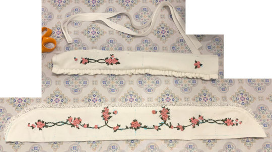
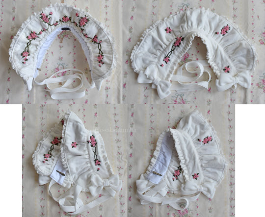
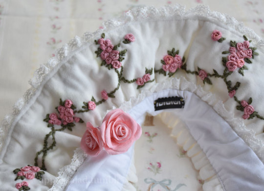
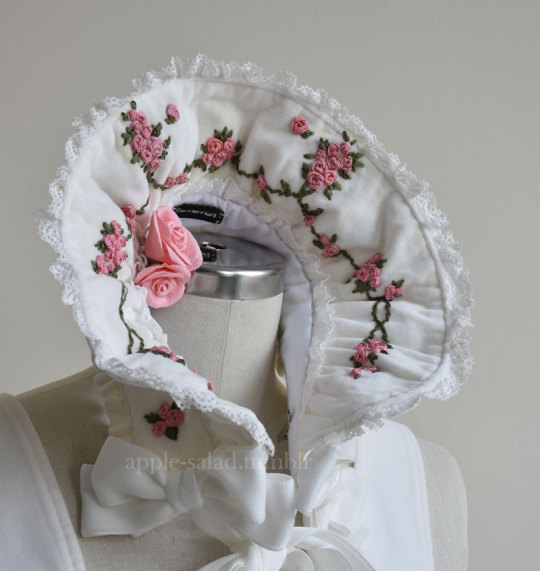
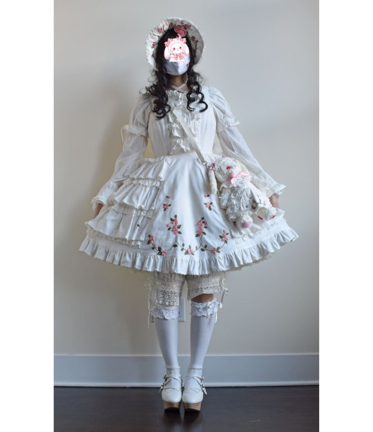
Rose Ribbon Embroidery "Mini" Projects (for BABY NYFW) Part 2: Embroidered Bonnet
I decided semi-last minute to attend BABY's fashion show at NYFW!
BABY had mentioned in their NYFW brand description that their newest collection would be a return to their origins, as well as presenting archival items.
You have to dress to impress for NYFW, right? So of course, I had to pull out all the stops and wear my Rose Ribbon Embroidery.
Also at the last minute, I decided to make a few extra complementing items...
A matching RRE kumya JSK, and a bonnet.
What follows is more of a sew-along/journal rather than a tutorial or guide, mainly for my own memory's sake. But if you enjoy looking at my process (sometimes sloppy), I'm happy!
Also feel free to take a look at the more romantic process video I edited.
Part 1: Kumya JSK
Part 2: Bonnet (you are here)
This post will be my process pictures and notes for the bonnet, as well as a matching mask as a bonus.
I don't believe BABY released matching headwear for Rose Ribbon Embroidery, although I've seen an unknown velveteen headbow with rose lace sold with RRE before.
BABY usually coords RRE with the bunny ear bonnet since Ichigo wears it this way in Kamikaze Girls.
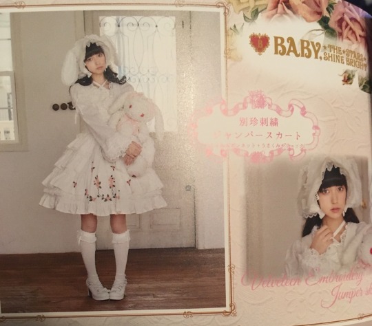
I do own this because I wanted to wear an Ichigo-like outfit at some point, but for this occasion I decided to do something different and make a "matching" embroidered bonnet.
I originally wanted to make a hard bonnet with a very defined brim that could show off the embroidery clearly as I don't really like soft bonnets, but when looking at existing BABY bonnets as a reference, it doesn't look like hard bonnets were a thing back in 2004 (and as it is, BABY rarely releases hard bonnets). So to keep with the oldschool theme, the bonnet is a soft one, although I later make some decisions to make it slightly more structured.
The next decision to make was full bonnet vs half bonnet. The bunny ear bonnet is a full bonnet and I think this is technically more "period accurate", but I am not a fan of how they look like a weird hood from the back so I opted for half (plus, that makes construction and patterning easier for me).
I still used my own bunny ear bonnet as a reference for approximate brim dimensions!
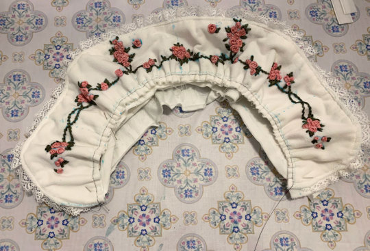
The kumya JSK was a little easier to carelessly sketch out and embroider since I was copying 1:1 from an existing design, but I felt I needed to do at least a bit more careful planning for the embroidery on this. I'm quite bad at creating embroidery designs from scratch, but with the mental image of the rose clusters and swags of vine, as well as referencing the embroidery from the film, I came up with this:
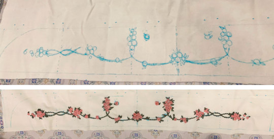
I wanted to emulate the embroidery style of the Momoko's (well, in reality likely the embroidery designer Onoe Megumi--unclear if she did the actual embroidery, but it's likely) embroidery, which I figured wouldn't be too difficult if I was also embroidering by hand.
For material, I am using the same velveteen I used for kumya's JSK. Not my first choice and I actually purchased some thicker looking 100% cotton velvet that I thought would be more similar to the original JSK material, but was worried it wouldn't arrive in time and wanted this project out of the way in case things went wrong/took longer than I expected (it did arrive about a week before the event, but it was totally wrong IRL so I'm glad I just went with this acceptable option). I also bought some more torchon lace, so I used that and another lace from my stash.
The colours of the embroidery in the film also seem to be quite different than BABY's dress. I'm not sure if the pink of the roses has faded over the years, but it has a slight salmon tone whereas the film's roses seem to be more of a pale cool/neutral pink (hard to tell with the yellow tint of the entire film) with some variegation. I love the colour scheme of the film's embroidery, but to keep things coordinated I try to opt for the same colours as the actual dress I have.
I only have white silk ribbon in the width I wanted, so I opted to attempt to dye it to match. Previously I have used alcohol markers to colour the embroidery afterwards, but I find the colour hard to control and it tends to bleed into the fabric. I've also tried colouring the ribbon with the marker before embroidering, but without heat setting the colour transfers onto the fabric as well (and it seems like trying to do so with the amount of ribbon I need would be a waste of ink).
I don't have a lot of experience with it, but since the ribbon is silk, acid dyeing seemed like the way to go.
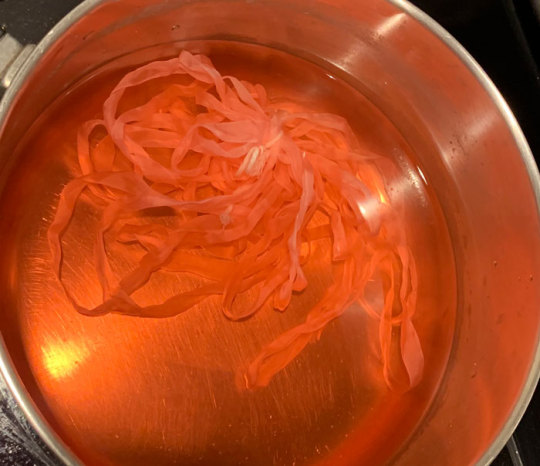
Very interesting photo of ribbon in pot (the pink ribbon gets eaten up by pinwheel roses much faster than I expected so this is the second batch I had to dye--not ideal as they are definitely slightly different in colour but it's not too noticeable). In total, I think I had to dye 3 batches of ribbon and 4 for the pink ribbon as I just barely ran out near the end, and they are all slightly different colours. Thankfully the undertone is the same so it's difficult to tell unless you are really comparing up close.
I thought I would take this opportunity to use the "peach" acid dye that I bought years ago for another project, but this ended up being a mistake as the colour was totally off (maybe the red dye was too expired). I ended up using my regular fiber reactive procion dyes (with heat/acid), because I have many more colours I could mix together, and that was much better. I really should have done this from the start as I wasted perfectly good silk ribbon by making it too dark/off for my purposes (I ended up overdyeing it in pink so it's a usable colour now, but not for this project).
The silk seems to take on dye extremely fast--even just heating up the dyebath will colour it. In some cases I removed the ribbon before adding any acid at all because I felt the ribbon was already getting too dark.
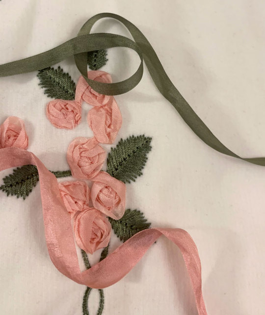
I managed to get a fairly usable mossy green colour for the leaves and vines, however the pink still ended up being a little off/dark compared to whatever BABY used. It's not too bad here as one strand of ribbon, but when many layers are on top of each other in a rose it seems pretty dark. While not ideal, I think it's still okay, especially considering the embroidery colours used in kumya's JSK match nothing else (many pinks will be going on in this coord).
After dyeing and drying, the ribbon is super wrinkled so I ironed it and wound it on some spare card so it's ready to use.
And now I can start the arduous process of embroidery.
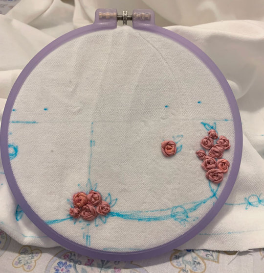
Like before, I mainly use a combination of ordinary ribbon stitches, pinwheel roses, and french knot roses. However, this time I try harder to duplicate, or at least evoke the appearance of the embroidery of the film.
It's interesting how plain and somewhat boring the roses look on their own, especially with this monotone colouring. The varied colours of the film's embroidered roses are lovely, but I decided against it here because the BABY dress has monotone ribbon roses.
The roses definitely seem to just be pinwheel style which is very easy and doable, however I am a bit more confused about the leaves. They look like a number of straight stitches in various lengths and directions that fill in a leaf-like shape. I have no idea if this technique has a name and if there is a proper method for it, because I am a silly beginner who is very uneducated in embroidery.
Anyway I do my best and hopefully I got close enough. Ribbon embroidery is really all about the texture, which is really lovely to look at. Except I have trouble looking at my own work for too long because I start nitpicking all the mistakes I made...
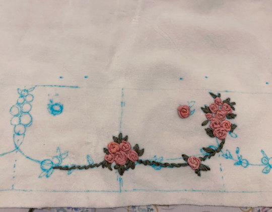
Adding the green and leaves really helps the embroidery come to life.
I took even fewer pictures of the embroidery process than kumya's JSK this time because it's not that interesting. I was definitely getting sick of doing the same pinwheel over and over...
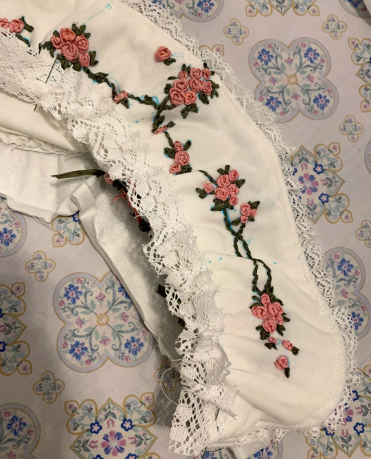
I stupidly decided that aside from embroidering the front of the brim, I also wanted a little bit of embroidery on the back of the brim for interest, as well as on the side.
The designs I drafted out for these two pieces is much simpler, but still, more work....
Almost ready for construction! Hopefully a lot faster with the handwork out of the way.
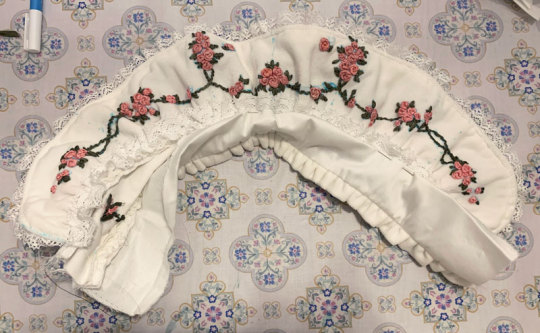
I iron on some interfacing onto the back brim panel and the bonnet band for slight extra stiffness.
The bottom part of the brim is plain cotton sateen because I was worried that the part that touches the head would get dirtier more quickly it if was velveteen.
I wanted some lace gathered around the brim and an extra velveteen ruffle on the back of the band, so I prepare that now. The lace is gathered with a single gathering thread and sewn down before sandwiching between the two brim panels.
Brim sewn and topstitched (and band is ready for attachment).
The upper flowers ended up a little closer to the top of the band then I intended, but I think it's okay.
Gathering brim and attaching it to band. Because the velvet fabric is so thick, the usual "sew one line of stitching with a wide stitch length" not only made the fabric incredibly difficult to gather, but the thin polyester thread also continually broke when trying to do so. Therefore, I opted for an alternative method I think I'd remember seeing in my sewing machine manual of all things--a zigzag carefully stitched over a central gathering thread. This worked much better, although I probably should have used a thicker/extra strong thread as the central gathering thread because it did break the second time I had to gather the brim due to a mistake.
I also add a bit of lace to the inside of the brim. I think this adds some luxury and frilliness between the head and the bonnet's brim, so I wanted to add a small width. I probably could have used even more of the lace's width since it turned out very subtle when worn. But I still think it adds a small amount of interest to the innermost part of the brim and was worth adding.
Unfortunately here after sewing on both brim parts I realize that I gathered both using an incorrectly marked centre line, so I had to rip it out and do it again ;_;
Next, I can carefully align and pin the bottom of the brim to the bonnet and sew it down. I tack this down by hand because I'm not skilled/accurate enough with a sewing machine to topstitch both sides nicely at once (look closely, and my messy stitching is quite visible...)

I also fold in the raw edges and finish the sides of the brim by hand, leaving some openings for ribbon ties.
At this point I spray almost the whole bonnet with water to disperse and fade my markings. Unfortunately, some of the earlier batches of ribbon that I dyed (Can you tell the variance in the 3 dye batches I needed to do?) were probably not washed well after dying and seem to have bled into the fabric from the water...but hopefully it's not too noticeable.
Next I topstitched all around the brim and attached the ribbon ties.
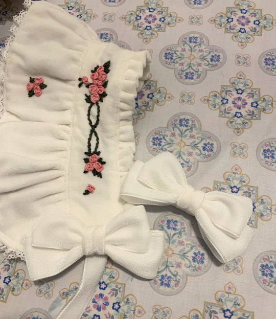
I bought some double sided velvet ribbon in my last minute supplies shipment and made some bows from it. I think the material is a little thick and petersham would have worked alright as well, but the consistent velvet material feels more luxurious, doesn't it? I also think as an added benefit (?) the ribbon being plush and double sided made the bows more puffy looking.
I add some clips to the sides and a toupee clip to the top for security. I opted for a toupee clips because I think it's really the way to go if you don't want the head item to move at all, no matter how thin or slippery your hair.
Finished.
Bonus 1: rose accent pin
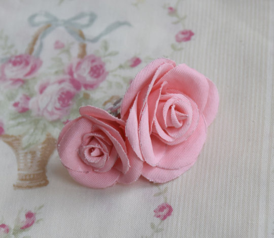
I was in a bit of a rush at this point as it was near the end of the week coming up to the show, so I didn't take any photos of the process here but the technique and templates I used were identical to my handmade faux rose rosettes I made for UM (and the bonus corsages). I have a post with all the details of this sitting in my drafts that I will post eventually, and I will update this post when that happens.
The brooch was just meant to add a bit of 3D faux flower accent to the bonnet, bringing in the rose motif even more. Partially inspired by the faux flowers BABY adds to their bonnets sometimes, like on Milk Tea Doll.
The fabric was "custom dyed" with the same fiber reactive dye I used for the silk. The fabric was further starched, cut out by hand, and shaped with flower iron tools before gluing together.
Bonus 2: matching embroidered mask
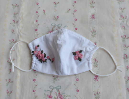
I wasn't sure about whether or not I wanted to wear a matching mask, but decided to do so for situations when I would want my face at least half-covered in public. I didn't really expect to be visible in fashion show pictures as someone in the back, but just in case. (I think this decision was worth it, although my makeup transferred all over the thing and in most pictures my face was even more unflattering. eh well)
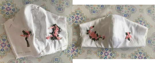
I forgot to take a lot of pictures of my process for this, but it's very uninteresting and not dissimilar from every other mask sewalong from 2020. I draft out a design similar to the bonnet motifs on both of my mask panels (cotton sateen), and embroider.
I should have embroidered closer to the centre of the mask because when worn the embroidery is not very visible/covered by my hair at the sides. What can I do since the panels were already cut though...oh well!
The lining material is some Japanese CLEANSE Ex fabric I had bought previously to make masks during the pandemic. It's supposed to be antibacterial and antiviral, as well as washable, but I have no idea how well supported those claims are.
Sew together normally on both upper and lower sides, turn inside out, add a channel for nose wire and side channels for elastic.
I also have some mask elastic on hand so I use that.
And the finished outfit again with all my items~
Thank you for reading! If you ever feel inspired to take up a similar project, such as the kumya JSK, I'd love to see it!
236 notes
·
View notes
Note
I am in love with your art style. I love all your jjk art, it’s like stitching back the pieces of my shattered heart. Your art is so soothing and has such a warm feel, I love it. Also if you don’t mind me asking what program do you use for your art, and do you have any tips? I strive to someday create art that gives the same feeling of comfort as yours. Thank you <3
Thank you so much for the kind message! I'm actually in the middle of making another jjk piece but it's been a while so I've been trying to remember and consolidate my process. This ask came at a great time hehe
I use photoshop for most of my art pieces but I think there are a lot of cheaper alternatives (procreate on Ipad, clipstudio paint, medibang etc) that would work just as well. As for tips, I have a technical and an emotional one:
My technical tip would be to use references!! Especially if you're just starting out, it's SO IMPORTANT imo for catching mistakes especially with anatomy, lighting and perspective. And by reference I mean real life photos. I think you can be inspired by other artists' work, but there is the danger of picking up their bad habits if you only use their work for reference. I would recommend sticking mainly to real life and looking to other artists only for resolving specific stylistic details once you have a solid grasp of your fundamentals.


I would start with a rough sketch first of whatever you want to draw and then look for refs that match the mood and tone you want to go for. Get the idea down first and draw from the heart. Then the refs come in to help with the specifics (ex. what a window looks like, how someone would hold a cigarette) The jump from the rough to the clean line version is an amalgamation of all the little things you learn along the way. For example, on one day, I learned that clothing folds usually start at one point and spread out. Then another day, I learned how to do 1 point perspective and so on and so forth. Then all those tidbits slowly add up to help you get better and better.
2. My second tip would be to understand what you want to convey with your artwork. If it's fanart, what about the media that you're interacting with draws you in? It doesn't always need to be a complex answer, sometimes you just want to draw a character because you think they're hot and that's totally valid imo.
I occasionally tutor very young artists and oftentimes, they will tell me that they want to draw like X artist or X painting/piece of media. I always try to encourage them to go deeper. What about that drawing resonates with them and what specifics are occurring in the picture to make them feel that way? For example, I recently realized I love environment heavy drawings not for the background itself but because they ground the characters and seeing them do mundane things makes them feel more real to me.
For the example below, the whole set was to explore friendship and mental health. Sometimes just having someone there who listens and is willing to talk with you can make a huge difference.


Once you know the purpose of your art, then I think it makes the decision making for the rest of the process much easier. What type of lighting scenario conveys support and comfort? I went with dusk. Then I started searching up references for dusk lighting. Couldn't find the ref I actually used for colour but a quick google will show you lots of similar options.
What kind of poses feel in character for Shoko vs Geto? What is the focus of the picture? As much as I love details, I think sometimes they can actually take away from the main message. For example, if I had rendered the lamp on the right a lot more, it would've distracted from the main point of the picture so I tried to keep that and the background in general simple (still something I need to improve on haha).
Then those extra technical things (value structure, cool vs warm light, reflective lighting, connotations behind colours) you pick up along the way are all there to help you better communicate what you want to convey with your art.
Okay I lied one more tip, be patient and learn to appreciate the process. Like with any skill, there are a lot of technical aspects that you have to study and practice. I think because the end result is so visual and easily accessible in comparison to other hobbies/jobs, it really cripples beginners. Even with writing, you won't realize a book is good until you learn how to read. With art, you can resonate with a painting without having drawn a single line yourself.
I think beginners and even professionals see a lot of beautiful finished artwork and get enticed by that only to be discouraged when they find their process/finished work didn't end up the way they wanted it to look. Treat it like you would learning how to write. The fundamentals can be tedious and do take time to drill into your head, but learning them will help you SO MUCH with the creative fun parts. You can't write a poem without first taking the time to learn the alphabet, spelling and grammar. You're also probably going to write a bunch of shitty poems before you write that one good one, but that's okay because each piece lets you experiment and exercise your voice. Art is the same thing, don't rush it! Enjoy the process and celebrate your improvements.
#omg i typed way too much but i have a lot to say!!#thank you for the ask this was actually so therapeutic lmao#ask#my last advice...is to be selective about who you take advice from#so you can just ignore all this or cherry pick what resonates with you and your process
98 notes
·
View notes
Text
Sorry guys, been having to do a lot of the boring work behind the scenes.
I sketched the next 6 pages + chapter 2's cover, which was fun.
But something was bothering me super bad - Wolfpaw's speech + text bubble are the same colour that his mother and uncle both use, two characters he's gonna be talking to a lot. And I don't want readers to get confused as to who is talking.
So I thought about using his other eye colour, which is green, but then it hit me that people could get his bubbles confused for Hazelpaw or even Oakpaw, who have green eyes.
So... I compromised, and I mixed Wolfpaw's eye colours together and made a new speech bubble colour. Which means I have to overhaul every page he's been in. That is what I mean by boring work 😭

Discord & Tumblr pages will remain unaffected, which is why I thought to update yall if his bubbles change next page. The pages will be updated on Comicfury. And DeviantART too but I don't care for that site as much.
I will be back soon. I just have so much to do. VaporClan will be back soon too. I spent a while making a bunch of re-usable backgrounds for VaporClan, to make page making easier. That was *also* incredibly boring work.
Sorry, just anxious yall will think I've abandoned my comics. There's just a lot of behind the scenes stuff to do, more than you'd think 😔
#i will miss the blue. it was a pretty blue. but unfortunately i have to prioritise reading comprehension#a chunk of my readerbase seem to be quite young#and being young dont have a great grasp of context clues#speaking from experience. i was 12 once
37 notes
·
View notes
Note
THAT LAST CHAPTER!!!!???!!!!! SO BEAUTIFUL!!!! THE DIALOGUE IS INSANE, THE COLORS, THE LITTLE DETAILS AND HIDDEN THOUGHTS THE CHARACTERS HAVE, I COULD SPENT HOURS TALKING ABOUT IT.
But... i won't (at least for now) because there is another thing that i wanted to talk about that this new chapter made me think, the artistic improvement of the oopsie!omens comic, specially on the designs!!
Let's start with Azazel's owl forehead. Yes. His forehead. That's a very important topic for me, the way his forehead is drawn has improved significantly over the time. When i was reading the first chapters, i noticed that his forehead mark was drawn in the same way regardless of his facial expressions or the camera angle.
BUT as the story went along, I began to notice that this has started to change... for the better!!! His head mark started to be drawn attached to his eyebrows and IT LOOKS SO MUCH BETTER!?! Not only does it look more realistic ofc but it also looks a lot more expressive, SO IM TALKING ABOUT IT. CUZ IT DESERVES TO BE PRAISED.
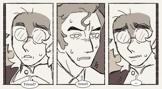
Uurrrrgh ok so idk if you guys can see what i mean so i drew a little example to make it easier:
I know that i should go back to paying attention to more important details like character development, dialogue, etc but im just way too obsessed about every single detail i cant control myself im SORRY
FLIPP you know i love you!! i'm glad that these little quality improvements are being noticed and appreciated!!
to be quite honest, I only actually have around 2 days to work on each update; the first day I spend writing and sketching it out, and the next day I line it, colour it, and do all the text and paneling, so it's really hard for me to keep things improving, some updates look better than others, unfortunately. so i just really appreciate that you guys can see small improvements like this!!! <3
212 notes
·
View notes
Note
Do you have any advice on how to begin drawing a cetacean? When I'm drawing terrestrial animals, I can break them down into simpler shapes pretty easily, but cetaceans are just Big Tubes and I'm completely stumped on how to start
(Disclaimer that my work is rather stylised, so I'm not looking for advice on photorealism! Just any advice you have in general. I admire your ability to understand and render these sausage-bodied beasts)
Hi! That's an interesting question. I have to admit I had to draw a couple of dolphins first to see how I actually deal with them when free-handing lol. So much of my work as of late is scientific illustration, where in many cases I can build upon my own older illustrations. The new pieces are always 100% new, but correcting a base - however poor - is easier than starting from scratch.
Before I go any further let me stress the eternal importance of references. I can draw a dolphin fine from memory but for it to be actually accurate I need references. I always use them. Especially when it comes to weird poses or angles, but even for illustrations I will reference 25-50 photographs. Use them, study them, find them. They are a resource not a cheat.
Also, years ago I actually started work on a whole series of dolphin drawing tutorials. Or rather, collections of notes and tips for different topics (anatomy, differences between males and females, colouration, variation). Looking at the files now I see I had actually written and drawn a frightening amount already. Perhaps I should try to finish them? Is that something people would be interested in? Anyway, it starts off with a word of encouragement, which I do want to share here:

Actual advice is below the cut:
ONTO METHODS - illustrations
I found that for me, my method depends on whether I'm making an illustration or a full scene painting. For illustrations - which are in flat side view - I actually embrace the sausage. I drew a dolphin for you and saved the steps of how I go about it.
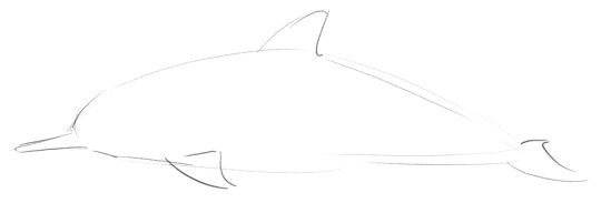
And this is the first. I start with a sort of flat-bottomed airfoil shape, and then add fins and a beak in approximate locations.

Next is refining the appendages and giving a face. Shape and placement of appendages as well as eye and mouth line is all experience and/or reference work.

Then comes fixing what I messed up lol. I always make the head too big first try (would have been good for a baby dolphin though!). Using cutting/transforming/moving selections around I correct proportions to what feels correct to me (again, that part comes from having seen and drawn a lot of dolphins).

Add some markings and hooray we have a spinner dolphin! This is the part where I would seriously start consulting references to check all the details and proportions are in order. If you don't need (photo)realism you can skip that step and use refs further back in the process just to get the shape/idea/colour of the species you're trying to paint right.
MORE METHODS - for different poses
When it comes to dynamic poses, my workflow is completely different. I just start from the nose and build my dolphin from there. Because as said above, they do have anatomy. And I think the way the beak flows into the cheek, the eye bumps connect, then the curve of the throat, the attachment of the pectoral fin, the way the belly curved up towards the genital region, the slight bulge behind that, then the muscles of the peduncle which flow into the flukes - I think the relations between those separate parts are enough for me?

These are the little dolphins (and a porpoise) I sketched from memory. In all cases I started from the tip of the nose and built from there, with minimal or no adjustments/erasing along the way. It was very much outline work. Details on eyes, mouth, etc, would come later. The killer whale is a bit different and got way more detailed than the rest. With such a front view angle I do use some spherical shapes to break it down for the body and face.
Otherwise I've never really liked or used the method of breaking an animal down into shapes, it never felt logical or intuitive to me. My "method" (if you can call it that lol) just comes from having drawn a lot of dolphins. I don't know if it is necessarily helpful when you want to get a grasp of them when starting out. Regardless I do hope this answered your question somewhat and you could get something useful out of it!
Also, I realise now I mostly talked about "standard "dolphins - for whales/short-beaked smaller cetaceans/etc my process is mostly the same, except their heads just have different shapes.
#namtalk#tutorial#sort of?#i always wish I had a clearer answer to these kinds of questions!#but i do hope this is still helpful#seeing those old tutorials also really makes me want to finish them#so many projeeccctttssss
42 notes
·
View notes
Note
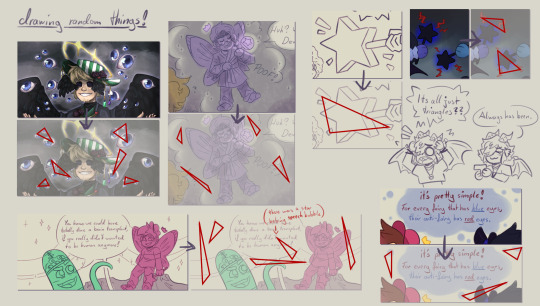
I absolutely adore your art style! Do you have any tips? Specifically for the fairies cause I am struggling to draw them.
thank you so much! well, this is gonna be a long post.
Im gonna be real, the best art advise anyone can give you is to use references and to break complicated stuff down into easier shapes. for example:
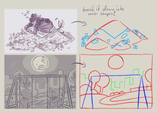
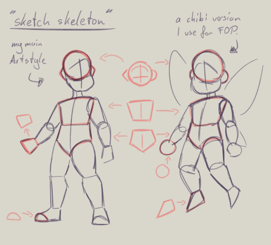
this is my basic body skeleton! i always start with the circle of the head and work my way down to the feet. i have highlighted some part of the body which are actually just simple shapes.
the center line down the middle of the torso also helps me draw on collars, bra cups, ties, or any other more difficult clothing more accurate!
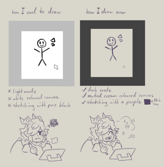
However i have to ask you, are you comfortable while you draw?
I remember when I first started drawing digital, i was really uncomfortable with the basic set up of my program. The white canvas and the light setting of the program was really bright and irritated my eyes. And the contrast of the pure black I used for drawing wasn't really helping. sketching and doing line art was my least favorite part of drawing because of this.
you don't have to draw on a white canvas, you can also use multiple colours for sketching if you wanted. Once I stoppend using a pure white canvas I noticed i stopped staring at a empty canvas not knowing what i wanted to draw anymore!
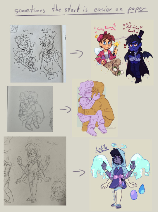
also sometimes when a drawing doesn't want to look right, i switch back to traditional. idk why but when my brain sometimes struggles with a specific pose or character design, it comes to me a lot more easier when I switch back onto paper. i guess the change of scenery opens up the creativity again haha.
don't be afraid to simplify stuff, you don't have to draw everything! As long as it still translates to the thing, it should be fine.
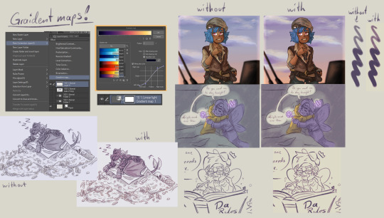
these two are a bit clip studio exclusive,
but Gradient maps! god how I love my gradient maps, it just makes the colours pop! I never draw without it anymore. I always pick the sunset gradient, put it in Linear light mode and put it on 10% (cus its really saturated on 100%)
usually i have it on while i sketch and line, and turn it off so i can properly colour and shade. i turn it back on at the end again
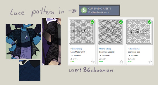
the clip studio assets has a lot of beautiful stuff in there created from other users. (a good amount for free too) for example I got the lace pattern of my shawl from there. and its really easy to import the downloaded stuff into the program.
now this is a drawing hack that blew my mind when I first saw it! i use it all the time and I just have to share this!
whenever you want to draw something random like sparkles, stars, bubbles, feathers, falling leaves, or anything that you want to float around your characters, position them in the form of a triangle.
its even better if you put two points of the triangle closer together and then the third further away. this makes it look random but still looking appealing to the eye, and not oddly placed.
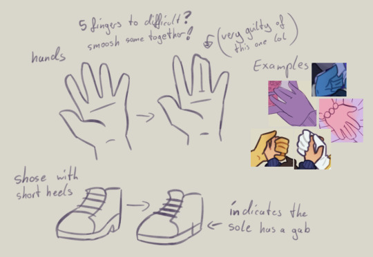
now that thats out of the way! Fairies! The one thing i struggled with when drawing them first is their hair. I suggest looking through the fop tag to see how other people have drawn them and take inspiration from your favorites and make up your own. (do not trace tho! that should be obvious!)
when I draw hair I think of it separated in two parts, the front and the back. I usually start with the front hair pieces, then draw in the jaw, ears and rest of the head, then continue with the back section of the hair.
the only outliers of this are Timmy and Peri. when I draw Timmy (Ymmit as well) I start with his hat, before drawing his hair. Since I draw Peris hair-swirl over his hairline, i start drawing his upper back hair style first before drawing his head and then his mullet.
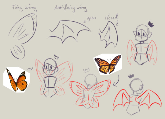
wings can also be tricky. the fairy wings i have given then have a more butterfly look. if you also want to base off the wings to real life animals or bugs you can use them flying as references to. Or you could even cut out the wing shape out of paper, fold it in the middle and take pictures in the angle you desire.
I hope this somehow helped, I thought about what could have helped me if I had known it sooner. even if most of these were for generic drawing.
#my art#asks#art tips#drawing advice#clip studio paint#fop#if anyone has more questions about how i draw#once i open up the ask boy again feel free to do so
52 notes
·
View notes
Note
Can we see your drawing process? The way you colour and render (esp your insane lighting skills) is so impressive 🥹
Sorry for late answer, I've finally managed to compose myself and make this post Let me walk you through my process Usually I have a complete idea of what I want to draw in my head, and if the final art is close enough to what I see in there, I consider it a success Starting with a sketch, the idea in my head might be blurry, so to better understand what I want a pose or composition to be, I use references (everybody should) You can see it clearly below

Also I use browser app called Magic Poser, it's a bit clunky, but it helps to figure out a pose/angle/composition
Usually I try to keep my lineart clean so it will be easier to render later, but sometimes it's just prettier to clean up a sketch When it comes to colors, I don't use palettes, I kinda see colors in my head, so I just eye-pick them, and then use overlays to correct stuff I use blue/purple for shadows, and orange/white for light Also my art mostly in the same hues (blue or orange), so I'm used to work with these colors Here's an example of how bland my art looks without overlays

Render is actually my favorite part! I can fix any mistakes and add some details I don't have much to say about the process, I just mish-mash everything until it looks right, add some shadows on edges, smooth some lines

I do lighting with shine overlay, and to add deepness I use multiply (and a bunch of other overlays) As to how I think light should land on things, I think it's a mix of poser app, references and trained eye (so my lighting usually don't make sense haha) (same goes for folds)

I can't say anything about background work, because my brain just shuts down in the beginning and powers back up when it's done (but actually it's, again, references what helps)
So ughhhh I don't think this post was helpful in any way, but thank you for giving me an opportunity to blab about my process!
Here's a full process of one of my art that I was able to compile

19 notes
·
View notes
Note
Hello I am obsessed with your art—your line work and your colours and shading sjfjslkdkd I want to put your artwork in my mouth and consume everything. Your AC characters are so cute, i loved your timeskip Shauna and your pixel art is amazing???? I simply must know if you’re open for commissions and what guidelines you have because I would die 🥺
Aough, thank you so so very much! I'm so happy to hear that :'D As for commissions- yes, they're open! I don't have any pretty sheets I'm afraid (graphic design is not my passion), but I have the rundown.

Further details under the cut!
I'm fine with doing:
Fanart
Shipping
Self inserts/Sona's
OC's
Furries
Pokémon, stylized animals, or any monster type creatures
Pin-ups
I don't do:
NSFWT (Not Safe For Tumblr. Sorry)
Real people
Backgrounds
Mecha's (I'm just not strong enough)
Eternatus (Sorry for singling you out buddy. You're the only Pokémon that truly terrifies me when it comes to drawing)
Currently not taking any pixel commissions, I don't have a set enough 'style' yet to feel comfortable charging for it. I'd like to one day, though!
Please note: if you want something like a Pokémon or a similarish creature, feel free to ask about pricing! A Togepi and a Rayquaza are at very different levels there and I wouldn't make you pay the same for both.
In general, if you have any questions, always feel free to reach out!
General terms of service:
Payment is upfront. Please note that prices are in euro's!
Payment is done via PayPal. I do need to set up a Ko-Fi, though.
Each second character is 80% of the price.
Please do NOT use my art for any commercial use.
Please do NOT alter my art with AI or use it to work with AI.
Feel free to post wherever, just credit me if you post it on any socials!
I have a right to refuse a commission for any reason.
Please have some sort of reference sheet ready! It doesn't have to be a full drawing, just... something. Can be a picrew, a collage, a general 'something like x', but please have something ready to work with!
Let me know if you want your commission posted after it is done. If you do, let me know if you wish to be credited as the commissioner or would prefer staying anonymous.
What you can expect of me:
I work in three 'phases'. First is the sketch- you'll be send some quick thumbnail sketches to establish the general pose and vibe you want to pick from. Once you have one you like, I'll send work on the full sketch! Sketching is the stage for any and all big changes, so please mention anything you want changed here.
Once the final sketch is approved, I'll move on to the second phase, lines. Not a very exciting stage, it's just the lines! Again, I'll run them by you for approval first, to make sure I didn't miss or mess up any details.
Finally is the third phase, colors! This is both flats and rendering. I don't mind tweaking colors at all, just let me know if you want any changes in them. After this phase is approved, that's the commission done! Each phase should take around a week at the maximum, assuming there's no breaks in communication. If for whatever reason I might take longer then that, I'll make sure to mention it as soon as possible.
I have a discord which communicates slightly easier then on Tumblr, so if you have one as well and you don't mind I'll make sure to reach out to you there! Otherwise, Tumblr does always still work too.
I hope that's somewhat clear! Generally speaking my commissions are always open, no timed slots or anything like that. Whenever works for someone else works for me. But yeah!
#asks that finally convinced me it was time to update my old old comm sheet#the old one was from 2021 it was dire.#not that this is exactly a stunning piece of art sheet but at least everythings updated now.#THANK YOU AGAIN FOR THE SUPER KIND ASK!!#Im really glad people have been enjoying my stuff :]#Also happy people liked the Shauna i did i kind of was expecting that one to be a flop post i did only for myself#but i have been proven wrong. Which makes me very very happy. xy fans RISE UP !!!#all the excuse i need. to draw a little bit more timeskip stuff#@ the other ask currently in my inbox. >:] They are coming. Do not worry#ribbon answers#Ive been happy with the progress Ive been making in my art lately. Im really glad everyones so kind
16 notes
·
View notes