#(even if the overall composition is a bit meh)
Explore tagged Tumblr posts
Visit Tumblr Blog
Explore Tumblr blogs with no restrictions, modern design and the best experience.
Last Seen Tumblr Blogs


Fun Fact
Users from the US are the majority of Tumblr visitors.
Text

dive! dive!
#horizon forbidden west#hfw#waterwing#tideripper#i really liked the color combo so i wanted to post this#(even if the overall composition is a bit meh)#i say this every time i do one of these lol but i'm not entirely satisfied with it#wide angles/the way the camera interacts with water make it hard to get a convincing waterline in-game to fake this kind of shot imo#also the sunset lighting conditions didn't help#at least for me and my idk-what-i'm-doing-really collection of photomanipulation skills XD#...i think need to try adding a few bubbles on the 'lens' again#hfw underwater#hfw machines#hfw the isle of spires
31 notes
·
View notes
Photo
Drawn: 2017 (Updated 2020)
Analysis: Nice symmetrical layout, bro! I don't know how much I intended that originally, but since most of my panel layouts are based around what's in each panel rather than an whole-page composition, it was probably something that just worked out well and I rolled with it... That said, I do like the layout of this page a lot, even if the individual panels aren't all the best. I was definitely thinking of something different for the first panel; I still am not happy with it, but it just sorta ended up not working the way I thought it would in the thumbnail, and I had more stuff to fit on the page so I kinda left it as an acceptable casualty for the time being.
If I drew it again: I would definitely do something different with the first panel... Might be tough in that small space, but even if I didn't change the overall layout I would still find some way to show Rick and Max that wasn't so aggressively meh. I would also fix Hartwin's hand in panel two so he didn't look like he was punching his own beak (though miming a punch when you have a beak might actually very well look like you're punching your own beak!) Otherwise I like the other shots and I don't think I would change anything major. Perhaps adjust the heights of the background characters in the last two panels, because they're a bit too samey (Hans and Schmitt are too close in height there mainly.)
Favorite Panel: I like all three Hans and Hartwin panels for the interaction and their faces, but I think my favorite is the last panel just for the more contrasting composition and the bold impact with the panel border!

26 notes
·
View notes
Text
[ 15.01.22 @ 2:17am ]
dumping my belle thoughts here, gonna be all over the place
ok ok ok so belle? belle
honestly the beginning was pretty hard to follow. between the opening scene where she's already a u-user and the part where her mom dies and she joins u, it's hard to decipher when everything takes place. there's no like explicit "4 months ago" or timeskip to show the timeline so i was a bit confused for the first like 20 minutes
god, the lack of logic is only coming to me now. i was so caught up in the initial euphoria of finishing it and the "separating reality from the universe of the movie/show you just watched" stage. like realistically, how on earth would shinobu have known that suzu was belle? in the scene where she gets unveiled and everyone is in the old elementary school, he isn't seen wearing the u-headphones. he's just looking off of the screen. so from that, there's no way he could've really known, unless he has a pair and wasn't wearing that but that's unlikely. i don't even know if it was that useful for the plot? i don't know. i get it was interesting for the story but come on :/ also for some reason, i didn't really think it fit for kamishin and luka to be in the classroom, but that's just me
ok the animation? the regular anime-style animation was fine. subpar, definitely, but it didn't take away much. the 3d-style animation is where this movie really shines for me though. the scene where everyone sings together after belle is unveiled was so beautiful though. like all those lights (hearts?)? god, i got genuine chills. reminded me a lot of the lantern rite scene in genshin. but anyway, yes i loved the 3d-animation.
the music? best part, i'd argue. maybe. absolutely beautiful composition and choice of singing voice for suzu/belle. definitely will be adding a few of the main songs to my jpn playlist.
ok another part that iffed me was the various age gaps? for example, hiroka and mr terada (?), one of the choir ladies in high school and that 8th grade boy, and suzu and kei. now suzu is in high school, obviously. seems like a senior? judging by familiarity w kamishin, and he was revealed to be a senior. kei seems to be on the younger side, middle school or first year at most. it obviously wasn't explicitly revealed that suzu and kei got together at the end of the movie, but judging by the "i love you"'s said, you can infer from that. overall, age gaps iffy but eh, i can deal with it
what else what else
oh! tropes. ok so for the beginning half of the movie i really thought it was going to be one of those "unknown world beauty and the beast type of trope but it turns into childhood friends" trope but i was pleasantly surprised to find that it wasn't. am i upset? meh, not really. i wouldn't have minded suzu and shinobu together, is all.
for a while i really thought he was beast. i thought he had this whole emotional complex and dead mom, and he loved suzu but couldn't reveal it, that stuff. i'm probably wrong, but i think that the production team was initially like "oh let's make shinobu the beast" for the first half of the movie, but then thought that was too cliche so they made it the kid only seen in one or two scenes. completely out of left field
god it's really hard to get my thoughts down my mind is going a million miles a minute, i'm overstimulated, listening to music, really itchy, and there's a bug in my room
ok i do appreciate the touch on child abuse though. and the autistic representation with tomo but that is completely my opinion and most likely wrong.
ok i know it's only a movie, but i really wish they could've given us more. i want to know what happened after belle was unveiled. did suzu blow up on the internet? was she still able to use belle as her AS? what was the story with kei and tomo's mom? was tomo the small child suzu's mom rescued years ago? did suzu and kei get together? what happened to them after that? did they stay in contact? or did suzu and shinobu get together? did they just stay friends? what's the deal with shinobu?? does he have a dead parent? was he a u-user and just isn't seen in-world? so many questions, but no answers :(
i can say that i want a sequel, but i'm not sure if it would enhance it or take away from the special feelings of a stand-alone movie.
OH
ANOTHER THING THAT BOTHERED ME
that sun image at the end that was so obviously taken in real life and not drawn/rendered. like i think that ruined the ending a lot. it's one image. not even animated or anything, just slapped on there. it would've been so much better if it was at least drawn/rendered out and not taken in real life.
hmm, what else. i am still very much overstimulated. listening to the soundtrack rn and it's nice
i think i might change my rating from a 4.5/5 to a 4.
it's very much like a barbie/disney movie in that you know it's not objectively the best movie ever. considering the animation, storyline, plot, logic, and everything. but it still brings about so much joy and happiness that you can't help but love it
ok i think those are all my thoughts
it was really nice to get those all down. i don't really... have anyone to talk to at the moment so it's liberating being able to go off, albeit to myself on a blog no one knows about.
but in any case this movie made me happy and stim a lot, despite my criticisms
3 notes
·
View notes
Note
I found you through your Lucio's comic, but I really loved your lineless mood practices and I wish you could show how you choose the colors for it/ how you do those? It's so pretty and I need to learn about it...
TLDR : I cant tldr this, but here’s muriel’s process if you wantI’m so sorry for taking so much time to answer, I wanted to provide as much details into my thought-process as I could but… I can’t?
I’m someone who works a loooot on instinct, so there’s not really anything I can provide that’s practical :/.I’d only be repeating what has already been said (work with references/get out of comfort zone, practice makes perfect T_T…). But I can share the process of Muriel’s picture (which a lot people appreciated despite it being BAD [sorry but it’s the truth lol])
Also lastly, I’m a student and I’m still young, my stuff is faaaar from the ultimate goal!!! not like i’d ever pretend it to be, but just to be sure you check out actual professional artists!I try my best to do small pieces that follow the kind of thing Snatti does for example, it’s “simple” and effective. I personally try to do quick studies with the aim of doing something similar ;v; (ill never show them tho ahah nopenope).
Not all of the things I can say about Muriel’s pic goes into your question in specific, but I hope it can help! Also I’m french hope the terms translate well in english
- First thing I can say goes into composition : there’s a veeeery quick grid that highlights the rule of third! The subject of the piece (Muriel + Innana (rip) + The Heart of the Forest) is placed on one of the third because it “fits well”. It looks harmonious? You can always play with that rule if you wish to convey other feelings tho (squish a character on one third while another fills the other two for example, another with the same idea would be a characted on the top left dominating over another who stands on the bottom right, classic!). I didn’t have much in mind beyond just getting used to Procreate so there’s not much thinking beyond just having the pic look nice.You can check out the Lucio comic again and normally, you’ll see that the rule of third is almost always there!
- Next I put a main color as background + fill it with some others to have the general mood.Best advice I can give there is to avoid as much as possible layer effects if you want to improve faster on colors (otherwise have fun!), it’s just personnal experience, but being able to find the colors yourself on not rely on layer effects like multiply or overlay to make things blend together well is important, it helps for everything, i have friends who often work with limited color palettes and oh boi their sense of colors is so amazing they create beautiful things.I picked green (on the yellowy side because green green is meh) as the main color! But forests are very varied and you can do whatever you want! There is some bits of blue here and there too just to bring variety and avoid just saturating the pic with green (tho it still ends ups like that lol)
Thus far all the moody pics I made had a main color, so even the brown trees go towards the green side (thus end up on the yellow/orange range in the color wheel), it helps keeping things harmonized and further the ‘mood’ c:. I think.
- I lied tho, I still use layer effects for those kind of painterly pics, but at the end of them! Finishing touches! Multiply with dark green on the edge just to help the eye focus on the subject + hard light for the rays of lights uvu. There’s also an overlay overall to help blend things together because ya, I still struggle with colors.If you work with Photoshop, there’s A TON of post-production stuff you can do! Curves, Levels, effects! Check out tutorials or just experiment with them yourself, they make miracles.
- Lastly, have fun!! Ya obvious, I hate studies too TuT, so mash it up with stuff you enjoy! You don’t like backgrounds? But what if you could put your apprentice having tea time with Nadia at the end of it?? Struggling with male anatomy?? Me too man, but what wouldn’t I do to put Lucio’s face on them pecs?? Just find what works with you my dude!!
- EDIT : I can say something about the beginning too! I work almost always with masses, big silhouettes for everything thumbnaily-like (like, post-it sized on the screen), just to get a feel of the overall piece and composition, it helps A TON, both for making poses and just having the general feel of the piece work great, only afterward will I zoom in with and make another layer on which i draw the details.
MURIEL VID HERE
22 notes
·
View notes
Text
Tel Aviv 2019: Straight outta Montenegro to Eurovision with 6 young souls
youtube
(this is a pre-vamp review so take this whole thing as “something I wanted to publish but my schedule was withholding until it was specifically time for them to be reviewed”, therefore, this is a bit of a retrospective review. Will tackle on its revamp later!)
Montevizija, which finally has an official Twitter account (we all should forget the times some dude named Vasilije pretended to having made one), offered us another batch of 5 songs for another year, actually revealing all of them beforehand this time and not just the snippets! Joy to the world I guess.
You gotta love Montevizija for it being the most underrated ex-Yugoslavian national final btw. Granted, it only lasted for 2 editions as of now, and it will take years to grow bigger as a thing, but so far, for us the NFs that are ingrained to our brains more are Dora, EMA and Beovizija (and even Skopje Fest when THAT was used to pick an act and not just served as a festival like it originally was meant to be), therefore Montevizija seems more shunned. But what do you expect when the lineup of 5 for two years in a row is not exactly as stellar as hoped for? Well, there are gems here and there, but they haven’t really won on either years (or at least not on the 2nd year if you call Vanja’s song a gem too), and yet somehow they find someone who call them great. But for me this Montenegrin entry is not. :L
And who is up there to be colossally blamed for its existence? None other than this group of 6 refering to themselves as D mol (with “mol” decapitalized for whatever reason... they used to have hyphen separating the ‘D’ and ‘mol’, but now they scrapped it altogether, an anime death I’ll never forget). Worth noting that I, as a 19 year old, have this particularly ugly feeling I must get rid of, and that’s the one of “feeling old”, already at my age. And this is how I felt seeing that the band whose song I am not fond of today is made up by members that are of 16-17 to 21-ish years old!!! So my heart insists that I shouldn’t go too hard on these poor younglings, even if this is just me, currently tackling the brethren of my age. Prepare as I’ll go to shred their composition they’re going to Tel Aviv with, “Heaven”, to bits.
Although, what I call “shredding to bits” is merely just nitpicking the reasons the original version (keep bearing in mind that I haven’t heard the revamp yet) sucks imo, and idk, the new “Heaven” miiiiiiight just grow on me, but I heavily doubt about it because I never cared for it in the first place (youhouuu, they were my last in Montevizija ‘19 for a reason), and I’m rather looking forward for the new faves from the 8 songs I haven’t listened to yet rather than those that were already chosen. And even the Eurofans were not quite fond on the revamp, as some think the additional ethno sounds made it sound worse (and of course there are some that kinda like it or think of the song as their guilty pleasure). So why shouldn’t I? :O
Anyway, old “Heaven”. The first sounds on here to grace my ears on this song consist of one light piano note being tapped to an exact rhythm and a confused baby girl stuttering. And I’d’ve maybe enjoyed this more ironically at some point if it weren’t for the latter sound effect being re(ab)used later in the song!! Ugh I hate it. The lyrics are fine I guess... though isn’t it ironic the only English song in Montevizija’s lineup this year won?? It’s like the Montenegrin people were openly cringing when being the only ones to understand Vanja comparing his life to cat’s and mouse’s and calling his heart “the most expensive toy” in his song and then they were like “you know what? Let’s let the WHOLE Europe understand how terrible our lyrics are! ^_^” (no but for real, who still uses “I’m in heaven, falling straight into your heart” as a pick-up line? Did they travel through time from 1998 to 2019 or something???)
Speaking of the 90s, the whole song smells like a dated cliché of that period. You know, the kind of “the high school prom song from that 90s teen sitcom’s who you’re forced to watch when your elderly aunt is in the house with you and there’s nothing else on TV” dated. Dated even more than “Chain of Lights”. Seriously though! It includes the pathetic “wah wah” bassline, mid-tempo beats, the boy/girl-group harmonies... catch me puking sugar-coated cheese to this, no thanks. Oh and if you already read my “Zero Gravity” review (which you probably never even bothered to after seeing how much text would you have to read), I definitely mentioned that I’m not a fan of those “two verses-two choruses” songs, and especially those kind of ones that aren’t sounding like something suited for radio (e.g.: Poland 2018, “Light Me Up”)... this obviously sounds like something from the radio of the times the at-the-time senior highschoolers are currently over 30 or slightly over 40, and that should be 4 and a half minutes long. These verses could just not be more ridiculously dragged out for the choruses to prevail and get stuck in our brains... fucking welp [sic] me already.
Well, if there are any brownie points I could give this, it’s pleasant, it’s harmless if I don’t take into account the cheese vibes this emits, and all this bunch are made up by up-and-coming talented singers that clearly deserved a better song...
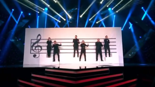
And the staging concept in their NF was cool tho (illustrating their power of D mol), and I applaud the couple chemistry I guess
Oh and this below is one of the most underappreciated memes this Euroseason:
*stares into your soul in Montenegrin*
So yeah. Oh and the Rizo(tto) guy who is self-aware of his hotness and the hotness of the much older Eurovision guys this year, but he’s not doing it for me so that I could be in heaven falling, so he’s getting a hard pass.
All in all - a nostalgia cash-in made to appease the housewives from Podgorica to Skopje, from Novi Sad to Štúrovo, and nothing quite else, sung by a cool bunch of people that if anything are deemed this year’s "great people with an unfortunately too dated song and a shitty draw” by me. I don’t know much of their personalities but I do believe that even if they like what they’re singing, they’d be much better off doing a better sounding throwback, at least. So that even the disappointed-by-”Heaven” Eurofans could at least call it “so dated but a BOP!”. And hey, I’m aware of those fans that will likely be pissed at me for not bopping along to this, but I said what I said about it and yet again, if revamp changes my mind, I will change my opinion, but right now I’d not prefer to. Grumpy Adio.
Approval factor: Hell with the no. I would like Vanja back instead. At least he made himself a somebody to be cared about even if the Eurofans didn’t quite adapt to his song in return.
Follow-up factor: somehow, both “Inje” and “Heaven” were/are seen by the masses as instant NQs, so it somehow doesn’t sound like Montenegro is following a great path so far. And after this year anything that audience favours and wins can be seen as a way better follow up after something meh coming after something wrose.
Qualification factor: For the n-th time, I’m yet to check the revamp out to state where this will actually go, but being put 2nd in the draw is a massive stab in the knee, as demonstrated by even the national finals this year (Electric Fields in Australia Decides, Aly Ryan in Unser Lied für Israel, Lisa Ajax in Melodifestivalen final... the only glaring exception is ZENA in Eurofest but is it me or these producers did this just so they could be all like “heeeey we put a winning song on 2nd just to show that a NF song can win from ANY draw! ANY DRAW!!!” lol nope), and from it only a few lucky souls have crawled out victorious (Nathan Trent for example, the draw might have pushed him down in the semi but he got up again!). D mol, for as young and developing in talent as they are, don’t seem to be such. You can be young and pitied for your personality, but you always can at the same time have a song that completely crushes your chances to do well and sweeps up the last shards of hope right in front of your eyes despite being an angel worthy of protection (Ari Ólafsson, anyone?). Unless the D molians work all their magic and the random ethnic vibes into their favour for some reason, but for now it ain’t gonna work.
NATIONAL FINAL BONUS
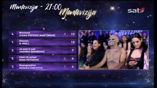
And even then, what was so interesting about Montevizija 2019?? Let’s see...
• First off, let’s address one meme of the beginning of 2019 that Facebook may or may have not used purposefully to upgrade their automatic “facial recognition” skills - the 10 years challenge. Our first one of this season is the sassy maneater who spent her ESC stint by trying to unlove a guy so hard that he just couldn’t oblige - Andrea Demirović. Her decade-later A-game happened to be this one song she sang in her mother-tongue: “Ja sam ti san” (I am your dream). Now, I wasn’t particularly into it - I enjoy some electro tracks out there (like hello, “Igranka” is one of my favourite Montenegrin entries, and 2013 entries overall as well) but this one just ended up being the right amount of cool AND overbearingly unsettling for me to not really fancy it. Kinda like “Red” by HyunA - I can only bop to this if I don’t care about the fact I actually hate it, oops. (Or maybe it is just because Andrea once again used a composition done by one of those “rent-a-NF-songwriter” people. Which is at least better than collabing Ralph Siegel who’s stopped being relevant ever since starting to work with San Marino, or even since the hilarious attempt of a peace song sung by the original common framework, six4One. But since Michael James Down has co-contributed to one of the better Montevizija songs last year, I will not allow myself to think it’s thanks to those kind of songwriters.) Nevertheless, the Eurofans actualy kind of loved this song, but sadly, Montenegrins and the international jury did quite not, and she didn’t land on to the superfinal 2 (as opposed to a superfinal 3 last year, to which she could have easily qualified if it still were a 3). Here’s her song to y’all anyways (and the performance too, which just needed to include some random monster dudes dancing around... why? Because Eurovision! ^^):
youtube
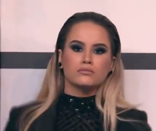
• Speaking of Andrea, during the results part there was this one shot of hers where she was pictured just casually chilling on her phone, not giving a damn that she’s being underrated on the scoreboard. Not only she was badly rated, but this moment was such an universal #mood!
• In between the finally final results announcement (which I didn’t really know when exactly was it taking place because the winner wasn’t really said out loud before the event I will describe next was taking place??) there was this lottery going on of who would be the lucky two audience observers that’d win tickets to Tel Aviv... hilariously enough though, it somehow malfunctioned and there were some sort of errors regarding the announcement of the RIGHT winner <3 but the winners happened and I hope they’re getting to go to Tel Aviv at some point during the Eurovision events! Hope they don’t feel startled by the lack of taken seats this year.
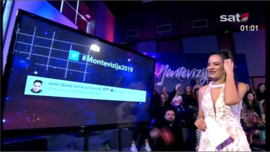
• Unlike Eesti Laul, Montevizija this year took up the job of showcasing tweets of Eurofans, and somehow this fellow fella ended up seen by a handful of Montenegrins AND international viewers. Take a wild guess which of them know what a daddy Serhat is.
• And who could not forget the magic flying envelope for to announce the winner of the NF:

there must have been some Harry Potter magic in there :O
As for what touches the other songs, well there’s the last year’s fan fave Nina Petković with another song, but it’s no “Dišem”, so don’t even bother. Or bother, but imo it’s just okay-sounding, nothing that groundbreaking or pleasant enough to be competitive. The other few songs were also nice but I’d like not to make this longer as my other write-ups, to be fair. Sucked to be Mr. Kállay-Saunders who, as the international juror chosen for this national final, had to rank its songs... as that NF happened right on the same day his second A Dal 2019 performance was taking off. Not that the international jurors were supposed to be present in Montenegro on the day of this NF, anyways...
Anyway, despite all this goddamn criticism (that could’ve flown more smooth had my computer not restarted in the middle of me doing paragraphs for this review), I’m fare welling the D mol-ians and would like to wish them a heavenly Eurovision experience. ^_^
3 notes
·
View notes
Photo


Tessa Virtue and Scott Moir’s protocols from the Olympic Team Event 2018
Learn how to read an Ice Dance protocol here. Analysis below the cut.
I don’t want to go too far into this because I think they know what they need to do to get the marks they lost. If you have a specific question feel free to shoot me an ask and I’ll gladly help you out. Pls take into consideration that these are my opinions and not facts, I am not a judge. Here’s a quick review:
Short Dance → 80.51 (GPF: 81.53)
Rhumba got a Level 2, that’s 1.20 points less than a Level 4 which they’ve been getting all season. This was really tough panel and no one got a level 4 Rhumba and only C/L got a Level 3. They’ll train it and get it back, I’m not worried, they have the best Rhumba in the game. Their GOEs were also the best in the event and better than GPF.
No Touch was exactly the same as GPF, one +2 but the lowest GOE is dropped so same score. I didn’t see where they lost the level at GPF and I don’t know where they lost it here.
PSt is exactly the same.
Twizzles and Lift were both higher GOEs at GPF. The 2nd twizzle wasn’t completely perfect so fair (I s2g if PC get all 3s for twizzles worse than this one I will flip). The lift was really good imo so idk I think we’ll see it back up at 3s for the individual, they’ve been getting the full 6.30 all season but this panel was hella strict and Judge 6 especially.
PCS was about the same as GPF. Meh. Again a tough panel that I expect was keeping the PCS lower across the board so that the individual event can show improvement and break records. That being said VM were the only team to get any 10s so.
Free Dance → 118.10 (GPF: 118.33)
Lifts: Perfect StaLi here, up from almost perfect at GPF. RoLi down by 0.25, I don’t know if they’ll keep the change or go back but that 0.25 is big (esp when somehow PC’s junior lifts get perfect lift scores smh). CuLi still perfect ❤
Step Sequences: Still both level 3s. Again, tough panel, I thought both were more clean than GPF and I can’t see where the levels are lost. They’re probably not on a defined/deep enough edge somewhere but I don’t see it. GOE wise they switched the 2.51 and 2.99 they had on the CiSt and DiSt at GPF but same overall GOEs.
Spin is down… smh at the judge 4 who gave them a 1 (who also gave low PCS… I see you… I also see you Judge 5). They did travel a tiny little bit vs no travel at GPF.
Twizzles were down from perfect… I thought these were better (again @ 4 and 5)
Choreographic Spin up to almost perfect - I like this changed exit so thumbs up from me.
Changed Choreographic Lift got 1.70 instead of 1.90 but it wasn’t as good as they can do it so I’m not concerned there.
PCS they actually have slightly higher than GPF with a tougher panel so I’m content. They were also lowballed by 4 and 5 here so we will see what happens in the individual on that front. Again they only team to get any 10s. Their Transitions and Composition went up 0.04 and 0.14, Skating Skills down by 0.03 and the other two stayed the same.
All in all I feel good and maybe it’s the optimistic part of me taking over and believing even more than I have been. Maybe it’ll hurt like a motherfucker but right now I feel better about their chances then I have all season.
#tessa and scott#virtuemoir#virtue and moir#scott and tessa#protocols#pyeongchang team event#mine#*my analysis
110 notes
·
View notes
Text
first lines :: a writing game
rules : list the first lines of your last 20 stories ( if you have less than 20, just list them all! ) see if there are any patterns. choose your favorite opening line. then tag 10 of your favorite authors!! --- i’m going to be ranking mine x / 10, with comments, just for the heck of it.
1. with friends like these ( 2100, gen, phantoms friendship )
“Dude,” says Reggie, after the third — or maybe fourth — time it happens. “You... doin’ okay?”
verdict : starting off with a line of dialogue is always an effective way to throw the audience right into the story, without a lot of build - up exposition. and i... get carried away with the exposition sometimes. this was my first ever JATP fic, so i was just trying to get a feel for the characters voices --- starting off with dialogue felt like a good place to begin! 7 / 10, vague but it works, and i can hear reggie’s voice clearly!
2. even if we hit the ground ( 3200, pre-canon, shameless reggie whump )
It all explodes in an instant, so fast that no one gets the chance to react.
verdict : this line punches!! it’s supposed to punch, it’s supposed to feel like the audience just got caught up in an explosion, because reggie literally does! ( this is the story in which i establish the precedent of Hurting Reggie in my fics, just because he’s there. ) 9 / 10, super effective line
3. if i didn’t know better ( 3500, grief fic, julie centric )
Doctor Turner always said the special days would be the hardest.
verdict : it’s... okay. i mean, it accomplishes what it needs to, but it’s nothing special. this story holds a very dear place in my heart, and might be my favorite --- i wrote it to help cope with my sister’s very recent death, and frankly, it was just what i needed at the time. i love the story as a whole more than this opening line. 5 / 10
4. 21st century (dead) teen rebellion ( 2100, willex, ghoul bois antics )
If Alex knew exactly how he gets talked into half the things he does, he’d know how to avoid them, and his life would be so much easier.
verdict : bahahaha, it’s sad because it’s true!! i love this story, and this line --- while a bit cluttered --- makes me giggle. 7 / 10
5. how to be a heartbreaker ( 7500, luke character study, light jukebox )
Luke learns the danger of a crying woman early.
verdict : this story was a constant surprise. i didn’t expect it to get as long as it did ; i never expected it to take off the way it did, oh my gosh ; and there are parts of it i really like, and parts i’m more ‘meh’ about. this opening line is good, it absolutely works in the scope of the story... i just feel i could have done it better somehow. but... it leads into a whole segment with baby luke, so no regrets. 5 / 10
6. nothing quite like living on the edge ( 6200, missing scene after ‘nothing to lose’ ; the boys trapped at caleb’s club )
By the time Caleb’s song reaches its grand finale, self-control is trickling back to them… slowly, slowly, like the reverberation of the final notes.
verdict : heehee... like the entirety of ‘nothing to lose’, this line is delightfully unnerving. caleb’s weird not-quite-mind-control was a topic i just had to explore in greater detail, so i really took it and ran with it. this isn’t exactly a whump fic, but none of the boys are having a good time... and i get to explore a much darker tone, which works really well with my writing style. overall, one of my favorite stories, and an excellent line. 9 / 10
7. every empty space ( 2900, emily patterson study, growing up luke )
Raising Luke was never easy, even for a moment… but in the beginning, it was a dream come true.
verdict : the first half of this line was the main thesis for the entire story... and i love how it sets up emily’s entire pov, and her arc over the course of 17 years, in a really effective way. ilove writing emily because i relate to her --- i also look at luke and think “my beautiful, stupid son” daily. fun story, great opener. 8 / 10
8. revelations (3200, gen, boys coming back to life, ray finds out )
The night of the Orpheum performance is definitely the start of something… and things never go back to normal after that.
verdict : this is a very sexy leading line! it’s informative, it’s ominous, and sets up a fun story / series. i can get behind this!! 8 / 10
9. sugar, how'd you get so fly? ( 3000, gen, alex learns to fly, help him )
Her mom used to call it the “Mama Spidey Sense”; a very loud, very accurate superpower that only parents have, to let them know when something is Going Down.
verdict : ... meh. i like the idea, it’s a very rose vibe, but. i don’t love it. doesn’t have a lot to do with the rest of the story. i think i just honestly didn’t know how to kick things off. 3 / 10
10. know that it's probably magic ( 4600, gen, soul bonding w/ spirits )
It takes a while for the boys to figure out all the weirdness that comes with being a ghost — and for Julie, on her end, to sort out living with a haunted band.
verdict : opening lines work best when they’re short and pithy. this... feels a bit cluttered, not going to lie. while it definitely sets up the rest of the story, i feel like there was a more concise way to do it, if i just dug around a bit more. i love this story as a whole more than this actual line. ( also, ‘haunted band’?? does that even make sense?? girl... ) 4 / 10
11. still alive but i’m bearly breathing ( 4100, possessed teddy bear )
Honestly, if she hadn’t been zoning out on her history essay long enough for her eyes to wander, Julie might’ve never noticed anything was wrong at all.
verdict : uhhhh.... i don’t know how to talk about this one, actually. midterm season is one hell of a drug. ( another theme in my stories? really putting alex through it. not in a whumpy way, just in a ‘fml’ way. ) fine opening line, 6 / 10
12. regenesis ( 28000, multichapter, reggie whump / backstory )
Carlos is the first one to bring it up.
verdict : this story!! i love this story so much!! while this opening line is the definition of ‘meh’, the story itself is such a favorite, and was so much fun to write. i’d rank the story itself 10/10... this line, though, will have to get 4 / 10
13. paint a picture of it ( 1800, gen, julie + reggie become art buddies )
“These are amazing! You’re really playing with color composition here, I like how you blend it all together.”
verdict : can you tell i’m bullshitting my way through art terminology? oof. i started off this story with an entire conversation, through literally just dialogue ; i don’t love it, but it works well enough. 5 / 10
14. interwoven ( 2500, emily adopts sunset curve via knitting )
They break her heart sometimes, just a bit — her eager boy and his habit of bringing home strays.
verdict : luke and emily patterson, out here once again, breaking my heart. this was a more sympathetic view on emily, yes --- i didn’t want to excuse her canon behavior, and she still has flaws in this story... but she also cares, and tries to be a good mom, in her own way. she loves luke, and she loves his friends too. this line sets that up wonderfully. 9 / 10
15. if i was you (i'd wanna be me too) ( 11000, multichapter, carrie redemption arc-ish?? ; exploring carrie / julie relationship )
Because her dad always has impeccable timing, he picks the night Julie plays at the Orpheum to completely lose his mind.
verdict : oooh, i love this line. poor trevor, but also... this line slaps. it’s just the right amount of carrie-pov bitchiness. while this story is still very much a work in progress, but i love how it’s coming along so far ; it already has so many moments i love ( ‘this band is home’!! ) and writing carrie is an exercise in characters i’m not used to writing. excellent line, 8 / 10
16. kill your heroes (and then kill them again) ( 9500, vampire reggie )
Reggie gets bitten on a Monday. On Tuesday, he goes to band practice.
verdict : EXCELLENT opening line!! it’s short, it’s pithy, it gets right to the point, and you’re sure not going to forget it. i love this line. i love this story. this really set up the story and i’m super happy with it. 10 / 10
17. feast or famine ( 7200, demon goose fic )
In their absolute defense, the boys do not, as they’re later accused of, murder a goose.
verdict : ... listen. this is the best opening line i’ve ever written. it literally doesn’t get better than this, you can’t top this one. the pinnacle has been reached. i will literally never write a line, or a story, more engaging than this one. 200 / 10
18. fall out boy knockoff ( work in progress ; 5 times luke falls while climbing things he really shouldn’t be climbing )
The first thing Luke says when he sets foot in the garage for the first time is, “Whoa! You’re kidding me, you got a loft!”
verdict : starting off with action --- another great way to toss readers right into the story!! this is a fun line that really encapsulates luke’s sheer... chaos gremlin energy. this entire fic radiates chaos gremlin energy, and i can’t wait to post it. 7 / 10
19. i can’t even hear them scream ( work in progress ; all the women in julie’s maternal line have the ability to see ghosts, the boys ain’t special )
Julie is eight months old when she sees her first ghost.
verdict : straightforward! to-the-point!! tosses you right into the plot!! not the most engaging... but i like it, especially as this section of the fic is being told from rose’s point of view, so it comes from a perspective we wouldn’t otherwise get. 6 / 10
20. remembering ( work in progress ; part of the ‘side effects of coming back from the dead’ series, basically an excuse to write sleepy bois )
Even after the spell is broken and Caleb’s stamps are gone, Julie can’t bear to leave the boys alone; the idea that they will vanish when out of her sight, flickering out of existence like candles dying in the rain, is too real, and too awful to endure.
verdict : this... might work better broken up into two sentences. i’m probably gonna do that. technically it works better as two lines, but as an opening sentiment, i love this?? the entire fic has a... very slow, soft, thoughtful vibe, and i like how this line establishes that with a metaphor. excited for this one!! 8 / 10
tagged by : the absolute superstar that is @sunsetcurvecuddles tagging : uhhhhh i don’t know a lot of writers in the fandom i don’t socialize hEL P
0 notes
Text
Best Brand Of Gum For The Gum Tree

A Southeast Missouri State landmark lives at the corner of Pacific and Alta Vista at the top of Cardiac Hill. The Gum Tree (or rather, Gum Tree II) has been around since… well we’re not really sure. And we’re not really sure where the tradition to stick a chewed wad of gum to a tree trunk began either. Some say it started during the era of Southeast President Mark Scully who frowned upon students chewing gum on campus. They didn’t want to be caught with it, so they discarded it before they walked to class. Others suspect as students reached the top of Cardiac, they were too tired to even chew it anymore and just ditched it on the spot. Regardless of why the tradition began, students have carried on the tradition to this day.
We decided to put six types of gum to the test to see which gum leaves the biggest impact. Each piece of gum was chewed for 3 minutes, then stuck to a Ponytail Palm, which was exposed to the elements for approximately one month.

The gums:
Wrigley’s Big Red
Trident Original Flavor
Extra Polar Ice
Orbit Sweet Mint
5 Peppermint Cobalt
The criterion:
Initial Chew
Color
Size
Stickiness
Initial Chew Data:
WBR: The upfront cinnamon flavor was strong, but faded quickly. The gum was also hardened quite a bit throughout the three minutes.
TOF: Started strong with an initial burst of flavor, but the intense mint flavor faded over time.
EPI: The pack had a little drawing on the inside flap, which was cute. The flavor seemed to fade in and out throughout the chew. The gum was very soft for the first two minutes, but hardened quickly in the last period.
HBMSW: Really did not taste like strawberries nor did it taste like watermelon. Was actually so large it was tough on the jaw after a minute or so. Did incite nostalgia though.
OSM: A little tough from the get-go. Softened up only slightly. Flavor was *shoulder shrug* meh. The kind of gum you wouldn’t feel bad about offering to friends, but wouldn’t be mad if your friends ate every last piece of it either.
5PC: Gorgeous wrapper. Flavor literally made your mouth feel colder and left a pleasant taste after removal.
Color Data:
WBR: Big Red retained its bold red shade throughout the month.
TOF: Reminiscent of the color you might paint a living room wall before you sell the house. Not offensive, but not particularly impressive.
EPI: Turned into a light gray with just a subtle hint of blue. Nothing to write home about.
HBMSW: Bold green, but a little on the nauseas face emoji side.
OSM: Would’ve been a nice light green if it hadn’t attracted so much dirt. Turned into an icky green/brown glob of gum.
5PC: Beautiful, vibrant blue. Very attractive.
Size Data:
WBR: Average size
TOF: Average size
EPI: Average size
HBMSW: Enormous
OSM: Quite small
5PC: A little on the small size
Stickiness Data:
All gums seem to have stuck.
Composite Analysis:

Conclusions:
If all factors are considered, the best gums in order of overall score are 5 Peppermint Cobalt, Wrigley’s Big Red and Hubba Bubba Max Strawberry Watermelon (tied), Trident Original Flavor, Extra Polar Ice and Orbit Sweet Mint, respectively.
If only post-chew factors are considered, the best gums in order of overall score are Hubba Bubba Max Strawberry Watermelon, Wrigley’s Big Red and 5 Peppermint Cobalt (tied), Trident Original Flavor and Extra Polar Ice (tied), and Orbit Sweet Mint, respectively.
Did we skip over your favorite? Test it out yourself on the real Gum Tree! Regardless of your preference, it’s one icky tradition you have to take part in during your time at Southeast.
1 note
·
View note
Text
TV Review - Marvel's Defenders Review
Ok so before I continue. I was ROOTING so hard for this crossover but at some point whoever was on the writing staff made INCREDIBLY TERRIBLE storytelling and dialogue decisions. With our previous installments Marvel had a habit of establishing COMPELLING villains. They did it so well in DD and JJ that I began to consider it a hallmark of the Netflix Universe. The second half of LC of course didn't do this with Diamondback and IF completely missed the mark (I do however believe this is the fault of the writing staff as far as the villains are concerned). For some reason the staff of The Defenders thought that establishing a moderately interesting villain would equate to the same thing. It doesn't and that is a HUGE frustration. Kingpin, Purple Man, Punisher, Cottonmouth were all written and acted beautifully. Alexandra although played by the dope Sigourney Weaver wasn't at all compelling in her personal story. And they could have EASILY have made her so viciously fun. Grrrrr. Anyway here's my breakdown. (SPOILERS MAYBE) ******************************* Cinematography 8/10 ******************************* There are some beautiful shots in this series, some of those long one shot fight scenes (which we saw done well in Daredevil specifically) were a lot of fun to watch. Some shots had interesting composition but the jump cut B-roll transitions got old. ******************************* Soundtrack 7/10 ******************************** D'angelo. Wu-Tang. They had obviously someone with good taste making decisions at some point but there was not nearly enough of that happening. It's like they picked dope music for a few scenes with Luke Cage and meh every other opportunity. ******************************** Fight Choreography 7/10 ******************************** Ok so I thought that the scenes with the main four were actually not too shabby but this was due mostly to the shot choices. The fighting itself was mildly interesting in that the four characters all possessed these different styles but I felt those styles just weren't thought out enough. ******************************** Story 4/10 ******************************** Ok so what is everyone's problem?!
Why is everyone on their lone wolf hype even if it makes NO sense. I feel like SO MUCH of the initial tension in the group was SO contrived that it just took me completely out of the experience. It's like you guys have literally NO REASON to not like each other (except Danny, he's kinda a twat but they play that up). The initial dialogue between IF and Luke was cringe city. They created tension and problems between characters that was unnecessary several times. It would have made far more sense if LC and IF bonded over 90s hip-hop (they both like it) and then went on some side quest until they joined up with the other two. Having the four of them unnecessarily struggle just to decide to work together seemed pointless especially when the organization they were fighting was having struggles of its own. Also so many just terrible dialogue choice. This story could have been approached far more originally, as it had interesting elements to it. Also WAY too much Danny Rand. Also WAY too many pages taken out of Iron Fist in its story structure. ******************************** Dialogue - 🤦🏽♂️/10 ******************************** "You guys are on the same side!" "We're not so different, you and I..." "It's not your fault..." "I have to do this alone..." "They won't get away with this...." "I have an idea but.....you're not gonna like it....." Like really doe? Jessica at least had some sassy little quips and Matt has such strong delivery that he could talk about N. Korean economics and I'd be drawn in. But whoever wrote Luke's dialogue was getting on my last nerve. Danny Rand wasn't as unbearable this time. I actually felt there was some improvement in him as an actor BUT still way too much of him. Also seeing him get clowned by Stick, chewed out by Luke and beat up by the gang was satisfying. Claire's little stint as the voice of reason was contrived this time. We just got too much of her the last two shows and her and Collen's little monologues were tacky. ******************************** Characters 🙄/10 ******************************** Not enough Jessica or Trish or Malcolm. I rather have had them use Electra in a completely different story because Alexandra's character was not explored enough for me to care like with so many previous villains. I don't even know WHY she's bad. Luke didn't quite feel like Luke in the beginning and there was waaaaaaay too much Danny and Collen. There was simply too much Iron Fist in this show... Too many side characters brought in to have no effect on the story other than "look these people share a universe!" A side quest with Trish, Karen and Malcolm could have been super interesting. Luke and Claire being an item was mildly annoying. ******************************** Conclusion ******************************** A ton of opportunity was WASTED in this script. There were so many quality actors present so to reduce the story to a bunch of familiar tropes and team-up movie arcs was a complete waste. There are quite a few REALLY good scenes that I adored but there are also scenes that are just so awkward in their characterization. I thought the use of Stick was wise but poorly executed. There is even a scene where the guys are all arguing and Jessica just stands there silent. I was like....wait what? The Library scene, D and J scenes, and the architect bits were interesting. The subway scene tickled. The final battle was snooze fest mostly. My verdict is watch it if you've been following the universe. If not, it might not be worth your time. Overall 6/10 realistically 7/10 as a fan But I am also lowering my score of Iron Fist because it's still better than that heap...
BINGE THE DEFENDERS ON NETFLIX
1 note
·
View note
Text
Immunity Challenge #2 Results

Let’s get to the results and see the iconic music videos! First let’s meet our iconic judges!

TYLER!
He edited the barbie girl video and guided us during Algonquin and is a professional video editor. He’s also my dynamic duo #ClashMeDora

JESS! Jess was a famous girl on zwooper but migrated to Tumblr a few months ago but she still goes to her hometown zwooper to visit her children

JOHNNY! Who doesn’t know Johnny? He has won the most group games on zwooper and hosts almost every TS season and i am pretty sure i have seen him judge music videos before so he has the experience!

ALYSSA! Alyssa won TS Guyana and has been in one of the videos where she killed it in 7 rings! Now let’s right jump into the music videos! Zwooper’s Music Video
youtube
TYLER Creativity: (4/10) You guys definitely paid attention to the lyrics and there were moments where you matched the song with funny props. With that being said I wish you pushed that envelope the whole way through. There was not much coordination (except for Carter who went in). Maybe some costuming could have helped? Effort: (6/10) Some people definitely put in more work than others when it came to dressing up and dancing. I peeped how there were different "roles" or "parts" and that was great organization, but in some cases I just wish it came through more. You had great material with the song because they were talking about different kind of boys and you had a tribe full of boys who could have literally embodied that. But you just didn't. Composition: (4/10) The edit was really lacking. There was a lot of moments off-sync and there was a lot of times there was no footage at all. Also, the recycling of footage kind of took me out of it. I'd rather you have shown dancing there when it was just instrumental or cut that part out entirely. Most of the cuts were just simple cuts between footage and some of the shots lingered for too long. Theme: (5/10) I don't really think there was a theme to this. It's hard to have a "message" with a song like this, which you guys clearly chose to be entertaining. It was fun to watch, but I don't think you really thought about this aspect. Nothing tied it together. JESS Creativity: Honestly was it creative... no? Did you have a cute cat who stole the show..yes! This wasn't a standout at all.... 5 Effort: Sadly, not all of your tribe members were in the video :( I think the effort was there it just didn't really translate... 6 Composition: The beginning of this video dragged on too much. The editing picked up throughout the video and personally.. this might be your stronger point? 6.5 Theme: There was a theme? Um.... awkward because I didn't really see one. 5 JOHNNY Creativity: 3 Effort: 6 Composition: 8 Theme: 4 A lot of this didn't really flow and there was no outward thinking when it came to the song and what y'all did with the lip sync. It seemed like y'all were like "okay here's the song, now record your parts and let's not discuss WHAT we're doing in our recordings." It was kinda entertaining, and I love TJ, but the first 35 seconds being on the same person is just meh with coming out with a KILLER opening for a video and drawing me in as a viewer. I do take into account that a good amount of y'all were in the actual video, but missing some tribemates is always going to dock some points so........... ALYSSA Creativity: 7 Effort: 7 Composition: 6 Theme: 8 The editing of the second verse made my life but I think that some portions were looped, so I docked for effort there. But I think the whole tribe was included in the video which is excellent. Docked point in composition for the ever dreaded horizontal/vertical mix. Stan Lizzo !! TOTAL 83.5/160 Tumblr’s Music Video
youtube
TYLER Creativity: (6/10) I think the creativity came through more in the edit than in the performances. Several people wore ridiculous outfits to stand out in their own way, but they go together. I think some coordination in that department could have really benefitted you guys. The editor did a good job putting everything together but the footage wasn't always the best material to work with. Effort: (7/10) It seemed like everyone had a lot of fun. Again, the editor did a lot of work here. I appreciated the shots of people dancing and going all in, regardless of how they look. Composition: (8/10) This was the highlight of this video. The fast cuts, the use of transitions, the special effects. These all made it more exciting to watch. It felt more like a music video and my attention was maintained. I don't even know who edited this but if you bitches end up losing somehow and then vote out the editor I hope all y'all go home. Theme: (4/10) This was the weakest part. There really was no theme, and I think the song choice makes it hard to put together a theme. The footage and costumes were all very different so nothing really meshed. The one shot of the girl singing on the city billboard sent me because it came out of nowhere. JESS Creativity: I admire the onesies and costumes. I appreciated the choreography too! 7.5 Effort: Just as the Zwooper tribe, not all members were in this video so that kind of sucks? (RIP MADISON K). But there was SOME effort here so… 7 Composition: This video flowed well. I really liked it. My little virgo heart is happy. 8 Theme: I don’t know if there was a strong enough theme here? BUT I’ll give you a pass. 6 JOHNNY Creative: 6 Effort: 8 Composition: 9 Theme: 6
Ahhhhh a Sammy edited music video? Yea everyone was into it, and I love the little bits of y'all at the beach house (excluding the fact that Jack and Connor aren't in the GAME), but I just think everyone in this video was into the song itself more than literally everyone on the other tribe besides maybe Carter. Also, Maynor had the funniest part of both videos with his icky face and the piece of paper. That's some fun creativity to make me laugh. Decent standard music video, but in my opinion, better than the other tribe so good job woooooo ALYSSA Creativity: 6 Effort: 6 Composition: 8 Theme: 7 In my opinion this was overedited.... But this made me laugh at points and obviously a lot of effort was put into it on the editing portion. I do think there were some people missing based on the mini flag at the end so I docked some points for that. Overall it looks like you guys had fun so I’m glad! TOTAL 109.5/160 Congratulations to TUMBLR on winning the immunity! and zwooper you will be heading to tribal council, where you will be voting off the first person from zwooper tribe and second from ZVT. Tribal will be over skype call and skype call will be recorded, and we plan to start at 9:00 EST. please let the hosts know beforehand if you will be able to attend tribal council or not. Tribal Council 9EST August 5th
0 notes
Photo

So, I posted this on Reddit, but I figured I would post here as well!
Bit of a long post, but I want to share some detail about my weight loss/fitness journey...
I'm a 25-year-old female that, through CICO (Calories In, Calories Out), has been able to drop from my highest weight of 200 lbs (January 2016) to a healthy, fit 125 lbs (though in the pic I've posted is when I was probably closer to ~187 lbs). Also, I'm about 5'7", for reference. I actually lost the first 65 lbs in about seven or eight months (I know that's very quick, but I was very determined!) with drastic lifestyle changes. I was very depressed at close to my highest weight. I've been diagnosed with manic depression and generalized anxiety for about nine years now, but it got especially bad around December 2015/January 2016 when I was the heaviest and most physically unhealthy I had ever been. I was barely motivated to get out of bed some days, I had no job, hardly any friends, and I was a serious emotional overeater with major self-esteem and confidence issues. But one morning, by the grace of God maybe, IDK I really can't even explain what happened (maybe it's because the first number on the scale was, for the first time, a 2 and not a 1), after a long crying/self-pity session, something just kinda stirred within me. Like an epiphany of some sort. At that moment, I decided I was going to stop making excuses and acting like a victim to my misery and obesity, that enough was enough. I was sick and tired of being unhealthy, overweight, and miserable. I wanted to gain control of my life. I had tried numerous attempts at weight loss before, but never could stick with any kind of routine or diet for longer than about two weeks. But this time it was gonna be different, I decided. So, I put on a pair of sweatpants and some old running shoes I had lying around and I left my house with my hardly-used Fitbit watch (that I had received as a Christmas gift from my mom about a month earlier), and I just. started. walking... I wasn't sure where I was gonna walk to or for how long, but I wanted to do ANYTHING other than just sit at home and be miserable. So, I put in my earbuds, turned on some upbeat music, and just kept walking. I walked for about two hours around my neighborhood and when I got back to my place, I realized that I had walked five miles! And it felt good... It was just one walk (granted, a really long one), but I decided I was gonna make it a habit. I started going on daily five-mile walks that I had mapped out around my neighborhood, and actually usually twice in a day (one walk in early morning and one in late afternoon), since I was unemployed/not in school and had extra time on my hands. My feet/legs were definitely hurting and sore at first, but gel inserts for my shoes really helped a lot. This long-distance walking was nearly every day for about four or five months, a time period in which I dropped about 40-45 lbs. The first 15 or 20 being in the first month alone. As the weight dropped and I was eating healthier/becoming a lot more active, my overall confidence was increasing, my sleep, "brain fog", and feelings of "meh" (as I call it) were all improving/diminishing, and my energy levels were higher than they had been in a very long time. I was even starting to get some compliments from family and people around me who noticed my weight loss and my overall change in mood/attitude, which felt pretty good honestly.
My CICO was monitored pretty thoroughly through consistent food logging on the app, "My Fitness Pal", and activity monitoring on my Fitbit HR watch. Diet, in summary, was mainly cutting out soda (for good! To this day, I still don't drink soda.) and fast food (though I admit I will now occasionally have fast food as a "cheat meal"), drinking lots of water, and I greatly decreased my intake of refined carbs/sugars. I replaced a lot of these foods that I was used to eating with more protein-rich foods/fruits &veggies/healthy fats & carbs. Less crap, basically. It was very difficult at first because I loved things like Kraft mac and cheese and Dr. Pepper. I also had a horrible habit of overeating in general and eating out of boredom, rather than when feeling truly hungry. However, I was determined to change. As I practiced more self-discipline and started noticing results in how I looked/felt, the cravings lessened and became easier to combat. I realized I could eat healthier, fewer calories and still feel satiated.
And though I know it's not usually advised to go higher than a 1,000 calorie deficit a day without consulting a medical professional first, my daily step count was averaging about 27,000 (which, for my weight then, was a LOT of burned calories) and my overall caloric deficit was usually anywhere between 700 and 1,500 (but I was careful to not ever eat below 1200 calories for the day and generally my consumption was between 1500 and 2000). I was losing a steady 2-3 lbs a week and feeling pretty awesome as I noticed results not only in the mirror, but with how I carried myself and my overall attitude.
I hit a relatively short three-week plateau in May (I think?) which was frustrating at first, but caused me to switch up my fitness routine a bit. I started mixing in some higher-intensity cardio such as jogging (could barely jog a half mile at first, but now I go anywhere between 2-6 miles) and hiking local trails. I also incorporated some at-home strength training using 5 or 8 lb dumbbells three times a week to help with overall body composition and fat loss. By early July, I had lost about 55 lbs , was at what's considered a healthy and no longer overweight BMI, and finally felt confident enough to go out and look for a job again. I landed a decent job after my first interview, something I would have not even thought possible 6 or 7 months earlier.
I hit my first major weight loss goal of 65 lbs, weighing 135 lbs, in late August, I believe? (As you can see, I can't quite remember the exact timeline right now lol). I maintained this weight for about six months, but still felt like I could maybe "cut" and get some more muscle definition. So, just these last six weeks, I've lost ten more pounds and have attained a more ~toned~ look through yoga, running, heavier weights at the gym, and hardly any going out/drinking [Though I know it's not exactly beneficial for weight loss, I still have drunk some alcohol throughout this journey. It used to be mainly very sugary drinks (i.e. whiskey/coke) when I was fat, but I switched to a not as bad vodka/club soda while I was losing weight.] I don't think I want/need to lose any more weight at this point, I might try to add some muscle/weight even, but I can't express enough how much this experience has changed my life in SO many aspects, not even just physical health and appearance [though that's definitely a huge (no pun intended) plus!]. Like I mentioned, I have more confidence overall, more emotional stability, my bipolar/depression and anxiety symptoms have been significantly alleviated, and I feel like a productive member of society again (I'm also attending college again and planning for a new career path). Of course I still have my ups, downs, issues, and insecurities (who doesn't?), but I've definitely come a long way and am pretty proud of that. I feel like a whole new person. And this newfound wellness obviously isn't JUST because the number on the scale has changed, but it's a result of the diet and lifestyle changes I incorporated to lose the weight in the first place.
Though I wouldn't call what I did disordered or dangerous, I realize that what worked for me may not be the healthiest or most realistic options for everyone. I lost a pretty significant amount of weight in a relatively short amount of time. I would definitely advise consulting a doctor or medical professional before trying anything that might be considered too extreme or drastic! The focus should not be on how fast you lose the weight though, but rather making permanent (yet sustainable), healthy lifestyle changes that take you in the right direction. Additional advice I would offer is to remember to not compare your progress to anyone else's or let a "setback" keep you feeling defeated and/or prevent you from moving forward. As long as you keep at it and don't give up, then you're on the right track and results will come! :) Any questions, feel free to ask!
#weight loss#fitness#fitspiration#mental health#fitspo#fitblr#before and after weight loss#weight loss advice#my fitness journey#me#selfie
176 notes
·
View notes
Text
7 graphic design tips you absolutely need to know
Visuals can really pack a punch, depending upon the asset you’re designing and how you balance text with graphical elements.
Whether you’re just starting out or you’re a pro designer, there are a few rules that you should keep in mind to take your visual elements from “meh”, to “WOW”.
First things first, we’re going over the basics – these are the rules that you should follow no matter if you’re creating a feature image for a blog, visuals to support whitepaper content, or a full-fledged eBook or infographic.
Consider these your cardinal design rules:
Abide by the style guide.
Consider your colour palette.
Limit your fonts and choose them wisely.
Build in negative space.
Scale is your friend.
Take a step back.
Take it all in.
Now, let’s break these down, one by one:
1. Abide by the style guide
Your brand style guide (whether you’re designing for your own employer or a client) is your bible.
When in doubt, you can always fall back on the the guide.
Often, this asset will contain the company’s choices of fonts, colours and other elements that help ensure all of its visual assets are consistent with its brand identity.
Be sure that your designs don’t stray from the style guide. And if they do, be prepared to have a really, reallyyyy good reason for the decision to break away – or show your reasoning through examples (one that aligns with the style guide, and one that incorporates your own design choices).
2. Consider your colour palette
While the style guide may direct the palette in certain instances (i.e. the brand logo, header/footer elements, etc.), you’ll likely have a bit of artistic freedom when it comes to the overall colour choice of the graphic.
colours can convey a certain mood and message all of their own – for instance, using bolder, warm colours can evoke a different response in your target audience than cooler, complementary colours.
When choosing your colours, consider not only the content and message you’re designing around, but the reaction you want to bring out in viewers.
You should use contrasting colour combinations, or those directly across from each other in the colour wheel. It’s important to ensure that your palette is not only complementary, but also aligns with the style guide .
Selecting a high-contrast colour palette can draw viewers in, and make your designs, well …
3. Limit your fonts and choose them wisely
Full disclosure, I have quite the opinion on typography, as you can see from this piece I wrote on email font choices.
Similar to colours, your choice of font(s) can send a message depending on the shape and size of the typeface. And if the look and feel of your font doesn’t match up with the purpose and content of your graphic, it can really throw readers off.
Using a different typeface for the heading, subtitle and any body text can be visually appealing. However, as Canva put it, for font’s sake, limit the number of typefaces you choose.
Selecting and mixing too many fonts is a rookie mistake, and can make your graphic look messy and just all over the map.
Overall, both sans serif and serif fonts are good for readability. Sans serif has become the more popular option for web content, while serif fonts are typically used for print assets. Remember to follow the guidance from your style guide, though.
4. Build in blank space
While I immediately want to make a Taylor Swift reference here, we’ll push forward without one.
When creating visual elements, it’s good to leave a bit of white space, or negative space, in and around your design. Consider this breathing room for your design – smoosh too much into a graphic, and viewers won’t know what to look at first.
White space can be a design element all on its own, helping to direct the eye to the other shapes and visuals therein.
What’s more, building in negative blank space can help keep your graphics simple, and prevent you from going overboard with visuals or colours.
Take Apple, for example, the veritable king of white space.
The brand really knows how to work blank space into its visuals, and the use of white also helps provide a clean and polished look.
Plus, when the brand does decide to include more colourful elements, including white space around these visuals helps give them the attention they’re due.
Okay, I couldn’t help myself:
See how your eye is drawn to Tay and her shiny red apple? Blank space, people! It’s a must for great graphic design.
5. Scale is your friend
In addition to thinking about your colour scheme, fonts and negative space, you should also put thought into the scale of each of these elements. Scale is particularly important when it comes to any included icons, shapes or illustrations. Giving a greater scale to certain visual elements can shake up your composition while providing emphasis in areas where it’s needed.
Using scale strategically is also a great way to help lead readers’/viewers’ eyes from one compositional feature to the next.
6. Take a step back
This is best practice for anyone who stares at screens all day, but is especially important for designers – don’t forget to take a step back every now and then and rest your eyes.
It’s super easy to get lost in your visual elements if you’ve been looking at them all damn day.
But taking even a short break to go look at the sky or that patch of grass that your dog likes in the park is important. When you come back with fresh eyes, you never know what might jump out at you or what inspiration may come to mind.
7. Take it all in
Building off this last point, it’s also important to avoid getting tunnel vision on a single visual element, icon or shape.
Remember to zoom out and take everything in as a whole, because that’s what your target audience will be doing.
Check to ensure that your fonts, colour scheme, scale and other compositional features support the content, message and purpose of the graphic. And if anything feels off, make adjustments where needed – your goal is to create something cohesive, while still providing a path for readers’ eyes.
Let’s get specific
The above cardinal rules should represent the standards you use for good design in every instance. However, as any great designer will tell you, things get a bit different when it comes to designing for assets like feature images, whitepapers, infographics and eBooks. So let’s drill down a bit further into each one:
Tips for feature images
As a writer, I can certainly attest to the power of a well-placed feature image within a blog – it takes the entire piece of content to the next level. And unlike typically non-specific (and often low grade) stock imagery, feature images can draw on information or stats directly from the text (hence “feature”).
A few tips and tricks to keep in mind with your feature designs:
Pick an engaging fact, stat or quote to design around. I tend to prefer feature images that include statistics, because throwing your target audience a number to drive your point home is a strong strategy. However, a main talking point from the article, or in some cases a powerful quote, can work well too.
Custom imagery or dressing up stock images? While our graphics team usually creates custom designs for our feature images, time or other factors can sometimes prevent this approach. In these instances, another route to take is to start with an image (stock or otherwise) and dress it up with some extra elements and text overlay. Check out the example here from Magnet4Blogging:
The initial stock image, spiced up with a lens flare effect.
Here comes our custom text, in an opaque overlay.
A mockup of the final result. Replace that filler “This is a headline title…blahblah” with something more engaging and voila! A feature image to be proud of.
Tips for whitepapers
Whitepapers are beasts in their own right.
This long-form, in-depth informational content can span across multiple pages, but unlike an eBook (which we’ll delve into below), in a whitepaper, it’s the written content that is the main focus.
Thus, designing for whitepapers can get a bit tricky.
With a few tips, though, you can take on any length of whitepaper like a pro. Keep these things in mind:
Use graphical elements to break up the text. Yes, the writing is the shining star of a whitepaper, but no reader wants to be greeted by a gigantic block of text. Use visual elements to strategically break up the content, and consider adding in bulleted “takeaways” lists, pull-quotes, featured statistics and more. These can help break up blocks of text without taking away from the content.
Be mindful of page breaks. With so much text to account for, it can get a bit difficult to ensure that page breaks happen naturally. However, as the designer, it’s your job to watch for and avoid things like awkwardly cramming new sections in too close to the footnotes. The same goes for weird breaks in the typography – if you can make a few adjustments to avoid hyphenating almost every word landing on the right side of a column, definitely do so.
Choose images wisely. Keep in mind that, more often than not, the target audience reading a whitepaper is particularly savvy and knowledgeable. They’ve downloaded the whitepaper to read something more in-depth and want to come away with the feeling that they’ve learned something new. For this level of reader, clunky stock images can be a quick turnoff, so choose your images thoughtfully. Avoid the smug-looking business person, wearing a suit typing at their computer – your audience has seen this, or a version of it, a million times before, and we can do better.
Tips for eBooks
Ebooks are like the more bite-sized, visual-heavy cousin of the whitepaper.
Wee limit the number of words per page to about 150 for our eBooks – this gives readers just enough written content, while providing room for the graphical elements to really shine.
When designing an eBook, keep these tips and tricks handy:
Keep the front cover simple, yet engaging. This is the first thing your readers will see on a dedicated eBook landing page, and it serves to draw them in and encourage them to complete the form fill and download the asset. Your front cover should be bold, yet simple, and picking the ideal image, icon or other graphical element is key. B2B Marketing Lab contributor Kim Glazier recommends using a striking image as part of the front cover, but remember to keep the message of the content and the brand style guide in mind.
Things should easily flow from page to page. Page breaks in an eBook give readers a moment to digest the content they’ve just taken in, and then head on to the next page. Unlike whitepapers where readers will spend a few minutes or more on each page, eBooks are shorter and meant to be thumbed through. So when you’re creating the design, make sure that things flow, and that readers will be encouraged to flip to the next page.
Include sharable and engaging elements: Ebooks are meant to be shared, and your design should include buttons so readers can easily post the content to top social networks to drive up readership. Remember, though, that sharable links should lead readers to your dedicated landing page and form fill so you can support solid lead generation.
Mirror the design on the landing page: Speaking of the landing page, you can take cues from your eBook design to create something visually engaging. Plus, using this strategy will help make the form fill more streamlined for your target audience, as they’ll get a taste of what the eBook will look like from the landing page.
Consider trying something new: Because eBooks rely so heavily on graphics, this could provide just the opportunity to break out of the box a bit (while still observing the brand guidelines). For instance, the flat design technique has gained popularity recently.
Tips for infographics
In the hierarchy of graphic design, infographics just might be considered the king of the jungle. Here’s how to get the most value out of them:
Show, don’t tell. This means that writers should keep text to the bare-bones minimum, as you’ll be using graphical elements to drive the main points of the graphic home. A bite-sized fact supported by an icon, for example, is often all readers will want or expect.
Don’t go overboard. This includes written content and graphical elements. This is one of those things that’s hard to explain, but you know when a designer has taken things a biiiit too far when you see it:
As Neil Patel pointed out, the above example could have easily been four or more separate graphics. Your eye doesn’t know where to go first, and while the recognisable brand icons help, this graphic is all over the place – what do those dots mean? Why are they different sizes? There’s also a bar graph at the bottom?? As a reader, I wouldn’t even take the time to begin deciphering this.
Go with a theme: This can help inform your choices for colour, font, icons, shapes and more. Take this example, for instance (which also just happens to be about infographic best practices :
The recipe/ingredients theme here ties the content together. The numbered items and dash-line border help to keep everything distinct, yet simple. The reader’s eye is drawn from point to point without being overwhelmed.
A theme is a crucial element that can take your good design to great. Check out the rest of our best practices here.
Learning resources
While the above is certainly by no means an exhaustive list of tips, tricks and best practices, it can help put you on the path to great design work.
When you’re ready to brush up a bit further, check out some of these top educational resources:
Niice – the place to go for inspiration.
Design Taxi – for trending graphic design industry news.
Adobe colour CC – helping you pick an appealing colour palette.
Noun Project – for all things icons.
FontSquirrel – 100% free fonts, ready for use.
Get out there and take your designs to the next level.
Brief
from http://bit.ly/2mBsPrJ
0 notes
Text
An Honest Review of Black Panther from a Non-Black Person (#08)
Yep, here is your honest review from a film major who watched this movie very critically on the first go. Now I haven’t read the original Black Panther, nor have I watched Ragnarok (why do people keep comparing it???). I went in expecting it to be as good as any other super hero Marvel film. Here are the results:
Yes, I am still very annoyed at seeing Black Panther posts online from black people who love it just because it has black people.
It is as good as any other super hero Marvel film.
It did not surprise me. It did not impress me.
I enjoyed it, but I also enjoy most Marvel films. It didn’t make me say “I want to watch this again” any time soon.
The best thing about this film is it’s historical achievement. I have to go here because I am a filmmaker and I will credit as so. Black people have the right to be excited about a top Hollywood film that was made by 100% black people. That is impressive. It is NOT impressive that it was made by 100% black people, because let’s not view people by color here!! Anyone can do anything and no skin color or ethnicity will define that! It is impressive that they proved to Hollywood that they don’t need to hire a 50+ yr old white male to produce something amazing or a top-paid actor/actress to appeal to the market. Now going off that, here’s my biggest point:
Casuals will say Black Panther is an amazing film. I think the real credit goes to the amazing director.
Seriously, has anyone credited the director yet (asides from the fact he’s young and black)??? So for all you normies out there who are saying “it’s amazing because it’s different” and not because it’s 99% black people, it’s because the visionary is different. There’s 2 ways to earn my approval, and that’s either with a great original story or with auteur. Usually that comes hand in hand. This dude, Ryan Coogler, got his big break from directing Fruitvale Station. I also saw that movie with skepticism because...well... the black-people hype. I enjoyed it, because it was directed with a balance of indie and Hollywood. He carried this tradition in Black Panther, so without really seeing any of his other films, maybe I’ll assume that this is his auteur. What exactly do I mean by that? Hollywood, and honestly most of Marvel, have a very dry-cut formula in terms of shot type, composition, and editing. Coolger branches off from it. It’s not obvious, but clearly the normies aren’t seeing it.
He takes advantage of a lot of sound bridging (which ya’ll know is like porn to me), he takes advantage of sound cues to seamlessly edit pacing and transitions. An example is the scene where he is crowned King. I was pretty meh about the BGM the first quarter of the film. The rest was pretty nice. I don’t even like Kendrick Lamar but dang that chase scene + soundtrack was pretty dope.
He switches up angles a lot. Traditional films will do a main shot-reverse. Nope, this guy wanted to switch it between aerial angles and low angles, and a shit ton of reaction shots which is sooo *makes clicking sound with tongue* nice.
Overall, when I watch Coogler’s films, I am not immersed in it. I am very into his art style and the story of the film, but I’m 95% of the time aware I’m watching a film because I’m so focused on what he visually created. I’m not checking my watch, I wouldn’t get up to pee, which is good, but it doesn’t get my full attention. Maintaining your audience’s attention is arguably the most important thing when it comes to these kinds of movies. It’s not a bad thing, it’s just a side effect when it comes to his style, and I appreciate it for being different.
And I have to say this..I’m not sure if this is on purpose but maybe he loves including that 1 shot-reverse-shot that breaks 180. There’s always one!! And I caught it! It’s there. No error escapes my gaze!! (it’s the scene where he’s talking to a girl overlooking the horizon during sunset)
Now for plot, because apparently one of my coworkers emphasized that he felt like the bad guy did nothing wrong. I expected some nice you-choose-your-hero kind of plot. NOPE. He was a plain bad guy. He wasn’t evil for the sake of being evil but he didn’t present anything new. He didn’t convince me of his ways. It was a very very typical plot. Now, if you really want to bite your nails over who’s a real bad guy, go watch drifterindenial’s Hybrid. As a side note, I feel like I understand my coworker less and less now.. his way of thinking has been just...assertively stupid.
Generally speaking the plot was basic. There were also some plot holes, which didn’t bother me much, but they were there. I did have questions. Many questions. But sometimes you just tell yourself you’re fine but you’re not fine...
Female roles (from the perspective of a non-black and non-feminist person). It’s strong, and I can’t hide that fact. How prominent females actually are in the original story, I have no idea, but the main character is practically assisted/supported by 80% female characters. Did gender matter? Nah. But it was a good choice. I loved every single female character for their unique personality and strengths and not for the sake of them being there. I also have a fetish for strong female warriors, so that’s probably why. Oh yea, they weren’t even sexualized at the slightest. Good for the director. I will say this...are the Black Panther’s people like 100% female or what??? Does he not have male soldiers or guards but all the other tribes do?? What the fuck..
Conclusion time! Should you watch it? Of course, but I wouldn’t stress over waiting hours in line, pre-booking tickets, or feeling the need to see it opening weekend. Hell, I was dragged into this. Even when I sat down, I was not excited. It didn’t live up to the hype as social media has been blasting. Again, another Marvel film being a Marvel film except it was created in the hands of someone new, and thus it was a bit different.
0 notes