#【 aesthetics 】 make your tragedies a work art ⨷
Explore tagged Tumblr posts
Text
The thing about romanticizing the tortured artist trope is that it takes very serious health conditions, physical, mental, and emotional ones, and it turns it into a very empty aesthetic made for consumption. It takes a life story, and it turns it into a punch line, an easy way out to explain a lifelong struggle while having no regard for the person who actually lived it.
It’s a way of simplifying something so complex as a whole life story, take away the good parts, the artist’s talent, and atribute years and year of studying and practicing their craft to an illness. As if it makes people feel better that maybe they aren’t geniuses but at least they aren’t “insane”.
Artists are constantly working to the bone to get people to see and understand their art, to change the current status quo, to perfect their craft. The most important thing is not how an artist died. It’s the life they lived, the work they’ve left behind, their mark on the world. Reducing people to a tragedy is not a way of appreciating their genius: their art is.
No one is a genius because of their illness, their trauma, their suffering, but because they studied and worked hard to develop the aptitude they were born with. Talent is not a miracle, it’s a lifelong effort.
This stereotype is extremely harmful to people who are currently struggling with those health problems, and it should not be used to “give pain a meaning”, because there is always so much more to someone’s life than suffering, and there is always so much more to your own life than romanticizing your own struggles and those of others.
Pain is meant to be worked through, not fed. And when you feed yourself the myth that an artist was brilliant because they were sick, you are erasing a big part of their life to try and make sense of yours. But you won’t find true meaning in life if you’re only feeding your sorrow instead of maybe, just maybe, doing what those artists did and work through it with your own art.
A lot of them did not have any access to healthcare because their conditions were unknown, but they did what they could to keep going. Their deaths don’t mean they gave up in a big tragic ending, and reducing them to that means you’re erasing everything they did to keep going, every fight, every effort they put into their own health and into their life’s work.
I love impressionist art ever since I was in elementary school, my favorite artist being Vincent Van Gogh. I was first introduced to his story as a man who had a mental illness and died a tragic death, while struggling financially and never being recognized properly during his lifetime.
But you see, Vincent Van Gogh had his brother Theo, who kept all the letters his older brother sent him, and sent his brother words of admiration, support, and unconditional love in his own.
He helped Vincent financially so he could pursue his paiting career. He saw the talent in his own brother even when others might’ve not. The period when Vincent was doing a little better with his health was actually when he was most prolific in his painting, which shuts down the idea that someone must be on the gutter and on the deepest pain and sickness to produce great art.
Most people in really poor health have a hard time managing daily life, and they probably won’t miraculously produce their best work yet while they in extreme suffering (I dare you to make the greatest work of art you’re capable of while you’re down with the flu, now imagine being in constant physical, mental and emotional distress and people think you can just make just about anything). Great art takes a lot of work. Genius and suffering don’t go hand in hand, and it reductive to explain away talent by an illness, as if any effort artists put into their craft was meaningless.
Theo named his own son after his brother, and after Vicent died, he still wanted to make his work known, and after his own death, his wife Johanna kept working on Theo’s mission besides her own political activism. She published the letters between the two brothers, and her own son helped in making Van Gogh’s work even more well known. Even though he was just a baby when his uncle died, he kept his memory alive by founding a world famous museum in his name.
Vincent Van Gogh was able to keep working because he was helped by his own family, financially, emocionally, and was given every encouragement so he could go on with his own career. He painted more when he got medical help, even though in his own time he would have had access to much simpler treatments, since the understanding of illnesses has largely changed in the last centuries.
Healthcare, support, compassion and understanding go a long way, and that’s why it’s important to keep pushing society to be more inclusive to people with illnesses - so they will get the help they need, so they won’t leave earlier than they should.
Vincent Van Gogh’s name is not well known just because of his own efforts, but also by the efforts of those who loved him and kept his name alive long after he was gone. He is not famous because he was a tortured artist. He is famous because those who loved him tried to help him in the ways they could, even after he was gone. His fame is not the result of his death, but of his life’s work and the work of those around him.
Love made him known. Support allowed him to keep working. Getting some help even at a time people did not understand his condition well enough meant he could paint more.
Van Gogh was only human, and he felt such a broad spectrum of emotions and lived through so many things, just as we all do. Behind those paintings, there is a person, a story, and so much hard work, and none of that can be reduced to the romanticized ideal of a tragic death of a tortured man.
It is not about his pain, his suffering, his death, you see. It’s about his life. And it’s about the life of those who loved him. He was able to do what he loved because he was loved, and that is the reason is remembered to this day.
I will end this long post with one of his most famous quotes:
“There is nothing more truly artistic than to love people.”
#van gogh#theo van gogh#johanna van gogh-bonger#Vincent willem Van Gogh#on being human#on the tortured artist trope#original writing#on compassion#on art#on love
470 notes
·
View notes
Text
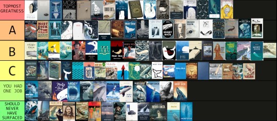
100 Moby-Dick covers ranked by your's truly. Thank you so much to all those of you who sent in contributions and helped make this completely out of proportion project a thing. Jars of angelic spermaceti for everyone! 🤍
As for the ranking, it is purely the result of my own personal taste in aesthetics and heavily influenced by my perception of the story. Add to that a generous amount of sentimentality, as shall be apparent.
What I have been mainly looking at in judging the designs is as follows...
- General appearance; is it attractive? 💕
- Does it help sufficiantly communicate the nature of the story (theme, genre, mood, plot)? ⚰️
- Is it canon? (Meaningful creative licence perfectly allowed!) ✅️
As for the tiers themselves, we have...
Topmost Greatness: this is something out of the ordinary, possibly genius and also I neeeeed it for my collection!
A: Good, good stuff, but might lack that very extra special something
B: Gets the job done, agreeable, totally okay.
C: It's not exactly bad and I'll let that oopsie over there slide, but I probably wouldn't pay much for this one.
You Had One Job: Yeah, you did.
Should Never Have Surfaced: Makes the Pequod tragedy look like a merry holiday.
Art thou ready?
TOPMOST GREATNESS
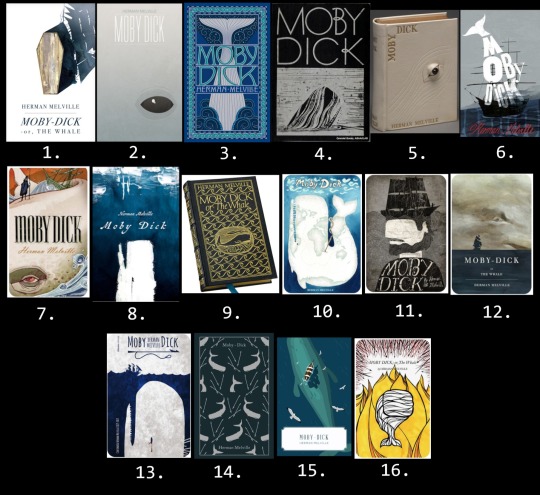
1. The most beautiful Moby-Dick cover I've ever seen. I was almost tempted to create a tier higher than Topmost Greatness only so that I could place it there.
2. Brilliant composition and color choice, despite its simplicity it hits me straight in the soul.
3. I remember drooling over this in the book store back in the day and considered reading it only because it was so gorgeous. Manages to be both crowded and clean at the same time. Story instantly recognizable.
4. The classiest of all time? Forever a winner!
5. I show the image of this one to people to make them understand the creative brilliancy that thrives within the Moby-Dick community.
6. Captures the mood in a fittingly crooked, awkward way that makes my heart beat faster. (Also reminds me of my copy of One Flew Over the Cuckoo's Nest for some reason.)
7. Another sort of awkward one, but I love the style, I love the surreal combination of drama and stiffness, pretty fitting the story itself. Makes 'Hab look a bit like the Grim Reaper.
8. The erratic painting technique gives me the perfect kind of crazy vibes.
9. Moby-Dick, a bibliophile's dream, topmost mood nailing, superior dark academia accessory... what more could anyone wish for in a book?
10. So well thought out and the claustrophobic feel helps to create an unsettling mood despite the otherwise quite cheery colors. Sorry, Madagascar.
11. Look, my two main areas of Moby-Dick interest is Ahab and rhe psychology, so... y'know.
12. Mood certainly set.
13. Guess I have a thing for harpoon/eye symbolism. Again that claustrophobic feel by leaving only a sliver of crowded surface.
14. First physical Moby-Dick copy I ever bought. All the books in this Penguin series are gorgeous, but to me this is one of the design winners regardless of the contents.
15. Unsettled in all this tropical serenity yet?
16. The boldness in color choice and to focus on the fire theme is as unusual as it is exciting, and the very modern touch makes it even more interesting!
A.
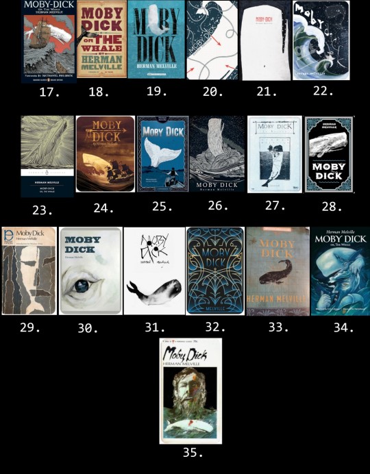
17. Not normally a style I'm drawn to, but somehow this manages to capture my interest. A successful nod to the painting at the Spouter Inn, lovely line work. My sibling got me this one as a locket for my last b-day.
18. My beloved companion, by now containing almost as much tape as paper. The 19th century poster design is irresistable to me. A white tail would've been even cooler though.
19. It's not that unique looking, yet the worn feel and harpooned Moby Dick simply gets to me somehow.
20. All the crucial elements skillfully and effectivly forged (no pun intended) together.
21. The way the psychology has been captured and the missing leg detail is yum!
22. Kind of busy but so unique and interesting! Yes plz.
23. Another classic! How could Kent's iconic whale ever fail?
24. Aiming for the adventure theme, it appears, and successfully so. Unusual color choice which I happen to be all about. Total vintage feel!
25. Again, not that much is happening, but the ropes, the character design, the inking... I love you, cover, and I need you in my life!
26. An often used scene, but the style gets to me so, so bad.
27. I'm not that much about the washed out color, but the rest is love.
28. Very basic, but also very nice and display friendly and I enjoy the vibe so much.
29. Almost made it to Topmost, but the positioning of the illustration gives off a cheap feel to me. Why couldn't you have used that gorgeous theme depiction to better advantage? Can one order a remake? Or a cropped poster?
30. Love the composition so much but the technique simply doesn't do it quite enough for me to move up one full notch. Still want it so bad for the collection though.
31. Runny ink on pure white is something I associate with Moby-Dick, don't know why. The blotchiness is a really great touch.
32. The design doesn't say much concerning the content, but nevertheless it is so pretty and am I correct when I say there's harpoon vibes?
33. Had that been a white whale, it would've ended up under Topmost!
34. My first reaction to this was that it's a really interesting piece of art, but I wasn't so sure I liked it as much in book cover form. The more I look at it, the more intrigued and enamoured I get. I want more of this.
35. Ahab and Moby Dick from Ahab's POV? Love the distorted psychedelic atmosphere, but another one with missed full illustration use potential.
B.
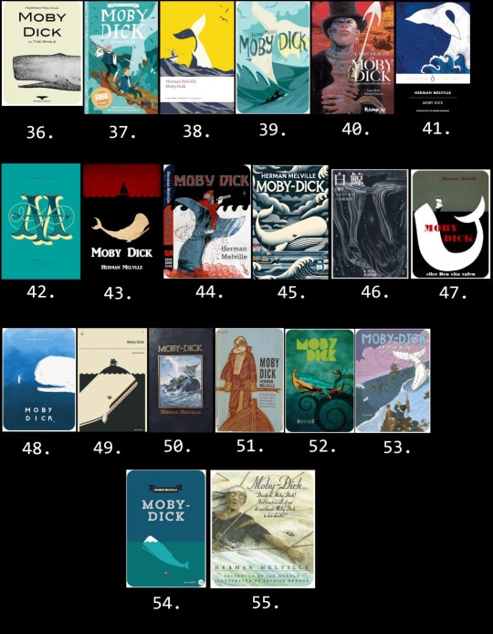
36. Brings back the menory of cigarettes and fear. Granny the Gregory Peck fan owned one of these and it freaked me out where she kept it on display ever after I'd been forced to watch the movie at age 6. Now I want one just for the hell of it.
37. Okay, so hear me out. I know it's a children's book, but the illustrator obviously knew the story. Love the tangling rope and that Ahab's prosthetic leg seems made out of whale bone rather than wood for once.
38. Nice modern touch, but that's straight up the New Bedford whaler statue, which kinda ruins it for me.
39. Lovely, lovely design, but I simply don't associate it with a story about suicidal tendencies, gore, and mass death.
40. A somewhat unusual character choice to pose on a cover, but hey, I'll take it! :D
41. Doesn't pop, but I do like me some traditional Japanese art vibes!
42. Elegant, but the huge M obscures the title text and the harpoon looks as if crossed with a sewing needle.
43. Basic, but the feel is there and I like the color combination for this story.
44. Love the art and it's impossible not to identify which story this is, but I have several Ahab design choice questions which won't leave me.
45. This whole thing is odd and busy, but I also really like it!
46. Speaking of Japanese traditional art. The lines and the moodiness is much to my liking.
47. Simple, spot on, nothing that extra.
48. If only he hadn't looked so damn happy about it as if Ahab was about to throw that harpoon like a stick for him to fetch. Untold plot line??
49. There is this whole sub genre of Moby Dick balancing the Pequod, a concept that certainly works, but by now it has to have that little extra something to seem truly special.
50. We have a less erroneous whale, folks! It may be a stock image, but Ishmael gave this one thumbs up, and so how could I possibly do differently? Nicely done!
51. First, I get strong The Old Man and the Sea impressions. Second, what kind of whale do you intend to kill with that thing, my dude? Points for canonical end game beard though.
52. I assume this is meant as a traditional Polynesian art style nod in honor of our dear Queequeg. The sports wear lining texture in the title letters confuses me though.
53. There certainly are plenty of canon here, but also, this is some odd mayhem and where are you aiming, Captain? Yay, ivory leg again!
54. Basic, works perfectly fine.
55. This is a really odd scene choice to pick for a cover, but I love this edition and its illustrations to bits. In fact, I'm planning on posting a review of it soon.
C.
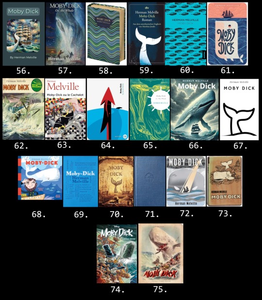
56. I haven't peeked into Melville's mind, but I'm pretty sure the Pequod looked quite different. The story is unmistakable though.
57. Nothing wrong with it, I guess, but way too messy for me to be comfortable with.
58. Not much to say here, but a perfectly nice-looking cover for any book.
59. Gets the job done, but not that inspiring.
60. Despite seemingly little effort behind it, this design based on a 19th century (erroneous) whale drawing could have gone straight up to A. You see, in the original image the (erroneous) whale has his penis (erroneous?) in full view, but on this cover it has been erased. How could I not have given a Moby-Dick book cover depicting dozens of (erroneous) whale dicks A? Alas.
61. Good, professional-looking cover, but judging by the illustration only, I would have guessed this was a children's book about the adventures of a jolly porpoise named Toni.
62. No spoilers to see here or anything. Is that a gold prosthetics??
63. This looks so much like a academic book on psychology. Not too far off, I suppose, but I wouldn't be able to figure out which famous story it is.
64. The Temple toggle harpoon was invented in 1848. Do with this information what you will.
65. Hey! That other cover from before! Have to say that the color alterations and helm sihouette wasn't an improvement.
66. A bit extreme for me.
67. I call this excessive simplicity. If you need a copy of Moby-Dick, you will recognize it at once, but it might not attract new readers merely in itself.
68. Just because it's a children's book doesn't mean the vibe has to be off, but I think it is in this case. Recently posted an example of this illustrator's adorable Ishmael here.
69. Where's the title? Confusing for a cover, but I would love this for a poster of mug! Also, the biggest words are Ahab, Queequeg, and Pequod, which I find mildly insulting towards a certain someone. What was he called again?
70. Cool whale picture which I really like, but the accuracy for Moby-Dick isn't really there.
71. It's blue.
72. I understand the idea and the illustration is awesome, but for me, the vibe is strangely all off and I get almost a comedic feel. Again, that's just me.
73. I often feel like an Ahab apologist and can often be somewhat harsh on the whale, but holy shit! A sort of red herring situation meant to make the reader think Ahab will be the winner?
74. It looks full of action and Scrooge's Ahab cosplay look is really neat, but I have... concerns.
75. I don't remember the scene playing out like this and Ahab is clearly not having it.
YOU HAD ONE JOB
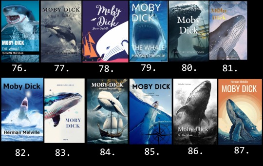
76. The exact face I made the first time I saw this kind of cover.
77. After all the people I've heard at the museum mistaking the sperm whale skeleton for an orca, I'm honestly surprised these fails aren't more common. The snowy setting is a nice touch.
78. Hast seen the white beluga?!
79. First shark Moby-Dick I ever saw and during my first week on Tumblr even. The nostalgia is real, shipmates.
80. Cool scene. Where is it from?
81. Come on! This is a fucking Wordsworth's edition!
82. My sentiments exactly.
83. No, it isn't.
84. At first I seriously thought this was some interesting modern sci-fi/fantasy take on Moby-Dick. Nope.
85. At least the person who did this one bothered to give it a traditional nautical flair.
86. The ocean is canon.
87. *screaming shark mode*
SHOULD NEVER HAVE SURFACED
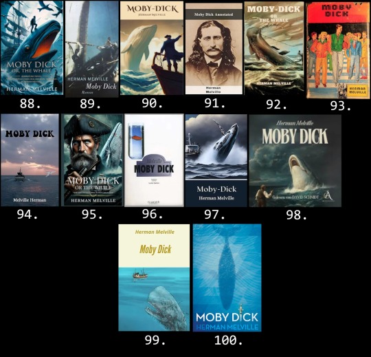
88. Someone's dad is balancing on top of a fire breathing eel whilst ravens are flying around and a poor guy has dark thoughts in the bottom right corner and... I dunno, man. "Whaling voyage turns fatal obsession" apparently. Moby-Dick the Prequel?
89. Whoa, dude!! I know you're angry, but holy shit!
90. "Captain Ahab? He went that way. Me? Just your average cliché 18th century pirate. If you don't mind me asking, sir, what sort of creature are you?"
91. By "annotated" they mean the truth about Wild Bill Hickok's one time side gig as a whaler. There's a fan fiction idea for ya.
92. What in the everloving AI fuck is happening here?
93. Friends, your guesses are as good as mine.
94. In the early 2020s, the ghost of Melville Herman set out to find the ghost of Moby Dick.
95. I guess we never learned what Ahab's dad died from back in the 18th century. Runs in the family and all that.
96. ?????????
97. If you download a public domain work to sell on Amazon for a possible extra buck, taking one minute to check the basic plot before slapping a stock image on it for a cover will be an actual long term investment.
98. "Lol! U overbite!"
99. Well, he is clearly a zombie whale, so maybe this is the sequel then?
100. And thus endeth MOBY D CK.
#moby dick#herman melville#literature#classic literature#ishmael#captain ahab#queequeg#moby dick spoilers#whale weekly#book tier list#tier list#moby dick tier list#moby dick projects#for fun#ranking#i'm dead
62 notes
·
View notes
Text
Aesthetic Emotions and the Catharsis of Tragedy
How I feel after watching Jimin's Production Diary - The Truth Untold.
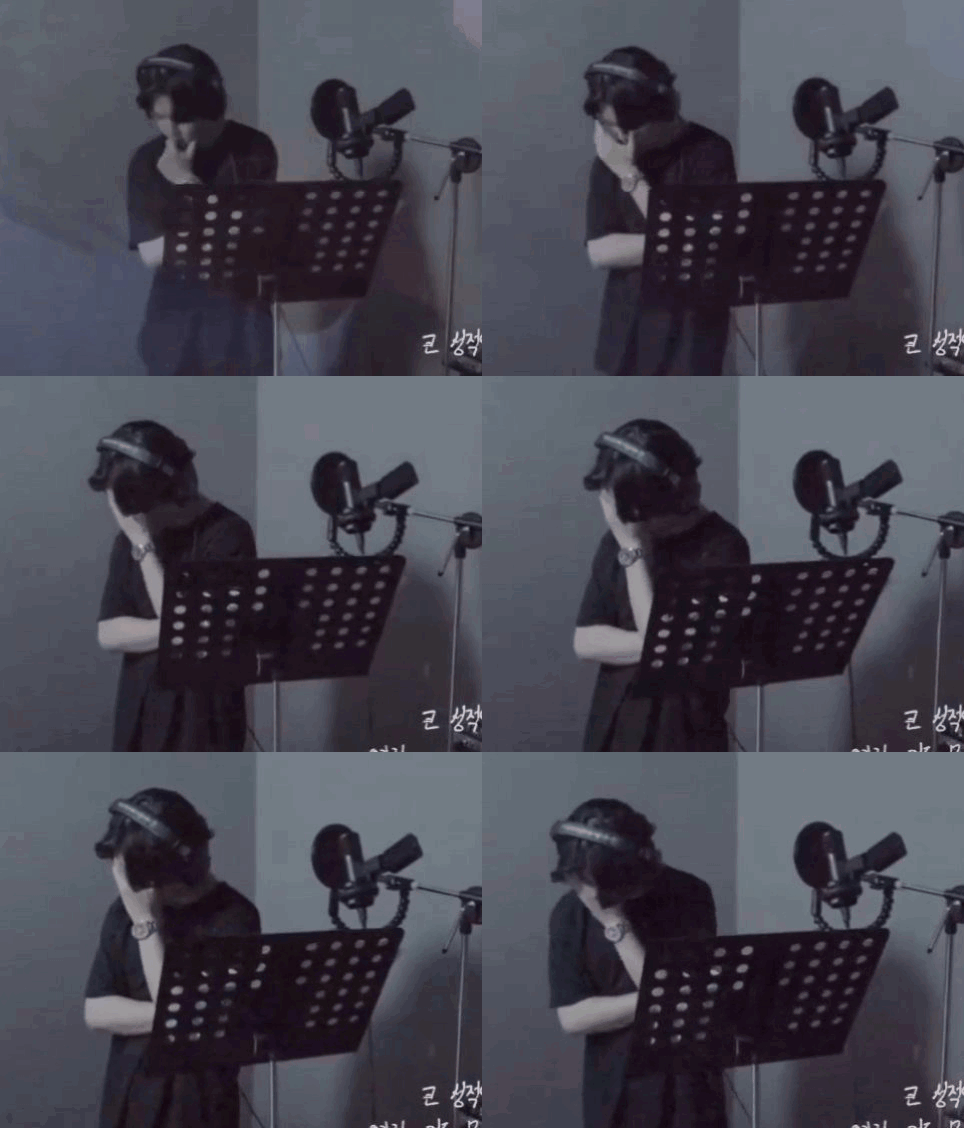
Why do we feel so drawn to emotional outpouring of others?
Why does the suffering and pain of artists make 'meaningful' art'?
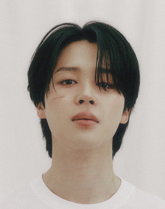
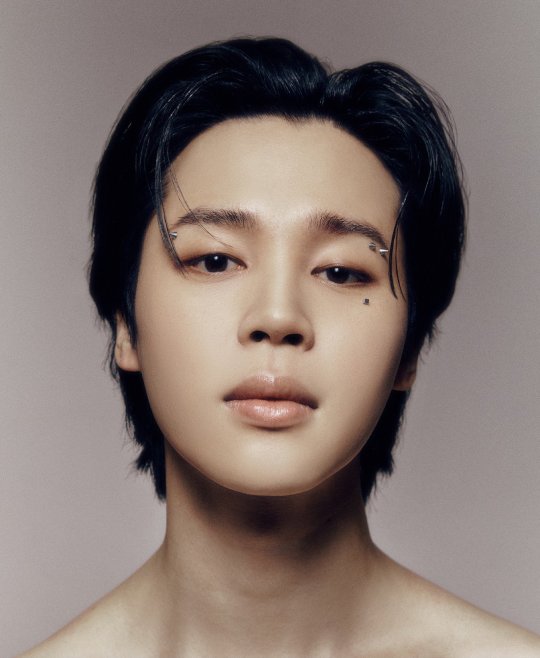
I'm going to tell you why I think Face is a Greek Tragedy and why, even though the album is a complete and perfect story, we still needed Letter.
You know how sometimes you just need a good cry? And afterwards you feel better, like a weight has lifted... that's catharsis.
Based on the philosophy of the ancient greek philosopers Aristotle and Plato, the catharsis offered by tragedy in art is good for your soul.
The tragedy I'm talking about is not like a natural disaster. Its not like an unfathomably sad real life situation such as war, or the failure of the referendum for The Voice to pass in Australia.
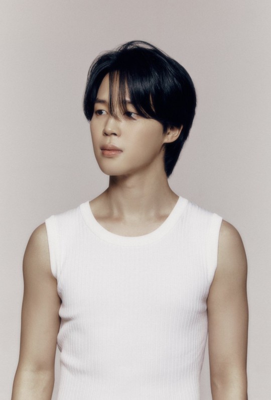
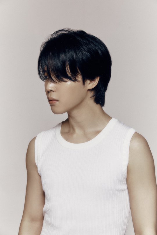
I'm talking about Tragedy as a literary and artistic genre.
Simply put, Tragedy as a genre is identified by pathos and passion. And the work must have a narrative structure - a beginning, a middle, and an end.
Pathos being the ability to identify with and pity a person going through hard times.
Passion referring to strong emotion (of any sort).
But how do we find the equivalent of that literary theory in work that's not a typical story? In a song, or in art?
In my opinion, we can see something similar in music if we combine literary theory and art theory. After all, what is a song but a story delivered with emotion through music, and experienced as art is?
There's a school of art theory called Aesthetic Emotionalism.
In a nutshell, this means that the VALUE of the artwork comes from the way it communicates or expresses emotion. Mood, colour, tone, language all contribute to the feelings we get when we experience that work, whether it's looking at a picture or listening to music. They help us pick up on the emotions the artist is conveying.
So what happens when you experience those emotions through art? What is catharsis?
The experience of tragic events in art, whether it's a heart-rending drama, or a beautiful sad song, or a dark and menacing painting, can give you access to emotions like fear, pity, and regret. Feeling those emotions through art lets you purge the heaviness of them from your mind and body, giving you a sense of relief. That's catharsis.
It seems counter-intuitive but ultimately the experience is uplifting. It's like having the benefits of a therapy session, but without having to face YOUR OWN demons.
Becuase of the narrative structure, and the resolution of conflict, there's always relief at the end of the story.
You feel cleansed of those strong emotions, reengergised and ready to go on. But you also feel a sense of calm understanding. The pathos part of the tragedy gives you insight into the suffering of the character in the story.
Think about the narrative structure of the album Face.
The album has a carefully planned narrative, and a sense of rising and falling energy with these songs that's strongly reminiscent of the structure of a Hero's Journey.
And think about the individual songs in terms of Aesthetic Emotionalism too ...how they convey emotions through tone, pace, language, colour etc.
I'm going to go ahead and say that the strength of the Aesthetic Emotionalism in these songs (and in BTS's music in general) is a major reason they have such impact even when you dont understand the lyrics.
Now let's combine them... look at the emotions conveyed in these songs and how the literary theory of a tragedy might apply to the album :
The first song is the slow and devastating Face Off, with its hypnotic rhythm and strange, discomforting sound effects. It reallly does transport us into a dreamlike/nightmare landscape. But the last few words of the song foreshadow that it's gonna be alright.
Then we have the surreal, melancholy Dive, drawing us further into this dystopian world. It also uses sound effects to make us feel like we are being pulled through time. Dive is reminiscent of a soundtrack from a video, but it's been separated from it's film reel, leaving the listener to guess and imagine the scenes unfolding. It feels like jimin has come untethered from his reality.
Like Crazy comes like rising action in a novel, and we get character development, a bit of plot information, and conflict. But the song itself is a viby dance track with a party atmosphere (if you don't look too closely) so we get a reprieve from the darkness of Face Off and Dive. Its hypnotic beat is enough to keep us locked in the surreal dreamlike world that's been built around us by the previous songs, and the lyrics echo that.
Alone takes us back down into the darkness of Jimin's state of mind, both lyrically and with its low tones and slow pace. We get the metronome, the marking of slow time.
Set Me Free has a totally different energy. Jimin's tone of of voice is much brighter, but hard and determined. Set Me Free isnt a request, it's a demand. The music is forceful. It's like a battle march. The story has reached its climax.
Returning to Like Crazy (English version) after Set Me Free, is like returning to a gentle refrain. Its so much softer and more plaintive than the demanding Set Me Free, echoing the earlier melody and words, but it hits sightly different in English. We are into the denouement of this story, the resolution has come.
But it's not the end.
It is not the end, because after a few minutes of silence, time to breathe, we get Letter.
Why is letter here?
Jimin could have released Letter on Weverse or Soundcloud or directly onto Spotify. But he chose to include it at the end of the album.
I feel this is so important, because the specific set of circumstances of this album means this Tragedy we've just experienced isn't entirely consistent with the literary genre.
FACE ticks all the boxes for a Tragedy in the literary sense, it has pathos and passion and narrative structure. If you were a casual listener and you got to the end of the album you would have a sense of catharsis, as intended. But there's a complication.
ARMY aren't casual listeners.
This is personal.
We know Park Jimin, the real person.
We know this isn't fiction. This shit is real. It was real for him when he wrote it and it's real for us now.
Achieving catharsis isn't that easy when it's personal. Not when the hurt is real.
That's why he gave us letter.
That's why he gave it ONLY TO US.
Letter is a soft sweet gift, a sentimental dedication full of reminiscences that only ARMY will understand. The melody is gentle, like a lullaby, and Jungkook's backup vocals are enough to make you weep, if you aren't weeping already.
(**I have a theory that jk either didn't know about letter or didn't know Jimin was going to ask him to sing. See this post for why)
Letter does exactly what it's meant to - it fills us with warmth. It makes us overflow with love. It's a soothing balm to heal our hearts.
And its everything we need in order to let go of those heavy feelings of fear and pity, of worry and sadness for Jimin that the album brought to the fore.

Jimin knew we would need more. That's why he he sent us letter, right at the very end.
"I'm sorry. Thank you," It says.
"Don't cry. It's gonna be alright."
#park jimin#jeon jungguk#jikook#jimin face#park jimin face#park jimin letter#letter for army#pathos#plato#tragedy#aesthetic emotion#art theory#literary theory#bts#bts Jimin
149 notes
·
View notes
Text
Things about Lestat's rock band in the books that I hope the show carries through:
- Lestat is a sellout. He found this existing band, convinced them to let him join promising fame and fortune, then without asking them went directly to his lawyers and accountants to throw all the money in the world into Making The Band Famous. Also renaming the band in the process. RIP Satan's Night Out.
- He also changed the whole aesthetic of the band to be Vampires™. They're described as wearing rainbow silk shirts and dungarees before Lestat, and black vampire capes after. What gets sacrificed in the poser's pursuit of goth?
- He paints himself as playing from the heart, but that's only true to the extent that he's doing this to start a war and maybe die in the process. The actual art is secondary at best. Knowing the writers' modernism interest I'm really hoping for some futurism creeping in.
- On that note, the lyrics are. Well. Not very good. Many other characters recognise this.
- There's tragedy in that! Lestat as a human was borderline revolutionary! He criticised the rich, loved working in his tiny little theatre, and wanted to do good by making good art. What does vampirism take away from you? The ability to create? Or was it Magnus's wealth that removed him from his old self? Made him believe he could send a Strad to Nicki and everything would be fine?
- "Lestat, those songs of yours could wake the dead." (Not a compliment. They should be Loud.)
- The band is smoking so much weed all of the time. I don't think Alex, Larry, or Tough Cookie have any understanding of events. How does that play into the abuse of power of it all?
- We know next to nothing about the band
- Despite throwing, again, all the money in the world at this event, it's not an absurdly large concert in the end. 15,000 people is a big concert, but is it "this band's music videos play on every channel on repeat" big? Given the scale of investment, was it even really successful?
21 notes
·
View notes
Note
*Define Cultural Impact*
Taylor stans: " Well it made a lot of money and it charts."
I pray for them to understand the difference between commercial success and cultural impact.
And dressing like her, RIGHT NOW isn't impact either. She's one or the biggest popstars at the moment. Of course some gonna cosplay as her. Talk to me if anyone does this 20 years later. I can GUARANTEE you no one will be doing that.
And OF COURSE businesses will try to captilize of her name. As if they wouldn't suck up to her to gain cash.
What impact has she DONE with her MUSIC? Her ART? Has she done ANYTHING that hasn't been done before? Did she push any boundaries? Did she risk anything?
Preach-
You have no idea how stressful I find it that most- if not all- young people are consistently conflating the idea of material success with cultural impact.
Capitalistic Hellscape American Dreams are literally rotting out the core of the human experience-
Not to be too overly dramatic- but Taylor Swift is literally the poster child for the vapidity of conflating materialism with cultural presence.
To be honest- now that it has been roughly 6 months since TTPD release- I don't really see much impact from the album at all.
In fact- I barely hear it played on anything except the most obnoxious Tik Toks you've ever heard in your life. Do Swifties think that having an impact on Tik Toks is the equivalent of making an impact as an artist?
I wonder- about this a lot since I've been reading so much on dialectical materialism, ancient aesthetics, and Marxist philosophy-
It's getting weird inside my brain.
It is an interesting question at least- to wonder, are we culturally influenced by the most vapid, shallow aspects of capitalistic music production; or is art mainly beholden to aesthetics?
Does the modern pop music captivate us for aesthetic purposes? or does it captivate our impulse towards distraction in an era of increasingly short attention spans?
Either way- I am rather sick of the banality Swift is propping up as "genius"
I don't know- I fell down a rabbit hole the other day at the crosshairs of neurobiology and aesthetics-
Some scholars of Ancient Greek plays argue that the unique rythme and prosody of employed by the playwright had the ability to affect the mind- and further our ability to empathize, think critically, and engage with reality. Some of the theories relate- of course- to the Aristotelian idea of catharsis- so imagine my surprise when I realized there is a real neuroscientific basis to that ancient theory.
I really enjoy thinking about this stuff- if you can tell; mainly because I know that Taylor Swift was aiming for classic Greek Tragedy aesthetics and missed it by a mile, simply because she is not a good enough writer to employ the tactics of catharsis in her work.
Not that I want to fall into a neo-fascist trap of glorifying past art as the pinnacle to which we should all aspire because it represents some past "pure" age- free of corruption. I do, however, think that we live in an interesting era- one which nearly demands that we pay attention to what slips past our attention, and what is missing from our periphery of attention:
What is missing from art? Where are the neurobiological cathartic impulses- the aesthetics of critical engagement? Where did it go? Is it actually missing- I think, at least, for some more mind-numbing music (like Swift's) it certainly is.
And, of course, a follow up question from people who would no doubt play devil's advocate with this topic: Should we even bother with emotionality and cognitive engagement for the purpose of creating good art? Does good art have to make people think or feel? Is that the purpose of art?
Relating it all back to cultural impact vs material success- Why do people think that material success is indicative of any further artistic depth? I don't have an answer- it is actually confusing to me.
You pose a really thought-provoking discussion in your ask, and I thank you for it.
I will be returning to writing about aesthetics- I am sure of that.
#anti taylor swift#ex swiftie#taylor swift critical#anti swifties#ttpd#taylor swift#self#literary aesthetics#aesthetics#dark acadamia aesthetic#aristotle#philosophy#ancient greek#literary theory
15 notes
·
View notes
Note
I am curious what your take is on this "star boy the shape shifter" after seeing your nice reply to that clown. Even if the idea remained I have a funny feeling about it in my spirit.
Thank you for the ask!! People will cling on anything just to hate on another Disney movie (without even watching it nor caring about Disney in the first place lol), they think it makes them look cool I guess?
Honestly, I like the concept of human Star. I know we don’t know for sure if he was gonna be a love interest, even though the demo version of At All Costs strongly makes me think so. Even having him as a platonic friend to Asha, not necessarily a love interest, had potential in my opinion, but an old fashioned love story would have been nice for the Disney 100th (we arguably don’t have one since Tangled). Especially the shapeshifting part would have been so fun to see in animation! I’m imagining some sort of fusion between Maui and Jack Frost lmao
HOWEVER, unlike some people who, clearly, are just in love with the aesthetic of it and were searching for yet another reason to sh*t on Disney, I’m not PISSED at the writers for changing that. First of all I’m pretty satisfied with what we got: as I said previously, I definitely don’t consider Wish the BEST Disney movie, but still a quite enjoyable one with nice characters, animation, and music. Secondly, we don’t know the full original story, we don’t even know if they had one when Starboy was considered. Maybe it didn’t work, maybe they were just exploring ideas and some concepts of him as a human were made. It’s not like this is the first time a cool scrapped concept appears in an art book lol, Disney art books are filled with those.
Also, I feel like people need to understand that it’s perfectly fine to say “you know what this would have been cool. I’m making a fic/fanart/headcanon” instead of immediately going “oh my goddd!!! this would have been SO much cooler than the actual movie, which I haven’t seen, based on this specific scrapped concept art and some ai art I’ve seen on tiktok!!!” I know it’s not EVERYONE acting this way but, sorry, most complaints I’ve seen are coming from these people lol. Fortunately I’ve also seen a few comments from people who genuinely wonder what the movie would have been like if they went with Starboy without making tragedies, as well as people making fanarts out of creativity and not hate for the actual movie (which is not deserved come on. You can dislike it ofc but it’s not some immoral monster like some people paint it).
So that said, I’m glad people are having fun exploring concepts and making fanarts, I’m all for it! Long post but I took an opportunity to express all my thoughts on the topic lol
#wish#wish disney#wish 2023#disney wish#disney#I still don’t know how to tag it#star boy#star wish#asha
17 notes
·
View notes
Note
Hey sorry to bother but which other blogs do you run? Ik you run gangle's and kaufmo's but idk abt any others but I wanna follow them
[using this ask to do a mod Q&A cause my inbox is flooded w/ stuff directed towards me (soup/stew)]
[A: all the blogs I run will be on the masterlist! some won't be included here (as they arent fully set up yet) but i run this blog, @helper-central (multi-run comic blog . spreading comic propaganda), @theclownkaufmo (obviously!!), and @putting-sun-and-moon-in-places (also multi-run)]
[theres three more blogs but as i said, they're a work in progress! you will learn about them soon]
[more questions answered below the cut. your question may be answered here, feel free to check!!!!!]

[A: i do use mspaint! i use a lot of art programs actually. ibispaint, procreate, art set, and magma (the website)] [i usually switch between different apps so expect different styles every now and then] [also ty for the compliment :3]

[A: ghsjkdf ... this makes me really happy to see- im glad you like my blog so much, i love this blog with my soul and i love interacting with the different characters. i consider all my anons important- and i love seeing them around. tysm for this ask!!..]

[A: is that the guy who played micheal in the fnaf movie. are you kidding m-]

[A: GOOGLE IS NOT REAL-]
[also (disappointed sigh) bing is kinger x "blur" (what we named the abstraction we straight up can't design because theres no clear images of what the heck it is)]

[A: chaos.]

[A: can someone make a gif of an image of gangle slowly turning into flintheart glomgold. please and ty] [man do i love my character gnalge]

[i think i have an idea of what it is? i don't think it has any meaning, its just another part of their body. most likely there for aesthetic reasons]
[i'm pretty sure that the badge is just an accessory they wear!]
[final notes: any asks with images i'll probably save for later cause i can't fit them here. and dear xeya. POST YOUR TRAGEDY PROPAGANDA ON YOUR OWN BLOG!! STOP SPREADING KAUFMO X GANGLE AHHHHH-]
16 notes
·
View notes
Text
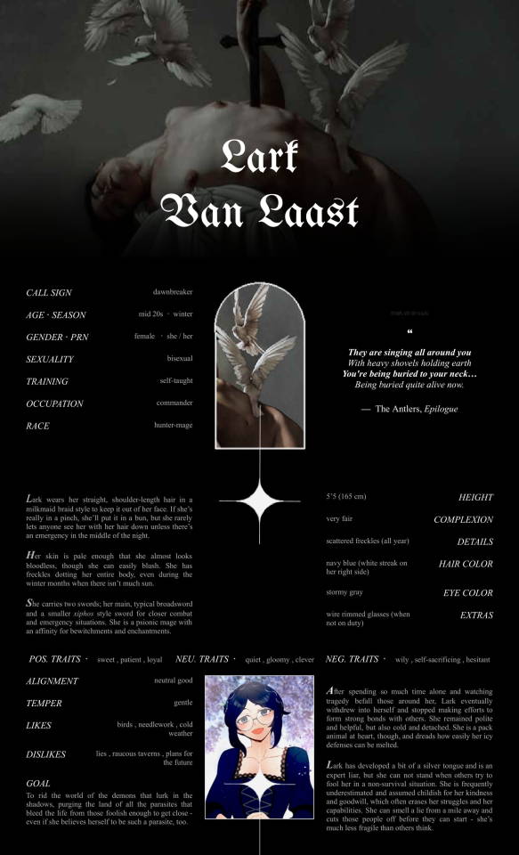
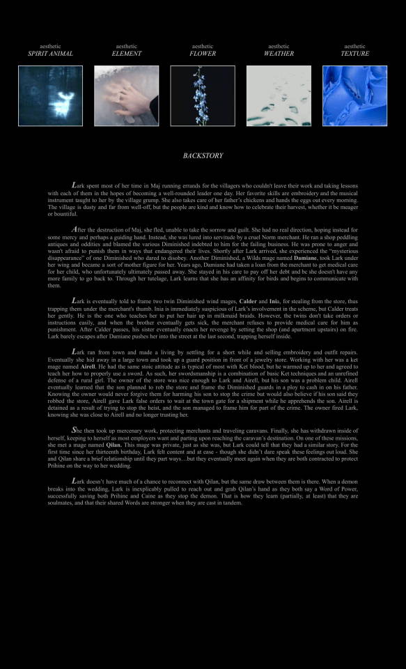
BREAKING THE DAWN - an OC introduction template link - @youngmrclaus lark art cred qilan belongs to @yuechicake lark exists in the @shepherds-of-haven universe!
Lark has gone through a ton of lore upheavals and additions, so I decided a reintroduction was in order! and also this template was beautiful so i had to use it :3c I also wanted to see how her backstory diverted from the canon story with her soulmate Qilan thrown into the mix!
(Having trouble reading? This post is transcribed beneath the cut!)
LARK VAN LAAST
CALL SIGN - dawnbreaker
AGE / SEASON - mid 20s / winter
GENDER / PRN - female / she / her
SEXUALITY - bisexual
TRAINING - self-taught
OCCUPATION - commander
RACE - hunter-mage
"
They are singing all around you
With heavy shovels holding earth
You're being buried to your neck...
Being buried quite alive now
The Antlers, Epilogue
"
HEIGHT - 5'5 (165cm)
COMPLEXION - very fair
DETAILS - scattered freckles (all year)
HAIR COLOR - navy blue (white streak on her right side)
EYE COLOR - stormy gray
EXTRAS - wire rimmed glasses (when not on duty)
Lark wears her straight, shoulder-length hair in a milkmaid braid style to keep it out of her face. If she’s really in a pinch, she’ll put it in a bun, but she rarely lets anyone see her with her hair down unless there’s an emergency in the middle of the night.
Her skin is pale enough that she almost looks bloodless, though she can easily blush. She has freckles dotting her entire body, even during the winter months when there isn’t much sun.
She carries two swords; her main, typical broadsword and a smaller xiphos style sword for closer combat and emergency situations. She is a psionic mage with an affinity for bewitchments and enchantments.
-
POS. TRAITS - sweet , patient , loyal / NEU. TRAITS - quiet , gloomy , clever / NEG. TRAITS - wily , self-sacrificing , hesitant
ALIGNMENT - neutral good
TEMPER - gentle
LIKES - birds, needlework, cold weather
DISLIKES - lies, raucous taverns, plans for the future
GOALS - To rid the world of the demons that lurk in the shadows, purging the land of all the parasites that bleed the life from those foolish enough to get close - even if she believes herself to be such a parasite, too.
After spending so much time alone and watching tragedy befall those around her, Lark eventually withdrew into herself and stopped making efforts to form strong bonds with others. She remained polite and helpful, but also cold and detached. She is a pack animal at heart, though, and dreads how easily her icy defenses can be melted.
Lark has developed a bit of a silver tongue and is an expert liar, but she can not stand when others try to fool her in a non-survival situation. She is frequently underestimated and assumed childish for her kindness and goodwill, which often erases her struggles and her capabilities. She can smell a lie from a mile away and cuts those people off before they can start - she’s much less fragile than others think.
-
AESTHETIC - spirit animal / AESTHETIC - element / AESTHETIC - flower / AESTHETIC - weather / AESTHETIC - texture
BACKSTORY
Lark spent most of her time in Maj running errands for the villagers who couldn't leave their work and taking lessons with each of them in the hopes of becoming a well-rounded leader one day. Her favorite skills are embroidery and the musical instrument taught to her by the village grump. She also takes care of her father’s chickens and hands the eggs out every morning. The village is dusty and far from well-off, but the people are kind and know how to celebrate their harvest, whether it be meager or bountiful.
After the destruction of Maj, she fled, unable to take the sorrow and guilt. She had no real direction, hoping instead for some mercy and perhaps a guiding hand. Instead, she was lured into servitude by a cruel Norm merchant. He ran a shop peddling antiques and oddities and blamed the various Diminished indebted to him for the failing business. He was prone to anger and wasn't afraid to punish them in ways that endangered their lives. Shortly after Lark arrived, she experienced the “mysterious disappearance” of one Diminished who dared to disobey. Another Diminished, a Wilds mage named Damiane, took Lark under her wing and became a sort of mother figure for her. Years ago, Damiane had taken a loan from the merchant to get medical care for her child, who unfortunately ultimately passed away. She stayed in his care to pay off her debt and bc she doesn't have any more family to go back to. Through her tutelage, Lark learns that she has an affinity for birds and begins to communicate with them.
Lark is eventually told to frame two twin Diminished wind mages, Calder and Inia, for stealing from the store, thus trapping them under the merchant's thumb. Inia is immediately suspicious of Lark’s involvement in the scheme, but Calder treats her gently. He is the one who teaches her to put her hair up in milkmaid braids. However, the twins don't take orders or instructions easily, and when the brother eventually gets sick, the merchant refuses to provide medical care for him as punishment. After Calder passes, his sister eventually enacts her revenge by setting the shop (and apartment upstairs) on fire. Lark barely escapes after Damiane pushes her into the street at the last second, trapping herself inside.
Lark ran from town and made a living by settling for a short while and selling embroidery and outfit repairs. Eventually she hid away in a large town and took up a guard position in front of a jewelry store. Working with her was a ket mage named Airell. He had the same stoic attitude as is typical of most with Ket blood, but he warmed up to her and agreed to teach her how to properly use a sword. As such, her swordsmanship is a combination of basic Ket techniques and an unrefined defense of a rural girl. The owner of the store was nice enough to Lark and Airell, but his son was a problem child. Airell eventually learned that the son planned to rob the store and frame the Diminished guards in a ploy to cash in on his father. Knowing the owner would never forgive them for harming his son to stop the crime but would also believe if his son said they robbed the store, Airell gave Lark false orders to wait at the town gate for a shipment while he apprehends the son. Airell is detained as a result of trying to stop the heist, and the son managed to frame him for part of the crime. The owner fired Lark, knowing she was close to Airell and no longer trusting her.
She then took up mercenary work, protecting merchants and traveling caravans. Finally, she has withdrawn inside of herself, keeping to herself as most employers want and parting upon reaching the caravan’s destination. On one of these missions, she met a mage named Qilan. This mage was private, just as she was, but Lark could tell that they had a similar story. For the first time since her thirteenth birthday, Lark felt content and at ease - though she didn’t dare speak these feelings out loud. She and Qilan share a brief relationship until they part ways…but they eventually meet again when they are both contracted to protect Prihine on the way to her wedding.
Lark doesn’t have much of a chance to reconnect with Qilan, but the same draw between them is there. When a demon breaks into the wedding, Lark is inexplicably pulled to reach out and grab Qilan’s hand as they both say a Word of Power, successfully saving both Prihine and Caine as they stop the demon. That is how they learn (partially, at least) that they are soulmates, and that their shared Words are stronger when they are cast in tandem.
#shepherds of haven mc#shepherds of haven#shoh#shoh oc#🌠 pisces ゚+..。*゚+{all writing}#👩🚀 astronaut ゚+..。*゚+{ocs}#☆ shoh#☆ shoh oc
5 notes
·
View notes
Note
Hy nat hope your doing well can I just ask what you like so much about Rothko his paintings? And why did you pick the paintings you chose for ahb!?
Hi!! I hope you're doing well this lovely morning! I get very rambley abt art and Rothko and so I will answer under the cut! 😋
Rothko specifically is one of those artists I didn't "get" at first. He was a very common name brought up in my undergraduate classes and when I looked at his paintings I felt very meh about them. Like, they were blocks of color,, which is cool I guess?? Most people say that you have to see a Rothko in person in order to understand it. That the very act of standing in front of a Rothko allows you to tap into something online renderings can't provide. Which annoyed me, because I'd never seen a Rothko in person. And it felt very inaccessible to me,,, this idea that I'd have to travel to see a Rothko in person in order to understand it. (although there is always something to be said for witnessing a painting in person, up close and personal) So I started doing my own research.
Rothko was obsessed with trying to capture human emotion. He wanted to paint feelings. He was actually quite annoyed and pained when people only valued his artwork for the aesthetic qualities and decorative functions. He was attempting to paint joy and pain and excitement and all of these things at once on one canvas to visualize what he was feeling. He wanted his paintings to interact with the emotions of the viewer and vibrate with feeling.
Rothko stated: "My art is not abstract; it lives and breathes. I’m not interested in the relationship of colour and form or something in this spirit. I’m interested only in expressing the basic human emotions — tragedy, ecstasy, despair."
Anyway! After all of that research, I started looking at Rothko works more carefully but less analytically if that makes sense. I wasn't looking at form and composition and his color mixing techniques, but at the work as an emotional piece, and I started to appreciate Rothko's work a lot more! This is also why in Art Heist, Baby! Rothko is brought up in times of intense emotional distress. Both in the car chase and in the final swap, James thinks of Rothko. He is emotionally battered and bruised and experiencing a million feelings all at once and that's when he relates to Rothko. That's when he understands. When he connects to the human and emotional aspects of the works because he sees something reflected in the paintings that is now also reflected back in himself.
As for why I included some of the other works in Art Heist, Baby! Some of them I've seen in person and they've awed me and I wanted to write about them because I've seen them and they make me weep!! (looking at u canova's eros and psyche!!) Some of them, I've never had the fortune to see in person but I love them dearly and I wanted my characters to see these works if I couldn't (haha) and Some of the paintings are picked for narrative purposes. Like the Van Eyck and the Cézanne in chapter 34. The paintings James carries to the final swap foreshadow what's to come. One, a portrait of a lover, and the other, a still life reminding viewers of impending death. James is carrying paintings about a lover and death. And then his lover dies hehehe. So it really depends on the work!!
#sorry i feel like none of this makes sense#tbf i am listening to flo milli while typing this so the thoughts aren't thinking#ARH talks#art heist baby!#asks
39 notes
·
View notes
Note
i mean if you are interested in shoujo manga recs, clamp's catalogue gives you a pretty wide variety. even the series that are technically categorized as shounen and seinen have a distinctly shoujo feel to them. high quality character writing and emotion driven stories across the board.
on the sweeter side of things card captor sakura and wish are the place to start (my personal fluff favourite is kobato, but it makes sense to read wish and possibly chobits before that one)
on the other side of the spectrum you have rg veda (toxic gay central, plenty of bloodshed and tragedy) and x/1999 (all kinds of flavours of doomed relationships, aesthetically an absolute highlight, unfortunately forever unfinished)
though before getting into x you gotta read tokyo babylon! it provides the backstory for 2 important characters from x, but it's also a genuinely fantastic exploration of different societal issues that still resonates despite its age. the art style is a little rough, but it's only 5 volumes and in my opinion the best place to start, if you want to get into clamp.
clover is kind of an outlier and also tragically forever unfinished, but i love the aesthetic! highly recommend to at least flip through and look at the pretty images.
also whatever you do, don't start with tsubasa and xxxholic. they're great and there are vampires to be encountered, but you should definitely look into their older works first.
Oh my thank you so much for the detailed rundown and explanation dear anon, this is very informative. I'll take your advice and add these to my reading list in the order you have suggested 😌🙏
5 notes
·
View notes
Text
I don't care about how beautiful or ugly AI pictures are.
Before you read this, keep in mind that I have taken History and Culture of the Arts classes (from ancient history to the days of today), History of Drawing classes, as well as studying on my free time because this quite literally my area of expertise. I am also finalizing my license degree in the artes field.
Art in it's many forms is a form of communication. It doesn't matter if it's paintings, illustrations, video games, books, architecture, sculpting, pottery, you name it. It's how each artist/writer/musician views and shares the world, how each person has an unique approach reflecting their own life experiences and tastes.
It's how one writer drafts poetry upon the ocean, while another fears it, and a third one merely views it as a body of salty water. How one artist tenderly paints the hands of a portrait while another slaps a couple of brush strokes on it and calls it a day. How some do a lot of messy and sketchy charcoal lines, while others prefer a pretty and rendered piece. How some prefer the melody of the violin, while others the beat of the drums. It's how you draw backgrounds, what backgrounds, people, which people.
The details you choose to put in - a flower pressed into the background, with no importance to the picture or environment but still consciously put there, for a reason or another; the way a character shows their emotions, in ways we rarely think about but the author knows intimately; how a game developer hides little easter eggs in their game and delights in those who find them and get the reference...
How we still talk to Homero after he's been dead for millennia. How we see ruins from civilizations past, where people once had their first love, first tragedy, last breath. How now we use digital art to depict animals, the same way ancient humans used stone to carve them upon walls.
A machine has no thought. It copies without meaning. You cannot talk to it or marvel at the details it puts in, because they are mindless. The machine puts in a rose because the artists it references also put in roses. It draws a blue ocean when you write prompts for mermaids because mermaid = water = blue. It takes from the humans before it and doesn't adapt it or build upon it, for it cannot combine two completely different - and at first sight irrelevant - things on its own without it having been done before. This is not Detroit: Become Human. The AI is not alive or intelligent. It's a tool, the same way your phone or microwave are.
I love pretty art. In fact, as someone finishing my license in the arts field, I would consider myself quite elitist. I have a strong love for Pre-Raphaelite and Noveau art, and classical architecture. I would suck Alphonse Mucha and John William Waterhouse's dicks if they so commanded, if I could get a small napkin drawing from them afterwards. I don't like XX century art movements like cubism or dadaism. I find them ugly, and they go completely against my aesthetics.
But as much as I hate those, the artists who made them had a story to tell. They had hands and a brain. They put it forward in their own way, with their own language, based on their own likes and dislikes, happy and tragic memories.
A machine has none of the touch.
Art is not the same as working in the mines or in the sewers. It's a human connection. It has been here before we even called ourselves human, it has been here when there was more than one human species walking the planet (for the homo sapiens wasn't always alone). There ir no need to replace it.
Does AI artwork has it's uses? Well, I believe so. I believe there could be ways to make it work. A tool is a tool, after all. But I have yet to see it being used in a ""good"", innovative, useful way.
There is no TLDR. I cannot contain what I just wrote in few words. It would defeat the purpose.
#ai#ai art discourse#ai art isn't real art#anti ai art#my opinion if you disagree ignore#unless you have the bare minimum of art history I don't believe I can have a conversation with you on this topic#I dont care how much faster AI is#I dont care if you think I'm gatekeeping art#shoving prompts into a machine isn't creating art the same way me shoving a pre made meal in a microwave isn't cooking#if you have a disability there are many different types of art you can follow so don't even try to use that as an excuse
28 notes
·
View notes
Note
Could you elaborate your thoughts on a little life? Does thinking it's overwrought and sort of aimless (a prevalent criticism I think, a part of Andrea Long Chu's, famously) amount to calling it irredeemable?
i generally don't go out of my way to read andrea long chu's work so im not familiar with what she's said abt this, what i was referring more to was the wave of conversation about a little life on here specifically that was being done by people generally aesthetically opposed to the "su critical" style of argumentation while still employing their arguments. this manifested in posts calling the book homophobic or trauma porn etc rather than any real engagement w the book as a work of art. i can understand someone thinking it's overwrought and i thought its aimlessness was good actually but that's about taste obviously. personally i think the book was trying to say something about the concept of like "deserving" pain which it does competently through its portrayal of a protagonist who believes he deserves all of it while we as the reader obviously disagree with him and want better for him (illustrated both through a like cycle of pain where abuse begets more abuse but also notably ending not with a series of effects caused by this cycle of abuse but by a completely random tragedy which is probably what makes it feel more overwrought but to me encapsulates the themes moreso than all of jude's pain in the end being caused by this cycle of abuse that he keeps getting into). in this it obviously resembles year 24 (im specifically thinking about heart of thomas) proto-yaoi but on a much grander scale and taken more seriously by the author. and like i dont think yaoi on a grand scale is actually homophobic i dont think a little life is either
2 notes
·
View notes
Text
i’ve been watching a lot of patricia taxxon video essays and it’s been striking me just how much of analysis is like, completely out of line with the aesthetic experience of the actual piece.
it’s like when someone talks about breaking bad and goes “it’s crazy, the first season is basically comedy!” when it’s like. the entire show is a comedy. it has jokes, like a lot of them, and they’re funny, and clearly meant to be funny. even when shit hits the fan over and over it still is funny. arguably the jokes only stop in the latter half of season 5, i.e. it maintains huge elements of comedy up until the very end of its plot. and it’s not just background gags, either, a ton of plot important events and character work is framed through comedy. it is, very firmly, a tragicomedy. it’s kind of crazy how people overlook that.
and like, this happens with a ton of media! i’ve been getting back into bsd recently and people will provide so many analysis pieces about the characters and the themes etc etc, and yet everyone, in their analysis, fails to talk about the aesthetic experience of bsd. they talk about the plot points, the information provided etc, but they rarely talk about how that information is delivered. because, actually, bsd is camp as shit.
like, for example, people will write pages upon pages about dazai and his tragedy etc etc, but if you only read those you wouldn’t realize that he’s actually a very funny guy. he’s basically the closest bsd has to a comic relief! he provides comedy in most scenes he’s in, and often while other characters are only funny to the audience, like the characters are unaware that a comedic moment is taking place, dazai jokes and is amused in universe! comedy is very, very prevalent in his character.
and you could say “oh it’s just a facade” (a take i wholeheartedly disagree with), but 1. it is still something he does pretty much all the time, half his screen time is dedicated to a level of comedy, so how can you not talk about something that he does constantly in your character analysis and 2. he says multiple times he does it for his own amusement! he says he finds fun in making people think he’s weird, and dismissing that as a “facade” seems highly strange considering how big of a thing this is for his character. even in his more serious scenes, he’s consistently cracking jokes, often in contrast to the sometimes playing along but still serious tone of other characters.
and maybe you could argue people do mention this, by mentioning his detachment or his closed off nature or blah blah blah, but you can’t really address that aspect without mentioning the fact that it’s funny. it is. it just is, so in all those essays upon essays about his depression or whatever they fundamentally fail to mention the framing of the entire thing. bsd, like most media, is not a bullet point list of events, of plot points or disconnected lines. it is not an array of facts or summaries. it is all conveyed through certain lenses at certain parts of the story, and those lenses are the meaning. the medium is the message. it would be missing the forest for the trees to talk about dazai’s, say, attempts on himself without mentioning that most of the time he makes those attempts into a joke. they are comedic within their framing. that doesn’t mean they’re not serious or should be downplayed, mind you, it just means that we cannot just ask “what do these events within the story mean”, we have to consider “what do these events within the story mean by being presented this way”.
this happens a lot with comedy, too, i’ve noticed. people think the sad parts are the “real story” while the comedic scenes are “just meaningless entertainment”. something cannot be both funny and meaningful in some people’s eyes, and i think that’s just a great disservice to art in general! comedy, and things framed through a comedic lens, can be and are meaningful! the comedy doesn’t obfuscate the meaning. the comedy adds to the meaning.
anyway watch “art, furries and god” as well as “the autistic horror of don’t hug me i’m scared” by patricia taxxon
#my hot takes#analysis#art#meta#breaking bad#brba#bsd#bungo stray dogs#< insane sequence of tags right there#dazai#dazai analysis#osamu dazai
39 notes
·
View notes
Text

Fuck it, sure
Clowning is complicated so for this we're going to talk about the two 'main' pairs which is Whiteface + Auguste and Pierrot + Harlequin
Obvious point first is the whiteface title has literally nothing to do with race, it's just a full face of White paint basically. Whiteface clowns from my research when they're in a skit tend to be the person in charge with some dastardly scheme, their minion, the auguste, will attempt to follow the commands of the whiteface, only for it to end in hilarious mayhem from either intentional sabotage or just general fucking up. This is super easy to apply to Kokichi and Gonta, Kokichi makes the commands and the decisions and then Gonta fucks it up to intense comedy, or in the case of trial 4, intense tragedy. Often to Kokichi's detriment. The entire meet and greet is basically a whiteface and auguste skit.
There are two types of main whiteface, the classic which is more sophisticated and intelligent, and the grotesque which is more comedic and dramatic. Technically Kokichi could work as the auguste to a character like Tsumugi, however, Kokichi fucking hates anyone having power over him so any clown role that takes on a servant role is just a bad fit for him. There is also the contra-auguste, which serves as the middle ground between auguste and whiteface, but thats not always a feature. Kiibo could make a decent contra-auguste I feel
Then there is the Pierrot and the Harlequin. These two are in constant feud, often over a character called the Columbine. Now theres a lot of sexism here but the basic of the Columbine is usually both the Pierrot and the Harlequin want her for some reason. Usually the only braincell on stage, she often uses a flirty nature to get what she wants. She also tends to be married to the Pierrot but is a mistress to the Harlequin. The relationship between the harlequin and columbine can vary drastically, sometimes they are close friends, while sometimes the columbine will actively disguise herself to trick or avoid the harlequin.
The harlequin and Pierrot are OPPOSITES, the harlequin is a romantic dramatic tricky hero, while the Pierrot is a bit of a depressed, stern, and pining, who tends to lose to the harlequin. The Pierrot is often dressed in white, with loose clothing and buttons, which is why so many Kokichi clown art reminds me of the Pierrot. Meanwhile the Harlequin will have either a checkered theme or a night sky theme. The harlequin tends to be rather tricky and nimble, being given a lot of traits from an old devil character from old plays, and similar to the auguste is a servant character. Which is why I tend to lean kokichi more Whiteface despite him sharing more physical qualities with the harlequin, though if pushed into the Harlequin role he definitely could do this part.
If I was to compare this trio to anyone in game my first instinct is to make Himiko the Columbine, Angie the Harlequin, and Tenko the Pierrot, though it doesnt fit neatly because tenko is very optimistic and positive which isn't very pierrot though she is very serious when she focuses on something important which could work. It's as close as I can get off the top of my head at least.
I do think it's interesting that Kokichi's general aesthetic is like a strange combination of Pierrot and Harlequin though, like he's a single person trying to do an entire routine by himself. I'm sure someone could make something out of that, but this is all information I got from frantic googling like a month ago so who knows maybe I've completely misunderstood this do your own research if you want more.
#ndrv3#musings from the music manager#clowns#i guess#tenko chabishira#himiko yumeno#kokichi ouma#gonta gokuhara#kiibo#angie yonaga#meta
37 notes
·
View notes
Text
Check It Out
01/19/2024 Click here for Spotify, Apple Music, or Youtube. “Check It Out” is my 68th official release. This is the last release from the “Party Politics” album/era. This was self-record but mixed and mastered by Sam Peters at La Luna in Kalamazoo Michigan. The beat is by Anno Domini and the cover art is by xoxodesigns from fiverr.
I talk about this blog post and other updates in the latest Sunday update here:
youtube
Lyrics: A yo, what could? I’m Eric, what’s good? I inspire minds by rhyming lines Film, designs, and mesmerize I used to go hard but I stopped the aggression I felt it wasn’t needed and shouldn’t be the message I’m focused on the soul and providing a lesson Like pick up the book and put down the weapon I’d rather kick back on tracks Then get jacked, and put cats on blast Primates work better in groups This really isn’t news I’m illustrious My lyrics have substance It gives your ears sustenance To listen to the love I give The world a cold place and I’m try’na make it better Remind you of times that bring us together Like celebrating birthdays, graduation or Earth Day Life comes in waves, Hope your down for the sur-fang The vibe feels like a hot day out in the water park Or an other day with the sprinkler out up in the yard I do it for the love, the dabs and smiles For the pretty young thing that wanna have my child For the academics, the young and wild That like the aesthetic, swag, and style I do it for the love, the dabs and smiles For the pretty young thing that wanna have my child For the academics, the young and wild That like the aesthetic, swag, and style If hip-hop made me miserable man I’d quit But I take joy in all of it, whether I listen or spit I know I can make it, if you put me on your playlist On tour these songs will double as stage hits So if you like it spit it back to me In the metro retroactively Attracting what you’d rather be Then attacking and some tragedy Know I’m down for whatever Get high on endeavors Winning hearts and minds for the better Spending time together Feelin like kids Playin without rules Crankin up tunes Talkin bout the news Leave behind the drama Track money with commas Love fans and the genre I stand for karma. Can’t change your lineage or history Say “It realy isn’t up to me” But I can change my attitude And show myself some gratitude Rather cipher than a battle Ride the beat like a saddle Have some fun, and spread some love And hope that we go platinum Cuz I do it for the love, the dabs and smiles For the pretty young thing that wanna have my child For the academics, the young and wild That like the aesthetic, swag, and style I do it for the love, the dabs and smiles For the pretty young thing that wanna have my child For the academics, the young and wild That like the aesthetic, swag, and style
2 notes
·
View notes
Text

INTRO & WARNINGS
Hello there, my name is Rosemary. I use she/her pronouns. I'm over 18 (23 y/o), but this is not a typical NSFT blatant explicit blog.
This is a side-blog for curating content that reminds me of The Gothic. Specifically Gothic Romances, with a heroine lead. Fucked up coming-of-age tales, with a fantastical, dramatic and historical edge to them. This blog will include unnerving themes and imagery, so please leave if you're sensitive for your own benefit.
This is a side-blog, so I will not be able to be mutuals or start conversations. If you'd like to get in touch with me, do send me an ask! And if you'd like to talk more, I'll reach out to you through my personal account.
CW List, Tag Directory and Media Inspo after the cut.
LIST OF SENSITIVE TOPICS
abduction, blood, cannibalism (#devour), excessive/ gratuitous violence, gore, psychological torment, supernatural monsters and elements, unhealthy + toxic relationships, etc
These topics will not be tagged individually.
You are strongly advised to leave this blog if you are uncomfortable with these topics.
You are responsible for your experience on Tumblr. I cannot physically stop you from following so it's your judgement for your own sake.
TAG DIRECTORY
#actual advice — The Gothic explores and highlights human flaws and points of conflict. But they say a character flaw is just a character’s strength taken too far. A trait in reverse. So, if you reverse all of these constructive, helpful observations and just see them from another angle… these keys to recovery end up as destructive tragedies. And Gothic stories are often the biggest tragedies there are.
#art — artwork that depicts the aesthetic.
#analysis — posts that are serious insights into tropes and stories. Analyses and academic papers and such.
#board — collages, mood boards, web weaves, gif sets
#characters — characters and the interactions between them
#costume — fashion of the aesthetic
#gothic heroine shit — Active and angsty female leads, instead of dream-like feeble female leads. Byronic she-bastards. themes of self-discovery and independence
#gothic pulp — Artwork from the Women-Running-Away-From-Houses era of Gothic literature. Art style ranges from the 1940s to the 1970s.
#holy — these posts specifically include religious themes and imagery.
#ingenue things — the idea of pure innocence and naivety and kindness and sympathy. brutes who become enamoured and possessive over damsels. ideas of corruption and escapism
#mine — My own posts… both serious and silly.
#people — images of figures that would be at home in this aesthetic.
#places — images of various estates, castles, forests, churches and other similar scenes.
#poetry — various quotes, translations and poems.
#prompt — ideas, prompts and plots that can make for interesting stories in this genre
#prose — relatively longer snippets of fiction
#recs — recommendations for any works in this genre (typically films or novels)
#writing help — how to write a better story or better characters.
#yearning — shitposts that poke fun or straight-up idealize the Gothic
FOOLERY
🌘 a pearl from the pile: a random post from this blog
🌘 what haunts your heart: asks that i've answered
🌘 the cultural touchstone of our generation: a personal list of (tv) tropes that fascinates me
🌘 how to navigate tags on desktop
MEDIA INSPO
🕯️ Candyman (1996) 🕯️ Corpse Bride 🕯️Crimson Peak 🕯️ Curse of Strahd 🕯️ Ghost (the band) 🕯️ Hannibal (2019) 🕯️ Haunted Mansion (2003) 🕯️ Phantom of the Opera 🕯️ (tbc)
If you have any recommendations, please send them in. I'm always looking for that perfect story that captures the feeling.
#actual advice#analysis#art#ask#board#characters#costume#devour#gothic heroine shit#gore#gothic pulp#holy#ingenue things#mine#people#places#poetry#prompt#recs#tropes#writing help#yearning#prose
7 notes
·
View notes