#^ me when either photoshop either illustrator crashes
Explore tagged Tumblr posts
Visit Tumblr Blog
Explore Tumblr blogs with no restrictions, modern design and the best experience.
Last Seen Tumblr Blogs


Fun Fact
Mobile Tumblr US users spend an average of 4.04 minutes per session on the app.
Text
hes just like me
(^ computer crashed… bitches… someone did a mean thing… made a virus via internet….. bitches planted virus… villains..)
1 note
·
View note
Note
Do you think Clip Studio is worth the payments? ( asking for a friend/j ) And do the pros outway the cons or is it the other way around? Also, do you use custom brushes? And one last question.. Do you just draw on your laptop? Like, do you use a mouse, touchscreen or maybe a drawing tablet?
I've never seen anybody ask these questions and I'm curious, you don't have to answer though! Have a bagel 🥯🤲 and if you don't like bagels... 🥪🤲 Have a sammich.. and.. if you don't like either uhmm- Have a whole damn cake 🎂🤲 happy birthday [/silly], or hell, take all three! Have a wonderful day ❤️ [/gen]
Do you think Clip Studio is worth the payments?: When it comes to payments, I think it's always better to get it when it's on sale (which do come every now and then), it is a onetime payment and it's better to get it when the price is as low as it can be For pros and cons, the biggest pro of the program is you can get new brushes, blenders, erasers, tools, etc (anything that will help you with drawing easier) from the programs own little assets store (and majority of the brushes are free to download). And it's also easy to import brushes you get from other places (ex: you buy a brush from Kofi made by another artist). Meaning you have options in CSP's own brush store, and also other places on the internet, you aren't stuck with just using the default brushes you're given when you start the program That's the biggest pro to me, besides that you have everything else that comes with your average art program,
I will also mention that clipstudio also has it's own 3D modeler program, like you can import 3D figures and use them as your reference if you can't find one on pinterest. Though I've haven't used it myself so I do not know how easy it is or what the features are, so I can't comment much.
I think the last biggest pro is that if you program crashes (not often, but the chances are never low unfortunately), clip studio will restore your drawing for you and your drawing won't be sent to the shadow realm meaning you don't lose progress. I compare it to dropping your phone and you slowly pick it up out of fear that theres a crack in it only to find out oh there's not one it's fine.
Now for the cons, the biggest is the definitely the price, which is why I recommend getting it while it's on sale while it's at it's lowest. The program is insanely pricey. I also recommend the PRO ver instead of the EX ver. The PRO ver is cheaper and it's main focus is illustrations which is all you need if you're only planning on drawing. The EX ver is both for drawing and animation, while you can still animate on the PRO ver, it limits you insanely, like you can only make 25 second long animations and refuses to let you do more unless you pay for the EX ver. Now I have the EX ver and I'm learning animation, I will say Clip Studio's animation set up and layout is very confusing and tedious to beginners (I had to watch a good amount of tutorials to understand the features and everything), I believe some people compared it to animating on Photoshop, so if you haven't animated on Photoshop before, good luck. I'd say just use another animation program for animating (Flipaclip, ibispaint etc), the only reason why I'm sticking to animating to ClipStudio is because I'm stubborn and don't like switching programs. Clip Studio also has a free trial feature (which I believe lasts for 3 months), now this is good yes, but the problem is that the program refuses you to save your drawings with the free trial. I don't know if this was changed or not since it's been a while when I used the free trial, but if you want to get a hang of the program and test it out, there is a free trial, just be aware that it won't let you save your progress at all which is bull.
Those are my pros and cons, I have a lot more pros than cons but I tried to sum it up as best as I could. It's really your choice to decide if the program is worth it or not (again there is a free trial, and if you do plan on buying it, get it while it's on sale) The assets store with all the downloadable brushes is my biggest pro, but I'm aware other programs like IbisPaint also have that. I think that's all I have to say now for ClipStudio, i've yapped alot gulps.
---- do you use custom brushes?:
A good handful of the brushes I use are brushes I bought from other artists:


These brushes from PharanBrush on Kofi , I'm someone who likes to experiment with alot of brushes, so I often download/buy from other artists (I also have no self control). The EnpitsuP set comes with 100 brushes, alot I know, but your options are endless. The Krupuk set comes with 160 brushes, and alot of them are similar to like copic markers but for digital art. And the last one is BōrupenP sets, these are free and mimic school supplies, if you miss the feeling of drawing on your school books with pens, this one is also neat (plus it's free) Another brushpack I have is Cole's Pencil Pack , it comes with 19 brushes, of all kinds of taste and texture. I use this set alot, especially the "Cream Sketch 2" pencil as it's fun for lineart or sketching.

(Can you tell I like supporting artists) next set I have is Brush Box Vol.1 Markers by Olguioo this set mimics the feel of traditional art and even has a brush that makes your canvas look like paper!! It's very neat
Now of course I do have brushes that are free from the assets store, like these, which you can easily find by searching up their content ID codes:


Ofc there's more, but these are just some I use which I find neat!
---- Do you just draw on your laptop? Like, do you use a mouse, touchscreen or maybe a drawing tablet?:
I use a laptop and a drawing tablet! I specifically use the VEIKK Studio VK1200 pen display, my brother bought me it as a birthday gift this year, but before I had that one, I used the beginners One by Wacom tablet for like 4 years or more, I still use it sometimes, but only when i'm on vacation somewhere I can't bring my main one
OKAY I think that's about everything!!! Very long post so apologies if there are any typos or misspells or repeats! And thank you for the food, in return I will share the food with you because sharing is caring (ALSO if anyone elses wants to add something like other pros or cons about ClipStudio, or other brushes or anything like that, please feel free to leave it in the replies!!!)
#My ass yapped a whole essay here#mono ask#clip studio paint#again sorry for any typos/misspells/repeats LMAO
9 notes
·
View notes
Note
Your new miku this week has reminded me I've been wanting to get into digital illustration, so I wanted to ask.
What drawing tablet and software do you use? And do you have any recommendations?
Sorry, we didn't see this just now! We currently have two tablets technically, though we don't use the old much outside of edits on PC. One is an Artist 12 pro, which plugs into the computer, and the one we use now is an S7 FE. We use Clip Studio Paint on both, though we own 1 on the PC and have a CSP 2 subscription for the tablet. They are largely compatible.
There are some issues with the S7 FE - it often claims it's running out of memory while drawing, and cites that it may crash. It never does, and auto saves like every two minutes, but the pop up is obnoxious. I can't seem to transfer any files directly off it to my PC, and Patreon doesn't let me upload from it either. If I try to upload an image to discord, discord crashes. Maybe these things have fixes we didn't find, maybe it's just that I bought an older tablet to save a bit of money. Who can say. It's probably our fault for drawing 300dpi on big canvases. I would suggest maybe trying the S9 FE or something else.
CSP is really good though, and we love it a lot. It has a ton of cool features we don't really know how to use cuz we're too lazy to learn them, and a bunch that we do understand! It also can use Photoshop brushes and has a pretty extensive online market of its own brush and asset wise. It's a really powerful program that can do whatever you want it to.
We've also heard great things about iPads for drawing, which also support CSP. We've never used Procreate but that's also really good we hear, and on both Android and Apple systems.
As for what we recommend, uhhh, a standalone tablet is expensive, but the ability to whip it out and doodle is hard to match. They are pretty expensive compared to something like the Artist 12 pro however. I think we paid 325 for the S7 FE and another 50$ for the s pen pro, vs like 100$ for the 12 pro, but one let's me draw at work or in bed or cuddled up, and the other needs me to be at my computer.
It really comes down to what you can afford and the screen size you want though - you can definitely get an older or refurbished iPad for cheaper and it will probably run just fine. The S7 FE we have is only 4gb memory and does great despite its whining. Of course, it's the only thing we use it for, especially when drawing, so ymmv.
3 notes
·
View notes
Text
FOSS CAD is useless.
Last night/today I tried out: LibreCAD, QCAD, FreeCAD, GIMP, Blender, Inkscape, MSPaint and SweetHome3D to try to get a simple diagram of one room with proportional measurement marks and labels on it. I tried both the stable and dev versions of each, including but not limited to FreeCAD. I found inconsistency in both the dev and stable versions of that last one when it came to getting the units to stay uniform as applied to US architectural units. Even after I set it to that measurement standard, other measurements within the program wouldn't follow suit, and remained at metric. The grid would either display in units of less than 2", or would have to be set prior to starting a new file. For QCAD, there were no object hierarchies that other than layers and blocks. QCAD lacked something as simple as selecting an object by clicking on one single line. I ran into a bunch of other limitations with the other CAD programs or drawing programs listed. Mainly that they didn't allow modifying the dimensions of lines after they'd been drawn. Other problems included not supporting measurement marks at all, crashing during adding bezier paths, lacking complete community or organizational documentation regarding boolean shape combinations for polygonals, limited bezier path options, not changing paint colors when selected, requiring signing up through their website to access or download the software, and being trialware rather than FOSS. I could've used an old copy of Maya, 3dsMax, Photoshop, or Illustrator to do this project, but I wanted to see how far things have come with open source alternatives since I last tried them a few years ago. I haven't completely given up hope for the future of FOSS CAD, since it turns out relative to the other software, Irfanview has the best set of tools for getting any of the requirements for the project done. At this point it's unimportant to me how the results look if it can actually do the same thing a ruler and a pencil can without falling apart.
0 notes
Text
#showyourprocess
From planning to posting, share your process for making creative content!
To continue supporting content makers, this tag game is meant to show the entire process of making creative content: this can be for any creation.
RULES — When your work is tagged, show the process of its creation from planning to posting, then tag up to 5 people with a specific link to one of their creative works you’d like to see the process of. Use the tag #showyourprocess so we can find yours!
sabrina @lanwangiji, my love, tagged me to share my process of making this typography edit! check out her explanation of her the untamed edit and her edit tag.
1. PLANNING
i once opened lyrics edit requests so i can learn and practice typography. this edit was a request as well. i asked them which lyrics they wanted to have and the colors they’d like. since i got several requests and it was hard to keep tabs on them, i made a trello board so i could organize everything. i’m still using the trello board for every edit idea i have, the board makes my life easier.
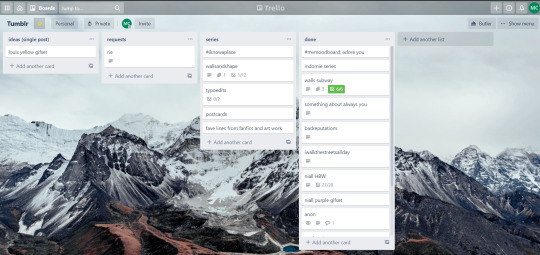

above is what i filled the card in the board with. basically just information of the requests.
1.1 INSPIRATION
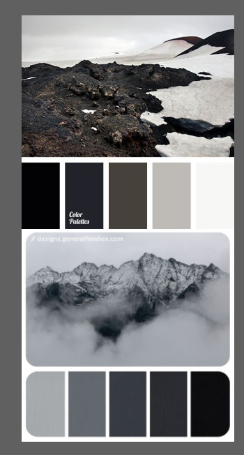
once i got the request, my first thought was to find the vibe the song/lyrics exude. “it��s an old curse” screamed witchy vibes to me, so i went to pinterest to find some inspirations. at first i was looking for witchy poster designs and i came across this. i liked how it has smoke-ish graphic and i thought the smoke suited the “old curse” lyrics. and tbh pinterest is a rabbit hole, they gave me suggestions after suggestions, like this and this which became my inspiration for the color palette (i added the gold from those pics) and the sun moon design gave me the idea to incorporate space stuffs too. i somehow landed on this too, and because i wanted to include space theme, i made a simple phases of the moon. ultimately the hero of this edit was the lyrics, i didnt want the graphics took the center stage. i was inspired to make a crystal ball and do this kind of typography but after several trials i couldnt get the the typography right, so i scratched that idea and went with the space theme instead.
1.2 PICKING COLORS
after i was feeling inspired enough, i went looking for the right colors. i usually just type “color name” and “palette” on pinterest. example “dark grey color palette” and i chose the one i liked best. when the request only asked for 1 color, i always searched for either a complimentary or contrasting color to give it a jushz, to add sprinkles. that’s why i added gold on top of the dark grey.
1.3 FINDING FONTS
this is the hardest part. the fonts play important role to the design. they need to convey the vibes of the lyrics, in this case witchy/magic vibe. i needed to find fonts or font just as magical and a bit whimsical. tho i hoard fonts... i like to use new font for every typography edit lmao sue me.
i highly recommend going to creativemarket free goods site, pixelsurplus font freebies and behance to search for fonts. i always use 100% free fonts, that means i can use it personally as well as commercially. creativemarket gives me desktop license for the fonts, which means i can use it for commercial as well. the reason i do this because i want to open an etsy shop someday, and i want to have the right license when i sell my stuffs. i almost never buy fonts bc they are expensive lmao.
the fonts in used are “Vintage” for the main typograpy (i think i was a freebie from creativemarket) and “Morganite” for the title of the lyrics and the name of artist.
2. CREATING
once i have my materials and ideas, i open my illustrator and hope it doesnt crash every 5 min.
for this kind of typography edits, i use 600x700 px. tbh i dont like using 540px, the suggested tumblr size, as the width bc to me it doesn’t look as good in quality, so i up the px. but more on this sizing later. i utilize the artboards function in illustrator, and i use 2 artboards.
i use illustrator (ai) bc i’m working with vectors. when i work with vectors, the graphics/texts or whatever im making in ai wont become blurry or lose its quality when i enlarge or shrink it. in compare to photoshop, i need to make for example the moon graphic very big, so i wont lose the quality when i reduce and enlarge it again. with vector, i can start small and when i expand it, it’s still as good as when it’s tiny.
2.1 GRADIENTS
i started with the gradients first. i created a rectangle as big as 600x700px and with the “freeform gradient” tool in ai, i played with the colors. below is the color palettes i used
2.2 LYRICS AND GRAPHICS
once the gradients are done, i worked with the lyrics and graphics right away. when i first doing this edits, i made typos a lot lmaooooooo. so i copy and pasted the lyrics on top of my artboard, so i wouldnt have any typos.
i had 3 layers in my ai. one for the inspo pics and the OG lyrics. the rest for the edits themselves. i broke up “It's an old curse/dreamers diving headfirst” into to parts, hence the 2 more layers
i almost always started with the lyrics first then the graphics. but for this edit, i made the smoke first so i can layout where my text would be.
tbh the process of making the lyrics is a trial and error. i tried bunch of different stuffs and i chose whatever the best. but i worked like methodically, i made sure i finished the first part of the lyrics first then i could move on.
i was lucky with this font “vintage”. the font offers me several glyphs like these
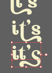
and i chose the one at the bottom. you’re very lucky if you find a font and they have glyphs.
excursion: glyphs vs fonts
glyph is an individual character. It might be a letter, an accented letter, a ligature, a punctuation mark, a dingbat, etc.
A font is a digital file which is used to display a typeface, which contains the entire upper- and lowercase alphabet as well as punctuation, numbers, and other special characters.
after i was finished with all the lyrics i added some graphics to make the edit pretty like small stars or dots. i added the song title and the artist too, sometimes at the bottom sometimes at the top. and i added my watermark put it as small as i could and made it a bit invisible but still can be seen.
2.3 EXPORTING
exporting! this is where i’m going to go deeper with the dimension of my work. in ai, i always choose to save with “export as screens” function. it automatically divides the artboards i have and save them separately. i always save as png, bc the size is smaller than jpg but can maintain the quality.
now the export tab looks like this
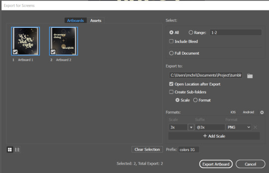
see the formats? i always scale up my edits, 2-3 times the original artboard size. reason is, to maintain the quality. i have tried to save it as original, 600x700 px, but it turned out a bit blurry. bc everything in ai is vector, when i scale up it doesnt lose the quality. BUT once i save it as png, it’s not a vector anymore, and when you zoom in until a certain degree it’ll be pixelated. that’s why i always scale up, to avoid it becoming pixelated when it’s just zoomed 1 or 2 times.
2.4 FINAL TOUCH
i opened my photoshop and also pray it won’t crash. import the png of my edits, add some grains/noise. the reason i use photoshop is, the noise filter is way better than in ai. it’s smoother somehow. and then i export my edits.
(i have a timelapse of how i made one of my edits, it’s not this one, but it’ll give you a better visualization. find it HERE
3. POSTING
now the hardest parts are done, we go to posting!
i uploaded the 2 posters on tumblr as photos then i wrote the captions. for this typography edit, i always chose another lyrics that i like from the same song for the caption. i bolded the lyrics, add link to all of my typography gradient edits.
i always use this link to color my caption. i usually choose 3-4 colors, and i took the colors from my edit. but this was not until recently lmao. before i just took a guess and looked for similar colors that match the edit, but then i thought “why didnt i just use the color in the posters lmao”
ok after i have my html code for the caption, i go to this site to replace the “;” with “ “ so tumblr can read the code.
i’m not one who puts their edits in draft, bc i just cant wait to post it. i have to option here, either i post it immediately when the time is right (i usually post between 4-8) or i schedule it, if im finished before 4.
i put all the necessary tags and click post! i am done finally!
i’m tagging:
@thetriangletattoo for this amazing series
@deludedandlostcause for this impressive gif
@half-lightl for this spectacular edit
@gayndrew for this stunning drawing
@thechampagnelovers for this cool collage
@cloudslou for this incredible edit
@heyangels for this incredible edit
35 notes
·
View notes
Text
But I Don’t Even Have a Contract!
When I was 16, I had a stint as a small-time social media star on Twitter — not because I’m particularly interesting or anything, but for two reasons: a) I got on Twitter really early in 2007 when it was way easier to get followers and engagement due to the site being less noisy and more ‘stupid’ in terms of algorithms and b) I stood out from a lot of other minor Twitter stars because I didn’t let it get to my head; while a lot of them were egotistical and haughty, I followed everyone back, turned ‘haters’ into friends instead of retaliating, etc.
Through this fleeting fame, my former boss found me. He said he was setting up a regional media studio to help small- and medium-sized local businesses with their social media marketing, and he planned to eventually franchise the business into other cities. He hired me on the basis of my large social following (81,000 followers at the time). Obviously, having a large social following doesn’t automatically mean you know how to market businesses on social media, but I adapted and studiously researched how to do my job properly.
My boss didn’t come from a creative background or a marketing role — he came from a property background, and was just sort of winging it in finding an alternative source of income after the housing crash. Being as young as I was at the time, I didn’t really think about any of this stuff. The outcome was that I never received any training, had no real guidance in what I was doing, and was generally left to my own devices. Younger me thought it was great! I saw it as ‘freedom’, but looking back, I realize it was far too much freedom.
The side effects of this disparity between my social media skills and his inability to communicate creative ideas manifested themselves as people trying to cut past the business and come straight to me, asking me directly as an individual whether I’d do work for them rather than give my boss the money. I was respectful (or naïve) enough to open up to my boss about this, and that’s when things started getting a little bit manipulative. He told me I could go my own way or remain part of a business that’d soon be growing across the country.
Fair enough, I thought. So I stayed, and one year in (I was 17/18 at this time) I realized that managing brands via social media had naturally morphed me into something of a graphic designer. A lot of my time was spent creating eye-catching visuals in Photoshop, Illustrator, InDesign etc. and so I suggested to my boss that we expand our media offering to include logo, graphic, and print design, and visual branding consultancy. Again, I received no training — I worked all day and self-studied late into the night.
This pattern snowballed over the years. By the time I was 21, I was a social media manager, visual branding designer, copywriter, photographer, video editor, and web developer — all skills I developed independently with no input or guidance from my boss. The business was still operating in just one city, and my boss had started spending less and less time in the office. I still didn’t realize this wasn’t particularly normal, until clients who came to the office to meet me constantly asked where he was.
One day, a client went as far as to say: “You’re basically running the business at this point!” It was a huge ‘glass shatter’ moment for me, and I suddenly realized that, yeah, although I wasn’t actually managing the business and its admin work etc., without me, there wouldn’t be a service or product to sell. What’s more, my wages hadn’t gone up, even though my ‘this is great, I have so much freedom!’ mind-set had motivated me to continue working on stuff related to the business when I got home.
As I was nearing 22, the owner of the building where the business’ office was located asked me if I’d help him fix his computer (it was just running really slowly because he hadn’t managed his files very well). Not really thinking of it as work, I agreed, and headed into his office after work to help him out. As luck would have it, my boss walked in to hand over that month‘s rent, so he saw me there. He looked surprised, but didn’t comment — he just gave the dude the rent and left the building.
The next day, my boss wasted no time in probing me about what I was doing. He was speaking to me like a cop would speak to a suspect, asking me how long I’d been doing work for the landlord, what kind of work I was doing, why I hadn’t folded the work into the business, etc. I explained I was just fixing up his computer, and he leapt into a lecture about how we needed to keep all work inside the business, or else we would never be able to grow into other cities.
I turned 22. I’d been there for five years, my wages hadn’t gone up, I wasn’t allowed to do any work outside of the business, I hadn’t witnessed any of the growth I’d initially been promised, my boss was only in the office 25% of the time, and I saw him uploading Instagram Stories from him lunching, working out at the gym, walking his dogs, taking day trips etc. while I was in the office managing everything. A lot of the time he didn’t even warn me he’d not be in the office. It became the norm that if he didn’t turn up, I’d be running everything for the day. Because I’d grown with the business from my youngest working age, I didn’t know any different, so all of this felt completely normal to me. And because I worked all day and all night and had no firm social life, I never got any outside perspective, until one day, on a whim, I opened up to the landlord about it. He hadn’t even realized I was the one doing all the work — he figured it was split fairly 50/50. He said the amount of work I was producing was on the same level as an agency with three or four employees.
I started managing all of the branding, social media, and website maintenance for the landlord’s business, but didn’t broadcast that news to anyone. As I was nearing the age of 23, I met my now-fiancée, a perfectly feisty woman who, as soon as I told her about my situation, passionately advised I start my own media studio. This is where I entered the ‘long breakup’ period of my job, where I got increasingly depressed at work and physically felt my productivity slow to a near-halt. My boss noticed, but never talked to me about it face-to-face. He started sending me irritated emails full of swear words demanding explanations for why I hadn’t delivered certain work by certain times and dates, while he was off sunning at the beach. It was like someone had pulled out his cork and let all the toxicity out in one torrent. My girlfriend hated him, and gently pushed me to the point where I felt like I was ready to confront him about the dead end we’d wound up in.
I asked a few of my friends about it, just to get a wider set of viewpoints on how I should go about it. They asked me things like, what does your contact say about you leaving the company and working with other businesses independently? Legal stuff, y’know. And that’s when I realized my lack of training over the past six years had also left me ignorant of the formalities of employment — I never had a contract! The real kicker was, I never had employee liability coverage either. My boss wasn’t even doing the admin stuff properly.
Obviously, that meant he also had no control over me when it came to contracts, so I literally just walked in (without my laptop — I’m now just realizing he never provided equipment either, yikes) and sat there waiting for him to arrive. Thankfully, it was one of the days he decided to turn up. He went and sat down in his chair, asked me where my laptop was and why I wasn’t working etc., and so I just straight-up told him that I was leaving the company to start my own media venture.
He laughed a patronizing laugh and simply said, “Alright, good luck then.” Part of me felt like this was normal, because he was usually quite cold like that, but another part of me knew that there should have been some sort of emotion and deeper discussion in that moment. I wanted to say, “so that’s it, then?” to try to flesh the talk out, but that really was it. He just turned to his computer and began typing away as if I wasn‘t there. So I just turned around and left, went home, and that was it.
He did WhatsApp me a message later that day (all his caring and considerate communication came through digital means — perhaps he hired someone on a zero-hour contract to inject emotion into his texts?) asking if we could meet at the pub for a proper goodbye. And we did. It was a nice gesture, but it felt very awkward and forced, as if he’d spoken to someone about it and they’d coaxed him into doing it. He shook my hand, wished me good luck (much more genuinely this time), and we parted ways.
Three months later, I’d tripled my income as a freelancer. All of those clients who’d try to come to me directly over the years — it was like a floodgate had opened, and they all came rushing to me. I hadn’t told them I’d left, but obviously, they realized it themselves when they went to the office and I was never there. I felt bad about ‘stealing’ clients away from my former boss, but what was I supposed to do? I couldn’t just abandon the people I’d been working with just because of morals. That‘d be immoral, if anything. I continued working with the landlord and even travelled with him a few times to build my solo filmmaking portfolio by documenting his brand’s work across the UK, including his talks at business seminars. We developed a very close working relationship, to the point where just my work for his company was earning me more than all the work I did for my former boss. He started sharing a few bits of gossip with me about how my old boss had begun paying rent later and later. I figure perhaps his cash flow had something to do with it, but the landlord also showed me an email my old boss had written in which he’d expressed his anger at the landlord for ‘colluding’ with me and pushing me to leave his company.
The further I distanced myself from the company, the more I realized how toxic he behaved towards everyone he came into contact with. I could never see it from the inside. Every time I checked the old company’s website, a new service had been removed, because it wasn’t something he could offer anyone anymore.
Back in November 2018, the landlord told me that he was kicking my old boss out of the office after he failed to pay rent for three months. A few weeks after that, the landlord proposed that we go into business together to create a separate media studio solely focused on the industry his business operates within. He said that we’d take the old company’s office once my former boss had moved out, and that I could also use that office for my own freelance venture, free of charge.
One year after leaving, I’ve taken 25% of my old boss’ clients, occupied his office, and quadrupled my income.
There’s a part of me that feels guilty about all of this — he’s a guy who didn’t quite know what to do after the housing market crashed and tried something out which didn’t go too well. But at the same time, I can’t feel too bad for someone who I believe took advantage of me for half a decade. If you treat someone with disrespect, you end up with very little. If you treat someone with respect, they give you a free office and offer to start a new business with you.
TL;DR: Boss never did anything properly — no training, no contracts, no insurance, very little respect, not much guidance, empty promises about business growth, etc. Everything I learned independently resulted in me quadrupling my income and taking over his office within a year of leaving his company.
(source) story by (/u/Adingding90)
333 notes
·
View notes
Note
heyo! it's padawin (or wan??) anon again!! thank you for your very kind words ;////; huu, who knows, maybe you'll be able to see them one day! but for now i have another question ~as usual i am dum~ i recently got csp and i have 0 idea how to work it? not asking for a whole tutorial just a basic review on why it's so good since i won't lie i almost deleted it and had a heart attack o(-( thank you! hope ur having a good day!
AH! hello young padawan!
This is ganna be long so I’ll put this under a readmore!
thats great news! honestly from experience once you’ve learnt how to use CSP you can master pretty much adobe (Photoshop and illustrator) The program can be really intimidating at first thats for sure take it easy and stick to the basics and once you’re comfortable with that
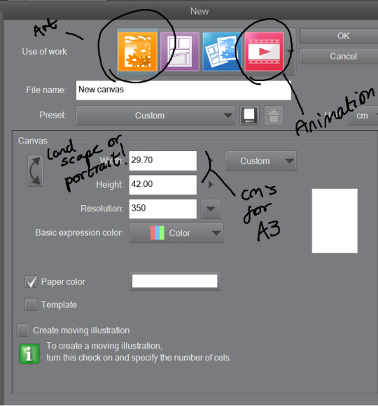
Once you’ve opened the program you’d want to work on an illustration so click on the top bar file > new. You’ll see something like this-
The Illustration one is for drawing and is overall best and easy! The comic ones are little more over whelming with shapes and layout hh and animation is more so timeline (little like flash animation and photoshop sorta)
This tool bar here is mainly useful for layers hhh
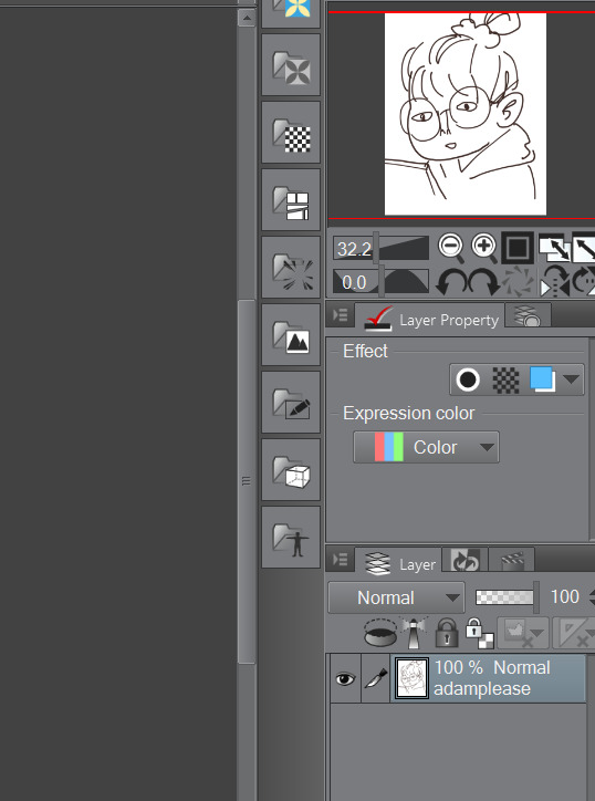
I don’t really touch much from there hhh, I only use expression colour to really look at the work in grayscale!
The three most important tools that’ll help give your work dimensions!
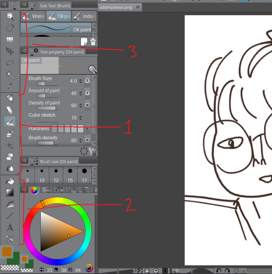
1) These are the tools for drawing, Each tool here represents the mediums they look like/ named after. Listed in order!
The pen - Thick lines, different options mess around to see which one suits you, I mainly use this for lineart or bulky shape work
Chalk - in the name! I use this tool for sketches!
Paint brush - This one is best for colour and for defined work! this is biased but the best is the oil paint brush, it just HMMM it just GLides from One colour to another and helps me create this effect -
The spray - Similar to the chalk but is more so identical to the mspaint spray one hhh from experience so I dont really USe THAT one
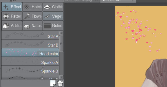
Stars - these are shapes! If you’ve used gimp you’d know how this one works! your brush turns into the pattern and shapes you chose like so -
Eraser - Self explanatory!
Blend tool - alot of people like this hhh but I’d recommend the oil painbrush over this but this basically makes blending alot more smoother and easier!
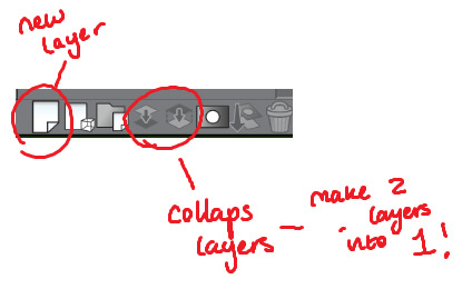
2) this is more so layout, some of these activate a new layer (like text)
fill bucket - my lazy butts fav tool, It fills in the pixilated or selected area, be careful tho if the colour is weak it’ll leak out and fill other areas!
Gradient - This… I dont use this at all hhh
Contour Line paint - This tool I dont use either hh, it basically bucket fills and area that is similar to the line around that area
TYPEEE!! - this is where you add text! the text on this program is kinda annoying but hey you can rotate it! how you rotate it, after you’ve chosen what type face (font) you want and size and colour COLLAPSE IT to a EMPTY LAYER!!! then use the selection tool and rotate it! (I will discuss the rotation took in part three!)
NO idEa WHat THIS tOOL IS IF IM HONEST
3) This is basically cropping and editing!
Zoom - This will help you zoom in and out!
Rotation - helps you turn your canvas around, upside down and so on to make difficult angles easy to reach!
— no clue
Movement - helps you move selected layer around! can be a pain if done by accident but hey what is ctrl + z for!
Selection/ lasso! - THIS TOOL wILL bE yoUR SAVOIR! I use to to fix layout as well as anatomy and perspective. When you select an area this will pop up!. The first one on the left is to cancel selection, 7th from the left is the one where you can move, resize! Those are really the important ones hh

Wand - The iconic select took, that selects an area you click and the same options from the selection/ lasso will pop up!
eyedropper - this tool will basically copy a colour on any canvas that is advisable, helps to reuse a colour! it auto works if you just right click on your mouse or pen so you dont have to keep changing from your pen,painbrush or bucket tool!
I think thats the basics? now I’ll talk about all the aspects CSP has to offer in Edit that makes life a blessing such as colour corrector, change line of drawing and change canvas size (which is a million times easier than photoshop, which makes you use math and NUmBERS)
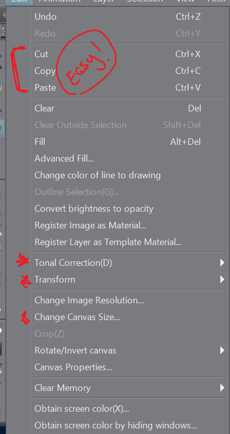
Tonal correction is what I use to basically fix the colours of my artworks, Its easier than redrawing the entire piece hhh, sometimes we all draw a little off colour pallette! so when you click that you’ll get -
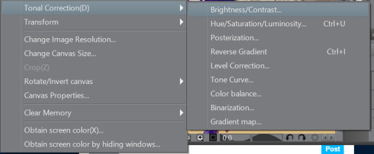
Brightness and contrasts - brightness really just makes its more white and black but contrast makes the colour more vibrant and pop, its a scale option so its really fiddling around with the two bars until what you see is something you’re happy with!
Hue, saturation hhhh - This will help you change YOUR ENTIRE hue aka the CMY (the primary colours, magenta cyan yellow) and the saturation tones the contrast making it easier on the eyes! same as the last one it’ll be sliders! so really mess with it and pick which one is pleasing to you!
the rest i dont use hhh but
Colour BALANCE - this helps me hhh basically you change the entire colour layout beyond CMY, it has three effects, the highlight, shadow and halftone! same as before sliders! mess around with until youre happy with how it looks! (It’ll auto preview)
I think that’s really it? any more questions please shoot me up!
OH! CSP is known to crash, its the only downside tbh, it also auto saves alot, so save alot! SAVE ALOT!! i’ve lost whole works like 6 hours from csp crashing as it was overwhelmed from my layers hh
here is how you can look for backup files incase it does crash! -
My documents -> CELSYS -> Clip studio PAINT DATA-> -Document BackUp or -Initial Backup.
5 notes
·
View notes
Text
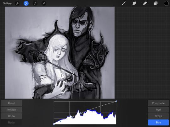
Coloring in grey scale
So, hey, this is somewhat of a tutorial for those curious about some of my coloring and blending. I made this especially for anyone younger than me and is exploring digital art, but this is also for others who are curious about what I do. I love reading other artist’s comments and looking at their WIPs, so why not.
Another reminder: if you’re looking for my artwork, please follow @rainbow-illness and not this blog. All of my finished stuff goes there; usually, my works in progress (WIPs) or Angry Doodle Corner go here. Sometimes I use this blog to repost my art, but that is my official art blog, no this one. Not unless you like nonsensical posting and metal, then have at it. If you have any questions, don’t be afraid to hit me up, I love talking about art.
So I can’t always sit down and talk about my processes and how I go about doing them, but I was able to sit down and take some screencaps while I was working on my iPad Pro. Using the iPad is actually my first choice to draw on because of the convenience of carrying it around like a sketchbook, whereas my laptop isn’t always easy to carry around--it’s a big laptop. While I use my iPad, I also like to go back and correct things, recolor, re-proportion, or spend more time privately working on a drawing. I have my iPad with me, all the time, so I’m out in places usually like Starbucks doing this. I also struggle with pretty bad PTSD and agoraphobia, so having my iPad out with my headphones on gives me an excuse to put my mind elsewhere to calm down. My family just usually looks at me and goes “oh, she’s working on her art again”; I did this as a kid, too, only with sketchbooks.
I do not have a Cintiq either, though I would absolutely love one. This laptop is capable of using a stylus, but I think I need a better one to do it with. All I’m using is a cheap Wacom Bamboo tablet that I’ve had for five years, that’s it. Everything I’ve done on this blog has been on a small surface. So if you’re just dabbling into art, don’t beat yourself up for having the small stuff, I’ve worked with small stuff and still do. The only thing I have that’s not small is, well, the space and processor on my laptop are much faster than any other laptop I’ve owned, bought especially for graphic design classes and my artwork.
So, that being said lemme just forewarn some of you guys. My artwork is all done in two to three layers! Yes, you read that right! Why? When I was 16, I didn’t have a Wacom tablet to mess with, so I had to use a mouse and learned from there. When I turned 18, I got my first Wacom tablet while working my first official job and the family computer didn’t have a good processor. So when I got my first official laptop, it was basic and not made to run anything beyond the web browser and such, it could barely handle Photoshop. It did, however, run Paint Tool SAI with no issue (which is why I still prefer it over anything I use), it just couldn’t handle more than five layers. After losing my drawings constantly and not being able to do anything in the prized software I’ve been eyeing since my Sophmore year of high school, I found a workaround with it.
And that’s what I’m going to write about here. With that in mind, no, you do not have to limit your layers! I’ve taken traditional art classes so my first instinct is to literally paint over my stuff like I would on a canvas. If you don’t want to do that, you don’t have to! Yes, I am nuts.
That being said, let's do this.
If you haven’t taken traditional art classes, that’s cool! I’m going to be using some art terms you haven’t heard of, but you definitely will when you take your first ever drawing class. These terms are foreground, value, negative space, contour, and weighted line (I’ve seen it called line weight too). For the more experienced art students who are likely groaning over that stupid contour practice from that book “Drawing on the Right Side of the Brain”, I’m sorry, guys. Newbies, you are going to know this.
And you are going to hate it. While I still hate it and, yeah, my eyes are rolling into my skull right now just even talking about it, there are some useful practices in here that I... actually use. Who would have thought? At least we’re not talking about still lives.
Anyway, here’s what I’M going to say that some art teachers will not tell you but I want anyone to read this to know:
- Do not obsess over your drawing to look exactly like your reference. Just don’t. Forget this completely, worry about it later or don’t even worry about it at all. This is your style, your interpretation.
- Digital art is hard. Art is hard! Practice makes perfect and you learn over time just by studying (looking at) other pieces of art. It took me like well over 10 years to find my own little niche and I’m still playing around with coloring styles. I have a lot.
- If you’re just starting to draw with a tablet of any kind, play around with it. My first official program was a cheaper version of Paint Shop Pro and when I first got it when I was 14, I sat around and experimented on layers to see what it would look like. Explore!
- When you start drawing figures or faces, try not to think of it as, well, face or a figure. Reduce it to basic shapes, like squares, triangles, and circles.
Greyscale can establish light source, value, scale, and negative space.
I don’t always use greyscale for my art, but when I do, I appreciate it because it makes my life easier. For example, Alphonse Mucha’s pieces here from his “Slav Epic”.
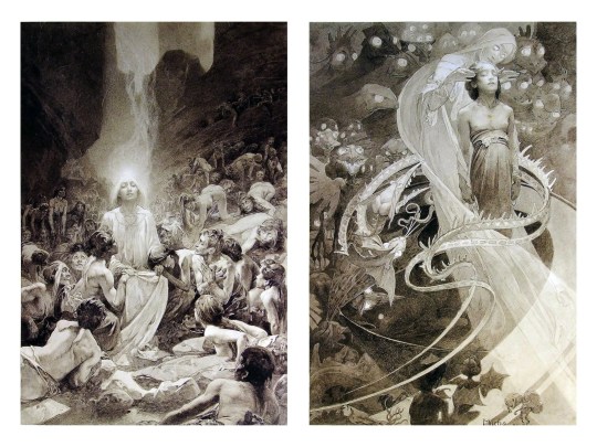
Chances are, you’ve seen Mucha’s art nouveau on prints, fanart, fabrics, and all of that. But Mucha did so much more and he is a huge influence on me for a reason. By the greyscale we see here, we can see foreground/subject with each illustration. Mucha is using value (that’s shadow) to emphasize this, in addition to negative space (background) to draw you in, just by using black and white. Notice how the other subjects don’t have such a powerful contrast and light source versus the other, especially the woman on the left. Mucha made his art pop by his understanding of contrast.
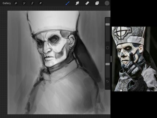
For this first part of this entry, I’m going to be using Papa Emeritus II from “Ghost”... who is a good example of how to draw faces, too. Huh. Regardless of what drawing program you’re using, keep your opacity low, at 50%.
Simplicity at its finest
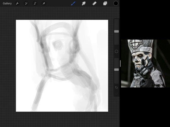
Instead of focusing a lot on Emeritus’ face, I’m going to focus on the negative space behind him. I’m using this to define his figure. This is a good picture because of the stark contrast, though, it’s a little tricky because it is really contrasted and you can’t see where the light source really is. But that is okay! I am going in and just using this negative space, the contour of his head and torso. Before I even think of a face, I want to softly go in and use black (or grey) to fill up that negative space. Keep it simple and work your way up.
After I lightly fill in the negative space around him, I can start lightly going in and establish his face by blocks of shadow. And this is why Emeritus II is such a good example for this kind of work. I don’t usually start going in and drawing eyes, I rely on the shadows of the face to see where their eyes, ears, lips, and such lie.
Here’s another example (though, it’s old):
This is in my maroon style underpaint, which is what I post most of the time. For their faces, I just used basically eye sockets to start working on their faces, like Papa Emeritus II down below. Again, this dude is a great example.
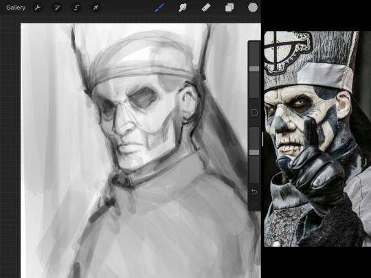
Here is where it may get a little funky. I created a new layer and set that layer to Multiply, still keeping that opacity low. Since I have no light source and I just want to create a really dramatic lighting, I made a vignette with a simple airbrush tool.
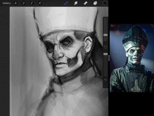
With that little vignette, you can create a new layer (unless you’re me, I just merge it down because of that constant fear of nonexistent software crashing) and I’m using the color pick tool to go back and forth to start using greys to really get into Emeritus’ face, especially his wrinkles. I’m painting over it constantly, switching back and forth between a paintbrush tool and color pick tool to blend. Again, keep your opacity low... unless you’re me and you’re feeling adventurous. You’ll also notice here that I have more than one photo reference. I use several for a lot of my art, so I encourage you to do the same. I had no idea what his jaw looked like, so I grabbed a second photo. Now that I have a better idea of where his hat ends on his forehead and how his nose looks, I start doing a weighted line.
Weighted line and Contour
Now is the dreaded talk. Of contour.

Welcome to Drawing I hell. This cursed image is from the book “How to Draw on the Right Side of the Brain” and if your teacher does not talk about this in your first drawing class, I am going to eat my hat... I have a hat lying around here somewhere. ANYWAY, the contour line exercise is basically you just using a neverending line for a drawing. I don’t know who drew this (and tbh, thanks a lot for every single boring assignment I’ve done in drawing classes), but this guy used contour lines for his drawing. I’m having war flashbacks over here, but I managed to find an art teacher’s page talking about different types of contour. My god, they are evolving.
Going back to our dear friend Papa Emeritus II, I used weighted line to start adding in little shadows to his face. Weighted line goes hand in hand with contour; it is a great technique to not only add details, but add little bits of shadows.

This is a simple example; the thicker line is adding to the shadow of the apple, giving it value!
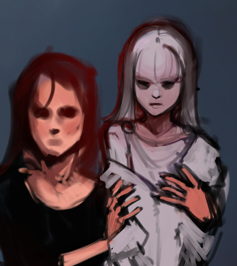
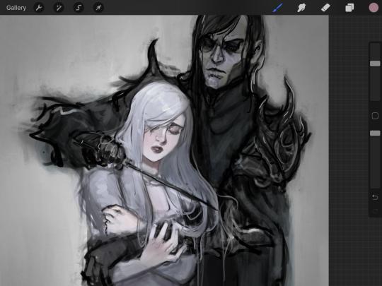
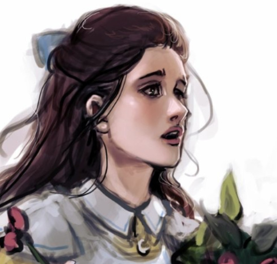
Papa Emeritus II is such a good reference... I used him as inspiration for King Melwas here.
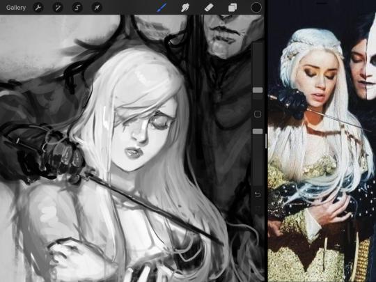
Gwenhwyfar is also a good example of weighted line. Gwen is essentially a very, very pale character. In contrast to Melwas, who is in darker clothing, Gwen is soft, she is the focal point in this drawing. For the little pieces of her hair, the corner of her lips, eyelashes, and her fingertips, I used a weighted line to establish these things, otherwise, Gwen is so pale, she’ll easily be washed out completely.
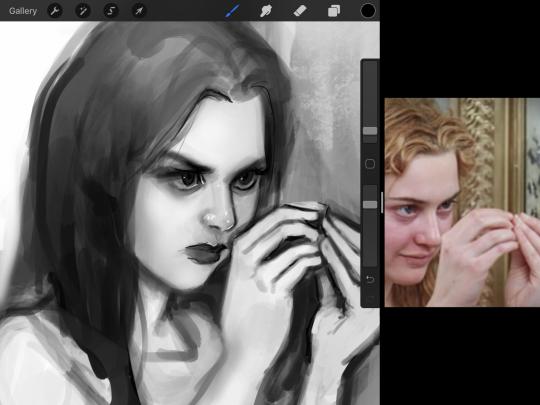
This drawing of Alice, which I’m still messing around with, is another example of how effective a weighted line can be with depth. The lines I added into her face, eyelashes, creases, hair, and fingers add those little details since everything I’ve done before like Papa Emeritus II was so soft with a low opacity on the brush settings.
Layer masks and curves
There are two ways you can color greyscale images.
You can do this by going into Layer > Adjustment Layer > Curves (this is how it looks like in Procreate).
This gives you a neat ol’ base color! I am playing around in the blues, adding soft hues of blue in their figures and the white in this picture can either turn blue, cream, or even green. You don’t have to use Blue, you can use any of the other colors. For me, I’m always drawn to blues. Another cool thing to play around with is Color Balance, which is underneath the same function as Curves.
But if you don’t have any of these, you can add a new layer, and do Multiply.
The only drawback to this, of course, is how destaturated (the lack of color) it looks. And yes, that’s an issue you will have and I did run into this while doing this. How I combat this is using additional layer masks. Believe it or not, Alice here was once at a grey scale, looking even more desaturated than Gwen.
For Alice’s face, I went in and use:
- Soft Light because she needed more peach and roses in her skin. Omri’s original drawing gave her a light rose blush so I wanted to do the same.
- Overlay to mask out the black lines from the greyscale I had.
- Lighten which I used to make her lips pinker, her apron’s shadows lighter, and parts of her hair brown.
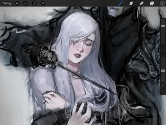
The same went for Gwen, who is, again, very pale. But while she’s supposed to be pale, I didn’t wash her out completely. To add more saturation, I used a combination of Soft Light over my Multiply layer and Overlay to start working at the highlights on her hair, nose, and shoulder.
This little walkthrough isn’t as visual as I like, but with limited software like Fire Alpaca, GIMP, or Paint Tool SAI that don’t have the abilities of Photoshop in terms of color correction and playing around with colors, I really encourage you, readers, to play around with these tools. Using the color picker back and forth, especially after using layer masks, gives you an ability to mix and blend colors. The reason why I work with greyscale or a maroon under paint is that you can create brilliant colors and make a new palette; the trick is to constantly mess around with them. I never go in and flat out color anything, with the exception of things like “angry doodle corner” which is basically what I call my lazy drawings, drawings where I’m just honestly goofing off with.
So in summation...! Or me trying to summarize this.
Experiment and explore with layer masks and adjustments. Whoever says that using these tools isn’t real art, they’re wrong. And please don’t ever be afraid of using references of any sort! Alphonse Mucha is saved ten times over on this computer.
#my art#tutorial#i think#an attempt was made#digital art#procreate#ipad drawing#ipad pro#Alice madness returns#alice liddell#american mcgee's alice#alice asylum
8 notes
·
View notes
Photo


Work in Progress: Day 5
9 November 2021:
This is the last week to work on my experiments before Assesment, and this was when my drawing software decided to no longer function. I spend my entirety of yesterday afternoon finding new free softwares to work with and ended up with, Krita and MediBang Paint Pro. It wasn’t just about finding a software it was also about finding one that could access a mdp file. I also finally managed to download Photoshop, so I hope I might have time this week to finish working on the pattern brief.
Today I worked on the graphic design area of my experiments as I realised I hadn’t done much of that last week. So I worked with the Krita software getting a feel of how it worked and played with colours and shapes. As the software is underdeveloped compared to my old one, my lines didn’t end up as smooth as they could be, but it trained me to have a steadier hand. When playing with the colours I decided to use the complementary colours of the flames, but then darkening them to make the flames stand out more in the middle. Some were easy others took some work, for the complementary colour of blue is orange, and not that many dark oranges look nice. For most of this it was just playing around with movement and colours, to what looked good and what felt right.
In the afternoon I decided to play with Typography on my works, I used the last works with words I did and picked out words to add to the piece. Getting the words to flow with the flames, or sometimes even the flames. To make them stand out I would use either a colour to complement the background or the same colours used in brighter shades. I also had a play with some of the brushes available with the software, they have good paint like brushes, the strokes are very lifelike.
At 3 (European time) I joined the graphic design talk, seeing the projects and work that students did in that course was quite inspirational. During the talk we were also told what graphic design was; it is transforming ideas, igniting empathy, social connecting, generating new narratives, empowering communities and designed for debate. If this truly is what graphic design is then I hope my works ignite empathy, and show the viewer what mental illness can do to someone and what it can feel like.
Tomorrow I plan to test out the second software I downloaded and test further within the graphic design area. Maybe I will even continue playing with the illustration side. I took a quick look at the brushes and they are going to be fun to play with. I know that having your drawing software crash on you half into a “project” is unfortunate, but I’m willing to put a positive spin on it and see this as an opportunity to further experiment with brushes, tools and techniques.
(next)
0 notes
Text
Phenakistoscope Development
Here is the initial drawings, ideas and sketch that I produced when trying to think of an idea to make with my phenakistoscope animation. This shows everything from the notes in my notebook to to creation of the actual animation on the disk.
You will see the finished animation on a different thread talking about whether I liked this bit of work and my opinions on this type of animation or not. Also to go along with that, I include what I can improve upon and also what I like about the animation.

Every piece of work starts with a thought of a original idea whether its from research or just something that you would like to try out in even if its physical work or in a digital software. Thats exactly what's here. VERY SIMPLE. When I try to think of ideas that could work with particular tasks at hand I open a note pad that always sits on my desk and show any thing that come to my head either with a little illustration or few notes to remind me where I wanted to and the direction I wanted to take with some work. This is what you can see here.
My first thought for my animation was to create a planet that would wave al about the page as if it was rotating around the sun which would be located in the centre of the circle this would also have little moving parts that would be featured in the animation such as shooting stars.
The second idea (and the one that I decided to end up going with in the end) was this little UFO sawing thought the dark sky taking off from a plant in the centre and then floating about for a bit for a few frames in the animation then when it comes to land again there is a malfunction and the UFO crashes into a ball of flames.

The next steps show how I made it and how I got to the final product in physical form. Starting with drawing a circle with a pencil around a bowl then splitting into 8 even sections to get ready for the illustrations to be imported into photoshop.
For the animation part of the process its very much like the stop motion. Where you use the same tool in photoshop to create the animation out of the frames that you have made.

When finished and putting this into photoshop I had to duplicate it 9 more times including the original picture and rotate each time for a different section to show during different frames in the animation. I also had to cut the circle out in photoshop using the circle marque tool and then going to the transform selection tool to adjust it to the perfect size for each circles. Then when I found the optimum point I right clicked then selected ‘select inverse’ and deleted the background from the image.

For the animation part of the process its very much like the stop motion. Where you use the same tool in photoshop to create the animation out of the frames that you have made.
0 notes
Text
I Cant Download Google Chrome On Mac

Chrome Not Downloading On Mac
I Can T Download Google Chrome On My Mac
I Cant Download Google Chrome On Mac Computer
Switch out of S mode on your computer. To learn about S mode and how to install Chrome, go to the Microsoft Help Center. Download the installation file for Chrome.; If prompted, click Run or Save.; If you chose Save, double-click the download to start installing.; Start Chrome. Download for Mac. Mac OS X 10.10 or later. This computer will no longer receive Google Chrome updates because Mac OS X 10.6 - 10.9 are no longer supported. This computer will no longer receive Google Chrome updates because Mac OS X 10.6 - 10.9 are no longer supported. Google Chrome is the solution that over 63% of the world turns to and with good reason. Mac users have distinguished taste and as such, expect high quality in their hardware and software products. Google Chrome delivers this to Mac users with its low CPU usage, reliability, and overall browsing experience.
There are better browsers I like chrome because it syncs across all devices but it’s so slow and constantly crashing on all formats, when I first downloaded this app it crashed every few minutes, then after about five or six updates it started working fine for over a year it only crashed twice, which is on par with the built in safari browser, but now it has stared crashing every single time. Google Chrome Running Slow. This problem may be caused by the computer running out of. Google Chrome is a lightweight browser that is free to download for Windows, Mac OS X, Linux, Android, and iOS. Follow this guide to get it downloaded and installed on your system of choice.How to. Hi, I would just like to know why we aren't able to install Google Chrome from Edge.
Summary
'Chrome not downloading files' is an issue that occurs quite frequently. Given that, here we detail all the potentials fixes for the 'Chrome won't download files' error on your computer, including simple tricks and effective tips. If you have lost files during the fix, don't worry. You can retrieve your browser history, bookmarks, and more using the professional data recovery software - EaseUS Data Recovery Wizard.
On this page, you'll find two parts of solutions - both simple & advanced to help you fix Google Chrome Not Downloading Files error. If your Chrome is now downloading files, pick any method here to ger rid of this issue on your own:
Workable SolutionsStep-by-step TroubleshootingQuick FixCheck internet connection > Restart Chrome > Try to download files again..Full stepsFix 1. Do Basic CleaningClear history and cache > Run Chrome cleanup tool > Reset Chrome..Full stepsFix 2. Uncheck Hardware AccelerationGo to Chrome Settings > Advanced Settings > Uncheck 'Use hardware acceleration when available'..Full stepsFix 3. Reinstall Google ChromeUninstall Google Chrome in 'Apps & features' > Delete all Google folders in Registry > Reinstall Chrome..Full stepsFix 4. Disable Related ExtensionsOpen Chrome > Go to 'More' > 'More tools' > 'Extensions' > Disable downloading related extensions..Full steps
Google Chrome Won't Download Files Anymore
'Why won't Google Chrome let me download files anymore? I used to download email attachments, pictures and music very easily. Since last week, it's no longer downloading any type of file from any website. What's the matter?'
Google Chrome is so simple and powerful that everyone loves it. But recently I found that one issue is under heated discussion on some major-related forums: Google Chrome is not downloading files!
After clicking the download button/icon on a web page, the request is not responding. Or, while selecting a location to preserve the download(s), the required download prompt box doesn't appear as usual. After many searches on the internet, Chrome fans said that they still don't find a confirmed solution to solve the problem.
How to Fix Google Chrome Not Downloading Files
According to Google Chrome Help page about how to fix file download errors in Google Chrome, if you get an error message on Chrome when you try to download apps, themes or other files, try to fix the most file download errors with the troubleshooting tips:
Part 1. Simple Tips to Fix Chrome Won't Download Files
Make sure your Internet connection is working normally. Fix Internet stability issues if the connection is unstable
Try to download the file later
Contact the website owner
There, on the linked page, you can find more 'error messages' related to this problem in downloading files with Chrome, such as Chrome network failed, download blocked, no file, virus scan failed, disk full, insufficient permissions, system busy, needs authorization or forbidden. All those errors are responsible for Chrome not being able to download files.
Chrome Not Downloading On Mac
If the easy tips above fail to solve the problem, don't get upset. There are other potential solutions provided below for you to fix the 'Chrome not downloading files' issue.
Part 2. Further Troubleshooting 'Chrome not downloading files' Error
Some people are not so lucky, they can't finish any download in Chrome. What's worse, they fail to download files without receiving a warning or error message indicating where the process went wrong. In this case, it's time to take some further measures. After reading numerous stories telling how people fix the downloading problems in Chrome, we summed up four effective solutions which I hope to be a permanent cure.
Method 1. Do Some Basic Cleaning Works
These are what you can try: clear all history and cache, run Chrome cleanup tool and reset settings to Chrome's original defaults. If you want to keep your Chrome history and cookies, you can backup or export Chrome history and cookies in advance.
To Clear history and cache in Google Chrome:
Step 1. Open Chrome on your computer and go to 'More (three dots)' > 'More tools' > 'Clear browsing data..'.
Step 2. Check the content you want to remove and click 'Clear Data'.
To Run the Chrom cleanup tool:
A Chrome cleanup tool can find and remove harmful software on your computer. Running this tool may solve the 'Chrome won't download files' issue caused by malware.
Step 1. Open Google Chrome on your computer.
Download the file. Before the file can be downloaded, you must accept the license agreement. From either the Downloads window of the browser, or from the file browser, double click the file.dmg to launch it. A Finder window appears containing an icon of an open box and the name of the.pkg file. Double click the package icon to launch the. Download the jre-8u65-macosx-x64.pkg file for mac.
Step 2. In the top right corner, click 'More (three dots)' > 'Settings'.
Step 3. Scroll down to the bottom and click 'Advanced'.
Step 4. Under 'Reset and clean up', click 'Clean up computer' > 'Find'.
To reset Chrome:
Step 1. Open Google Chrome on your computer.
I Can T Download Google Chrome On My Mac
Step 2. In the top right corner, click 'More (three dots)' > 'Settings'.
Step 3. Scroll down to the bottom and click 'Advanced'.
Step 4. Under 'Reset and clean up', click 'Restore settings to their original defaults' and then click 'Reset Settings' to confirm.
Attention, resetting Chrome will reset the browser startup page, new tab page, pinned tabs, and more. It will also disable all extensions and clear temporary data like cookies. However, other files like your bookmarks, history, and saved passwords will not be saved still. If you want to retrieve cookies but have no backup available, learn how to recover cache files in Google Chrome here.
Method 2. Uncheck Use Hardware Acceleration Option
Step 1. Go to Chrome Menu > Settings > Show Advanced Settings.
Step 2. Under System, uncheck Use hardware acceleration when available.
Step 3. Restart Chrome.
Method 3. Reinstall Google Chrome
To uninstall Google Chrome completely, first, you need to uninstall Google Chrome under Settings, then go to the registry to delete all Google folders.
To uninstall Google Chrome:
Step 1. Click the Windows icon and choose 'Settings (the gear icon)'.
Step 2. Choose 'Apps' > 'Apps & features'.
I Cant Download Google Chrome On Mac Computer
Step 3. Find and click 'Google Chrome'. Then click the 'Uninstall' button.
To delete All Google Folders in Registry:
Cumulative Security Update for Internet Explorer 8 in Windows 7 (KB2817183) This update addresses the vulnerability discussed in Microsoft Security Bulletin MS13-028. To find out if other security updates are available for you, see the Additional Information section at. Download internet explorer 8 for apple mac. Internet explorer 8 download for 8 1 free download - Apple Mac OS Update 8.1, uTorrent, Apple Mac OS Update 8.6, and many more programs. Internet Explorer for Mac, free and safe download. Internet Explorer latest version: Microsoft's now discontinued browser for Mac. Internet Explorer for Mac was Microsoft's free web browser designed to run on Mac computers.
Step 1. Press 'Windows + R' and type regedit.
Step 2. Go to 'Computer' > 'HKEY_CURRENT_USER' > 'Software'.
Step 3. Find and right-click 'Google' then choose 'Delete'.
Step 4. Go to the 'HKEY_LOCAL_MACHINE' folder and click 'SOFTWARE'.
Step 5. Find and right-click 'Google' then choose 'Delete'.
Now you have successfully and completely uninstalled Google Chrome from your computer. Go to Microsoft Store to reinstall Google and see whether the 'Chrome not downloading files' still exists.
Method 4. Disable Download Related Extensions
Disable all extensions that work as download managers since they may interfere with file downloading of Chrome.
Step 1. Open Chrome and go to 'More (three dots in the top-right corner)' > 'More tools' > 'Extensions'.
Step 2. Then you will see all the enabled extensions in your Chrome.
Adobe illustrator cs5 mac free trial download. Adobe illustrator cs5 free download - Adobe Illustrator CS6, IndicPlus Adobe Illustrator Plugin, Adobe Photoshop CS5 Extended trial, and many more programs.
Step 3. Toggle the button to disable downloading related extensions. (The extension shown in the image below is irrelevant to download managers. But you can apply the very same way to disable the extension you need to turn off.)
Extra Tip for Chrome History & Bookmarks Recovery
Some of the fixing methods will restore your browser to its original defaults or delete the Google folder. If the browsing history or bookmarks were unfortunately removed. Don't panic though, we left a data recovery plan for you here, to assist you to recover Chrome history in Windows and restore Chrome bookmarks on Mac.
Since Google has a temporary folder that stores some cache files related to browsing history and bookmarks, you can use EaseUS Data Recovery Wizard, the most powerful third-party hard drive recovery software to restore missing or lost Chrome data from its temporary folder, even the folder has been deleted on a local disk.
Step 1. Select a location to scan.
Launch EaseUS Data Recovery Wizard, hover on the partition, external hard drive, USB, or memory card from which you want to perform data recovery, and then click 'Scan'. How to get icloud on mac.
Step 2. Select the files you want to recover.
Wait until the scanning completes. Afterward, select the lost files you want to recover. If you need, double-click the file to preview its content.
Step 3. Recover lost data.
After choosing the files, click 'Recover' and choose a location on another drive to save the recovered files.
Here we introduce multiple ways to fix Google Chrome not downloading files, including simple tips you can try first and further troubleshooting tips. Hope it works and your favorite browser is getting back to normal.
So you are unhappy because the Google Chrome web browser won’t open or launch. This article explains how you can troubleshoot when Google Chrome won’t open after successfully installing on your Mac. More specifically the problem is that Google Chrome seems to be unresponsive and won’t start at all when trying to open the Chrome App. Do not worry, you are not alone. It seems that many macOS users are having this problem. Here is what to do:
See also: “App Is Damaged and Can’t Be Opened. You Should Move It To The Trash”
How to fix when Chrome won’t open

1-It is possible that Chrome is already running. You may want to check if Chrome is already open. Here is how you can check this:
Press the Option, Command, and Esc (Escape) keys together or you can click Force Quit from the Apple menu (upper-left corner of your screen).
Do you see Google Chrome there in the list
If you do, select it and then click Force Quit, and try re-opening Chrome. if you do not see Google Chrome in the Force Quit window, then see the step below.
2-Restart your Mac. (see also: How To Use Spotlight On Your Mac)
3-If you do not see Google Chrome in the Force Quit menu (see tip#1), follow the steps below:
Go to the Finder of your Mac.
From the “Go” menu select “Go to Folder”
Enter this:
~/Library/Application Support
And click Go
This will open a folder
Find the ���Google’ named folder
Right click the folder and click Get Info
Click Sharing & Permissions to open the section
Click to Lock icon (bottom right corner) to unlock it. You need to be an admin and then enter your password.
Find the user who is having the Chrome opening problem and click its Privilege
Change Privilege from ‘Read Only’ to ‘Read & Write’.
Now click the Settings icon and select ‘Apply to enclosed items.’
Click Ok and try restarting the Chrome app.
4– If nothing helps you, you may want to try removing Google Chrome and then downloading and reinstalling. It is possible that your Google Chrome browser files may be corrupted and that is why it is now working. To uninstall Chrome, open Finder and click Applications. Then drag Google Chrome to the Trash. And then like the step number #3, select Finder and, from the Menu bar, click Go and then Go to Folder and enter ~/Library/Application Support/Google/Chrome and click Go. A new window will open. Select all the folders, and drag them to the Trash. This completely removes Google Chrome. Now you can go head and download and install again.
See also: How To Use Terminal On Your Mac
0 notes
Text
week2.1
<1>Lecture:
Exploring a social issue:
housework(chore wars)-look for the evidence and reasons-follow the leads-for visual evidence
web: theconversation.com; Massey uni library; nz official sources;
red dot magazine; mezzanine: Adbusters, CA communication arts;
Image Source: Massey image source
How poster works:
1. Focus the eye: what do the audiences focus on first? How can we determine it?
2. Overwhelm the eye:
to use ornamentation, pattern, swirling lines and repeating forms to keep the viewers’ eye engaged.
3. Simplify: simple image while requires painstaking hand skills combined with close observational analysis.
4. Cut and paste:
inspiration: cinema juxtaposed image at different scales and angels and created new images out of fragments.
5. Overlap: to create the illusion of depth within the flatness of 2d space.
6. Assault the surface:
burning, bending, ripping an image can be similar to breaking through the “fourth wall in cinema”
7.Activate the Daigonal:
Vision is dynamic.
8.Manipulate Scale:
scale is relative. An object is only big or small in relation to what surrounds it. Scale can indicate hierarchy.
9.Use Text as Image:
well resolved typography often disappears, playing a supporting role to the content.
10. Tell a story:
the use of image and text within the fixed frame of page can indicate an event unfolding in time. What just happened? What will happen next?
11. Double the meaning:
through the use of metaphors, puns, irony and other rhetorical devices, designer can create double meanings.
12. Amplify: means to turn up, boost or intensify any signal or message.
13. Making Eye Contact:
14. Making a System:
Studio Exercise:


<2>Daily Exercise:

<3>Research:
1.Good Examples:
I find some impressive public service ads to learn from, here are a series of WWF animal & environment protection posters:

Since all of them are displayed as photography ( some edited in photoshop) rather than illustration or other forms, the main visual rhetoric here is about telling a story. I find these posters sharing some tricks in common that they either combine nature with human goods or use artificial products to represent nature.
For the first two, the corals are made of plastic bottles that people drop into the sea and real turtles are replaced with plastic turtle toys. Though it’s just a simple transformation, the familiar scene makes the audiences scared because that could really happen in real life if we keep polluting the ocean.
The third is regarding animals as the material of coat, the fourth is about earth is liking a melting ice cream and the fifth using “manipulate scale” describes a scene where a huge dirty water bucket is toppling over and becoming a real river.
To sum up, WWF is really good at connecting the natural subject with familiar products or scenes in our daily life to express a dangerous signal. It makes you feel that the scary imagery in the poster isn’t that far away from our life if no one starts to change a little bit.

The next two WWF ads are kind of my favorite. If the last group is about connecting nature with human life, these two are giving human behaviors and emotions to animals. If something inhuman is acting or being treated in a human way, it’s easier to provoke our internalized feelings.
We see deserted cats and dogs relatively often on street, but what if we see a polar bear or a seal becoming homeless and wandering in the street. Though you know it’s impossible for a polar bear acting like a homeless man and sleep around a dirty corner, it still make you feel painful since you know before that, they are already dead. If they are able to act like mankind, there is still a chance to be alive. However, for those endangered animals, if the environment changes too much, there is no other place to live.
They also reminds of the teddy bear. A deserted teddy bear could represent the homeless and a torn teddy bear is like a child suffering family violence. Sometimes, there is no need to set a real human in the scene.

There is a group of posters about homeless and child poverty, I like these three because they are all from unique perspectives.
2. Key Facts about alcoholism in New Zealand:
Source: Key Facts about Drinking in New Zealand | Alcohol.Org.Nz. https://www.alcohol.org.nz/research-resources/nz-statistics. Accessed 28 July 2020.
4 in 5 adults (79%) consumed alcohol in the past year (2017/18 data). Alcohol consumption is highest in men (83%), those identifying as European/Other (85%) or Māori (80%), and people living in the least deprived neighbourhoods (86%).
1 in 4 (25%) past-year drinkers have drunk hazardously in a way that can harm themselves or others.

When looking further into hazardous drinking:
Men are twice as likely as women to be hazardous drinkers
1 in 2 Māori men who drink and 1 in 3 Māori women who drink are hazardous drinkers
2 in 5 young adults drink hazardously
Pasifika and Asian men and women are the least likely to drink alcohol but hazardous drinking is high among Pasifika who do drink

In 2007, around 800 deaths of New Zealanders aged 0-79 years were attributable to alcohol, representing 5.4% of all deaths under 80 years old.43% of all deaths attributed to alcohol are due to injuries, 30% to cancer and 27% to a variety of other chronic diseases.
Over twice as many deaths are seen in men as women – 23 deaths per 100,000 for men compared to 10 deaths per 100,000 for women.The death rate for Māori is disproportionately higher – 34 deaths per 100,000 for Māori compared to 14 deaths per 100,000 for non-Māori.
Alcohol is known to be a factor in 1 in 5 fatal crashes between 2015 and 2017. It is also a factor in 15% of serious injury crashes and 10% of minor injury crashes.
2 in 5 violent interpersonal offences in 2014 are known to involve alcohol with either the offender, the victim or both drinking at the time of the offence. Women (30%) are less likely than men (51%) to be the victim where they and/or the offender had been drinking. Alcohol is also involved in 1 in every 3 family violence incidents in 2018.
3. Visual Understanding:


IDEAS:
The photos of the beer bottles remind me of the clock hands, bowling, ship, and the shadow of the beer bottles look like a giant hand...

1: The first one is based on alcoholic death clock, some alcoholic parents do not consider their drinking problem as a serious issue but relaxation, however, this could cause huge negative effects toward their children.
2: The 2nd, 3rd and 4th ideas are mainly about tell a story. The scenes of children walking pass through the show windows where parents models are being sold. On the left side, there is a happy, warm family while on the right side, there is a drunk family. And the kids are all gathering around the first group of parents.


0 notes
Text
#showyourprocess
From planning to posting, share your process for making creative content!
To continue supporting content makers, this tag game is meant to show the entire process of making creative content: this can be for any creation.
RULES - When your work is tagged, show the process of its creation from planning to posting, then tag up to 5 people with a specific link to one of their creative works you’d like to see the process of. Use the tag #showyourprocess so we can find yours.
sabrina @lanwangiji tagged me to show how i made my zayn’s birthday edit! check out her explanation on this mesmerizing zayn’s edit
1. PLANNING
It’s Zayn’s birthday, I ought to make something because so far I have made birthday posts for Louis, Niall and Liam. I didn’t participate in his birthday challenge so I had more time to create something for his birthday. I saw this post by @spaceniall and instantly fell in love with it. It's so clean, so neat, an amazing edit. I had that post tagged for inspo and because my Louis’s birthday edit was a bit “grand”, I thought I should make something simple.
I went to look for some photos of Zayn everywhere. Literally e v e r y w h e r e. I saved every photo I found beautiful and there were a LOT. I asked my friends for adjectives that describe Louis best and added them on my Louis’s birthday post, and I followed that approach for this edit. I asked several friends what they think of Zayn and collected the adjectives.
This was a time where I haven’t used trello board, so I put all the adjectives in a google doc. Seriously I swear by trello board, they make my life easier.
After I had all the photos and the adjectives, I went to pinterest to look for the color palette. I forgot how and why I came up with this color scheme, but I believed I wanted something pastel and muted color.
I had this idea to make an evergreen birthday post. I didn’t want to state any “happy birthday zayn” or his age on the graphic. I didn’t want to make all the edits to have his face because I wanted to showcase my graphics and typography style lmao. So I came up with 2 pictures with Zayn’s face and one central picture with his name. And I’m obsessed with space stuffs so this birthday edit is space themed.
2. PROCESSING
This is one of my earliest edits that I made in Illustrator, though I used Photoshop as well.
2.1 REMOVING PICTURES BACKGROUND
Remember I saved a LOT of Zayn’s photos? Yeah? Well I had a hard time choosing the right one. I asked Sabrina to help lmao. After I agreed with myself which photos I would use, I opened Photoshop and prayed it won’t crash after 5 min.
I uploaded the 2 photos and then I used selection on Zayn and then clicked inverse and deleted the background. Recently I found this website who can delete your background in 1 min, tbh that’s a life saver. I recommend using them, if you hate removing backgrounds with Photoshop.
I saved the backgroundless Zayn’s photos as png. And we’re moving on to the next step
2.2 THE TYPOGRAPHY
I only used Photoshop to remove the backgrounds. Now onto Illustrator. Always pray it won’t close by itself every 5 min.
I don’t really remember which dimension I used, but I suspect it’s 600x700 px. I made 3 artboards and loaded the color palette I found from Pinterest. I made 3 rectangles as the backgrounds for each picture and filled them with my desired colors, 2 pink and 1 green. Green being the standalone was put in the middle.
A bit of excursion based on my experience
When you open an artboard in Illustrator, you’ll see a white background. When you save the file you’ve worked on, it’ll actually be transparent. That’s why I always draw a rectangle as a background so it has a solid color.
I focused on ZAYN (middle pic) first because I wanted that to be the main focus. I don’t remember the font I used and I already deleted all files. I followed this tutorial to make the text. Basically you write your text first and choose effect > 3d > extrude and bevel > isometric top. Changed the colors according to my color palette.
I moved on to the first picture, Zayn and the adjectives. I uploaded his photo to the artboard and put it in the middle. I wanted the adjectives to encircle him. I just followed this tutorial on how to make the effect. I made that text effect because that reminded me of the saturn ring lmao.
2.3 THE GRAPHIC DETAILS
Once I got the typography done, I made stars and moon to make the edits merrier and more space themed.
For the stars you can follow this tutorials. For the moon I made 2 circles, one of them was bigger. I put the smaller one in front and click minus front (I think). For the saturn planet, I made a circle with filling and an oval with stroke only, putting the oval infront of the circle and delete the back part of the ring (I hope this makes sense).
I have these lines around Zayn, my intention was to make Zayn pop and kind of crown him or give him a glowy effect sort-of.
All I did was follow this tutorial and delete the lines at the top, because I didn’t want it to be too crowded. Then I put some stars and planets at the top to balance it.
2.4 FINISHING TOUCHES & EXPORTING
I rearranged some things, zoomed out the artboard so I could see everything as one post and picked and deleted some unwanted things. After I was satisfied, I added my watermark and it was my old url, I just typed louistomlinboo. (Now I made a logo-ish and use that as my watermark and the logo is not dependent on my url)
Ok I lied I used Photoshop again… so I had these adjectives in 2.1 that encircled him right but some parts of the texts are above him. I exported my Illustrator file as a psd, uploaded it on Photoshop and used layer mask magic to delete the texts that were above him to create an illusion that the texts went around and under him you know. See the picture below, some texts are beneath him.
For this picture I exported the png file from Photoshop, the rest directly from Illustrator.
This was when I learned I needed to scale up, because on Illustrator they all look good in terms of quality. But when I posted it, the quality was reduced. That time I just exported as big as the dimensions and I was disappointed with the quality when it’s on tumblr.
3. POSTING
I uploaded the 3 pictures I have on tumblr and chose “happy birthday zayn” with star symbols/emojis to keep up with the space theme.
So I always write out what my caption will be with the “rich text” option.

Then I go to this color html website to add the gradient color in the caption and remove the “;” with “ “ in here. Once I have everything, I change rich text to html so I can put the text with color in html mode.
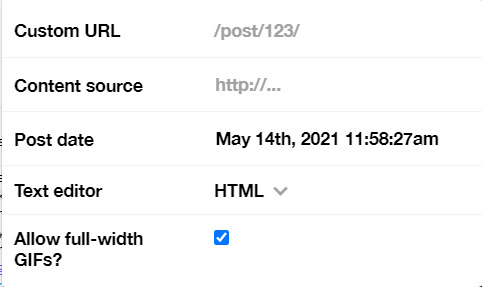
Put some tags related to Zayn. (self promotion time lol. i have compiled tags for 1d creators check them out here)
I finished I think a week earlier before Zayn's birthday so I saved it on draft. I posted around midnight (my timezone is CET), because oh boy it is a competition with birthday post lmao. That’s what I feel like at least. You know, everyone wants to make a birthday post, I feel I have a better chance If I post something first. Whenever I have something done earlier before a certain due date, I either save it on draft or schedule it so it’ll be posted automatically.
Yeah that’s it! It’s not as detailed as before I think because the files are deleted sorry!
i’m tagging:
@spaceniall for this wonderful niall’s birthday edit
@she-fearlesss for this magnificent louis’s birthday gifset
@finewalls for this mesmerizing animation
@louitomlinson (i know you’re not that active but if you want and can!) for this amazing edit
and @tomlinsun for this cool edit
21 notes
·
View notes
Text
Bean’s 15 tips for beginner (digital) artists...
TO THE ANON WHO SENT ME THAT ASK FOR BEGINNER TIPS~
I drafted my reply stupidly and tumblr ate it. Oops.
DISCLAIMER: I am by no means excellent with digital art. I’m deficient with color schemes/the concept of “color” in general (I’m definitely not colorblind, but there’s definitely a screw loose somewhere,) I rarely if at all have the patience to line my art, and forget painting altogether because I don’t get it. So I’m flattered you’re asking me for advice even though I consider myself the last person you should (haha~.)
TIP #1: TL;DR it took me years to get to where I am. Some people don’t need that long. Change may not happen on a day to day basis. Try to be patient.
We hear it all the time, “practice makes perfect.” It’s actually “perfect practice makes perfect” and I don’t believe there is such a thing as “perfection” when it comes to art. When people say it’s “all practice,” they’re full of nonsense. There is definitely a role for talent, in that some artists pick up on stuff really quickly and advance at unreal speeds. I am not that. I started with mouse drawing before I got my first tablet in 2005, followed by the second around 2013-ish (maybe.) I’ve been art-ing in general since I was a wee bitty toddler.
Here’s my progression over the 10+ years I’ve been doing this:
MOUSE PIECE, 2005 (age 14:)

FIRST TABLET PIECE, 2005 (age 15:)
COMPARISON PIECE FROM 2011 (age 20...so about 5-6 years of practice:)

RECENT PIECE, 2017 (age 26...another 5-6 years later:)
TIP #2: Appreciate even the slightest improvements. Maybe it’s easier for you to draw out a smoother line. Maybe you figured out how to use a new tool! Maybe one tool works better than another. Maybe the software needs to be simpler to use. I’ve never been comfortable with Photoshop; I’ve instead used OpenCanvas or Sai.
TIP #3: Please, please, please don’t expect to learn new tricks in a day. If you do, then awesome! If you don’t, then keep trying and you WILL get there eventually. If you’re frustrated, move on to something else. Getting comfortable with digital art isn’t about getting the hang of all of it in one day. There’s a lot to absorb.
TIP #4: Try tutorials. There’s a bajillion out there. They’ll help you work towards “mastering” a skill, or maybe even a few skills, at a time. Once you’ve gotten the hang of a skill, you can then work towards molding it into something of your own.
TIP #5: Practice motions, whether it be with a mouse or with a tablet pen, with doodles. Try doodling different things. Focus on those subjects or themes that are in your comfort zone when using traditional media. Getting used to the feel of the hardware, the texture of the drawing surface, and the motions your fingers need to go through to click or flip through swiftly takes practice.
TIP #6: If you’re not sure how to draw something, use references! Trace over the references at first if you need to for your own benefit (don’t be tracing over other people’s art and posting it as your own, of course.) Sometimes we need to learn from example to get the hang of new skills.
TIP #7: When using references, you may try to mimic different styles. That’s how I started. It took this long for me to finally say, “hey, I think I have my own style and man, I’m actually happy with it!” The whole style business was the bane of my existence as an artist. When you finally find your own way, drawing will come a bit more naturally.
TIP #8: Take breaks. I took a 2 year break. It doesn’t have to be that long, of course, but it actually allowed me some new perspective. I started fresh. Do what you need to do. Don’t overload and crash. Frustration just makes it that much harder to progress.
TIP #9: Set small, achievable goals. “I want to shade hair in *this* way.” Work towards that. If you get the hang of it, then move on. If you don’t, that’s okay! Maybe there’s another method that you may find more achievable. Maybe you’ll achieve a different kind of result that appeals to you more.
TIP #10: EXPERIMENT! There’s more than one way to draw lines. There’s more than one tool you can use to color. If there are rules then I don’t know them nor do I care. YOU DO YOU!!
TIP #11: Take your time, please. Art isn’t a race. Yes, it’s annoying to spend hours on something that doesn’t look the way you want it to. Yes, it’s unbelievable that so-and-so artist painted a masterpiece that could rival the entirety of the Sistine Chapel in a matter of 2 hours. If they got there overnight, then...savants are few and incredibly far between. If you enjoy creating art, then use that extra time you spent as a learning opportunity. If you’re frustrated enough, make the next thing you draw quick and simple. You might surprise yourself.
TIP #12: This is a more personal thing, but one of the most important things I’ve come to accept is that my art WON’T AND SHOULDN’T BE PERFECT. Those little scribbles I leave in my linework are the motions made my by hands, by my own design. They’re an expression of what I’m feeling and thinking. Who cares if my lines are not thin and pretty? I got my message across in my own way. That’s what matters the most. It took me this long to realize that. =P
TIP #13: CREATE YOUR OWN DEFINITION OF “IMPROVEMENT!” Becoming the next Michelangelo is admirable and all, don’t get me wrong, but if YOU feel like you haven’t gotten there despite all you’ve practiced, then it doesn’t matter how much praise you get. Don’t put yourself down, either. I’m so guilty of this and set an awful example.
TIP #14: I cannot emphasize this enough - use software that you can understand and adapt to first, then work your way up. If you use like...3 things to make traditional art, maybe Photoshop is going to be kind of a lot. I mean, I used to draw with a mechanical pencil and eraser. To go from that to Photoshop 7 was mindboggling. Baby steps.
TIP #15: Consider yourself awesome for even trying. When I told job interviewers that digital art is one of my hobbies, they were amazed. Like woah, what a concept. Digital illustration? “I can’t even draw a stick figure!” We’ve all heard it, and well, y’all could if you tried hard enough, I mean it doesn’t have to look one certain way to be a stick figure.
...My point is, digital art is HARD. But listen, people go to school for this stuff. Give yourself some credit.
#long post#art tips#digital art tips#tutorial#art tutorial#this turned into a pep talk#I hope this helps even a little#beanaroony rambles
536 notes
·
View notes
Text
Written Rationale Draft
Written Rationale
This project was about creating a satirical magazine posing as a manifesto for an abhorrent populist party of the type that is currently enjoying a resurgence. The far right went too far decades ago when Timothy Mcveigh detonated his car bomb in Oklahoma City, killing 168 people. It went too far when Dylann Roof killed 9 African Americans in their home church while they held bible study. Too far in New Zealand, too far in Charlottesville and too far in Norway. It went too far when Thomas Mair murdered MP Jo Cox as she held her constituency surgery.
Aside from the 2008 crash, I trace this turn to radicalism to a particular set of people – Alex Jones of Info Wars, Steve Bannon, ‘Tommy Robinson’, Richard Spencer, Rebel Media, Lauren Southern and Milo Yiannopoulos (to name a few). Then there are the ‘reasonable’ people who enable them: Ben Shapiro, Dave Rubin, Fox News, Nigel Farage & Ukip etc. My publication attempts to mock these people.
It seeks to send a strong message by highlighting common racist dog-whistles, hidden agendas and prejudices via the use of fashion and humour. I have tried to address these issues using collaging, styling and photography.
Each model plays a character – Roy Swett as party leader, Chastity Hollers for health, Ambrose Brown for industry, Webb Foote for immigration, Monty Blackshirt for housing, and Dirk Paul for education.
My publication captures each character looking shifty, or otherwise creepy. Getting the balance between a comedic picture and a satirical-but-still-stylised was very important to every shoot. I think this line could have perhaps been better tread in the headshot shoot – where even though lots of effort was put into styling selections – it could have been perhaps elevated to the level of fashion more effectively. Having said this, as images I do think they are very effective and have the satirical effect that I really wanted.
The collages (which are my favourite method of illustration and feature throughout my body of work) were produced from the mindset of some of my politicians. They attempt to complement their imagery and polices, and visually make manifest their words.
I think the world is getting scarier, with ‘men of the people’ either being scripted to the absolute hilt, informed by the latest (illegally?) attained public data or saying abhorrent things that have poisoned the discourse. ‘Telling it like it is’ mostly now seems to mean identifying scapegoats, attacking them and standing up for the ‘traditional working class’ (a dogwhistle for *white* working class), all with either a pint or a golf club in hand. Because this ‘honesty’ is poisonous and negative rather than constructive, I think it is important to not meet this with further negativity. This is often the reaction of well meaning people, but it creates tribes. Further, compassion is so important and I think in some respects necessary here. But validation of this movement is incredibly dangerous. This is why I have, therefore, decided to meet it with humour. To make these powerful figures look less powerful. I focused on distinct tropes, and each shoot was a response to these: ‘conservative women are the most beautiful’, climate change denial, a strong popular leader, pulling yourself up by the bootstraps and paranoid health concerns.
This is a publication for people who despair at our current political climate – people like me. Although this could be seen as ‘preaching to the choir’, I think it is important for people who want to fight the far right to feel empowered – less alone. This, in turn empowers the movement. And a movement, to be truly pervasive, should ideally come from all spheres. Maybe fashion is not the first thing you would think of, but fashion should be motivated by contemporary issues. And for me, this is the greatest, along with climate change. I feel like if you feel a gap for something, if you feel like the way you feel is not being represented, then there are at least a few people who feel the same, and as this is a global movement, and the zine does not focus heavily on one particular nation, it could appeal throughout the western world. The words from this publication are a new idea for me – normally I would include poetry and interviews – but in this circumstance, they come directly from the politicians themselves. To get a real feel for how these people think, I pored over Infowars.com, Alex Jones clips on YouTube, Dave Rubin gaffes (he genuinely wants to scrap building codes because he believes the market would ensure safe builds – NOT SURE THAT WORKS ANYWHERE IN THE WORLD…), Katie Hopkins, Sargon of Akkad, Stephen Yaxley Lennon, Breitbart and Dennis Prager etc. Among other things, I begun to realise just how depressing this worldview is. I lost a lot of hope and humour while submerging myself into this world, and can only imagine what it would be like to believe every word. I think it would make you very, very angry at the world.
I can see this publication on the shelves flanked perhaps by Adbusters and Eye on Design’s latest issue. The are both motivated by external political stimuli, which they respond to in an urgent, but lighthearted way. With more of a focus on fashion, rather than art (although I produced a lot of collages), I think this justifies the gap being left between them on the shelf for The Sovereign Advancement League. The target audience is the same – creative, liberal individuals who are politically motivated – from around 17-40. My unique selling point is the concept as it pairs with fashion. As hard as I looked, I couldn’t find anything similar, but really feel there is a need for it.
This zine will be sold over the internet (find at ellieedis.com/sovereign-advancement-league) at £20 (each costs £10 to print). I would like to make this a series of issues – either continuing with the same group of fake politicians, or with a different group each time focusing on the most pertinent issue of the day – perhaps a whole issue of climate-change-denial. It will be in print each time because, while I think online is a great space to promote, I think it is more likely that people will come across the issue by chance, and feel more of a connection with it in person.
I took all images myself apart from the headshot shoot and the picture that I feature in. The first was shot by Declan Creffield, an amazing professional portrait photo who I was able to collaborate with because I offered to model for him for free. He was great to work with and he really understood the kind of awkward feel I wanted. The second mentioned was a collaboration shoot between me, Lauren Davey (an illustration student) and Simi Kanda (a photography student). We got together to take some fairly simple shots (alternating photography/creative direction ideas) and then went on to edit them however we wanted. Lauren did all of the makeup, and I did the styling. As with most of my work, each shoot was very different from the other, but with a common thread. I like to do this because it keeps it interesting as you go through the zine. I kept the colour scheme (deep red, blue and cream/gold) throughout, to maintain cohesiveness. A lot of these shoots are innovative mainly through post-production, editing faces slightly to carry a sense of evil/awkwardness, changing colours or adding a sense of retro kitsch fantasy by changing the background altogether, as in the final collaboration shoot.
The stylisation of the shoots references a lot of 70s/80s, but the zine is hopefully self-aware enough to modernise these concepts. Further to that, these eras are back in a big way, evidenced by the famous Balenciaga A/W18 campaign shot by Robbie Ausberger. I mainly used lightroom and photoshop to achieve the effects I did.
When it comes to evaluation, as always happens with projects, there were a lot of hurdles to overcome, particularly the headshot shoot, where it was vital that I had at least 7 models showed up on the same day, at the same time. Three models I had planned all messaged last minute to say they couldn’t make it, so sourcing three people who were right for the shoot on the same day it was happening was stressful. Despite this, I actually think that it turned out for the best, and that the models who were able to do it in the end were actually even better for the party. This is the kind of thing you expect when you are asking people for favours, and you have to account for it. I do normally have shoots with two models and shoot them both, so that if one pulls out I can definitely shoot that day, but having backups for 7 people was a lot! I also got my publication printed too early, and noticed certain issues and so had to rejig it and print again. This was tough on finances, but was important to the final outcome. I have learned to be more persuasive and to double and triple check things before I send them off for print.
I am happy and proud of what I produced. I think if I were to do the project again, I might perhaps somehow focus more on the fashion element. I styled everything down to small details, but I think the images could look slightly more editorial (in a fashion communication context). I also produced a short promotional film (also viewable at ellieedis.com/sovereign-advancement-league). I am proud that I managed to turn a political issue I care about deeply into a fully realised, stylised project. The photographer I collaborated with is the most professional I have thus far, and I believe the models are also more relevant to my project than they have been in the past. I pushed myself in this module despite a few hurdles, and I hope it shows.
0 notes
Text
Enterprise of Graphic Communication
Evaluation report.
What went well/ positives
Since the beginning of this module I was very interested in the content of the brief, because it is a free of choice festival project, meaning that you can choose any type of festival you like. The majority of interest went into different music festivals, but I decided to go with something slightly different and still relate to music, so I created a dance festival.
I wanted to create a festival that would bring every one together from all over the world through dancing and music for two days. I also wanted my festival to be a way of communication amongst people, and to get away from the everyday life stresses. The festival would include any kind of dance from any culture, generation or place, but the main concept of it would be on modern dancing, generations from the early 1970s to current…For that reason the audience would be mostly people of this era (ages 8 - middle aged) and also people who are interested in music, dancing, choreography, singing…although that doesn’t mean that people go older generations or even people who haven’t had any of these experiences before can’t participate and be interested in this festival either. Right after sorting out my festival’s concept, I did a festival analysis on the name, location, period, hours, competitors, guests etc. I experimented with many different names but the best suitable name that I think covers the concept of my festival is 360° (united) because it is all over the world and the purpose is to unite everyone. Since it is a summer festival I believe that a great destination for it would be in a city in Madrid - Spain around July. The guests would mainly be dancers and singers. In my analysis I also included the main competitors to my festival such Tomorrowland, world of dance and Eurovision because they are all summer shows.
I wanted to look deeper into dancing in general since I didn’t really know that much about its history or how does it impact on culture so I researched on various cultural dances on different locations of the world and made a dance analysis including most of the modern dances worldwide. Then I also showed some examples of each dance based on their locations.
Now that I had a view on cultural dances from around the world I started doing research on practitioners art, referenced a wide variety of music, art, and dance festivals and also posters that I got a lot of inspiration from. I decided that I wanted my festival to be in a stadium and since the name is 360° I thought it would be a cool idea if the festival was taking place in a round stadium in Madrid. For that I looked into stage designs from other shows, concerts and festivals such as Block9 and stages of the main competitors to my festival: Eurovision, tomorrow land and world of dance. I was impressed by the block9 stage architecture although I think Eurovision stage designs take the lead as they are always outstanding and they resemble more to a stadium which is where will my festival be taking place. I also looked at 2D and 3D stage illustrations and analysis to get a brief example on how to do mine.
Then I looked at different examples of festival logo designs that were related into mine so I started sketching out potential logos. From an example that I referenced I decided to apply a splash effect in my digital logo which in the end worked out magnificently. I also looked at different examples of festival merchandise and wearables for inspiration. The application of my logo onto the wearables I think worked out quite well. I thought it would be fun If I made the tickets wearable as well, clearly for safety purposes and it would look very modern, so I turned the tickets into slap bands (something that I have witnessed and experienced before in a concert) using colours like black and white and with the logo - barcodes applied on them as well as the name of the seat at the bottom of each slap band.
Moreover, I wanted all my designs for the festival to be simple and have the same concept so I used only one typeface for everything (Bauhaus 93, because it is modern, bold enough and matches nicely with my logo design) and only colours such as black, white and shades of grey. Following this concept I created a facebook event page, vip backstage and all access passes, app icons for both android and iOS and also a mobile website. In the end, again following this simple technique I did dome templates for my final poster/ad display covering the positioning and size of all the poster elements, as the final piece worked out as well as I excepted it to. The whole poster look like it was been painted by a brush since I used to black brush lines to cover the text making a very nice contrast and matching greatly with my logo. Lastly I had to create my gif, so I decided to make an animated logo instead go making a promotional animated video. The process took me way longer that I thought but the outcome was better than I expected, simple and quick enough exactly as I wanted it to be.
Negatives & Areas of improvement
If I had the time to fix something in my project that would be my logo, because the fact that I used a splash effect on it made it impossible to use in smaller surfaces such in the wearables (hats, headbands, tickets - slap bands) so I had to create another simpler - clearer, illustrated version so the logo would look proper when scaled down on these smaller surfaces.
Furthermore, I would also change the design of my poster, because despite the fact that the final design worked out quite well, I wasn’t 100% satisfied with the whole look of it. I wanted my poster to look as simple and plain as possible and everything to be in perfect positioning but the sponsor logos at the bottom don’t fit as well as I thought they would, so the positioning of those logos os another thing that I would fix. Development wise, I think I did as much as I needed to, although I could probably do a bit more. For some minor improvements, I think one of them is the fact that I haven’t created a map or guide for my festival and also I have only made a mobile version of the festival’s website as well while I could have made a computer version as well.
What didn’t go well at all was the process of making my gif…Making my gif took me a very long time (even though I was very satisfied with the final outcome), I didn’t work a lot with after effects as it kept crashing for some reason…I mainly used photos animation, which is something that I have used before and know how to handle, but the entire process was exhausting as I had to keep fixing things that weren’t going the way I wanted them to and keep positioning and testing my gif until it came into its final form. Also the fact that the file was too large made my photoshop lag and freeze from time to time making it even harder to work on.
Despite all that, in general I really enjoyed this brief, I’m satisfied with all my designs and also learnt a lot from it.
0 notes