#So
Explore tagged Tumblr posts
Text
You're just so pretty
by miaisreadytorun (mia28ls)
“Today 7 years ago,” Louis whispers. “Can you believe it’s already been 7 years?”
Harry slowly shakes his head, soft hazel-gray curls swirling around his head.
“Me neither.”
Words: 400, Chapters: 1/1, Language: English
Series: Part 3 of Do you know who you are? (mia’s pride month drabbles)
Fandoms: One Direction (Band)
Rating: Teen And Up Audiences
Warnings: Creator Chose Not To Use Archive Warnings, No Archive Warnings Apply
Categories: M/M
Characters: Louis Tomlinson, Harry Styles
Relationships: Harry Styles/Louis Tomlinson
Additional Tags: Louis Tomlinson Loves Harry Styles, Louis Tomlinson Calls Harry Styles Pet Names, Coming Out, Harry Styles/Louis Tomlinson Come Out, not really act they're already out, Domestic Fluff
via AO3 works tagged 'Harry Styles/Louis Tomlinson' https://ift.tt/vL0mgWq
8 notes
·
View notes
Text
Edgaring time!
Tutorial on how to make your own responsive Edgar :D I will try to explain it in really basic terms, like you’ve never touched a puter (which if you’re making this… I’m sure you’ve touched plenty of computers amirite??? EL APLAUSO SEÑOOOREEES).
If you have some experience I tried to highlight the most important things so you won’t have to read everything, this is literally building a website but easier.
I will only show how to make him move like this:
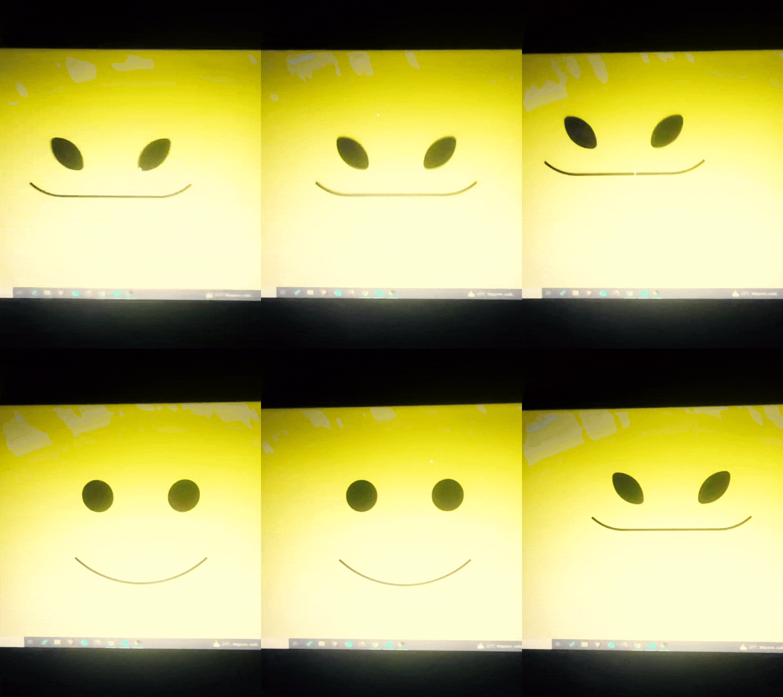
Disclaimer: I’m a yapper.
Choosing an engine First of all you’ll need something that will allow you to display a responsive background, I used LivelyWallpaper since it’s free and open-source (we love open-source).
Choosing an IDE Next is having any IDE to make some silly code! (Unless you can rawdog code… Which would be honestly impressive and you need to slide in my DMs and we will make out) I use Visual Studio!!!
So now that we have those two things we just need to set up the structure we will use.
Project structure
We will now create our project, which I will call “Edgar”, we will include some things inside as follows:
Edgar
img (folder that will contain images) - thumbnail.png (I literally just have a png of his face :]) - [some svgs…]
face.js (script that will make him interactive)
index.html (script that structures his face!)
LivelyInfo,json (script that LivelyWallpaper uses to display your new wallpaper)
style.css (script we will use to paint him!)
All of those scripts are just literally like a “.txt” file but instead of “.txt” we use “.js”, “.html”, etc… You know? We just write stuff and tell the puter it’s in “.{language}”, nothing fancy.
index.html
Basically the way you build his silly little face! Here’s the code:
<!doctype html> <html> <head> <meta charset="utf-8"> <title>Face!</title> <link rel = "stylesheet" type = "text/css" href = "style.css"> </head> <body> <div class="area"> <div class="face"> <div class="eyes"> <div class="eyeR"></div> <div class="eyeL"></div> </div> <div class="mouth"></div> </div> </div> <script src="face.js"></script> </body> </html>
Ok so now some of you will be thinking “Why would you use eyeR and eyeL? Just use eye!“ and you’d be right but I’m a dummy who couldn’t handle making two different instances of the same object and altering it… It’s scary but if you can do it, please please please teach me ;0;!!!
Area comes in handy to the caress function we will implement in the next module (script)! It encapsulates face.
Face just contains the elements inside, trust me it made sense but i can’t remember why…
Eyes contains each different eye, probably here because I wanted to reuse code and it did not work out and when I kept going I was too scared to restructure it.
EyeR/EyeL are the eyes! We will paint them in the “.css”.
Mouth, like the eyeR/eyeL, will be used in the “.css”.
face.js
Here I will only show how to make it so he feels you mouse on top of him! Too ashamed of how I coded the kisses… Believe me, it’s not pretty at all and so sooo repetitive…
// ######################### // ## CONSTANTS ## // ######################### const area = document.querySelector('.area'); const face = document.querySelector('.face'); const mouth = document.querySelector('.mouth'); const eyeL = document.querySelector('.eyeL'); const eyeR = document.querySelector('.eyeR'); // ######################### // ## CARESS HIM ## // ######################### // When the mouse enters the area the face will follow the mouse area.addEventListener('mousemove', (event) => { const rect = area.getBoundingClientRect(); const x = event.clientX - rect.left; const y = event.clientY - rect.top; face.style.left = `${x}px`; face.style.top = `${y}px`; }); // When the mouse leaves the area the face will return to the original position area.addEventListener('mouseout', () => { face.style.left = '50%'; face.style.top = '50%'; });
God bless my past self for explaining it so well, but tbf it’s really simple,,
style.css
body { padding: 0; margin: 0; background: #c9c368; overflow: hidden; } .area { width: 55vh; height: 55vh; position: absolute; top: 50%; left: 50%; transform: translate(-50%,-50%); background: transparent; display: flex; } .face { width: 55vh; height: 55vh; position: absolute; top: 50%; left: 50%; transform: translate(-50%,-50%); background: transparent; display: flex; justify-content: center; align-items: center; transition: 0.5s ease-out; } .mouth { width: 75vh; height: 70vh; position: absolute; bottom: 5vh; background: transparent; border-radius: 100%; border: 1vh solid #000; border-color: transparent transparent black transparent; pointer-events: none; animation: mouth-sad 3s 420s forwards step-end; } .face:hover .mouth { animation: mouth-happy 0.5s forwards; } .eyes { position: relative; bottom: 27%; display: flex; } .eyes .eyeR { position: relative; width: 13vh; height: 13vh; display: block; background: black; margin-right: 11vh; border-radius: 50%; transition: 1s ease } .face:hover .eyeR { transform: translateY(10vh); border-radius: 20px 100% 20px 100%; } .eyes .eyeL { position: relative; width: 13vh; height: 13vh; display: block; background: black; margin-left: 11vh; border-radius: 50%; transition: 1s ease; } .face:hover .eyeL { transform: translateY(10vh); border-radius: 100% 20px 100% 20px; } @keyframes mouth-happy { 0% { background-color: transparent; height: 70vh; width: 75vh; } 100% { border-radius: 0 0 25% 25%; transform: translateY(-10vh); } } @keyframes mouth-sad { 12.5%{ height: 35vh; width: 67vh; } 25% { height: 10vh; width: 60vh; } 37.5% { width: 53vh; border-radius: 0%; border-bottom-color: black; } 50% { width: 60vh; height: 10vh; transform: translateY(11vh); border-radius: 100%; border-color: black transparent transparent transparent; } 62.5% { width: 64vh; height: 20vh; transform: translateY(21vh); } 75% { width: 69vh; height: 40vh; transform: translateY(41vh); } 87.5% { width: 75vh; height: 70vh; transform: translateY(71vh); } 100% { width: 77vh; height: 90vh; border-color: black transparent transparent transparent; transform: translateY(91vh); } }
I didn’t show it but this also makes it so if you don’t pay attention to him he will get sad (mouth-sad, tried to make it as accurate to the movie as possible, that’s why it’s choppy!)
The .hover is what makes him go like a creature when you hover over him, if you want to change it just… Change it! If you’d rather him always have the same expression, delete it!
Anyway, lots of easy stuff, lots of code that I didn’t reuse and I probably should’ve (the eyes!!! Can someone please tell me a way I can just… Mirror the other or something…? There must be a way!!!) So now this is when we do a thinking exercise in which you think about me as like someone who is kind of dumb and take some pity on me.
LivelyInfo.json
{ "AppVersion": "1.0.0.0", "Title": "Edgar", "Thumbnail": "img/thumbnail.png", "Preview": "thumbnail.png", "Desc": "It's me!.", "Author": "Champagne?", "License": "", "Type": 1, "FileName": "index.html" }
Easy stuff!!!
Conclusion
This could've been a project on git but i'm not ready and we're already finished. I'm curious about how this will be seen on mobile and PC,,, i'm not one to post here.
Sorry if I rambled too much or if i didn't explain something good enough! If you have any doubts please don't hesitate to ask.
And if you add any functionality to my code or see improvements please please please tell me, or make your own post!
96 notes
·
View notes
Text
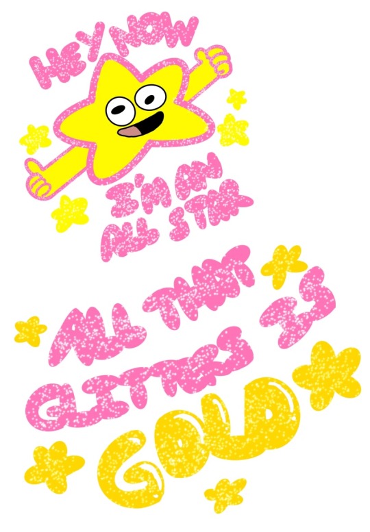
I read this short one shot of blind Au with Ford and Stan getting matching tattoos, did the best I could with what was described lol
Link to the fanfic below:
<a href="https://archiveofourown.org/works/46985245"><strong>All That Glitters Is Gold</strong></a> (6130 words) by <a href="https://archiveofourown.org/users/whimsical_zulda"><strong>whimsical_zulda</strong></a><br />Chapters: 1/1<br />Fandom: <a href="https://archiveofourown.org/tags/Gravity%20Falls">Gravity Falls</a><br />Rating: Teen And Up Audiences<br />Warnings: No Archive Warnings Apply<br />Relationships: Ford Pines & Stan Pines<br />Characters: Ford Pines, Stan Pines, Chief OC, Octopus-Armed Warrior Piglets<br />Additional Tags: Alternate Universe - Blind Faith (Gravity Falls), blind faith au, Fluff and Angst, Drunken Shenanigans, sprinkle of angst, Tattoos, these two should never drink again, but that isn't gonna happen, Guilty Ford Pines, Ford Pines Needs a Hug, Stan Pines is a Good Brother, Swearing, Stuttering, Brotherly Love, Emotional Hurt/Comfort, just a little bit, I adore this au so much<br />Series: Part 1 of <a href="https://archiveofourown.org/series/3499261">Blind Faith! Collection</a><br />Summary: <p>After battling with the octopus-armed warrior piglets, Stan and Ford join in on their customary traditions, including a loud grand feast, drinking, and victory tattoos!</p><p>Stan likes all of the traditions. Ford... doesn't.</p><p>Fic based on pinesinthewood's <a href="https://archiveofourown.org/works/6473938/chapters/14818372" rel="nofollow">Blind Faith</a></p
32 notes
·
View notes
Text
How to Add Images to Ao3
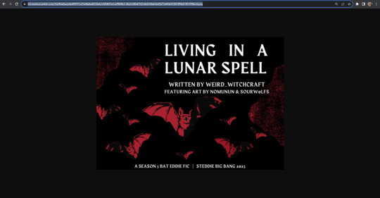
Since it's @steddiebang season I thought I'd do a quick guide on how to add images to your fics in case people don't know how! First off, you need to use the "Rich Text" Editor on Ao3
Next, you need the url of the image you want to embed. This needs to be a direct link to the image (not the post of it on socials) the way to get this is to right click on the pic wherever it's posted and "copy image address" this will copy the direct link to the image
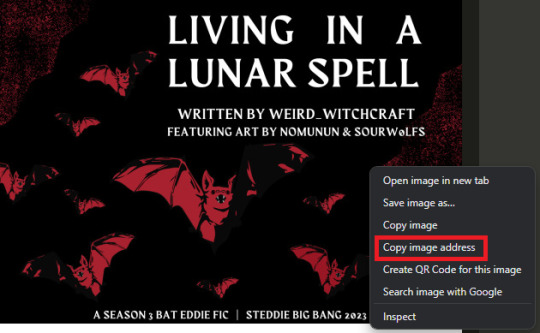
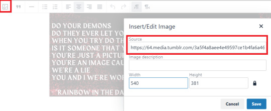
In the Ao3 Rich Text editor click the picture icon to "insert/edit image" paste the "source" url adjust width and height as needed
There you go! Image in your fic! A few things to note: I copied this url from tumblr, the quality is significantly lower than the Ch1 image I already have in there. Since I haven't posted all my title cards on socials I posted them on imgur and set them to private. You could also post them on a private Pinterest board or another hosting site, you just need that url to the image address.
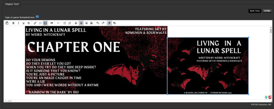
If you want the image to be centered (something i struggled with for a while) you can click next to it to select the text line it's sitting in and center it from there
Personally, when I embed art in fics I add a line underneath to link to credit the artist & the original post to encourage readers to engage with the art directly. You can do that in the rich text editor like so:
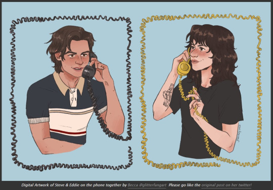
And cause i'm a stickler for crediting here's the link to this art by @glitterfang on Twitter & Tumblr
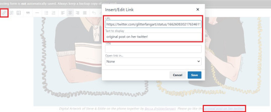
If you want to link anything in the Summary or Notes then you need to use html like this: <a href="LINK URL" rel="nofollow">DISPLAY TEXT</a> Okay! Thanks for coming to my ted talk, hope that helps at least one person!


67 notes
·
View notes
Text
i was so close to flipping out because my stylesheet just wasnt working and then i remembered. i forgot to link it from the html file. im going insane do yall see. i was quite literally scanning through all this code being like is there an error??? is something wrong????? but no i just forgot my cute lil <link rel="stylesheet" href="main.css"> like an idiot lmfao
6 notes
·
View notes
Text
Released a FREE mini artbook/zine !!!
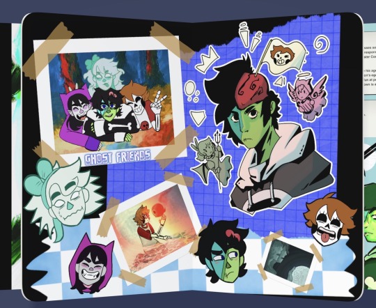
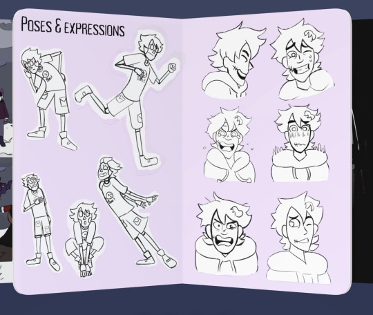
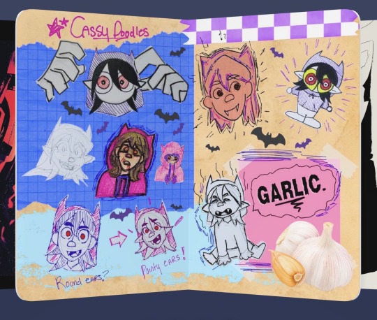
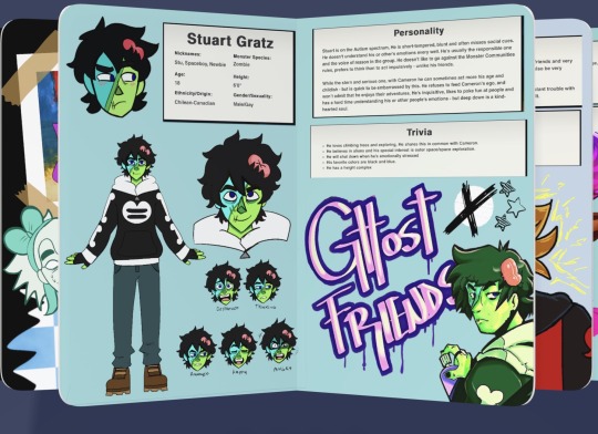
It’s made so you can import the PNGs and put them into the paper by we transfer app and flip it for real! (Only on Apple phones and iPad) (dm me for pngs)
Otherwise the pdf is available here: https://ghost-friends-shop.fourthwall.com/en-cad/products/new-product
#ghost friends#indie animation#animation#artists on tumblr#art#digital art#ghostfriendsconceptart#artbook
32 notes
·
View notes
Note
This may be kinda a stupid ask but how do you get the links on AO3 to work, if you don’t mind sharing? (Specifically in the chapter/author notes.) I’ve tried linking tumblr and stuff on AO3 in the notes, but it always just ends up turning into normal text of the URL thingy
(I know how to make a working link in the body of text of the fic, just not the notes)
Hi!!! Ok so there’s a special coding which I always just copy and paste-
You do need to be in HTML, i don’t think it works in rich text BUT the code is
<a href="WEBSITE LINK” rel="nofollow">words you want it to say</a>
So just put the link you want where I wrote “WEBSITE LINK”
Then write what you want it to say in place of the words “words you want it to say”
FOR EXAMPLE- this is what i put at the end of my fics:
find me on tumblr <a href="https://www.tumblr.com/thief-of-eggs" rel="nofollow">here!</a>
I hope this helps!!! let me know if it’s confusing, i’m so bad at explaining stuff😭
8 notes
·
View notes
Text
Universal Scroll Button(Autochange Direction) For Any Host
Hey, do you have a site with a lot of forums? Does your host allow you to use Javascript? Boy does this weirdo have a deal for you! For the low low price of free, you can get right now access to a scroll button that swaps directions when you scroll automatically, as well as changing the target & title on hover! Act fast, this deal won't last! I kid, but enough of the ShamWowery. In reality, this is a very simple script that reads how far you have scrolled a window, & applies or removes a class to your scroll button, as well as changing the target of said scroll button & adjusting the title to reflect which way it will take you!
It's so simple, crediting me seems superfluous but if you want, feel free to credit with a link to my blog <3 I hope the new verse of our song is eminently kind to everyone!
See it In Action(Click, or look Below):
I currently use this code on two different WIPS, so feel free to check out some gifs;
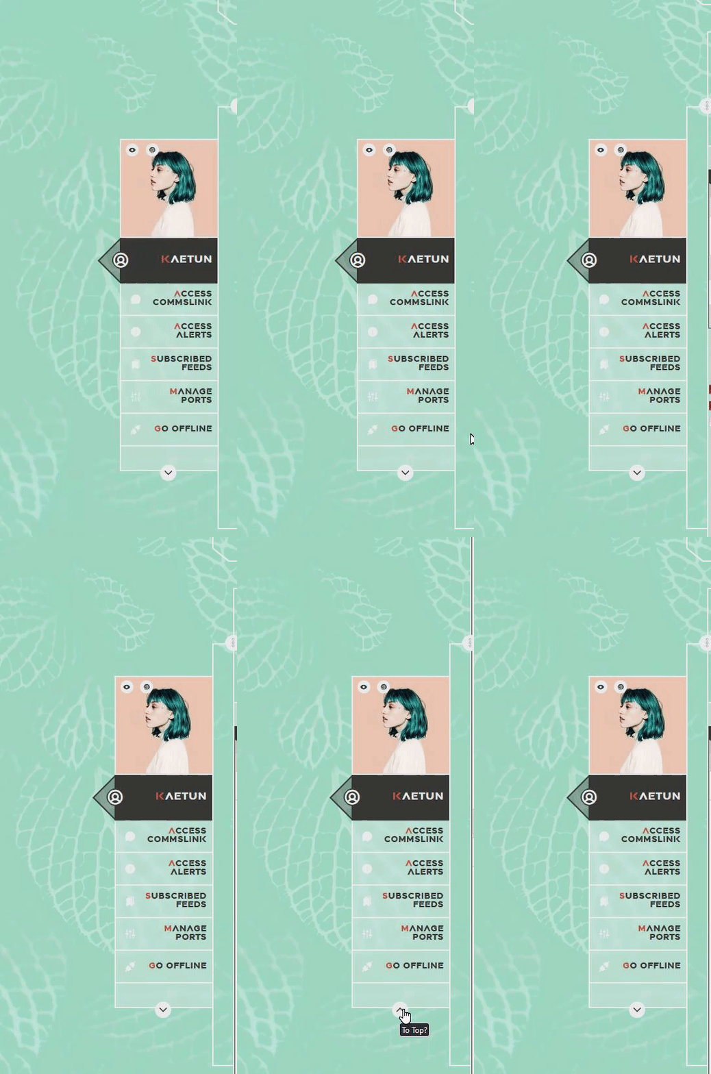
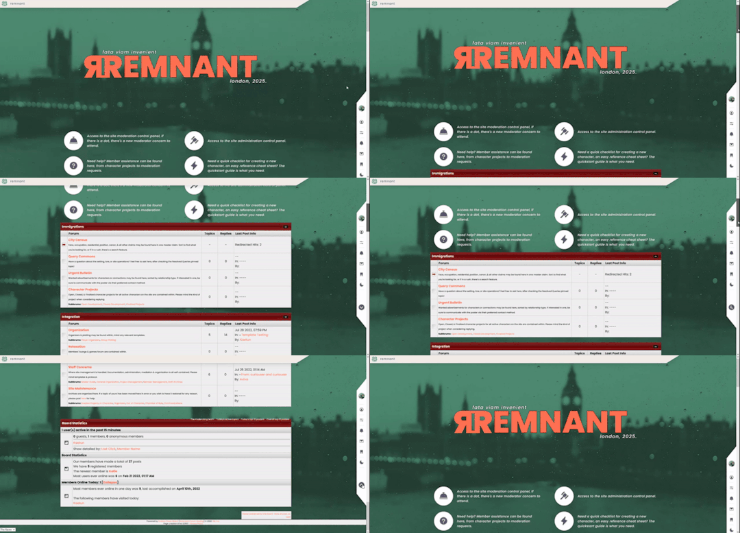
To Begin
Before the end of your </body> tag in your wrappers(for Jcink) or wherever the HTML templates go on other sites, you want to place this script:
<script> $(window).scroll(function() { if ($(this).scrollTop() > 800) { $('#scroll').attr("title","To Top?").attr("href","#Top").addClass('totop'); } else { $('#scroll').attr("title", "To Bottom?").attr("href","#Bottom").removeClass('totop'); } });</script>
This seeks out an id of Scroll to adjust the href & title as needed depending on the scroll position within the relevant window. The scroll amount is in px, so to change how quickly it changes the button, alter the number 800 to whatever you desire, fiddle with it; one size never fits all.
The Styling
Once you've saved that, move to your CSS, or wherever your Style tag is to add styling for the link itself. Keep in mind the link should be contained within a container that handles its positioning for it as otherwise the script will fuck with the positioning as well as the transformation & you really just want it to spin upwards.
The styling for the link should be as follows;
#scroll { display: inline-block; positioning: relative; transform: rotate(0deg); transition: transform .5s ease-in-out; /*** ^ change the .5s to alter duration or the ease-in-out to alter the timing of the transition between button states ***/ }
#scroll.totop { transform: rotate(180deg); }
The first statement defines the default state (linking to the bottom) of the scroll button on the load of the page, the second defines the change of position once the window has been scrolled far enough to activate one's script.
The HTML
Now you've got the behaviour defined via JS & the styling defined via CSS, it's time to input the HTML, or the bone structure of the code itself. In your wrappers, template, or wherever HTML goes on your host, locate three places;
One, where you want the TOP scroll location to be. This is where the scroll button will take you once it has changed states on scrolling a certain distance. Here, you place an anchor span as follows;
<span id="Top"></span>
Two, Where you desire for the BOTTOM or BODY scroll location to be, as in where the scroll button will take you on click initially. This could also be a scroll to the start of content, in which case I recommend changing #Bottom & id="Bottom" respectively to reflect the syntax, it's entirely up to you. Here, you place an anchor span as follows;
<span id="Bottom"></span>
Finally, It's time to add the scroll button. Keep in mind, where you put it is a function of utility & design choice. Some like it persistently hovering in a fixed position, some like it in a sidebar or on userlinks, some prefer it in the navigation bar.
Wherever you place it, try to ensure that it's easily accessible on any device, screen size, & matches the User Interface logic you've used everywhere else. If you have all text buttons, don't use just an icon, if you have all icons, don't suddenly use just text. Match your action calls, so users don't feel confused while using your site.
Once you've decided where you want it, place the following code, NOTING that there should be a container for this code that positions it for you. I've provided two options; the Icon Font option (courtesy of Phosphoricons -- a free & reliable Icon Font I recommend -- As well as one which includes text, so both UI/UX design philosophies are accommodated.
Note the option with text will only rotate the caret from downwards to upwards, so the scroll text shouldn't need editing unless you want to add or supplement flavourtext.
Please choose the appropriate option for yourself;
Icon Font
<a id="scroll" class="ph-fill ph-caret-down"></a>
Icon Font with Text
<span>Scroll <a id="scroll" class="ph-fill ph-caret-down"></a>?</span>
Some Notes:
I just want to add a bit of info:
If your browser isn't scrolling smoothly to your anchors? Check your settings, & be sure the root of your CSS has scroll-behaviour: smooth; in it.
If you use this guide & have problems getting it to work, please let me know! I will troubleshoot this for you & tumblr has strange coding, I may have futzed something up, I want this to be as accessible as possible, so don't be silent; questions help!
If you are not using Jcink, or another host with a Jquery library pre-loaded, be aware that one is needed for this script to work. Most hosts will have a default Jquery library, but if yours doesn't or you're self hosting, any should do. The Jcink file is below, however, if you want to just use that.
8 notes
·
View notes
Text
Continuing Django #2

Continued from the last post
I figured out how to add CSS and JavaScript to my pages, and what a hassle! Took me forever to figure it out! Because files like .css, .js and even image files are classed as 'static' files, they have to be in a special folder in my app folder called 'static' for Django to recognise the files. Then I have to add the tag {% load static %} at the top of the HTML page so it can use any static files in the folder. Then the actual link tag for the stylesheet looks like this now: ' link rel="stylesheet" href="{% static 'style.css' %}" '. It looks easy now but I was struggling to figure this out, even after reading the documentation, it finally got it after trial and error 😅
With that being said, I will now be keeping track of all the information I learn from the video and by myself as I continue because I will forget that easily 😌🙌🏾


#codeblr#coding#programming#progblr#studying#studyblr#comp sci#tech#computer science#python#learning python#django#django todo app
26 notes
·
View notes
Note
Hi! I am so sorry to bother you. I've tried looking into how to do this myself and cannot seem to find anything that helps me or understand better. I was wondering how I can use more icons on the seashell navi. If I'm reading the code correctly, the latest version of the icons isn't included. I'm trying to use the ti ti-bubble and ti ti-users-group icons, but sadly, I cannot. Is there any way to update this on my own? Thank you! <3
hey no worries! if you go to the tabler icon website it will say what the most recent version is, right now it's v3.14.0.
in the code find the following section, it's towards the top

copy and paste the following line below it! <link rel="stylesheet" href="https://cdn.jsdelivr.net/npm/@tabler/[email protected]/tabler-icons.min.css">
in my newer codes the line above is already there but in general this applies to all my codes if anyone else wants to do this too! whenever they update you can change 3.14.0 to the newest version
#answered#manthakinz#updates#icons#icon fonts#tabler icons#the link i have that says @latest should automatically use the newest version but it doesn't always work idk why </3
2 notes
·
View notes
Text
So Be Good For Goodness Sake
by Kikiberoski16
Moving his fingers alongside the elastic, Louis’ eyes got darker again. “Did you like my dick down your throat?”
“Yes, daddy, I’m sorry.” A whimper escaped him, he wasn’t ready for a spanking at all, especially not in a broom closet.
Harry felt his pants go down his legs in one go. “That big new plug I got for you, did that feel good?”
Or, Louis picks Harry's outfit for their TV appearance and adds a little surprise.
Words: 3746, Chapters: 1/1, Language: English
Fandoms: One Direction (Band)
Rating: Explicit
Warnings: No Archive Warnings Apply
Categories: M/M
Characters: Harry Styles, Louis Tomlinson
Relationships: Harry Styles/Louis Tomlinson
Additional Tags: Canon Compliant, Established Relationship, Smut, Plot What Plot/Porn Without Plot, Dom/sub, Dom Louis Tomlinson/Sub Harry Styles, Butt Plugs, Vibrators, Sex Toys, Blow Jobs, Daddy Kink, Exhibitionism, Semi-Public Sex, Anal Sex, Orgasm Control
via AO3 works tagged 'Harry Styles/Louis Tomlinson' https://ift.tt/TB0sG2p
9 notes
·
View notes
Text
Building an RSS Feed for a Static Site
Lover's tree! Lover's tree! I have crafted an RSS feed for the first time! It was a pain in the ass, but I'm glad I learned how to do it.
This page was indispensable, but it doesn't have every part of what I learned, so I'll write my own tutorial below. Specifically, I used this with the Zonelets system, but it should work fine for most static sites.
First, make an .xml file. I just titled mine feed.xml and put it in the same directory as my blog.
Copy and paste the following into your xml file.
<?xml version="1.0" encoding="utf-8"?> <rss version="2.0" xmlns:atom="http://www.w3.org/2005/Atom"> <channel> </channel> </rss>
Between the <channel></channel> tags, we are going to do two things. First, we have to detail what our blog actually is.
<title>Title of your blog</title> <description>Description of your blog</description> <link>URL of blog</link> <atom:link href="URL of blog/feed.xml" rel="self" type="application/rss+xml" />
Change the stuff in pink to be what it's supposed to be.
Now, we are going to add a bunch of "items". Each item = a post in your blog. Copy and paste this template for each post:
<item> <title>Title of post</title> <link>link goes here</link> <guid>link goes here again</guid> <pubDate>Mon, 1 Jan 2023 00:00:00 EST</pubDate> <description><![CDATA[html of your post goes here]]></description> </item>
Change the stuff in pink to be what it's supposed to be. Keep to the structure as closely as possible, ESPECIALLY in the pubDate section. If you want to make sure your RSS feed works correctly, copy and paste the whole thing into the W3C Feed Validator and see if it gives you the OK.
Here is a (very condensed) version of what my RSS feed looks like, for comparison. The indents and colors are just for ease of viewing/understanding what every part is.
<?xml version="1.0" encoding="utf-8"?> <rss version="2.0" xmlns:atom="http://www.w3.org/2005/Atom"> <channel> <title>moonblog</title> <description>Please enjoy.</description> <link>http://moon-hotel.neocities.org/blog</link> <atom:link href="http://moon-hotel.neocities.org/blog/feed.xml" rel="self" type="application/rss+xml" /> <item> <title>Hello World</title> <link>https://moon-hotel.neocities.org/blog/posts/2023-06-24-Hello-World.html</link> <guid>https://moon-hotel.neocities.org/blog/posts/2023-06-24-Hello-World.html</guid> <pubDate>Sat, 24 Jun 2023 19:07:25 EST</pubDate> <description><![CDATA[<p>Hey, testing out <a href="http://zonelets.net">Zonelets</a> as a new blog engine. Hopefully it'll be easier--well, not easier, but more full-featured--than the way I was doing it? I really just wanted a way to do a blog on Neocities while also supporting stuff like Commento, so we'll see if that works.</p>]]></description> </item> </channel> </rss>
12 notes
·
View notes
Text
i really don't know how to feel about being able to just enjoy sterek has been
Like barbie just reminded me I didn't need to white knuckle adulthood
Life isn't just how much blood I can squeeze from the stone of my life
(I just rant about sterek pretty much)
But also just why I started obsessing about the ship itself, the dynamics and just
I an so embarrassed and enlightened by my self journey with these two
Like, Stiles is my favorite character in the show. He just was himself, and he said the right things at the right time, and he just
He really helped me understand my own thoughts and I honestly found a lot of myself
And like yeah, I like Derek, but as a character study, it's like - a caricature. I can't stop reading the stupid fics tho, and I start venturing further in
And i can't stop, because it's like a mirror sometimes. It scratches my brain in the right way, lets me roll with those questions I've always had
And then i found that beautiful fic, that just, Derek was allowed to be h
Derek's caricature made sense. I realized that I had always seen myself as Derek. That Derek, Derek was seen by Stiles. And no matter what ended up happening in the canon story, it all made sense.
I, personally, will never be able t
I never want to, remember, and I think that's fine. Because i don't trust myself, and Derek's life in canon was just one tragedy after another.
Like, wtf did that character do to u Jeff.
And why did u agree to this Tyler, like, get a better agent or whatever.
This shifty show tho, let me look into myself without going too crazy.
I think crazy is relative.
And i think that i just need to channel the Derek who moves to a remote lake and is just healing or the Derek who gets to rebuild instead of fucking burning to death, and stop trying to be Stiles i guess.
Yeah my head feels like it's splitting open and just, reading isthatbloodonyourshirt's fic just was so fucking good u should go read it if u made it this far for some reason
<a href="https://archiveofourown.org/works/44597413"><strong>Matchmaking in Fandom</strong></a> (13092 words) by <a href="https://archiveofourown.org/users/wasterella"><strong>isthatbloodonhisshirt</strong></a><br />Chapters: 1/1<br />Fandom: <a href="https://archiveofourown.org/tags/Teen%20Wolf%20(TV)">Teen Wolf (TV)</a><br />Rating: Teen And Up Audiences<br />Warnings: No Archive Warnings Apply<br />Relationships: Derek Hale/Stiles Stilinski<br />Characters: Derek Hale, Stiles Stilinski, Scott McCall (Teen Wolf), Vernon Boyd<br />Additional Tags: Meet-Cute, Getting Together, Alternate Universe - Human, Grumpy Derek Hale, Fix-It of Sorts, Derek Hale Deserves Nice Things, Stiles Stilinski is a Nice Thing, Fluff, The Movie Doesn't Exist, Don't copy to another site<br />Summary: <p>It wasn’t like it was a secret that the showrunners made <i>terrible</i> decisions when it came to their own show, so why he’d had actual faith in them <i>not</i> fucking the movie up, he had no idea. Really, it was his own fault.</p><p>He hadn’t even set the bar <i>high</i> for the movie! The bar was so incredibly low, like mid-shin height, and they somehow managed to get it subterranean. That was talent. A bad talent, but still a talent.</p>
8 notes
·
View notes
Text
33/100 Days of Code
THE THING WORKS I AM DRAFTING THIS SO THAT I CAN GOOF AROUND WITH IT AT WORK AND DO THE FLEXBOX THING.. evil flexbox...
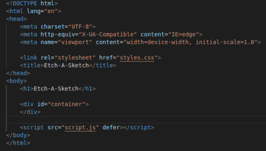
html
<!DOCTYPE html>
<html lang="en">
<head>
<meta charset="UTF-8">
<meta http-equiv="X-UA-Compatible" content="IE=edge">
<meta name="viewport" content="width=device-width, initial-scale=1.0">
<link rel="stylesheet" href="styles.css">
<title>Etch-A-Sketch</title>
</head>
<body>
<h1>Etch-A-Sketch</h1>
<div id="container">
</div>
<script src="script.js" defer></script>
</body>
</html>
css
body {
font-family: sans-serif;
}
#container {
display:flex;
flex-wrap: wrap;
margin: auto;
height:auto;
background-color:lightblue;
max-width: 90vw;
}
div {
/* flex: 1; */
border: 1px solid gray;
}
.empty {
background-color:pink;
}
.activated {
background-color:red;
}
/* .pixel {
height: 8px;
width: 8px;
border: 1px solid black;
} */
script
const container = document.getElementById("container");
let gridNumber = 16;
container.style.width = (gridNumber * 10) + "px";
// draw as many pixel boxes as gridNumber
for (i = 0; i < gridNumber * gridNumber; i++) {
let pixel = document.createElement("div");
pixel.style.cssText = "height: 8px; width: 8px; border: 1px solid black;";
pixel.setAttribute('class', 'empty');
pixel.addEventListener("mouseover", myTest)
container.append(pixel);
// console.log(i);
}
//pixels.addEventListener("mouseover", myTest);
function myTest() {
// console.log("Moused Over");
this.removeAttribute('empty');
this.setAttribute('class', 'activated');
}
!! :) Print Button!
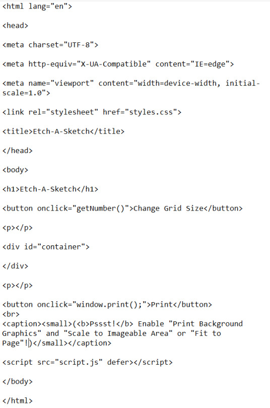
const container = document.getElementById("container");
let gridNumber = 16;
let containerWidth = container.offsetWidth;
// draw as many pixel boxes as gridNumber
for (i = 0; i < gridNumber * gridNumber; i++) {
let pixel = document.createElement("div");
pixel.style.cssText = "border: 1px solid black;"; pixel.style.width = ((containerWidth / gridNumber) - 2) + "px"; pixel.style.height = ((containerWidth / gridNumber) - 2) + "px";
pixel.setAttribute('class', 'empty');
pixel.addEventListener("mouseover", pixelHover)
container.append(pixel);
// console.log(i); }
console.log(containerWidth);
//pixels.addEventListener("mouseover", pixelHover);
function pixelHover() {
// console.log("Moused Over");
this.removeAttribute('empty');
this.setAttribute('class', 'activated');
}
function getNumber() { if (gridNumber) { gridNumber = prompt("Please provide a number", "4");} else { gridNumber = prompt("Please provide a number", "4"); }if (isNaN(gridNumber)) { alert("Must input numbers"); return false; } if (gridNumber > 100) { alert("Please use a number between 1 and 100"); return false; } console.log(`New Number is ${gridNumber}`); container.textContent = "";
for (i = 0; i < gridNumber * gridNumber; i++) {
let pixel = document.createElement("div");
pixel.style.cssText = "border: 1px solid black;"; pixel.style.width = ((containerWidth / gridNumber) - 2) + "px"; pixel.style.height = ((containerWidth / gridNumber) - 2) + "px";
pixel.setAttribute('class', 'empty');
pixel.addEventListener("mouseover", pixelHover)
container.append(pixel);
// console.log(i); }
}
7 notes
·
View notes
Note
Hi, I've been using your amazing Ao3 'Various Tricks to HTML Coding' resource but I've come across something I can't quite work out. I could just be being stupid!
But if I have more than one definition that then requires multiple footnote anchor points, how do I make the "back" function go back to the right place in the text?
<a href="#definition" rel="nofollow">Press here to head on back to the anchor section</a> only takes me back to the first definition and not the 2nd/3rd or whatever number in the main text. If that makes sense. I tried adding numbers after definition (<a href="#definition2") but this didn't work either.
Any help would be amazing ^_^
Hello! HTML can be kinda tricky, but I'm glad the guide has been helpful to you so far. It's actually not super clear within the guide, so I've added some extra information and a simplified version.
Here's a screenshot of what text you'd use. But you can also go straight to the guide so that you can copy and paste from there (HTML GUIDE).

3 notes
·
View notes
Text
I came across this website where you like? enter anything and it'll do it with AI. so i told it to show me a picture of a really good sandwich.
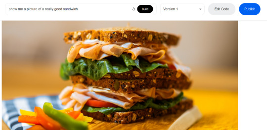
and what it did was generate code that would get a random photo of a sandwich from some photo website. (The images are not AI generated). It automatically generates that description too.
So then i told it to write javascript code for a game of pong (I'll paste the code at the end of this post) and it gave me this:
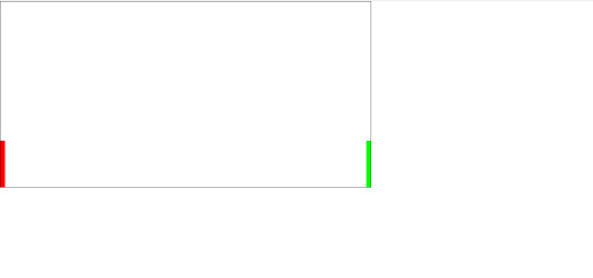
which does nothing. And idk why but I was kinda scared it would actually deliver me a functioning game lol. Probably bc it would take me at least an hour to code a simple pong game, when this generated in 30 seconds.
So i launched the code in vsc and it DOES do something. the ball bounces around but it made the ball white for some reason? so this is what it does after only changing the ball color.
and look at the code, its all formatted and commented and stuff. And i mean, it looks like its at least 85% there, it just needs movable paddles and fixing the ball to bounce into the side walls.
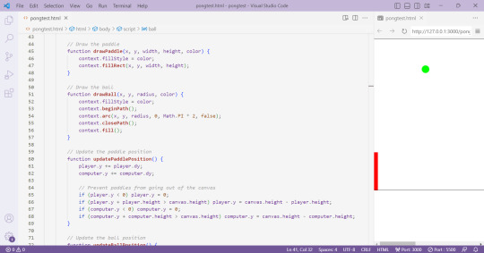
idk i just think this is pretty cool. and now i will be fixing this ai code into a working pong game
Here is the ai generated pong code:
<html>
<head>
<link rel="stylesheet" href="https://cdn.jsdelivr.net/npm/[email protected]/dist/css/bootstrap.min.css">
<script src="https://cdn.jsdelivr.net/npm/[email protected]/dist/js/bootstrap.min.js"></script>
</head>
<body>
<canvas id="pong" width="800" height="400" style="border:1px solid #000000;"></canvas>
<script>
// Create the canvas element
const canvas = document.getElementById("pong");
const context = canvas.getContext("2d");
// Create the paddle
const paddleWidth = 10, paddleHeight = 100;
const player = {
x: 0,
y: canvas.height / 2 - paddleHeight / 2,
width: paddleWidth,
height: paddleHeight,
color: "#FF0000",
dy: 8
};
const computer = {
x: canvas.width - paddleWidth,
y: canvas.height / 2 - paddleHeight / 2,
width: paddleWidth,
height: paddleHeight,
color: "#00FF00",
dy: 4
};
// Create the ball
const ball = {
x: canvas.width / 2,
y: canvas.height / 2,
radius: 10,
speed: 4,
dx: 4,
dy: 4,
color: "#FFFFFF"
};
// Draw the paddle
function drawPaddle(x, y, width, height, color) {
context.fillStyle = color;
context.fillRect(x, y, width, height);
}
// Draw the ball
function drawBall(x, y, radius, color) {
context.fillStyle = color;
context.beginPath();
context.arc(x, y, radius, 0, Math.PI * 2, false);
context.closePath();
context.fill();
}
// Update the paddle position
function updatePaddlePosition() {
player.y += player.dy;
computer.y += computer.dy;
// Prevent paddles from going out of the canvas
if (player.y < 0) player.y = 0;
if (player.y + player.height > canvas.height) player.y = canvas.height - player.height;
if (computer.y < 0) computer.y = 0;
if (computer.y + computer.height > canvas.height) computer.y = canvas.height - computer.height;
}
// Update the ball position
function updateBallPosition() {
ball.x += ball.dx;
ball.y += ball.dy;
// Reverse the ball direction if it hits the top or bottom wall
if (ball.y + ball.radius > canvas.height || ball.y - ball.radius < 0) {
ball.dy *= -1;
}
// Check if the ball hits the paddles
if (
ball.y + ball.radius > player.y &&
ball.y - ball.radius < player.y + player.height &&
ball.dx < 0
) {
if (ball.x - ball.radius < player.x + player.width) {
ball.dx *= -1;
}
}
if (
ball.y + ball.radius > computer.y &&
ball.y - ball.radius < computer.y + computer.height &&
ball.dx > 0
) {
if (ball.x + ball.radius > computer.x) {
ball.dx *= -1;
}
}
}
// Draw the game
function draw() {
// Clear the canvas
context.clearRect(0, 0, canvas.width, canvas.height);
// Draw the paddles
drawPaddle(player.x, player.y, player.width, player.height, player.color);
drawPaddle(computer.x, computer.y, computer.width, computer.height, computer.color);
// Draw the ball
drawBall(ball.x, ball.y, ball.radius, ball.color);
}
// Update the game
function update() {
updatePaddlePosition();
updateBallPosition();
draw();
}
// Game loop
function loop() {
update();
requestAnimationFrame(loop);
}
loop();
</script>
</body>
</html>
4 notes
·
View notes