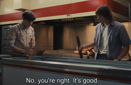
#/have a screencap for reference lol
Explore tagged Tumblr posts
Text
closed for @ourpretender, late 2020.
"I understand grief makes us a stranger even to ourselves, but this is completely, utterly mad, you know that, right?" Venetia is hardly finished with one cigarette before she lights another. A scowl lines her face at the slight tremble that moves through her fingertips, and the next drag she takes is so deep the entire surface of her lungs feels singed. She's stood on one end of the library, staring out the window at the sodden lawn, the once yellow-green grounds turned grey and cold in the pale light of a winter storm. On the other end sits the Lady Elspeth, her fingers tucked under her chin as she dips a biscuit in her tea with an air of barely concealed annoyance. "I'd scarcely call it grieving, Venetia, your father was eighty years old. We've had arrangements made for, ohhh, about five years now, I'd say." Venetia barks a laugh, a nervous thing tinged with bitterness. She cannot believe what she's hearing right now. "So you're just the bog-standard sort of insane then? I mean, really, what on Earth were you thinking inviting Oliver Quick here?" She scrubs a hand over her face with a strained groan. "I'm glad Daddy isn't even in his grave yet because he'd be rolling about like a bloody doner kebab if he knew. He did not like that boy." In the end, neither did Venetia. But she had had no evidence, no witnesses, nothing to show at all in the eyes of the law or her family all those years ago. No one would ever care that she had bad feelings about Oliver Quick and her brother's death at the end of that awful, awful summer. Just Venetia being Venetia, really. Unreliable. Hysterical. Unfortunately female. But they hadn't seen the look in his eyes that night he found her bathing in Felix's tub. They would never know the sick smell of his sweat layered with her brother's aftershave, or the way his mouth felt when he—No. She lets a little smouldering ash fall onto her hand to stop that ancient memory right in its tracks. Elspeth rolls her eyes and delicately bites into her biscuit. "Now you're being dramatic. He wasn't in his right mind then, you know, after… everything that happened." A misty expression crosses her face as she takes another teensy nibble, her lower lip quivering ever so slightly. How Venetia wants to shake her teeth out. "And Oliver is as much a boy as you are a girl. No, he's a grown man, one that I've come to respect tremendously in the rekindling of our friendship. He has every right to be here." "I wish you'd told Colin and me ahead of time, at least," says Venetia quietly, staring at the tiny blisters beginning to form across her knuckles. "What time will he be here?" There comes an abrupt knock at the door, both Venetia and Elspeth startling as they turn to stare. Duncan gives a curt bow from the threshold. "My apologies, Your Ladyship, Miss Venetia," he nods at each of them in turn. "But Oliver Quick has just arrived."

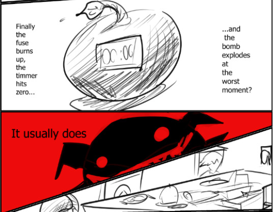
#ourpretender#.venetia: closed;#/hyelloooo#/do not have any good gifs of alison from this series but#/have a screencap for reference lol
3 notes
·
View notes
Text

dramatic :/
#art#digital art#my art 🦷#digital painting#iwtv#interview with the vampire#iwtv fanart#smoking tw#louis de pointe du lac#this was gonna have a timelapse to go with it but uhhhhh. lost all that lol..#either way tho. im pretty satisfied with this portrait :)#i think im done with adding the sort of hatched lines tho#i think it doesnt add the type of texture i want#overall tho im happy with the values n texture stuff#wonder if anyone recognizes the reference photo i used for this lol#i just really liked the vibes of it#i think it suited that one promo photo/screencap of the last ep
2K notes
·
View notes
Photo

I have no memory of needing to appeal this, or doing so, but I'm so curious as to what TOS Tumblr thought it was violating.


Shortly after Lightning moves his headquarters to Radiator Springs, when their relationship–and the idea of having actual relationships–is as new as the moon was that night, Sally takes them on their first night drive. Lightning still doesn’t have real headlights, and so must rely on Sally’s guidance.
(Even after the Grand Prix, he usually doesn’t turn his headlights on for their night drives. He lets Sally lead the way, like she always does.)
Drawn for and inspired by @stickersandsally and #8 of her Salqueen Headcanons <333333333:
Who likes to drive at night?
They both do. I’d say they do this pretty often. This is just their way to unwind, communicate, and bond with each other. They don’t need to be talking all the time; sometimes a good drive up to their spot in the middle of the night does the trick for both of them.
#are they driving through a fallopian tube or something?#female-presenting highways#uhhhh if you have 'expand post' on this for context is in reference to a screencap in a reblog lol
243 notes
·
View notes
Text
nobody cares any more but if yall remember that one girl who traced n sold her art in the bnha community moved over to genshin and honkai star rail n still does what she's been doing but the 'realism' affect gets lost and looks more eerie/uncanny valley.
#also her 'references' are more or less just straight up p*rn stills/screencaps but i have like zero proof other than it just Looks Like That#i won't blow up the spot cuz i mean it's old beef atp but she's still doin her thang lol
0 notes
Text

Unclean page form Soul Eater post chapter 32
#soul eater post#soul eater#manga panel#screencap#comic panel#crona gorgon#ragnarok#soul eater evans#Crona is having an explosive charachter moment of feeling down while soul is in the background like waking up from a hangover lol#but idk I actually liked how this one turned out#hell the uncleaness was just a manga reference not some self criticism about the quality of this one#chapter 32
1 note
·
View note
Text
HEY! YOU!
You've probably heard by now, but from March 4th to 10th 2024, Help Gaza Children will be sending all their donations to families in northern Gaza, where food prices have skyrocketed even more than in the south. Their goal is $25K by the end of the week; at the time of writing this post, it's about halfway a quarter way there! (OG post about it) [EDIT: my mistake, I misinterpreted the numbers in the original post; evidently I cannot do arithmetic anymore]
This is their notion site, which has their donation link as well as additional info, their FAQ, important updates, and proof of purchases from donations they’ve gotten in the past. You can also donate directly to their paypal here.
As such, I'll be open for sketch commissions up from now (March 7th, 2024 ~02:20 PST) through March 10th in exchange for proof of donation to Help Gaza Children!
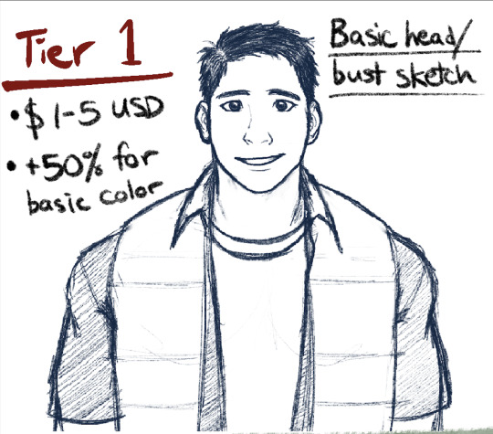


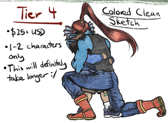
BASIC OVERVIEW:
Tier 1 - Basic head/bust sketch for $1-5 USD, +50% for basic color. Up to 3 characters.
Tier 2 - Basic screencap resketch for $5-15 USD, +50% for basic color.
Tier 3 - Posed sketch for $15-25 USD, 1-2 characters ONLY.
Tier 4 - Colored clean sketch: $25+ USD, 1-2 characters ONLY.
RULES:
Please provide a visual reference or detailed description of the character(s) you want drawn (and depending on the tier, a screencap or pose/expression you want to go with it)
DO'S: OCs, humans and human-like creatures, other creatures that don't have a lot of mechanical or anatomical detail (as in, I can TRY to do mecha stuff, but I think you and I will both be better of if I don't lol; can ask for further details)
DON'T'S: any NSFW stuff, real people currently alive (as in, historical figures in the setting of historical fiction may be okay, but other things may not be; can ask for further details)
If you've made your donation in a currency that is not USD, I'll give you something of equivalent value according to the tier based on whatever the conversion is at the time that I look it up. If one or both of our economies crashes spectacularly in between the time you send it and the time I look it up, I'm very sorry in advance
DISCLAIMER 1: I reserve the right to decline a commission for any reason; however, if this ends up being the case, I may reach out to you to see if we can come up with a middle ground that suits us both.
DISCLAIMER 2: I don't anticipate being able to do a lot of these, as I've got a full-time job that's in the ballpark ~80+ hours a week with really weird hours. That being said, depending on how far this goes, turnaround time will probably be ~2-3 months, give or take...something. I'll update you monthly until it's done.
FOR PERSONAL, NON-COMMERCIAL USE ONLY!
If you're interested in nabbing a sketch from me in exchange for your donation, email a screenshot (devoid of any personal info please) of your donation receipt and details of your sketch request (e.g. reference, tier, etc.) to [email protected]. For your donation to count for a sketch, it must be made after I wrote this post! (March 7, 2024 ~02:20 A.M. PST)
If you are NOT interested in nabbing a sketch from me, feel free to donate anyway!!
(And if you've got any questions about anything feel free to email, DM, or send an ask!)
#palestine#gaza#helpgazachildren#orv#undertale#commissions#donations#if this inspires even one extra person to donate that wouldn't otherwise have known about it I'll consider that a win#anyways I don't really expect this to go very far outside my circle if at all#so I'd appreciate some help in spreading the word#especially about the main fundraiser#these drawings are really secondary to the whole thing#but if you want to donate AND help a sad partially-art-blocked artist get unblocked! here is your opportunity!#if this goes somewhere I might do it again with other links#otherwise I'll just keep donating privately
792 notes
·
View notes
Text

Fakiru Week Day Two! "If My Heart Was a House" Gosh, OwlCity songs really take me back to when I first watched Princess Tutu. I used to be obsessed with both back then, and I have one vivid memory of scouring YouTube for a Princess Tutu AMV set to Fireflies and getting really sad when I couldn't find any lol! Anyways, I'd not heard this particular OwlCity song before today, but it's so cute! It'll be on repeat in my earbuds for a while! The vibe of this song is so warm, and I wanted to draw something simple today, so I drew them napping together. Good naps are the best! Especially when you're not alone. The reference image I used was found on Pinterest, it was a screencap from a J-Drama called My Personal Weatherman!
#my art#fakiru week#2024#princess tutu#also i accidentally made her shirt navy blue#it is fakirs shirt to be clear#but i kinda forgot when drawing that the lyrics of the song mention the narrators love borrowing his shirt because she likes navy blue
101 notes
·
View notes
Text
Holy shit. TIMEBOMB FANS STRAP IN FOR THIS.
(lots of you have probably already seen this video before, but here’s a quick reminder)
First let’s start with the pinned comment that breaks down time stamps in the video:
Introduction (Ekko did not just have a SLIGHT crush on Jinx lol) : [0:00]
RIOT geniously hiding stuff about Timebomb till the reveal : [1:32]
The timelapse (lots of uncorrect lines in the audio cause we didn't know they met at that time, so it was just me theorizing, but I guess I wasn't wrong now lol) : [2.35]
Ekko-Jinx background, Timelapse + what we know from LORE, and how RIOT been playing with our sanity : [3:20]
✨ WALL ANALYSIS [starting with the easiest ones to see, most interesting parts are near the end]
Intro : Ekko's Wall painted in a RORSCHACH Art style [patchwork graffiti] - being full of Powder & Jinx, Ekko being in love representations, and references to Arcane : [7:28]
Jinx's heroe number and Ekko having her X and her signature all over him : [10:09]
(!) Please see the threads in description to see it all pointed out (!) The video didn't really say it right but these pictures and explanations will definitely make you see what I mean, and also, what I mean about the hair-clip and the Firelight symbol might be theory but I have explained in my thread all the things I discovered that make me thing the Firelight symbol, seeing how it changed, might have a link with Jinx in the first place when it was invented by Ekko.
RIOT playing with us and hiding the fact Jinx was on the wall : [12:14]
This is NOT hypothesis : [12:58]
The developers pointing out the forms we need to see with the thunder hextech energy : [14:54]
Yes, Ekko was in love, and he represented himself 6 times looking at her with bewildered eyes, heart in his eyes, blushing or spying on her during their teenage days : [15:18]
✨ SUMMARY FOR THE THE PAINTINGS --------
NOTE : sometimes you will see the paintings I’m pointing out even better in the next paintings I will point out. By exemple, the Firebomb and the Ekko blushing drawing described in N°2, are clearer and more easy to see in the screencaps pointing out painting N°3! Just try sticking till the end of the video to see them all! ;)
First observations & How I started my Analyze : [16:11]
N°1 - Arcane Jinx main painting on the left - representing Ekko’s Hope to get her back : [16:41]
N°2 - Powder main painting on the right (double faced Powder-Jinx + Ekko blushing + Jinx Chumper bomb) : [17:44]
N°3 & N°4 (I apologize for the lame quality of this one but it was quite hard to make it stand out!) - Screaming/crying Powder, teenage Powder-Jinx drawn K/DA style boxing + teenage Ekko with his Firelight jacket standing on the other side : 5 scenes painted in one and moving along with the seconds! (SIDE NOTE : the cube design on the painting represents the Arcade place in which Jinx boxes the machine, I forgot to mention it in the video!) : [19:19]
N°5 - Vi abandoning Powder - exact Arcane scene : [21:28]
N°6 - Get Jinxed scene from Arcane and Ekko spying on her : [22:14]
N°6, 7 & 8 - Ekko representations watching with bewildered eyes, blushing, with his Firelight mask AND A HEART around the 2 middle Powder & Jinx paintings : [25:20]
Back on N°7, beautiful painting of teenage-adult Jinx with shimmer eyes on top of the wall : [26:26]
N°9 - Little Powder from Arcane & Ekko blushing next to it : [27:47]
N°10 - Doll Jinx with Arcane's clothes : [28:28]
N°11 - Black & white picture of the same screaming/crying Powder represented on painting N°3 : [28:50]
N°12 (that you can see more clearly later in the screencaps of N°27!!) - Ekko in GILDED skin & Jinx with untie long hair drawn in negative mode : [29:04] (!) in the video I said Firelight jacket but now that I discovered all the Ekko-Jinx matching stuff in the Gilded universe (and them hiding in the crowd side-by-side on the Caitlyn’s Gilded artwork lol), I realized it looked like Gilded Ekko in that painting!
N°13 - Young Ekko with unknown person on his side but seeing how the rest of the wall is Jinx, it is probably Powder : [29:19]
N°14 - Young Powder & Ekko talking, probably the talk they had after Powder was taking in by Silco, seeing how Ekko is represented like a skeleton (dying inside) : [29:37]
N°15 - Jinx blue smoke/cloud tattoos representation (!) this cloud I'm pointing out is actually part of the ''cracking the hextech scene'' I've discovered later on, and is located on her shoulder! I will show the painting of that scene later in the video don't worry ! ;) [30:25]
N°16 - Symbols next to the Get Jinxed painting, that have different meanings in the next scenes I will show when the wall will be upside down (singing, crying + hextech symbols) : [30:32]
N°17 - THREE PAINTINGS IN ONE : Powder's red eye when she looks at Silco at the end of Act 3 + Jinx's face/mouth when she looks at Ekko before she made her bomb explode : [30:45]
N°18 - Representation of baby Powder's trauma on the bridge : [31:54]
N°19 - Lighting the flare scene drawn negative mode again, being represented in every way/side you turn the wall : [32:12]
N°20 - Random elements, like Ekko's young blushing face, giving the shape of a heart when you turn them upside-down : [32:29]
N°21 - Young Powder with Arcane's clothes, but looking more fierce as the Powder we know. Perhaps one Powder from Ekko's memory, or the Powder from the Timelapse : [32:40] (!) You can see this painting more clearly in the screencaps of N°27 (!)
N°22 - Jinx drawning/reborn scene with Silco : [32:56]
N°23 - (sorry I have deleted this one since I couldn't point it out in the video, but here's what it was : the black canvas on each side of the scene, also have Jinx & Powder's representations on them, but you'll have to zoom in and improve lighting + the quality yourself to see them cause it can't be shown in a video ToT/)
N°24 - Powder’s leather bag + teenage Ekko staring + blue & pink hand palm : [33:17]
N°25 - Big Jinx monkey-bomb from Arcane, near the other paintings of that exact same scene : [33:37]
N°26 - Drawn negative mode : ''Devil'' Jinx from the bridge scene : [34:08]
N°27 - Two paintings in 1 - Teenage or adult Ekko & Jinx + Ekko’s Gilded skin again ? : [34:31]
N°28 - Jinx ''cracking the Hextech'' scene : [34:57]
N°29 - Firelights representations, same as the ones Jinx drew in her Diary : [35:40]
N°30 - end [36:05]
MORE INTERPRETATIONS & BETTER QUALITY OF SOME PAINTINGS :
N°12 - Ekko & Jinx with untie long hair drawn in negative mode but also, if you look at it at [34:55], you'll see it way more clearly AND also see that it gives Jinx lighting up the flare scene with Ekko on his overboard flying around her.
N°27 - at [34:37] you'll see the young Powder from N°21 way more clearly!
The Jinx Monckey-bomb. At [30:58] ; [31:55] and [34:13] you might see the Jinx Monckey-bomb more clearly as the pictures are in better quality or more focused on this area !
N°22 [32:06] : I forgot to mention it in the video but in that drawing-reborn scene with Silco, you can actually see fingers/a hand (drawn by the Jinx mouth from N°28) pushing on Jinx’s skull/in her hair which seems to be pulling her under water.
More stuff about the Get Jinxed painting and the Devil Jinx one : on top of the Get Jinxed painting, there is a scary white mask/face that I believe to be representing Silco. When you turn the picture upside down, and try not focusing on that mask, it then gives off the Devil Jinx I showed earlier.
Also, the big yellow/bewildered eye in the middle of Jinx chest in the Get Jinxed painting could be representing the Eye of Zaun, as this a tech-nerd Jinx being represented here, and as Ekko is represented staring/spying on her, it could imply that Ekko has recognized Powder in her in that moment, the Zaunite child with whom he grew up with and whom he loved.
End note : I forgot to mention it in the video but there are also 2–3 Vi representations on the Jinx paintings, one from the scene where she left her on the street and went to calm herself away from her, and another with her head and shoulders down, on the main Jinx painting on the left, that looks like the Vi introducing scene from Episode 4 in the prison.
OKAY INSANE. Next I’m gonna give you some screenshots I took so y’all can get some visuals to the stuff you just read. Also, WATCH THE VIDEO!!! The creator does a lot better at exposing than I do—never mind the fact that this is literally their findings! (I didn’t find any of these, just watched the video and now spreading it to tumblr). I have absolutely no recollection of which N• photo these images belong to so you’ll have to play connect the dots lmao
A lot of the images also already have text on the screen explaining, I’m just gonna paraphrase what the voice in the video (not the text) is saying.


These two photos are telling us how Ekko’s down bad ass based the entire firefly logo off of Jinx and her logo… and for the context in the first image about the emboldened Z, here it is:

PRACTICALLY IDENTICAL.

This is the video creator explaining their level 1 billion brain power on thinking outside the box and how the idea of the painting was to go back to an Ekko origin short that came out YEARS before Arcane did. They’ve been planning this entire time, and when the description pasted far above talking about the different photos it was talking about the images painted on a wall in an Ekko origin (will show screenshots next)

The creator of the yt video found almost FORTY Jinx paintings and references to Arcane (which hadn’t been anywhere near its release date when the origin came out.


These ones on the large wood slab are CRAZY. The artists and develops had loads of fun because in the last photo you can see jinx screaming/crying if you focus on all the colours in the photo.
However, the YouTuber blurred Jinx’s face to hell you focus on the blues and pinks where the developers/artists made kind of like a moving mini scene that moved while the video itself moved. To my understanding you can see Jinx boxing and at some point Ekko shows up, too.
(I’ll repost this so I can add more images 👍)
#✮ reef talks#arcane#timebomb#theories#league of legend#Ekko#jinx#crush#before you started talking to the gun#league of legends#lol
68 notes
·
View notes
Text
Will said he's "not gonna fall in love" EXACTLY when he does something referring to Mike:


I'm late to Byler (just watched s4 a month ago and found y'all after), and I'm guessing some caught that Will opened a bottle of syrup in front of his plate which has eggs, and Mike definitely liked syrup on his eggs in s1.
But has anyone pointed out the IRONY of Will saying "I'm not gonna fall in love" EXACTLY when he gets the syrup? The creators must have known eagle-eyed viewers would remember s1 Mike grossing out his sister with this.
So Will said "I'm not gonna fall in love," while we're all reminded of someone he's already in love with. But not only that: syrup on eggs is an unusual preference he seems to share with the boy he loves. Which symbolically suggests they're meant for each other.
(Yes, I know Will has pancakes there, but we all know you put ketchup on eggs lol. And he starts eating with just the syrup!)
The creators SO wanted him to say this line while unscrewing the cap that they made a continuity error. In the IMMEDIATE previous shot, Will had already unscrewed the cap:
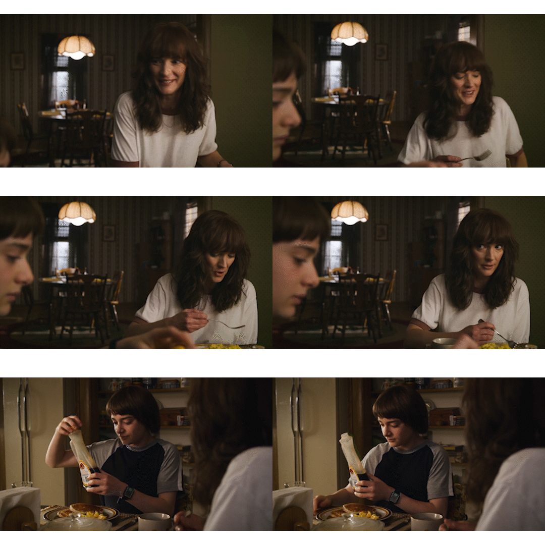
So the timing was deliberate.
And we all remember the very gay-coded Mike Tries Fruit on Pizza Incident. To which I'll point out:
Syrup on eggs = Fruit on pizza
Syrup and fruit both add sweetness to an otherwise starchy food. Just like being queer, some people instantly find the IDEA of it repulsive (Mike's sister called the syrup "disgusting"). But others find it delicious!
And it's canon that Mike has always liked sugar on his starch ;)
Mike didn't want to try fruit on pizza. "Fruit" is historically a derogatory word for gay men. He called fruit on pizza "blasphemous." His friends had to coax him to try sugar on his starch, which he always liked.
Afterward, Mike says off-camera that he liked his fruity pizza (screencap with subtitle):
Oh, Mike, you just had to try it! And what's the harm in telling Will you like him? He just might like sugar on his starch as well!
"Try before you deny" indeed!
-teambyler
#byler#pizza#fruit on pizza#try before you deny#syrup#not gonna fall in love#will byers#mike wheeler#stranger things#byler theory#pizzagate#syrupgate
231 notes
·
View notes
Note
Do/for you have to make references for any other characters in Handplates? Like the mouse or pterofractal? The same goes for the characters that have canon designs in Undertale. Did you ever need a ref for them?
Honestly I like never make reference sheets until something forces me, haha. With the mouse I just go back to the first comic he appeared in and just ref off of those. I might have mentioned this before, I forget, but originally that mouse was supposed to be the mole in the MTT comedy club but then I looked up their speech pattern and it didn't fit, so instead I made them a Rathbone cameo from The Lost Mind of Dr. Brain. :B

I had to improvise his lower body so I just gave him big wading pants lol.
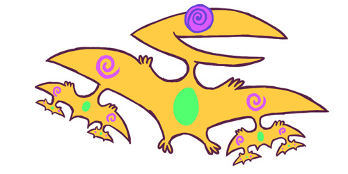
As for Pterofractal, Jaz gave me this!
I do have a folder for canon refs, mostly screenshots I've taken to get colors and layouts for certain areas in the Underground, haha. And some sprite sheets if I need them.
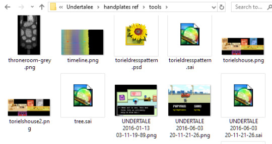
Nothing really official or purposeful though, just screencaps and snips from other files I end up reusing.
#asks and answers#novafloofeatsbirds#undertale#handplates#this is unrelated but you would not BELIEVE what i went through to get that cap of rathbone#first i couldn't find my disk for lost mind of dr brain#then i couldn't get it to install on windows 10#so i had to get pcem and set up windows 3.1 on a virtual machine which was its own whole thing#THEN i had to set it to a graphics driver that had 256 colors which was ANOTHER different thing#and i FINALLY got it working and the sound stutters lol#well i got my own personal shot that's what matters#and maybe this emulated machine will come in handy sometime who knows
159 notes
·
View notes
Note
Hi! I don't know if you already have a tutorial but would you mind sharing your gif making process? Thank you!
hiiii anon!
thank you for sending this in :) it's my first time getting a tutorial request hehe i tried to explain each step i do as best as i can.
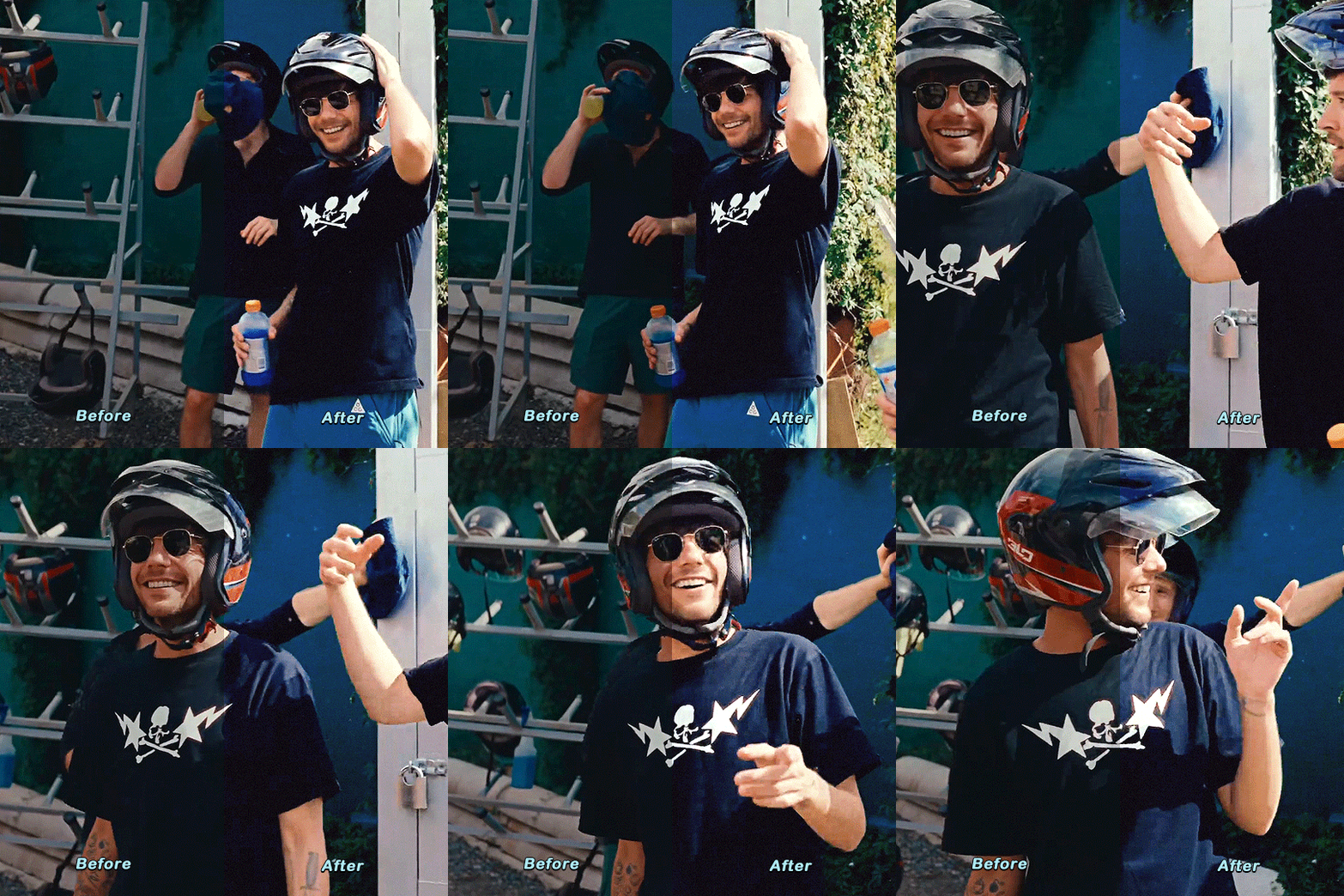
i'll put the gif making process and tutorial under the cut bc it's image + text heavy
before starting, i'd just like to share what i use in creating gifs:
i'm on mac (i used to do them on windows... the ps steps are the same if you're using one)
i'm currently using photoshop 2022
i use 9xbuddy or video downloadhelper extension on firefox mainly for downloading videos
best quality to download for hq gifs is ideally 1080p and above. (although you can get away with 720p for smaller gif sizes)
i use mplayer-osx extended to get the screencaps/frames for my gifs (if i'm not doing the import option in photoshop)
for this tutorial, i'm using the latam highlights video from louis' ig reels to make today's gif. on to the tutorial / process!
please click the screenshots i've included below and zoom in on the texts on them to see them clearly (apologies for the quality!)
IMPORT YOUR FRAMES. once you've downloaded your video, open photoshop and click FILE > IMPORT > VIDEO FRAMES TO LAYERS
SELECT THE PART YOU WANT TO GIF. the shorter, the better because you want to keep it crisp and keep the file under 10mb when you save it after all the layers. here are the settings i use:

toggle the smaller arrows under the bar to select the parts you want to gif. once you have your frames loaded, it should show you a timeline table at the bottom and their corresponding layers on the right side. (if you can't see the timeline, go to WINDOW > click TIMELINE)
3. DELETE EXTRA LAYERS, CROP PARTS YOU WANT TO FOCUS ON, AND RESIZE.

after cropping the parts of the gifs, resize them according to the tumblr sizing to prevent your gifs from looking blurry once you upload them. you can use this size guide for your reference :) the gif's height can be any size as far as i know. go to IMAGE > IMAGE SIZE > INPUT THE SIZE. for this gif, we'll do 540 x 540
4. CHANGE GIF SPEED and CONVERT TO SMART OBJECT

once you've selected all frames
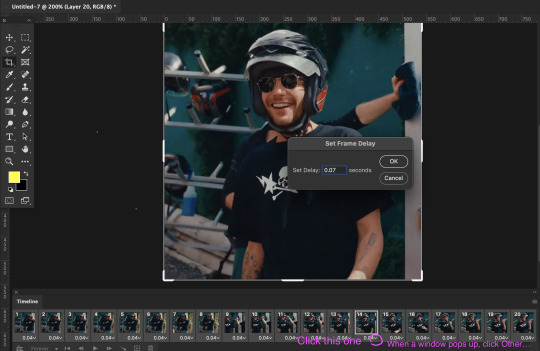
set the delay to 0.07. this is usually the natural, normal speed for gifs on here. it depends on the number of frames you have but i usually do .07 or .05 (sometimes .08 haha)
with all your timeline frames still selected, then select all the layers on the right side. go to SELECT > ALL LAYERS
then convert them to smart object so we can edit all the layers all at once. go to LAYER > SMART OBJECTS > CONVERT TO SMART OBJECT
5. SHARPEN (one of my fave parts!)
this is the basic one that most users use:
STEP 1: go to FILTER > SHARPEN > SMART SHARPEN

radius usually goes from 0.3-0.4
STEP 2: Repeat STEP 1, but this time change the settings to:

you can stop here but i like my gifs crispier and to have more texture! i use the sharpening settings from this tutorial or these sharpening action packs from user brainwasheds. i highly recommend these! i mix and match the settings when i'm not happy with how they look on my gifs. but for this gif we'll use the sharpening settings from this tutorial.
in addition to the settings from that tutorial, i also added FILTER > OTHER > HIGH PASS at 3.4 radius, then set the opacity to 60-80
then lastly add FILTER > ADD NOISE > NOISE at gaussian setting with 1.5 amount, then set opacity to 20-30
6. BRIGHTENING, COLORING, BALANCING, ADDING TEXTURE
now for the fun part!
STEP 1: BRIGHTEN UP THE GIF this is my go-to way to increase the brightness. go to LAYER > NEW ADJUSTMENT LAYER > BRIGHTNESS / CONTRAST then change its blending mode from NORMAL to SCREEN
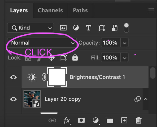
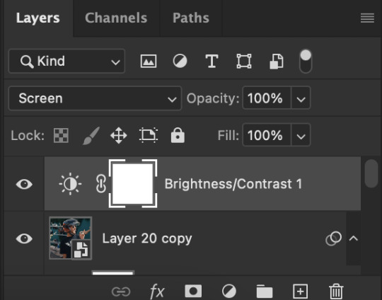

you now have a very bright, highly saturated gif but we'll fix that lol
STEP 2: ADD CONTRAST BY FIXING THE BLACKS AND WHITES add a new adjustment layer > LEVELS

i usually play around with these. middle and black arrows add shadows and contrast while the white arrows add highlights/brightness to the gifs.

these are my settings! these are not definite bc it varies depending on what you're working on, so adjust them accordingly. next, add another adjustment layer > CURVES

i usually zoom in to locate the darkest / black area using the black dropper. then once that's done, do the same and locate the brightest/white area. this adds further contrast to your gif that wasn't done in the previous step.
STEP 3: COLORING (my fave part!!!) add a new adjustment layer > SELECTIVE COLOR this is the part where i like to neutralize the skin color when it gets too yellow or red, make the colors pop, and sometimes change them too. louis' skin was looking too red heavy, so i wanted to reduce that! i start with balancing out the skin color with REDS & YELLOWS.
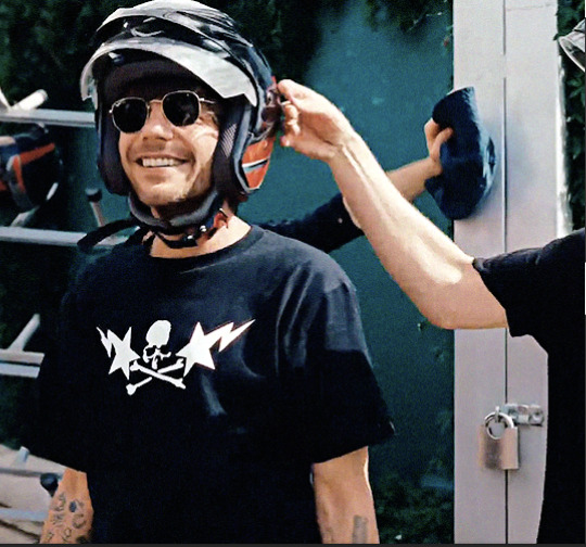
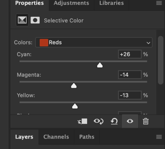

these are my settings for this gif! adjust them and observe the changes it makes on the person's skin. if you know color theory, it's helpful to see how it affects the colors on your gifs. putting the arrows more on the left side, adds more 'cool' tones, whilst putting the arrows to the right side, adds more 'warm' tones.
i like to deepen the blacks on my gifs further so, go to selective color's BLACKS and on the black scale, add more to the right! for this one, i added +10
add a new SELECTIVE COLOR adjustment layer. for this one, we'll make the surrounding colors pop more!

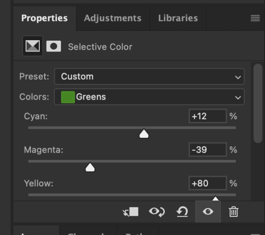
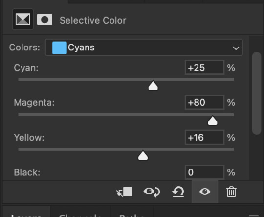

for these settings, i made the leaves more vivid while the teal(?) wall, i adjusted them made it more blue.
next, add a new adjustment layer > COLOR BALANCE this is where you can make further adjustments on the overall colors of your gif. you can also change the color tone of your gifs here if you want to make it more 'cool' tone or 'warm' tone looking.


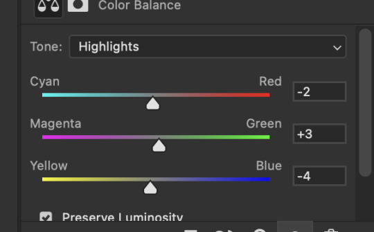
earlier's color theory applies here as well!
6.5. OPTIONAL STEP: ADD TEXTURE/OVERLAYS after the last step, you can save your gif as is but again, i like adding textures to my gifs so we'll add one. i use the textures/overlays that i got from here :)
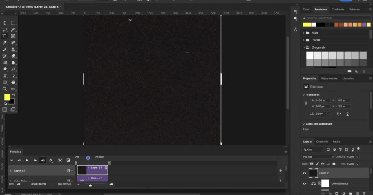
i like to use film, grainy textures! add the texture you want on top of all the layers.

then change the blending mode to LIGHTEN or SCREEN. adjust the opacity to 20-40%. for this gif i used screen with 40%.
7. EXPORT AND SAVE YOUR GIF time to save your gif! click FILE > EXPORT > SAVE FOR WEB

this is my default setting for my gifs. i also tick the interlaced option sometimes.
here's the finished gif:
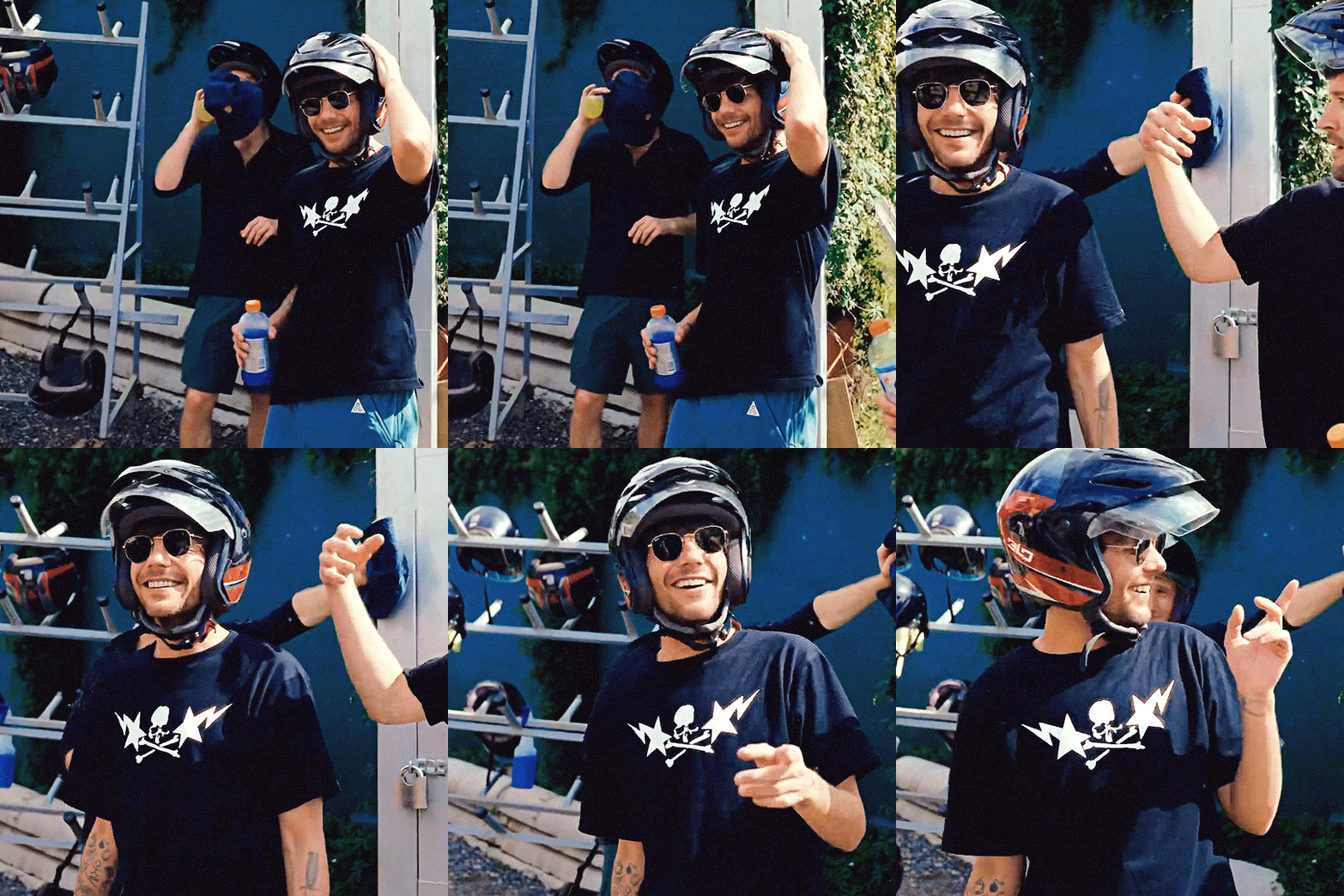
there you go anon! :) if you have any more questions, just lmk or you can directly dm me off-anon if you want.
i also get inspo, guides, and other tutorials over at @usergif
77 notes
·
View notes
Text
Tabitha: The sacrificial lamb? And possible Sybil motivations + partnership with Wayne
So in this post I'll be discussing why I think Tabitha is supposed to be the sacrifice and we're supposed to run the town.
I will also give a theory as to what Sybil's motivations might be and why her and "Wayne" seem to be working together even though they appear to dislike each other.
SPOILERS AND MANY SCREENSHOTS BELOW. THIS IS A LONG POST BE WARNED.
Right at the beginning of the game we can tell that Tabitha is unhappy with her lot in life and feels forced into doing what she believes is best for the town (similar to how Neeks feels forced and trapped)
She even admits as such during our time with her in chapter 3.
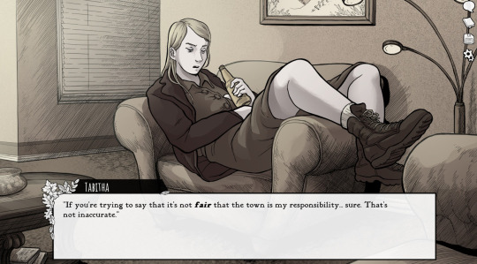
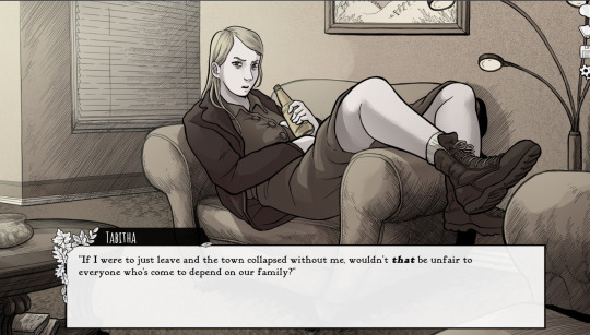
She; as the cousin who is older and has lived in Scarlet Hollow has been groomed by her mother into thinking that all this falls on her and she needs to sacrifice her life and happiness for the sake of the town.
But she's not the only one that believes this. Both Keneeka and Sybil have stated as much. Keneeka makes an offhand comment about how "we're not even a real Scarlet like Tabitha and this should fall on her" if we give up years of our life in chapter 3.
But Sybil is more....insidious and serious when she says this;
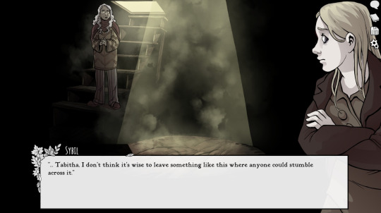
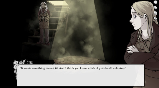
Sybil thinks it's Tabby's responsibility to give up a decade of her life to placate a ghost that was murdered by a Scarlet decades ago. I'm not gonna screencap every time Sybil makes an argument "for the greater good" but if you listen to her all throughout this story, you'll notice she does it A LOT.
Here's one example;
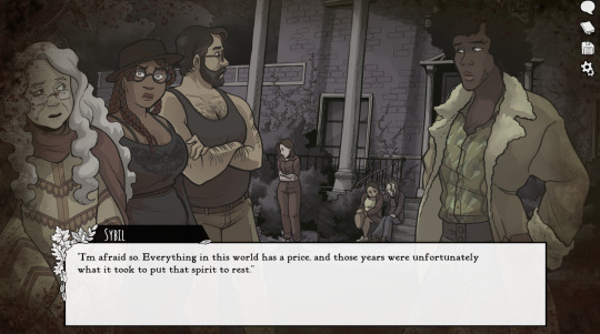
Everything has a price....but would Sybil do something like this herself? Perhaps...but it's more likely she's willing to do something horrible to her own daughter "for the sake of the town". She makes a big deal out of how the people in Scarlet Hollow are tied to this town and how they can't just get up and leave in chapter 2. She's not wrong but it's also obvious she's plotting and hiding information from us.
Which brings me to this; There's a strong possibility that "The Witch" is not merely an ancestor of Sybil but rather Sybil herself. In this scene we notice that The Witch has many poisonous plants...similar to how Book Smart can point out all the poisonous plants in chapter 1 or 4.
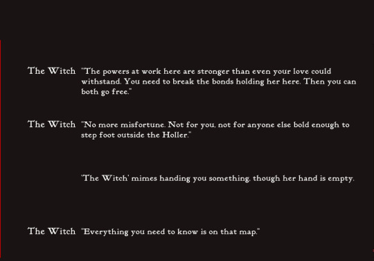
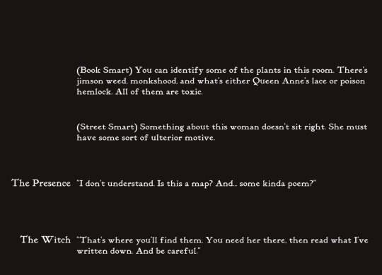
The Witch also sends Charlie on a dangerous mission to uncover the seals...hmmm who does that sound like? In chapter 4 after our tea session with Sybil she tells us to investigate the seals and find out what's hidden beneath them.
More importantly....if you have Mystical or don't drink Sybil's tea you can resist the urge to open the door in chapter 3.
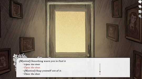
We also learn towards the end of chapter 4 that Sybil is the one who told Dr Kelly to poison her son but we can only learn this if we didn't drink the chaga tea in chapter 2.
So it's pretty clear that Sybil wants two things;
(1) Uncover the seals
(2) Protect the town....even at the expense of others
But something that's interesting is that Sybil and whatever is piloting Sam Wayne's corpse seem to be working together for a common goal..even though the two don't seem to like or even respect each other.
We learn in chapter 1 or 2 depending on our choices, that "Wayne" has been coming by Sybil's tea room. Although it's unclear if the original Sam Wayne did this as well.
Regardless; Sybil tells Wayne she can't help him tonight and tells him to go away. In multiple chapters Sybil refers to Wayne as a drifter who'll be gone soon. She also stresses that we should be wary of him and to steer clear whenever he's around and we'll be fine. It's clear she knows what Wayne wants and most likely knows what "he" really is. She also gets this worried (disgusted?) look on her face if we tell her we're in love with Wayne (sorry no pic lol)

But she also steers clear of Wayne as well and rarely interacts with him and Wayne straight up threatens her if we choose to give up years of our life.
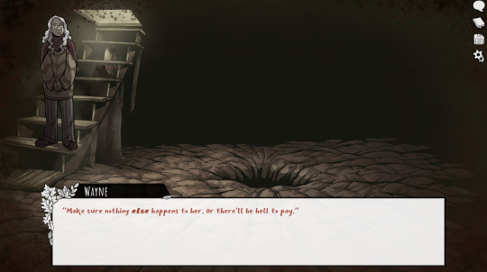
So why this hostility? And why do I think they might be working together?
Lets talk about those boxes in chapter 4. If you have Keen Eye in chapter 4 and open the closet you get this;

So it's Wayne that opens these boxes and shifts the doll around. Why? Well at the end of chapter 4 he tells us to investigate the estate and that we might be surprised at what we find. Wayne does this thing where it's obvious he knows what's going on but he won't directly tell us what's happening. He says it's because it'll be better for us to find out ourselves so "we can know who to really trust".
In other words; Wayne believes that once we uncover everything we'll be on his side. He's pretty confident about all this and I'm unsure how much to trust him; given that he repeatably bad mouths our friends and suggests we abandon them to save our own skins.
But I'm getting ahead of myself. Why did Wayne open these boxes? Did he hope to find damming information against the Scarlet's? I find it hard to believe that Tabby has that pushed into the front of our closet but maybe she doesn't know it's there? And why didn't he put the boxes back in place? Almost as if he wants us to open that specific box.
What if...Wayne planted something there? Or maybe he took a piece of evidence and hid it? I think option 1 is more likely considering he seems to be isolating us from our friends.
I believe Wayne is working with Sybil to make sure Tabitha is the one to pay for all the crimes the Scarlet's did and insure that we are unharmed. I don't think Sybil cares too much if we get hurt but I also think she's of the belief that it's Tabitha who should be the sacrifice not us. Tabitha is the only one that Sybil agrees on being "The Cat" in episode 4. Sybil pushes you to distrust Tabby and perhaps Wayne planted something there to make us distrust her too.
Look at this interaction between Wayne and Tabby during the haunting;
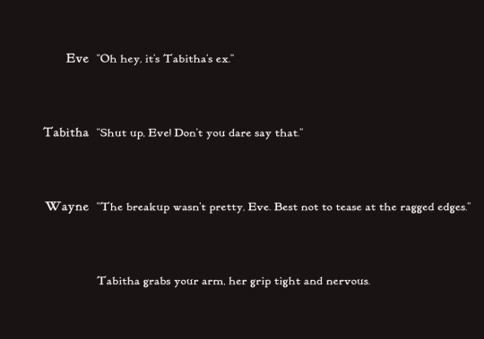
He says this if you deliberately taunt Tabitha but I don't believe he's being sincere here. It sounds like he's mocking her in a subtle way given what he says in another option;
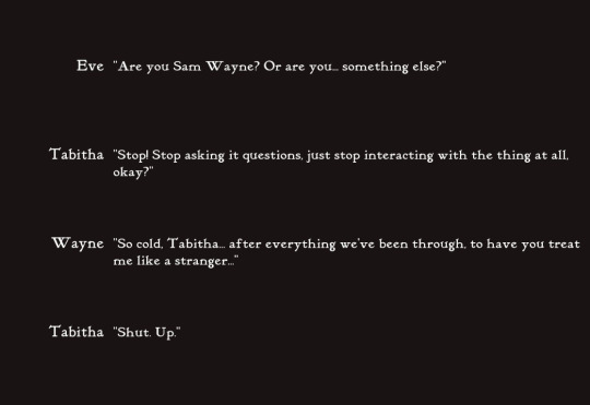
So far Tabby and Wayne haven't interacted much but imo it appears that Wayne enjoys taunting Tabitha and rubbing her ex's dead body and their failed relationship in her face. Pretty nasty but Wayne is pretty nasty to a lot of our friends.
Either way; Wayne is very invested in making sure we're safe and he gets pissed if we sacrifice ourselves and this is the only time we see him have any kind of emotion.
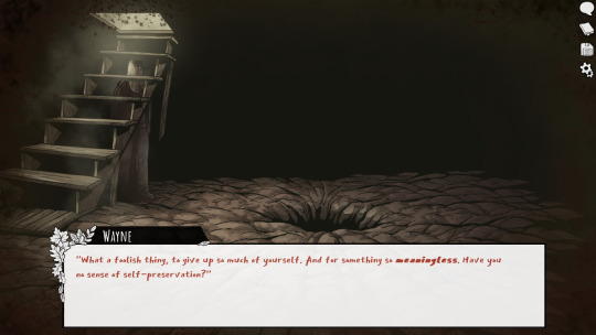
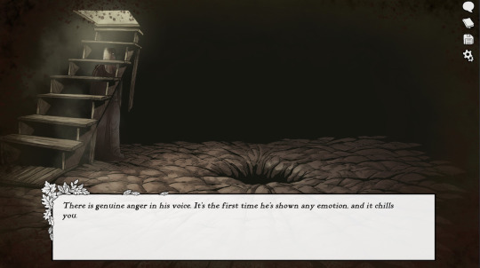
So what if he's so intent on keeping us safe he wants Tabby to take the fall for whatever skeletons are in the Scarlet's closet?
There's also this theme of the heir to the estate sacrificing their younger siblings or others to keep themselves in power. After all; Enoch sacrificed Teddy for power.
Tabby may be older than us but she's not the child of the heir, that's us. Vivian was supposed to be the boss of the mines but she left after she discovered she was pregnant.
I believe the Scarlet's have a history of having one side of their family rule while the other side gets used as sacrifices for whatever is cursing this town. Wayne wants to protect us from getting murked and Sybil is willing to do whatever it takes to ensure the people of the Holler can keep living their lives.
And let's face it; most of the town believes Tabby is to blame for all of their problems. She isn't sociable, she's blunt, she's isolated, she's alone....the perfect scapegoat?
#scarlet hollow#scarlet hollow theories#sybil forsyth#wayne scarlet hollow#tabitha scarlet#if some of this sounds off or all over the place just know I'm tired and wrote this without checking my spelling or whatever#no first draft I die like a loser#black tabby games
85 notes
·
View notes
Note
I am obsessed with the way in which you draw Dean. You have his features nailed to perfection - somehow your Dean looks even more Dean than Dean in the show, because you exaggerate everything that makes him HIM. It's truly breathtaking <3 Any advice on how to get those features so flawless?
This is so so nice, thank you so much 😭💕💕💕
Honestly Dean is like my go-to thing to draw basically, and has been for many years, like I have to try to refrain myself from just drawing Dean again sometimes. He's like probably half of how I've learned to draw at all. So there's definitely practice there.
That said, I did not immediately have much of answer to this. It's like, his face is just his perfect, beautiful face, and then I try to draw that. 😅
So I drew some Dean to figure out what it is I do, so thanks for the excuse to draw more Dean lol
Extensive answer under the cut
If you're drawing something realistic from reference, for Dean you kind of have two options, you can either get a screencap that's closer up so you can see details better, but the top of his head is cut off, or you can get one where you can see less details but his whole torso is in frame. It can be weirdly difficult to guess at where the top of his head is sometimes, and you don't need details to capture a likeness, I think it was Sargent that said that the shape of the head is actually the most important aspect in capturing a likeness, so it's something to keep in mind. On the other hand, if you want to look at his pretty eyelashes while you draw him, you might want something closer up. (An understandable impulse).
Another thing is just to look for a reference that you really like, contrasty light and shadow are also great to look for. It's difficult to create a great drawing without them, but also it will illustrate the structure of his head best too. Look for shadow shapes you want to draw. If a reference is too dark (as it often is, because it's supernatural), edit it so you can actually see what you're drawing lmao.
I took a bunch of random screencaps of 11x02-- as random as I could, normally I'd just take screencaps of what I already kind of like, but I tried to just get all of it so you can see what I'm not choosing. (also couldn't help taking some cas ones when the lighting was going really hard)
I love a profile, I love a 3/4 view, I love when his eyes are like half open. His face was kinda giving towards the end of this episode.
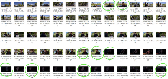

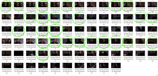
Hopefully you can see them well enough. The mass ideas are more important for picking at impactful reference, but ofc I'm also trying to avoid any where he's making a dumb face or it's blurry. Sometimes that's only evident when I open it bigger, but that's okay, we have a bunch to pick from.
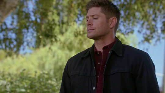
a. This one is one I picked out because it's an interesting angle, and I'd definitely do a little study of it, but because the lighting is so soft, it probably wouldn't be super interesting.
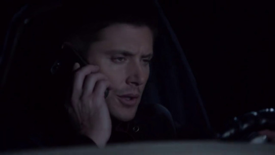
b. I like this one, the face he's making is hilarious, and I like the rhythm of his hand, but if I were to draw it, I might draw a fourth finger, otherwise it might look strange. So keep that in mind too, if it looks odd in the reference, it will look odd in the drawing, so unless you're confident that you can effectively change it, pick a different reference or find a second reference to help you change it.
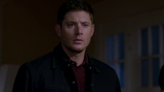
c. This lighting's more dynamic, and I like his expression.
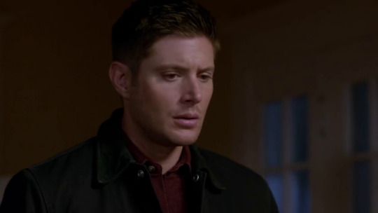
d. Would be hard to pick between these. This one's 3/4 and has a nice eyelash shadow, and I love the shape of his eye when it's downturned.
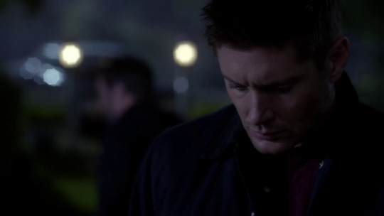
e. Shoutout to the shape of Jensen's brow when he looks down gotta be one of my favorite genders. + subtle Rembrandt lighting. Lovely.
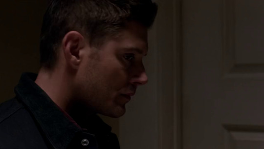
f. This one is so good. Overhead lighting getting a shadow from his ear in a sideview, defining the jaw in an interesting way. Great expression. It's a bit strange, the way he's looking to the side, so it might be hard to draw convincingly, but would be worth it if I could do it. The shadow from the hair defining the shape of the brow. The light on the cheek defining the slight eyebag. The reflected light under the eye, the light landing on the nose. Would probably change the hair a bit because it looks a bit odd at this angle in this lighting, and if drawn like this it would probably look at bit block-like.
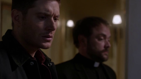
g. More rembrandt lighting. Shoutout to the shadow that this upper lip casts on his lower lip. Shoutout to the shadow his lower lip casts on his chin. Shoutout to the line of light defining his neck. Shoutout to the shape of his brow and forehead.
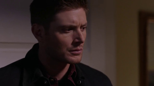
h. The rhythms here are chefs kiss-- the shadow line diagonal from the corner of his hairline to the corner of his brow echoed by the shadow line diagonal of his cheekbone, then that second line following through to the line of light on his neck that curves the other way.
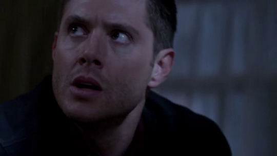
i. This one's kinda boring wrt lighting, but it's an interesting enough angle to do a study of.
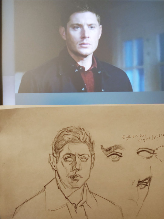
I'm going with screencap c because it's gonna work well to effectively illustrate the basic structure of how I construct his features. It's not directly straight-on, so the form isn't lost, but it's straight enough on to properly show our proportions.
For supplies here, I'm just using a soft charcoal pencil, I just use the kinda cheap ones (currently Markart) cause I actually like them better than General's. And it's on smooth newsprint. I just get it in a big thing of 500 sheets. Not archival but it's a cheap thing that's incredibly enjoyable to draw on. Pink Papermate eraser and a kneaded eraser. The pen I use at one point for some reason is a red Pentel RSVP ballpoint I think, although I actually prefer a Bic.
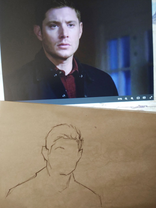
1. So first thing I block in that main shape, in this case, his head and shoulders. I also have to draw in the hairline at the same time, cause I can't figure it out otherwise. He's got kind of pointy ears. The collar of his jacket often comes up pretty high on the back of his neck. He's got a distinctive hairline that I think can go a long way to showing it's Dean, it's worth taking note of. It swoops to our left, and then the corner (I guess?) of his hairline will line up with the corner/arch of his brow. And don't draw the hairline as an unbroken line, but several lines with some room to breathe. His shoulders are pretty straight and broad, but about three heads across which is pretty normal.
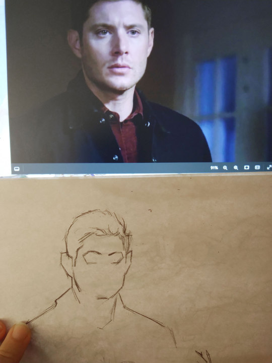
2. Next what I think about is the shape of the eyesockets and the line of the brow. This bit will go a ways for conveying Dean's expression, because he has a wide range from light and happy to horribly scowly that's in the brows. You don't have to define the exact line of the brow at this moment, blocking in the general line is fine just to have an idea of where it lands. You can go back later and refine it. I also find where the bottom lid lands. In my brain it makes a shape like what I've drawn. I might not draw it just like this, but even if I don't, this is the shape I'm thinking about. The line from the end of his eyebrow to his bottom lid is a fave, sometimes you can see it on him, especially at an angle, and it's real pretty.

3. Next I find where the bottom of his nose lands, it's about double the length of the eyesocket. And the line under his bottom lip, about halfway between his nose and the bottom of his chin. These measurements are pretty average measurements for a face. I didn't give myself enough room for his chin initially, so I moved it down to fix it. Also adjusted his face very slightly wider on the right side, cause it's looking a bit narrow.
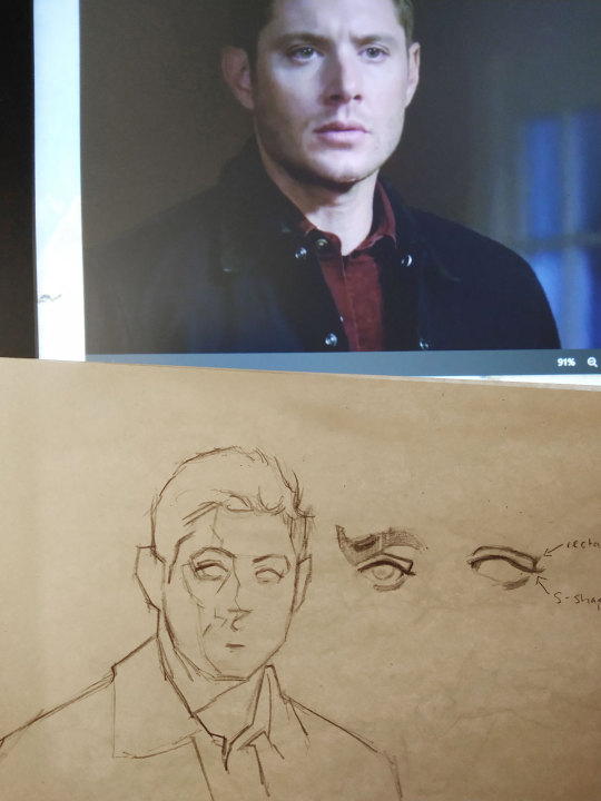
4. I added some of our shadow shapes. This is where finding a reference with well-defined shadows will be very helpful. And I sketched in the clothes cause why not. The clothes don't have to be perfect, who cares, Dean's collar is not our point of interest lol. The shadow on the neck will probably be slightly curved because of the roundness of the neck. If it's not, you might want to make it curve slightly anyway just to help define the form. I blocked in where the eyes are.

eyes: For Jensen's lovely eyes, they have a specific shape that is so nice to draw, especially at certain and angles and with certain expressions. But basically the top lid is more angular and can be almost boxed off at the end, and the line from the corner of the eye to the lashes is an s-curve that's higher in the middle. Again, not unusual features in drawing a face, but such pretty examples. The shadow that his lower lid casts (or his makeup idk?) is often dark enough to look vaguely like eyeliner. Jensen's lower eyelids, an underrated part of Jensen. His eyebrows are thicker in the middle and sparser on the ends.
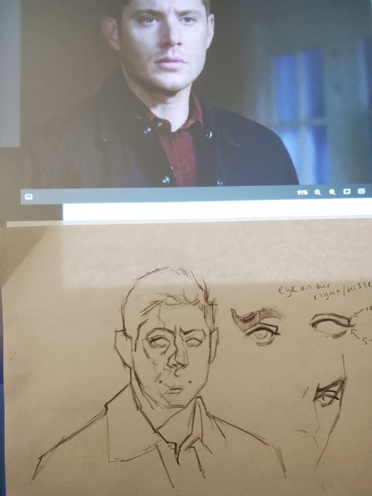
5. Next I found the corners of the lips. This is an important aspect in the way I draw mouths. Sometimes I just draw them with dots where the corners of the lips are, a curve where the lips part in the middle, a shadow under the bottom lip, and the curve of the cupid's bow. (This is seen below in 6) I think I also adjusted the bottom lip shadow here. Straight-on, the middle of his lips is slightly higher than the corners, but of course, this will change when not straight-on, depending on if we're looking up or down at his mouth. I also sketched in the nose shape. The ridge of his nose has a nice subtle bump, and then the ball of his nose is very slightly squared off I think, from a front-facing perspective, I feel like. And I drew in his slightly drawn brows. Just pay attention to the angles in your reference, because the expression, the perspective and the angle of the head can impact it. But of course generally, drawn down in the middle, furrowed = scowly; drawn up, unfurrowed = happy.
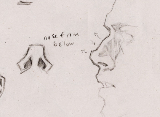
nose: I prefer drawing his nose in profile. And who wouldn't, look at it! The slight curve of the bridge and then the ball of the nose. I will exaggerate this a little sometimes, just because it's fun and I like it. I couldn't find a reference, but from below, you can see the shape of the bottom of his nose, it dips in the middle a bit more than average. Drawing the bottom of the nose is often a delicate balance between shadow and reflected light. I love keeping it light, save for the nostrils, but then the shadow under the nose can be important too. Sometimes it's just a stylistic choice. Note that there's a plane change between the side of the nose and the cheek. (I think I drew his nose too upturned here, but the general idea is still there)

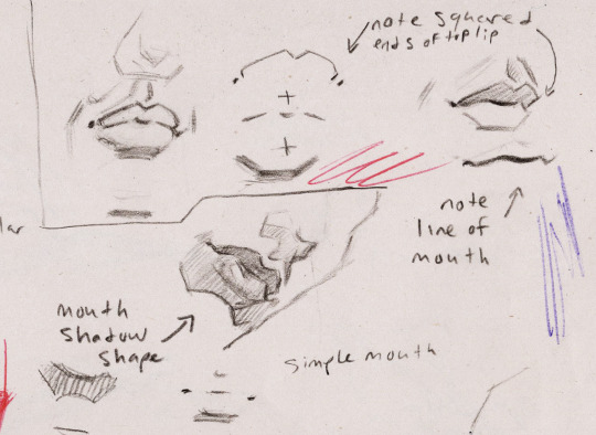
6/mouth: In drawing the mouth, the top line of the upper lip looks more rectangular at the ends, increasingly so as it turns away from us, and much less so as it turns towards us. Of course, he has a full upper lip that you can shade as you like. I try to keep it distinct from the shadow of the line of the mouth, and a reflected light on the top lip can be good here too. For the bottom lip, it's always nice to give is some shine with a hard-edge highlight. For the cupid's bow, I try to leave a light between the upper lip and the shadow in the cupid's bow. For some reason I drew the shadow backwards here, but I think it looks fine.

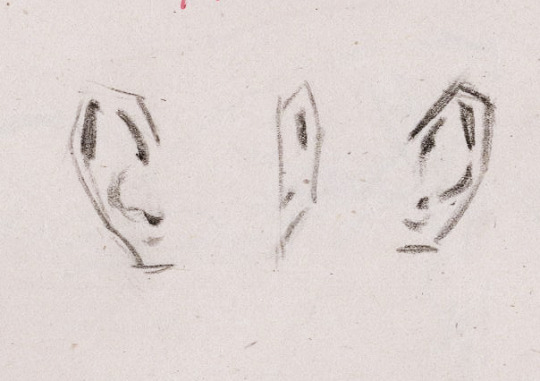
7/ears: I started to shade it, and then I remembered that he has ears. There's a simplified way I draw ears that I like. It's not entirely accurate, because the two shadows at the top are actually usually connected, but I find it a bit distracting that way sometimes, so this is more subtle I guess. In profile, I don't really have a method of drawing it, I just draw whatever the reference gives me or bs it with a similar version of this, depending.
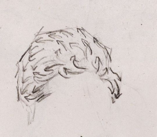
8/hair: My method for drawing his hair is 1) suffer 2) hope and pray. I like to leave a rim light-type deal between the contour/outliine of the hair and the rest of the hair, I feel like it helps define it a bit more. The direction of his hair, and thus the direction of my lines is something like this.
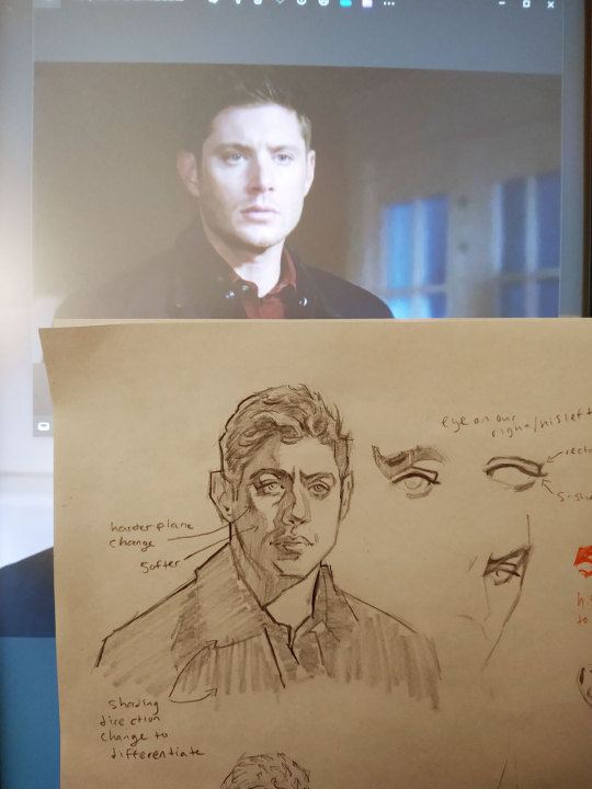
9. And then I more or less just shaded. When shading, it's always good to follow the direction of the plane, and I also alternatively like to shade in the direction that the light is falling to reinforce that gesture, but when I shade a face, I try to shade in the opposite direction of where wrinkles would go, if that makes sense, mostly up and down I guess. This is of course on a case by case basis, like a lot of times, I'll do the forehead horizontally anyway, but it's especially touchy around where the laugh lines of the mouth would be and the neck. And on soft plane changes (and softish hard plane changes), I often shade at a different angle to the main shadow. Shading direction can also delineate different areas of similar tones, like I did with the jacket and the side of the nose. I like to give Dean his eyelash shadow, because he deserves it. I also drew in the eyes, of course. I think I actually tend to shade them backwards, and the light would fall in the opposite direction, so when lit from the right, the right side would be darker, but I just don't draw it that way idk maybe I should.

And there he is, that's our guy!
Normally when I'm drawing, I'm definitely a bit more all over the place, and don't necessarily do things in perfect order. And it's good to move around. I'm probably not going to be shading things before noting where all the features are going to land, but I often am shading something before I've drawn everything. Or end up drawing one eye and then maybe do part of the other and then move to do part of the nose and then sketch in an ear and then maybe notice something's off somewhere and adjust that, etc. Just go with it, have fun, he's got a fun face to draw! 💗
#ask#art tutorial#if there's one thing I can talk about forever!!#dean winchester#my art#portrait drawing
94 notes
·
View notes
Text
ep 24 commentary (brain fried edition)
my head is a little empty after ep 24 tbh!! brain is not braining after all the zyc hurt no comfort (-:
some scattered thoughts here and there, painstakingly corralled like cats out of my vacuous brain and into a list (spoilers):
ZYZ is really emo this episode poor dude like he is having a hard time keeping it together it seems. Every other word out of his mouth is depressing as shit, which is saying a lot considering how depressing he usually is already (': I kind of wanted this episode to pick his brain more, give him room to emote in the aftermath of all that. But it almost feels like the character refuses to be alone, like he might spiral if he has too much time to get in his own head. I'm still so curious to know, though, what he thinks about the state of their promise in light of how far ZYC went trying to save him. “He has us,” ZYZ said to WX. When the time comes, I wonder how he'll reconcile that with what he’s asked of ZYC.
PSJ and Ying Lei bonding! shenanigans! I did laugh thank you guys. Also, not that the team didn't operate separately before, but I really get a sense of how much ZYC held things together with how apparent his absence is. It's obvs heartwarming seeing how hard everyone is working to save him (PSJ especially for me bc I love their mutual tacit trust and respect and all the ways they're alike and different), but ultimately it's still so angsty (':
Kind of love the couple instances where ZYC has been referred to as fragile/weak/of delicate constitution (depending on how you wanna translate it) like that's a very interesting quality to assign to basically the tank of your team. Even if the comments are made facetiously, it just reminds me of how often we witness his mortality, and of course how everything about the styling, aesthetics, and content of the flashbacks to his childhood reinforce a characterization of vulnerability at the very heart of him. I saw someone mention how the Cloud Light Sword responded to ZYC's tears and to that vulnerability rather than brute strength, and I totally agree. I love how this "fragile" characterization plays into the whole fate weapon deal. ZYC's strength is (imo) unconventional, and it is his sensitivity, his compassion, and his deep capacity to feel that the sword acknowledges, resonates with, and empowers. Almost like it protects his tender heart rather than making it something he needs to overcome to get stronger.
One thing I will never get over is how incredibly they styled TJR as baby!Yichen, adult ZYC, and Bingyi. What do you mean this is all from one drama and not three separate productions. Insane. I'm out of my mind with how gorgeous every change in costuming is.
A tangential note is I've seen people mention (paraphrasing very much here) ZYZ's demon form being nicely subtle in its eerie inhumanity and tbh I have a similar feeling even just about human adult ZYC imo. Especially when his hair is down and he's got that thick eyeliner on and we get a close up of his contacts, if you told me from the start that he's half-demon half-human or something I'd believe it. Along the same vein, baby!Yichen reads completely human to me, and Bingyi of course completely demon. Something something the Cloud Light Sword bridges the gap something. This point is unintelligible and not narratively based but I had to make it because I've been thinking "wow ZYC elven" for days now.
Saw a tag about yuanyi getting us through some dark times but man they are PUTTING me through some dark times rn help?/
Been trying to put off talking about the baby Yichen scenes because wow I cried immediately. Well, no, I was like "yay! I love seeing baby Yichen!" and then they crushed me into demon dust lol. And then WX had to tell that absolutely precious story about when she got sick and ZYZ had to go like "actually ZYC was probably lonely as fuck" and yeah that's fine I didn't need my heart anyway.
Ending on this point so I can put a pretty screencap here: There is so much gravity to just the short scene of Bingyi removing his mask and dropping to his knees with that anguished and fatigued expression. TJR's acting is the gift that keeps on giving (me angst).

so sorry if anything here didn't make sense, i currently have the same thousand-mile-stare as Bingyi the more i think about how this all might end and how long I'm gonna have to wait to find out.
#fangs of fortune spoilers#fangs of fortune#sorry this is late!#i started writing this after i watched the ep this morning but then i spent the whole day showing my partner the first six eps#zhuo yichen#tian jiarui#episode commentary#meta
26 notes
·
View notes
Text
Devilish panels from Soul Eater post chapter 6
#soul eater#soul eater post#manga panel#screencap#comic panel#soul eater evans#devil#thanksgiving dinner be like#i guess dont have that where I come from lol#warioware reference?#nah#that comes later#if I dont change my mind#chapter 6
0 notes
Text

blender lighting tutorial + tips.
requested by @thecrimsonsimmer + recommended viewing: youtube video one, two, three, and four. this post will be dealing with newer versions of blender (2.8+) and cycles since that's what i'm more familiar with + commonly used for rendering. this is coming from me as an artist with some dabbling in photography and things i've learned in college!
references and setting the mood
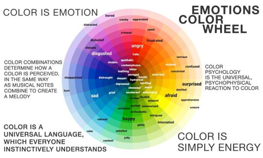
are you basing your render on an existing photo? study the light source and what direction it's coming from: that's what's going to tell you your set up for a similar effect. if you're not basing it on an existing piece, a good start is knowing How you want to set your subject (your sim) up - do you want them to be in the spotlight? are they in a specific environment that has neon lights? are you going for moody or something fresh, bright? definitely look up colors and their meaning (color theory, movie screencaps, etc.) to create a stronger image!
using resources to start the set up
it's always a good thing to mix your tools with different communities, such as the art community! many have lighting tools to figure out how to color their subject, such as this free-to-use head figure that depicts where the lighting source should be placed.

there's also the photography community and teaching people how to set up their lights for certain setups. video three and four linked in the beginning are from photography viewpoints.
spot? area? point? sun?
let's think of the lighting types as objects - a spot is like a plain lightbulb, area is a reflective sheet, spot is a flashlight, and the sun... well is the sun!
a spot is similar to an area light, but triangular/a cone. think of a helicopter search light, it's focused on a small area with the most light concentration. these can be used for lamps with lampshades, car headlights, or a lighthouse.
an area light is great for lighting up technology. a phone screen, tv screen, tablet, anything that's an LED screen emitting from a surface. the light is not as concentrated as a spot and is meant to cover more flatly (hence the rectangular source)
a point is best used for small pops of colors such as candlelight, lamppost, lightning bug tail, etc. a small source that has nothing covering it.
a sun covers the entire area and can be used as the overall mood setter. it can create filter over the entire render by just shifting the color like you would see in a movie. you'll be given a line with a sun light that gives the direction of where the sun is coming from. basically a spot light just on a much larger scale LOL.
power + coloring

this screenshot is mostly what you'll only use to start off with. watts is the unit of measurement and the higher you go, the brighter the light will be. examples with a white colored point light 10W-20W: general portrait lighting 30W-50W: bright source, close flashlight for example 60W+: blinding

coloring is just like the system for in game lights for ts4. shift it to whatever you want it to be (click the white bar, that's the color preview) and mess around with the vibrancy. the darker, more intense color, the less it's going to appear on the sim.

closeness and intensity
similar to what's shown in the head lighting tool shown earlier, the closer the light is, the more that specific area is lit up. go too close and your sim could be completely washed out. it helps to change the size of the light (change with the radius slider) to better imitate what you're wanting. the larger the radius, the more diffused and softer the light source will be. close + small = very clear of the light source shape, can obviously tell where it is in relation to the subject far away + large = soft lighting, more of a hazy lighting of the color you choose.


to quickly adjust the light, press "G" and hold down your middle mouse button to adjust which axis you'd like to edit along. green is the x-axis, blue is the y-axis, and red is the z-axis. you can also press "G" and type the letter of the axis you want to use. drag the mouse to change the placement on that specific axis to however you want. if you want to freely edit the placement, just press "G" to move it out of the axis bounds.
world lighting
take this step as setting your canvas color before you start painting. in order for the values to look their best, change the world color to the same hue of the color you are mostly using. for example, this is set in a red-toned environment:


this is essentially changing the cast shadow onto the sim. the default is gray and will muddy up your undertones if not changed properly. for this instance, if you were to still use the same red point light in a gray world color it'd look like this:

of course, this will be based on if you have an environment image or not that can affect your lighting overall. this post is based on the fact there is no environment image and what not! if you need a visual demonstration on how to mess with the world lighting, check out this short video.

i hope that helped anyone beginning to render or wanting to light up your own scenes! i'm no rendering expert, but here's some of the helpful tricks i've learned and collected over the years<3 if you have any other questions feel free to send an ask!
#ts4 blender tutorial#sims 4 blender tutorial#ts4 render tutorial#sims 4 render tutorial#lighting tutorial#lyko posts#tutorial#long post
212 notes
·
View notes