Text
Final Reflection & Summary
It’s almost impossible to put into under 200 words what I have learnt over the course of this semester in GRAP2199 but here we go:
Weekly, we moved historically through what has made design what it is today. I have gained a deep understanding of the key movements and periods of communication, first with interpreting communication as a visual code through paintings, carvings or movements like postmodernism. Each theme we touched on challenged us to discover new connections between the history of communication design and our contemporary practices. Pictograms are connected to emojis, grid typography is connected to Adobe postscript etc.
Beyond the classroom, the lectures and readings I have learnt about myself as a designer. My outcome that I wanted to achieve was to learn how to use illustrator and InDesign, I can happily say I achieved this goal. I also learnt how to better my designs with the help of not only historical contexts but from my peers and Bailey.
Missing out on what might have been the most practical of courses was disheartening, but it also demonstrated to me that I have resilience, if I can adapt to moving my whole life essentially into my bedroom, I can adapt to any design brief that is thrown at me, and I can overcome any initial fears to work at my best
Thanks so much to all classmates, Bailey, Karen and Andy for a great semester! P.s Sorry Bailey that my posts are always so long
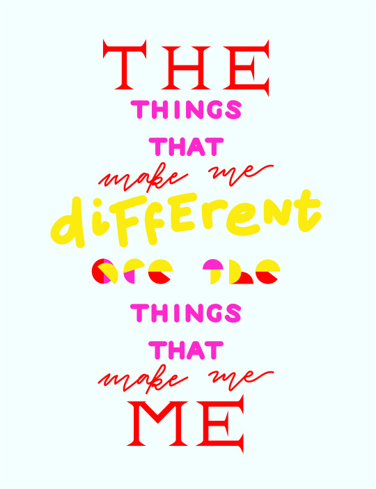
(A piglet quote I quickly illustrated to finish the semester!)
7 notes
·
View notes
Text
Ask Me Anything - Final (ish) outcome
Honestly, I have had a blast making weekly posts tumblr, but the time has come to wrap this assignment up, and post probably my second last post!
I didn’t want to finish the tumblr without showcasing and talking about my Zine, (even though there will probably be some finishing touches and refinements between now and Friday).
Below is my 8 page zine, with 6 double page spreads and a front and back cover. I have come a long way since I started the zine, even though I am still not 100% convinced it’s my best work, there are elements I really like, like the notebook back-cover from Microsoft bob help messages and some of the illustrations.
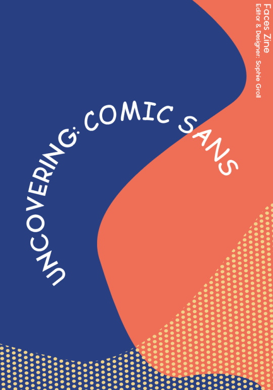
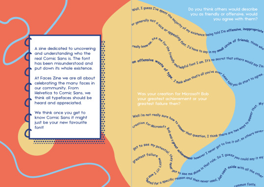

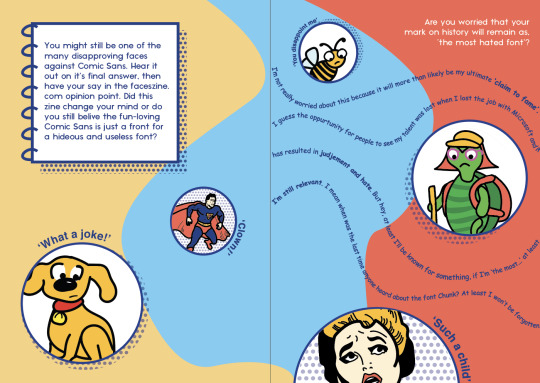
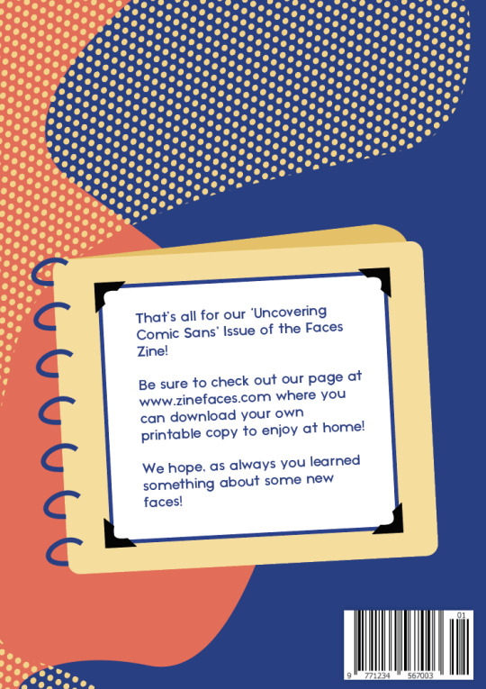
Adding small hints to the origins of comic sans, to allude to its success in fulfilling those criteria helped me add texture and more interest into the zine. The inclusion of ‘extra information’ boxes has also helped the overall feel of a publication I think (I might need to add some more historical info into those).
Through this project I have learnt not to let fear of failure get in the way of starting something. If I had begun the rough design play earlier, I would have had even more days to keep coming back to my work and refine it. I have also learnt that it’s ok to ask for help, it’s ok to ask the tutor when I’m stuck or ask peers for feedback - It always sparks new creative ideas for me.
#finaloutcome#wrapup#zine#digitalpublication#publication#digitalzine#commdesign#rmitdesign#graphicdesign#progress
24 notes
·
View notes
Text
Week 13 Drop In - Check-in & Processes
Luckily we had the option to have a final check-in with Bailey this week. I again was able to talk out some of my frustrations with a small handful of peers and then Bailey gave me some new ideas to move forward again with.
The main ideas from Bailey that really helped me begin to improve the zine were
The middle spread looked too chunky, take the same idea but make it more in line with the ideas on the first and last spread so it fits in
Where the faces in the last spread it is off. The balance of brush strokes and colours doesn't quite feel like it’s working. Also direct the eyes of the faces to the response.
Colourise the screen pattern so it’s not black
At the moment it’s not looking like a zine, so either play into a children’s book theme, or make it more zine like.
After our chat I opened up a blank indesign document and took the elements from my current WIP that I liked to carry across, and sort of started again. The first spread is looking much better now and I’m feeling overall far more confident. I also thought I would share a bit more of my process and decisions, rather than just WIP screenshots without explanation.


The colour scheme comes directly from a Microsoft Bob screen, I wanted to make subtle hints to the origin of comic sans (I am always reminded by the swiss cheese example from a few weeks ago - don’t make connections too obvious)
The bee illustration is in the same illustration style as the Microsoft Bob dog mascot - another subtle hint
Screen tone has been used as a hint to comic books as an influence for the font - the colour scheme also is a hint to comic characters like spider-man or superman.
Playful lines and ‘blobs’ have been used to reinforce the innocence and likeability of comic sans, making it more likeable rather than hated.
The feeling of finally getting somewhere is very nice! :)
0 notes
Text
This quote came up as a suggested quote on my home page when I went to make a post today - I think my computer is reading my blogs and it knows I need some motivation for this final brief.
I think it speaks to something really important that If I start comparing myself to other peers or WIP I see on Tumblr, I’m more likely to not get anywhere with my own assignment because I approach it with a mindset that mine is already less.
So today I spent almost the whole day reworking my zine and I’m becoming increasingly happy with it! (will share some WIP updates later tonight)
You are unique. You have different talents and abilities. You don’t have to always follow in the footsteps of others. And most important, you should always remind yourself that you don't have to do what everyone else is doing and have a responsibility to develop the talents you have been given.
— Roy T. Bennett, The Light in the Heart
3K notes
·
View notes
Photo
I love the direction these are going in so far! (I think the large one is my favourite(
It always makes me feel better seeing other people are in the same indecisive boat that I am! It can be easy to feel as though everyone is progressing faster with their project than I am


ZINE UPDATE
Still struggling a bit with the design aspect of my zine. The only progress I’ve seemed to have made is making the front cover, and I still can’t even decide on that. Here are a couple of options I’ve designed, I’m trying to incorporate the Bauhaus style and still keep a modern approach.
In this weeks tutorial class we were talking about how Andy and Karen want us to take a more abstract approach on the assignment, and I’m worried mine is still too literal, so I’m gonna have to think of how I can include something that isn’t traditional / something more creative in my presentation.
if u want u can comment your favourite version?? It’ll help me decide (I’m sooo bad at making decisions :) any feedback would be great too!!
19 notes
·
View notes
Text
Intervention #2 & WIP
I have been slightly apprehensive to share any ‘Ask Me Anything’ WIP on my tumblr as I’m still feeling quite unhappy with it. But i decided to give myself an intervention part 2, look at my zine and try see how I could play more with, or implement more design elements and principles.
I made myself a summary graphic of what I think are the most important ones to check my design against.

The progress I have made after this makes me feel better but I’m still not 100% satisfied with the direction it’s going in. The time I took to stop and reflect has made me more open to playing around with the possibilities of my zine and not being limited to one idea.
Again, I’m so happy we get an extension, I’m really happy I get to have more time to explore the composition, graphics and colour and get it to a point where I love it!
There are some WIP screenshots below, I’ve tried reducing the colour scheme and adding some more to it, I also began experimenting with a front cover but that is 98% likely to change quite a bit. Honestly I haven’t worked too much on it, I have been focused on Colour & Info which was due before this (until the due date was extended today).

I also plan to revisit my previous tumblr posts where I outlined the direction I wanted to go in to give myself more inspo and another little refresh!
0 notes
Text
‘AMA’ Intervention!
My starting point for my intervention, beginning today, was visiting the 3 links Bailey provided to us as sources of inspiration.
The 1st stop was Printed Matter (https://www.printedmatter.org/) a database of book, digital publication, posters etc. Even just scrolling through the ‘books’ tab was helpful in seeing covers that worked with more of a simplified colour palette, something I’m hoping to change myself. Two of my favourite examples are below.

1. “Human Shaped Void” by Pat Aulisio - cover of a 51 page staple bound paperback book via, https://www.printedmatter.org/catalog/55245/ 2. “But i thought the old lady dropped it into the ocean in the end”, by Kidtofer, cover of a 36 page sewn bound paperback book via, https://www.printedmatter.org/catalog/55062
Second stop was Mass Art (https://blogs.massart.edu/artistsbooks/). The artist books here seemed to look more muted and less colourful, presenting more historial or vintage looking works, I found less inspiration here but it was still helpful to explore somewhere where I normally wouldn't
Something I’d like to add into my own work is some texture, I found the example below to show how nice I think texture can make designs look...

“Grrrhhhh: A Study of Social Patterns” by Warren Lehrer, artistbook via https://blogs.massart.edu/artistsbooks/2016/05/03/grrrhhhh-a-study-of-social-patterns-by-warren-lehrer/
Last stop was the Guggenheim internet archive, scrolling through this archive in particular it really gave me a sense of how important a more restricted colour palette in my own design will be, I found myself looking at designs that felt less cluttered and more organised. Scrolling through the Guggenheim actually reminded me of the work of Keith Haring, I realised he is a great source of inspiration in that he creates fun but also meaningful designs. They include colour, but thematic and simple, and they are playful and wobbly but still tasteful. All the things I’m aiming to achieve.

Illustration by Thomas hedger, 2018, via, https://www.itsnicethat.com/features/keith-haring-60th-birthday-celebration-illustration-art-040518
0 notes
Text
Week 12 Notes & Tut
I had a really enjoyable class this week, maybe it was because I was less tired this week compared with previous weeks (which is strange because it’s week 12 and you’d think i’d be more tired closer to the end of sem). I have mixed emotions about today’s last formal comm designs class. I'm happy because I'm quite looking forward to the break but it was probably my favourite tutorial of the week, I find it the most engaging and interesting so I’m going to miss that discussion space.
Some week 12 points…
We got a week extension on our zine project! Genuinely the most exciting news all semester, I feel like I really need that in order to get my publication to a standard I’m happy with :)
Still feeling creative block, I feel like my other two projects in other subjects are coming along whereas this one is taking a back seat because I felt stuck
Even though I feel stuck there’s 1 week left so I’m reminding myself ’i'm almost there (and thinking back to the ‘everything will be fine’ balloon from lecture slides
Class Notes & Activities
At the beginning of class Bailey spoke of an ‘Intervention’ - we were encouraged to refresh, pause, revaluate and revisit our designs, previous inspirations and design principles and elements. I really needed to hear this - and I think the photoshop activity we did also reinforced that and forced me to play around with layout more freely, rather than sticking to one design and focusing on small details at this stage.
I have made a little graphic showing the 3 layout iterations I created as well as some of the works from peers that I thought were interesting.

After this we were able to share our various WIP stages as a class which I love because I love being able to share and see how others are progressing too, I find it so valuable to receive comments from not only Bailey, but others in the class (like the ones about my zine from the class chat I’ve placed below)

Overall, I’m now feeling so much better and less frustrated with my current design outcomes, the main points of improvements from Bailey were...
Simplify the colour palette
Play more with layouts that flow across page spreads
Play more with sections of bolded text
Don’t be afraid to exaggerate elements more
And I’m looking forward to applying those suggestions and playing lots more with my design :)
1 note
·
View note
Text
i’m not sure if following a zine page was a good idea for inspiration, or makes me feel a little sad about not making and showcasing zines of our own.
I might make a mini zine as a personal project to fill the gap (once I have assignments finished and more time)
Mini-zine made of my watercolour drawings of Moscow. It is about feeling of loneliness and descomfort and in familiar yet strange city


59 notes
·
View notes
Photo
I quite like this alternative masks shoot that appeared on my home page today - The humour and photography style and aesthetic reminds me of zine humour. If you were to lay out the images on facing pages spreads I think it would make a great quaren-zine (terrible pun I know)

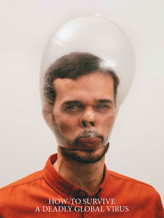

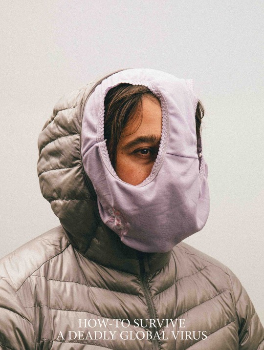


How-To Survive A Deadly Global Virus London-based designer Siedentopf has created original alternative masks for people to protect themselves from the coronavirus.
2K notes
·
View notes
Text
Wk 11 Lecture Revisited
Patterns in Digital Art For over a week I had the Metaflop website (https://www.metaflop.com/modulator) tab open and had forgotten it was there. Since Karen and Andy mentioned the websites Metaflop and Metapolator I have been meaning to have a play around, as I love typography, but I know nothing about type design.
I found the font building process on Metaflop difficult, probably because I didn’t have a strong understanding of the parametrics I was using to build it, but also because I was ultimately limited by the what the program allowed me to do.
While it was fun to play around with and I came up with two interesting fonts, I would have loved to be able to create a more playful, rather than structural looking font.

This caused me to revisit my week 11 lecture notes and I immediately had a better understanding of my notes. When Karen stated “we moved into a hybrid state between a material world and a digital world” I though this was an interesting concept, but it was only after having been on metaflop that I could really understand the move of human to computer - I think we have come a long way with technology but there is still something to be said for handwriting and the manual creation of typefaces I think.

Ultimately, even though it’s a ‘make your own font’ website, it will always be governed by a system of rules in its program or software, something that the freedom of brush strokes or handwriting has over digital technology I think.
0 notes
Text
Zine Graphics & Composition Layout WIP
I was really looking forward to the week 11 class as it offered an opportunity to check in with bailey and classmates and get some much needed feedback!
I’m still feeling a bit of creative block and a little bit stumped on how to go about designing these 8 pages of my zine, but I’m definitely feeling better than I was before the class. I shared an inspiration pdf and my classmates and Bailey seemed to like the ideas, Bailey pointed out while it’s fun and playful and she likes my direction, I have to make sure to play with the playfulness in other ways, like the font widths or the ‘wobbliness of the font’.
The two pieces of feedback I received that were most helpful were
- maybe the answers are wobbly and curvy, but the interview questions are straight, to highlight the quirkiness of Comic Sans vs other fonts
- The answers should be in Comic Sans itself, (what other font would it answer in after all?)
This feedback helped my initial text layout to develop and look a little less lost (left to right image below)

The colours in the bottom right are some basic playful and fun colours I’m experimenting with at the moment, AND they have all actually been picked out of Microsoft Bob, the original program Comic Sans was created for. I though this was a clever little way to add some deeper meaning to the design of the zine

Overall I’m still feeling quite overwhelmed by the thought of this assignment (especially with major assignments coming to a close in the other two subjects), I’m not sure I trust my creative abilities just yet - but I’m trying to push through the fear of it being crap, and just keep developing and keep experimenting and hopefully will end up with an outcome I’m happy with :)
1 note
·
View note
Text
Lots of Week 11 Readings
Even though this week we had 6 long readings, I have read and taken notes on every other reading. It couldn't not read them. I have been slowly making my way through them over the weekend. (I have still only made my way through 4/6 readings so this post is not a summary of all of them)
The first reading I read was ‘Generative Practice’ which helped me to better understand both week 10 & 11’s lectures. I will summarise what info helped me to connect with the topics better below...
Generative systems allow a range of possible outcomes, they usually combine a range of forms into one outcome, making their complexity one of their defining features (this is true to the complexity of movie barcodes for examples, a range of average colours combined into one image)
It could be defined as “Art where the artist gives partial control of their productive process to some kind of autonomous system” (Leonardo Solaas)
Or as “the various possible forms of creative collaboration between human and non human”
I think I’m able to connect with the second definition better, and I think it is more open to the fact that really, every artistic process has a certain degree of autonomy e.g a pottery wheel or printing plates.
Trying to find some more practical examples of generative design working well (beyond inspirobot) I came across AutoDesk’s work with VW to create lighter and stronger structures for their classic van. They described the process as “human engineering combined with artificial intelligence” and claims it has revolutionised the way they work. I have the link to a great video explaining it, and some screen-grabs of their work.

Video: ADSK 2019-01 VW Bus Generative Design V07
The next 3 readings I tackled (‘M/M Interview’, ‘Interview with Lucienne Roberts’ & ‘Please, Eat the Daisies’) discussed what Design is, what Design Art is and if Design and Art can work together as one or do they are inherently different and opposing.
These three readings all displayed very strong opinions so it’s hard to present any facts here, I think it is best displayed with some quotes, first from M/M Interview
“Design is omnipresent and fundamental in a way art is just not”
“Michelangelo was not the artist we think of him today as, but more of an artisan”
And then from ‘Interview with Lucienne Roberts’,
“Design should change people’s way of thinking, not just their opinions” (I really like this quote)
I think the M/M interview quotes display a much more closed minded view on the art and design practices and I think I disagree with how dismissive he is of art, especially when people often lump art and design together as one.

(I think i’m back to really long tumblr posts ooops)
0 notes
Text
Love all these posters! Was really awesome and helpful to see lots of WIP graphics from today’s tutorial - always inspires me to keep working on my own ideas and reassures me people are in the same boat as me :)
Assessment 3 - poster development Q4
My fourth question asks, “Do you care about us?” I wanted to highlight the opinion that propaganda manipulates its audience for gain to the government or political leaders, not for the good of the people. It especially excludes minorities and foreigners in its imagery. I decided to create a poster that shows a figure which the government may consider as a minority and present them as the hero of the poster along with the answer, “Only true citizens!” I took an illustration by Emory Douglas drawn on a Black Panther Movement poster and aded it to my own modernised design, in a similar style.

4 notes
·
View notes
Text
Wk 11 - What’s Next For Design?
Just a short recap for the lecture this week as I’m focusing on the 3 major assignments across all subjects.
The week 11 lecture followed on from week 10, discussing why we design and how it can assist society. A transitioning of these ideas came with updating technology saying that we could find meaning via the new technological tools available. There are examples of this movie barcodes, inspirobot and thispersondoesnotexist.com. These examples of generative designs highlight the move from human led design to computer or technology led, something that I think is often obviously really helpful, but that also sometimes halts us from being as creative as we can be.


Are we the one’s choosing what we design or is there already so much inspiration out there and help from programs that nothing is really original anymore?

(the first ‘inspirational’ message I received from Inspiro Bot....)
Movie Barcodes Via, https://moviebarcode.tumblr.com/page/4 Inspiro bot via https://inspirobot.me/ This person does not exist via https://thispersondoesnotexist.com/
1 note
·
View note
Text
Wk 10 Lecture Notes
What is design for? It merged into Art language and Conceptual Art, the art you would make if you were to make it and these works had a heavy reliance on words, this led into a discussion on Fischli & Weiss’, ‘How to Work Better’ Mural, in 1991.
To be honest I don't understand Conceptual art too much, but I do know I really like this artwork, and the fact that it is considered an artwork not just a mural or not just vandalism.

Image via, https://www.twago.com/blog/how-to-work-better/, 2016, “How to Work Better”
The following discussion on art activism was easier for me to engage with. My favourite example of this is Ken Garland’s ‘First Thing’s First’ in which he is frustrated with the primary reasons for designing. His manifesto asks for designers to design beyond the means of profit and marketing. He was angered that design was overlooked as being something to benefit society and only viewed as something that needed to make money. This is something I totally agree with and I share his outrage. Below I found a redesign of his manifesto.

Image via, https://thicreative.com/first-things-first-manifesto, “First Thing’s First Manifesto”
I guess this leads into art activism exemplified by Benetton’s Colours Magazine campaigns speaking to prominent social issues in a new bold and open way.
1 note
·
View note
Text
Comic Sans Aesthetic
The overall aesthetic of the pdf zine is coming together - I am thinking of combining the “comic sans aesthetic” with a more sophisticated and playful visual interpretation of the comic sans aesthetic.
I found a few more examples of how comic sans can be useful, reinforcing the fact that comic sans is a misunderstood font.

Image references
Cvijetic, Marko. "Portfolio Page // Comic Sans Challenge / UI Challenge — Week 08." Dribbble. N.p., 2016. Web. 16 May 2020.
Grubisic, Hrvoje. "Comic Sans — Weekly Design Challenge." Dribbble. N.p., 2016. Web. 16 May 2020.
Meir, Dana. "Why People Hate Comic Sans (And Shouldn't)." Wix.com. N.p., 2019. Web. 16 May 2020.
Poffenberger, Travis. "Behance." Behance.net. N.p., 2013. Web. 16 May 2020.
Strizver, Ilene. "The Story Behind Comic Sans - Fonts.Com | Fonts.Com." Fonts.com. Web. 16 May 2020.
Ulmer, Ash. "Ash Ulmer Design." ash ulmer design. N.p., 2020. Web. 16 May 2020.
1 note
·
View note