All kinds of interesting stuff on GIS and Asset Management. please visit http://www.realworld-systems.com for more information.
Don't wanna be here? Send us removal request.
Text
GUI Testing using MUnit in Smallworld
In Smallworld development it becomes, increasingly more, common practice to use MUnit for automated testing. Advanced teams plug MUnit into Jenkins to create automated continuous integration.
One of the remaining challenges is testing the graphical user interface. Sure there are many automated GUI robots out there that simulate mouse events and use OCR for result validation. But in reality this is often very tedious and error-prone work. Changes to the software can easily break the test and require a new recording session.
Presentation Model
A promising solution is the so-called Presentation Model design pattern.

The three parts of the pattern define the behavior of a graphical user interface.
The Presentation Model holds the state and defines the logic of the GUI. For example the presentation model determines if a control is enabled or disabled and it executes the actions of the controls.
The Dialog defines the layout of the GUI and the visual aspects like size and position.
The Engine holds the business domain knowledge and actually performs the tasks the user is interested in.
This pattern becomes interesting for testing if the binding between the Presentation Model and the Dialog is very strong. If the binding is strong then validating the Presentation Model also validates the Dialog!
sw_action
Luckily such a strong binding is available in Smallworld: the sw_action. The sw_action is an abstraction of a gui control and is created without a GUI. It can be executed, assigned a value, assigned a list, assigned a picture, etc., all without a GUI. The state is handled in the sw_action object and the execution is done by the engine that is assigned to the sw_action. Controls can be bound to the sw_action to visualize the state and to manipulate it.
In this example the user clicks a button. That triggers the first sw_action that executes on the engine. The engine sets the value in the second sw_action that is bound to a text_item that displays the result.
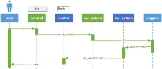
This particular use case can be validated without creating any GUI controls. The test_case can execute the first sw_action and read the value of the second sw_action.
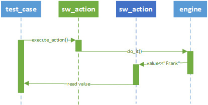
If the test runs successfully, then it is reasonable to assume that the dialog will function correctly also.
Example
As an example let’s build a fictional dialog that loads selected objects in a list. In the list the objects can be selected, toggled on/off and given a custom name.
Eventually the GUI will look like the picture below, but that is of no concern at the moment. First we test state and logic.
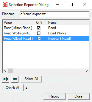
Using the Test Driven Development principle we will start by creating a test first by subclassing the base class test_case.
_pragma(classify_level=basic, topic={test}) def_slotted_exemplar(:selection_reporter_dialog_test_case, ## Test the behavior of the presentation model. { {:pmodel, _unset}, {:report_data, _unset}, {:report?, _unset} }, :test_case) $
For each test we setup the environment by creating a presentation_model that uses a (mocked) engine.
_pragma(classify_level=restricted,topic={test}) _method selection_reporter_dialog_test_case.set_up() _local engine << _self.mock_engine() _local pmodel << selection_reporter_pmodel.new(engine) .pmodel << pmodel _endmethod $
First we start by testing that on the initial startup most of the buttons will be disabled. We simply do this by accessing the actions from the presentation model.
_pragma(classify_level=basic, topic={test}) _method selection_reporter_dialog_test_case.test_initially_disabled_states() ## Test that when the GUI is activated initially, the ok, add ## and del buttons are greyed out. # _local as << .pmodel.actions _self.assert_false(as[:ok].enabled?, "When activated, the dialog OK button is disabled") _self.assert_false(as[:add].enabled?, "When activated, the dialog Add button is disabled") _self.assert_false(as[:del].enabled?, "When activated, the dialog Del button is disabled") _endmethod $
Next we create the presentation model. We create actions as an abstraction of all the GUI controls.
_pragma(classify_level=basic, topic={test}) _private _method selection_reporter_pmodel.init_actions() ## Intialise actions. _self.add_action(:filename, :engine, _self, :dialog_control, :text_item, :value_change_message, :|filename_changed()|, :incremental_change_message, :|filename_changed()|) _self.add_action(:add, :engine, _self, :action_message, :|add()|, :image, {:element_add, :ui_resources}) _self.add_tree_action(:tree, _self, :data, rope.new(), :selection, {}, :value_changed_notifier, :|tree_value_changed()|, :toggle_notifier, :|tree_toggle_changed()|, :select_notifier, :|tree_selection_changed()|) ... _endmethod $
Now we make sure that the test passes, by managing the actions after each event.
_pragma(classify_level=basic, topic={test}) _method selection_reporter_pmodel.manage_actions() _local t << .actions[:tree] .actions[:select_all].enabled? << .selection.size <> .data.size .actions[:check_all].enabled? << _self.toggle_count <> .data.size .actions[:add].enabled? << .map_selection.empty?.not .actions[:del].enabled? << .selection.empty?.not .actions[:ok].enabled? << .data.empty?.not _and .filename _isnt _unset _andif .filename.empty?.not _endmethod $
Next we move on to more complex functionality. When something is selected in the map, then the Add button should be enabled. After execution the add() the tree should be filled with data. This we can test by simulating a map selection. The MUnit framework has powerful mocking constructions to do simulate that.
_pragma(classify_level=basic, topic={test}) _method selection_reporter_dialog_test_case.test_add() ## Test that when something is selected in the map, the add ## button will be enabled. After pressing the add button the ## tree_item should be populated. # _local as << .pmodel.actions _self.simulate_map_selection() _self.assert_false(as[:ok].enabled?, "When activated, the dialog OK button is disabled") _self.assert_true(as[:add].enabled?, "When something is selected in the map, The Add button should be pressed") _self.assert_false(as[:del].enabled?, "When activated, the dialog Del button is disabled") as[:add].execute_action() _self.assert_true(as[:tree].data.empty?.not, "After pressing Add, the list should be populated") _endmethod $
And again we add functionality to the presentation model to make sure that the test passes.
_pragma(classify_level=basic, topic={test}) _method selection_reporter_pmodel.add() ## Add the map_selection to the data. # _for i_rwo _over .map_selection.rwo_set().fast_elements() _loop .data[i_rwo] << property_list.new_with( :on, _true, :name, i_rwo.external_name) _endloop .actions[:tree].renew_data(_self.trees) _self.update_toggle_count() _self.manage_actions() _endmethod $
We can go on like this until all functionality of the model is implemented and tested.
Next, as the final step, we will create an actual dialog with GUI controls for the user. The dialog will be a subclass of model, as usual, and will have the presentation model as a slot. The actions of the presentation model will be placed as GUI controls on the panel.
_pragma(classify_level=basic, topic={test}) _private _method selection_reporter_dialog.build_list_buttons_panel(p_container) _local rc << rowcol.new(p_container, 1, _unset, _unset, :style, :button_box) _self.actions[:add].place_control_on(rc, :dialog) _self.actions[:del].place_control_on(rc, :dialog) _self.actions[:select_all].place_control_on(rc, :dialog) _endmethod $
The dialog will not handle any logic, that is all handled by the presentation model. The dialog will only create the GUI and handle the interaction with the application plugin.
The complete sourcecode is available at: https://github.com/FrankVanHam/blog/tree/master/gui_test_product.
Conclusion
Each class in the design pattern has a clear and single responsibility. There is no duplication of code necessary. The Presentation Model design pattern offers a robust and elegant approach to build and test user interfaces in Smallworld.
I like it, do you?
0 notes
Text
What not to say to your projectmanager
You are the lead developer of your team. The project manager comes up to you and you talk about the new project. Finally the project manager asks you:
“can you give me a rough estimate of the development work involved. Just an estimate, I won’t hold it against you.”
Alarm bells should be going off right now. Two things you can be sure off:
Whatever number you supply will be used as an exact figure.
It will be held against you. Maybe not in your presence, but when thing go sour, and they sometimes do, the project manager will explain he got the number from the expert. Yes, that’s you.
So what should you not say?
Something like:
“If things go well I should be able to do it in 100 days. Note that this is only the development in the development environment. The application should be tested and probably some rework will come out of it. Next the application has to be deployed in the acceptance environment where the user acceptance test takes place. Deployment is probably tricky because another project is there also being tested. Bla bla bla. And don’t forget user documentation, release notes, updating the course material, marketing material….”
You projectmanager will read “100 days” and ignore the rest. Project Titanic is on its way, iceberg ahead.
So what should you then say to the project manager?
First know: things never go well. You have to remember that the happy place between your ears is not the place where you actually live and work. In your mind development is simple, the steps are clear and straightforward. Except things doesn’t work that way. There is the 80/20 rule governing all development work. 80% of the work is done in 20% of the time. And then starts the other 80% of the time: adding exceptions, handling all possible errors and the endless testing and debugging; looking all day for 1 meagerly typo.
That 20% is the happy path that is in your head. But we don’t travel the happy path, we may start on it but we always end on the rough gravel road.
So you should take time to give the complete estimate that will account for all work and has buffers for possible rocky roads.
Perhaps you don’t know how to estimate some parts, like documentation or testing. Then you simply have to ask someone who does. Perhaps your company has estimation guidelines you can use. If not, create them, they are a valuable tools.
But in no case give a half-assed answer because it will come back and bite you in the other half…

0 notes
Text
Minds and Machines Conference, day 3
pThe last day of the conference there was an interesting talk from Colin Parris, the vice president of GE Software Research.
He talked about the Digital Twin, the digital representation of the physical asset out there. He discussed how companies like Amazon, Google and Apple build a profile of each individual user. This profile is used to predict what the user wants and how to monetize that information. The same story applies to the Digital Twin. By building up a profile of the physical asset we should be able to predict the behavior of the asset and optimize the operation on the asset. Again monetize that information.
There is no longer need to work with statistics and averages over types of machines. Because we now have the technology to handle vast amounts of data we can actually analyse and optimize each individual asset. Predix is the platform to achieve this.
Smallworld
At long last I finally saw a glimpse of Smallworld. One of presenters showed an example of Predix being used for a gas transport network. And yes, they used Smallworld for that (duh!).

Closing
The closing keynote speaker was Ed Catmull, the co-founder of Pixar. He talked about creativity. The bottom line was that in order to cultivate creativity in your company you mainly have to remove all the obstacles that prevent your people to flourish. I thought that was inspiring....
this was the last day of the conference. I really enjoyed it. It was great to get to know this world and I am excited about what Predix can bring to our spatial asset management domain...
0 notes
Text
Minds and Machines Conference, day 2
Today’s keynote speaker was Mickey McManus, the CTO of Autodesk. He talks about trillions. A very large number, the number of machines that will be connected pretty soon. Machines will work together, become smart, learn by doing and create communities. Not unlike nature does itself, where simple things work together to great things.
There is a great challenge in that, not in the least in the area of security. Cars can be hacked, even pacemakers (pacemaker-virus). The best way to combat this is to use Bill Joy’s law: "No matter who you are, most of the smartest people work for someone else”. In other words, create a community, work together and create standards.
Another interesting session was about Asset Management Performance (AMP). A set of people from different industries explain how they raise asset IQ and analyze large amounts of data to predict failure and capture value from that. This is an example how sensors on train capture data and process it in Predix.

Stands
Many apps are displayed at the stands:
managing cities (the so-called Smart Cities)
Powerplants
Healthcare
Rail
Aviation (monitoring the landing gear)
Smart production plants
Outside was even a smart barbecue that was monitored for best cooking performance :-).

Predix
Predix will be a SAAS offering. Predix will run on the Cloud Foundry platform. That explains the $105 million interest of GE in Pivotal (pivotal.io).
The platform will be hosted in GE datacenters. At this moment some of the infrastructure is on Amazon, but this is all moved to GE’s own datacenters.
Predix as-a-service will handle scaling, (big) data, security, analysis, etc. You can find a lot of information at the new website (predix.io). As a partner we can focus on the business problem, GE will handle the problems of scale.
The pricing model will be consumption based. Nothing is written in stone yet, because this is all new for GE too so they need to figure this out together with their partners and customers.
MES
How this all translates to Mobile Enterprise Suite I don’t know, there is no GE Smallworld at the conference. But we’ll find out…
0 notes
Text
Minds and Machines Conference, day 1
On one of the stands this was demonstrated. A machine was hooked up with kinds of sensors that were uploading to the cloud and a predix app was showing the results. GE's fourth annual Minds + Machines event is held at Fort Mason Center in San Francisco, California. A 1,000+ visitors and partners are attending. The conference is held in 4 large warehouse buildings overlooking Alcatraz island. There is a nice conflict in that scene as Alcatraz is about isolation, the conference is about connecting.
The main theme of the conference is Predix, the “operating system” of the industrial internet. If you do not know Predix, the concept is rather simple: all machine-data or backoffice-data is connected to Predix and the results are presented in small focused apps to the operators. The operator change the data or manipulate the machines through these apps. Obviously there are some hard challenges to overcome: handling large amounts of data, realtime analysis and supporting every possible device and OS. But that is the goal...
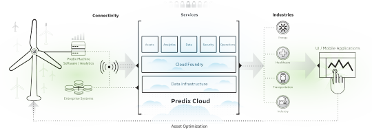
On one of the stands this was demonstrated. A machine was hooked up with kinds of sensors that were uploading to the cloud and a predix app was showing the results.

some kind of engine was running. All kinds of sensors are attached and you can see the white datacables disappearing in the cabinet. The data is uploaded to the cloud.

In an app the data can be monitored. If any thresholds are exceeded alerts will popup.
keynote
The keynote was given by mr. Jeffrey Immelt, the CEO of General Electric. He gave a very inspiring talk about the way GE is transforming into a digital company. To eat their own dogfood, GE is rolling out Predix in their own systems and plants. GE Healthcare has 60 Predix apps already. Mr. Immelt compared the way the internet has change the consumers with the way the industrial internet will change the industrial companies. A nice analogy that goes a long way.
Today the developers site https://www.predix.io/ has opened. Their hope is that about 20.000 developers will be working with Predix next year and that by the year 2020 there will be half a million apps available for Predix.
Yes, the CEO of GE is taking Predix very seriously…
0 notes
Text
Your passion is their hassle
You are passionate about GIS and software development. You like to build cool and useful tools in the GIS for your utility or telecom company. The only drawback are these users that somehow just don’t get it.
They just don’t understand the long transaction mechanism, get confused when solving multilevel structural conflicts and they keep forgetting those 5 steps you have to perform (in exactly the correct order) to relocate a cable. I mean, come on….
Shadowing
Recently I had the opportunity to shadow some network engineers at a large telecom company. I spend time with an engineer that worked on coaxial networks, one that worked on the fiber backbone and one that planned B2B connections. These guys where known as heavy GIS users.
However, when I talked to them and watched them all day, I found out that they only worked a few hours a day in the GIS! A lot of time was spend communicating with the municipalities, the contractors, the project developers, other network companies and internal departments. They also used a lot of other applications for material management, asset management, project management and still did amazingly much on paper.
This came as a (little) shock. These were my super users, my experts and to my surprise they only barely touched the GIS.
Analysis
This triggered me to do an analysis of the users sessions for 2 large customers over a period of a year. These are the results:
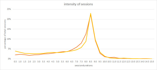
This is graph of the session durations. Most people stay logged on for about 8.5 hour. That does not mean they work in the GIS for 8.5 hours, as I have experienced myself. Still it is surprising to see that a lot of sessions only last for a couple of hours. These users apparently have a little task in the GIS, they do it and logoff.
Another result is this:
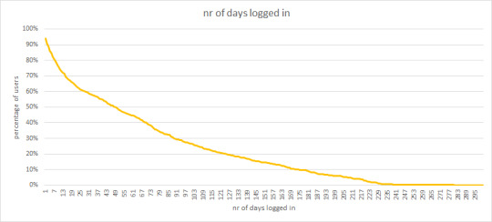
This graph shows the number of times a user has logged on in a period of a year. Obviously all have logged on once, otherwise they would not be in the analysis. But note that about 50% log on just 50 times a year, basically once a week. Also note that just a few people log on every day.
Conclusion
So your passion, your daytime job in the GIS, is for most users just an occasional encounter. Any software you do not frequently use can become a hassle pretty fast. Certain SAP GUIs comes to mind…
So your job is to design your software for the occasional user. That means you need to understand the processes the user is working on. Processes like: decommissioning a gaspipe, inserting a distribution box in the network, splitting the optical node in a cabinet, etc.
Don’t just give them a thousand functions that they need to figure out.
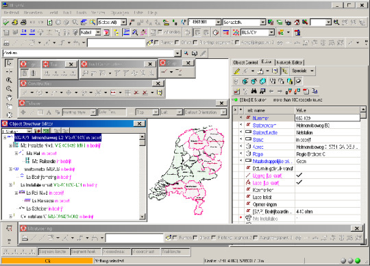
A GIS with some functions, find the map…
Give them wizards to guide the process, step by step. Or even better, involve a user interaction designer. You will end up with happier users.
Cheers, Frank
0 notes
Text
Don’t let the zombies kill your performance
Modern applications, like GIS systems, typically have context sensitive graphical interfaces. The state of the application determines the availability of functions to the user and the content of the components. When the database is readonly, the insert button is greyed out. When a road is selected the Editor displays its attributes and the Object View displays the full view of the road.
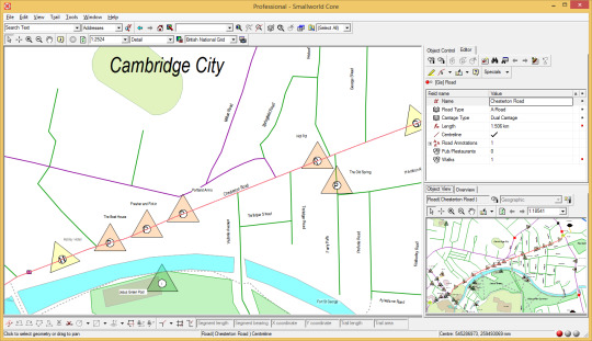
This behavior is commonly implemented using the Observer pattern. The interest party (the Observer) tells the owner of the state (the Subject) that it is interested in any changes in the state. The Observer registers at the Subject. From then on the Subject informs the Observer of any change in the state and the Observer can react accordingly.
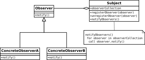
For example: if the Subject is the database and the Observer is the editor, then the editor gets a signal when the database is switches readonly and the editor can disable its insert button accordingly.
So far so good, so when does it go wrong?
Things go wrong when the Observer is killed but forgot to tell the Subject it is no longer interested (unregister).The Observer now basically became a zombie. It should be dead, it was killed, but the garbage collector does not remove the Observer because the Subject still has a reference to it (since it is registered as an observer). Now the zombie starts eating away at your performance. The zombie will react to every state change in the Subject. If you are ‘lucky’, the zombie will throw errors and you are informed by an angry user. However, the zombie could be silent and drag your performance down in silence. After a while the amount of zombies can start adding up and the memory usage can kill your application, commonly known as the lapsed listener problem.
How to fight these zombies?
The Observer should avoid becoming a zombie in the first place. As soon as the Observer is killed it should unregister at the Subject. Most components have methods, like Terminate() or Dispose(), that are invoked to kill the component. These methods can be subclassed to provide additional behavior, like unregistering at all Subjects.
Not dead, but not helping either
A similar breed of problem is when invisible components are reacting to changes. The components do stuff, cost performance, but the user has no benefit from it because the component is hidden. This most commonly happens in tabboxes. Only one tab is visible, but all tabs are reacting to all changes.
The simple way to counter this is for the component to register for the visibility event. When the component is hidden, it should unregister, when it is shown it should register and refresh. This sounds simple enough but in my experience it is usually not implemented.
Things like this should be part of the application development guide and part of the peer review checklist. This will help us all to build responsive and context sensitive application.
Go build…
0 notes
Text
Assume nothing
Recently we got a call from a customer on a Sunday evening, never a good sign. One of their automated processes had severe performance problems to the point that the customer was afraid it could not fulfill the legal response times required for the business process. Apparently they had the problem for a week now. The IT company that does their support had been working really hard all week but did find the problem yet. So the customer asked us to help.
That is a little awkward because the IT company is our competitor, but luckily they welcomed the help. I joined the senior developer assigned to the problem. We walked through all the steps they had taken so far. Apparently the problem started on a Sunday. The automated process started slowing down. Since nothing has changed in the software source code they assumed that it must be something else. So they rolled back the Windows patches, no help. They rolled back the product software patches, no help. They installed the software on another machine, no help. Nothing seemed to fix the problem.
I insisted on popping the hood: dive into the source code, debug it, monitor the threads, set breakpoints, etc. Even if the source code is not the problem, the source code will tell you were the problem is. It was a multithreaded application, so debugging was not easy. But soon we found that the most important thread occasionally did not get enough processing time. Soon thereafter we found that it was because some other thread was querying 2 large tables without proper indexes and this thread was using all the processing power. So there was the problem: indexes. It took us 4 hours.
How could it so suddenly appear on a Sunday? Very likely the application in-core cache could somehow deal with the lack of indexes up to a certain table size. After that the in-core cache will suffer from cache rollovers and the performance will suffer.
So take my advise: If you encounter a strange problem, assume nothing and pop the hood.
1 note
·
View note
Text
Lessons learned in synchronizing ERP and GIS
Introduction
In a utility or telecom company some business processes make extensive use of both the ERP system and the GIS. As an example: a typical design process will likely start with a project definition in the ERP system. This will trigger a design process in the GIS. The ERP can estimate costs for different alternative designs created in the GIS. When a design is approved the ERP will put out a work order appended with GIS data. After the work order is completed the as-built information is entered in the GIS. The GIS will publish the data and replicate it to the ERP system. The ERP project will then be closed.
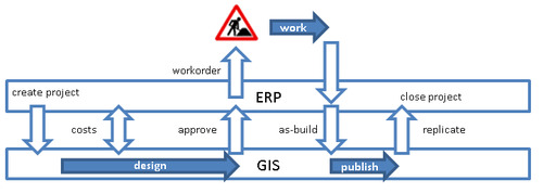
Figure 1, Synchronisation of a business process
This process, and others, can be supported by synchronising ERP and GIS.Projects to implement this kind of synchronisation invariably run into the same kinds of challenges. We would like to share some lessons we learned from past projects.
Lessons Learned
Build a Business Semantics Glossary
Both the ERP and GIS department have a different view of the company assets. Both departments have different ways of operating and use different jargon and concepts. This creates a lot of room for miscommunication when you are trying to work out the specification for mapping and synchronisation. Ask each department to describe a middle voltage electric installation, a gas pressure reducing station or a water hydrant and you will get different answers.
What are you thinking of when you are talking about a hydrant? The red, green or yellow box?
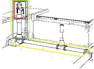
Figure 2, hydrant definition
The ERP viewpoint will be a hierarchical view that includes the elements needed for a bill of material and needed for maintenance and inspection. The GIS viewpoint will be as close to reality as possible (real world modelling), focussing on the network connectivity of the element.
A Business Semantics Glossary will help avoid confusion. It will hold the definitions of the assets. It should be an exact definition of the asset with little room for interpretation. Pictures, real and schematic, will clarify a lot. The definition should state, among other things, what the boundaries are of the object. As an example: suppose you have purchased two electric installations and you have connected them by a fixed cable. Electrically they operate as one. What do you have? Two installations or one?
The glossary also lists the attributes of the assets, for each attribute it should contain:
The exact definition of the attribute, including the unit of measurement (eg. metre, kVA, etc.).
The range of possible values or enumeration of possible values.
The source of the attribute value. Is it from the specification document of the supplier, measured by the contractor, set by the engineer as part of the design process, etc.
The owner of the attribute. Who is allowed to set the value? Is it the designer in the GIS, the buyer in ERP, the engineer, etc.?
The way the attribute is used in the business processes, what decisions are based on its value.
A fully implemented glossary will supports the process to reach agreement and alignment between the stakeholders. It can become a valuable standard document in project specifications and cross department discussions.
Synchronise departments
In order to keep an operational synchronisation process, all departments involved have to be synchronised too. The ERP department, the GIS department and the integration (middleware) department have to align. Both the processes and the data models have to align. Consider these topics:
The maintenance windows, the release cycles, the upgrade projects, the patch weekends all have to be synchronised to minimize disruptions. Because of the synchronisation the applications are linked, so when the ERP goes down a part of the GIS process goes down too because it cannot synchronise any more.
Development in ERP and GIS has to be synchronised. Projects in each domain should do a careful impact analysis to determine the impact on the linked systems. Ideally the middleware will decouple the systems to allow each system a degree of freedom of change without influencing the other. But in reality, more often than not, the middleware simply is a communication medium and the systems are strongly coupled. Either way; a rigid impact analysis should be part of any project in each domain.
Responsibility for the synchronisation process should be addressed. Because the process crosses departments, the responsibility is easily diffused. Clearly define who monitors the process, who takes responsibility for fixes the bugs and data problems and who provides helpdesk service. A periodic inter-department meeting is a great platform to address and avoid problems with synchronisation.
Clean-up data
Any project to synchronise ERP and GIS should start with a data analysis and clean-up. For every asset there should be some way of identifying it in both systems. That calls for a consistent naming and numbering convention in each system. Assets that are identified by an address are especially facing challenges because of the age-old problem of address notation (e.g. “Road” vs “Rd.” notation). The clean-up should be executed before the systems are linked up. This will offer the most freedom in data manipulation without dragging the synchronisation out too long.
The thought might cross your mind to skip clean-up and simply activate the synchronisation and fix whatever fails to synchronise. We advise against it, you will get more then you bargained for. Do not underestimate the clean-up project.
Asset documentation, not drawing pictures
Most GIS systems allow their users great freedom in manipulation of data. For many companies the GIS system has started in the drawing office and has made a steady progress from a CAD-like drawing tool to an asset documentation and planning tool. The days that the graphical output is the main purpose of the GIS have long gone by. A modern GIS provides a model of the assets and their connectivity and it supports the company in making the best decisions about their assets.
GIS users can no longer simply delete and reinsert or move assets around as if they were CAD lines or points. GIS objects are no longer lightweight, they are heavy. They contain audit history, process history, they are linked to the ERP system with maintenance information, measurement information, they have parents and children in a hierarchical structure, etc.
Depending on the maturity of the GIS, the type of GIS and their users this new mind set could take some serious change management to accomplish.
DTAP synchronisation
Larger systems like GIS and ERP usually have a DTAP environment (Development, Test, Acceptance and Production). Each environment should be synchronised to their corresponding counterpart.
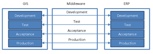
Figure 3, mirror synchronisation
Not always are all 4 environments defined for ERP or GIS. In that case the synchronisation should be made switchable between environments. Take for example a customer that has a DTAP setup for GIS but only a TAP for ERP. In that case it would make sense that the GIS Development environment can be switched to the ERP Test environment for testing purposes.
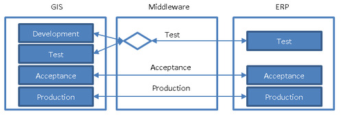
Figure 4, sharing synchronisation partner
DTAP streets are refreshed according to a release plan. The Production is copied to the Acceptance and Test after each new production release. The Production will be copied to Development when project planning allows it, typically between projects. It is important to try to synchronise the release planning to make sure the environments match each other. If this is not possible for one reason or another then the synchronisation should contain a reset mechanism that allows two environment that are not in sync to act as if they are in sync.
Stub environment
Ease of development in each system is improved if there is the option for a stub environment. A stub environment simply simulates an environment and it can be used to synchronise against it. For example it would allow a project to work on the GIS data model and configure the synchronisation using an ERP-stub environment while the actual ERP is not configured yet. It allows a project to work on both environments at different speeds. It removes temporarily a dependency between environments.

Figure 5, synchronisation stub
Conclusion
Automating business processes by synchronising the GIS and ERP adds great value to a company. The implementation has its challenges and as often is the case the biggest challenges are not technical but about people and organisation.
Are you interested in the topic and do you want to discuss it? Please contact Frank van Ham at Realworld Systems ([email protected]).
1 note
·
View note
Text
Put Spatial in Asset Management
Utilities today are facing challenges: aging infrastructure, unexpected system failures and increasing costs. The complexity of the network is increasing due to development in energy transition and more dynamic behavior of the customers. Operations are more complex than before. Not only that, utilities have to make decisions with less capital and budget constraints for operations and maintenance. There is a clear demand to do more with existing resources.
Traditional engineering solutions focused on the planning and construction of new system capacity will not address these service and operating issues. There is a necessary transition from building and operating to managing assets. Asset Management addresses these needs.
Risk
One of the fundamental components in Asset Management is management of Risk. The governing formula for risk is the equation:
Risk = PoF * CoF
PoF: probability of failure CoF: consequence of failure
The risk matrix is the visual representation of that equation.

Figure 1, Risk matrix
The probability of a failure is partly based on the inherit properties of the asset like age and material and partly it is based on the location of the asset. The way the surroundings impact the asset influences the probability of a failure of the asset.
The consequence of a failure can be measured across many axis. Usually the following axis are considered:
impact on safely, health and welfare;
the environment;
reputation of the company;
financial impact.
The weight of the consequence is eventually determined by the location of the asset. The way the asset works on the surrounding determines the consequence of failure.

Figure 2, Asset interaction with the surroundings
Location
Location is twofold; there is the physical spatial location of the asset that determines the surrounding the asset interacts with. Think of soil type, proximity of heavy traffic, the weather profile, third party infrastructural work (eg FTTH), etc. There is also the location of the asset in the network. That location determines the pressure, the demand, power feedback from solar panels and windmills, the number of customers depending on the asset, etc.
Figure 3, Spatial location of station
Figure 4, Network location of station
The arrow in the two pictures above point to the same station. Once in a spatial context and once in a network context. Both are important in determining the risk of failure.
Let’s zoom in on the two main components of risk (probability of failure and consequence of failure) and see how they depend on the spatial component.
Probability of failure
Assets have four major failure modes:
Capacity Failure. Because of the growth of the network and/or increase of the demand on the network, the volume of demand exceeds the design capacity.
Level of Service Failure. Because of increasingly regulatory restrictions and higher demands of the customers to increase reliability (frequency of outages), availability (duration of outages) and quality of product (odor, taste, stability, pressure) the functional requirements exceed the design capacity.
Mortality. Because of physical deterioration, either due to age or otherwise, the consumption of the asset reduces performance below the acceptable level.
Efficiency Failure. Because of increasing operation cost (inspection, repair, maintenance) the asset becomes more expensive than the replacement costs.
The first three failure modes will depend largely on the location of the asset; both the spatial location and the network location.
Spatial location
The spatial location of the asset determines the surrounding where the assets reside. For underground assets a very important factor is the soil they are buried in. There are some aspects to consider:
Chemical composition. For underground assets the chemical composition of the soil can influence the lifetime tremendously. Take for example the deterioration rates of pipe. The rate will vary considerably as a function of climatic conditions, soil properties and corrosiveness of the drinking water. Pipe of the same material, for example, can last from 15 years to over 200 years depending on the soil characteristics alone.
Soil contamination. Some contaminations affect the asset material by chemical reaction. Take for example the water networks; in heavy contaminated soil it is forbidden to use PE because chemicals effect the pipes and can even diffuse through the pipe and influence the water quality.
Structural composition. The composition of the soil determines if there is any ground displacement possible that affects the assets. Take for example sewer joint failures. These failures are common when the sewer is in soggy soil with insufficient bearing capacity.
The spatial location also determines the traffic exposure of the asset. Frequent exposure to heavy traffic causes vibrations that have a negative impact on assets. Typically the joints in a network structure are sensitive to vibrations. Spatial analysis can tell if the asset is near a train rail, highway or other heavy traffic zone.
The spatial location, combined with the depth of the asset, determines the groundwater exposure. High groundwater levels can have a negative impact on the durability of an asset. For example: the common assumption is that Asbestos Cement (AC) pipes in groundwater have a higher probability of failure than AC pipes above groundwater level.
In the example below a gas pipe replacement plan is visualized. The plan is part of the asset strategy implementation and the goal is to minimize risks efficiently. The pipes are colored according to their priority in the replacement plan. The priority is based on a number of important factors like: age, material, diameter, soil characteristics, traffic exposure, etc.
Figure 5, Gas replacement prioritization
These types of visualizations can be great aid when determining the asset strategy.
Network location
The position of the asset in the network determines the demand requirements of the asset. The demand can be the gas pressure, the water pressure, the electric power, etc. The demand increases as the number of customers increase and the behavior of the customers changes. For example the increasing use of electric cars lay a burden on the electricity network that was not designed for it. When the actual load of the asset is significantly higher than the load it was designed for, the probability of failure increases.
Galvanic protection is another network related issue. Whether or not a pipe receives galvanic protection (and to what level) depends on the position of the pipe in the galvanic network. Lacking galvanic protection will lead to rust; either on the inside or outside. This will increase the probability of failure of the asset.

Figure 6, City of Rockville. A pipe removed from Rockville’s water main system shows tuberculation, or rusting from the inside. Tuberculation decreases the diameter of the pipe, thereby reducing water flow.
The network position can also be used to determine the design construction of the asset. Some combinations of material in service connections have shown to be weaker than others. For example the combination of PVC glued to copper is known to be less durable than others. In the example below the constructions are colored to according to their structure and the material combination. This will help the asset manager in determining the replacement strategy. This analysis becomes even more powerful when it is combined with the replacement plan for the main pipes to minimize costs and impact on the neighborhood.
Figure 7, service constructions colored by type
Consequence of Failure
The way the failure of an asset impacts the customers or the neighborhood depends to a large extent on the location; both the spatial location and the network location.
Spatial location
Failure of underground assets will lead to infrastructural work. Infrastructural work is disruptive to the daily life in the working area. When the location is in a dense, commercially active, area the consequences of failure is much more dramatic than a failure in a rural area. Spatial analysis can put a value on each asset regarding the social impact infrastructural work would have.
Infrastructural work gets more disruptive and expensive when the structure is complex. Take for example the complexity of pipes that go under rivers, tunnels and highways. The consequences of a failure of a gas pipe that crosses a river is much larger than of the same type of pipe in a shallow ground.
A network failure can also have a trigger effect that increases the impact of the failure. An electric outage can cause a failure of an internet hub or GSM antenna that will impact a larger area then the electric network on itself.
Network location
The number of customers that depend on the asset working has a direct relation to the consequence of failure. Damage settlements, service outage mitigation and substitution costs are based on number of connected customers, so there is a direct financial consequence. For a network based GIS it will be relatively easy to determine how many customers depend on every asset in the network and what kind of customers are involved. Customers can be assigned a weight factor according to importance. An outage that cuts of a hospital should be valued a higher risk than an outage at a normal household. This risk factor should be an important number in any risk evaluation. In the example below the coaxial cables are colored according to the number of customers that depend on the cable. The red cables service many customers or important customers, the green feed just a few. It is clear that not all cables should be treated equally as far ask risk is concerned.
Figure 8, cables colored by nr of customers
Redundancy is an often used risk mitigation tactic in networks. Many networks have inherit redundancy in the design, either by creating mesh networks that have redundant pathways to service customers or by duplication of critical assets. The consequences of failure will be lower when upon failure of an asset another component can still deliver the required services to the customers.
Besides the static network location information, also the dynamic information from the network is very important in decision making. Leak registration for pipes or SCADA data of protection devices and indicators all contribute to making the most efficient decisions.
Spatial
Let the conclusion be that location is important. The GIS or spatial datawarehouse can link all the spatial risk factors directly to the assets. Risk based attributes can be assigned directly to each asset. A pipe could have for example the following attributes; the colored ones are spatial based.

Figure 9, example attributes of a gas pipe
This spatial based information is vital for effective risk based asset management. It can be fed directly into asset management tools for statistical analysis and decision support.
The data can also be fed directly into powerful visualization tools. This allows the asset manager to play what-if analyses with business rules and weighing factors with immediate visual feedback. This helps the asset manager to fine tune the asset management strategy.
Are you interested in the topic and do you want to discuss it? Please contact Frank van Ham of Realworld Systems ([email protected]).
0 notes
Text
Network Topology in a Datawarehouse
In a datawarehouse the data from the primary systems of a company are integrated. A good reason for many utility- and telecom companies to incorporate a datawarehouse. The purpose of the datawarehouse (DWH) is to answer integral questions. For a network company many integral questions concern the connectivity of network components. Consider the following questions:
What service connections are fed by a transformer?
What streetlights are controlled by an ignition point?
What is the weakest fuse in the path from the service connection to the transformer?
What is the alternative route to feed a service connection if fuse X should blow?
What gas service connection constructions have a combination of PVC and cast-iron?
What water pipe sections have more than three registered leaks and are feeding more than 100 households?
To be able to answer these kinds of questions the DWH must have network topology.
Network topology
Network topology is in its core the arrangement of nodes and links. Graph theory is the mathematical basis of this topology.
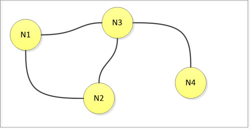
Figure 1, a graph
The GIS is the source of network topology in a utility or telecom company. The GIS system documents for every network component (pipe, hydrant, cable, streetlight, gas-valve) how it is connected to others. This connectivity can be documented in a variety of ways.
Geometrical networks
Geometrical networks are the most obvious method to document connectivity. Most GIS systems have an internal network model that connect lines, points and areas. The connectivity is stored in nodes and links that are an integral part of the geometry. One could for example configure that a valve is connected to a pipe if it is positioned on top of it. If the valve is moved, the pipe will be moved too because of the intrinsic connection between the two.

Figure 2, geometrical network
However, the GIS offers more functionality to document connectivity.
Relational model
Most GIS systems have a relational database as their main data storage. Using foreign keys and joins, the records in the tables can be related to each other. These relations can be used to define connectivity. Take for example the trench model. Cable companies either choose for a trench based model or a cable based model to document the cables. For a trench based model connectivity questions for the cables must be answered by navigating over the related trenches.
Hypernodes
Some GIS systems support the storage of geometry in different worlds (or planes). For example one world could store the outside map, another world could store the schematics and yet other worlds could store the inside floorplans of buildings. Connectivity between these worlds is defined by so-called hypernodes, nodes that jump from one world to another.
Assumptions
The GIS creates a model of reality. Just like in any model, the level of detail will be limited. The consequence of this limitation could be that connectivity between certain objects is not explicitly defined in the GIS. This creates a mismatch between what is needed and what is documented. This mismatch will typically occur when certain details were not considered important during initial design of the model. To complete the model and capture the data could involve large scale surveys which usually come at a large cost. The connectivity in these incomplete networks could partially be derived from assumptions and rules of thumb.
Extraction
A special extraction process can move the connectivity information from the GIS to a topology dataset. In the topology dataset all network relations will be explicit and no detailed knowledge of the GIS is necessary to travel the network. The interesting questions about network topology are now pure data related and independent of the GIS implementation.
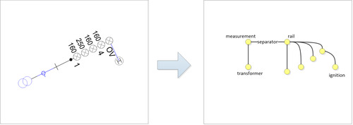
Figure 3, extraction of the content of an electricity station
In its core the topology dataset consist of a node table and a link table that both relate to the original GIS objects. Databases like Oracle can navigate these tables very efficiently, even better after the introduction of Recursive Subquery Factoring in Oracle Database 11g Release 2.
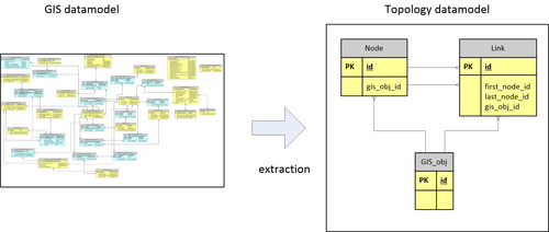
Figure 4, from complex GIS model to simple topologymodel
By adding the topology dataset to the DWH, the DWH is fully equipped to answer integral network related questions.
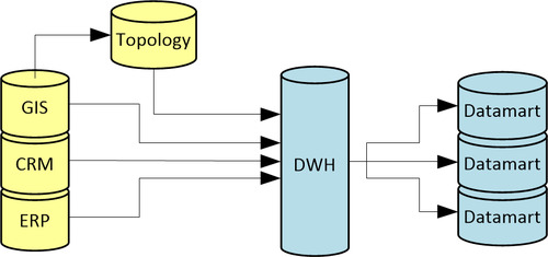
Figure 5, topology in DWH
Datamart
To answer recurring questions of a similar structure, usually a datamart is constructed. In a datamart the answers to these questions are preprocessed and materialized in easy to access data structures. An example datamart is visualized in the picture below. In this datamart the complex relationship between a service connection and its feeding station is reduced to straight red line. A lot of interesting questions can now be answered using these simple structures, for example which service connections are not fed, which service connections are fed by multiple stations, how many customers are fed by a station, etc.
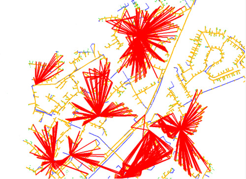
Figure 6, visualization of services and stations
Note that certain areas in the map have no red lines. These turn out to be data errors in the documentation of transformers. This is a useful application of the datawarehouse because it can point out otherwise hard to detect data errors.
Network topology is a useful, perhaps necessary, addition to the datawarehouse of a utility and telecom company. Are you interested in the topic and do you want to discuss it? Please contact Frank van Ham at Realworld Systems ([email protected]).
1 note
·
View note