Don't wanna be here? Send us removal request.
Text
Journal 4
Introduction to Information Design digs into multiple case studies contracted by professional designers and design teams that showcased the effective use of spatial information design. The projects consisted of a variety of information design projects, from the public transportation maps in Los Angeles to wayfinding through Alcatraz and other exhibits and locations where wayfinding was key. Each case study went into deep detail about how the projects began, and the targets the designers had in mind. The projects followed similar design theories, all wanting to convey a large sum of information into the simplest way possible. The design required to be accessible to all age groups, and to find this information, the designers required to put themselves into the customer's shoes. They needed to solve the important questions such as how can any stranger get the right information from our designs, removing unnecessary distractions. Spatial design requires thinking about how people move through space to learn about where the information should be placed. All designers agreed that good wayfinding makes experiences for customers much more enjoyable and easier and by analyzing these case studies, I can form an opinion on other design projects to understand their processes, and if the design was successful or not.

Above is an example that completely fails to follow many of the correct design principles and is required of a design overhaul. This is an example from the transit map used in Central London's bus routes. The map is distracting, hard to follow and loses your attention on first glance. The use of an overwhelming amount of blue makes it extremely hard to distinguish routes, and the overwhelming amount of information is required to be broken down into tangibles. As a customer, it would require an unnecessary amount of time, simply to find out where you are on the map, let alone where you need to go. The map disregards simplicity and misses an opportunity to make for an enjoyable and easy to use experience. To improve this design, I would focus on maintaining a simple clear infrastructure, using color as a tool to distinguish routes. Leaving more white space would also help readability for the users and eliminate some of the excessive clutter. The transportation messages need to be easier to understand and the designers should put themselves into the consumer's shoes and imagine if they saw this for the first time, would they be able to efficiently transport there way around central London with this map.
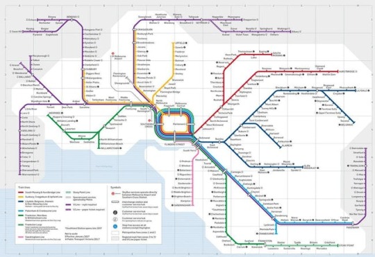
This transportation map used for trains in Victoria Australia is a refreshing example on a transportation map that has been clearly designed and effectively communicated. Despite the numerous amounts of os routes and different stations that are located in the city, the map uses a clear grid structure, followed by distinguished color coding to separate different routes. Users will not get lost on first glance, and there are many helpful wayfinding tools such as an obvious legend located on the bottom left to understand logos and color paths. The design team clearly thought about the users, as this map can be read throughout a broad audience. Efficient whitespace is used to allow a large amount of text to breathe, amplifying readability. By adding key features, and simplifying the design project, this design team was able to pull off a much more effective example of wayfinding.
The textbook case studies reviewed several case studies that informed me of the correct principles and ways to look at spatial design for things such as wayfinding and transportation. With the information the textbook has taught, I was able to look at different examples of design and give my own opinion on what was successful, unsuccessful and how to improve on failed designs.
0 notes
Text
Final Project Research #2
Homepage
The homepage will be clean and simple, with a top-handed navigation bar. The navigation bar will consist of four different sections, each page containing deeper information about the topic. I plan on using a full spread image with a compelling title to want viewers to learn more about this crisis. The page will clearly describe the topic at hand, with easy to understand navigation tabs to learn more about salmon farming in British Columbia. Inspired by the website below as the following example is extremely easy to use and understand while being able to declutter the homepage and allowing the majority of information to be on the websites subpages. Challenges by doing this might include, finding the right background image that is not distracting but yet relatable to the topic, and choosing the correct fonts to best display all this information.

History - Subpage 1
The history of salmon farming in British Columbia began due to the disappearing numbers of wild salmon in the 20th century. At the beginning of production in the early 1970’s, the majority of farm sites were centered in the areas of Sunshine Coast, Tofino, and Barkley Sound.
In the 1980’s we began to see an expansion of the rising industry into Campbell River, Skyward, and Port Mcneill, these farms showed technological improvements from the 1970’s, with the use of state of the art equipment that replaced the old wooden pens. This resulted in record low salmon prices with many of the smaller farms, running out of business.
In the 1990’s till now, the salmon farming industry is 90 percent owned by Three Norwegian companies: Marine Harvest, Cermaq and Grieg Seafood with around 75 farms being operational at any current time.
History - Design Visualization
For the infrastructure of the history about salmon farming in British Columbia, a scrollable timeline on one of the websites web pages will be how I convey this information. Using relatable pictures such as a map, the user will be able to understand the history of salmon farming in BC with a clear idea of the locations where the farms are located. The aim is to create a visual timeline, like the website shown below as it is a simple but very effective and visually pleasing way to display information through different time periods.


Farmed VS Wild Salmon - Subpage 3
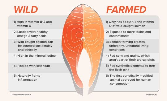
What are the differences between wild and farmed salmon? Wild salmon contains more natural fats, calcium, iron, potassium, and zinc. While on the other hand, Farmed salmon has 3x the Saturated fat, more contaminants and more phosphorus.
Farmed VS Wild Salmon - Design Visualization
As there is not a large amount of information but with many of the points being extremely important, I plan on using a page with clear infographics, boldly telling the user the information at hand. The text will need to be dynamic, with potential relating icons next to them. The facts will be grouped together by the differences between salmon, with one cluster showing the facts about farmed salmon and a different cluster displaying the facts about wild salmon.

Environmental Risks - Subpage 2
Why should we care about saving the wild salmon? Farmed salmon pose a large number of environmental risks and threatens extinction for wild salmon. One of the biggest environmental concerns among farmed salmon is the sea lice that they develop. The sea lice are pesticides that lead to large amounts of agriculture deaths. Another risk is that these farmed salmon suffer from HSMI ( Heart or Skeletal Muscle Inflammation) which causes mortality rates of up to 30 percent at fish farms. Farmed salmon is also a leading cause of Marine Debris and organic waste.
Environmental Risks - Design Visualization
Similar to the website below, I want to use factual infographics again to display data surrounding the environmental risks caused by farmed salmon. A bold subtitle will give the viewers a clear background, with a brief explanation and background following it. Helpful pieces of design data types I would implement could include graphs and related pictures.

Potential Solutions - Subpage 4
With this rising problem at hand, what possible solutions can be done to support this problem? One possible solution could include relocating the existing salmon farms into locations that will pose less of a threat to surrounding agriculture. However, that may be difficult for some existing farms so we propose newer and improved technologies. New closed containment technologies are a great alternative to the net-cage aquaculture that is currently being used by most farms. These upgraded farms, included open net cages which allow for salmon to pass more freely, largely reducing the chances of pesticides and sea lice.
Currently, there is only a small percentage of salmon being farmed in closed containment due to the upgrade costs, and risks of damaging profit.
If pressure is put on these farms, it would relieve the complaints of many locals and go along way for farming healthier salmon while simultaneously preserving our wild salmon in the process.
Potential Solutions - Design Visualization
I would keep a clean background with subtitles to separate pieces of information.
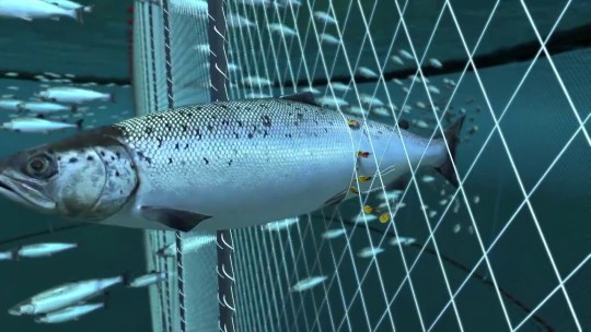
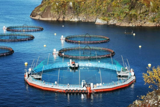
Infographics such as pictures of the new technology versus the old would allow the viewers easy understanding, with the pictures being placed in close relation to the relevant text. Challenges for this page would be finding a balance of whitespace. Having these important pictures to be clear and easy to read, as there will be several of them, whitespace will still be required to keep the page clean and easy to navigate.

0 notes
Text
Journal 3
Introduction to Information Design details several successful information design projects constructed by professional designers and design teams. These projects consist of a variety of information design, from websites, to brochures and even interactive exhibits. Each interview detailed the step by step process that goes into tackling these projects. Following the information explained earlier in the book, the approaches taken for these projects, share and follow the majority of the principles taught. These projects made information that can be difficult to understand for most people into something that is easier to understand, and communicate it in a clear and more appropriate matter. We are taught that pleasing the client is vital and that constant feedback and interaction with the client will result in a more successful result. We also get in depth on the process of beginning a design project. First gathering as much useful information is possible and than communicating with your client on what information they want to be clearly displayed and clarified. That could be a combination of choosing the correct colours to avoid distraction, avoiding long blocks of text, and use of proper hierarchy at the correct scale to make the text more critical. With the information in mind, I can analyze and critique both of the successful and unsuccessful projects to further understand the processes, positives, and negatives of the following designs.

Above is a website example that fails to follow several design principles and leaves much room for improvement. It’s a distracting, total design failure that could has information that can be communicated much more effectively. Introduction to Information Design teaches a list of design principles that this website could desperately follow. Right off the bat, the intense gradient being used as a background combined with the number of colours being used in the text makes the website hard to look at. Color is used to create differentiation, wayfinding and clear hierarchies The website disregards appropriate hierarchy and type styling at all with the font being too small and awfully distracting. When designing for an audience, simplicity and clarity are very important, with more elements, it leads to unnecessary distraction. When designed for the client, it seems as the client just wanted to get as much information onto the website without any clear way of navigating and understanding it. To improve this design, I would focus on clarity simplicity, there is no point to have a website with a large amount of information if the majority of it could not be properly read or understood. The use of a underlying grid should be used as it helps orient the viewer and help them select the information they are most interested in. The typography and background would be completely redone in a manner that the text is bigger, and the background is much less distracting. I would redo the navigation bar and move it to the top or left hand side as that is where most users will be familiar with as well as making the graphical elements more simple and clear to attract the eye instead of repulse it. To conclude, there is a large of information that the client wants to be communicated, this can be done in a way that is more clear and concise to result in a more simple. Easy to understand design that does not result in constant pausing.

Contrasting to the website that is considered a design failure. The following homepage of a website executes the company's goal much more effectively. Following proper techniques and principles such as the one shared in the Introduction to Information Design this website is targeting a broad audience while maintaining simplicity and having a clear message. The distracting elements are removed to help efficiently deliver the information and much of that information is separated in easy to find subpages that can be accessed through the clear navigation bar at the top of the page

The webpage including the navigation bar, also includes correct use of javascript to highlight mouse hovers and allow for smooth scrolling further helping the usability of the website. With those key features that are included, and unnecessary elements which are removed in this design. It can be assumed that the designer has had constant feedback and communication with the client company, the required information was given to the designer and they managed to display it clearly. The choice of colour was not without thought, as the deep blue resembles the subsea that the company operates in. Without even knowing the context of the company, the website is very approachable.

The textbook details a successful design project that was accomplished with, brief paragraphs and clear subheadings for easy scanning. This site highlights only its most important information, allowing the viewer to clearly scroll through its pages, and not get lost in its context. A use of a grid is clearly present, as text and graphical elements are sharply lined up, and there is correct spacing throughout. This website shares common principles with many of the case studies shown in the textbook, telling a story and presenting a website that is extremely successful due to its ease of use, thought for the customer, and representation of the client.
0 notes
Text
Journal Entry 2
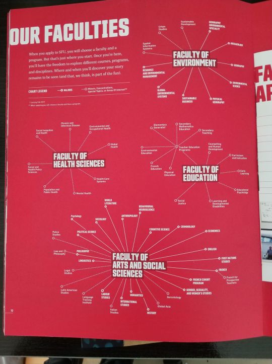
SFU’s brochure is targeting new students who are looking to apply to the school in 2019. This information web is well structured and clear in audience. It's type styling provides clear distinctions between the faculties and concentrations. Its use of complimentary fonts make it easy to distinguish between headings and body text, and despite its overwhelming amount of content focused information, it remains easy to read and understand. Its color displays a representation of the school and also creates clear wayfinding. The plain language is easy to follow and is well structured to convey important information in a clear and concise manner. There is a large amount of information being displayed, so its big form factor allows for appropriate font sizes that makes the information very legible.
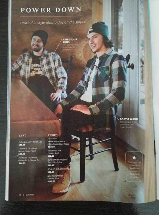
Sportcheck’s lookbook for the fall and winter of 2018 provides many good displays and effective information design. I chose this page in particular as it is well targeted and relatable for its audience. Sportcheck uses clear graphical elements such as the one in the bottom right, with descriptions that are clear and concise, informing important information about the products. The page can evoke emotional connections, as many Canadians are in a similar situation during the fall and winter. The products are specifically chosen for these seasons, and are easily identifiable because of the cluster in the bottom left. Its weight of fonts make important information such as the prices stand out. Other elements such as the page number and category in the bottom left are small but very important in case people want to track back and find this page.
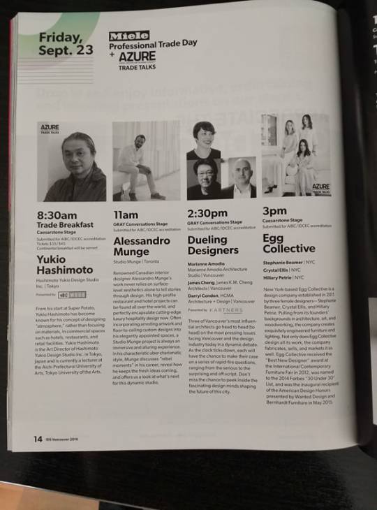
This magazine page for GRAY Magazine, is used as an information design layout to communicate upcoming presentations. The visual weight and scale makes the page attractive to the eye, with big bold fonts displaying the name and time of presenting, followed by a well copyrighted description in plain language to best inform readers about the presenters. The choice to keep the majority of the page grayscale was effectively done to resemble the magazines brand GRAY, with just a splash of colour for differentiation. There is a clear structure and underlying grid that makes the design uniform and extremely easy to follow. Sponsored logos are well placed to not look out of place with the rest of the page.
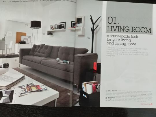
This example is a lookbook for an Italian furniture company. The company is effectively displaying its catalogue of products in easy to read spread. The type styling provides complimentary fonts, that are easily distinguishable due to its weight and colour. The copywriting is also in a plain and concise language that makes the descriptions clear and concise. The legend is clear and present, allowing the viewer to understand the category and being able to track back to it at a later time. There is clear graphical elements such as the pointers that are present on each product that are displayed. Each pointer is well followed up by the content in the bottom right, allowing readers to easily view the product, and find its description. The message is clear, it wants to sell you products that will be just right for your living room.
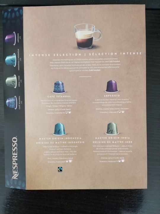
This example is packaging done by Nespresso that effectively displays information about the variety of products that are included in the box. The packaging is a clean, easy to understand layout with a clear underlying grid that is providing a constant structure. Nespresso is targeting coffee users which is well shown by the choice of color, easy to view graphics and copywriting. The clear descriptions create a clear understanding of where the coffee comes from and the type styling and information graphics display a clear understanding of the flavour and intensity. The sidebar informs users of the box contents as well as making the design visually dynamic by its layout and contrast. Overall, this package translate what can be a complex or unstructured amount of data into a meaningful and easy to read design.
0 notes
Text
Final Project Research Submission #1
History
Due to disappearing numbers of wild salmon in the 20th Century, British Columbia began hatchery production.
Hatcheries culture salmon for their freshwater phase of life before releasing them into the marine environment for their continued growth.
Began on a commercial basis in the 1970’s
In the beginning of production, majority of farm sites were centered in the Sunshine coast area, Tofino, Barkley sound, and Oneal falls.
This industry was learned through trial and error to test what species of salmon could be most successfully raised to harvest size.
1980’s saw expansion of the industry into Campbell River, Sayward, and Port McNeil, these farms replaced the old wooden pens with state of the art equipment, this resulted in record low salmon prices with many small farms running out of business.
1990’s the industry is mostly owned by large corporations and continues to use current technology to produce healthy salmon.
About 75 Farms in BC.
In BC, the salmon farming industry is now more than 90 per cent owned by three Norwegian companies: Marine Harvest, Cermaq and Grieg Seafood.
Farmed VS Wild Salmon
Wild salmon has more natural fats, calcium, iron, potassium, zinc
Farmed salmon has 3x saturated fat, more contaminants, more phosphorus
Challenges
Environmental Risks
Pesticides for sea lice,
Huge agriculture depends on wild salmon, farming threatens extinction for wild salmon
Marine mammal deaths due to a lack of wild salmon which are key foods for many mammals.
Marine Debris and organic waste (https://www.youtube.com/watch?v=TdQOjWSumto)
Diseases being spread affecting fish
Many of these farmed salmon suffered from HSMI, over 80% in 2015.
Fish surrounding salmon farms have shown tumors, and several diseases
HSMI or heart and skeletal muscle inflammation cause mortality rates of up to 30 percent at fish farms.
Economical Impacts
Aquaculture in BC created 1500 full time jobs (Could use charts, and graphs to show impact)
Contributes $400 million in export sales, and is BC’s most important agricultural crop
Some communities rely on these farms for jobs, and believe that better built farms are coming in the future.
Potential Solutions
Better Farming Technology
Open net cages which allows for salmon to pass freely
Farms need to move away from locations that can damage the surrounding environment
Improved Closed containment technologies as an alternative to net-cage aquaculture
Only small percentage of salmon is farmed in closed containment due the risks of damaging profit
Closed containment technology provides protection against the loss of fish in plankton
Sources
http://www.farmfreshsalmon.org/history-salmon-aquaculture-bc-canada
https://www.cbc.ca/news/canada/british-columbia/fish-farming-bc-leases-1.4704626
http://bcsalmonfarmers.ca/
https://www.seafoodx.io/articles/56/fish-farms-in-bc-and-the-west-coast-us/
https://www.theglobeandmail.com/news/national/bc-report-on-salmon-farming-about-to-land/article20397651/
http://www.bucksuzuki.org/current-projects/salmon-farming-campaign/solutions/closed-containment-technologies/
0 notes
Text
Idea Journal #1

1. 50/50 Plus Pamphlet
50/50 plus is a local lottery and their pamphlet is a hard to read, overfilled and poor display of information design. The pamphlet doesn’t use correct principles of proper spacing, alignment, and proximity. The page looks like it was designed to communicate as much information as possible, instead of communicating the important information well. The choice to use an abundance of capital letters, contrasting colours, and different fonts make this design extremely unorganized. If read from top to bottom, the copywriting has no flow or direction but instead is an overwhelming amount of information that is not properly arranged. The required legal information, daily draws, rules to play, and contact info are all clustered and shoved to the bottom in close proximity, making it confusing and extremely distracting.
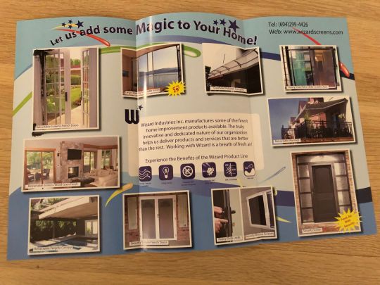
2. Wizard Industries Brochure
This example is a brochure that was mailed to me for a home improvement company that specializes in products such as canopies, railing, and doors. The brochure fails at effectively communicating good information design. The overall theme of the advertisement tries too hard to match the company's name without good effect. The majority of customers interested in their services would be adult homeowners. The company focuses on home improvement but the graphic design theme is trying to communicate a party type environment that is childish due to the large, in your face fonts, and bright colours throughout. The centered icons are blurry, difficult to understand and the text below it is a contrasting colour from the background, making it barely legible. The way the pictures are structured and aligned makes it confusing to know what to view first, and where to direct your eye next.

3. Home Improvement Pamphlet
This pamphlet is created with the intent to make consumers upgrade their pre-existing furnace however the intended information to be presented is poor due to the design. The background is extremely overwhelming and instead should be more subtle and complimentary in order to better communicate the text being shown. The typography is a mixture of different alignments, fonts, and colours making the pamphlet hard to read and follow. The picture that is attached could use captions to better communicate what it is trying to display. The advertisement shows how a rebate is given with a purchase but fails to display the main advantages of upgrading to a product like theirs. There is also a majour lack of clear branding, customers might get confused if this is a FortisBC ad or one from a local home improvement store.
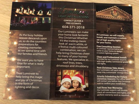
4. Lumineer Light Installs Brochure
This brochure is for a local light installation company that can put up your Christmas lights. The logo is chosen in a script font that although looks festive and fits the company's theme, is extremely difficult to read and many customers could mistake the spelling of the company. Two of the pictures are shoved into corners with no need to bleed into the sides. The copyrighting and structure of the typography is hard to follow. There is a lack of consistency due to some sections being left aligned, with others being center aligned. The font is simply too large and overpowers the contact information and branding. With no distinction in different colours, and little proximity between headings and body text creates an overall ineffective work of information design.
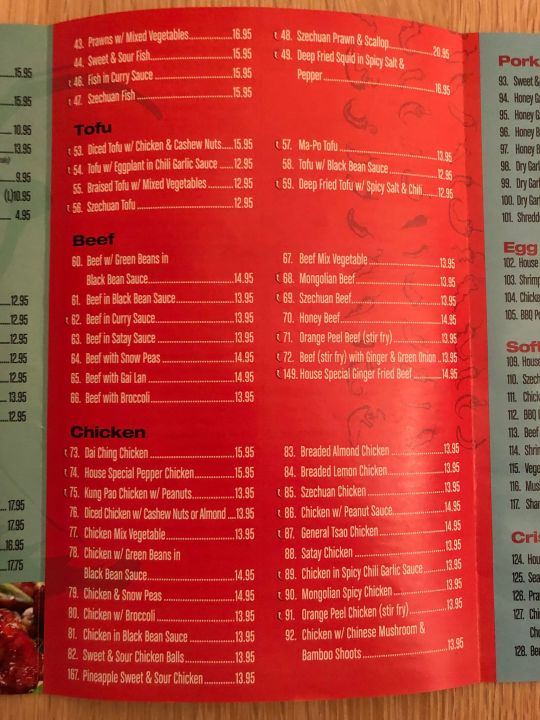
5.Chile Lee Sichuan Restaurant Menu
The menu for this local Chinese restaurant is a confusing, run on list that needs improvement. There is a lack of proper spacing and indenting, making the items on the menu difficult to separate. The icons used to indicate an item is spicy is not backed by any legend and is difficult to understand. Judging by the icon, we can assume that the dish will be spicy, but with using only one icon on each item, the viewer can not distinguish the level of heat that each item contains. There is also a lack of detail with each item listed, many of the items do not mention ingredients, how they are cooked, or what’s included with the order. The choice to use periods to right align the pricing, combining with the close proximity of text makes the menu extremely cluttered.
1 note
·
View note