Kalle Wolters (1993) is an Illustrator from Groningen, the Netherlands. His main emphasis is on editorial illustration, poster design, packaging and comics. Drawing inspiration from the Russian Avant-Garde to Hergé, he loves combining strong concepts with an aesthetic approach.
Don't wanna be here? Send us removal request.
Statistics
We looked inside some of the posts by kallewolters and here's what we found interesting.
Average Info
Notes Per Post
40
Likes Per Post
34
Reblog Per Post
6
Reply Per Post
0
Time Between Posts
13 days ago
Number of Posts By Type
Photo
17
Last Seen Tumblr Blogs


Fun Fact
The total number of visits Tumblr.com received during January 2021 is 327 million.
Photo


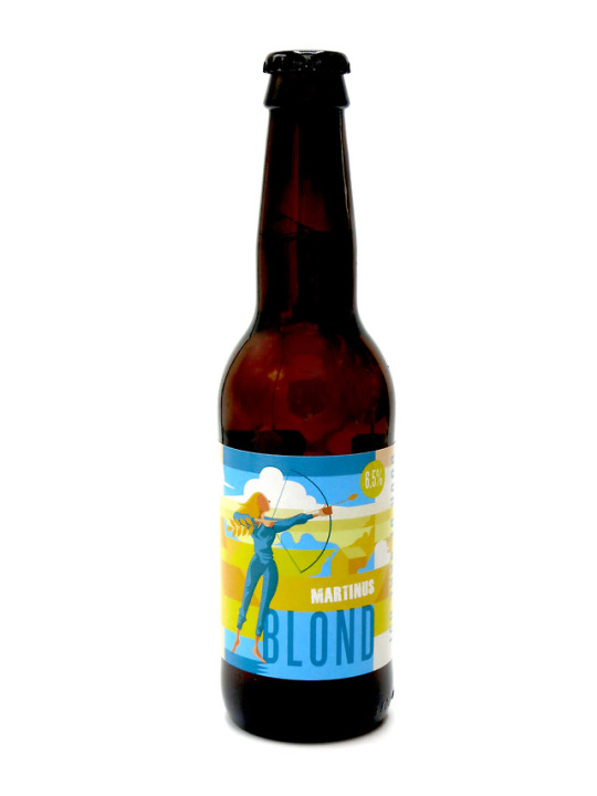
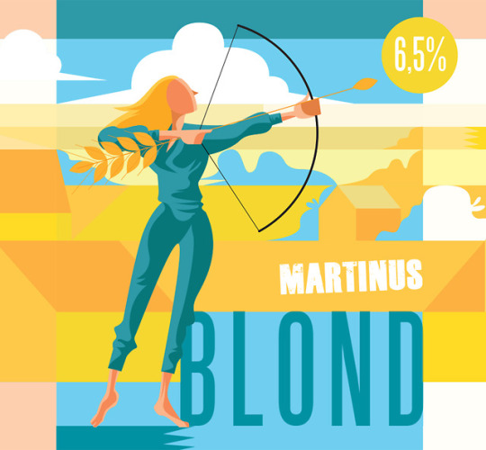
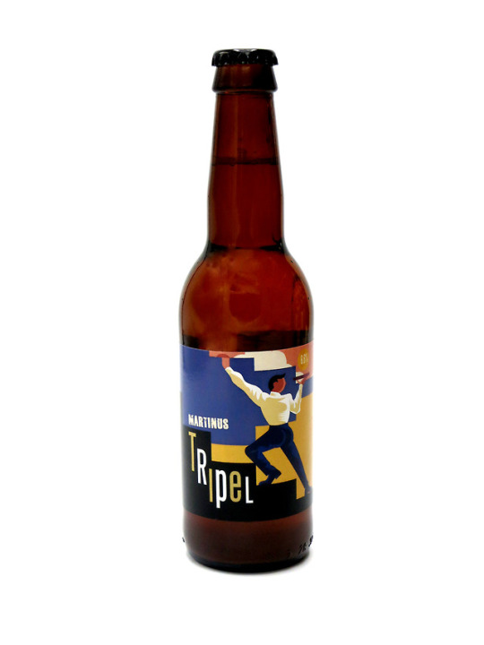

Beerlabels Illustrated for Brouwerij Martinus (2016 - present)
6 notes
·
View notes
Photo
Editorial illustration
3 notes
·
View notes
Photo
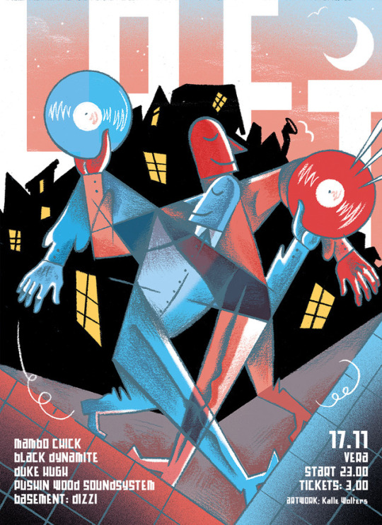
Poster for Loft
1 note
·
View note
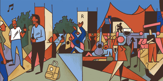
Photo

A new illustration for Hard//Hoofd. Siri Beerends wrote a great article titled ‘Gekunstelde Echtheid’. In the digital age, we’re desperately looking for authenticity. However, this authenticity results into something just as constructed and fake. The only solution lies in ‘real spontanity.’
0 notes
Photo


Beer label design for Martinus Nuver.
0 notes
Photo
Panel from a comic I created for the theater play ‘Leben’ at theater Bremen. The comic was used in visuals. This part of the comic is depicting Karl Ove visiting a music festival for the first time.
0 notes
Photo

Poster for FENN at this year’s Noorderzon performing arts festival.
5 notes
·
View notes
Photo

Editorial illustration on Matching tests at dutch universities. There’s big differences how each faculty approaches the obligatory matching tests, that guide students choosing the right studies. Nevertheless, for finding the right study, there’s is still no easy way.
2 notes
·
View notes
Photo

Nieuws in Beeld for Hard//Hoofd.
3 notes
·
View notes
Photo
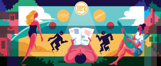

I designed a Banner for this year’s Vera Container at Noorderzon performing arts festival!
#illustration#vera groningen#Noorderzon#performing arts#festival#banner#summer#beach#graphic design#identity
3 notes
·
View notes
Photo

Illustrations I made for the Hard//Hoofd summer book. A digital book containing all sorts of essays, short stories and illustrations on the theme 'Summer of 2069.'
0 notes
Photo
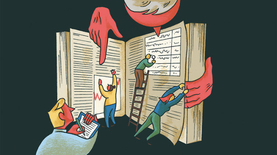
Editorial for Ukrant about Perusall, an application that is meant to improve ‘close reading skills of students’, but a lot of students have the feeling ‘being watched’ while reading, because of all the information the app records while students read texts.
3 notes
·
View notes
Photo

A spread from the booklet 'Nacht 85: 86: 87: 88', created together with Jan Hamstra and Megan de Vos from our Knetterijs collective for Theater Bremen. It was used in the theatre play 'Leben' directed by Frank Abt. The booklet was projected on stage, used by the actors during the play as a prop and sold to the audience afterwards.
#illustration#zine#booklet#theater bremen#club night#drinking#dancing#karl ove knausgaard#visuals#knetterijs#nacht#leben
3 notes
·
View notes
Photo

Latest Loft-poster!
#gig poster#loft#city at night#vera groningen#drawing#texture#abstraction#music graphics#graphic design#pencil
2 notes
·
View notes
Photo
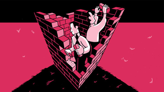
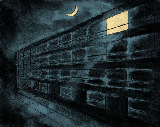
Editorial illustration for Ukrant. The management of Rijksuniversiteit Groningen has become less and less transparent through the years, because the managers are afraid of too much resistance against new plans. However, this lack of transparency leads to a lot of criticism, and induced a culture where employees and students feel not represented by their managers.
#illustration#editorial#building walls#transparancy#graphic design#perspective#management#rijksuniversiteit groningen#monochrome#ligne claire
4 notes
·
View notes
Photo

Another Gig poster: Kitty Kitty Tuna, at Vera Groningen.
2 notes
·
View notes
Photo
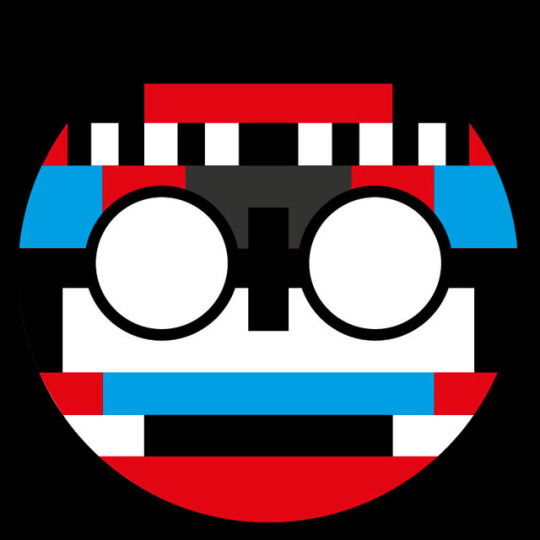
Already a while ago, but this is the back-cover I designed for the Zine Knetterijs #3, Timothy wants to be on tv (2017)
#illustration#test screen#tv#graphic design#timothywantstobeontv#knetterijs#zine#smallpress#screenprinting#artists on tumblr
3 notes
·
View notes