Photo


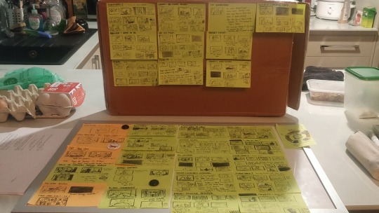
Dead End Paranormal Park Season 2, Episode 3 “The Trials of Barney” thumbnail pass of the wrestling match. (Basically the second half of the episode) #spoilers but only if you look too close.
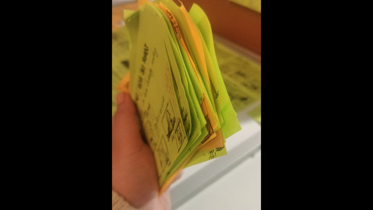
So fast forward like 6+ years since I last posted on my Tumblr, I’ve moved on from art department and illustration into story departments. I work as a Story Artist, mostly on animated series. In the back of my mind I always knew I wanted to do storyboards but it took such a long time for anyone to give me that chance (and a long time for me to be good enough.) Working on Dead End Paranormal Park was so special and this episode was probably my personal favourite to work on. I remember reading something Hamish Steele wrote about the Demon Wrestling in the DeadEndia graphic novels being a love letter to Pro Wrestling and so I wanted this to be an extension of that love letter. I researched the heck out of Pro Wrestling leading up to being briefed on this episode, watching every YouTube clip and documentary I could find and fit into my schedule. I went from someone who knew very little (I’d say Glow was as much as I knew) to someone who actually yelled at my board partner “OMG The Undertaker retired!!” Anyway, I like to think that wrestling with Demon magic is kind of that extra little kick you could only get away with in animation so it was a real ride being able to sink my teeth into that fantasy. I use this post-it method when I have to do a lot of visual writing, which happens whenever I’m working on heavy action sequences like fights that are also story-heavy. Sometimes in order to get a scene working we have to shuffle sections of the script around, add and really plus things. The biggest change was making Hox a constant commentator to tie the whole sequence together (so we gave him A LOT more lines.) Some of the flashbacks originally were at the start of the script and we felt the story was stronger if we saw them during the fight so we moved them here. It was a bit of a choreography of all the parts that had to happen. I still think it was an astounding script to work with and it really helped that to me it was clear from the start what plot A (Barney’s Wrestling) B (Pugsley trying to protect Barney) and C (Norma and Courtney being DWF fans) were. And I absolutely love how all 3 come together in the end. Anyway, this post-it method was something I just started doing after being inspired by this Better Call Saul beat boards I saw on Twitter. https://twitter.com/TomSchnauz/status/1233512024350609409?s=20&t=HFN2Z93g3KgEYUqPOuoAOQ This is the absolute raw first version storyboards of this half of the ep. After that, I developed it into a first pass which we pitched internally. After that, me, my storyboard partner, Eva Figueroa and our episode’s storyboard supervisor, (storyboard lead) Max Loubaresse had a look at the entire episode and refined it some more.
6 notes
·
View notes
Photo

Long time no post! (Storyboard artist … you work so bloody hard all the bloody time because you friggin love it).
Repainting this because I’m going to a portfolio consultation tomorrow for my illustration work. It’s based on some feedback I got on my portfolio last year from a literary agent. She said I had to make my illustrations less sharp-edged… more soft and fluffy. *shrugs* let’s see what these guys say. :)
#illustration#repaint#digital painting#pomeranian#dog#fluffy#soft#cute#colour#children's literature#theschoolmagazine
3 notes
·
View notes
Photo

Fluffy Duck and Nina
I went to SCBWI (British Isles) Agent’s Party last Friday and got feedback on my portfolio from a wonderful agent. I was inspired to rework an old piece. Looking forward to exploring this style more!
1 note
·
View note
Photo

One Day
Full page illustration for poem, One Day by Beverly McLoughland. Published in The School Magazine, Orbit (September) 2016.
#illustration#children's literature#concept#cow#milking cow#colour#digital#art#artists on tumblr#field#farm#nature#kids#poetry#poem
1 note
·
View note
Photo


Chester’s Ears
3 x illustrations for short story, Chester’s Ears by Anne Renaud. Published in The School Magazine, Blast Off (June) 2016.
#illustration#colour#digital art#color#character#short story#childrens#literature#the school magazine#Chester Greenwood#Ear Muffs#Fun#kids
16 notes
·
View notes
Photo


The Rug Part 2
4 x Illustrations for part 2 of story, “The Rug” by Anna Feinburg. Published in The School Magazine, Countdown #4 (May) 2016.
Part one is here.
Roughs are here.
#illustration#fantasy#children's literature#The School Magazine#colour#digital art#concept#character#character design
1 note
·
View note
Photo

The Cyclist
Another character from “Clever Cats” -- the short play I’m working on right now. Don’t have a lot of time to clean this up properly! :<
0 notes
Photo

Catching up for yesterday... First rough sketch of the final Mrs Tilby character design from the play I’m currently illustrating.
#character design#wip#rough#pencil#research#first pass#drawing#illustration#old lady#design#character
9 notes
·
View notes
Photo

London Cat Village: Oscar vs Alice
8 notes
·
View notes
Photo

Lelu on the back burner...
Wish I could say this project’s being revived but for now it’s still sitting in the back burner. It was a comic collaboration between myself and my partner, Max Loubaresse... we worked on a pitch for it. The story is small but sweet and close to my heart and I might one day pick it up and dust it off, finish it and get it over with! But for now... so many other things to do damn it!! TT^TT
5 notes
·
View notes
Photo


The Rug Part 1
6 x Illustrations for part 1 of story, “The Rug” by Anna Feinburg (who wrote the Tashi books with Barbara Feinberg). Published in The School Magazine, Countdown #3 (April) 2016.
I heard back positive comments from Anna Feinberg through The School Magazine staff. I’m so thrilled she liked them! I really loved this short story.
#short story#illustration#childrens#literature#anna feinberg#fantasy#creatures#animals#colour#art#artists on tumblr#digital#painting#character#concept#publishing#magazine#the school magazine
4 notes
·
View notes
Photo

Here is a stylistic pineapple drink...
.
.
.
Sorry guys... no time for new art today. OTZ
#prop design#tashi#cg#tv animation#CGI#3D#pineapple#stylistic#visual development#digital art#concept art#fruit#drink
1 note
·
View note
Photo

Schoolboy
Ahh crap time flies!! It’s 11PM and we haven’t eaten dinner yet. T-T I rushed the clean up of this so badly, I’ll definitely have to revisit it. Anyway, first pass. One of the characters I’ve designed for an upcoming short story.
1 note
·
View note
Photo

Dragon Glider (Prop Design)
The character, Tiki Pu was designed (in 2D colour) by Marc Bouyer. I coloured him up to look 3D. Prop design by me.
I’m almost running out of props to post from Tashi, which is a good and bad thing. Bad because I don’t have a lot of things to post daily, good because it’ll push me to draw more new stuff.
#Prop design#colour#digital#animation#children's#kids#CGI#CG#3D#TV series#Tashi#visual development#concept art
3 notes
·
View notes
Photo

False teeth jar
Prop design for “Tashi.” Probably a contender for the weirdest thing I’ve been asked to design.
I came SO CLOSE to designing dragon poo but regretfully had to delegate it to someone else because I was busy. :(
3 notes
·
View notes
Photo

Sick turtle, kind snail
Been sick lately. Max took the day off to be on tea duty. :) <3
Not sure if I can make up for the last few days of no-posts. But back to every day posting when I’m feeling better. Hopefully soon!
3 notes
·
View notes
Photo

2016 NSW Premier’s Reading Challenge Poster Art
So apparently this poster has been out a while! (I’m not in the country so I couldn’t see for myself!)
It was created for this years NSW Premier’s Reading Challenge, commissioned by the NSW Department of Education.
#poster art#illustration#kids#literature#final art#digital#NSW#Premier's Reading Challenge#event#education#reading#competition
3 notes
·
View notes