
Don't wanna be here? Send us removal request.
Statistics
We looked inside some of the posts by aleisharuby and here's what we found interesting.
Average Info
Notes Per Post
1
Likes Per Post
0
Reblog Per Post
1
Reply Per Post
0
Time Between Posts
9 hours
Number of Posts By Type
Photo
9
Text
1
Video
7
Last Seen Tumblr Blogs


Fun Fact
Tumblr Inc. is funded by 13 investors.
Photo
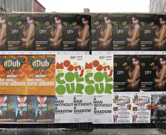
Our poster on a poster wall!
0 notes
Text
Rationale
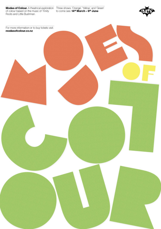
This trans-media project Modes of Colour explores the music of Warren Maxwell, and uses colour to understand and depict the meaning that lays behind his songs. Using both colour theory and our imaginations, we chose a colour to represent each song: Te Oranga is orange, Little Things is yellow, and Home, Land, and Sea, is green. These three colours are analogous, meaning they work together in harmony and are not harsh on the eyes. This concept of ‘harmony’ formed the objective of our season of plays: through the series (Titled Karakaraka, Kōwhai, and Kakariki) we hoped to make our audience look deeper into colours, and possibly even learn something about living better in harmony with one another from this.
We used a playful child-like style of design with paper cut-outs of bold illustrations, bright colours, and a geometric typeface Flegrei from the Tipoteca Series. This communicates light-heartedness, hopefulness, and soon-to-be growth across to our audiences – sensations we feel will be communicated within the season. To prevent our designs from appearing like children’s advertisements, we countered this with a mature use of typography across all media. Through the process of group work, we learnt the importance of clear communication and planning, and used tools such as Trello, Tumblr, Google Docs, and Google Drive to aid this process.
0 notes
Photo
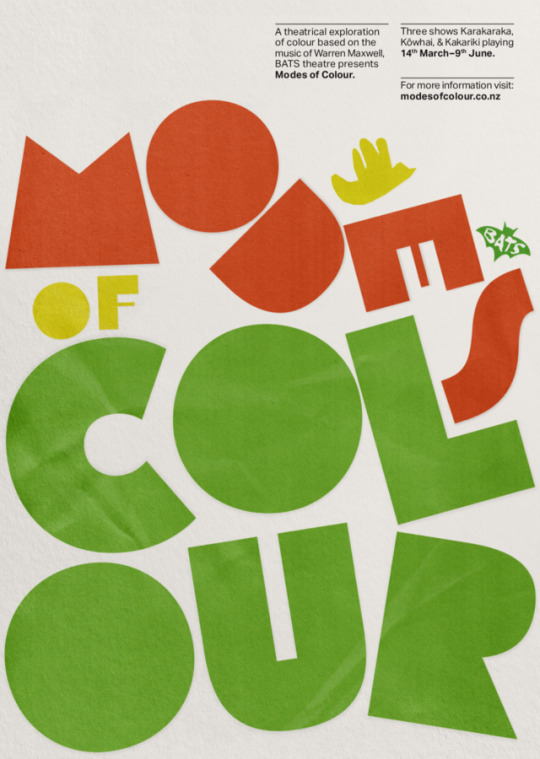
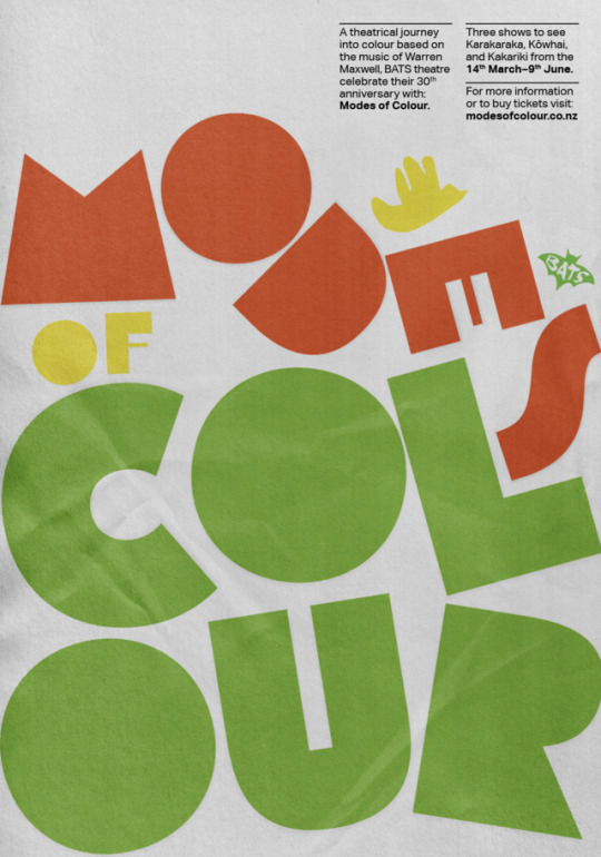
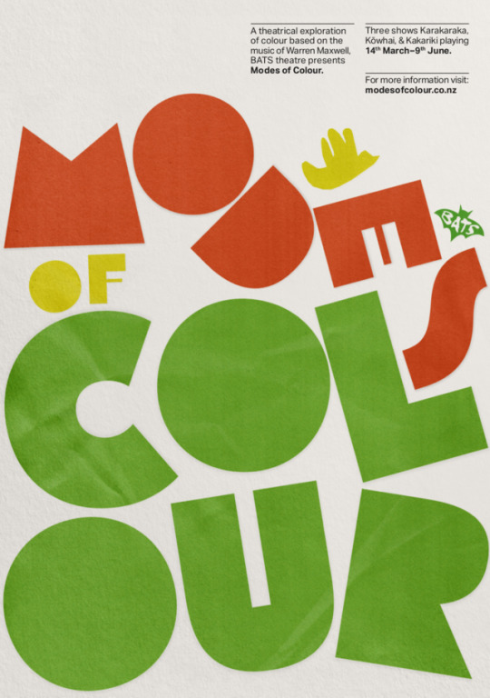
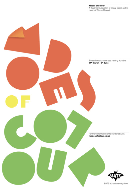
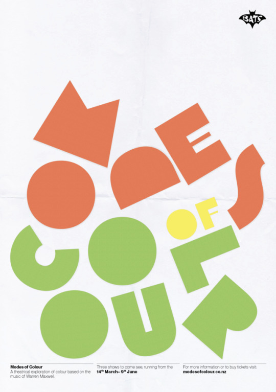
Final Poster!
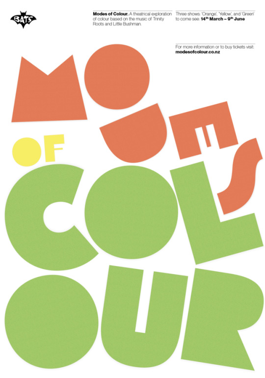
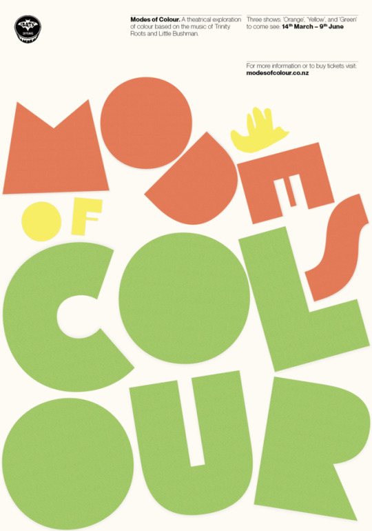
I ended up going with the paper texture background, but with having crumple in the letters. I think this works because it still makes the background interesting, and look like paper (so kind of like a paper collage - like the animation), and I also added a layer of white with the smallest bit of yellow to give it some colouring and make it not completely white. I added some drop shadow to the letters, but not too much, as I didnt love the look with a dark drop shadow. I also shifted around the grid, and worked the text so it looked cleaner. I like the little BATS logo where it is, in my opinion it fits with the imagery really well.
0 notes
Photo


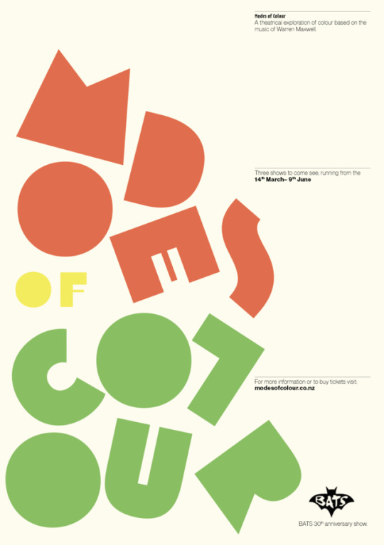
Even more poster iterations
0 notes
Photo


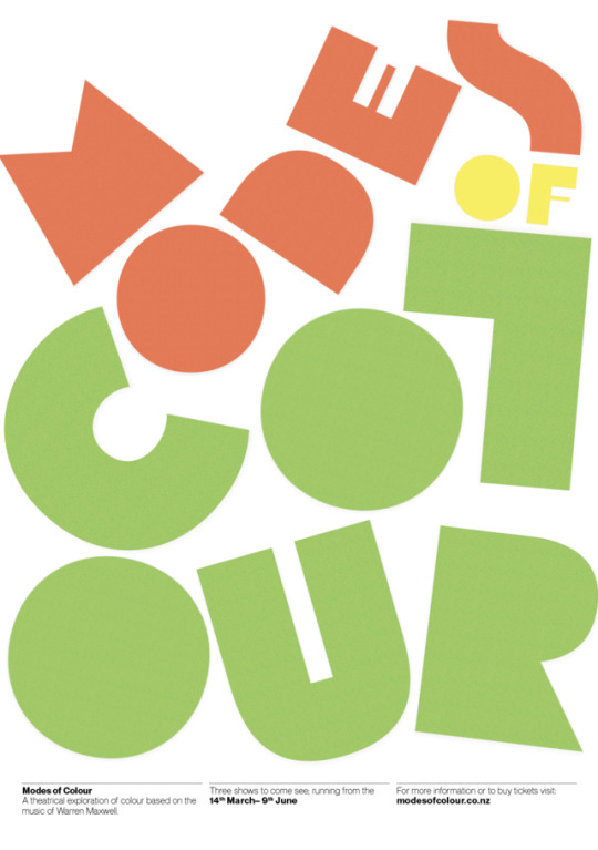
More poster developments
0 notes
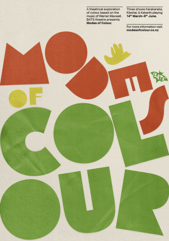
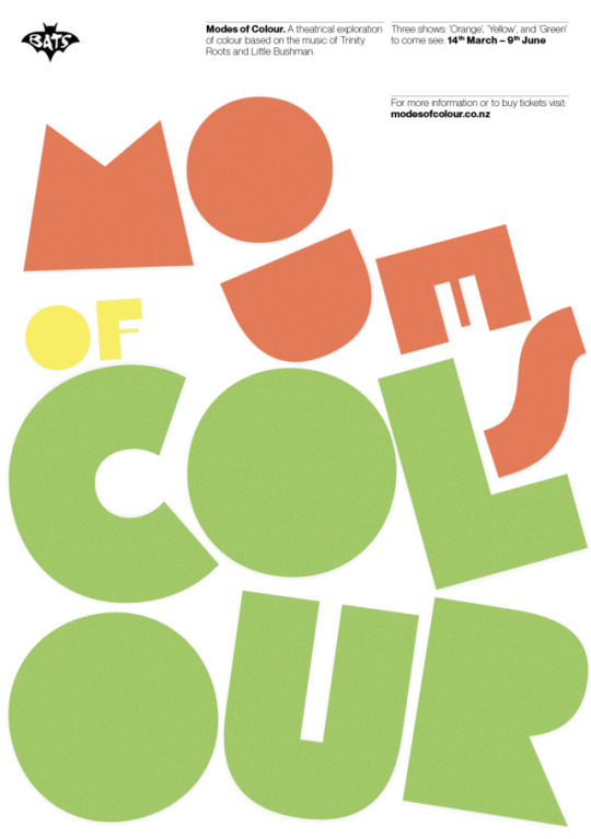
Photo


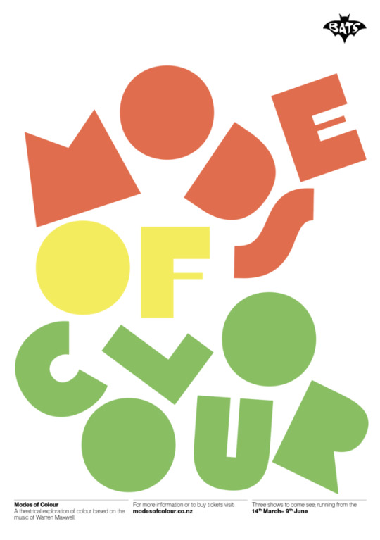
Poster Developments!
0 notes
Photo

How will our trans-media project work together? By seeing advertisements such as posters on the street, and on online Instagram ads, users will then be directed to the website, where they can find out more information and also buy tickets to the show.
0 notes
Video
tumblr
Our final website tour video for submission!
0 notes
Video
tumblr
Choosing a visual style (Karakaraka)
0 notes
Video
tumblr
Choosing a visual style (Kōwhai)
0 notes
Video
tumblr
Choosing a visual style (Kakariki)
0 notes
Video
tumblr
Website Development (1)
0 notes
Video
tumblr
Website Mock-Up The first version of our website! Things that need to be worked on from here: - Needs to feel more playful and less business-like. Perhaps we could do this by making the headings more exciting, e.g. make them look like paper as well? We could also try and make the shapes look like paper. Steer clear of the black & white so heavily! - Maybe add some paper cuts down the bottom that makes the landscape for our motion graphic, e.g. where the sun comes up or the mountains or tree.
- The overlapping of shapes on top of photographs works well! Try and push this further. - Refine text, figure out what it is that you want to say. - Change the typeface to match the new poster.
0 notes
Video
tumblr
Updated Animation (class 6.1)
I updated the animation to include both a bold and a regular version of our updated body copy typeface, Aktiv Grotesque. I changed the typography in the final frame as well as changing the background for the yellow section to orange to create more continuity in the animation.
#ruby#orange#yellow#green#te oranga#little things#home land and sea#warren maxwell#massey#design#wellington#new zealand#after effects#bats theatre#animation
0 notes
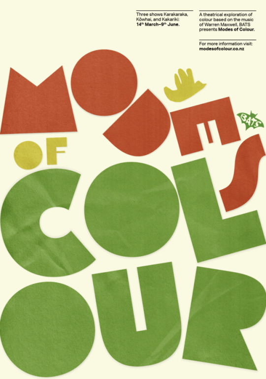
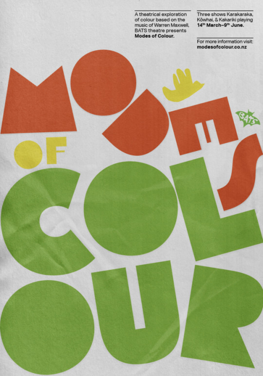
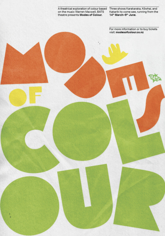
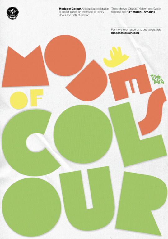
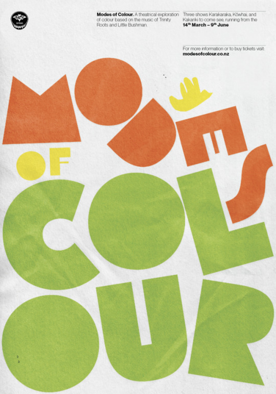
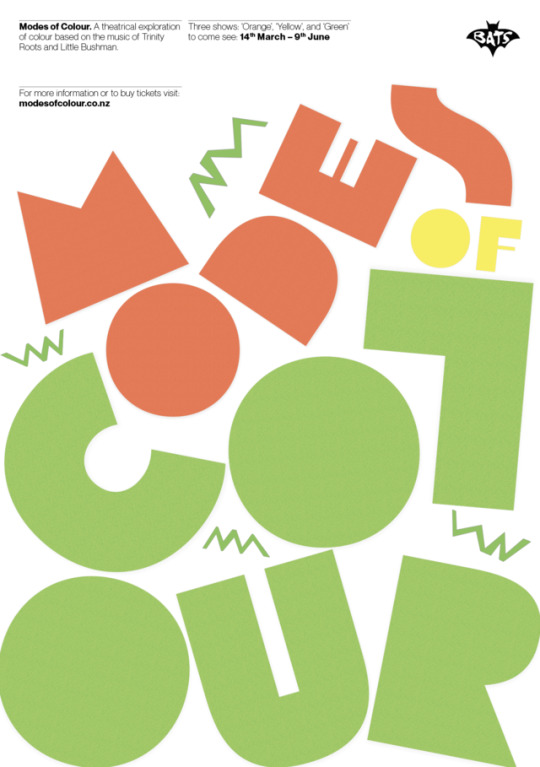
Photo

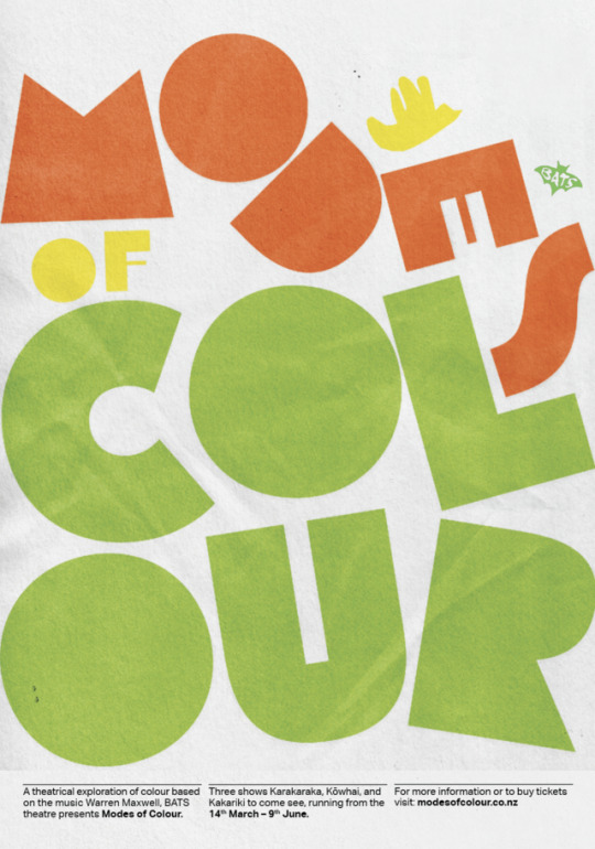
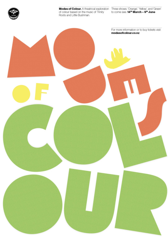
Refined Poster Added a layer of some-what crumpled paper stock to make it match with the ‘handcrafted’ paper style in our motion graphic. The large type has also been shifted around for better readability, as before the letters were too scrambled and it wasn't very legible. The little bird that features in our motion graphic has also been added, this is to introduce viewers to our illustration style (outside of the type), to show a representation of our theme of ‘harmony’, and to connect with our motion graphic. I have also refined the body copy type, it is now easier to read and makes more sense cohesively, and the text has been adjusted so that there are no widow’s or any weird spacing. We have also decided to change the titles of our plays from ‘orange’, ‘yellow’, and ‘green’, to the Te Reo translations of these words ‘karakaraka’, ‘kōwhai, and ‘kakariki’, this so as to include Te Reo in the season seeing as Warren Maxwell integrates it heavily into his music.
1 note
·
View note
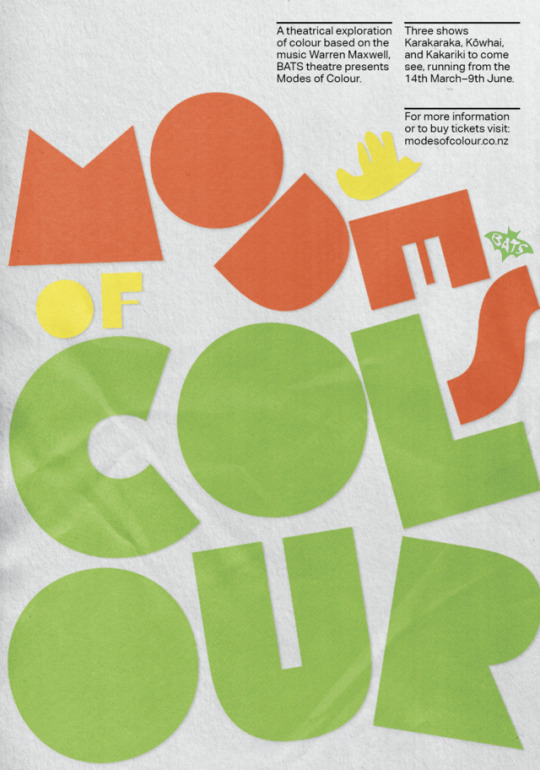
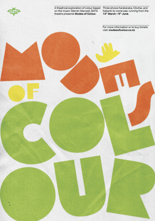
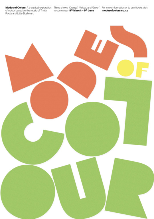
Photo

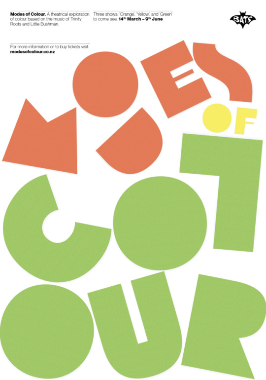
Poster Iterations Trying to introduce the concept of paper more into the poster. In the first one introduced a ‘fold’ to the lettering, and in the second two, I used a paper background to bring some further detailing. Don’t love them, but interesting concepts!
0 notes
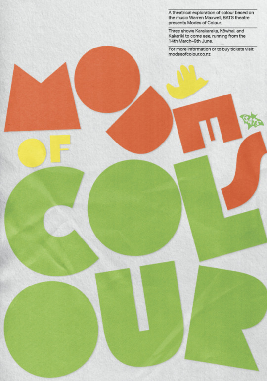
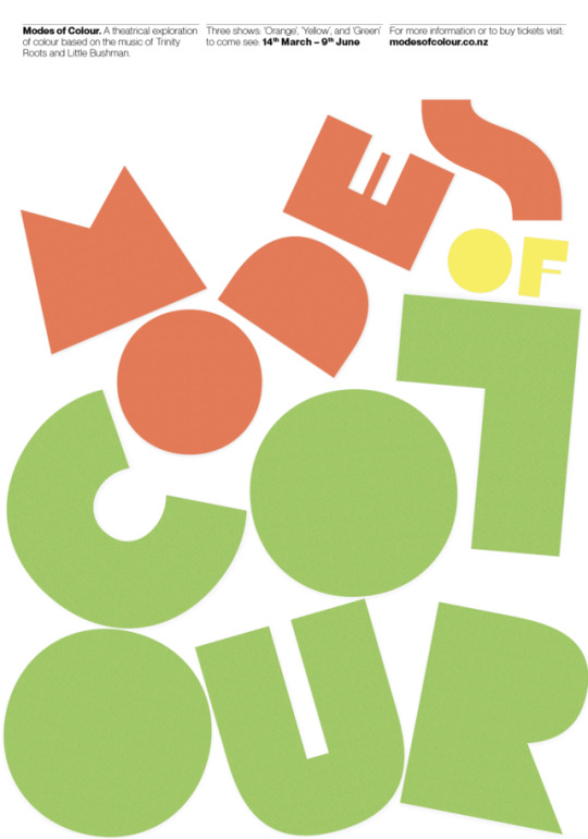
Photo
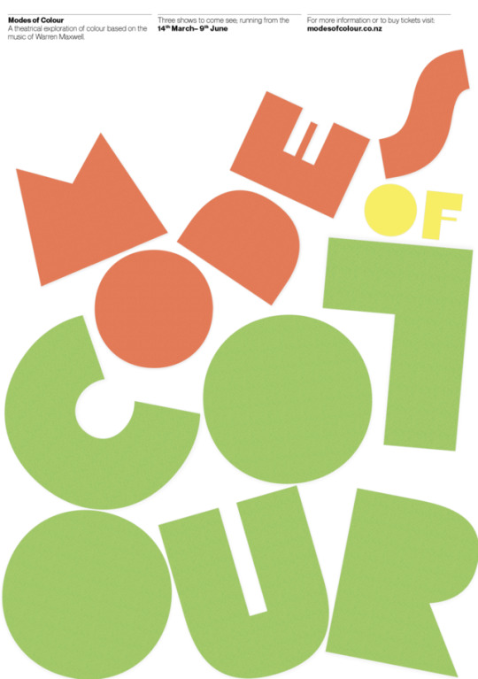


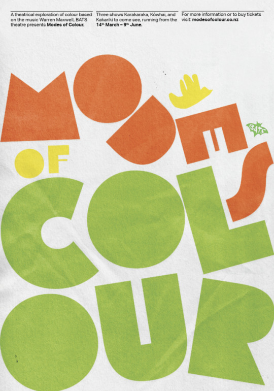
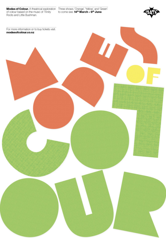
More poster iterations Really pushing the concept of type as image! Since I was struggling with the white background, I thought perhaps one way to tackle it would be to over-size the type and use colour in the type, this way most of the page is used and filled with colour. The arrangement of letters is made to appear as playful and almost as if they have just been dropped into the page. They work in harmony and sit together without being disruptive, however, they are still very eye-catching. I also added a pattern effect and a drop shadow behind each of the letters to make them appear as though they are paper cut-outs, this is in order to connect it to the motion graphic concept.
0 notes