#typeasimage
Explore tagged Tumblr posts
Visit Tumblr Blog
Explore Tumblr blogs with no restrictions, modern design and the best experience.
Last Seen Tumblr Blogs


Fun Fact
Tumblr.com rank in the US is 25.
Text


Assignment = Type as image
3 notes
·
View notes
Text
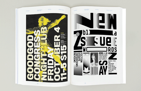
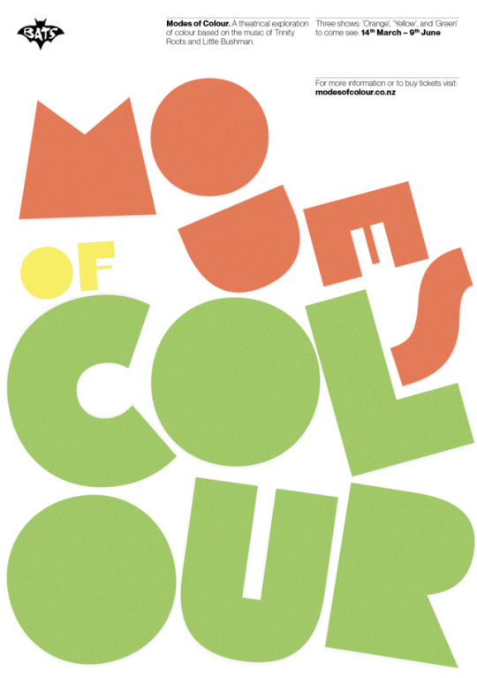
Magazine Layout with Type as Image
For this assignment, I used materials that embody the essence of my chosen word, turning it into a compelling image. I transformed expressive typography into a visual representation of its meaning! This not only brings the word to life but also serves as the foundation for magazine layouts that speak to its story.
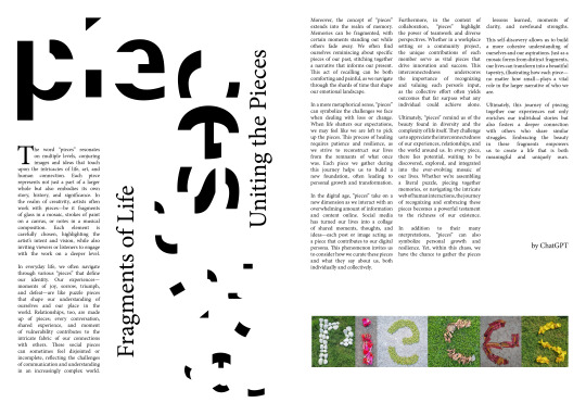
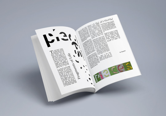
#TypeAsImage #MagazineLayouts #ExpressiveTypography
0 notes
Text
Type as image lecture
Here are my notes from the lecture:
noun: Typography - style and appearance of printed matter, and the art of arranging type.
noun: Lettering - the act, art, or technique of inscribing letters on to something.
Herb Lubalin - is an American graphic designer, 50s / 60s, avant garde, logo design magazine, playful type, best known for his stark, bold layout, word pictures or conceptual typography.
Craig Ward - is an British born designer, words are pictures, uses materials to add another layer of meaning to his typographic creations e.g. bacteria on the letters.
Alison Carmicheal - is an London based artist known for hand - crafted typography, fancy type, cadburys advert, using cream and chocolate to write with.
Ji Lee - video on moving type, I really like this artist because it was entertaining. Has a book called ‘words as image’.
Paula Scher - I have researched this artist before and I really like her work. There is a show about her on Netflix and she talks about her company and her work.
Sarah Hyndman - talks, books ‘Fonts form a kind of language of their own, and we are all unconsciously fluent in it’. Hyndman uses the psychology of type and how typefaces affect us subconsciously.
What did I learn from this lecture?
I have learnt the meaning of typography and lettering.
Understood that typography can have a powerful impact on the viewer and can become an image.
How artist use different mediums and even science to create typography.
I liked this lecture because I am interested in typography and it made me think how I can use typography in a different way. The most interesting thing in the lecture was the work of Craig Ward.
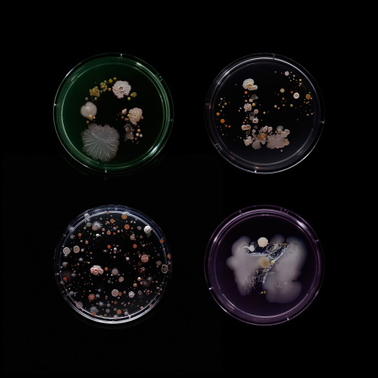
I haven’t seen anything like this before and I like how the artist has used science and art together. This is really smart!
Second half of the lecture
The second half of the lecture was hard to follow and there was a lot of new terminology that I didn’t understand. BUT, what I did gather from the talk was that sometimes text is needed along with a image so that the viewer can understand what is going on.
#text as image#graphic design#graphic design blog#blog#craig ward#ji lee#typography#lettering#typeasimage#image#typeface#Experimental#explore#design#art#lecture#experimental typography#paula scher#sarah hyndman#herb lubalin
7 notes
·
View notes
Photo
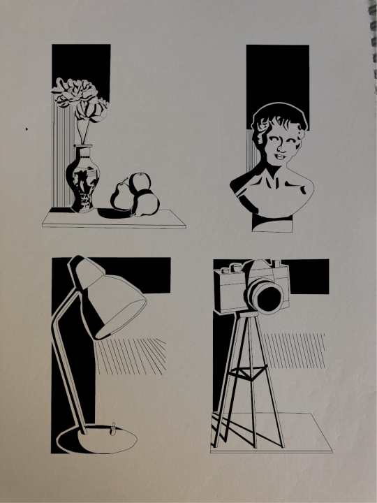
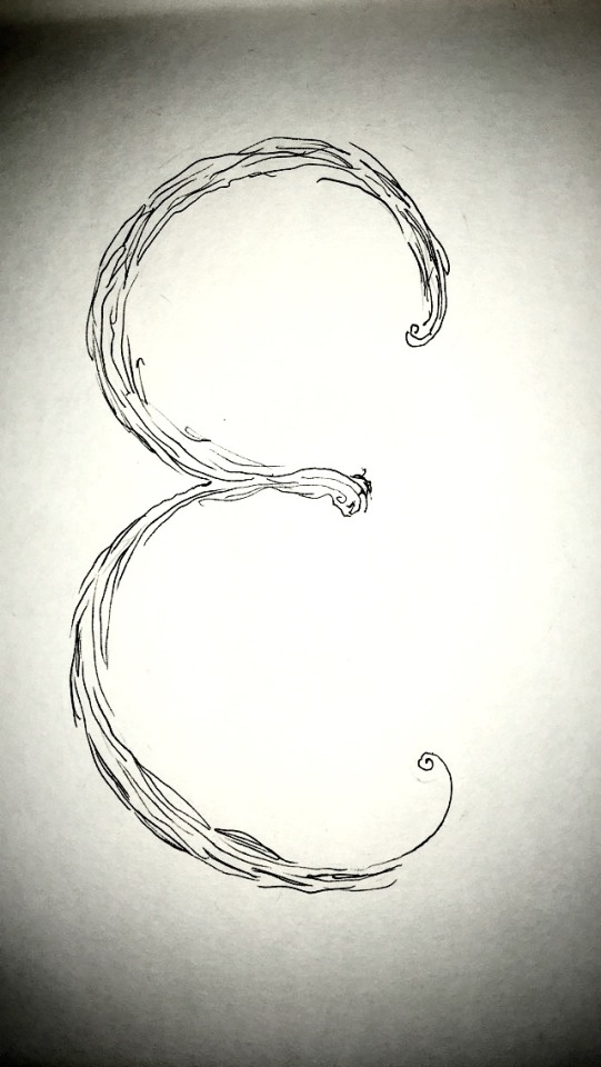
This is one of my illstration i may mix it up a bit. But its a type as a image. I love this piece. Its meant to show as still life with pistically saying still life.
0 notes
Photo
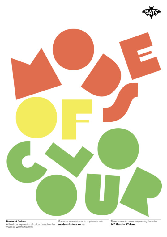
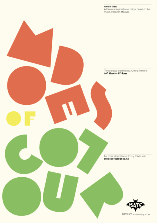
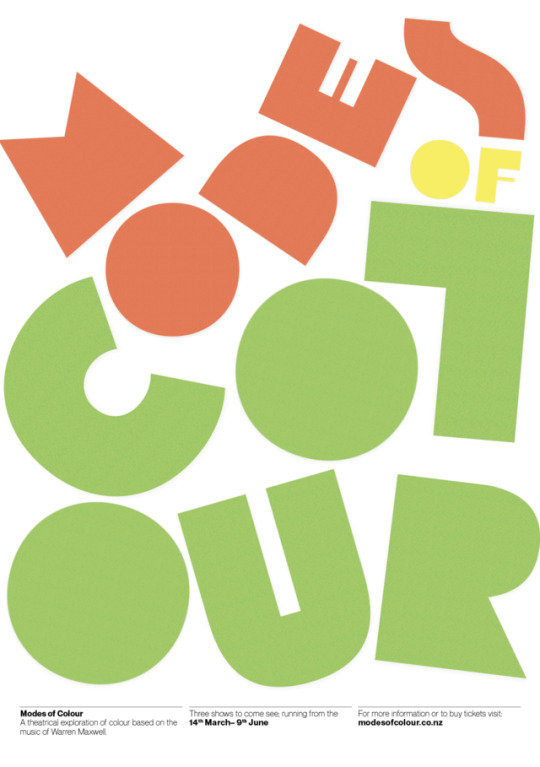
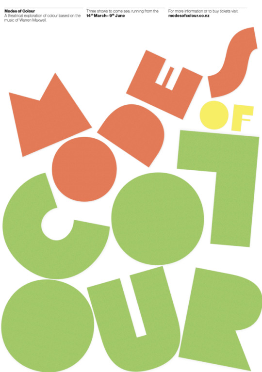
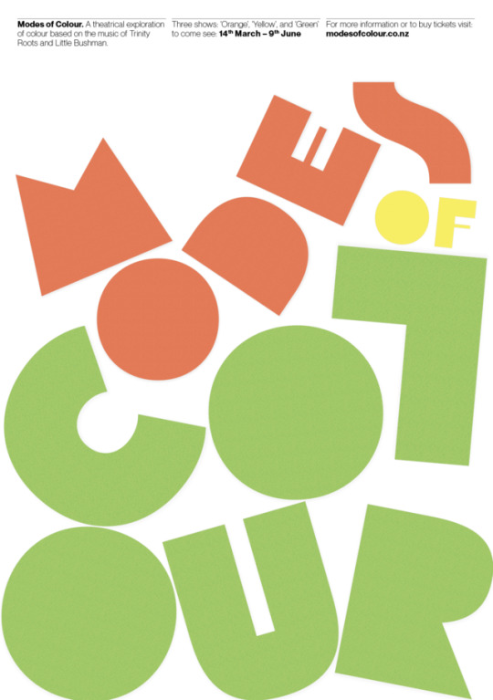
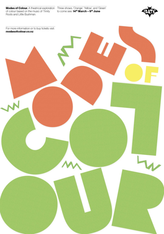


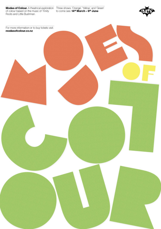
More poster iterations Really pushing the concept of type as image! Since I was struggling with the white background, I thought perhaps one way to tackle it would be to over-size the type and use colour in the type, this way most of the page is used and filled with colour. The arrangement of letters is made to appear as playful and almost as if they have just been dropped into the page. They work in harmony and sit together without being disruptive, however, they are still very eye-catching. I also added a pattern effect and a drop shadow behind each of the letters to make them appear as though they are paper cut-outs, this is in order to connect it to the motion graphic concept.
0 notes
Photo

typeasimage
RENDANG by Will Harris, to be published in February by @grantabooks .
Art direction by @wasley.sarah
https://www.instagram.com/p/B5GCqs6hlF5/
1 note
·
View note
Photo
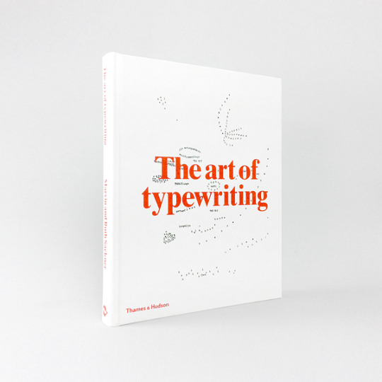
The art of typewriting by by Marvin & Ruth Sackner / Design by Graphic Thought Facility / Published by @thamesandhudson / available @counterprintbooks * * * * * #theartoftypewriting #thamesandhudson #graphicthoughtfacility #type #typewriter #typewriterart #typographic #typography #typeasimage #typographer #design #graphicdesign #graphicbooks #graphicbook #bookdesign #booksondesign #designbooks #graphicdesignbook #publishing #publication
#typewriter#typographic#bookdesign#typography#designbooks#publication#typeasimage#type#theartoftypewriting#graphicdesign#design#graphicbooks#booksondesign#graphicbook#typewriterart#graphicdesignbook#graphicthoughtfacility#thamesandhudson#publishing#typographer
0 notes
Photo

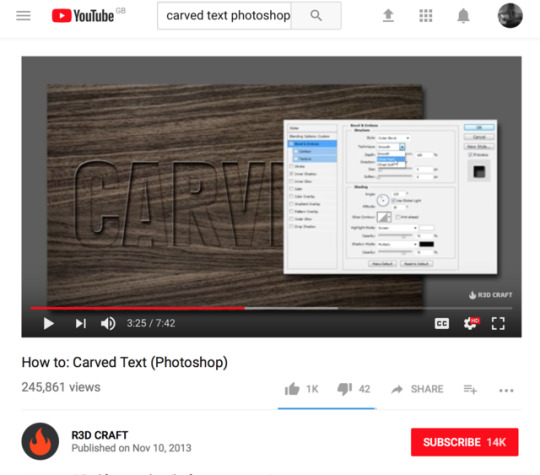
Photoshop Experimenting
Creating a carved look with the type tool in photoshop
0 notes
Photo
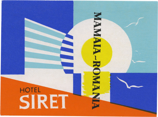
Hotel Siret, Mamaia (75mm × 101mm) by typeasimage https://flic.kr/p/aAcock
0 notes
Photo
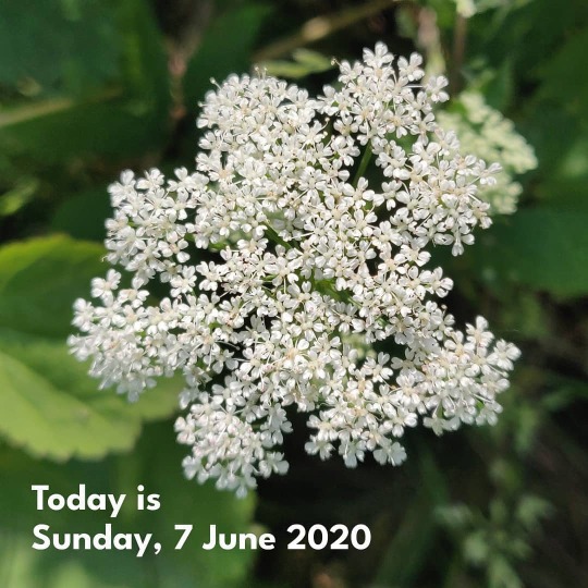
Finally going to try and post information on the plants and flowers I photograph as I've always loved that @typeasimage does it. Today I learned how many plants aren't Cow Parsley, yesterday it was how many geraniums look superficially the same. This is, I think, Aegopodium podagraria, (commonly called ground elder, herb gerard, bishop's weed, goutweed, gout wort, and snow-in-the-mountain, and sometimes called English masterwort and wild masterwort). Also in the family of plants that won't keep still at the mere suggestion of wind and won't play nicely with my phone's focusing abilities. https://www.instagram.com/p/CBH9eZbHyQ6/?igshid=99jaapv06s4w
0 notes
Photo

#vhs#vhsart#art#glitch art#video games#game over#colour aesthetic#dark aesthetic#aesthetic#text aesthetic#typeface#Typography#experimental typography#typeasimage#graphic design#black and white photography#photography#glow#grunge#aestheitcs#grunge aesthetic#waves
4 notes
·
View notes
Photo

Hotel Jordán Tábor (77mm × 78mm) by typeasimage http://flic.kr/p/cL5qsq
0 notes
Text
TYPE AS IMAGE. THE IMPACT OF VISUAL LETTERS/WORDS
‘A picture speaks a thousand words...’
I strongly agree with the sentence above, and it is one of the reasons why I am so passionate about graphic design and photography.
I believe they are a strong tool to reach out to the most inner parts of humans through the emotions.
As humans we are strongly affected by what we see more than we even realise and this gives us a kind of power as visual communicators to communicate, to influence, to inform and get across messages, stories and much more.
Typography is an interesting way in which we can visually speak to our audiences, each typeface communicates something, each font gives more detail about what we are communicating, the way in which we place each letter, how we picture each letter, how we can make each letter visually represent the word or how the word can visually help the sentence, these are all questions that from now on I will try to apply to each typographic task so that I can rightly communicate to my audience.
youtube
This reminds me of the activity we did in the first module where we were given some letters and we had to write them based on their meaning. Here are some examples of my work:


0 notes
Photo

- Creating letters that embody their chosen words - for example ‘X’ was assigned the word ‘ecstatic’, so we were instructed to portray the meaning of this word through a design of the letter ‘X’.
0 notes
Text
Type and Image Lecture
Semiotics
Signifier
The signifier is the pointing finger, the word, the sound-image.
A word is simply a jumble of letters. The pointing finger is not the star. It is in the interpretation of the signifier that meaning is created.
Signified
The signified is the concept, the meaning, the thing indicated by the signifier. It need not be a 'real object' but is some referent to which the signifier refers.
The thing signified is created in the perceiver and is internal to them. Whilst we share concepts, we do so via signifiers.
Whilst the signifier is more stable, the signified varies between people and contexts.
The signified does stabilize with habit, as the signifier cues thoughts and images.
Approaches
Mirror, symmetry, repetition, scale, integration, contrast, juxtaposition, type as image, fusion, shape, zeitgeist, concrete poetry
0 notes