Don't wanna be here? Send us removal request.
Photo
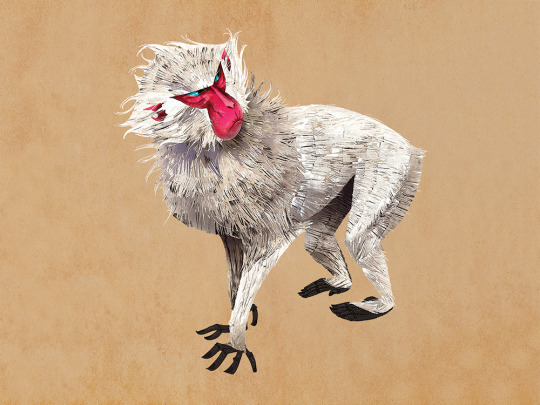
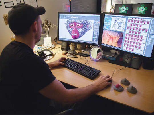
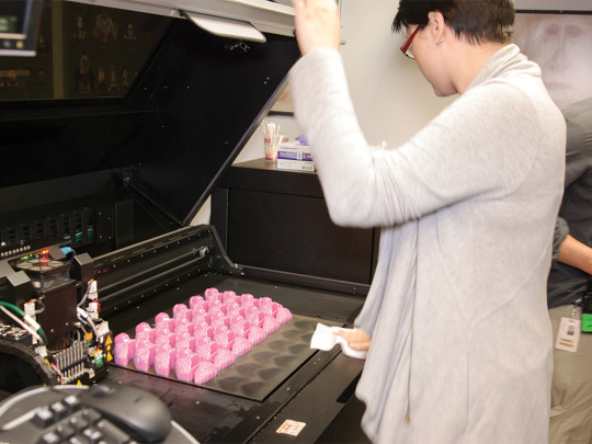
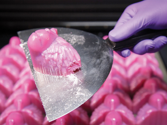
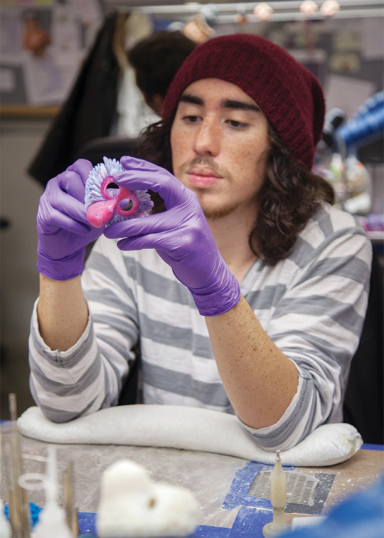
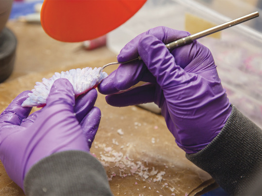
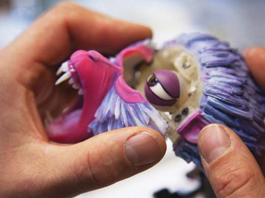
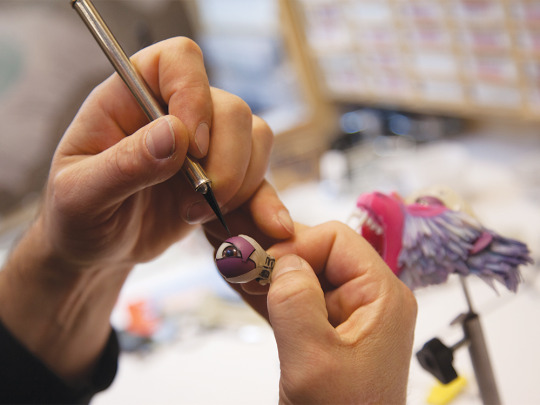
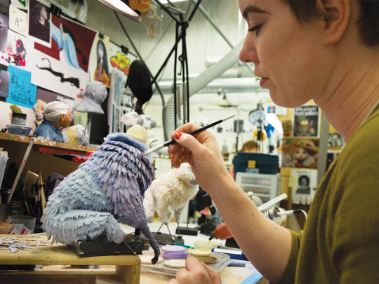
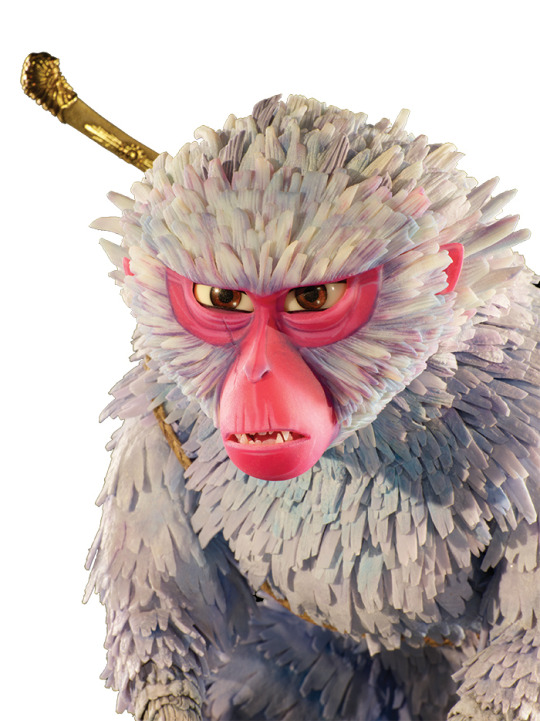
Here’s how Laika’s artists and technicians made Monkey, a key character for their next release, “Kubo and the Two Strings.”
“It starts with a kind of classically proportioned character,” says David Vanderwoot, character artist, “but a chip in the tooth, or a little tuft of hairs not quite in place, really endear a character to the audience.”
Read the whole article HERE!
8K notes
·
View notes
Photo


MD: Toward the end of production on season two of Avatar The Last Airbender, Nickelodeon asked us to create some extra content that could be used online or on DVDs. We immeditately thought of doing shorts in a “super deformed” and chibi style, which is popular among anime fans. The style was simpler, the stories were sillier, and everyone involved had a really great time breaking away from the normal style of the show. Designs by Bryan Konietzko and Seung Hyun Oh.
[x]
6K notes
·
View notes
Photo
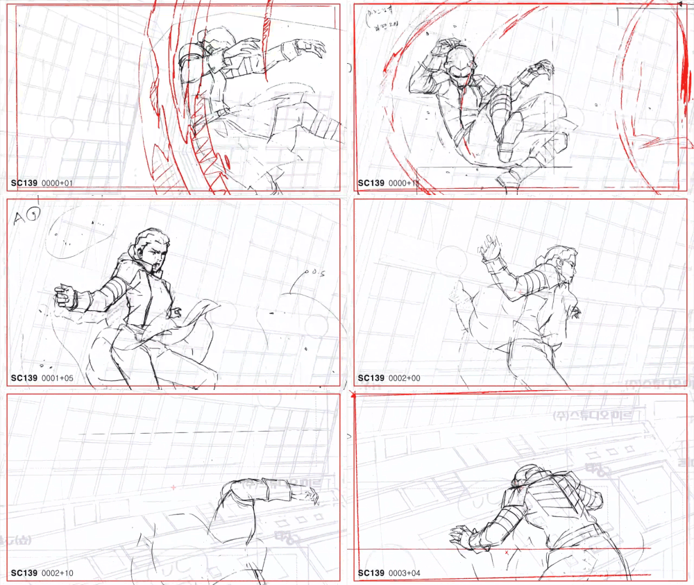


Pencil tests from the last episode of Legend of Korra “The Last Stand" by animator Kwang il Han! (Gifs of the video I uploaded) #The epicness is overflowing from every frame.
11K notes
·
View notes
Photo

Fun fact: According to Glen Keane, this section right here is the only one in the whole movie to completely use his drawings. They used his charcoal drawings and filled them in digitally.
9K notes
·
View notes
Photo

Hand-drawn animation is a beautiful thing to see
9K notes
·
View notes
Video
youtube
Wolf Children - Pencil Tests
2K notes
·
View notes
Photo


Sergeant Calhoun by Glen Keane
123 notes
·
View notes
Photo


Sergeant Calhoun by Jin Kim
5K notes
·
View notes
Video
tumblr
Preview video of Disney short film “Feast” directed by Patrick Osborne (head animator on Paperman).
9K notes
·
View notes
Link
When I was a kid playing Pokemon Blue Version on my brand new Gameboy, I chose Squirtle as my starter because I thought he was the cutest. (although to be fair, they were all adorable). It was the first game I ever actually beat and as I went into the final Gym Battles and faced the Elite Four it...
1K notes
·
View notes
Photo
guys check this out


Urbance animated project is now on Kickstarter. http://www.kickstarter.com/projects/2088672139/urbance
43K notes
·
View notes
Photo


[1/2] some complete and incomplete animation, some backgrounds and some concept art for a project that will likely never see the light of day
[2/2] [x]
16K notes
·
View notes
Photo


Cloudy With A Chance Of Meatballs 2
Production Designer’s Notebook #005
Flint Lockwood’s apartment interior: Rough pencil sketch & final design.
The tiny flat that Flint Lockwood and his father, Tim, are sharing in San Franjose was an interesting assignment. The Directors asked me to create an environment that would clearly illustrate the two distinct personalities of the characters that divided the room in half: Tim Lockwood’s earthy traditional values that are fixed in the past on one side, and Flint’s limitless sense of invention and self-expression on the other. Tim’s side is 70’s earth-tones and Flint’s side is an 80’s science experiment. Neither one of them can relate to the contemporary world and neither one of them wants to. They are both living in their own happy realities, while coexisting side by side.
*There are small changes between the rough and the final that were motivated by changes in story, but for the most part, I was able to keep my concept pretty consistent from start to finish.
1K notes
·
View notes
Photo

Rodney Copperbottom from Robots
226 notes
·
View notes
Photo


Monsters vs. Aliens
469 notes
·
View notes
Photo


Megamind
1K notes
·
View notes


