Don't wanna be here? Send us removal request.
Text
Week 12
This week I finished off my AutoCAD drawing and built my model. I had a few goes at trying to cut the foam core as straight as possible, however, I felt like it was still crooked. In all I felt happy with it, I was very nervous when I turned up on Wednesday to present and I was the only one with more than one vertical profile. In hindsight, I feel like I could have got away with using only one. As I was assembling the model it held good rigidity with only one vertical profile and I thought twice about putting the others in. I decided to put the other profiles in as I felt it communicated a truer form than without.
Reflecting on this course I feel like it could have been better structured with having sketching lessons first then progressing into Photoshop then drafting etc... None the less I honestly feel we have all learnt some essential techniques that we can apply to other courses to help us, and essentially help us become better designers because of this course.


2 notes
·
View notes
Text
WEEK 11 Project 3
This week we were given Project 3 model making, I bought in my helmet to measure and construct a profile from it. However, I felt that the helmet was too complex and I found it very difficult to measure. Instead I selected a kettle from home, I found the form of measuring it incredibly difficult, at first I made a jig using a block of timber, tape and a pen to draw my contour lines on the kettle at 20mm intervals up the kettle. I then tried to make a contour gauge with bamboo sticks, this failed and became very frustrating as it was very difficult to use. I then borrowed a contour gauge from the workshop and found It much easier to measure.
I transferred all my measurements down onto paper and measured the depth and length from each contour. I then transferred these measurements into AutoCAD. Next time I would not recommend using bamboo sticks for contour gauges as these are not always straight and give you incorrect measurements most of the time. I also found I had to triple check my measurements as I found they tended to differ slightly each time so I recorded these down as I went and used the medium. Unfortunately, the contour gauge did not fit around the kettle so I used my digital Vernier’s to measure the diameter of the round section of the kettle. Next time I feel like I have a better idea on how to approach the measuring task.


0 notes
Text
WEEK 10
Sketching with Tom Skeehan
This week we were lucky enough to have Tom teach us how to sketch, I felt like this was a very important skill that we should have probably learned in the first few weeks. I found the warm up sketching drawing straight lines and circles helped me to draw much better to my amazement. I found the drawing in perspective went relatively well and was impressed by how Tom could draw so accurately without construction lines and vanishing points. After quite some practice I started to find my lines becoming cleaner and more accurate line weights. On the other hand, I struggled drawing ellipses. Tom did stress that they are incredibly hard to accurately draw, I found them incredibly hard even after going back to the warm up exercises
I thoroughly enjoyed the lecture and tutorial along with the following tutorial the next day, where we learned how to transfer sketches by tracing onto a new page to keep the page clean from construction lines ready for some copic rendering. Here I used what we learned from our project 2 Photoshop rendering assignment and applied it in the same manner but with copic markers. Next time I would try use a different ball point pen, as the one I was using was very difficult to control. I would also try some bleed proof paper.


0 notes
Text
Week 9 Render Presentation


The Smeg Mixer
I chose this mixer because it is something I have personally been looking into buying as I really like the contrast between the high gloss top section, the matte stand and the retro/streamline shapes Smeg have used. I felt this assignment was a crash course on photoshop rendering and I didn’t feel completely prepared for this assignment after the hairdryer as I realised how many shapes and masks there are on a product and how important it is to keep things neatly arranged. Overall, I felt happy with the final render, it took much longer than I had anticipated. I found I had to keep coming back to it everyday for one week after I thought I had completed it in order to touch it up as I kept finding things I could improve on. Even after printing it I still felt there were areas I could have honed out.
I believe throughout this assignment I learnt a lot about photoshop and all the different ways of rendering, whether it was using the paint brush, adding bevels, using the marquee tools, adding gradients, distorting it and sometimes adding a shadow. Through studying how light falls and reflects off different surfaces, I learnt a lot about the fundamental techniques of rendering.
During the final stages I decided to compose the Smeg in a marble kitchen setting to reiterate the products sophistication and upper market demographic. I paid attention to. including minor shadows to illustrate this product as if it were real. Before printing my final work, I tested out a range of papers at the printers to see which paper quality would give the best results. I ended up going with silk paper 180gsm which is similar to the quality of satin. In hindsight, I believe this project taught me a considerable amount about light, reflection, shadows, composition and visual communication as well as fundamental skills in photoshop.
Feedback from class was really helpful for improving in the future. It was pointed out that I could have made the background on my render a bit lighter to give it more contrast and depth of field, which once pointed out, was immediately apparent. I also felt like I could have made the base of the RH view a little more realistic as I feel like it lost its true shading. I struggled with shading a lot through the process and had to keep going back to my research and looking at how the light really fell on the materials. I kept my research board really simple and coherent with the render so it was easy to see, however, I feel I could have added different products or added a third board to the presentation.
In regards to my presentation, I felt reasonably content with how I did. I am relatively comfortable talking in front of groups as it is something I have to do as part of my job. I made sure I positioned myself in a spot where everyone could see me and my work as I noticed other people before me had stood in front of their work and blocked it for half the class. I felt like I accurately described the process from the research to the product selection on my research board then further explained the render and finally the print. I also explained what I had difficulties with and why I used the background textures that I had used. I found having the research board on display helped a great deal as I could clearly communicate with classmates and Max what I was trying to achieve. After the presentation I felt relieved it was over for a brief moment until I started to think about all the other assignments I have due.
2 notes
·
View notes
Text
Week 8 Photography Tutorial


This week, I enjoyed the opportunity to walk around campus, not in a rush and gaze over the architectural forms of the buildings. Whilst walking around I focused heavily on the lighting, observing how the light fell onto the buildings, and how the light casted shadows.
We - Noah, Tarana and I looked around for interesting geometric shapes found in the architecture, and how might I express that in a interesting way through a photo. And, what might people see that will draw the eye and provoke emotion or a connection.
I then proceeded to capture the light in the photographs, carefully manually exposing the camera until I reached an acceptable result using my light meter as a guide. I then manually tweaked the exposure by lowering or raising the stops fractionally to allow just a little bit more light into the camera.
I have been forever trying to hone out the exposure settings to get perfect exposure in the first 3 photos, this is something I have always found difficult, so I took my time metering the light. I took multiple photographs of each subject, all at slightly different exposure settings to so i could review the exposure in detail on the computer. After visiting multiple sites over campus and observing as much as we could over hour I felt like I had enough images to make a good selection.
I used Adobe Lightroom to edit the photos as it not only organises your photographs you can also edit them to a high standard within the one program. You can also export them to photoshop for final touches.
After reviewing Platon and Sebastian Salgado’s work i felt inspired to experiment with black and white presets over the photographs which I haven't tried previously. I focused heavily on trying to convey the light falling over the geometric shapes in the architecture, trying to bring the photographs to life to make them look as real as it were at the time of capture, using exposure, contrast, clarity, highlights, shadows, whites and blacks, to achieve the desired results.
The product photography was interesting, most of my photographs in the past have been subject to people or landscape in natural lighting, so setting up lighting in a non natural environment was challenging and out of my comfort zone. I did enjoy the challenge of the exercise and will need a bit more practice at this in the future.


Next time I would use a tripod as I would also like to try some long exposure (30sec) shots with high aperture on a few locations on campus to convey movement. I also think i could have shot the product photography at a higher aperture to give more clarity and detail
Overall I thoroughly enjoy taking photos and will continue to refine my exposure and aperture settings.
4 notes
·
View notes
Text
Week 6 Studio Tutorial
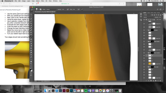
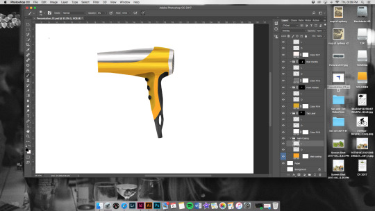
This week I had quite some difficulty with using photoshop as I found the instructions quite vague (this could be due to the outdated version used in the instructions). I also have not used photoshop like this before so I found it a bit overwhelming and not as intuitive as I would have hoped, thus, its was quite frustrating at times. Even the tutorials online were on PC and were in different layouts compared to Mac versions. Thankfully, by the end of the exercise, I found it relatively easy to navigate photoshop.
What I did like about the program is its flexibility. Once knowing how to use it, the abilities of this program are endless. I had trouble getting the chrome and shiny surface finish and its still not perfect but much better than previous attempts. I also liked the task as it taught me a lot about masks, highlights and shadows across different types of surfaces. Next time, I would probably attempt to do something much simpler that gains a good understanding of the tools and the program before attempting the task again.
Most importantly what I felt I learned was a crash course on photoshop layering and masking. The shading and edging was interesting, as I found out how light bounces off edges and how to make them pop and become more defined, rather than adding a thicker line.

3 notes
·
View notes
Text
Studio Week 5 Tutorial
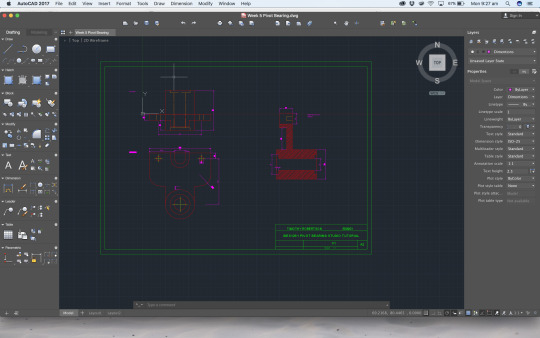
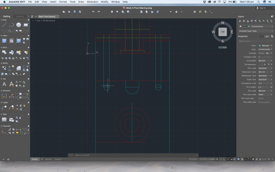
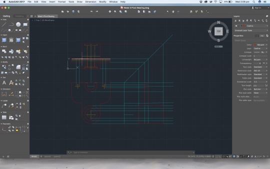
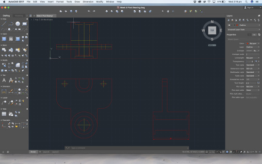
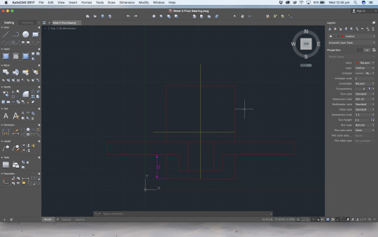
This week I found Autocad is becoming more intuitive as we are doing the tutorials. However, I found I had a few difficulties with projecting construction lines on the 45 degree angle as I was getting incorrect measurements on the right cross section view. As a result I had to go back and start the whole cross section view all over again, this time without the use of the construction lines. As to why this happened, I speculate, may have been due to the incorrect settings. I also had difficulty with the text function as it was causing me problems trying to centre it in the title block. After a lot of adjusting via manual moving I was able to achieve the desired results.
I enjoyed taking my time and practicing the techniques we learned last week and building on that. Next time I would double check my settings before projecting construction lines so I can achieve correct results. I also saved the title block as a template to save time in the future.
Some of the key things I learnt this week were how to hatch and set up for print as well as reviewing and perfecting the skills we have learnt so far. Printing is essential to any designer as you have to ensure proper page setup to display to clients, so I found this task vital and relevant for the future.
1 note
·
View note
Text
Week 04 Studio Exercise AutoCad
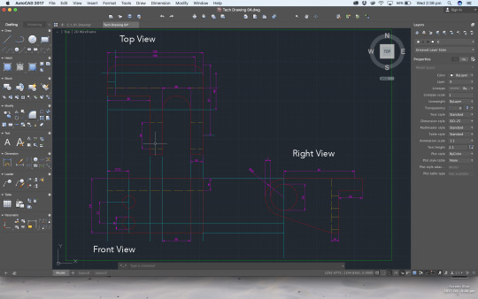
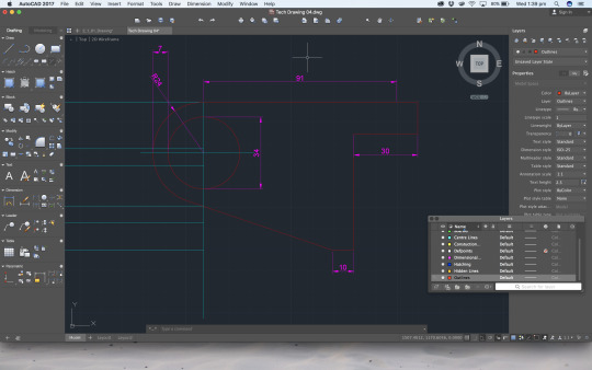
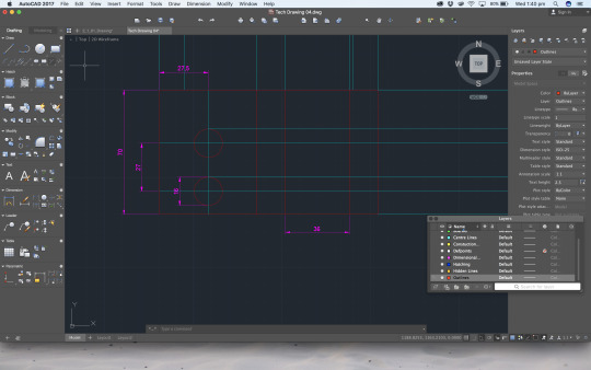
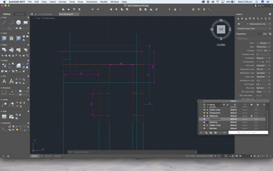
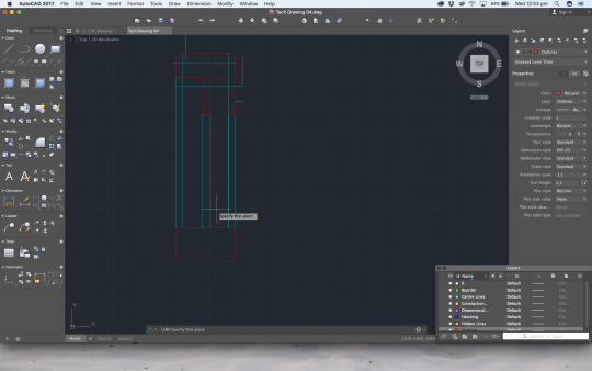
AUTOCAD LT
This week we started using AutocadLT, I found the program very intuitive and, relatively easy to navigate. I encountered a few problems with the radial corners altering the end points which in return distorted the rest of the drawing so I had to go back and fix it.
I liked the ease of being able to delete lines and alter the drawing without using an eraser or redrawing the whole image. I also found the shortcuts to be extremely effective, I liked the way you could type what you wanted to do instead of having to click your way through the tool bar.
Next time I would double check the measurements before transferring my centrelines onto the next view, as it would save a significant amount of time.
This exercise helped me to learn the basic operation of AutoCad, how to set up the page and draw in different layers. Looking forward to more cad work.
1 note
·
View note
Photo


WEEK 3 Studio Tutorial
This week for some reason I had difficulty with the pen in the compass as it kept moving on the arm hinges, results of this were disappointing with stray pen marks, I am not sure as to why I struggled with the pen and compass, possibly to do with the lack of experience using them, I also felt like I needed to complete the drawing task in the studio time, in hindsight next time I will take my time and finish at home if need be. Reflecting on previous weeks I used cartridge paper instead as I found I had bleeding problems in the past, I also took time to plan out my orthogonal views.
The things I missed or forgot...
Reflecting on this week I failed to adhere to the standards for the A section, rather drawing a straight line through the top view, I am still familiarising myself with these standards and procedures. Also due to being in deep and exciting conversation about the up and coming Autocad work i forgot again to take sufficient progress photos.
2 notes
·
View notes
Photo


WEEK 3 Studio Tutorial
Attempted to draft my laptop charger (minus the cord).
What went well: I enjoyed the freedom to select and draw something, for this exercise I chose my laptop charger as it was relatively simple but not over complicated and non the less a challenge. I used my verniers to get an accurate measurement and took my time to lay it out with a practice sketch first. I successfully managed to produce clean crisp lines, my penmanship is improving.
What didn’t go so well: Well for a start for the life of me I cannot keep remembering to take progress shots, it is my ultimate weakness.
Secondly, I had not purchased the text book at this stage as the book shop was out of stock and did not know the AS1100 standards. So I have incorrectly done the line thicknesses, this irritates me every time I review it. I also incorrectly measured the radius and should have inserted arrows for dimensions. Reflecting back on this now I can see how far I have come with my drawing abilities and understanding the standards upon which we need to draft by.
Key things I learnt: Different line thicknesses for outlines and measurement lines, aka AS1100 standards. Also getting quicker and cleaner with my pen.
Things to improve on next time: I strongly think I need to triple check everything before I pen the drawing, having a better understanding of the AS1100 standards. Owning the book since has helped a lot, however I will write down a cheat sheet/ check list for the future to help avoid making these mistakes again.
0 notes
Photo


WEEK 2 Studio Tutorial
This week I was getting more comfortable with setting up the page, planning out with the pencil then going over in ink, I enjoyed using the t square and the right angles and 30/60 angles off the square too. I liked Will the tutor’s trick of finding the centreline between two points using the compass, I though it was very accurate and effective yet simple.
I accidentally drew the wrong line in pen, *see middle of photos* as a result I went back and started again. I had difficulties taking progress photo’s as I became so absorbed in the work I picked up my momentum and totally forgot. I would describe the feeling as, its more like putting a puzzle together, as it all starts to come together, the more excited you get!
Next time I will look more closely at my lines before inking them, and also take a step back when I get too excited and take a photo before moving on.
1 note
·
View note
Photo


WEEK 1 Studio Tutorial
Apologies on the delayed posts as I had difficulty getting into the group and navigating Tumblr.
I found the studio session a great time to get familiar with the drafting equipment their functions and learning a few tricks to using them to make life easier. I had a bit of difficulty with the pen bleeding on the paper, especially whilst using the pen on the compass, as evident in the image. I was careful not to use the flat side of the set square face down on the paper to avoid bleeding, however, I found this made little difference. I also struggled to get the feel with the pencil trying to draw construction lines very lightly as most of my lines were darker than required.
Next time I would use cartridge paper or something more dense to reduce the bleeding of the pen. I would also consider triple check my work before going over with the pen as that would be faster to do so than re draw the whole object.
Some of the key things I learnt this week were how to use the equipment and different ways of drawing an object and the thought process behind it. I learnt this through demonstration by the tutors and trial and error.
0 notes