#you know what. I'm kinda getting used to this new pixel style!
Explore tagged Tumblr posts
Note
Oh! Uhm... It seems Vigi cant hear us. Uh... I suppose you should tell him about us, Harmburger. Or at least try to.

Harmburger: "🐝🔬🍔🧠🐝❓️"
The Vigilante:*visible confusion on what the hell he just said*


The Vigilante: "....So does that mean like voices? Or bees that ask questions?"
Harmburger: "✔️"
The Vigilante: *sigh*
"Alright then. Not the strangest thing I heard of, atleast from what I've seen in th' tower, or those new folks that came in here earlier. But that ain't my business to butt into."
[The Vigilante can now receive asks through Harmburger.]
#pizza tower#burgrr#burgrr tower#awful hospital#harmburger#the vigilante#you know what. I'm kinda getting used to this new pixel style!#only going to apply it to pizza tower characters now. For obvious reasons#also confused vigi lol#story post
22 notes
·
View notes
Text
nintendo direct reaction
NEW MARIO AND LUIGI WHAT THE HELL? "SEAFARING ADVENTURE" BRO MARIO ON THE GRAND LINE
NINTENDO WORLD CHAMPIONSHIPS LOOKING GOOD
ok random anime game
New Squeenix RPG? this can go one of two ways
nintendo switch sports dlc... i thought that died 2 years ago
ok new metroidvania
disney illusion island dlc... haven't heard that name in ages
hello kitty game?
looney tunes sports game? ok ig. might still get it
AMOGUS UPDATE?
Farmagia? ok looks kinda fun
DKC RETURNS HD? WITH CONTENT FROM THE 3DS PORT?
DRAGON QUEST 3 REMAKE? IT'S LIKE THE FINAL FANTASY PIXEL REMASTERS? MY GODDDDDDD! AND HD 2D REMAKES OF DQ 1 AND 2? I'M SOLD. and such incredible spritework...
A funko pop game. why. BUT FUNKO FORDY FORZBORE THO?
denpa men looks fun. actually, i kinda want it, since i know it's free now
METAL SLUG TOWER DEFENSE? looks cool, but not for me
darkest dungeon 2 is here now.
four swords with online play? turok? PERFECT DARK? switch online going hard
what is phantom brave
MARVEL VS CAPCOM COLLECTION? OH YEAH I'M BEING TAKEN FOR A RIDE
NEW MARIO PARTY? JAMBOREE? THIS IS AWESOME!!! BROKEN TURBO DICE? what's with all the mario games on islands tho
ALL NEW CLASSIC STYLE 2D ZELDA? USING THE LINK'S AWAKENING REMAKE'S ART STYLE? AND YOU ACTUALLY PLAY AS ZELDA? the puzzle solving in this game is gonna be epicccccc
ugh. just dance
lego horizon? i thought this was gonna be a playstation exclusive. looks really different from normal lego games
stray on switch?
hobbit simulator?
ACE ATTORNEY INVESTIGATIONS COLLECTION?
is this danganronpa? no, not exactly
romancing SaGa? never heard of her
METROID? IS THIS PRIME 4? AFTER ALL THE YEARS OF TORTUROUS WAIT? SYLUX? THE METROID PRIME 4 IS REALLLLLLL
#a glimpse into my world#nintendo#nintendo direct#mario and luigi brothership#super mario party jamboree#the legend of zelda echoes of wisdom#metroid prime 4 beyond
39 notes
·
View notes
Text
Cornbread's Texture Fixer Devlog v0.9.0 - Beta 6 December 8th, 2024
i've decided i'm going to be doing weekly devlogs for whatever pack i'm working on at the time. primarily so this blog (pretend i posted this to the mc sideblog; i saved the draft wrong) isn't overrun with my responses to the vanilla change logs, but also, it adds a bit of structure to this whole thing. (well, i say this, but i've also put this off by multiple days).
anyway, first things first, i have updated my fix to the sides of grass blocks to account for the pale garden. (vanilla on left, resource pack on right)
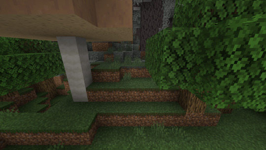

it isn't perfect, but that's mostly because minecraft's biome blending as a whole isn't perfect.
also, i only included the colors for transitions to dark forests, birch forests and groves, since i'm contemplating increasing the number of colors for each biome transition again. that'd be a lot of work for something that i don't even know if it'll be more accurate, so i haven't yet come to a decision, but once i do, i will finish the pale garden biome transitions.
these are the only transitions i even found generating naturally anyway, and bedrock edition does not yet have /fillbiome, so this shouldn't be noticeable in-game, but if it is, i would appreciate if people told me.
i fixed the issue this pack was having with cobblestone walls, as i said i would.
i removed the textures for the different types of nether bricks, since vanilla fixed their issue, but to match them (and other kinds of bricks), i shifted the texture for mud bricks over a pixel to the left, so that the stuff in between the bricks (i forgor what it's called) is on the right side.


in very early versions, this pack and Conglomeration were initially meant to be one and the same, but that ended up getting changed. while a bunch of features got removed in favor of just having them in conglomeration, bedrock edition's green item slot highlight is just really ugly, and so the java-edition-styled highlights stayed in the pack for a long time, up until their removal in Beta 5.
i reverted that back.
turns out, the green slot highlight, apart from being really ugly, is also really difficult to work with from a creative perspective. particularly, in the crafter screen and the new bundle tooltip (bundle ui changed slightly in game version 1.21.50).
so i re-implemented all the JE-styled highlights i had from Beta 4. (i also reverted the changes to the buttons on the beacon screen, since those use the same color palette). there were some small changes to the json, but those aren't super important. what is important is that these changes meant i had to start paying attention to the bundle ui, which, of course, is off center. so i fixed that.
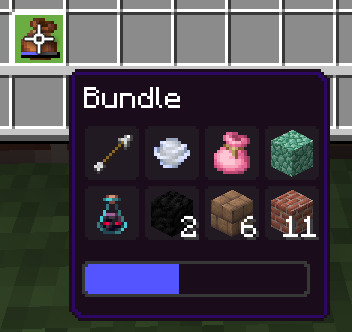
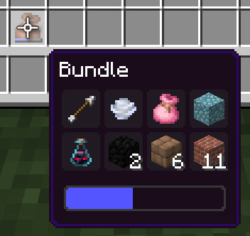
sidenote, but you ever notice that light blue and light gray bundles have long enough names to stretch the ui?? java edition has its bundle ui pre-stretched to deal with this, which is kinda silly imo.
anyway, i also did the highlight inside the bundle ui:
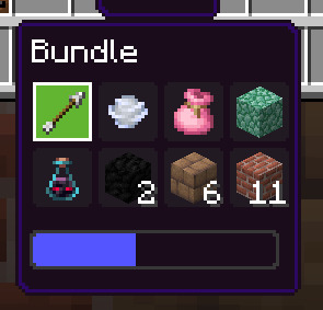
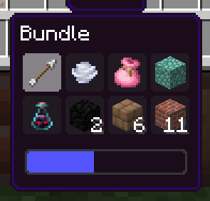
this is mostly accurate to java edition, except the slot background doesn't disappear when the highlight is visible, since the background of the tooltip is already opaque (and therefore inaccurate) anyway.
this uses two different textures (directly adapted from the java edition textures) because i couldn't get it accurate otherwise, but it might still be technically better optimized than vanilla, since it isn't needlessly checking whether touch controls are being used (selecting an item with touch controls instantly closes the bundle ui).
speaking of which, i also fixed bundles with pocket ui.
i'm holding off on pocket ui until the end of this pack's development, but i figured since i'm already here and pocket bundles are in the same file as classic bundles, i might as well.

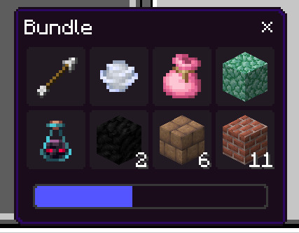
aaaaand before we leave bundle land, i just want to say that Beta 5 has an issue where a closed bundle is visible behind the open bundle when scrolling through a bundle's contents in a crafting grid specifically. i don't have an installation of Beta 5 right now to show this off with, but i fixed it.
one of my favorite parts of this pack is the way it changes the recipe book (/creative inventory). in vanilla, as with the rest of the ui, things are just kinda scaled willy nilly. the scrolling part of the recipe book doesn't quite fit into the space allotted, but this pack fixes that. (would you believe me if i said it was difficult? you shouldn't, because that would be me lying.)
one of the things this pack neglected to fix previously was the length that the recipe book scrolls. in vanilla, as with some other parts of the ui, the recipe book scrolls down farther than it should, leaving a noticeable gap between the buttons and the bottom of the scrolling area.
i didn't previously have any idea what the issue was on account of scrolling panels being complicated, but i've since messed around with dropdowns, learning a lot about scrolling in the process. the issue was the exact first thing i thought to check. mojang should be ashamed.
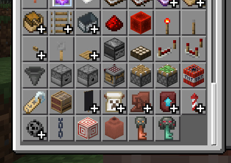
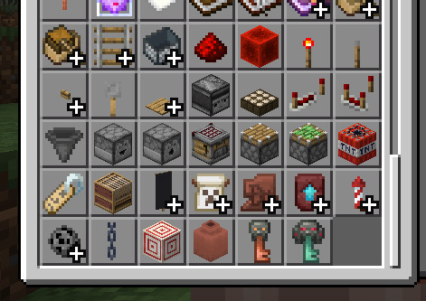
Holy Shit It's So FUCKING SNUG!!!!!!!
last things last, mojang added an option to the GUI Log Level dropdown in the settings screen, making it scroll. this pack previously made it not be considered scrolling, since it didn't scroll before, but now that it does, this change has been reverted, with the fixes for scrolling dropdowns now in effect.
#minecraft#minecraft bedrock#minecraft resource pack#cornbread does a devlog#cornbread's texture fixer#id in alt
5 notes
·
View notes
Note
I'm still stuck on this, and I wonder about Found Footage Horror, or Analog Horror (maybe the recent Digital Horror). Like, I know for a fact that Twst is advance enough to have new technology. Like, those Horror are mostly found in the Internet with the rarities in main stream media like the Blair Witch Project.
There is also Liminal Space, like the uncanny feeling like there should be people here but there is no one. I feel Hearstabyul and Octa (this is the only dorm I can't spell with confidence) are the most creepiest. Hearstabyul cuz has the largest amount of people and it being fucking loopy. While, Octa being a rest of sort, and the big ass aquarium windows. Like some content creators, are good at it that it creates suspense and some lore. For example Kain Pixel's Backroom series and the Oldest View.
There are also other sites that are making horror stories with varying quality. Like the SCP wiki (but I have more fun seeing the world building, but there are some good stories in there), r/nosleep (it's a mixed bag), and my personal favorite podcast series The Magnus Archive (my fav is episode one)
There are a lot of similarities between horror in Twisted Wonderland and our own, primarily because we have significant overlap in the things we find scary. However, the existence of magic has made horror fiction both more and less scary. Less because if you’re a mage, there are a lot of things you can do to get yourself out of a situation or fight off the thing harming you. More because, well, imagine a powerful mage being the slasher in your horror movie.
The existence of magic has also created something of a niche of horror fiction: mage horror. Typically, it’s horror directed to mage consumers, often dealing with magic going out of control, overblots, and other general unsettling aspects of being a magic user. Overblotters mages also take a starring role in a lot of horror fiction- an overblotted mage actually is the main villain of a piece of horror media close in style to the Blair Witch Project film. A lot of the common tropes you might get from a witch on Earth are replaced with mages, often overblotted mage, in Twisted Wonderland. Demons roles are similarly filled by evil spirits.
Uncanny feelings in the dorms is an interesting idea. The Heartslabyul dorm at least seems like it would have some interesting shadowy places that would freak you out in the early morning. The dorm’s architecture is much less creepy to people who grew up in the Queendom of Roses, since that kind of architecture is traditional there, but people from elsewhere might be freaked out!
Octavinelle’s kinda creepy, too. To look out those windows and see nothing but the empty darkness beyond… That’d be enough to trigger anyone’s latent thalassophobia! I'd imagine there are some students who just avoid looking out the windows at night. Or maybe during the day, too!
Speaking of Octavinelle, my headcanon is that merfolk have the creepiest scary stories. Like, horrifically scary. They've canonically mentioned that a lot of merfolk go missing, and the sea is a very dangerous place to live (though it was the twins who said this, and I feel like they could be messing with us for fun. Until we have confirmation otherwise, I'll take their word for it). Merfolk horror media often is highly realistic, deals both with personal and cosmic horror in the same breath, and tends to get kind of graphic. A lot of hardcore horror fans on land will pay top dollar for copies of merfolk media. (Yes, Azul leverages this to hell and back.)
Generally, human and beastman media is pretty similar to what we have, with some modifications to existing myths. Vampires exist in horror media pretty much unchanged from our world, but werewolves are a tale from wolf beastmen, for example. Traditionally the same kind of horror. Fae horror is... well, it's either piss-terrifying or it doesn't translate well. Lilia's really good at identifying the piss-terrifying stuff and scaring people with that. Malleus will either tell you something that will make you stay up all night in cold fear completely casually, or he'll try to give some protracted horror story about the slow passage of time and the alteration of the world. It's a little unsettling, but it's not scary exactly.
That's about the sum of it. I don't think there's much more I have to say on horror here... though I'm sure if you ask more, I can come up with more headcanons!
15 notes
·
View notes
Note
A question for Woo. Would you enjoy an explorers DX getting revealed on the upcoming Pokemon Day?
// if this hypothetical proposes that this sort of explorers DX would be almost exactly the same in execution to rescue DX then I'd have to say................ no..............
before you bring out the pitchforks, let me explain myself. anyone who attends my streams or catches me in the wild in discord servers knows that I don't really like how the 3d games look. it's not as much a debate on "does pixel art or 3d models look better", but more "which style does chunsoft handle better", which I can sum up how I feel about in one screenshot

which is to say, my main problem with the 3D games is that the charm kinda got sucked straight out of them. it's true that pixel sprites have limitations- it's why we have portraits to more easily convey how characters are feeling, and your brain can fill in any missing details. but with 3D games, every aspect is able to be rendered out, and if you aren't going 100% all in, it's a lot more easy for the intended emotions to fall through. we have the ability to have pokemon emote like this now,

so why on earth is this the range that we're stuck with for PMD?

the simplest answer I can think of is that chunsoft is trying to apply the same strategy they used with sprites onto 3D models... which I think could work in theory, but not in the way they're applying it. as is, they don't have the models emote much and rely on portraits to carry the intended emotion through. the models also have some of the most stiff rigging I've seen in any game to date. I'm sure it has something to do with hardware limitations, but if that's the case I don't see why they couldn't create something that would fit their needs better like pokemon rumble's low poly models. well I know the answer is that they don't wanna actually render new 3D models for a PMD game and just use the library of models they got from gamefreak, but I like to think something like XY or ORAS's overworld models would make for a nicer looking game.

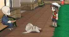
one pet peeve of mine is seeing folks praise DX for its unique look, which I think is true for the backgrounds!... but not really the models. I don't think putting an outline and paper texture overlay on the models is particularly revolutionary. it's a good direction to start, but far from peak aesthetic.
other problems I have with DX are how the main hub areas look (the grass for pokemon square is so blown out I have to play the game with lowered saturation and a darkened screen), and how the general UI looks in the dungeons. idk if it's because I'm neurodivergent or if it's just a "me" thing, but there's so much useless information being thrown at me at all times in a dungeon that it makes it really hard to focus on what's happening

I imagine this is mostly a side effect of losing the dual screen ability on the switch and I don't really have a proposed solution, but at least removing the text bubbles that come up every single time you get attacked or use a move would be a good start. maybe just save those for critical hits or smth idk, I don't really need to hear every single thought that comes out of my team.
I also think accessibility features like the auto-dungeon crawl feature are nice for those who want it, but it does feel a little overpowered by (seemingly) knowing exactly where the stairs are in a dungeon, which can take the exploration aspect out of playing the game. I'd also like the ability to disable that feature in a menu since I tend to misclick sometimes and accidentally activate things lmao
I just kinda tore into DX, but there are a few things I do like about it. the gummi system is vastly improved first of all (thank god I can stop grinding for one million gummis), and I think the dungeon environments are some of the best to come out of the series. I also think the models wearing scarves is super cute, I loved it in Super and am glad it made a return here. I'm sure there are other QOL features I'd like in theory but I kinda... didn't get very far in the game due to the aforementioned graphical and UI issues that felt like actual sandpaper to my brain.
if there was an explorers DX, I actually think one fun direction the series could take is something like pokemon cafe remix or paper mario, which is still the energy of a 2D game just using nice looking art assets instead of sprites. I just think a PMD game that looks like this could be really cute and charming...

and it'd probably be closer to chunsoft's wheelhouse since it'd take notes from how they put the sprite games together! just wishful thinking though. my current crack theory is that rescue DX was just to test the waters for how popular PMD still is and maybe to test out the engine on switch before releasing an original game, a la let's go pikachu/eevee to sword/shield. I doubt they'll make an explorers remake.
57 notes
·
View notes
Text
-1bitHeart-
Nov, 28,2023,
Hi, I'm new here. I've been wanting to create a blog for a long time now. I wasn't sure how to start a blog, what exactly should I share. I meaan...I have a lot to share but I was thinking to my self..should I just be consistent and stick to one thing or would it be ok to do a little bit of everthing?? Well I guess we'll see since I'm kinda..winging it. lol
Today I'd like to share with you what I've been up to recently. I decided to give youtube a try. I love to game and thought why not..it might be fun. I recently finished a game and posted the short series. I still have a lot to learn about editing so it's not great to be honest but the good thing is I've learned a lot for my first time.Oh yes..from the many mistakes. It was not so fun starting over a lot, I'll tell you that ,yet I hope the next series is much better and maybe I'll even have some commentary.
The game I recently completed and posted on youtube is called 1bitHeart. It is created by, not a very well known, developer Miwashiba. This Japanese dev is from Fukuoka and has illustrated and created various cute and interesting RPG games. Miwashiba is known for creating their own pixel adventure games Alicemare, LiEat series,1bitHeart and the sequel 1BeatHeart.I just found out, while doing some research, that pool of creativity has not run dry just yet. In fact,there is a game in production right now by the name of The Faceless Double. You can find all of the games on steam; all but one,1BeatHeart.The game is available and you can find it here on this link.I have yet to give the game a try but so far the big difference I see between them is the more dull or muted colors and maybe less cuteness? It doesn't seem to be going on steam anytime soon so I'm a little hesitant to give it a go.
So far, all of the games that are available on steam are also published under the same publisher, PLAYISM. They publish a variety of genres. From story-focused games to Horror to strategy etc.
Now, I'll be honest, I didn't dive too much into the dev or the publisher so sorry I have no idea if there is any juicy gossip lol. I do though, want to tell you a little bit more about the game,1bitHeart. As far as I know, the game was released on steam back in 2017. The game is set in Japan, in the near future, where technology has progressed to the point that I'd say it's somewhat similar to now in our lives; it is used pretty much everyday, everywhere. It dominates the lives of everyone.
In the game, we play a young guy by the name of Nanashi, who spends most of his time indoors. He is very intelligent but a bit socially awkward. He meets a young girl by the name of Misane. While out making friends and solving mysteries, he learns of a frightening plot to take control of people via hacking. Together they set out to stop the people behind this evil plot.
I have yet to play the other games myself but I can tell you that this game, compared to the others, it's a 2D side scroller instead of using the top down perspective the others used.This allows for larger side view portraits of the game's many characters which lets the game to emphasize Miwashiba's incredible skill at designing cute characters and more detailed during dialogue. The game doesn't have turn based battles like LiEat, according to some other reviews, and also isn't solely based on exploration like Alicemare.The game has it's own systems. The hints being one, that helped me, which you get to chose to have them on or off in the very beginning. When you come across hackers and they attempt to hack the player, you defend yourself by directional inputs; which are basic. Still, the game is fun when you have to play detective and have the subsequent confrontations. You also progress the story by solving the various cases through the chapters during which you need to gather information and evidence.
Stardew Valley is a game I have played, but not finished but I can tell you that in the same way that you are able to give gifts to the characters that hang around the town in 1bitHeart you do the same. You'll trigger scenes once you become better friends with them but you are not able to romance any of the characters like in SV. This leads to one of the most impressive parts: there are actually about 48 characters in all that are spread across the town. Each with their own story, personality and style. The end goal, depending on what end you want, is of course, for these characters to become the main character's friend. You can see the amount of love and effort that was put into the game. In a review I read that the backgrounds during character's dialogue could use a little work. They probably could but I think it was done that way so the characters and their dialogue was the main focus.
Like I mentioned earlier, you need to give gifts to the characters in order to be friends but you need money or bits to buy gifts. You get bits by playing tetris-type minigames but it'll take A LOT of grinding=time to get enough bits to befriend everyone. Fortunately, the dev was aware of this flaw, as there is a secret in the game to acquire endless bits=endless gifts.
Honestly, I enjoyed the soundtrack. It's ok. One of my favorites its the opening theme.
youtube
The biggest gripe I have with the game is that I didn't see the option for borderless windowed or something to prevent the game from minimizing. The game would minimize each and every time I clicked out of the game. It was very frustrating and annoying. Honestly, it's one of the reasons why I'm hesitant to play them to record them.
I wonder if streaming would be easier in this case?? I don't want to totally give up.Anyway..If you made it this far, THANK YOU for taking the time to read my blog today. Let me know what your thoughts are...til next time!
-A
#anime#game#pc games#steam#steam games#1bitheart#cute#story#indie#game review#review#Youtube#daily life#diary entry#diary#playism#vgperson#lieat#alicemare#2023#november#visual novel#dear diary
3 notes
·
View notes
Text
(Hey op, sorry for long post I tried to make a short comment but I failed miserably)
The state of horror YouTube I so fucking atrocious. I'm slowly falling out of love with it.
Just every new iteration, every new wave of internet/analog/digital horror feels more and more like a cheaper mockery. People who enjoyed tge first wave trying to get on the fun slowly melted away into people just wanting to do anything to fit into the genre. You cannot tell anymore if a series existence originates from an idea or chasing a fad.
I would love to say that bitch urban spook was the culmination of if and not lie but no, he was just an omen of what's to come. Now it feels in the onslaught of new series it is rarer and rarer that you see something evocative, it seems like everyone gets more scared by association. As if previous series trained us into fearing the style and foregoing the actual content.
One of the semi-recent examples of something just going viral and people swarming around it without giving it much consideration (and to be clear, even I think this is a good series, one of the better ones in this mess, has some good ideas etc. I'm a hater but like gotta appreciate the good too) is the "Boiled one phenomenon" I think that's what it's called, no time to check, I'm fighting with sleep meds. It's just a well crafted image, one, one fucking image that's pasted over and over. I'd love to love the series becouse it has some great ideas but god fucking damn it, every time I try thinking about it that one fuck-ass image comes to mind where there's just a normal bloke on the bed a small jpg of the boiled one in the corner and some ominous text somewhere on the screen. Are we fucking scared of Arial now? My mans in the cuck window looking at a coma it caused and just projecting text onto a video tape (tape? I think). Amazing outstanding glorious. Again that's one of the better series that still suffers the same redundancy. Most series will just flash you an image or a short video qnd add some text without much thought. "There I no time" there is no time my ass those are found tapes, from like 40 years ago, people who filmed it and lived are asking to speak to a manager right about now, by all means they had time. This is also assuming that they are trying to sell it off as a found footage, please believe this is real kinda content qnd I'm trying to join in and be "omg this is so real I wonder what had happened" but it just takes it out of immersion. I know not all series are like this but come on, so much of it is that.
If not the previous case it's just a twist on a show or a game or a series and it just makes it oh so spooky by slaping on an analogue filter or pixelation and adding music to it and you've baked the cake. Thanks. It's starting to be no better that mainstream horror movies that throw some jumpscares at you and conduct when you're scared with a fucking violin.
We are truelly entering the "it's this thing but it had hyper realistic blood, qnd it splattered everywhere and those hyperrealistic eyes and btw this is blorbo the killer" era of internet horror. I get it it happens to everything. Oversaturation of a genre will always happen and when a trend is started, if allowed to live long enough, will flanderised itself into oblivion.
The walls are moving, the sleeping concoction is winning I might onto this later but fuck it we ball I'm posting this before thinking, I'm too drugged out of my mind to reread this, I just pray to some god I made sense.

im so tired of horror youtube man
14K notes
·
View notes
Text
what song should be each hunting dog
base on their past
Tecchou:mother mother wrecking ball:(base on when he was send to war as child: lyrics
I made a wreck out of my hand I put it through the wall I made a fist and not a plan call me a reckless wrecking ball I throw my plates against the wall and give it all I got,
I aim to break not one but all I'm just a big ol' wrecking ball
I am unruly in the stands I am a rock on top of the sand I am a fist amidst the hands And I break it just because I can
It takes a dedicated hand To put it through the wall You gotta wanna break the heart Of all those pretty porcelain dolls You gotta wanna be the drummer in the band You gotta wanna be a battering ram You gotta see the artistry In tearing the place apart with me, baby
I am unruly in the stands I am a rock on top of the sand I am a fist amidst the hands And I break it just because I can
Let's break it (Just because we can) Deface it (Just because we can) Let's break it Just because Just because Just because Just because
I am unruly in the stands (I am a rock on top of the sand) I am a fist amidst the hands And I make a wreck out of my hand (I make a fist and not a plan) And I break it just because I can
Because I can Because I can Because I can Because I can Because I can Because I can Because I can.
Jouno:Gladiator base on when he was a criminal
Welcome to the party, say hi to everybody Paid for by Martini, but they're sippin' on Bacardi Body's more than just a flesh, you can sell it for success What's your price what's your address? We can finish at my place Ever been to Bali? I really need some sun Such a shame 'bout that tsunami, I'll have to go to Cali I can get you dressed, wrap your body in excess Give them something to obsess over
You'll love it when I give it to you, leave you wanting more I know your addiction's attention, let's start a show Is it everything and more than you were hoping for? Show us something we ain't never seen before
Smash your competition, baby Show us some good entertainment Victory's your only payment Gladiator, gladiator
Welcome to the party, I know it's kinda funny That everyone is acting like they know you personally Just play along, be nice and all You won't get far being on your own They've all been dying for a little drama Their favourite stars getting out of coma To fill the news with 90's nostalgia It will take more than just a pretty face to top that
Give it to you, leave you wanting more I know your addiction's attention, let's start a show Is it everything and more than you were hoping for? Show us something we ain't never seen before
Smash your competition, baby Show us some good entertainment Victory's your only payment Gladiator, gladiator
Fake it 'til you make it Mask on, never take it off Wear it 'til wearing it feels natural Whatever you tell yourself, it's not true Power's what I make it Pixels like it's 8-bit I'm picking your new favourite You buy it and I savour it
You buy it and I savour it You buy it and I savour it You buy it and I savour it Buy it and I savour it Buy it and I savour it
teruko:
Anthropology (TeiThePony Electro Redub)
Song by Awkward Marina
base on when she got her surgery’s
Human beings fascinate me Being just the way they are Tell me little pony can you Push a cart or drive a car? Lyre is my instrument but Humans strum their sweet guitar It's a mystery Anthropology! Fingers, toes, and tiny noses, Brownish hair and tannish skin Would it be to much to ask To see the world they're living in? Everybody tells me that it's old and fake mythology It's a mystery Anthropology! Aren't you bored of brushing your coat? Styling your mane with your hooves? I don't mean to butt in or gloat But ancient history proves Humans don't have wings or magic They don't need it, they don't care All they've got's imagination New inventions everywhere! Babies, children, teens, and elders All alike have clothes to wear It's so real to me, Anthropology! Albert Einstein, Cleopatra, William Shakespeare, Elton John, Lauren Faust, and Lady Gaga, Who's to say that they're all gone? Maybe humans like us too, and write us our own fandom songs It's so real to me, Anthropology! Yeah, they've had a couple of fights Nobody's perfect, you see Still I say, I'm born with the rights To study whatever I please I don't need to horse around now I can stand on two legs I would trade my magic powers For a pair of new legs Grab your camera, come on, zoom in 'Cause your favorite mare's a human: Me! That is who I'll be Anthropology! Shh.
Tachihara:Nintendo 64 by Alex G base on the death of his brother
My dog just ran away and I am feeling pretty bad I've been sneaking out at night and my parents are real mad I've been taking lots of drugs Cause they teach me not to care Yeah, I guess that's how you cheat Because life doesn't play fair
… My brother told me that he's gonna kill himself tonight With a whole bottle of Prozac or a shiny kitchen knife He said that when he's dead, I can have his Nintendo 64 And I can play all it night long Sitting on the basement floor
… My girlfriend told me that she doesn't love me anymore And I wish I didn't care but I thought she was really cool So I drank a ton of liquor Then I threw up in her sink She said next time use the toilet Then she offered me a drink
… We passed an old man bleeding on the side of the street So I got out of the car and I helped him on his feet His breath smelled like whiskey He was crying like a man When I helped him stand up straight I got his blood all on my hands He said "I need a ride home because I got into a fight" Said "I should've seen the other guy but he didn't see my point" He said his house was all the way on the other side of town So we left him in the road and said we wouldn't turn around
0 notes
Text
1st Art of 2023, 100 First Artworks and a Look Back (Number 62)
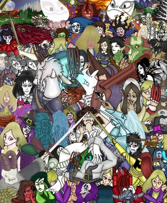
62. Busy Scene

Trust me, I'm going somewhere with this. When I used to go to elementary school, particularly 2-4th grade (don't remember exactly, my memory is hazy), there was a some kind of children's savings account program, in which kids would deposit their (usually parents') money in and get it back at the end of the school year. And probably win some prizes, also we all had these little notebooks to write the amount of money and have a teacher sign it. It was some sort of economics deal made in cooperation with a state bank, it was a long time ago. Now, what's with this backstory? You see, with every new season (winter, spring etc.), we would get a new bank brochure with an illustration depicting a busy town street in each season. I remember enjoying looking at these artworks, and my favorite was the autumn brochure, and thought about making something in that vein. However, the scale was too big for the whole town, so I had chosen only a small part, the one taking originally 1/4 of the whole brochure, nowadays this wouldn't be a problem. About the piece, it's not a remake of any sorts, more like a narrow reimagining of something I have certain, quite vague memories of. I can't hate this thing, it's so colorful, it's packed with activity, has many different characters that I had a lot of fun while designing. Cons would include some of the cars and their details, also should have added more people, and the art style might be weird to some people. This said, I think this piece has a lot of charm, it's full of colors and characters, a dainty (maybe underrated) sleeper hit of 2020 uploads.
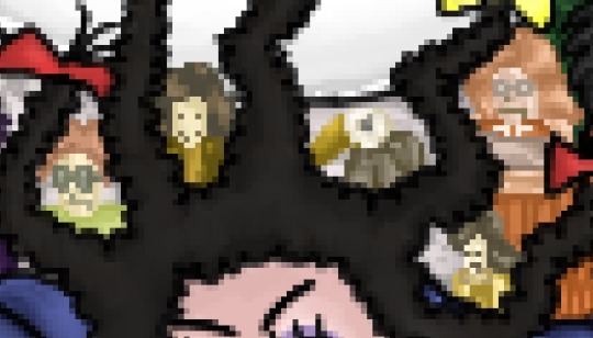
I don't know why, but making these super tiny portraits was really fun. My favorite is dark yellow/brown shirt-vest combo person with a half smile made of beads (second from the left). Come to think of it, kinda looks like pixel art.
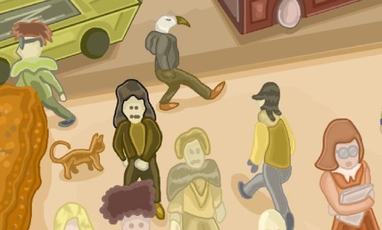
From left to right for clarification/comparison: red-haired glasses guy, bead face, bird face, mullet man and a book girl.
#art#artwork#digitalart#digital art#digital#digital drawing#digital illustration#illustration#original design#original art#myart#my art#myartwork#my artwork#busy street#art gallery#busy scene#street#street art#character#character art#character design#remake#rendition#visual art#visualart#autumn colors#long story
1 note
·
View note
Note
hihihi !! came across your tumblr while looking at hermitcraft/life series art (your art is lovely by the way, definitely going into my cool people with cool art collection) , and saw that you use/used krita !! as a krita user, i would love to know your main brushes and canvas sizes, and art process too :D would love to get into things like illustration but no clue where to start ,,
hello! since i get asked about stuff like that relatively often and i'm usually too lazy to answer properly everytime i'll use this ask to answer all of those in one big post :D
Brushes

i don't think i have main brushes? i jump from style to style quite frequently and i love love love trying out new stuff so the set of brushes i'm using for any given drawing can change drastically but there're a few that came to my mind

i've been vibing with the first brush the most lately! it's kinda has spray paint feel to it?? but not really? idk but it's fun to make messy sketches with :D 2nd and 3rd are probably the brushes i find myself coming back to most often bc they're just really basic lol
all of the brushes ^ are default krita brushes bc i dont like downloading brushes from the internet so if you wanna find cool non default krita brushes you'll need to ask sm1 else sorry
(btw my advice: don't care about brushes. limiting oneself to a certain set of brushes can also limit the creativity so don't do that)
Canvas Size

my default canvas size is 2000 x 2000 px and it usually goes up from that if i need other proportions for a piece - basically that means that the shortest side of (almost) any of my drawings is minimum 2000px (2000 x 3000, 2500 x 2000, etc). for pixel art it's the same rules but for minimum of 200px!
social media eats the quality of images really hard so i usually don't see the point of drawing on bigger canvases than that ¯\_(ツ)_/¯
Art Process

there isn't much to say about the art process for me bc i'm sure my process is not too different from everyone else's process lol for lineart stuff it's the usual:
super messy, super quick sketch
cleaner sketch (depending on the art style and the vibe i'm going for this step can be skipped)
messy colouring (also can be skipped sometimes; this step is just for myself to find the colour palette i wanna use and to determine whether i like the drawing so far or not so i can change the idea or completely abandon the piece)
clean lineart
flat colouring + shading
adding small details, colouring the lineart, making lighting prettier, etc. (this one cannot be properly described bc for me it's usually a mess of tweaking everything and nothing until i like the final product)

for lineless stuff i don't have a process - i put pretty colours on the canvas and just,, Pray for the best or smth lmao
it most likely won’t be helpful but i do have youtube channel where i (once in a blue moon) post speedpaints! they might help in understanding what my art process is
and that's it i think? i hope this was useful at least in some way :D it's not the best idea to ask me about any of art related things bc my approach to art can be summarised with throwing stuff at the wall until smth sticks lmao
#asks and stuff#this is a Mess#i got very sick exactly on january 1st (good start of the year) and i'm still sick#and bc of that my brain is slow at times so#if anything is incomprehensible i'm sorry
47 notes
·
View notes
Text
Pokemon Scarlet and Violet Theory
I have a theory about the themes for pokemon scarlet and violet after yesterday's trailer and after reflecting upon the announcement trailer from February. This is gonna get lengthy and obviously include spoilers for the trailers, so here's your chance to skip this post!
We good to continue? Cool.
Ok. So. I think these games are going to have a kind of… archaeology vs technology, old vs new world, past vs future… kind of angle. Which while writing some of this up yesterday (I had thoughts of making a video like some kind of youtuber lmao - not my style) I saw on articles about the trailer, I'm not the first one to come up with this idea. I think it's pretty obvious even from just the new trailer, but I think the old one has hints for this theme conflict too.

If you look at the opening scene of the announcement trailer, it starts in a very fancy building - presumably the game freak offices. Already it gives off the futuristic vibes with the lit up escalators, sleek chairs, and chrome everywhere.
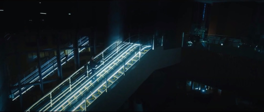
But then when the security guard opens up the door it reveals a much more old school space, with lots of antiques and what could be archaeological finds.

Not to mention the clock that flips forward and backward in time very rapidly - almost like the forces are fighting each other (I'll come back to that).
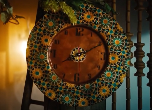
That's really all the announcement trailer gives us for this idea, at least that I've spotted. But back to the new one: if you look at our trainer clothing options, it's a lot of really professional looking gear: the kind of stuff you might think of an archaeologist or scientist wearing around their offices or museums or at conferences. It also looks kinda like school or delivery person uniforms, but either way - professional uniforms of some sort.

Plus in a lot of the shots around the region, there's very obvious new shiny technology bumping right up against much older structures like this weird pokemon center (it gives me gas station vibes) right up against this obviously much older stone structure. (Also note the additional trainer outfits, still maintaining that professional vibe.)
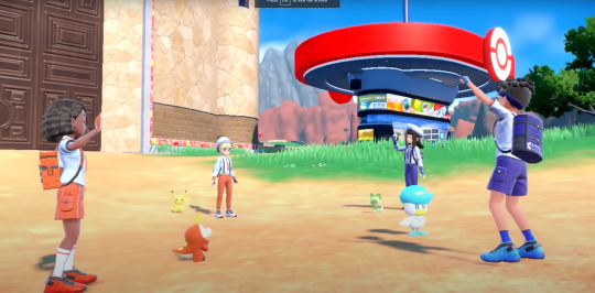
Also, there are going to be two different professors, one for each game, which is something game freak has never done before, and I think that's significant for the overall story theming of these games. If you look at Sada, the professor for Scarlet, she is dressed in what I would call "cavewoman chic". It's a lot of really rustic furs and big bone or stone looking jewelry, and overall is just a really rough and tumble vibe. Whereas Turo, the professor for Violet, is dressed in a very futuristic looking jumpsuit, like something out of Tron.

This split also continues through to the legendaries, especially in the trailer, with Koraidon looking very natural and powerful and mad maxy, whereas Miraidon has literal space engines? And pixel eyes? Like it's one big robot lizard snake. Very synthetic vs natural even down to the textures on their skin.

Now most of the time the legendary and naming themes of the pokemon games are just compatible doubles or trios, like space and time for diamond and pearl or sword and shield being literally just… a big sword dog and a big shield dog, but there is precedent for an opposites theme in a pokemon game set: ruby and sapphire.
In Ruby you help team aqua stop team magma from expanding the landmass and destroying the oceans, and in Sapphire you help team magma stop team aqua from flooding the earth. Two opposing forces with two opposite goals. And while we haven't seen any of the new team (or teams) for scarlet and violet, I do think these potential themes of past vs future might lend themselves to a similarly opposing team structure.
And maybe… maybe… Ok this is a crackpot theory but is it just me or do the professors look… too hot? Like I don't know, they both look a little mean right? They have an edge to them that past professors haven't, and I'm wondering now if maybe the professors could wind up as the antagonists? That could be a really fun spin which I doubt game freak would ever actually do but…

Yeah anyway that's my theory.
#pokemon#pokemon scarlet and violet#pokemon sv#pokemon spoilers#pokemon sv spoilers#pokemon theory#now someone else is gonna have to figure out what the hell the oranges and grapes are about
45 notes
·
View notes
Text
PSA for all new users
Alright so i saw some new users who came from Twitter, Instagram and TikTok and they post as if Tumblr is the same with those platform. No, buddy hey hey my brother in Akatosh, this platform is quite different than Twitter, Instagram and TikTok.
New account? You can't just post an edited picture of your number #234 lunch and expected to get a lot of likes like in Instagram. Unless you already a part of a niche/fandom and has following, trust me... Nobody will care ( or very little )
GET INTO A NICHE/FANDOM, Tumblr is a very fandom dominated platform and it's less general like Twitter or Instagram, get yourself into a group or two, maybe you can make your blog about LGBT issues? Dragon Age? TES? Fallout?
Once you get following on those niches and establish yourself, you can expand to other niches and groups ( this is just advice if you want to get optimum following and exposure, you can reblog or post anything )
Likes is very nice, but reblog have a greater impact on a post. From my observation, per 1 reblog there will be 4 more notes from that reblog
IF YOU ARE A NEW ACCOUNT please please put some effort on your blog aesthetic and don't use the default profile picture or people will think you are a bot
I SWEAR TO GOD, please don't type like this: S3X or D34TH or K1LL ( unless you are in Homestuck fandom ) typing like that on unironic post will make it harder for people to read and understand what you meant to say, especially if they already have difficulty reading context or they have dyslexia. I'm not sure how other autistic people feels, but I'm autistic and the 'S3X D34TH' kind of post gives me a headache.
THIS IS NOT TWITTER OR TIKTOK nobody will ban you or temporary ban you for saying 'MOTHER FUCKING CUNT FUCKING DIE' or 'FUCKING DIPSHIT' so you don't have to censor yourself, instead of typing D34ATH, if you are really uncomfortable with the subject, it'll be better for you to censor it like this: D*ath
Don't get discouraged if your post get 10 notes or something like that, Tumblr has a much smaller user base than other platforms ( and it's kinda dying ) also everyone have their own niche/fandom
Tumblr is more like a personal public diary to post your unhinged thoughts or hanging out with fandoms, not a place to be an influencer or whatever. You wouldn't get a brand deal for being famous on Tumblr *laugh* also, people wouldn't care if you make an advertisement post promoting huge brands like Hello fresh or whatever ( in fact, it's more likely that you'll lose followers)
Post about brand or business that most Tumblr users like? Post promoting cute stuff like plushies, keychain and sticker ( Tumblr also more friendly to small or indie business, Tumblr really don't like huge shitty companies, if coca cola try to promote something here they'll get clowned) Tumblr users also likes LGBT/POC/minorities owned business
Be careful with blogs asking for donations, sadly, a lot of them are scammers ( not all of them, but you know *shrug* ). Please check the blog throughly and DM the OP if you want to donate.
New blog? Don't left your blog empty or with barely any post. Reblog a lot of stuff so people wouldn't think you are a bot
Don't use the same posting style like on Instagram and Twitter, don't use a lot of dots for a long post, use read more.
Don't put tags on your post, put them on the appropriate place! This is not Instagram, writing the list of tags wouldn't do anything
Lastly, if you are a conservative blog, you are more likely to get your blog pixelated LMAO
10 notes
·
View notes
Text
trying to get back into the game???
i've been really obsessed with playing again lately, but since i couldn't cause i wasn't home for weeks, i've been adding to my pinterest boards and writing and really thinking about what and how i wanted to do it (idk why i always need to be super organized and give myself rules to literally play with pixels)
------how do i want to play???
i want to really play the game, have fun again. but i'm also always super invested in my sims storylines because i can't enjoy playing if i don't thread a little story, even if it's just for myself. so i've decided to lean towards story-driven gameplays (i.e: i have a slight idea of the direction i want my characters lives to go in, but i'm letting myself play as i like and the story can and will be affected by gameplay)
i've been super into interactive narrative games lately, and i wanna try replicating this in the sims (i.e: if this happens then i can allow that to happen, but if that happens then i can't do this, etc. etc. blabla)
+ i don't want to stick to ONE gameplay. i know i tend to get messy and start 10000 saves, but i get bored so fast and there's never one week in which i only want to play in one save. i need some variety, and it leads us to:
------new ideas???
OK the best part now: what am i cooking???
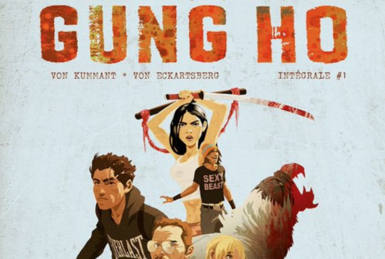
i'd like to give dystopia/post-apocalypse another go, cause i had so much fun the first time i did it and am really into these kind of graphic novels—so GUNG HO save reboot! this time: way more story-driven & more of a caricatural cartoony style with comic-like editing. already started writing some of the plot & characters and looking for aesthetic references. the title will probably change but for now i'm calling it like that in my head lol. (ps: above is the cover of the actual comic that first inspired me for this save—below is my reference board for sim design)

then,
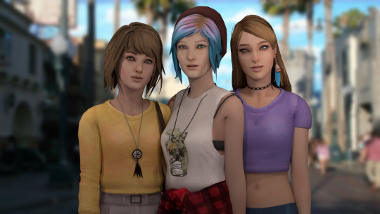
i really want to play with high school years when it's fixed so of course i'll make my HEARTBREAK HIGH save - basically bringing macha back to life as a teen because it's my fave sim ever, but the style will be more semi-realistic (no alpha in mind but like LiS aesthetic if you get me?? we'll see how i feel) this will still be story-driven but way less, more gameplay-oriented (just like i did with 2002 actually, having fun and making up stories out of what the game gave me lol)—i kinda want it to feel like my own lil sitcom yk???

these will be my 2 main saves for the moment (i'm still playing my heartblood save but i think i need to give it a makeover before posting it again lol)—and then, i'd like to create a mini SLASHER challenge/story, because it's my favourite kind of horror movies and i wanna make my own!! something really cliché like in a summer camp & using sacrificial mods and i'll play the murderer and you won't know who it is until the end of the challenge ANYWAYS i've been rambling for too long and no oNE CARES so good night!!! i'm going back home tomorrow so i will be able to PLAY
good night!!!
xox
4 notes
·
View notes
Text
Jives as High Duke
So Jives gets a second pick and oh my G did i struggle with choosing this one. In the end I'm pretty happy with the decision to give him the Monkey Miraculous
The whole story for how he ended up with having to pick a second time is already on the post about Stingy, who gets the Turtle from Jives, so I'll try not to repeat myself too much
So here are the references for this design

This design came out a lot simpler than it probably should be considering that it's based on the Chinese Monkey King but Jives isn't one for overly flashy and elaborate costumes in my opinion
Also, yes, again, his eyey should be blue but making colour changes to coloured pencil drawings is really hard, I'm sorry
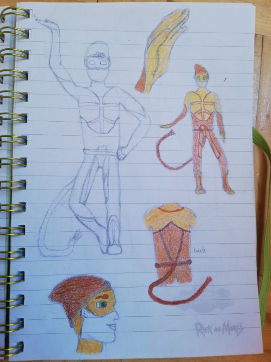
Again, i just did what felt natural to me and in no time this was the outcome. Conclusion: drawing Jives comes very natural to me and i appreciate him for that
Design Notes:
Chest Pattern - i wanted to make the chest pattern here resemble the one he had as Grinder Turtle, this was also a big factor that sold me on giving him this Miraculous. I just think it looks really cool and it connects the two designs in a vague sense
Beanie - my boy Jives always wears some sort of hat, this is no exception. The Monkey Miraculous is a Crown and here it blends in so it now replaces the brim section of the beanie. On second thought it might be a little basic to choose a beanie but it just really suits him, i couldn't think of a better fit. Especially because it goes along really well with the headshape of the monkey i based him on
Toque Macaque - I'll be real with you, I'm not a huge fan of monkeys which makes them one of the few animal species i don't love and also makes the biggest reason i wasn't immediately happy to give my dear Jives this Miraculous xD I'm shallow i know. Anyways. I may not know a lot about monkeys but i knew enough to pick this macaque because the colours go well enough with the Monkey Kwami Xuppu and i liked the markings it has. [coicidentally this specific kind, the Toque Macaque, happens to share its natural habitat with the peacock ;)]
Tail - on his back you see how the rope detailing from his chest and pants combine into the belt and eventually the tail. I wanted the markings to kind of resemble a harness for climbing, i don't think it comes across too well though
Hair - the little bit you can still see of his actual hair coincidentally blends in almost seamlessly with the colour of his costume, that wasn't planned but i like it a lot
Reasoning:
At the point in time where i made the decision that Stingy would take the Turtle Miraculous from Jives i already had most Miraculous assigned to most other characters, in fact i was only really missing one for Ziggy. So spoiler alert i guess for him. I fudged around for a while between the Mouse and the Monkey, both would've worked well with either but in the end settled on the Monkey for Jives for multiple stupid timy reasons. For example the chest pattern i already mentioned, my ship-trash side going "a monkey and a peacock fit together way better aesthetically than a mouse and a peacock would", he and Xuppu would have a funny bro dynamic together etc.
Story:
I already explained why and how Jives loses the Turtle Miraculous to Stingy in my post about the latter so I'll just give a short summary here before moving on
As per usual Jives didn't eat much throughout the day and ends up fainting. This time it's a much bigger deal though. Usually he doesn't actually fully faint, just sway a little, maybe collapse but for the most parts he stays conscious just really weakened. That day the team of new heroes is fighting an important battle when he full on passes out in the middle of it. Luckily Stingy is able to step in to build their defense up again.
Obviously, instead of saying "i eat as little as possible because i have a problem" Jives just shrugs it off and goes "guess i didn't eat enough again, my bad guys, sorry" and thinks it'll be fine. He didn't expect Álfurildi, aka Sportacus, to take this very literal and announce that he planned on having them eat in his airship as a whole group anyway gor team moral and to make sure they're all healthy enough to actually handle a Miraculous. They deduce that must have been the reason Jives full on fainted this time, while going by his usual life he obviously didn't need as much energy as he now needs to be a superhero so the simple solution is to just eat more.
He makes excuses to not eat with the others as often as he can but one day he'd have to actively leave the others to do so as he already is in the airship with them when they start preparing to serve the next meal. That day he actually snaps at Sportacus that he just doesn't want to eat. Unfortunately, thanks to being such a gentle soul and also sensing Jives frustration and hunger Sportacus tries to comfort Jives with the worst thing he could've said. "heroes gotta eat well, so you can become big and strong" to which Jives absolutely loses it. He snaps at him "I'm already too big without eating anything, can't you just leave me alone!" and just jumps out of the airship. By now he already has Xuppu as his new partner so of cause he makes it down unharmed to run off into the forest. Sportacus wants to follow him but Robbie stops him. Robbie, who so far was pretty quiet and reclusive when the teens came to visit, says he will go find and talk to him taking Pixel with him as he is his best friend after all.
I'll spare you the unnecessarily details i cane up with and just say this is the moment Robbie gets to explain how the powers i gave him work and we get to see that he does really deeply care but just can't really express it. They find Jives and thanks to Robbie being able to relate to him about some of his insecurities and Pixel being a great friend he ends up confessing to them about his eating disorder. He never wanted to be the odd one out but never managed to fit in with the others. It's hard to hide you're different when you're towering over your peers so he figured if he just stopped eating he'd stop growing and though it had no positive effect on him he just couldn't stop doing it even after realizing how bad it had gotten.
Going back to the airship together once the situation calmed down a bit and with Jives' permission they let Sportacus in on this secret. As Robbie figured, the local health expert knows exactly what foods wouldn't upset such an empty stomach too badly and they start the process of finding a few good things for Jives to eat so he doesn't break down again.
Name:
Quick, something more lighthearted
When Jives gets his second pick for a Miraculous his eyes fall on the little Monkey, Xuppu. The two pretty quickly get along thanks to Xuppu being a jokester and Jives liking how bro-like they can talk and poke fun at each other. This turns out to be a great pick as this Kwami of Jubilation not only like shouting random noises around just like Jives but is also sassy and straightforward enough to remind him to eat every once in a while by poking fun at him using something Pixel once said to him "I'll not let you eat less than the Kwamis" (yes this part should've technically been in the reasoning section but you kinda need the context of the story for it so i put it here)
So Trixie explains that Xuppu's transformation and powers are based on the Chinese Monkey King (she knows that from the Guardians) but Jives really isn't one for flashy costumes and important titles so not only is his costume more basic than it probably should be but also he wamts to name himself "Duke". Stingy immediately objects "A duke is about as royal as a prince! You're completely underselling this concept. You have to trade with me! You get yoir turtle back. Let me be King!" Xuppu and Wayzz look at each other and roll their eyes, Xuppu then steps floats forward to say "well, he's not entirely wrong. Wouldn't you like to pick something higher?" so Jives chuckles and goes "High Duke". Again Stingy is outraged by this disrespect "that's ridiculous!" but Xuppu laughs and says "no, i like his style! Let's do this!" and so their new duo is established
Look, don't judge me, everyone headcanons Jives with growing not all legal things in his garden so now that he's actually a teen in my au I'm keeping it xD
Thank you so so much for reading so much of my rambling. You're so cool for taking the time to read this!
#Lazytown#miraculous ladybug#Lazytown au#Miraculous Lazybug#revive the lazy#jives junkfood#maggi mjói#Xuppu#Eating disorder#mentioned
15 notes
·
View notes
Text
i should really actually post my art on this site either way i'll still answer this lol
1. ms paint, used to use it before i moved to aseprite, paint.net kinda counts but i do use it sometimes because the magic wand tool in it is cool
2. left or right is equally easy for me, but forward? hhGRGAAAAAAAAA
3. i like to remaster a lot of really really old drawings i made on ms paint (because i got a computer wayyyy too early), only one i can think of off the top of my head is the mushroom guys
4. humans are just bitches to draw in general. hate those things
5. i keep literally all of it to myself
6. adventure time's art style tends to creep into some of my stuff, also eyes are a weird motif in a lot of my art that i just kinda throw in because it's the first cool pattern i can think of
7. sculpting man... HOW do they do that?? i've tried it before but i can't touch clay without proceeding to just squish and knead it for an hour instead of making anything of value
8. oh i got a ton of those. deltarune missing link (the discarded vessel having spooky shenanigans in the void), a deltarune swap AU i came up with where papyrus switches with susie, rouxls switches with ralsei and other stuff, deltascryption (deltarune/inscryption crossover spritecomic) so mostly deltarune stuff. sorry deltarune
9. batshit insane. i crawl to my computer like a dying rat and sift through hundreds of files titled shit like "743567hgrgh", "cheese" and "glumbo go glumbo go glumbo go" only to find the one i was looking for, titled "scrunk table" which is just a bunch of pvz fanart
10. i hate drawing clothes, but overalls are fun i guess
11. usually my playlist filled with STRANGE and EVIL music, but this board game podcast my dad listens to (called ludology) is also nice
12. most of the human body sucks but can i choose bug body parts?? a thorax or abdomen perchance?? pretty please?
13. this is hard to answer since most creators i admire are My Thing so instead i'll say My Thing is absolutely whatever the hell bep/anne and squimpus mcgrimpus' vibe is, their art is the goofiest coolest shit and i love it so so much
14. EYES EYES EYES EYES EYES EYES
15. in my cave, on the puter
16. i don't really know tbh, my motivation for anything is because it's fun
17. i mean if i happen to have food there yeah. which i usually do, and it's usually dried fruit, nuts and/or cheese because i have the diet of a pet rat
18. HAH!! GET A LOAD OF THIS GUY!!! THINKS A DIGITAL ARTIST CAN "BREAK THEIR ART SUPPLIES" HAH!!!! (i have accidentally snapped a drawing tablet in half once please don't ask)
19. impossible triangles man... i care them
20. BUGS BUGS BUGS BUGS BUGS BUGS BUGS
21. as a pixel artist i really like people who can pull off 1 bit / two colour stuff and i do want to try it at some point
22. NONE!!! (my dyspraxia grows worse by the second)
23. i have artist friends who draw normal, sane digital art and cry as they realise they've drawn on layer #7769 instead of layer #5443. they work on a new inch of their drawing and open up another layer, catapulting the total into the millions. as their tired eyes look upon me, they ask "hey how many layers do you use" my face contorts into an evil smirk "ONE" they cower and scream at my raw power
24. yeah, i probably don't notice though
25. okay... d-dwarf fortress?? it's all CHARACTERS what do they MEAN by this
26. okay so i was drawing my evil lesbian lady "Dr. E. Vile" and she has a bunch of arms with cartoon gloves on them i have no idea how five separate friends of mine said "I like her chef hat" THEY ARE GLOVES WHERE DID IT ALL GO SO WROOOONGG
27. my warm up drawings tend to be me going "time to draw the Thing", and immediately creating the most wretched abomination known to man, so abhorrent in its anatomy that i have to start over entirely
28. nope. too much pressure man WAIT I WAS IN A RAIN WORLD THING https://youtu.be/jBu7gOwtYSY?t=1628 LOOK MA I'M ON TV
29. this is a weird way to answer the question, but i DESPARATELY want to draw in a similar weird and 'unfinished' type of style that stuff like yume nikki, ENA and INTERFACE have it's just that i have no idea how to actually emulate it, like how to create that specific uncanny/eccentric vibe well
30. hahahahahahahahaha (they all are)
Weirdly Specific Artist Ask Game
Didn't see a lot of artist ask games, wanted to make a silly one.
(I wrote this while sick out of my mind last year and it's been collecting dust in my drafts, I might as well let it run free) 1. Art programs you have but don't use
2. Is it easier to draw someone facing left or right (or forward even)
3. What ideas come from when you were little
4. Fav character/subject that's a bitch to draw
5. Estimate of how much of your art you post online vs. the art you keep for yourself
6. Anything that might inspire you subconsciously (i.e. this horse wasn't supposed to look like the Last Unicorn but I see it)
7. A medium of art you don't work in but appreciate
8. What's an old project idea that you've lost interest in
9. What are your file name conventions
10. Favorite piece of clothing to draw
11. Do you listen to anything while drawing? If so, what
12. Easiest part of body to draw
13. A creator who you admire but whose work isn't your thing
14. Any favorite motifs
15. *Where* do you draw (don't drop your ip address this just means do you doodle at a park or smth)
16. Something you are good at but don't really have fun doing
17. Do you eat/drink when drawing? if so, what
18. An estimate of how much art supplies you've broken
19. Favorite inanimate objects to draw (food, nature, etc.)
20. Something everyone else finds hard to draw but you enjoy
21. Art styles nothing like your own but you like anyways
22. What physical exercises do you do before drawing, if any
23. Do you use different layer modes
24. Do your references include stock images
25. Something your art has been compared to that you were NOT inspired by
26. What's a piece that got a wildly different interpretation from what you intended
27. Do you warm up before getting to the good stuff? If so, what is it you draw to warm up with
28. Any art events you have participated in the past (like zines)
29. Media you love, but doesn't inspire you artistically
30. What piece of yours do you think is underrated
34K notes
·
View notes
Note
Hiiii!!! I really love your kiribaku fanarts...I've seen that you also draw haikyuu art as well and i'm thrilled to found this out :) (since I'm kinda new here.) have you heard the news that hq!! s4 is confirmed in sept?
I have!!! I wonder how far in they’re gonna get with adapting the manga in it, cause the current arc is being !!!!!! hhhhhhhhh !!!!!! but it’s definitely too much to ask for this game to be adapted in s4 already haha I’m especially hype for Daishou, Hoshiumi and Kita to be animated >:]c
Anon said:Hey!! I love your work!! But I’m curious, how long does it take for you to draw + color what you post? Like on average?
Thank you!! And that really, really depends on what I’m drawing/how much effort I’m putting in/how good I’m feeling about drawing while drawing, so I can’t easily say! For a full colors piece it goes from two or even just one hour (when it’s characters I’m used to draw in simple clothing with no bg/easy poses or anything equally easy) to over two days of constant work (lotsa characters or a character I’m not used to, complex clothing, a huge background, things like that) - the single page illustration that took me the longest to ever finish was my extra piece for the sixth wheel zine and that one was something like five or six days of constant work!
I tend to be very sloppy with what I make though, and my style was built to let me be as fast as I possibly could cause my attention span is minimal orz I’m working on that !!!!
Anon said:I really love the way you draw it’s so beautiful
Thank you so much!!! TTOTT
Anon said:Happy New Year’s! Your art really inspires me to be an artist, so thank you. I’ve only recently discovered your blog, but whenever I see your art it makes me really happy!
Oh man that makes me so happy to hear?? I hope you’re having all the fun in the world with your art!!!!
Anon said:I’m excited to see more luca and nico I’m not ready for their cuteness 🥰
I wanna draw more of them toooooooo !!!!!!! maybe soon!!! I’m so happy to hear you’re excited about them
Anon said:Any tips for lineart, bc mine literally looks like pixels
It would seriously be easier for me to help you if you could tell me which art program you use and which tools, ngl! I don’t really know what you mean with “looks like pixels” since from my experience the only ways to make the lineart look like pixels is to either use the binary tool or to zoom in on the drawing further than 100% (but in the second case it should stop being a problem once you save the drawing anyway) - like this the only tip I can give you is to switch tools around a bit to see what looks best for you! I use Easy Paint Tool SAI as a program and my lining tools are either the default brush tool or (lately) the default pen one, both with sizes between 4px and 6px - it’s really basic tools really! If you’re asking how to make your lines look smooth, then that changes from artist to artist and the best thing I can tell you to do is to keep trying different ways till you find the one that works best for you (again, yes) - my way is to try and interrupt the line while lining as little as I can, which implies a lot of ctrl+z and drawing the same lines over and over again till they look right orz you get faster at it the more you try, at least haha
Anon said:I just saw the drawing of your OC, Dave (I love it and I love him) and I was wondering where you got the inspiration for his shirt? Did you create it or is it actually a design you’ve seen before? Because I love it! I hope you have a nice day! :D
Ah, I made it up myself! He likes cats and he likes music so I mixed the two haha I’m glad you liked it, though!! And I’m glad you liked my boy, too!!!
#fran answers#trying to start this year with the resolve of not letting asks pile up in my inbox#can i do it can i not#we'll just have to wait and see#haha#anonymous
173 notes
·
View notes