#yeet them as well
Explore tagged Tumblr posts
Text
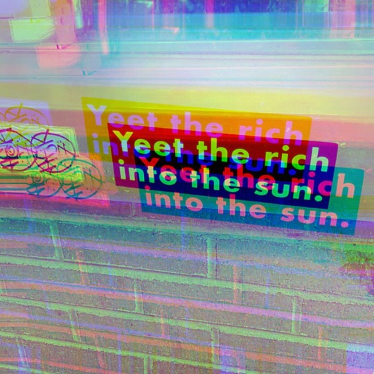
Bless whoever co-opted this sbux thrive thru window to spread The Truth.
[Image Description: bumper sticker stuck under drive thru window that reads “Yeet the rich into the sun.”]
6 notes
·
View notes
Text

Jy and his two guard dogs (or cats)
#aratribow#my art#honkai star rail#jing yuan#hsr jing yuan#hsr yanqing#hsr yunli#jingyuan and yanqing#yanqing#jingyuan and yunli#they r father and daughter to me fr#also NO YANLI TAGS OR M YEETING MYSELF INTO YALLS WALLS TO NIBBLE AWAY AT ALL YALLS CABLES#parent child relatioship tm#kitsune jy so thought the kids would be kitsune as well#but everyone i've shown this art to have called them cats#so cats dogs foxes whatever yall like fr
2K notes
·
View notes
Text
Prompt 177
Now Dan is no coward. He’s not.
But this stupid child body does have an effect on his reactions to things and honestly it’s a horrible thing that’s too small and too weak for him to use all his abilities. He could barely manage a fireball if he concentrated, yet everything caught fire with a mere outburst! His control was utterly gone, and a tantrum resulted in having to wear a stupid child leash backpack.
It wasn’t like he was really a child, and it wasn’t like he’d get lost or some stupid shit that Danny would insist. Ugh, this isn’t even fair, technically he was older than him yet was stuck in a smaller body that he kept tripping over!
Urgh, he’s even insisting on rewarding ‘good behavior’ and shit- must have talked to Jazz or something- because… Oh. No he wants the constellation bear, give! His star bear now, no takes back and, urgh, stupid baby body!
Well, on the other hand, it’s utterly hilarious how much Danny sputters whenever he calls him Mom, not to mention strangers’ utter befuddlement. He ignores how Danny seems to be trying his best to live up ro the title.
But! As he was saying, he’s no coward! He’s also not an idiot though, and having no control over his powers isn’t exactly a good thing. It’s really not a good thing when there’s a murderous-looking hero that he thinks he might have maimed in the future- which they apparently remember- staring down at him. So, he has to call in the big guns to fix this.
“Mom, there’s a creepy fruitloop staring at me!” “There’s WHAT?!” Hah. Take that hero he doesn’t remember the name of.
(Behold the Grumpiest of Babies)

#Dcxdp#Dpxdc#Prompts#dp x marvel#Who is the hero who went back in time to stop the Dan situation? Who knows#Dan who is just a lil guy right now: FOOL you have fallen into my trap#6ft+ Mother Bear Danny who is always down to fight:#I need you to know he is not a tank#He still looks thin and a stick it is just a very tall stick with fangs and claws and enough anger to fight god#and win#Jordan (Dan) is like 8 at most and giving the time traveler the most bloodthirsty smile ever before Danny slams into them at full speed#Someone is going to see the hero get yeeted#Dan is going to throw a fit when Danny reattaches the child leash since he wandered off#Vlad is semi redeemed but not mentally well enough to deal with a child#Especially Dan who knows how to push All of his Buttons and rip him apart emotionally mentally and physically
2K notes
·
View notes
Text

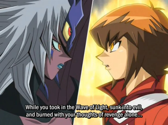


Yugioh characters simply have no patience for your skill issues.
#yugioh series#yugioh#yugioh gx#yugioh zexal#joey wheeler#yubel#judai yuki#kaito tenjo#this post inspired by discord and my zexal watch#pics#screencaps#thanks to kuriboo for the first image#biased but:#never 4get that judai 'haou' yuki yeeted his partner into space#driving them insane from the experience#and then said well that's your own fault#the most guy ever
880 notes
·
View notes
Text
why Aurora's art is genius
It's break for me, and I've been meaning to sit down and read the Aurora webcomic (https://comicaurora.com/, @comicaurora on Tumblr) for quite a bit. So I did that over the last few days.
And… y'know. I can't actually say "I should've read this earlier," because otherwise I would've been up at 2:30-3am when I had responsibilities in the morning and I couldn't have properly enjoyed it, but. Holy shit guys THIS COMIC.
I intended to just do a generalized "hello this is all the things I love about this story," and I wrote a paragraph or two about art style. …and then another. And another. And I realized I needed to actually reference things so I would stop being too vague. I was reading the comic on my tablet or phone, because I wanted to stay curled up in my chair, but I type at a big monitor and so I saw more details… aaaaaand it turned into its own giant-ass post.
SO. Enjoy a few thousand words of me nerding out about this insanely cool art style and how fucking gorgeous this comic is? (There are screenshots, I promise it isn't just a wall of text.) In my defense, I just spent two semesters in graphic design classes focusing on the Adobe Suite, so… I get to be a nerd about pretty things…???
All positive feedback btw! No downers here. <3
---
I cannot emphasize enough how much I love the beautiful, simple stylistic method of drawing characters and figures. It is absolutely stunning and effortless and utterly graceful—it is so hard to capture the sheer beauty and fluidity of the human form in such a fashion. Even a simple outline of a character feels dynamic! It's gorgeous!
Though I do have a love-hate relationship with this, because my artistic side looks at that lovely simplicity, goes "I CAN DO THAT!" and then I sit down and go to the paper and realize that no, in fact, I cannot do that yet, because that simplicity is born of a hell of a lot of practice and understanding of bodies and actually is really hard to do. It's a very developed style that only looks simple because the artist knows what they're doing. The human body is hard to pull off, and this comic does so beautifully and makes it look effortless.
Also: line weight line weight line weight. It's especially important in simplified shapes and figures like this, and hoo boy is it used excellently. It's especially apparent the newer the pages get—I love watching that improvement over time—but with simpler figures and lines, you get nice light lines to emphasize both smaller details, like in the draping of clothing and the curls of hair—which, hello, yes—and thicker lines to emphasize bigger and more important details and silhouettes. It's the sort of thing that's essential to most illustrations, but I wanted to make a note of it because it's so vital to this art style.
THE USE OF LAYER BLENDING MODES OH MY GODS. (...uhhh, apologies to the people who don't know what that means, it's a digital art program thing? This article explains it for beginners.)
Bear with me, I just finished my second Photoshop course, I spent months and months working on projects with this shit so I see the genius use of Screen and/or its siblings (of which there are many—if I say "Screen" here, assume I mean the entire umbrella of Screen blending modes and possibly Overlay) and go nuts, but seriously it's so clever and also fucking gorgeous:
Firstly: the use of screened-on sound effect words over an action? A "CRACK" written over a branch and then put on Screen in glowy green so that it's subtle enough that it doesn't disrupt the visual flow, but still sticks out enough to make itself heard? Little "scritches" that are transparent where they're laid on without outlines to emphasize the sound without disrupting the underlying image? FUCK YES. I haven't seen this done literally anywhere else—granted, I haven't read a massive amount of comics, but I've read enough—and it is so clever and I adore it. Examples:


Secondly: The beautiful lighting effects. The curling leaves, all the magic, the various glowing eyes, the fog, the way it's all so vividly colored but doesn't burn your eyeballs out—a balance that's way harder to achieve than you'd think—and the soft glows around them, eeeee it's so pretty so pretty SO PRETTY. Not sure if some of these are Outer/Inner Glow/Shadow layer effects or if it's entirely hand-drawn, but major kudos either way; I can see the beautiful use of blending modes and I SALUTE YOUR GENIUS.
I keep looking at some of this stuff and go "is that a layer effect or is it done by hand?" Because you can make some similar things with the Satin layer effect in Photoshop (I don't know if other programs have this? I'm gonna have to find out since I won't have access to PS for much longer ;-;) that resembles some of the swirly inner bits on some of the lit effects, but I'm not sure if it is that or not. Or you could mask over textures? There's... many ways to do it.
If done by hand: oh my gods the patience, how. If done with layer effects: really clever work that knows how to stop said effects from looking wonky, because ugh those things get temperamental. If done with a layer of texture that's been masked over: very, very good masking work. No matter the method, pretty shimmers and swirly bits inside the bigger pretty swirls!
Next: The way color contrast is used! I will never be over the glowy green-on-black Primordial Life vibes when Alinua gets dropped into that… unconscious space?? with Life, for example, and the sharp contrast of vines and crack and branches and leaves against pitch black is just visually stunning. The way the roots sink into the ground and the three-dimensional sensation of it is particularly badass here:

Friggin. How does this imply depth like that. HOW. IT'S SO FREAKING COOL.
A huge point here is also color language and use! Everybody has their own particular shade, generally matching their eyes, magic, and personality, and I adore how this is used to make it clear who's talking or who's doing an action. That was especially apparent to me with Dainix and Falst in the caves—their colors are both fairly warm, but quite distinct, and I love how this clarifies who's doing what in panels with a lot of action from both of them. There is a particular bit that stuck out to me, so I dug up the panels (see this page and the following one https://comicaurora.com/aurora/1-20-30/):

(Gods it looks even prettier now that I put it against a plain background. Also, appreciation to Falst for managing a bridal-carry midair, damn.)
The way that their colors MERGE here! And the immense attention to detail in doing so—Dainix is higher up than Falst is in the first panel, so Dainix's orange fades into Falst's orange at the base. The next panel has gold up top and orange on bottom; we can't really tell in that panel where each of them are, but that's carried over to the next panel—
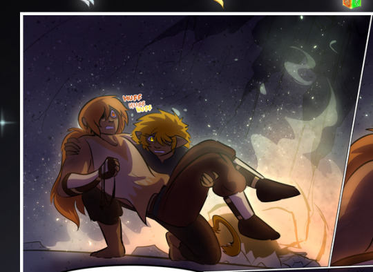
—where we now see that Falst's position is raised above Dainix's due to the way he's carrying him. (Points for continuity!) And, of course, we see the little "huffs" flowing from orange to yellow over their heads (where Dainix's head is higher than Falst's) to merge the sound of their breathing, which is absurdly clever because it emphasizes to the viewer how we hear two sets of huffing overlaying each other, not one. Absolutely brilliant.
(A few other notes of appreciation to that panel: beautiful glows around them, the sparks, the jagged silhouette of the spider legs, the lovely colors that have no right to make the area around a spider corpse that pretty, the excellent texturing on the cave walls plus perspective, the way Falst's movements imply Dainix's hefty weight, the natural posing of the characters, their on-point expressions that convey exactly how fuckin terrifying everything is right now, the slight glows to their eyes, and also they're just handsome boys <3)
Next up: Rain!!!! So well done! It's subtle enough that it never ever disrupts the impact of the focal point, but evident enough you can tell! And more importantly: THE MIST OFF THE CHARACTERS. Rain does this irl, it has that little vapor that comes off you and makes that little misty effect that plays with lighting, it's so cool-looking and here it's used to such pretty effect!
One of the panel captions says something about it blurring out all the injuries on the characters but like THAT AIN'T TOO BIG OF A PROBLEM when it gets across the environmental vibes, and also that'd be how it would look in real life too so like… outside viewer's angle is the same as the characters', mostly? my point is: that's the environment!!! that's the vibes, that's the feel! It gets it across and it does so in the most pretty way possible!
And another thing re: rain, the use of it to establish perspective, particularly in panels like this—

—where we can tell we're looking down at Tynan due to the perspective on the rain and where it's pointing. Excellent. (Also, kudos for looking down and emphasizing how Tynan's losing his advantage—lovely use of visual storytelling.)
Additionally, the misting here:
We see it most heavily in the leftmost panel, where it's quite foggy as you would expect in a rainstorm, especially in an environment with a lot of heat, but it's also lightly powdered on in the following two panels and tends to follow light sources, which makes complete sense given how light bounces off particles in the air.
A major point of strength in these too is a thorough understanding of lighting, like rim lighting, the various hues and shades, and an intricate understanding of how light bounces off surfaces even when they're in shadow (we'll see a faint glow in spots where characters are half in shadow, but that's how it would work in real life, because of how light bounces around).
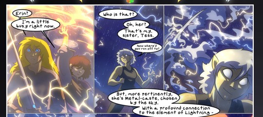
Bringing some of these points together: the fluidity of the lines in magic, and the way simple glowing lines are used to emphasize motion and the magic itself, is deeply clever. I'm basically pulling at random from panels and there's definitely even better examples, but here's one (see this page https://comicaurora.com/aurora/1-16-33/):

First panel, listed in numbers because these build on each other:
The tension of the lines in Tess's magic here. This works on a couple levels: first, the way she's holding her fists, as if she's pulling a rope taut.
The way there's one primary line, emphasizing the rope feeling, accompanied by smaller ones.
The additional lines starbursting around her hands, to indicate the energy crackling in her hands and how she's doing a good bit more than just holding it. (That combined with the fists suggests some tension to the magic, too.) Also the variations in brightness, a feature you'll find in actual lightning. :D Additional kudos for how the lightning sparks and breaks off the metal of the sword.
A handful of miscellaneous notes on the second panel:
The reflection of the flames in Erin's typically dark blue eyes (which bears a remarkable resemblance to Dainix, incidentally—almost a thematic sort of parallel given Erin's using the same magic Dainix specializes in?)
The flowing of fabric in the wind and associated variation in the lineart
The way Erin's tattoos interact with the fire he's pulling to his hand
The way the rain overlays some of the fainter areas of fire (attention! to! detail! hell yeah!)
I could go on. I won't because this is a lot of writing already.
Third panel gets paragraphs, not bullets:
Erin's giant-ass "FWOOM" of fire there, and the way the outline of the word is puffy-edged and gradated to feel almost three-dimensional, plus once again using Screen or a variation on it so that the stars show up in the background. All this against that stunning plume of fire, which ripples and sparks so gorgeously, and the ending "om" of the onomatopoeia is emphasized incredibly brightly against that, adding to the punch of it and making the plume feel even brighter.
Also, once again, rain helping establish perspective, especially in how it's very angular in the left side of the panel and then slowly becomes more like a point to the right to indicate it's falling directly down on the viewer. Add in the bright, beautiful glow effects, fainter but no less important black lines beneath them to emphasize the sky and smoke and the like, and the stunningly beautiful lighting and gradated glows surrounding Erin plus the lightning jagging up at him from below, and you get one hell of an impactful panel right there. (And there is definitely more in there I could break down, this is just a lot already.)
And in general: The colors in this? Incredible. The blues and purples and oranges and golds compliment so well, and it's all so rich.
Like, seriously, just throughout the whole comic, the use of gradients, blending modes, color balance and hues, all the things, all the things, it makes for the most beautiful effects and glows and such a rich environment. There's a very distinct style to this comic in its simplified backgrounds (which I recognize are done partly because it's way easier and also backgrounds are so time-consuming dear gods but lemme say this) and vivid, smoothly drawn characters; the simplicity lets them come to the front and gives room for those beautiful, richly saturated focal points, letting the stylized designs of the magic and characters shine. The use of distinct silhouettes is insanely good. Honestly, complex backgrounds might run the risk of making everything too visually busy in this case. It's just, augh, so GORGEOUS.
Another bit, take a look at this page (https://comicaurora.com/aurora/1-15-28/):
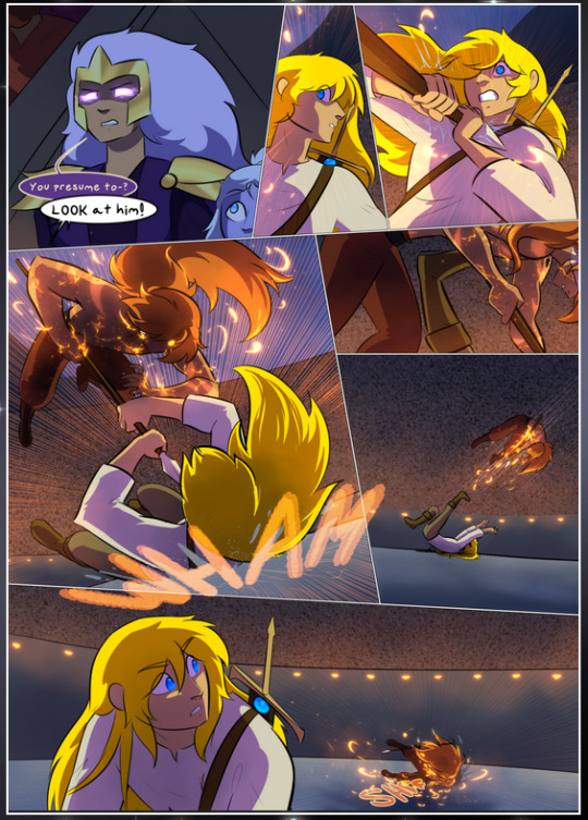
It's not quite as evident here as it is in the next page, but this one does some other fun things so I'm grabbing it. Points:
Once again, using different colors to represent different character actions. The "WHAM" of Kendal hitting the ground is caused by Dainix's force, so it's orange (and kudos for doubling the word over to add a shake effect). But we see blue layered underneath, which could be an environmental choice, but might also be because it's Kendal, whose color is blue.
And speaking off, take a look at the right-most panel on top, where Kendal grabs the spear: his motion is, again, illustrated in bright blue, versus the atmospheric screened-on orange lines that point toward him around the whole panel (I'm sure these have a name, I think they might be more of a manga thing though and the only experience I have in manga is reading a bit of Fullmetal Alchemist). Those lines emphasize the weight of the spear being shoved at him, and their color tells us Dainix is responsible for it.
One of my all-time favorite effects in this comic is the way cracks manifest across Dainix's body to represent when he starts to lose control; it is utterly gorgeous and wonderfully thematic. These are more evident in the page before and after this one, but you get a decent idea here. I love the way they glow softly, the way the fire juuuust flickers through at the start and then becomes more evident over time, and the cracks feel so realistic, like his skin is made of pottery. Additional points for how fire begins to creep into his hair.
A small detail that's generally consistent across the comic, but which I want to make note of here because you can see it pretty well: Kendal's eyes glow about the same as the jewel in his sword, mirroring his connection to said sword and calling back to how the jewel became Vash's eye temporarily and thus was once Kendal's eye. You can always see this connection (though there might be some spots where this also changes in a symbolic manner; I went through it quickly on the first time around, so I'll pay more attention when I inevitably reread this), where Kendal's always got that little shine of blue in his eyes the same as the jewel. It's a beautiful visual parallel that encourages the reader to subconsciously link them together, especially since the lines used to illustrate character movements typically mirror their eye color. It's an extension of Kendal.
Did I mention how ABSOLUTELY BEAUTIFUL the colors in this are?
Also, the mythological/legend-type scenes are illustrated in familiar style often used for that type of story, a simple and heavily symbolic two-dimensional cave-painting-like look. They are absolutely beautiful on many levels, employing simple, lovely gradients, slightly rougher and thicker lineart that is nonetheless smoothly beautiful, and working with clear silhouettes (a major strength of this art style, but also a strength in the comic overall). But in particular, I wanted to call attention to a particular thing (see this page https://comicaurora.com/aurora/1-12-4/):
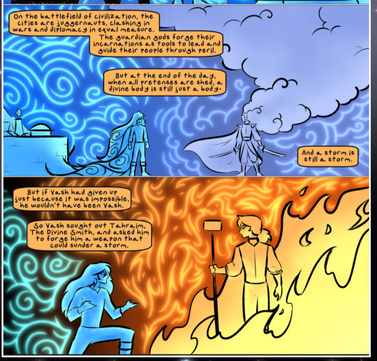
The flowing symbolic lineart surrounding each character. This is actually quite consistent across characters—see also Life's typical lines and how they curl:
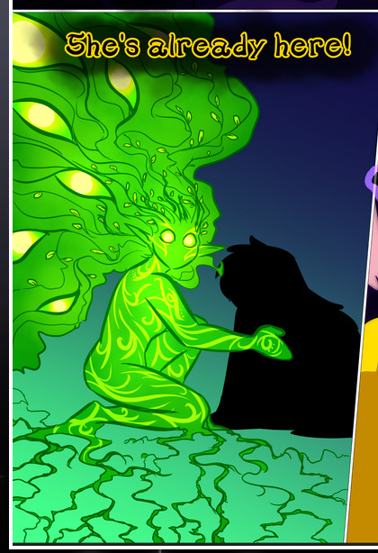
What's particularly interesting here is how these symbols are often similar, but not the same. Vash's lines are always smooth, clean curls, often playing off each other and echoing one another like ripples in a pond. You'd think they'd look too similar to Life's—but they don't. Life's curl like vines, and they remain connected; where one curve might echo another but exist entirely detached from each other in Vash's, Life's lines still remain wound together, because vines are continuous and don't float around. :P
Tahraim's are less continuous, often breaking up with significantly smaller bits and pieces floating around like—of course—sparks, and come to sharper points. These are also constants: we see the vines repeated over and over in Alinua's dreams of Life, and the echoing ripples of Vash are consistent wherever we encounter him. Kendal's dream of the ghost citizens of the city of Vash in the last few chapters is filled with these rippling, echoing patterns, to beautiful effect (https://comicaurora.com/aurora/1-20-14/):
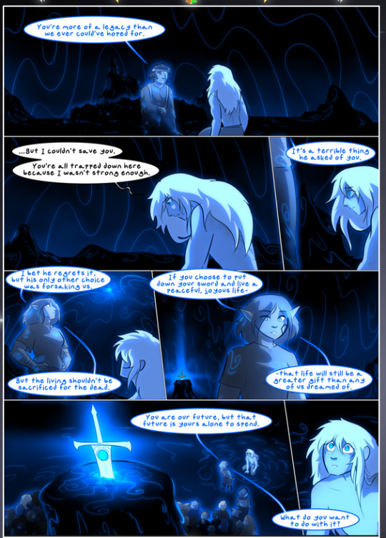
They ripple and spiral, often in long, sinuous curves, with smooth elegance. It reminds me a great deal of images of space and sine waves and the like. This establishes a definite feel to these different characters and their magic. And the thing is, that's not something that had to be done—the colors are good at emphasizing who's who. But it was done, and it adds a whole other dimension to the story. Whenever you're in a deity's domain, you know whose it is no matter the color.
Regarding that shape language, I wanted to make another note, too—Vash is sometimes described as chaotic and doing what he likes, which is interesting to me, because smooth, elegant curves and the color blue aren't generally associated with chaos. So while Vash might behave like that on the surface, I'm guessing he's got a lot more going on underneath; he's probably much more intentional in his actions than you'd think at a glance, and he is certainly quite caring with his city. The other thing is that this suits Kendal perfectly. He's a paragon character; he is kind, virtuous, and self-sacrificing, and often we see him aiming to calm others and keep them safe. Blue is such a good color for him. There is… probably more to this, but I'm not deep enough in yet to say.
And here's the thing: I'm only scratching the surface. There is so much more here I'm not covering (color palettes! outfits! character design! environment! the deities! so much more!) and a lot more I can't cover, because I don't have the experience; this is me as a hobbyist artist who happened to take a couple design classes because I wanted to. The art style to this comic is so clever and creative and beautiful, though, I just had to go off about it. <3
...brownie points for getting all the way down here? Have a cookie.
#aurora comic#aurora webcomic#comicaurora#art analysis#...I hope those are the right tags???#new fandom new tagging practices to learn ig#much thanks for something to read while I try to rest my wrists. carpal tunnel BAD. (ignore that I wrote this I've got braces ok it's fine)#anyway! I HAVE. MANY MORE THOUGHTS. ON THE STORY ITSELF. THIS LOVELY STORY#also a collection of reactions to a chunk of the comic before I hit the point where I was too busy reading to write anything down#idk how to format those tho#...yeet them into one post...???#eh I usually don't go off this much these days but this seems like a smaller tight-knit fandom so... might as well help build it?#and I have a little more time thanks to break so#oh yes also shoutout to my insanely awesome professor for teaching me all the technical stuff from this he is LOVELY#made an incredibly complex program into something comprehensible <3#synapse talks
786 notes
·
View notes
Note
I have discovered your Derg AU/Dragon Weiss and I’m very much in love. Thank you 🙇🏻♂️🙇🏻♂️

glad to hear that! im very much obsessed about her and she holds all my brainworms captive
#weiss schnee#derg AU#rwby#my art#she has snack#don't question about it i have no idea either#what would she eat anyway#hm#ruby caught her casually snacking on dust one day and had a heart attack#she then immediately takes it away from weiss and yeets it#and then it exploded and burnt down a good portion of the forest#no flammable areas are ever safe from them#anyways yeah they're stupid i love them#and i actually really gotta go do my homework now hfkjdaghkfh bye#i can't believe i wanted more (art) homework when i was in high school college me is crying because of it lmaooo#high school me please gimme your enthusiasm hjgkgjhgj#well no i can actually believe it since there was only 1 piece to do per week#yeah#lmao#buut yes#always happy to see someone discovering dragon weiss!!!!#we're in this brainrot together
571 notes
·
View notes
Text
I am of the opinion that if Cale were to ever realize how much his kids think of him as their parent, he would absolutely speedrun therapy and you cannot change my mind
#cale henituse#lout of the count’s family#lotcf#trash of the counts family#totcf#my communication issues are actually causing these children harm???#YEET#deruth and violan would ask him if he wants to introduce them to the high society scene#and if they say yes they will be decked in gold turtles#if not then oh well#organizer: how grand do you want this debutante ball?#cale: yes#theyre his kids they deserve the best#tcf#lcf#tcf cale#lcf cale
297 notes
·
View notes
Note

This was his way of testing their fall damage, Leo was first and last lmao
hELP
Alternatively, Mikey managed to unlock his floaty levitating mystic abilities really early on and Draxum wanted to check if his brothers could also use such powers
#ngl draxum strikes me as the type of guy who teaches his kids to swim by just throwing them in the water and expects them to learn#except in this specific case i guess it's throwing them into the air expecting them to float#tho tbf if drax threw leo into water things would go significantly better considering he's an aquatic turtle lol#SCENARIO!#*leo and donnie bickering*#donnie: ''what's wrong with you were you dropped on your head as a child??''#leo: ''well uh....''#btw this is all jokes draxum didn't actually yeet turtle tot leo into the ground#...... propably.#Tiz Sep AU#tmnt#rottmnt
162 notes
·
View notes
Text

HEWWO???
(source)
#miriel#elendil#rings of power#rop#tar miriel#trop#mirendil#miriel x elendil#cynthia addai robinson#lloyd owen#ok there's no way that's only friendly I'm officially on board lol ( as much as I can be I'm not a shipper type of fan )#I mean it might be - the Aragorn Boromir forehead boop was friendly but that was um a different situation#( I am however an enjoyer of both characters I like almost everyone in the main cast but waow did they cast the Numenoreans well )#( also I love all Miriel's outfits )#(after the end of season 1 I'd assumed it would either go this way or go the way of a seasoned friendship that would come from#all the stuff Numenor is about to go through starting with the events in the Southlands )#tar-miriel#the rings of power#trop spoilers#just for safety#lil edit I had to mess w the post because tumblr is yeeting the post but this was first posted by ladyofwot on x bird app#I had to mess w the tags too it hates one of them and idk which it was
66 notes
·
View notes
Text


PRESENTING: HYUNA [insp]
#alien stage#alnst#alnstedit#hyuna#» edits#animangahive#anisource#allanimanga#dailyanimanga#animangaladies#fyanimanga#useradrienne#useraki#userrashed#usericybtch#i wasn’t sure if i was gonna post these#but now that i am posting the first i’m hopefully going to make one for each character as well!#i think i love them your honor#can’t tell if i’m really proud of this or not either but alas#into the void#YEET
42 notes
·
View notes
Text
Hey y'all! Another weird question for you: How long do you have to fast for a blood sugar reading to count as a fasting blood sugar measurement? Also, does drinking soda (like, full sugar soda) slowly over the time before the blood test count as not-fasting? Asking because I keep testing* in the fasting blood sugar range when I am pretty sure I am not supposed to. Like, two hours after eating a meal when I've been slowly drinking soda the whole intervening time, or half an hour after drinking a whole full-sugar gatorade *with the home blood sugar test thing, not like doctor's office tests. though I test in the fasting range there too? I do know the word for the tester thing but I am brain fogged at the moment
#the person behind the yarn#blood mention#food mention#like. obliquely? but sort of there so I tag it just in case#I have a new personal record for lowest blood sugar when testing at home now! 91#I ate lunch two hours ago had some goldfish crackers after that and have been slowly sipping on a dr pepper#(as well as water I have two drinks going at all times)#and my blood sugar is STILL low#so I am eating some candy and then I will eat more goldfish and make sure I get extra protein with dinner#but seriously what the heck#this is not how blood sugar works for other people right????#it's not just always low but technically not hypoglycemic?????#I do not have diabetes I have been checked for that. a lot. it's probably the second or third most common thing they test me for#but nope whatever my problem is it's not that my body just yearns to yeet nutrients as efficiently as possible without retaining them#salt and sugar both apparently. also vitamin D but that one could just be that I don't go outside much#I take supplements for that it's fine#but there's not really salt and sugar supplements?#okay there are. I take the salt pills. but sugar is iffier. like there are sugar pills but I suspect#that's probably not the best way to increase my blood sugar
33 notes
·
View notes
Text
Danny Phantom x Moon Knight
Been obsessed with the idea of the crossover between these two shows! Mostly because it’s Danny Phantom cannon that Tucker is the reincarnation of an Egyptian pharaoh!! And the crossover would come in with Tucker’s past life having being one of Khonshu’s previous avatars. Hell it could even be that Tucker was Konshu’s first ever avatar!
Like I’m just picturing a scene where the Moon Knight System and Khonshu meet team Phantom and Khonshu takes one look at Tucker and just has a stroke cause that is one of his previous avatars who died thousands of years ago wtf is he doing here alive and looking like a teenager. And if we’re going with the whole Danny is the king of the ghost zone via conquest, his next thought would be and why the hell is he hanging out with the king of the dead?!!!!
Meanwhile the whole of team Phantom can see Khonshu, Danny because he’s half ghost, Tucker because he’s a reincarnated pharaoh who was a previous avatar, Sam cause she was once given ghost like powers for a short time by Undergrowth and is now not fully human anymore, and Jazz because she’s lived in Amity Park exposed to ambient ectoplasm in the air for so long that she’s now liminal as hell!!!
Team Phantom is just staring up at this giant bird skull person in absolute confusion. And then Tucker just kind of squints at him for a moment and goes “hey I know you!” And the Moon Knight system is just standing there in the background confused as all hell, looking back and forth between this group of kids and Konshu.
#dp x mcu#dp x marvel#dp x moon knight#danny phantom#moon knight#everlasting trio#everyone that grew up in amity is liminal as hell#I imagine the moon knight system wouldn’t be able to be overshadowed#cause Konshu is an Egyptian god and he has a claim on them#and that protects them from ghost possession#vlad tries to overshadow them one time and gets yeeted#the moon daggers can harm ghosts as well#so moon knight can actually fight ghosts and help the Phantom team out on patrols#the moon knight system are absolutely horrified tho when they find out how Danny died#and that his parents are ghost hunters#who routinely shoot at him cause they don’t know he’s Phantom#they have flashbacks to their childhood#and now the moon knight system has adopted Danny#Steven has to hold Jake back from going absolutely feral on the Fenton parents#he wants to go feral on them too but he knows Danny still cares about his parents#so he’s holding himself and the other two back#though he does sass the ever loving shit out of the Fenton parents
587 notes
·
View notes
Text
On the train zooming! Might as well have wore a scuba suit with the weather though, going to go charity shop hunting for a cute waterproof trench coat so with me luck!
#Soo technically I didn't wake up till 9pm yesterday so the lack of sleep isn't a huge issue buttt I may have drank a bottle of wine#😶#technically with me sleep being flipped it isn't bad right?#tispy pup on an adventure!#imma be so sociable in the shops which is so off for me 😅😂#my dad would be proud#(my dad's an alcoholic)#is a joke#you can laugh#dark humour ahahaha#sort of grump i hid back in myself when i wasnt single#now i feel like i can post silly stuff again#what the heck brain#he did indicate he was a lil controlling (a reason i yeeted out of there) but he didnt outright say i couldn't post stuff#pup brain in a scramble egg#may haps have a lil drinky drinky with me in a bottle#im a big kid#im safe#a lil reckless behaviour is fine right?#i say out of all the things i could be doing to cope this is pretty tame right#ooo pups really going off showing that mental health side huh?#ahahah#im so normal and definitely not the problem#also yes he was the abysmal dicking but no that isnt way i yeeted myself out of there#well the lack of noticing i wasnt enjoying it/begging me to give consent again sort of was but shhhhhh#if you read all this i understand if you decide to unfollow 😂#also why do i feel more me in genral again#like i love being called they/them but he only ever called me she even after i talked about why i like they#sort of shitty he did but why did i just accept it and forget how comfy they them makes me#she is fine too but i pup not just a she
23 notes
·
View notes
Text
the discord brainstormed a "HoO plot but better" au where it's more focused on being the Gigantomachy + The Odyssey (like how the first series was primarily the Titantomachy + The Iliad, particularly TLO) rather than the awkward Gigantomachy + 7 Against Thebes + Argonauts juggling, and i literally have not stopped thinking about it since. someone remind me to explain it at some point because i'm obsessed with it. it's just extremely fun.
#pjo#riordanverse#au#the main thing with it is instead of it being the gods swapping characters#its the giants just. yeeting the heroes into europe#for prophecy reasons cause the good ol' ''accidentally sealing your fate by trying to avoid a prophecy''#giants: they cant stop us if theyre across the sea!#the 7: we should fight them for throwing us across the sea#also in this version there's more reasoning for percy and annabeth to be there#and also Reyna gets to be there from the start!#and even Octavian ends up with a better character#because in this one it makes Total Sense what his motives are and why he acts the way he does#both the praetors just disappeared overnight and left him in charge. good luck with that bud!#im just rotating it in my brain man#its so SILLY but also works surprisingly well really easily
161 notes
·
View notes
Note
Hey i am back with a thought.
I know we already mentioned like. The future future plans concerning kids in the New Age storyline.
I was thinking. Who would carry/get the kid in the couples? (Yes this implies mpreg. If this aint your thing no worries you can just ignore everything else :3 )
As you mentioned before. Nightmare and error would most likely adopt.
Between dream and blue i think blue would end up carrying the kid. Dream would feel too locked up and locked down if he had to take it easy. Also. Let this man pamper Blue. He deserves that.
Ccino and Killer. Ccino wouldnt want kids for a LONG time and even just the idea would be slow going. But killer has his soul situation (is that also a situation in this story?) And he is a knight being out and about. Ccino is safely at home and would be the safer option. But they would need a long time before ccino would feel comfortable with the idea.
Horror and Crop. Crop. Hands down. Horror with his work and Crop has help on the farm. But i doubt thwy would get a kid because they have along distance relationship.
Cross and Lust it depends on who wants it more. I can see both being the one who does it mostly because i can see pros and cons for both sides.
Reaper, Geno and Dust. Only one option. Reaper. Dust doesnt have a healthy enough soul and that with his spell around it? No way he can carry a kid. Geno meanwhile only has a soulshard so he isnt healthy enough to carry a kid either. Leaving only Reaper as an option.
Okay that was it. :D
Haha! Omg I keep forgetting this is smth I can think about! Usually it's not my scene so it might not cone up much in-stiry but it IS how I picture the cast having kids in this one, so!!! We're diving in!!
Like u said, those boys are adopting hehe-
With Dream and Blue it's a bit hard, because I think that Dream would be really really worried about Blue the entire time. Like, terrified his magic would accidentally trigger the whole Twin thing. But, ultimately, yeah, probably Blue! Dream *would* get too restless, and Blue rlly does deserve to be pampered hehe- (I just think Blue would have to really really talk Dream into it. Dream does NOT want to be like his mother anymore.)
Killer and Ccino... let's go with a yes on Killer's soul situation, so Ccino would be their only option. But, like you said, it would be ages before they even thought about discussing the idea, let alone actually having a kid.
Ohhh yeah. I see Horror and Crop as the ones least likely to have kids (as u said, long Distance relationship, but also they just have to much on their plates? They're practical guys and focus on their work and existing families first. Plus, someone has to be the cool uncles to their nieces and nephews!) But definitely Crop. Especially because Horror is pretty low on natural magic as-is and even though his soul is healthy, his body might not even be able to form a firm ecto, let alone anything safe to harbor a forming soul. (Unlike Ccino, Horror was born that way, and the injury didn't help lmao-)
Cross and Lust? I think they'd both regularly get baby fever, but neither of then would be ready to settle down for a *while* in that way, so I think they'd push off the question until years later. Then when it comes up, they 'fight' over it. Insisting that they should carry- I think they'd end up choosing Cross though! As much as Lust seems like the more convenient option, as he's not a knight, Cross is just built different and insists that if anything goes wrong he wants to be the one it happens to. Which, ofc, leads to him doing training whilst in the early stages until someone (probably Killer or Dust) notices he's a little off and then Cross admits he's got a soulling. He did not expect to immediately get horrified looks (because they were fighting someone with a lil guy inside them, not because he has a lil guy) or to immediately get ushered out of training and to his room because??? Idiot??? What were you thinking??? Cross is the worst at staying off his duties, but his brother's have him covered, thank god-
And yep, put perfectly! Reaper is so genuinely the only option! It leads to some odd interactions, since Reaper can't exactly stop being King, but he manages shockingly well and has Geno there to help him (and probably later on Dust, since Night isn't about to leave Dust out of that due to work-) And. I like to think these three in particular have multiple kids perhaps, Kane and then another, and it's kinda a running joke that Reaper's the one hauling them around lmao- (Also very convenient! Because Reaper is the one with death magic in his soul, the kids are effectively immune to it! They were made from that stuff basically, so ofc they're fine!)
#new age au#this ask hit me like a truck at first ngl#but it was actually really fun to think about so I committed and it helped me work on dynamics so ty Ancha!#(usually pregnancy gives me the ick but don't worry about it lol)#I really really love the image of Cross being stubborn and absolutely sure that he can train for a little while#at least until it really starts developing. no one will even notice! y'know? it'll be fine!#and he gets away with it pretty much until either Lust spills the beans at a dinner how far along they are or until Cross suddenly has an#ecto all the time and the others are suspiscious and get the answer out of him themselves lmao#bad first-time parent Cross my beloved. he loves the little soul so much. but was also not raised well.#people keep forgetting his awful childhood and that he's still not 100% sure what's normal 😭#also unrelated but Reaper is in such a situation- he doesn't care and neither does Geno but#it is SUCH a thing because. a king? a king is carrying? what about the wizard? the assassin? the partners he never shuts up about?#and because Dust's soul is a sensitive topic Reaper cones up with more abd more stupid reasons as to why he's the one who has it#'If Dust carried then the kid would be a citizen of Orchard. we can't have that!' is definitely one of them and it's said through giggles#okay enough of my rambling-#I love making characters into good parents (*COUGH* Ccino and Killee *COUGH*) but I also love making them horrendous at it at first while#alao lovibg their kids more than anything else (Cross. Lust. Probably Error. probably Dream-)#wait I lied#not done#Blue really has to beg Dream to let him carry like. so fr. because Dream refuses to risk it.#I think he'd make Blue promise that if twins started forming they'd nope out. yeet them and try again. which is a very heavy promise#for Dream to ask of Blue but... he agrees because he understands. ofc it doesn't come to that but I think it'd have to be the stipulation.#otherwise it'd be a Blue-only kid or nothing at all haha-#queuing this for the morning!
14 notes
·
View notes
Text
i just love how my brain came up with implication of why Salieri’s minions started to receive enough mana to manifest constantly and have more human like appearance
‘… Count, don’t you think that Salieri’s minions also kinda resemble you—‘
‘How about we do not talk about it, master‘
#fate grand order#fgo#I just love how this mystery started and evolved into a comedic mess#salieri be having no idea why that’s happening#dantes having all the idea based on the fact that minions do resemble him a little in looks and behavior as well#guda has suspicions and is having too much fun from this#dantes supplying salieri with mana and here’s the result#‘now go and take responsibility’ says guda who’s having to much fun to dantes who’s having a crisis#rest of chaldea seeing them trying to collect chaotic gremlins in one place and going like#wait a fucking minute why they look like a family#side note dantes is definitely the one to take children out on a beach to see them freak out seeing sea for first time#he’s also the one to proceed to pick them all up and yeet them into said sea while laughing maniacally
31 notes
·
View notes