#wowie loving this colour palette
Explore tagged Tumblr posts
Text

BELGIUM GP 24' - july 28, 2024 (Sam Bloxham/LAT Images via Getty)
54 notes
·
View notes
Text
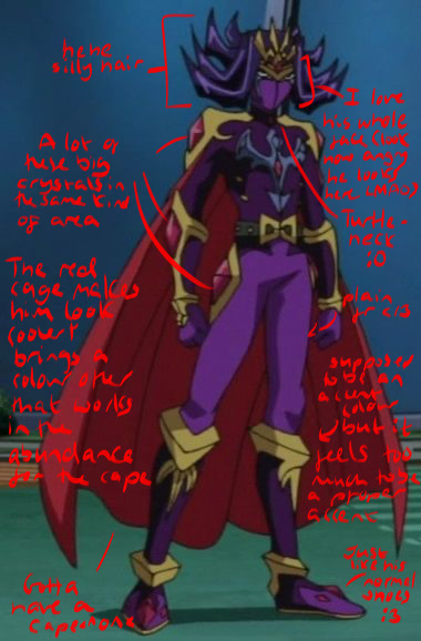
My opinions on the Barian Emperors’ designs :3!!!


Nasch — “hehe silly hair, a lot of these big crystals in the same kind of area, the red cape makes him look cooler + brings a colour other than purple that works in abundance, gotta have a cape *^0^*, I love his whole face (look how angry he looks here LMAO), turtle neck :0, plain fr </3 (the trousers, leggings things??), supposed to be an accent colour but it feels too much to be a proper accent, just like his normal shoes :3”
Marin — “she’s so cool <3, the colours go so cool together as well?? - the lighter colours for her body/dress thing contrasting the darker hair??? Just wowie :00, these shoulder plates look cool?? Yippee!!, I love the longer hair they give her, her dress/skirt design is just WOAH!!, the diamond theme again fr (more subtle + nicer than Nasch’s design tbh /nm), HEELS?? /pos)”


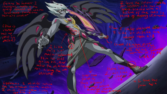
Vector — “Gonna be honest I thought more of the frets would be warm tones but turns out they are colder when I colour picked them, I like this multi-coloured skin he has going on, and how the diamonds run along the divide, goddamn I didn’t notice the diamond theme until I did this tbh like Woah :0, not too fond of this yknow? (The yellow thing on his chest) should have added more yellow around (feels like you need to look there instead of where you would usually wanna look (the face)), I love the colour palette for Vector. Like mostly greys/blacks with an accent of the reds in terms of mostly diamonds, I can’t decide whether I like or dislike the wings tbh </3 (I’m leaning more to like), could scratch out someone’s eye with those nails, just as he would want it to be like :3, hehhe Idk I just like his shoes :3, + I love his face ^0^, (btw if Vector has no Fans I’m dead)”
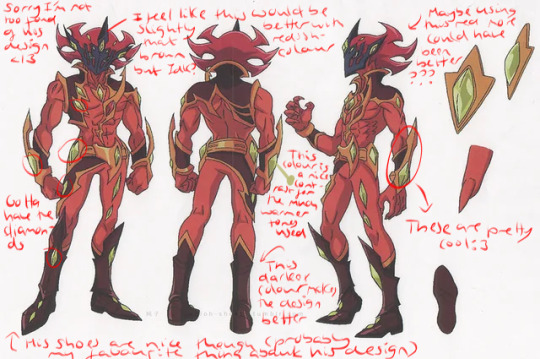
Alito — “sorry I’m not too fond of his design </3, I feel like this would be slightly better (the mask thingy) with that reddish-brown colour but idk??, gotta have the diamonds, this colour (the green one) is a nice contrast to the warmer tones used, this darker colour makes the design better, his shoes are nice though (PROBBALY my favourite thing about his design), maybe using this red more could have been better?? (Just relegated to his hair), these are cool (the arm thingys)”


Girag — “ooooo face shrouded in darkness, silly!! (Horns), silly little Mohawk :3 - random use of that colour though - one off can look good/fit with the design but doesn’t feel like it does here, idk how to feel about this collar </3, his design does not feel derailed enough tbh - especially compared to the better designs imo (Vector + Marin), Woah more diamonds! Who would have guessed!!, how could have I never noticed this before??? (The G on the belt) THIS IS SO STUPIDD /Pos”
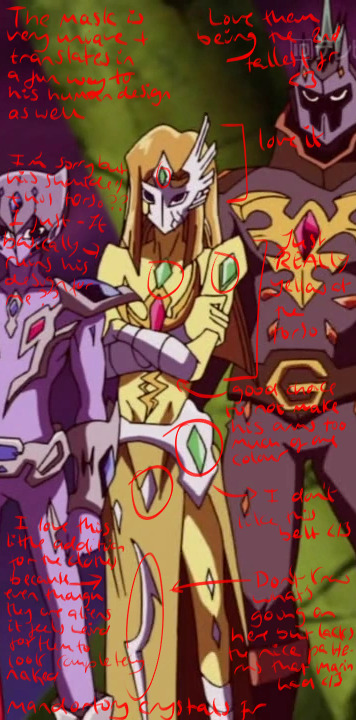
Mizar — “The mask is very unique + translates in a fun way to his human design as well, love them being the 2nd tallest fr <3, love it (the face), I’m sorry but his shoulders + his torso?? I just- it basically ruins his design for me /nm (not entirely true but yknow), Just feels REALLY yellow at the torso, good choice to not make his arms too much of one colour (the bandages (same goes with his legs)), I don’t like this belt </3, I love this little additional for the clothes because even though they are aliens it feels weird for them to be completely naked, mandatory crystals fr, don’t know what’s going on here but lacks the nice patterns that Marin had </3”
Dumon — “I’m sorry but I really don’t like Dumon’s design-, hair + face colour mostly blends together like hardly different, these are cute :3 makes me think of a cat, mandatory diamonds fr, the facial markings look cool :3, I’m sorry but this belt is NOT it, shoulder plates look cool, mostly the other barians are wearing SOMETHING but not him”
-
Quick ranking:
7. Dumon - sorry but his design just doesn’t look nice to me. I’m not too attached to his character either so that doesn’t help. He does look WILDLY better in his human form though
6. Girag - orginally gonna put Alito in this place but Girag is much more plain imo like go girl give us nothing!!! /nm (they did do him so dirty in both his forms though </3)
5. Alito - sorry Alito but your design is not much better. Like I like your boots and that reddish-brown colour but idk I’m just not too fond of it (prefer his human design). It is growing on me but I still dislike it </3
4/3. Mizar/Nasch - I couldn’t decide who to put above the other so they are tying. I love their faces like they both look AMAZING looking at just that part of their designs but I feel like as you look further down it’s like “uhmmm-“
2. Vector - I love Vector so much so it’s not surprising that I’m gonna also be fond of his design too. Like when I first starting rewatching Zexal I forgot most stuff so when this silly little guy appeared on my screen I started to LOVE him (and now he’s one of my favourite Yugioh characters) and it 100% helps that I love his design fr
1. Marin - MY GOD DID THEY DO HER SO WELL??? Like just look at her design and try TRY to tell me that she doesn’t look wonderful?? YOU CANT!!! Like she looks just so amazing. It just makes me wish that she had more focus because her design is making me see her in a brighter light than what they gave to here tbh. Like the backstory for her + Nasch is MAINLY focused on Nasch I get how he’s important and everything but I would like to see more of her </3 (the episode of her as Rio showing how cool she is beating all those people who just want her to manage their teams cause she’s pretty is just SO COOL!!)
-
I do love all these characters though (some more than others LMAO) and not trying to insult the character design at all just wanted to look at these designs and point out what I liked and didn’t <3333
(Also I felt like i had to write out all what I put on the actual images CAUSE MY HANDWRITING IS BASICALLY UNREADABLE TO 90% OF PEOPLE </3)
#yourlocalpurplekinnie#yourlocalpurplekinnie info dumps <3#yugioh#ygo#yugioh zexal#barians#I am NOT a Professional character designer or anything#these are just my personal opinions yknow!!!
17 notes
·
View notes
Text
scottish council logos hell judgment day part 1
there’s 32 of them so I’m not putting em all in here, Especially since there’s alternate/older versions of certain logos that just. really need to be addressed.
If you want to block this little series of rants, block ‘scottish council logo rant’ and that should hide it away from your dash.
Disclaimer: all of this is humorous and also based on my own sensibilties as someone with lots of arts training including some graphic design/ logo design.
Also disclaimer: I have favourites. I will not change this.
SO. We begin.
1- Aberdeen City

it’s..... well, it’s fine. Nothing really wrong here. Can’t really offend with a wee heraldic crest and a simple sans serif font. Spacing’s nice, readable, pleasant dark green colour. 6/10 cause the griffins should have wings imo
2- Aberdeenshire

the weird little A looks like the feeling you get going through a road tunnel late at night, and you’re sleepy and your parents didn’t buy McDonalds and it’s 2 and a half hours til you get home.
5/10. I hate the sonic the hedgehog colour but it’s otherwise inoffensive.
3- Angus Council

OHOHO THIS IS NARSTY. the wiggles? (I think it’s maybe water?) the horrific gradient? the lurid blue and eye-burning green giving me really lazy glitchcore palette inspiration? Angus, you have outdone yourself, this is minging 100%.
8/10 for sheer disgustingness, and audacity. Gotta give this bitch credit for the confidence.
4- Argyll and Bute

... wowie zowie. Again with the horrible blue/green eyestrain thing, which makes the word ‘council’ in white so so unreadable. At least Angus up there was against a white background so it was readable. I do like the wee celtic cross used as the ‘and’ in Argyll and Bute, that’s very fun. The rest tho? oh no.
7/10 because Angus did it better. Do love that wee cross tho.
5- City of Edinburgh

okay I personally dislike this one and have always disliked it whenever I have encountered it in the wilderness (of Edinburgh). The font itself... fine, I suppose. Very quirky, very ‘look at me aren’t I cute?’ but ultimately no more offensive than any other font that’s trying a little too hard. The vaguely Roman vibe... suits, at least. Appropriate for the city. the choices of where the red and black go tho.... no.
4/10 because I personally hate it and they get docked three points for not having the little roman V/U thing going on in the text underneath. Come on, commit to the bit.
6- Clackmannanshire

wee clackie’s fine, look at him. Also their motto is ‘look aboot ye’ which is in reference to the fact you can basically see all of Clackmannanshire from any given spot in the region.
10/10 look at him. wee lad. Simple, effective, fits the bill.
7- Comhairle nan Eilean Siar

oh this is a good one. means business, the font’s maybe a bit not-well spaced but the IMPACT, lad. And the boat. You know this is the council of the western isles, and not just because it’s the only one entirely in Gaelic. :D
10/10, I love this one for just how it essentially gives you nothing and everything. Go on yersel queen you’re doing great.
8-Dumfries and Galloway

I. You ruined it. I was getting a streak of 10′s going. It’s not the most offensive design but it really feels like it tried something and did not hit the mark. At least it is largely readable even if the D/G faux celtic script font logo thing is fuck ugly and a bit hard to work out at a glance.
5/10. Hardly the worst but I still hate it. And not in a fun way.
Tune in later for part 2! (of 4)
#scottish council logo rant#chatter#not art#tho is it an art form to get a good rant going? I think so#I'm still unwell and a bit limited in what I have the physical energy for#so I gotta find my own fun
5 notes
·
View notes
Text
April TC Challenge Day 19-30 (SORRY HAHA)
What colour do you associate your tc with?
For some reason, it’s a vibrant green! I just get that vibe from him for some reason, I do think that color is nice.
is your tc a good teacher?
Oh yeah, most definitely. Out of all of my math teachers, I never had a straight A in math until I signed up for this guy’s class. Before registering for any class, I check reviews just to make sure I’m not making a mistake and wowie! This guy had great reviews, and happened to fit into my schedule! So of course, I chose his class. And let me say, he explains everything so well, he takes into consideration what someone might find confusing before they can think of asking the question and goes through the problem like that! He’s a wonderful teacher.
Can you remember the last thing you said to your tc or that they said to you?
The last thing I remember him like verbally saying something to me was when we greeted each other in the hallway. With email though, it was some academic stuff from a week or two ago. He’s starting to more casual talk in his emails with me, which is really neat! I do hope we can talk in person again in a future semester.
How do you cope when you really miss your tc?
I play video games to distract myself, like a LOT of video games. When D/oom E/ternal came out I did not stop playing that game until I finished it. I really want games for my switch too but alas I am kind of broke :(
What animal does your tc remind you of?
I always thought a golden retriever, because his energy is just like that ha.
if actors had to play you and your tc in a movie, who would you cast as yourself and who would you cast as them? why?
I actually don’t have an answer to this jgfklhj
What’s your favourite outfit of theirs?
Two words: Black. Suit. He looks amazing in any suit he wears but honestly, the first time i saw him wearing black he looked so great in it! Also there’s a maroon button down shirt he wore before and it looks great. It’s really weird though, some days (before the quarantine stuff went down) our color palettes matched.
Do you stay in contact outside of school? if so, how? (email, text, letters etc.)
Ehh school email.
in your opinion, what’s the hardest thing about having a tc?
The fantasizing, idealization, and unrequited love in general. It’s literally one of the worst things to go through. Like looking at how I felt with my former TC’s from a couple years back, I realize that it really wasn’t going anywhere and would’ve been bad if it was. It was a roller coaster of emotions, all of that and for what? Having a TC is like knowing you’re walking down a path that leads to dead end, but then wanting to go through it all just to make sure it really is a dead end, you know? It’s the “what if it’s not a dead end” thought that keeps you going, and it just feels so horrible not being able to get over it because you need the closure. Idk why I’m letting myself walk down the same path again, but I’m really just vibing with it rn. For the most part I really just want to befriend him now, but some feelings are still there.
Do you flirt with your tc? do they flirt back?
HA, definitely a hard no to both.
if you could ask your tc absolutely anything and get a completely honest response, what would you ask them?
I’d probably end up hurting my own feelings with any of the questions that come to mind, but I really want to know what he thinks of me, I want a completely honest read.
How do you think your tc would react if you told them your feelings?
Flattered, maybe bashful? But respectively he would keep his distance. As a professor, he does need to keep a strictly professional boundary up with his students and he’d probably remind me of that. He’d also probably tell me why it wouldn’t work between us.
#woo#this took a long time to write#I was slacking#tc#tcc#teacher crush#teacher crush community#text#april tc challenge
4 notes
·
View notes
Photo

⚙️🔧 Steam Punk🔧⚙️ The latest look from my Story torial I did for my love @glitterandpinktourmaline ⚙️🔧⚙️🔧⚙️ Products @essencemakeup colour enhancing primer, @bellaforevercosmetics desert dusk palette, @officialbelievebeauty skin finish foundation, @wetnwildbeauty photofocus foundation, bronzer reserve your Cabana, liquid catsuit metallic liquid lipstick in Coral crown @elfcosmetics 16hr camo Concealer @katvondbeauty lock it setting powder translucent, @pixibeauty endless silky eyeliner pencil in rose gold, @nyxcosmetics slide on glide on...brown perfection, @shopmissa lumi baked blush so close, @notoriouslymorbid we gladly feast on those who would subdue us contour, @tartecosmetics pro glow to go in chisel, @ibybeauty radiant Glow Highlighter Prosecco, @incendiobeauty liner in she wolf, @toofaced better than sex mascara, @lacolorscosmetics Browie Wowie brow tint, @mysteriouscosmetics lips gloss in 24k. ⚙️🔧⚙️🔧⚙️ #essencemakeup #essencenorthamerica #notoriouslymorbid #nmaffiliatesearch #abhprsearch #incendiobeauties #incendiobeauty #wetnwildbeauty #toofaced #tartecosmetics #mysteriouscosmetics #lacolorscosmetics #ibybeauty #shopmissa #nyxcosmetics #pixibeauty #elfcosmetics #crueltyfreecosmetics #crueltyfree #believebeauty #bellaforevercosmetics #affordabemakeup https://www.instagram.com/p/Bx-PE3MJnK6/?igshid=1k9gvjt3qtt58
#essencemakeup#essencenorthamerica#notoriouslymorbid#nmaffiliatesearch#abhprsearch#incendiobeauties#incendiobeauty#wetnwildbeauty#toofaced#tartecosmetics#mysteriouscosmetics#lacolorscosmetics#ibybeauty#shopmissa#nyxcosmetics#pixibeauty#elfcosmetics#crueltyfreecosmetics#crueltyfree#believebeauty#bellaforevercosmetics#affordabemakeup
0 notes
Note
i associate you with either 'guidance' or 'the sweetest chill'

!!! I don’t usually get those colours wowie!! that’s so cool! I really like guidance because of the earthy tones and i like the sweetest chill bc i love purple!!!! it makes me wonder why we see people the way we do!
Tell me what colour palette you associate me with!
0 notes
Note
i followed both your instagrams, and wowie they're really lovely and the colours palettes are so calming
thanks!! :’)
0 notes