#wood design and building awards
Explore tagged Tumblr posts
Photo

Walk Out in Houston Large transitional walk-out basement design with a brown floor and medium-tone wood walls and no fireplace.
0 notes
Photo

Walk Out in Houston Large transitional walk-out basement design with a brown floor and medium-tone wood walls and no fireplace.
0 notes
Text
"Chicago’s 82-story Aqua Tower appears to flutter with the wind. Its unusual, undulating facade has made it one of the most unique features of Chicago’s skyline, distinct from the many right-angled glass towers that surround it.
In designing it, the architect Jeanne Gang thought not only about how humans would see it, dancing against the sky, but also how it would look to the birds who fly past. The irregularity of the building’s face allows birds to see it more clearly and avoid fatal collisions. “It’s kind of designed to work for both humans and birds,” she said.
As many as 1 billion birds in the US die in building collisions each year. And Chicago, which sits along the Mississippi Flyway, one of the four major north-south migration routes, is among the riskiest places for birds. This year, at least 1,000 birds died in one day from colliding with a single glass-covered building. In New York, which lies along the Atlantic Flyway, hundreds of species traverse the skyline and tens of thousands die each year.
As awareness grows of the dangers posed by glistening towers and bright lights, architects are starting to reimagine city skylines to design buildings that are both aesthetically daring and bird-safe.
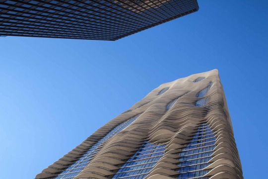
Pictured: Chicago's Aqua Tower was designed with birds in mind.
Some are experimenting with new types of patterned or coated glass that birds can see. Others are rethinking glass towers entirely, experimenting with exteriors that use wood, concrete or steel rods. Blurring lines between the indoors and outdoors, some architects are creating green roofs and facades, inviting birds to nest within the building.
“Many people think about bird-friendly design as yet another limitation on buildings, yet another requirement,” said Dan Piselli, director of sustainability at the New York-based architecture firm FXCollaborative. “But there are so many design-forward buildings that perfectly exemplify that this doesn’t have to limit your design, your freedom.”
How modern buildings put birds in danger
For Deborah Laurel, principal in the firm Prendergast Laurel Architects, the realization came a couple of decades ago. She was up for an award for her firm’s renovation of the Staten Island Children’s Museum when the museum’s director mentioned to her that a number of birds had been crashing into the new addition. “I was horrified,” she said.
She embarked on a frenzy of research to learn more about bird collisions. After several years of investigation, she found there was little in the way of practical tips for architects, and she teamed up with the conservation group NYC Audubon, to develop a bird-safe building guide.
The issue, she discovered, was that technological and architectural advancements over the last half-century had in some ways transformed New York City – and most other US skylines and suburbs – into death traps for birds...
At certain times of day, tall glass towers almost blend into the sky. At other times, windows appear so pristinely clear that they are imperceptible to birds, who might try to fly though them. During the day, trees and greenery reflected on shiny building facades can trick birds, whereas at night, brightly lit buildings can confuse and bewilder them...

Pictured: A green roof on the Javits Convention Center serves as a sanctuary for birds.
The changes that could save avian lives
About a decade ago, Piselli’s firm worked on a half-billion-dollar renovation of New York’s Jacob K Javits Convention Center, a gleaming glass-clad space frame structure that was killing 4,000-5,000 birds a year. “The building was this black Death Star in the urban landscape,” Piselli said.
To make it more bird friendly, FXCollaborative (which was then called FXFowle) reduced the amount of glass and replaced the rest of it with fritted glass, which has a ceramic pattern baked into it. Tiny, textured dots on the glass are barely perceptible to people – but birds can see them. The fritted glass can also help reduce heat from the sun, keeping the building cooler and lowering air conditioning costs. “This became kind of the poster child for bird-friendly design in the last decade,” Piselli said.
The renovation also included a green roof, monitored by the NYC Audubon. The roof now serves as a sanctuary for several species of birds, including a colony of herring gulls. Living roofs have since become popular in New York and other major cities, in an inversion of the decades-long practice of fortifying buildings with anti-bird spikes. In the Netherlands, the facade of the World Wildlife Fund headquarters, a futuristic structure that looks like an undulating blob of mercury, contains nest boxes and spaces for birds and bats to live.
The use of fritted glass has also become more common as a way to save the birds and energy.
Earlier this year, Azadeh Omidfar Sawyer, an assistant professor in building technology in the Carnegie Mellon School of Architecture, working with student researchers, used open-source software to help designers create bespoke, bird-friendly glass patterns. A book of 50 patterns that Sawyer published recently includes intricate geometric lattices and abstract arrays of lines and blobs. “Any architect can pick up this book and choose a pattern they like, or they can customize it,” she said.
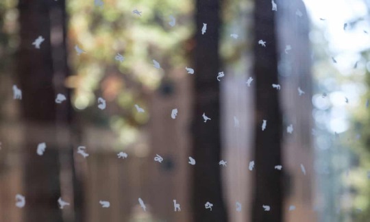
Pictured: The fritted glass used in Studio Gang’s expansion of Kresge College at the University of California, Santa Cruz, depicts the animals in the local ecosystem.
Builders have also been experimenting with UV-printed patterns, which are invisible to humans but perceptible to most birds. At night, conservationists and architects are encouraging buildings turn off lights, especially during migration season, when the bright glow of a city skyline can disorient birds.
And architects are increasingly integrating screens or grates that provide shade as well as visibility for birds. The 52-floor New York Times building, for example, uses fritted glass clad with ceramic rods. The spacing between the rods increases toward the top of the building, to give the impression that the building is dissolving into the sky.
Gang’s work has incorporated structures that can also serve as blinds for birders, or perches from which to observe nature. A theater she designed in Glencoe, Illinois, for example, is surrounded by a walking path made of a wood lattice, where visitors can feel like they’re up in the canopy of trees.
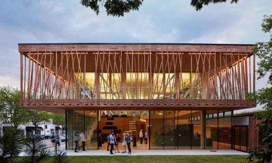
Pictured: The Writers Theatre, designed by Studio Gang, includes a walking path encased in wood lattice.
Rejecting the idea of the iridescent, entirely mirrored-glass building, “where you can’t tell the difference between the habitat and the sky”, Gang aims for the opposite. “I always tried to make the buildings more visible with light and shadow and geometry, to have more of a solid presence,” she said.
Gang has been experimenting with adding bird feeders around her own home in an effort to reduce collisions with windows, and she encourages other homeowners to do the same.
“I’ve found that birds slow down and stop at feeders instead of trying to fly through the glass,” she said.
While high-rise buildings and massive urban projects receive the most attention, homes and low-rise buildings account for most bird collision deaths. “The huge challenge is that glass is everywhere.” said Christine Sheppard, who directs the glass collisions program at the American Bird Conservancy (ABC). “It’s hard to know what I know and not cringe when I look at it.”
Tips for improving your own home include using stained glass or patterned decals that can help birds see a window, she said. ABC has compiled a list of window treatments and materials, ranked by how bird-safe they are.
Whether they’re large or small, the challenge of designing buildings that are safe for birds can be “liberating”, said Gang, who has become an avid birdwatcher and now carries a pair of binoculars on her morning jogs. “It gives you another dimension to try to imagine.”"
-via The Guardian, December 27, 2023
#conservation#birds#avian#ornithology#new york city#chicago#united states#architecture#green architecture#conservation biology#construction#sustainability#glass#glass windows#skyscraper#cityscape#buildings#bird conservation#birdwatching#good news#hope#“hey mc why is this post so in depth and full of pics compared to what you usually post” you ask#great question#the answer is bc I like architecture a lot#...well I like the kinds of architecture I like a lot lol#bauhaus can fight me tbh#but sustainable architecture is awesome#also this article actually came with a bunch of pics#which yknow most of them don't#cw animal death
1K notes
·
View notes
Text
Relativity Falls AU Outline Part 1 [Part 2] [Part 3] [Part 4]
-It is my hot take that Relativity!Dipper wouldn't be a scientist or paranormal researcher. I decided he's an investigative journalist, because "Mystery Solving" seemed more his speed than "Physicist" and whatever the other 11 of Ford's PhDs are.
-Mabel is a fashion designer, which is someone else's idea that I liked and stole
-It is my other hot take that Mabel and Dipper don't have a dramatic split like Stan and Ford do when they're young. They're more in-sync as kids, and they don't have the same familial pressures that the Stans do, growing up. So they're just fine with each other!
Okay now for the actual plot:
-Dipper is an investigative journalist who isn't doing... great in his career. He's not breaking any huge stories or winning any awards, and the stress of his job is getting to him. He catches wind of some sort of "Northwest Conspiracy" involving a false founder of a town and jets off to Gravity Falls, determined to make this story the start of his career
-He starts investigating the whole conspiracy. Pacifica Northwest catches wind of all of this and is Quite Irritated that some random Californian fucker is in Gravity Falls specifically and solely to ruin her family's reputation. Which, from her point of view, is fair. I'd be annoyed too.
-To be completely honest, I forgot the smaller details of the "town founder is a fraud" and "murder ghost haunting the manor" episode plots, so just... everyone accept that Bada Bing Bada Boom The Secret Is Revealed And What The Fuck There's Also A Ghost
-Through the power of being mildly annoying to each other and teamwork, Dipper and Pacifica defeat the murderous ghost. Pacifica realizes how badly her family has fucked up in the past and (un)graciously + (un)enthusiastically decides to be better. She and Dipper go from hating each other to tentative friends/allies. As a sign of this friendship and also because she saved his life, Dipper promises to not publish the huge article that proves that Pacifica's entire family is full of shit
-He instead pivots to investigating all of the weird shit around Gravity Falls - which he is now aware of, thanks to the murder ghost. This is his last-last-last chance at making a name for himself in the industry; publishing the Northwest story would have helped him, but again he's trying to be a good person and all of that
-While exploring the woods, Dipper finds a mystery cave with mystery symbols and managed to summon a helpful friendly yellow mystery triangle who promises to help him discover all of the mysteries of Gravity Falls... for a deal.
-Dipper goes "DEAL" and slaps Bill's outstretched hand like a high five, then has to awkwardly go back and actually shake his hand to make the magic deal binding.
-Then his brain reboots and Dipper goes "wait what's my end of the deal?"
-ooohhhhhh nothing much!! he just has to build this portal to another dimension! the portal will reveal ALLLLL the secrets of Gravity Falls!! wahoo!
-Dipper [journalism major] Uhhh let me get back to you on that whole "building a portal" thing. I'll be right back.
Dipper, calling Pacifica (he has no money or engineering knowledge): Heeey can I have like a lot of money to build an interdimensional portal? I know we're still kinda friends kinda nemeses but I promise it's for a good cause also you owe me for not publishing that article
Pacifica, trying to become a better person (this will not backfire in any way): Well, if it's for a good cause. Not like I'm using this money for anything else.
Part 1 | Part 2 |
#mads posts#relativity falls#dipper pines#gravity falls#mabel pines#relativity falls AU#pacifica northwest#bill cipher#poor dipper. he doesn't even have 12 phds to fall back on#how is he supposed to build a portal from scratch without 12 phds :(#oh right! a sugar mommy#- who said that-#feel free to yell at me abt this in the notes or my askbox!#containment maintained#grunkle mason AU
208 notes
·
View notes
Text
The building may look like it’s made solely of concrete and wood, but it’s woven together with intention and gratitude. Nestled between the Squamish River and the towering Coast Mountains range in the Lower Mainland, Esḵéḵxwi7ch tl’a Sp’áḵw’us Place is a 27-unit development that provides housing exclusively for vulnerable Sḵwx̱wú7mesh residents on the nation’s territory. On the side of the building are four blue diamonds, stacked on top of each other in delicate balance as though holding each other in place. It’s a feature that Rory Richards, CEO of NUQO Modular, a female-led, Indigenous-owned company that designed the building in tandem with the Squamish Nation, says is supposed to remind endangered residents — women, children and Elders at risk of experiencing homelessness — that they are never alone. “We wanted the building to be wrapped in protection, comfort and ancestor love,” Richards said. “It’s being heralded as the future of Indigenous housing: culturally informed, culturally proud housing.” Many First Nations communities — who are already 23 times more likely to experience homelessness than non-Indigenous folks — struggle to find adequate housing, let alone homes that reflect their history. A 2023 study by the Assembly of First Nations and Indigenous Services Canada found that $135 billion is needed to close the housing gap disadvantaging First Nations communities by 2030. More than one in six Indigenous people live in overcrowded housing, according to Statistics Canada.
Continue Reading
Tagging: @newsfromstolenland
#first nations#indigenous#homlessness#british columbia#cdnpoli#canadian politics#canadian news#canada
169 notes
·
View notes
Text
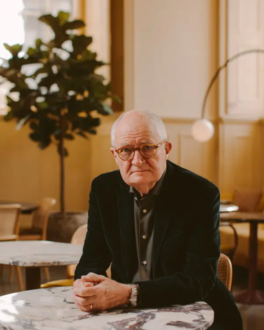
Jim Broadbent

Physique: Average Build Height: 6’ 2" (1.88 m)
James Broadbent (born 24 May 1949-) is an English actor. A graduate of the London Academy of Music and Dramatic Art in 1972, he came to prominence as a character actor for his many roles in film and television. He's received various accolades including an Academy Award, two BAFTA Awards, and two Golden Globe Awards as well as nominations for two Primetime Emmy Awards and a Grammy Award. Notable film roles include Bullets Over Broadway (1994), Topsy-Turvy (1999), Bridget Jones's Diary (2001), Gangs of New York (2002), Another Year (2010), The Iron Lady (2011), Le Week-End (2013), and Brooklyn (2015).

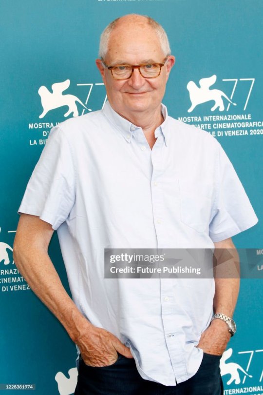



Broadbent is kinda cute in glass, in a nerdy old dad kinda way, in something, but didn't blow me away. Later I saw him in Harry Potter and the Half-Blood Prince and thought Wow! And he has managed to become more and more adorable with each passing year.


Broadbent is married to costume designer-turned-artist and he is stepfather to her two grown-up sons. He is an atheist and is fond of wood carving. That last part is good to know as I've got a piece of wood I'd gladly let him handle. Hint. Hint. Its my penis.
RECOMMENDATIONS: Hot Fuzz (2007) The Gathering Storm (2002) Iris (2001) Moulin Rouge! (2001) Bridget Jones's Diary (2001)
60 notes
·
View notes
Text
Path of the Scoutmaster
For you, the Wood is a place where the community comes together. It is where you test your mettle and gain an understanding of nature. You’re used to organizing events and volunteer efforts, and a natural leader especially for the youth.
The Scout Troop: You can designate a group of people to be your Troop. You gain a Mentorship Connection towards them as a collective.
Let’s Regroup Here: You can designate a site in nature, such as a forest clearing, as your campsite. Members of your Troop can always find their way back to it no matter how lost they are, and violent action cannot be attempted while inside.
Set Up for the Night: When in nature, you can always find the adequate materials to build improvised shelter. Anything you put up is always just big enough to fit everyone in your Troop.
Stick Together: You instinctively know where each member of your Troop is at all times and if they're in danger, even when they are miles away.
Across the Mountains: You can lead your Troop in a single-file line, even through dangerous territory such as a cliff path. External attempts to break your formation are cursed, and anyone in your formation is blessed on roles to avoid harm.
Ever-Ready, Always Prepared: You always have survival supplies in your backpack, and once a scene can find something unusual that is immediately helpful to the current scenario.
Cleanup Drive: Once a scene, you can lead your Troop to carry out an effort that helps the local community, such as distributing food or cleaning up trash. All tests made as part of this effort are blessed.
On Your Sash: Once a scene, you can award a badge to someone for their efforts. They are blessed on all Heart rolls for the rest of the scene. If this person is part of your Troop when you give them their badge, they gain a Loyalty Connection to you.
+
This is a fanmade Path for The Gloaming Diaries by Timor Jack Press. It's inspired by my experiences as a Boy Scout during elementary school!
10 notes
·
View notes
Text

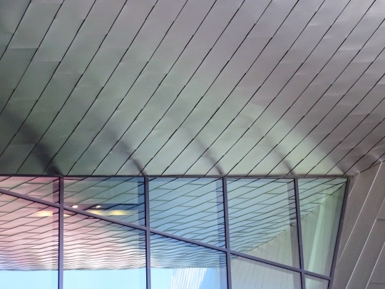
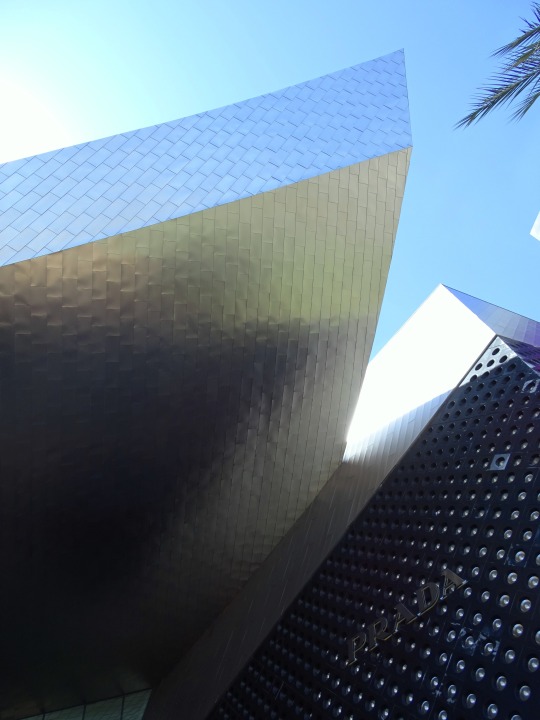


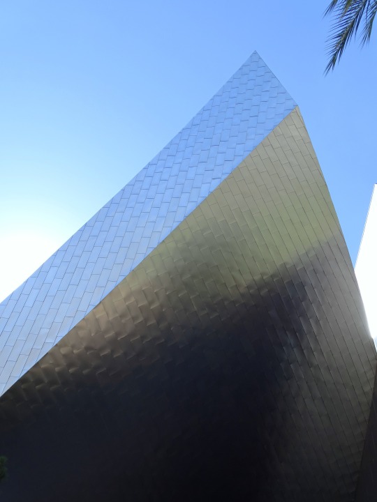
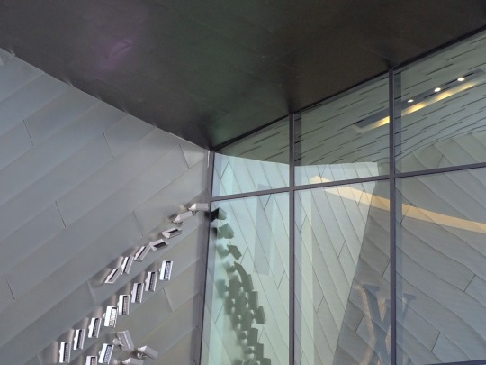
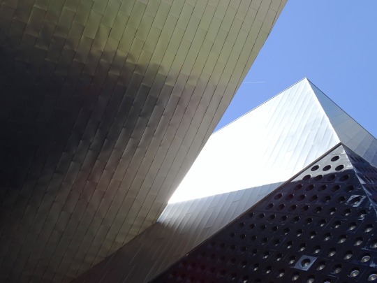
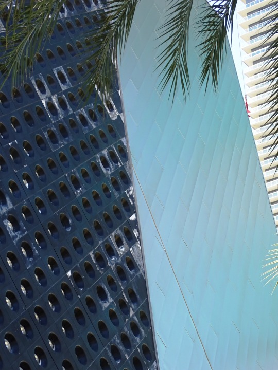
The Shops at Crystals, NV (No. 4)
Architecture critic James S. Russell, writing for Bloomberg News, called Crystals "a fun antidote to the smothering fairy-tale pomp that has become the Las Vegas norm". Another architectural critic, Paul Goldberger, wrote in The New Yorker that Libeskind's jagged shapes "inject the normally dreary precinct of a shopping mall with a shot of adrenaline". In 2013, USA Today named it among the most "amazing luxury malls" in the U.S.
Like other buildings at CityCenter, Crystals was designed to be environmentally friendly, with features including skylights, reclaimed wood, and efficient water fixtures. In October 2009, it was awarded LEED Gold Core & Shell certification from the U.S. Green Building Council, making it the largest retail district in the world to achieve such a feat.
Source: Wikipedia
#The Shops at Crystals#3720 South Las Vegas Boulevard#Daniel Libeskind#exterior#Paradise#travel#original photography#vacation#tourist attraction#landmark#summer 2022#USA#cityscape#Nevada#architecture#reflection#I really love the first pic#stainless steel#palm tree#detail#Prada Burberry#mall
13 notes
·
View notes
Text
Griffin and Sword Targe for Fergus O'Dae

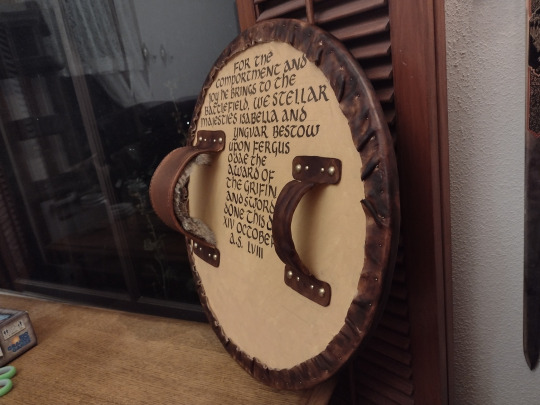
This is a build log for a late period Scottish targe for Fergus O'Dae, a border reaver and rising star of the Northshield Army. The Griffin and Sword is our Award of Arms-level award for excellency in armored combat.

Before starting the design, I layed out my idea using Heraldicon, a free website built to be even more powerful than Drawshield for assembling coats of arms. I thought it would be very fetching to have the Northshield populace badge outlined in the brass studs characteristic to targes, with the griffin and sword represented with different colored metals.

Laying out the carving and the tacks. A missed step in this album is cutting the wooden core. I actually already had a 20" round of plywood lying around. It wasn't actually a shield blank; it was the center cutout of a wooden ring I made to hold the 3.5' long bolts on our giant electrical wire spool in a specific pattern so I could reassemble the whole thing.
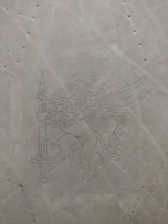
The griffin layout. Many thanks go to Heraldic Traceable Art and Heraldicon as well as the /r/heraldry community for maintaining so many Creative Commons vector assets. I've used this griffin asset by Gunnvôr (Viking Answer Lady) so many times.
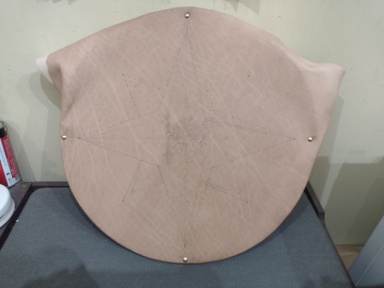

With the leather dried it's much easier to see the layout lines. Here's a spot I can make some big improvements on next time: I attached the leather before trimming it to a proper round, and then I didn't fully tack down the back before beginning the layout process. The wood I used was pretty trashy plywood so my drawing and carving surface is also extremely bumpy underneath the leather.
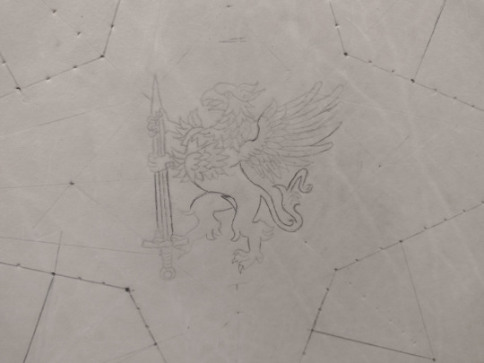
At this stage I began to carve the central award badge with my swivel knife. I need to see if there's swivel knives for children with arthritis because my bog standard Tandy knife gives me hella hand cramps and extreme inflammation on my thumb-palm muscles.
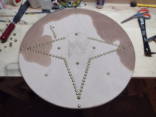
Your eyes do not deceive you: I did in fact have a crisis of attention span and pivoted from carving the badge to outlining the compass rose in brass tacks. The majority of the tacks used for this project are 7/16" low dome brass tacks from Crazy Crow Trading Post down in Texas. I also used 1/2" high dome and 1/4" dome tacks from the same shop.

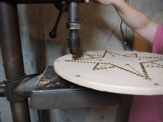
Lining up the 1/4" tacks. I actually hadn't planned to do these lines initially, but I had to emergency order more tacks and tossed these in for greater variety. I love the end result of this decision. If you tuckered out your arm hammering in 2/3 of the outline tacks with a ball peen, a drill press can take over in a pinch. I really need to get a stool for the drill press.
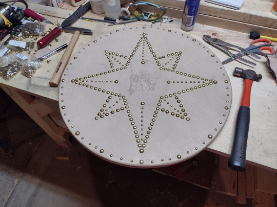
Tacks complete! We can carve again now.
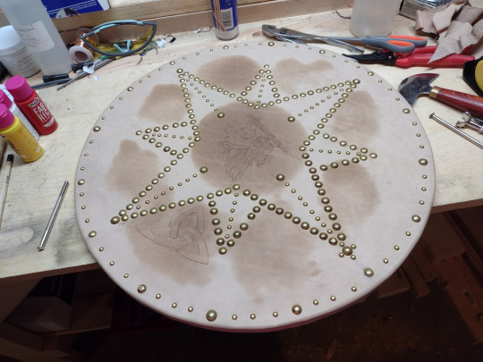
Added some obligatory trinity knots. It's not Scottish if it doesn't have a triskelion or a trinity knot, dontcha know?

(Sarcasm aside, check out the targe used by Donald Cameron of Lochiel, the Cameron Clan Chief who was a prominent Jacobite commander throughout the 1745 campaign. Post period for the SCA but who's counting? Photo from Paul Macdonald of Macdonald Armories in Scotland.)
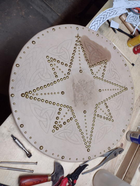
All trinity knots cut, one carved, and I began to add a braid motif too.

...Aaaaand here's improvement opportunity number 2. I was low on time and hand strength so I decided to dye the leather before I carved the braids, but after I cut them. I also picked Fibbings Medium Brown for my dye without doing test patches, and used the standard daubers to apply it. That is three Big Mistakes in a row, and only one is actually justifiable in any way. The result is an extremely uneven dye job that completely washes out the uncarved braids. If I'd given myself one more week to do this scroll, I would've had more rest time for my hands and I think I wouldn't have made these mistakes, but in a way I'm grateful I did because now I know to schedule more time for working on scrolls for the next assignment. Plus, I try to remember what Samii of SunCat Designs says about art: "the mistakes are what make it human".

Because this is an SCA award, I chose to swap the traditional deerhide backing for glued muslin and paint. I then taped off my handle locations and handed it off to my spouse @dustycymbre for the award scroll text. They used their default uncial hand, which is my favorite of their script hands.
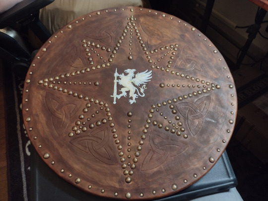
Traditional targes have a small brass center boss. When I originally conceived of this award, I had imagined the griffin in brass with a tinned sword, but I haven't actually tried chase and repousse yet and struck upon a different method of making the center griffin allude visually to the center bosses: carve it directly into the leather and then gild it. This particular stage is sealing the carving with Ecoflow Cova Color leather paint, to provide a smooth surface for the glue (also know as gild size).
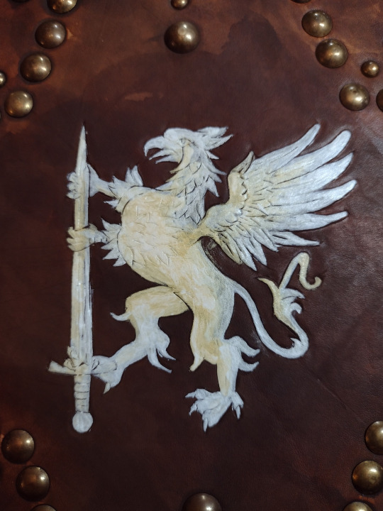
Cova Color white shouldn't be directly applied to damp dyed leather like this because it soaks up the brown like a sponge. My brightest white application is my H-shield, which dried for about a week before I painted it.

Another ADHD swing of focus: needed to have a long phone conversation with my spouse and bro in law and stitching is a far less active hand activity for me than The Thing I've Never Done Before, so I stitched up the strap and handle. Here the handle is inside out in a jar of water to get nice and soft for turning.
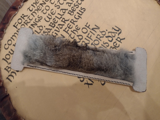

I stitched a rabbit hide into the interior of the arm strap. It's soft and a little padded, and I think it looks quite fetching. To figure out the right strap length for the recipient's ridiculously beefy arm that helped him earn this award, I asked my former football player bro in law for his arm circumference and then rooted around the house for a pickel jar of the same diameter. Stitch width awls are your friend. One of the top ten tools I own for sure.

Turning out the handle. This took a lot of hand strength and chopstick finagling. I'm genuinely looking forward to making Kat the Herald's purple shoes because they'll be easier to turn than this fucker.
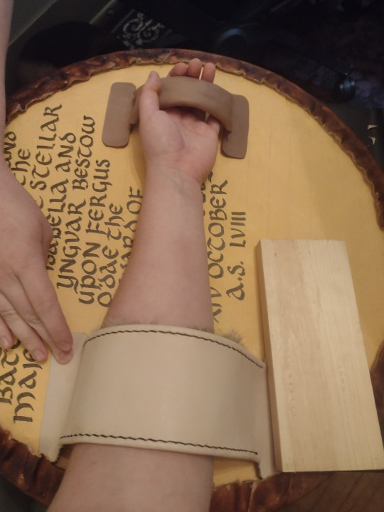
Fit check. Look at that beautiful wet shaping on the handle! At this point I felt a level of actual mastery of my craft. I think I can really call myself a leatherworker now. I still have so much to learn and improve, but I feel comfortable. It feels good.

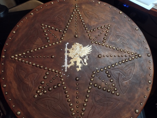
With the handles done, it's back to gilding. According to the Pinterest mommy blogs, you can skip the professional artist size and use watered down mod podge for the gilding process. I gambled on them being right, whipped out my pack of silver, copper and gold foils, and got down to business. I used a tiny but cheap paint brush to apply the thinned glue to the sword, let it dry a little, and then applied the silver foil. I tapped at it with a napkin through a flour sack towel, let it dry a little and brushed off the excess with a second and much fluffier brush.
The Pinterest pinnsters aren't entirely wrong about mod podge, but they aren't entirely right either. I had to add more glue and gilding foil like eight times. This is after one of the last additions, but before I brushed away the excess. Mod podge doesn't want to work on the irregular curves of carved leather. The dry time to tackiness was also imprecise and very very short, which made applying the delicate foil correctly very difficult.
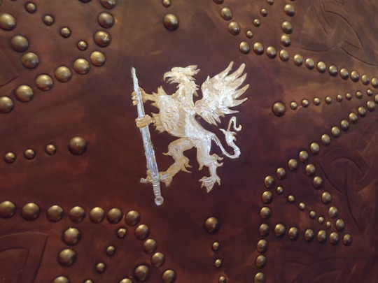
I finally had to give up. There were just too many spots that would not take foil at all. I grabbed my Stewart Semple Heavy Metals box set, pulled out the Goldest Gold, and painted over the bare spots. At this angle, the difference in reflection angles and quality is obvious. The paint is so much more yellow. But deadlines are deadlines, and imperfections make it human.
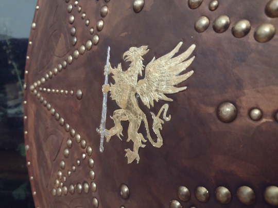
This angle is much more favorable. I find myself in love with the effect of the gilding over the carving on the feathers. I need to get good at gilding.
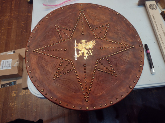
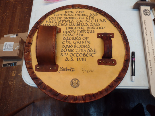
And here she is signed by Their Majesties Northshield, in the warm lights of the Sioux Falls Coliseum stage. Fergus loves it and it got a lot of ooos and ahs from the populace. I had a lot of fun in spite of some of the frustrations of this build, and I'm excited to try another targe with even more accuracy at some point.
#sca#society of creative anachronism#my crafts#reenactment#scottish#scotland#targe#did you know that certain jacobite targes made of softwood with wool felt sandwiched inside the wood core can stop musket shots#i learned that from fandabi dozi and paul macdonald#they tested it mythbusters style
17 notes
·
View notes
Text
Legend of Zelda Theme Park - Death Mountain (UPDATED)

Death Mountain is to the north of Castle Town (just as it is usually in the north on the game map). The whole area is sculpted as a reddish-brown canyon landscape, with walkways gently sloping upward toward the artificial volcano which dominates the scene, “erupting” every half hour with a display of pyrotechnics and smoke effects. The volcano in turn is the upper portion of a massive show building which occupies roughly half the area’s footprint and houses several of its attractions. Interior spaces are designed as rocky caves lit by torches and glowing crystals. The exterior background music highlights various iterations of Death Mountain and other mountainous areas in the games, as well as music associated with the Gorons. However, the interior queue space for the two big rides has its own music loop, drawing from fire and volcano-themed dungeons.

Attractions
Spirit Train (Mountain Station)
Crystal Caverns: A very simple attraction, more like a scenic view. The pathways through the Death Mountain area include side branches that veer through short stretches of tunnel lined with multicolored glowing crystals and gemstone veins. (These are marked on the detailed map with squiggly shading.) Make a habit of following these side paths, and you will find one that heads a little deeper into the mountainside, culminating in a spectacular cavern of exotic stone formations and massive crystal clusters that make soft chiming music as their colors shift through the spectrum.
Goro-Gondolas: Not an intense ride, but still exciting on its own terms, the Goro-Gondolas are boats in a flume…but the water is continuously under-lit with warm-toned lights, giving it the appearance of a glowing lava river! The ten to twelve-minute circuit includes lifts and gentle drops, and in the meantime, the boat passes by numerous detailed scenes of Gorons going about their daily lives—mining for choice rocks to eat, tending Bomb Flower gardens, soaking in hot springs, engaging in athletic competitions, rolling from place to place, etc. At other points, similarly lit “leaping” fountains send streams of “lava” arcing over the flume. From time to time, the flume even exits the interior of the mountain, giving riders a view of the area, and at other points, it shares a scene with the Dodongo Dive-Bomb track.
Gut Check Challenge Arena: A play area, but more…advanced than the Picori Picnic Park in the Lost Woods. Named after the Goron-hosted mini-games in Breath of the Wild, this attraction features rock-climbing walls, obstacle courses, and other stamina-testing activities. The especially bold can sign up for the Gut Check Challenge itself, a rock-climbing event held several times a day on the big wall, with real medals awarded to the winners.
Sworn Brothers Meeting Hall: A meet-and-greet location for favorite Goron characters, including Ocarina of Time’s Darunia, Majora’s Mask’s Darmani, and Breath of the Wild’s Daruk and Yunobo.
Dodongo Dive-Bomb: The number just marks the queue entrance–this ride is a big one! Arguably the biggest thrill in the park, it is a mag-launched roller coaster with cars designed to resemble a chain of minecarts. It takes place mostly inside the cinder cone of the volcano, twisting through lava-lit caverns infested with fire-breathing Dodongo lizards, occasionally breaking out into the open before diving right back into the mountain. The climax takes place in a spacious cavern inhabited by a ferocious dragon, and the train makes a loop around its head and neck in order to escape!
Shops
7. From Mine to Yours: A rock and mineral shop offering all sorts of tumbled semiprecious stones, crystals, carved charms and figurines, geodes (with an option to have them cut open on-site), Himalayan salt lamps, stone-based knickknacks, and books about minerals and gems. For those with fancier tastes, there’s even a special sales counter where precious jewelry is available for purchase. In the center of the store is a fountain mimicking a sluice full of gem-bearing slurry, the employees wear overalls and hard hats with mounted headlights, and the shop slogan “Ore and More!” derives from the name of a similar business in Breath of the Wild.
8. Forged in Fire: Being rooted in a medieval(-ish) fantasy franchise is likely to give this theme park some appeal for historical weapons enthusiasts, and this shop is for them, offering a selection of sturdy, functional swords, daggers, axes, and shields, including some replicas of famous designs. (Naturally, various noteworthy swords from the games themselves are among them.) Modern camping/hunting knives are also available, and every purchase of a blade includes a fine hardened leather sheath. However, we can’t have people walking around a theme park with real weapons, so all purchases will be either held at the front of the park for pickup upon exiting, or shipped to the guest for an additional fee. (This is true of any retail location in the park that sells metal weapons, even if they aren’t made to be functional.)
9. Goron Spice Rack: “A spicy nook for spicy cooks” declares the sign out front. Lovers of herbs and seasonings will find much to love in here, with a wide selection of culinary flavorings. Pick a jar or bottle off the shelf or have a mix blended to order! We especially recommend the various types of “Goron Spice” (mostly curry powder and paprika, with assorted variations), made famous by Breath of the Wild.
10. Ripped and Shredded: A shop for sporting goods and memorabilia located next to the Gut Check Challenge Arena. Includes lines of tongue-in-cheek jerseys, caps, and other items referencing peoples, groups, and locations in the LoZ franchise as if they were sports teams. Named after the Goron armor shop in Breath of the Wild.
Eateries
11. Magma Munchies: Adventurous foodies will love this place, where everything on the menu—meat, veggies, fries, and more—is hot and spicy. The intensity ranges widely, from “Hawaiian” (mild curry) all the way up to “Ultra-Plinian” (ghost peppers). Hot sauces are available for purchase at the Goron Spice Rack.
12. Rock Candy Stand: Pretty much exactly what it says: an outdoor kiosk with various colors of traditional rock candy (i.e. sugar crystals on a stick), chocolate “pebbles,” Ring Pops and Pop Rocks, and other mineral-themed sweet treats.
13. Protein Palace: They say the rocky ground of Death Mountain is so hot, you can drop food to cook right on it! That may or may not be true, but this Mongolian BBQ buffet uses a more conventional stainless steel hibachi. Choose a protein (beef, chicken, or tofu) and a selection of vegetables, noodles, sauces, and other ingredients, and your food is cooked up while you watch!
3 notes
·
View notes
Text
Kéré Architecture is an acclaimed architectural practice founded by Diébédo Francis Kéré, known for its innovative and sustainable approach to design. The firm has garnered international recognition for its work, particularly in creating community-focused buildings that utilize local materials and traditional construction techniques. Below is a detailed review of Kéré Architecture’s features and achievements:
Key Features Sustainable Design:
Local Materials: Kéré Architecture emphasizes the use of locally sourced materials, which reduces environmental impact and supports local economies. Energy Efficiency: The firm incorporates passive cooling and natural ventilation in its designs, minimizing the need for artificial climate control and reducing energy consumption. Eco-Friendly Techniques: Use of sustainable construction techniques and green building practices that respect and enhance the local environment. Cultural Sensitivity:
Community Engagement: The practice engages with local communities to understand their needs and incorporate their input into the design process, ensuring that the buildings are culturally relevant and functional.
Traditional Methods: By integrating traditional building methods with modern techniques, Kéré Architecture preserves cultural heritage while enhancing structural integrity and functionality. Innovative Projects:
Educational Facilities: Many of Kéré Architecture’s projects focus on educational buildings, such as schools and libraries, that provide essential infrastructure for communities. Public Spaces: The firm designs public spaces like parks, pavilions, and cultural centers that foster community interaction and social engagement.
Healthcare Facilities: Projects also include healthcare buildings that are accessible, sustainable, and designed to improve community health and well-being.
Award-Winning Work:
International Recognition: The practice has received numerous awards and accolades for its innovative and impactful designs, including the prestigious Aga Khan Award for Architecture and the Global Award for Sustainable Architecture. Exhibitions and Publications: Kéré’s work has been featured in prominent architectural exhibitions and publications, highlighting the firm’s contributions to contemporary architecture. Notable Projects
Gando Primary School, Burkina Faso:
Community Involvement: Built in Kéré’s home village, this project involved the local community in the construction process, providing education and skills training. Sustainable Design: The school uses local clay and a unique double-roof structure to enhance ventilation and reduce heat, creating a comfortable learning environment. Serpentine Pavilion, London:
Innovative Use of Wood: The 2017 pavilion design featured a dynamic wooden structure that created a sense of enclosure while allowing light and air to flow freely. Cultural Exchange: This project showcased Kéré’s design philosophy on an international stage, blending African architectural traditions with contemporary design. Lycée Schorge Secondary School, Burkina Faso:
Modern Educational Facility: This project includes innovative features such as shaded outdoor classrooms and a passive cooling system, providing a modern and sustainable educational environment.
National Assembly of Burkina Faso:
Symbolic Design: The design of the new National Assembly building incorporates elements that symbolize transparency and democracy, reflecting the country’s aspirations for a better future.
Pros Sustainability: Strong emphasis on environmentally friendly designs that minimize ecological impact. Cultural Relevance: Designs that are deeply rooted in the cultural and social context of the locations they serve. Community Focus: Active engagement with local communities ensures that buildings meet the specific needs of the users. Innovative Solutions: Creative use of materials and construction techniques to solve design challenges.
Cons Resource Constraints: Working in developing regions can present challenges related to resource availability and infrastructure limitations. Scalability: While the projects are highly impactful, scaling up the approach to larger urban environments may require additional adaptation.
Kéré Architecture stands out for its commitment to sustainable and culturally sensitive design, creating buildings that are not only functional but also deeply connected to the communities they serve. The practice’s innovative use of local materials and traditional techniques, combined with modern design principles, results in architecture that is both beautiful and impactful. Despite the challenges of resource constraints, the firm’s work continues to inspire and set a benchmark for socially responsible and environmentally conscious architecture.
5 notes
·
View notes
Text
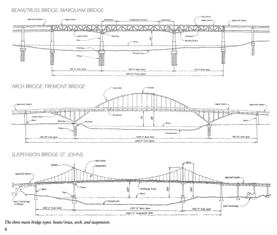


The Portland Bridge Book by Sharon Wood Wortman with Ed Wortman
Third edition of The Portland Bridge Book is like an old faithful bridge that's been restored by a dedicated crew of specialists to increase its carrying capacity for the public's enjoyment. Over a span of 225 pages (50 percent larger than the second edition and more than twice the size of the first edition), this edition delivers: Profiles 15 highway bridges and four railroad bridges across the Willamette and Columbia rivers in the metro area. Each structure's general history, technical details, source of its name, and more are explained in accessible language. 150 historic and large format contemporary photographs, many published for the first time. Annotated drawings by Joseph Boquiren showing Portland's movable bridges in operation. How & Why Bridges Are Built, written by Fremont Bridge field engineer Ed Wortman. Expanded and localized glossary of bridge termsPortland transportation history timeline, truss patterns, bridge poetry, lyrics.
Images 1 & 2 from the Portland Bridge Book. Image 3 is the cover of the book.
Snippets
Multnomah County owns four of the five large movable bridges: Hawthorne, Morrison, Burnside, and Broadway bridges, as well as Sellwood and Sauvie Island bridges. Oregon Department of Transportation (ODOT) owns state and interstate highway structures, i.e. Ross Island, Marquam, Fremont, St. Johns, Oregon City, and Abernethy bridges, and across the Columbia River, Glenn Jackson Bridge and in a joint agreement with WA state, the Interstate Bridge.
Other notable bridges in Portland Oregon that do not cross the river.
Balch Gulch Bridge on Thurman Street in Northwest Portland, built for the 1905 Lewis and Clark Exposition. One of about 150 highway and pedestrian bridges owned and maintained by the City of Portland, this unusual hanging deck truss is the oldest highway deck truss bridge in Oregon. Vista Avenue Viaduct, a 248-foot open-spandrel reinforced concrete highway arch located 128 feet above SW Jefferson St on the way to US Highway 26 in Portland's West Hills.
Tilikum Crossing: Portland's Bridges and a New Icon by Donald MacDonald & Ira Nadel (2020)
Portland, Oregon's innovative and distinctive landmark, Tilikum Crossing Bridge of the People, is the first major bridge in the U.S, carrying trains, busses, streetcars, bicycles, and pedestrians- but no private automobiles. When regional transportation agency TriMet began planning for the first bridge to be constructed across the Willamette River since 1973, the goal was to build a something symbolic, which would represent the progressive nature of the Twenty-First Century. Part of that progressiveness was engaging in a public process that involved neighborhood associations, small businesses, environmentalists, biologists, bicycling enthusiasts, designers, engineers, and the City Council. The result of this collaboration was an entirely unique bridge that increased the transportation capacity of the city while allowing Portlanders to experience their urban home in an entirely new way—car-free. In this book, the award winning architect of Tilikum Crossing, Donald MacDonald, and co-author Ira Nadel, tell the story of Portland through its bridges. Written in a friendly voice, readers will learn how Portland came to be known as "The City of Bridges" and the home to this new icon in the city's landscape. MacDonald uses 98 of his own drawings to illustrate the history of Portland river crossings and to show the process of building a Twenty-First Century landmark
Image 4 is the Tilikum Crossing book cover. Image 5 is a photo of the bridge itself.
youtube
Short video: Aerial footage of some of the bridges in Portland, Oregon. Relaxing views of the Broadway, Fremont and Steel bridges. Apr 26, 2021
2 notes
·
View notes
Text
Change is Fucked || Self Para
First of all, the island looked much better with fireworks all the time. It finally felt like a celebration was constantly happening, and Tilly wasn't supernatural, so she didn't give a damn if it was a bad sign.
Nothing changed for her this summer, not really. She had to move her clothes back to the cells, which was unfortunate, squeezing everything together in airtight bags hung up and smushed in the small space she had, shoes unceremoniously tossed under her bed. Otherwise, though, it was a decent summer. She begun sketches on the fall fashion line she wanted to accomplish this summer, and even begun picking out swatches - it felt nice to take pride in something like this, something that was solely hers. Not an industry inherited from her parents (almost, since her mother was a model, but she never designed anything), but something inherently Tilly.
It felt good, for once. But nothing good can last, right?

She didn't think much of the fireworks, assuming it was some late summer thing they were trying out, to get people ready for the next semester - what an idiot she was. Tilly had known about her empathic abilities her entire life, and she always used them to her advantage. It made playing parts so much better, a secret ace up her sleeve to really be a good actress, but it was so hard to turn it off. While the problems that got her in and out of rehab for those few years she didn't think were influenced because of them, it was hard to separate it. Feeling emotions of sad, embittered, rejected actors and other crewmembers was always so difficult. It was a tough business to shoulder for one person, but to feel that stress from all directions? It would weigh on anyone.
The first indicator that something was amiss was after a confused slave passed her by. It hit her instantly, and staring at them for a few moments - someone with a collar on but fire balls coming out of his hands - raised the hairs on the back of her neck. It wasn't her 'reading the room' now, it was that stupid empathy, in the way she couldn't turn off. Something was going on, something was totally wrong.
Everybody was a mess, running amok, and all Tilly wanted to do was be by herself, not speak to anyone, and just be by herself with her sketches, some headphones, and maybe a low-cal snack to keep herself occupied. A big building blew up? Oh well, there's witches everywhere, something probably went wrong, and that, according to her, was still not her problem. Tilly skirted around people so much that she felt she deserved an award for it - a very difficult thing to do for such an extroverted person, who constantly craved attention. She slept in the day, when everyone else was gone doing anything they wanted, showered and ate all her meals at night, restaurants that were 24 hours. She did everything right, and then during one of her late night breakfasts, she realized she left her sketch pencils in her cell. But, to her absolute horror, it was collapsed. The whole building, a lopsided mess. And with a scream and absolutely no regard for her personal safety, she dashed inside.
Her expensive, designer, often one-of-a-kind clothes were down there. Her only memory of her past, where she was somebody - someone with impeccable sense of style.
It was sooty and smoky, small fires throughout the cell blocks that Tilly had no intention of trying to help with. She could hear screams, justifying it in her head that it was either outside, or on a different floor, desperately trying to block it out. Her poor belongings! She was too late - clothes were singed, shoes were crumpled. A broken piece of her jewelry box was by her feet, a sharpened bit of painted wood all that was left. Unsure if the tears in her eyes were from the clouded air or the sadness, she scooped up as many necklaces, bracelets, and rings, shoving as many as she could in the pockets of her leggings. There was creaking above her, so she figured it was time to beat it, and she forced herself away from the mess, wishing she had more time for a proper farewell. So she stood on shaking knees, carrying herself from the remains.
There was someone in front of her, emerging from the rubble, as if there was no issue. Tossing aside a plank of wood, straight through another wall. It made her freeze, totally unsure of what to do next.
Before she could blink, they were on her, tackling her to the floor of her cell. She hit her head on the bed post and any struggling was useless, for this vampire above her had her pinned, shoulders to the floor, teeth attached to her neck. She screamed, as loud as she could, hoping someone would be able to find her. Biting was a new thing to get used to, and while she didn't hate it, she sure did now. Above him, in the ceiling, she could see embers in exposed foundation, and there was no way it was going to stay put.
With closed fists, she began hitting the vampire in the head as much as she could, desperately trying to push him off. A dark, intuitive thought of this guy is going to kill me blared through her head like a siren, and her hands were useless. They clawed around the floor, her broken manicured nails scratching at whatever she could find. A stroke of luck had her finding that splintered piece of wood from her jewelry box, and a quick thought went through her head - hawthorn. She did pay attention in her supernatural class, and she knew it was hawthorn. It was an expensive box, a gift from her grandmother.
And with an angered cry, she drove the stake into the vampire's back, deep enough until she felt it stopped by something - hopefully the heart. The blood wasnt spurting out like she expected, from every horror movie she's ever seen (and the one she was in), but rather running out of the body like a grotesque, severely leaking faucet, getting all over her hand, because she would not let go. She kept pushing, feeling the teeth leave her neck, the heaviness of the body above her slackening.
Tilly didn't feel like sticking around to see what happened. The ceiling was groaning loud now, so she rolled the two of them over, backing up until she hit a wall, the slow moving vampire trying to find purchase on the ground to stand.

That's when the ceiling began to collapse, and she made a mad dash for the exit, that was still shockingly standing. She just made it, making it a good thirty feet out before the whole building fell apart. She didn't look back, just kept going until she felt she couldn't run anymore.
Her neck was covered in blood, and both of her hands now too, as she tried to stop her bleeding with her still dry one. Shaking, she removed her tank, tying it around her neck as a makeshift bandage, standing at the edge of the woods in only a sports bra, leggings - her flip flops were lost somewhere along the way.
There was a buzzing in her phone, then, which she completely forgot she even had:
MALVOLIO ISLAND IS UNDER ATTACK. PLEASE PROCEED TO YOUR DESIGNATED SHELTER FOR EMERGENCY LOCKDOWN.
Her feet moved on their own, then, bringing her into the clinic, shuffled along with the other island residents, shell shocked of what just became of her. She found her own gauze, her own bandages - nobody was going to touch her, she was going to handle it her damn self.
For the first time, her own fear, anger, and sadness was so potent that those empathic abilities finally were quiet, as she fixed up her neck. There was no desire to speak to anyone, to try and see if her friends were even around.
All she wanted was to lay down on the clinic bed, with a big blanket. So she did just that, and maybe when she woke up, she'd be back in her four poster bed, designer pajamas, and everything she missed in California.
One could dream.

#all the filthy freaks and the glamorous geeks || event#broken spells event#self para#there's glitter on your fingers || headcanons#violence tw#murder tw#death tw#stabbing tw
3 notes
·
View notes
Text


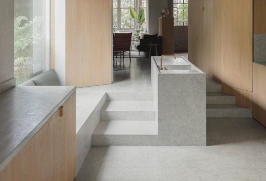

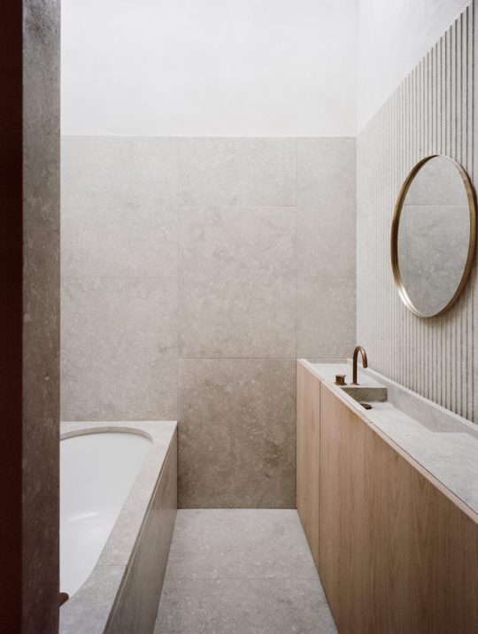
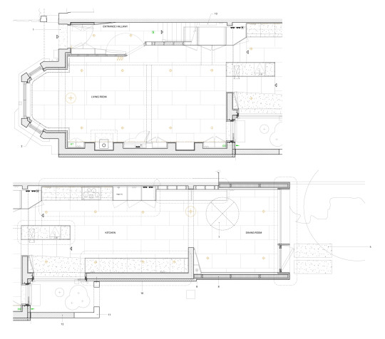
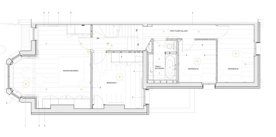


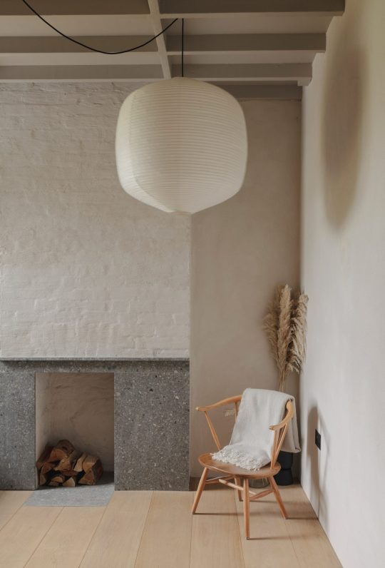
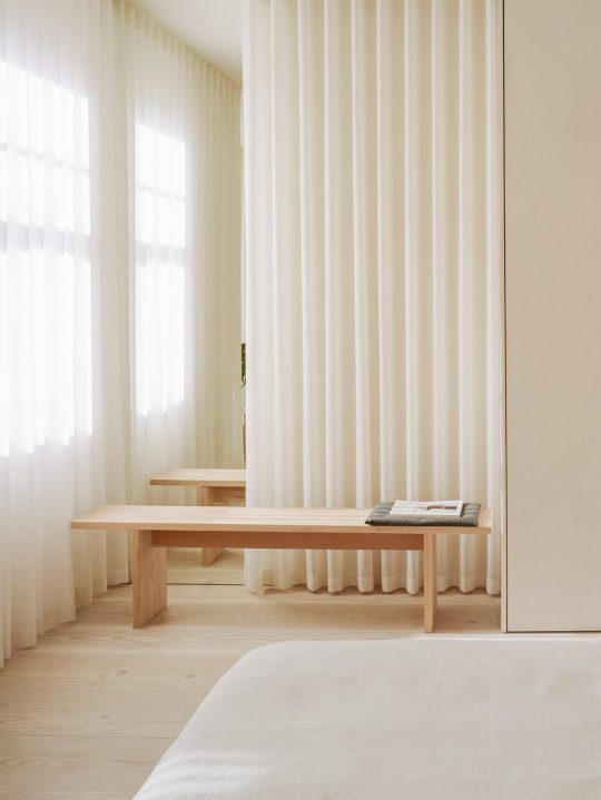

Low Energy House — Architecture for London
Architecture for London uses natural materials to renovate founder's home
Retrofit Talks: Low Energy House - a retrofit of an Edwardian terrace - YouTube - Presentation
An Edwardian terrace in Muswell Hill was extended and refurbished to create a comfortable, low energy house. The original structure of the house was revealed, its modest beauty celebrated.
Energy requirements are reduced dramatically by insulating, triple-glazing and improving airtightness. New additions include a rear extension and a loft conversion.
This project aims to be an exemplar for the sustainable refurbishment of a typical terraced home in London, with a constrained budget. Both embodied energy and energy in-use have been considered in depth.
Design features include timber structure, triple glazing, a continuous airtight layer and insulation to the entire building envelope. Walls were insulated externally at the side and rear, and internally at the front with wood fibre. Insulating internally at the front has allowed the original Edwardian facade to be preserved.
Masonry nib walls were retained at ground floor to avoid energy-intensive steel box frames. Natural materials including stone, timber and lime plaster were used throughout rather than cement-based products.
The rear extension was built in highly insulated 172mm SIPS and all existing building elements achieved a Passivhaus standard U-value of 0.15 or better.
An MVHR system provides pre-heated fresh air, creating a warm and comfortable home. The system also filters the incoming air, removing pollen, diesel particulates and NOx to create a healthy indoor environment.
Awards: DMI Environmental Leadership Prize AJ Small Projects Finalist
Project Architect: Ben Ridley
Location: Halliwick Road, Muswell Hill N10
Photography: Lorenzo Zandri and Christian Brailey
Host profile – Airbnb
2 notes
·
View notes
Text
Fuzzy Zoeller

Physique: Husky Build Height: 5'10" (1.78 m)
Frank Urban "Fuzzy" Zoeller Jr. (born November 11, 1951-) is an American professional golfer who has won ten PGA Tour events including two major championships. He is one of three golfers to have won the Masters Tournament in his first appearance in the event. He also won the 1984 U.S. Open, which earned him the 1985 Bob Jones Award.


Handsome, nice belly, an even nicer bulge and easygoing American masculine style, Fuzzy always looks ready to shoot a load or two down some lucky cocksucker’s throat. Known for his critical humor, at the 1997 Masters Tournament, he made a racist remark regarding Tiger Woods. Zoeller later offered an apology which Woods accepted.


Of course he's married with a son and three daughters (which go to my 'love to fuck' theory). His passions include hunting, fishing and he enjoys all sports as well as golf course design. A plus. He also loves to cook and grill with his own line of BBQ and Steak Sauces as well as premium dry rubs. Another plus. He has also launched his own line of ultra-premium vodka, Fuzzy’s Ultra Premium Vodka. Also a plus as I can get him drunk with his own stash so we could have some inebriated fun.

84 notes
·
View notes
Text
Chapter 1: Paper Pagoda
Narrated by William.
William: Almost there!
Susan: You can do it!
Narrator: Very carefully, I add some glue to the assembled tower, align the edges, and fix it onto the base plate.
Narrator: Then, using a length of nylon thread, I tie Susan’s origami crane to the protruding eave.
Narrator: Some of the cranes’ mouths are wonky, and some have flat bodies.
Susan: I used my magic on all of them!
Susan: Stick them on the tower and they’ll never fall down!
Narrator: So, Susan and I tie her magic cranes to the roof, finishing our “collaborative” paper craft of the Cloud Empire Tower.
Choose either “Paper craft?” or “You like doing paper crafts?”
If “paper,” ...
You: What’s paper craft?
Narrator: Paper craft is the art of making delicate 3D sculptures out of paper.
Narrator: You can take a simple piece of paper and turn it into works of art.
If “like,” ...
You: You like doing paper craft?
Narrator: Yeah! You can turn a simple piece of paper into works of art.
--
Narrator: You just need to cut, glue, and assemble it into complicated and wonderful shapes.
Narrator: It’s like alchemy, combining different elements and materials by arcane means to create new objects! It’s amazing!
Choose “Why Cloud Empire structures?”
You: Why make a traditional Cloud Empire building and not a castle or skyscraper?
Narrator: One time a teacher told me...
Teacher: The Cloud Empire is located to the east of Miraland.
Teacher: It has a long and prestigious history, like the Pigeon Kingdom to the south.
Teacher: The people of Cloud Empire are oriental in appearance.
Teacher: They wear elegant and loose-fitting garments, and their traditional buildings are oriental in design.
Teacher: Cloud Empire buildings are made primarily from wood, rather than concrete and steel.
Teacher: Cloud Empire architecture embodies the wisdom and experience of earlier generations.
Teacher: In terms of structural precision and classical exterior.
Teacher: Take for example, these eaves, known as “flying eaves” ...
Narrator: That’s what got me interested in Cloud Empire. I read a lot of books about it.
Narrator: Looking at the pictures in this travel guide, I’d LOVE to go to Cloud Empire and visit all their old buildings.
Susan: Will! Will! Are you reading those silly books again?!
William: Check out this Cloud Empire building! So beautiful.
Narrator: The tower in the picture has many levels, and the wood is carved with intricate and floral designs.
Susan: “Cloud. Empire. Traditional. Fresh. Pastries. Limited time only”?!
Narrator: Typical Susan, distracted by the food advertisement.
Susan: Oh my god! It looks so delicious! Award-winning pastries! And the packaging is printed with flowers!
Susan: That’s it! On our next vacation we’re going to Cloud Empire!
Narrator: Mom promised us, if we did well on our exams, she would take us on a vacation. But thinking about Susan’s assignments...
Susan: Don’t worry! It’s just an exam. Nothing a magician can’t handle! Leave it to me!
Narrator: To make sure we could go, every day after school I helped Susan with her homework.
Narrator: She studied very hard and got one of the top 10 highest scores in her class.
Narrator: According to her, it was the magic of the east that inspired her to break her personal best.
Narrator: So as it was, our family set out one sunny morning on our first journey to Cloud Empire.
Chapter 2
Chapter 3
#william#shining nikki#chapter 1#transcript#sr designer#cloud#cloud empire#paper pagoda#origami#arts and crafts#vacation#crane#tower#studying
6 notes
·
View notes