#wim technologies
Explore tagged Tumblr posts
Text
So I watched Skeleton Crew
AND I LOVE IT
LIKE
PIRATES
It's so much cooler than I thought it would be. I love the main four and there's so much to find and figure out especially with Jod.
And of course the music slaps. More spoilery things under cut (for all 6 current released episodes)
Ok first off I love KB, she's my favorite. (She's autism coded ngl)
Also KB lore drop in episode 6??? Like girl what was the accident?
ALSO WHAT THERES ONLY TWO MORE EPISODES IN S1???
Ngl it kinda bothered me how they didn't pronounce the T's in At Attin.
Ah yes. Jod, Silvo, who is this guy?? (Also i know they mention Silvo in the first ep but I can't for the life of me remember what that bit was about.)
HE SAID THE QUI-GON QUOTE your focus determines your reality LIKE WHAT
Also they've used "kriffing" twice now and that makes me really happy. It is part of my daily vocabulary and I even heard one of my best friends say it and j was like what (i think all she knows is that it's a star wars cuss word) ANYWAYS
I need Jod backstory like now. He's a Force user, and he knew the Qui-Gon quote, and he has a lightsaber, but how did he get to where he is in the show I NEED ANSWERS
Speaking of backstories I also need full KB backstory. I love how she has two moms. Also what the kriff happened to Wim's mom? It seems like with such a perfect (too perfect) society she'd still be alive, especially since it seems KB had a terrible accident yet she was saved by technology. So what about Wim's mom?
And I also love how determined the parents are to break the rules for their kids, it's adorable. Also who the kriff is the Supervisor. Watch it be like the Red- something pirate dude (I'm kidding)
Speaking of the pirate dude (cannot remember his name rn) how long ago was that ship crashed? Cuz like Jod knows about him, but there was also a whole lot of growth over the ship? Granted Jod could have just heard and read about him not actually seen him. Idk.
Yas Neel you preach peace to the whoever clan they are, with Hayna or whatever her name was (why can't I remember). He's so precious.
Wim's name is so silly I love it. He's a silly little guy i love him.
Fern is such a character oh my gosh. At first I didn't like her but with the character development I'm liking her more and more.
Also (last point) At Attin is way sus. Too perfect. Actually all the At planets are sus (once again I need backstory). Also the beginning episodes didn't really feel like Star Wars, especially the like suburbia bits and stuff.
Anyways yea i think Skeleton Crew's really cool, better than I was expecting. I really like the piratey music, though they do lean a little too hard into the aesthetic to feel completely like Star Wars, in my opinion. However it's unique, so.
#should I make a tag shre#salubriousbean talks about skeleton crew#salubriousbean rambles#skeleton crew#star wars#salubriousbean talks about music#cuz i did a little bit#kb skeleton crew#jod skeleton crew#wim skeleton crew#neel skeleton crew#fern skeleton crew
34 notes
·
View notes
Text
Skeleton Crew - This Could Be A Real Adventure and Way, Way Past The Barrier Thoughts

"Since the fall of the EMPIRE, the NEW REPUBLIC has maintained order.
And yet, remote hyperspace routes are increasingly plagued by piracy.
These PIRATES boldly brand their armored hulls as a sign to all ships.
Surrender or die...." The opening crawl of Skeleton Crew
The first two episodes are such a fun and refreshing open to this new Star Wars adventure. The editing in this show is top notch and full of personality. The child actors did an amazing job of selling the four kids as kids in the Star Wars galaxy. The high number of aliens in this show also really refreshing.
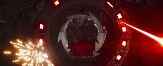
That opening space battle goes so hard, especially the transition from the title crawl (I'm loving how the live-action shows since Ahsoka been doing this) to the action. The action sequence is shot really well and I love how the visual effects look.
Mick Giacchino did an amazing job with the score with the kid's theme and the pirates' theme. I can't wait to see what else this man cooks in the rest of the episodes, especially with the piano.
Captain Silvo is pretty much Jude Law's character, Jod Na Nawood (at least one of his many, many identities).
Brutus being a Shistavanen is such a good choice. Such great alien prosthetic work. It was also some good continuity to see Vane in the show, given the focus on pirates.
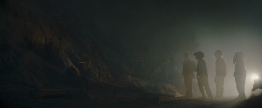
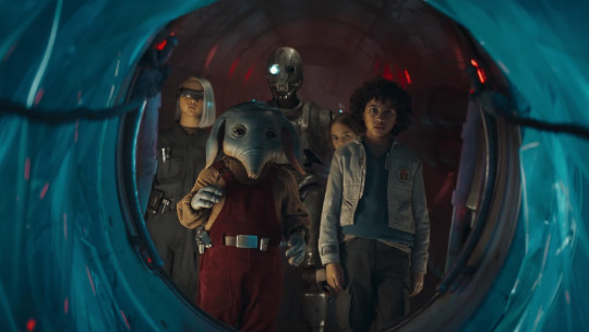
I like how Wim is a deconstruction of wanting to have a classic SW adventure and believing in the classic SW tropes. As he'll see over and over again, the galaxy is not as idealistic and happy as the stories make them out to be. But I also feel with his desire to do something more and different, especially in that scene when he looks at Neel's family and his own reflection. I hope Wendle, Wim's dad, gets further exploration in the forthcoming episodes.
Nell is the best. That boi must be protected at all costs. The prosthetics for him and his family are so amazing. He seems to have a problem with asserting and standing up for himself. It's both funny and cursed that his siblings are watching footage from the Holiday Special lmao. Fern is a bit of a brat, but she's also dealing with a mother who expects a lot from her. She tries to escape that as much as she can while trying to live up to her expectations. She also is the most level-headed of the group. KB is the most intelligent of the group but also seems to long for more in life. Her fascination in the creatures in the pirate spaceport and absent mindedness at the creatures suggest interests beyond technology. I want to know about KB about why she's given cybernetics and where her family is.
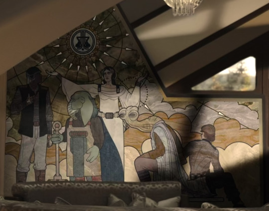
I also wonder what the mural in Fern's house means for the history of the world and the story of the show.
The production design is very impressive and I really like the electronic devices used in the show, especially how Wim uses his to look at images of the Jedi.
I always had a feeling that At Attin was pretty fishy based solely on the suburbs, lmao. They seem to have a false utopia of sorts with all the predetermined career tests (the US Department of Education would love them lol), especially toward whatever the "Great Work" is. I wonder if the Great Work mentioned by Fara is related to Soh's Great Works.
I also like the nod to how some Jedi Temples can arise from underground and arise plus the Atollon and Aldhani mentions are nice nods to the larger Canon.
I like a theory that the Barrier could be a hologram of sorts.
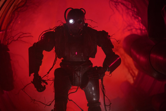
The Onyx Cinder is such a cool ship design. SM-33 (Nick Frost) is such a fun pirate droid with some kickass fighting choreography. His introduction in the red lighting is also really cool. I hope we get to see more of his antics and character in the show. Port Borgo looks so fire, and God, the visual effects for the pirate port and this show are so amazing. It blows Ahsoka's visual effects out of the water. A Teek being the driver is a fun nod to Ewok: The Battle for Endor. I also find it interesting that everyone thinks their world is not only considered a myth and doesn't exist but is full of treasure. I also like that the Theelin brothel worker wanted to help out the kids and get them back home, tho it's very understandable why Fern is distrustful of her, given the nature of the port.
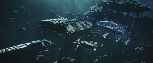
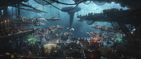
The fact the kids literally know nothing that's commonplace and normal to the galaxy means most of At Attin (since they had droids from the galaxy, I wonder if the general public doesn't know about the galaxy but only a few in govt know) didn't hear anything of the Skywalker Saga. Oh God, that's going to be a depressing story to tell the kids (especially Wim on Order 66) and At Attin's public about how the galaxy went to hell for decades.
I love that rat (Snowball) that lives in SM-33's empty eye. I also like how Wim refer to Old Republic credits as dataries just as Qui-Gon said when referring to credits in The Phantom Menace. I wonder how insane the exchange rate between Old Republic credits and New Republic credits is.
I wonder what Jod's backstory is since Jude Law confirmed he is an actual Force-sensitive and not pretending to be one. Realistically, I think he's just a Force-sensitive who is posing as a Jedi to the kids. However, I feel like there could be more to his story since Law mentions we'll be learning a lot about his character in Episode 7. If he was a Jedi, I like to think he was a Jedi dropout and then using the Force subtly to rise in the pirate ranks. I hope Jod gets some character development if he is going to try to manipulate the kids at first (mainly because I like Jude Law and hope he gets to do more Star Wars.
Otherwise, these two episodes is such a great start to this show.
"The distance between us and the key...is an illusion." "Jod Na Nawood"

#star wars#skeleton crew#star wars skeleton crew#sw skeleton crew#skeleton crew spoilers#mandoverse#this could be a real adventure#way way past the barrier#sw wim#sw neel#sw fern#sw kb#brutus#sm 33#sm-33#jod na nawood#silvo#sw vane#my original post
29 notes
·
View notes
Text
As Alyssa Battistoni rightly observed recently, there are no politically realistic climate change mitigation options. There is nothing politically realistic about assuming that large-scale NETs (negative emissions technologies) are going to save the day. It merely defers the political inconvenience of implementing those technologies to future generations, pushing the problem out of sight for the current generation of decision makers. To accept this as a matter of fact is to fail to stand up to the magnitude of the challenge, to default on our collective responsibility toward future generations. It is to deny that the only realistic way forward involves a fundamental change of politics.
Wim Carton, Carbon Unicorns and Fossil Futures: Whose Emission Reduction Pathways Is the IPCC Performing?
73 notes
·
View notes
Text
So, I recently started watching Avatar: The Last Airbender. The politics of the show are very interesting to me, especially considering I just finished reading The Animorphs series. Now, I know they aren’t directly comparable, what with being two different mediums (books vs a cartoon), being created at different times (Animorphs the 1990s, ATLA 2005-2008), and (slightly) different age ranges (ATLA 7+, Animorphs middle grade (specifically 9-12, though I’d argue it generally skews older.)) But both are very anti-war and anti-imperialism. Animorphs was the first series in that age range I encountered that truly goes “hard” with its themes. It asked a LOT of tough questions, and its protagonists were truly morally gray in the end. One of my favorite scenes in the series is where the villain is on trial for war crimes, and his lawyers bring up that the protagonist is ALSO a war criminal. The protagonist is acquitted by The Hague because it was self-defense. Incredible. But, back to ATLA.
An episode that really stood out to me was “The Puppet Master,” particularly Hana’s fate. Now, if I’m being completely honest, I was never afraid of Hama, and honestly, I didn’t blame her. I’m not saying she was RIGHT, she was torturing innocent people who had nothing to do with her original imprisonment, but I could understand how she’d operate on all Fire Nation citizens being a monolith. Honestly, I was a little disappointed that her arc ended with her being locked up again, the very same thing that drove her to blood-bending in the first place.
It really made me think about “justice,” particularly the western view of it. I feel like the west, particularly America (ATLA, though inspired by Asian culture, is an American made-TV show), justice is viewed as a punitive and retributive thing, where the ultimate goal is to punish the fact that a crime was committed, rather than address why, how, and the humanity at the heart of the situation. Wim Laven says, in an article for LAProgressive, “No criminal trial is motivated by healing or truth. Trials are about fact finding and fact exclusion,” (2021). Healing is a part of my problem with Hama’s story. She is someone who has suffered from immense trauma in being kidnapped, imprisoned, (probably) tortured, and lost not only her home but everyone she knew. Yes, continuing the cycle of violence doesn’t help you heal from it, but sometimes it feels like it’s the only option. Again, I’m not saying what Hama did was RIGHT, but to her it was something, something to deal with the pain and anger. And putting her back in the very same conditions that fueled this pain and anger doesn’t feel like justice to me.
Let’s take it back to Animorphs since I brought it up for a reason. There is actually a similar situation portrayed in the series. In book 20, The Discovery, we’re introduced to a character named David. He recently began attending the same school as the protagonists, and came across a piece of technology he shouldn’t have. This leads to him being targeted by the villains of the series and triggers a fight between the protagonists and antagonists. In this fight, David’s parents are captured by the villains, and his home is destroyed, leaving him at the mercy of the protagonists. They debate whether to leave David to be captured by the antagonists or induct him into their group. (The villains are parasitic slugs who can crawl into people's brains and take them over, and the protagonists can morph into any animal whose DNA they acquire. Because they take over brains, you have no way of knowing who is and isn’t actually a parasitic slug, so the protagonists must keep their powers a secret from everyone they know. Yes, IK Animorphs is weird. The point is, the slugs know everything about you, so either way David is a risk.) They ultimately decide to give him the power to morph and induct him into the group, but this ultimately ends up being a mistake. David repeatedly endangers the group, breaks their rules, almost betrays them to the villains, and tries to kill multiple of the protagonists. The group has no choice but to do something with David, but what? They don’t want to kill him, so they do something that’s honestly far worse. They trap him in rat morph (you can only stay in morph for two hours before it becomes permanent) and drop him off on a secluded island in the middle of nowhere. This haunts the protagonists for the rest of their lives. Later, through fever dream plot reasons, David comes back and begs to be killed. We never find out if he is or not. A key part of David’s story is that at the end of the day, he was just a traumatized, troubled kid whose life was turned upside down, and EVERYONE ended up suffering for it. Animorphs does a really good job of exploring the tragedy of war, and it's because of the focus on how war creates conditions where violence is the only option because it is easier to commit to a cycle of revenge than work to improve conditions so that war doesn't have to be inevitable.
I'm not saying Avatar: The Last Airbender doesn't talk about this, or that it has to! It's for a younger audience, I don't expect or need the protagonists to commit atrocities! But it's interesting that they introduced a character that is villainized for this, and disappointing to me. The situation isn't black or white, Hama is sympathetic, and we understand why she's doing this, but the writing presents the only solution as punishing Hama for the harm she caused instead of allowing her to redeem herself.
I'm not saying that's an easy answer, either. The gaang are kids, in Fire Nation territory where they're subjected to Fire Nation laws, and just freed her victims. With the upcoming invasion, they couldn't just take Hama back to the Southern Water Tribe. But why is locking her away the only solution? Why didn't they at least consider the route where they prevented her from committing further harm by taking her out of the situation? Maybe they ask her to join the invasion with the promise she'll stop blood-bending. Maybe they promise to break her out later. I'm not saying everything would be perfect, but letting Hama return to her home, surrounded by people who would help her heal, takes away the desire to do harm, does it not? This is a situation where punitive justice is NOT the only answer, yet it's presented as if it is. I wouldn't even be as upset at her fate if the narrative addressed this wasn't the only way, and the tragedy of this being their only option at the moment. But it doesn't because it sees it as right.
This also frustrating because Zuko IS given the benefit of tragedy and restorative justice. Now, I haven't finished the show yet (I just finished 3x11), but from what I've seen so far, I'm assuming Zuko redeems himself by not only working to heal HIS trauma but the trauma he caused OTHERS. And that's GREAT! I LOVE Zuko, he's my favorite character. I'm not saying he doesn't deserve a redemption arc. He DOES. But it's frustrating that he, a member of the royal family of an imperialist nation, who's directly harmed the gaang amongst other crimes, is given this opportunity while Hama, a victim of said imperialist nation, isn't. Yes, you can chalk it up to Hama admittedly committing far worse a crime than Zuko has, and Zuko being a child while Hama is an old woman, my main concern is still the optics here.
ATLA has a philosophy of actions defining character, and while this is fine, and I agree with it, I don't think it's given quite the amount of nuance it needs. Motivations for actions are just as important. Hama's arc is messy and nuanced, but that isn't explored nearly enough.
If we can all agree that Zuko is a victim who deserves a second chance, then why isn't Hama?
12 notes
·
View notes
Text

Biodegradable aerogel: Airy cellulose from a 3D printer
At first glance, biodegradable materials, inks for 3D printing and aerogels don't seem to have much in common. All three have great potential for the future; however, "green" materials do not pollute the environment, 3D printing can produce complex structures without waste, and ultra-light aerogels are excellent heat insulators. Empa researchers have now succeeded in combining all these advantages in a single material. And their cellulose-based, 3D-printable aerogel can do even more. The study is published in Advanced Science. The material was created under the leadership of Deeptanshu Sivaraman, Wim Malfait and Shanyu Zhao from Empa's Building Energy Materials and Components laboratory, in collaboration with the Cellulose & Wood Materials and Advanced Analytical Technologies laboratories as well as the Center for X-ray Analytics.
Read more.
10 notes
·
View notes
Text

Uncovering the role of oxygen concentration in the formation of early earth magma ocean
It is widely accepted that the early Earth largely consisted of molten magma, forming a global ocean of magma. This extreme state of Earth was likely caused by the intense heat generated from accretionary impacts, meaning the collision of smaller celestial bodies with Earth. Understanding the formation of this magma ocean is crucial for comprehending Earth’s formation. A major problem with current magma ocean formation models is the lack of consensus on the melting temperatures of deep mantle rocks. Models explaining Earth’s core formation use a specific set of experimental data to estimate mantle melting temperatures, but recent experiments have shown that these temperatures may differ by 200–250 °C from the previously accepted data.
Some studies indicate that oxygen fugacity, or the amount of oxygen available in the mantle, may strongly affect the melting temperatures of deep mantle rocks, which in turn may have influenced the formation of the magma ocean. The mantle’s oxygen fugacity is thought to have increased during accretion, core formation and subsequent mantle evolution; however, the effect of this increase on the melting temperatures of deep mantle materials remains unclear.
Addressing this gap, a team of researchers led by Associate Professor Takayuki Ishii from the Institute for Planetary Materials at Okayama University, Japan and Dr. Yanhao Lin from the Center for High Pressure Science and Technology Advanced Research, China, investigated the effects of oxygen fugacity on magma ocean formation during early Earth evolution. “The evolution of early Earth has been greatly influenced by oxygen fugacity, which may necessitate the reconsideration of current models. To this end, we assessed the effect of oxygen fugacity on the melting temperatures of deep mantle materials to constrain the conditions at the floor of a deep terrestrial magma ocean,” explains Prof. Ishii.
The study also involved Professor Wim van Westrenen from the Department of Earth Sciences, Faculty of Science at Vrije Universiteit Amsterdam, the Netherlands, Professor Tomoo Katsura from Bayerisches Geoinstitut, University of Bayreuth, Germany, and Dr. Ho-Kwang Mao from the Center for High Pressure Science and Technology Advanced Research, China. It was published online in the journal Nature Geoscience on July 16, 2024.
The researchers conducted melting experiments at pressures of 16–26 Gigapascals, similar to mantle depths between 470 km and 720 km, at high oxygen fugacities, on mantle pyrolite, a material composition representing Earth’s mantle. Results revealed that over this pressure range, the melting temperatures decreased with increasing oxygen fugacity and were at least 230–450 °C lower than those from experiments conducted at low oxygen fugacities. Assuming a constant temperature for the magma ocean, this implies that the magma ocean floor deepens by about 60 km for each logarithmic unit increase in mantle oxygen fugacity. This strong influence of oxygen fugacity on mantle melting suggests that current models for early Earth thermal evolution and core formation need re-evaluation.
Furthermore, these results can also explain the apparent discrepancy between the low oxygen fugacities predicted for the Earth’s deep mantle post-core formation and the high oxygen fugacities observed in magmatic rocks over 3 billion years old, formed by melting of the deep mantle.
“Beyond Earth’s formation, our findings on the dependence of melting temperatures on oxygen fugacity can also be applied to understand the formation of other rocky planets that can support human life,” remarks Dr. Lin, highlighting the potential impact of the study. He adds, “For example, these results can improve our understanding of Mars, which is a recent hot topic regarding human habitability.”
This groundbreaking study promises to improve Earth formation models, deepening our understanding of the formation of Earth and other such planets.
IMAGE: The melting temperatures of deep mantle rocks decrease with an increase in mantle oxygen concentration, suggesting the need for re-evaluation of current Earth core formation and thermal evolution models. Credit Takayuki Ishii from Okayama University
5 notes
·
View notes
Text
due to popular demand (2 mutuals and me) i present to you my top ten movies watched in 2024!
i wanted to be fair and in the actual top 10 i've only included movies that premiered in 2024 in poland (with one exception) but i've also made a honorable mentions list and top short movies (because they deserve as much attention as feature films!). so, here it is! enjoy!☺
10. All Of Us Strangers (Andrew Haigh, 2023) 4/5 stars It's one of the rawest, most intimate films I've ever seen. It makes you feel like and intruder of someone's deepest thoughts and feelings, as if you were reaching directly into the main characters' minds, souls and hearts. It's uncomfortable in the best possible way and it's very very real. The dialouges are so honest and emotional and gave me chills, some of the shots are out of this world and made me feel like I was personally there, basking in the sunlight or smelling the smoke. AND Andrew Scott and Paul Mescal are a perfect duo, their acting was so believable it makes you forget you're watching something fictional. It has it's flaws yes, but it also made me think about it for days. It's like a healing fever dream in which you're trying to make things better.
9. Evil Does Not Exist (Ryūsuke Hamaguchi, 2023) 4/5 stars Damn. This one. You know, I wasn't really sure about it at first bc it is frustrating but then I think this film wants you to question it and that's a good thing about it. It's all about perspective and whether you actually believe that evil does not exist. It's a good reflection on grief, cruelty, humanity and how we choose to exist in this world. I wish it reflected more on nature and how we influence the envoirnment around us BUT I also understand why it didn't. It has a beautiful score from Eiko Ishibashi and some hypnotising, breathtaking cinematography. And it proves that evil does in fact exist and is stored in annoying glamping guys who disturb your routine and plan to destroy your envoirnment and community. Also, I'm impressed in Hamaguchi's ability to create a slow cinema film that's under 2 hours, that manages to actually give the story space it needs and resolves all important plot points.
8. Sometimes I Think About Dying (Rachel Lambert, 2023) 4/5 stars🖤 Touching and relatable in ways I wouldn't expect. It was a pretty personal watch for me so I might be biased but I think it's a very interesting take on mundanity, death (and fantasizing about it) and the mortifying ordeal of being known. The cinematography is beautiful, the story is written and told in such a gentle and understanding way, Daisy Ridley is simply great and the music score gives it all a nice touch and sets the mood perfectly - everything works together very well. Justice for boring girls who fantasize about death and live inside their heads!
7. The Beast (Bertrand Bonello, 2023) 4,5/5 stars It NEVER went the direction I expected it to go and that's a VERY good thing in this case. It crawls under your skin and feels a little haunted. It's unpredictible so it keeps you guessing and wondering all the time and it never gives you a simple answer (and trust me, you'll have a lot of questions watching this), even at the end of the movie. It's a very complex reflection on relationships and love, modern world and gender dynamics, technology and history. It's surreal and realistic at the same time. Yes, you need to be patient with this film but it's worth it. Everything shown, said and done in this movie has its' purpose. And I'm in awe of Seydoux's and MacKay's acting here, it's incredible how they managed to play multiple characters that are basically the same people in different timelines and yet I couldn't recognise them sometimes.
6. Perfect Days (Wim Wenders, 2023) 4,5/5 stars 🖤 Well, it turns out I'm a sucker for some slow cinema. Another film that demands patience from you but it was one of the most memorable watches for me this year. I could watch Hirayama-san go about his life for 10 more hours. Yes, it's a little cliche but it also works because it knows exactly what it wants to achieve. It shows the beauty and freedom in the mundane and it also shows the prettiest public bathrooms you could imagine ajkfgjsfjadsgfaj no, but seriously, I really appreciate this movie for showing that sometimes "a boring life" is just... a good one. You don't need to do great things, you don't need to kill your soul for labor, you don't have to be proud of every choice in your life but it's also not worth it to dwell on the past. It's about whether you're satisfied with how you live now and your life can just be... ordinary. What's important is - are you free and living in harmony and true to yourself? Some shots here are magical but what caught my attention the most was the sound design and how it adds to the story. I could talk about this movie for hours but I'll stop here.
5. How to Make Millions Before Grandma Dies (Pat Boonnitipat, 2024) 4,5/5 🖤 Have you seen all the videos of people sobbing in theatres as the credits of this film play in the background? I'm happy to inform that all this videos are true and I sobbed like a baby. I have a strong loving relationship with my grandma so this film was a very personal watch for me and a bitter-sweet one too. Guys, this film is a warm hug on a cold day, it's a beautiful, touching story about appreciating your loved ones (even if you lie to yourself that you don't actually care about them) and saying goodbye to them, when you really really don't want to. But it also made me laugh a lot and this is just how life is right? It's bitter-sweet and there's never enough time with the ones you love but it's still worth it. Some beautiful shots, great acting and a simply lovely story.
4. Challengers (Luca Guadagnino, 2024) 4,5/5 stars 🖤 Oh, where do I even start. I must admit that I was sceptical at first with all the hype this movie had and then I regreted SO MUCH that I didn't manage to see this in cinema😭 I just know I would've had an out of body experience. This movie had me sitting on the edge of my seat, pacing around the room, gasping and cheering. The tension is incredible but the pacing is also really good so the story isn't rushed but keeps you intrigued the whole time. The soundtrack is crazy good and got me hooked from the start, the main characters are so interesting and the cast did an amazing job. The final 30 minutes of this movie?! OUT OF THIS WORLD, I'm so serious. Challengers is like watching a very intense match of tennis between a divorced couple and their lover. Literally! And you will have the best time ever watching them and you will get involved and take sides. It's very fun and the cast is incredible, brain goes brrrr!
3. Anatomy of a Fall (Justine Triet, 2023) 4,5/5 stars 🖤 This film has it all. COURT DRAMA, great cast, trilingual queen accused of killing her asshole husband, dog's acting that's better than half of film industry, amazing child acting as well, hot loser lawyer, great script that never lets you get bored and cinematography that makes you feel like you're a part of it all. What I love about Anatomy of a Fall is that it forces you to come to conclusions yourself, not giving you an actual answer. Whether the main character is guilty or not is actually up to you. There were moments where I was totally hypnotised and immersed in the story with my whole body. It's complex but executed very well, so there's no loose plot points and there are so many details too but you also have to decide yourself if they matter or not. And the multilingual part is done SO WELL, it shows the struggle of existing in a foreign country, being forced to use languages that are not yours to build an image of yourself that can never be really true because it's not in your mother tongue and how it affects you in a very honest way imo. I kind of can't wait to watch it again.
2. Wham! (Chris Smith, 2023) 4,5/5 stars 🖤 (Okay, hear me out. So technically I watched this in 2025 already BUT! It was in the first days of january so in my head it still counts as 2024, okay? Okay. And besides, I really want to put it on this list because it belongs here.) It's not easy to make a decent documentary and it's hard to make a good one. This one? It's very very good, great even. The editing and songs choices are excellent and the whole production feels like a conversation between George and Andrew, them recalling memories as if they were telling you their story at a cozy party. It made me miss Wham! and George a lot but it also made me appreciate Andrew a lot more and understand both of them better. It's lovely to see and hear their perspective on the whole phenomem that was Wham!. It's definitely my new comfort watch <3
1. Monster (Hirokazu Koreeda, 2023) 5/5 stars 🖤 AND THE WINNER IS... MONSTER!!! MOVIE OF THE YEAR, MOVIE OF THE DECADE, MOVIE OF THE CENTURY. TO ME! I've seen it several times, I've had the soundtrack on repeat for the whole year, it's my new comfort watch, I want to give it a whole chapter in my master's thesis, I can not shut up about it ever since I've seen it, it's serious. This film means so much to me at this point that it's hard to describe with words, but I'll try. If you've seen any Koreeda's films before, you know the drill. He likes to tell subtle stories about what makes us human but he's never idealistic about it, most of the time it's just brutal truths about our world shown in a beautiful way. But he never leaves viewers without hope. And that's what Monster is as well. It's about two boys, who become friends but we don't know that at first. The story is told from 3 perspectives - the mother's, the teacher's and finally the boys'. And it's an excellent choice because we get to learn everyone's motives behind their actions and then the actual course of events when it's time for the boys' perspective. It's not just "same story told from different POVs" - each POV brings something completely new and focuses on diffrent details. It's told beautifully, with so much understanding for each character and it's just so. gentle. You're waiting for the perspectives to collide, for bits and pieces to connect and show the whole picture and when they do... Let's just say, it's a rollercoaster of emotions. The story is simple but so complicated at the same time. It asks, who is the monster? Is being a monster actually a bad thing? Who decides about all that? I think it's an interesting choice of Koreeda's to answer these questions with this story and these characters. I love so many things about this movie. It's a story I didn't know I needed. It's like watching someone's distant memories, it's like watching something, that will happen soon. The soundtrack from Ryūichi Sakamoto is perfect and only adds to that feeling. Actors? 12/10, amazing job, especially from the kids and Sakura Ando. The cinematography? Excellent. I sobbed obnoxiously, I laughed, I was devastated, it was the most cathartic watch for me this year and in general. If you were to watch only one film from my list, I want it to be this one.

Honorable mentions: 1. The Matrix series (Wachowski duo, 1999-2021) 4,5/5 stars overall 2. When Harry Met Sally (Rob Reiner, 1989) 5/5 stars🖤 3. Shinjuku Boys (Jano Williams, Kim Longinotto, 1995) 5/5 stars🖤 4. Nausicaä of the Valley of the Wind (Hayao Miyazaki, 1984) 4,5/5 stars🖤 5. Tokyo Godfathers (Satoshi Kon, 2003) 5/5 stars🖤 +bonus: Utrata równowagi (Korek Bojanowski, 2024)

Top 5 short films: 1. Pussy (Renata Gąsiorowska, 2016) 5/5 stars🖤 2. Knight of Fortune (Lasse Lyskjær Noer, 2022) 5/5 stars🖤 3. Nun or Never! (Heta Jäälinoja, 2023) 5/5 stars🖤 4. Taniec w narożniku (Jan Bujnowski, 2024) 4,5/5 stars🖤 5. Sierra (Sander Joon, 2022) 5/5 stars🖤 + bonus: Invincible (Vincent René-Lortie, 2022), Left-Handed Pen (Adas Burkšaitis, 2024), Love, Dad (Diana Cam Van Nguyen, 2021)

letterboxd list with some bonus films: https://boxd.it/DmR84
#this post is soooo long i'm sorry😭 jshdsjkfhdsjkfhasd#and it also took me so long to make this but here it is! enjoy!🥺#feel free to comment and share your favourite films i literally love talking about cinema🥺#it was both very hard and very easy to choose my faves from this year#bc i haven't actually seen a lot of NEW films but the ones i've seen i've mostly liked#anyway. hope you like my silly little list mwah!#agnes talking
6 notes
·
View notes
Text
There are a number of different contemporary artists that I have been interested during this semester, but that haven't directly linked to artworks I was creating.
A number of them relate to abject art movements. One of these is works by Tung Ming-Chin. This artwork really effectively connects figures of the body and the supple forms of human interaction with the hard nature of wood, and the level of labour needed to develop such perfectly smooth timber forms.
The Birth of a New Hero (2008), 35x30x45cm (Left). Inner Turmoil (2009), 85x85x30cm (Right). https://www.thisiscolossal.com/2019/05/wood-sculptures-by-tung-ming-chin/


Another artist who creates visibly similar artworks is Lois Cecchini. Cecchini creates artworks depicting objects almost languidly being contained in a stretching wall. It creates a similar sense of tension to Ming-Chin's work, but with much more sterile forms and a more architectural focus, as if a world was being absorbed and forced into sterility.
http://inspirationist.net/extruding-bodies-by-loris-cecchini/


Another artist that caught my interest is David Altmejd, with his artwork 'Le Trou' (The Hand). I found this artwork when researching contemporary artworks involving hands as they have been of interest to me recently. This particular artwork struck me because of how something without any form of colour and relatively simple forms could express such powerful emotion. In further research, I found a number of his other works were also highly psychological and abject, and focussed on distorting the human form, but in logical and mathematical ways, sometimes described as 'crystalline' to highlight the ways that different perceptions of reality can overlap and merge.
Image on Left sourced from daltmejd on Instagram.
Other images: https://www.davidkordanskygallery.com/viewing-room/one-on-one-david-altmejd


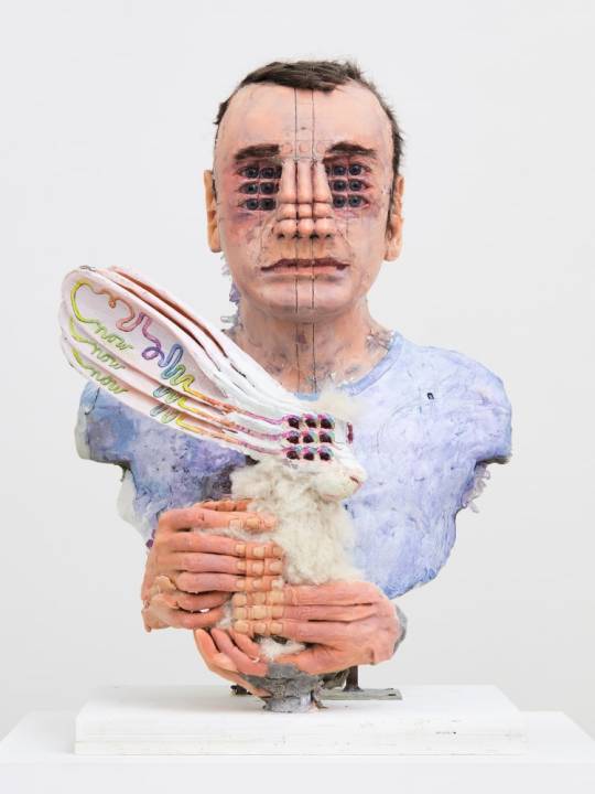
I don't want to make an excessively long post, so these are some other artists of interest I've looked into:
Susanna Bauer (the highly delicate and detailed embroidery works make powerful connections to the natural world), Armelle Blary Daphné (the stark red and white fabric sculptures convert the human body into dense structures of coral and roots), Wim Delvoye (the extremely detailed scultpures warp the world into a mathematical reality, drawing on contemporary and traditional art concepts), Keiko Sato (reminds me of exploring the ways that technology attempts to mimic the existing forms of the natural world), Jamie North (taking hard and industrial forms and placing them in organic shapes and softening them with plant inclusion), Marc Pouyet (using the natural world to create structural whimsy), Nicoletta De La Brown (Combining craft with contemporary waste in a performance that celebrates it rather than rejects it), Jonathan Callan (taking the readymade and converting it into something supple and new).





Image sources (in order) https://www.susannabauer.com/, https://armelleblary.com/sculptures-et-installations/, http://viemagazine.com/wim-delvoye-art-of-steel-and-elements/, http://kathrynrodrigues.blogspot.com/2011/02/metamorphosis-by-keiko-sato-laser-beam.html, https://www.behance.net/gallery/28139599/Rock-Melt-2015, https://www.designspiration.com/save/1845621598407/, https://www.mrxstitch.com/all-about-plastic-bags/, http://www.electricdreaming.com/archives/748
5 notes
·
View notes
Text
15
@crazydictator tagged me, it's friday so might as well!
are you named after anyone? nada, they picked my name right out of the baby book
when was the last time you cried? yesterday, crazy bad day @ work
do you have kids? no, but I have 7 cats, does that count? I think it counts
do you use sarcasm a lot? kind of sort of? I don't know if its sarcasm or that I say very off the cuff bs
what sports do you play/have you played? I did gymnastics as a child, and karate and was quite the cyclist
what's the first thing you notice about other people? general vibe, and their willingness to be open and kind.
eye color? I have partial heterochromia, eyes are blue, with a yellow ring, and my left eye is a quarter brown.
scary movies or happy endings? bro neither. psychologically devastating endings that make that brain think, and that heart thump
any special talents? functional depression.
where were you born? the midwest usa (ew)
what are your hobbies? uhhhhhhh... computer repair and server setup, 3d modelling, reading, video games, gardening, politics, and smoking devil lettuce
do you have any pets? I have 7 rescue cats. Eclipse (10), Maya (10), Squishy (5), Venus (5), Hecate (3), Bean Bean (2) and Freya (2). They are my babies and I dote on their every wim.
how tall are you? five foot three baby. I cannot reach the top shelf at the grocery store
fave subject in school? bro I did online highschool, and college was a lot of econ classes, calculus, and computers. I did have a favorite class though. 5000 Level grad course about the history of American labor unions. Really moved me for my passion for Workers Rights
dream job? I'd like to at some point be the Director of Information Technology with my organization, or to eventually cross the stream and do digital art/3d work. One way or another, computer oriented.
I don't know who I would tag, but I appreciate the tag. Was a fun lil do.
16 notes
·
View notes
Link
[ad_1] SHARJAH, (UrduPoint / Pakistan Point News / WAM - 10th Jan, 2025) The Sharjah Entrepreneurship Festival (SEF), renowned for bringing the world’s most influential leaders, pioneers, and disruptors to Sharjah, will host a stellar lineup of over 300 globally respected luminaries representing over 45 nations for its 8th edition. Welcoming high-profile speakers such as Sheikha Hoor bint Sultan Al Qasimi, Princess Lamia bint Majed Saud AlSaud, Wim Hof, Mo Gawdat, and Ammar Kandil, alongside a plethora of global changemakers in technology, leadership, finance, the arts, and many other fields.Taking place over two full days from 1st to 2nd February 2025, this expanded edition of the Sharjah Entrepreneurship Centre’s (Sheraa) flagship event has doubled its agenda featuring global voices who will inspire and enlighten thousands of attendees across 10 dynamic zones and 5 stages.Commenting on this year’s star-studded lineup, Sara Abdelaziz Al Nuaimi, CEO of Sheraa, said, “By bringing together the world’s most visionary and pioneering leaders from diverse industries, SEF 2025 offers a wealth of expertise and real-world insights. This exceptional lineup will inspire our entrepreneurial community to think boldly, act decisively, and create meaningful impact. Attendees will leave not only equipped with valuable knowledge but also empowered with the confidence and connections to bring their visions to life”.As the President and Director of the Sharjah Art Foundation, Sheikha Hoor bint Sultan Al Qasimi has helped to position Sharjah as a global centre for contemporary art and culture. Her leadership bridges the worlds of creativity and commerce, offering entrepreneurs a visionary perspective on integrating artistic innovation into business.A pillar of philanthropy and leadership, HRH Princess Lamia bint Majed Saud Al Saud serves as Secretary General and member of the board of Trustees at Alwaleed Philanthropies, and with a relentless commitment to humanitarian causes. She has transformed countless lives through initiatives that champion global development, education, and cultural exchange. Her keynote at SEF 2025 will provide a compelling example of visionary leadership and purposeful dedication, inspiring attendees to integrate meaningful impact into their entrepreneurial endeavours.Known around the world as “The Iceman,” Dutch extreme athlete and wellness guru, Wim Hof has redefined human potential through his globally praised methods of endurance and cold exposure, as the man behind the ice-bath trend that has taken the world by storm. His presence at SEF 2025 is set to challenge conventional boundaries and inspire attendees to embrace a holistic and resilient approach in their personal and professional lives.The former Chief Business Officer of Alphabet’s ‘X moonshot factory’ (Formally Google X), Mo Gawdat, is an authority on technology, innovation and mental wellness who has inspired millions globally, making him one of the most sought-after speakers in the tech industry. Additionally, as an international bestselling author and podcaster, Gawdat’s insights will bridge the gap between human potential and technological advancement, offering a blueprint for creating impactful ventures.Ammar Kandil, is the Egyptian co-founder of YES Theory, a movement that inspires people to step out of their comfort zones and connect meaningfully through shared experiences. His mantra, “Seek Discomfort,” empowers entrepreneurs to embrace courage as a foundation to success. Palestinian journalist and writer Plestia Alaqad uses her platform to uncover untold stories, demonstrating the power of storytelling in driving meaningful change and fostering connection. As the first Emirati female shipmaster and CEO of SJR Group, Sahar Rasti exemplifies resilience and leadership, forging new paths in maritime services and providing a shining example for a new generation of female leaders.Mohammed Saeed Harib, an acclaimed Emirati animator, director, and creator of FREEJ, the middle East's first 3D animated series, will share his successes in forming new pathways for the region. Shelly Frost, Founder and Director of The Fridge, a prominent live events entertainment company in the UAE, has been a key figure in the region's music and events scene and will share her experience in fostering local talent and creating culturally inclusive platforms. Maaz Sheikh will also share his success story as CEO and Co-Founder of STARZPLAY, how he built a successful streaming platform while navigating challenges in the media industry, and insights into entrepreneurial leadership that led to a $420 million valuation for his company.Regarding beauty products and the power of personal branding, Noha Nabil stands as a trailblazer who transformed her brand, ‘Noha Nabil Beauty’, into a household name, showcasing how creating a unique and personal marketing strategy can drive substantial business success. Niki Skene, an innovator and futurist, renowned for his curated global inspiration tours, will empower individuals with strategies to stand out in a crowded market. Additionally, Charlie Wright, the founder of Humantra, the largest electrolytes brand in the UAE, will share his success in helping people address dehydration and wellness through innovative, science-backed solutions, and his perspective on expanding market reach.Hadil El Khatib combines tradition and modern wellness with expertise in matcha and Japanese tea ceremonies and will demonstrate how entrepreneurship can be harnessed within one’s interests and passions. Artist Diaa Allam will bring a creative touch, blending calligraphy and mural art to inspire resilience, cultural pride, and the power of authenticity in business.Mohammed Al-Hakim, the newly appointed President of Crypto.com’s UAE operations, will bring extensive expertise in strategic development and business expansion, while Rashid Alabbar, an online retail entrepreneur and co-founder of the online fashion portal SIVVI.com will discuss the expansion of e-commerce opportunities in the Middle East. Ali Mokhtar, who serves as CEO and Managing Partner of Beltone Venture Capital, will share how he built a portfolio of 10 startups and the management of over $40 million in investments. Noor Sweid, founder of ‘Global Ventures’, rounds out this group as a prominent venture capitalist fostering tech growth in emerging markets.These industry leaders have clearly demonstrated the power of strategic thinking in fostering sustainable success, and are set to leave a lasting impression on all that attend SEF 2025.The returning theme for SEF 2025, “Where We Belong,” encapsulates its mission to foster a community of dreamers, doers, and disruptors, through life-changing keynote addresses, interactive workshops, panel discussions, startup showcases and pitch competitions, as well as invaluable networking opportunities, this year’s festival is a truly unmissable occasion for entrepreneurs to learn, connect, and grow. (function(d, s, id) var js, fjs = d.getElementsByTagName(s)[0]; if (d.getElementById(id)) return; js = d.createElement(s); js.id = id; js.src=" fjs.parentNode.insertBefore(js, fjs); (document, 'script', 'facebook-jssdk')); [ad_2] Source link
0 notes
Text
The big 2024 round-up: Arthouse and documentary
This is one of three parts of my look back at this year in movies, alongside The big 2024 round-up: More or less mainstream and my Films of the year.

The Zone Of Interest
As a rule, I like to know as little as reasonably possible about a film before I see it. But in order to consider seeing The Zone Of Interest, I needed to know at least something about it – I’m not enamoured of the depths of human suffering as a source of entertainment and I don’t go to the movies for lessons, mostly. But the drawback of seeing Jonathan Glazer’s the-family-life-of-a-concentration-camp-commandant film after hearing a lot about it was that rather being surprised by how radical it was in terms of not doing what cinematic accounts of the Holocaust normally do, I found it fairly conventional compared with what I had built up in my imagination. It’s smart, it’s startling at moments, it’s an interesting take on the subject… and it’s still not the kind of thing that I want to go to the cinema for. I was impressed but not moved.

Perfect Days
Confession: there’s a fair chance if Perfect Days was exactly the same film but had been made by a Japanese director, it would be one of my favourite films of the year. But it was made by Wim Wenders and Wenders is a notorious cultural tourist and so I’m just that bit distrustful about what he’s saying here about Japan.
Probably unfairly – this is a lovely film. It’s about Hirayama (Koji Yakusho), who takes immense pride in his job of cleaning public toilets. Not grim municipal conveniences like you’d find in London – these are a range of outstanding bits of architecture and technology (although you’d never get me to use the glass-cube ones that switch to obscured windows when you step inside).
Hirayama reads, listens to Lou Reed and Patti Smith on original cassettes in his little van, takes photos on film, looks after his many plants. He’s all routine but it doesn’t seem boring. He’s just the coolest and the film is begging the ignorant Western critic to misuse the word ‘Zen’. So, so much better than I would ever have expected a Wenders film to be at this point in history.
(MUBI)

Love Lies Bleeding
The first half of 2024 seemed to offer a clear choice for anyone interested in a sapphic crime movie that wasn’t shy about sex: if you wanted goofy, you could go for Drive-Away Dolls. And if you wanted gritty, there was Love Lies Bleeding. Only, well, LLB turns out to be surprisingly goofy, too, although (as the title promises) bloody.
It’s 1989 and Lou (Kristen Stewart) is stuck in a dusty small town working in a gym when the strapping Jackie (Katy O’Brian) pops in to lift some weights. Very, very quickly Lou is cooking Jackie breakfast and agreeing to let this drifter who is en route to (of course) Vegas stay.
There’s a strong 1990s neo-noir vibe here – the lesbian thing has had people mentioning Bound but it's much closer to John Dahl, particularly Red Rock West.
But (and this was the surprise), it gets very heightened, so yes David Lynch but also Sin City and (it turns out this was one of director Rose Glass’ main reference points) Showgirls. And that leaves Stewart feeling a bit out of sync with her castmates through no fault of hers because her character is fairly grounded and everyone else’s (O’Brian, Ed Harris, Dave Franco etc) are not.
And in the end, it’s a little unclear about how much we’re meant to be laughing and that left me not fully sold on the movie.

La Chimera
When you think of Italy, is it grubby and cold? Chances are, probably not, although it can certainly be both. La Chimera leans heavily into showing us uncomfortable, crumbling places. The film is about a bunch of youngish folk who scratch a living through illegal archaeology – they are tomb raiders without the adventure that might imply. Their erstwhile leader, fresh back from prison, is a lanky Englishman played by the currently modish Josh O’Connor. The film is light on plot, focusing more on the dysfunctional little gang. I wasn’t annoyed that I saw La Chimera but not sure I actively enjoyed it.

Kinds Of Kindness
The year’s second Yorgos Lanthimos film is an anthology movie – a form that seems more popular with directors than audiences. The achingly ironically named Kinds Of Kindness is a three-parter with the same cast playing different characters each time. We’re talking dark modern fables – I was going to say ‘dark little…’ but as the whole thing comes in at a podgy 2hrs 44mins, each episode is long enough. It’s proudly nasty and aggressively pervy. I can’t fault the cast – Jesse Plemons, Emma Stone, Willem Dafoe, Hong Chau and Margaret Qualley – but it felt a bit smug, gratuitous and a bit trite to me (not to mention mad long.)

Janet Planet
Quiet, low-key US indie about Lacy (Zoe Ziegler), a kid who says she has no friends and her chronically unlucky-in-love single mom Janet (Julianne Nicholson). They live in a beautiful (so beautiful) house in the woods (this seems to be the early ’90s, so property is more affordable – but also, it seems, Janet comes from means). It looks great, there are some excellent sequences, Nicholson is reliably good but it didn’t fully hit with me – usually (though not always) I need this stuff to be funnier. (Director Annie Baker, by the way, is married to Nico Baumbach and by extension part of the Baumbach-Gerwig power axis.)

La Cocina
Arnold Wesker’s 1957 play The Kitchen updated and relocated to a Times Square tourist trap. Lots to admire technically: lush black & white, great choreography of swarms of staff moving in and out of the kitchen, overlapping dialogue in a half dozen languages… But it’s all heavy-handed and wearying – everything stopping so characters can give speeches about their dreams plus a lot of obvious stuff about how much it sucks to be an undocumented worker in a frantic restaurant.
Full review here

Priscilla
Sofia Coppola tells the unsettling story of Elvis’ child bride. Plus points: Cailee Spaeny in the lead role, even if it’s somewhat disturbing how plausible she is when she’s playing a teen (Spaeny is 25.) A phenomenal soundtrack makes light of not having the rights to the King’s music and instead goes from The Ramones to Dolly Parton. Minus points: Aussie Jacob Elordi seems to have put in so much effort getting Elvis’ voice right that he’s too exhausted to do anything else. And about three-quarters of the way in, it slides into conventional biopic territory. Could have done with a 15-minute trim. It’s good, but my expectations were a bit too high.
(MUBI)
Full review here

Problemista
Not the only new film I saw this year that reminded me of the work of Michel Gondry, this is a charming comedy written & directed by/starring Julio Torres as a wannabe toy designer who needs a job, any job, to keep him in the US. He ends up working for the eccentric Elizabeth (Tilda Swinton in a long, curly red wig), whose artist husband (Rza) has been cryogenically frozen. I can imagine that Torres’ manboy shtick and the lot-of-stuff-made-of-cardboard look of the film will put some people off, but I found lots to enjoy here.

All Of Us Strangers
Critics loved this, various people I know found it fully tear-inducing. As with Aftersun last year, I ended up feeling a bit heartless.
This is a ghost story that’s about emotions not scares. Andrew Scott plays a screenwriter living in a near-empty new luxury high-rise in London. Two things start happening: he’s hooking up with his warm-but-damaged neighbour (Paul Mescal) and he’s taking the train down to Surrey to visit his long-dead parents (Claire Foy and Jaime Bell), Spending time with his folks (no explanation is given for how, a good decision), he gets to understand a bit more about his childhood and process being a gay kid in the 1980s, when on the one hand there was no shortage of representation in the pop charts – Frankie Goes To Hollywood’s Power Of Love is central to this film – but the suburban world was extremely hostile and harmful.
The performances are all terrific – and previously I had been somewhat sceptical about both Foy and Mescal. The scenes with the parents are all pretty excellent. The vibe in the Scott-Mescal scenes is also good. My problem – which predates this film – is with director Andrew Haigh’s writing: I find a lot of his dialogue so plodding it takes me out of the situation entirely. And that’s why I was left feeling this is a film of great moments rather than one that fully worked for me, but I'm in the minority.

Evil Does Not Exist
This is the newest film by Ryusuke Hamaguchi, who made the 2022 critics’ fave Drive My Car. This one is set in a village up in wooded hills, where everyone is obsessed with things like the taste of noodles cooked in pure mountain stream water. (If you are fully spoiler adverse, stop reading now.)
The plot – such that there is – is nudged into motion when a Tokyo talent agency decides to grab a post-Covid subsidy by reinventing itself as a glamping operation. A big chunk of the film is taken up with the fractious public consultation the company has to hold.
The vibe is something like a Japanese version of a Kelly Reichardt film. Until the final 10 minutes or so, that is, when, in its own quiet way, it goes absolutely batshit. And lost me completely.
(BFIplayer)

Monster
The great Japanese director Hirokazu Koreeda is back on home soil after French and Korean excursions with a film about a troubled schoolkid. Someone is being bullied but whether Minato (Soya Kurokawa) is perpetrator, victim or something else is the question. This is one of those films in which we see the same stretch of time from three different perspectives in turn. Unfortunately for how I felt at the end of watching it, the segment I thought was truly outstanding was the first one, about a feisty single mother (Sakura Andô) taking on school officials who behave in a way that if a non-Japanese director had made this, they might be accused of overdoing the stereotypes of groupthink and oppressive politeness.
The rest of the film is thoughtful and well filmed and objectively good but I just felt the energy dip and my interest fade, to the point where I was thinking fondly of other Koreeda movies. Mind you, one of those was last year’s Broker, which I now don’t understand why I left off my favourites of 2023 list, so ask me in 12 months and I might be raving about Monster.
(BFIplayer)

His Three Daughters
This is one of those films you’d swear blind was adapted from a play but weirdly seems to have been written for the screen. I mean, there’s a core cast of three with maybe five other speaking parts. It takes place almost entirely within a New York apartment with a few scenes on a bench in the building’s grounds, and precisely one trip out to a cannabis dispensary. And it has the rhythm of theatre. But it’s a movie, shot on film even.
Vincent is dying. His daughter Rachel (Natasha Lyonne) shares the apartment with him. Her sister Christina (Elizabeth Olsen) has flown in across country. Katie (Carrie Coon) only lives in Brooklyn but apparently the end is so near that she’s also sleeping there. There’s an annoying guy from the local hospice who drops in with advice, and a nurse.
The film broadly matches my experience of this kind of situation, which is you know you should be on your best behaviour and supportive of everyone else because they are also in pain but you’re exhausted and overwhelmed and just so unbearably angry.
So rather than being there for each other, Katie – who thinks of herself as the grown-up one – snipes at weed-smoking self-proclaimed professional gambler Rachel, who she clearly thinks of as a fuck-up. Meanwhile, neither of them are paying much attention to Christina, whose assigned family role is the happy one.
This is very much an acting showcase, although one that leans into known strengths. In other words, it’s Natasha Lyonne playing the streetwise one and Carrie Coon the seemingly together one – none of them are out of their comfort zones.
Obviously, the subject matter is grim, but I found it grim-relatable rather than grim-as-spectacle. Pretty good. (Netflix)

I Saw The TV Glow
Great title, great look, great vibe… There’s much to like about the first half or so of this hard-to-pigeonhole movie, one that sits somewhere between, I don’t know, David Lynch and Michel Gondry, plus a little bit It Follows and I was also reminded of Boots Riley’s TV show I’m A Virgo. Maybe it would simpler to say that Jane Schoenbrun has created something all of its own here. What it isn’t in any normal sense of the term is a horror movie – there are quite a few disgruntled viewers who thought they were going to get scares and maybe gore and got neither.
It’s about a pair of marginalised teens in the 1990s who are obsessed by a cult TV show that’s part Buffy and part one of those low-budget 1980s kid’s fantasy shows with rudimentary special effects.
The cinematography, production design, lighting are as good as anything I’ve seen this year. But in the second half, the storytelling feels a bit clunky to me, and the conclusion a bit forced. I had huge expectations for I Saw The TV Glow, and it fell a little short. But it's one of the most distinctive and memorable things I saw this year.
Documentaries

Brats
Has Andrew McCarthy got over the sense that he and his co-stars from the John Hughes movies plus St Elmo’s Fire were considered spoilt party kids? According to this documentary he directed, the answer is no. The shtick is that he rings up Emilio, Demi, Rob, Molly, Judd and Ally* and asks them to talk it through almost 40 years later – but which of them will say yes? Fortunately, he also talks to journalists and behind-the-scenes people and gets a bit more perspective. Not flattering to its maker but I was hooked.
*If you can’t automatically add the surnames, this isn’t for you.
(Disney+)
Full review here

Catching Fire: The Anita Pallenberg Story
There’s maybe a bit of a Trojan horse effect going on with this documentary: draw folks in with gossip from the set of Performance and hope they stay for the deeply sobering stuff about how wholly unfit to be parents Keef Richards & chums were. The moral of story: keep clear of rock stars.
Full review here

Getting It All Back: The Story of Cymande
Full disclosure – the director of photography on this film is a friend of mine (hi, David!). This is a documentary about Cymande, a classic obscure-at-the-time, later massively influential band. There weren’t a lot of successful black bands of any kind in London in the 1970s, let alone funk groups that drew from Rastafarian drumming and chanting as well as jazz and soul.
The documentary tells the story of both Cymande’s original career – no love here, some in the States – and then the repeated way that subsequent generations continuously ‘rediscover’ and sometimes sample them. We get Mark Ronson and Jazzie B and Maseo from De La Soul and Norman Jay and the bloke from beardy American rockers My Morning Jacket…

It’s a good story and Cymande are an interesting lot, although there’s a always an implication in these kind of docs that with just a little luck, the subjects would have been huge and I’m not sure here that’s necessarily the case. (Or maybe I think that, because, whisper it, Cymande aren’t really my bag – like a lot of ‘70s bands, I like the samples grabbed from their records but not the records themselves.)

Scala!!! or, The Incredibly Strange Rise and Fall of the World's Wildest Cinema and How It Influenced a Mixed-up Generation of Weirdos and Misfits
I mean, that subtitle does a lot of the work there. The Scala was a cinema club, first in Fitzrovia and then in an amazing building in King’s Cross, that existed from the late 1970s until the early 1990s. The KX building, now a club/gig venue, is still called The Scala and it’s where the interviews for this documentary were shot.
Because The Scala was notionally a private members’ club and not a general admission cinema, they got away with showing all sorts extreme horror and beyond X-rated films you couldn’t possibly see elsewhere, plus just lots of assorted culty stuff. They ran all-nighters, hosted assorted obsessive fan groups etc. It was, by all accounts, quite something. (I think I only went once, and just to see a film that was on current release, so didn’t get the full experience.)
This documentary tells all that story well enough, but I got tired of lots of people telling us how cool it was and therefore how cool they were for hanging out there. And how it was somehow politically important (I don’t think so). When they are going, ‘It was so daring, people were having sex in the loos,’ I’m afraid I’m just thinking, ‘Christ, you’re at an all-night quadruple bill and you’re busting for a piss and two selfish bastards are going at… Nightmare.’ (BFIplayer)

Made In England: The Films Of Powell And Pressburger
In which cinema’s no1 superfan Martin Scorsese talks us through the work of arguably the greatest British-based filmmakers, interwoven with his memories of seeing these movies, how they influenced key sequences from his movies and the story of how Marty and chums rescued Michael Powell from chilly obscurity in the English countryside and whisked him off to be their guru (culminating in Scorsese’s editor Thelma Schoonmaker marrying him). Scorsese is the only 2024 voice we here, everything else is archive footage and generous clips from the films – this is a luxury version of the kind of video essay you get on YouTube, but then Scorsese did help invent the idea in the first place. If you haven’t seen all of Powell and Pressburger’s masterpieces (A Matter Of Life And Death, The Red Shoes, Black Narcissus), I’d skip this for now because there are massive spoilers.
*Emeric Pressburger came from Hungary + Hitchcock did the bulk of his best work in Hollywood
(BBC iPlayer)

Piece By Piece
Essentially all you need to know is this: Piece By Piece is an otherwise standard documentary about the life and career of Pharrell Williams except in Lego computer animation. So if you are tickled by the idea of, say, the video for Snoop Dogg’s Drop It Like It’s Hot rendered in (CG) Lego, you might want to see this. If not, walk on by.
Full review here
1 note
·
View note
Text

Researchers hijack solar cell technology to develop a simple spray test for lead
AMOLF researchers have used the special properties of perovskite semiconductors to develop a simple spray test to demonstrate the presence of lead. Perovskite is a material suitable for use in LEDs and solar cells, for example. A lead-containing surface shines bright green when it is sprayed with the test. This test is 1,000 times more sensitive than existing tests and the researchers found no false positive or false negative results. The study was published on November 27 in the journal Environmental Science & Technology. "We have hijacked the technology of perovskite semiconductors and used it in a widely deployable lead test. Nobody in this discipline had ever thought of that," says Lukas Helmbrecht, researcher at the group Self-Organizing Matter led by Wim Noorduin at AMOLF. "We are very pleased with these results," says Noorduin. "It is a really cool project and it is quite rare for fundamental research to literally impact the entire world with an application."
Read more.
18 notes
·
View notes
Text

Until The End of the World (1991) theknockoutsf 12/9 4:30
Sleepless avant partier Claire crusades through an epic global chase as the end of the world decays in orbit. Are her answers to be found with her writer ex-husband, a would-be detective, bank robbers, corporate espionage spooks, the next bar, aborigines, the next hotel, bounty hunters or a mysterious system for recording dreams? What is anyone supposed to do during a slow armageddon? Until the End of the World was originally released in 1991 in a much shorter version. This 4.5 hour director’s cut is perfect cyberpunk cinema, and captures the 80’s future aesthetic in numerous technology predictions, devices and futurescapes that have held their ground. The movie itself was produced over more than a decade and has a killer soundtrack featuring the likes of Depeche Mode, Elvis Costello, REM, Lou Reed and the Talking Heads. Wim Wenders intended it to be the perfect road trip movie, and it has aged as an ode to global cinema. Featuring San Francisco’s Tosca Cafe and the Excelsior, Sam Jurrasic Grant Neil, Exorcist Max Von Syndow, William Altered States Hurt, and co-author of the movie Solveg Demmartin as Claire. Directed by Wim Wenders.
The KO will be open early at 4:30, and the movie is perfect if you show up anytime after.
Thanks again for all the great times Space Cowboys! This will be the last Cyberpunk Cinema for the foreseeable future. Please show up as early as you can. And remember, every future, is already a retro future.
0 notes
Text
Roadside Inspections for Commercial Vehicles
Roadside inspection reduction typically refers to strategies, programs, and technologies aimed at minimizing the frequency or duration of roadside inspections for commercial vehicles. These efforts improve efficiency, reduce delays, and help compliant carriers maintain smooth operations. Below are key ways this can be achieved:
1. Pre-Clearance Programs
Examples: PrePass, Drivewyze, NorPass.
These systems use transponders or mobile apps that communicate with roadside inspection stations. Vehicles with good safety records and valid credentials can bypass inspections, saving time.
2. Electronic Logging Devices (ELDs)
ELDs automate compliance with Hours of Service (HOS) regulations and reduce the need for manual logbook checks during inspections.
3. Safety Ratings and Compliance
Maintaining a strong safety record through compliance with Federal Motor Carrier Safety Administration (FMCSA) rules.
Lowering CSA (Compliance, Safety, Accountability) scores minimizes the likelihood of inspections.
4. Data Integration and Vehicle Maintenance
Regularly updated maintenance records and proactive fleet management systems help reduce inspection triggers.
Smart technologies like telematics and diagnostic systems ensure vehicles remain compliant and roadworthy.
5. Credentialing and Documentation
Ensuring all required documents, such as licenses, permits, and certifications, are up-to-date and accessible reduces delays during inspections.
6. Participation in Trusted Carrier Programs
Enrolling in programs like the FMCSA's Inspection Selection System (ISS) or Customs-Trade Partnership Against Terrorism (C-TPAT) may lead to fewer inspections.
7. Advanced Vehicle Technology
Installing technologies like weigh-in-motion (WIM) scales, tire pressure monitoring systems, and automated brake inspection tools ensures compliance with regulations and reduces inspection frequency.
Would you like more information on any specific method or technology? For more information visit at: https://cdlconsultants.com/csa-roadside-inspections.php
Blog Source: https://sites.google.com/view/roadsideinspectionreduction/home
0 notes