#william's reblogs
Explore tagged Tumblr posts
Text
A Message to The Vibe Amphibian
@pmseymourva

'Shall I explain to thee a Sexyman?
For thou feign ignorance and disinterest:
His voice doth make us darling simps obey,
And three decades is all too long to wait;
Sometime so tall the man of purple stands,
And often is his assur'd firmness trimm'd;
And many fan from fan cannot withstand,
By chance or Afton’s changing course untrimm'd;
But his undying beauty shall not fade,
Nor lose allurement from the simps he ow’st;
Nor shall death brag he captur'd by its shade,
When in eternal lines to time he grow’st:
��So long as kids can die or eyes can dim,
So long lives this, and this gives life to him.'
Now, do thee truly understand for what reasons the Tumblr Redemption Arc happened?
Doth what I've laid out for thee well explain what maketh us go 'OwO' and 'Rawr XD' for the madman at Fazbear's?
Sincerely,
an Afton Simp.
#he is#william afton#my british bunny#my man behind the slaughter#my baby briton#my beloved#my bastard#springtrap#scraptrap#spring bonnie#glitchtrap#afton blogging#fnaf#five nights at freddy's#fnaf william afton#william afton fnaf#The Aftonite Church of Latter Day Sinners#william's reblogs#michael afton#fnaf michael afton#pmseymourva#pm seymour#the council has spoken
7 notes
·
View notes
Text
No, I will not discuss Dream Theory again, for the last time, THIS IS NOT A DREAM.
No, I'm not about to argue about whether or not Ballora is Mrs Afton, we've done this 50 times.
No, I am not going to tell my opinion of whether or not it's ethical to ship the Classics and the Toys, because frankly, I don't care right now and I don't even want to know why you're asking me.
NO, I AM NOT ABOUT TO DEBATE WHETHER OR NOT THERE'S SEVERAL PURPLE GUYS, NOR ABOUT WHO IS RESPONSIBLE FOR THE FREDBEAR PLUSH.
being in a fandom long term: urrrrrrrrrrgh not this shitty argument again we’ve covered this
353K notes
·
View notes
Text
solangelo is only “opposites attract” in aesthetics and nothing more but you guys aren’t ready for that conversation
#im going to immediately reblog this with elaboration guys dw#made a shrek cake earlier btw. didnt end well#tastes good though#percy jackson#pjo#nico pjo#nico di angelo#nico di angelo pjo#nico and will#will solace#will solace pjo#will pjo#will x nico#will solace/nico di angelo#solangelo#tsats#william andrew solace#pjo hoo toa tsats
3K notes
·
View notes
Text
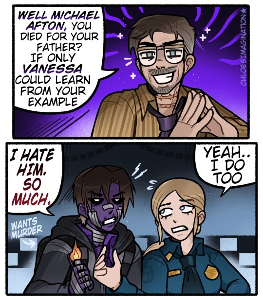
Michael doesn’t like his father in any FNAF universe..
#myart#chloesimagination#reblog#william afton#michael afton#vanessa afton#fnaf vanessa#vanessa shelly#steve raglan#fnaf#fnaf movie#fnaf 3#fnaf fanart#five nights at freddy's#Michael would HATE movie William#I think that’s an accepted assumption BAHA#Shocker all William’s suck 🔥#I always got the impression William sees his family members as pawns#so movie William meeting Michael would immediately try to manipulate him#though of course Michael wouldn’t have any of it#pulling the lighter out only one way to get rid of this man#Vanessa also expected her father to say something like this#BOTH of you get him!!#I haven’t drawn William enough maybe I’ll do it more soon!
3K notes
·
View notes
Text
im so fucking infuriated at the state of the world. is there no compassion left in anyones hearts. marcellus was murdered by the court for a crime he provably did not commit. so many people called in that they cut off the number, so many people signed, called in, faxed in, sent emails, and no one in this fucked up system even cared. im so angry and distraught. what a miserable fucking world.
#kitty purrs#death#ask to tag#antiblackness#im just sitting here crying ive been keeping up with it the whole time#rest in power marcellus williams.#sorry for turning reblogs off this post was stressing me tf out bc i didnt expect it to get 1k overnight
2K notes
·
View notes
Text
nice going ellie. you broke a perfectly grumpy old man. look at him. he’s got the giggles.
#tlou#tlou spoilers#tlou hbo#the last of us spoilers#the last of us#ellie williams#bella ramsey#pedro pascal#joel miller#please reblog this is clever
19K notes
·
View notes
Text
So y'all have seen the Williams F1 Logo before, yeah?
well get ready, becaues I am about to ruin your day!
where does one even begin with this. i am sorry in advance. -just a poor learning graphic design student, who simply tried to enjoy their saturday evening
The Logo
For anyone that doesn't know, here's the Williams F1 Logo. Entirely unedited, copied straight from Wikipedia:

Now like many fans, I actually quite enjoy this logo. I like the modern, sharp edges of it and it's simple yet intriguiging design. It's memorable, while also easily recognizable as a W. I also really enjoy the colour choice (this, however, is entirely a personal preference.)
(entire rant under the cut. please keep reading this took years off my life span.)
How did we even get here?
Let's start at the beginning. How did we even get here? Well I, a poor poor learning graphic designer, was watching this lovely video from Mr. V's Garage about bad F1 Logo's over the past 35 or so seasons. Very interesting, I can only recommend it (but you don't need to watch the video to understand this post)!
Now, to cleanse the palette at the end of the video, Mr. V included a top 10 GOOD logos from this time span, it was very kind of him.
On P4 of this "Good List," Mr. V placed the current Williams F1 Logo, as pictured above. At first I vaguely agreed with this, believing that he probably simply hadn't noticed one of the things that's been bothering me about that Logo since the first time I saw it up close.
The first sign of Trouble
So, what is this mystery issue, you might ask?
It's simple really. You don't necessarily notice it at a first glance, but something about that logo seems off. Taking a second longer, you may notice it yourself.
No, I mean it, take a minute and go look at the logo. It looks wonky as hell, doesn't it?
Well I can tell you the first thing that I personally noticed. The arms of the W aren't in line with the bottom half, see:

(Graphic by @girlrussell who was so kind to let me use it, as it is way prettier than the one I made)
It's a crooked W. There is no good explanation for this. The rest of the font is perfectly fine, geometrical shapes.

Anyway, the good person that I am I went to point this out to my partner ( @leftneb ) who proceeded to inform me that he, infact, was not aware about this and was, quote, "never going to unsee that."
Now, the good FRIEND that I am, I, of course, proceeded to rush into our broader F1 friendgroup to make them suffer for eternity.
What's the logical next step to take? Of course, fix the logo in Adobe Photoshop, you know, as a joke.
(Disclaimer at this point, I am not necessarily the biggest fan of Williams Management Team. I enjoy ALL their drivers this season. I do NOT enjoy James Vowels. Be warned.)(Also I am aware that he probably did not have an influence on the logo)
Trying to fix it. Oh god, I was so innocent back then
Trying to fix the logo in Photoshop is the worst mistake I could've made. THE worst path to take. I could've just giggled about making my friends suffer (which I succeeded in, by the way) and moved on. Instead I ruined a perfectly good Saturday evening, and for what? I don't know anymore.
Anyway, how was I gonna go about fixing the logo in the simplest way possible? Simplest way I could come up with: slap the thing in Photoshop and put two, mirrored boxes at each side to make the sides line up. Small issue, how do I make the thing actually even? Fix: line them up at the intersecting point with the bottom tips of the W.
Here's the result:

Hey, anyone care to explain to me why in THE LORDS NAME the arms are different sized? I mean, surely they weren't before. Surely, certainly, I must've messed up.
I double, I tripple checked. I made sure everything was lined up and made sense. But no.
It just couldn't be. Something was uneven in this logo, something even deeper. Something I could not have predicted when first taking a closer look. It was at this point I realized I had messed up. What rabbit hole had I stumbled across? Certainly, it couldn't get much worse.
And that's when I noticed.

(pictured above; my genuine reaction)
There's MORE? (oh god, the top isn't lined up)

I couldn't believe my eyes. This is the PINNACLE of the sport, and THIS was the logo of one of the competing teams? I mean, yeah, we have a Visa Cash App RB or a Kick Sauber or even a MoneyGram Haas which are all terrible logos, but at least they're CLEAN. (this has not been checked. If anyone wishes to ruin a nice Saturday evening, feel free to check them and tell me how wrong I was in the previous statement!)
But you can see that there is no end in sight for this post. I'm sure you're as scared as I was at this point. By now we were sitting in VC, discussing the horribleness of this logo. I had long informed my irl's about this, who take said design classes with me. And it was one of them who pointed out the next thing that had been bothering me, but I had not been able to put a finger on up to this point.
thE DISTANCE, HOW DID THEY FUCK IT?

I'm afraid I have to confirm your fears.
Yes, those lines are the same length. According to Photoshop, they're on the same level as well, so no flunking with angles.
The gaps of the arms to the main W are not the same. They're differently sized gaps.
It was clear to us, this logo is inherintely flawed. They're subtle issues, but once you pay attention you start to notice things. It all looks slightly wonky and off centre. And eventually, you get paranoid, and start comparing other angles and sizes. And you will keep finding things. This has ruined my life.
HOOOOOW

Honestly, I don't even know what to say. Yes, yes sadly those lines, too, are the same length. Just copied over from one side to the other and layed over on the same height. I admit, they're not layed over perfectly. I was honestly holding back tears at this point. But the point still stands, you can clearly see a difference in width.
Honestly, the only way I can explain it is that at some point there was a mess up of distance or proportions and whoever was designing the logo couldn't pin it down and tried to restore the visual balance by making manual adjustments. And in all honesty? They kinda did a good job, if that's what's happened. I mean, you notice the crookedness of the arms, and then maybe the difference in height, but the rest you probably will not notice if you don't spend too much time staring at it. (like some of us) And even those issues clearly aren't noticeable to the vast majority, considering I had to go point it out to a group chat for my friends at least to notice.
what the fuck is THAT?
Now, the thing about doing this investigative work of prooving a team you dislike is worse in more aspects than you previously thought, is that you do a lot of zooming in. And zooming in means you might notice bits that yours eyes simply overlooked before, because they were too small.

Here you can witness the top of the middle point, that, for whatever reason, really wants to touch the top border of the Logo. I'm relatively certain that's the highest few pixel in the entire graphic, considering earlier chapter "There's MORE?" I have no idea why it looks like that or why they thought it was necessary for it to not end in a clean point.

I just actually have no idea how to even describe what is going on on the top of the left arm. That left hand side, again, touches the side and is therefore the most-left-pixel in the graphic. I, once again, have no idea the purpose of this. However the RIGHT hand side also makes no sense, as it is the most prominent corner in the whole logo. There's pointed corners, and rounded OF corners, but nothing that is trying to form it's own colony in a distant land that hopefully isn't this god awful logo. I hope that blob gets away. I really do. You go king.
i'm loosing my mind
Anyway, the only reason I could come UP with those weird "reachy-outy-bits" was to establish the dimensions of the logo? But if that was the case, I don't understand why they managed to keep all the other potentially border touching corners clean?


Like, look. Those are clean, sharp corners with some clearance off the borders. I have no clue why they managed it here but not with the others.
guys. please.
Backtrackig a little bit, going back to the positioning of the arms.

Do I need to mention that those lines are both the same length and the same (mirrored) angle? I really hope I don't, because I don't think I could be making this shit up. Like, once you roughly know what you need to look for it just kinda becomes easy to find.
As said before, I genuinely do think that most of these issues happened in a chain-reaction. For example, the distances between the main part and the W wouldn't be as noticeable (and they do get noticeable once you start looking at it) if the angle wasn't fucked. And guess what, there's more fucked angles here! Which ALSO influence this specific area of the logo!
this is just embarrasing for you.

something something same line copied over and mirrored etc etc
It's not as visible but the angles defintely don't line up here as well. As mentioned before, these issues for the most part all influence each other. It doesn't really excuse the issues, in my opinion as a designer, because a big company like this shouldn't have these sort of issues in their logo.
So let's review;
to sum it up,

i cannot even BEGIN to explain to you how big of a fucking JOKE this FUCKING logo is. because, i thought to myself, to round the post out, hey, why not show ALL the issues i pointed out in one picture? that would round it out quite nicely, wouldn't it?
Yeah well, this logo sent STRAIGHT FROM HELL just could NOT let me rest. I had only done the lines visualizing the crooked arms in PAINT up until this point, i.e. I had only pulled both up individually. To make a nice "rounding out" picture I still had to add them into PHOTOSHOP. so i did. i pulled up the line. i mirrored the line.
THE ANGLE IS FUCKING DIFFERENT
none. and i mean NONE of my friends had noticed this before. i need you to understand that we looked at this thing with FIVE pair of eyes, and NONE of us noticed that until i thought to myself "Oh I still need to add these specific lines to have ALL the issues I pointed out in my SILLY TUMBLR POST in ONE image" and i get THAT FUCKING SURPRISE
I was PLANNING to round the post out with a statement on how obviously this isn't a serious post. Here, I even had it all written out already because I accidentally started writing it in the last paragraph:
Of course, this is nitpicking, and it's not that serious. I'm aware of that. AS MENTIONED most of these would not be noticeable if we hadn't gone specifically looking for them.
yeah, well, fuck that. i just spent two hours seething about this logo. i'm ending the post on this instead.

#i am ENRAGED#i managed to actually calm down about it#yk. just typing away#and then i just try to ROUND OUT THE POST#for fucks sake#anyway i know i'm posting this at an hourrendous hour#if you read all the way. reblog? maybe#pretty please#williams f1#williams formula 1#williams racing#formula 1#f1#also apologies for any spelling mistakes i do NOT have the nerve to go back and proofread this
932 notes
·
View notes
Text
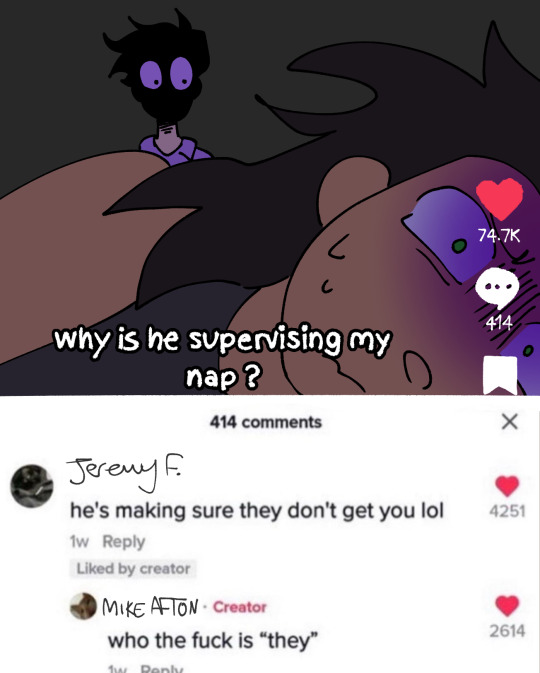
Mike has to deal with things worse than the nightmares. He has to deal with his clinically insane father
#i cant wait to reblog this after ''it'' happens in fnan and yall are like WHAT THE FUUUCCCKKKK#em draws shit#art#doodle#fnaf#michael afton#william afton
2K notes
·
View notes
Text
Happened with @reallyndacarter ! I wasn't expecting that, but she's on here! :3
I refuse to seek out Ryan Reynolds' Tumblr account. If it has any value it will find it's way into my dash naturally. This is how the Tumblr ecosystem is meant to work.
163K notes
·
View notes
Text
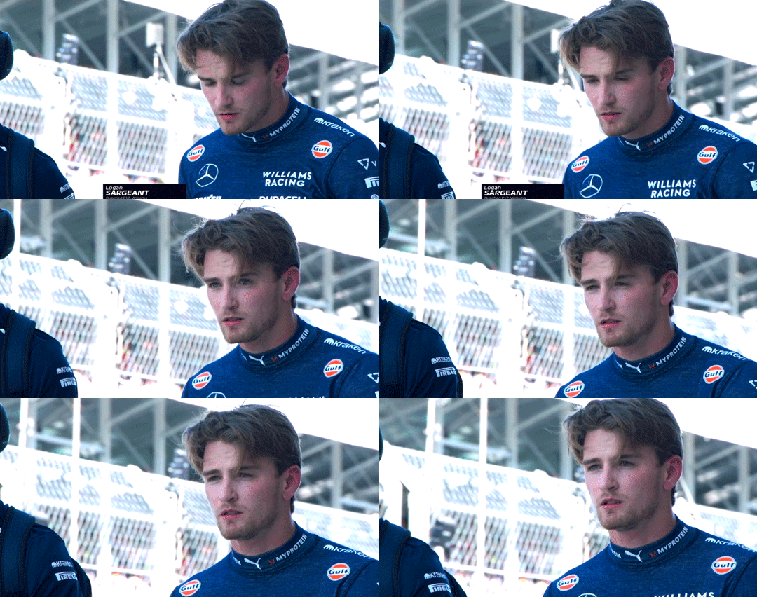
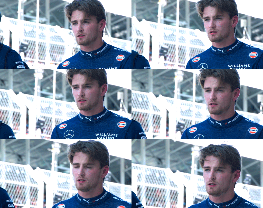
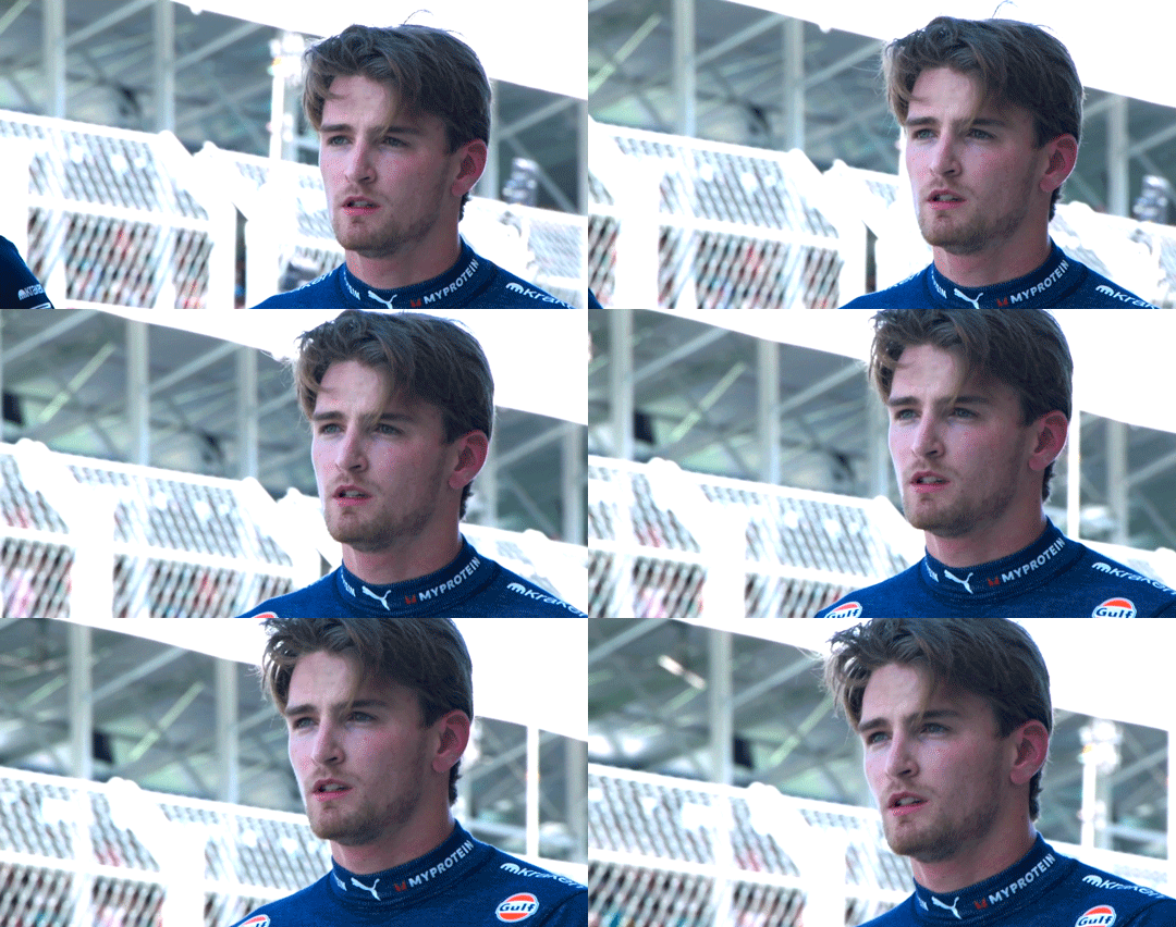
2024 Miami Grand Prix | Qualifying
#logan sargeant#formula 1#f1#formula one#f1edit#williams#williams racing#finally captioning these oop#myedit#*gif#*f1#everyone who reblogged my post abt this pls reblog the gifs now 🥺#miami gp 2024#24miami
1K notes
·
View notes
Text

transfem william afton aka my beautiful wife whom i love
#william afton#FNAF#wisterioid#incredibly self indulgent lmfao#my beautiful wife that i share my estrogen with#was doing a study and decided to just turn her into my wife HELLO gorgeous#if you saw/reblogged the version without freckles um. pretend you didnt.
453 notes
·
View notes
Text
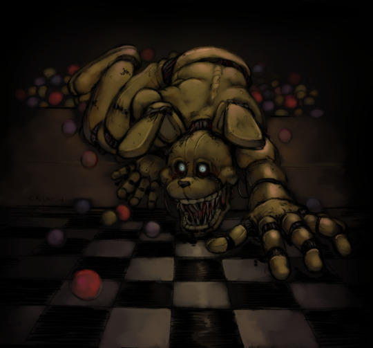
Out of the pit
#crunchchute art#my art#fnaf#five nights at freddy's#five nights at freddys#into the pit#fnaf into the pit#uhhmmm guys. my dad looks weird#did this instead of finishing a drawing of william cause ive had enough of that guy#middle finger emoji#i keep adding random shit like this in the tags and then people reblog my posts with all of the tags#<- OPs tags#there we go
2K notes
·
View notes
Text

Meme made by me. Reblog don’t repost
#scream fanfiction#scream movie#scream movies#scream franchise#scream#scream 1996#billy loomis#scream fandom#tatum riley#stu macher#stu x billy#billy x stu#billy and stu#stu and billy#billy#stu#stuart macher#stuilly kiss#stuilly#randy meeks#scream meme#scream 1996 meme#william loomis#reblog don’t repost#memes
946 notes
·
View notes
Text
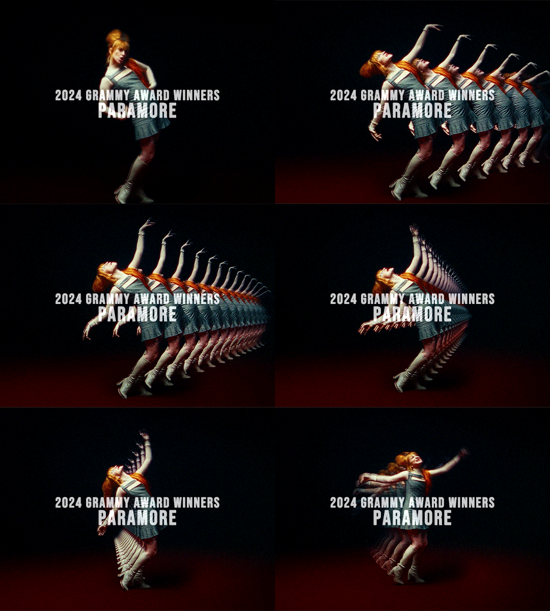
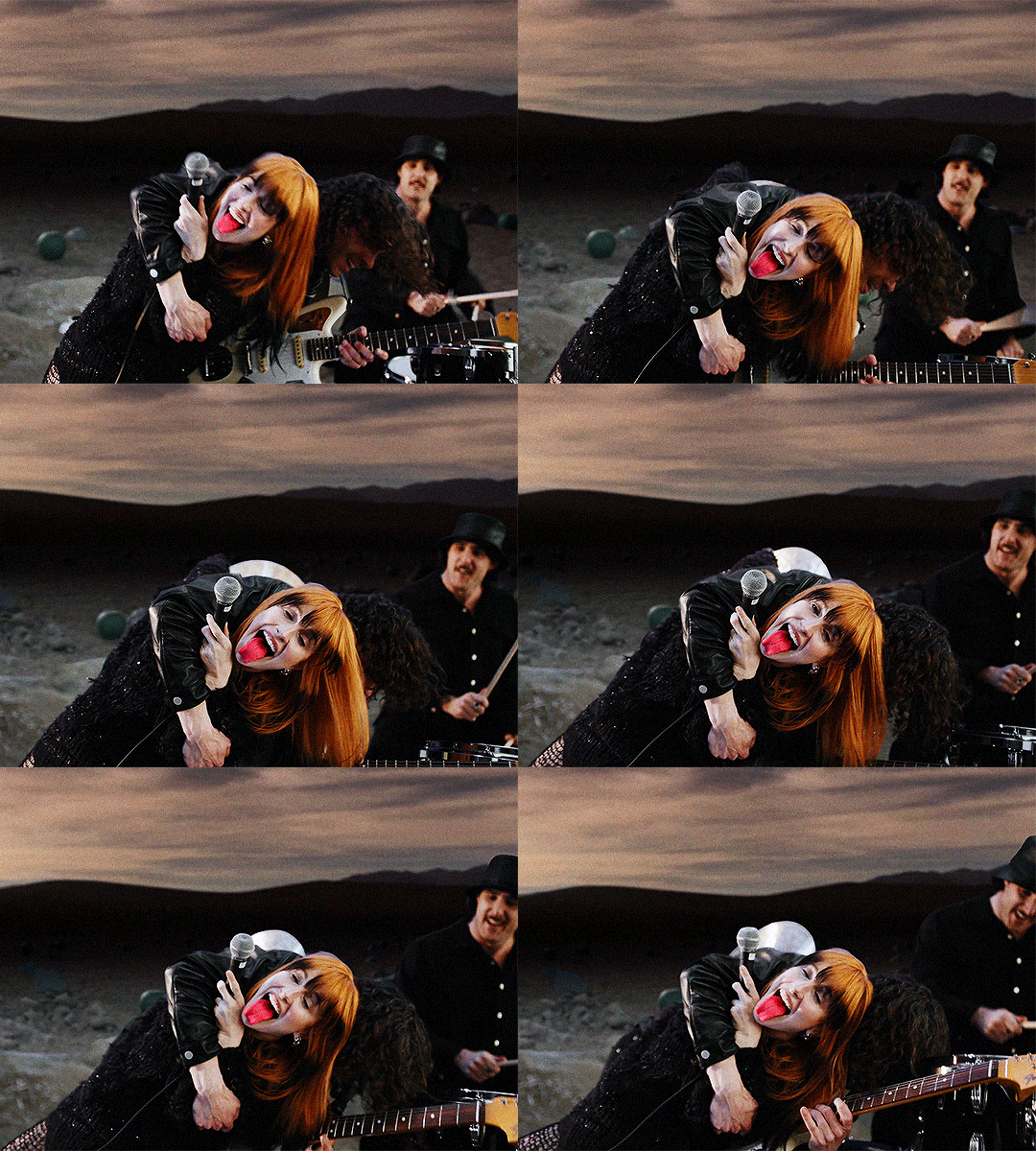
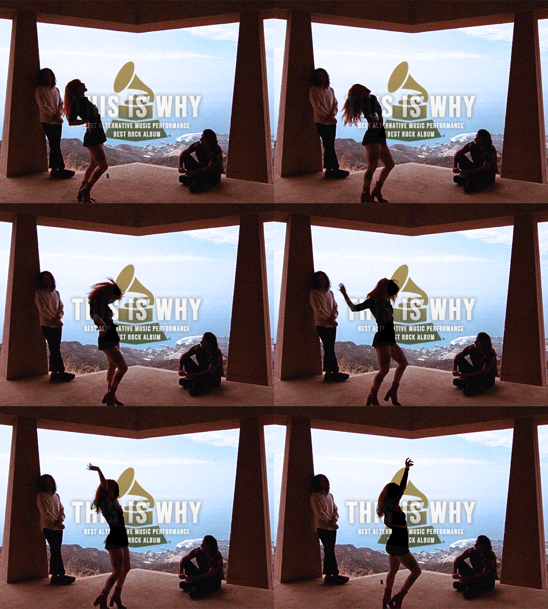
CONGRATULATIONS PARAMORE on winning two 2024 Grammy Awards, bringing them to 3 Grammys in total and making history as the first female-fronted band to ever win Best Rock Album
#paramore#hayley williams#taylor york#zac farro#hwilliamsedit#paramoreedit#useriselin#pmoreuserlupe#userkam#edits*#people#grammys 2024#i made this so quickly dont look at it just reblog#1k+
2K notes
·
View notes
Text
Robbie Williams - No Regrets 1998
"No Regrets" is a song by English singer Robbie Williams. It was released on 30 November 1998 as the second single from his second studio album, I've Been Expecting You. The track was written by Williams and Guy Chambers and features backing vocals from Neil Tennant of Pet Shop Boys and Neil Hannon of the Divine Comedy. "No Regrets" was another top-five hit for Williams in the UK and became a substantial hit around the world. It went on to sell over 200,000 copies in the UK, where it was certified Silver in October 2004, almost six years after its original release.
The album I've Been Expecting You was a critical and major commercial success, it debuted at number one on the UK Albums Chart, marking Williams' second consecutive chart-topper, and has been certified 10× Platinum. It became the UK's best selling album of 1998. Six of Williams' albums are among the top 100 biggest-selling albums in the UK, with two of them in the top 60, and he gained a Guinness World Record in 2006 for selling 1.6 million tickets in a single day during his Close Encounters Tour.
"No Regrets" received a total of 61% yes votes! Previous Robbie Williams polls: #129 "The Road to Mandalay" (see also: Take That)
youtube
328 notes
·
View notes
Text
nsfw ! — thinking about ex!ellie with a marking kink. she just couldnt help herself when you ended up back at her place. and obviously youve been with other people since her, but she fucking hated the thought, loathed it even. shes fucking you so good (the both of you knew this but youd never tell her this), her strap hitting your g-spot has your eyes rolling.
ellie wouldve been holding you close while sinking her teeth into any part of your body she could. your neck, your shoulders, your collarbone. it feels like shes all over you all at once. shes grunting softly while shes listening to those oh so pretty noises she enjoys so much. she sinks her teeth into your skin one more time for good measure while you’re on the brink of your orgasm. it was hard enough to draw blood, and she laps it up with no problem. while you’re cumming for her, she smiles, but it wasnt a content one.
she admires her work for a second, running her hand across the marks while you were catching your breath. “i wonder how long itll take before you come running back to me again after saying youre ’done with me’.” she jeers, making you roll your eyes.
aestras notes: i will not be elaborating on this until further notice. 😇 i didnt proofread this too much so please dont kill me if theres grammatical errors. 💔💔 writing to you while i am also not wearing my effing glasses!!!!! i hope it was good at least tho xx. rbs/comments r appreciated cause im def chronically online and will respond in like thirty seconds!! 😜
#nats-revival#- ͙۪۪̥˚┊❛ 𝐚𝐞𝐬𝐭𝐫𝐚𝐬 𝐚𝐫𝐜𝐡𝐢𝐯𝐞 ❜┊˚ ͙۪۪̥◌#tlou#the last of us#the last of us two#ellie williams imagine#ellie williams#ellie williams fanfic#ellie williams fic#ellie williams smut#ellie x you#ellie x reader smut#why is tagging so embarrassing lowkeyly#okay im stoppin here#does this make me look like im saying “please…. spare a reblog kind soul. 😞” or what!!
608 notes
·
View notes