#will add more ref in future
Explore tagged Tumblr posts
Text

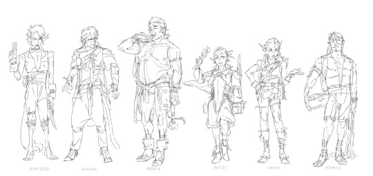
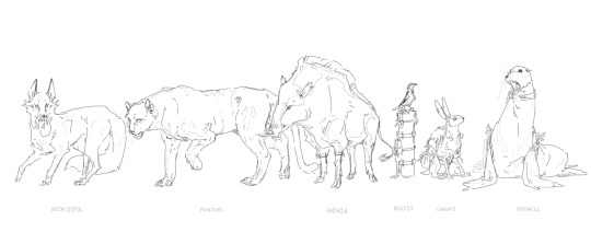
Elves of Nalur
#Chronicles of Cassendenia#Kassier#Shan Halren#Grisha Onesh#OC#CoC ref#MSPaint Draw#less character ref and more general worldbuilding#and very not so secretly - animal practice#Nalur is made up of several ethnic groups and I wanted to -firstly- narrow down what the groups actually are#and -secondly- try and design them more visually distinct from one another and not just differentiated by their seals#so like what animal features carry over in their natural state (tails/wings/etc) and designing mostly unique ear shapes for each group#and then thinking also what carriers over when they've shifted which is mosty piercing and small accessories#their clothes are enchanted away and reappear as they shift back and forth#Bc i personally think it's annoying to have shapeshifters disrobe and redress themselves whenever they change#not inherent tho - Nalur magic is centered around shifting so young elves need to learn how to bend the magic to include their clothes#i have another group kicking around in Nalur but their broad enough to merit a separate post#but i also might add one more to the lot - i don't know to draw bears let's learn :D#now how all these groups work as a “country” that's for future myre to figure out...
66 notes
·
View notes
Text
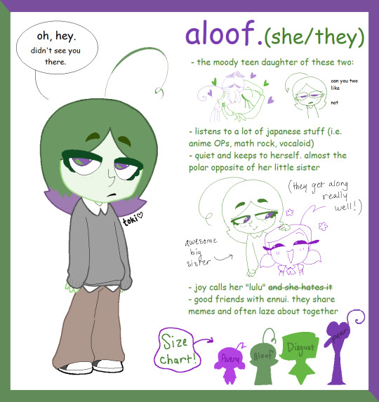
OK SCREW IT I'M KEEPING HER.
Meet Aloof, AKA The Bellflower Child! 🔔🌼
More about herrrr 👀
Aloof has a low tolerance when it comes to her parents being overly affectionate (and PDA in general), and shields Avery's eyes if she's near.
She's asexual and aromantic. (explains the above. lol)
Her favorite hobby is playing the bass guitar.
Her memory color is a earthy green (kind of like the color of matcha).
Aloof's muted color scheme is there to contrast with Avery's bright purple, encompassing their general moods.
She prefers her mom over her dad if given a choice.
*** I spent a lot of time on this reference (a lot more than I expected for an OC I was considering not keeping), so she's now a permanent member of my fanon Disear family. :)
EDIT: I have decided to make Aloof strictly asexual, meaning she's no longer aromantic.
#i felt comic sans was the most appropriate font to use haha#i will add more to her ref in the future#inside out#inside out 2#inside out fandom#disear#fashion disaster#inside out fear#inside out disgust#inside out oc#oc#oc reference#fankid#fanchild#lavender child#bellflower child#my art#ms paint
154 notes
·
View notes
Text
Guys I fucking win I’m getting the deluxe preorder of Sonic Racing Cross Worlds NINE IM GOING TO GET YOU
I’m giggling and kicking my feet I don’t think you understand… I’m going to rip my hair out out of excitement I need to calm down
#RAHUAJRJAJAOFOPPPP#OH. Y FUCKING GOD#NINE IM COMING HOME SWEETIEEE#/ref#I#oh my god#guys#this is such a bad decision it’s 90 fucking bones#too late#bought it#heehee#sth#sonic the hedgehog#sonic racing crossworlds#OH MY GOD I DID THAT#AHAHHAHFJGKFORLKEO GUYS GUYS GUYS GUYS GUYS#MY SON IS COMING HOME#dude if they add Kit and Surge into the game in the future it’s over for my wallet#there will be flies in my wallet#I’m giving them all of my fucking money#Need more kit content
7 notes
·
View notes
Text
long awaited intro
yoyoyo im ari! inbox is always open to ask / chat about whatever
Do your daily clicks!
> strawpage! - # strawri page
> generally safe blog but i would rate it 16+
> current brainrot: sonic (mostly black knight)
> multifandom: includes undertale, omori, rottmnt, mouthwashing, ace attorney, etc. just gotta ask!
> i play roblox and sonic rumble too so… hmu if u wna play tgt 👍
> artist / writer. also open to roleplaying, semi– to literate, or anything goes. again, just gotta ask :)
> usual DNI list. you know the drill. be respectful to each other and don't be weird. we're good
Tags
#ari's mindless rambles - my writings
#ari doods - random art
#i fucking love satbk - everything EVERYTHING sonic and the black knight
#intro#first intro post kinda scared#might add more in the future but this is what ur getting for now#ari mentioned#refs#srb
5 notes
·
View notes
Text
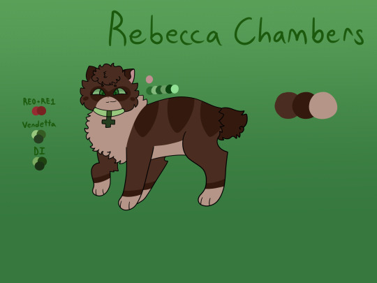
Rebecca!!! :DDD I love her so much and absolutely adore how her final design came out! I would love to see Rebecca in more future games, she has a lot of character that Capcom can do so much with. It likely won’t happen but I really hope to see her in re9 as a playable character!
Design fact: Instead of having a collar tag like other characters with collars, she had a medical symbol. I thought it would fit more for her than just giving her a collar tag.
#rebecca chambers#my art#resident evil#catified#design#catified design#catified resident evil#she’s friend shaped ^w^#and fluffy#she’s definitely one of favorite designs#i really love the mask-like marking i gave her#also im probably going to add a headcanon or design fact to more future ref. sheets#theyre fun to do lol#i might give barry a ref. sheet or start with designs for re3 characters (which is like only two of them)
11 notes
·
View notes
Text
alright so ive decided the first three chapters of as the years pass by are getting rewritten!!
updates with each will be slow, but ill try to somehow release them all at once to not confuse things since there are some things i need to add, plus i realized how i wasnt actually focusing on jenna and ethan properly so yeah a rewrite here we come lmao
#ninjago#ninjago au#astheyearspassby#atypb#levi's ted talks#levi's writing#will put this on ao3 rn#since they really do need a rewrite#theyll definitelyy take a long while esp with other wips but hey theyll be out eventually!#of course there are also things that ill keep but ive been thinking of adding and changing stuff yk what i mean#which means i also have ch4 to start over once i finish those 3#*sigh* well i put myself up to this lmao#another multichapter story (the lostshipping fic) is also coming up so i think ill be focusing a little more on that first and on atypb#at the same time somehow#but with my lack of free time itll be a hella slow process#ill try to post the ref sheets of jenna and ethan first too#its like if im posting the fic again yk what i mean#i also might add their designs in the future too bc theyre still kids here#ninjago dragons rising#sorry if anyone was waiting for ch4 :"))#ill try to write it along with the rewrites#so the release date between the two wouldnt be too big#watch my freetime go “fuck you”
12 notes
·
View notes
Text
The Princes
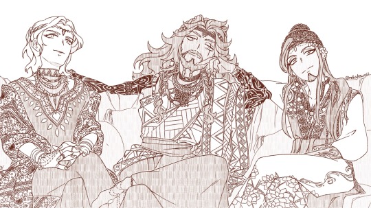
Ten years later. When marrying a Prince turns a Queen and a Servant into actual Royalties.
Because Vil deserves a real crown and Jamil deserves to be treated better.
NOW I'M GONNA RANT ABOUT MY CHARA DESIGNS CHOICES AND ALL THE DISCOVERIES I MADE WHILE LOOKING FOR REFS! If you only care about art and funny doodles, you can scroll down for a handful of slices of life.
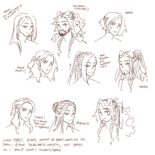
(Don't worry if you can't read my notes, I'm repeating myself better right under this)
Leona
-Lion: As you may know, one of my grievances with Leona is how his hair doesn't look like an actual mane despite being a lion. While I don't want to stray too far from the canon design with the usual drawings, that's the occasion for me to have some fun with a future version. Give that lion a beard and voluminous hair!
-Hair: First, get those bangs out of his face. Despite Leona being very confident, he still has bangs covering his scarred eye. I wanted him to finally own the aspects of him that may be scary to others (his UM, his scar, etc). I actually went with bangs framing his face similar to the ones he had during his Overblot. I wasn't sure whether to give him dreadlocks or curly hair, but I ended up choosing the free curls decorated with some atebas and braids so that Vil could have more fun styling them.
-Eye: Thanks @aria-faye for the idea, I decided to have his eye gradually lose its capacities with time. From a headcanon that, while the eye wasn't directly touched by whatever attack scarred him, the process of healing still had an impact on it and he gradually lost sight in his left eye years after years.
-Body: Not giving him a dad bod (yet, maybe in another ten years), but definitely giving him more voluminous yet casual muscles. Practical muscles with a healthy dose of fat and tissues. Also giving him two full sleeves of tattoos because I decided he should have much more than just his lion tattoo.
-Clothes: Went full Maasai dressing and Kenyan fabrics and beadworks. If you're not familiar with it, please go check it out, it's GORGEOUS!! Crown is beadwork too. He also has one Arabic styled foot jewellery.
Jamil
-Hair: My first order was to remove his double-faced hairstyle and also remove his bangs from his eye. Make him confident enough to show his whole face. Unlike Leona and Vil, he doesn't really want a crown though (he still feels weird about becoming royalty) so instead he uses a braid as crown. Also gave him a little goatee because I like facial hair and Jafar has a beard too.
-Body: He grew up! While he didn't quite catch up with Leona and Vil, he is now closer to their sizes than before, sitting at around 180cm. He kept his breakdancer/martial artist lean muscles but developed a bit of shoulders.
-Clothes: Went full Arabic dressing and fabrics (once more, go check the fabrics, they are pieces of arts). I gave him floral motifs instead of his usual fire/snake motifs (though he does have a snake earring and a fangs necklace) to symbolise his rebirth/blooming. Like Leona, he has one piece of jewellery that is beadwork.
Vil
-Hair: Here it was a bit tricky. Considering Vil's work, he likely changes hairstyles a lot, going from long to short for his roles instead of his wants. So I leaned into the little things he could add to his hair despite their constant changes, mostly jewelleries, beadworks and wool decorations he stole from his husbands. He also cares a bit less about them looking perfect and is allowing himself to be more natural. He doesn't have any facial hair (yet), keeping a youthful appearance for as long as he can. In another ten years though, he might start looking more and more like his father, beard included.
-Clothes: For Leona and Jamil's mental states, the three of them most likely started living in Sunset Savanna so they wouldn't freeze to death. Vil is well traveled so he can handle most temperatures without trouble, and he is used to dressing up in the local get ups. Here I decided to give him both African dress and Arabic fabric, and likewise both beadwork and golden jewellery. I gave him crown and heart motifs so he can keep being himself despite borrowing a lot from his husbands.
There, I'm done rambling. Here's some doodles, followed by some random headcanons.
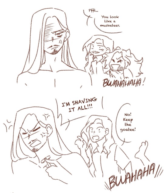
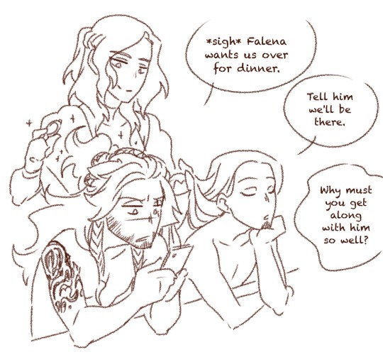
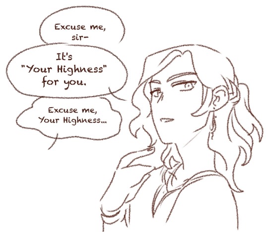
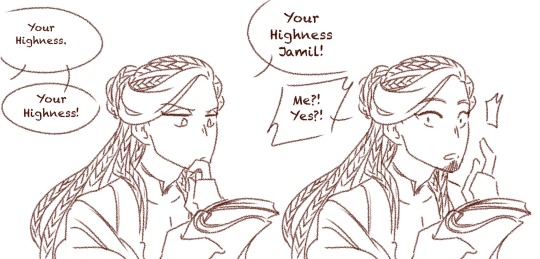
-Vil does his husbands hair every morning and keeps giving them more and more intricate hairstyles. He developed a whole haircare and beard-care products set for them.
-When Vil is away for a movie, Jamil keeps his hair mostly down save for a few accessories.
-Jamil and Falena get along surprisingly well (to Leona's despair). Vil gets along very well with Falena's wife.
-Jamil acts as a Scalding Sands ambassador and still is the one to care for Kalim when he comes to visit, though this time he's doing it because he wants to and not because he has to.
-Vil got used to his new title immediately but Jamil struggles with it a lot. He still has a hard time wrapping his head around the fact that he is no longer a servant.
-The servants at the palace love Jamil because he always makes their job easier.
-Leona finally decided to put his wits to good use and became Falena's advisor. He still fights a lot with Kifaji about the direction to take with the country, but he managed to make some of his ideas heard to help with the staggering inequalities in the country.
That's all for now!
#so... that's officially my longest piece to date#this one took me nearly 10 hours#and I'm considering doing a colored version because Arabic and Kenyan fabrics are so beautiful I swear#won't happen in a while tho#mello's drawings#n2 squad#jamil viper#leona kingscholar#vil schoenheit#javil#leojami#leovil#twisted wonderland#twst#art#my art#analysis#Future!N2
1K notes
·
View notes
Text
Tenna from my AU Brainwashed
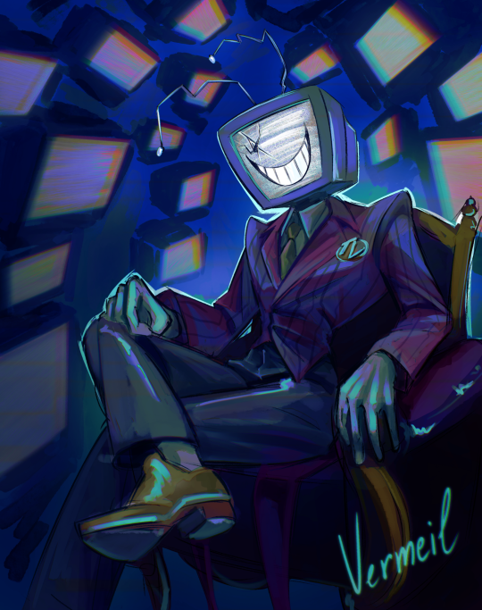
This is basically an AU where Tenna started to brainwash people so they would watch television...
(i am going to add him to my ArtFight acc :), also I will make a detailed ref for him in a few days)
(if yall are interested then I will tell more about this AU in the future)
#AGHRR IM FINALLY FREE FROM UNI FOR 2 MONTH#and ofc i have got sick on my first day😭#i have been wanting to draw Tenna since the release but i was preparing for my exams...#i did not expect my first post about him to be my AU#my art#deltarune chapter 3#deltarune 3#deltarune au#deltarune tenna#deltarune#tenna deltarune#mr ant tenna#mr tenna#mr. “ant” tenna#tenna fanart#tenna
351 notes
·
View notes
Text
It took literal months, but I finished it!!
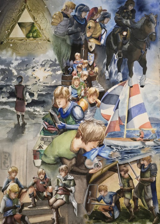
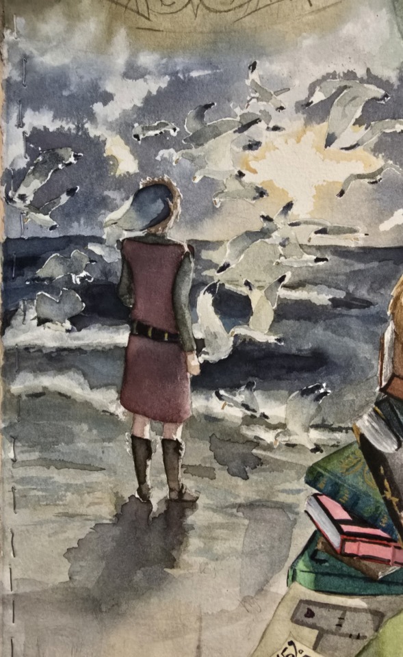
Top left: linked universe logo
The jojo's lu logo is sooooo detailed. It is one of the things I love about Jojo's asethetic with linked universe. The detail she adds brings so much life and information about the world of Linked Universe. Great example is all the embroidery on the chain's clothing. Let's you know about civilization, that an item may be magical, etc. It is difficult to keep small details in watercolor, but I think I caught most of the main details in the painting.

Middle left: Soulful legend
This was the fourth of the images I did for the painting, and the first image I really started to get into the painting. I think legend is my favorite to paint because he makes composition so easy. The red tunic adds an easy focal point. I did learn from this that I do not like masking fluid and likely won't use it again. It added to many hard edges that I wasn't intending. Very happy with the sky!
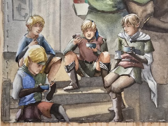
Bottom left: Evening snack
In this image, I liked the idea that wind and sky don't know what Ramen is because their worlds don't have enough space to produce wheat. So sky and wind are super excited about this new food, while legend has no idea why they are so hyped for noodles. I also liked the idea that four found a green pepper in the ramen as a topping and is a hater (this is from a note that jojo left somewhere saying that the chain will eat anything but four in the Manga does not like green peppers, idk where this note is to link it though....). I didn't end up drawing the Ramen noodles as it was just getting too small of a scale for me to be comfortable drawing the thin lines for the noodles in.
Bottom right: Testudo
I am very hyped in the future when we see more collaborative fighting with the chain and them working together effectively. I absolutely love the scene in shifting shadows part 3 where lenged and hyrule work together with the beam and hookshot.
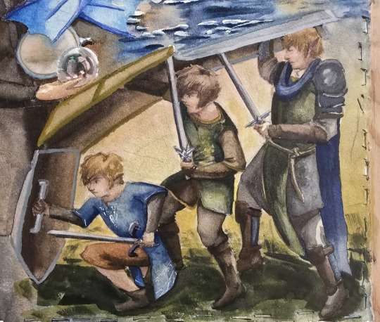
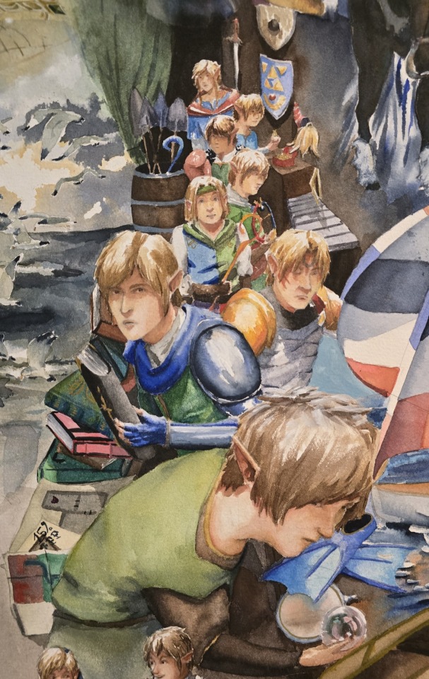
Middle: Legends storage
This is a reference to one of jojo's earliest works where the chain goes to legends storage for him to pick up some gear. I love that scene and I tried to put as many references as I could. The one thing I need to figure out is how I want twilight to look. I can't wrap my head around it. Need to sit down and just try out a bunch of different faces for him. My Pinterest inspo for twilight is all over the place. I want twilight to look different from time because when Malon was trying to guess who was the descendent, she did not consider twilight (she looked at wars and wind (so I typically draw time, wind, and wars looking similar). For my own personal headcannon, twilight and time are very similar in their manner (the way the walk, stand, etc) and personality (their stubbornness (as seen in sunset pt3)) but not necessarily in looks.
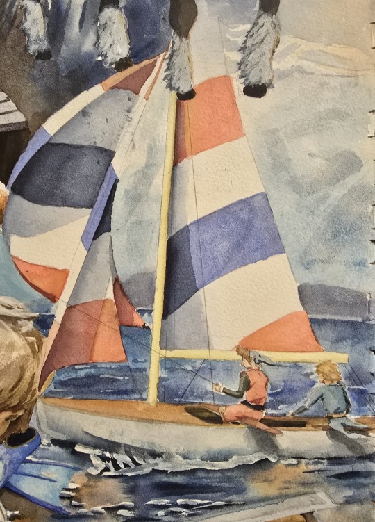
Middle right: Boat boys
The first image I did. I like how the water turned out, but I will not be using masking fluid for the same reasons I noted earlier. I did trace the boat (i think this is the reference [L240632 Hornet Class. J. Arthur Dixon Ltd. Beken and Son]). I do regret not doing anything creative with the boat, but I just wanted to get into painting and needed some confidence by working directly from a reference. I also forgot that legend might not be so keen to be on a boat again based on a comment jojo left in 2022 or something. I think she mentioned something in a discord event back then about legend not too willing to be on a boat again. But that doesn't really matter, I put that boy in a boat whether he likes it or not lol.
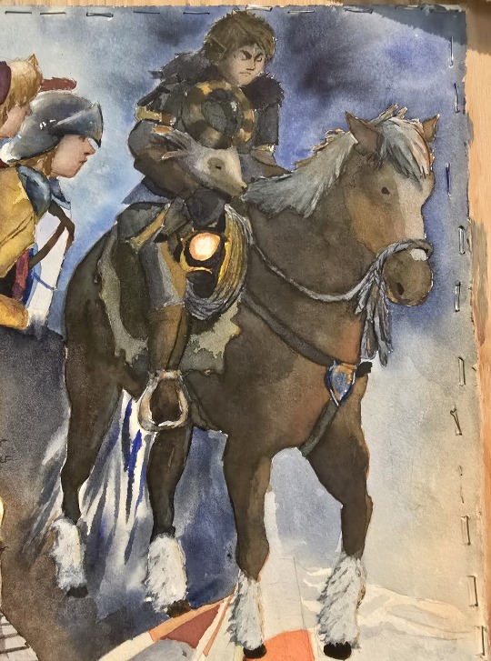
Top right: Winter storm
Second image I did for this painting. I did trace most of the horse because I do not care to learn horse anatomy (ref. [Winter Save By David Stoecklein]) Favorite part about this is the lighting on the rope from the lantern. I think it turn out well.
Top middle: Heavy armour
Third image I did for the painting and the one I realized I need to spend more time painting people in neutral or back lite lighting. But for my first time I think it is good. I really want to see what jojo does with the armour sets! I like the idea that war's armour is clean and pristine while wild's armour is rusted and beaten from the calamity. In this painting I played with adding pink to the golden armour and I liked it. In the middle picture of the collage (legends storage), you can see i added pink to time's armour.
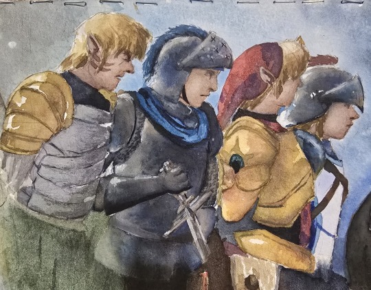
That's everything! ❤️
#linkeduniverse#lu legend#lu warriors#lu chain#lu sky#lu time#lu wind#lu art#lu four#lu hyrule#lu twilight#lu wild#lu epona#watercolor#i felt as though i needed a large painting where i would just commit and have to live with whatever i painted#and i had so many references for the lu boys that i decided to make a collage of all of them#so i got the largest watercolour paper i could find (22x30) and just commited#i say this eveytime but i definitely learned a lot with this and i know where i should focus in the future#pencil lines? what pencil lines? i dont see any. Definitely dont see any#(for some reason my pencil lines would not lift so they are now forever in the painting)#(which is not a bad thing#i just wanted to not be dependent on the pencil lines and be able to bring form with only the paint
465 notes
·
View notes
Note
Do you have any reference sheets for the characters in your au?
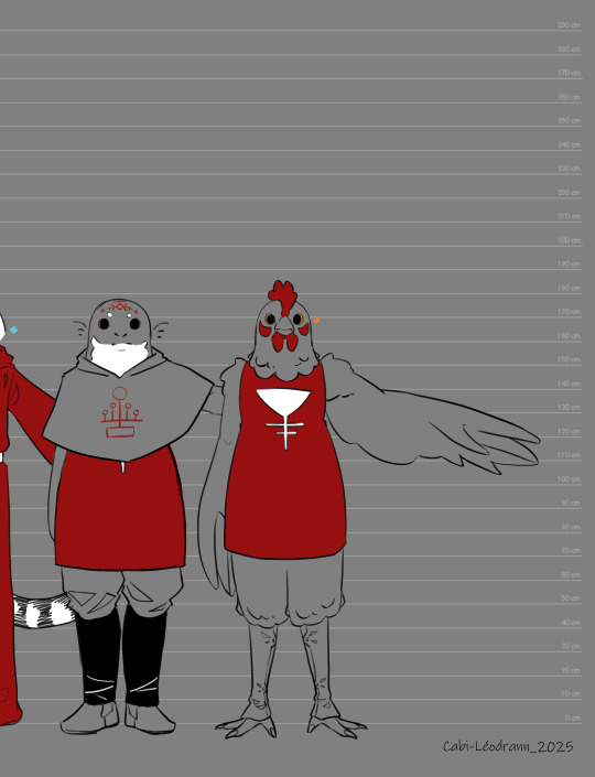
I do have a reference sheet for you! Not everyone is here, since I haven't drawn everyone yet, and some are massive spoilers, but you got a lot of the cast! I used it as a height chart, but we kinda have to modify it. Some of the size difference are really exaggerated- But it does the work!

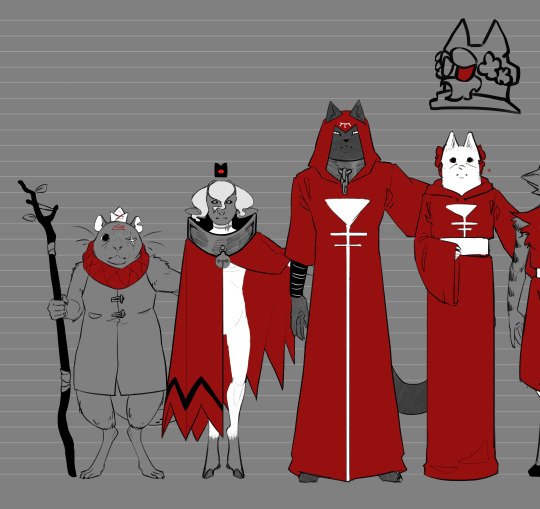
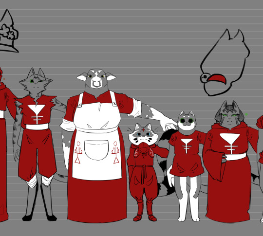
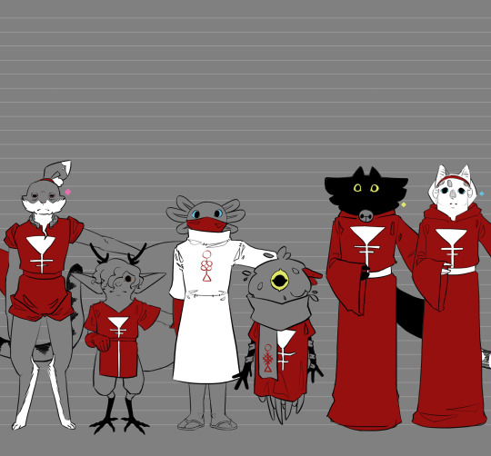
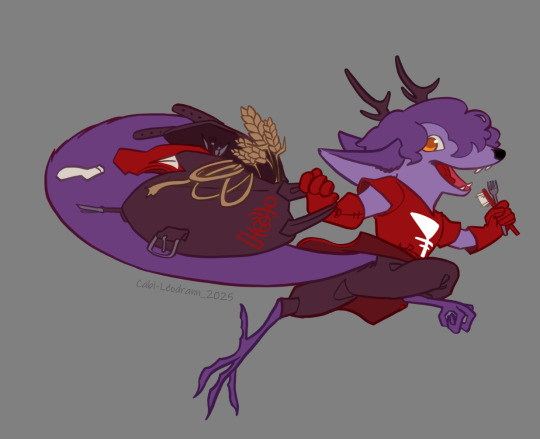
Here are also other references I have around for the characters!
I got this particular chibi of Nysus that is a pretty good reference!
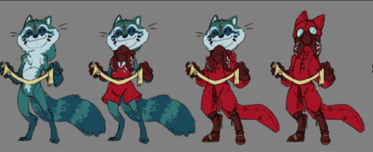
I have this post with part of the cast, and headshots of them And those reference of Meralon and Gérard by @greenycartoon! I use my style when drawing them for THaB, but the original are perfect as ref! But they might change a bit in the future? As Greeny would like to make some tweaks to Meralon =3
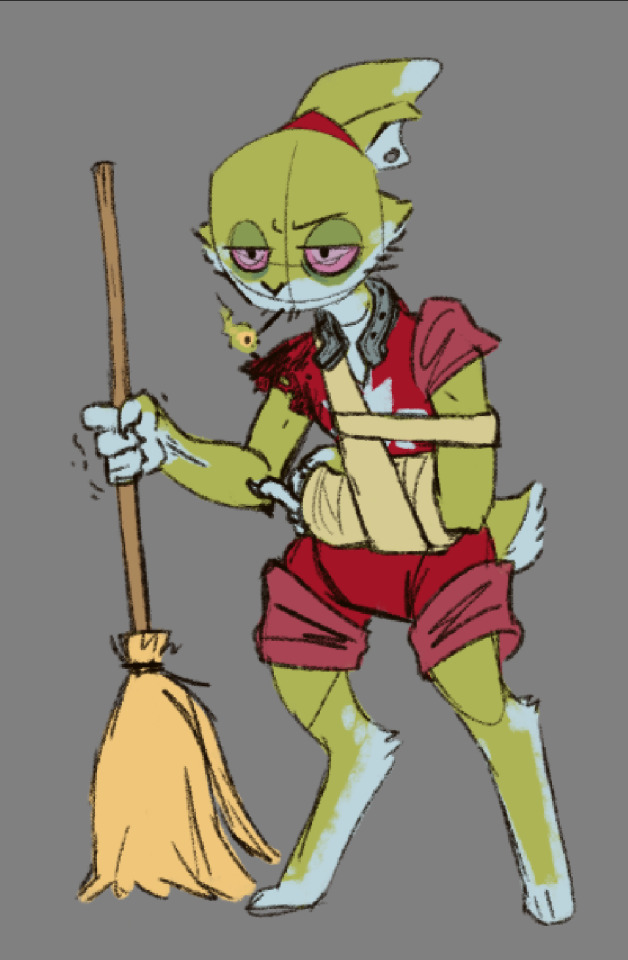
I might add more refs in the future, as the characters appear! But If you need more, the best refs are in the comic, and particularly the last updates since my art skills leveled up a bit =3
83 notes
·
View notes
Text
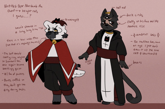
Be it as it may that I've spent the last few weeks very very very much itching to make comics but. Alas. I am. Under the weather, to put it lightly and I have been for a while so. I attempted to scratch the comics itch by making actual references for the (yet unnamed) silly au versions of Narinder and Lambert so that when I do return to making comics I have good references for them (I should probably make some for like the Bishops and like some other canon characters and maybe some followers but I'll do it later it's fine)
Gonna add a read more with their individual refs with some of the layers of these outfits and some bonus notes. I would've done more stuff for these but it's fine it's a future me task-
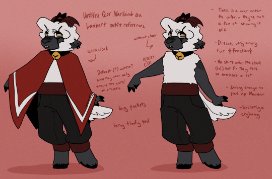
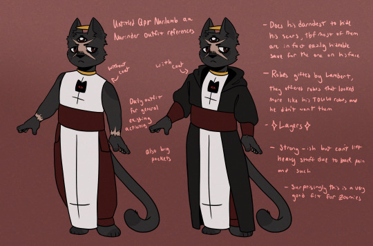
Pls enjoy these, have a good one y'all :D
#cotl#cotl lamb#cotl narinder#cult of the lamb#cotl fanart#cult of the lamb fanart#cotl au#more of the cotl qpr narilamb au that i havent named yet. im gonna name it at some point i promise-#i'm not necessarily the happiest ever with these but i also havent made character refs for myself in a very long time so. good enough#the yet untitled qpr narilamb au
274 notes
·
View notes
Text
Judge Sans Ref Sheet

So I've talked about this guy before. Drew a bunch of pictures of him...but I decided to make a ref sheet for him because he's prob one of my favorite Undertale OCs and I felt he deserved one :3 Been working on this bad boy for a few months.
It's a gift for my friend and the creator of Judge Sans, @valcreator 💛
If you'd like to learn more about how cool Judge is, you can read his wiki here!
More Judge drawings I've done can be found here, here and here! and likely more in the future heheheh...
ALSO I WANNA ADD! If anyone has any questions for Judge, Val (the creator of Judge) has an ask blog on tumblr that you can send questions to!
💛 @ask-judge-sans 💛
______________
Linktree • Patreon • DeviantArt • Discord • Webtoon • Tapas
#undertale au#undertale#art#sans#judge sans#the judge#judge#utmv#ref sheet#sans oc#original character#undertale oc#character sheet#skeleton oc
60 notes
·
View notes
Text
this whole situation keeps getting worse and worse. speedrunning how to lose the goodwill of a good chunk of your fanbase while also making the most racist decisions possible. going to put some links and information about the situation and how to contact happyele below and ill probably be posting them on my refs for the forseeable future
why ibuki joining akatsuki is offensive
HappyEle support email: [email protected] (be polite, do NOT be aggressive. you can write to them in english and they will respond. explain to them your concerns about adding a new member and also how it relates to ibukis identity)
do NOT spend money on the game - no in game purchases, no buying merch except for secondhand
i would also suggest you open the game as little as possible. dont do events. dont gacha. dont interact with official posts. unfollow any ensemble stars official accounts, dislike their youtube videos, leave low reviews on the app store/google play store/etc
spread the word, use the twitter hashtags, let people know what is happening
theres probably more i could add but i cant think of anything else off the top of my head
most importantly - educate yourself
119 notes
·
View notes
Text
A big batch of skywing designs related to the Royal family, featuring Sky along with it.


From left to right, row to row. As I list them, I rambled about them and their designs and my choices. Feel free to give any comments on them!!
Scarlet
Boy, oh boy, do I love her, Scar shit my beloved. I wanted to make her purple because purple is often associated with the rich and royalty. Funfact! Back in ye olden days, purple was a very expensive and rare color to get with pretty much anything, so the rich and royals often wore it, giving it its regal representation in the present day. Also, I gave Scarlet's horns stripes because I was going for a jester vibe. Might seem odd, but she's such an intelligent villain, yet her rage, selfishness, and greed blinded her, in the end making her the fool.
Canyon
I really enjoyed reading Tailwind's writing about their egotistical brother. Canyon, to me, is a diva, and I'd love to talk more about him. Those glasses? Doesn't need them. He believes they're fashionable, along with his robes and cloths. The only thing I put into his design that has meaning is his mistletoe, since it represents love and romance, and Canyon is a slut like that /heavy j. He's a hopeless romantic to me and loves his big wife. Although it's implied he married Scarlet to just to brag about it, or that's atleats what I interpreted last I read it, I like to think he actually did love Scarlet and would surprise her with new prisoners for the champions to battle before Peril. It's a shame he died before Peril was born. Imagine the Peril having TWO manipulative and evil caretakers. Orange represents arrogance and impatience, so boom, orange Canyon. Also the the stereotypical Canyon is orange, so it fits in that way as well. Note that I just remembered hours after typing this. This is future felix here to say: I based Canyons design slightly off the canyon wren.
Tourmaline
TOURMALINE!!!! MY GIRL!!! MY BADDIE!! I love Tourmaline and her confidence so much. It shows how strong she was when she realized she was not the dragon who she'd been for 7 years because of an enchantment, as soon as she figured it out she came to terms and did not have an existential crisis, or atleats not around Peril. ( Or Tui didn't really think about how much that would fuck up a person lol ). Nothing in her design has symbolism that I purposefully put in. She's orange like her father and has curved horns like her mother. She also has Canyon's face shape with somewhat of Scarlets nose Bridge and nose. Scars from training combat.
Vermillion
omg this gay ass mother fucker. I fucking hate him /heavy j. Anyways, Vermillion is interesting to me, I guess. I haven't really looked deep into his character other than what's on the surface, a victim of being a child of Scarlet and under her rule. To me, he is very fashionable, including his gold band of amazonite. Not only does baby blue look good on him, but it symbolizes empowerment, which he has. And I ship Cherrylime ( Chameleon x Vermillionv) as well as Vermillion x Chameleon x Mastermind.
Ruby
Heh, get a load of this guy /ref. Anyways, for a hc, enchanted dragons' irises turn a certain color, skywings being pink, which is why Ruby and Pyrites eyes are pink. I gave her harlequin diamond patterns since they symbolize the gap between two metaphoric worlds and the forced silence by others. The first part is that she is two dragons in one and that she is quiet. Although she has the ability to speak up, the power hanging over her head like a guillotine stops her.
Cliff
he's literally just a guy. Though I did add one thing "evil" to him; I gave him Scarlet's eyes. Even though that horror is long gone, anytime Ruby looks her son in the eyes, Scarlet will be staring back at her. But in canon, I don't think she will ever see it that way unless Cliff's personality begins to develop in a negative way, then shed begin to worry and see the illusion resulting from her anxiety. I gave him bits of orange from the reccesive genes she carried from Canyon and from Cliff's father, who I hc to be orange. Also, to symbolize his optimism.
Peril
In the books, she's described as bronze, which i feel is such a loss when her book cover and gn design is a hot cheeto. ( No hate to her Canon design. It looks really cool imo, i just miss bronze Peril. ) The point of her being bronze was supposed to be the fact that she's so different from her tribe other than the obvious. Brown Peril ftw!! She does have stripes of reds, oranges, and greens on her legs and tail, but that's not visible in her headshot, unfortunately. Wanted to throw in Chameleon's genes in there for funzies. Ik in canon Soar is physically a completely different dragon with different genetic makeup, but I think it's more fun to do this, and it's not like I'm hurting anyone lol ( I say this because when I first posted my Peril design I got a on hate for "shitting one canon." Which like ???? Go touch grass instead of telling me I can't be creative. ) ( Here's my 1st post of my Peril design, and then my 2nd slightly tweaked one. )
Sky
I hate how the Fandom treats sky honestly. It's a shame they just dumb him down to "cinnamon roll baby." That's a full adult dragon. Stop acting like he's a child just because he grew up outside of Dragon culture and civilization. Made him pink n brown and gave him a little swirly scale on his cheekbone. Or well above his cheekbone, actually.
Pyrite
I put a bunch of details that yells, "Hey, this is secretly an icewing." Like her spikey scale patterns, antler like horns, and deep colored eyes. Enchanted icewings have red eyes, so I just made them a deep maroon Ish pink, thats why it's not a shade of pink like Ruby's. I have a post planned in my brain, not even in my drafts yet, so it might be a bit, but it's about Hailstorm n Pyrite's relationship and how I think Hailstorm would have handled himself afterwards.
And that's all for these guys!! There's a chance I'll draw other skywing characters or other characters that surround this bunch, like Hailstorm, Chameleon, Kestrel, Tailwind, and maybe how I imagine Cliff's father But thank you for reading if you read all of this! This took up a lot of time, but I enjoyed all of it :33
#felix scribbles#felix rambles resulting in a long post#wof#wings of fire#scarlet wof#canyon wof#tourmaline wof#vermillion wof#ruby wof#cliff wof#peril wof#sky wof#pyrite wof#skywing#dont mind that i put my water mark on each head shot#i made a post styled like this once and the water mark was placed in fhe corners of the screen and ppl on pinterest kspt claiming my art#it was so frustrating. luckily i got them to take it down after explaining the rules for the use of my art#almosy forgot! sidyashchiy-na-plakhe was the main inspo for Scarlet and Canyon's designs
129 notes
·
View notes
Text
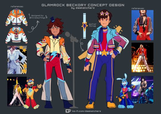
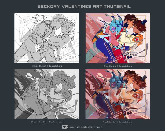
thought i'd share my thought process for this fun lil piece / outfit in full display that i whipped out for beckory on valentines cuz i really had a lotta fun making it <3
OKAY first off, big thanks to @leaky-heart for helpin me gather some really cool outfit refs and for lending me resources where I can find a ref for bonnie's guitar in a 3d space. Thank you bestie, yar a life saver <3
Second, @/littleleaflings' jacket—goated af, will never stop gushin bout it aaaaAAA <3
Okay so looking at freddy & bonnie's designs—i am in love with how their dominant and accent colors are opposite of each other like a yin and yang situation. So i absolutely tried to incorporate that when rearranging the palette unto beckory's outfit
Fronnie's colors arent the only contrasting elements about them. Aside from their earrings, even their symbols are a pair—i love how freddy's is a lighting bolt but he is also associated with stars on the side cuz of his branding. While bonnie's is a star but he also has lightning bolts on the side (the purple accent in his fit) to match freddy
And to sprinkle a bit of beckory flair, i put stripe lines across their pants (if you look back on my ref sheet for the squad, the three amigos all have stripes somewhere in their fits, i purposely designed that to be their thing) just to also unify the patterns from their top
i gave tony a scarf to match greg's bow tie accessory. Its a combo homage to bonnie's headband and bunny ears in a way (cuz the ribbons on its ends look like droopy rabbit ears) i gave them gloves to compensate being unable to add punk bracelets on em cuz it would be too much for the overall look (same logic applies to the star shades, its to match with the top hat)
Also this was such a pure coincidence but i also realized beckory wears their fazwatches in the same placement as fronnie wears their earrings on. That actually makes me very happy, i think its a really cool coincidence
And as yall can see, Greg's jacket initially had stars on his sleeves (like it does in the ref), but i decided against putting it in the final cuz im startin to think it might look cluttered and hard to read from afar and tbh, I really liked how the translucent sleeves turned out... I didnt want the star pattern to cover it up lol
And thats pretty much it, thank you coming to my ted talk!! <3
if youre interested to see more of my art process compilation like this you can check over on my ko-fi page, you can support me by buying me a latte cuz I am planning to post more exclusive stuff like this over there in the future so I hope yall look forward to that! I deeply appreciate yall and thank you so much in advance!!
#daske art#fnaf#beckory#gregtony#GTY46#fnaf gregory#tony becker#five nights at freddy's#fnaf sb#fnaf security breach#fnaf GGY#five nights at freddy's security breach#detective rabbit#fnaf tales from the pizzaplex#five nights at freddy's tales from the pizzaplex
600 notes
·
View notes
Text
Been a bit... but updated Thousand Eyes and Golden Eyes refs!
If you don't know what I mean by those names points at the creature that's usually lurking in the distance in treasure reef (even though they took a vacation to sanctuary recently.)
Going to include some transcripts of some of the more noteworthy notes... just in case if it's hard to read.
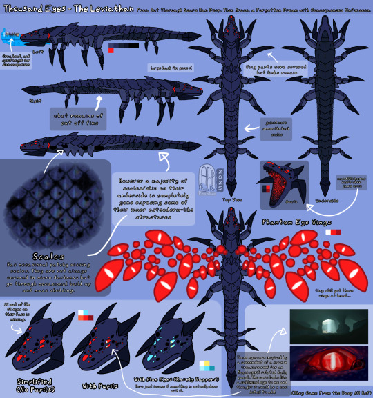
Thousand Eyes - The Leviathan
Free, but thorough scars run deep. Then arose, a forgotten dream with consequences unforseen.
Crew, boat, and spirit height for size comparison
Large back fin gone :(
What remains of cut off fins
Scales - Has occasional patchy missing scales. They are not always covered in micro darkness but go through occasional build up and mass shedding
22 out of the 51 eyes on their face is missing
With pupils - These eyes are inspired by a screenshot of a cave in treasure reef for an Abyss spirit related daily quest. The cave looks like a subliminal eye to me and thought it would be a cool detail to add.
Wing parts were severed but limbs remain
Gained more armor-like back scales
Mandible horns move when jaws open
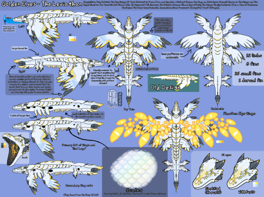
Golden Eyes - The Leviathan
Inquisitive, they watched the tiny beings it took interest in from a far, and sparked a distant dream. One day, an interloper wrought havoc on the beings and The Regal Observer for once did not stand idle. The opponent fell, however, The Beholder became ill and regrettably the beings finally perceived it in a time of weakness. Contained the once uncontainable. Inconsiderations prominent. Unrequited trust betrayed.
Crew, boat, and spirit height for size comparison
Large dorsal fin
Mineral deposits gather and naturally form around specific parts of the body. Used for protection or display. Closest to eels but is made of a similar rock material that the masks that form on elder manta and whales are made out of. Also similar to crabs "shells" and even sky folk masks to some extent.
4 sets of larger fins - small collection of fins similar to the sanctuary elder manta
Scales - has very faint gold splotches that can't be seen from a distance
Blue coloration inspired by night birds and certain accessories (points at flight)
Less patterns on underside
Subliminal eye patterns - [additional art note] friendly reminder to myself that simplification is my friend and to do it when I feel like I need to (especially with pattern details.)
51 eyes (on face)
12 limbs, 8 fins, 36 small fins, 1 dorsal fin.
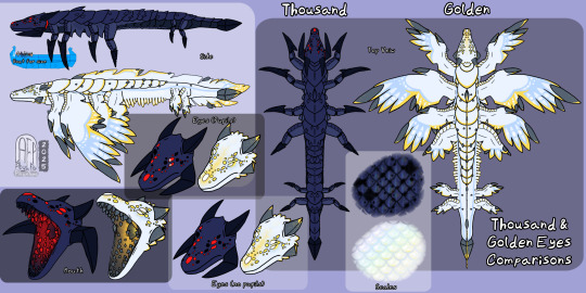
Thousand & Golden Eyes Comparisons sheet
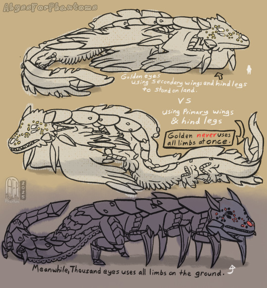
Sketch sheet showing how both would stand on land
Golden eyes using secondary wings and hind legs to stand on land vs using primary wings & hind legs
Golden never uses all limbs at once
Meanwhile, Thousand eyes uses all limbs on the ground.
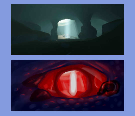
The screenshot I redrew as an eye mentioned in the Thousand Eyes ref
Just for a better veiw.
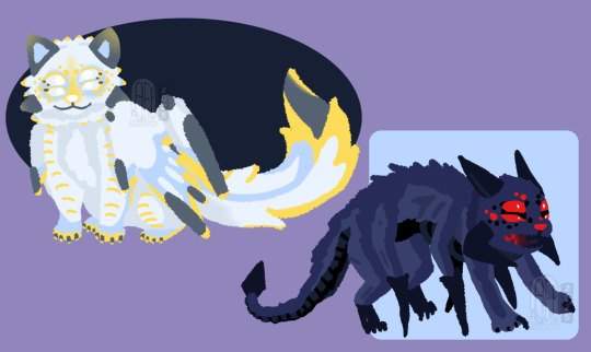
BONUS THEM AS CATSSSSS!!! HEHEHE!!!
I also have a bunch of meme-y stuff I might share in the future but for now that's it from me. :]
#sky children of the light#sky cotl#season of abyss#sky cotl fanart#sky children of the light fanart#they came from the deep au#that sky game#sky cotl au#sky creature#skyblr#dragon#i adore this creature sm#i think design wise from old ref this is definitely an improvement#took some inspiration from more creatures irl as well stuff from some official sky concept arts i thought were really cool#Au backstory for them is definitely going to be upsetting though
64 notes
·
View notes