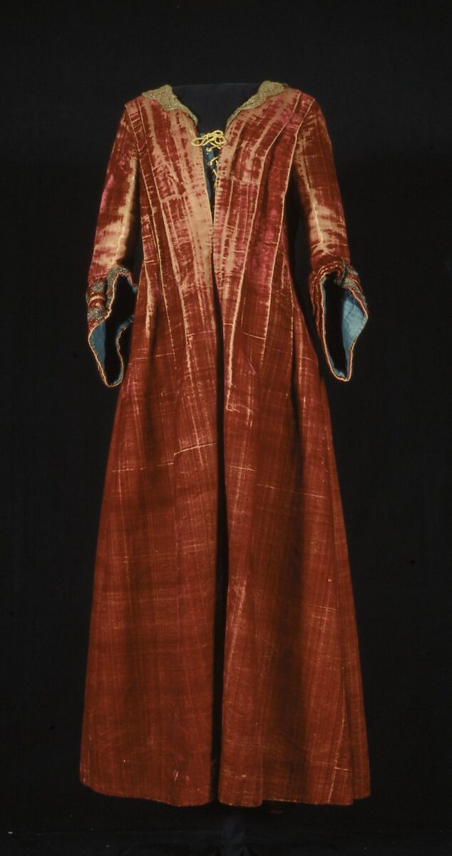
#wig style
Text


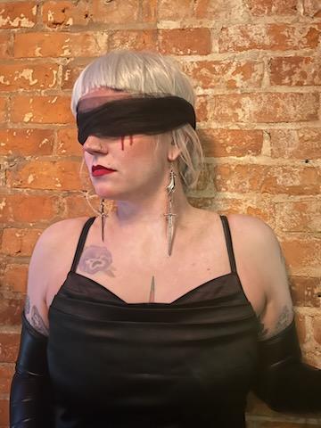
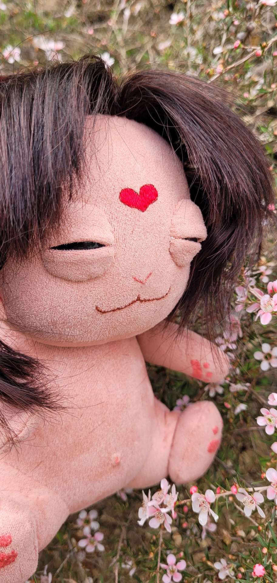
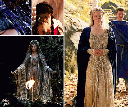
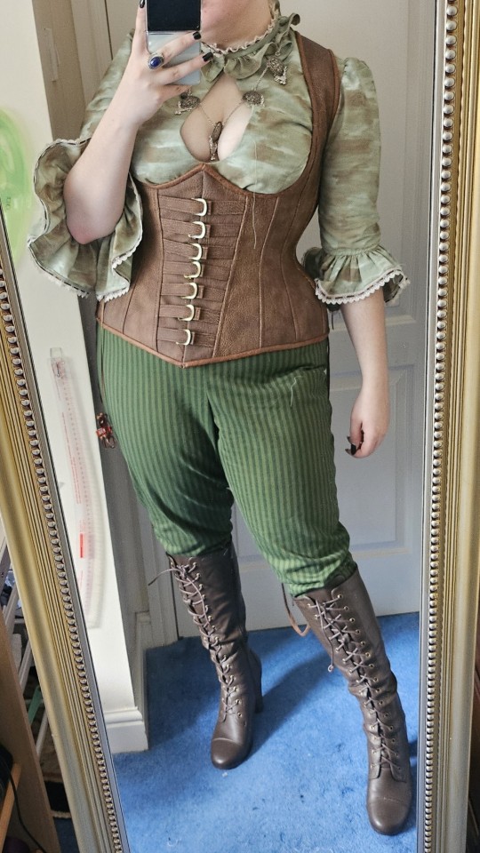
I put together a costume of lady justice. The theme for this event was "divinity". I thought of the American worship of police, vigilantism, the wrongfully imprisoned. This character has no eyes of her own, so I believe this is part of her motivation. An eye for an eye truly does make the whole world blind.
In order:
1. Prop detail: 3 live 9mm rounds on one side of a Libra scale with a sculpture on the other side representing a pile of gore. The scales are at the same level, showing equal importance between the bullets and body parts.
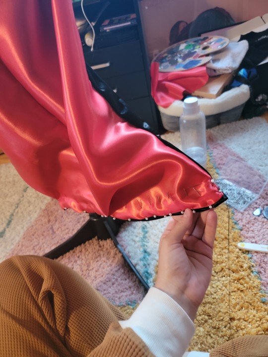
2. Progress photo of the hand-sewn (!!!) hem. I bought the dress online, but I would like to note I patterned, cut, machine-sewed the lining myself. Only did the hem by hand but it felt like it was a mile long.
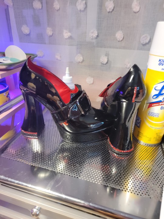
3. Shoe detail. Hand-stoned. This is actually an unfinished version. I never got a photo of the complete ones. More blood drippings along the sides. I kept it somewhat subtle.
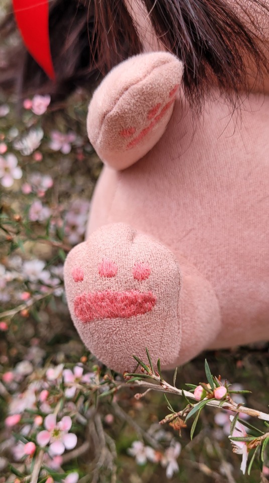
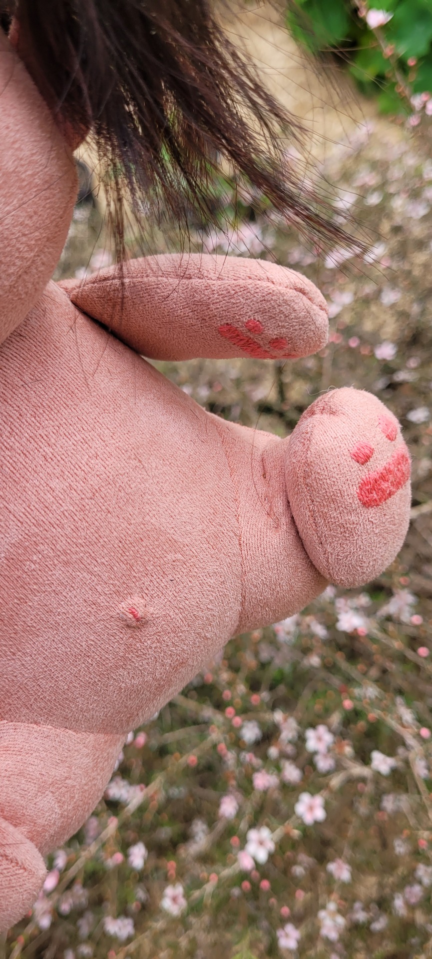
4. Wig styling. Also me.
5. Makeup detail. The bloody tears were a last minute decision. Literally sprayed myself in the eyes with fake blood. When it started to burn I remembered I didn't check if that was a safe thing to do. Not blind so that's a W
6. Smiling proudly with my fangs and handmade tulle blindfold.
7 and 8 are shots of the completed look!
I learned a lot through making this piece. It also is my first costume that serves as commentary. I am so proud of the outcome, and if you read this far in the post I can't thank you enough for sharing it with me
#personal#art#costume#costuming#sewing#sculpture#wig#wig style#vampire#justice#lady justice#my face#me#self#photo
2 notes
·
View notes
Text


here's to self indulgence and cosplaying your own bg3 character
#bg3#baldur's gate 3#tav#cosplay#i promise this is the worst this wig is going to look. i haven't styled it properly or blended in the wefts yet#i threw this together in an hour bc i was too excited#i need to master the dorian look of constant terror#also i wish there was better lighting outside my bathroom
1K notes
·
View notes
Text
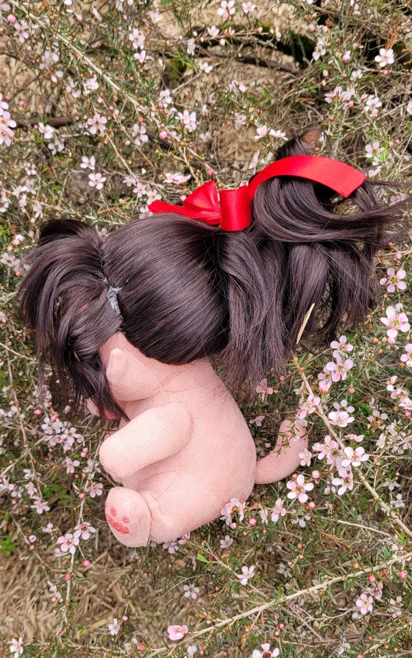
@themolluscasometimes said she wanted a Skinhe plush and now this skin creature lives in her home because I asked 'how much do you want one?' and everything spiraled from there. The most interesting part of all this has been explaining who and what he is to people not in the know - stay insane svsss fandom
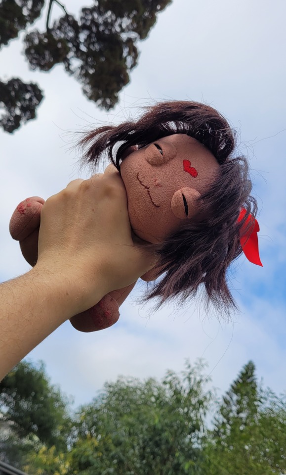
#I have no idea what to tag this. my art? my sewing?? who cares I don't post enough that this won't be easy to find again#svsss#scum villains self saving system#luo binghe#skinhe#my specialist little flesh homunculus#this design is based on the skinhe art by piosplayhouse!#fun fact his eyes are googly eyes with nail polish over them so they make a rattling sound when you shake him#and his hair is basically a custom wig sewn onto his head - I pulled apart a ponytail extension wig and then sewed them onto a tiny wig cap#tailored to fit his massive head. I also hand tied parts of the fringe to make sure it looked right. I could have styled it better#but my straightener is old and not suited for doing anything at this scale#anyway he's already become a custom emote in a discord server and is very loved. as he should be.
714 notes
·
View notes
Text
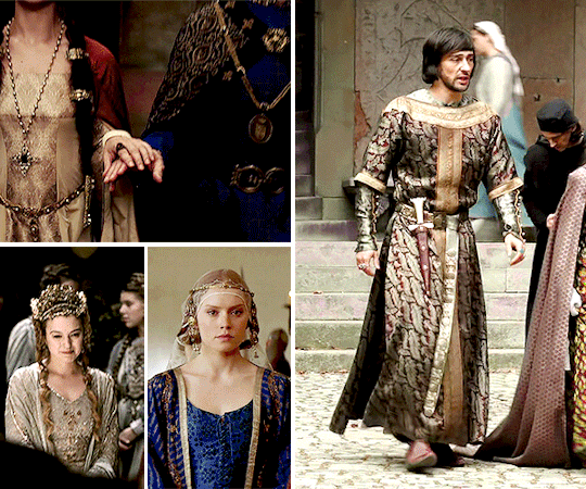
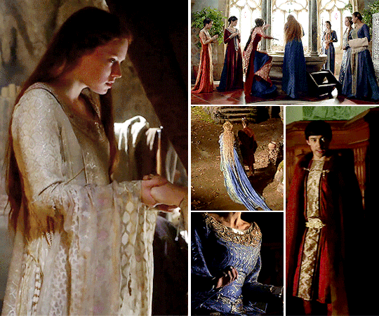
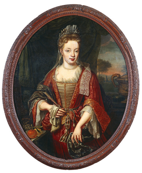
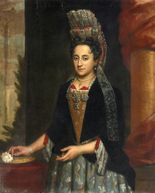
Fashion of the Great Houses of Westeros: House Tully of Riverrun
#asoiafedit#asongoficeandfireedit#valyrianscrolls#valyriansource#tullyedit#housetullyedit#asoiaf#a song of ice and fire#house tully#ghf*#mine*#this is actually the first house i visualised in a fashion sense way back when#i watched claire mccarthy's ophelia in 2020 and saw all the gorgeous flowy gowns and daisy ridley's red wig and just went 'tully!!!'#I know the Riverlands are very rich and populous due to their centralisation but in my mind#they’re also a little behind culturally due to the constant battles and invasions#so the style of their fashion is a little less structured and complex than what you’d find in the westerlands or the vale or the stormlands#and also the cut of the outfits is reminiscent of what you’d find in both the iron islands and the north which echoes the impact#both kingdoms have had on the region#that doesn’t mean they skimp on fabric or aesthetic though!!#there's lots of flowy silks and shiny fabrics that evok running water#women wear their hair either loose or in intricate braids held with metal rings (a holdover from the three centuries of durrandon reign)#also THEE beetle wing lady macbeth dress is here in spirit!!!
566 notes
·
View notes
Text
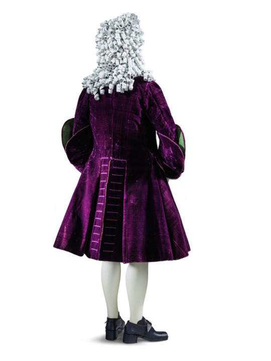
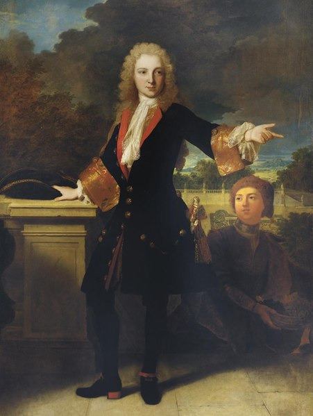
Early 18th (and late 17th) century fashions are so under-utilized in vampire media and I think it's a damn shame.
I don't actually think I've ever seen a single image of a vampire character in an early 18th century suit. Hardly any movies set in that era either, and hardly any historical costumers who do it.
(Even my beloved gay pirate show set in 1717 takes nearly all of its 18th century looks from the second half of the century. Not enough appreciation for baroque fashion!!)
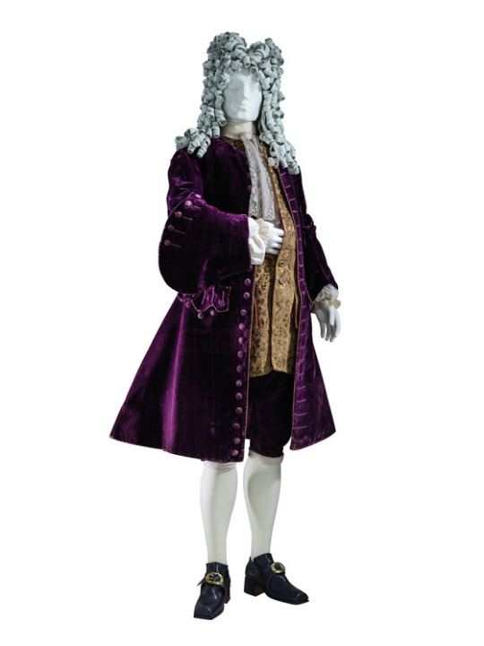
Yes I love late 18th century fashion as much as anyone, and 19th century formal suits are all very well and good, but if you want something that says old, dead, wealthy, and slightly dishevelled, then the 1690's-1730's are where it's at.
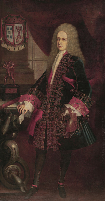
(Retrato del Virrey Alencastre Noroña y Silva, Duque de Linares, ca. 1711-1723.)
There was so much dark velvet, and so many little metallic buttons & buttonholes. Blood red linings were VERY fashionable in this era, no matter what the colour of the rest of the suit was.
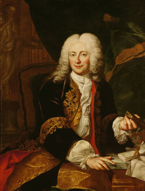
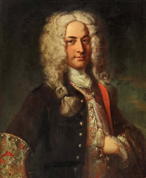
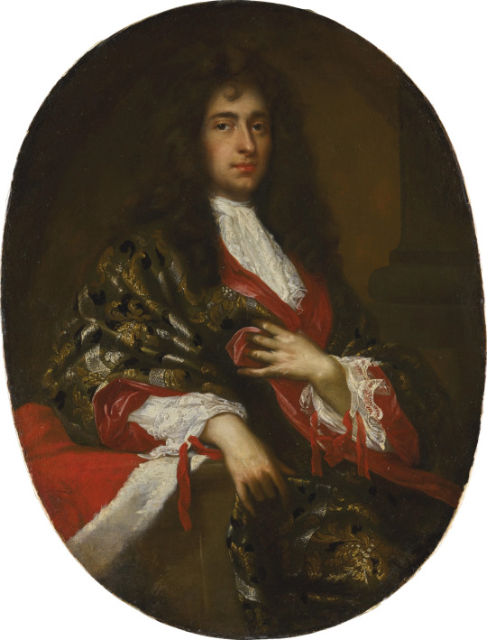
(Johann Christoph Freiherr von Bartenstein by Martin van Meytens the Younger, 1730's.)
The slits on the front of the shirts are super low, they button only at the collar, and it's fashionable to leave most of the waistcoat unbuttoned so the shirt sticks out, as seen in the above portraits.
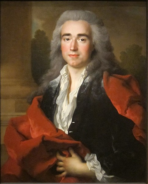
(Portrait of Anne Louis Goislard de Montsabert, Comte de Richbourg-le-Toureil, 1734.)
Waistcoats are very long, coats are very full, and the cuffs are huge. But the sleeves are on the shorter side to show off more of that shirt, and the ruffles if it has them! Creepy undead hands with long nails would sit so nicely under those ruffles.
(1720's-30's, LACMA)
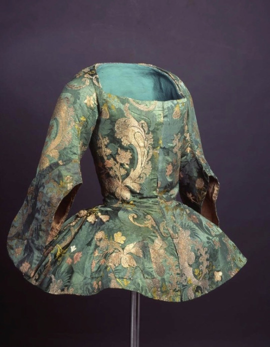
Embroidery designs are huge and chunky and often full of metallic threads, and the brocade designs even bigger.
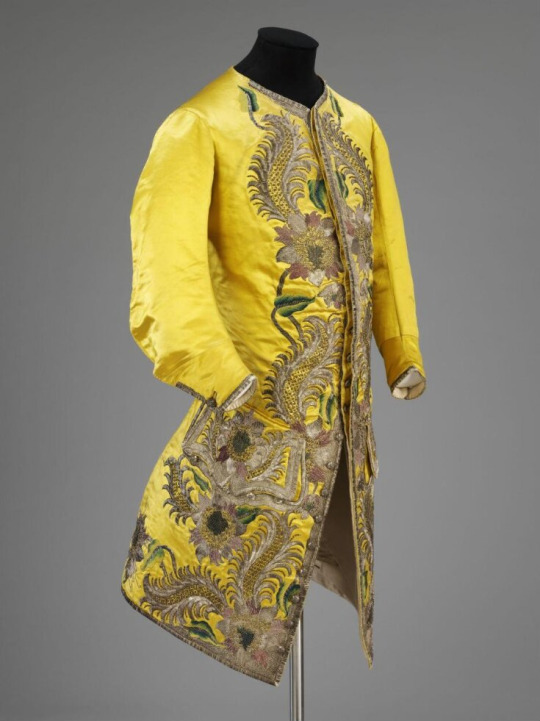
(1730's, V&A, metal and silk embroidery on silk satin.)
Sometimes they did this fun thing where the coat would have contrasting cuffs made from the same fabric as the waistcoat.
(Niklaus Sigmund Steiger by Johann Rudolf Huber, 1724.)
Tell me this look isn't positively made for vampires!
(Portrait of Jean-Baptiste de Roll-Montpellier, 1713.)
(Yeah I am cherry-picking mostly red and black examples for this post, and there are plenty of non-vampire-y looking images from this time, but you get the idea!)
And the wrappers (at-home robes) were also cut very large, and, if you could afford it, made with incredible brocades.
(Portrait of a nobleman by Giovanni Maria delle Piane, no date given but I'd guess maybe 1680's or 90's.)
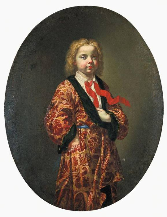
(Circle of Giovanni Maria delle Piane, no date given but I'd guess very late 17th or very early 18th century.)
Now that looks like a child who's been stuck at the same age for a hundred years if I ever saw one!
I don't know as much about the women's fashion from this era, but they had many equally large and elabourate things.
(1730's, Museo del Traje.)
(Don't believe The Met's shitty dating, this is a robe volante from probably the 1720's.)
(Mantua, c. 1708, The Met. No idea why they had to be that specific when they get other things wrong by entire decades but ok.)
(Portrait of Duchess Colavit Piccolomini, 1690's.)
(Maria van Buttinga-van Berghuys by Hermannus Collenius, 1717.)
Sometimes they also had these cute little devil horn hair curls that came down on either side of the forehead.
(Viago in drag Portrait of a lady, Italian School, c. 1690.)
Enough suave Victorian vampires, I want to see Baroque ones! With huge wigs and brocade coat cuffs so big they go past the elbow!
#long post#vampires#fashion#history#18th century#17th century#someday. SOMEDAY I will make a black/red/dark orange/metallic gold 1720's suit#I've got nearly all the materials I just need to:#1. Learn how to make early 18th century metallic thread buttons‚ preferably without having to buy the super expensive kind of thread#2. get a wig and style it appropriately
2K notes
·
View notes
Text
The most homoerotically charged scene in the Death Note franchise is not the feet washing scene you guys, you freaks and fools, it’s this moment from the musical


#welcome to my obsession with the death note musical#love every bit of it. the music#the casting (both japanese and the english demo my GOD are jeremy jordan and jarrod spector’s duets fire)#the way they styled the actors so they look like the characters but not like theyre in cosplay#like if they had given L a spiky wig it does not hit the same#REM AND RYUK’S HUMAN DESIGNS??? PARTICULARLY REM’S?????????#Misa going from a model to a pop star???#and dont even get my STARTED on the adapted ending because ho l y shit#death note#my post#death note the musical#light yagami#l lawliet
254 notes
·
View notes
Text


IG: Leilani_Capalot
#black moodboard#black tumblr#melanin#black is beautiful#moodboard#aesthetic#beauty#beatiful black women#black barbie#90s asthetic#90s fashion#capalot#90s baby#baby phat#petite woman#dark skin women#urbanwear#urban#street style#fashion#ghetto barbie#pretty black girls#pretty woman#barbie#black girl luxury#leilanicapalot#polog#pologsister#it girl#lace front wig
189 notes
·
View notes
Text

Four NO
From this post by @crazylittlejester
#I saw this and it was so vivid in my head#It had to be drawn#Lu four#linked universe#lu#linkeduniverse#lu wind#lu incorrect quotes#Sort of#it has that vibe lol#My art#okee dokee and I am off#Byyeeeeeee#Watch me trying out a new bit of style every other day#When we say “your character” who are we thinking of I wonder#Tbh when I drew it I’d misread and thought it meant FOUR would eat the wig#But maybe he’s talking about shadow and the chain are trying to figure out what type of person shadow is or smth XD
247 notes
·
View notes
Text

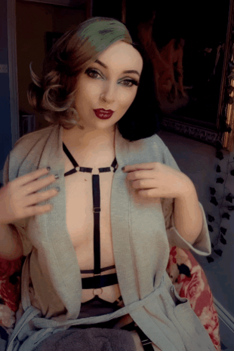

Split me in half??? Yeah, let's go with that.
Treat me ~ Tip Me ~ More of me
#THIS WIG WAS £6 IN THE LUSH WIGS CLEARANCE SALE I AM SCREAMING ABT IT!! ITS ADORABLE!!#You can't see it in these v well but it's a green/black split wig. Trying to style it vintage-esque#satans knitwear#I feel like I haven't put makeup on properly in a little while. For me. This feels better already! Such fun#alt pinup#pinup girl#pretty lingerie#bi girl#cheeky#uk girl#wlw#my gif to you#Strappy lingerie#Lingerie reveal
405 notes
·
View notes
Text
i hope we can all at least agree that the MVP of the season was blackbeard's wig. girl was putting the work in like rent was due and she deserves all the awards
#she was about 15 different styles; drowned; thrown in the ocean#what i really mean is the hair and make up team is off the charts talented and made a very good investment in budget spend on wigs#our flag means death#ofmd s2 spoilers#ofmd spoilers
809 notes
·
View notes
Text
shes finally coming together!! still got a bunch of hand work to do on the blouse and corset, and of course, style the wig, but annes gonna be ready for mcm next weekend!
#nyxtalks#nyx sews#ofmd#anne bonny cosplay#mcm london#ha honestly feeling. so unconfident about this right now#the pants r def. mid. i keep telling myself theyre the best i could do and other such things but i feel like. they let the side down n just#make the whole thing look eh#you cant see a lot of the issues bc of how im stood but. theyre there#gonna go back to making skirts foreverrrrrrr#(also the boots being darker DOES annoy me. ill weather them up at some point before i wear her again i think)#anyway sorry for the complaining i know nobody else sees the issues i doooooo#onto wig styling i guess
193 notes
·
View notes
Text


ੈ✩‧₊˚༺☆ D r e a m l a n d ☆༻ੈ✩‧₊˚ (heahair)
(Credit this post if you use!) (ko-fi)
#pastel rainbow#pastel rainbows#cutecore#rainbowcore#pastel colors#rainbow pastel#rainbow hair#hands#pastel#pastel stim#fairycore#hair#long hair#hair styles#hair stim#wig#rainbow wings#rainbow colours#rainbow stim#rainbow aesthetic#cute style#kawaii#kawaii style#kawaii aesthetic#pastel aesthetic#pastel style#pastel fashion
329 notes
·
View notes
Text


One of my absolute favourite techniques for getting synthetic wigs with depth and realism is to go at them with alcohol markers (copics if you can afford them, but store brand also work!)
Light-coloured wigs give the most possibilities for dramatic alterations, but you can add depth to medium-darker shades as well! By adding roots and lowlights, you can get really beautiful blended shades, or you can even change the colour completely. You can also tint wigs warmer or cooler depending on your goals - a blonde wig for example could read more platinum if you blend in a cool grey, blue, or purple tone.
For most of the work featured here, I literally just drew on the wig strands with markers, and heat-set with a hairdryer after! You could also do alcohol inks mixed with isopropyl alcohol in a spray bottle if you need more coverage.
Basically, I always encourage folks to look at wigs (and any materials tbh) with an eye for not an exact match, but what they COULD become with a little work behind the scenes! Happy wigging!
(Oh and to add!! The one thing you have to be careful of is hairspray! Wigs that are lightly markered are usually okay, but the more ink you add, the more likely it will be reactivated by the alcohol in hairspray cans, so keep that in mind for your projects!)
95 notes
·
View notes
Text

[Hazbin Hotel Redesigns Pt.6] Velvette
Just doing these for fun!
The method to my madness is a mystery, so instead of having the rest of the main cast why not a villain!
Velvette is certainly my favorite of the three and I especially like how many different looks that she has throughout the show, which makes sense for a fashion designer, so I may doodle her with a variety of different out fit and hair styles. Anyhow like a lot of the others I quite like her original designs so I just sorta drew her in my style lol, I gave her doll joints since I believe she’s based after one, but the outfit I chose for her doesn’t exactly put those details on display too much, I also gave her a nose as I-personally-think too many characters don’t have noses, sorta like bow ties in this show, so I have her one, I also shifted the blue coloring in her palette to more purple just to make the overall palette more cohesive.
I’ve also cooked up another redesign I’ll post in a few days, Mayhaps a certain designers rival 👀
#I also imagine that she just has a closet of different hair styles#they’re not wigs-more like Lego hair#but it’s slightly cursed to think of a bald Velvette XD so I’m keeping this thought in teh tags#art#digital art#fanart#hazbin hotel#character redesign#redesign#hazbin hotel fanart#hazbin hotel redesign#hazbin hotel velvette#hazbin velvette#Velvette#velvette fanart#hazbin hotel vox#valentino hazbin hotel#hazbin hotel valentino
148 notes
·
View notes
Text


non hsr friends all i want u to know about this character is that he's canonically a ptsd having war veteran and also we watched him make someone else shit their pants in broad daylight in front of us
#ts4#ts4 edit#honkai star rail#jiaoqiu#my cosplay for him looks soo good i just have to style the wig and make. the tail. dear lord#seph.txt
82 notes
·
View notes
Text

Have covid :( sketchin' cats I guess.
#cats the musical#cats 1998#the music always cheers me up :)#also can you believe tugger was like a lil baby gay awakening for me and yet I've never really drawn him?#never really drawn any of them actually#which is something i must correct bc they are FUN to draw#the big gorgeous 80s style wigs.... the a makeup...... girl...........#my art
71 notes
·
View notes
Last Seen Blogs

consume-calcium-tendies
Shy Fox's Art Blog
shakkysripoffbar
Shakky's Rip-off Bar

olgasafonova
OLGA SAFONOVA

ayushiguptanex
Ayushi Gupta