#which also aligns with their split perspectives and appearances and hey I love this series
Explore tagged Tumblr posts
Text

HELLO???? [x]
#the jjk posting WILL continue I am not sorry#satosugu#stsg#gojo satoru#geto suguru#jujutsu kaisen#jjk#jjk s2#jujutsu kaisen spoilers#sort of#if anyone needs more context:#their final confrontation in this episode is set on Omoide Yokocho in Tokyo (which basically translates to Memory Lane)#people looked at the exact setting and determined that it specifically takes place in front of a KFC#thus this event becomes known as the KFC breakup#also has great significance as Gojo is aligned with the KFC (more modern)#while Geto was aligned with a more traditional Japanese restaurant (more traditional obv)#which also aligns with their split perspectives and appearances and hey I love this series
199 notes
·
View notes
Text
Joel Aron Fan Club Meeting - Dissecting the Lighting of 'Rescue on Ryloth'
Main Masterlist
Star Wars Masterlist
Get ready for a semi-cohesive rant disguised as a dissection on the lighting of Rescue on Ryloth, mainly just me fangirling over the man, the myth, the legend, Joel Aron.
If you don't know, Aron was the CG VFX and lighting supervisor for The Clone Wars, Rebels, and The Bad Batch, and holds the position of cinematography, lighting, and VFX director of Lucas Films.
He was also one of the frequent cryptic tweeters when TBB episodes were airing.
~ ~
Intro
So I went back to Rescue on Ryloth earlier today to find frames for the background of my laptop. I have to go through the episode second by second to get the right frames and I fell into a rabbit hole of examining individual shots could you tell I have adhd.
~ ~
NUMBER 1
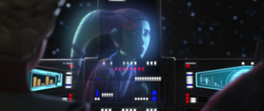
We all know this scene as the one Hera calls for the help of TBB Leia Organa style.
First off, I absolutely love how Hera's projection isn't just all shadows, the light from whatever screen Chopper probably has out is reflecting on her face. The contrast between her left side verses her right is gorgeous and so effective in telling us she's somewhere dark, perhaps in hiding, which contributes to the storytelling as well.
As well, the minimal (but strong) light showing on her right lekku is much warmer than the cool lighting of the screen reflecting on her face, which also tells us she's somewhere dark but with access to natural light. Perhaps a cave?
Something not related to lighting, but this whole scene was beautifully framed. The natural leading lines of the ship console unconsciously guide our eyes to Hera, the subject of the scene. This is one of the main things my art teachers love to yell at my grade for: why don't you have any leading lines to draw attention to the subject?! It's free real estate! The design of the cockpit makes so much sense from a visual and storytelling standpoint which I appreciate a lot.
I go to an art high school, so we have enhanced programs that you have to audition for. I have a visual arts major (like uni majors and minors) that I auditioned for, so I get the highest level of arts education my school has to offer, unlike a visual arts minor or the general arts courses of the Canadian curriculum, so when I'm talking about my art teachers yelling at us about things, they fuckin yell cause they know we know better.
~ ~
NUMBER 2

A theme you'll start to see in this rant is that I'm a huge fuckin fan of harsh contrast. Dark darks, light lights, that kinda thing (Spoons, if you see this, 😎. If you know, you know). I incorporate it into my own art to make it more effective in the vibe I'm trying to convey.
Joel Aron's style is hard, hard contrast and accentuating natural outlines, he even confirmed that in an interview when talking about season 7 of TCW, and he's incredible at executing this! The small sections of light reaching Hera are making her character stand out even more against the background and grounds her even more in the space. Harsh black outlines usually used to make something stand out don't appear naturally, so finding other ways to naturally outline or highlight a character against the environment is a must, and Aron is so fuckin good at this, his style contributing tremendously to it as well.
Plus the light is much warmer than the shadows which I appreciate a lot. Natural sunlight is always going to come off in warm tones on any surface, so thank god this guy knows colours and basic lighting 🤣
~ ~
NUMBER 3
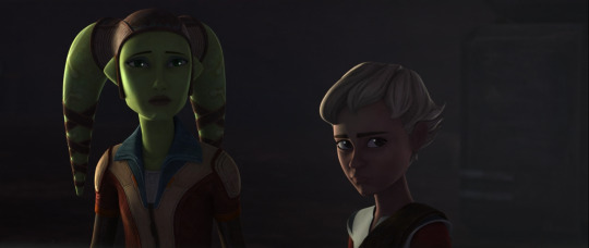
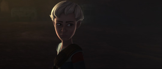
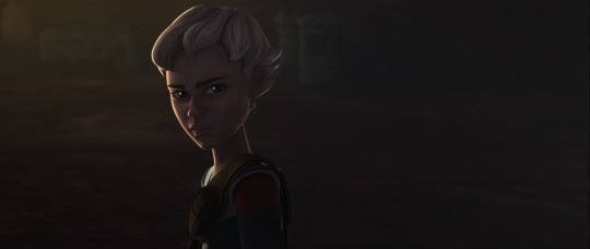
Again, just more amazing contrast and separating a subject from the surrounding environment using light.
As well, the 2 bottom images really resemble Crosshair in the second last episode when he's being all edgy and saying "Don't make the same mistake twice, don't become my enemy" and like- bruh, this man is fuckin typing up non-existent loose ends through the fucking lighting of all things doing better then the writers, but that's none of my business >kermit sipping tea meme<.
He also said somewhere that it was definitely his intention of lighting Crosshair much darker than the rest of the Batch to show his alignment with the Empire or some shit, so I don't know what he's doing here, but as a dark Omega fan, I approve 👀👀
~ ~
NUMBER 4
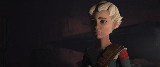
Even more beautiful contrast. Something my photography teacher also drilled into our heads is the triangle rule (at least that's what she called it), which is actually called rembrandt lighting. When you photograph portraits, you usually want a small triangle on the opposite side of the main light source to balance out the shadows or some shit.
But Aron didn't do that here. Remember, his style is much more dramatic and heightened. He used split lighting here, where half the subject's face is completely shadows and the other completely light, a demonstration of the stylistic choices he made for this show.
~ ~
NUMBER 5 (you made it to the end! Gold star to you bestie)


More cool and warm highlights being used, the warm coming from within the ship which is also positioned towards her friends and the planning of rescuing her parents which I find kinda cute and the cool light from space outside the windshield?, both beautifully outlining her face and kind of showing what she's fighting for: her family (warm light) and the freedom of space and the galaxy (cool light), but I'm totally reading into this, so take it with a grain of salt 🤣, he probably didn't mean anything by that.
~ ~
END
So yeah, that's my rant on the lighting of Rescue on Ryloth.
Hey, you know what's a good idea, if you want me to dissect a specific scene or episode of any series/movie in Star Wars based on an art student's perspective and 'expertise', just ask! I love talking about Star Wars and art techniques, plus I'd get to use my schooling for something useful.
There'll definitely be more of these as I go through the episodes to find more backgrounds, but if you ask for a certain episode, I'll definitely get to that ep. first!
#the bad batch#tbb#bad batch#star wars#sw#the clone wars#tcw#star wars rebels#sw rebels#hera syndulla#omega#hunter#echo#crosshair#wrecker#tech#hera#clone wars#joel aron fan club meeting 1
8 notes
·
View notes