#where i just do it in greyscale and then slap a color or multiply layer on top
Explore tagged Tumblr posts
Text

oc time (it is atlas and laika)
#ocs#oc#atlas#laika#cmdonovann#i love them your honor#sorry i cant elaborate on this pic even a little bit#i have many thoughts but none of them are coherent#anyway sorry for the weird crop there was text on this but i got rid of it lol#maybe ill post that version later#anyway really enjoy this style of coloring#where i just do it in greyscale and then slap a color or multiply layer on top#or a gradient map! even faster!#this is actually both (gradient map with color layer on top)#its a surprisingly fast and fun way of coloring#i could probably refine it a little on top of those layers but i dont have the time lol#im working on portfolio stuff so i got a bunch of pieces im trying to finish at once#anyway please hire me i will draw your ocs so so pretty just like this i promise#(my commission info is on my neocities site)#(cmdonovann.neocities.org/art-commissions.html)
8 notes
·
View notes
Text
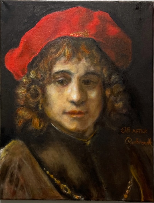
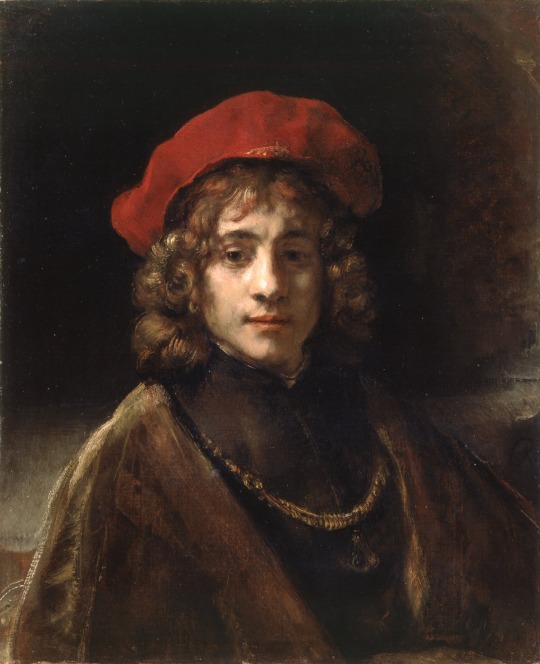
Woot! Finished my first color portrait, a study of Rembrandt's painting of his son (original below the cut).

(I promise, I matched the warmth of the colors better than my camera!)

Not a perfect copy, but the point was to study technique, not clone the lad.
 This is only my fifth attempt at glazing (building up transparent layers of primary colors one atop the other like cel animation, letting them dry in between, rather than mixing the desired hue — the effect is more luminous). I'm pretty happy about it because it's a challenging technique to get right. On top of which  I still struggle with the fine details.
I'm having fun with glazing because it's like… I'm doing layers in Photoshop, but they're physical, so I'm having to figure things out like a jigsaw puzzle.
They even have the same problem as multiply: if you stack them on top of each other, they tend to get dark in a hurry, so you have to plan ahead with the greyscale underpainting and make it lighter than the final painting will be, especially where color needs to be saturated.
A thing I've learned:
Some oil paints are made from ground-up substances like clay and stone and charcoal; those paints are opaque because it's really a fine powder in suspension. Other paints just tint the oil like food coloring; they're called "transparent." These are the ones that work for glazing.
White is always some kind of powder, but zinc oxide is so fine it's more filmy or veil-like than opaque, allowing for delicate effects.
Glazes light up like stained glass, almost having the luminosity of an led screen. But opaque paints are much easier to work with and much faster: mix the color you want, slap it on, done. Pretty much essential if you're painting outdoors or want to catch something quickly in one sitting.
15 notes
·
View notes
Note
how do you choose colors? they look so nice ... :0
(hmm now that im putting this all into words. its very complicated.. I feel like there is so much more to say under each section :--o)
and I also just started doing this technique very recently, its usually a bit different but this one is fun to share. Please note that this is just my personal method and may not apply to everyone. The effect of this method specifically tend to make things look super dramatic and artistic which should be applied situationally.
The first step is just lay out out the base colours. Theres already a lot to this step since its not the point of this showcase its just one step (gold is the main colour here so the green of the stem is yellowish in order for it to blend better with the petals and ground. The light in the BG is bluish so that it contrasts w the warm colours. this ends up resembling one of those Y palettes you see in tutorials. Its very intuitive at this point for me. and I just slapped a multiply shading layer because i wanted to. )

Next I would Identify the focal point. where do I want people to look when they first see this image? Here it is the area near Floweys face. In order to draw attention there, I select the colour chunks near his face and use an airbrush to replace it with a more saturated colour. And as you may notice I also painted the surrounding area on the ground with a more grayish colour.

Now Ill do the similar thing except with tone. Ill turn the image greyscale and try and figure out if there is anything hindering the subjects ability to stand out. (theres a couple ways to do this that i forget... But setting a white layer to Color Mode will do the trick).
I want Floweys head to be more visible against the background so I change it to a darker colour. I make the base of the shadow darker to merge it with the stem and make it less distracting. I make the top of the stem darker so that its visible against the BG. I make Floweys face brighter to highlight it.


(B&W and Coloured version of the Before -> After)
This last part is kind of silly and its just when I start beating the art with a stick. I will create a layer with a random colour and put it on every different blending mode to see what happens. I will send it to myself back and forth between devices to spot errors and put phone filters on it. Ill use the “auto color” option in photoshop to see what happens. And I will mix and match all of these to see if I can get a better result. Sometimes it does nothing and sometimes it helps a lot haha. Here is the final pic.

#my art#Anonymous#and i can add a highlight at the top because I didnt actually draw floweys petals in a way to warrent this kind of shading#theres so much so much all the time just dont worry about it
295 notes
·
View notes