#what the heck is a consistent artstyle
Explore tagged Tumblr posts
Text

IM BACK FROM THE DEAD
(and so is my gorillaz hyperfixation apparently) but i finally got motivation to draw after a really long time, and ive been meaning to draw the pickle man himself better after years of trying lol
soooo yeah, here you go 👍 (along with 2D just bein a little guy)
#art#digital art#gorillaz#murdoc niccals#murdoc gorillaz#gorillaz art#gorillaz fanart#2d gorillaz#what the heck is a consistent artstyle
48 notes
·
View notes
Text
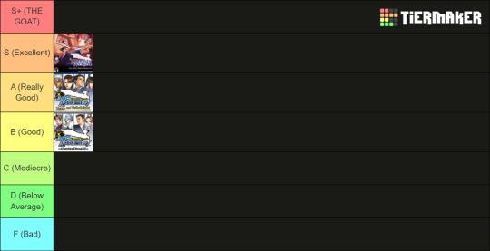
Phoenix Wright: Ace Attorney Trilogy Review - Court is in Session!
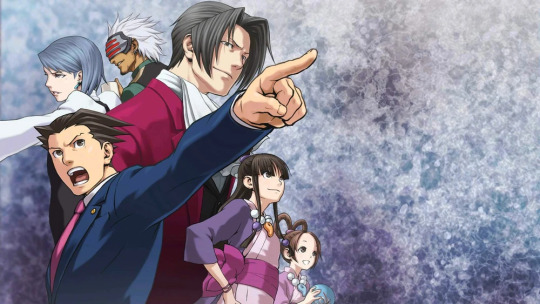
As we move on to a new story, it's time for us to look back at the three that started it all!
I'm not exactly sure how to format this, so I think I'm just gonna let it ride.
When it comes to overall consistent quality, I think the Trilogy is the best Ace Attorney has to offer. There's really no other collection in the series that comes close. The first three games are usually regarded as the best in the series for good reason: they're classics! There's a reason why the series became so popular so quickly, and it's because of these original three games and the stories they tell: not just the individual ones, but also the overarching story of the entire Trilogy. It's a story of tragedy, of a family warring against itself, and of justice falling into the hands of those who seek to manipulate it.
The Trilogy does work when it comes to character development. Not a single character, even our defendants, are left unchanged by our cases. The Trilogy does more than any other collection in the franchise to really focus on how these stories impact our cast: Phoenix matures into a veteran unafraid to risk his own life to save the people he loves, Edgeworth shifts his focus and becomes a true agent of justice against the criminal, Maya comes to peace with her heritage and takes her place as Master of the Kurain Channeling Technique, Franziska pushes her father to the side and focuses on living for herself, and so on.
I think the Trilogy also has beautiful art direction. Visual novels have to be good to look at—looking at you, Danganronpa—given that there's only so much gameplay that can be put into them. The Trilogy manages to do this without sacrificing its own unique, hand-drawn artstyle, and actually shows massive improvement when compared to the original GBA and DS releases.
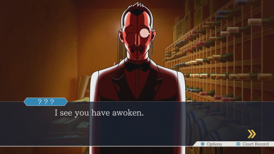
Case in point.
The Trilogy's music is also the most iconic in the franchise and for good reason. The original Pursuit theme is a classic, and I still hum Swimming, Anyone? and The Detective From the Wild West daily. Heck, Phoenix's ringtone is actually my ringtone! Speaking of JfA's music, even if its OST isn't the strongest its Pursuit theme is one of my favorite in the series solely for the bombastic percussion beats. I wish it went on for longer! The general quickness and audacity of JfA's music is countered by slower themes like Shelly de Killer's or its recollection themes, namely 2-4's. It's only fitting, then, that T&T comes in with the quintessential Phoenix themes: its Objection! and Pursuit themes. T&T also gives us Larry's, Godot's, and Dahlia's themes, more of my favorites! The Trilogy has incredible sound design all across the board but its music really takes the cake.
Finally, the Trilogy had the hardest job of any AA game: creating and perfecting the formula. And you know what? It does it! The Trilogy pushed through all the growing pains and laid down the foundations for Ace Attorney: creating one of the greatest mystery and visual novel franchises of all time.
The Trilogy is one of my favorite game collections ever. Most of my criticisms of the Trilogy are aimed at its dated humor and general inconsistency, especially in regards to its later entries. All those aforementioned growing pains were really just that: growing pains. Weirdly-paced cases, strange writing choices, dated humor... all of these things are really secondary when it comes to the quality of the Trilogy as a whole. Could I keep pointing out my problems with 2-1, 2-3, 3-1, or 3-4 and use them as criticisms towards the Trilogy as a whole? Sure. But I don't think that's fair. They're exceptions that prove the rule: the Trilogy could have been poorly written, but these cases really make the best cases like 1-4, 1-5, 2-4, and 3-2 shine even brighter.
Before we finish, I'm going to take a page from my game reviews and list my top five characters from the entire Trilogy before we end this review!
Number Five: Damon Gant
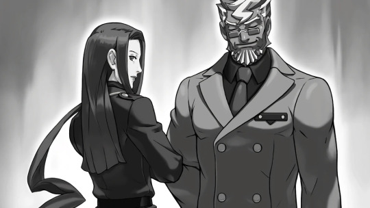
I'm never going to the pool again.
Damon Gant is one of my favorite culprits in the entire franchise and one of my favorite villains in all of fiction. I already gushed about him to death in my PW:AA review, so I'll try to touch on a few other things here.
Gant is the logical conclusion of Edgeworth's worldview. He has sacrificed his own innocence to put a criminal he just couldn't quite catch to death. Much like a veteran video game player, he had something denied to him just one too many times: and decided to cheat to get the victory he felt he deserved. He had done everything in his power to get Darke convicted, and when that wasn't enough decided to bend the rules to get his victory even if he had to sacrifice a family to get his way. I think Gant's constant claim that he only looks out for himself is a bit of a lie: he's a narcissistic power-hungry manipulator, sure, but I think he also genuinely wanted to find justice for all the people that Darke had murdered.
Gant is unique when it comes to all other finale villains in the Trilogy in the sense that he doesn't have a plan. The murder that brought him down was spur of the moment, unpremeditated: in contrast to literally everything else around him. He's a masterful planner and brilliant strategist, but his fall is due to an unexpected variable and something he simply did not plan for. It's a fitting outcome. For all the control Gant held over Lana, the SL-9 investigation, the courtroom itself, and the police system, everything came crashing down when one thing slipped out of his grasp.
I love Damon Gant to bits. He's a brilliantly-written character with a lot of fun dialogue, and his shift from "funny cooky police guy" to "I'm going to beat you to death" flows so naturally. Shu and Janet did a wonderful job writing and localizing him, and to top it all off he's got one of the greatest breakdowns in the Trilogy. We love Damon Gant here.
Number Four: Maya Fey
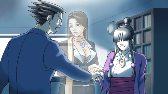
Nothing says "absolutely normal" like dressing up as a yippie.
Maya has one of the strongest character introductions in the series. We're introduced to her crying over Mia's body, being abandoned by the one person she thought she could trust, and eventually rooting for us when we're taking the fall for her sister's murder. Even in 1-2, her core character traits really shine: she never gives up hope, even when she's at her lowest. Throughout PW:AA she slowly comes out of her shell, and by JfA she's become best friends with Phoenix and is willing to put herself in danger to see Matt Engarde thrown in prison.
Maya is a super complex character. There's nobody else in the Trilogy as perpetually optimistic as Maya: and this optimism isn't sacrificed even when Maya's mentally and emotionally exhausted. Even in 1-4, when she's questioning her self-worth, Maya still manages to put her insecurities aside to help Edgeworth and put together the final pieces we need to nail Manfred for Gregory's murder. She's a rare, enduring spirit, and an anchor for much of the Trilogy's most heartfelt moments.
She's also just funny! Maya manages to be consistently funny without ever falling into just being comic relief, always willing to crack a joke at Phoenix's expense or let her scatterbrain get the better of her. Maya's happiness and optimism never fades away, and that's incredibly important to both her and the people around her. She knows people very well and uses that to make them feel better—whether they be people she's known for years or clients she's just met. Maya's grown up into a fine young woman.
Number Three: Miles Edgeworth
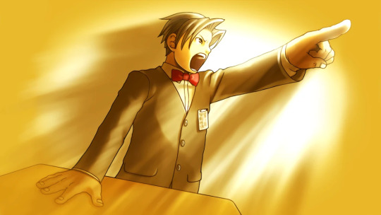
Get your bangs cut. Jeez.
Miles is a very interesting character. If Phoenix is the embodiment of a defense attorney and Franziska is the embodiment of a prosecutor, then Miles is in a weird middle ground for much of the Trilogy. He's stuck between two fathers, one who he looked up to as a child and one he followed as an adolescent: all combining into a burning hatred for criminals and a desire to protect the innocent. This hatred and desire is warped under layers of trauma and Manfred's influence. His arc from PW:AA to JfA is very well-written, even if most of it happens off-screen, and 1-5 just really did everything in its power to make it more interesting.
He's an excellent foil to Phoenix, but he's also a lot more than that. He's representative of Ace Attorney's themes of a failing justice system: the police failed to catch his father's killer and the court system let the person they arrested go on a plea of insanity. Miles, through his mentor, has become desensitized to dirty tricks and tampering with witnesses to make sure the defendant—the criminal—is declared guilty by all means within his power. This is further compounded upon by Damon Gant praising Edgeworth as similar to him in many ways.
This makes his development all the more satisfying. By the end of JfA it's clear that Edgeworth is a changed man, having gone through a Zuko-esque metamorphosis that challenged his ideology and philosophy. Sure, he still badgers witnesses, but he also cooperates with the defense and tempers his conduct in pursuit of one thing over all else: the truth. His hatred for criminals has been refocused into finding true justice for the bereaved. Miles is a really excellent example of a character's core values not changing even if their role in the story and relationships with other characters do. He's one of the greats.
Number Two: Franziska von Karma
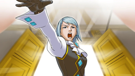
she's so pretty ahhhhhhh
It's really unfortunate that the Trilogy is Franziska's best showing. Her first two games are her best appearances, meaning that we can only go downhill from here: but let's focus on what she brings to the table. Franziska is a perfect adversary for somebody like Trilogy-era Phoenix. She is brash, she is confident, she is mean, she's willing to bend the rules to get what she wants, and she will manipulate witnesses and evidence alike to get her way.
As the games progress, though, we get to see a softer side of Franziska slowly emerge: and I think her change symbolically begins when she throws away her whip in 2-4. Franziska's whip is a symbol of independence and self-preservation—of control over her own life. Her throwing it away is a rejection of her father's ideals and control over her life, something I'll talk about once we get to the AAI games, and Edgeworth returning it to her is a really sweet moment that gives her back that control: now to be used for herself rather than her father's legacy. She then teaches Adrian how to use the whip, giving up her sense of protection and independence for a moment to give it to somebody she can empathize with. I love Franziska's story so much.
In 3-5, she's even on not-hostile terms with Phoenix, having moments of friendly banter during their investigation. Her development from JfA to T&T is probably my favorite arc in the Trilogy, and seeing her come to terms with herself is really nice. As someone with a lot of issues around being emotionally vulnerable and my fair share of anger issues, I relate to Franziska a lot. She's by far my favorite prosecutor in the Trilogy, and it felt wrong to place her any lower. I love her.
Honorable Mention: Ema Skye
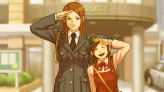
This will be a slightly shorter section than the others, given that she's just an honorable mention, but I can't not talk about my favorite character in the series. Ema is wonderful. Her role as Phoenix's assistant in 1-5 fits perfectly, and in many ways she's Maya taken to extremes: she's more impulsive, scatterbrained, and zanier than Maya, but she's also more calculated, more in-line with her emotions, and more focused on the investigation at hand. Her relationships with Lana and to a lesser extent Gant define the emotional core of 1-5, and she manages to fit in without feeling like she's trying to take Maya's place. She brings a lot of her own jokes, personality traits, and mechanics to the game, and that's very welcome.
I just wanted to talk about her for a bit. I love Ema very dearly.
Number One: Phoenix Wright
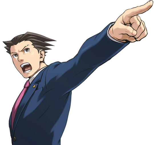
Who else?
Phoenix is an icon and the Trilogy is why. No other character is given the care and focus that he is, which makes sense: he's our protagonist, after all. His development is all about maturity and independence, striking his own path through the legal system while also trying to uphold what Mia taught him. He cares deeply and honestly for the people around him, yet at the same time the developers weren't afraid to give him serious flaws: he's secretive, never quite sharing exactly what he knows or what he feels, and is unafraid to manipulate the people around him to get the information that he needs. His relationships with other people are complex and varied, but even under his straight man persona there's elements of zaniness and wackiness that get accentuated by his shared moments with Maya and Edgeworth.
Phoenix isn't a perfect guy. He holds secrets and grudges, perhaps unfairly at times. He doesn't tell his friends everything that they should know, and he's scared to be emotionally vulnerable and honest with other people. But all of those flaws just help him feel like a real person: especially with the context that T&T provides. He's not just distrustful and closed-off: his relationship with Dahlia was traumatizing. This trauma is slowly but surely broached in 3-5 and retroactively helps explain his secretive, protective, stubborn nature.
Even if I don't think he's at his best in the Trilogy, Phoenix is still one of the best-written and most important characters the Trilogy has to offer. Sure, he's not consistently the best, and his quality can vary from case-to-case, but at the end of the day Phoenix is the Trilogy. He's the only character that appears in (nearly) every single case and this is never a bad thing. He always feels like Phoenix.
I remember when I first played the Trilogy. I was around 9 or 10 years old, fresh off of completing AJ:AA (with a guide of course). I was hooked instantly, even if I didn't know what I was doing. I was stuck with the shitty iOS port from way back in the day, but that was still more than enough for me. Without the Trilogy, I wouldn't be here today gushing about my favorite video game franchise. The Trilogy is my favorite overall collection in the series, even if none of its games individually are my favorites.
I'm not sure what else to say here: I feel like I'd just be rehashing the same points over and over. I think I'm going to end the review here, starting a new tier list. Let's start ranking the games and getting ready for Apollo Justice: Ace Attorney. See you then!
12 notes
·
View notes
Text
BRO I SWEAR IM SO BAD AT DRAWING FEM!AZUL WHAT THE HECK. 🙏 ya'll, my artstyle changes consistently... btw, I didn't do a text bubble but she was meant to say, "[Name], let's make a deal." 😔🙏


BROOO HELPEPP I CANT MAKE ZULLY IM SO SORRYY AZUL FORGIVE MEEEE OMG 😭🙏 my artstyle doesn't have a specific order 😔😔😔 SIGHHHHH*
#lambyspeaks#azul ashengrotto x reader#fem!Azul#fem!twst#azul ashengrotto#twst azul#orr Azula#twisted wonderland
9 notes
·
View notes
Note
RHYTHM DOCTOR FAN SPOTTED!!!! YOUR VIDEOS ARE SO COOL WHAT THE HECK?!? also your brush is cool, i’ve been using it and it’s really nice 👌. Any advice for just drawing and art in general?
RD GANG YEAAAAAA also thank you i really appreciate it 😭
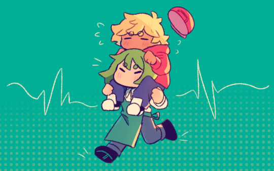
im glad you like the brush as well!! as for advice i cant really say i could give like actual professional tips since im still learning art myself, tho i will be sharing what helped me at least (under the cut since i think this is gonna be pretty long wbhwbhb)
when it comes to drawing in general, one of the things that helped me the most can be summarized in this tweet
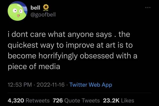
drawing rhythm doctor fanart for a year unironically helped me with posing, anatomy, coloring and improve with my artstyle which is funny since it's essentially the brainrot keeping me going
the best way i could explain this as advice is to find subjects or topics youre passionate about. it could be making fanart for your favorite media (me </3), making ocs, drawing environments, and just anything youre happy with. while it's important to get out of your comfort zone to learn, it's important to be comfortable with art first
also!! please!! dont make art *just* for the sake of posting dont be like me during my artstreet days im begging you 😭😭😭. of course this doesnt apply to every artist, since im sure there are people who do need to post consistently. but if you draw solely because you enjoy it, please remember to keep it that way and prioritize yourself! lots of rd art i made are self indulgent that i just so happened to post, which is honestly why i made so much art now that i think about it 💀
initially i was gonna add a color tutorial here so it's in one singular post but it's almost 1 am and probably for the best that i just do it tomorrow lmao
edit: tutorial pt 2 yippee
#rhythm doctor#chiimo art shenanigans#self indulgent mv art because i can <3#this ask really made my day btw!! thanks a bunch :D#chiimo ask shenanigans
44 notes
·
View notes
Text
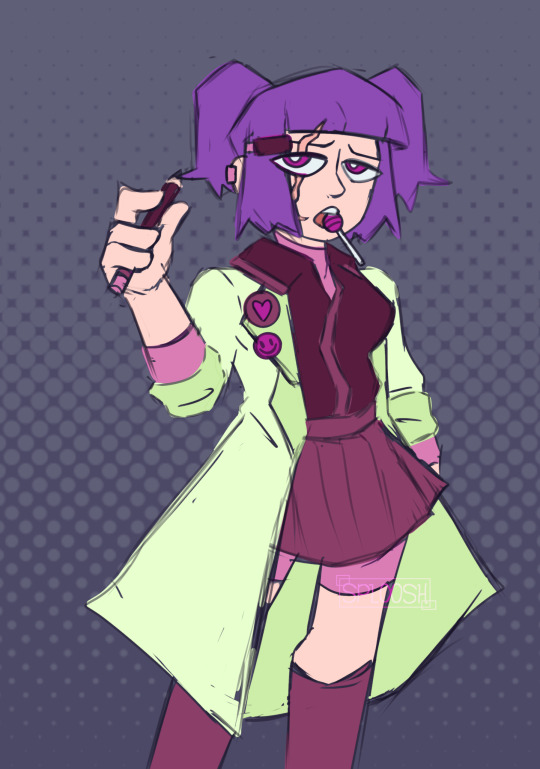
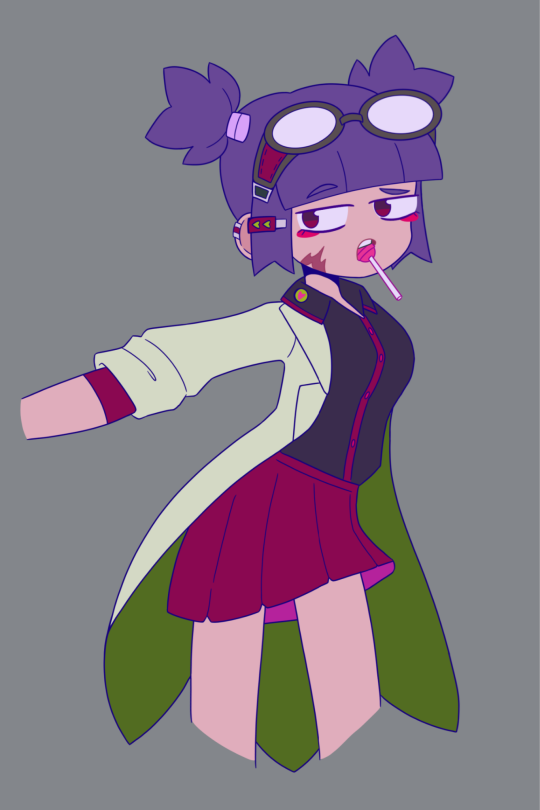
Redrawing my 2023 redraw of an old OC drawing I did years ago. Definitely going to do this yearly to see how my overall artstyle changes overtime :0
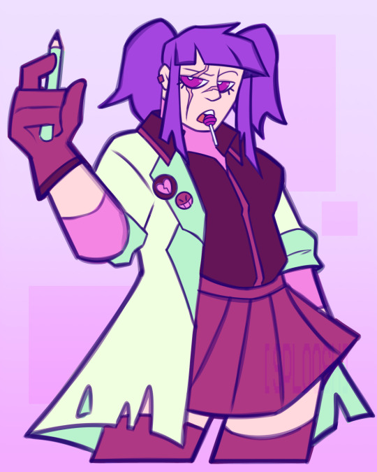
Honestly, my style hasn't changed that much...? I mean, the new one obviously looks completely different compared to the 2023 one BUT like the way I draw some parts remained consistent?
Like, the way I drew the hand, the ears,the mouth, heck even the pupils are pretty similar :0
I think my style remained almost consistent but my execution definitely improved a little
Also, not what I usually post but here's a speedpaint of it for funsies
#sploosh rambles#oc art#oc redraw#oc speedpaint#art#drawing#improvement comparison#original character#2025 oc redraw#old art#old drawing#sketch
2 notes
·
View notes
Text
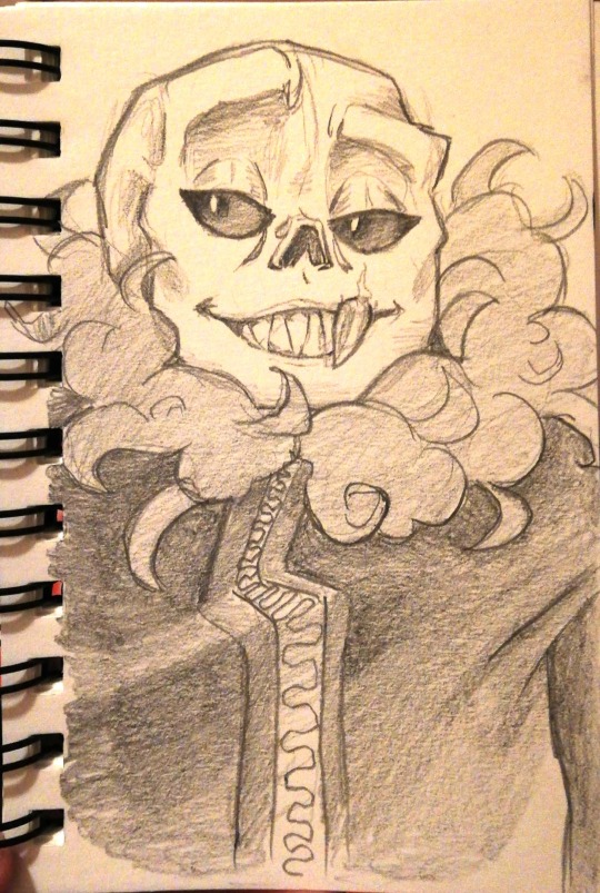
Sharp boy
#Uf!sans#Red#Undertale#What is a consistent artstyle?#Who knows?#Not this asshole#I forgot how much I enjoy drawing with pencils#The sound is just so good#The feel of it#The texture#Yasss#Sorry peeps for saying that I'll have more time/draw more#I'm a liar apparently#There are more of you following me than I ever expected#And I'm slightly intimidated#You guys are cool as heck!#Thank you for liking my art and saying cool shit in tags!#My art
352 notes
·
View notes
Text
So...I MAY have been collecting Fawfuls like pokemon cards <3
(and what the heck do I mean by that exactly??) WELL in a discord GC my friend Parmy suggested we’d imitate each other’s art styles as like a collab of sorts? Well...I kinda took that a step further heheh ^^
(And fun fact...this was supposed to be something I was gonna do for AU day of Fawful month too, but that idea got cut due to time)
So may I present...the different Fawfuls I drew!! For my friends/cool acquaintances!
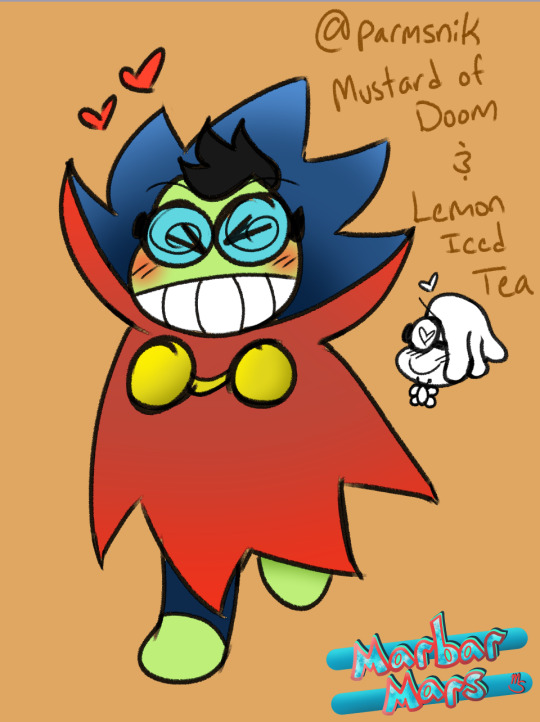
So the one who led up to this in the first place, Fawful from @parmsnik AU!! He is dating/eventually marrying Naspi depending on where you’re at in the AU haha! Your way of drawing Fawful seems to change a little bit each time you draw him, so I tried to my best to guestimate a consistent looking Fawf! Very cute!
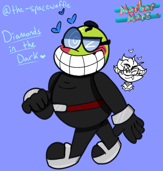
Up next is Fawful from @the-spacewaffle AU!! Yippee Ronnie’s AU! Thanks for being my friend for so long,,to talk about Fawful and all that stuff y’know? I’ll be cheering you on to complete the story qwq your Fawful is always so nice to my OCs when we crossover khskdjh also...pet the Reddo!
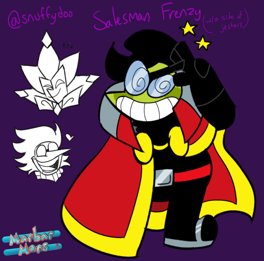
Eee yay now it’s @snuffydoo Fawful and his AU title I totally made up on the spot! I know you don’t really have a name for that kind of thing and it doesn’t have to be canon but I hope you think it’s cute anyways haha! I had a lot of fun drawing this one!! It’s so stylized! AND IT HAS DIMMY (I enjoy your Dimmy artstyle sm) but I don’t draw Spamton very often kjhskgh
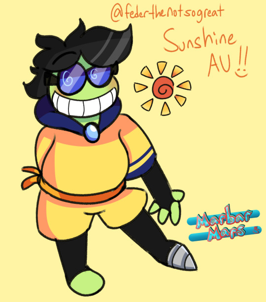
Here’s @federthenotsogreat Fawful AU of sunshine goodness~! HE RETURNITH (and since I couldn’t think of another character to feature with your AU...not knowing if Cackletta is there or not jhgskg I gave him a cute little swirly sun!) I admire the fact his outfit is mostly YELLOW and also blue those are cool colors OH AND THAT LEG TOO, also super cool :)
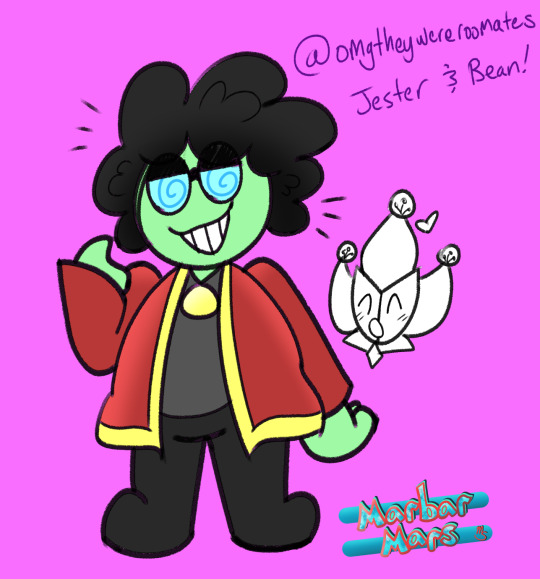
The smol and cute @omgtheywereroomates Fawf! Your ask blog is so neat! I know I don’t ask too many questions there but I just,,,the cartoony fluffy hair?? Love that, and also thank you for your support and the super cool ship as well ^^
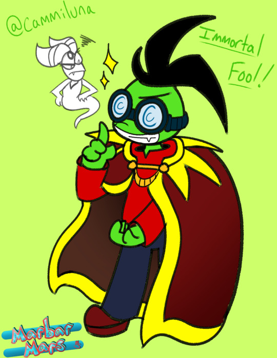
Heheee yeah hey it’s @cammiluna Fawful from Immortal Fool! Before you say anything YES I’m aware he’s got the new design since it’s near the end of the comic, you released the page that featured said new design while I was already working on this drawing xD So whoops! I just wanted to give appreciation to your comic series that you continued despite everything, and well...I know I haven’t shown much progress on it, I also want to make a comic series...so you’ve inspired me a lil :D
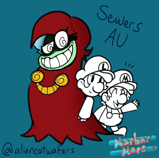
Deep down here there’s a little AU by @aliencatwafers which features Fawful in the sewers! With the little baby bros!! You’re a very insightful and inspiring writer with plenty of neat headcanons and ideas for the bean! Ik you mostly draw in pencil but I took the colors from your submissions to Fawful month this year and used em here! Hope it looks cool!
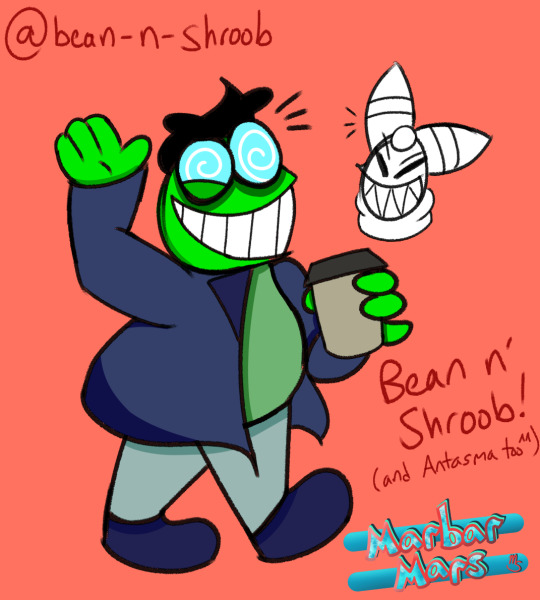
This little gremlin here with the two moms is Fawful from @bean-n-shroob ask blog! He looks very silly and unhinged (in a good way) and I hope he’s having a good time since after BIS! I love how round your designs are and Fawf is no exception :D

Last but not least is this VERY soft Fawful from @localdealmaker and their AU, whose title I made up too (again doesn’t need to be canon or anything if you don’t want it to be, I just wanted to give every drawing a cute name ^^) I think yours was the most complicated to draw for me but I love how he looks, so squish!! Kaboo is cute too!
WHEW THAT WAS A LOT OF TYPING KSJHKGH but yeah I hope you guys have enjoyed this...I might make another part someday full of more Fawful designs from friends but I AM A LITTLE BURNT OUT...doesn’t mean I didn’t have fun tho!
#Marbars2023#Fawful#AU#oc x canon#Superstar Saga#partners in time#bowsers inside story#dimentio#spamton#cackletta#baby mario#baby luigi#Naspi#Reddo#Kaboo#so many Fawfs!
101 notes
·
View notes
Text
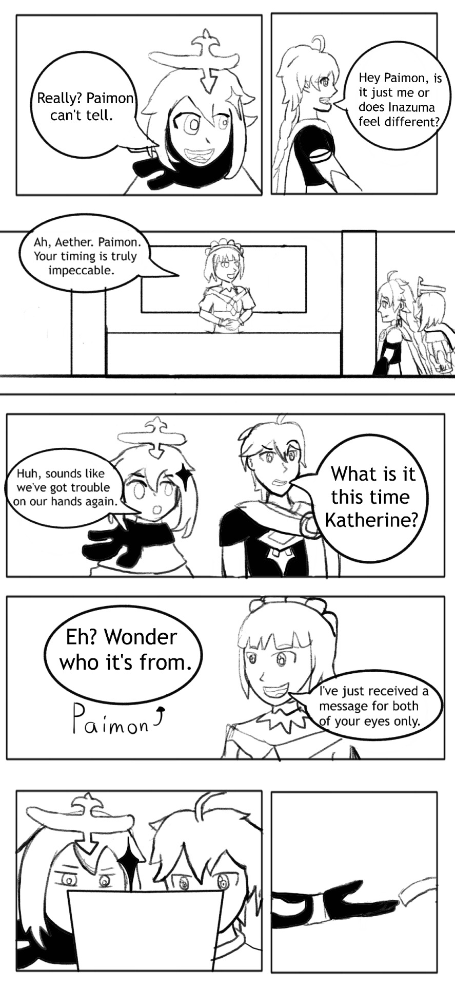
Read from right to left
Previous
Next
Masterlist
Announcement under cut!
(Disclaimer: This was typed around midnight.)
Hey! Noraa here.
I’ll try to keep things as casual-and brief-as possible, but I’m gonna be 100% transparent with y’all and state that I think this project can go in a different, much better direction.
In what direction you may ask?
First of all, genre: Slice of life+comedy. Dry humor, witty banter, and meta jokes will be used. Heck I’ll even throw in some lighthearted shenanigans. For instance, a joke about the characters’ idle voicelines may be used (lookin’ at you Zhongli).
Second, artstyle: I’m gonna draw similarly to @seseild aka the progenitor of the crying Raiden Shogun meme. That also means characters will be chibi depending on the plot of each comic. That doesn’t mean they won’t be fully humanoid sometimes.

Third: Format: It’s gonna be drawn in comic style & it’s episodic meaning each has its own plot. And they’re typically short like Peanuts or like Sesield’s comics. They’ll each convey a joke or a life lesson. You feel me?
Fourth: Clarification: I am not changing this because I am too lazy to come up with a whole arse comic about overcoming existential dread and learning how to cherish the time one has in the present, but because I’ve realized that ideally, webcomics can only be optimally made via a team consisting of a writer, an artist, and quality control (at least that’s what come at the top of my head). In short, as a one man artist I cannot even hope to be on the same level as those professional artists and have realized my limits.
If you’re still reading this, congratulations! You’ve reached end. I’m gonna take-uhhhhh-a week to rest. What can I say? I want to avoid burnout at all costs. On that note, take care and try not to draw past midnight (Seriously don’t. Speaking from experience here. Alright see ya’ll later).
42 notes
·
View notes
Text
so, i was just going through my flipaclip projects when i stumbled upon this knifetrick animatic that i never finished. that was, like, very, VERY old--because the artstyle was very old and bad--and. i dont even remember making this but its my style? and tbh i dont remember reading knifetrick that long ago this is making me feel old asbjdmnkasd look at this


and then compare that to them in my artstyle now (this is the most recent drawing of them i have)

man. i feel old
but also that improvement, nice. im gonna try to figure out when this was made edit: ok so i cant find when that animation was made exactly but i found an animation made right before it, which was around september last year--oh my god its almost been a year since i started reading knifetrick what. i am also watching this animatic and laughing at my cringy as heck old art lmao--please i couldnt even keep the frames consistent without it going darker by accidentally copy pasting it twice
6 notes
·
View notes
Text
Promotin’ my game blog because I feel like it :)
@retphienix
is a blog I’ve run for 5 years as a poor man’s letsplay/liveblog platform and if you’re looking for bizarre haphazard liveblog game posts, bad opinions, analysis of things you don’t care about, and a way to make me a mild dash of endorphins through clicking a button- you can follow that blog :)
In order to give a semi-relevant display of what the blog is like I figured I’d share a few pics and captions from the past year (2020). Spoilers avoided, which sucks because I wanted to share moments that made me cry but that sounds rude for a promote post to do lol.
This post is long, press J on your keyboard to skip it or curse me out in an ask if you’re on mobile.
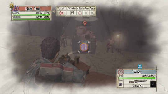
I am LOVING how strong the orders are for taking out tanks. Being able to take down a light tank with just a scout so consistently is wild. (Valkyria Chronicles)
(This game made me cry and was such a visual treat with its watercolor artstyle)
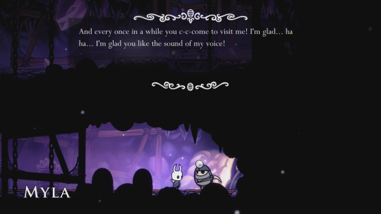
This is a very very good bug. (Hollow Knight)
(Hollow Knight is an amazing game, through and through!)
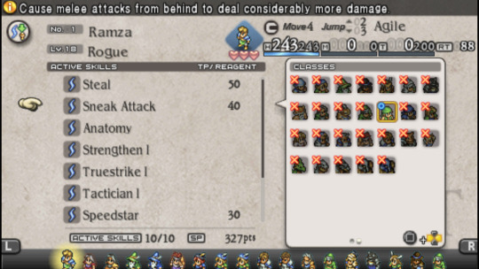
NINJAS.
CAN NOT USE.
SNEAK. ATTACK. (Tactics Ogre: Let Us Cling Together)
(I spent most of this playthrough noting weaknesses this game had in comparison to the spiritual successor Final Fantasy Tactics, but I ALSO pushed a guy off a cliff to win a fight so it has its ups and downs for certain)
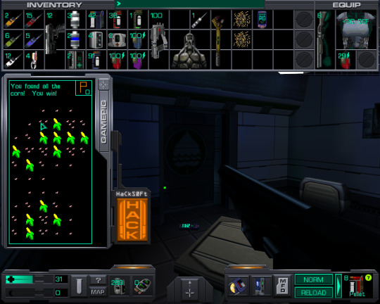
Did some REAL gaming. Including winning I think my very first game of minesweeper ever because I haven’t played it since I was a kid and I never learned how as a kid? (System Shock 2)
(I beat the final boss by jumping in place)
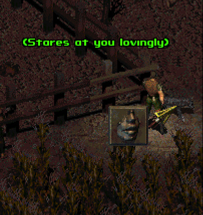
Feeding pixel pups is always rewarding. (Fallout 2)
(Fallout 2 WAS very fun, but mostly it made me realize just how much I loved Fallout 1.)
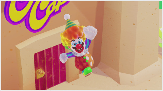
Alright!
Screw everything else about this game.
I’m beating it with this on.
Bowser is getting bopped by Bippo the clown and I will overcome any obstacle to make that happen. (Super Mario Odyssey)
(SMO is a lot of fun and it added so much bright and colorful vistas to my switch, I loved that)
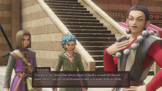
I love him, SO MUCH (Dragon Quest XI)
(SERENA IS PERFECT AND THIS GAME MADE ME CRY AND IT MADE ME THINK AND IT’S SO MUCH BETTER THAN I THOUGHT IT WOULD BE.)
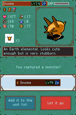
That’s a GNOME? (Lost Magic)
(This was an interesting playthrough mostly to see exactly where this game from my childhood succeeded and failed. It’s not the best game, but it’s interesting, and gimmicky as HECK.)
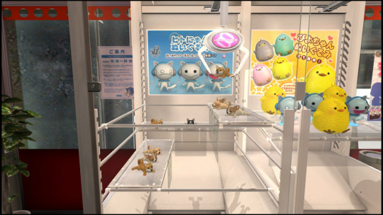
You KNOW I repeated the time honored tradition of throwing yen by the bucket-full into the prize grabber. I just had to get this french bulldog! (Yakuza 4)
(Yakuza games come by the blog semi-frequently. 4 was alright, it had faults that bothered me, and it’s my least favorite currently, but it was alright.)
And that’s just some 2020 stuff, the blog has tackled a LOT over the years and it’s been good fun. Maybe some day I’ll evolve the blog into another site’s format of content, but for now I’ve just been enjoying posting clips, pics, and gifs with some thoughts below good old tumblr live blog style.
7 notes
·
View notes
Text

Pico drawings because Im mentally sane, and also Gir holding a revolver that my friend drew for some reason lol. I like how theres one thing that I actually made nice and the other things are..well, other things but I feel so bad I think I did Darnell so dirty Im so sorry Darnell fans 😭
#what the heck is a consistent artstyle#art#newgrounds#traditional art#pico newgrounds#picos school#pico#darnell#darnell pico’s school#fnf pico#fnf darnell#fnf#gir#invader zim#I formally apologize to all Darnell fans Im so sorry
58 notes
·
View notes
Text
What medium best expresses Sonic’s character?
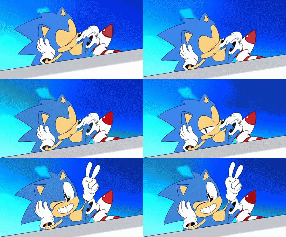
Right, so this is a bit of a detour from the typical Hazbin Hotel posts I’ve been making, but I really did a heck-ton of work to come up with this. Then again, I type overly long paragraphs as a hobby, so jokes on anyone who thinks I don’t do this for fun... but then again... jokes on me for making the time to type Hamilton-esque essays on fictional characters ._.
Okay enough with tangents, this is an essay dedicated to answering what medium -- songs, scenes, cartoons, maybe even a comic issue -- best encompasses Sonic’s character. Take in mind, throughout the 29-almost-30 years of Sonic, there have been many iterations and takes on the character that either differentiate on a minor level, or to the point that some Sonics when compared seem to be starkly different characters altogether, so this is purely what I feel is the best take on Sonic’s character. For my sake, I’ve sworn off including material that require a long-winding read through some mediocre storylines -- nothing personal, Archie Comics. I won’t be covering Archie Comics because I’ve yet to finish reading all 200+ comic issues because that’s not humanly possible for me. If I ever manage to though, I might make a post about Archie Comics in some way. For now, here’s my personal essay on “What medium best expresses Sonic’s character”
Starting off with shows...
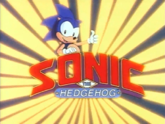
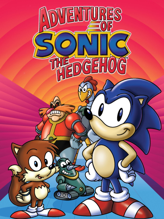
Sonic SatAM (1993) and Adventures of Sonic the Hedgehog (1993) are products of their time, and I never got to watch them when I was young, so I hold no sentimental nostalgia. Sonic SatAM seems in-line with Archie Comics, with the Freedom Fighters plotline and the infamous Sonic mohawk with lasted for a significant amount of issues. Adventures of Sonic the Hedgehog was pretty comical and lighthearted in comparison. Both were voiced by Jaleel White, had the same artstyle, and established Sonic’s character in vastly different tones. It’s rather outdated as Sonic has lived past the 90s for 20 years, where he got revised and reinvented to suit the decades. So both characterizations are simply inapplicable to Sonic’s character.

2003′s Sonic X worked off of the newly reinvented Sonic and paved way for Sonic’s personality for the following years, but I do have critique over the show, and their execution of Sonic’s character. Though they did provide Sonic's "constant desire to run", he lacked soul and the over-the- top nature of his character. Sonic throughout this show displayed a rather hollow connection with his relationships, was as distant and aloof as Knuckles for seemingly no reason, lacked much depth and barely developed, and was overall, very poor with communicating his thoughts and actions -- which ultimately led to a number of plot lines where his friends and/or authorities saw his intentions as malicious or even evil. Sonic is hyperactive and free-spirited -- something this show doesn't fail to display -- but Sonic lacked his heart. Where was that desire to hang out with his friends? Where was the underlying love and compassion he'd constantly display in and out of battle? Where were his cheesy yet well-meaning impromptu speeches? These aspects of Sonic were sorely lacking and missed when I watched through this series which is why I believe this anime didn’t really express Sonic's character.
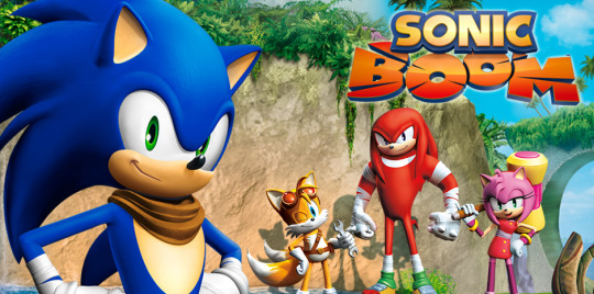
Sonic Boom...
...is a lighthearted, slapstick sitcom-based comedy. Very episodic, which is aight, but the the show’s execution as a whole was mediocre-borderline-bad. It doesn't have much elements inherently Sonic-esque -- it's a product of the Modern era, which at this point, doesn’t seem to have good connotations. No worthwhile soundtrack, stunted animation and movement, embarrassingly heavy reliance on overused archetypes/stereotypes at the expense of the characters, repetitive plots that get the THICC layer of frosted sarcasm and self-awareness. Sonic had attitude sure, there was a clear level of disinterest and cynicism to this portrayal -- it was as though protecting people felt like a burden and chore to him. It doesn’t help that this feeling is justified as Eggman’s been reduced to a pathetic Saturday Morning villain with lesser competency in being a world threat, and much rather a constant nuisance to Sonic’s town than anything else. Subjectively speaking, this show's clearly not for me -- even when I was in the supposed age range at the time. Objectively, this Saturday morning cartoon should've been branded as it is, rather than a Sonic cartoon because the identity of Sonic the Hedgehog definitely got skewed and misconstrued by the eyes of newcomers whose first exposure to Sonic the Hedgehog character was this. Ironically, due to this show, I subsequently furthered my distance from the franchise at that age, and got into it much, much later in life.
Now moving onto the songs...
Initially, I considered “Escape from the City”, “Live and Learn", "His World" and "Fist Bump" as good contenders in defining who Sonic is. But through some vigorous looping of those songs, I've pinpointed what they've to offer in showing Sonic's character, and due to my consistent nature of typing overly long arguments about anything I find interesting, I'll be putting each song into its own paragraph -- picking out any significant verses, and explaining why I think each song subconsciously contributed to my thought process that they would be the best take on his character. Afterwards, I’ll finish with my conclusion. (I personally suggest you go listen to each song as you read each paragraph)
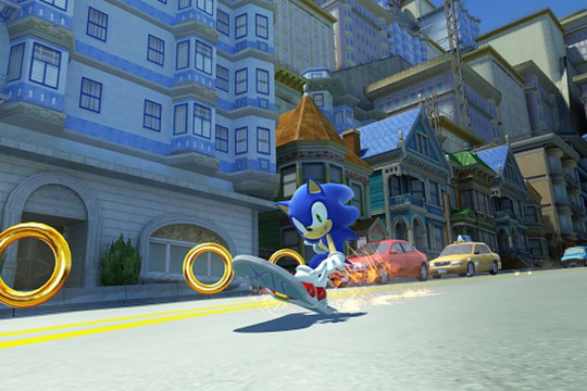
"Escape from the City" is a timeless bop, and I will play it in the car whenever I'm actively escaping from authorities in my city. What this song does is use rhythmic beats and repetitive bass line to emulate the constant adrenaline and excitement Sonic feels when he's moving around, it embodies his carefree nature and spontaneity to a T. It succeeds in portraying the energetic, upbeat aspect of his personality as the song itself contrasts the very dangerous implication of being chased down by the government for a crime you didn't commit. Sonic doesn't get enough credit for the amount of cheerful optimism he has -- always moving with a spring in his step, or steps considering the speed part. He brushes off the most life-threatening dangers he has to face and takes it all in with that well known Sonic™ grin. It also shares a constant message of "Live and Learn" (which the song of the same title) -- this is a rather succinct version of Sonic's mantra. The song is very Sonic, but only manages to show his surface level personality. Kinda like Sonic X's theme song "Gotta Go Fast" but it's much less in your face about Sonic's whole shtick. Another thing to note is the element of "escape" is a constant in both "Escape from the City" and "Endless Possibility", which I'll get further into later. Given that this song was more focused on the primary objective of ‘City Escape’ the game level rather than exploring Sonic’s fundamental character, it's very cool how it just so happened to tie in well with him...
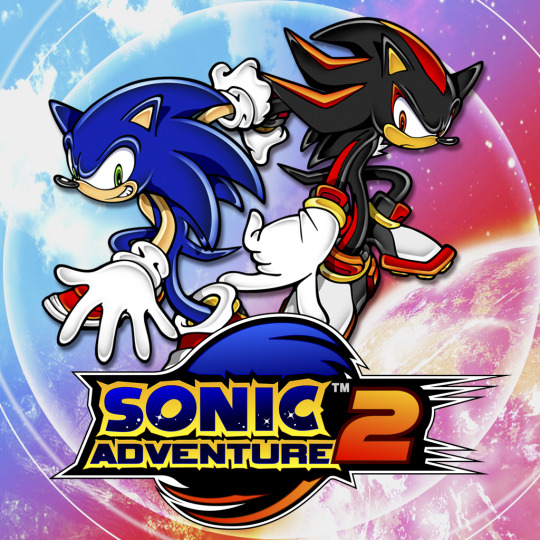
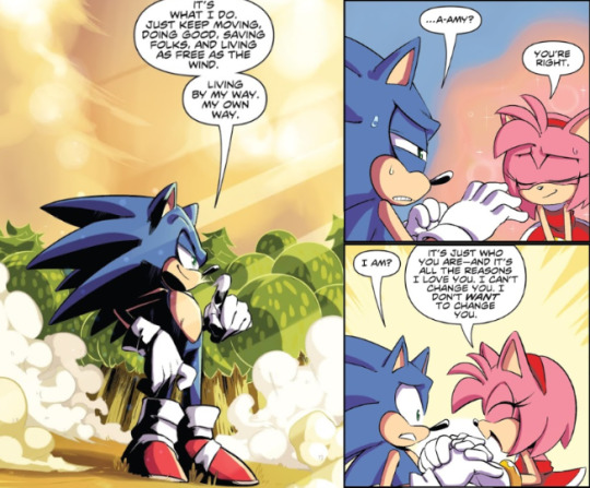
"Live and Learn" was more of a Sonic and Shadow song, so I already kinda figured it wouldn't manage to explore Sonic's character much. The first verse and chorus offers as much for Sonic's character as Shadow's oh-so few lines of verse 2 does. Again, the song only manages to provide Sonic's surface level personality. Reason it came up in my mind was because of the words 'Live and Learn'. It's a very motivational and inspiring line -- what got me thinking about Sonic’s character in the first place. It's an unspoken rule for him to take life headfirst and live in the moment, and legit the second issue of the IDW's comics reiterates this by Amy expressing that this free-spirited approach to life is what essentially makes her love him.
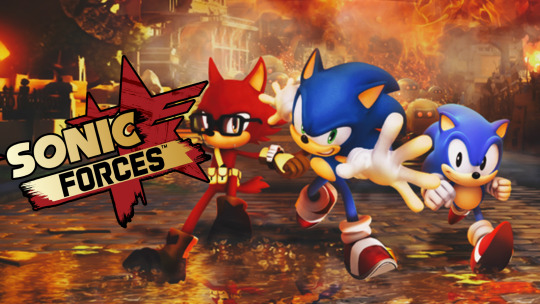
"Fist Bump" was like my first exposure to Sonic main theme songs -- and I'm still into listening to the song. I realize the lyrics are pretty generic, but it does reflect the general focus of Sonic character very well -- which may further explain why Modern Sonic is much less... developed, to say the least. What the lyrics essentially hone in on are Sonic's loyalty to his friends and his.... unyielding determination? Honestly, a very generic take for a main theme, and it reflects on the quality of the game if even the music lacked much personality compared to any heroic video game character theme song. Sonic had more personality to offer in his silent protagonist games, compared to this. This issue with Sonic's character barrels down to Modern Sonic retaining his previous counterpart's cheesy insistence to spout improvised speeches and embrace the power of friendship -- though it's definitely gotten out of hand in this case. We need balance.
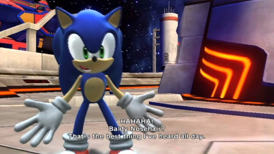
Making Sonic more family-friendly ≠ Dumbing down what nuance or individuality there was to his character and making him every other generic hero protagonist who quips for 90% of his dialogues.
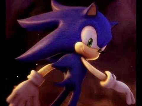
Finally, "His World", but I'll do Crush 40 and Zebrahead's separately, sort of. Crush 40 explicitly tells Sonic's character how it is -- his strict moral code, good intuition, confidence in himself, "seize the day" mentality, straightforward disposition, stubborn determination, love for his friends, and fearless risk-taking -- it's pretty lengthy but it does a good job as Sonic's theme and manages to state what it's like in his world. However, the song faces eerily similar issues to "Fist Bump" with it's lack of creative interpretation with its lyrics, and compared to "Escape from the City", it seems more formal and serious in tone which is reflective of their portrayal of Sonic.
I interpret Sonic as a multifaceted character, but when listing out all those traits in the verses and chorus in the song’s tone and format melody-and-lyric-wise, the song makes it appear as though Sonic is strictly a pillar of justice and represents the strong, untouchable hero persona -- which I find to be a detrimental writing aspect for his character. It writes off his personality as second priority to the reputation that would have receded him through the years of defeating Eggman and saving the world -- and subsequently, paints his character in a rather dulled and overly no-nonsense light. Not saying I don't want Sonic to be serious at certain points, but I think with this song, and this game as a whole, there was some truth to the issue of Sonic '06 being a little too serious. While these characters were well-written in this game e̶x̶c̶e̶p̶t̶ ̶t̶h̶e̶ ̶t̶h̶i̶r̶d̶ ̶p̶o̶i̶n̶t, I've had personal issues tied to em:
Shadow coming back was quite risky and foolhardy for his character journey and I believe if it weren't for the great execution for his storyline in '06, his appearance would've been viewed as fanservice -- which is what he's sadly been reduced to now
Silver's character concept as a whole was pretty dark and serious, which again isn’t a bad thing, but with the plot resulting in him seeing Sonic as the Iblis Trigger, it limited Sonic's ability to play up his easy-going, carefree nature since he couldn’t just brush off that accusation with offhanded remarks as that would’ve risked Sonic coming off as insensitive and unsympathetic at that moment. Which is not what the writers want their characters to go.
Elise. There, I said it.
On top of it all, "His World" is pretty slow-going for Sonic’s theme, which I could try justifying by saying it might’ve been a representation of significant growth to Sonic's character -- perhaps the journey managed to shape him into a man (hedgehog) who could spare a bit of time to contemplate his next course of action -- as this game definitely explored a major deviation from typical Sonic game story lines. But, even with that, I still really prefer Zebrahead's version.
Zebrahead's is vastly the same when telling Sonic's character how it is, but the instrumentals, pacing and speed is increased significantly that it definitely sounds more reminiscent of Sonic's musical style -- fast-paced rock and roll. But, I’ve yet to figure out the significance of the lyrics:

Especially when it follows right after "Never fear the fall" -- so you take the leap of faith, but also don't let yourself fall in the process? Pretty weird flow of words there, but maybe I’m just not getting it at all. Point is, what both songs hone in on is Sonic's intuitive sense of justice and a bit of his carefree nature -- since the lyrics from Zebrahead's specifically highlight on Sonic's "leap before looking" nature. What Zebrahead further hones in on is his adventurous and hyperactive qualities as verse 1 and the bridge show. It's a timeless song of anticipation and build-up with good execution, but it doesn't cover the main essentials in what makes Sonic Sonic.
Finally, reaching the song I've found best covers the basics and essentials to Sonic's character is...
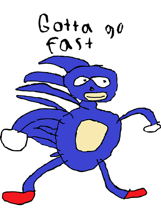
Believe it or not, “Gotta go fast” encompasses the defining characteristics of a well-written Sonic -- the title itself is a testament to the his motto and is all things Sonic stands for.

While this refers directly to the plot of the show itself, it manages to familiarize us with the speed and urgency crucial to Sonic’s character and--

Okay, clown time’s over, here’s the real winner.
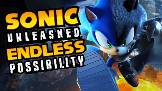
Unleashed's main theme: "Endless Possibility"
From the get-go, intro already separates itself from the other songs by being freeing and exciting, without being too carefree like "Escape from the City", too orchestral or urgent like "His World", and definitely more compelling lyric-wise compared to "Fist Bump". This tone is a constant throughout the song, and makes it seem like Sonic's the one directly singing -- the singer nailed it with the level of obnoxious and genuine tone to his voice.
This song, like the rest of the other main themes, reflect the game itself. Unleashed is a race against time for Sonic to fight Dark Gaia before the Earth gets torn apart. But similar to the gameplay and form of story, the music is very fast-paced yet unburdening, with hints of inner contemplation, and darkness (or how I like to put it, edge). The first verse already succeeds in getting into the bare bones of Sonic's character -- he runs, he can never stay still out because he knows that's not who he is, he's free-spirited and will run around the world out of his own volition, it's a form of escape and liberty to him -- and this is what ties into "Escape from the City”. This verse sums up the essential traits to Sonic better than any of the previous songs without letting one attribute overpower it. It refers to his three fundamental traits: that he's fast, adventurous and carefree.
The pre-chorus further expands from verse 1's establishments, by showing the deeper, inner turmoil that pass through Sonic's mind -- “How will I know when I get there? And how will I know when to leave?” -- these are the rare instances where Sonic is found in inner conflict with himself which came out of his simplistic philosophy rather than an external conflict or influence, and it's more of unspoken and nuanced as Sonic never usually calls himself into question for the way he lives. This showcases that he's capable of processing the long-term effects of living and moving around aimlessly -- constant adventure and freedom might eventually feel mundane, so he might eventually find the destination his heart feels is right for him, so what will he do when that period of his life unfolds, and will this period end the days of adventure and freedom? The possibilities are never-ending, so as always, he'll take everything in stride, and prepare for whatever hits him.
This is what the song's main theme is. Endless possibility. Potential and growth -- which reflects back to Sonic: mentally, physically and emotionally. Mentally, he's acknowledged that he's always growing and developing throughout his adventures -- as there's one thing that no one, not even Sonic can outrun, and that's change. "Endless Possibility" opens us up to the concept of ever-changing development for Sonic, and the possibility that he might eventually reach his unknown destination and end this long-running journey, while also implying that every journey that he goes through and ends -- whether it directly ties into the games or off-screen adventures -- will always lead with a new one. Unleashed encompasses this youthful feeling of change and vigor. Sonic is in his element and is going through a personal journey to save the world once again, but as always, he'll do it with enthusiasm and unbridled drive.
Interestingly, Unleashed feels reminiscent of Sonic X's Sonic but done right. Both have the character mostly isolated from his friends for the majority of their respective stories, but where Sonic X forces Sonic to clean up on Isle Eggbot each episode, Unleashed puts him through a singular adventure that requires he takes care of the major issue at stake while the others are doing their respective jobs or living their own lives. Unleashed's Sonic even has a temporary companion which he clearly warms up to and befriends throughout the whole journey, whereas Sonic X shows Sonic actively dismissing his previous friends to sleep, travel, and adventure for the heck of it -- while they spent a majority of the first season trying to find the chaos emeralds without him.
Sonic being isolated is usually due to situational happenstance rather than conscious preference. Sonic isn't inherently solitary or aloof, it's just due to his ability to move from place to place with ease that he subsequently has to leave his friends behind to confront the source of the problem. It's not a part of his character that he plays lone wolf like those archetypal "cool characters", the nature of what he does and excels at leads him to fight front and center, even if it means doing it alone. Despite this, he still is the sentimental, over-the-top dork that believes in the power of friendship and will go to the ends of the Earth to protect his friends. Which is exactly what he does in Unleashed.
The bridge provides the hints of edge where Eggman and Sonic exchange dialogue in the song, very much referring to the events of Unleashed's intro battle between the two. Eggman essentially tells Sonic to give up as he's actually beaten him -- which Sonic replies that it's not over, that this is just another start to another journey. The lyrics aren't very subtle about what they're saying, but it does a good job in encompassing two key traits when Sonic responds to any threats -- his cheerful optimism and unyielding determination. He doesn't respond to danger with simply quips, he responds to it with a campy but genuine declaration of strength and courage. The cheesiness in his words are very prominent, but he says them with a straight face like he's announcing his battle cry and promise to do what it takes to save the world and protect the ones he love.
In short, "Endless Possibilty" manages to fully encompass the best iteration of Sonic, and humanizes him to the point that I can only really see this as the current best sum up of his character without any needed dialogue, animation, or prior context. This song could just be tied directly to Sonic's overall character outside of the game's plot, and I'd be fine.
#my posts#sonic the hedgehog#sonic#sonic character essay#my character essays#small spoilers for idw#another session of overly long essays from yours truly
18 notes
·
View notes
Photo
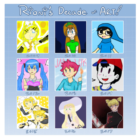
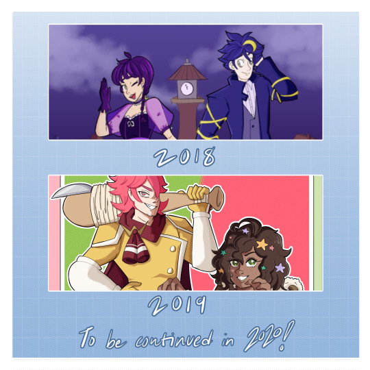
welp, gang! not only another year is coming to an end, but it also marks the end of a decade. i’ve been drawing for over 10 years now, so i figured i should do a decade of art just to show off my work over the years!
if you want to read my retrospect of each year, it’ll be under the read more! heads up, it is a bit of a doozy.
TL;DR: just all around happy with how much i improved over the years and i can’t wait to see what 2020 will bring!
2009 (11-12 yrs old) at this point, I’m on my second year of drawing (both traditionally and digitally!) This year mainly consisted of either oc art or drawings of my best friends at the time, but there was some fanarts sprinkled here and there. I also did my first animation piece around this time too tho it’s private now :3c i may show it off one day...
2010 (12-13 yrs old) I got my first drawing tablet for Christmas 2009 and this is when i went ham on my digital drawings. this year was kinda weird i guess? i started experimenting a more cartoony style on some artworks, though the majority are still anime inspired.
2011 (13-14 yrs old) ah yes...... the year i found out about homestuck.... well, i found out about it on the second half of the year. the first half was all about my ocs. this was because around this time (or late 2010? i dont remember exactly) i discovered flipnote hatena, where I did tons of animations including my ocs. but once i discovered homestuck, that was all i posted for a while lol. this was also the year I made my tumblr account. oh and I also lost my tablet pen for a few months so some of the drawings from this year were made with a mouse.
2012 (14-15 yrs old) I started falling out of deviantArt and became more active on tumblr. I mellowed out on the homestuck drawings a bit and posted other stuff. this year was kinda similar to 2010, where my artstyle was kinda all over the place. the second half of the year I discovered a super obscure browser dating sim called Star Project and became a part of the roleplaying community so plenty of my artworks revolved on my muse Souta and the game as a whole. 2013 (15-16 yrs old) this year was really quiet in terms me posting art. i had been constantly doodling both traditionally and digitally but I never got around to posting the majority of them. this was mainly because I was so busy with school. on the flipside however, I discovered Earthbound and i hecking fell in love with it ♥
2014 (16-17 yrs old) still relatively quiet but i posted more than 2013 lol. Earthbound drawings galore! i also did posted more oc work, including my gal Usako. I haven’t posted her anywhere in a long time though. i have been redesigning her and i’ll show it off sometime in the future!
2015 (17-18 yrs old) ahh, here we go! now we’re picking up the pace! i graduated from high school this year and started posting more often. splatoon came out this year and I was constantly drawing them squidkiddies! (tho tbh my rin and len drawing is my fav) this was also the year I got Manga Studio (an older version of Clip Studio Paint) but I still used Paint Tool Sai. this was also the first year i did commissions!
2016 (18-19 yrs old) this year was really interesting tbh. lots of really neat works and i started to do more backgrounds. this was also the year I (attempted) to do my webcomic! i haven’t updated that thing in a long time tho. I want to reboot it one of these days. but anyways, good mix of fanart and oc works. really, this year was great.
2017 (19-20 yrs old) this was the year i made this very art blog and my instagram account! (which i haven’t advertised here at all but here’s the link lol) i think it was around this point i found my own artstyle that i want to more or less stick to! of course, it was going to change overtime, but compared to the years prior, my artstyle at this point has been more consistent. this was also the year i attempted to start an oc askblog with a friend of mine but it haven’t gone far ;w; def want to try again one of these days!
2018 (20-21 yrs old) this year was also really nice! i moved to a new university to get a major in animation. quite a few persona 5 and kingdom hearts drawings here and there since i was like love with both of those games (even tho kh3 wasn’t even out at that point, but i was still hyped omg) i also introduced Cimmaria and Nicktornal for a future story that i’m currently developing! i also made a full move to Clip Studio Paint after Paint Tool Sai wouldn’t load on my new computer.
2019 (21-22 yrs old) last year of the decade and i left it with quite a bang! I def posted more often. i did missed a few months, but then i would come back with a bunch more works to post! I discovered Artfight from a friend so that kept me busy during the month of july! made a couple more animations too since of course i will be doing more of it for university.
So, what’s my 2020 art resolution?
Def want to keep posting! try to go for at least 4 artworks per month, one for each week.
experiment more on backgrounds, perspective and composition!
post more oc artworks! i haven’t been posting much about them for the past few years but I really want to change that. there is one oc i am definitely introducing to you all! here’s a hint: it is a Dungeons and Dragons character. I will show them off when the time is right uwu
continue developing on story ideas and sticking to it! i’ve noticed that i usually start on projects only then to drop them later on. I really want to revive them and work on it!
continue working on animation! if all goes well, i’ll be taking animation classes in fall of 2020 so i need to start prepping more!
and of course, continue improving my art!
that’s all i have in mind! if you got this far, thank you guys so much for reading this wall of text lol. I promise that will do as much as I can to fulfill these resolutions! onwards to 2020 and beyond!!
#decade in art#2009 vs 2019#art improvement#art meme#decade challenge#digital art#artists on tumblr#fanart#ocs
5 notes
·
View notes
Note
hi! i've been following ur fandom blog and just noticed that u do digital drawing as well. I like ur cute style and admire how fast ur drawing style evolved. I want to start doing digital drawing too (i always draw on sketchbook) but dont know where to start. do you mind giving us tips on how to start digital drawing? like the app that u use, what kind of tablet/pencil, where to learn, etc.
Hi! Sorry about the late response.
I don’t think I’m the best at giving tips but I can try!
I use paint tool sai ver. 2 and photoshop(sometimes)
My tablet is an intuos art

Just recently I watched tutorials that I found to be really useful, especially for starters:
youtube
As for tips hmmm… never give up? Like, sometimes you’re gonna think your drawing is crap when actually you just gotta keep working on it and it’ll look the way you wanted to. Thankfully, you can edit your work endlessly digitally!
It’s okay if you do the sketch in traditional or if you need to use different programs. You don’t have to do everything at once.
Always learn something from others. Be it artists you like or you dislike. Look at others’ works closely and try to learn from them. I guess this applies to traditional art too… but you’ll get a lot from learning how other ppl choose colors and brushes. Also, don’t hesitate to ask for help.
Don’t look for a consistent artstyle? I think it was really useful that I spent a long time in fandoms without drawing because I learned a couple of things as an outsider. One of the funniest things I realized is that everyone thinks their style is inconsistent… except for the rest of people (lol). You will think your art is extremely inconsistent but, in other people’s eyes, your artstyle is 100% recognizable. I know because I’d always watch other ppl say that but when I looked at their art it had an obvious style.
Watching tutorials and speedpaints is actually really useful. I was kind of a dumbass when I started because I didn’t watch those. I bet I would have improved faster if I had.
Always keep a water bottle next to you. You will never find me drawing without my faithful water bottle. Stay hydrated, kids.
Love your art. Enjoy choosing colors. Feel proud of yourself whenever you finish a lineart. Just love your works. If you love what you do, it’ll show. God I’m so cheesy, but it’s true! When you dislike what you do, it kind of taints your artwork and you feel miserable. You will feel insecure and might even want to give up. You have to believe in yourself. Believe that it will turn out well in the end. Heck, even if you feel like you dislike your work, force yourself to like it.
Play with the colors. Try different things. Explore the brushes. Try everything.
When you look at more experienced artists don’t think “I will never be that good”. Never ever think that way. What you gotta think is “I want to learn from this person. If I keep working hard, I will be able to draw like this some day. If they could then I can too.” PNL.
#dop-pio#shit rather than tips this ended up being a motivational speech#this is what happens when you mix artist with psychologist
47 notes
·
View notes
Text
[Read] Warmth, Magic and Violence
The past few weeks I have been... Consuming a lot of entertainment from various form of medium. Mostly it's returning back to reading mangas, listening to music I used to listen to, and also... I have... I have discovered Ao3... The modern day Library of Alexandria except it's not burnt yet and hopefully not ever💀
(1) Skip and Loafer
A... A...!! I've saw the trailer for this anime several months ago. But from the premise alone I knew it's just up to my alley. It's not Shoujo per se, though the artstyle is so soft and very Shoujo-like, but it's released in a Seinen magazine. The premise is, a village bumpkin went to school in the city of Tokyo. She met her friends, crushes, experiences, stuff like that. I was about to tune in to the anime each week but being the marathon-kinda type of person, I went straight to read the manga instead. I wish it's localized in my native language so I could buy a physical copy of it😔
I love, love the pairing of Mitsumi and the aware Shima. Mitsumi isn't portrayed like usual Shoujo protagonist (fair, because it's not a Shoujo manga, though there isn't anything wrong if there's a character portrayed like that). In the sense that she's so... How do I say... Katro... She's lame, ambitious but she's also charming!! Even her face is drawn so simple too. Shima is kind of doozy, the class darling, popular, charming, but also distant. He had stuff happened in his youth, doesn't treated with proper care as a kid and stuff about his career as a model actor and that's what happened. Shima is cute. But Mitsumi is super adorable. And what I like is how they Shima can open up although slowly and learn more to experience youth and fun and stuff like that.
The series hasn't been completed yet. But I... It's just a ball of warmth and fluff. Granted there's a bit of angst and I sometimes feel like Mitsumi is very, how do I say, it's not Mary Sue, it's like... She tends to affect others rather easily. And I know, it's not supposed to be angsty and stuff. But sometime I felt like her character only sees the world confined through the lens of the all-sunshine and rainbow and everything is going to be okay. Something that is directed later on, introducing clashing perspective and a more challenging conflict for her to face on.
I don't know what I'm saying. I also love that for the anime, it's by Suda Keina!!!! ANYWAY. I usually forget to tune to monthly manga (heck, weekly manga too), but if I remember I would of course want to know how it goes.
(2) Witch Hat Atelier
Not going to lie, this title has been in my mind ever since I saw the name and the guy Qifrey around (which I personally pronounce Chifrey, although the official pronounciation is Kifrey). Uh... There's something about character with partially covered face. DO NOT PERCEIVE👁️
So. I don't know what I'm going to read about. What I know is, magic. Truthfully I have read the first chapter few years back, because I remembered the premise. But I didn't continue because there's a lot of text. I wasn't a good reader back then (even now honestly) and big chunk of paragraph in a graphic media scares me💀 But. Reading it again, I realized it's a testament of how wonderful and intricate the worldbuilding of this series is. Witch Hat Atelier follows Coco, a human fascinated by the prospect of magic. In her world, magic can be only used by Witches, something they're born with, not attained through learning. Comes an encouter that allows her to gain a peek into the possibility of a mere human learning magic.
I was hesitant to actually read through, granted I'm more of a grounded modern world romance consumer lately and this one tackles magic journeys with the main cast consist of four girls under their mage master <- Qifrey. But the art... It's so pretty😭 I love how Shirahamaさん draws and later on I also love the way she involves a very... How do I say... Some real-life issues through the lens of the magical world of WHA. Limitation of the access for knowledge (being magic) is the core issue of the manga, and as her journey goes Coco can see understand why some faction oppose to this. I don't know what I'm saying again💀
Characters! I love characterization. Curiosity and clumsiness of Coco, being introduced to a grander world and how we also see the manga from her perspective (so the author can bring us and introduce us to the world also, putting tidbits of how magic work, etc). It can be dark sometimes. One guy have his body forcefully transformed into a wolf. Another one is implied to have fused with his cat and now tries to use magic to veil his appearance instead. Implied abuse, that way-ly. Another guy have a boulder over him, permanently paralyzed his lower limbs. Another guy is dead and is being dragged one day before his death, and thus living a cycle of it being unaware. Have your enemy put forbidden magic on you, and poof! Memory cleanse! That gave me... Uh... Body horror just reading about it. It tackles a lot of elements regarding disabilities too. And it being portrayed so raw, how the world most of the times doesn't cater to accomodate them. It's endearing because I can see the author put a lots of thoughts before implementing them.
Well... What I want to say is... The scale is going bigger as we see Coco struggles with principles and morales. Qifrey's past and bigger goals. What else... I liked the lightheared segment better mostly because I'm not an angsty person but I understand plot needs to progress lol. I think the feel of it reminds me of Magi. I read that in the past. I forgot how it goes by now but vibes alone... There's also an anime adaptation soon. Life is well and good.
(3) AN ORIGINAL FIC I FOUND ON AO3. It's titled uHH
UM. I. I don't know if I should write about this because this is embarassing💀 I'll even hide the title somewhere in these paragraphs under because. WELL. Okay. As a preface... I discovered the world of Ao3. I was honestly intimidated by the tags system since people used to basically write everything in that. Not to mention I was side-eyeing so hard at how... Uh... People's fantasy can be when written in world. Like... I'm more of a cute fluff wholesome story enjoyer so... BUT... Putting that aside there's a search system with advanced filtering so poof! I pretend I do not see!
Then the first thing I searched was the Enemies to Lovers trope. DO NOT PERCEIVE💀 There's just!!! I MEAN!!! Sure there's rough path and most of the times there's angst and hatred involved BUT THE PAYOFF?!??! From the clashing dynamics to lukewarm to downright lovebirds?!?!?! Yes. Also I'm not too used to reading fanfiction of an existing story, so I was just looking for the tag Original Work also. Completed. Excluding lots of tags so that the more tame and (what I hope) fluffier and wholesome one remains.
And I do! I read lots of it but mostly one with less than 8k words. Because... Well conclusive one-shot is good! But this one... I have made a mistake. I read this one thinking it's a one-shot but noticed there's 34 chapters💀 I've read the first chapter but I was like... HOOOKED by the premise. It's just. Oh my goodness. This will be good. I knew it. AND IT DID. but. What's insane is that it's 108k words in total... As a comparison. Ari&Dante have like 60k-ish words and Eleanor Oliphant have like 90k-ish words. So I basically read this whole thing in one read in like a day💀 this is ruining my life. I love skull emoji💀
AND MAN. I'm not too fond of the main character being a guy with anger management issues but I just know seeing him more soft as I read is like... It's going to be worth it. And it is. It's. IT'S. I'm melting. I... Underlying all that I... ARSHDGAJHADGSHJRGK. Though it's like... Super slow. And I spend a third of the whole book being... When will they get to spend times together. He took so long to realize. I mean, I should've expected it reading the tags but man... The denial. they're cute. I DON'T KNOW WHAT ELSE TO SAY WITHOUT ME FEELING EMBARASSED. Just. 😭. There's this one scene after a fight because two of them doesn't want to be seen together, he walked to the house across to prove that he's not afraid of being seen together and it's so unneededly sweet😳
I... I SHOULD STOP... I JUST NEEDED TO LET IT OUT. I've read about the title and it seems like this one is published way back at 2006?ish? And it's just been reposted by the author on ao3 later at 2014. I'm...
I don't like what it implies for my wellbeing to me discovering a site where basically I can look through my favorite tropes and see fiction with that tagged in. It's not looking good💀
------------
Edit. So from what I've read the author actually planned to make a sequel for the series (Sets in college) and they actually released bits of side stories and it's so cute😭 but they didn't continue it and it's been around 7 years since the ao3 Page is updated I'm 😔no I'm actually😓
I saw some reviews on goodreads about the series... But why do these reviews seems so snobby like chill up it's a story that could be read freely and the author spend like a lot building the characters and ok opinions and stuff but 3 STARS?!?! Critics see arts in a whole different lens I'll never get them.
Anyways... I peeked a bit about their college life. What do you mean breaking up... WHAT. STOP. Stop with the realism. Most romance stories I liked and remember somehow had these points one way or another like after they got together... LIKE... this. Normal people. Aridante (2nd book which I haven't read because of this particular reason). Heck, skip and loafer. Tonari no Kaibutsu-kun. Love isn't real even in the fictional realm😔 O well... I guess it's a common mechanism to bring newer dynamics and conflicts else things would be stagnant. Not to mentions also developing each character and how they cope with it, living outside their pairing, letting them grow and be like... An individual! Like life does. But still😔
-----------
0 notes
Text
Watching someone who's your friend develop in their art is so cool because like damn. I helped and sometimes influenced that! I watched them develop their artstyle! I very unhelpfully cried on the floor with them over hands!
I'm nowhere near an expert artist, but watching people who recently picked up art do things I did and be able to comment on it and help is just so cool and I think different levels of 'artist' should interact more.
Heck, I have a few friends that are much, much more experienced than me, and I can still relate to them. Because no matter what 'level' you're on or how "good" your art is, we're still all drawing silly little things on paper. And we all had and will continue to have old outdated art, when we didn't know about something like anatomy or consistent proportions or colour pallets or lineart.
And when a friend doesn't blindly claim you're the second coming of god with your flawed art or call it ugly but instead offers criticism, you take it to heart. Because they're your friend.
When they acknowledge artstyles and personal quirks on your art that define you and support that, you slowly start to realize; hey, maybe my art is good.
Because art isn't good depending on how many likes it has, it's good if you think it's better than last time, or if you put in so much effort and are pleased with the result, or if it's a gift for a loved one and they positively freak out and make it their profile picture on everything for 6 months.
Art is only good if you're growing with it. What other people think comes after.
(This post became utterly incomprehensible after like the second paragraph, but here it is nonetheless)
#sg talks#sg rambles about something dumb#art#drawing#i dont know how to tag things#my thoughts#(BASED)#i have a few friends that just recently picked up art and im like the most unhelpful cool aunt#long post#art talk#this is about illustration but it can be taken otherwise aswell#shoutout to ppl who do music#motivational#ig#remember: once youve picked up the pencil and drawn somethin#youre no longer an aspiring artist
1 note
·
View note