#wallau
Explore tagged Tumblr posts
Visit Tumblr Blog
Explore Tumblr blogs with no restrictions, modern design and the best experience.
Last Seen Tumblr Blogs


Fun Fact
In 2020, Tumblr had 29.4 million users in the US.
Photo
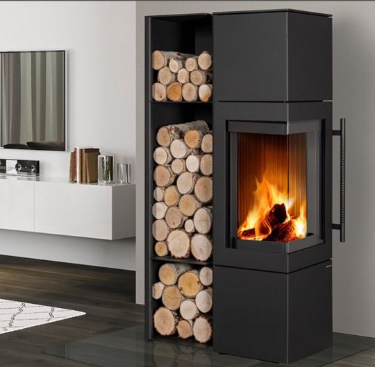
Romotop Esquina 3G mit #holzregal im #ofenhausmainspitze #kaminofen #holzofen #ofen #kamin #wohnzimmer #einrichtung #architektur #mainz #wiesbaden #frankfurt #rüsselsheim #grossgerau #hochheim #hofheim #wallau #rüdesheim #eltville #ingelheim #oppenheim #stromberg #ginsheim #kostheim #kastel #rheinmain #rheingau #rheinhessen https://www.ofenhaus-mainspitze.de (hier: Ginsheim-Gustavsburg) https://www.instagram.com/p/CqJDN3SMJ5l/?igshid=NGJjMDIxMWI=
#holzregal#ofenhausmainspitze#kaminofen#holzofen#ofen#kamin#wohnzimmer#einrichtung#architektur#mainz#wiesbaden#frankfurt#rüsselsheim#grossgerau#hochheim#hofheim#wallau#rüdesheim#eltville#ingelheim#oppenheim#stromberg#ginsheim#kostheim#kastel#rheinmain#rheingau#rheinhessen
0 notes
Text
only to be hit in the face with feelings by the dream ):<
THE LOADING SCREEN FOR REST BY THE FIRE IS SO BEAUTIFUL
8 notes
·
View notes
Text
Ostrichmonkey Hack: Layout Behind the Scenes
Been procrastinating on this enough! So here is a look at some of the process and decisions that went into doing the layout for the Ostrichmonkey Hack.
Let's start with the goals I had in mind:
Keep it simple.
Keep it easy to make.
With those goals set, next step is gathering materials and resources (not all of this was done as cleanly as I'm making it out to be, but this is the gist).
Materials used:
Classic Explorer Template
Affinity Publisher and Photo
Fonts
Art
The text itself
The Classic Explorer Template was critical in getting this layout done efficiently, since it does a lot of the work for you. It's not a replacement for having a rough idea on how to do layout, but it can serve as a nice tutorial/explainer on different elements of layout and typesetting, and honestly, is worth its (digital) weight in gold. There's a free version available if you want to check out what it offers.
I use the Affinity Suite for my layout work. It's a nice set of programs with a manageable learning curve, but there are plenty of other alternatives so go with whatever works for you (one of my favorite elements of using multiple Affinity programs is that within Publisher, you can access both Designer (vector illustration) and Photo (photo editing, illustration etc) functions, which is just a nice workflow).
Here's what my setup looks like, with all the guidelines/base grid stuff turned on;

Normally I start with some style tests and “sketches” to get a feel for what I want the layout to look like, but the Classic Explorer’s does a lot of that heavy lifting for me already so I get to skip this step for this project. Speed and efficiency is one of the main reasons I wanted to use the template - this was envisioned as a “I just need to get something done” kind of project.
So next up on getting it done, fonts!
There are lots of great places to get fonts from, just make sure you're getting them from legitimate sources. Do your homework and make sure that "free" font is actually free to use in commercial projects.
I pulled three fonts from the depths of my collection.
One for the title and main headers (Wallau Deutsch)
One for the second header (Rakkas)
One for the body text (PT Serif)
Technically a secret fourth font for some "bullet points" (1651 Alchemy)

I picked these fonts out because they work together well and are readable. The title/main header fonts are comparatively less readable, but you can get away with that since headers are Big and used less frequently. The second header (Rakkas) is a nice middle ground between a full on blackletter font like the main header, and the classic-y serif of the body text. It creates a transition between the two fonts.
I used PT Serif since it was already in the template, but it also had the bold/italics versions I knew I would need, is readable at a variety of sizes, and had all the special glyphs I would need (it actually did not, but whoops, we'll get to that later).
Normally when I start layout, I do a quick "sketch page" where I try out different fonts and style tests that can look something like this;

But that wasn't necessary for this project (another advantage of the using the template).
Now, let's get to some choices in formatting the text itself.

Each time a key term came up, it was highlighted by bolding and italicizing it. Any time after that, it was just normal text. I went back and forth on highlighting it every single time, but the current format just looked cleaner so it won out.
Additionally, in several places in the text, rather than introducing a third header (which just broke up the page too much, disrupting the flow and clean look), I instead put what would have been the new third header (HP or WOUNDS in the above example) in all caps and behind a colon. This ended up not disrupting the text too much, and was only necessary a handful of times. But when it was necessary, I made sure to stay consistent. Consistent and organized formatting is one of the key ways to make your layout look nice and clean.
Aside from changing some font choices, one of the other ways I tweaked the template was with some spacing (between "sections", like in the above text, introducing an extra line break between the Attributes and Staying Alive sections) and the "bullet points".
The large bullet points that accompany the second headers are actually a glyph pulled from a different font. I picked that one out specifically because its just a little irregular and handwritten looking (1651 Alchemy is a handwritten styled font), and it also helped pull you to the start of new sections, further enhancing the second header. It helps make each section discrete and more "modular".
Back to extra spacing for a second now. So each "chapter" of the text uses the main header to designate it as a full "chapter".

"Characters" up top there is one of those chapter headers. It's nice and big and special, and also takes up a good chunk of space. One a full spread, this also means that the second page of text begins higher up than the text on the first page (compare where Attributes starts vs where Dying starts).
I played around with the format of spreads that did not have a main chapter header on them, starting the first page text up toward the top to have it line up with the second page. Which, probably would have been totally fine, but I preferred the look when each spread had the same kind of spacing. But repeating the main header on each spread was too clunky. So the solution;

Bam! A line!
Blank empty space looked too empty, but slapping a quick line there took up just enough visual space for it to work. Then, I carried that line-design-language to other places (to separate footnotes from the body text, within the tables, and sort of on the cover). This then made the line choice feel even more cohesive and purposeful.
And speaking of footnotes, that was another extra tweak/flourish I added not present in the template (the sidebars are part of the template, but sidebars rule so they would have happened regardless). The footnotes served as a way to share specific references as an informal "works cited". A lot of NSR/OSR design is super iterative, so I thought it would be cool to shout out some of the more direct inspirations and references I used when making my game.
But the footnotes were also kind of not really my downfall. Turns out PT Serif didn't seem to have all the necessary footnote glyphs, nor did it want to make proper superscripts of integers past 3. So, rather than trying to find a new body font (or deal with the headache of using a font solely for superscript notation), I just fudged the formatting some and stuck to asterisks, and restarting "numbering" on each spread. Oh well.
Let's now briefly touch on laying out tables.
It sucks.
My advice is find an example of a really nice looking table and then try and figure out what makes it look nice, and then doing that forever. Luckily, the template saves me again by including multiple examples of tables, ripe for tweaking. Which ended up looking like this;

Nice and clean! Hooray!
Okay, there's a lot of small decisions that goes into making text properly formatted and look nice, but I skipped some of those decisions and didn't go ham on typesetting, but whatever. That all about covers the important parts regarding the text. Now let's talk about art.
Public domain art is your best friend.
I went and trawled through a bunch of art I've saved from the Met's Open Access collection (there's plenty of great open access collections out there, just happened to have some from the Met handy), and settled on this piece;
Which I then dropped into Affinity Photo and played around until I ended up with this;
Nothing too wild, but it Felt Right, so it's done.
I then immediately dropped that onto the cover page, slapped the title on, added a quick border (and also spent some time trying to fix some weird issues that ended up being solved by just rasterizing it, whoops) and bam;

And that's the only art piece used throughout the zine! But I made the most out of it. Between each chapter, I had a single splash page and dropped in different zoomed/cropped versions of the art. Like so (and even on the back cover!);


The original image was high resolution, so zooming in worked, plus the effects/distortions I created hid any imperfections.
So that's the art sorted and the zine finished!
Now, this is getting pretty long, so if there's anything anyone reading this is interested that I didn't touch on, shout in the notes!
38 notes
·
View notes

Text
Not my best work but BRINGING THIS BACK FOR SPEAK YOUR LANGUAGE DAY
WELSH TEDROS HEADCANONS
He spoke Welsh with both his parents and Merlin but no-one (bar the palace staff) spoke Welsh with him after Arthur's death so his Welsh is abysmal
Like on a conversational level it's fine but grammatically. god.
Merlin has to give him Welsh lessons in the run up to his coronation because he speaks in fluent Wenglish
Tedros cannot get the hang of mutations and he spends every waking moment complaining about them. He actually seriously looks into banning them as his first act as king
Agatha also starts learning Welsh as part of her preparation to be Queen. She's better at the grammar than Tedros is but she can't roll her "r" so Tedros gets to keep some of his pride
Part of her education consists of mythology nights in the Celestium with Merlin and Tedros. They cover most of the Mabinogi and some of Arthur's earlier history
Not Blodeuwedd though. Tedros very pointedly avoids Blodeuwedd. I WONDER WHY
50% of mythology night is Merlin and Tedros arguing over minor details in the myths. They are both from different areas and they are both convinced that their regional version of each myth is the correct one.
When Tedros reunited with Gwen during TLEA she would try and speak to him in Welsh and he would reply in English.
He started speaking Welsh with her once they started to reconcile and he remembered Lancelot could only understand half of what they were saying when they spoke Welsh
Lancelot is Breton by the way. This is not relevant but I thought you should know
Sophie had a terrible time staying with Gwen and Lance because Gwen cooks like a true Welshwoman. (Mountains of butter and cheese. Mountains)
Agatha loved it
Anglesey eggs have become her go-to stress eating food. Gwen sends it directly to the palace via Merlin because the Camelot chefs have never touched a carbohydrate in their lives.
Tedros only misses a few mutations in his coronation speech AND he manages to channel his grammar-induced rage into pulling Excalibur so it’s a win all round!
57 notes
·
View notes
Link
0 notes
Photo
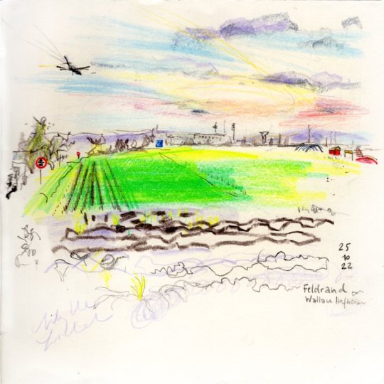
Warten am Ortsrand, eigentlich langweilig und nichts zu sehen, aber eigentlich doch nicht, kann man auch zeichnen: die Autobahnschilder und das Rauschen der Autobahn, eine rote Hüpfinsel irgendwie im Gewerbegebiet, kleinmotorige Flugzeuge ✈️ im Tiefflug, der Acker leuchtet, dunkle Erde und der Geruch vom Abend im Herbst… das letzte Leuchten am Himmel. Das Baugebiet von 1980 ca? wäre eine eigene Zeichnung wert gewesen. Die verschiedenen Nutzungen von Erkern (Fernsehzimmer, Fitnesszimmer, Abstellkammer…) und die vielen Garagentore. #uskrheinmain #urbansketching #urbansketch #landscapesketch #sketchwhilewaiting #feldrand #ortsrand #autobahninsicht #vorort #wallau #hofheimwallau @maiengruen.de @uskrheinmain #grüneracker (hier: Gewerbegebiet Wallau-Hofheim) https://www.instagram.com/p/CkmDBhirtB5/?igshid=NGJjMDIxMWI=
#uskrheinmain#urbansketching#urbansketch#landscapesketch#sketchwhilewaiting#feldrand#ortsrand#autobahninsicht#vorort#wallau#hofheimwallau#grüneracker
1 note
·
View note
Photo
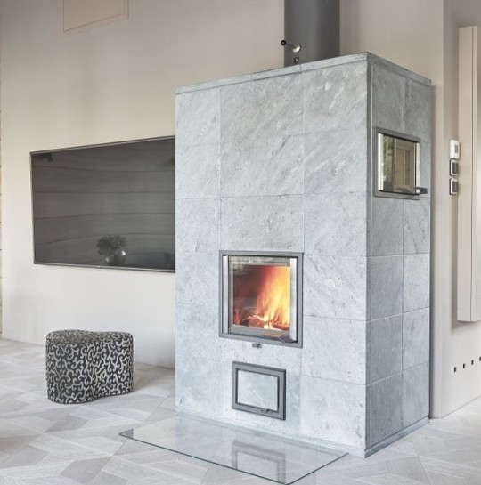
Nunnauuni #specksteinofen #speicherofen mit #backofen #backen #backenmachtglücklich #holzbackofen #kamin #warm #villa #haus #gemütlich #autark #mainz #wiesbaden #frankfurt #darmstadt #hanau #nordenstadt #wallau #stromberg #rheingau #ofenhausmainspitze #speckstein #warm #winter #ferienhaus https://www.ofenhaus-mainspitze.de (hier: Ginsheim-Gustavsburg) https://www.instagram.com/p/Cp9-IuuMAFh/?igshid=NGJjMDIxMWI=
#specksteinofen#speicherofen#backofen#backen#backenmachtglücklich#holzbackofen#kamin#warm#villa#haus#gemütlich#autark#mainz#wiesbaden#frankfurt#darmstadt#hanau#nordenstadt#wallau#stromberg#rheingau#ofenhausmainspitze#speckstein#winter#ferienhaus
1 note
·
View note
Photo
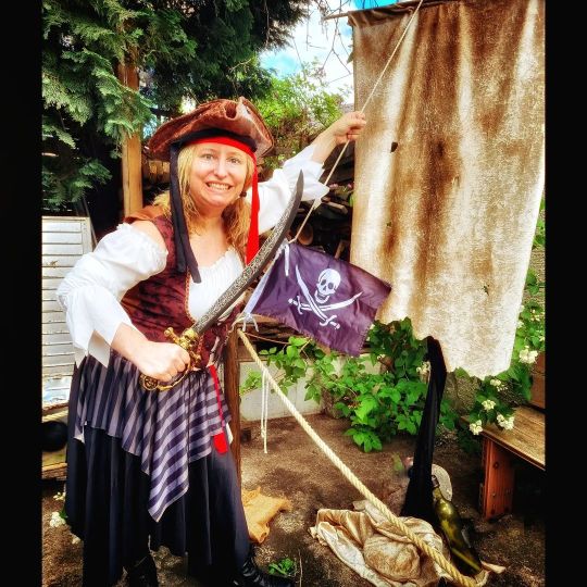
Die #Piratenbraut Anja beim KIDS ESCAPE in #Wallau 🏴☠️🏴☠️🏴☠️ Wir bauen den mobilen #Escaperoom bei euch auf 🤗🤗🤗 #mobilerescaperoom #kidsescape #kidsescaperoom #roomescape #Rheinmain #taunus #hessen #mainz #wiesbaden #frankfurt #kindergeburtstag #pirat #geocachingmitkindern #roomescape #exit #exitgame #escapetheroom #escaperoomfürkinder #darmstadt #hanau (at Wallau, Hessen, Germany) https://www.instagram.com/p/CeLkQG_IGDn/?igshid=NGJjMDIxMWI=
#piratenbraut#wallau#escaperoom#mobilerescaperoom#kidsescape#kidsescaperoom#roomescape#rheinmain#taunus#hessen#mainz#wiesbaden#frankfurt#kindergeburtstag#pirat#geocachingmitkindern#exit#exitgame#escapetheroom#escaperoomfürkinder#darmstadt#hanau
0 notes
Photo

Sunset #frankfurt #ThonyDesign #sunset #afterwork #wbn #wiesbaden #wallau #photography #picoftheday #bestoftheday #urban #artwork #creative #graphic #graphics #artoftheday #instaart #instagood (hier: Wallau, Hessen, Germany)
#artwork#frankfurt#creative#instaart#thonydesign#afterwork#urban#graphic#sunset#wbn#wiesbaden#photography#bestoftheday#graphics#wallau#artoftheday#instagood#picoftheday
1 note
·
View note
Photo

° ° ° #retro #hujicam #kujicam #huji #kujicamera #kujifilter #hujicamera #hujifilter #hujicam📸 #hujiphoto #hujiapp #kujiapp #kujiphoto #hujiphotography #kujiphotography #retrofilter #retrophotography #retrophoto #wallau #hessen #katzi https://www.instagram.com/p/B2CYAaDoGRk/?igshid=1kbm7813jmzzj
#retro#hujicam#kujicam#huji#kujicamera#kujifilter#hujicamera#hujifilter#hujicam📸#hujiphoto#hujiapp#kujiapp#kujiphoto#hujiphotography#kujiphotography#retrofilter#retrophotography#retrophoto#wallau#hessen#katzi
0 notes
Text
Unfall Rastede heute 03.08.22 | Rastede unfall Bahnübergang
Unfall Rastede heute 03.08.22 | Rastede unfall Bahnübergang
Unfall Rastede heute Was ist heute in Rastede passiert? Alles, was Sie interessiert, finden Sie in unserem Artikel. Nachrichten vom Unfallort, Aussagen der Behörden und alle anderen Details. Lesen Sie unseren Artikel bis zum Ende. Unfall Rastede Bahnübergang heute Verkehrsunfall in Rastede im Moment: Was ist heute passiert? Die Polizeiinspektion Ingelheim informiert über die heutigen…

View On WordPress
#rastede unfall bahnübergang 19.11#rastede unfall pferd#unfall bahnübergang frankfurt#unfall bahnübergang gronau heute#unfall bahnübergang hessen#unfall bahnübergang heute#unfall bahnübergang heute ulm#unfall bahnübergang neustadt#unfall bahnübergang sachsenhausen#unfall bahnübergang ulm#unfall bahnübergang wallau#unfall rastede 19.11 21#unfall rastede a29#unfall rastede autobahn#unfall rastede bahnübergang#unfall rastede landesturnier#unfall rastede polizei#unfall rastede raiffeisenstraße
0 notes
Note
Mbak.. saya mau tanya barangkali mbak dea tahu jawabannya hehe
Kalo dosa yang udah kita lakuin itu apa ngaruh ke takdir kita mbak?
Misal, takdir kita jadi orang kaya tapi garagara kita ngelakuin dosa jadinya ga kaya kaya 😂
Pertanyaannya agak nyeleneh mungkin wkwk tapi saya penasaran banget huhu. Terima kasih mbak..
Wallau a’lam sih. Urusan takdir itu cuma Allah yang tahu.
Apakah perbuatan buruk kita berpengaruh buruk ke masa depan? Secara rasional iya. Misalkan kamu nebang kayu di hutan, maka hutan jadi rusak. Efeknya? Ga ada yang gantiin fungsi hutan. Biodiversity juga rusak. Efek domino bisa panjang sampe ke banjir, timbul wabah dan sebagainya.
Sejauh ini, saya memahami bahwa nggak semua perbuatan buruk bener-bener dibales dengan siksaan di dunia. Makanya kadang ada orang yang dzalim banget sama lingkungan dan sama orang lain tapi dia tuh tambah kaya. Sampe meninggal tetep kaya.
Tapi di sisi lain, kadang Allah ngasih hidayah ke manusia sehingga manusia yang awalnya jahat berubah jadi baik. Kemudian dia bertaubat dan menggantikan perbuatan jahatnya di masa lalu dengan perbuatan yang lebih baik. Taubat ini yang mengantarkan dia mendapatkan ampunan.
Dunia itu ladang amal. Sifatnya nggak selalu kayak sinetron yang happy ending. Yang dzalim nggak selalu masuk kantor polisi. Mengurangi kedzoliman itu wilayah ikhtiarnya manusia. Ladang amalnya manusia. Kita tuh udah dikasih panduan Al Qur’an sama akal. Mestinya ini bisa jadi bekal kita untuk mencegah orang lain berbuat jahat.
Hal lain yang perlu kita ingat perkara takdir,
Allah ngasih takdir kita itu sekehendak-Nya. Kita dikasih kekayaan juga belum tentu karena kita taat :D Kita dikasih kesulitan juga bukan selalu karena kita kurang ibadah. Yang jelas, kalau kita selalu berusaha ke arah yang lebih baik, kita dapat pahala kebaikan.
Makin ke sini, saya nggak pernah menanyakan kenapa suatu hal ditakdirkan kepada saya. Yang saya pikirkan cuma bagaimana saya bisa menghadapi takdir dengan baik. Soalnya kalo nanya, nggak bakal ada jawaban juga. Selama kita masih di dunia :)
33 notes
·
View notes
Text

THICKER THAN BLOOD by @voxofthevoid
Summary:
The verse where Will is a vampire who becomes dangerously obsessed with his murderous psychiatrist.
Title page illustration by @lactobacille
26k words, 88 pages.
Inside: Titles in DS Wallau OsF and text in Garamond. printed on Domtar Earthchoice.


Binding: Using the German Stiffened Paper method. Boards are scrap matboard from a local frame shop, covered with a Halloween scrapbook paper.
Date completed: November 2020
34 notes
·
View notes
Text
sekrang sempat diposisi yang "ahh ntar aja bahas masalah beginian ah, msih lama juga kyaknya, bahkan belum keliatan hilalnya", dan klau scrolling YouTube atau Instagram dan muncul timeline tentang nikah² gt langsung skip, wkwk gini ni akibat gk lanjut wkwkw. Salah sih sbenarnya ini mah
Padahal ilmu nikah itu persiapannya harus lebih matang matang dan matang, karena itu ibadah, seumur hidup malah, dan gk semudah yg dikira, kebayang klau ilmunya masih minim wkwkw tapi sampai sekarang msih tetap skip, gk yg se excited pas awal, wallau a'alam
1 note
·
View note