#vnconf
Explore tagged Tumblr posts
Text
The Art of Asset Reduction: VNConf 2024 Write-Up
youtube
This is a write-up for my Visual;Conference 2024 talk on asset reduction: presentation of scenes with reduced art labor.
I will discuss how to reduce production requirements via various methods of asset presentation and staging, walking you through case studies of existing visual novels. This talk will guide you to answer the question: How do I fulfill my project scope without asset bloat?
This is an art talk that assumes you have already scoped down your story and have created a list of scenes that you need. This is not a talk about scoping down your game's story.
You have scenes you need to make. How are you going to make them (and with style)?
Abstraction
Cut-ins
Reduce
Reuse
-
I. Abstraction
I start off with abstraction as a reminder that visual novels are a combination of visual and novel (amongst other aspects)
Abstraction
Abstraction is a strong tool for bringing focus to the writing, highlighting ambiguity and setting the mood with colors.
Examples I mentioned in my talk include:
Black screen
Solid colored screen
Sky BG
Of Components
The mood-setting power of abstraction also extends to scenes with characters, especially CGs.
As again, abstraction draws focus to what you choose to emphasize: the characters.
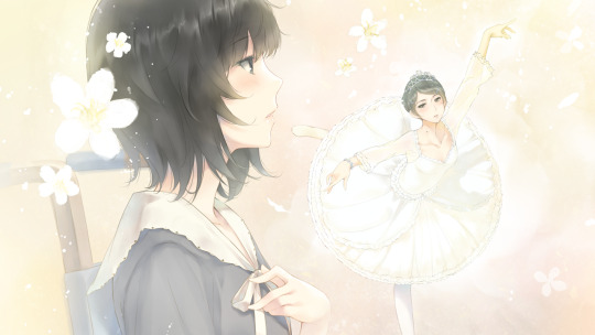
(FLOWERS -Le volume sur ete-)
They are gay. Thank you for coming to my VNConf talk.
-
You can similarly abstract characters.
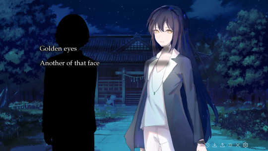
(Lachesis or Atropos)
Consider representing irrelevant characters (e.g., NPCs) as silhouettes. The reader can fill in the details within the shapes themselves.
Silhouettes are especially great for crowd scenes where you want to draw focus to the main characters.
This will be a recurring theme:
What do you really need to draw?
-
II. Cut-ins
One common not-quite full screen piece of art you'll see in many visual novels is the cut-in.
The cut-in typically consists of the:
Item/focus
Frame
And is often for topics such as objects or small animals, which may exist in the scene but may not be within the same frame of reference as the background and sprites.
The separate framing informs the players that the item is "separately framed."
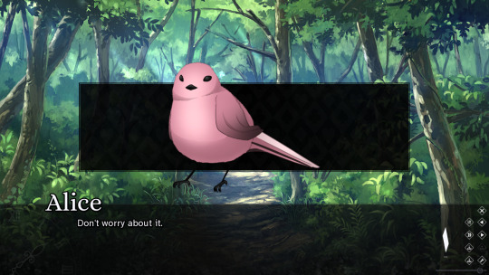
(Who is the Red Queen?)
For example, this small bird is not huge and would not be the size of a character's head even had a sprite been on screen.
The Foreground-Backdrop Heuristic
Cut-ins make strong use of what I refer to as the "foreground-backdrop heuristic."
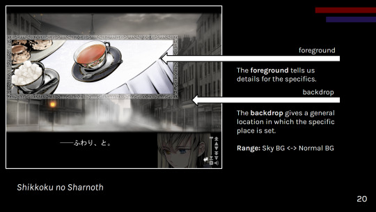
(Shikkoku no Sharnoth)
A general backdrop informs the reader of a broad location or scene (especially if characters are present). Then a more specific foreground (the cut-in) informs the reader of the specifics.
As the foreground cut-in is in a different frame, the pairing of the two helps create a mental model of the space in the reader's mind.
Cut-ins can be used for:
Backgrounds (mix and match foregrounds with a backdrop)
Reduced CGs
Presenting existing assets in a different frame of reference
CG variants
Try tackling your visual presentation in a layered, comic book-esque fashion with cut-ins!
Just be careful about clutter.
Whether you want to go for the layered cut-in style, the 3d stage cinematic style, or a combination of the two, make sure you have a vision before you jump in.
SD CGs
I had to make an obligatory mention of SD "super deformed" CGs in this talk, so here it is in the write up as well.
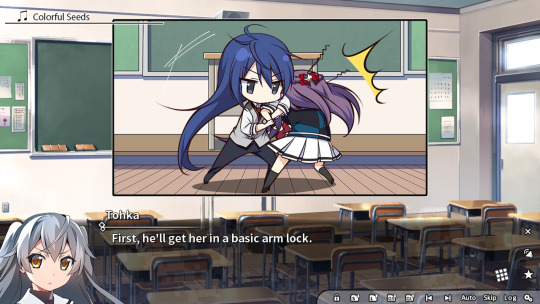
(Grisaia: Phantom Trigger Vol. 1)
SD, chibi. However you call these, they're great for playful scenes that might require more art than your classic sprite-background combination.
What SD CGs do best is that they:
Fulfill the role of a CG
Are easier to draw than fully rendered non-chibi art
Can be distributed to different artists to reduce artist workloads due to style difference
Just keep in mind that a simplified CG is still a CG and thus may lack reusability.
Consider what scenes really need a CG.
-
III. Reduce
Now, consider asking yourself: "Does what a player does not see need to exist?" (mostly applicable for games with opaque UI)
Yet, what you need to draw is what you need to draw. How can you reduce the work in what you need to draw?
One option is:
Palette Limitation
You've heard of gray scale games, but don't forget about other ways of limiting your palette to reduce workload.
Dramatic, mood setting color power
Less rendering work
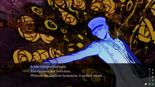
(Sona-Nyl of the Violet Shadows)
A similar idea can be applied to NPCs for a more detailed take on silhouettes.
-
IV. Reuse
Lastly, please remember to be economical and reuse assets as necessary. One of the great joys of cut-in BGs, for example, is reusability.
I had to give an obligatory mention to CG variants in my talk, such as:
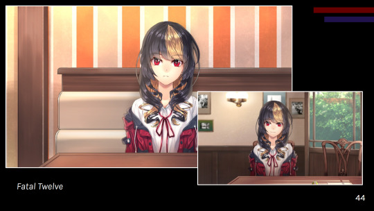
(Fatal Twelve)
However, overall, you never know when you'll want to use various components of your art elsewhere such as intermixing CG and sprite art.
Please keep your working layers if possible.
Other reuse examples:
UI (especially in episodic games)
Gameplay (e.g., Kogado's rhythm game)
Consider asking your programmer to work on a framework to reuse, reducing repeated code work.
-
Conclusions
All in all, you can make your game.
And it doesn't need to be hellish on your budget or timeline.
If you take anything away from this talk, let it be to:
Prioritize reusable assets
Maintain aesthetic; avoid clutter
Display important scenes
Do not scope up; aim for a set goal
A scene can be presented in many stylish ways, some of which will suit your workflow better than others.
So, go on. Make your game!
-
Interested in my works? Find me on itch:
And check out my newsletter:
-
VNConf 2023 Talk Write-up:
#visual novel development#vnconf#visual novel#vn#vndev#development guide#devlog#game development#talk write-up#gamedev#indiedev#this talk is also a yuri visual novel recommendation (kind of)#lachesis or atropos#shiei no sona-nyl#fatal twelve#grisaia phantom trigger#shikkoku no sharnoth#flowers visual novel#who is the red queen?
54 notes
·
View notes
Text
Forefront Post: Visual Novel Con
I have been following the youtube channel Visual Novel Design, as he gives really helpful advice on how to create visual novels, and through him I hound out that there is a conference that happens every year centred around visual novels, VNConf. I follow their channel and they had a bunch of talks given by professional visual novel developers.
Since I have been really enjoying creating a game I have been thinking about it, and I would really like to keep making my own games like that on the side after Uni is over too, so I really wanted to see what they had to say about being a visual novel developer.
In this talk shibalist/ Toast talks about being a solo dev:
VNConf 2023 - 14 - Toast - So You Want to be a Solo Dev - YouTube
While I would like to collaborate with people on some games I also like the idea of developing some myself so this was very useful. During the talk, Toast explained that being a solo dev comes with a lot of advantages and disadvantages. The advantages include:
Having more creative freedom. in my small experience developing the Detective Amphibian Demo, this has been true, and something that I really appreciated it.
There is less social pressure, which can also be a con. In my case while I did have less social pressure than I would working in a group, I still had a lot of external pressures since tis was a university assignment. So I'm not really certain if I will be able to keep myself accountable while developing a game if I am not in an educational environment where those pressures exist, so this is something I should watch out for.
You learn a lot of new things that you wouldn't otherwise. This has certainly been true for me. If I was working with in a group someone else would have taken charge of the programming, and potentially the UI design, both of which I ended up really enjoying. So I am very grateful that I had the chance to learn those skills.
You can work however you like. This was only partially true for me. I definitely had a lot more freedom to work in a way that felt more natural to me than whenever I've had to work in a group, but I also had some restrictions/ obligations set by my planning folder and the major project brief. While some of those restrictions and obligations did feel like they hindered me, others like having to follow the planning folder ultimately really helped me stay on task, even if the felt annoying at the time. So I think I should keep that in mind in the future when working on my own projects
The disadvantages included:
Having less time, as you can’t do tasks in parallel with each other, since you are working on everything. This is something that I encountered and kind of blocked me creatively.
there will be a trade-off in quality. Which is something that knowing myself might be a bit hard to accept, so I will have to keep it in mind
You have to do everything.
The work will stall a lot more and a lot more easily. This is also something I had trouble with. There were a lot of things that got me stuck creatively, and since there were no other people working with me everything would kind of come to a halt, wich felt really demotivating and made it hard to push through.
They also included some questions to ask yourself when making a game, like what you need to build it, how you will get it, how much time it will take, ect. which felt really reminiscent of the planning folder.
They also mentioned that being a solo Dev doesn't necessarily mean you have to do everything yourself, you can download pre-made assets, or existing music to make your life easier. I know that in my case I deffinetly want to leave the music to someone else.
They also mentioned that areas to watch out for are, overscoping, underestimating the difficulty of something and isolation, all of wich I experienced to various degreed throughout the project and should take steps to avoid in the future.
All of these issues caused me to burn out quite often, so I found this talk by Maxi Molin very useful.
(Visual;Conference 2021) 04 - Maxi Molina - Avoiding burnout as a solo dev! - YouTube
The talk was about avoiding burnout as a solo dev. One of the first things the advised was to question if solo dev is right for you.
For me I think it is, at least as something I do on the side. While I did get burnt out a lot, I also felt a great sense of satisfaction in varios stages of the project, so it is something that I want to keep doing. I think it was worth it even with the burnout, but that doesn't mean I don't want to avoid it happening in the future.
They also talked about some of the pros and cons, and a lot of them where the same as Toast's, but there were some different ones that I hadn't considered. One of the pros was that you can have full ownership of what you do, which is something that I hadn't really stopped to appreciate. The new cons were that, you don't really have emotional support from a team, and that it becomes really difficult to estimate time. For the first point I think getting emotional support is not always the case, as it depends on who you are working with, but I also hadn't considered that being a solo dev means you are definitely not getting any of it. So, I think I should start talking to people around me more about what I am doing in order to avoid feeling isolated. For the second point, that was deffinetly true for me I think, and I need to keep that in mind and start overestimating how much time things will take me more.
Some of the advice that they gave for avoiding burnout was:
Finding a message that you want to convey, and keep that in mind to stay motivated ad remember why you need your game to be made. Honestly I really struggle with that one, because while I can see why it would be helpful and needed, whenever I try to do that it ends up feeling shoehorned and like im taking myself too seriously, so I end up feeling more demotivated. I think that's something that I have to sort out about myself.
Keeping the project's scope in mind. I generaly struggle with that type of thing as I end up being too ambissious sometimes, (which is something that happened during the major project too) so I really have to make sure I stick with my initial goals and stay realistic.
I need to keep a good pace instad of rellying on passion. This is something that I really need to keep in mind because throughout the project I would get these spikes in excitement and productivity and then burn out creating a bit of a vicious cycle.
Finaly i should try spotting what patterns demotivate me.
Overall these talks were really insightful about the challenges of being a solo game at the moment, and I should really keep what I learned in mind in the future if I want to pursue making games (or any other type of solo project)
Bibliography
(Visual;Conference 2021) 04 - Maxi Molina - Avoiding burnout as a solo dev! (2021). YouTube. 24 January. Available at: https://www.youtube.com/watch?v=RadK66-eWDM&ab_channel=Visual%3BConference (Accessed: 23 August 2023).
VNConf 2023 - 14 - Toast - So You Want to be a Solo Dev (2023). YouTube. 30 January. Available at: https://www.youtube.com/watch?v=_l-Yht1UjWg&ab_channel=Visual%3BConference (Accessed: 23 August 2023).
0 notes
Text
Fictional relationships feel real
I’ve been writing a few posts now about the relationships in Knife Sisters and what we learned from making that game, as well as from the comments we received (here and here). This post is about one of the most important findings we’ve done when it comes to relation games.

Players invest themselves when playing
Knife Sisters was the first game I made about relationships. I've written novels, but as you might know, there are big differences between games and novels… one of the most prominent being that people who play games and retell what happened, talk about themselves in first person. That’s something I’ve never experienced when it comes to novels. It seems like the player identifies more closely with the player character than what readers do with the main character in a novel. That isn’t to say that readers don’t engage deeply with the characters in novels, they definitely do - I just think they do it in another way.

Players who played Knife Sisters tend to say things like “I dated Vicki”, or “I went to the forest to find a skull”… and by that, in a way, they’re stating that they are in fact the main character Leo – because they’re the ones making that character’s decisions. The one that brought this phenomenon to my attention was Christine Love in her fantastic talk Narrative Techniques in Ladykiller in a Bind at VNConf in 2017. And after hearing about it, I’ve paid attention to this habit in myself, and yes, I do it too!
From that viewpoint it also gets pretty easy to see something that I’m not sure I was fully aware of when I started working on Knife Sisters, and that I will elaborate on below.
Fictional relationships feel real and should be treated as such
Players invest themselves when playing, and the decisions they make, as well as what happens in the in-game relationships, needs to align somewhat with the player’s wishes for that outcome – otherwise it might feel very out of tune for them. The relationships in a game need to be handled with care, just like ‘real’ relationships.
The break-ups
From my own experiences of playing games, I have two examples, both from the same game, an otome game called Amnesia (the English release is called Amnesia:Memories) by Idea Factory & Otomate. (Note that there will be spoilers ahead so if you’re not up for that, you can stop reading here.)

In Amnesia you play a girl with memory loss. There are four parallel worlds which you as a player can enter and explore, to try to find out what has really happened. In each world, one out of four guys is the protagonist’s boyfriend… or are they really? She can’t be entirely sure that the guy presenting as her boyfriend was actually that in her previous life, before she lost her memories.

One of the boyfriends is Ikki, a very popular person who even has his own fan club. As the game progresses, the heroine feels quite unsure of her feelings and what she is to him. But me and Ikki (now I’m doing it) went on nice dates – and when I got to the first ending in that route, it was one where Ikki broke up with me. Even though I shared the heroine’s feelings of doubt about the sincerity of this person, I actually felt heartbroken. I still wanted the relationship to succeed – and I especially didn’t want him to break up with me!

Another relationship I had in Amnesia was with Toma. Toma is a very jealous and “protective” person, and his route takes quite a strange turn, when he locks the heroine up in a cage to keep track of her. I detested Toma, and when I reached the so-called good ending – where the heroine chooses to stay with him and forgive his actions, I couldn’t feel accomplished at all. I really wanted a way to tell him that what he had done wasn’t okay in any way – and for sure I wanted the chance to break up with him (and more too).

I think those two examples from the same game are very different, even though both are about things that happened in the game that made me feel bad. I could accept that I had gotten a (mildly) bad ending with Ikki, and that I could replay his route and try to get the romance ending, where he wouldn’t break up with me. But I found it hard to stomach that I had to accept Toma’s actions toward myself, which I thought were repulsive, without getting the chance to object to it. In the first case, I think the game is fine in leaving me with my feelings of regret for being dumped, but in the second case, I absolutely think the devs should have added the possibility to say “thanks, but no thanks”. I think it would have been better to give the player the opportunity to set boundaries in this situation.
(I’ve written another lengthy post full of spoilers about this game and its anime adaptation, if anyone’s interested!)
If fictional relationships feel real, how does that affect game design?
Accepting that fictional relationships feel real, and that players might object to going against their own will, can definitely affect the way we design games. We need to be mindful of how we utilize characters and relationships in games and what options we give to players. But as game developers, and especially indie devs, we also have constraints. Every new character and every route with different options adds to the game’s size – and therefore to the budget and development time. So there needs to be a balance between the options given and the scope of the game. This can lead to tricky design challenges when deciding which characters are in the game and how the player can affect the relationships with them. I’ll continue the discussion about relationships and gameplay in my next post.
Have you played any games in which you objected to relationship outcomes?
1 note
·
View note
Text
Changes in VN Screen Resolutions

Tracking the default screen resolutions of new VNs releases shows how long it’s taken for HD resolutions to reach the VN mainstream. It wasn’t until 2014 that the majority of VNs being released were widescreen, which is also the year Japan released the first 4k televisions.
This is just a teaser for my VNConf18 presentation on trends in the VN market this weekend, which will have an accompanying post I’ll put up here.
8 notes
·
View notes
Link
The Visual Novel con starts in 5 hours! *excited as a puppy*
Last year was lots of fun, so I’m really looking forward to this one!
1 note
·
View note
Text
Questions Needed!
Heyo fellow game devs! Have you ever wanted to know more about the business side of working with voice actors? Hiring, payment, contracts, finding, etc? I'm doing a talk about that at VNConf in January!
If you have any specific questions, feel free to drop them here. Would love to make sure I cover the stuff you're most interested in.
15 notes
·
View notes
Text
VNconf was fun, but my ADHD brain was not ready for the sitting-and-listening-all-day an online conference requires. Learned a lot, but also zoned out a ton and took way fewer notes than intended.
0 notes
Photo

The Drastik Measure News Room – Visual;Conference Interview with Agilis and VNConf Presenters
It’s been about two weeks since the first western visual novel conference, Visual;Conference, has happened. During the con, many amazing talks and great connections were made between fellow devs and attendees. Afterwards, I wanted to talk with attendees, presenters, and the organizer about thoughts after the con. This is the interview done, finally written and compiled, for your reading pleasure. Enjoy!
Read the full interview here
For those who missed Visual;Conference, a playlist containing full recordings of all of the event’s presentations can be found on Youtube.
79 notes
·
View notes
Text
Happy New Year 2024
It’s hard to imagine that 2024 is already upon us. Thank you for all the support! I’ve had the chance to work with lots of amazing people again this year.
Let’s take a look back on 2023.
2023 Recap
In January, I gave a talk at Visual;Conference: Polishing your Release: the Little Features that Could.
youtube
In June, I released a short demo of a story I’ve been wanting to write for a while. While Consummation isn’t quite next up on my list of games to make, I hope you enjoyed a sneak peek at its characters and world!
In July, we released an updated version of our horror-mystery visual novel Lachesis or Atropos on Steam with the help of folks at Quill Yuri. Thank you for the hard work, everyone!
youtube
Check it out at
At the end of September, we released our survival-horror visual novel, The Final Prize is Soup, for Spooktober VN Jam. Amazingly, it won second place!
Jajajan!
A fulfilling year! (*¯︶¯*)
Upcoming
As for what’s upcoming in January…
I’ll be speaking again at Visual;Conference this year! The topic will be: The Art of Asset Reduction: Make More With Less
I will discuss how to reduce production requirements via the use of asset staging, recycled frameworks, and online resources, walking you through case studies of existing visual novels. This talk will guide you to answer the question: How do I fulfill my project scope without asset bloat?
Find out more at https://vnconf.com/
-
Happy New Year!
shino
-
Interested in getting updates straight to your email inbox? Subscribe to my newsletter!
#vndev#newsletter#happy new year#indie dev#gamedev#vn#visual novel#visual novel development#vnconf#visual conference#vn development#Youtube
7 notes
·
View notes
Text
Hi everyone. As always with exciting things happening, I thought I’d let you know about Visual;Conference 2017. It’s a day-long online conference run over the course of January 14th (US time), organised and hosted by Randy “Agilis” Au, Project Manager and translator for Sekai Project.
The conference hosts 30 speakers who will share their experiences with visual novel creation, translation, publishing and everything in between. While not all speakers have been revealed at the moment, I will make an educated guess and say that there might be a talk on UI design, past Jake Bowkett’s logo design talk.
The event is paid (with ticket discounts until Dec 31st), so if you’re interested, keep an eye on the VNconf schedule and Twitter for news as it happens.
6 notes
·
View notes
Text
Polishing your Release: the Little Features that Could
youtube
This is a write-up for my Visual;Conference 2023 talk on polish: UX and accessibility.
I will discuss quality-of-life features and accessible design with engine-agnostic tips for implementation, walking you through case studies of existing visual novels.
This talk will guide you to answer the question: How do I give my players an improved user experience?
To create a polished visual novel is to deliver your game with both style and usability.
This talk focused on the aspect of usability and accessibility in your visual novel. How can you give your players a better user experience in terms of the following?
Core Visual Novel Experience
Accessibility
Extra QoL Features
-
I. Core Visual Novel Experience
You want your player to be able to read your narrative as conveniently for them as possible. Interactive components in your game application should mostly be there to enhance the player experience whether it is part of your narrative or there to give players more control.
I briefly touched on some common components/screens found in just about every visual novel.
Quick Menu
Be easy to click and inobtrusive
Be easy to understand
Convince your players that it actually works by providing feedback to button clicks
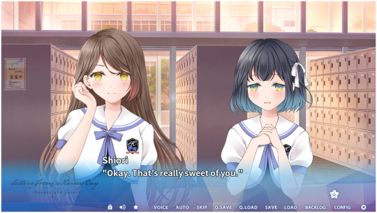
Text based quick menus are easy to understand, but take up lots of space. Icon based quick menus can be very abstract (what do the icons mean even if seemingly "obvious?")
You may want to consider a combination of both, but if using icon based quick menus, be sure to clarify the icons such as via tooltips.

Provide feedback when the quick menu items are clicked. Most actions just bring up a screen (obvious feedback). Skip will cause rapid movement of text on screen (easy). Auto is more subtle.
What can you do?
Change the auto button to an active state vs. idle state on press
Hide the CTC and/or quick menu on auto
Change the CTC to an "auto-mode activated" CTC
Etc.
History
Provide long enough history to backread
Provide utilities (e.g., if voice acting in game, allow voice replay)
Remember that rollback and history are two different things
Save/Load
Provide context of when and where
Provide sufficient slots for all choices without requiring player overwrite (visual novel players SAVE EVERY CHOICE)
Consider feature to indicate newest save, file deletion button, save file locking
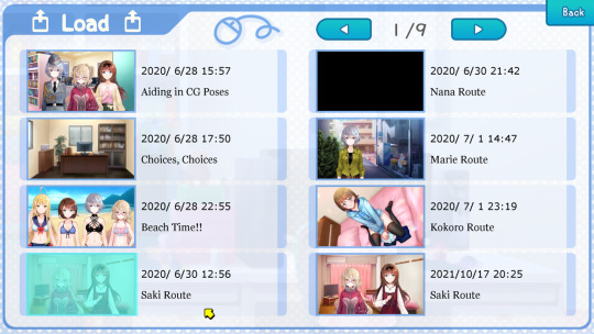
To provide context, have a visual and timestamp, but also try providing chapter names or scene descriptions.
Configs
Provide reasonable default settings (e.g., audio at 70%)
Avoid overwhelming users by categorizing options and providing reasonable support (e.g., slider vs radio)
Provide previews
Single pagers and multi-pagers are both good. Make it easy for the player to get in, change the settings to their preferred values, and get back to the game.
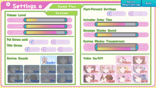

Additional recommendations:
CTC icons
System sound
Splash screens (especially first time setting initializations)
-
II. Accessibility
Stating the obvious: start with good design :)
Make accessibility features easily accessed and support them:
Put it into your configs screen even if it's built in if you want to support it
Test and check that it works correctly (e.g., self voicing pronunciation, text size overflow)
Provide a reasonable number of options per feature. Whatever options you explicitly provide, you should actually be supporting them.
No one’s coming after you if the built in Ren’Py accessibility toggles overflow your textbox, but it sure will be a problem if the font sizes you’re explicitly providing are broken because that’s just a bug.
Recommended accessibility features: (italics talked about in presentation explicitly)
Self voicing
Image descriptions
Text options
Photosensitivity
Screenshake
Audio captions
Graphic images filter
-
III. Extra QoL Features
Not all features are great for all games, but some quality of life features can be very useful depending on your game. Therefore, you should know your game to know how to make the player experience better.
What's the genre?
How long is it?
What's the branching structure (if any) like?
Gameplay?
In this section, I briefly tackled exploring Aoishiro (highly recommend this game, by the way) and how some of its quality of life features are useful due to the type of game it is.
Genre?
occult fantasy, Japanese mythology

Having a glossary (with "new" indicator and alphabetization to make it usable) is very useful in game genres with lots of terms!
Length?
30+ hours (according to vndb. I took way longer, so pretty long)

Fourth item down in the first box is a togglable alarm for when skip ends! (Vibration mode, sound mode, both, or silent) Longer visual novels with large trunk portions of shared text that might get new unlocked text often need lots of skipping.
Branching?
56 endings, route unlocking mechanics
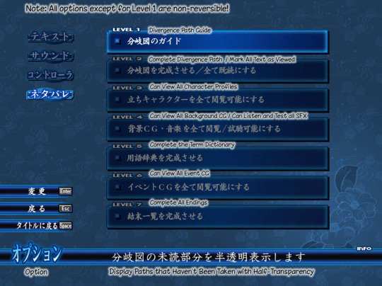
Aoishiro provides a spoiler option that lets you "mark unread content as read," unlocking content that you may not have actually been able to play through, whether it's due to difficulty or just laziness.
(This is also useful for remasters or sequels that contain previous game content but are not backward compatible save file wise.)
-
Conclusions
Make life more convenient for your players by keeping in mind UX heuristics such as:
Providing feedback & status
Error prevention & control
Recognition over recall
Consistency & standards
To polish your release, you want to make its features usable, accessible, and useful for your players!
Make baseline features with usability and accessibility.
Add additional QoL features depending on your game.
I hope this talk helps you make your visual novel a better experience for your players!
#visual novel development#vnconf#visual novel#vndev#development guide#talk write-up#devlog#game development#ux#accessibility#game work game convenient game good#this talk is also a yuri visual novel recommendation (kind of)#Youtube
54 notes
·
View notes
Text
Releasing 8+ games (ft. game jams) and when to take a break
youtube
This is a write-up for my Visual;Conference 2022 talk on game jams.
I will discuss how game jams made me a better developer, walking you through my experiences as director, co-director, and direct creative roles in jam games across two years before I put a moratorium on jams. This talk will guide you to answer the question: Should you participate in game jams? (Spoiler: yes, conditionally)
In the talk, I discussed 3 main topics:
How to Game Jam
Lessons Learned
Should you participate in game jams?
How to Game Jam
The game jam timeline typically consists of four components:
Planning
Recruitment
Development
Release
There may be some overlap between the first three, but let's go in order.
Planning
Identify your premise
Identify your scope
Create references (outline, visual references)
Before you can bring a game to life with your team (or solo), you have to put the idea on the table.
Visual references are especially important if you're working with other artists. They reduce:
Communication difficulties (does the character look like this or that?)
Schedule delays (how can they draw if they don't know what to?)
Future issues (how do you draw this again...?)
Recruitment
Have your idea set before you recruit. When making your recruitment pitch, you'll want to address most if not all of the following:
Who are you? What are you doing?
Premise of the game
Scope of the game
Requested roles
Proof of concept
Here's an example I gave in my presentation:
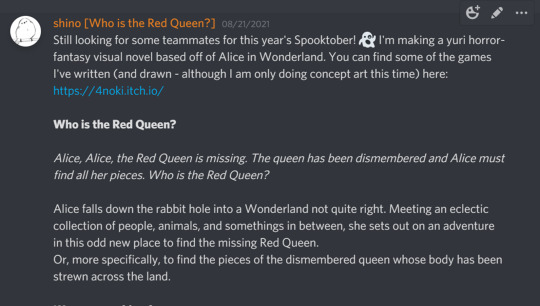
You might not always have everything, but people won't get recruited if they don't know you're recruiting their role.

Once you've assembled the team, be sure you verify how they want to be attributed in the credits.
If you can't find a role, remember that CC assets exist!
Organizing Your Team
I recommend having a home base such as a Discord server (communication), shared Google Drive folder (assets), and GitHub repo (code version control).
Make sure folks know project information that isn't in your recruitment pitch such as:
File types (.ogg for music?)
Engine (Ren'Py?)
Asset specs (1080p?)
Compensation (if any)
Deadlines
Communication is key in avoiding delays. Start communication before the jam.
Development
Ideally, your planning has prepared you for the development process, and you don't need to do anything but make the game during the jam.
Ideal is rare, issues popping up here and there. Some common ones include:
Q. What if a teammate falls through?
Don't panic! If you're the teammate, remember that your team lead will appreciate upfront communication.
If you're the team lead, there's a number of options to take. Cut scope in that teammate's component, take on the task yourself, try to recruit a new teammate, and or grab some asset packs.
Q. What if we can't finish on time?
A jam is a jam. Remember the trusty old scope knife. In order to avoid having to cut scope from your game, do your planning well.
Release
Jams will give you a visibility boost, but remember to market regardless.
Plan to submit a few days before the jam ends. This gives your team leeway in case delays occur.
I believe in you!
Lessons from 8 Jams
There are 3 types of roles (a bit of a simplification) you can take on in a production regardless of your creative specialization:
Team lead
Solo developer
Contributor
Each comes with pros and cons. Jams are a great way to figure out what you like to do, and what your preferred team dynamic is.
Here's some questions that might help you:
How much creative control do you want?
How do you like to communicate?
Thus with these tips for jamming in mind, we ask and answer the key question:
Should you participate in game jams?
Yes, conditionally.

There are pros and cons to game jams.
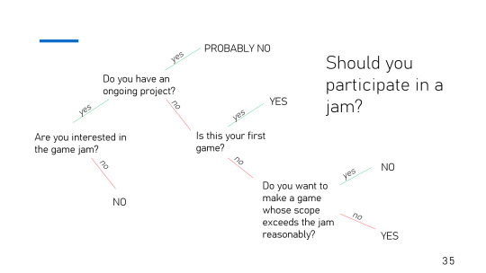
But overall, jams are a great way to dip your feet into making visual novels. Make great friends and great games.
If you're aiming for a larger production, especially one with money involved, remember that you don't need to join every jam. Why not focus on your ongoing project first?
_:(´ཀ`」 ∠):_ That's advice I need to take myself...
After note
If you're interested in learning more via case studies, please feel free to check out the following:
Postmortem for NaNoRenO 2021
Postmortem: Spooktober Visual Novel Jam (2022)
#visual novel development#vnconf#vndev#game development#visual;conference#development guide#devlog#talk write-up#Youtube
12 notes
·
View notes
Text
Happy New Year! To get these posts straight to your inbox when they come out, do subscribe to my newsletter!
Happy New Year 2023
Looking back on 2022: Who is the Red Queen Steam release, Lachesis or Atropos, and more!
As the world rolls into 2023, I’d like to look back on everything we’ve accomplished in the year 2022 and thank everyone who was part of it.
Who is the Red Queen? Steam Release
Alice, Alice, the Red Queen is missing. The queen has been dismembered and Alice must find all her pieces.
youtube
In August, with the help of the Bellhouse, we were able to publish an updated version of Who is the Red Queen? on Steam. The updated release includes new CGs, tracks, a LatAm Spanish translation, and more!
-
Lachesis ∨ Atropos Release
This world is woven of strings, of fate and of hate. What do you see, detective?

At the end of September, we released a horror-mystery, yuri visual novel Lachesis ∨ Atropos. Coming out to over 45k words and 4 major endings, LoA is our biggest game yet!
The game was shortlisted for the Spooktober 4th Annual Visual Novel Jam.
Postmortem || Fun Facts
-
Other
In addition to the two major releases…
In January, I presented a talk on game jams at VNConf 2022—write up available here.
In February, Moon Archer Shooting Stars received a Chinese translation with the help of Yuan.
Thank you to everyone for the wonderful year, and let’s have an even more wonderful 2023 together!
This upcoming year, I will be working on an unannounced project and collaborations with Quill Yuri, Quill Studio’s yuri branch. Please follow me on Tumblr and Twitter for updates!
Happy New Year (*´▽`*)
shino
-
Newsletter
#visual novel development#vndev#yuri#visual novel#wlw#lesbian#devlog#announcement#end of year#newsletter#who is the red queen?#lachesis or atropos#moon archer shooting stars#vnconf#Youtube
8 notes
·
View notes
Text
Attending Visual;Conference 2023
Visual;Conference, also known as VNConf, is an annual online visual novel developer conference (website). VNConf 2023 will be held on January 28, 2023 (Sat) 11AM-6PM EST.
-
I’ll be giving a talk called “Polishing your Release: the Little Features that Could” at VNConf 2023 next weekend.
I will discuss quality-of-life features and accessible design with engine-agnostic tips for implementation, walking you through case studies of existing visual novels.
This talk will guide you to answer the question: How do I give my players an improved user experience?
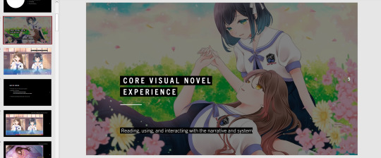
If you’re interested in visual novel development, I hope to see you there!
#visual novel development#visual novel#vndev#vnconf#visual;conference#game development#announcement#indie game development
2 notes
·
View notes
Text
Introduction
Hi! I’m shino, an indie yuri visual novel developer who makes gaymes under the label 4noki.
I gave a talk earlier this year at VNConf on the topic of game jams ( Releasing 8+ games (ft. game jams) and when to take a break ) and released a number of yuri games of varying lengths including:
Who is the Red Queen?
A Wonderland themed horror-fantasy yuri visual novel with 3 main endings. This game was published with the help of Studio Elan’s Bellhouse, and you can play it for free on Steam and itch!
Alice, Alice, the Red Queen is missing. The queen has been dismembered and Alice must find all her pieces.
Alice falls down the rabbit hole into a Wonderland not quite right. Meeting an eclectic collection of people, animals, and some things in between, she sets out on an adventure in this odd new place to find the missing Red Queen. Or, more specifically, to find the pieces of the dismembered queen whose body has been strewn across the land.
youtube
And most recently, a cosmic-horror, mystery, yuri visual novel with 4 main endings: Lachesis ∨ Atropos
This world is woven of strings, of fate and of hate. The seeing-detective finds herself entangled in the threads of Parca, destiny and disaster.
A private investigator visits a small town after recovering from a coma. She searches for her mentor's lost beloved, but the very eyes she was born with, those that can see the black strings of hate, drag her down into the darkness of conspiracy.
A cult, two priestesses, and the threads that puppet the world.
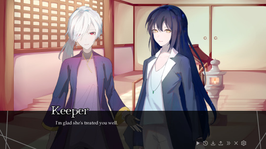

You can get it on itch.io for free as well!
https://4noki.itch.io/lachesis-or-atropos
Due to various events on a certain bird app recently, I was finally galvanized to make a tumblr! I’ll be posting my thoughts, behind the scenes sketches, and announcements here as well now.
Do drop me a follow if you’re interested in keeping up with my projects!
Filling the world with cute girls and yuri one story at a time.
shino
#yuri#visual novel development#visual novel#vndev#vn#introduction#who is the red queen?#lachesis or atropos
42 notes
·
View notes