#vernaculardesign
Explore tagged Tumblr posts
Video
youtube
For Visual Diary #4, another service that helps the disabled are the inclusive playgrounds that Singapore has been establishing around their country. From a TedTalk on May 24th, 2018, "To design better tech, understand context (TEDGlobal2017),” it was emphasized that as designers, we need to engage ourselves and immerse ourselves in the environment of those in the audience in order to really understand what they need, and those who designed this playground and work with these kids have done so to understand how to make such a playground exist and work for these kids to use and play with. Additionally, in Nelson and Stolterman’s book, “The Design Way : Intentional Change in an Unpredictable World - Foundations and Fundamentals of Design Competence,” it states how “design ideally is about service on behalf of the other -- not merely about changing someone's behavior for their own good or convincing them to buy products and services” (page 41). I think this inclusive playground does a great job painting how the designer built this service on behalf of these disabled kids and now allows them to develop equal relationships with other kids and those who help them through such platform.
#gumpdc620#service#designintervention#designleadership#vernaculardesign#designvernacular#playground#inclusive#design
6 notes
·
View notes
Text
Good design is economical. That is, it maximizes the use of whatever resources it employs - nothing is wasted. Francis Kéré, from Burkina Faso, uses traditional architectural archetypes from his home village in order to build beautiful, useful, and sustainable buildings.
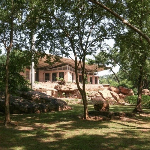


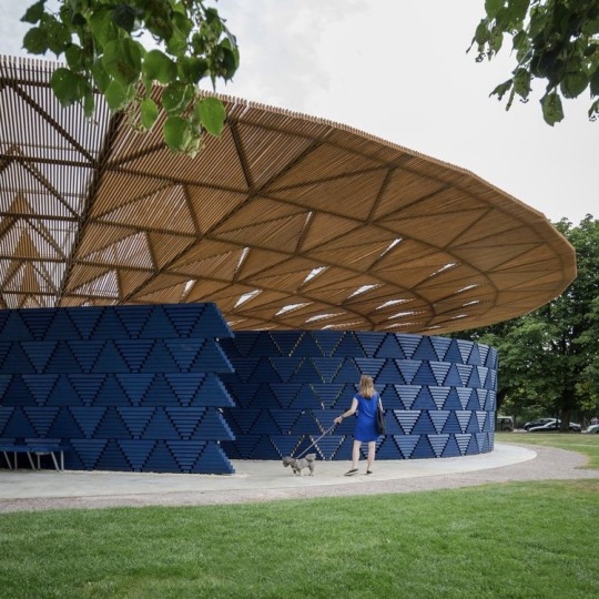
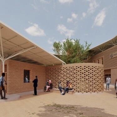

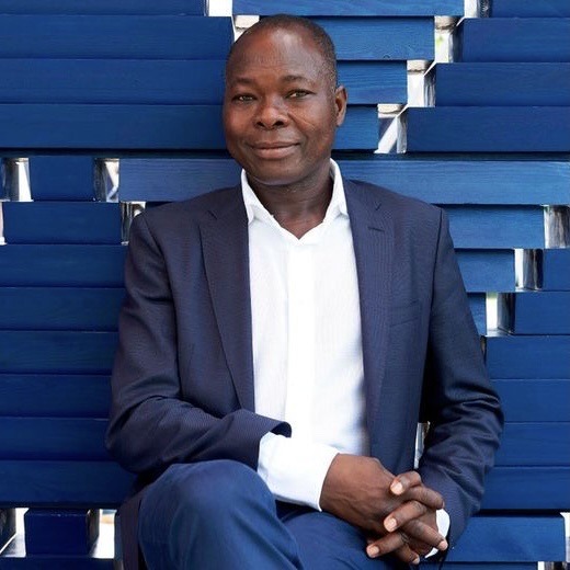

This is Francis Kéré, an architect from Burkina Faso and at least in my eyes, the patron saint of "afro solar punk". He builds using local, sustainable materials, and uses the education he received in Germany to improve on traditional methods already known. His first project was a school in his home village, built to enable other children to receive an education like he once was. The school has a self-cooling mechanism that does not require AC and was built cost effectively together with the community. This year he won the Pritzker Prize. You know what, just watch his TED Talk, I highly recommend it.
2K notes
·
View notes
Photo

Silly selection of signs seen on Sunday. . . #signage #collage #londonsport #sunday #alliteration #vernacularart #vernaculardesign #typography #foundfont https://www.instagram.com/p/CoprqgXoiqx/?igshid=NGJjMDIxMWI=
#signage#collage#londonsport#sunday#alliteration#vernacularart#vernaculardesign#typography#foundfont
0 notes
Text

"How design makes the world" by Scott Berkun discusses the importance of planning before implementing. As an interior design consultant, this is the best part of the process.
1 note
·
View note
Photo

Kochar House: View of #greenery & the #bangaloreskyline from the Master #suitebedroom #balcony #jaliwall #kadappaflooring #blackflooring #architecture #residencial #residenceinteriors #homedecor #bangalorehome #bangaloredesigner #ecofriendlyhomes #vernaculardesign #archdaily #sustainableliving @neha_sanj @nivedhithakarthikeyan #balconyrailing #greendesign #kocharhouse (at Jai Bharath Nagar) https://www.instagram.com/p/BtGRjdjlJSg/?utm_source=ig_tumblr_share&igshid=vvh5iclr86fi
#greenery#bangaloreskyline#suitebedroom#balcony#jaliwall#kadappaflooring#blackflooring#architecture#residencial#residenceinteriors#homedecor#bangalorehome#bangaloredesigner#ecofriendlyhomes#vernaculardesign#archdaily#sustainableliving#balconyrailing#greendesign#kocharhouse
0 notes
Photo

🙋🏻Women are marching together all around the world despite their cultural, language and background differences. Their dreams, longings and hopes are all linked together by a thread of support and solidarity. “Different Causes. Same Struggle.” is one of the signs that women carried during the march in Beirut, Lebanon. Eventhough it was initially written in Arabic, the sign summarizes the bigger picture of this global event. ❌ This book documents the messages shared openly from the streets during the marches. 261 placards were analysed from research about the Women's March across 11 countries. The placards were then divided across themes and moods using designerly text analysis tools. Paper Stock: Colorplan Stone & Ecostar #womensmarch #designineverything #handbind #binding #scoring #vernaculardesign #folding #datavisualisation #textanalysis #womensrights #socialdesign #utsintl #utsint #uts @utsdab @utsint (at Sydney, Australia)
#womensrights#datavisualisation#folding#socialdesign#utsint#binding#utsintl#handbind#designineverything#textanalysis#uts#vernaculardesign#womensmarch#scoring
1 note
·
View note
Video
instagram
Buongiorno my little friend(s)! What is your purpose of existence I wonder? #venice #vernaculardesign (at Venezia, Italia)
0 notes
Photo

Had my #firstgo at doing this and enjoyed it loads #flashbacktomychildhood #lollysticks and #sandcastles #pointing #flintwalls #sussex #crafts #keepcraftsmanshipalive #learnsomethingneweveryday #builderlife #landscaping #fibrofighter #justtenmoremeters #vernaculardesign
#learnsomethingneweveryday#fibrofighter#sussex#lollysticks#flintwalls#landscaping#justtenmoremeters#crafts#flashbacktomychildhood#vernaculardesign#firstgo#keepcraftsmanshipalive#builderlife#sandcastles#pointing
0 notes
Video
youtube
For visual diary #4, I thought back to one of the Super Bowl ads that touched me. For kids, especially in this generation, games tend to be one of the ways where many tend to bond over and to spend time doing to have fun together. With the original controllers across various gaming companies, it requires people to play with two hands. However, Microsoft created the first adaptive controller for the Xbox that can allow anyone (with no hands, one hand, or someone with poor motor skills) to play! As the kids here state, it helps with inclusivity and allow them to play with various disabled and non-disabled kids of their age, and hence, allows them to play as equals and to serve together in games.
6 notes
·
View notes
Photo

🙋🏻Women are marching together all around the world despite their cultural, language and background differences. Their dreams, longings and hopes are all linked together by a thread of support and solidarity. “Different Causes. Same Struggle.” is one of the signs that women carried during the march in Beirut, Lebanon. Eventhough it was initially written in Arabic, the sign summarizes the bigger picture of this global event. ❌ This book documents the messages shared openly from the streets during the marches. 261 placards were analysed from research about the Women's March across 11 countries. The placards were then divided across themes and moods using designerly text analysis tools. Paper Stock: Colorplan Stone & Ecostar #womensmarch #designineverything #handbind #binding #scoring #vernaculardesign #folding #datavisualisation #textanalysis #womensrights #socialdesign #utsintl #utsint #uts @utsdab @utsint (at Sydney, Australia)
#datavisualisation#utsintl#handbind#binding#socialdesign#scoring#womensmarch#textanalysis#utsint#uts#folding#vernaculardesign#designineverything#womensrights
0 notes
Photo

Easily reusable and understandable patterns ... . . . . . . . #vernaculardesign #sustainabilitist http://ift.tt/2n8wjOc March 08, 2017 at 10:32PM
0 notes
Photo
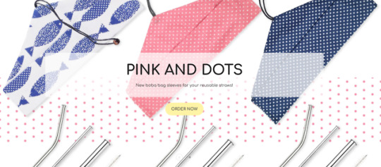
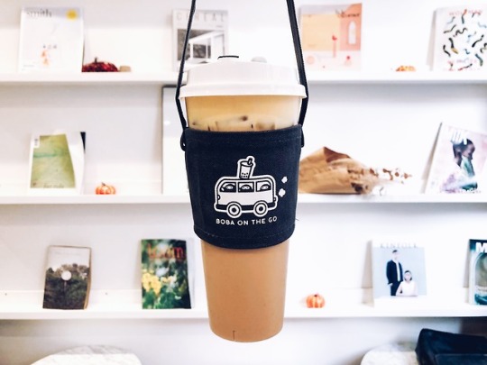
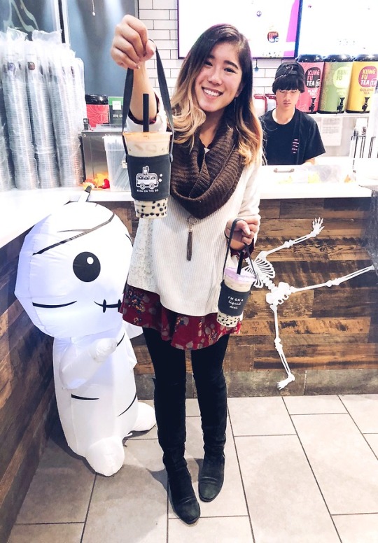
For Visual Diary #12, I also thought of BobaMade, which is a small online store that sells reusable bubble tea and smoothie straws, along with boba bags. The owner, Julia, decided to create this out of her love for bubble tea. I worked with her a few times on Instagram before in marketing her products, and I love how she values sustainability and wants to encourage other bubble tea loves to consider how we can help the environment more by using less cardboard/paper cartons that hold bubble teas and less plastic by using reusable straws. While there’s not much about what we can do about the bubble tea stores using plastic cups (small through large) that holds the very bubble tea itself, I think it’s encouraging to see how we can influence buyers and consumers to take part in sustainability through our own actions! BobaMade is located mainly in San Francisco and has this online store to reach consumers all around the U.S. BobaMade also has built some relationships with local bubble teas stores in SanFran, so they can also show support in sustainability. Fun Fact: This actually was already a thing in Taiwan, so she thought it would be a great idea to bring this to the United States and promote ways of how consumers can be sustainable as diverse businesses especially restaurants and tea shops grow here all over the states. It’s awesome to see such design leadership and how creators can consider low cost and environmentally friendly products, while also thinking of the consumers and what would attract them (aka the cute designs on the bags).
#gumpdc620#sustainability#bubbletea#boba#environmentallyconscious#design thinking#designresearch#designleadership#consumerfocused#artifact#vernaculardesign#designvernacular#visual diary
2 notes
·
View notes
Photo

For Visual Diary 10, I immediately thought of TOMS and their “one for one” campaign. They put this stake in the ground to positively have the community be able to support and help those who are in need. Their campaign encourage buyers to buy their shoes, since each pair of shoes purchased allows a pair of new shoes to be given to a child in need. This campaign also grew and evolved, as they are starting to launch TOMS Roasting Co., where each bag of coffee purchased will allow TOMS to provide one week of clean water to a person in need! This “one for one” concept is what shaped TOMS as they threw this stake on the ground and it’s been a successful business model that encourages many to support those in need.
(Posted this a second time because my first post didn’t show up in the tags for some reason.)
#gumpdc620#design thinking#designresearch#design tools#charity#designvernacular#vernaculardesign#visual diary#designneed#designleadership
2 notes
·
View notes
Photo

For Visual Diary #8, I also thought about the design process that went into the U.S.’s first sign language Starbucks store (https://stories.starbucks.com/stories/2018/eight-things-to-know-about-the-new-starbucks-signing-store/). I decided to share a picture of me when I was visiting the store near Union Station/NoMa-Gallaudet.
This store is located in Washington, D.C., and is down the street from Gallaudet University, which is an institution for Deaf and hard of hearing students. My parents are deaf and hard of hearing, and they graduated from this university as well! I must admit, I don’t love Starbucks coffee, but they do a great job in creating close knit communities and having a relationship with their customers. I have friends who have worked in Starbucks and majority of them always expressed positive experiences there, and to hear how Starbucks are engaged with their audience to understand their needs show their care for their customers. What makes this sign language store different is their ability to meet the consumers where they are at.
For tangible parameters, they made use of the space/building near the deaf and hard of hearing campus and they value user experience to understand their needs. It was known that they created a sign language store in the past in Malaysia and Canada before as well, so they most likely have collected much data and experiences while also engaging with the audience here to get a better understanding how to design such a store here. For intangible parameters, it is clear that they are anticipating the future as this generation tends to share more awareness of various needs around the world. As the deaf community have continually and increasingly voiced their needs and opinions and feedback, it is interesting how Starbucks have included this parameter to work with concurrently and in the future. Additionally, another intangible parameter would be the societal impact the store would have on the deaf community.
2 notes
·
View notes
Photo

For visual diary #13, I would like to share how some people grow herbs in their kitchen as such. In regards to interior design, some have thought to create/design eco-friendly kitchens by adding more greenery and sunlight. It’s like having their own miniature garden indoors, and it’s accessible in the kitchen. Some choose herbs, as it’s easy to grow and can be always used in cooking. Many would say they would save money from constantly buying store-bought herbs, and it’s fresher to grow your own. I believe this is a great solution to people who may be interested in being eco-friendly and looking to save a bit of money when it comes to groceries.
1 note
·
View note
Photo

For our third visual diary assignment, I also thought of a toothpaste tube squeezer, such as the one I took a photo of here in green. It’s simple, yet it takes the convenience out of squeezing the toothpaste out of the tube so cleanly. It also helps people save more money because it helps maximize the toothpaste in each and every tube. Although it may seem minor, this creation represents an example of an unexpected need that matters to the end users/customers and their long term convenience and needs.
3 notes
·
View notes