#using a very limited palette that had very different colors from each other
Explore tagged Tumblr posts
Note
I'd love to see your personal headcanons for Jou if you feel up to it !! :-D
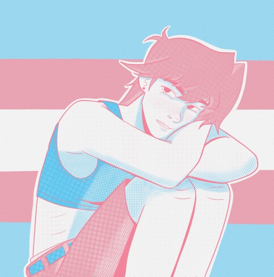
Well, since I’ve already done one for Bi Jou, I did my other HC, which is trans Jou!
Bonus Bi version under the cut (because I couldn’t resist another Bi Jou)
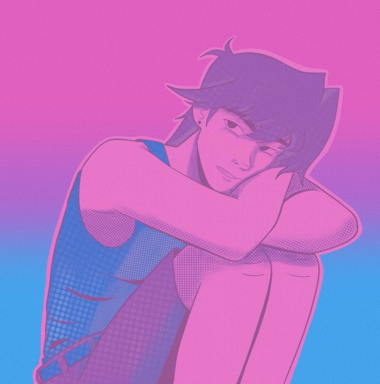
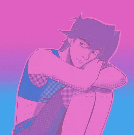
#jounouchi katsuya#joey wheeler#transgender#cupcake art#one of my fave hc honestly#I think that Jou really struggled with self image and that was part of his issue with yugi in the beginning#because in my hc world if there's trans jou there is trans yugi too#I think Yugi helped Jou realize he didnt need to conform to what he thought being masculine was#that it didn't make him any less of a man#also boy would not be able to afford top surgery or any of that stuff#which is why he is always in a baggy t shirt even with his school uniform#also about this art#using a very limited palette that had very different colors from each other#I couldnt shade the why I usually do and had to mess around with textures and stuff to see what looked good#ok done rambling in the tags!#THANK YOU FOR ASKING THIS!!!!!#my boy plus my own hc!!#loved loved this one
48 notes
·
View notes
Note
I'm going to be asking a lot of artists I follow this question, but how did you develop your style? It SEEMS like most people find their style and stick with it forever, just making improvements and iterations. I tend to work in a lot of different styles because I enjoy doing that, though I know there are things I gravitate towards as well. But I wonder what your journey was and how you got feedback and improved while staying true to what you enjoyed?
Hi there!
I definitely wouldn't say that I've found my style and stuck with it forever-- I feel like each of my projects has asked for a certain kind of art, and has presented new challenges that push me in new directions.
Some of that comes from seeing someone else's work and having something click into place that might fix errors/faults in my own, and then I might try to incorporate that, such as bigger outlines on my characters to help distinguish them from the background, or maybe a way someone else simplifies eyes that can help make mine look less weird.
When I first started drawing, I can see where I encountered certain influences because my sketchbooks suddenly switch to incorporating some new stylistic element that I liked from whatever I was reading/watching at the time. But it was never QUITE right, it was never just copying, there was always something ~wrong~ with it. And that wrongness was my style! As much as I hated it, that was what distinguished my art from being just a copy of someone else's. I hate it less now, and understand that other people see something there that maybe I don't, because it's just what happens when I filter other people's work through my head. My soul, if you will.
There are definitely through-lines with my work, driven by what I like drawing and what comes easily to me-- hatching is almost always a major component, and I like making expressive characters. Here's some of my earliest available stuff, from my old webcomic:

Then not long after that, I started The Last Halloween, which pushed me to challenge myself in both layout and style:

And here's the same comic, years later:

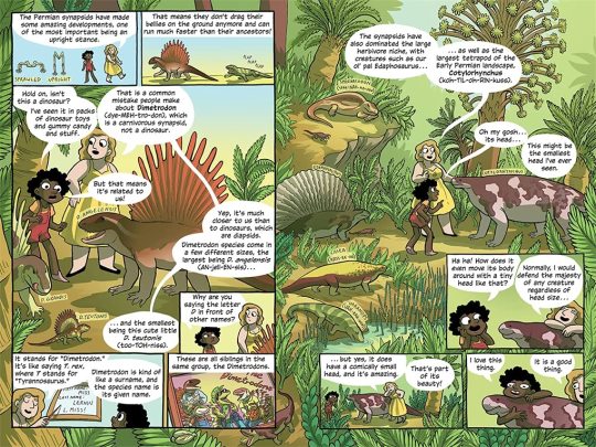
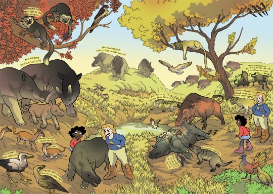
And here's a series I did for kids, where I had to use full color and lay off on the hatching, as well as learn how to reconstruct animals that we have no photo references for, which is definitely a place where style comes majorly into play, whether I wanted it to or not:
Then there was the horror book I did, where I tried to push my work to be less cartoony overall, and to work very hard on improving my hatching:
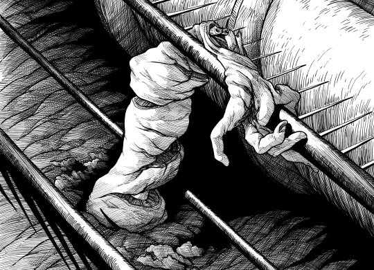
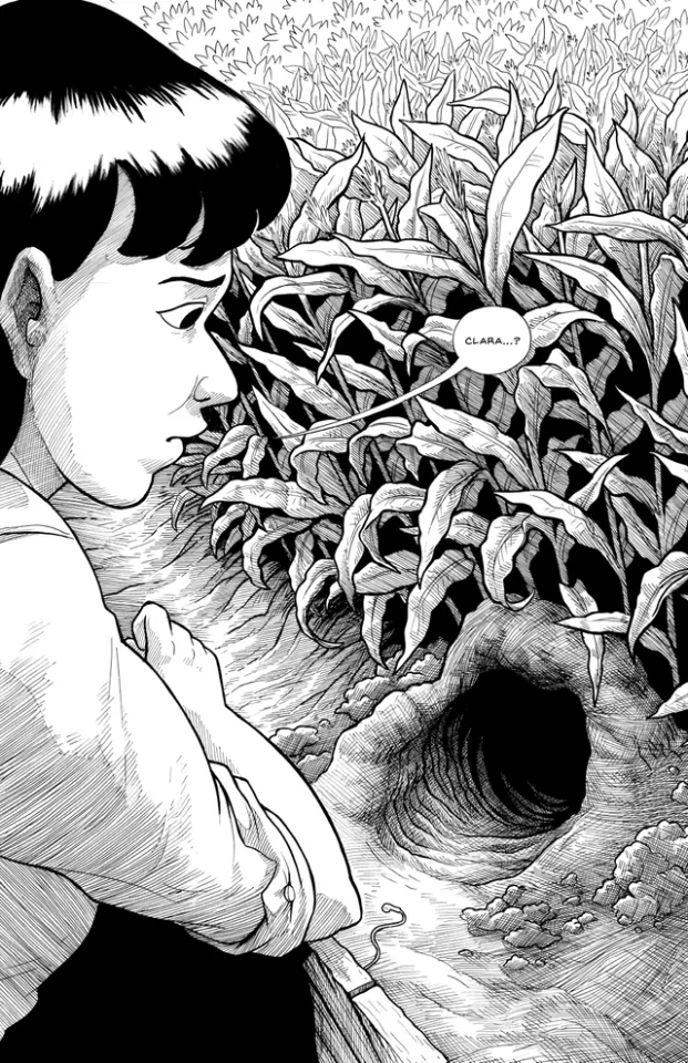
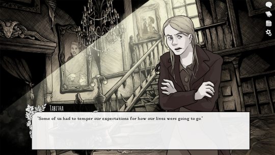
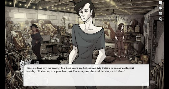
Then I started work on Scarlet Hollow, where I incorporated a limited/muted palette and had to once again push myself to make less-cartoony art, as well as learn more consistency so I could draw sprite sets. This was a big challenge for me, and has helped me grow as an artist so much!
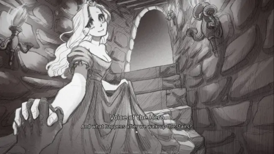
And most recently, I wrapped up work on Slay the Princess, which required that I go back in the cartoony direction, but in a very different way than I was used to. This took a lot of sketching to figure out, and there's still a decent amount of artistic stumbling in Chapter 1 while I settled into it.
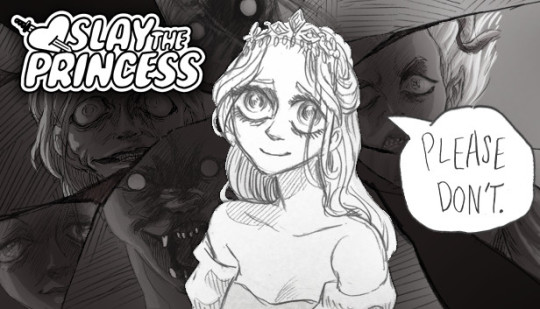
She's drawing on anime/Disney influence, but each Princess required a bit of stylistic variability. Some are more anime, while some are more realistic than even the Scarlet Hollow characters.
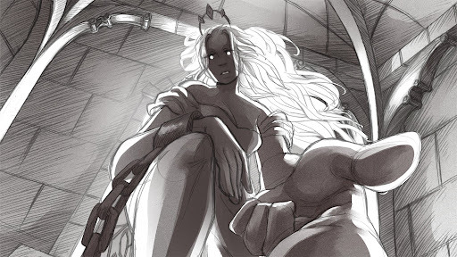
So I wouldn't worry too much, honestly! A person's style is often something that reveals itself over the course of their career, rather than something they choose and then try to stick to forever.
Even if you don't think you have a style, you do. It might vary a lot piece by piece, especially if you're trying to closely imitate another person's art, but the more work you do, the more you'll figure out your own strengths and interests!
#long post#my art#junior scientist power hour#the last halloween#abby howard#scarlet hollow#slay the princess#once you work long enough on art#style starts to feel more like modes you switch in and out of#all based around a core of what you're good at and what you can do#which in itself will change sometimes!#and of course your style with different mediums is gonna be different too#like slay the princess is pencil which is why it looks more distinct from my other work#never forget that at its core art is about messin around#wait shoot i should've put all this in the post#but it's long enough as it is
438 notes
·
View notes
Note
your designs are so peak! dyou think youd be willing to share some of your process for how you develop the looks you make?
Sure thing ! I'll take you on a journey into my mind's eye
Long text post ahead in case anyone's interested in my designing process
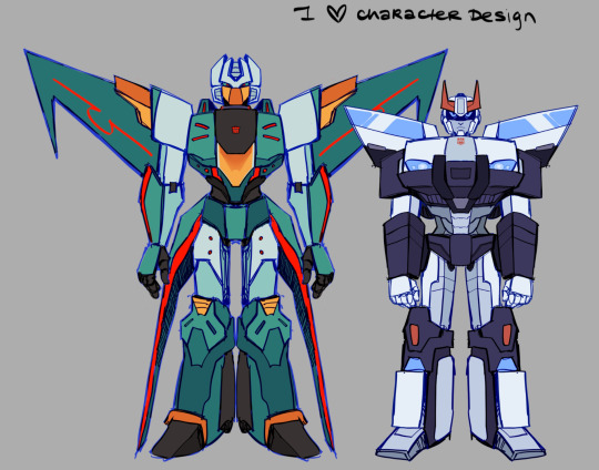
I start off with references-- lots of references. I pull inspiration from more than one iteration for a character ! For Brainstorm specifically I took the most inspiration from IDW Brainstorm with aspects from G1 like his darker/greener color.

Red Alert's darker color palette is also based on the TFA design with heavy IDW influence. First Aid's little doctor's coat was inspired by the Bayverse Crosshair's coat. Ratchet's design is based on his Prime, G1, IDW, and Cyberverse iterations but I took the most inspiration from his Prime design (I think Prime Ratchet is also my favorite Ratchet so I might be biased)
Before I begin designing anything, I map out the character's silhouette, it gives me a feel for the shapes I want and how they'd stand out in a lineup. Here's Wheeljack for an example.
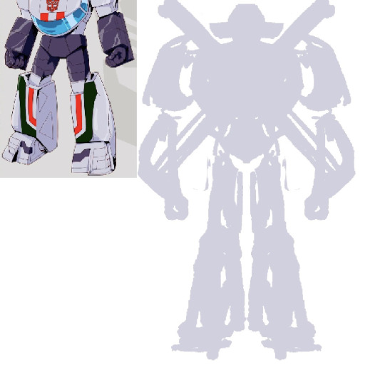
Then I start the first draft/sketch. I just draw on top of the silhouette and adjust as I go, I'm mostly going based on what feels right to me.
Since a lot of the bots I was working with had White and Red color palettes I had to use different accent colors to break it up and I wanted to emphasize their shape language. I try to keep things from blurring together too much. I also used various off-white colors (it's very subtle) and different shades of red.

I also pull inspiration from figurines/model kits from gundams specifically-- honestly I do this mostly for the legs, I struggle a lot with making the legs look right so I look at Gundam legs for references on knee articulations and the ankles.

a lot of it is trial and error and it usually takes me more than one attempt before finalizing a design. Let me show you the monster that is my first Brainstorm attempt.
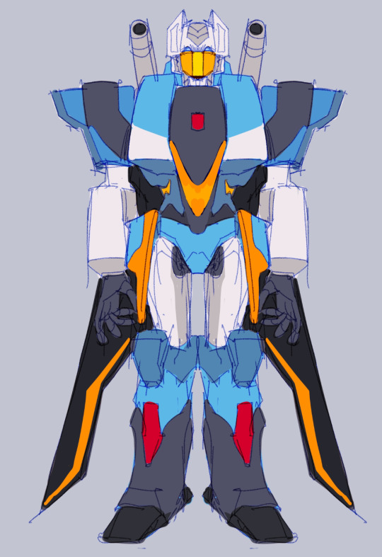
Good fucking god I have no idea what the hell I was thinking, literally the first thing I said to myself as I was finishing this was "Oh my god he is UGLY, I cannot keep him like that" he was not working out so I went back to the drawing board and worked small.
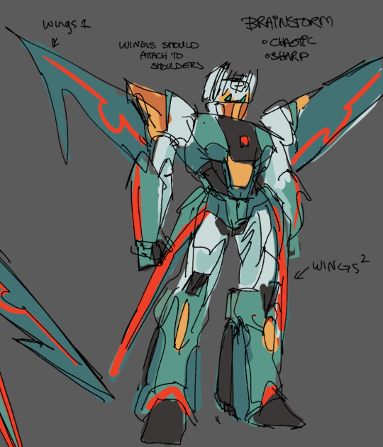
Here was my second draft of Brainstorm, I was thinking about his personality as I was working on him which I think helped a lot. Chaotically natured, I incorporated a lot of sharp shapes and I darkened his color palette to a sea green to let the red and yellow/orange accents stand out. It also emphasizes his more sinister personality while the broad yellow-accented shoulders paired with the extra red accents kind of give him this "show-off" and "full of himself" vibe.
My previous mistake was that the blue was far too bright and the orange and red were just clashing too much. Also his wings being flat against his back just did not fit him. I think I was too afraid to break to mold with Brainstorm-- Like there was this line between "This is not Brainstorm enough" or "This is too far from being Brainstorm" and then I remembered his very wise words
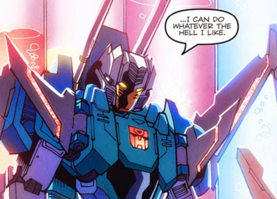
Then I just started to get adventurous and experimental and bam, we have Science AU Brainstorm. The major takeaway from this is don't be afraid to get wild with your designs.
In contrast, Since Prowl and Brainstorm will be seen around each other a lot, I kept Prowl's design less flashy and his palette limited, pulling heavily from IDW Prowl. It also fits his personality, he's much more serious and orderly. So when they're seen in the same drawing, there's this nice design compliment between Brainstorm and Prowl.
Another oopsies I did was initial First Aid attempt where I made his accent color orange for some reason. It looked really bad and I ended up changing it to blue which worked a lot better.
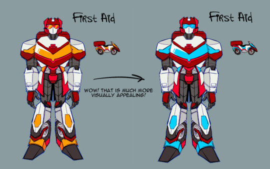
But yeah ! That's my general design process ! Play around, have fun and don't be afraid to get experimental and try some new things for designs !
124 notes
·
View notes
Text
August-September Post-Alpha Check In
Hello, everyone!
With the release of Alpha testing, we have in this update a retrospective on the test itself, a host of content from August, some lore drop, and word on where we are with Moontail and Leopard!
Let’s begin with some art!
Southern Romanovtsa
Users in our Discord participated in a community game to see the preproduction designs of our Romanovtsa variants. The Southern olive variant is done!
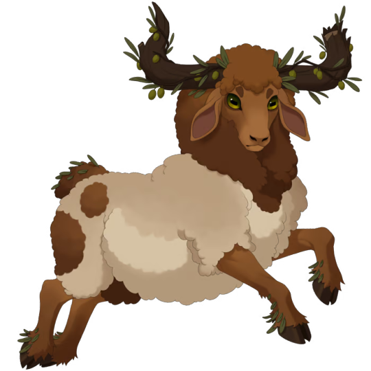
Design and illustration by Hydde
Crests
We’ve illustrated two more forum crests, Orchard Crest and Spectral Crest!
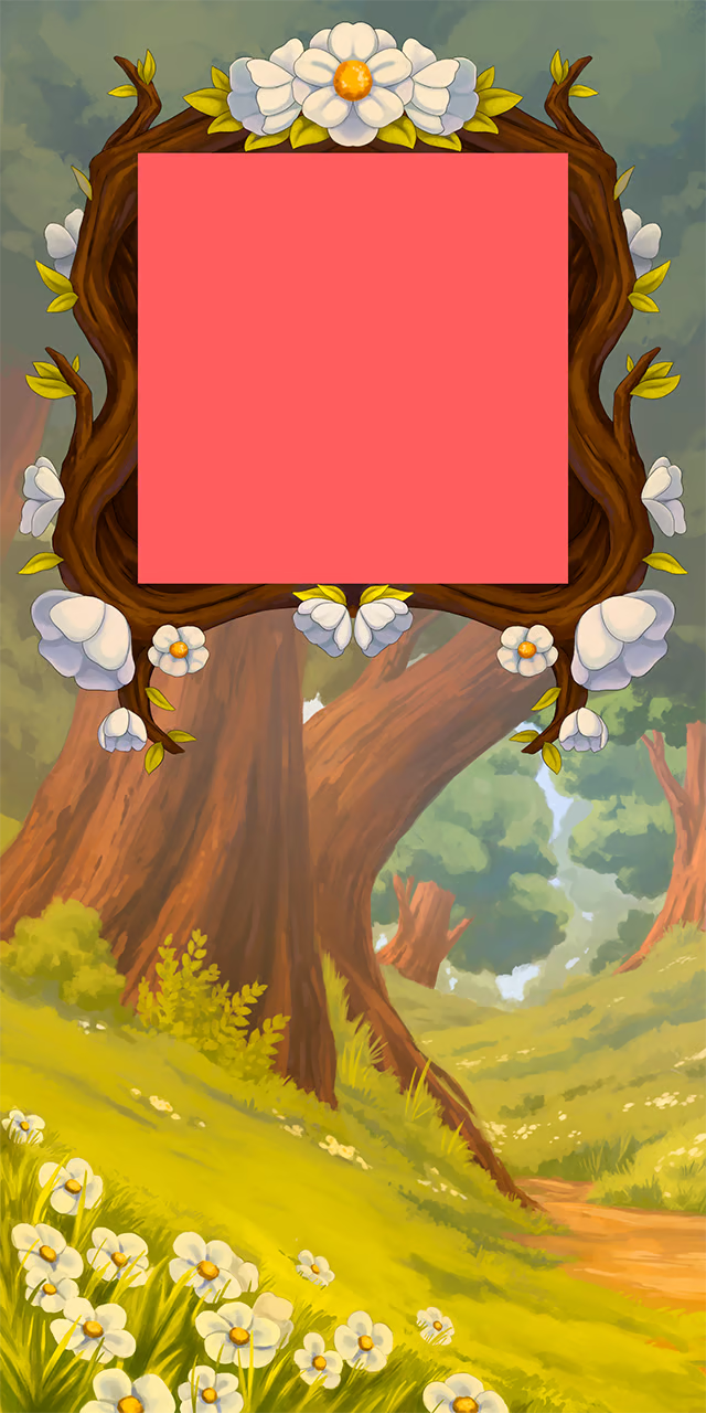
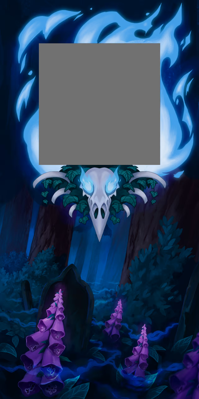
Design and illustration by Giulia
Currently, Demonic is being illustrated now!
Regal Set recolors
Regal set had its recolors done!
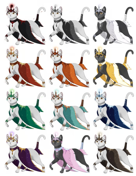
Black, grey, white, red, orange, yellow, green, teal, blue, purple, pink, and brown, recolors by Emma (@missbluefrost)
New Accessory: Gilded Crest
Next, preview of the design for the Gilded Crest, the sponsored accessory item from the individual who won our sweepstakes: Emma! (Not the one on our team)
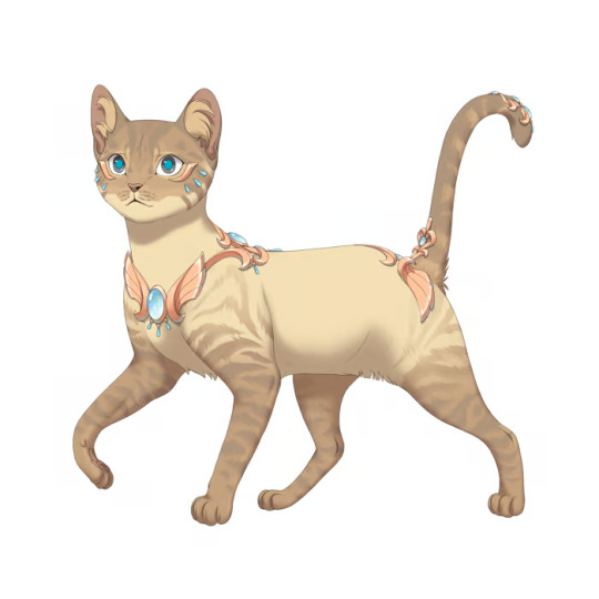
KS sponsored by Emma, illustrated by Azarel
Harvest Logo
As promised, the Harvest logo was updated to better reflect the difference in the thematic stone and incense items.

This visual will slowly be updated in all our content.
Wheatley and Crowley
Take a peak at the newest progress on Whealtey and Crowley!

Leopard and Moontails Check In
As promised, we want to release these two things together. So where are we?
Moontails have all patterns but Leopard done.
Moontail wing colors, a mighty feat, are good to go, but we are currently working on perfecting the tail and whisker glow colors. Moontails will be utilizing the accent 1 color for their glow tint, much like the previous cat creator, and we’ve had to start from the ground up on accommodating all of our colors in a way that flatters the glow.
In addition, doing this work now will help benefit any glowing mystic breeds in the future...��;)
Here is an example of in-progress glow designs:
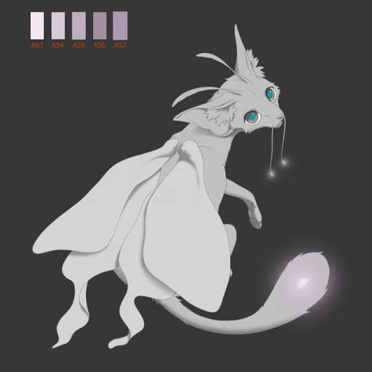
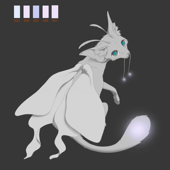

Thistle, Wisteria, River
Overall this breed is very robust in comparison to our other breeds, and it will be extremely rewarding to release all 3 wing types at once. With all the effort gone in, Moontails have certainly earned their place as a legacy breed.
Leopard
Leopard is all done! Sans Moontails, but they’re currently being worked on. Here is an in-progress example:
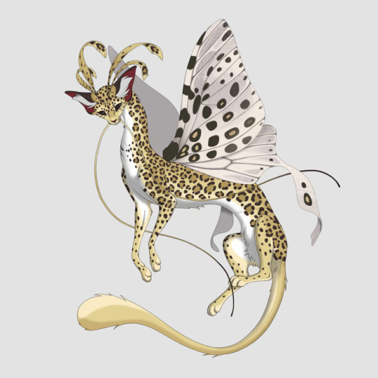
WIP by Asp
Though, we are wary of using the designated “tiger” palette for Leopard 100% of the time, as we worry this will create a washed-out look for the pattern in the majority of cases, so while we tool Moontail glows, we’re visiting altering Leopard spot colors.
As far as art goes as a whole, these two things are concurrently working alongside our main production push. A vast majority of our time is going towards icons or continuing accessory illustration. This will limit the amount of new content we can share, as it will just be the same items repeated several times over! However, we’re dedicated to taking the time to not only prepare our starter breeds, but to expand the breed compatibility for each accessory as soon as possible!
New Information on the land of Kotemara
New information on the continent known as Kotemara, which is the name for the giant landmass that users will be joining when they play PawBorough.
Kotemara is home to 7 Boroughs, which each have a capital, we're here to share the capital names for each!
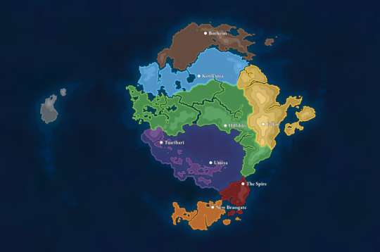
Luna: Kotikansa Sol: Borheim Upper Abyssal: Tsuribari Lower Abyssal: Umiya Zenith: Felkin Harvest: Hillshire Cogwheel: New Brassgate The Metropolis: The Spire
But there's something else...
The Wastes
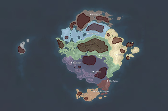
The magic of the geological deposits that Catfolk are currently studying and learning has ran rampant in large areas around Kotemara, influencing the localized flora and fauna. These areas are home to large, powerful, magical beasts roaming the land, colloquially called Wastebeasts. Plant life either dies out, save for hardy, shrubby grasses and sparse foliage, or overgrows and mutates into a magical nightmare.
All Wastebeasts are very dangerous and magically aggressive. Cats who brave the wastes seldom return home, and catfolk settlements bordering the wastes are frequently terrorized by Wastebeast attacks.
The Spire, the head magical academy in The Metropolis, has sworn to make studying and controlling the Wastes its top priority in magical research and modernization. But the latest achievements coming from The Spire have been little more than pithy advancements in magical products...
Independent organizations like Maven's Guild have cropped up around the Boroughs, with trained recruits helping scared cats cross the wastes, helping to fend off Wastebeasts from catfolk villages, and to assist with mundane errands.
As you learn about Maven and her organization, you'll discover more about her connection to the Wastes...
Alpha Retrospective
At the beginning of this month, we started dedicated Alpha testing. This was a challenging time, as we as a team have never before performed public-facing testing of this nature.
But we are jovial and positive behind the scenes, because we have learned a lot regarding our own application, our development tactics, user feedback tracking, user desires, and community support management. This test-run has given us beginning experience on how the full game will function with an active user base, and has allowed us to foster a more prepared understanding for not only server preparation, but all further development efforts.
In addition, the mass amounts of testing and QA reporting has truly helped to improve our development, as we can knock out and identify bugs much easier. We are thriving with this, able to swiftly chop and iterate upon any flaws found in the functionality. The flow of tickets means there’s always something to improve on, and we have burgeoned with this setup.
The warm and positive attitude from our testers has also helped to lift our spirits. We’re very open to the criticism and feedback we have received on the application thus far! In fact, we’re duly grateful that so many users have put in their valuable time and energy to both constructively and bluntly critique what we have. Earnestly, with no aggression nor sarcasm: It is stellar that we have users who care. It means that we have something which people love, and want to see improve, and we could not ask for better!
That being said, we were expecting more aggression and user vitriol than we actually received thus far, and it’s uplifted the spirits of our team in such a way that we’re real fired up!
Our biggest aspects we want to improve on going forward is:
Better user-side communication. This will come as we grow and can expand our team. Right now, only two individuals handle user tickets, and with one of them being myself, who also handles a great brunt of not only user-side updates, but also all development management, and it can cause swift and detailed user-side communication to suffer. This is certainly a problem! The infallible solution will be to hire more help once we have the resources, and for now we’ll do our best to structure the responsibility in a way which prioritizes communication more favorably for users in the coming future. We truly owe you all better! And we are very grateful that you are all so patient while we’re working this hard.
Better code management. In general, we’d like to see things come out the gate a little less breakable, and this is on us to improve. We’ve tightened our form, including running more tests before releasing updates or iterating, and we’re only seeing the application get stronger from here.
Staying vague on promising deadlines. Unfortunately, we did fall a month behind, and taking that into consideration, we're just not in a place to make sweeping promises on the timeline. We admit fault, and will learn from this. From here, we're going to err on the side of caution and simply take the time we need. It smarts that we have had so many roadbumps and delays, but what's important is that we are consistently making progress, and that the final product is robust and surpasses user expectation for fun and enjoyment. We're keeping our heads down and grinding on.
And here’s a summary of what we liked:
Even without a gameplay loop, users have frequently reported having fun interacting with the mechanics. This implies that there’s an inherent enjoyment to the setup, and is one of the best omens for longevity as a game that we could receive. It means that, at our core, we have an enjoyable game. That’s huge! We can only improve!
We’ve knocked out bugs fast. Users have been happy to see new iterations frequently released for testing.
Users are very eager to test, giving us detailed reports that improve our development.
In conclusion, this has been a hugely positive experience, and we’re excited to keep building and improving.
We’re hoping to run this test for a few more weeks while we do the following:
Nail down intended functionality of all working mechanics.
Iterate a few key functionalities: metamorphics, cross-team play, and potentially combat.
We’ll then close the test, with an announcement of such a week before closing, and take some time to rest, reflect, iterate on any important aspects of the game that we’re missing, and polish what we have with the most pertinent user feedback. After which, we’ll prepare for the opening of Closed Beta!
Here is an updated timeline to reflect how things are shaking out:
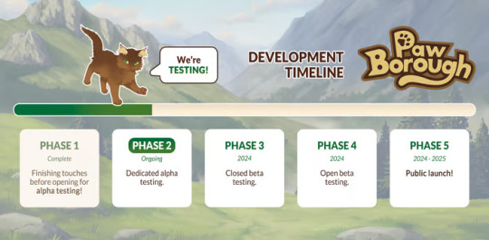
This will be cross-posted to our socials as we focus on updating them!
If I can provide a small update from myself, the project lead: Overall it’s been great, though I am personally working a lot. Between everything I do, I have been working myself to sleep most days of the week. Right now, I eat, I sleep, and I wake up to work on PawBorough, and many times I forgo the sleep part. So I have been extremely grateful for the positivity and patience from the user base, and I have to pre-emptively request a bit of grace and patience if I disappear for a time to get some rest.
But saying this, I stress that you all do not worry about me! I am completely alright! In fact I am very happy to be working, and I love it. I simply want to communicate the amount of dedication I have right now, ask for a bit of grace if I'm slow to reply to questions or tickets, and to give a big THANK YOU for the opportunity you all have given me to be doing this. I really could not be more in love with PawBorough, and so far I see a bright path for it to grow its wings and flourish as it improves. I hope all of our supporters and users feel this with me!
And from here, I am going to be taking this upcoming weekend away to rest. But we'll be back bright and squirrelly on Monday!
To summarize: We shared the Southern Romanovtsa, Regal set recoloring, 2 new crests, the Gilded Crest accessory, the updated Harvest logo, an NPC wip, a lore drop for longterm conflict, and our Alpha retrospective.
What to expect next update: Further asset and development updates. Check-ins for how Alpha is going, updated Borough descriptions to put on the site, and any further plans we'll have to share.
#virtual pet#paw borough#pet site#indie game#petsite#pet sim#art update#development update#pawborough#kickstarter update
44 notes
·
View notes
Note
I just read ooa and it was so so amazing. As I read thru I high lighted parts that interested me about the world/characters and the way each character views women. It’s just so fascinating and well written, I need to discuss it Socratic seminar style. It’s amazing as both a work of erotica and as an analysis of the way view women. The blend of horror and porn is so expertly done too!! I’ve been following your work for years and I think this might be my favorite
I really love the art in this too, your art has always been a huge inspiration for me. I just love the way you work with limited color pallets to establish mood. I loved the fairytale pinks and blues used in the art for Samarts story, but the blue and yellow meant to convey the lamplight used for Touma’s story was my favorite for sure!!
I’ve been thinking a lot about Ratna, definitely my favorite of the three stories, and the way she insists on the Purrley Pleasure pussies. She frames it to her costumers as something they’d want so she can charge more to install them, but does she also want to install them for herself? She gets pleasure from giving other women pleasure (I really love how connected her identity as a stone butch is to her story btw) and the Purrley Pleasure pussies can detect more and yield more responsive dialogue. Does Ratna like installing these because it makes the androids react like they’re actually receiving pleasure/in a more life like way, thus making things more pleasurable for her?
that's an interesting read for ratna! to be honest, i didn't think about how she felt about purrley pleasures in particular. i believe in an earlier draft i had a line that she had a promotional deal with them, but i'm pretty sure that didn't survive to final. she definitely gets taken in by the anthropomorphizing purrley pleasure does as part of their marketing, as much as she tries not to let it get in her head. i don't think she's examined the idea that she likes them to be more responsive. she certainly prefers it, but does it motivate her? i'd say no. i think above all she's motivated by the bigger number on the invoice.
also i'm glad you like the palette in the mari-ko story because i actually didn't like it at all, haha. the intended palette was white, blue, and pink, like in the previous art i've made of her, but in the writing i'd very specifically called out that yellow light. it would have made me a different kind of insane to just ignore that the light is yellow.
26 notes
·
View notes
Note
Hey !! I just wanted to say your art is CRAZY good and I was wondering if you had any tips on picking color palettes?
Sorry for taking forever to respond, but hi!!! Thank you so much!!! wahh always wild when I am percieved, makes me v happy :)) As for color, your ask got me really excited since it my favorite part of the artistic process!
The long and short of it is that I like to use color theory (complimentary, analogous, triadic colors, etc) to minimize the amount of color in my work while using a variety of saturation and value to create the variation! Complimentary being colors across eachother on the color wheel, analogous are the colors next to eachother, and triadic are colors equidistant from each other,,, triangularly.
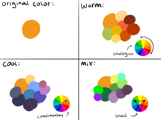
I typically don’t like starting out with a rigid number of colors of specific shades when I do my work cause it feels really limiting, and I enjoy adding color when it feels right. However, when I do color pick, I like to get a main big overall color scheme in mind then start placing various shades and saturations within that minimized pallete. The important part for me is not to stray too far from my pallete without some intent.
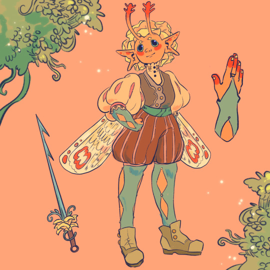
For example, when creating my character Peter, my goal was to make her a very warm colored character. To do that, I used an analogous color scheme of oranges and yellows with green sparingly. By minimizing the amount of different colors used, it helped the piece feel far more cohesive, but the amount of saturated and desaturated forms of the color created a lot more energy. And even though the colors I used were all next to eachother on the color wheel, the green provided a cooling contrast that I used in the eyes and portion of her costume to connect the two and emphasize. I also tried to use saturation and value to separate her from her outfit. Her skintone, hair petals, and markings are all very bright, while the outfit is desaturated tones. This made the seperation of the two more apparent to the viewer that this is body and this is clothes. I also like throwing in multiple color schemes to create even more visual interest. For example, for the lineart I used a deep saturated blue since blue is the complimentary to orange, her main color. This caused the lineart to stand out against her even more so than black lineart would.

To the upper right I also sketched out a different costume for her while maintaining the motif of orange and green (though some of the colors I’m not necessarily happy with).
Here are examples of some of my other stuff to show the “main colors” of the work. And as a secret, if a color isn’t matching my scheme, I like putting a color from my color scheme over it with a lower opacity and color pick from there ;) helps with melding it into it.

Of course these rules are not set in stone and I break them when I gotta, but this is generally how I like to find my colors. Anyways,, I hope this made some sense!! I really enjoy color :)
67 notes
·
View notes
Note
I'm going to be asking a lot of artists I follow this question, but how did you develop your style? It SEEMS like most people find their style and stick with it forever, just making improvements and iterations. I tend to work in a lot of different styles because I enjoy doing that, though I know there are things I gravitate towards as well. But I wonder what your journey was and how you got feedback and improved while staying true to what you enjoyed?
Interesting question!
I never really think about style when making a piece, I don’t worry about making it match the rest of my portfolio, it’s just that the things that make up my style are things that come most naturally to me when I don’t think about it.
✦ TL;DR: My style is a combination of: the different mediums I use (including tablet and PS brushes), the fact I’m scatterbrained and unlikely to finish if I take too long, the aesthetics I like seeing, what feels good physically (movements that feel good to make with my arm and hand), and rhythms that feel innate and come naturally. I really believe that the things that make up your, or anyone else's style, are already within them, they just need to be brought out into view through making art.
Longer thorough answer with images below 👇
✦ I’d say that I “developed” my style by doing what feels comfortable - the shapes of my lines are I think influenced by the fact I’m “lazy” and don’t like erasing, which isn’t a problem in digital, but I used to do a lot of traditional art in ink, and not to mention etchings where I definitely can’t erase without wasting a bunch of time.
✦ My line art looks the way it does because it’s basically a cleaned up sketch, because I don’t have the patience to do both, or line art that was done without a prior sketch, just trying to make lines as good as I can on the first go knowing that any parts that end up feeling off will be painted over later. The brushes I've been using for years also play a role here.


✦ The way I paint digitally, as in colors are not often blended, and often the transitions between colors are made up of blobs of color or even something resembling hatching, stems from:
1. When I started art college, I realized I was waaaay slower than everybody else when it comes to painting, and in order to finish a full body real size portrait in time there was no way I could do it with blended shadows and realism (in high school I worked mostly in pencil, going for as much realism as possible because that's what was expected). So I started constructing planes from these blobs, only going into more detail if time allowed. The goal was to make something that can pass as finished in as little time as possible and then refine it later if possible. Sadly I don’t have much college work to scan as an example (some fruits are below). Quickly this became not just a way to finish a painting in time, but a part of what made my painting mine. I started doing it in charcoal, and in digital even when there was no time limit.
2. Digitally I used to paint with a brush with didn't always match the color on the palette, and the very slight color difference in each stroke or blob was interesting and something I started doing intentionally, and in traditional acrylic painting as well.


3. Long story short, the way I work in one medium influences the way I work in others. So it feels that choice of mediums (digital, acrylic, tempera, charcoal) leads to a style that can be reproduced in all these different mediums.
4. If I had any photos of my (unbaked, unglazed) clay works from sculpting class you could even recognize my style there as well. So we can assume that clay sculpting also influenced my 2D art as well.
Some examples of the non blended colors in different mediums (digital, acrylic, acr., tempera, digital):


✦ Obviously the things I find visually attractive and interesting - shiny or glossy surfaces, interesting pointy shapes, subtle differences in tone, dramatic lighting - will be things I reproduce and emphasize in my art consciously or subconsciously, and those will make a style across different mediums.
✦ A mostly consistent color palette is a part of style as well. I gravitate towards the colors I find pretty - grays, browns, reds, gold, pink, and shades of off-white.
✦ As for feedback, I didn't get a whole lot of it from my art profs (which is one of the reasons I dropped out), but one thing is they encouraged my choice of color palette and gloomy mood, and my messy process. My friends say the most recognizable thing about my art and what they call my signature is the little sparkle shapes I love to use. Not that other artists don’t use sparkles but when I put mine on at the end it feels like one really conscious choice that I make that makes the finished piece feel really mine ✨


✦ Another thing people noted about my art are the solid black areas I sometimes use as pure black cel shading, sometimes as kinda random blobs - I feel like line art needs to have a certain “weight” to look good, but as my lines are mostly the same weight, and often very light and sketchy, I add the black areas to compensate for that lack of weight across the piece. In my head this genuinely feels like weight, and if a piece feels too light in my head/hands, I add weight via flat black areas. I don’t know if that makes sense but it does to me and leads to a style. In pieces without lines it adds weight that's missing because of a lack of contrast or details elsewhere.


✦ And last but not least: The artists I admire and who are an inspiration have and continue to influence my style on a conscious or subconscious level. Either in regards to coloring, composition, shapes, or whatever. Leyendecker and Schaeffer are two pretty obvious ones I think. Mike Mignola and Chris Bourassa (the artist of Darkest Dunegon) also include flat black shadows and planes in their art.
All these things I feel like aren't going anywhere even as I improve, nor do they impede improvement or would hold me back if I decided to completely switch mediums or themes. They are so at the core of my craft(s) I don't think I could change or ditch them without great effort and even then it would be hard to stick to something else.
Basically I guess do what feels good and don't overthink, chances are even when you think you switch between wildly different styles there's something tying them together. At the same time, if there's an element that you really like, nothing wrong with consciously incorporating into your style(s), like I do with sparkles.
15 notes
·
View notes
Note
During your art challenge stuff like Vivid Shadows, how do you typically keep up motivation to continue doing it every single day? Because it’s been a struggle to keep writing stuff every single day. Granted this is my first time doing this, but I was wondering if you had any way you prevent creative burnout from doing these.
I have thoughts on this lol. There's a few ways. First a disclaimer, I started working on these Vivid Shadows pieces about a month ago. I have up through day 19 done right now (cough see them early on patreon cough). So I've been spacing these out a bit more than one every other day. I have done the challenge day by day before, and it's doable. But I'm a busy adult that needs to pay bills, and I like to give myself some cushion. But with that established, here are some thoughts I have. 1. Collaborators and Witnesses I doubt I could find the motivation to do these kinds of big projects if I didn't have friends and collaborators doing them with me. This is different for everyone, but I find I'm much more productive when I have someone else to bounce ideas off of, send WIPs to, and honestly to judge me when I don't meet my goals. This can be a friend you're working with, or a discord server where you share updates, or any other online community that you're a part of. 2. Effort Budgeting For big series like Vivid Shadows or longer comics with a lot of panels, I do not put all my effort into every piece. There's just no way. I consciously choose to half ass some things, and tell myself "eh, good enough" even if I know I can spend more time polishing. It is infinitely better to finish a piece at 60% of your full power than to pour all your heart into a project that never sees the light of day. If you feel up to it, you can spend more effort on some select parts that really make you happy. But those should be the exception, not the rule. And the more projects you finish, the better your half-assed work will become. 3. Creative Limitations You have to define some bounding rules for your project, or you'll get stuck with decision paralysis and scope creep. For Vivid Shadows, the rules I use are pretty simple. Each day has a prompt, one color to use, set dimensions and a hard deadline. I mostly use a limited palette (3 colors + black or white) because I know I can spend hours and hours shading and coloring otherwise. Limitations foster creativity. If you have a tight frame around what you can do, your brain comes up with way more ideas. 4. Keep an eye on the clock Part of what I like about projects like Vivid Shadows is that they have built in deadlines. I know I have to wrap things up by a certain day and time, and if it isn't perfect then so be it. I've done enough creative work to know roughly how much I can get done in a certain amount of time, which is very helpful for planning. The program I use for drawing has a built-in clock that tracks time spent on each document, which is a godsend. 5. Find your own methods This is all just stuff that helps me, but everyone's brain works in different ways. It absolutely takes practice to enter creative mode at will, rather than when the stars align and you feel inspired. Start with small projects, and as you train yourself you can eventually finish larger ones. Remember, something small and finished is always better than something grand that never gets done. Also worth mentioning, find the things that light up your brain. Personally, I've found that making my art horny is a powerful motivator for my creativity. In addition to the obvious neuron activation, I find it very satisfying to explore the boundaries of what I find attractive, like a mad scientist or detective. 6. Keep it fun! None of this will work if you don't enjoy the project. There may be parts you don't enjoy, but overall the project should bring you joy. If the project isn't fun, change it or drop it and start one that is. You don't owe your past self anything. Even if you abandon a project, the work you put into it is good practice for your next thing. Make work you like, and move on. Hope this helps! Good luck on your project 🙌
37 notes
·
View notes
Text
Sega Mega Drive - Chameleon Kid
Title: Chameleon Kid / カメレオンキッド
Developer/Publisher: Sega Technical Institute / Nu Romantic Productions
Release date: 29 May 1992
Catalogue No.: G-4070
Genre: Action

Kid Chameleon is an above-average platformer which was held back by only one flaw. The fact that you could play the game non-stop for five hours and make steady progress and then find that you're only halfway through the absolute multitude of levels. If only there was a save feature, it could have been so good!
The background of the game goes a little something like this. There's a new game in town. A virtual reality game to be exact, the most superior game of its kind, and every kid in town wants to play it. There's a problem however, any player that goes in doesn't come out, the evil boss of the game is kidnapping them! Kids all over town keep disappearing until finally there's only one person to turn to, the coolest kid in town, Kid Chameleon!
The gameplay in Chameleon Kid (or Kid Chameleon as it was called in the West) is actually quite good, there's a lot of depth and originality in there. The best feature that Kid Chameleon offers is his transformation. Find a helmet and he'll change into one of his various alter-egos, each with different abilities. Knowing when and how to use the abilities of your character is vital if you want to progress further into the game, for example, the fly will enable you to stick to walls and fit into tiny spots, and the iron knight can break blocks with his jumps and shimmy up walls and the cyclone guy can fly. There are over 10 different transformations and each of them requires a mastery to finish the game.
The controls are decent, once you've got the hang of them there's not a worry in the world. There's a button for running, one for jumping, and one for performing the special move of your character. All of the levels are well designed, but as you progress it's difficult not to notice the repetition, and passing through the levels can quite quickly become a chore. There is a steady learning curve, the levels gradually get harder and harder until you're pulling your hair out in frustration from the ridiculous time limits and hordes of enemies.
Graphically Chameleon Kid’s graphics are reasonable. There is a huge amount of detail put into the backgrounds, just some fuzzy trees and clouds with a few other things thrown in there. It wouldn't have hurt the developers to put a few brighter colors in as the darker palette that was used often sets a mood that's just too gloomy for a platformer. The chameleon himself, and all the various transformations that he undertakes look very nice, it's a pleasure to control someone who looks that stylish, but overall, the graphics were a bit of a disappointment.
Kid Chameleon's challenge is perhaps too difficult for most of us. Only the most persistent gamers could have a chance of finding their way to the end, and that's only a slim chance. The learning curve, as written above, is decent, but about halfway through the game the difficulty peaks, and making any more progress becomes near impossible. The fun factor was good for a start, but the more times you start up a new game the less fun there was to be had. IF ONLY YOU COULD SAVE IT!


youtube
4 notes
·
View notes
Note
Talk Shop Tuesday: what's your process for designing a new character? How do you determine things like their color scheme or what animal they're going to be? Do you usually spend a while refining your characters, or do they come to you all in one burst?
Okay so it's been a while since I last designed a character, but there is some method to my madness lol
For Mist and Spark, I wanted there to be a lot of contrast between them while also having stuff that ties them together - hence both of them sharing an accent color (yellow) and being dogs, while their main colors are complementary and their other species are very different
For the rest of the main six, I just asked my friends for two animals they like lol (with the stipulation that apart from Fern all of them had to be mammals)
Their colors... I don't remember how I did that part. I think I was going through the color wheel trying to pick something interesting for all of them, but I do know there was a lot of tweaking involved - Rowan's color scheme used to be a lot lighter, Dew used to be purple instead of orange, and Fern took quite some time to get the pink and black color scheme. For the girlie ever Basil, her color scheme came about just from her species, since she is a coral snake
For the side characters, most of them are just one-off archetypes that I end up messing with until they're something unique; like with Basil, I wanted her to be this sort of really sporty person and gave her a slightly more butch appearance than my female characters at the time, but that developed into her current style that I *think* can be categorized as punk, with the leather jacket and combat boots and all that.
Believe it or not whether I go with the first draft really depends on the character LMAO like with Dew and Via I had three separate design phases for each (Dew especially took a lot of tweaking and experimenting to get his hairstyle and color palette right), meanwhile Mist has been pretty much stagnant design-wise if you don't count his outfit changing as I got more and more experience with drawing clothes
The amount of designs I do also depends on a lot of stuff, like I did a whole burst of eight side characters at once (and haven't drawn any of them in months lmaooooo) but sometimes I just don't come up with anything for a while, especially right now that FGCC has hit a point where it has a good amount of characters and the other stories are mainly developing dynamics between characters I already have established
Now, with all those messy ramblings out of the way, here's how I would design a brand new character right now:
Think of a role that needs to be filled. Like, uhhh, the Calculus teacher.
What sort of basic premise can I go for here? I already have a concept for the Chem teacher (he'll show up for a bit on Rowan's Birthday) and he's a really chill teacher that doesn't mind if the students' methodology isn't perfect as long as they understand the concepts and get the right results, so I could go for the polar opposite: a really strict teacher that wants every aspect of the subject to be done perfectly, with little room for error
In terms of species, I think I could go for some more non-mammalian characters, as a way to make my lineup a tad more diverse, so how about an owl? It's a tad stereotypical, but I think it could work to kinda show their more strict and stern nature. Plus, there's a ton of visual variety in owl species irl, so there's a lot of design potential both if I limit it to a single species and if I mix and match them
Then I'd actually draw the design, mostly paying attention to their build, clothing, and animal features (I tend to forget stuff like wings at this point so it'd probably involve a ton of tries lol)
After I'm satisfied with how the design looks, I take a picture of the final sketch and draw over it on my phone, and this is where I actually choose the color palette. For this one, I'm thinking a simple palette is best since they'd be a very minor side character, so maybe something like a mix of grey and either blue or red. Blue for the usual color theory associations (and also tying them to Mist a bit since they're both rigorous) or red to tie them to Via, since Via's plot has a few ties to Calculus specifically
And done! After that I'd probably draw the character a lot until they've ship-of-theseus'd into something unrecognizable (like Dew who has changed almost everything in his design lmao)
Thanks for the ask! Sorry for the really rambly answer akjsdhaskjhdjkas
2 notes
·
View notes
Text
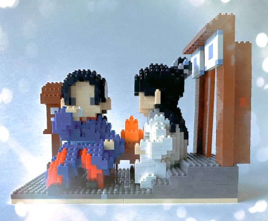
Building Block Figs - Basking in the Sun
Following up on yesterday's Beautiful Fight Scene in the Middle of the Lake Part One and Two, we have another building block set!
I won't go into all the backstory on these sets (please refer to Part One for a lengthy story), if only to keep this at one post instead of another two-parter.
The name of this set is actually just "Tavern". This inspiration for this scene is actually my favorite scene in the show. It's the Basking in the Sun scene from Episode 12, where they are drinking in front of the tavern and talking about good and bad people. Wen Kexing has my favorite line: "I just feel, that to be alive, to have the sun shining, and having someone’s name for me to call, is so good".
Both A-Xu and I agree, he's right.
Before we get started, a few specs: this set is 1,726 pieces, measures 8.4 x 16.8 x 12.8 cm, and is rated 11 hours of assembly time. This is the longest rating out of any of them, with two others clocking in at 10 hours each. I will say that I have found their assembly times to be extremely accurate.
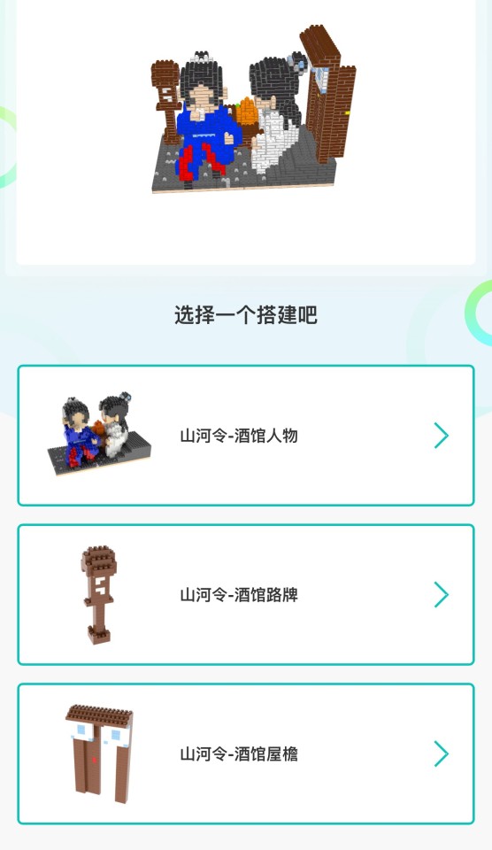
Here's what the finished model is expected to look like, along with the directions for each piece. As you can see, we have both figs, the tavern table, the (open) door behind A-Xu, and a lantern.
Once more into the breach! The kit looks so small and innocent there in it's box, doesn't it? It doesn't look like 11 hours at all.
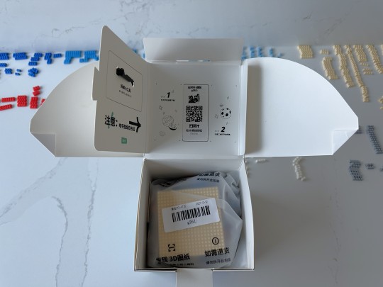
Like yesterday's set, this comes with the small black utility tool, the sticker with the tiny image of the finished set, and the QR code for the directions.
You'll notice there's already quite a few bricks sorted behind the unopened box. Those are all the left overs from my previous projects in this line. I didn't want to waste all the time I had put into sorting the bricks, and since the color palette is so limited, I end up using the same ones over and over again.
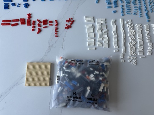
It really doesn't look that bad, huh?
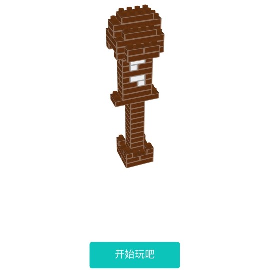
In order to encourage myself and give myself a sense of satisfaction from completing a piece, I skipped over the figs and went straight to the easiest component - the lantern.
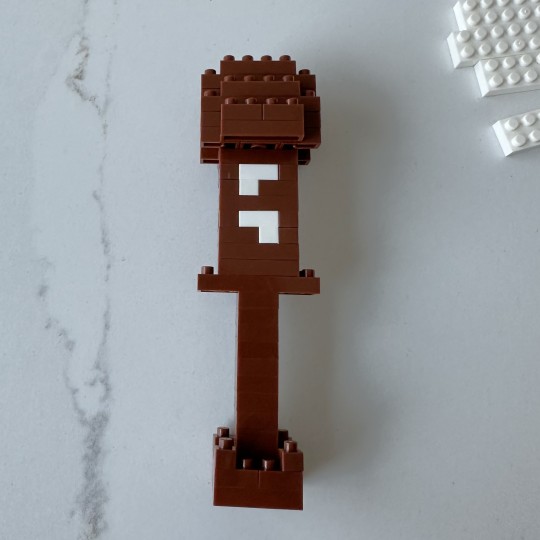
It was indeed quite satisfying to finish this up and put it to the side.
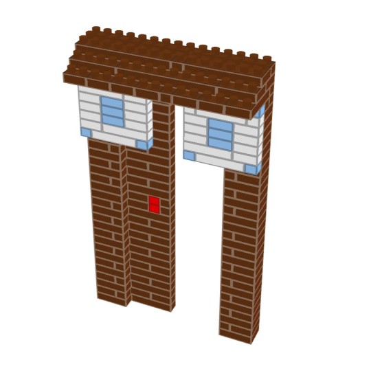
Next up is the tavern door. I admit when I saw this I was a little confused - I know A-Xu was leaning up against a pole kind of thingy, but the background with the flags didn't really register to me. So, I went back and watched the scene again, this time for the background:
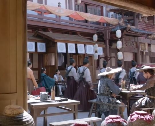
It looks pretty good!
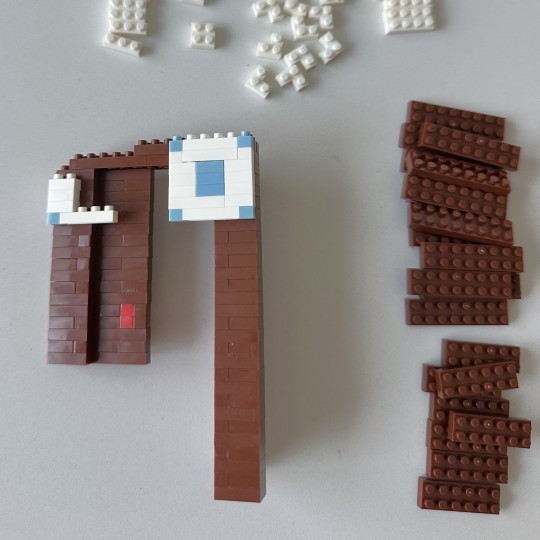
It was a lot of building up. As I mentioned in the last post, they don't have thicker bricks, so it's all 1-ply bricks here.
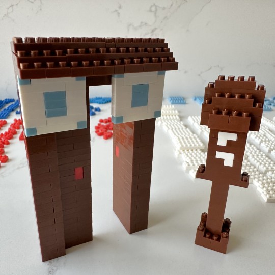
Looks good! I like how they have one of the doors open.
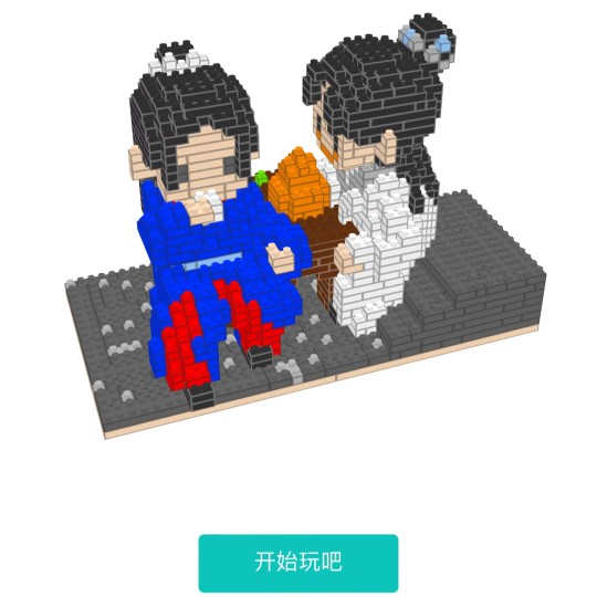
Well, at this point I could no longer put off the main part of the set. Nor did I want to - I was excited to get into it.
Onwards and upwards!
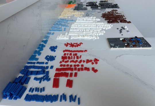
I'll save you the bulk of the gory assembly details, but here's a shot of my counter with all the sorted bricks all lined up, along with the base that I have just started working on. You can see what I mean about the limited size and color palette. By limited I don't mean as a criticism, it's just what we have available to work with. 3 different colors of blue, 3 different colors of grey, and then pretty much just one of each other color.
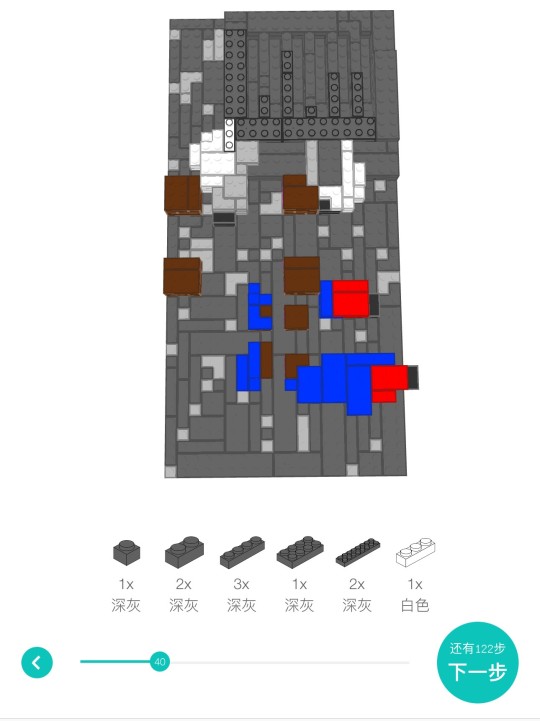
As you may recall from the last post, here's a sample of the directions from one of the sets. It looks flat and 2-D here, but I can pinch and swipe my phone's screen to rotate completely around to see from all angles. You can also see the step's bricks listed there, along with the left arrow to go back if you need to check your previous work, and the circle with the number of how many steps you have left. As you can see, I'm pretty far from the end.
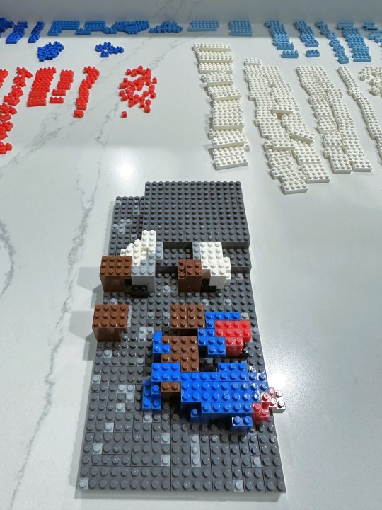
Here's my progress that matches the corresponding direction. I haven't gotten very far, here!
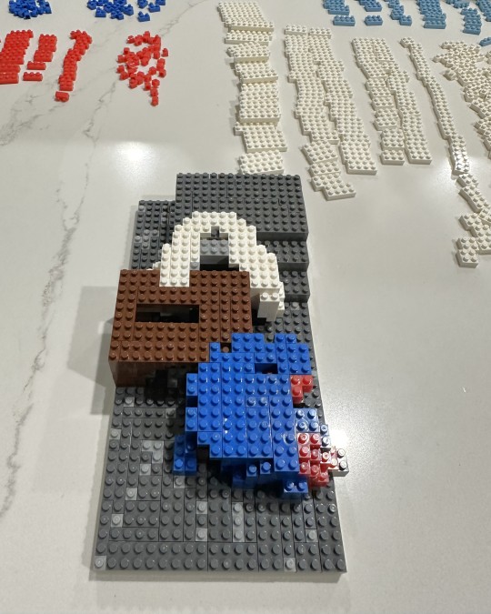
It's been funny for me to watch the progress of light and shadow across these pics - you can literally see time passing with the day going into the night!
At this point, I had finished the base, was well as the bottom robes of A-Xu and Lao Wen. You can see the steps behind A-Xu, and the table they are both leaning on.
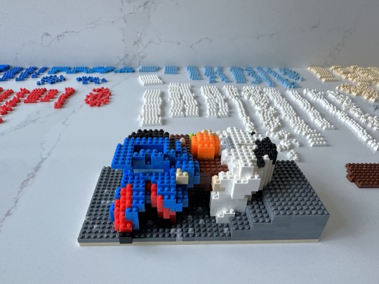
Last progress pic (a couple days later). Now you can really start to see the figs take shape!
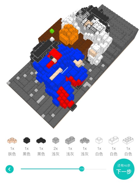
Here's a little bit of a better illustration of how I can rotate the instructional image to see different areas. Only 46 more steps here to go!
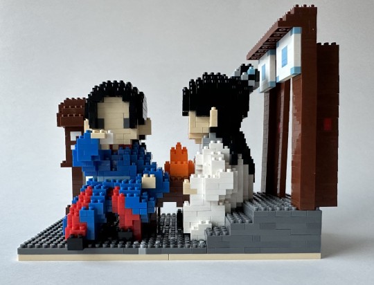
And here's the final assembled piece. I love it!
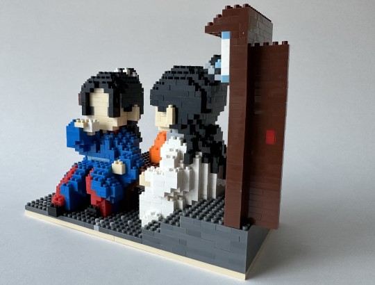
The way they modeled the poses are just excellent. We have Lao Wen's relaxed sprawl here, and A-Xu's equally relaxed pose on the stairs.
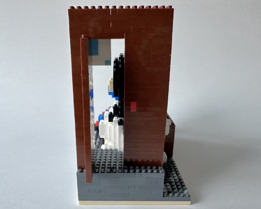
A little peek through the open door.
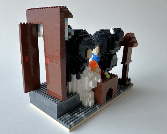
You'll notice that A-Xu's drinking gourd here is a pretty neon shade of orange, and that one of the dishes on the table is a similarly neon shade of green. This is again due to the limited color palette - there's no light brown or light green in this world.
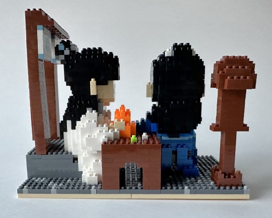
Their hair is not as dramatic in this scene as it is in the fight scene from yesterday, but that makes sense, they're just basking in the sun. I still love it - we have A-Xu's multicolored guan and Lao Wen's silver guan rendered in tiny brick form.
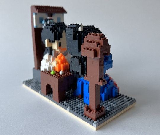
They decided to show exactly how happy A-Xu is here by giving him a big smile! The same neon orange color as the gourd, unfortunately.
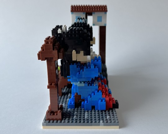
You can see here the way they have rendered the robe's drapery. And Lao Wen's little black boot there.
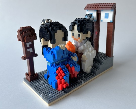
A full view of A-Xu's big orange smile! I could remove it if I wanted - as you saw, I have plenty of leftover bricks. I could take the orange off all together (which I think I will) or just leave on a little bit for his cheeks.
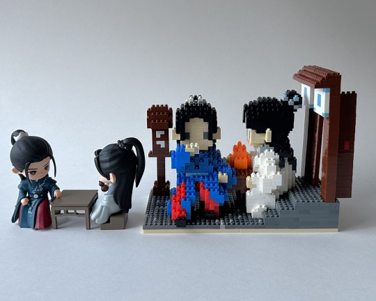
Here's the official Basking in the Sun figs to show the size up against these figs. This set is quite a bit bigger, but still not too bad, space wise.
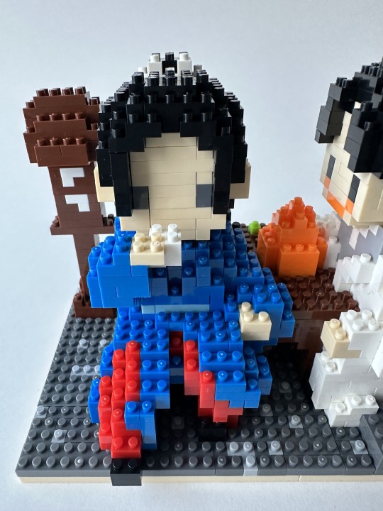
Let's get a couple close-ups of our main stars...
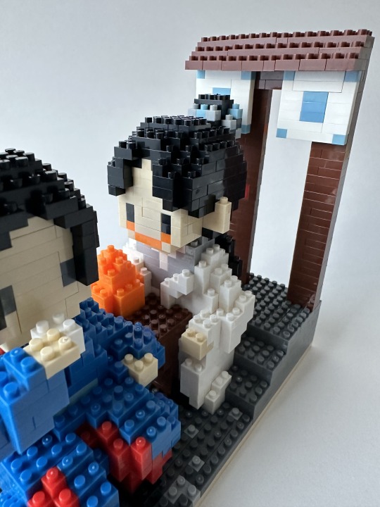
A-Xu's smile is so funny! You can also see his bangs here, which I really like, and a little more detail on his robe. I think they did a fantastic job on the robes in general. Very evocative of the show.
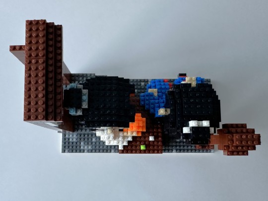
Here's a top down view, with a particularly nice view of the hair crowns.
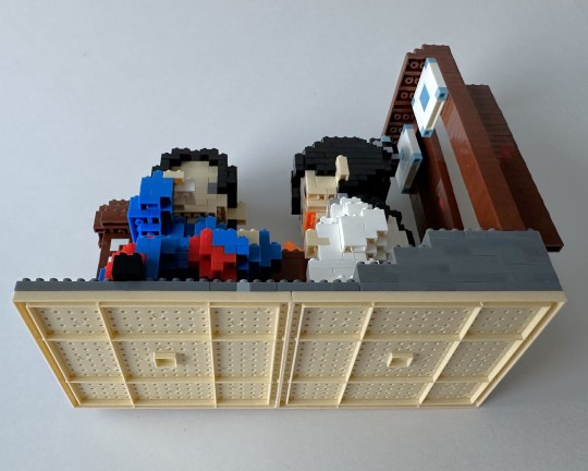
Ah ha! I was able to squeeze in one last picture before I hit the 30-pic limit. Here's our bottoms up pic - not very good I know. It's hard to do these ones with the bases.
In closing, I will say that when I told my husband I was putting together the "Tavern" scene set of building blocks, he got a puzzled look on his face and said, "which tavern? weren't they at taverns for like half the show?"
Fair. Very fair!
Material: Plastic building blocks
Fig Count: 504
Scene Count: 34
Rating: Let's drink!
[link to the Master Post Index]
10 notes
·
View notes
Text
talking abt the drawings
ok so.
i've had chronic pain for as long as i can remember. in high school i literally walked around with a wrist brace on each hand 24/7
despite this, i really wanted to go into art. and i did. i managed to get into art school, studied for 5 years, and earned my degree.
my chronic pain was always there, but when i was on T, weirdly, it lessened. that made it easier to do studio work. with T, though, i had a lot of other medical issues, and decided to stop it in my final year.
regardless of pain, i've always had a "craft" issue. that's what professors referred to it as. it's like... you struggle to color in the lines. when you fold a paper it's crooked. when you trim a print it isn't a perfect rectangle. and anyone who has ever received a wrapped present from me will know. it's like, the messiest thing you've ever seen.
i've always had some kind of like. fine motor difficulty. and that never went way even with my training. in many cases, it resulted in lower grades. but i just kept going.
and i'm unsure if it's due to craft or something else, but i was never a strong illustrator. and that's not too uncommon for some graphic designers. illustration and graphic design are different tracks, even. a lot of us rely on shapes, typography, and patterns instead of very elaborate drawings.
the pandemic (and other circumstances) uprooted my life. instead of going right into a graphic design internship, i was jobless and stuck at home. i sank into a deep depression, and my pain worsened to the point where making art even for fun hurt my body too much.
i think the first time i bothered to try traditional art again was when i made a portrait of my ex boyfriend a couple of years ago, but then i stagnated again.
and right now, i'm in a period of my life where choosing to live each day is very, very hard. but i want to. and i want to try to make art. so i am challenging myself to draw as much as possible. i'm being mindful of my pain and stopping when i need to. and i'm trying to be kind to myself. even if the craft is bad (it will be) and if the end result is Bad Art. because making Bad Art is okay, and because i'm trying to regain muscle memory i lost years ago, and improve upon it.
this is a new medium, too. i have never worked with markers previously. my traditional 2D art was always pencils, pens, charcoal, or acrylic paint. the markers i have are very cheap, and marketed as highlighters for books, not as drawing materials. i'm taking advantage of the pastels, and challenging myself with the limited color palette.
i'm having fun so far. i was always scared of markers for some reason. maybe because "real" brush markers are expensive. maybe because markers have a reputation through bleeding through paper (which i've since learned is often a paper issue, not a marker one.) and i think the permanence, too. i can't erase a mark after i make it. but that's letting me sit with my mistakes.
6 notes
·
View notes
Text
long Rain World ramble warning!!!!!
I got really damn sick yesterday and had a vivid dream about an Enot-like secret joke slugcat, and it was weirdly in-depth.
They were essentially a combination of all the positives and negatives of every other slugcat, with some tweaks here and there. (They had Rivulet's mobility but also their low rain timer, Saint's tongue but also their frailness and vegan diet, Enot's free eggs but also their 100% shelter failures, etc.)
(They also had Hunter's 20-cycle countdown, but I'll explain what that did later.)
Due to the dream slugcat not having a mouth, they couldn't use Gourm's item generation or Arti's grenade crafting; I assume that that was because those abilities are tied to item swallowing/regurgitation. They were able to do all other mouth-requiring actions, like Saint's tongue and Arti's explosive spears.
The most interesting part was all the stupid interactions all the mishmashed abilities had with each other. That included, but was not limited to:
The tongue made it very easy to gain height to use Gourmand's bodyslam.
The 100% cycle failures meant the lowered rain timer was much less punishing.
Arti's explosive jump still launched the slugcat, but it would stun them for a bit due to weak bones. (Doing a parry would also give them a snail pop seizure. They could still do the jump while stunned.)
They could eat corpses, but because of vegan diet it would just stun them and not give any food pips.
Throwing a spear would still exhaust them, despite them throwing like Saint.
Rivulet's speed would usually make the dream slugcat 1.75x faster, but would also make them 1.75x slower when exhausted. (Stacking with the initial exhaustion slowing.)
The generatable spears were colored with a rainbow gradient instead of white, for some reason.
They had a Citizen ID Drone that was colored like Andrew's pfp. I don't know what it did. (I also don't have a name for it, in case you guys have any suggestions. :3)
Though as you can probably guess, all of that was trivial compared to how they had to obtain food. Due to their
A. Inability to siphon with spears,
B. Carnivorous biology making non-meat food give 1/4 the pips,
C. Vegan diet that made then unable to eat any corpses, and
D. Lack of a goodamn mouth,
it was next to impossible to get any food in any feasible way. (Technically there's a bug that allows Saint spears to hit creatures like dropwigs and vultures, but it's very inconsistent and dangerous to do.)
There was ONE way to consistently get food, and it was through a "bug" with Gourmand's meal ability. If they took two different food items and crafted them together, they wouldn't gain anything from the food itself. (Cause no mouth, I guess?) However, the meal bonus will still apply and they'd get a SINGLE food pip. Unhelpfully, Arti's carnivorism meant that they'd only get 1/4 of a food pip if both of the meal components weren't meat.
I don't remember how big their food bar was, but this all means they'd need 8x the normal amount of food to fill a single pip. 👍
The most vivid part of the dream was how Hunter's cycle timer worked. Once it reached cycle 0, every single singularity bomb egg in the region would hatch into a new creature called an "Enot Long Legs". (Which was just an HLL that could fit in pipes and was recolored with Enot's palette.) It would spawn tamed, giving the dream slugcat a very powerful ally. The cycles would then continue into the negatives, and a new tamed ELL would spawn at the start of every cycle instead of an egg.
However,
each cycle below 0 would add a +2% chance for every item in the region to turn into an untamed ELL, capping at a 50% chance by cycle -25. This made scavenger tolls utter hell on earth because of all the hanging pearls and items the scavs were carrying. Assumedly, this would also kill Moon very quickly and make Five Pebbles much harder.
Due to the way their AI was set up, the ELLs seemed to always prioritize non-rot creatures. That meant that if they were aggro'd on the slugcat, then they would completely ignore the tamed ELLs. The tamed ELLs would then quickly eat all the untamed ones. (If the swarms lost aggro on the slugcat, however, they would easily overwhelm and eat all the tamed ELLs.)
-----------------------------------------------
Sorry for the long ramble, this dream has been sticking in my mind all day.
I don't think I dreamt a name, design, or hunger requirement for this slugcat, so I'd love to hear any suggestions! or just any ideas or questions in general! :3
#rain world#rain world downpour#rw downpour#rain world enot#rain world inv#rw enot#rw inv#long post#long#rambles#ramblings#sorry again for the college essay#i may be autistic#rainworld downpour#rainworld
14 notes
·
View notes
Text
What is Diversity-Positivity and Why Does It Matter?
While I’m all about body positivity, most of the time it’s reserved for conversations about plus-sized/fat/chubby individuals or characters. Occasionally, I’ve seen it used to talk about other traits that fall outside the beauty standards (like crooked noses) and I am very passionate about this side of representation as well, but “diversity positivity” is bigger than that.
For one thing, it doesn’t really revolve around beauty standards (though beauty standards are anti-diversity positive.) It’s more about adding new colors to our artistic palettes.
Diversity positivity is my personal term for all stories, music videos, fashion lines, drawings (and more) that promote and appreciate the beauty of various diasporas. Whether that diaspora is “female body types,” “people of color” or any other category we use to ‘organize’ humanity.
Diversity positivity is having two black characters in one story with different features, complexions, and hairstyles, who absolutely do NOT look like they could be twins.
Diversity positivity is making the cast of your comic book multi-cultural/multi-ethnic with mixed-race couples and biracial characters.
Diversity positivity is giving all your characters different hair textures, body types, and nose shapes from each other, (even if they're all from the same culture/country.)
Diversity positivity is any way we illustrate, celebrate, and adore the wonderful things that make us all different from each other.
This has been a passion of mine since I was a middle schooler, but for a very long time, I didn’t have a name for it. Since I was 10 years old, I’ve been writing stories about mixed-race couples. I’ve written (and drawn) Arab characters, African American characters, Japanese characters, and more.
A passion for beauty (in any and every form) has been ingrained in my bones for almost two decades, so of course it had to blossom into a passion for genetics, unique cultural traits, and the nuances of human appearance.
Diversity is a wonderful thing. For writers and artists especially, it’s a nearly endless source of inspiration, if we just learn to branch out and widen our perspectives.
A new language can spawn new ideas for wordplay (did you know the Spanish word for “wife” and the word for “handcuff” are identical?)
And don’t even get me started on the amount of fantasy creatures that exist in different mythologies. (We might finally be able to write about something other than dragons and elves. That would be a nice change of pace.)
And the further we dig into the details of each culture, the more we can learn how to represent their individual nuances. It helps keep our character designs fresh and interesting. Not every Latino or Asian character has to have the same identical character design. Cliches and stereotypes have been recycled more than enough. Let’s go beyond the ‘typical’ and appreciate the rare, the little-known, and the unique.
Did you know that some Koreans (naturally) have 4C hair? Did you know that some Dominican children are blond?
The world is full of beauty, whimsy, and inspiration if we’re willing to look for it.
Diversity positivity doesn’t have to be a struggle or a limitation, (or at least, it shouldn’t have to be.)
Representation actually gives us a LARGER palette to work with. It’s broadening our canvas and our perspectives. Because, honestly, the more we learn and read about the people we share this globe with, the more we’ll realize that we have TONS in common.
But that leads us back to the initial question.
Why does diversity positivity matter?
It matters because change starts with changing our mindsets, and there is no better place to start than with the art, books, cartoons, fashion shows, and movies that we enjoy (and create.)
It matters because, 70 years after the civil rights movement of the American 1950s, dark skin is still widely scorned.
It matters because people use the word ‘fat’ as an insult and make massive amounts of artwork mocking fat people instead of giving them a chance to be beautiful like anyone else.
It matters because we still live in a world where it’s novel to find a disabled character in a book or TV show, who isn’t there for a one-off episode about ASL or wheelchairs.
This world needs to think a little further outside the box, or better yet, set that cursed box on fire so we can all roast marshmallows over it together and make smores.
Everyone, fat or thin, able-bodied or disabled, African, Asian, European, or anything else, should get a chance to see themselves in the world of art and the world of fiction.
That’s my mission. Would you like to join me?
#diversity#positivity#body positivity#representation#creativity#writing#cultures#cultural appreciation#diverse#represent#black characters#body positive#art#activism#activism through media#why it matters#movement#starting a movement#poc characters#plus-sized characters#ethnic characters#empowering#empowerment#body types#positive#dark skin is beautiful#all cultures are beautiful#equity#author#black author
1 note
·
View note
Text
Two more this time that kind of make a matched set: 20 Minutes Till Dawn and Twilight Survivors, which are both very inspired by Vampire Survivors but went in different directions with it, one of them successfully and the other not so much so (yet?).
20 Minutes Till Dawn is the good one. Let's get that out of the way up front. Its influences are obvious, but it has a lot of its own ideas that make it feel distinctly like its own thing, and mostly in ways that are just different, not better or worse. Twilight Survivors doesn't have a lot of original ideas, and large chunks of it come across as "what if we did the same thing as that other game but not as well?"
The extremely limited color palette in 20MTD is used to great effect, particularly with the character portraits, but it really sets a particular mood in the gameplay too. It does make some things a little hard to distinguish sometimes, especially on the Switch's screen, but overall it's great. TS is much more colorful, mostly in a pleasing way, but I actually have a bigger problem with stuff getting lost in the visual noise in that one, and barely legible tiny icons are a bigger offender in that one too because they more frequently appear with no other description next to them even in important places.
Both games actually have manual aiming. This actually works fairly well in 20MTD because it also has a manual attack button. There's also a button to toggle auto-aim whenever you want, which is nice and suits some weapons better than others. Meanwhile manual aiming just feels bad in TS because too many weapons have frustratingly long cooldowns and no indication of when they're about to fire, so you just have to wave it in a direction and hope for the best. You can unlock auto-aim later, but it takes up an entire upgrade slot and has a damage penalty, which is just silly because it makes the game feel much better to play to use it. I am strongly of the opinion that manual aiming works best with either fully manual attacking or quick-firing weapons, but not slow auto-attacking weapons like TS is full of.
Almost every character and weapon in 20MTD feels unique and plays differently and is interesting to build around, and I've finished runs with just about all of them (not every combination, just one or more with each character and one or more with each weapon) that all turned out differently. Different playstyles require entirely different upgrades, and nothing in particular feels mandatory to take on every run as long as you have enough defense/healing for your skill level of (not) getting hit and enough damage to actually kill stuff fast enough, and there are plenty of ways to achieve each of those things.
Most of the characters I managed to unlock in TS and bothered to try felt kind of bad to play. Melee seems particularly like garbage from my few attempts at it, and most melee/short range weapons seem to have terrible damage and mostly be for support, and unless you're the durian you don't end up tanky enough to stand up to bosses anyway. A 15 minute run with a ten minute boss fight at the end does not feel awesome when I can go full glass cannon projectile spam and do it in like 18 seconds instead without having to stand close enough to anything to take any damage in the first place. It also feels exceptionally biased toward cooldown reduction being the most important stat, and with some other really useful passives being the upgrade material for character-specific weapons I kept feeling like I had to choose between my build being unplayable because I didn't have mandatory upgrades or my build being mediocre/not fun because I couldn't upgrade all my weapons because I had to sacrifice a couple slots to meet bare minimums.
Weapons and skills and upgrades also feel more impactful in 20MTD. There's still some room for improvement, but most things feel satisfying to use, and it's pretty easy to see the visual effect of a lot of the upgrades and the impact on enemies. TS is just kind of...mushy? The upgraded versions of weapons are a lot better, but that's not saying much because the base versions of a lot of them are incredibly meh. And even with a few of the upgraded ones I've had runs where I forgot I had a particular weapon because it just gets lost in the visual noise (looking at you, totally-not-the-Runetracer/NO FUTURE). It just needs some kind of something or other to make the attacks hitting enemies not feel like nothing is happening.
Basically go play 20 Minutes Till Dawn if you want a little bit of a different take on the bullet heaven genre that's done pretty well. I got a little burned out like halfway through the difficulty tiers because I was having a hard time coming up with new build ideas to try that actually worked at all, but up until that point I had a lot of fun. And probably wait to see if the planned updates for Twilight Survivors make it feel better to play and balance stuff out a bit better, Or if you've always wanted to be a durian. It has some potential, but it's not there yet and may or may not ever get there.
0 notes
Text
How Is Rosé Wine Made at an Oklahoma Winery? | OGIC
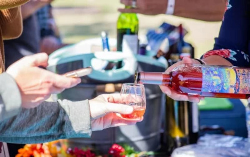
When you visit an Oklahoma winery, there will be many unique wines to try, including rosé. These wines are known for their color, with varieties ranging from pinks so pale that they are almost white to deep shades of raspberry. In addition to the palette, rosés have a delicious flavor profile featuring citrus, spice, fruit, and floral notes.
Because these selections are so unique, you may be interested in learning how these wines are made. Overall, rosés are produced in the same way that red or white Oklahoma wines are. However, there are some key differences.
How Are Oklahoma Wines Made?
After the grapes are grown and harvested, they are brought to a winery. There, they are crushed into a mixture called “must” and fermented. The mixture will also be pressed at some point (before or after fermentation, depending on the type of wine). The wine is then clarified, bottled, and aged to perfection.
When making rosé, there are a few more steps in-between.
An Oklahoma Winery Can Make Rosé Through:
Maceration
The most common rosé production method is “maceration.” For this, red wine grapes are harvested and crushed. Afterward, they are left to soak for 2 to 48 hours, allowing the grape skins to start influencing the juice. This process is called “maceration” – the longer the grapes are macerated, the darker the juice. After this, the skins are strained out of the grape juice, and the fermentation process begins. Due to extended contact with the grape skins, the resulting wines have more texture and body than some other rosés.
Direct Press
The “direct press” style of rosé production is also a very popular approach. To create this wine, red grapes are harvested and pressed to extract their juices. Unlike maceration, the skins and the grape juice are separated almost immediately. While this contact is limited, it still leads to a finished wine that has a lovely pink color. From there, the winemaking process continues in the usual way until the rosé is ready to be enjoyed.
Saignée
Another method is the “saignée” approach. If you create rosé wines this way, you must also make red wine. This method involves “bleeding off” some of the juice from a vat that is being used to make red wine. (The name “saignée” translates from French as “bleeding.”) Because the removed juice had limited contact with the grape skins, the resulting wine will be pink. Saignée wines tend to be more complex and have a fuller body when compared to some other rosé varieties.
Blending
While other methods start with red grapes, “blended” rosés start with white grapes. The winemakers begin by making a white wine; afterward, a small amount of red wine is added, leading to a pink color. If you try a sparkling rosé, it was likely made with this production style. Blending may also be used in addition to maceration, saignée, or direct press. For example, if a direct press wine does not have the desired shade, the winemaker may blend some red wine into the rosé.
Enjoy Rosé on Oklahoma Wine Tours
There are many wineries and vineyards across the state, each producing a unique variety of wines – often including rosé. If you want to try quality wines, consider visiting members of the Oklahoma Grape Industry Council. In addition to creating delicious wines, many of our member vineyards and wineries offer Oklahoma wine tours, so you can learn more about the grape growing and winemaking process.
#OklahomaWinery#Oklahomawines#Oklahomawinetours#oklahomawineryneari-35#madeinoklahomawine#growinggrapesinoklahoma#oklahomavineyard#winetastingokc#oklahomavineyardsnearme#oklahomawinetrails
0 notes