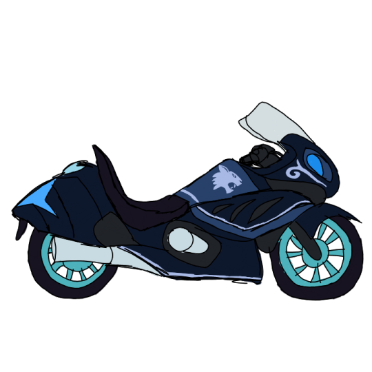
#used a previous sketch to try experimenting with his palette
Explore tagged Tumblr posts
Visit Tumblr Blog
Explore Tumblr blogs with no restrictions, modern design and the best experience.
Last Seen Tumblr Blogs


Fun Fact
Tumblr was the first site to host the blog for President Barack Obama in 2011.
Text
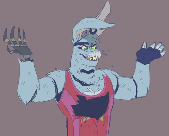
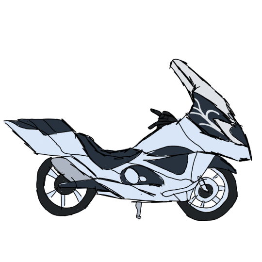
evil!bonnie with his dulled down colours
#used a previous sketch to try experimenting with his palette#hes very grayish from being very colourful when he was normal bonnie#art#fnaf#fnaf security breach#glamrock bonnie#evil!bonnie#fnaf au#glitch in the code webcomic
485 notes
·
View notes
Note
Oh ho ho, now I'm curious, do you have any refs for anyone that might want to draw your OCs? Pictures or specific descriptions or anything of that sort? Just curious...
Thank you for the ask! I'm so glad it interests you!!
Well You See: I'm an artist. I should have references lying around. But if I were to present them, it would be some super sporadic stuff bc I never got around to drawing MOST of my ocs, for some reason...
That being said, I have a few things lying around. I'll post it here and maybe update when I make more.
(Also, I know the digital drawings suck. I have 0 experience with it. I am Trying Very Hard)
This is gonna be Long, so buckle up.
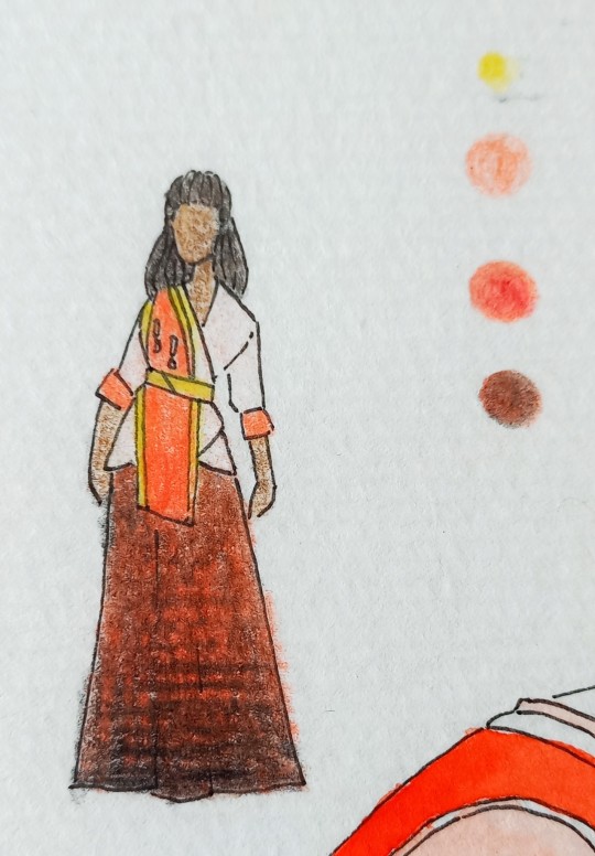
Dystopia WIP:
This WIP was originally concieved at a graphic novel, so I have a few drawings - especially a few rough sketches mapping out outfit shapes and colours. Let's go through the main cast:
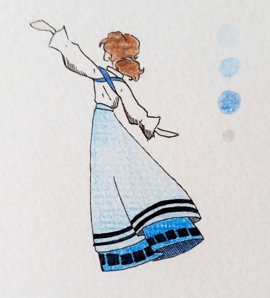
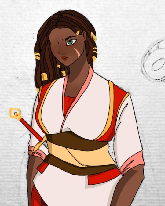
Veta, Vi and Veo (aka the Communist Polycule):
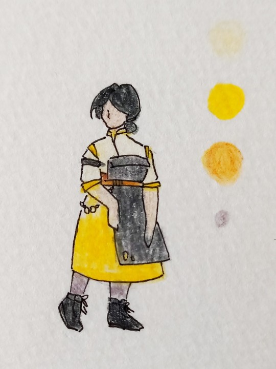
Veera:
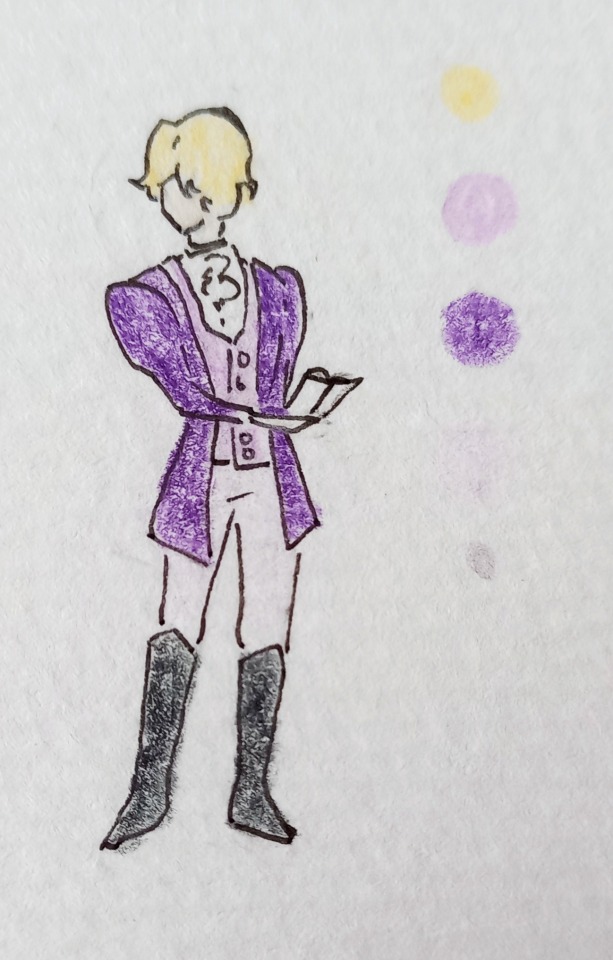
Alexis Ivanik:
Cristover (left) and Nester Kalenev (right):
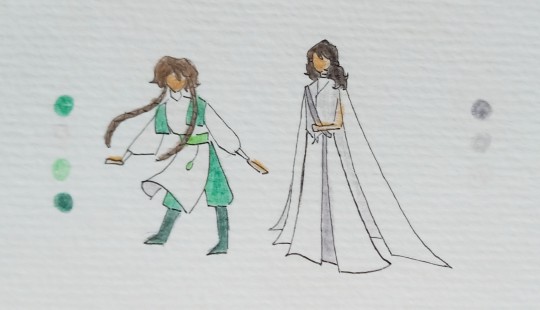
I have a post explaining the significance of most of the colour palettes of the 3 WIPs here
Notes on the characters:
Nester, Cristover, and Vi are all guys. They're wearing skirts bc they're Fashionable. Vi has a beard
Vi's outfits are inspired by traditional portuguese costume
idc what you do with Alexis, they NEED to be wearing extremely over-the-top eyeliner at all times
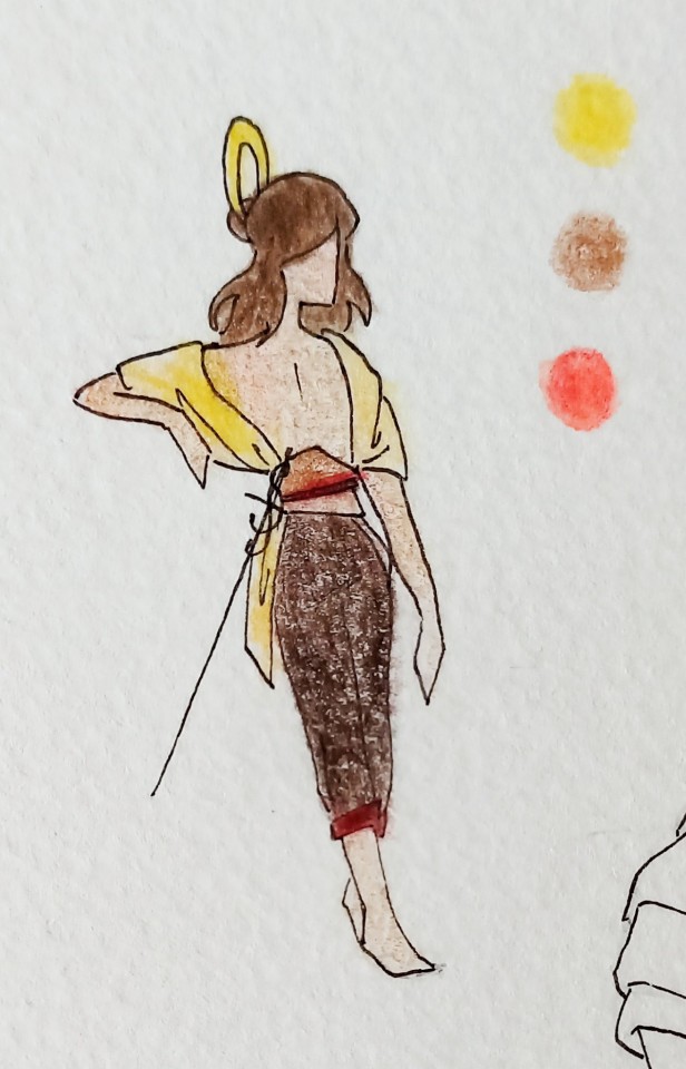
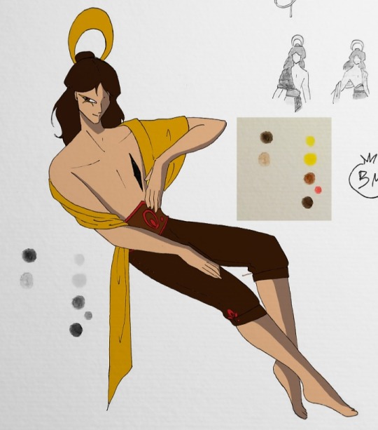
Devourer of Souls:
So here is the Thing. Most characters in this WIP being female is a very recent development. Almost all except for Flick used to be guys. So the only pic of Seth is her as a man. Literally just picture her with longer hair and it's almost accurate.
Seth (very zoomed into a drawing I once made):
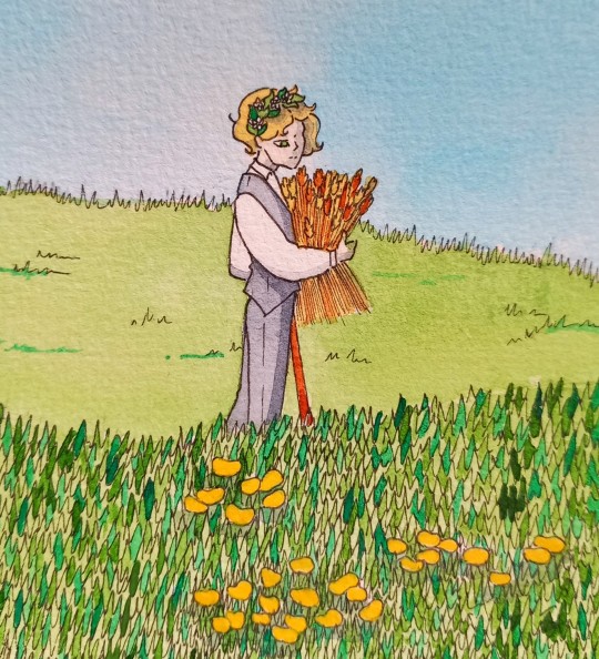
(pls don't forget that she's a cane user)
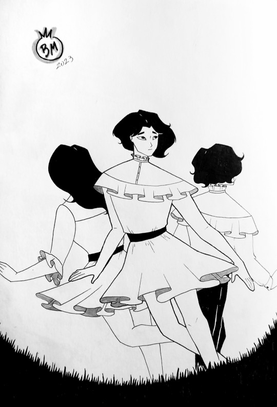
Flick (the people on the sides are Allana and Hunter, the two souls their body houses):
Notes on characters not pictured (Jane and Theo):
Theo and Jane are technically twins, and they have a Snow White/Rose Red motif
Theo has bright red eyes long white hair in a huge braid. She wears all white tends to prefer overalls
Jane has short red hair and white eyes, the inverse of Theo
Black and White
Considering this WIP is my main one and the one I've had the longest, I have shamefully little material on it that I like. And also, I've already reaches the limit on pictures I can post.
I mean, my icon is a drawing of Darius, and there's also the Great Reyna Picrew Show-Down, but otherwise? Almost nothing. When it comes to descriptions, it's kinda vague ig? But let me kinda compile a little bit. Here's the most relevant characters in order of appearance:
Johann:
[...] He was significantly older and dressed much more presentably. His deep black suit had a refined and expensive-looking cut. He carried an old walking stick, which might have been in fashion in the previous century, to complete the look. Besides that, he had a box-shaped camera hanging from his shoulder. His hair was almost completely grey and perfectly combed, which made him look organized and important. When he walked closer, Darius noticed the strange shine in his eyes, his crooked nose, his lively smile. There was no doubt. He looked like all the pictures he'd seen. [...]
August:
He would almost be a perfectly normal person if not for his height. He wasn't a giant, but he had a considerable advantage over most people, although not at the expense of any muscle. His hair was longer than one would normally see in a man, almost shoulder-length. Otherwise, he looked pretty average, dressed in a half-opened shirt and very tight trousers. He couldn't decide if he should categorize him as "weird" or not.
Extra note: he wears a glove on his right hand that he never takes off. I once made a joke about the glove staying on during sex and it's 100% true.
Reyna:
[...] The girl was absolutely enormous. He'd never seen anyone so tall. She was taller than August, who was almost a giant himself. Even without heels, she was taller than anyone he'd ever met. And besides that, she was dressed quite scandalously. Her red dress barely reached the middle of her legs, leaving part of the knees exposed. The skirt was made of various layers of light fabrics, like chiffon and tule, all of them ending in excessive frills. It looked like a flower upside down. The dress had no sleeves, being held in place solely by two thin straps covered in glitter, reflecting the light of the sun. All of her seemed more suited to a burlesque show than a circus.
Diedrich:
His red hair, tied into a ponytail, fell down the side of his neck, like a small flame. He wore a crisp black suit, like any common man would. [...]
I can't believe I never actually described Diedrich. I know he's a POV character but still, wtf??
I mean, I guess there wouldn't be a point in describing him from Darius's or Reyna's POV because Darius spent years collecting pictures of him and Reyna has seen him every day for the past 5 years. But if you want an age range, he's 50 in the main story, just like Johann.
You know what? Hit me up if you want a drawing or better description. I'd be happy to do it for you, if you wanna actually draw him.
(if you're wondering why the descriptions are so weird about fabrics, it's because this is narrated by Darius and he's a tailor - he's really into sewing)
As for Darius himself, he's only ever described as "looking like Alphonse". And what does Alphonse look like, you ask? Johann describes him in relation to Diedrich (a description we don't have), and Diedrich feels no need to describe him because he's literally his son and he's known him since he was born. I need to fix this, holy shit.
Anyway, I hope this gave you better insight into how (some of) my ocs look! And I hope you had fun looking at sketches, zoomed-in pictures and 1 (one) fully fledged illustration of Flick.
Also, feel free to ask if you need more info! I can add it here to paint a more complete picture.
#this took WAY too long to compile#but it's nice#maybe I'll update it and make it a masterpost#who knows#writing#writeblr#my wips#black & wip#asks#the dystopia wip#devourer of souls wip#oc reference#my art#the images are behaving weirdly in the draft PLS HELP
8 notes
·
View notes
Text
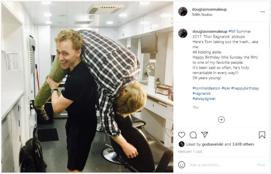
Interview: Makeup Artist Douglas Noe on Loki’s Looks Through the Years & Creating Anew for ‘Loki’ [EXCLUSIVE]
Douglas Noe has been in Hollywood for three decades. An award-winning makeup artist, he’s worked on projects such as World War Z, Planet of the Apes, Spider-Man 3, I Saw the Light, and Birth of a Nation. On top of these impressive credits, he’s also been Tom Hiddleston’s personal makeup artist since joining the MCU in The Avengers, designing all of the looks for Loki’s subsequent appearances.
Noe has been nominated for three Emmys with one win, and five Makeup Artist and Hairstylist (MUAHS) Awards resulting in two MUAHS awards. His skills include creating making natural and period looks, prosthetics, hair, and tattoos.
Along with being the head of the makeup department for the most recent Disney+ series Loki, Noe is also creating looks for the new Netflix comedy series True Story starring Kevin Hart and Wesley Snipes.
We had a chance to chat with Douglas Noe about his work on Loki, The Avengers, the incomparable value of teamwork on set, and most importantly, Richard E. Grant.
Nerds and Beyond: So you started your Marvel journey with The Avengers, but what drew you to your field in the first place? And how did you get your start?
Douglas Noe: Star Wars was a huge influence to me as a young boy, both sketching and drawing, and a little bit of sculpting but not much. Cut to 1983, Michael Jackson’s “Thriller” comes out and I find a magazine called Fangoria on the newsstands where I can order blood and wax and pencils and fake hair. So, I started playing with these things. I was also taken with the horror movie craze that was happening in the early 80s — Nightmare on Elm Street and Friday the 13th, and others, obviously.
In High School, in 1984, I joined choir thinking I would get an easy credit, but my voice had not changed. So the choral instructor had been waiting for a boy soprano to do a theatrical opera presentation. So with that I sang the lead, I quit choir after that, because my peers were merciless, but, I learned the world of theatrical makeup which I hadn’t been introduced to.
I did years of theater. I went to a performing arts high school — it’s called Fort Hayes School for the Performing Arts in Columbus, Ohio — graduated, went to beauty school, and continued working in Ohio doing industrial, commercial, theater, and opera [makeup]. Worked for Maybelline and Revlon, got restless, worked in Cincinnati on my first film in the summer of 1990, it was July so 31 years ago, A Rage in Harlem. And my boss said you come to Los Angeles, I’ll make sure you get on your feet.
Nerds and Beyond: So you mentioned that it’s been about 31 years since your career started, what’s changed over the course of those 30 years in your field?
Douglas: How much time do we have? I’d say the biggest, biggest change would probably be the way we make these things now. Although another large change, more specific, would be the materials that we use. There’s a constant evolution and reinvention of almost all aspects of the materials that a makeup artist uses. That said, I have to shine a light on the way we do things now with the onset of digital and digital cameras. Shooting on film now has almost completely fallen by the wayside. Film was very forgiving, quite frankly, and now it’s not so forgiving. And because of that, the bar has been raised. The wonderful thing about this journey is watching my peers just get better and better and better, my colleagues rising to meet the challenge of not having anything to hide from with this new way we make films.
Nerds and Beyond: So, sometimes you kind of throw prosthetics to the wayside in favor of a more traditional makeup. How do you make that decision on which one to go with?
Douglas: That’s an excellent question. The decision is based purely on what are we going to see. That’s where I start, what is the lighting? I have a conversation with the director of photography and I find out what is the dynamic. Obviously, I know from the script whether it’s an interior or exterior, or if we’re exterior but we’re going to be on a stage, if it’s day or night. These variables all play into my decision as to whether or not I should rely on my theatrical experience and ability to paint 2D to appear 3D, or go ahead and make small prosthetics and put them where I need to put them and use actual prosthetics in lieu of paint.
That has everything to do with lighting, locations, logistics, and because most of his [Loki’s] wounds appear on his arm and some on his face in the Void, it’s all very moody and very dark. And again, the theatrical quality of the paint is not going to be altered by the changing light, it’s just going to react the same way the rest of the face is going to react. It’s purple light, it’s going to make everything have a purple hue. There was no accounting for any correction that didn’t need to be done. There wasn’t anything wrong with that. It’s real.
Nerds and Beyond: So, you did make up for not only Tom on Loki, but you helped plan out the looks for everybody?
Douglas: Yes, what I do is I surround myself with strong talent. It’s all about team. I designed Wunmi Mosaku, Gugu Mbatha-Raw, Sophia DiMartino, and Tom [Hiddleston]. Regarding the rest of it, Neil Ellis, both Dennis Liddiard and I, added to the elements of his scars and wounds, which you would only see in close-ups.
The rest of it, the parameters are set — Blade Runner to Mad Men — and stay in those confines. And obviously, I choose color palettes for the women and there are parameters set for the men, but then it’s about team. I’m a big one on a team and not putting my thumbprints on other people’s work, but rather build other people up so they feel like they own what they’re doing.
My team consists of artists that also have stronger resumes and quite frankly, skills that exceed mine. It’s the mutual trust that allows us to keep a high level of artistic integrity in every aspect of the job. It also means I get the very best from my team, and it shows on the screen.
So, I didn’t have every look in my hand. Dennis Liddiard designed the Mobius character and I had Ned Neidhardt run with Gugu and turn up the volume on some of the elements that she already possesses that we can play with. Her eyes and lips, I think Ned turned the volume on both. And because we’re shooting in order, it’s a progression in the makeup you did.
Nerds and Beyond: When it came to Sylvie and Loki, when you when you’re doing those, did you try to kind of plan them both to have any similar things to give them a Loki look?
Douglas: It’s a fair question, but the answer is no. So again, I think the characteristics and traits that were going to be similar among them, aside from wardrobe and costume hints, were all character driven. And I did nothing with the makeup and hair to try to make them look or even closely resemble each other.
Nerds and Beyond: I want to kind of back up a little bit to Tom in the first Avengers film. That was by far one of his most standout looks. Can you tell me anything about what went into the creation of that absolutely tormented, haunted look that he had throughout that entire movie?
Douglas: Yeah, and that’s probably one of the elements that, because the character has evolved, we kind of left with Avengers because by the end of Avengers, and we carried it into Endgame, he does have a bit of an edgier look in Avengers, and not many people pick up on it. But the reality is he’s a little sculpted in Avengers.
I remember sculpting his cheekbones and temples, and doing a little play on his forehead for when he’s in the cell on the Helicarrier carrier with all that overhead lighting. I did like a little devil horn shadow, which is so subtle. The only person who’s going to notice is anybody who looks back at it and having read this and knows what to look for, but it is so nuanced and so subtle. And that’s the only place I think we did that. But the rest of him is very much chiseled and sculpted, but it’s a light touch.
And I think, again, as he evolved through the Marvel Universe and into the other movies that was something that was easy to leave behind, because I think that look played directly into his evil desire to rule over Earth. We rested that design element with that storyline.
Nerds and Beyond: It’s very clear too and I’ve always loved looking at that, because I’m a huge fan of the character. I’ve always loved kind of comparing how he looked in that movie to the rest of them.
Douglas: You’re on to me!
Nerds and Beyond: I’m not! I swear [laughs] So, what’s your best method for making the actors comfortable in the makeup chair? And with the final outcome?
Douglas: It’s dialogue; listening, talking to them, talking to their representation, whether it be an agent or a manager, and doing my homework and doing my due diligence to find out what’s going to make them comfortable the moment they walk through the door. I do my homework on them. It’s not just IMDb, it’s an internet search. So, I spend some time on the web and find out who these folks are, and if I find out, for example, they’re not one that likes to talk a lot, well, the writing’s on the wall, we’re not going to talk a lot, we’ll cut to the chase and get to the point. But also, it’s about building a rapport and building a relationship. Also, knowing that, I’ve said this in previous discussions, knowing it’s necessary to get out of the way.
Like if, for example, I’m not a proper fit for somebody, I have to be plugged in, I have to be aware enough to understand that it may not be working before somebody says to me, “Hey, this isn’t gonna work.” So it’s just about being open, especially as Tom’s personal on these projects and running the department, knowing that I don’t get to do everybody. I don’t get to put my thumbprint on other people’s work. Because not only is that disrespectful, it’s very often unnecessary, because I hire good people. I hire contemporaries and peers. Truly, you’re only as good as your weakest crew member. I surround myself with good people.
So, take Owen Wilson, for example, it would have been wonderful to do Owen’s makeup, but there were times when he was not going to be shooting with Tom and I was going to need to be ready for Tom or available to Tom, so it didn’t make sense. So I never touched Owen, I had Dennis Liddiard design that look and run with it. And then Ned Neidhardt took over that look when Dennis had to depart. That’s just one example of not trying to do everything.
Another one was the Classic Loki. I wanted to do Richard E. Grant’s [makeup] so bad, I can’t even tell you. I’ve been a huge fan since 1987. I wanted so badly to bring that full circle, didn’t make sense. It just didn’t make sense. So again, I never touched him. It wasn’t necessary. Ned was always there. And I think the same thing happened to me on Ragnarok reshoots, which I ran in Atlanta again with Dennis Liddiard. I wanted so badly to do Sir Anthony Hopkins makeup, but it didn’t make sense. So I was happy to hand it off to Bill Myer.
Nerds and Beyond: Oh man, I loved Richard E. Grant in this show so much.
Douglas: He’s amazing.
Nerds and Beyond: He’s so good!
Douglas: He really is. And he’s that good in person. He’s just so fun and interesting and alluring and attractive. He’s such a wonderful, wonderful person and, of course, a phenomenal actor.
Nerds and Beyond: I was watching little videos that he posted and he just seems like the warmest person.
Douglas: You know, just one last tidbit about Richard Grant is he’s got wonderful stories and as he’s telling them he’ll often stop and pause and just laugh. Just laugh, not for the sake of the stories or for anybody that he’s telling the story to, but because recounting the story brings him true joy. So he’ll stop and embrace that joy. Oh, it’s so wonderful.
Nerds and Beyond: That’s so amazing to hear. What is the most memorable job that you’ve done?
Douglas: The most memorable … That’s a tough one because I have so many fond memories of so many projects. The first Avengers film was memorable because there was a buzz, there was a vibration, a frequency, that was in the air when we were shooting that. We kind of knew we were making something big and something special. I don’t think any of us knew how big or how special it would be, but that certainly is one of the most memorable and most special projects.
I’m pretty good about focusing on the positive aspects of all these things, regardless of how difficult the project may be for whatever reason. The pros always, always heavily outweigh the cons, but I have a lot of wonderful, memorable experiences. Another one, it’s the polar opposite only because of the conditions in which we shot, but Birth of the Nation was one of the most memorable and exceptional experiences of my career. I was on the wrong side of 40, had 25 years of experience, and had still never worked so hard in my entire life. We did a 50-day shoot in 27 days. So proud of the work we did.
It was 100 degrees with 99 percent humidity, we shot it in the summer in Georgia, in Savannah, so it was hot, humid, and just getting the makeup necessary to be on individuals to stay put was its own challenge. And then the other challenges only added to that. But Nate Parker, the director, writer, producer, and lead actor, he is a special human being. And he was inspiring from start to finish. Usually, the first people in are the teamsters, transport department, and usually I’m second. He beat me in almost every single day. He’s in three hours before he needs to be. That was a very special experience.
Nerds and Beyond: Finally, are you excited about the news of Loki Season 2?
Douglas: I’m beyond thrilled! I invite being in the dark a little bit, I kind of like surprises and I like not knowing, so I suspected, but hearing the news confirmed, I was thrilled, naturally. What are they going to dream up? This is amazing. How do you top season 1 of Loki? That’s the burning question.
30 notes
·
View notes
Text
Let's talk about Art
First of all, I'd like to put it out there that whatever I'll say here will be personal takes and opinions and my advice to you coming from my own experiences. It might not apply to you or the next person, but it'll give you an insight into how things usually work with Art, and hope that my experience might ease your worries.
I have a degree in Graphic design and a minor in Illustration. I studied at the second most prestigious Art university in my country and was supposed to have been taught by these media giants with decades of experience in their fields and years of teaching experiences under their belts...all of that didn't matter in the end.
That being said, I started off my Art journey with a GREAT struggle. I did not have natural-born talent like my friends, and I mean it when I say that. Anatomy? We don't know her. Lighting and knowledge of shadows and colors? Lol. At most, what I could do in my first year (which was back in 2015), was somewhat sketch on paper, not humans, but nature and buildings....but that was it.
Within the first two months, my teachers isolated me with a bunch of kids they thought were too weak to go on. I spent the whole year desperately trying to stick to briefs and doing everything over the skeleton of what I thought the teacher would like,,, there was ZERO originality and some of my projects wouldn't even reach their ends.
My teachers didn't help either. Teachers tend to have a set of rules they'll make all students follow despite the obvious need for creativity and it gets difficult for beginners to cope with when they can't spread themselves around and explore a medium with personalized projects.
When it was time for my Thesis, something a student has full reign over, my mentor had confined me to a set palette of his choice and rejected any idea I came up with, leading the project to be everything HE had visualized and nowhere near what I wanted it to be. Understandably, there came a point where I crashed.
Nothing was working out and I would stare at my screen for hours while my friends were nearing the end of their projects. I had only done 10% of the actual work. I skipped a major jury and a month later, dropped the semester.
It wasn't until a couple of months later where I started the project over, this time with my own designs and palettes and a new mentor when I actually managed to like where I was headed.
The whole ordeal made me realize, that I reached a burnout stage so bad only because I was forcing myself to work on a medium that wasn't for me. When it comes to paper. I can't draw. At. All. If I were to learn what I do now on paper, it would take me YEARS of practice,,, something I couldn't afford back in Uni - I was left with two options: either continue doing what the teacher said and have a repeat of the year before or pick up a medium (in my case, digital art) that I hadn't tried before and hope it works out (something my teacher didn't want me to do)
It worked out. And the project was a success. If not for the teacher then at least it was for me.
My biggest advice for beginners, especially ones in Art schools, would be to experiment with multiple mediums until you find the one that works for you and then work on honing that skill. Teachers usually give you a concept and brief that you gotta stick to,,, do that. Stick to it, but don't be afraid to stand your ground when it comes to what medium you use. Back it up with a good reason and tell them that you'd use that chance to show what you can do with your strength. (They've most probably already seen your weaknesses so there's no going worse from there anyway)
I can't promise you if they'd listen; some might give you a chance while some might shut you down immediately. Stand your ground anyway.
I was bullied by my previous teacher to the point where he made me physically sick in front of a crowd. But I stood my ground the next day and kept working on my own designs and it helped me to finally see PROGRESS in my work.
I had to breeze through so many points here that need more elaboration but it would get too long so I'll say this again, my DMs are open for whoever needs a bit of advice, please feel free to come and talk <3
6 notes
·
View notes
Text
Nobody:
Me: Who wants moar streetracer AU crumbs? 8D
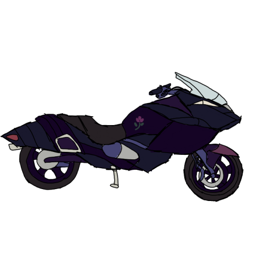
Road Wyvern (name tentative), owned by Camilla.
In a family fractured between streetracers and nons, she’s at odds with Xander between her passion as a racer and his massive concern for her safety, especially when as I mentioned last time for another sketch I did way back, Camilla was in a pretty bad wreck once before, and badly scarred the left side of her face while losing her left eye. (However, said accident wasn’t quite as “accidental” as it all seemed.) Occasionally, she hitches an additional seat for more mundane rides, but takes full advantage of her mostly dark palette during late night races not to be easily told in her daytime ongoings with the same bike. She’s a leader of a group of bike enthusiasts who may or may not be involved in lots of underground (probably) after dark streetrace circuits.
She is currently in a relationship with a budding med trainee, Erin, who found her at the scene of her accident and helped stabilize her long enough to go to the hospital. Because Erin can’t drive for crap, Camilla offered to drive for her, eventually easing her into outright drive dates together.
Silent Dragon, owned by Kamui (male Corrin). To Xander’s dismay, Kamui took up a bike and racing after heavy encouragement from Camilla, who similarly encouraged her other siblings. However, with Garon’s horribleness, combined with the increasingly high tension between Camilla and Xander, Kamui, at a loss of how not to make it so much worse, eventually runs away from home and rides off. In the time he disappeared, tensions broke so much that Camilla’s and Xander’s arguments eclipsed, they both said things they’ve soon regretted, and it all came to head when, while Xander was out trying and failing to find Kamui, Camilla was involved in the aforementioned wreck.Although Kamui wasn’t personally involved in said wreck, he blamed himself for leaving and leading to said turn of events, so while he visited Camilla when she was too bad off to realize he was there, he avoided his family even worse so after the incident.
By complete chance, Kamui wound up being roomates in the college dorms with Erin, and Eclair, while neighbors with Dash, Sparrow and Lyon, and as Camilla eventually got close enough to Erin to find out Kamui lived with them. The accident didn’t even cross her mind in favor of her massive joy and relief to find him again where she then proceeded to blow the landline up to no end of their dorm thereafter for a long while.
Happy Dream. Rider is Gunnthra. Jokingly/mockingly, people also dubbed it “Hello Ktty” for how obnoxiously kawaii it is, but for the sake of not having my kneecaps busted by Sanrio, it’s officially Happy Dream.
Gunnthra is a budding racer who had aspirations to have a pretty bike and by gawd she’s gonna get it. After running into Teru in his garage shop, and with him humoring her request for Happy Dream to be modded in all its brightly colored glory, it turned out she’s terrifyingly good in races, despite how caught off guard most get to see her bike, and through her unbridled joy and thrill of getting the hang of streetracing, it reignites Teru’s own interest to help her and relive his glory days through proxy of her.
Falchion, owned by Chrom. Its initial name was supposed to be Falcon, but Chrom got nervous and typoed the name while registering it, so Falchion it is.
He’s the least experienced out of anyone in streetracing, and quite honestly has no business at it. The reason he got roped into it at all is cuz he thought Sparrow and Lyon were cute, wanted to find a way to get to know them and break the ice, and Camilla, being Camilla, swooped in all “well biking’s cool, they’ll probably dig bikers. :) “
By pure luck and happenstance, he’s thankfully enough of a natural not to seriously break himself, surprisingly won his first race, and it took all the nerves in his not-quite-as-ylissian-but-whatever-this-AU body to try to pretend like he knew what he’s doing (while screaming internally), and how he has to live his lie to save face.
Except Sparrow and Lyon were way easier to impress than he thought, and both would’ve liked him just as well if he had any remote interest in games and anime but shhhhh...
Demon King, owned by Lyon. Between him and Sparrow, he has more experience in streetracing than he initially lets on.
While normally, Lyon is just another student trying to get by, he’s secretly more of an adrenaline junkie than he lets on. Partially, he started off stressed to a point of falling sick (often and repeatedly) out of stress, tension, taking way too much of his studies all at once, and the heavy, heavy inferiority complex he has of whether or not he could ever hold a candle to the name Vigarde made for himself in the social network.
Turns out, however, Vigarde was not just a big name in the public eye, but in the underground as well in his prime, and he was the previous owner of Demon King before he forced himself to retire from the public eye due to his ailing health. While Vigarde was supportive of Lyon’s pursuits of knowledge, and was open to the idea of letting him one day inherit Demon King, he initially hesitated on the idea up until he tried his first streetrace with a different bike he borrowed and won.
Although initially trying to ground himself and swear off the idea, he unfortunately was overcome by the sheer thrill and energy from the adrenaline rush of such a reckless and chaotic sport, he eventually does end up taking Demon King after all, albeit not simply for commute as his father believed. Though he maintains a calm, fairly friendly and helpful demeanor in schoolwork, he is described as having a completely different personality in races he takes part in, being highly competitive and surprisingly terrifying, living up the reputation of a speed demon.
I’ll be honest, I have no crumbs for Dimitri, or any real plot thoughts about the Blue Lion, but someone requested a bike for Dimitri, and also this gives me a chance to share thoughts of the other people:
- Erin is a student studying medicine, and while it’s debatable how much of it is outright her job just yet, she’s a trainee, and she happened to be around when Camilla was in her wreck to stabilize her and call an ambulance for her, saving her life. When Camilla sought her out to find her again, the two got closer to a point of dating, and it’s through her that she eventually reunited with her estranged brother, Kamui. Though she doesn’t drive at all, and she harbors all manner of history that would imply she should be against biking and streetracing, she doesn’t get in Camilla’s way of her clear passion for riding bikes despite her experiences. She also is frenemies with Kyo, to a point her rivalry with him is bad enough to make her recognize when he pulls up on campus from the sound of his engine. She is just as familiar of Camilla’s engine to otherwise perk up at the sound of Camilla pulling up similarly.
- Kyo is an on-again off-again biker who cycles through more bikes than clothes. He owns a penthouse to live elsewhere, he works as a charmer off-campus, and he initially catches the interest of Kamui and Eclair in trying to charm both of them, whom Erin and lightly so Sparrow are less than convinced of his virtues behind why, especially as they unfortunately got to know both have pretty big and powerful family connections (well, Lyon too, but still...) He made an enemy out of Thorr, so much so that she tried to task a hit against him, only for the hit to target Teru instead (who unfortunately looks similar) which caused Teru to be permanently stuck with crutches, was the cause of Camilla’s accident, and nearly killed the one doing the hit, all in one fell swoop, just on the vain attempt to get Kyo to stop coming near her son Eclair. To say she was infuriated to find out Kyo came out of it all unscathed and still trying to woo her son is an understatement.
- Sparrow, whose actual name is Jase, uses the handle of “Sparrow” this AU based on her online aliases as she works for commission on art, this also being her major. She tends to be the most keen on upkeep of keeping the place tidy and not on fire. She knows more than she lets on about Lyon’s underground antics and suspects Chrom’s doing far more than he could actually handle, but so long as they and Dash stay alive and well, that’s about as much as she has the spoons to care for. She’s slightly more accommodating to Kyo, but not as unsuspecting of him completely like Kamui of his intentions with him and Eclair.
- Eclair is actually named Magni, and is the son of Thorr and nephew of Loki, both of whom are powerful people with heavy social influence, including in the underground. He is, effectively, a son of a mafioso, and despite meaning well this time around and trying to have a more genuine mother-son relationship to him this time, Thorr is still too smothering, controlling, and too much of a helicopter parent to have a particularly healthy relationship with all the same (but at least this time around, the three aren’t so all powerful as to delete countries with a passing fart, so, yay.) This unfortunately left him bright-eyed, naive, and very babie-vibed of the world of college life, which he only got into because Loki happens to like to give him leeways, be it to have Cool Aunt dibs and/or to piss Thorr off on purpose otherwise. While he isn’t so hopeless as to not function in the normal world, he unfortunately is still hopelessly naive all the same, which led to Erin and Sparrow being much more protective of him and Kamui.
#My kiransona things#My OCs Headcanons#Just AU things#Streetracer AU#This isn't a be all end all thing#But it's certainly a thing
2 notes
·
View notes
Photo
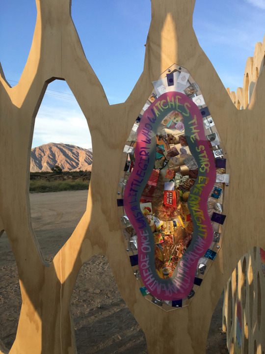
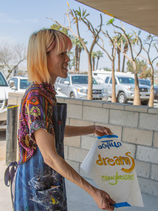
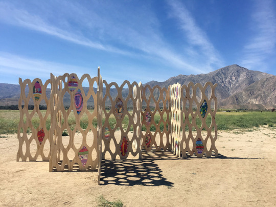
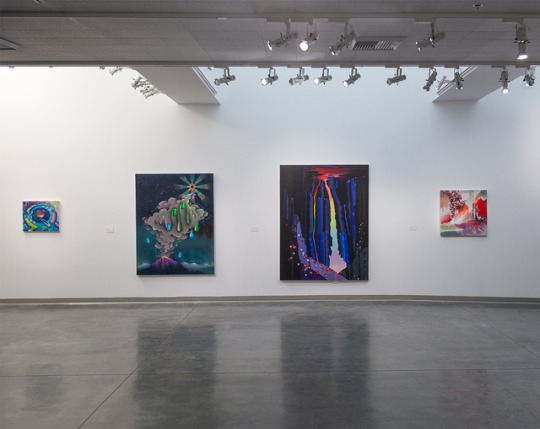
SKETCHY BEHAVIORS | INTERVIEW WITH PEARL C. HSIUNG
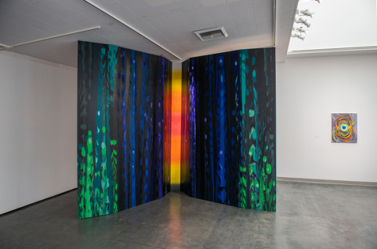
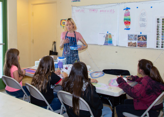
LA based multimedia artist Pearl C. Hsiung explores the relationships between humans and nature through her various paintings, sculptures, videos and installations. In a collaboration with the Borrego Boys & Girls Club as well as members of the public, Pearl recently created a site-specific sculpture using wood, plexiglass and non-recyclable plastic waste. She’s also unveiling a large-scale tile mosaic commission in 2022 at the new 2nd/Hope St Metro station in downtown, LA. We’re excited to find out more about Pearl’s artwork, collaborations, and what she’s got coming up for the rest of the year.
Take the Leap!
Photographs courtesy of the artist.
Could you introduce yourself to everybody? Hi I’m Pearl C Hsiung, I live and work in Los Angeles. ‘Hsiung’ is pronounced ‘shung’ and means the animal bear in Chinese. I have a pet mini-Rex named Rambo who lives free- range in my apartment.
How would you describe the art you create? How would you describe your particular technique? I’d say that my practice uses the landscape as a starting point for thinking through our connection to it and towards the idea that we are inseparable from the matter around us. If all matter in the universe combusted out of the same material then our current, subjective reality, where we behave as if we’re defined apart from everything around us, is an illusion.
In past painting, video and installation works this is performed through metamorphosing, flowing and eruptive forms bursting out of their geological, biological, technological, and cultural skins. In works like Full Gorge (2017) and Original Face (2018), I was thinking about the interconnection of all that is natural, human, more-than-human and artificial through an experience of immersive presence in material space.
For me, these free-standing paintings point to a certain moment of presence, not unlike the moment I experience sometimes after reading certain zen kõans or Daoist phrases; it is an instant moment, a moment of clarity where I understand it all. But it is fleeting, it is a momentary experience that precedes, challenges or completely eludes language. Maybe this is not unlike a moment experienced when in nature, during sex or laughter (during both?), plugged into VR or while coding.
What are your favorite things to paint? What should folks take away from your works? I enjoy painting on canvas, paper, MDF, wood… Actually I hope people bring to my works. I encourage the exchange that I make the work and viewers bring their perceptions and interpretations.
What’s a typical day in the studio for you like? And what are you currently working on in the studio? My studio schedule is fluid depending on the season. It also depends on how much I’m teaching, I may only get one full day and a couple half days a week for the studio, other times I’m 5-6 days a week. Time spent in the studio varies a lot and can include research, reading, sketching, painting, writing, building, cleaning, organizing, accounting, correspondence, grant proposals, teaching applications, pacing, prepping for big work/big actions, paint experiments, materials tests, staring, repotting plants…
I’m starting on new work for a show at Visitor Welcome Center in Koreatown in November 2019.
When you’re working on and developing a new painting or piece, how does it begin - take us from sketchbook, to color choices, to finished painting? New work is always a continuation of themes and ideas from previous works and research. The form changes as the focus shifts on those ideas or approaches. The decisions on everything from composition, structure, color palette and presentation are informed by this new focus as well as the new context of making that work. Personal, experiential, studio environment, cultural influences, topical events all seep into that. The sketchbook is full of garbage, I let it sit there to compost and sometimes it sprouts a new bud…
What tools will someone always find you using at your studio? What are your preferred materials? Tools have changed through the years. More recently you’ll see squeegees and plastic paint guides (that I use like a squeegee) rather than brushes for the paintings. Consistently, I use white paper and tape as painting tools. The computer, the internet and books are always studio necessities for research and admin tools. I use paints and inks that comes tubes, tubs, tins, buckets, bottles, spray cans, jars, sets on canvas, cold-pressed paper, MDF, cardboard. I’ve been experimenting with painting on non-recyclable plastic I’ve tried to make into it’s own substrate but it’s not yet working out.
How do you unplug yourself so to speak? What do you do to center or re-focus yourself if you find yourself stressed out about deadlines, art shows, and the sort? When the stress piles up it helps if I do yoga first thing in the morning in my living room, but the best way to deal with the stress is to work through it. When I feel overwhelmed by anxiety relating to projects, teaching, or deadlines, it usually helps me to become more prepared, using research, preparation and experimentation to deal with the parts that can be addressed. For short term refocusing, I step outside and stare at things: the sky, the plants outside of my studio, the birds on the telephone lines, the clouds. Or I’ll take a walk around the block, change my daily routine like driving a different route, take the bus, walk through the grocery or thrift store before getting to work.
For longer term re-centering, if I can, I leave town or just go stare at the ocean. Staring is like open-eyed meditation for me, I try to empty out my thoughts, blank out and spend unscheduled time. Sleep well and spending time with family and friends are also priceless rechargers.
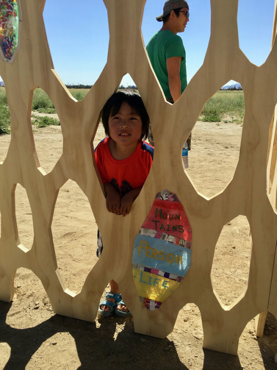
You recently worked with AIR Talks: Candlewood Arts Festival collaborated with folks you met at the Borrego Boys & Girls Club? Tells us about the festival, the project and about the various workshops you helped conduct? Why was this event so important to you? This was the inaugural Candlewood Arts Festival, a temporary public art event in the town of Borrego Springs located in the Anza Borrego State Park. Tanya Aguiniga, Devon Tsuno, Kor Newkirk, Mario Ybarra Jr and I created different site- and community-specific sculptures and happenings during the last weekend of March 2019. Most of our works were located out in Galleta Meadows, an open, outdoor lot amidst the expansive desert landscape.
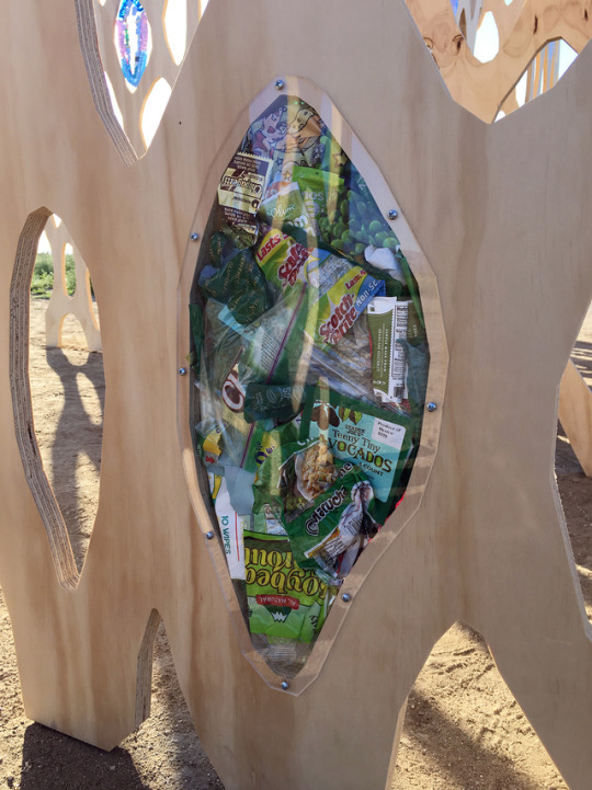
For my sculpture Holocene Screen, I collaborated with youth from the Borrego Boys & Girls Club as well as members of the public during a workshop at the Borrego Art Institute to create a sculpture using wood, plexiglass and non-recyclable plastic waste that considered the simultaneity of nature, human and artificial as a landscape within a landscape.
As part of the Holocene Screen workshop process, the students had to brainstorm words that fell into three categories: nature, human and artificial. Then they were asked to write a short story, poem or single sentence using one word from each category which they painted onto a plexiglass window in the sculpture. It was interesting to learn how easy it was for them to identify elements from nature and human, yet struggle with artificial.
We had discussions about what artificial is and what items from their everyday lives fall under that definition. Their next step was to visualize and compose a singular picture or narrative that threaded all three. I think that was a good example of how easily we can grasp, and even romanticize and/or idealize the relationship between nature and human, and the difficulty or resistance to imagining the artificial in our aesthetic compositions or picture of reality.
My intention, for both workshop participants and myself, was to place these three elements in one view, one image in order to de-emphasize the space between natural and unnatural. What does that look like and where does that lead us to.
What do you enjoy about collaborations? What would be your dream collaboration? The best aspect of collaboration is giving up control and the sharing of ideas and labor. Working in the studio is so solitary that it can be a great relief to open up to working with someone else or others.
Earlier this year you also showed works and visited with the Paramo Galeria in Guadalajara! Tell us a bit about the overall experience and exhibition. I had paintings included in New Suns, a group exhibition curated by Kris Kuramitsu at Paramó, it was the first time I’ve been to Guadalajara. It was thrilling to be showing with such a strong group of artists, Sherin Guirguis, Kenyatta A.C. Hinkle, Nasim Hantehzadeh and Gabriella Sánchez among them. I went for the opening back in December and also spoke on a panel with Sherin, Kenyatta and Kris at the Guadalajara International Book Fair, which I learned is the largest book fair of the Americas and the second largest in the world.
Another first was speaking to an audience while being translated sentence by sentence. We had a really furtive conversation though regarding the themes that our practices share.
Something else that was new for me, was having an experience that someone might call…spirit related. Ghost or undead related? I told you about it later and you also had a ghostly experience the same weekend but in Big Bear?
All I will say is that it was a disturbance by very young thing that was too visceral to be a dream.
You’ve worked in various mediums from murals to sculpture to painting to video / animation. Is there a medium you’ve yet to try that you want to get into? I like an answer that Gertrude Stein gave during an interview from 1935. It regards the forms that writing takes, i.e. the novel, the autobiography etc, so I’m taking it out of context a bit, but the interviewer asks her “What has passion got to do with choosing an art form?” She answers “Everything. There is nothing else that determines form.” So I think I’ve let form, or choice of medium come from the initial impulses of the work I end up making. Maybe there is a VR piece or mural in bronze in my future….
What’s the most challenging aspect of what you do? How do you overcome these obstacles? What keeps you going? Financial sustainability. Keeping the studio open while also preserving time to work in it. I live off a financial collage composed of hustling - teaching, selling work, artist lectures, panel discussions, grants, commissions - but the stress of keeping it together has taken years off my life!
Share with us some artists you’re really excited about as of late. York Chang,The Signal and The Noiseat Vincent Price Art Museum, April-July 2019. What I like about York Chang’s works in this show is that he uses information, text, images and sound to magnify the chaotic and disorienting feeling that comes with checking your phone, radio or tv for news or information. Facts and truths are just atoms floating around in a giant cosmos of distorted narratives, info, and transmissions, you cannot locate the signal or its source amidst the noise. The show’s installation makes you feel swallowed up in this, it’s enveloping yetliberating to be lost in, setting you up to enjoy the weird connections that York makes.
Carolina Caycedo’s Apariciones / Apparitions, a video exhibited at the Huntington Library last summer (you can see it on view at the Vincent Price Art Museum this summer, June 15 - December 21, 2019.) This video is gorgeous and powerful. Female, black, brown and queer dancers twirl, flounce, throb and glide throughout the colonial-style and asian gardens and libraries of the Huntington. Sometimes they are totally fluid bodies in motion and at others times quite still and making spellbinding eye-contact with the viewer. You are watching a conjuring of the bodies and spirits of those whose representations and histories are missing throughout the art, books and histories archived in the Huntington’s collections.
Christina Quarles But I Woke Jus’ Tha Same at Regen Projects, April-May 2019. I suggest people see her paintings in person, they are really engaging. They are figurative, figures coupling, moving into and through each other, embracing beyond recognition by the brain and into recognition by the flesh. Materially they are gymnastic, virtuosic but not stuffy and make me want to paint. York Chang, The Signal and The Noise at Vincent Price Art Museum, April-July 2019. What I like about York Chang’s works in this show is that he uses information, text, images and sound to magnify the chaotic and disorienting feeling that comes with checking your phone, radio or tv for news or information. Facts and truths are just atoms floating around in a giant cosmos of distorted narratives, info, and transmissions, you cannot locate the signal or its source amidst the noise.
Dynasty Handbag (Jibz Cameron) is a performance, video artist who lives in LA right now. She’s the sharpest, funniest, slipperiest, grotesque-adjacent comic performer in the universe. When you see her live, she reads the room, the crowd and herself so spontaneously that you’re always on a mood-swinging rollercoaster. She’s so distortedly vulnerable, proud and charming that you’re not only laugh-crying with and at her, but you’re mostly dying over how culture makes us schizo and insane. She hosts a monthly queer performance night called Weirdo Night here at Zebulon.
What are your favorite Vans? SK8-His that are all solid black w/ black soles.
What do you have coming up that you can share with us? I’ve got a show opening in November 2019 at Visitor Welcome Center in Koreatown, LA and a large-scale tile mosaic commission at the new 2nd/Hope St Metro station in downtown LA, opening in 2022!!
FOLLOW PEARL | WEBSITE | INSTAGRAM
#Art#Vans#Vans Art#Vans Girls#Sketchy Behaviors#Pearl Hsiung#painting#installation#recycling#borengo springs#interview
26 notes
·
View notes
Text
Week 4 Summary
This week I focused on building the brand of the project.
I revisited the logo sketches and found that the minimal and handwritten style suits the project best. I remembered during my previous meeting with Elham Al Dawsari a phrase she said about building these types of communities, she mentioned that sitting on a meeting table around a projector can feel cold and counterintuitive to the idea of a community, and that sometimes she wishes they could just pass around a phone containing the picture of the artwork as it felt more intimate, friendly and casual.
I was thinking of this while experimenting and began using storytelling to brainstorm a concept, where a group of friends are sitting around a table with the desire to create a space where their thoughts surrounding art can be shared and debated. These moments fueled by passion demand urgency, I imagined them scribbling the name of the community enthusiastically on a piece of napkin. Sometimes ideas burst out of you, and the need to document an idea as a means to bring it to life takes over.
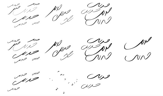

I narrowed down the sketches and chose two lockups

Afterwards, I considered the colorscheme. I was inspired by Mohammed Al Melehi’s work and began with one of his paintings and adjusted the palette until I was satisfied. I will further study the color ratios later

Then I began designing the graphic elements, I had the idea to represent the purpose of the community using geometric shapes. People come in a variety of shapes and the space created by their connection is literally where the project exists.
This intersection between shapes represents Hadeeth Community visually and efficiently.

I then worried the identity was beginning to look too minimal and simple, so I went back to visual research to try to find possible stylizations of geometric shapes.

I experimented with 3D wireframes and stroked shape, but did not land on anything interesting.
Finally, I began testing typefaces and settled on HadiType’s HT Baybars Display font. The reasons I chose it was
-It is distinctive and pairs well with the font
-It is bilingual and has multiple weights
-works for both display and body text

I created initial tests for the combination of all elements.

Afterwards, I began planning the Instagram strategy and content
First, I refreshed my memory of similar or interesting accounts

@Mathqaf
Studying the visuals of projects surrounding Modern Arab Art. I was concerned about having a similar typeface, but found that Mathqaf only publishes content in english while Hadeeth will publish in Arabic.
@RPS_Studio
a good example of communicating the project values through:
-relevant posts to audience
-guides
-inspiring audience to do something, even if it does not directly benefit the brand.
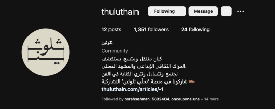
@Thuluthain
Example of a good bio. Communicated what the project is and the scope, also included a CTA to website.
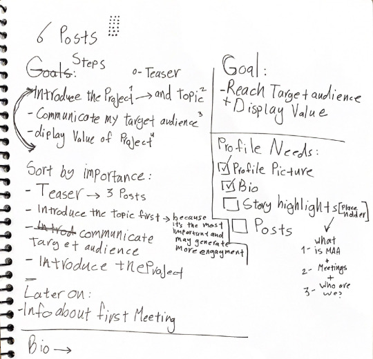
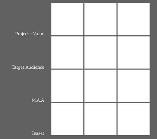
I began by defining the goals of the Instagram account to better asses what steps will aid in creating the content.
The goal is: Reach Target Audience While Displaying the Value of the Project.
The steps are:
-Teaser Posts
-Introducing the topic
-Communicate who the target audience are
-Introduce the project
Later On:
-Provide Information about the meeting details
I assessed the profile needs and found that an engaging and clear bio is essential. I also planned 3 Story highlights:
1-What is Modern Arab Art?
This could work as a quick brief before meetings for newcomers and general knowledge of followers
2-What is Hadeeth?
This explains briefly and conveniently all information about the project
3-Meetings Highlights
This will be activated when actual meetings take place

I began writing drafts for the bio
I also met with Ghadeer Sadeq and it was a fruitful meeting. She is the first advisor I chose for the topic of Modern Arab Art; she was generous with resources and very helpful. For the upcoming week my priority is working on finalizing the identity, content, and starting to upload to instagram!
0 notes
Text
Ernie Barnes
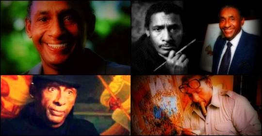
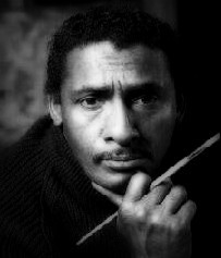
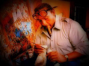
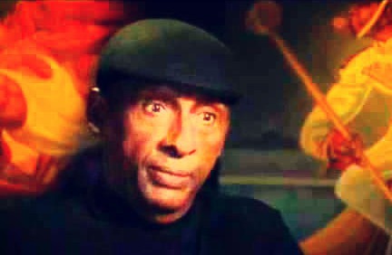
Ernest Eugene Barnes, Jr. (July 15, 1938 – April 27, 2009) was an African-American painter, well known for his unique style of elongation and movement. He was also a professional football player, actor and author.
Early life
Childhood
Ernest Barnes, Jr. was born during Jim Crow in "the bottom" community of Durham, North Carolina, near the Hayti District of the city. His father, Ernest E. Barnes, Sr. (1899–1966) worked as a shipping clerk for Liggett Myers Tobacco Company in Durham. His mother, Fannie Mae Geer (1905–2004) oversaw the household staff for prominent Durham attorney and local Board of Education member Frank L. Fuller, Jr.
On days when Fannie allowed "June" (Barnes' nickname to family and childhood friends) to accompany her to the Fuller home, Barnes had the opportunity to peruse the art books and listen to classical music. The young Ernest was intrigued and captivated by the works of master artists. By the time Barnes entered the first grade, he was familiar with the works of such masters as Toulouse-Lautrec, Delacroix, Velasquez, Rubens, and Michelangelo. When he entered junior high, he could appreciate, as well as decode, many of the cherished masterpieces within the walls of mainstream museums – although it would be a half dozen more years before he was allowed entrance because of his race.
A self-described chubby and unathletic child, Barnes was taunted and bullied by classmates. He continually sought refuge in his sketchbooks, hiding in the less-traveled parts of campus away from other students. One day in a quiet area, Ernest was found drawing in a notebook by the masonry teacher, Tommy Tucker, who was also the weightlifting coach and a former athlete. Tucker was intrigued with Barnes' drawings so he asked the aspiring artist about his grades and goals. Tucker shared his own experience of how bodybuilding improved his strength and outlook on life. That one encounter would begin Barnes' discipline and dedication that would permeate his life. In his senior year at Hillside High School, Barnes became the captain of the football team and state champion in the shot put.
Education
In 1956 Barnes graduated from Hillside High School with 26 athletic scholarship offers. Segregation prevented him from attending nearby Duke or the University of North Carolina. His mother promised him a car if he lived at home, so he chose North Carolina College at Durham (formerly North Carolina College for Negroes, now North Carolina Central University). He majored in art on a full athletic scholarship. His college track coach was the famed Dr. Leroy T. Walker. Barnes played the football positions of tackle and center at NCC at Durham.
At age 18, on a college art class field trip to the newly desegregated North Carolina Museum of Art in Raleigh, Barnes inquired where he could find "paintings by Negro artists." The docent responded, "Your people don't express themselves that way." Poetic justice prevailed 23 years later in 1979 when Barnes returned to the museum for a solo exhibition, hosted by North Carolina Governor James Hunt.
In 1990 Barnes was awarded an Honorary Doctorate of Fine Arts by North Carolina Central University.
In 1993 Barnes was selected to the "Black College Football 100th Year All-Time Team" by the Sheridan Broadcasting Network.
In 1999 Barnes was bestowed "The University Award", the highest honor by The University of North Carolina Board of Governors.
Professional football
Baltimore Colts (1959-60)
In December 1959 Barnes was drafted in the 10th round by the then-World Champion Baltimore Colts. He was originally selected in the 8th-round by the Washington Redskins, who renounced the pick minutes after discovering he was a Negro.
Shortly after his 22nd birthday, while at the Colts training camp, Barnes was interviewed by N.P. Clark, sportswriter for the Baltimore News-Post newspaper. Until then Barnes was always known by his birth name, Ernest Barnes. But when Clark's article appeared on July 20, 1960, it referred to him as "Ernie Barnes," which changed his name and life forever.
Titans of New York (1960)
Barnes was the last cut of the Colts' training camp. After Baltimore released Barnes, the newly formed Titans of New York immediately signed him because the team had first option on any player released within the league.
Barnes loathed being on the Titans. He said, "(New York) was a circus of ineptitude. The equipment was poor, the coaches not as knowledgeable as the ones in Baltimore. We were like a group of guys in the neighborhood who said let's pretend we're pros."
After a 27-21 loss to the Oilers on October 9, 1960 at Jeppesen Stadium, his teammate Howard Glenn died. Barnes asked for his release two days later. Glenn had sustained a broken neck in the first half of the game and it was reported that injury caused his death. However, Barnes and other teammates have long attributed it to heatstroke. In a later interview, Barnes said, "They never really said what he died of. (Coach) Sammy Baugh said he'd broken his neck in a game the Sunday before. But how could that be? How could he have hit in practice all week with a broken neck? What he died of, I think, was more like heat exhaustion. I told them I didn't want to play on a team like this."
San Diego Chargers (1960-62)
Barnes then accepted a previous offer from Coach Al Davis at the Los Angeles Chargers. Barnes joined their team at mid-season as a member of their taxi squad. The following season in 1961 the team moved to San Diego. It was there Barnes met their quarterback and future congressman Jack Kemp. The two men would share a lifelong close friendship.
During the off-seasons with the Chargers, Barnes was program director at San Diego's Southeast YMCA working with parolees from the California Youth Authority. He also worked as the Sports Editor for The Voice, a local San Diego newspaper, writing a weekly column called "A Matter of Sports."
Barnes also illustrated several articles for San Diego Magazine during the off-seasons in 1962 and 1963.
Barnes' first television interview as a professional football player and artist was in 1962 on The Regis Philbin Show on KGTV in San Diego. It was Philbin's first talk show.
Denver Broncos (1963-64)
After a series of injuries, Barnes was cut midway through his second season with the Chargers. He then signed with the Denver Broncos.
Barnes was called "Big Rembrandt" by his Denver teammates. Coincidentally, Barnes and Rembrandt share the same birthday.
Barnes was often fined by Denver Coach Jack Faulkner when caught sketching during team meetings. One of the sketches that he was fined $100 for sold years later for $1000.
During the Broncos games, Barnes would run off the field and onto the sideline to give his offensive line coach Red Miller the scraps of paper of his sketches and notes.
"During a timeout you've got nothing to do – you're not talking – you're just trying to breathe, mostly. Nothing to take out that little pencil and write down what you saw. The shape of the linemen. The body language a defensive lineman would occupy... his posture... What I see when you pull. The reaction of the defense to your movement. The awareness of the lines within the movement, the pattern within the lines, the rhythm of movement. A couple of notes to me would denote an action... an image that I could instantly recreate in my mind. Some of those notes have been made into paintings. Quite a few, really."
On Barnes' 1964 Denver Broncos Topps football card he is shown wearing jersey #55 although he never played in that number. His jersey was #62.
Canadian Football League
In 1965, after his second season with the Broncos, Barnes signed with the Saskatchewan Roughriders in Canada. In the final quarter of their last exhibition game, Barnes fractured his right foot, effectively ending his professional football career.
Retirement
Shortly after his final football game, Barnes went to the 1965 NFL owners meeting in Houston in hopes of becoming the league's official artist. There he was introduced to New York Jets owner Sonny Werblin, who was intrigued by Barnes and his art. He paid for Barnes to bring his paintings to New York City. Later they met at a gallery and unbeknownst to Barnes, three art critics were there to evaluate his paintings. They told Werblin that Barnes was "the most expressive painter of sports since George Bellows."
In what was undoubtedly one of the most unusual personnel transactions in the history of the NFL, Werblin retained Barnes as a salaried player, but positioned him in front of the canvas, rather than on the football field. Werblin told Barnes "You have more value to the country as an artist than as a football player"
Barnes' November 1966 debut solo exhibition, hosted by Werblin at the Grand Central Art Galleries in New York City was critically acclaimed and all the paintings sold.
In 1971 Barnes wrote a series of essays (illustrated with his own drawings) in the Gridiron newspaper titled "I Hate the Game I Love" (with Neil Amdur). These articles became the beginning manuscript of his autobiography, later-published in 1995 titled From Pads to Palette which chronicles his transition from professional football to his art career.
In October 2007, the National Football League and Time Warner hosted a tribute to Ernie Barnes in New York City.
Work
Barnes credits his college art instructor Ed Wilson for laying the foundation for his development as an artist. Wilson was a sculptor who instructed Barnes to paint from his own life experiences. "He made me conscious of the fact that the artist who is useful to America is one who studies his own life and records it through the medium of art, manners and customs of his own experiences."
All his life, Barnes was ambivalent about his football experience. In interviews and in personal appearances, Barnes said he hated the violence and the physical torment of the sport. However, his years as an athlete gave him unique, in-depth observations. "(Wilson) told me to pay attention to what my body felt like in movement. Within that elongation, there's a feeling. And attitude and expression. I hate to think had I not played sports what my work would look like."
Barnes' first painting sale was in 1959 for $90 to Boston Celtic Sam Jones for a painting called Slow Dance. It was subsequently lost in a fire at Jones' home.
Critics have defined Barnes' work as neo-mannerist. Based on his signature use of serpentine lines, elongation of the human figure, clarity of line, unusual spatial relationships, painted frames, and distinctive color palettes, art critic Frank Getlein credited Barnes as the founder of the neo-Mannerism movement - because of the similarity of technique and composition prevalent during the 16th century, as practiced by such masters as Michelangelo and Raphael.
Numerous artists have been influenced by Barnes' art and unique style. Accordingly, several copyright infringement lawsuits have been settled and are currently pending.
Framing
Ernie Barnes framed his paintings with distressed wood in homage to his father. In his 1995 autobiography, artist Ernie Barnes wrote of his father: “... with so little education, he had worked so hard for us. His legacy to me was his effort, and that was plenty. He knew absolutely nothing about art.”
Weeks before Ernie Barnes’ first solo art exhibition in 1966, he was at the family home in Durham, North Carolina as his father lay in the hospital after suffering a stroke. He noticed the usually well-maintained white picketed fence had gone untended since his father’s illness. Days later, Ernest E. Barnes, Sr. died. “I placed a painting against the fence and stood away and had a look. I was startled at the marriage between the old wood fence and the painting. It was perfect. In tribute, Daddy’s fence would hug all my paintings in a prestigious New York gallery. That would have made him smile.”
Eyes closed
A consistent and distinct feature in Barnes' work is the closed eyes of his subjects. "It was in 1971 when I conceived the idea of The Beauty of the Ghetto as an exhibition. And I exposed it to some people who were black to get a reaction. And from one (person) it was very negative. And when I began to express my points of view (to this) professional man, he resisted the notion. And as a result of his comments and his attitude I began to see, observe, how blind we are to one another's humanity. Blinded by a lot of things that have, perhaps, initiated feelings in that light. We don't see into the depths of our interconnection. The gifts, the strength and potential within other human beings. We stop at color quite often. So one of the things we have to be aware of is who we are in order to have the capacity to like others. But when you cannot visualize the offerings of another human being you're obviously not looking at the human being with open eyes." "We look upon each other and decide immediately: This person is black, so he must be... This person lives in poverty, so he must be..."
Sports art
The Los Angeles Olympic Organizing Committee named Barnes "Sports Artist of the 1984 Olympic Games". LAOOC President Peter V. Ueberroth said Barnes and his art "captured the essence of the Olympics" and "portray the city's ethnic diversity, the power and emotion of sports competition, the singleness of purpose and hopes that go into the making of athletes the world over." Barnes was commissioned to create five Olympic-themed paintings and serve as an official Olympic spokesman to encourage inner city youth.
In 1985 Barnes was named the first "Sports Artist of the Year" by the United States Sports Academy.
In 1987 Barnes created Fastbreak, a commissioned painting of the World Champion Los Angeles Lakers basketball team that included Magic Johnson, Kareem Abdul-Jabbar, James Worthy, Kurt Rambis and Michael Cooper.
Carolina Panthers football team owners Rosalind and Jerry Richardson (Barnes' former Colts teammate) commissioned Barnes to create the large painting Victory in Overtime (approximately 7 ft. x 14 ft.). It was unveiled before the team's 1996 inaugural season and hangs permanently in the owner's suite at the stadium.
To commemorate their 50th anniversary in 1996, the National Basketball Association commissioned Barnes to create a painting with the theme, "Where we were, where we are, and where we are going." The painting, The Dream Unfolds hangs in the Naismith Memorial Basketball Hall of Fame in Springfield, Massachusetts. A limited edition of lithographs were made, with the first 50 prints going to each of the NBA's 50th Anniversary All-Time Team.
In 2004 Barnes was named "America's Best Painter of Sports" by the American Sport Art Museum & Archives.
Other notable sports commissions include paintings for the New Orleans Saints, Oakland Raiders and Boston Patriots football team owners.
"The Bench" painting
Shortly after Barnes was drafted by the Baltimore Colts in 1959, Barnes was invited to see their Colts' NFL Championship Game vs. the New York Giants at Memorial Stadium in Maryland. The Colts won 31-16 and Barnes was filled with layers of emotion after watching the game from behind the Colts' bench. He had just signed his football contract and met his new teammates Johnny Unitas, Jim Parker, Lenny Moore, Art Donovan, Gino Marchetti, Alan Ameche and "Big Daddy" Lipscomb.
Barnes later wrote that after he returned home, he "placed a stretched canvas on the easel. Without making any preliminary sketches, I started painting in quick, direct movements hoping to capture the vision in my mind before it evaporated." He created The Bench in less than an hour. Throughout his life, The Bench remained in Barnes' possession, even taking it with him to all his football training camps and hiding it under his bed. It would be the only painting Barnes would never sell, despite many substantial offers, including a $25,000 bid at his first show in 1966.
On June 18, 2014 The Bench was formally presented to the Pro Football Hall of Fame in Canton, Ohio for their permanent collection by his wife Bernie Barnes.
"The Sugar Shack" painting
Barnes created the painting The Sugar Shack in the 1970s. It gained international exposure when it was used on the Good Times television series and on the 1976 Marvin Gaye album I Want You.
According to Barnes, he created the original version of The Sugar Shack after reflecting upon his childhood, during which he was not "able to go to a dance." In a 2008 interview, Barnes said, "The Sugar Shack is a recall of a childhood experience. It was the first time my innocence met with the sins of dance. The painting transmits rhythm so the experience is re-created in the person viewing it. To show that African-Americans utilize rhythm as a way of resolving physical tension." The Sugar Shack has been known to art critics for embodying the style of art composition known as "Black Romantic," which, according to Natalie Hopkinson of The Washington Post, is the "visual-art equivalent of the Chitlin' circuit." When Barnes first created The Sugar Shack, he included his hometown radio station WSRC (Durham, NC) on a banner. He incorrectly listed the frequency at 620. It was actually 1410. Barnes confused what he used to hear WSRC's on-air personality Norfley Whitted saying "620 on your dial" when Whitted was at his former station WDNC in the early 1950s.
After Marvin Gaye asked him for permission to use the painting as an album cover, Barnes then augmented the painting by adding references that allude to Gaye's album, including banners hanging from the ceiling to promote the album's singles.
During the Motown 25: Yesterday, Today, Forever anniversary television special on March 25, 1983, tribute was paid to The Sugar Shack with a dance interpretation of the painting.
The original piece is currently owned by actor Eddie Murphy.
Music album covers
Barnes' work appears on the following album covers:
The Sugar Shack on Marvin Gaye's 1976 I Want You
The Disco on self-titled 1978 Faith, Hope & Charity
Donald Byrd and 125th Street, NYC on self-titled 1979 album
Late Night DJ on Curtis Mayfield's 1980 Something to Believe In
The Maestro on The Crusaders' 1984 Ghetto Blaster
Head Over Heels on The Crusaders' 1986 The Good and Bad Times
In Rapture on B.B. King's 2000 Making Love is Good For You
Other notable art and exhibitions
In response to the 1960s "Black is beautiful" cultural movement and James Brown's 1968 Say it loud: I'm Black and I'm Proud song, Barnes created The Beauty of the Ghetto exhibition of 35 paintings that toured major American cities from 1972 to 1979 hosted by dignitaries, professional athletes and celebrities.
Of his The Beauty of the Ghetto exhibition, Barnes said, "I am providing a pictorial background for an understanding into the aesthetics of black America. It is not a plea to people to continue to live there (in the ghetto) but for those who feel trapped, it is...a challenge of how beautiful life can be." When The Beauty of the Ghetto was on view in 1974 at the Museum of African Art in Washington, DC, Rep. John Conyers stressed the important positive message of the exhibit in the Congressional Record.
In the wake of the 1992 Los Angeles riots, Mayor Tom Bradley used Barnes' painting Growth Through Limits as an inspirational billboard in the inner-city. Barnes contributed $1000 to the winner of a slogan contest among the city's junior high school students that best represented the painting.
Barnes' work was included in the 1995 traveling group exhibition 20th Century Masterworks of African-American Artists II.
Barnes' painting The Advocate was donated to the North Carolina Central University School of Law in 1998 by a private collector. Barnes felt compelled to create the painting from his "concern with the just application of the law... the integrity of the legal process for all people, but especially those without resource or influence."
While watching the tragic events of 9/11, Barnes created the painting In Remembrance. It was formally unveiled at the Seattle Art Museum. It was later acquired on behalf of the City of Philadelphia and donated to its African American Museum. A limited number of giclée prints were sold with 100% of the proceeds going to the Hero Scholarship Fund, which provides college tuition and expenses to children of Pennsylvania police and fire personnel killed in the line of duty.
Three of Barnes' original paintings were exhibited at the London, England Whitechapel Gallery in the 2005 Back to Black: Art, Cinema & Racial Imaginary art exhibition.
In 2005 rapper producer Kanye West commissioned Barnes to create a painting to depict his life-changing experience following his near-fatal car crash. A Life Restored measures 9 ft. x 10 ft. and hangs on West's dining room ceiling. In the center of the painting is a large angel reaching out to a much smaller figure of West. It was inaccurately reported in several media outlets that the image of the angel in the painting is of West.
Barnes' final public exhibition was in October 2007 when the NFL and Time Warner sponsored A Tribute to Artist and NFL Alumni Ernie Barnes in New York City. It was hosted by Donna Brazile, Susan L. Taylor, Brig Owens and his former teammate, the Hon. Jack Kemp (who died five days after Barnes in 2009).
At the time of his death, Barnes had been working on an exhibition titled Liberating Humanity From Within which featured a majority of paintings he created in the last few years of his life. Plans will continue. The exhibition will travel throughout the country and abroad.
Television and movies
Barnes appeared on a 1967 episode of the game show To Tell The Truth The panelists correctly guessed Barnes was the professional football player-turned-artist.
Barnes played Deke Coleman in the 1969 motion picture Number One with Charlton Heston and Jessica Walter.
In 1971 Barnes, along with Mike Henry, created the Super Comedy Bowl, a CBS television variety special which showcased pro athletes with celebrities such as John Wayne, Frank Gifford, Alex Karras, Joe Namath, Jack Lemmon, Lucille Ball, Carol Burnett and Tony Curtis. A second special aired in 1972.
Barnes played Dr. Penfield in the 1971 movie Doctors' Wives, which starred Dyan Cannon, Richard Crenna, Gene Hackman and Carroll O'Connor.
Throughout the Good Times television series (1974–79) most of the paintings by the character J.J. are works by Ernie Barnes. However a few images, including "Black Jesus" in the first season (1974), were not painted by Barnes. The Sugar Shack made its debut on the show's fourth season (1976–77) during the opening and closing credits. In the fifth season (1977–78) The Sugar Shack was only used in the closing credits for five early episodes during that season. In the sixth season (1978–79), The Sugar Shack was only used in opening credits for the first eight episodes and in the closing credits for five early episodes during that season. In the fifth and sixth seasons (1977–79), The Sugar Shack appears in the background of the Evans family apartment.
Barnes had a bit part on two episodes of Good Times: The Houseguest (February 18, 1975) and Sweet Daddy Williams (January 20, 1976).
The artwork of Ernie Barnes was also used on television shows Columbo, The White Shadow, Dream On, The Hughleys, The Wayans Bros, Wife Swap, Soul Food and the movies Drumline and Boyz n The Hood.
In 1981 Barnes played the famed baseball catcher Josh Gibson of the Negro league in the television movie Don't Look Back: The Story of Leroy ‘Satchel' Paige with Lou Gossett, Jr., who played Paige.
The 2016 film Southside With You about Barack and Michelle Obama's first date features the artwork of Ernie Barnes.
Personal
In addition to his parents, Barnes was preceded in death by his half-brother Benjamin B. Rogers, Jr. (1920–1970). His brother James (b. 1942) resides in Durham, North Carolina. Barnes has five children: Deidre (b. 1957) and Michael (b. 1961) with first wife Andrea Burnett (1957–1965); and Sean (b. 1965), Erin (b. 1969) and Paige (b. 1972) with second wife Janet Thaleen Norton (1965–1983). He was also married to Bernadine "Bernie" Gradney (1984 - to death).
Barnes died on April 27, 2009 at Cedars Sinai Hospital in Los Angeles, California from blood cancer. He was cremated and his ashes were scattered in Durham, North Carolina near the site of where his family home once stood, and at the beach in Carmel, California, one of his favorite cities.
Quotations
"An artist paints his own reality."
"The artist uses creative visualization and the athlete uses the same thing... It's the muscle of the mind, that's the main muscle."
"I am bound by the strongest ties with the organic life of all people. And being an artist has created in me the desire to continually affirm beauty."
"The five years I lived in (the Fairfax district) a Los Angeles Jewish community led me to learn of their unyielding spiritual strength and internal sense of grandeur. I met people who had survived a hard school of struggle."
"My early paintings have all the rawness and passion of the (football) game."
"I was angry. I wanted to show and tell people what I had seen and felt. I wanted to show the dehumanization that is professional football. My only expression is through art. I painted until I had exhausted the hate. I had so many ideas that I couldn't put a canvas up quick enough."
"One day on the playing field, I looked up and the sun was breaking through the clouds, hitting the unmuddied areas on the uniforms, and I said, ‘that's beautiful!' I knew then that it was all over being a player. I was more interested in art. So I traded my cleats for canvas, my bruises for brushes, and put all the violence and power I had felt on the field into my paintings."
"Throughout my five seasons in the NFL, I remained at the deepest level of my being...an artist."
Wikipedia
3 notes
·
View notes
Text
Collab Project - Character Sketches, Editing and Brand New Animatic
For this week in my development on the collab project, I started on a lot of different developments for the collab project for both the modeled character and the animatic sequence which I made from the ground up.
Starting off with my modeled character progress, I began to do a lot more sketches for the character as I went back to how I did the first sheet of sketches for the Monk character and acted very playful with my lines. Whilst I got the general form of the character from the first sheet of sketches, there were a couple of things I weren't sure about the design like the beard as one of the images I found as part of my research has really grown on me. This is because I really loved the idea of having a face mask or sheet in front of the character’s mouth. However, this does block the beard and essentially means there’s not really any point to sculpting it. But then again, I think the mask really helps to embrace the idea of passion within the character due to how reserve he must be to achieve true harmony and true flow in his body.
With the second sheet of sketches just below it, they’re mostly studies for the Monk character’s final design which happens to be the Monk coloured in blue in the bottom left of the pannel. I settled on this design being the final character design for the Monk due to how simple but also emitting of the idea of Passion as whilst he is a monk, the face mask and the umbrella paired with him help to create the perfect combination of the my principle as well as a combination of my previous work in the project too. In addition to coming up with the final design on the second page, I also experimented a bit with colour on some of the other sketches I did to see how the colour palette adjusted to the designs. So far, I think I really loving the blue colour scheme so far on the character but I do plan to look further into the colours of the character later down the project.
Sketches for the Character

Exploring Colour in the sketch
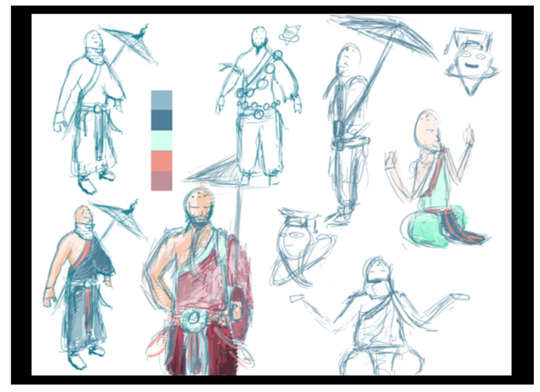
After the Monk development, it was time to fully revise my animatic/ scene for the sequence as based from the feedback I received from the last meeting. Not only from that, nut I also felt it needed changing too as it was a bit too safe for my liking whenever I watched it back. But before I could even start animating, I had to model the scene out.
Modelling the area started from watching a tutorial online on how to create rocks in maya which luckily made the exact kind of rocks that I wanted to for the sequence which was really handy. From here, I stretched and manipulated each rock piece to make it so it can look like a large looking cave with all the in-perfections in place inside to make it look more authentic and more cabe-looking. With the cave construction, I also wanted to give the cave an entrance for the spirit and the light come into the sequence to make it both realistic and dramatic as the Spirit comes into the the cave where it hasn’t been before.
How to model rocks and stones in Maya, fast and easy
youtube
Rocks being divided up from the Sphere

Entrance to the Cave

Cave from the outside

Once the cave was sorted and it was looking nice, it was time to try out a new technique that I had plan to do in the sequence which I had been planning ever since the idea of having to change the sequence up. I basically was looking up symbolism of passion and low and behold, I was introduced to the Passion flower which literally inspires Passion. It’s a bit on the nose but my idea is still very vague to watch anyway so it may be a point on the nose if anyone of the Ai would be able to read and a really small bit of dialogue. But going back to the flower tutorial, the effect would create a see-through based flower petal flower that would bloom out of the Monk character to show he’s successfully reach his flow and steps into ‘Passion’.
However when trying to replicate the tutorial there were two problems with it, one the tutorial was going super fast with no chance to breathe or tell you how to specifically do something in the tutorial and the other being that that the process didn't really work at all. Because the tutorial is both only one out there that does this effect and having no clue to solve this issue, I emailed Jon the problem I had with it which hopefully it wasn’t anything too complicated.
Anng showing off the principle with the spirits in either hand ( With temporary Flower)

ccc

Game Effect Tutorial - Flower Blossom - 3D Maya - After Effect
youtube
Never the less despite not being able to do the flower effect for the animatic, I came up with a replacement idea which involved my Monk character mediating silently in the cave which would cause the spirit to notice and fly over to him, This then causes him to split the animation spirit into two different spirits that the monk begins to manipulate around him similar to how it worked in the first animatic. Because this is increasing his flow and ‘Passion’, rocks come into contact with and begin to mold around him that makes the Monk become part of the Earth. This then later develops to him being cocooned inside when suddenly, a flash of the flower’s colour illuminate the cave as he pops out with both spirits on his hands with the word Passion behind him. The psirit then comes back to one spirit and he goes into the the next sequence.
Seeing the animation in action going through this storyline, I think it could have a bit more development to help sell the idea of passion as it looked a bit static to watch with the Monk sitting in the same place with no body animation. I think the group’s opinions on this idea will definitely be important.
youtube
Once the animatic was tuned and completed, I then created a group edit of everyone’s sequences from the group to see what it would look like if they were to be all put together. I didn’t necessarily worry too much on the story’telling side as it was really early stages still. My main focus was to experiment with different kinds off transitions that we could potentially use to travel to one sequence to another.
These transitions I experimented with were an invisible cut, a green screen transition and a explosion transition. The Invisible cut I was definitely the most prepared for as it involves the spirit in my scene moving from left to right of the screen causing a mapped wipe in the sequence. Testing it out in the animatic edit went surprisingly better than I thought as the mapping process was so much easier than I was expecting to do. I would say the green screen transition that I did on Brandon’s phone was definitely the hardest as I had to map out a green screen for every frame which wasn’t the funniest to do. The explosion transition was a bit smilliar but it more engulf the screen rather than a specific section which was a bit nicer to do.
With the overall cut of the film, I feel quite proud of it as whilst it may not be the final piece that i’m presenting, it feels really complete to me that we have some sort of narrative structure through our films even though it’s not finsilased what order everyone is. I just feel very energetic from watching it back as it just feels like the final piece even though there’s still a lot more work to do.
youtube
Invisible Cut
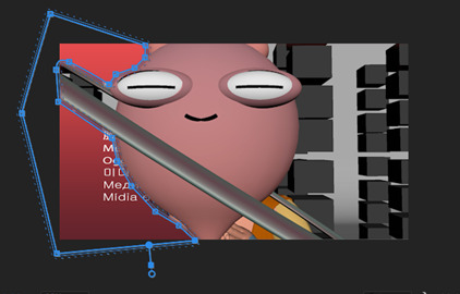
Green Screen inside the phone
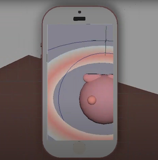
Extra explosion that engulfs the screen to the next sequence

Group’s and Jon’s Reactions
The reactions towards the animatic were essentially the same towards the sequence as I was to it. However, they apparently missed the balls that my Monk character used to control around him to achieve his flow and passion. Since it was requested, I really want to try a new sequence with everyone’s requests for my sequence so I feel like I’m creating the very best piece I can.
0 notes
Photo
ICON10 WORKSHOP REGISTRATION INFO
April 13th, 2018 at 1pm EDT / 10am PDT / 6PM GMT It's time to get your hands dirty, expand your mind, put your business on solid footing, and have a whole lot of fun. We have crafted two days of informative and inspiring hands-on workshops, lectures, tours, and events led by an impressive roster of illustrators, educators, and creative professionals (some from our Main Stage) designed to jumpstart your ICON10 experience.
ICON10 WORKSHOP DESCRIPTIONS
KIMBERLY HALL – Lecture, WED 9-10:20am, $25 Ideas on the Wall Getting drawings into people's homes is Nottene’s, Kimberly Hall’s studio, favorite thing to do—so she makes wallpaper! In this talk, Hall will discuss pattern and imagery on the wall and how it works, plus the different ways to make it real, whether manufacturing the product or selling designs at trade shows.
WILL VARNER – Lecture, WED 9-10:20am – $25 How Illustration Can Feed the Internet For years Will has explored the potential for original, illustrated content on the internet. He’ll discuss topics like: building artistic quality in an age of meme generators, the new rules for selling art and maintaining creative control, ways to maximize your social media presence, and more!
ESTHER PEARL WATSON & MARK TODD – Making, WED 9-12pm, $45 Zine Machine! Participants will create a one-of-a-kind book culled and edited from drawings, collage and research material that serve as a collection of thoughts, process and finished works. The goal is to disrupt the norm, discover ways to capture transitory thoughts and observations, construct interesting narratives and re-contextualize visuals.
MELANIE REIM – Making, WED 9-12pm, $45 Surf and Turf Participants will capture beach bodies under the majesty of downtown Detroit in this fast-paced reportage workshop about drawing people while they’re moving and getting the scale of Detroit architecture-drawing directly onto the page, with happy accidents of ink splatter and a variety of line and tone.
STEVE SIMPSON – Making, WED 9-4pm, $60 Illustrated Beer Label Workshop In Steve Simpson’s workshop, participants will illustrate their own beer label using traditional analogue techniques. The final piece of art will be glued to a bottle. This course is suitable for anyone with an interest in illustration, hand lettering and character design, and is very much illustration-focused.
TOM FROESE – Making, WED 9-4pm, $60 Inky Maps! Illustrate a Beautiful Map Using Digital and Analog Media For those who want to learn how to create a beautiful illustrated map, this is the class. Tom Froese will show, step by step, how to illustrate a map of a hometown or favorite city using the same techniques from his popular class, Inky Illustrations.
ADAM OSGOOD – Making, WED 9-4pm, $60 Intro to Animation Techniques for Illustrators in After Effects Participants will explore a workflow for creating layered artwork in Photoshop and then add animation within After Effects. Each person will create a small personal project using their own illustrations and complete the workshop with an exercise that demonstrates basic animation techniques.
DON KILPATRICK III – Making, WED 9-4pm, $60 Motor City Mega Print Jam This workshop will be held at The Detroit Wood Type Co. on Detroit’s east side and will allow participants to choose three of five types of relief printmaking: Risograph printing, silkscreen, letterpress, linocut and woodcut. Attendees can create either a poster, zine or card.
AKI CHOKLAT & TOM CARBONE – Making, WED 9-4pm, $60 Tote Your Own Creation In this hands-on workshop, participants will make their own unique tote bag from leather or canvas. The workshop will take place in the beautiful 20,000 square-foot College for Creative Studies Fashion Accessories Design Department. No previous sewing or making experience necessary.
BETSY & CHUCK CORDES – Lecture, WED 10:40-12pm, $25 To Thine Own Self Be True: Understanding and Using Your Bargaining Power In this workshop Betsy & Chuck Cordes will help prepare you for making your next big deal. Attendees will look at the changing nature of the artist/industry relationship, how to assess your bargaining power, and how to move past points of fear and resistance. They'll also go over the key parts of a rights agreement and offer specific language that you can suggest to contract partners as you negotiate usage rights for your work.
GRACE DANICO – Lecture, WED 10:40-12pm, $25 Be Your Own Archivist: A How-To Guide Grace Danico, professional archivist and freelance illustrator, will teach the ins and outs of creating a personal archive. Topics include basic care of paper and digital materials, file structure organization and metadata.
ANDY ESPINOZA – Making, WED 1-4pm, $45 Quick Sketching in Fashion Throughout the workshop, Andy Espinoza will explore various techniques of quick sketching the fashion figure. Drawing from life, the class will experiment with mark making and color to capture the gesture of the model and their outfits.
SEAN QUALLS – Making, WED 1-4pm, $45 Quallage Workshop: A New Way of Thinking About Collage Sean Qualls is a children’s book illustrator, author and artist. Sean will demonstrate how he paints and prepares textured papers for his collage and mixed media work. After a brief slideshow and demonstration, participants will then prepare their own papers and create their own mixed media piece.
JOHN ENGLISH – Lecture, WED 2:40-4pm, $25 Advanced Portfolio: A How-To Guide to Industry Success This workshop outlines a path for you to develop a professional portfolio. Your portfolio defines you as an illustrator and an advanced portfolio is the key to your industry success. We will tackle how to enter the competitive market using techniques taught at The Illustration Academy.
MOTION COMMOTION – Event, WED 6-8pm, FREE FREE Event: Screening of animated projects by attendees and beyond, held after the Education Symposium cocktail party at CCS.
GAIL MAROWITZ – Lecture, THUR 9-10:20am, $25 Illustration Makes Music Sound Better Gail Marowitz will talk about what it is to create art from what you “HEAR”, the process of finding illustrators for projects, other avenues of illustration for music such as gig posters and merchandise, and the tricky challenges of working with a product/brand with a heart, mind and voice.
ROBERT BEATTY – Lecture, THUR 9-10:20am, $25 Digital Airbrush: Adapting classic techniques to Photoshop and Illustrator Known for a prolific body of work in the field of album cover artwork, Illustrator Robert Beatty has developed an idiosyncratic take on classic airbrush artwork. Approaching the digital world using the classic techniques of airbrush artists, learn how to adapt pre-digital techniques to the world of Illustrator and Photoshop.
ROBERT HUNT – Lecture, THUR 9-12pm, $45 Painting Workshop: Using analog materials in a digital age, how to start and when to stop A demonstration of oil painting for contemporary illustrators. Focus of this workshop will be on techniques, materials and methods to enable the use of analog materials in a time effective, efficient manner in illustration. Photography/reproduction of paintings will also be discussed.
ROB WILSON – Making, THUR 9-12pm, $45 Drawing the Line In this workshop, participants will illustrate using various media—pens, sticks, inks, pencils—to understand how the experience of drawing changes given limitations, accidents and the inability to press Command Z. This means sketching on paper, creating a folio of images and exploring new ways of thinking.
LILLI CARRÉ – Making, THUR 9-12pm, $45 Experimental Comics Lilli Carré’s drawing and writing workshop is about loosening up and discovering new ways of generating ideas and structures for comics. Participants will try a number of fast-paced approaches to thinking through the arrangement of comics panels, collaborative play and the varied possibilities of sequential narrative.
THOMAS ALLEN – Making, THUR 9-12pm, $45 Pulp Fiction - Reimagining Paperback Covers In this hands-on workshop, you will learn how to carefully cut out and remove the characters found on the covers of vintage paperbacks. Once free, you will make good use of anything but state-of-the-art materials (pins, tape, wooden blocks) to fold and create spicy, pop-up visual narratives!
ADOBE Sponsored Workshop
SYD WEILER – Making, THUR 9-12pm, FREE Handcraft Magical Brushes In this hands-on-workshop Syd Weiler, freelance Illustrator & former Adobe Resident, demystifies the Photoshop brush engine. Learn to craft magical brushes and use them across desktop & mobile. Deep-dive into customization of Photoshop brushes on desktop. Tweak and finesse tools for desired effects, apply brushes to existing work, and think tactically by making brushes to speed up your workflow. Syd will use Adobe Capture to grab textures from real life, & explain the advantages of CC Libraries. Walk away knowing how to create perfect brushes, & finesse old favorites.
JOOHEE YOON BlockPrinting – Making, THUR 9-4pm, $60 In this intro to relief printmaking, participants will use rubber blocks as a carving surface to create bold images in a limited palette. Everyone will create a two-color print (black and one color) based on a prompt sent by the instructor after registration. Bring a design sketch/idea ready to carve.
MELINDA BECK – Lecture, THUR 10:40-12pm, $25 25 Lessons Learned from 25 Years as an Illustrator After a quarter century as an illustrator, Melinda Beck has learned a few things. She will be sharing tips on how to run an efficient business, balancing work and kids, being creative on a deadline, finding new clients and successfully dealing with difficult ones.
ALISSA LEVIN – Lecture, THUR 10:40-12pm, $25 Small Mags, Big Ideas Illustration thrives in independent and academic publications, where artists contribute to ambitious, award-wining projects. Alissa Levin shares insights on creating editorial art from initial assignment to final publication, focusing on the powerful collaboration between art directors and illustrators.
JENNIFER TOLO PIERCE – Lecture, THUR 1-2:20pm, $25 NARWHALS, APHRODITE AND DARTH VADER: Publishing Illustrators at Chronicle Books Ever wondered what it’s like to work with Chronicle Books? Design Director Jennifer Tolo Pierce will take participants through the how, what and when of publisher-illustrator collaboration. She’ll discuss both illustrating for adults and children and what it takes to be a Chronicle illustrator.
DANIEL SALMIERI & ADAM RUBIN – Lecture, THUR 1-4pm, $45 Pairing Words and Images In this workshop, best-selling picture book creators Daniel Salmieri and Adam Rubin will share some of their favorite collaborative techniques and games. They will lead interactive activities designed to highlight the complimentary power of text and illustration.
MARIA CARLUCCIO – Making, THUR 1-4pm, $45 The Book as Object and Experience Maria Carluccio will guide participants on making an accordion book, using the ideas discussed in the presentation. Accordion books provide a wonderful opportunity to experiment because they can be seen both as a whole and page by page. This can be a freeing way to explore narrative and allow the imagination to wander.
MIKE PERRY – Making, THUR 1-4pm, $45 Meditation, Moleskines, and Magic Makers: Things Go Bananas Mike Perry will discuss the sketchbook as the artist’s best friend throughout the chaos of life.
FRANCIS VALLEJO – Making, THUR 1-4pm, $45 Mixed Media Experimentation with the Costumed Figure The first half of this intensive workshop will review various mixed media techniques used by artists throughout history, and participants will receive a packet summarizing each process. The second half provides everyone space to work from numerous costumed models via assorted mixed media stations. Supplies will be provided.
CARIN BERGER– Making, THUR 1-4pm, $45 Wonder Cabinets and Memory Theaters Artists are treasure hunters and collectors. Inspired by the aesthetics of natural history collections and drawing from the imagination, Carin Berger will focus on creating specimen boxes of unique objects and invented creatures—miniature cabinets of wonder—from found paper and ephemera.
SABRINA NELSON – Tour, THUR 1-4pm, $45 Detroit Art Tour Led by Detroit native, artist and educator Sabrina Nelson, participants will tour four (4) of the must-see Detroit art venues! First stop, Dabls Mbad African Bead Museum — 18 outdoor installations as well as the African Bead Gallery, N'kisi House and the African Language Wall. The next stop on the tour, Diego Rivera’s Detroit Industry Murals at Detroit Institute of Arts — a twenty-seven panel work considered to be the finest example of Mexican mural art in the U.S.A. The third stop, The Heidelberg Project is an outdoor art environment in the heart of an urban area and a Detroit based community organization designed to improve the lives of people and neighborhoods through art. The artist and creator, Tyree Guyton, is also a ICON10 Main Stage presenter. The fourth and final stop will be Pewabic Tile — a ceramic studio and school founded in 1903 known for its iridescent glazes. Travel: Transportation will be provided. We will meet in the lobby of the Westin at 1pm sharp.
LYNDA WEINMAN and LAURIE BURRUSS – Making, THUR 2:40-4pm, FREE Reinventing School Can we as educators create a blueprint for the classroom of the future? Lynda Weinman and Laurie Burruss lead a 3-pronged workshop delving first into the problems facing students, faculty, and the school followed by a design thinking/problem-solving approach to reinventing the educational experience.
Plan you schedule, and get ready to REGISTER for workshops!
Note: Workshops are sold a la carte to registered attendees only and require additional fees, though some are FREE. So what are you waiting for? Register for ICON10 today.
Workshops run Wednesday through Thursday concurrently with the Education Symposium (view the schedule), which is open to all attendees (no pre-registration required). Plan your schedule accordingly.
1 note
·
View note
Text
Final Postcards
These are my final postcard designs. They are each based off one of my chosen articles and their are four in total. I like some more than others visually but I believe they all achieve the goal of representing and communicating the headlines they correspond with. I also tried to make them all fit together nicely as a set and not all look like stand alone pieces.
This postcard is based on my headlines regarding the hopes for finding a cure for blindness. Throughout this piece I have used space as much as possible, trying to add as much information to the page without it appearing cluttered or unreadable. I used layers to create depth and interest to the right side of the page especially and I have used a lower opacity to be able to add many objects in one space without them all obstructing one another in a negative way. The use of space is important to the theme of this postcard as I feel it could be a representation of the heightened senses people with blindness can feel, and therefore the imagery and space being on the verge of being cluttered can visually communicate an abundance of things us as non blind people may not hear or feel.
I stuck to a mainly black and white colour scheme with some smaller elements of red throughout. This approach was inspired by the work of David Foldvari, who typically only uses black and white with one part coloured, and Peter Bankov, who uses a white background in his work and often uses colour in linear areas, sometimes as gradients. The one bright area of red was chosen to represent the anger felt by people who experience blindness and their desperation for a cure, as red is typically seen as a very angry colour. I also added a more muted red in the background as a means to separate the harsh white background slightly.
The harsh lines seen in the background could communicate the harsh affects of blindness to the viewer due to their sharp edges and aggressive nature, as they were placed very quickly to give a flow across the page. I also placed the type saying “blind” repeating in a line down the side of the page. This regimented look was chosen to compliment the way that the edges of all of the shapes look as they are all very polygonal and harsh, with little to no curves throughout. I then also chose a type which contained a similar harshness and shape to fit with the lack of curves throughout the rest of it.
The form of the blind person is extremely simplified, using an abstract shape to portray the brain. This makes sense when paired with the chosen subject as a blind person would have not seen what a brain looks like and therefore they may believe it looks like this if it was described to them. On the other hand, the area containing many eyes is extremely accurate to what an eye looks like, to emphasise an importance of vision and to contrast the style of the open eyes with the style of the person who has no eyes, implying their blindness even further.
The textures seen in this contrast again each other, as the textures on the simplified face are very rough and grainy, whereas the textures in the rest of the parts, as they are mainly very blocky and smooth with little to no graininess I created the texture by using the threshold tool on photoshop to amplify the little texture which was found on the original screen print. The textures like this on this particular area of the piece can work to discuss the concept of a fuzziness in the vision of the person who the texture is a part of and how it is affecting them in a very large way, taking over their entire sense of self and changing who they are as a person.
Throughout the entire piece I have used contrast, especially utilising the natural harsh contrast that can be seen between black and white. To do this I have made the negative space very bright and clean white and covering the foreground in images which are bright and dark black. I also used a variety of different styles and mixed realism with more cartoon like styles together. The consistent contrast between light and dark is representative of what non blind people see versus what blind people experience. The elements I used being all put into the same page can be very jarring and striking and that is exactly what I wanted to achieve for this as it is such a serious and fascinating topic that caught my eye and I wanted to do the same thing with my art based on it.
My use of tone in this postcard is extremely harsh to create the previously mentioned contrast. I did this with heavy inspiration from Daniel Egneus and the way he uses black and white in his work. I created new tones by changing the opacity of certain areas but at the heart of every part of this postcard there is a black beginning. I did this in pursuit of a minimal colour variation, although the rest of the aspects of this postcard are all maximal, using space to it’s utmost to create a piece of art which is multi-layered and contains many areas of interest. To do this I also included repeat patterns multiple times, in the faces and the type, so as to not overwhelm the card with too many different images but still fill the space and create different layers and variations in tone.
This second postcard is based on the article concerning Botox being a cure for depression. I used the space in a similar way to how I did in the previous postcard but this time my layers were all made of smaller objects and therefore I didn’t use the opacity as much to make things visible and instead placed things in a way which meant what each part is is obvious. The space is filled and I used needles and faces to create a frame around the outside of the postcard. The way I have used space and filled it is an attempt to communicate that there is many things in this headline which need addressing and Therefore I have to use as much of the space as I have available to me.
I used a limited colour palette in this, inspired by some of Linda Zacks’ work, and I made the entire background a pale orange, to match with the rest of the elements of colour within it in hopes of achieving an almost monotone piece. The colour orange is to represent the colour of some needles and it worked very well as it also matched the hands that I took from my collage. The bright orange compliments the muted orange very nicely and helps to inform my concept. The colour orange also links to plastic surgeries and body modifications in general as it is a colour commonly associated with fake tan.
My use of lines are very sketch like and imperfect, which contrasts with the actual message of the postcard, since Botox is meant to fix imperfections and fine lines. I also positioned some faces in a line down the side of the page. These sad faces are to represent the depression element of the article and to draw away from the idea that this is just a piece regarding Botox, I also added lines of text linking to the depression part to further link away from it, since I have plenty of imagery to discuss Botox but not any to discuss depression. The repeat pattern also has implications of how vast a number of people are affected by depression and how it is something which people are desperate to treat.
All of the forms in this piece are very simplified, except for the needles which the hands are hold that are actually a collaged part of the composition. By producing lots of simple images in this way I have stripped the piece of all complications and reduced everything down to the bare essentials I really highlight the areas which are important to the piece. The person being central with the silhouettes of the needles going into their face does an effective job of displaying their importance to the narrative of the post card. The forms of the hands are very abstract and outstretched which is exaggerated to imply to the viewer that the hands are trying to reach the face. The abstract and simple hands contrast the needles they are holding which draws attention to the needles and makes them a focal point of the piece.
Texture was created when I accidentally teared the screen print but it worked as an interesting texture in this piece and the texture on the central screen print acts as a form of expression that the face is being modified and the needles are having an affect on it. The texture juxtaposes the smoothness of the hands which are holding the needs and this further implies that the face has had something done to it as the hands are seemingly normal and unaffected. The texture of the rough edges of the needles drawn in fineliner which are at the side and bottom of the piece carry the message to the viewer that the affects of Botox can be rough and damaging. This connotes that people with depression are willing to try anything to get rid of their illness due to the harsh symptoms they have to live with on a daily basis.
The way this piece moves is to the centre of the page to the face, as all the needles and other areas of the page intercept it and interact with it. This is to create a feeling that the needles are piercing through the person’s face and treating them for depression. My use of movement and a spiral like flow through the page was inspired by Meg Hitchcock who uses her type to create the flows through her page, so I thought I would try to create a similar flow using all the pieces of my composition.
The piece above is about robots showing human emotions. I used the negative space heavily in this piece and filled it with imagery of some type that adds context to the rest of the page. The dark, grain texture in the negative space can give the illusion that the robot profile is lifted from the background and creates depth in the background. This is to ensure that there is no question about what part of this composition is most important when discussing the chosen narrative. I have also densely filled the space inside the head with a dense repeated pattern which display the importance of the type that is creating the pattern as it is said multiple times and as many times as possible so the viewer has the words thoroughly enforced.
The colours I chose in this piece are complimentary colours as I wanted contrast between certain parts of it. I made the type in the head orange which contrasts the blue and has implications that it is out of place where it is and constructs the narrative that these feelings aren’t where they should be. I also made the Robot very pale in comparison to the background as this makes it stand apart from it even more and also breaks the monotonous darkness of the background with a bright area of light. My use of a dark background and a light character was inspired by the way that Daniel Egneus would fill areas of his background in with black to make the lighter shapes stand out more.
All of the lines in the positive space are very straight and controlled with sharp edges and purposeful placement. This placement was something which May Xiong inspired me to do as the geometric shapes in her work are all very carefully placed and also I felt these shapes and patterns would relate to the careful way in which a robot of any form of artificial intelligence is made. There is a lot of contrast in the lines in the foreground and the lines in the background which implies that the background could be portraying some type of malfunction due to it not being the clean cut example of what AI should be.
The form of the face is very human like, only being slightly manipulated to create some new angles and shapes which aren’t normally there, as a way to add an idea to the which discusses how similar robots are getting to humans, and how even though these human like objects can show emotions it doesn’t make them sentient. I also made the face lack in distinguishable features which humans have, for example eyes, to display a narrative that all these robots are the same and have no personality do to them being made the exact same way each time and not being able to develop their own opinions or thoughts.
Unlike the other pieces in this postcard series this particular one only contains two definable layers, the background and the foreground. I therefore chose to scale up the feature of the profile in the foreground and make it much larger than any other element of any of the other postcards. This works in favour of the narrative and helps to make it very clear what the story of the piece is without confusion or adding many parts to it which may not be as relevant as that piece. I also made the type get bigger from the top of the brain to the bottom as though the thoughts were becoming more clear as they were developed.
I created a realistic silhouette for the face but filled it with a texture and a colour which skews away from realism to create a slightly more abstract outcome. By creating the face in this way and using the collaging technique with smooth paper I construct a new texture for the skin which draws away from the human elements of the face and could imply something being almost human but not entirely. The fact that the space is still human makes parallels between the human side of this article and the robotic and technological side of it, which informs the viewer of the importance of both. The geometric pattern created with the collage in the face also separates the face from a human like texture, with the shapes being very sharp and unnatural. This connects the human side of the story to the robotic and technological side as it is using an unnatural thing to create a natural form.
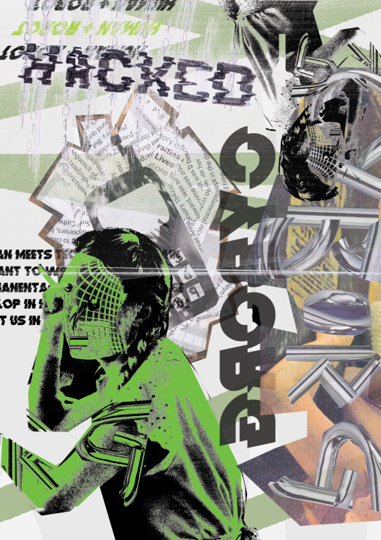
This piece is based on my article which is about a brain implant to connect people to social media. I have used the space in this to make the page as full as possible, which is important to my concept as it can represent the concerns of the experiment and how the implant would access all the data in your brain, which there is a lot of, possible ending up with an abundance of different data being shared which the person didn’t want to share. The amount of layers used in the small space given relates the viewer to the many layers they have in their own brain and how some they may want to keep hidden, hence why some objects are obscured and some type is slightly unreadable.
Many of the colours in this are very muted, so I created one large pop of colour in the top layer of images. Peter Bankov inspired me to work in this way as he commonly uses large blocks of colour with images overlaid and an off white background as I have here. The choice of green as the main colour was made as green is a colour I associate with dystopian and sci fi films, which this story makes me feel as though I am a part of due to it being such a huge drastic step in technology that seems completely unnecessary but is definitely something people would buy into. It also compliments the muted greens seen in the collage cuttings and and makes the whole piece cohesive instead of adding some new colour which may have disrupted the flow and continuity of the layers in the page.
I have used many styles of lines in this piece. The bolder lines and the stripes of green in the background were also inspired by Peter Bankov and are there to indicate the side to this story which is very futuristic and therefore contains bold lines and clear cut shapes. The more rough lines and unreadable type are to represent the issues with the technology that has been created, that being that the brain could be hacked in a similar way to how our computers are at the moment, therefore the mark making in the word “hacked” is very rough and scratchy, like a glitch in the system. The layers of lines and marks can also be reminiscent of the windows and tabs we seen on a computer, further linking to the computerised and technological aspect of the article.
I have created the form of a person in a grain texture by using the threshold application and I have duplicated her to create a balance between the top and the bottom of the page. The reason I have edited the form in this way is to connect the technology and the human sides of this article together. The way the form is built up makes the human look digital and melded together with technology. This works to reinforce the “cyborg” imagery and metaphor which I am pushing forward in this piece. I also included the from of a phone just behind the woman’s head as though the phone is coming out of it and connected ot it in some way. The phone is very old fashioned but simplified in design, contrasting with the rest of the imagery.
I used a variety of textures in this composition to represent both sides to the story. Grainy textures and lighter opacities were used in an attempt to show the issues with this product, such as the idea of a glitch in your brain (causing graininess) and the opacity creating a sense of transparency, which is there to show how this product could make your brain something anyone had access to. On the other hand, the smooth textures and sharp lines show the things which are right with this invention, and how it is a new and shiny piece if technology to be developed onto in the future. The reason I considered using texture in this way is because I saw it as a very prominent thing within Linda Zacks’ work and hoped it could bring a similar outcome into my own piece.
This piece doesn’t contain much contrast in tone but the one stand out figure of a human helps to highlight the key ideas of the narrative. Texture is where contrast happens most with grainy layers being on top of smooth colours. I should have made some areas darker than they are to avoid the completely mid tone look I ended up with but the look does fit with the article as this invention is a grey area when it comes to technology, with it being difficult to see if the bad is outweighing the good and whether the bad can even be fixed.
I didn’t opt for realism in this piece due to the entire concept seeming very unreal and dystopic to me, but I did make it as maximal as I could to enforce ideas of the brain and how many thoughts could be on display if this product was to be used on a human being.
0 notes
Text
Some of the palette and quick-draw experiments are in a sketchbook, but much of this work is not because I am finding scale a newly interesting phenomenon and the business of using an extended arm with a lengthy implement is an important area of learning for me. I am describing the piece that was almost the submission also as a sketch because, having finished it, I realised what a difference the Duck cotton support made to how I worked and to the way paint behaves in comparison to the various kinds of paper I usually use. This has been an adventure, and feels like a turning point. Like the moment I first made it round the ice rink on new skates with a sense of fluidity and no stumbles.
This, one of the exercises, was where the colours transcended, for me, the forms and the composition. It was a difficult task and frankly, the beetle came out of it best!
My goodness did this surprise me. I had gone for a more limited palette and struggled with the lemons (they are still rather blotchy, to my eye), and the composition seemed to float in space with the edge of the plate looking like a separate entity altogether. Then, inspired by nothing I can put my finger on beyond a vague notion of a rural French kitchen, I made those big, sweeping curves with incomplete detail and found I liked what had happened. To me, this was about following the spirit of the elements rather than documenting them. I learned more about dilute paint on dry brush undilute paint in this exercise, and leaving open spaces alone.
I am less keen on this as an outcome. My aim had been to represent the paint and the painted with tubes of paint sitting next to the metal bird ornaments but the result seems to me to be quite disjointed and inconsistent in style.
What I liked most about this was the fluency I was beginning to feel in the application of paint, and the fact that out of this came reflections from shiny surfaces that seemed consistent with what I was seeing in front of me. I also liked making a representation of the dark foliage on the other side of the window, and subverting the colours so that they picked up those in the items in front. The window frame itself felt less successful but at the same time, I felt that the composition benefited from those strong horizontals and verticals as contrast to the very rounded shapes in the foreground. The pear, it has to be said, is in a league of its own, I just don’t know which one!
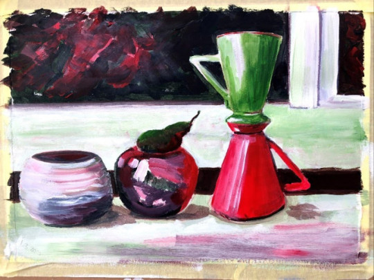
This was the mood version of that still life and while it probably established in my unconscious the palette for the eventual assignment pieces, I find it rather cartoonish and a bit trite. It has a Disney glow that feels a little naive and were i to do this again, I would take much more of a firm, dry brush approach with stronger, more bullish colours.
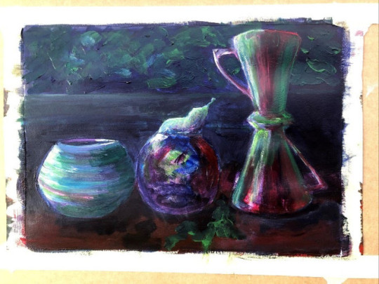
These are the ’round the house’ sketches I used to think about the interiors/perspectives task, the one at the bottom right being the eventual candidate. I chose that because, even though I prefer (or did prefer) the view in the other direction, I had done that on a previous module so it seemed right to try the reverse.
I made it bigger and extended it from beyond the view point of the sketch, used a muted palette, and tried this time for quite dilute medium. I am constantly surprised at how trying something I haven’t done before gives me results I couldn’t have expected, and simultaneously astonished that this surprises me. Looking at this makes me think of van Gogh but really I can’t claim that his work was any kind of inspiration except maybe subliminally. Perhaps it’s the colours, or maybe the blue with the small dabs of white in the string of lights having resonance in my mind with his starry skies.
These two, building on the perspective drawings and painting and the still life exercises, were significant steps in using this new support. Even prepared with gesso, this stuff sucks down paint and leaves naked texture that can be flooded with dilute wash and i really enjoyed working it to the point it was about to be the submission.
But part of my practice is to put these photographs onto rotation as background in my PC screen, and also my Echo Show devices. This means I am suddenly presented with my own images though they are someone else’s, which gives me the objectivity of eye that distancing offers. When I saw this as it popped up behind news items or projected temperatures for the day, it began to feel a little populist. Something I might like because of its ruddy colours and bright lights but not something I would find particularly ‘painterly’. I had used a red wash to underpin this painting and my feeling then was to use a green or blue one instead to darken and deepen the tones. I also wanted to go a little larger. These are some of the stages of this iteration; gradually building the image with layers of bright colour and washes of darker medium. The final adjustment, again after putting the previous image on rotation through my devices, was to mute the lights to subdue what looked to me like more hints of Disney.
The final piece is, for me anyway, a more mature image that, at this stage in my learning, feels like a triumph. I painted these things on fabric and somehow or other they look like an actual painting!
There are crops of detail from both iterations in the Assignment post, and a contemporaneous account of the process.
Time taken: 2 hours.
Sketch book work underpinning Assignment 2 Some of the palette and quick-draw experiments are in a sketchbook, but much of this work is not because I am finding scale a newly interesting phenomenon and the business of using an extended arm with a lengthy implement is an important area of learning for me.
0 notes
Note
hi! im that anon that asked for a tutorial and you said something specific and i really liked your harvey dent edit? the one that said, god is dead. and it was all red and stuff and super cool looking? no pressure! i just think your stuff is really cool and was wondering what the process behind some of it was!
ofc! it’s no problem at all :)
so i’ll just give a brief rundown and a v rough tutorial on how i made those particular graphics. thank u so much for the support, i’m especially proud of them too and it’s nice to hear u like them as well!
what you’ll need:
photoshop cc 2015.5 but any ps would do really
basic knowledge of photoshop
patience
fonts: dk shaken not stirred, liquido, couture, helvetica, helvetica neue, votu
so the first graphic is a really stupid move and i just realized it like hours after i posted it: it’s one of two graphics that feature a fanart instead of a faceclaim. looking at it as a whole, cohesive set it looks really stupid and surreal? bc it doesn’t match and just throws u off? so my advice is don’t do that. if ur gonna edit from an actual comic then the rest should be like that too (2D) but if ur gonna edit with real life elements i suggest to just stick to that path (3D) so that everything looks coordinated and neat :)
the second one actually took me a while to get right but basically the red circle is in [linear light] and the black circle is in [hard light] mode while the top most white is in [normal]. the paper texture is above all three layers and is on [multiply] mode so it only looks visible on the white circle. the “angels” text is just some basic layer mask so it looks like it’s inside the white circle. as for the style of the graphic itself it’s just based on the previous harvey graphic i did here, the last one on the left. the thing with that is i look for inspiration from other graphics i find and there’s a lot on behance, flickr and even pinterest. just search for ‘graphic designs’ and you’ll find a lot of good ones. u don’t have to copy them exactly but u can adopt and transform it into something urs! but if imitating some designs and tricks is what helps, then it’s fine too. nobody is born an innate artist/designer/whatever so just explore and experiment with what u know and what u want to see. eventually, u’ll be able to develop ur own style.
the third one is basically the same as the second and fairly straightforward. the big, red 2 is set to [darken] mode. i guess with this graphic it’s mostly abt negative space??? and also maybe laziness but negative space is good so that overall, ur graphic set wouldn’t look too cluttered. it helps the eyes breathe i think. also the main focus is the faceclaim, and since the graphics above and below it is already optically centered, it’s at the rightmost side for asymmetry. just a thought.
ok i’ll be real this is one of my faves bc it just looks so harvey i couldn’t believe my eyes when i saw that hand. i just cut it and applied a gradient map of white and light red i believe so it looks like it’s sketched out or smthng. it looks just like harvey’s burned hand but bc i’m an idiot i forgot to flip the canvas so that it would look like his left instead of his right hand. to this day i regret this mistake. if u look close enough the coin has harvey’s face on it too. damn i love him. but moving on, the lines are made with the pen tool. the pen tool can be a hit or miss thing to use and i just recently learned how to use it properly but it’s v convenient once u got around it! it’s like a sophisticated brush tool if u want to incorporate more lines in ur stuff. u can also use it to cut stuff out (like with the quick selection and magic wand tool) but i don’t do that method often so probs don’t listen to me. i only have a v basic knowledge on it but there’s a yt video tutorial on how to properly use the pen tool if ur interested.
this fifth one is very….. meh. theoretically, it could’ve been better but since i’m the Worst in practice it ended up like that. the design is p much those adidas ads with the many dots? sorry for the plagiarism, adidas, but i don’t make money off of this. so when in doubt just slap some geometry on ur edit and ur good to go. i go for circles bc they’re more aesthetically flexible, if that makes sense? i find rectangles cool but they tend to look out of place in something so vertical; it leaves little space for words and other elements. but polygons look better on horizontal canvases so u can try that too!
the last and definitely least is the most ‘meh’ out of the bunch bc i literally stopped caring abt 2/3 into this thing. the thought that comes to mind is: time magazine cover nov2017 so what does that say abt it really. the text is naturally like that thanks to the font: liquido with a wave-like option if ur into that kind of stuff. some layer masks too to get the effect of the text being inside the harvey art. it looks so dumb now wtf i’m an idiot. but hey, 2 harveys. i’m a visual genius in that respect. again, some gradient maps and a red rectangle border. tip: u should most definitely add a contrasting color or accent in ur graphics, which i once again failed to do here. in this case it’s black since the color palette is red, white and black. it adds a depth to ur work. if ur skilled enough, u can use a wider range of color palettes instead of the usual black, white, [random color]. i, myself, haven’t mastered that yet so that’s what i usually use but one extremely prolific graphic maker who has a good eye for these colors is user mattelektras. u can check out her stuff and see how she uses complementary colors in her edits.
some other things to note:
if u need a paragraph-like text for filler, u can go to type > paste lorem ipsum then adjust the font size to ur liking (somewhere around 0.8pt for maximum unreadability)
it’s good to pay attention to colors and spaces in ur works! the color wheel is ur friend in this trying time
smart sharpen always and forever (at abt 65-130 depending on ur image size)
this got lengthy but i hope i was able to help! i know it’s not that detailed but if u have anymore questions don’t hesitate to ask :) i’m not bothered at all so don’t worry abt it. happy designing!
4 notes
·
View notes
Text
Concept Artist Research
George Hull:
George Hull is a conceptual artist that has contributed mostly to the Science Fiction genre of films, his body of work includes a number of well performing films such as the matrix trilogy, Guardians of the Galaxy vol. 2, Blade Runner 2049 and much more.
His work often focuses on artificial landscapes and objects that posses many geometric shapes and sharp lines, this coupled with the stark contrast created by his use of bright colour and dark shadows give his work a whole unnatural feel. This is just compounded on by how clean the artwork is, it is usually akin to a photograph.
The scenes he has created with spaceships and cityscapes are impossibly detailed and must've taken many hours of painstaking and tedious work to make them photorealistic.
I personally love Hull's work and artstlye, I think it naturally creates a dystopian atmosphere that goes incredibly well with the films he has worked on.
Adam Adamowicz:
Adam Adamowicz was a concept artist that was often employed by Bethesda Softworks to create concepts for their Fallout and Elder Scrolls series.
The style that is used in his different pieces of work varies depending on which game series he was working and what purpose the artwork served, the range of work is actually quite impressive.
Looking at his artwork for Skyrim, they all look like fantastical paintings that convey the atmosphere of the final product perfectly. The colours he chose to use seem precisely chosen, whether it be the cold, but bright blues, whites and greys of the mountain ruins that exhibit the freezing temperature of the altitude or the dull shades beige and green to show the decay of ancient underground ruins.
Adamowicz Fallout work is however the complete opposite of the Elder Scrolls, gone is the diverse colour palette and the grand painting style. The pieces are now desaturated, with sickly greens and yellows, they look much more drawn than painted, giving the impression that they are pages of a survivors journal as they wandered the Wasteland.
I hadn't actually seen the concept art for these games before and I'm absolutely stunned to see how similar they look to the final product. I'm having a hard time criticising his work, I absolutely it and the worlds that it spawned and I find it incredible that Adamowicz was able to match his artwork so closely to the theme of what he was working on, even going so far as to change the artstyle almost completely. My one criticism would be that the Fallout artwork is lacking colour, but I believe this was a combination of the time it was designed, along with trying to sell the post nuclear apocalypse atmosphere, which also carried into the final game.
Noah Bradley:
Bradley is known for his work on the Magic: the Gathering cards as well as his own The Sin of Man Project.
He is yet another fantasy artist that's work is clearly painted, while some artists would rather try to hide the various brush stroke to make the piece seem more photorealtisc, I believe leaving them in gives it more character and just saves the artists time.
The way Bradley uses a wide range of bright colours and exaggerates different features of nature creates an otherworldly impression in his paintings. He seems uniquely capable of capturing the magic of these fictional worlds.
I haven't been able to experience Bradley's work as much as I have the previous two artists, so I don't have much to say, but I do really like the artistic choices he's taken throughout his work and any digital art that looks like a real painting is an automatic win from me.
Ryan Church:
Ryan Church has worked on many modern Sciemce fiction films, such as the disney star wars films, as well as the prequels, Rogue One, Age of Ultron, the newest Star Trek films, Tomorrowland and a lot more. For these productions, he mostly designed vehicles, architecture and planets. He even has the prestigious title of designing a few ships for the vapourware that is Star Citizen.
I'm especially interested by his vehicle designs, I feel like a lot of concept artists that specialise in this subject either stick with realistic designs that are rather blocky and have a lot of details, or sleek designs with a lot of curves and glossy surfaces, however Church seems to be rather versatile in this area, being able to produce both or a combination of both and have the results look stunning. He is actually the one that updated the design for the USS enterprise in the J.J Abrams movies, which is a good example of how ability to combine those two extremes.
I really like Ryan's work, it's an almost perfect representation of what I like to see in Science Fiction, all of his designs are clearly futuristic, but seem to be grounded on reality, like they're a tangible thing you could make. I think having such detailed and grounded designs to work from helps the final product be more (as much as I hate the word) immersive and believable.
Evaluation:
Like when I was looking at Pixel Artists before, it's really interesting to see the different possibilities that come with concept art, from quick sketches to hyper realistic painting. I decided to go with Science fiction and fantasy artists because that is what I'm most interest in at the moment and it's incredible to see things that you would never see in our world brought to life, especially in such detail.
The artists above leave big shoes to fill within the industry and its a lot to live up to, but I feel like a lot of people forget that these people have been practicing there skills for years, and you can't just pick up a pen and start designing an entire cinematic universe by yourself.
0 notes
Text
something wild 3/6
Summary: The locals speak of a monster and Newt’s all too ready to investigate.
A/N: I based the villagers off of the Dinka people of South Sudan if anyone’s interested. This story is on FF and AO3 if anyone prefers those sites.
First • Previous • Next
The locals don’t allow the girl to leave her hut. They strike down Newt’s pleas when he asks, thinking she’ll destroy the entire village and bring a plague upon them if she does. It’s doubtful, but there’s no convincing them otherwise, not when he’s fallen from their graces for defending the girl so adamantly.
So he casts a disillusionment charm and, after she’s done examining where her body once was, eases the girl into the outside world.
It’s risky, but Newt’s found that there are some things worth disobedience. The villagers don’t attempt to keep an eye on her, assuming she remains in the hut day after day- contact is limited, her food merely slipped past her hut’s entrance- so, as long as they’re cautious, no one knows about their little adventure.
The girl takes to everything from the wet grass to the rough bark of a fallen tree. She digs her toes into the dirt and weeds, grips and pulls at the low branches, crushing the ripped leaves in her dirty fingers. Newt watches her explore, nodding and smiling when she shows him a jagged rock with a slurred word, offering the English equivalent.
He talks a great deal more around her than he has to anyone besides his creatures. He tells her about everything and nothing, of the simple things like the shade of the sky, describing the texture of his clothes, the smell of the trees around them; he tells her about his creatures, his family, about the world beyond the mud walls of her hut and the village’s borders.
He talks too much- at least he thinks he does. After so long of traveling with only his creatures to keep him company, he’s out of practice.
“There’s a lot of us- wizards I mean. Not as many as Muggles, but we exist. We hide right under their noses all over the world- it’s all a great big secret. I’ve been to many wizarding communities, but none of them compare to London.”
They travel further away from the village, away from the calls of working men and women and the groans of the cattle roaming at the border, the overgrown jungle folding over them and hiding the way they’d come and opening up to newer sights. Everything looks different and yet the same, the multiple hues of green having no contrast to one another in Newt’s eyes. The sun shines through the space between the leaves, dappling the ground and highlighting the dull browns of the dirt and trees into something more lively- a stark change to Britain’s bleak palette.
“That’s where I come from. England.” He wipes the sweat off his brow, glad he had abandoned his coats before starting the hike. “One of the best communities there is. You can find almost anything at Diagon Alley. It’s got everything a wizard needs- there’s Ollivander’s, Madam Malkin’s, and Gringotts- not to mention Slug and Jiggers.”
The girl doesn’t seem bothered by the insects wizzing about, but Newt’s grown tired of them. He casts a spell to ward them off, fully aware of the eyes on his wand as he tucks in back into his pocket.
“We also have a school in Scotland- Hogwarts it’s called. It’s the best wizarding school there is- not even Beauxbatons can compare. It’s one of the safest places you can be. I spent a few good years there when I was younger until I was-”
He stops.
There’s only so much he can say about the school. A secondhand description can’t compare to the actual sight of it; Newt doesn’t think he can accurately describe the wonder that is the ancient school, can’t adequately explain the way it felt to see the distant lights against the dark shape of the castle, to take those first steps into the Great Hall, or entering the Hufflepuff common room for the first time.
Meeting Leta, their days spent within each other’s company and the experiments, is what made Hogwarts a second home. It was there he’d found a friend, a confidant, someone who was an outcast like him interested in the same things as he and who would listen to his theories. He’d like to tell her about these memories, only they’d be tainted with bitterness at his expulsion.
What he says instead: “You’d like Hogwarts.”
The girl is looking at him now, her big, dark eyes ignoring the amazing view of antelopes bounding beyond the openings between the trees. He imagines she’s inquiring for more.
“I was, well… asked to leave my sixth year. It’s an old story and I’ve moved on.” He tries for a smile, but can’t seem to make it work. “I’m boring you with this, aren’t I? Should we continue on with our walk?”
She doesn’t answer and, for once, he wishes she would.
He starts forward, the little girl following close behind, hoping for a distraction, and he’s in luck. They find tracks in the dirt when they reach a less clustered part of the jungle and his excitement bleeds into her, spurring them into a hunt. It’s a game of sorts, one that keeps the girl’s attention and let’s Newt forget out his past.
“Erumpets generally stick to open plains, but they’ve been known to wander into Muggle settlements,” he explains, ducking under a low hanging branch. “That’s what I think these tracks are from- an Erumpet. Then again, Rhinos and Erumpets share similar footprints, so I might be mistaken.”
Sadly, he is. Their little expedition is fruitless when the tracks become too faint for him to distinguish, not even a hint of exploded trees to indicate the presence of the magical beast. Newt’s put out, more than a few days since he’s caught sight of anything magical out in the wild. He would’ve enjoyed a quick respite from the close mindedness of the Muggle villagers and of his unpleasant memories.
“Ah, well, sorry I couldn’t show you an Erumpet.” He checks his pocketwatch. “Best we head back before someone notices us gone.”
The girl wrings her hands together, looking at the nearest tree before glancing back at him. She doesn’t want to go back. It’s obvious. Newt refrains from reaching out or else scaring her way.
“We’ll go out again tomorrow. Promise.”
He leads them back in silence, the girl only a step behind. About a fourth of the way back to the village something brushes against his hand. Ignoring it is as an accidental brush from the trees, he continues looking at the dirt to his left. It happens again, and then again when he still doesn’t respond. He glances at his companion and finds her aptly observing the jungle.
He wonders for a moment before catching her skittering closer when the terrain allows it, her hand barely missing his in her attempt to maintain balance. She’s still not looking at him and Newt can’t help but smile to himself.
When they cross the small stream he takes her smaller hand in his own.
It becomes a habit- a rudimentary schedule that they keep to. They sneak out after the girl eats her minuscule portion of rice and return when the sun just begins to set, before her evening meal is delivered.
In the time between they explore the surrounding jungle and even the more open savanna where the trees dwindle and the horizon can be seen at every angle. It’s there, trudging through the thick underbrush, he hears it.
The girl starts, but Newt brings his finger to his lips, shushing her quietly. Once she settles down he takes her hand and slowly leads them forward until they’re crouched, hidden in the tall grass at the base of an Acacia tree. From there, Newt quickly pinpoints the creature and, very quietly, directs the girl’s attention to the branches far above them; he hears her soft exhale and knows she sees the fiery red that hides in the virescent leaves.
The Phoenix doesn’t notice them, continuing on with its serenade.
The second one responds in absolute harmony.
The last time he saw a Phoenix was when he’d climbed Kibo, but it had only been one. A pair this far down was a rare occurrence, one he would use to his advantage.
He hurriedly brings out his journal, not wanting to waste a second of observation. Even as he watches, what he presumes to be the male scoots closer and preens its mate. They begin to croon, a perfect duet, their song so melodic that even the most renowned orchestra would be put to shame.
“Fascinating!” he mutters to himself. He jots down his observations on their behavior patterns before turning to drawing the pair.
They fly off before he’s finished his sketch, just as he’s beginning to shade in the shadows of their wings, so he fills in the rest by memory. Looking it over, he decides it’s not his best work, but still doable. It’s well enough to be put in his manuscript with his other sketches if he so wishes.
He shows the girl his drawing and she makes something akin to a giggle, shaking her head.
Newt overexaggerates his offense.
“Think you can do better?” He rummages around his case for spare paper and, setting up his case as makeshift table, sets it in front of her impromptu. She takes his utensil, fascinated at the black that lingers on his fingertips, when he offers it to her.
“Go on,” he says. “Give it a try.”
She stares at the charcoal in her hand, then at the paper, coming to the conclusion quickly, and begins to draw (scribble, really). She peppers the paper with dots, testing out the waters, before dragging the charcoal across the page. After that, she moves to curves and circles, drawing loops that turn into helixes. When she’s done, she sits back and reviews her creation.
Newt turns the paper more toward him for a better look. It’s looks like a blotted mess to him, but he thinks he can see two round shapes that could be the Phoenixes, a point that made their beaks while swooping lines that are most likely the tails. “Brilliant.”
She offers it to him.
He keeps it with the rest of his notes, marking the date.
#fbawtft#fantastic beasts and where to find them#fantastic beasts#hp#newt scamander#sudanese obscurial girl#njckle
15 notes
·
View notes
Text
one rotten apple or an ever changing path
Nollie was pretty sure getting your first tattoo was supposed to be fun. She was also sure that introducing your brother to your boyfriend was supposed to be at least bearable. And both of those things were; it was just the aftermath that was unbearable.
Parker had liked London much more than she had thought he would. He was the more judgemental of her brothers, especially when it came to boys she dated, but he had hit it off with her boyfriend immediately, so much so that Nollie had stayed almost silent while London tattooed the tiny “F” on her hip, right where it could be covered by even her tiniest underwear or swimsuits. Normally Parker would have been a little uncomfortable by his sister’s more exposed lower body, but his conversation with London seemed to distract him. It was perfect: the tattoo, the experience, her brother with London.
Nollie should have known it was too good to be true.
London had dragged Parker into his office to show him his portfolio (Parker had quite a few tattoos himself as wanted to see London’s work. His previous artist had moved from Wall Street where Parker worked off to Middle of Nowhere, Georgia. He was considering getting another while he was in town), so Nollie had occupied herself by talking to Winter up front. She’d grown fond of the girl in her frequent visits, and with her practically being London’s sister, Nollie had really valued their positive relationship.
“You know, I’m really glad this worked out,” Winter was saying. The two had been laughing at the blossoming bromance in the backroom. “I liked you from the start, I was just nervous London would rush things.”
Nollie raised an eyebrow, intrigued.
“Do tell,” she said, leaning on the counter Winter was behind. The other girl shrugged.
“I was nervous that he was going to force you into having sex. He talked a couple times about how he’d heard Ainsley saying that it was a while since you’d had sex, and that someone as hot as you probably had pent up horniness that was going to result in months of good sex. And I told him not to force you to do anything you didn’t want to or weren’t ready for, but he said not to worry-- he was just going to do everything he could to convince you that he could end your hibernation with him as soon as possible.”
Nollie’s mind was reeling. London had started hanging out with her because he wanted to have sex with her? Half of her said it was ridiculous, that he genuinely cared about her and wouldn’t do anything to hurt her. But the other half reminded her of Kendall. That was years of time together when he stayed with her for sex and publicity. It didn’t seem too far in left field for him to do it again.
“That’s kind of f-ked up, isn’t it,” Winter whispered, probably just now realizing it herself. Nollie swallowed, her eyes meeting Winter’s.
But she snapped out of it as soon as she heard two familiar laughs rejoining them. She put on a fake smile, dodged London’s kiss to her lips and directed him to her cheek, and she and Parker slipped out without her having to say too much besides a: “I’ll see you Wednesday night.”
///
Nollie went to London’s the next morning to return the portfolio he’d let Parker borrow. Her brother had flown back to New York City that evening and couldn’t return it himself, so she’d gone at a strategic time when she was sure her boyfriend would be at work and before she saw Bishop that afternoon for a shoot in one of the houses Langston had recently completed. This would hopefully give her enough time to process and pull her things from his drawer, just in case. She also hadn’t really been replying to his texts. She was nothing if not emotionally bubble wrapped.
Nollie unlocked London’s apartment and almost turned around and left when she saw a man sitting on the couch with his back to her. Who was that? But when the man turned around, neon green beanie and all, her mouth formed a little “o.”
“Paris?” she guessed, stepping further into the apartment and letting the door close behind her. The man’s face lit up, and he sprung out of his chair to wrap Nollie in the biggest bear hug she’d ever received.
“Finally!” he exclaimed, pulling away to look her over. “My brother keeps talking about you, and you sure live up to the da-n hype.” He winked, and she couldn’t help but laugh. Paris was identical to London, but shorter (just a few inches taller than the already tall Nollie) and much skinnier. His arms were just as heavily tattooed, had the style of a neon grunge band from the 90s, and reeked of spray paint and weed. He reminded her of the class clown in a coming of age movie, and Nollie had a feeling she wasn’t too far off with that assumption.
“I’m glad to hear it,” she said, grinning. “It’s nice to meet you. London’s said so much about you.”
“Good things?” Paris asked, not hopeful at all and sighing at Nollie’s lack of response. “God, I know I’m a royal f-ck up and he’s not proud of me, but he really doesn’t have to tell everyone. Especially not beautiful women.” He collapsed back into the chair he’d been in before.
“I’m pretty sure London’s proud of you, Paris,” Nollie said, moving towards London’s room. “He talks about your art and growing up with you and how close you two are now.”
“A lot?” Paris asked. Nollie shook her head.
“But that doesn’t mean he’s not.”
“London’s kinda the bragging type, Nollie. I know you’ve noticed.” She grimaced. Yeah, PDA was London’s strong suit. It made her stomach churn. He was using her.
“I’ll let you do what you came here for,” he said, waving her off and pulling out his phone. So she did. Nollie slipped into London’s room, dropped his portfolio on his bed, and cleaned every remnant of herself out of his room. When she came out, Paris had switched to an iPad and was sketching out what Nollie could only guess was a commission for someone. He saw her and patted the arm of the chair. And Nollie sat down. Just because things were weird with London didn’t mean they had to be with his brother. Without her asking, he explained what he had been commissioned to do and showed her all of the sketches and inspiration pictures of color palettes and the list of supplies he was making. Paris was what he called a reformed street artist. Now he mostly only spray painted what he was paid to. But Nollie was able to maintain a conversation by using art terms and the little knowledge she’d picked up from London, Langston, Ainsley, and Bishop-- each artists in their own way. He was impressed. He let Nollie watch as he continued to work, something he said he let very few people do, and let her draw a little something that he said was so unlike anything he’d do or come up with that he had to leave it in the final piece.
“You know, you’re just as cool as London said you were,” Paris said, grinning up at her.
“And you’re way cooler than he said you were,” Nollie replied.
“When he called me and said you two had finally hooked up, I was so relieved. Sure, he talked a lot about how much he liked you, but I remember first messaging him about how he wanted to f-k you from the minute he saw you and was one hundred percent going to make it happen.”
Nollie swallowed, the air suddenly becoming more serious. She looked away from a now frowning Paris.
“Hey, you know he wasn’t using you, right? You’re not Kendall. He really likes you,” he said, clearly trying to put a bandage on a broken bone.
“I know,” Nollie said, standing up. “I really do, Paris. It’s just not as easy for me to think about sex and relationships as it seems to be for everyone else.”
Paris seemed to buy that.
“I get it. I’m kind of the same way. But hey, I’m glad you feel comfortable around London.”
“Thanks, Paris.” She smiled weakly. “I’ve got to run to a shoot, but it was nice to meet you.”
“You’re like the big sister I wish I had growing up,” Paris admitted shyly. And her smile turned real.
He was like the little brother she’d lost. Unfortunately, she might lose Paris soon, too.
///
She wasn’t focusing on the shoot with Bishop, so much so that he’d called for a timeout in the most frustrated voice she’d ever heard him use.
“What’s up with you today, Nollie?” he asked, pulling her aside. He was annoyed, and now he had her eyes watering. “Oh gosh, Nollie, what’s wrong?” Bishop wrapped an arm around her shoulder, but Nollie pushed it off, dabbing her eyes before she could ruin her makeup.
“Did you know?”
“Did I know what?”
And Nollie told him everything, sparring him no detail. Her conversation with Winter, her meeting Paris. She shared her feelings, but Bishop knew about the whole Kendall situation, so she didn’t have to go too in depth.
“It’s like he doesn’t value my feelings about sex at all, Bish,” Nollie finished. “Why the h-ll would you start a relationship with someone just to f-k them?”
“To play Devil’s advocate,” Bishop said, pausing to allow Nollie to give him the go-ahead. She nodded.
“To play Devil’s advocate, he clearly really likes you now. I’d say he’s falling in love with you. And when we talked before and I said that he was falling in love with you, I meant it. Sure, London’s got a good poker face, but those were real feelings. It’s hard to make those up.”
“That’s what makes this hard.” Nollie groaned, leaning against the wall. “I’m falling in love with him, too. And I know that if he tells me he loves me, I’m going to get all mushy. So I need to go in with a decision already made.”
Bishop nodded, agreeing. This was really like when she’d asked him to help her break up with Langston all over again.
“So, what are your options?”
“Stay with him and stand on the fact that the path people are on can change halfway through.”
“And?”
“Break up with him and stand on the fact that one rotten apple spoils the whole barrel.”
“Both of those are true, Nollie.”
“I know.”
“So how are you going to decide?”
“I guess I’m just going to have to figure out what I feel. Maybe it’s time to go back to journaling.”
“Maybe,” Bishop said, giving her a hug. “Well, just let me know what you decide. I’m here for you, Nols.”
“Thanks, Bishop,” Nollie said, smiling weakly. “Let’s get back to the shoot so I can get home.”
She was going to see London in a few short days, and she needed to have her decision ready.
0 notes