Don't wanna be here? Send us removal request.
Text
youtube
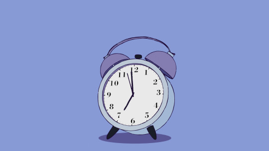
An(other) outline tutorial by Levi Magony.
Pros: doesn't require a solidify modifier and flipped normals (╯°□°)╯︵ ┻━┻
Cons: without baking will kill your frames; may heavily depend on the number of verticies
Overall: 10/10, gorgeous
Also, don't be like me and don't spend several hours trying to figure out why half of the edges don't have the outline and desperately attempting to fix it. It's a grease pencil thing - lines depend on the position of the camera, and won't appear if the edge is not visible from the camera perspective.
0 notes
Text
youtube
And the last stylized fire for today - by 3D TOON MAKER.
Pros: can provide separate layer for the brightest spots
Cons: displaced model; two models in fact, so, prepare for trouble and make it double :|
Overall: 7/10
Both layers use the same shader, the difference is in the second ColorRamp and scale of Voronoi texture.

What's interexting: this tutorial uses Voronoi for displacement texture, while the previous two used Marble. Probably for sharper edges.
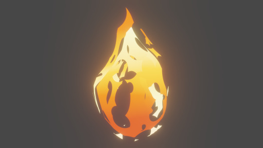
The most anime-like so far.

0 notes
Text
youtube
Another stylized fire, this time Zelda-edition by Ion Studio.
Pros: inversed gradient on the edges is *chef kiss*
Cons: displaced object; looks best like a solid object without transparency, and therefore may require more model tweaking
Overall: 8/10, Link approved
Shader noders include a tiny bit of math:

It's slightly difficult to catch a good frame for a screenshot without increasinf the displacement streght. But in the animation it's still good.
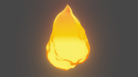
Probably the best version for more 3d-esque version of cartoon.

0 notes
Text
youtube
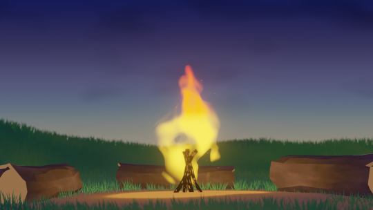
Next: stylized fire series. And starting with the tutorial by IdowhatIwant.
Pros: the best version for blurry fire
Cons: displaced object, may be a bit slow; depending on the number of verticies and displacement settings the top point of fire will look whacky
Overall: 8/10, very cool
The shader nodes:
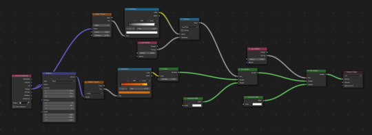
I tried to tie the animation of displacement to the rotating cubic empty, but with that the animation became worse - you literally can see a spinning cube at the base of the fire. Had to return to the simple empty flying away, as per the tutorial. ¯\_(ツ)_/¯

Oh, and you have to disable shadows for the model and place a light inside it, otherwise its own emission won't be enough.
0 notes
Text
youtube
And for the third we have (not really) honorable mention of this stylized glass tutorial by Mario Liang.
I wont't do the normal format of those posts, because so far I wasn't able to fully replicate the result exactly like in the video. So, maybe I am the problem here, and the shader is actially okay.
And my issue with the process comes from the reflections step, because in the tutorial they look like this:
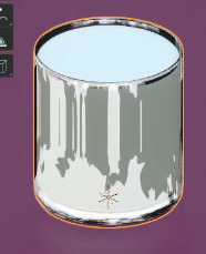
But no matter how high or low was the subdivision modifier, mine came up like this:

The main difference from the previous glass shader comes from the fact that this shader requires the solidify modifier to work as intended, and it works only with dark glass.
Plus it's one of those cases, when the thumbnail is vastly different from the end result of the actual tutorial.
So, for now it's 2/10. With one point for Tchaikosvky's overture as a BGM, and another point for visible keys.

0 notes
Text
youtube
The second example of stylized glass is from Blender Manong's tutorial.
Pros: still easy to use
Cons: same problems with solidify and light specks
Overall: still 7/10
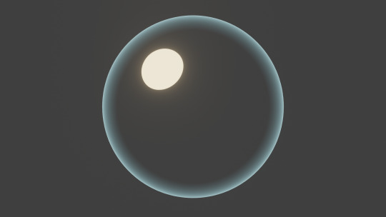
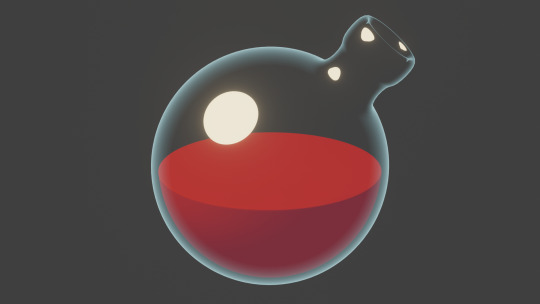
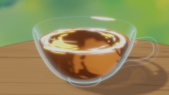
Very similar to the previous tutorial test, but this time with MixShader instead of MixRGB for tying the main gradient and the light specks together, and with Fresnel node instead of LayerWeight. There are no significant differences between these nodes for the glass shader, so it's up to your preferences.

Also, on a sphere it gives only one light speck:
But has much better reaction to the holes and gaps:
Hooray.
0 notes
Text
youtube
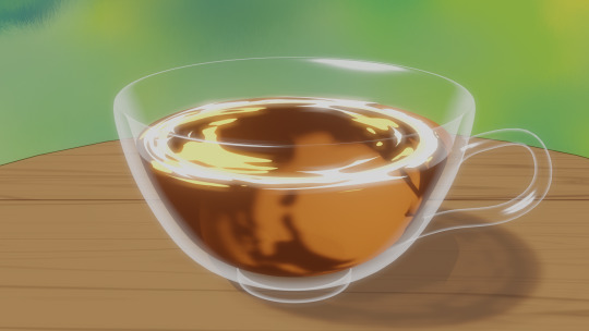
...and I rise from my slumber with the stylized glass series. The first one is the tutorial by phfdeflicted.
Pros: easy to implement; doesn't require any additional textures
Cons: doesn't react well to multy-layered models; may need some tweaking with light sources
Overall: 7/10, based
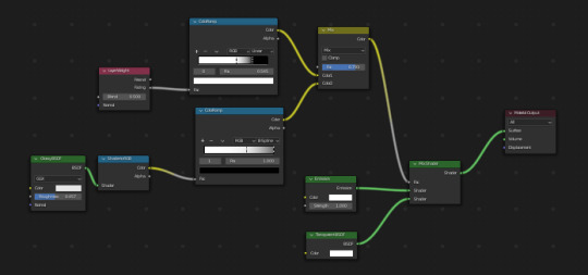
Here are the shader nodes. Simple.
About the multy-layered models: at first, I tried it with my old models of potion vials that had solidify modifier on them, and results were not good. Like that:
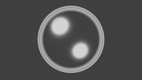
Versus the same sphere but without solidify modifier:

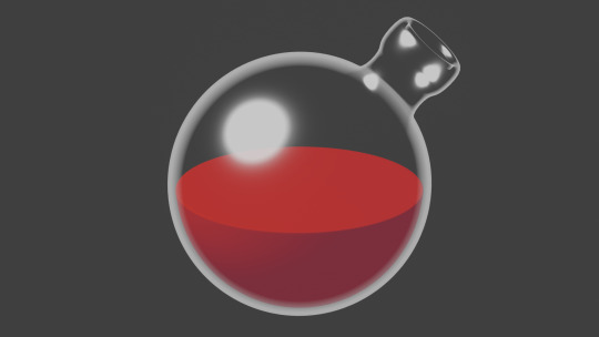
The shader applies that gradient edge to both sides of the model faces, but the light specks are visible only on the overwrap. Although, it may look less bad depending on the thickness of the model and range of the edge gradient.
It looks quite nice on the curvy objects, but may not react well to the holes in the faces:
Very cool and simple otherwise.
0 notes
Text
youtube
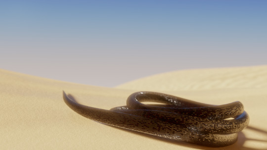
Okay, the first one here: procedural scales by Lance Phan.
Pros: it's a shader; it's procedural; it has a sort of normal map replacement built in.
Cons: it's pure MATH; has issues with curves on models; requires a very good unwrapping for anything semi-complicated.
Overall: 9/10, wouldn't be able to replicate on my own even when being at gunpoint.
Here how its node settings look like. Granted, this version includes color settings and shade variety between the scales, so just the basic shader is a tiny bit simpler.

Here how it would like with default unwrapping: a very visible seam and scales being all messed up on the top of the sphere where faces are a bit scuffed.


Still great for simple shapes though.
1 note
·
View note
Text
Hey there.
It's just a side blog for the links to various tutorials for Blender that I used.
0 notes