#until i can find a text adding website i can access on mobile
Explore tagged Tumblr posts
Text
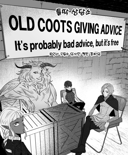

Translated with permission! Artist on Twitter (@achu_0u0) and original posts.
#guys.... i lost access to my tablet so i made this on my phone in the sketchbook app...#are you proud of me#i think it's safe to say translations are on a pause for now#until i can find a text adding website i can access on mobile#dungeon meshi#delicious in dungeon#winged lion#mithrun#chilchuck tims#thistle#dungeon meshi spoilers#katrina posts#translations#achu_0u0
1K notes
·
View notes
Text
Hello fellow dyslexic/adhd/others who would like to enjoy fanfics through their ears, I just spent the entire day testing android apps to find one that doesn’t suck as much.
TL;DR - these two T2S, Audify
I feel like I need to share this because 90% the apps don’t even allow a web page as a source, let alone get past the log in page, and I cant be the only one who doesn’t want to download every single fic.
“Oh, but doesn’t android have a built-in text-to-speech function in the accessibility settings?” I hear you ask. Yes, but it sucks ass very badly. Firstly it only reads in the system language, so it doesn’t really work. Second, you need to highlight all that you want it to read, and seeing that I read a minimum of 15k words in a sitting, I’m not gonna do that.
Also I’m broke, I imagine you are too, but even if I wasn’t I’m not paying for this, if I did I wouldn’t even be supporting a human being, so no.
I’ll immediately break your trust with the first point, but it’s what I’ve been doing until now, and now that I know what the android mobile experience is like, I feel the need to include this. The best solution I’ve had so far (which works wonders, let me tell you) is letting Siri read them on the iPad. It’s only doable when I’m at home and it’s still an apple product, so that’s why I began the research. However the positive points are INCREDIBLE so I’m going to ads it to the list because I said so.
First of all it’s built-in and SO EASY to access, you literally just swipe with two fingers and it stars to read. It reads the punctuation, you might think that’s a given and so did I, but no. A question sounds like a question, an exclamation point does why its supposed to do, short sentences sound what they’re supposed to sound like. In apparently all the apps ever created, you won’t find any of it, just flat, monotone voices with flat little pauses. Overall excellent experience 10/10.
Cons: it’s on apple, I consider apple the same as Disney, I would love to not give them more money so that they can make the market increasingly worse. Every now and then a system update will fuck with the tts function and it will be unusable for a while. Sometimes it doesn’t like the text format on some fics. It’s not portable.
Now that we got that out of the way let us get to the meet.
Speechify - it sucks bad. At least the free version, but seen as it costs almost 10€ a month I’m not even going to consider the premium version. Fuck that. You can’t increase the speed, and as somebody who hasn’t watched a single YouTube video on normal speed since they added the function I can’t do that, too slow, I forgot what we were talking about once we get to the end of the sentence. Also you can only use those weird very robotic voices, and they’re not even that many. Don’t recommend. I felt like I had to include it since it was one of the few who allowed browser navigation and well, it’s speechify. Also you can’t t have saved more than 3 “files” per time. Doesn’t have sleep mode.
T2S - cute. It works. Again, no emotions, but it reads what it has to, nice voice selections, easy to use. The premium version adds literally nothing, they’re a good app, what they have, they give. Also you can customise the interface colour if you want. Has the sleep mode. - EDIT: this app allows you to have multiple tabs open at the same time, unlike Audify. - EDIT EDIT: it's waaay better than Audify with pdf files.
Audify - works exactly the same as T2S, but it saves the history and has a bit more customisation for how it reads and what it reads (which you don’t really need for ao3, but if you wanted to read, say, Wikipedia with all the notes and stuff, now you know). Has the sleep mode. - EDIT: the double tap to start reading works slightly better than T2S on websites with weird formatting. But unlike T2S you can only have one tab open - EDIT EDIT: will turn your pdf file into text and will show you just text. If you had things like images or columns fucks for you.
That’s all folks. Now go and be free of your reading impediment, or be free in your multitasking, or whatever you want to do. I’m done, I’ve given my datas to all kinds of shady apps, I need to go do damage control
22 notes
·
View notes
Text
how to make a userbox
a long time ago I said a magician never reveals their secrets but considering the fact that I’ve been really bad about making userboxes in the past few years (this blog has existed since 2016 and has almost 4,000 followers) I figured it was time to write a tutorial on how to make your own userboxes.
fun fact - userboxes were originally for Wikipedia accounts.
THINGS TO NOTE:
text must start with “This user”.
some helpful things to know if you don't already: cntrl + a = select all (helpful for urls), cntrl + c = copy, cntrl + v = paste, cntrl + z = undo
MEMORIZE THIS CODE:

so let’s say you want to make a userbox that says “This user likes trees.” the method is different for pc and mobile, so I’ll start with pc:
the first step is to go to https://www.yerich.net/userbox/. then open a new tab and google “tree png” or “tree transparent” and find an image with a transparent background (tip: I’ve found that truly transparent photos appear white in the background, but if you click on it, become checkered. they are probably not actually transparent if they already have a checkered background or don’t turn checkered after you select it. also, if an icon is hard to find, I recommend https://thenounproject.com/). once you find one you like, right click the image and click “open image in new tab”. that should open up a page with the url for your image. copy that (cntrl + a & cntrl + c) and come back to yerich.net.
in the top bar that is titled “left box”, type in the code i mentioned and paste the url in-between the quotations (cntrl + v). if you did it correctly, the image you selected should appear in the left box.
now go to the bar right under it, titled right box. type “This user likes trees.” this should reflect immediately in the right box of the userbox.
now for colors! there are three ways to do this:
on yerich.net there is a tab that says “select color scheme” that has some presets to choose from.
google “color picker” and use that to find more precise colors, then copy the hex code (starts with a hashtag “#” and is 6 digits long). then you can paste it wherever you want: border color, left box color, right box color, or left (info) text. this method is better for getting custom colors, especially ones that match the image. (some hex codes to memorize: #fff - white, #000 - black, #ff000 - red, #ccc - light grey)
instead of hex codes, you can also use HTML colors. for example, if instead of #ffffff you just wrote "white" it would do the same thing. here's a full list of accepted color names.
your userbox is done! now all you have to do is take a picture of it and crop it. zoom up as far as possible to your userbox. in your search bar along your taskbar, search “sn”. this should come up with “snipping tool”. open that, select new (make sure that under mode, rectangular snip is selected), then carefully put your cursor at any corner, making sure the crosshairs align with the border of your userbox. then drag to the opposite end, also making sure it’s not too close or too far (this is hard and takes me a few tries sometimes, but chances are better the more you zoom up on your userbox). once you’ve taken your screenshot, save it as whatever you want, wherever it will be most accessible to you, and voila!
the only difference with mobile is:
when you’re looking for a picture, you may be able to hold down the photo you want to bring up a selection which might include “open image in new tab”. if not, try clicking the image until it takes you to a page where there is nothing but the image. copying and pasting the image doesn’t work, nor does pasting the url of the website it’s from, so it’s a little more complicated. if you really want, you can upload the image you want to something like imgur and then copy that url.
on the website, images and hex codes don't immediately update when pasted. how i fix this is deleting punctuation and adding it again, or deleting the last number of a hex code and adding it again. this refreshes the userbox.
cropping is also way more refined – I recommend flipping it sideways for better precision, and flipping it right side up when done.
also userbox resolution is a lot better on mobile. pc can look more pixelated.
but yeah! hope this was useful ~
432 notes
·
View notes
Text
How to gif without photoshop
Hello! By popular demand (of like 4 people) I am going to write out a tutorial of how I make gifs when I’m on my personal laptop and don’t have access to photoshop. There is another method I use with a different software that is a bit more complicated and if people are interested, I will make a tutorial of that method as well. I’ll do my best to keep this concise, so let’s get started.
Warning that this is VERY text and image heavy because I know how frustrating it can be when a tutorial feels like it’s skipping steps and I want this to be as clear as possible. Also please read this on desktop, tumblr mobile kills the quality of gifs inside text posts.
This is the video I will be giffing and here is the gif I will be making!

What you need:
A video to gif
For the best results, I recommend a video that is either 720p or 1080p (basically the higher the quality, the better). Videos with good lighting and bright colors also turn out the best. Unfortunately for me, I gif the TV show Prodigal Son a lot and that show has neither of those things, which is why my gif example is from that show; if you can make a scene with zero lighting or vibrancy look even somewhat decent, you can make anything else look good.
A video downloader or screen recorder
This is the video downloader I use and this is the screen recorder but basically any youtube video download website or screen recorder program works. Keep in mind that ezgif has a pretty low upload limit for videos, so if you want to gif something longer than like ~4 minutes, cut the video down to the specific parts you want first on a website like this one.
ezgif
A very straight forward website that anyone can access. You don’t need to download anything, it’s all online.
Bonus: Online Image Editor (not required, but I use this website to add text to gifs)
1. Making the gif:
Once you have a video downloaded, you go to ezgif.com and go to the section video to gif. Click choose a file, scroll to your downloaded video, and hit upload video. Your screen should look like this now.

There are two ways to pull out the sections of the video you want to gif. You can either write in the start and end time in the little sections (you have to convert them to seconds: for example, if my gif started at 1:16 and ended at 1:20, it would be 76 seconds and 80 seconds respectively). Or you can do the method that I feel is easier, where you go to the section you want it to start on, hit pause, and hit the blue button that says “use current position” then let the video play until it hits your stopping point, hit pause again, and click on the second “use current position” button.

Once you have the start and end time recorded, scroll down to the next part of the screen with the size options. For size, select “540xAUTO (for Tumblr)” since tumblr gif sizes start at 540p and go down the more gifs are in a row. For frame rate, try to do either 20 or 25; the higher the frame rate, the smoother the gif will look. If you are trying to gif something in 540p that is longer, you might need to chose 10 to keep it under 5mb, which is the tumblr gif size limit. For method, leave it on FFMPEG. Then hit, convert to gif.

your gif will now look something like this!

Now, this gif is currently 5.7mb, which is above the size limit for tumblr (5mb or above gifs will still play if I recall, but the quality will be really bad when you post them). If I was planning on keeping the gif this size, I would go back and change the frame rate to either 20 or 10 to get the size down. However, I am going to resize the gif to 268p, so I don’t need to worry about it being to big.
Using the correct gif size for tumblr is one of the easiest ways to make sure the gif looks good! For gifs that take up a whole row, the size should be 540p wide. For two gifs in one row, the size is 268p each. For three gifs in one row, the sizes are 177p, 178p, and 177p in that order. Here is a visual of it.
The next step would normally be resizing the gif, but Prodigal Son youtube videos come with a black banner on the top and bottom that I need to crop out. You will see a menu full of options under your gif, and you want to click on “crop.”

Cropping is pretty straight forward; you just move the little box over the part you want cropped, then hit the “crop image” button. Make sure width stays 540p!

Your gif now looks like this

Next, you look at the options under your gif again, and go to “resize.”

Again, resizing is pretty straight forward. I just put in 268 into the “width” section and leave the “height” section blank since the site will automatically resize the height. You can ignore the other menu options.

Your gif now looks like this

Next step is optional, but I usually do it. Once again, you go to the menu of options under your gif and select “speed.”

Speed is also super straight forward. I almost always reduce the speed of my gifs somewhere from 90% to 80% no matter what, just because I think it makes it look smoother. For gifs that are of short scenes that go really fast, I will reduce it to anywhere from 70% to 50%. You can try different speeds to test out what you think looks best. For this gif, I’m going to put it at 80%.

Here’s what we have so far. Congrats, you have made a gif!

Now for the fun part!
2. Coloring the gif
Go to the “effects” option, in the menu under your gif. You will see a LOT of options, but the panels I’m going to focus on are “colorize”, “brightness and contrast” and “color presets”. This section is going to vary a lot depending on what specific video you are giffing so remember to be flexible and try lots of different options out! It took me a while to get to a place where I can just eye a scene and know what settings to use. It’s super easy to go back and tweak a setting if the gif doesn’t look like how you want it the first time, but it’s a lot of trial and error.
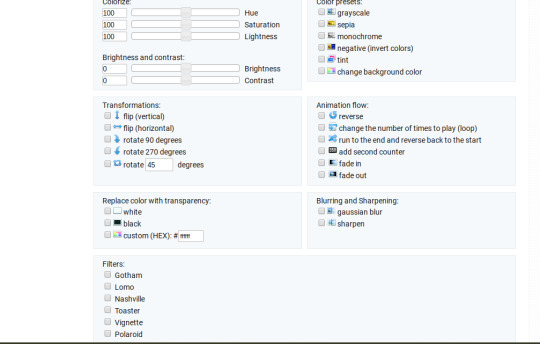
The main option I focus on in the “colorize” section, is “saturation.” This is what will make all the color in your gif pop out. The saturation I use varies a ton; for scenes that already are colorful/bright, I usually keep it around 120 to 150, since you don’t want it to be over saturated. If I’m making an edit that is supposed to look toned down or more grey/neutral tones, I’ll decreases the saturation in the range of like 90-40. For a show like Prodigal Son, where there is basically zero color vibrancy, I tend to go full out with saturation, usually in the 150-200 range. For this gif, I have it all the way up to 200.
Next is brightness and contrast. This also varies wildly, but a good rule of thumb is I always try to keep my contrast at least 5 points higher than whatever my brightness is, it just makes the lighting more even. You need to find a good balance; obviously, the darker the scene, the higher you want the brightness and contrast, but if you go too high, the gif with be staticy/grainy. For Prodigal Son, which has horrible lighting, my brightness is anywhere from 10-30 and my contrast is anywhere from 15-35. For this gif, my brightness is on the lower side since the scene is outside in natural light; brightness is 16, contrast is 26.

After you get those settings, I go over to “color presets” section and click on the “tint” option. It will pull up a color chart that looks like this
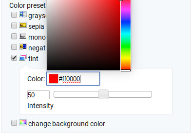
You ALWAYS want the intensity up to 100. This part is where the most trial and error occurs; there isn’t any one color option that works for every gif. The shade I use most often is light red/pink or light blue/light purple. For scenes that are lacking warm tones (which is almost all of Prodigal Son) I tend to go to the light reds, and for scenes that are lacking cool tones, I go to the light blues. The light reds are best for making characters skin tones look more...like actual skin tones and not totally washed out. To select a color, you just move your mouse around the chart. This is the range of color codes I tend to use.
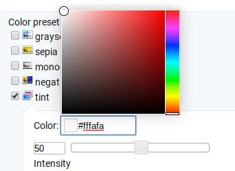
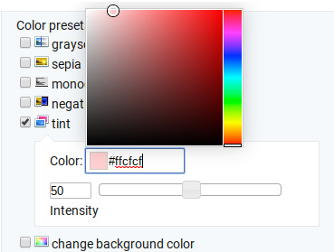
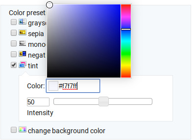
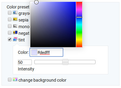
Again, intensity should be up to 100 (it automatically starts at 50 and I was too lazy to move it while getting screen shots :P).
For this gif, I actually used a new technique I’ve been trying out where I start with a light blue tint to even out the color tones, then once that gif is done, I go back to effects and add a layer of pink to make the colors brighter. Usually, one color works fine, but sometimes it’s hard to find a good balance (the red colors can get too red and the blue sometimes brings out too much of a yellow shade). For now, I have my color tint set at #eeebff.
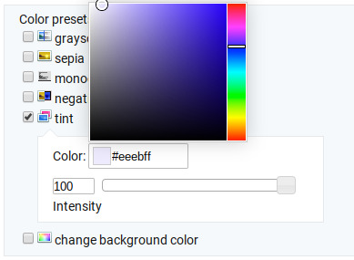
Ultimately, this is what my effect settings look like and this is what the gif looks like now.
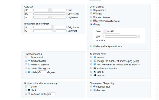

Now, like I said before, I added another layer of tint to this gif. All you have to do is go to the menu under your gif, and click on effects again.
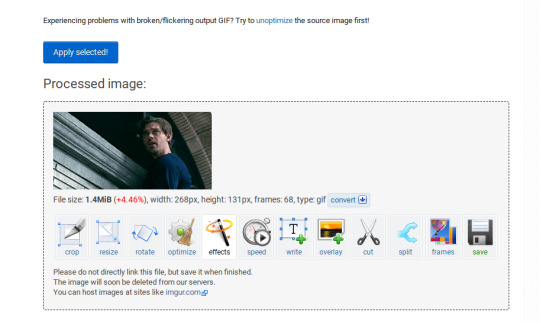
It will take you back to the panel you were just on, expect now your colored gif is on the top and all the settings are blank again. The only setting you need to use now is the tint option; go there, and select a light red shade. I used #fff0f0.

And here is the final gif! To save it, just right click and hit “save image as.”

I know it seems like a long process, but once you get a hang of it, it goes by super fast, especially if all your gifs are coming from the same video.
BONUS: Adding text
If you are trying to gif something with dialogue or you want a quote to put over your gif, you will want to put text over it. ezgif has a “text” option that you can use if you want, but I personally don’t really like their font options, so I use the website Online Image Editor.
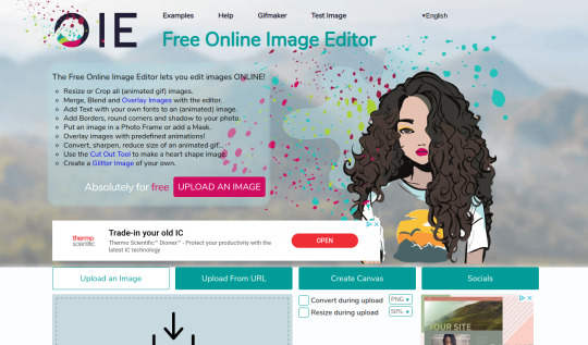
This is what it looks like. You can either hit “upload an image” and upload your saved gif, or you can go back to ezgif, right click the gif, hit “copy image url” and paste that url into the “upload from url” option. The web page should now look like this.
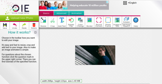
It’s pretty straight forward from here; click on the “add text” button and a menu will appear on the left hand with options for the text.
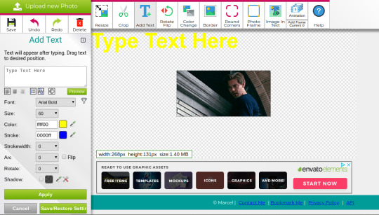
Type whatever you want the caption to be in the “type text here” box. This website has a ton of font options you can play around with, but when I just want to caption a gif, I stick with “Arial Bold Italic.” For a 268p gif, the font size should be 10-12, depending on how much writing you plan to put on each gif (if some gifs are going to have more writing than others, pick a smaller font size so it stays consistent!) When I make a 540p, the font goes up to 14-16. I use white for the color and black for the stroke. I make the strokewith 3 because it makes the caption stand out more. Once all these settings are selected, hit the “preview” button under the text box.
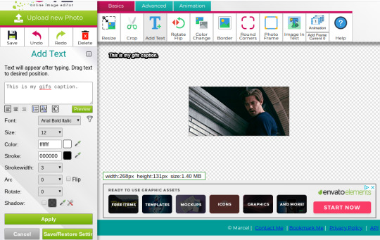
You can now drag your text anywhere you want on the image! The only bad thing about this website is that it doesn’t automatically center text, so you either have to eyeball it, or if you’re picky, like me, open up one of those online ruler applications and use it to measure out the center. For captions, I move the text just slightly above the bottom of the gif.
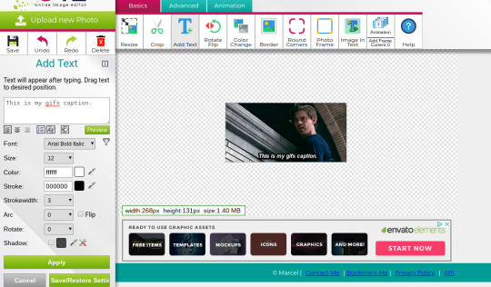
Finally, you hit apply. Once your gif has the text on it, all you have to do to save it is right click it and hit “save image as.” And here is the finished project!

That got a lot longer than I thought it would, but I hope it was informative! If anything was unclear or if you have further questions, feel free to send me an ask. Thank you for reading.
#gif tutorial#giffing tutorial#giffing#gifmaking#mine#my gifs#long post#I hope this makes sense lol#pls rb if it helped!!!#also if mobile doesn't keep the read more...idek
389 notes
·
View notes
Text
Archive Of All Articles Identified With Java.
Ninja Training For Software Program Testers.
#toc background: #f9f9f9;border: 1px solid #aaa;display: table;margin-bottom: 1em;padding: 1em;width: 350px; .toctitle font-weight: 700;text-align: center;
Content
Qualified Software Program Examination Automation Designer.
Automation Testing Resources.
Examination Automation With Selenium Webdriver.
Leading Tips For Learning Java Programming.

Qualified Software Examination Automation Architect.
How many days will it take to learn Java?
Bottom line -- beyond the most elementary, the math you need will come from the problem domain you're programming in. NONE of that needs to be a barrier to learning Java development. If you can learn Java, you can probably learn more math if you need it -- just don't try to do both at the same time.
Nevertheless this is inhibited, as well as making use of one browser per node is thought about finest technique for optimal efficiency. You can then utilize the TestNG collection to run your tests on several nodes in parallel customarily. The easiest means to use these in a regional Selenium Grid is to build a Docker Compose file within the origin directory of your project. Name the data docker-compose. yml to keep points easy.
Java 7 can be mounted on Lion and also Mountain Lion to run applets. Lion and also Hill can have both Java 6 as well as Java 7 set up concurrently.
And also, there will be far better assistance for Docker, parallel testing will be consisted of natively, and it will offer a more insightful UI. Request tracing with Hooks will also aid you to debug your grid. As any type of examination automation engineer understands, waits are important to the security of your test automation framework. They can additionally quicken your test by making any sleeps or pauses redundant as well as get rid of slow network and cross-browser concerns.
Automation Testing Resources.
Nevertheless, as these are commonly utilized to produce screenshots of a single element, it deserves recognizing that there will certainly also be an API command to record a screenshot of a component in Selenium 4. The Selenium Grid will certainly be extra steady as well as easier to set up and also take care of in Selenium 4. Individuals will certainly no longer need to establish as well as start nodes and hubs individually as the grid will work as a mixed node and hub.
To get up as well as running, initially you require to have Docker as well as Docker Compose installed on your device. They will both be set up with the Docker Desktop if you're running Windows 10 or a Mac. Selenium Grid is infamously difficult to establish, unsteady, and also difficult to either release, or version control, on a CI pipeline. A much easier, secure and also maintainable way is to utilize the pre-built Selenium Docker pictures. This is essential to ensuring the continued widespread adoption of their framework within their firm.
Generally, puffed up, bekijk volledige prijzen befall of fashion rapidly. He started at IBM, relocated to EADS, then Fujitsu, and now runs his own company.
Below are some suggestions to make your waits a lot more resistant. To create a stable variation of the Grid for your CI pipeline, it's additionally possible to release your Grid onto Kubernetes or Throng. If they do fall short, this guarantees that any Dockers are rapidly restored or replaced. It's worth keeping in mind that it is feasible to have multiple browsers operating on each node.
Test Automation With Selenium Webdriver.
I utilize TestNG as it's especially developed for Approval Tests, while structures such as JUnit are typically made use of for device testing.
Another wonderful structure that is well worth exploring is Spock as it's easy and extremely expressive to check out.
I would certainly additionally recommend setting a day to do this at the very least yearly, although ideally it would be every six months.
Google's Reality assertion collection is likewise a terrific method to compose legible examinations.
youtube

Check to guarantee that you have the suggested variation of Java installed for your operating system. I composed a book that gets testers began with Java quickly, is simple to adhere to, as well as has instances associated with their work. A driver.switchTo(). parentFrame() method has been added to make structure navigation simpler. WebElement.getSize() and also WebElement.getLocation() are currently replaced with a single method WebElement.getRect().
Apple did not create an Update 38 for the Mac, they maxed out at Update 37. On Windows, the Java runtime might or might not be pre-installed, the choice is left as much as the equipment manufacturer. A Java variation 6 runtime was pre-installed by Apple on OS X Leopard and also Snow Leopard, yet starting with Lion, Apple stopped pre-installing Java. Java 6 can be set up on Lion as well as Mountain Lion, however it will not run applets.
Top Tips For Understanding Java Shows.
You code as soon as, as well as the JVM does all the operate in making certain your awesome new programme runs efficiently on any platform, whether Windows, Mac, Linux or Android mobile. Java is one of the most preferred programming language in operation since it's the only language that functions throughout all computer system systems without needing to be recompiled each. Obtain your group access to 4,000+ leading Udemy programs anytime, anywhere.
Create A Junit Test Course
youtube
Check to make certain that you have the advised version of Java installed on your Windows computer and also identify any kind of variations that run out date and needs to be uninstalled. If Java is presently set up and enabled in your browser, we are unable to verify.
Java voor testers don't have to have experience of doing this as your understanding of the technology will certainly suffice (we'll help you with the remainder up until you depend on speed up). Mentor is our enthusiasm and we make every course so you can go back to square one, knowing nothing about a topic and also come to be a specialist after the program as well as can work with enterprise projects. You will get the best in class assistance from the trainer for any kind of concern you have associated with the training course.
Pointer # 3: Chrome Devtools: Mimicing Network Conditions
Where can I practice Java?
JavaScript can be used to do monotonous things like creating animation in HTML. In short, when it comes to how each programming language is used, Java is typically used for all server-side development, while creating client-side scripts for tasks such as JS validation and interactivity is reserved for.
Toptal handpicks leading Java designers to match your requirements. There's also an innovative side to the role as you will make training course web content as well as contribute suggestions for coding challenges for the students.
How can I learn Java for free?
Learning Java on your own doesn't have to be difficult; there are plenty of resources for independent study and practice. No matter your age or experience level, you will find plenty of websites that will give you hands-on experience and teach you how to program in Java.
1 note
·
View note
Text
RECENT NEWS, RESOURCES & STUDIES, late February 2020

Welcome to my latest summary of recent ecommerce news, resources & studies including search, analytics, content marketing, social media & Etsy! This covers articles I came across since the early February report, although some may be older than that. I am a bit behind due to my trip last week and other events, but some things here are a bit time-sensitive so I wanted to release this now.
I am still looking into setting up a new ecommerce business forum where we can discuss this sort of news, as well as any day-to-day issues we face. I need some good suggestions for a cheap or free forum space that has some editing tools, is fairly intuitive for inexperienced members, and is accessible. If you have any suggestions, please reply to this post, email me on my website, or send me a tweet. (I will put out a survey once we narrow this down to some good candidates, but if you have any other comments on what you want from such a forum, please include those too!)
As always, if you see any stories I might be interested in, please let me know!
TOP NEWS & ARTICLES
Since we are seeing more shops closed due to Etsy’s customer service level standards, my blog post on ODR now has major revisions explaining what we have learned, and includes some tips for staying out of trouble and if necessary, appealing a suspension. Please circulate the info widely, as many sellers still haven’t heard about this, and some were closed without having any clue this was possible.
Mobile continues to grow while desktop use is slowly shrinking. It should affect how we design web pages. “Mobile visitors also behave differently from their desktop web counterparts, staying on pages for shorter periods of time, for example.” Other interesting takeaways from this SimilarWeb report: “[Facebook] lost 8.6% of [web] traffic over the past year alone” but increased in app sessions.
The price of domains ending in “.com�� will almost certainly be going up soon, and will go up most years after that, unless something changes at the last minute. If you are absolutely certain that you will continue to use the same domain name for your website, blog, ecommerce forwarding etc., then you might consider paying a few years in advance to save a few bucks.
Another article explaining how people are selling thrift store and vintage clothing on Instagram, without setting up a checkout/cart anywhere. (The article focusses on teenagers, but does reference other examples.)
ETSY NEWS
Two weeks ago, Etsy Support posted on Twitter that they were no longer monitoring the account, and asked everyone to use the help page maze instead when they need support. Forum thread here.
Another trend report for 2020 from Dayna Isom Johnson [podcast links & transcript] She leads off with tips on how to get featured: “ so it's incredibly important to see a bright representation that really clearly shows your product...Do be original. I'm always trying to find the latest and the greatest that isn’t already on the shelves...Do be inclusive. ... I'm talking about models of all ethnicities, all genders, all body types, all ages.” Etsy chose chartreuse as their colour of the year: “in the last three months, there's been a 12% increase in searches for green already, and a 55% increase in neon green.” The wedding trends part was mostly already covered in a blog post, but she does also answer a few seller questions.
Website user experience (UX) is a big part of getting people to convert, and an outside group ranks Etsy’s as “acceptable”. Many will be unsurprised that search gets a score of “mediocre” and Accounts & Self-Service get a “poor” grade.
The migration to Google Cloud services is complete, so now Etsy can run more experiments more often, including those involving AI. (Although the forum thread was laughing at the idea of bad reviews helping shops, there is actually some research supporting that, so it is a logical thing to test.)
Etsy sellers in the US, UK & Canada who use Instagram can apply to win a trip to Etsy HQ here, until March 1.
Etsy is launching an Etsy U program which just seems a bit sketchy. Forum thread here.
Reverb (owned by Etsy) named a new Chief Technology Officer on Feb. 18.
SEO: GOOGLE & OTHER SEARCH ENGINES
Google does not confirm every large search update, so this one remains a mystery at the moment, since Google refused to give an answer. That means it’s not a core update.
Another video (with subtitles in several languages) from the SEO for Beginners series from Google, on the basics you need for good website SEO.
If you are interested in “searcher intent”, this 500 person survey asks about what people are really looking for, and what they think of the search results the end up with. Overwhelmingly, they say they prefer organic results to ads, and the majority see targeted ads that they can’t figure out the reason/s behind. “Sixty-eight percent responded that Google adding more ads to the search results would make them want to use the search engine less.” Also, a slight majority preferred text results to images, video, & audio. “When asked which factor had the most significant impact on their decision to click a result, 62.9% responded it was the description, followed by 24.2% who said the brand name, and 13% who said title.” That means that the first part of your Etsy listing description, or the coded meta description on a page on your website, has the most influence on people clicking on your link once they see it.
I usually strongly suggest that people setting up their own websites make sure they do some SEO work & keyword research for their category/shop section pages, and it turns out that there is new research showing I am correct. “Specifically, e-commerce category pages – which include parent category, subcategory and product grid pages with faceted navigation – ranked for 19% more keywords on average than product detail pages ranked for. The additional keywords they ranked for drove an estimated 413% more traffic, based on the keywords’ search demand and the pages’ ranking position. With optimization, those ranking category pages also showed the potential to drive 32% more traffic.”
Semi-advanced: explaining the (seemingly endless) debate on whether subdomains or subdirectories are better for SEO.
SEO study - do you really need to use H1 tags on a page? Maybe not, although some screen readers recognize them as the page title so they help with accessibility. (Etsy & many other marketplaces don’t let you make this coding choice, so don’t worry about it there.)
Confused about how to apply all of these SEO tips I post here to your Shopify site? Good news! Here’s a list of what is most important for Shopify SEO. Note the attention to setting up your category pages, which is something I completely agree with. (it’s by Ahrefs so of course it pushes their tools; you don’t need to pay for that.)
CONTENT MARKETING & SOCIAL MEDIA (includes blogging & emails)
Some businesses say social media doesn’t work, but maybe they aren’t doing it right. See if you are making one or more of these three mistakes. “Understanding who your target audience is - what they want, what they need, where you fit in, etc. - is critical to maximizing your social media marketing performance.”
Email marketing also works better if you do it right, so here are 5 things you might be doing wrong. And if you like a quick read, here’s an infographic on the psychology of email marketing.
8 ideas for getting more interactions on Facebook (detailed infographic).
More fourth quarter reports continue: Pinterest’s 4th quarter revenue was up 46% but they lost $1.36 billion, and they are introducing a verified merchant program. “Almost all (97%) of the top searches on Pinterest are unbranded, according to the company, giving merchants a chance to stand out.”
Want to tap into that Pinterest traffic? You should because “90% of weekly Pinterest users log in to make buying decisions.” Here are 10 ways to get more attention, followers, and pins.
Like almost all social media, Twitter has an algorithm that mediates what users see (although you can turn it off, or use apps such as Tweetdeck to get around it as a reader). Ranking factors include recency, engagement, media and activity. The article includes a few tips on how to make it work for you, but then slides into promoting its app as the solution - you can just skip that part.
ONLINE ADVERTISING (SEARCH ENGINES, SOCIAL MEDIA, & OTHERS)
Google search ads get more results than Facebook and Instagram, simply because more people who see them want to buy something. “Less expensive products tend to sell better than more expensive ones on Facebook and Instagram, per the study.”
If you are running ads where you can choose your keywords, don’t forget to examine your organic search results and impressions for new words to advertise. Google Search Console is a great source.
If you found Instagram ads too expensive, check out this post on how the ads are priced, which can help you make decisions on your spend.
ECOMMERCE NEWS, IDEAS, TRENDS
Amazon has nearly 40% of the US ecommerce market, according to a report by eMarketer. Etsy is not in the top 10; eBay is 3rd behind Walmart.
Sales on Shopify sites during the Black Friday-Cyber Monday long weekend went up 61% to $3 billion in 2019. They claim that the “direct -to-consumer” approach can be successful for both big & small brands.
Japanese authorities are going after Rakuten for the ecommerce company’s push to make its sellers offer free shipping.
eCommerceBytes’ annual Sellers Choice survey placed eBay first out of the online marketplaces that were rate. Note that this is not a scientific survey and largely covers the site’s readership only. Bonanza was the most improved & Etsy showed the worst drop (from 1st to 5th place).
A review of that article last month that says ecommerce sites should have info pages as well as product pages, if only for SEO reasons. The author approves.
The CBC show Marketplace did a large test buying branded items on AliExpress, Amazon, eBay, Walmart and Wish. It turns out that most were fake.
Facebook’s cryptocurrency plans (Libra) finally have a partner: Shopify. The potential benefits include no credit card processing fees.
BUSINESS & CONSUMER STUDIES, STATS & REPORTS; SOCIOLOGY & PSYCHOLOGY, CUSTOMER SERVICE
Younger people (think Gen Z) expect to see gender treated expansively and beyond traditional stereotypes, and they expect this from companies and advertising. “Half of women and four in 10 men in the U.S. now believe that there is a spectrum of gender identities, according to a recent Ipsos poll titled "The Future of Gender is Increasingly Nonbinary." An additional 16% of those surveyed said they know a person who identifies as transgender”
MISCELLANEOUS (including humour)
Google employees are pushing back against the sea change in the company’s culture and values - and some are being fired.
Turns out that the “Peleton Wife” ad might not have hurt them as much as you might think. However, their stock dropped 12% after the fourth quarter report showed a 77% increase in revenue that still managed to be below market predictions. Interesting discussion around going viral in a negative fashion.
#Cindylouwho2newsupdates#seo#search engine optimization#search engine marketing#Etsynews#etsy#social media#Contentmarketing#Content marketing#ecommerce#Smallbiz#Seotips#Customer service#Ppc advertising#onlinemarketing#ecommercetips#EmailMarketing#socialmedianews
3 notes
·
View notes
Text
#1yrago Oh for fuck's sake, not this fucking bullshit again (cryptography edition)

America, Canada, New Zealand, the UK and Australia are in a surveillance alliance called The Five Eyes, through which they share much of their illegally harvested surveillance data.
In a recently released Statement of Principles on Access to Evidence and Encryption, the Five Eyes powers have demanded, again, that strong cryptography be abolished and replaced with defective cryptography so that they can spy on bad guys.
They defend this by saying "Privacy is not absolute."
But of course, working crypto isn't just how we stay private from governments (though god knows all five of the Five Eyes have, in very recent times, proven themselves to be catastrophically unsuited to collect, analyze and act on all of our private and most intimate conversations). It's how we make sure that no one can break into the data from our voting machines, or push lethal fake firmware updates to our pacemakers, or steal all the money from all of the banks, or steal all of the kompromat on all 22,000,000 US military and government employees and contractors who've sought security clearance.
Also, this is bullshit.
Because it won't work.
Here's the text of my go-to post about why this is so fucking stupid. I just can't be bothered anymore. Jesus fucking christ. Seriously? Are we still fucking talking about this? Seriously? Come on, SERIOUSLY?
It’s impossible to overstate how bonkers the idea of sabotaging cryptography is to people who understand information security. If you want to secure your sensitive data either at rest – on your hard drive, in the cloud, on that phone you left on the train last week and never saw again – or on the wire, when you’re sending it to your doctor or your bank or to your work colleagues, you have to use good cryptography. Use deliberately compromised cryptography, that has a back door that only the “good guys” are supposed to have the keys to, and you have effectively no security. You might as well skywrite it as encrypt it with pre-broken, sabotaged encryption.
There are two reasons why this is so. First, there is the question of whether encryption can be made secure while still maintaining a “master key” for the authorities’ use. As lawyer/computer scientist Jonathan Mayer explained, adding the complexity of master keys to our technology will “introduce unquantifiable security risks”. It’s hard enough getting the security systems that protect our homes, finances, health and privacy to be airtight – making them airtight except when the authorities don’t want them to be is impossible.
What these leaders thinks they're saying is, "We will command all the software creators we can reach to introduce back-doors into their tools for us." There are enormous problems with this: there's no back door that only lets good guys go through it. If your Whatsapp or Google Hangouts has a deliberately introduced flaw in it, then foreign spies, criminals, crooked police (like those who fed sensitive information to the tabloids who were implicated in the hacking scandal -- and like the high-level police who secretly worked for organised crime for years), and criminals will eventually discover this vulnerability. They -- and not just the security services -- will be able to use it to intercept all of our communications. That includes things like the pictures of your kids in your bath that you send to your parents to the trade secrets you send to your co-workers.
But this is just for starters. These officials don't understand technology very well, so they doesn't actually know what they're asking for.
For this proposal to work, they will need to stop Britons, Canadians, Americans, Kiwis and Australians from installing software that comes from software creators who are out of their jurisdiction. The very best in secure communications are already free/open source projects, maintained by thousands of independent programmers around the world. They are widely available, and thanks to things like cryptographic signing, it is possible to download these packages from any server in the world (not just big ones like Github) and verify, with a very high degree of confidence, that the software you've downloaded hasn't been tampered with.
Australia is not alone here. The regime they proposes is already in place in countries like Syria, Russia, and Iran (for the record, none of these countries have had much luck with it). There are two means by which authoritarian governments have attempted to restrict the use of secure technology: by network filtering and by technology mandates.
Australian governments have already shown that they believes they can order the nation's ISPs to block access to certain websites (again, for the record, this hasn't worked very well). The next step is to order Chinese-style filtering using deep packet inspection, to try and distinguish traffic and block forbidden programs. This is a formidable technical challenge. Intrinsic to core Internet protocols like IPv4/6, TCP and UDP is the potential to "tunnel" one protocol inside another. This makes the project of figuring out whether a given packet is on the white-list or the black-list transcendentally hard, especially if you want to minimise the number of "good" sessions you accidentally blackhole.
More ambitious is a mandate over which code operating systems in the 5 Eyes nations are allowed to execute. This is very hard. We do have, in Apple's Ios platform and various games consoles, a regime where a single company uses countermeasures to ensure that only software it has blessed can run on the devices it sells to us. These companies could, indeed, be compelled (by an act of Parliament) to block secure software. Even there, you'd have to contend with the fact that other states are unlikely to follow suit, and that means that anyone who bought her Iphone in Paris or Mexico could come to the 5 Eyes countries with all their secure software intact and send messages "we cannot read."
But there is the problem of more open platforms, like GNU/Linux variants, BSD and other unixes, Mac OS X, and all the non-mobile versions of Windows. All of these operating systems are already designed to allow users to execute any code they want to run. The commercial operators -- Apple and Microsoft -- might conceivably be compelled by Parliament to change their operating systems to block secure software in the future, but that doesn't do anything to stop people from using all the PCs now in existence to run code that the PM wants to ban.
More difficult is the world of free/open operating systems like GNU/Linux and BSD. These operating systems are the gold standard for servers, and widely used on desktop computers (especially by the engineers and administrators who run the nation's IT). There is no legal or technical mechanism by which code that is designed to be modified by its users can co-exist with a rule that says that code must treat its users as adversaries and seek to prevent them from running prohibited code.
This, then, is what the Five Eyes are proposing:
* All 5 Eyes citizens' communications must be easy for criminals, voyeurs and foreign spies to intercept
* Any firms within reach of a 5 Eyes government must be banned from producing secure software
* All major code repositories, such as Github and Sourceforge, must be blocked in the 5 Eyes
* Search engines must not answer queries about web-pages that carry secure software
* Virtually all academic security work in the 5 Eyes must cease -- security research must only take place in proprietary research environments where there is no onus to publish one's findings, such as industry R&D and the security services
* All packets in and out of 5 Eyes countries, and within those countries, must be subject to Chinese-style deep-packet inspection and any packets that appear to originate from secure software must be dropped
* Existing walled gardens (like Ios and games consoles) must be ordered to ban their users from installing secure software
* Anyone visiting a 5 Eyes country from abroad must have their smartphones held at the border until they leave
* Proprietary operating system vendors (Microsoft and Apple) must be ordered to redesign their operating systems as walled gardens that only allow users to run software from an app store, which will not sell or give secure software to Britons
* Free/open source operating systems -- that power the energy, banking, ecommerce, and infrastructure sectors -- must be banned outright
The Five Eyes officials will say that they doesn't want to do any of this. They'll say that they can implement weaker versions of it -- say, only blocking some "notorious" sites that carry secure software. But anything less than the programme above will have no material effect on the ability of criminals to carry on perfectly secret conversations that "we cannot read". If any commodity PC or jailbroken phone can run any of the world's most popular communications applications, then "bad guys" will just use them. Jailbreaking an OS isn't hard. Downloading an app isn't hard. Stopping people from running code they want to run is -- and what's more, it puts the every 5 Eyes nation -- individuals and industry -- in terrible jeopardy.
That’s a technical argument, and it’s a good one, but you don’t have to be a cryptographer to understand the second problem with back doors: the security services are really bad at overseeing their own behaviour.
Once these same people have a back door that gives them access to everything that encryption protects, from the digital locks on your home or office to the information needed to clean out your bank account or read all your email, there will be lots more people who’ll want to subvert the vast cohort that is authorised to use the back door, and the incentives for betraying our trust will be much more lavish than anything a tabloid reporter could afford.
If you want a preview of what a back door looks like, just look at the US Transportation Security Administration’s “master keys” for the locks on our luggage. Since 2003, the TSA has required all locked baggage travelling within, or transiting through, the USA to be equipped with Travelsentry locks, which have been designed to allow anyone with a widely held master key to open them.
What happened after Travelsentry went into effect? Stuff started going missing from bags. Lots and lots of stuff. A CNN investigation into thefts from bags checked in US airports found thousands of incidents of theft committed by TSA workers and baggage handlers. And though “aggressive investigation work” has cut back on theft at some airports, insider thieves are still operating with impunity throughout the country, even managing to smuggle stolen goods off the airfield in airports where all employees are searched on their way in and out of their work areas.
The US system is rigged to create a halo of buck-passing unaccountability. When my family picked up our bags from our Easter holiday in the US, we discovered that the TSA had smashed the locks off my nearly new, unlocked, Travelsentry-approved bag, taping it shut after confirming it had nothing dangerous in it, and leaving it “completely destroyed” in the words of the official BA damage report. British Airways has sensibly declared the damage to be not their problem, as they had nothing to do with destroying the bag. The TSA directed me to a form that generated an illiterate reply from a government subcontractor, sent from a do-not-reply email address, advising that “TSA is not liable for any damage to locks or bags that are required to be opened by force for security purposes” (the same note had an appendix warning me that I should treat this communication as confidential). I’ve yet to have any other communications from the TSA.
Making it possible for the state to open your locks in secret means that anyone who works for the state, or anyone who can bribe or coerce anyone who works for the state, can have the run of your life. Cryptographic locks don’t just protect our mundane communications: cryptography is the reason why thieves can’t impersonate your fob to your car’s keyless ignition system; it’s the reason you can bank online; and it’s the basis for all trust and security in the 21st century.
In her Dimbleby lecture, Martha Lane Fox recalled Aaron Swartz’s words: “It’s not OK not to understand the internet anymore.” That goes double for cryptography: any politician caught spouting off about back doors is unfit for office anywhere but Hogwarts, which is also the only educational institution whose computer science department believes in “golden keys” that only let the right sort of people break your encryption.
https://boingboing.net/2018/09/04/illegal-math.html
22 notes
·
View notes
Text
Navigating devices and websites
This is a personal depository of links and notes I have taken about accessibility on mobile and web. Note that this is done with the most basic of accessibility software knowledge - I’m just exploring what is available to me now, because big anxiety about the possibility of being blind next time just won’t let me go.
Some blogs websites about blindness:
Blindbites (this specific page shows the Android apps this individual uses)
In sight full life
Blind new world
Overdrive for audiobooks.
Google Assistant
I never realised how useful this actually is!
‘Ok Google’ must be turned on to access it more easily. To turn on ‘Ok Google’. Open Google Assistant and go to ‘explore’. Then, head over to your account, and hit settings. Then, go to ‘Assistant’. Scroll down to ‘Assistant Devices’ and click ‘Phone’. Enable ‘Access with Voice match’
Under ‘Assistant’, you will also find ‘Routines’. This is quite useful in doing certain tasks with voice commands.
Talkback / Voice Assistant (Android)
For some reason, Talkback in Chrome does not work for me. Web searches are not read out, so it’s pretty useless.
I had more luck using it on Firefox. The experience was smoother and cleaner.
Copy and pasting:
Have Talkback speak whatever you want to copy. Open the global context menu with the down then right gesture. (That is, draw an L). Double tap on copy last utterance to clipboard. Go to wherever you want to paste the text that was just copied. For example a text message. Double tap on the edit box as if you were going to type in there with the on screen keyboard. Open the local context menu with the up then right gesture. The first item there is paste. Double tap on that and the text that was just copied will be pasted into the edit box.
Be My Eyes
As in a post I reblogged earlier, this is a mobile app that lets blind users get on video calls with volunteers. It can help with finding things you dropped, looking at expiry dates, choosing clothes colours and more.
Youtube
In the main site, for skipping ads - Hit ‘tab’ until the selection goes to ‘skip ad’. Skipping back a video was kinda difficult.
There are two sites for Accessible Youtube. These two sites filter out ads and make the play, restart, next, etc. button much more accessible with screenreader. The links are as follows: Link one, by cs.unc.edu Link two, by povidi
Spotify
Research and some limited experience shows this is not the most accessible app for the blind. The desktop version was impossible to navigate. On mobile, Talkback and Google Assistant was more helpful, though not all features are as easy to find (like adding songs to a playlist). Nonetheless, there are some links I have found that might help, but I’m uncertain if they work:
Doitblind Guide: This is a guide on the shortcuts to navigate Spotify in JAWS. I’m not sure if the scripts do not work in the updated version, but hartgen offers a link to an older vision of Spotify - as well as the link to the scripts to download.
Shortcuts: I guess these will help me play songs even if screen readers won’t read out what it says?
Other scripts for Jaws software by SnowMan.
These include apps like Sound Forge and Audio Studio. I personally don’t use them (yet?) but just in case, I’m leaving the link here.
6 notes
·
View notes
Text
Fun stuff to do while self-isolating
Websites:
1. Flight Rising - A cute dragon breeding browser game, good for 15-30 minutes of entertainment.
2. Kiss Anime, Kiss Cartoon, Kiss Comics - Free anime, cartoons and comics available for binging. USE AD BLOCK and antivirus when browsing through these websites, otherwise, pop-ups and ads will be unbearable. No links provided because these websites change domains and URLs often.
3. TV Tropes - I can get lost on this website for hours reading about the tropes and plot points my favorite media use. I recommend this especially for writers or people interested in fiction.
4. Bored Button - Randomly sends you to interactive websites, great for relieving a couple of minutes or to laugh at something silly, like a website that allows you to slap Captain Kirk.
5. Archive of Our Own and Fanfiction.net - These are the giants of the fanfiction writing community and are home to a vast collection of stories about your favorite characters.
6. Goodreads - This is a good place to go to find book recommendations, make lists of what you want to read, and keep track of reading goals.
Youtube Channels:
1. Jessica Kellgren-Fozard - A 50s aesthetic combined with educational videos about disability. Jessica has a lovely personality and has served as a well-loved voice of the spoonie community.
2. Acoustic Trench - Videos of Acoustic music featuring a golden retriever, what’s not to like?
3. Rare Earth - This channel explores the lesser-known stories of people all around the world.
4. Simone Giertz - She builds robots that don’t work and has a lovely personality!
5. Mike Boyd - He constantly works on learning new skills and uploads his journey on his channel.
6. ElleOfTheMills - Elle Mills makes vlogs about her life. The videos are so high quality that watching them is like watching a movie.
7. Crash Course - They don’t need an introduction but this channel is good to watch while in isolation, both to learn something new and for students to keep up with their studies.
Videogames:
1. Stardew Valley - This is probably one of my favorite games. You get to run a small farm, befriend the townsfolk, and explore the many secrets in the game. Relationships in this game are lgbtq+ friendly! This game is available on most platforms and is relatively inexpensive at $10.
2. Outer Worlds - This game is brought to you by the studio that made Fallout: New Vegas. This game is beautiful and has a complex interesting storyline. All of the companion characters are well written and likable (One of which is an ace lesbian!). This game is available on the PC, Playstation, and X Box. It’s more expensive than the previous game on this list but it more than deserves the triple-A price tag of $59.99
3. Night in the Woods - This game is much more story-based than the other games on this list. The plot is wonderful and grapples with issues of mental illness and young adulthood. The price sits somewhere in the middle of #1 and #2 in this list at $19.99 and is available on PC, Mac, Linux, and Playstation 4.
4. Undertale - This is one of those games that needs no introduction. It’s a quirky pixel RPG with moral choices that doesn’t take itself too seriously. Undertale costs around $10 and is available on the Nintendo Switch, PC, and Playstation 4
5. Runescape - This is one of the oldest MMORPGs out on the market and is free to play. Runescape has an engaging crafting system and a wide variety of fun quests. While it is free to play Runescape suffers from some pay to win elements. This game is available on the PC and is in the early access phases of becoming a mobile app.
6. Albion Online - Albion Online is a large MMORPG with its strengths in its large scale PvP battles, combat system, and crafting system. This game is free to play with an optional subscription.
Mobile Apps:
1. Amino - This is a lesser-known social media app home to thousands of online communities. Fandoms, hobbies, roleplaying, and various other interests dominate the content here.
2. Animal Crossing Pocket Camp - This is a small, cutesy animal crossing game, enough to tide everyone over until new horizons releases on the 20th.
3. The Arcana - A tarot themed dating sim! Lgbtq+ friendly and filled with beautiful art. The characters are well written and the plot is filled with intrigue.
Podcasts:
1. Welcome to Night Vale - I can’t say too much about this one without spoiling it, this podcast is best listened to without knowing what to expect.
2. The Adventure Zone - A D&D podcast hosted by the Mcelroys, full of witty characters and funny moments.
3. Duolingo - Available in Spanish and French these podcasts are perfect for practicing your target language without leaving home.
Activities:
1. Bake
2. Start a project you’ve always wanted to try but haven’t had the time to do.
3. Draw, paint, etc.
4. Start a diy craft
5. Cook
6. Do some spring cleaning!
7. Read
8. Go on social media
9. Binge shows/movies on your streaming service of choice.
10. Start a garden
11. Pick and press flowers
12. Spend time with your pets (if you have any)
13. Call/text loved ones.
14. Color in an adult coloring book.
15. Pick up a new hobby.
16. Journal
Feel free to comment/reblog with more suggestions!
#I wanted to list more but this list is getting super long#long post#self care#covid19#covid 19#covid2019#corona#coronavirus#self isolation#social distancing#2020#activities#flight rising#fr#jesica kellgren-fozard#acoustic trench#rare earth#simone giertz#mike boyd#elle mills#crashcourse#crash course#youtube#stardew valley#outer worlds#runescape#undertale#albion online#amino#animal crossing
1 note
·
View note
Text
Small Business Saturday® Customer Spotlight: Destin Vacation Boat Rentals
We always love hearing from Grasshopper customers, especially when they have a great story about how we helped make their lives easier and their business stronger. Such is the case for Destin Vacation Boat Rentals. Read below to learn more about how Grasshopper helped Heather Thomas, owner of Destin Vacation Boat Rentals, streamline her unique business needs.
And don’t forget to enter our Small Business Saturday® sweepstakes to win Grasshopper FREE for a year!
“...our business has more than doubled in just two years... We have also been able to control costs while growing our business by being able to expand without having to rent extra space to house a call center.” - Heather Thomas, Destin Vacation Boat Rentals
Tell us about your business.
We are a husband-and-wife-owned small business working in the watersports industry. Our business, Destin Vacation Boat Rentals is, as you might expect by the name, a boat and watersports equipment rental agency located in Destin, Florida. We specialize in providing Destin-area visitors with boat rentals and tours to one of Florida’s most popular natural attractions: Crab Island.
What sort of issues did you face with your previous phone carrier and what impact did that have on your business?
Working in a seasonal, tourism-driven environment can be challenging. We experience extremely high call volume from March-October, and very low call volume the remainder of the year. Our landline in our office had to be forwarded to one of our mobile phones when we were not physically in the office, and if we were on a line with one customer, we would miss other incoming calls. When we didn’t answer, would-be customers would call our competitors, so we were actually losing business by missing calls. We knew we had to make a change.
What alternatives did you look into to find a solution?
We were looking for a solution that offered the ability to have multiple lines so that calls could roll over to the next available person to prevent losing customers. We experienced severe sticker shock when we contacted our local phone service provider, who wanted us to purchase and install an expensive phone system and then commit to a two-year contract for hundreds of dollars a month, even when we were closed during the off-season and had little need for their system.
We also looked into hiring a virtual call center with virtual employees who would answer our calls for us, but this turned out to be even more expensive than our local phone company, plus we were concerned that they wouldn’t take care of our customers the way we would, or that potential customers wouldn’t be able to get answers from virtual employees that didn’t actually know our business.
How did you find out about Grasshopper?
My husband heard a radio advertisement for Grasshopper and told me about it, so we started doing some research. I was intrigued with the idea of having an entire phone system online, without the expensive equipment. Plus, the price was hard to beat! We must have read the entire Grasshopper website and watched all of the videos. We then called Grasshopper (twice, I think) with lots of questions, and they answered them all and put our fears to rest. We decided to give it a trial run: we got a temporary Grasshopper number and forwarded our landline to that for one month to see how it worked.
How was the trial run and implementation for you?
The temporary number worked great! We were concerned about call quality and other issues that are typically associated with VoIP services, but the calls sounded no different than our regular phone line. The online tutorials were helpful and allowed us to setup our vacation-themed hold music and voicemail fairly quickly even though I’m not very technically-inclined.
After that month, we were sold. We applied to have our business number transferred to Grasshopper and kept our landline forwarded to the temporary number until that happened. I was concerned about downtime during the transfer, but when it actually happened, it was so seamless that I didn’t even notice!
What have been your ultimate results from working with Grasshopper?
Switching to Grasshopper was a huge turning point for our business. We were able to add additional sales agents to answer the phones during our busy season, which led to more bookings, and to increased sales. Increased sales allowed us to add inventory, so the growth cycle continued. In fact, our business has more than doubled in just two years, and we are planning to add even more sales agents next year. We have also been able to control costs while growing our business by being able to expand without having to rent extra space to house a call center (and the expensive equipment that goes with it), since our agents can work from literally anywhere that they have access to a phone.
Do you have any favorite features?
There are a lot of features that we enjoy, and I know we haven’t even taken advantage of every feature available. Grasshopper is extremely customizable, and I think we’ve found what works best for us, but it’s nice to know we have other options available if we want to change things up in the future. For now, our “on hold music” has actually been very popular with our customers. Sometimes we pick up to find customers singing along, so that’s really funny and can be a great ice breaker.
We added voicemail transcription to our plan, and that has been a big time saver because it’s easier to skim text than to play each message individually for us. Plus, having the voicemails emailed to me is a great way to keep tabs on call volume and to make sure calls are being answered by employees who are working remotely.
As a seasonal business, I love that we can adjust our plan at any time. During the summer, we do the largest package available, the Max plan, with 10,000 minutes. Then, in the off-season, we drop down to the Grow plan with 2,000 minutes, so we aren’t paying for a plan that we don’t need when business is slow. This keeps the system affordable for us, and helps us to balance out the couple of months when we exceed our 10,000 minutes.
We also love that we can turn any employee’s phone on or off at any time, from anywhere, with the Grasshopper app, which helps us to manage times of higher call volume so we don’t miss calls.
Do you have any tips you could offer others who are involved in the process or looking for a similar solution?
I can’t imagine running our business without Grasshopper. I was so worried about trying something that seemed a little unconventional, but in hindsight I wish we had tried it sooner. My advice would be to just go for it!
To learn more about Destin Vacation Boat Rentals, visit www.destinvacationboatrentals.com.
Go for it today! Sign up for a free 7-day trial of Grasshopper any day in November and be entered to win a free year of Grasshopper! And don't forget to celebrate Small Business Saturday® on November 30!
from The Grasshopper Blog - Insights for Entrepreneurs https://grasshopper.com/blog/Customer Spotlight Destin Vacation Boat/ via IFTTT
1 note
·
View note
Photo

After beginning my website in code, I realised some difficulties with how I would accomplish something similar to my wireframes.
I first decided to look at the issue of social media links, which I decided would be awesome to create myself! For this reason I will create new social media icons before my website goes live. I believe these links will be amazing because they will be capable of having colours which relate to my personal brand.
I then noticed that when putting in my background image, it blocked the content and so I researched websites which would help me move content downward so that the font wasnt on top of the main background.
https://stackoverflow.com/questions/10982465/css-moving-the-text-down-a-few-pixels-but-keeping-the-background-still
https://stackoverflow.com/questions/7750715/css-to-push-content-down-page
I looked at some css grid style navigation bars however I couldnt find any that would always be visible within the webpage and thus decided to stay with my original navigation style. In this navigation the user could access all parts of the website at any section or position within the webpage and by changing up the style and colours of this navigation I feel like it will make the website more amazing!
https://webdesign.tutsplus.com/tutorials/how-to-build-an-off-canvas-navigation-with-css-grid--cms-28191
I also learnt that the position of my logo can be made in a specified location and it can also be made static throughout the site to not disappear by setting a fixed position.
https://bytes.com/topic/html-css/answers/510785-how-do-you-position-image
http://www.css3.com/css-z-index/
https://smallbusiness.chron.com/create-logo-positions-css-45446.html
https://stackoverflow.com/questions/5587458/how-to-move-an-element-down-a-litte-bit-in-html
I also wanted to change the dimensions of the monogram to allow breathing room for the text which first appears with the background image. After testing, I realised that changing the width % helped in fixing the sizing issue.
https://www.w3schools.com/Css/tryit.asp?filename=trycss_dim_height_width2
I then decided to look at the bakground image which caused a lot of issues as it was way larger than the actual background which meant most of the actual illustration was lost. I fixed this by going into Affinity Designer and making it an A3 document with some pieces cropped off and the dimensions played around with.
I also wanted to add an internal hyperlink onto my monogram which would allow it to put the user back to the start of the webpage. I done this by looking at the following website and playing around with the code to make it operational.
http://hyperlinkcode.com/html-image-hyperlink.php
I then added the appropriate "Thasadith" font by embedding it into the CSS and HTML of my website.
https://fonts.google.com/specimen/Thasadith
My next goal was set in my sight, I wanted to make my website a bit more accessible and hence I set out to find text that can be responsive relating to the scale of the site!
I inserted a visual mark into the website however found a new difficulty; adding images that are centered on the website. After research on many website I finally found one which worked and tested it on the browser to make sure it is accurate.
https://www.w3schools.com/csS/css_align.asp
https://www.lifewire.com/center-images-with-css-3466389
https://www.w3schools.com/Tags/att_img_align.asp
https://html-online.com/articles/image-align-center/
After a lot of testing I found a big difficulty, when adding certain images into my projects the text had a large gap from below the image and adding bottom and top borders did nothing to solve this. So I tried changing the size of those images to no avail. I tried the "Inspect" action within Google to try get more understanding on why this was happening and still nothing came up that would cause issues. I decided then that re-inserting the images and entire text could help and it did work- until I added those specific images. It was then that I realised how the issue could lie in the actual "page preset" itself in Affinity Designer. And so I changed from A4 layout onto "Web" and conducted the test for my first image, I refreshed the webpage hoping for the best and after scrolling down I realised that it had indeed worked. Then I continued this trend for the rest of the images. In the end this fixed this huge issue which I was very happen in the result of.
I then faced another issue when I wanted to create a colour background as there were large spaces between each section of the webpage even though I checked to make sure all margin, padding and borders were set to 0, with no effect! Being frustrated I took to the internet where I found a trick to fill the colour background however when I tried to do it I seen no effect.
https://stackoverflow.com/questions/25329260/html-background-color-not-filling-whole-page
I wanted to make my images more interactive and so I went to my github account and read in my blog that the "max-width: 100%;" means that the images will resize to fit the parent container instead of just rendering at its native width and overflowing its containing box however it doesnt seem to be working properly on all the images on my website.
https://github.com/ESmaciej/John-Baskerville/blob/gh-pages/css/style-history6.css
I faced a new issue as my text had enormous spaces, and so this meant that once I added anotehr background colour lower on within the page then it had a huge gap from the initial making it looks really unprofessional and made it not suitable. I tried changing all borders, paddings and margins to 0 to counteract that with no effect.
I wanted to ensure that all content on the webpage is scalable and to ensure this is used the "vw" measurements for all my font ensuring it scales alongside the size of the display dimensions. I however had an issue with my monogram which took up more space than was necessary within the grid layout. This meant that the monogram displayed either went beyond the border of the grid or extended the grid to the point in which it looked ridiculous. I tried changing borders and padding and went into inspector to see what could fix the issue and i noticed that removing the specified "height" of the mongoram fixed the issue a little.
I noticed a small issue, once using my smartphone, the navigation text went onto a new line which made the appeal and accessibility less apparent. I then looked through the reasons of why this may be happening and thus added the "white-space: nowrap;" as this was mentioned in most blogs and answers. I noticed that this didnt really help except for adding some space on the next line of the navigation text, however, I found that reducing padding ensured that in all dimensions the navigation stayed in one line.
https://teamtreehouse.com/community/how-to-put-my-nav-li-in-one-line
https://stackoverflow.com/questions/5232310/htmlcss-how-to-force-div-contents-to-stay-in-one-line
https://stackoverflow.com/questions/28568711/how-to-make-a-navbar-stay-in-one-line
Another issue I faced was the size of the background colour for my first paragraph below the background image. I made this more appealing by changing the height from 20vh to "auto".
I was frustrated at how much the scale of the background image in accordance to the below paragraph changed once the website was scaled down meaning there was a huge visible space between the two. I tried making the background scaled at 100% however this was already applied. After loads of testing with the height and width %'s I tried adding sizingMethod='scale', which helped (sort of). I then realised that I could change the height from "vh" to "vw" and this, mostly, fixed the issue of scalability and although there was a tiny space between the two when on mobile, it was a huge improvement which I couldnt make any better.
https://stackoverflow.com/questions/7660931/responsive-web-design-how-to-resize-a-background-image-according-to-browser-w
https://developer.mozilla.org/en-US/docs/Web/CSS/CSS_Backgrounds_and_Borders/Scaling_background_images
https://www.w3schools.com/csSref/css3_pr_background-size.asp
https://stackoverflow.com/questions/15588091/how-to-have-css-background-image-scale-with-window-size-and-device
I then tackled the issue of paragraphs being hugely spaced out within the portfolio section and what I done was reduced the padding of the images and text itself.
https://www.lifewire.com/styling-links-with-css-3466838
1 note
·
View note
Text
How to gif without photoshop (second method)
Hello! A couple months ago I made a tutorial on how to gif without photoshop using the website ezgif. I got a really great response for it and received some requests for the other giffing program I use when I don’t have access to photoshop. The program is called instagiffer; this is a software so it needs to be downloaded but I have never had any trouble with my version.
Warning that this is VERY text and image heavy because I know how frustrating it can be when a tutorial feels like it’s skipping steps and I want this to be as clear as possible. Also please read this on desktop, tumblr mobile kills the quality of gifs inside text posts.
Please reblog if you found this helpful!
This is the video I will be giffing and here is the gif I will be making!

What you need:
Instagiffer
This program has been around since 2013 and I have used it since 2016. Unfortunately, it hasn’t been updated since 2016 and the download link on the official website is broken. That being said, there are a few other websites that still have a working download, which is what I linked to above.
ezgif
Although we aren’t going to use this website to make the gif, we are going to use it to add more color and brightness to the gif.
A video downloader
This is the video downloader I use but basically any youtube/video download website works. There are two ways to gif on instagiffer; using a video and using the built in screen recorder. I will show you how to use both.
A video to gif
This program is a lot more forgiving about video quality than ezgif is, but for best results 720p or 1080p is still the standard. Scenes with good lighting and bright colors turn out the best, but you can still make good looking gifs from darker or unsaturated scenes if you know what you’re doing.
1. Making a gif with a downloaded video
Step One: Getting the frames
First, you download the video you want to gif. Then you open up instagiffer and click on “load video.” Scroll down until you find the video you want to gif and click on it.

The video will appear on the screen in the right hand side. Go ahead and put “smoothness” up as high as it can go. This increases the frames per second and makes the gif look smoother. It also makes the gif longer, so you may have to bring it down later so it doesn’t go over tumblr’s size limit, but I always start as high as possible then work down.
Next, find the moment in the video you want to gif. You can either use the sliding bar or just type in the start time (you can use hours, minutes, seconds, and millisecond). You also want to put how long the clip you want to gif is. 3 seconds is the default but I usually bump it up to at least 4 (unless I know it’s a really short clip) just because it’s a lot easier to delete frames than add them.

If you do this, you’ll quickly realize your gif has extra frames that appear slightly before and slightly after the moment you want to gif. It’s really easy to get rid of those frames; just click on them until you only see the frames you want in the gif. Use the scroll bar at the bottom of the gif to move around the frames, and use it to make sure the only thing on screen is the clip you want included in the gif.

Step Two: Resize the gif, brighten the gif, change the speed and add captions
Now, it’s time to size, brighten, and color your gif! First look at the “frame size” option. Using the correct gif size for tumblr is one of the easiest ways to make sure the gif looks good. For gifs that take up a whole row, the size should be 540p wide. For two gifs in one row, the size is 268p each. For three gifs in one row, the sizes are 177p, 178p, and 177p in that order. Here is a visual of it. You can see what the width/height of the gif is in the bottom right hand corner of the gif screen. I am making this gif 268p. Get the frame size as close to the width you want as possible; right now, it is 269x151. To get it down to 268 exactly, go up to the top of the program, click on “frame” > “manual crop”. This little box will pop up. Just set the width to 268 and make sure the size is listed as 268 under the gif as well. The height can stay the same.

Keep quality up to 100 obviously. I almost always brighten by 2. Unless you’re giffing something with a huge spot of light, 2 is basically standard. Going up any higher usually makes the gif just look grainy, but if the scene is REALLY badly lit, you can go up to 3. Playback rate is usually -1, just to make the gif look smoother. Unless it’s a super long gif or a super short gif, I don’t mess with it further.

Captions are obviously optional but if you want to add one, click on “click here to add a new caption.” A box will pop up with options of how you want the text to look. I only use this to “caption” gifs (aka add dialogue). The settings I use are 12pt font, calibri, white, bold italic, bottom of gif, outline up to 3. You can also chose what frame you want the caption to start/end on if you want. Since this gif doesn’t have talking, I’m not going to include the caption in the final gif, but I wanted to show how to use this function.

Step Three: Color the gif
There are two parts to this. The first place I color the gif is on instagiffer, and then I use ezgif to add more effects. The second part is totally optional but they have more choices for coloring there.
Click on the “open effects panel”. A window will open showing what the gif currently looks like, along with a variety of filters you can use. Ignore how grainy it looks, it won’t look that way when it’s finished.

First thing is keep “enhance” up to 100. This is basically a sharpening function and without it the gif will get super blurry. There are a ton of filters you can play around with, but the only two I focus on usually are “color fade” and “colorize.” For color fade, I click it on and set it at 10. Obviously, if you’re trying to make a desaturated gifset, you can raise it up for a faded color effect, but I use it more for color balance than desaturation. Next click on colorize, and then color picker.
I almost always pick a light shade of blue, purple or pink; it brings out the color in the gif and tends to keep skin tones from being washed out. This is usually my default:
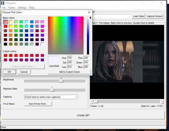
Then, I bring the “colorize” option down to 90 to increase the effects of shadows.

Last thing to do is click create gif! It’ll take a few seconds, especially for longer gifs, so be patient. ALSO there is a good chance you’re going to get a message saying something to the effect of “this gif is too big for tumblr’s photo limit.” Feel free to ignore that; the software being old means it still has the photo limit as 2gb when now it is 5-6gb so almost any gif you make will be considered “too big.”
Your gif now shows up in a preview tab! It should also show up as a file labeled “insta” on your desktop.

Here is the gif so far.

You can end here if you want. But when using instagiffer, I always go to ezgif to brighten up the colors further.
This part is basically the same as how you would color a gif you made in ezgif (see this tutorial) but I’ll quickly walk through what I do.
Go to ezgif.com/effects. Click chose file and upload your gif. First, you’re going to want to up the saturation, brightness, and contrast. You have to play around with these functions a lot because every scene is different, but in general, I have my saturation up pretty high and my brightness and contrast at at least 8. For a scene as dark and desaturated as this, I put saturation at 200, brightness at 12, and contrast at 16.
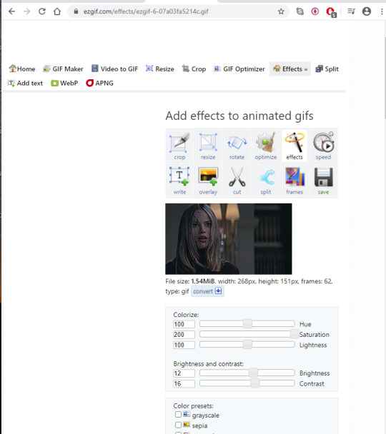
Afterwards, you want to go down to “color presets” and select “tint.” In my other tutorial, I recommended tinting with a light red or light blue, but for gifs made on instagiffer, I tend to use a light yellow/gold. I already tinted the gif purple in instagiffer so adding yellow in ezgif tends to balance it out. The shade I used for this gif is #fffcf0.
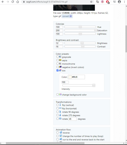
If the gif ends up looking too yellow, either decrease saturation, or click the “effects” button under the gif and add a layer of light purple to balance the colors more.
Your final gif should look like this.

2. Making a gif with the “capture screen” feature
This only changes the method of how you get gif frames. Everything related to resizing, coloring/effects, and adding captions is the same as above.
What if you don’t have a download of the thing you want to gif? The great thing about instagiffer is it has a built in screen recorder so you can gif any video you want, even if you can’t download it (or if you’re like me and don’t want to deal with downloading a 45 minute episode of something just to gif one scene).
To use this tool, click on the “capture screen” button on the top right corner next to “load video.” Then this screen will pop up.

You’re going to want to take this blue screen over to the screen you want to capture. I’m going to put it over the youtube video I am giffing. Adjust it so the only thing it’s focused on is the video and set the length in seconds. I usually set it for longer than the clip is just because it’s easier to remove extra frames than rerecord a scene. There is also sometimes a lag so starting it right before the scene you want to gif helps with that. For example, if the clip I’m giffing is 3 seconds long, I set it to 3.5. Then start running the video and click “start” on the screen!

Your frames will now show up on instagiffer. Everything is the same, except you can’t change the frame rate or timing. Go ahead and delete frames that you don’t need by clicking on them. After that, just use the same resizing, and coloring method I outlined above.

Some notes:
When using the video download option, the effects you use will save, as will the size of the gif. So if you gif one part of a video, then move the time stamp to another part, it will stay in whatever size you put the gif as. However, when using screen capture, you have to resize the gif and go to the effects menu each time because they reset after each use of the screen recorder.
You can also just paste a youtube link into the white bar at the top of instagiffer to gif it, but I’ve found that the quality is much better if you download or use the capture screen.
To crop a gif, move the red box around (just make sure it stays the right width size!)

If you are using the screen recorder and only want to record part of the video (like just a characters outfit) size the gif recorder so it’s just surrounding the part of the video you want to see.
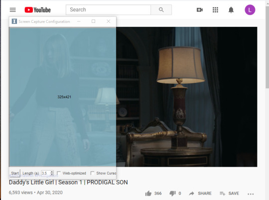
I hope this made sense lol, it took me a few days to write it all so please let me know if you have questions or need anything clarified! Support me on Ko-Fi if you’d like and are able 💕💕💕
#gif tutorial#giffing tutorial#giffing#gifmaking#mine#my gifs#blood //#long post#@ anon hope this helps!
82 notes
·
View notes
Text
Oh for fuck's sake, not this fucking bullshit again (cryptography edition)

America, Canada, New Zealand, the UK and Australia are in a surveillance alliance called The Five Eyes, through which they share much of their illegally harvested surveillance data.
In a recently released Statement of Principles on Access to Evidence and Encryption, the Five Eyes powers have demanded, again, that strong cryptography be abolished and replaced with defective cryptography so that they can spy on bad guys.
They defend this by saying "Privacy is not absolute."
But of course, working crypto isn't just how we stay private from governments (though god knows all five of the Five Eyes have, in very recent times, proven themselves to be catastrophically unsuited to collect, analyze and act on all of our private and most intimate conversations). It's how we make sure that no one can break into the data from our voting machines, or push lethal fake firmware updates to our pacemakers, or steal all the money from all of the banks, or steal all of the kompromat on all 22,000,000 US military and government employees and contractors who've sought security clearance.
Also, this is bullshit.
Because it won't work.
Here's the text of my go-to post about why this is so fucking stupid. I just can't be bothered anymore. Jesus fucking christ. Seriously? Are we still fucking talking about this? Seriously? Come on, SERIOUSLY?
It’s impossible to overstate how bonkers the idea of sabotaging cryptography is to people who understand information security. If you want to secure your sensitive data either at rest – on your hard drive, in the cloud, on that phone you left on the train last week and never saw again – or on the wire, when you’re sending it to your doctor or your bank or to your work colleagues, you have to use good cryptography. Use deliberately compromised cryptography, that has a back door that only the “good guys” are supposed to have the keys to, and you have effectively no security. You might as well skywrite it as encrypt it with pre-broken, sabotaged encryption.
There are two reasons why this is so. First, there is the question of whether encryption can be made secure while still maintaining a “master key” for the authorities’ use. As lawyer/computer scientist Jonathan Mayer explained, adding the complexity of master keys to our technology will “introduce unquantifiable security risks”. It’s hard enough getting the security systems that protect our homes, finances, health and privacy to be airtight – making them airtight except when the authorities don’t want them to be is impossible.
What these leaders thinks they're saying is, "We will command all the software creators we can reach to introduce back-doors into their tools for us." There are enormous problems with this: there's no back door that only lets good guys go through it. If your Whatsapp or Google Hangouts has a deliberately introduced flaw in it, then foreign spies, criminals, crooked police (like those who fed sensitive information to the tabloids who were implicated in the hacking scandal -- and like the high-level police who secretly worked for organised crime for years), and criminals will eventually discover this vulnerability. They -- and not just the security services -- will be able to use it to intercept all of our communications. That includes things like the pictures of your kids in your bath that you send to your parents to the trade secrets you send to your co-workers.
But this is just for starters. These officials don't understand technology very well, so they doesn't actually know what they're asking for.
For this proposal to work, they will need to stop Britons, Canadians, Americans, Kiwis and Australians from installing software that comes from software creators who are out of their jurisdiction. The very best in secure communications are already free/open source projects, maintained by thousands of independent programmers around the world. They are widely available, and thanks to things like cryptographic signing, it is possible to download these packages from any server in the world (not just big ones like Github) and verify, with a very high degree of confidence, that the software you've downloaded hasn't been tampered with.
Australia is not alone here. The regime they proposes is already in place in countries like Syria, Russia, and Iran (for the record, none of these countries have had much luck with it). There are two means by which authoritarian governments have attempted to restrict the use of secure technology: by network filtering and by technology mandates.
Australian governments have already shown that they believes they can order the nation's ISPs to block access to certain websites (again, for the record, this hasn't worked very well). The next step is to order Chinese-style filtering using deep packet inspection, to try and distinguish traffic and block forbidden programs. This is a formidable technical challenge. Intrinsic to core Internet protocols like IPv4/6, TCP and UDP is the potential to "tunnel" one protocol inside another. This makes the project of figuring out whether a given packet is on the white-list or the black-list transcendentally hard, especially if you want to minimise the number of "good" sessions you accidentally blackhole.
More ambitious is a mandate over which code operating systems in the 5 Eyes nations are allowed to execute. This is very hard. We do have, in Apple's Ios platform and various games consoles, a regime where a single company uses countermeasures to ensure that only software it has blessed can run on the devices it sells to us. These companies could, indeed, be compelled (by an act of Parliament) to block secure software. Even there, you'd have to contend with the fact that other states are unlikely to follow suit, and that means that anyone who bought her Iphone in Paris or Mexico could come to the 5 Eyes countries with all their secure software intact and send messages "we cannot read."
But there is the problem of more open platforms, like GNU/Linux variants, BSD and other unixes, Mac OS X, and all the non-mobile versions of Windows. All of these operating systems are already designed to allow users to execute any code they want to run. The commercial operators -- Apple and Microsoft -- might conceivably be compelled by Parliament to change their operating systems to block secure software in the future, but that doesn't do anything to stop people from using all the PCs now in existence to run code that the PM wants to ban.
More difficult is the world of free/open operating systems like GNU/Linux and BSD. These operating systems are the gold standard for servers, and widely used on desktop computers (especially by the engineers and administrators who run the nation's IT). There is no legal or technical mechanism by which code that is designed to be modified by its users can co-exist with a rule that says that code must treat its users as adversaries and seek to prevent them from running prohibited code.
This, then, is what the Five Eyes are proposing:
* All 5 Eyes citizens' communications must be easy for criminals, voyeurs and foreign spies to intercept
* Any firms within reach of a 5 Eyes government must be banned from producing secure software
* All major code repositories, such as Github and Sourceforge, must be blocked in the 5 Eyes
* Search engines must not answer queries about web-pages that carry secure software
* Virtually all academic security work in the 5 Eyes must cease -- security research must only take place in proprietary research environments where there is no onus to publish one's findings, such as industry R&D and the security services
* All packets in and out of 5 Eyes countries, and within those countries, must be subject to Chinese-style deep-packet inspection and any packets that appear to originate from secure software must be dropped
* Existing walled gardens (like Ios and games consoles) must be ordered to ban their users from installing secure software
* Anyone visiting a 5 Eyes country from abroad must have their smartphones held at the border until they leave
* Proprietary operating system vendors (Microsoft and Apple) must be ordered to redesign their operating systems as walled gardens that only allow users to run software from an app store, which will not sell or give secure software to Britons
* Free/open source operating systems -- that power the energy, banking, ecommerce, and infrastructure sectors -- must be banned outright
The Five Eyes officials will say that they doesn't want to do any of this. They'll say that they can implement weaker versions of it -- say, only blocking some "notorious" sites that carry secure software. But anything less than the programme above will have no material effect on the ability of criminals to carry on perfectly secret conversations that "we cannot read". If any commodity PC or jailbroken phone can run any of the world's most popular communications applications, then "bad guys" will just use them. Jailbreaking an OS isn't hard. Downloading an app isn't hard. Stopping people from running code they want to run is -- and what's more, it puts the every 5 Eyes nation -- individuals and industry -- in terrible jeopardy.
That’s a technical argument, and it’s a good one, but you don’t have to be a cryptographer to understand the second problem with back doors: the security services are really bad at overseeing their own behaviour.
Once these same people have a back door that gives them access to everything that encryption protects, from the digital locks on your home or office to the information needed to clean out your bank account or read all your email, there will be lots more people who’ll want to subvert the vast cohort that is authorised to use the back door, and the incentives for betraying our trust will be much more lavish than anything a tabloid reporter could afford.
If you want a preview of what a back door looks like, just look at the US Transportation Security Administration’s “master keys” for the locks on our luggage. Since 2003, the TSA has required all locked baggage travelling within, or transiting through, the USA to be equipped with Travelsentry locks, which have been designed to allow anyone with a widely held master key to open them.
What happened after Travelsentry went into effect? Stuff started going missing from bags. Lots and lots of stuff. A CNN investigation into thefts from bags checked in US airports found thousands of incidents of theft committed by TSA workers and baggage handlers. And though “aggressive investigation work” has cut back on theft at some airports, insider thieves are still operating with impunity throughout the country, even managing to smuggle stolen goods off the airfield in airports where all employees are searched on their way in and out of their work areas.
The US system is rigged to create a halo of buck-passing unaccountability. When my family picked up our bags from our Easter holiday in the US, we discovered that the TSA had smashed the locks off my nearly new, unlocked, Travelsentry-approved bag, taping it shut after confirming it had nothing dangerous in it, and leaving it “completely destroyed” in the words of the official BA damage report. British Airways has sensibly declared the damage to be not their problem, as they had nothing to do with destroying the bag. The TSA directed me to a form that generated an illiterate reply from a government subcontractor, sent from a do-not-reply email address, advising that “TSA is not liable for any damage to locks or bags that are required to be opened by force for security purposes” (the same note had an appendix warning me that I should treat this communication as confidential). I’ve yet to have any other communications from the TSA.
Making it possible for the state to open your locks in secret means that anyone who works for the state, or anyone who can bribe or coerce anyone who works for the state, can have the run of your life. Cryptographic locks don’t just protect our mundane communications: cryptography is the reason why thieves can’t impersonate your fob to your car’s keyless ignition system; it’s the reason you can bank online; and it’s the basis for all trust and security in the 21st century.
In her Dimbleby lecture, Martha Lane Fox recalled Aaron Swartz’s words: “It’s not OK not to understand the internet anymore.” That goes double for cryptography: any politician caught spouting off about back doors is unfit for office anywhere but Hogwarts, which is also the only educational institution whose computer science department believes in “golden keys” that only let the right sort of people break your encryption.
https://boingboing.net/2018/09/04/illegal-math.html
58 notes
·
View notes