#unholy geometry
Explore tagged Tumblr posts
Text
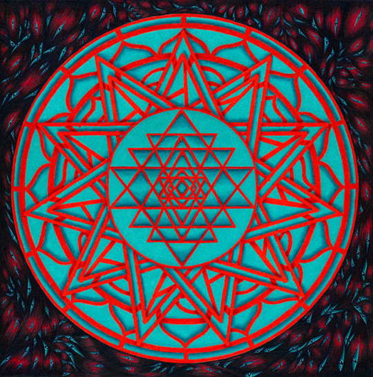
This was commissioned promotional art for my friend Tim Burke, an author of the strange, horrific, and humorous (all at the same time). The novel is called Saints of Flesh, a sequel to his first novel, Flesh Sutra.
For this promotional art, Tim wanted a magical emblem that utilized sacred geometry, but it needed to be "evil" sacred geometry. He provided several designs he liked that were proper geometric diagrams, as well as a traditional yantra design, and said to me, pervert them. He wanted them to be eye-searing, almost painful to look at. They needed to be off; the measurements and shapes tweaked so that they're just a hair out of true.
I'd originally wanted to make all the red linework into bones, but after we played around with designs back and forth, Tim favored a simpler approach. The red and aqua dance in front of my eyes, and tweaked just a little in Photoshop, the design is deliberately almost painful to look at for very long. Tim, of course, has made merchandise out of it, so it can be wrongity-wrongly-wrong on all kinds of stuff, including t-shirts and laptop stickers, and all kinds of cool stuff.
I worked out the geometric design on the computer, printed it out, then colored it with Prismacolors. The dark background is also Prismacolor. I don't know if it shows up well here, but the imagery is comprised entirely of muscle fibers and eyes. Lots of eyes. Oh God, So Many EYES.
#yantra#evil yantra#unholy geometry#not so sacred geometry#don't try this at home kids#aaaah my eyes they burn#color juxtaposition#color clash#muscles#eyes#horror art#weird art#commission art#promotional art#traditional art#traditional media#prismacolor
7 notes
·
View notes
Text

Ready for the end
5 notes
·
View notes
Text

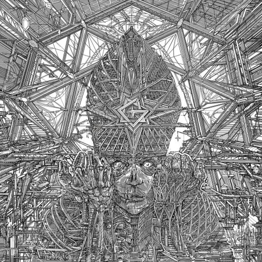

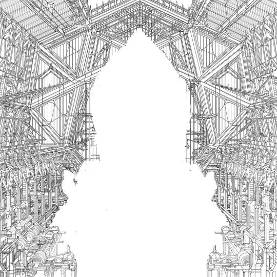
From Zbigniew M. Bielak:
Before it became what you all know, Impera started out as a whole different beast. When I began working on the cover art, I was still very much oriented towards dark and unsettling vibes set by Mgła and Imperial Triumphant cover artworks I did not long before. In my work I always strived to balance elusive feeling of unease and some kind of monumentalism, as I believe that’s what makes art great. It’s not easy and it relies on nuance if anything. So naturally I wanted to convey such grim vibes on Impera, pushing it toward Giger vibes present on To Mega Therion cover as it resonated very well with the Crowley theme. Albeit less literal and more abstract with emphasis on unholy geometry of heptagrams and new grucifix. In the meantime we decided to bring out the cathedral interior and as you can see from last images, I redrew all the architecture retaining basic geometry along the cityscape on back cover. I also mirrored the centerfigures face and hands for I believe much better visual balance. So, there you go - everything good is born in throes of painful process. And all that for the better in the end. Enjoy.
788 notes
·
View notes
Text
Evolution of writing smut
Stage 1: Nervously taps keyboard like it’s a live grenade. Spends an hour Googling “fancy word for penis.” Finally types “cock” and immediately logs off for three days to recover. Uses phrases like “sensitive bundle of nerves” because calling it a clit feels too unholy
Stage 2: Takes three shots, rips a bong, and decides shame is for mortals. Types with the raw, unhinged energy of someone who’s Googled “how much cum is too much cum” and lived to tell the tale. Suddenly, every sentence is an orchestral arrangement of obscene filth: “throbbing” this, “glistening folds” that, “the sacred geometry of his cumshot” somehow makes it in there. Slams ‘publish’ and bellows, “GET IN HERE, YOU FILTHY SWINE, DINNER IS SERVED!”

#i’ve been writing smut under the influence again#ao3 memes#ao3 shitpost#smut writer#smut is hard until you decide it doesn’t have to be#true story
54 notes
·
View notes
Text
About Me💤

💤Names you can call me💤
Morpheus, Moop, Dream(Preferred), Mystic(Preferred), Birbo, Nightmare
💤Gender💤
Nonbinary/Gendervoid/Novarian
I seem to be one of Liminality and of the unknown void .The gender is there, but sometimes it is not... It stretches into the formless abyss. For the sake of my sanity, I just but if I had to put a term to it it would be gendervoid or Novarian(Masc Nonbinary)(Preferred Pronouns are He/Him They/Them, it/its but you can use any)
💤Orientation💤
Asexual Panromantic
💤Myers Briggs💤
INTJ-A
💤Enneagram💤
5w4
💤Alignment💤
Chaotic Neutral
💤💤💤💤💤💤💤💤💤💤
I am a Hellenistic pagan and a Demonolator who specializes in Astral work, Energy work, oneriomancy, Divination, baneful magick, Chaos Magick and Celestial/Cosmic magick and Chthonic Deities and Demons
My patron deity is Morpheus
Patron Demon is Prince Stolas
Spirit spoused to Volo from Pokemon(pcp) he is my fictional other ie I self ship with him (yes he is a pop culture pagan entity that exists and he is fiercely in love with me apparently and unhinged as f)
💤Beliefs and Philosophy💤
Pantheist and Neo-platonist with a bit of animism(spirituality)
Luciferian ( morality)
Ethical and Existential Nihilism
Pessimist(Outlook on Life)
Relativism
Agnostic on some things tho
☆Zodiac: Pisces Sun(♓) Capricorn Moon(♑) Scorpio Rising(♏)
💤INTERESTS💤
Astronomy and Cosmology
Philosophy
Botany
Demonology and Angelology
Occultism and witchcraft
Mythology/Ancient History
Dreams and sleep science
Quantum physics
Ornithology
Psychiatry and Jungian Psychology
Geometry
Weird, dark, obscure, disturbing things in general
💤Other things I like💤
☆Writing(I write poetry)
☆Stargazing
☆Reading(Mostly Nonfiction, Classical Lit and Horror)
☆Heavy metal(Doom metal mostly)
☆Classic vinyl(60s and 70s with some 80s)
☆Gothic/Etherealwave/anything of that genre(newer to it and always looking for more bands of that nature)
☆Dark Blue, Dark purple, and black are my favorite colors
☆Neil Gaiman's The Sandman and Doctor Strange
☆Pokemon
☆I love Hazbin Hotel and Helluva Boss(I don't like Vivian as a person, though)
☆Anime
☆I love birds, especially corvids and owls
☆I own a black void kitty named Alice Cooper
☆parent of many photosynthetic children
☆I love collecting Oddities, Curiosities and Antiques
☆Misc☆
☆Neurodivergent up the ass(on spectrum)
☆Ravenclaw/Slytherin hybrid
☆expect some dark sarcastic humor from me
☆I am Gothic and voidpunk with some dark whimsigoth/Occult and Dark/Natural/Space Academia in fashion and aesthetic(Also WeirdCore , Psychedelic/Surreal, Dreamcore aesthetics are appealing as well). Liminal spaces are my j a m
☆I am an Otherkin/Therian/Fictionkin. My main Fictotypes are Dream of The Endless( The Sandman), Stolas(Helluva Boss), Giratina (Pokemon),Stephen Strange(Marvel), Aaravos(The Dragon Prince), Alastor(Hazbin Hotel), Princess Luna (My Little Pony) and Lord Sesshomaru (Inuyasha) My top otherkintypes are Fallen Angel /Demon, Angel/Seraphim, Eldritch/Void/Cosmic being, Corvidae (Cladiotherian), Jersey Devil. In general I am just here as a being of stars and thought up dreamscapes a borderline liminal conglomerate of holy and unholy abstractions

24 notes
·
View notes
Text

My first art fight attack ever, featuring The King from bestie @lemon69lol . This piece in my mind is linked to jerma and I can tell you exactly why: I had to study the planes of the face for this one and for some unholy reason I saw default man geometry and thought of jerma
uncropped full piece (and how it was submitted to af):

#recently had someone reblog a 0 notes post of mine saying it was the craziest mental illness post theyd seen. yeah#art fight#artfight 2024#artfight#artfight team stardust#artfight attack#artfight friendly fire#thinking of redoing this one next year or in some time cause I dont feel great about the colours#and also the background isn't as 3d as I would have liked#cause I got fatigued and also my computer was edging an explosion cause I had like 60 overlay layers
7 notes
·
View notes
Text
The Two Worlds of Highrook
(part 2 ) Nibiru

“Nibiru, the hidden twin, the unseen mirror, the cast shadow. A citadel island outside of time, created by The End to act as a shelter and a rebuke.” - The path across the water - Vilicent Moore
Niburu is a mirror world accessible only in dreams and ritual. It exists alongside the mundane world of BlackSands like a shadow, an ethereal isle of twisted terrain and cyclopean geometry. Dark tides lap at its ashen beaches, forming a barrier between the waking world and the nightmare domain.
Beyond the shore Nibiru is walled in labyrinthine circles, like Dantes visions. Strange geometric divisions, marking time and territory, like ripples frozen in water. Each circle is host to its own unholy denizens and uncanny architecture.
Nibiru floats outside of time or space and is only accessible through gateways that exist in the darkest corners of the earth or the deepest chambers of the mind. It cares not for the sunlit world and waits patiently for its demise. The Watchers of the First Circle writhe upon the ramparts, marking the fading sun with their unceasing gaze. The Key stands before the prismatic gates.

Influences
The mirror world that lurks unseen alongside Blacksands is named after the myth of the Niburu Cataclysm. This is a rich and multifaceted legend based on the idea that an unseen planet will one day destroy the earth, in an unavoidable catastrophic collision.
Although recent iterations of the idea are linked to millennial era conspiracy theories, the original source is taken from ancient Mesopotamian and Sumerian texts. In these texts, Nibiru is the "star of Marduk" - one of the most powerful gods of the Babylonian era
In the various interpretations this planet (also known as Planet X or Marduk) is described as invisible, hidden by astrospacial effects, or able to warp in and out of our dimensional plane. It is the home to a sentient alien race, described as gods by the ancient sumerians. It was part of the inspiration for the Lars Von Trier film Melancholia and has frequently resurfaced as part of internet memes and conspiracy theories. It is also a term in Akkadian language for a crossing or equinox.
All of these elements make the myth a rich and inspirational source for the creation of its 'reflection' in Highrook. I'm not trying to create an accurate version of the myth in the game, but I am using the amazing premise and evocative lore as a seed to create my own dark mirror world - A cosmic shadow plane, an island citadel, home to transfigured beings, once human but now ‘ascended’ and incorporated into a pantheon of powerful nightmarish beings.
Just as the waking world of Blacksands emerged from my interest in the cities of gothic fiction and cosmic horror, the unseen twin of Nibiru is inspired by countless myths of hidden apocalyptic worlds..
4 notes
·
View notes
Text

Unholy Geometry
Geometric Pride just because.
(If tumblr view screws up resolution, try viewing this in my Sheezy.)
#Pride#postcreated pride#postcreated#creature#traditional art#artists on tumblr#sin things#geometric art#original thing is 60 cm high#and it wasn't a black paper all bg is colored#metallic watercolors were used on Pride itself
11 notes
·
View notes
Text
hot take but I think the fantasy Event Horizon director's cut should have less gore and more of the character building moments. Less is more.
The more ambiguity about whether it was a mass hallucination, the more left to the imagination and conveyed by the actors reactions to what they saw off-screen, the better the film.
The set design, the lighting, the incredible acting speak for themselves - I think those things are so strong you could have a PG-13 rated cut with a single f-bomb (Fishburne's "Fuck this ship!" of course) that still leaves you sleepless.
-------------------------------
9/10 film. Would have been 10/10 without the extra gore.
As Anderson himself says, after a certain amount the viewer's imagination is stretched too far and you start to rationalize the rubber props and fake blood. The anatomy is off for PJ's death, the fire's effects are off even for different gravity, the carefully acted distress of the crew isn't present in the shock imagery. That's the one point against it, that and the prevailing belief that it's about a literal hell when that's refuted in the text.
==== I love this film ====
It is breathtakingly beautiful. the sets, the effects, the lighting, the filters, subliminal symbology everywhere. The acting, the way the world is lived in and their relationships are shown to us by the way the actors touch each other and move around their ship.
Within the first five minutes we have everything we need to know: Weir is a self-absorbed "genius" who hesitates over his jugular while shaving, Miller is an efficient and empathetic search and rescue lifeguard captain with full devotion to his crew which is fully returned.
Each member of the crew has their backstory in their mannerisms and design: we have a superstitious pilot with an ankh back tattoo, the sun-starved surgeon has scalpels on a utility vest and encourages you to smoke, the women are "one of the boys" facing the same ol' sexist banter from lovable rogue Cooper, but also respected in their fields. That's show not tell in impeccable detail.
We get a quick meet and greet verbal introduction to the crew at the 10-minute mark. We're introduced to the ship and its gothic, unholy geometries at 25. The design elements invoke a hybrid between the awe of a cathedral and the disgust of an intricate medieval torture device. The technology is robust and, except for an optical drive disk, future-proof.
This ship is a twisted Passion Play in design form with an evil seraphim of eyes within eyes, wheels within wheels as a beating heart engine. You don't have to be told that this thing demands worship and sacrifice, it is in your cultural subconscious.
It is in every jagged tooth and violence invoking shape engraved into the various panels and walls. The designers working on creating future warnings about nuclear waste would be pointing at different elements and yelling "Yes! That's it! Universal, visceral, primal signs of danger! Colours of disease!"
We're in a psychological thriller: the first real violence is a full 50 minutes into a 1h30 runtime and it's a plausible hazard of the job, shown with an unflinching camera with real time tension.
We spend the next ten minutes being gaslit by Weir into believing the ramping violence of the 'haunted house' might just be in our heads until the captain and crew subvert the horror trope and GET OUT. Fantastic story telling, very smart.
We now switch genres. again. to an ultra violent possession and slasher movie with a switch in tone for the ending: rewritten to be just open-ended enough to wonder if it was a shared psychotic frenzy, something supernatural or something natural but beyond humanity's understanding. A nice bookend to that almost campy over the top blood fest of a last half hour where Fishburne is the grounding force to Sam Neill's insane monster.
The CGI is in service to the practical effects and near seamless despite the age, it's mostly composite work on miniature sets and for zero gravity liquids. I honestly don't know how Mortal Kombat guy managed to get this kind of acting and photography talent to work on a space horror.
It feels a lot like the glitch that was Hannibal the TV show, art that wouldn't get made if the money men had known exactly what was involved and art that is bordering on schlocky but toeing a line that makes it brilliant. A kind of art that is achieved with a lot of talent and dedication but also the enforced limitation of The Edit.
I really think that the multiple test screenings and edits made this film better: it's like Robocop vs Showgirls*, Event Horizon vs Resident Evil*: the edits saved us from a movie that went too far and came out silly.
It's a film that feels rare.
*you already know I like both.
11 notes
·
View notes
Text
Hello Tumblr, it's been a while. Once again I find the specters of literary analysis haunting my blood screaming for release, and you are my favorite void in which to scream. Today we're taking a departure from Dune to talk about some thoughts regarding the horror genre and why I think It really knocks it out of the park.
Famous racist H.P. Lovecraft in his essay Supernatural horror in fiction asserts that the earliest human emotion is fear and the oldest fear is that of the unknown.
I largely agree with what Lovecraft is getting at here that the unknown is the key to eliciting a feeling of fear, even if the primacy of an emotion having to do with age feels weird. Please, Tumblr, understand that I do not share his opinions regarding the Chinese, but the guy was among the first to pick apart the horror genre to find out what made it tick.
Lovecraft's expression of fear of the unknown is decidedly dated, even aside from the bigotry. His writing is famously full of 'Dear reader I dare not describe what I beheld' sort of stuff. It's even more diminished in the public eye by the fact anyone with internet access has a very clear image of Cthulhu as being like a squid dragon as depicted in the sculptures in its eponymous story despite once they actually find the thing and run a boat into it it's like some geometry violating cloud thing.
The thing I do appreciate about Lovecraft is that he's never actually under any compunction to explain anything. Polaris starts with the line 'I am a scholar of the Pnakotic Manuscripts' and that's all we really get. There's an economy of words here in letting us know the narrator is an academic and the subject of his studies is something with an unholy assembly of consonants suggesting it is very strange. In Call of Cthulhu everything we know about the cult and its intentions is communicated by the phenomenally unreliable character of Cesar, who shines a light on the global scale of the operation, fleshing out the worldbuilding while only leaving us with more questions.
Now I'm not breaking any new ground by singing the praises of Stephen King. Dude's far from perfect, and his idiosyncratic style makes all sorts of people just bounce right off, but I think It is probably the best example in the public eye of this 'fear of the unknown' thing in practice. See, for King 'nightmare' is not just a word you use to describe a scary situation. In a nightmare, you feel like there's some hidden logic to the world you can't quite understand. There's a terrible sense of foreboding that preceeds the terror because our brains are familiar with that script. Even if something isn't implicitly awful, there is a pervasive wrongness that our subconscious latches onto.
So lemme just take a second to underline the fact that a clown in a sewer is really fucking bizarre. Like yeah, we're 40 years out from the Tim Curry movie and it's ingrained into the public concious, but please do your best to imagine your response to a sewer clown in an Itless universe. It is important to dispell the whole 'Oh yeah, that old chestnut, the sewer clown' to establish how totally surreal this famous scene actually is.
The thing I think is the real masterstroke is the line 'We all float down here. You'll float too!' Nowhere in the book do we have any inclination of what the fuck that means. There is a threat implicit to it; whatever future Pennywise has planned is not gonna be good, but it's not like there's anything implicitly wrong with floating. The story prominently involves a toy boat, several sinister balloons, a semi-aquatic clown monster, and moments of disconnectedness from reality. If you're a ginormous nerd, you'll know that in the Stephen King Multiverse, the nightmare that manifests as Pennywise is trapped between realities, 'floating' in a gloaming space. There are many floating things, but there's no real explanation. Rather than being point blank 'The thing is impossible' like Lovecraft does, we're given a box of puzzle pieces that seem like they make a complete picture and the slowly dawning realization none of them actually fit together.
2 notes
·
View notes
Note
Looking forward to Super Manticore Ball coming from the marble experiment. "Hold still to become invisible" would even work well as an integral mechanic!
keeping the marble still... in a marble maze game.... the ultimate test of skill, on god..., Y'know, I haven't really thought about the context of marble game much yet. Right now it's just a wooden board with a metal marble (the reflective metal is just an excuse to get away with a single billboarded sprite :3c), but it'd be cool to switch up the context... maybe it's an intricate key to unlocking a device, or perhaps you're just rolling a pillbug around in a shoebox. Typically I'll go into something with a pretty solid idea of how I want to present it, but since the aim largely amounts to a vague "get a Thing working on the N64", I haven't really given the presentation much thought. The only question in my mind as of late is "how in the h*ck do i handle collision" (there's no "game engine" here so I get to figure out how to program that from scratch, yay yippee!!) Similarly I also haven't thought much about the end goal of the Manticore model... again it's primarily an exercise to learn how to model a character that looks halfway decent. I've got OCs, sure, but no visual reference for them (at least I can't draw much myself nor afford commissions of em atm). And god the visual reference helps soooo so much when it comes to working out the shape of a thing in 3D space. So the ongoing hyperfixation brainrot of a particular Arknights character-- one that has both official reference art and a bunch of fanart-- seemed like a natural choice of subject xD
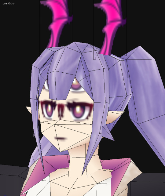
But if I can be brutally real about it... I don't think the model is gonna suit itself to *actually* run well on the N64. It's still fairly dense in terms of tri count, especially in the head/face area, like augh look how much is going on here. And for the love of all that is unholy I do not know how to model low poly hair. It's either an awkward clump of too much geometry-- something more reminiscent of 6th gen than 5th-- or it looks real flat and lifeless, with that perfect middle ground always escaping my grasp. Maybe someday I'll crack that code, but I have the sneaking suspicion that the character has to be designed with these limitations in mind from the outset. or maybe that's just an excuse for not knowing much lol I could potentially slap her in marble game if I can manage to think up a context that works... I'll have to let my brain sit on the whole presentation thing while I whittle away at optimizations and physics nonsense. Mark my words, whatever I wind up doing with the Manticore model... it's gonna be yuri.
#ough that sure is a wall of text alright#uuhhhuhh how does tagging work again#ask#gubdev#uhhhhhhh#instead of brain there is manticore and matrix math
6 notes
·
View notes
Text
Due to some unholy syzygy, some maddening eldritch geometry, my butthole and my toilet are so perfectly spaced out to splash directly upon my pucker EVERY time I shake a turd loose.
I truly am a cursed, wretched thing to be beloved by beast and man yet scourged by fate.
0 notes
Text
I was reserching mathematical paradoxes for a math project and like,
Who give math fucking steroids.
At first its like: look at this series of numbers the answer looks integer doesn’t it, well fuck you it is ½ because of geometry . Then it is like look at this ball, now see me dived this ball into two balls that each have the volume of the first one with some sets tomfoolery. Then just forgot about physics. This horn has unlimited surface and limited volume. We call it Gabriel's horn because we want to shove how hard we break all of his rules with mathematical mind fuckery to God's face. It is also used to symbolize the judgment day because we already turn God's order upside down and you can’t do shit about it. There is also mathematical jargon and I am still mad about that. Like you guys barely use words why do you need to modify regular normal words to fit into your unholy math magic purposes.
#math#paradoxes#this doesnt make any sense#why math why#rant#mathematics#if i die blame math paradoxes#...or math jargon
1 note
·
View note
Note
Hi, I was wondering if you had any general Vance headcanons? Like what his favourite subject is, what aftershave he uses (if he uses any??) and just general things like that? Thanks 🤍
Vance Hopper HC's
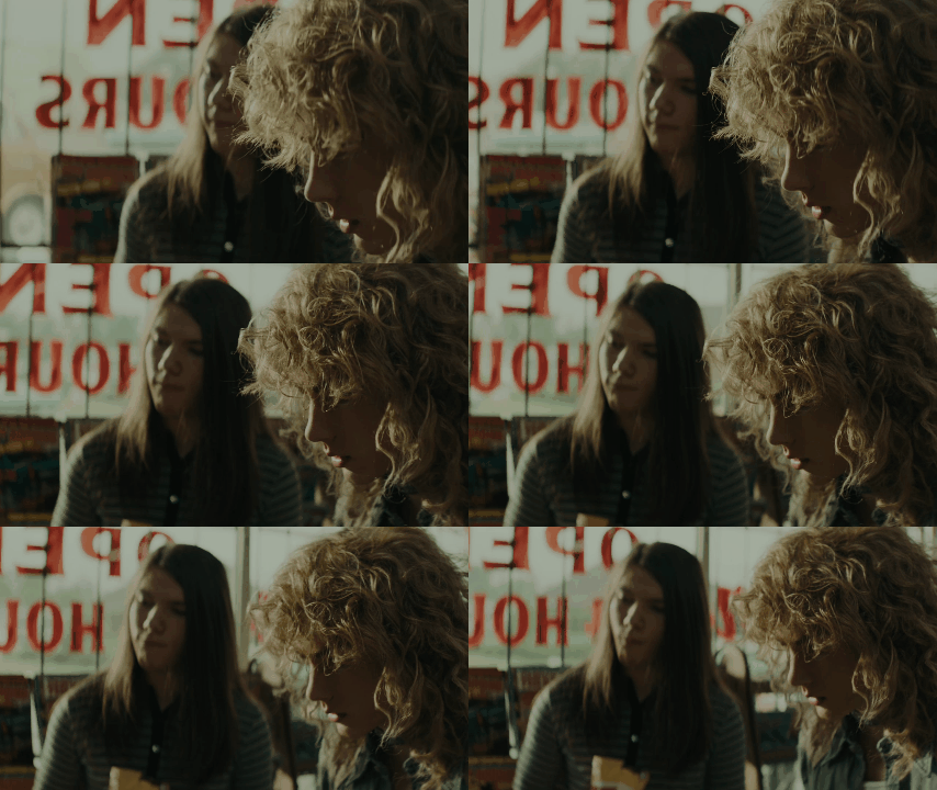
His favorite subject is math. He won't let people know but he's a total fucking math nerd. Specifically, Algebra. He hates Geometry tho
No clue about the aftershave thing but uhm, he's one of those guys who likes a clean shaven face. He doesn't care if people give him shit for it, he cannot stand having any stubble. Its more of a texture thing then anything, but he says "the chicks dig it"
I'm sorry guys but he would be one of those guys that spray whole cans of Axe body spray. You can smell him the moment he enters a room.
We've all established he hates getting his hair wet. He's like an angry cat. I also think his mom does his hair/is a hairdresser so she's very particular and strict after he gets his perm done.
He used to play basketball but got kicked off the team for fighting one of the other team members cuz they tripped one of his teammates on purpose.
We've already established within the fandom that hes autistic, and to expand on that, I think he often gets nonverbal. He doesn't like speaking a whole lot, and words just don't really process in his brain sometimes. People just think he's just a brooding and silent guy, but really his brain is running 500 mph and he's not focused on talking at that moment.
He stims with his feet a lot. Kicking things, kicking his feet into the dirt. He does the tappy feet thing when he is alone or with people he really trusts. Also makes little huffs and squeaks when he's nonverbal and excited.
Secretly likes wearing eyeliner.
I think if he was born in modern times, he would listen to so much ICP. Like my man would be obsessed with that shit. His favorite song would either be Imma Kill You or To Catch A Predator
He believes in ghosts and is secretly scared shitless of them
Another modern music thing, but he would lose his shit over Ghost, specifically Cirice.
His favorite candy is warheads probably. Anything that normal people would have a pained expression while eating. He loves sour candies, and he carries them around for when he's feeling overstimulated, because they help to ground him.
Chews gum constantly. Never mint gum. Its always some kind of fruity gum.
My man will absolutely tear up a bomb ass street taco. Absolutely fucks it up.
Loves unholy combinations of food. Will dip his oreos in nacho cheese (its really good yall should try it) and also gets like all the flavors of sodas from fountains. Like all of them and then drinks it like he didn't just commit the unholy sin of mixing sweet tea and powerade and Pepsi and mountain dew in one cup.
Secretly likes being acknowledged as pretty. Whether someone calls him a pretty boy or just compliments him the way they would a feminine person, he really likes it.
#the black phone#black phone edit#headcanon#vance hopper#vance hopper x reader#the black phone x reader
380 notes
·
View notes
Photo

1 note
·
View note
Text
I still can’t decide if my favorite part of the goofy outtake version of this render is the extremely large and shiny courgette, the rubber ducky, Jinana’s look of unholy glee, Marcus Aquila’s surprised!face, Julian’s eye as big as a dinnerplate, or the implication that they have been spanking his ass with bananas
Anyway, I felt the need to increase Julian’s body hair density by 30-40%, and it should show up well in tonight’s upcoming render - he was actually intended to be a bit hairier to start with, but too much geometry was a problem with my old GPU.
But now? TIME TO BE HAIRY
8 notes
·
View notes