#uncropped image because I’m lazy
Explore tagged Tumblr posts
Visit Tumblr Blog
Explore Tumblr blogs with no restrictions, modern design and the best experience.
Last Seen Tumblr Blogs


Fun Fact
Forty percent of Tumblr users are between the ages of 18 to 25.
Text

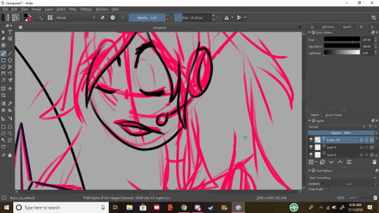
I tried to make some sexy propaganda for the @napoleonic-sexyman-tournament but . . . This seems a bit more like anti-propaganda 👉👈😅
#jean lannes#my art#digital art#uncropped image because I’m lazy#napoleon's mashals#ignore the bulge#look at him ✨respectfully✨
77 notes
·
View notes
Text
Rating Every Single Name of the Wind Cover
Why? Because I can. I am not a graphic designer, just a person with opinions.
Criteria for consideration: Must be a cover in a published edition of The Name of the Wind by Patrick Rothfuss. Hardcover, paperback, and ebook are all fair game, as are foreign language editions. Some editions reuse the same cover art, in which case I only rate one cover. Some editions modify cover art from another edition. If the differences are substantial, I’ll rate both.

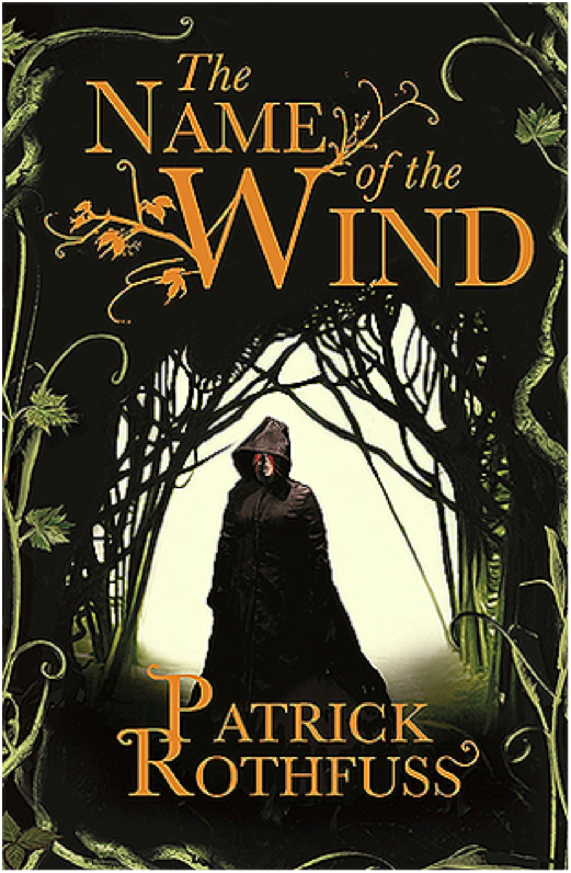
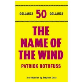
Kindle March 2007 Edition
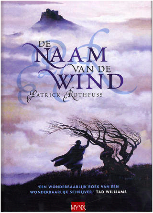
Ah, the famous shirtless redhead cover. This cover is a bit infamous in the fandom for being both bad and cringey. This is not good art. It’s cheesy. The shirtless aspect is silly, and the windswept hair is so windswept, you’d think Kvothe was in a tornado. Nice balance with the title and author text, although it looks like the title and author text are slightly off center.
3/10

Hardcover April 2007 Edition This is just a zoomed in crop of the above cover, which is a little lazy. It does make for a better cover image, except the creepy goat man bust has nothing to do with the plot of Name of the Wind. So I suppose they cancel out.
3/10

Mass Market Paperback April 2009 Edition
I despise this cover. It’s a lazy design, and the photo manipulation is terrible. Points I guess for good title text placement. But the photo manipulation is so! So! Bad! This is also the start of the trend of a hooded, cloaked figure with his back to the viewer staring out into the void. It is a bad trend.
2/10
Paperback UK June 2008 Edition
We’re still with the hooded, cloaked figure, but at least he’s facing front this time. I like the embellishment on the ‘W’ in the title text, although it gets a little pumpkin viney. Overall, it’s an ok cover. It doesn’t make me cringe, but it doesn’t grab the viewer’s interest, either.
4/10
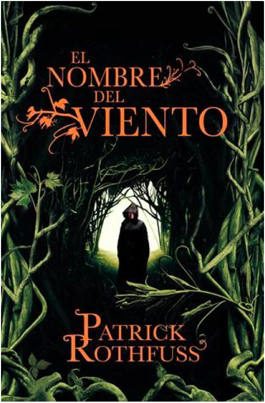
Paperback Spanish May 2009 Edition
Same image as the previous cover, but this one is uncropped and has a different plant border. I’m not sure how successful the changes are. On the one hand, shrinking the image of the figure makes the figure look more mysterious, which is good. But on the other hand, this is a bad plant border. I thought there was some corn on the right side for a minute.
4/10

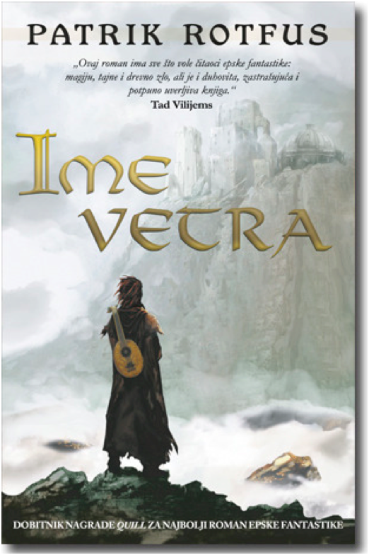
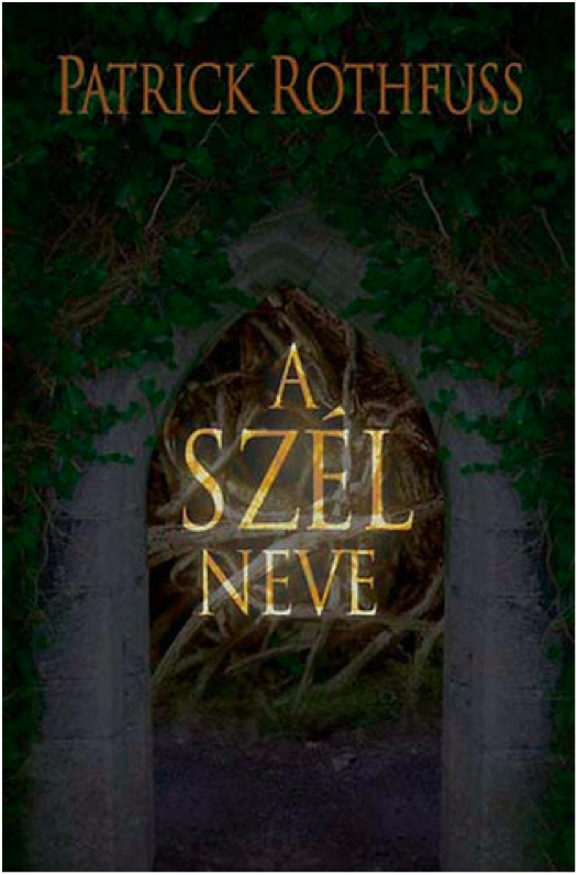
Hardcover 10th Anniversary October 2017 Edition
10th Anniversary edition got fancy, and it shows. I love the ruin influence in the title text, which is a great callback to the use of ruins in the novel and also a more creative and unexpected choice than making the title text leafy. That being said, the “of the” in the title text is very oddly formatted and doesn’t fit the style. The cover illustration is pretty great, with lots of symbolism for old fans while still maintaining visual interest for new readers who are browsing and happen to pick the book up. The Cinder statue is delightfully creepy and much more relevant to the novel than the dumb pan statue from the earlier cover.
9/10

Paperback Turkish March 2007 Edition
Another trend starting here: Cloaked figure staring out at a city in the distance. I like the painting, at least what I can see of it. I find the choice to crop out most of the painting really bizarre. Is this supposed to be a telescope we’re looking through? And the leaves look like lily pads. The title and author text leaf embellishments are quite nice here, but I don’t know why there’s a metallic color shift. Overall, a poor use of space.
4/10
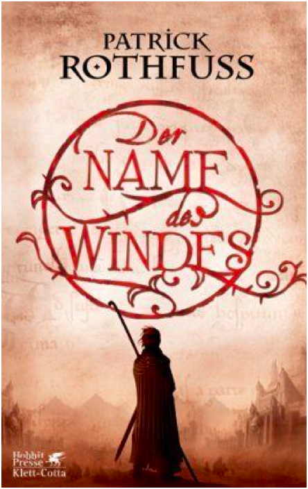
Hardcover German March 2007 Edition
Oh look! A cloaked figure staring at a city. What a surprise. I rather like the title text design, which is pretty creative and a good way to make the title visually appealing. I wish the city in the painting weren’t so damn faded and distant – I think it’s a mistake to keep the visual focus on the figure exclusively and only hint at the city beyond.
6/10
Paperback Portuguese September 2009 Edition
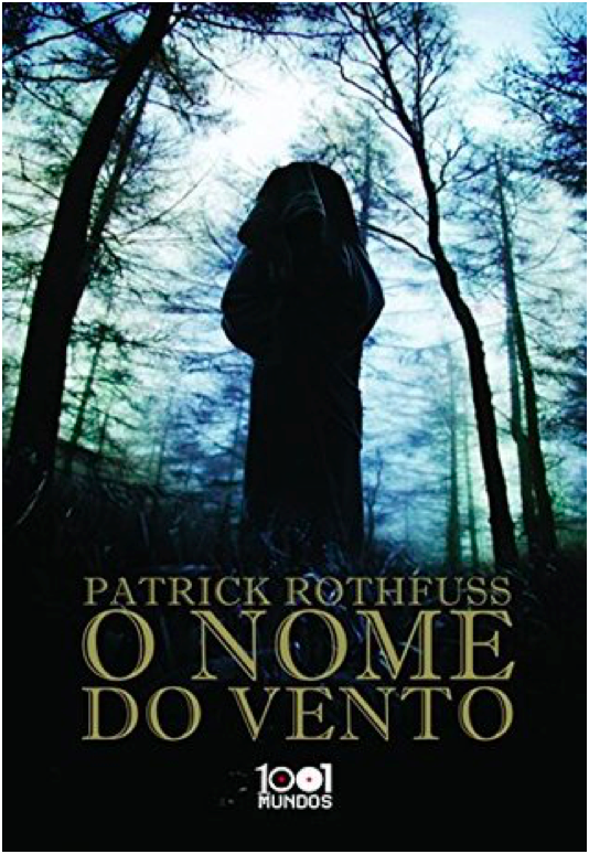
This cover is terrible. I would say the worst, but there’s more still to come. Anyways, this is incredibly bad. We’re once again with the hooded, cloaked figure with his back to the viewer, which is a lazy and uninteresting pose. The image is badly photoshopped and looks like an alternate movie poster for The Blair Witch Project. There’s nothing interesting about the image, nothing that interests the viewer. The title font isn’t boring, I guess. That’s the only good thing I have to say about this. 1/10

Paperback Portuguese July 2009 Edition
Still another cloaked figure staring off at a distant city, but this is one my favorite versions of this trope. The city is far enough in the middle distance that the figure is the main focus, but we can still see enough of the city to see that it’s cool looking. I’m glad to see the bridge from the books, which is a nice detail. The title text does a good job of filling in the empty space of the painting without crowding the other elements.
9/10

Paperback French November 2009 Edition
This is the same cover image as before, but it’s been cropped so that the figure is centered. I don’t like the change – the balance is better when the figure is off center. Also, the title text is way too big and dominates, which is unfortunate because the Spanish cover had such a lovely balance throughout. 7/10
Hardcover Dutch July 2007 Edition
Yet. Another. Hooded figure. Staring. At a city. Wow. This one has a tree, at least. The image is… fine? I might be kinder to it if I hadn’t seen several better iterations of this right before. Because so much of the image is shrouded in fog, there’s very little to go on in terms of visual interest. And while I don’t mind the shadowed, muted color scheme, it also means that there’s very little to distinguish the cloaked figure and make him intriguing. The shadow initials behind the title text is horrific and obscures the title somewhat, so docking a couple of points for that. 5/10

Hardcover UK January 2017 Edition
Ahahahaha. This looks like the My Neighbor Totoro edition of Name of the Wind. It’s very silly and lighthearted, but wholly inappropriate for a book whose reading level is above first grade. If this was a kid’s book, I’d give it full marks. But Name of the Wind is very much for adults, and this cover is way too young and childish.
1/10
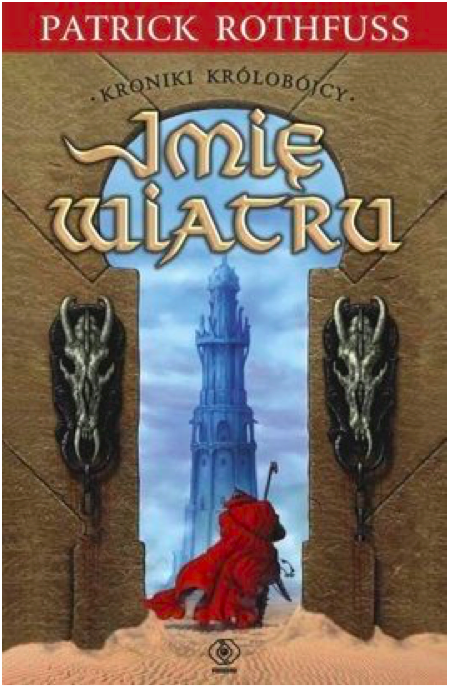
Paperback Polish August 2008
YIKES. I cannot figure out which scene or location from the book this image is trying to evoke, which makes me think the cover artist did not have the book or a text excerpt to work from. What the hell are those weird horse skulls? Why is this taking place in a desert? Why is the texture so bad? So many questions. And the effect on the title text is bad.
0/10 YES WE CAN GO LOWER THAN 1
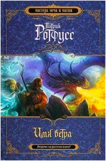
Hardcover Russian 2010 Edition
This looks like the cover to a Dungeons and Dragons manual. I suppose that’s supposed to be from the Dracchus scene with Denna, but the image doesn’t look quite right for Name of the Wind. It’s just so generic fantasy. I also don’t like how the image is cropped top and bottom to make way for a very generic marble background. Still, the image is colorful and exciting, even if it could be the cover for any fantasy novel ever.
5/10

Paperback UK 2011 Edition
What the FUCK happened here? Who let this shit happen?
-10/10
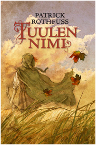
Hardcover Finnish August 2010 Edition
Ooooh, more Miyazaki fanart! This is actually quite lovely, and it fits the tone of the books much better than the kids book cover from before. I love how soft and gentle the painting is. Notice the color balance. I don’t know if this cover really ‘grabs’ you or draws interest, but it’s one of my favorites of the bunch.
10/10
Paperback Bulgarian October 2010 Edition
I reserve the right to change my opinion later, but this may be the worst contender in the cloaked and hooded figure from behind category. I actually had to double check that this wasn’t a reused image from the mass market paperback edition, but nope! This is a brand new cover image, and it’s absolute shit. The lighting is so dark it’s impossible to make out details, the balance is way off, and the cover and title text are placed over the figure (aka the only object of interest) instead of the boring, generic storm clouds.
0/10
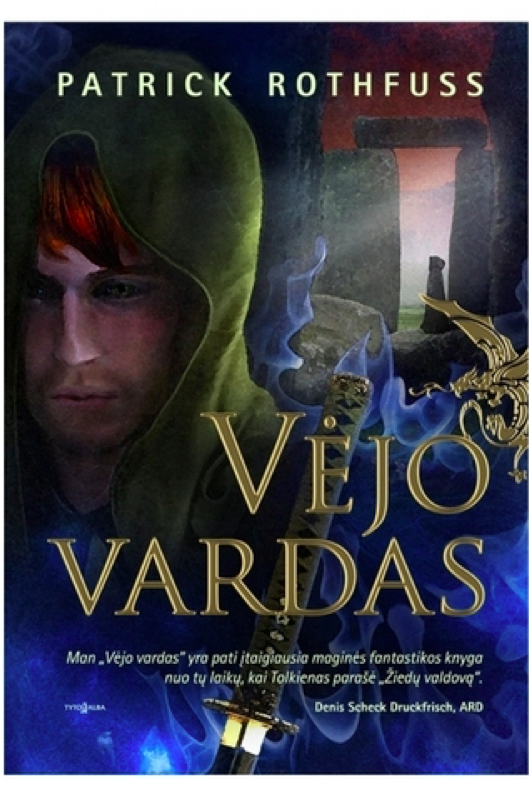
Hardcover Lithuanian 2011 Edition
YIKES times two. This cover art is truly awful in ways I didn’t know could still happen. Kvothe’s face looks ‘off’ because the facial proportions are all wrong. The blue mystical katana is bizarre because there’s no magical sword, much less a katana, in the story. And is that a photo of Stonehenge in the background? With yet another hooded figure?! I do like the gold foil of the title and the golden dragon embellishment, but the rest of this is such shit.
0/10
Paperback Serbian February 2011
And we’re back in the safe territory of a cloaked figure staring off at a distant city! All these covers are starting to run together, but this is a new cover art. It just looks like all the others. Once again, it’s fine. The city is a little too distant and greyed out to hold interest, and the figure is kind of generic.
5/10
Paperback Italian 2008 Edition
I do not know what happened here. Who is this figure supposed to be? I cannot for the life of me figure out which character this is. It’s a shame, because it’s well-done art with a cool character and costume design. The title and author text obscure the image, though, and the shadow on the text is so extreme it’s hilarious.
0/10
Hardcover Hungarian 2009 Edition
This is just boring. There’s no information conveyed here, nothing interesting or arresting to attract the viewer’s attention. The translucent overlay on the title is an odd choice.
2/10
Paperback Persian 2016 Edition
I believe this was originally a fanart of Kvothe (correct me if I’m wrong please), but it’s a good one. The tree shadow in the back is distracting and obscures the handle of the lute on his back, though. I wish there was more here – it feels very spare in an unintentional way.
6/10

Hardcover Georgian 2016 Edition
Cloaked and hooded figure staring off into the distance, check. I’m not crazy about this one – the art is very soft in a blurred kind of way, and it reads as a little humdrum. The tower in the distance is quite dull – it looks like a modern office building.
4/10

Hardcover Italian October 2016 Edition
The title text is a little too high – I don’t like how it covers the figure’s chin. It’s not a bad idea to make Kvothe’s green eyes a focal point, and it’s certainly more of an original idea than most of these covers have shown. But the muted color pallete drags the whole mood down. It’s not evocative, just kind of damp.
5/10

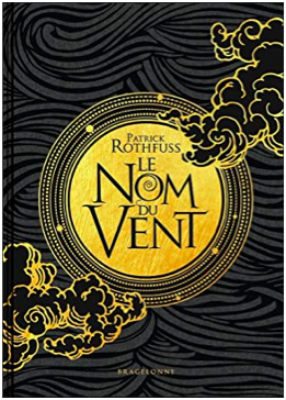
Hardcover 10th Anniversary French November 2019
I LOVE this cover. It’s gorgeous. I love the gold foil, love the text, love the clouds. It’s stunning and timeless. Amazing.
10/10
Hardcover Latvian October 2013 Edition
It’s a cloaked figure with a city in the distance, but he’s NOT looking at the city! What!! I’m rather surprised at how few covers feature Kvothe actually playing the lute – this may be the only one, actually. I don’t like the bottom fade, and I think the design is a little generic fantasy. But it’s a nice balance, and the title text is fancy and eye-catching.
7/10

Paperback Polish 2017 Edition
This cover artist also clearly wasn’t working off an excerpt from the book. The character design is so off and unlike Kvothe, except for the cloak. Wall texture looks like a photo manipulation, which is cheap. This whole thing is bad.
0/10

Hardcover Russian 2015 Edition
What is with the Stonehenge imagery? And why is that guy floating off of Stonehenge in a modern hoodie? Why is that one leaf in the top right so huge? Why is the title text red and difficult to read? At least there’s a broken lute, I guess.
1/10
Paperback Chinese May 2012 Edition
This is incredibly lazy and the photoshop job is terrible and generic. Zero effort was put into this cover.
0/10
Hardcover Russian 2011 Edition
I’ve been pretty harsh on Russia, mostly because the Russian covers have been terrible. This is ok-ish. It’s very generic fantasy, and the castle looks like Hogwarts. But it has visual interest, even if the title text color is garish.
2/10

Japanese 2017 Edition
I quite love that they turned Kvothe into an anime character. And he’s doing stuff, too, and not just staring out into the middle distance. There’s so much imagery of the broken lute in these covers, so it’s refreshing to see the other part of this scene – when Kvothe loses his shit and finally calls the name of the wind. Fun cover, good artwork. The red title text works here because it matches Kvothe’s hair.
9/10
WORST:
BEST:
#The name of the wind#kingkiller chronicle#patrick rothfuss#book cover art#books#apologies for poor image quality i was working with what god and goodreads gave me#which was variable image quality i guess#I've been told I'm very judgemental so I decided to put those judgey skills to good use
49 notes
·
View notes
Note
Hiya! You're art is really good! I was wondering if you could show your drawing process? I'm trying to develop some tips and stuff, heh.. thank you!!! - ♡♡♡
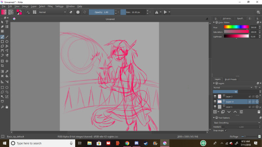
Well for starters, thank you so much! I’m glad you enjoy my art! But I’m very sorry if this isn’t as in depth as one might hope, I’ve been in a bit of a rush this morning, so my apologies (also please forgive my uncropped screencaps)
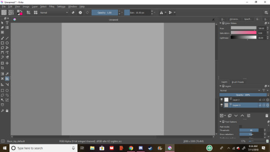
To start off, I either sketch it out on paper and take a pic, or sketch in krita. I typically use krita for almost everything I draw digitally. To start, my default canvas size is around 3300 x 3000, and if I’m not feeling lazy, I fill the canvas a nice grey. I don’t know why, but it makes the drawings nicer.
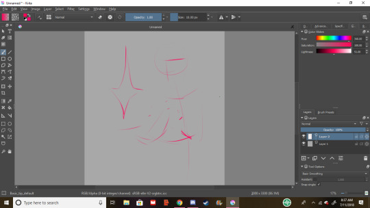
I like to start off with a basic idea of what posing I want, with a loose crosshair on the head to figure out where the character is looking, in this case, the weird floating thing we got here

Next, I start putting in shapes and finalizing our pose. most drawings of mine are built with shapes (usually most obvious with DKtDW Michael, he’s very rectangular.) For hands I use that pentagon shape, this helps me plug in the thumbs and fingers. Our character here is very slight, so i used sort of a tube, ect, ect,

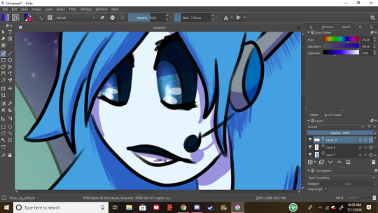
next, I refine the crosshair. Most artists who use a crosshair only have a line for the bottom of the eyes, but I never got the hang of that one, so I have it for the top and bottom (also I gave her a tail. Because.) And then I place the face stuff on. Eyes I like to do “anime style” (sparkly, only the top and bottom lash line are lined, ect, ect,) unless it’s robots, and by exenstion animatronics. One thing I’ve learned is a good idea is if your character has pupils, sketch the iris first, then the pupils. This will work better for you and gives you a nice ratio of iris to pupil.
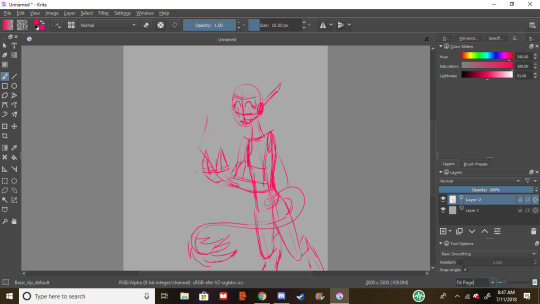
Next, plan the hairline. I usually have two hairlines I apply, rounded, and widow’s peak. This will help you plan the hair out easier, which is beneficial for short and long hair.
I’ve never known how to describe the way I draw hair, but generally, make it flowy if it’s long. Hair tends to be curlier with shorter hair, because it’s less weighed down, and please, practice different hair textures and styles, I may go into that more if anyone wants me to try to do a hair tutorial.

Next, move onto clothes, and refining other details. I like to make skirts flowy, flowy is fun, dynamic, and interesting, visually.
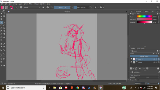
uhhh let’s refine that glowy thing, right? Let’s make it a crystal. Crystals are fun.
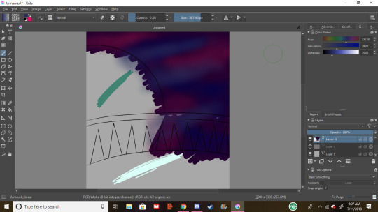
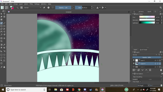
Next, let’s give her a background.I wanted to draw space, so we’re drawing space now. I gave her a planet.
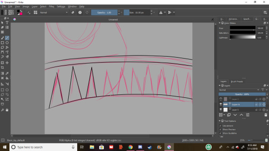
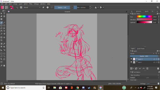
Line the background! I use Basic_tip_default on weighted smoothing for almost all my lineart. Don’t be afraid to use the line and circle tools. They’re helpful, and denying yourself the tools that the program comes with is dumb, and limiting.
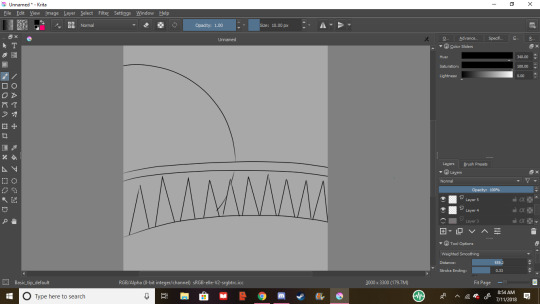
Rad, the lineart’s done on the background!
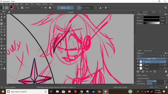
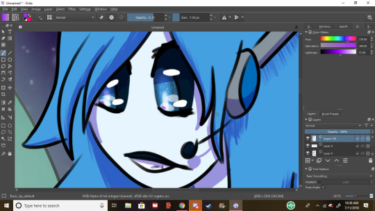
Next, let’s line the character. For hair lining, use gentle strokes, it creates a feathery and light feel
For lining around the eyes I turn off weighted smoothing, and feather ‘til it looks like eyelashes
lineart complete, nice
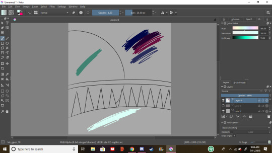
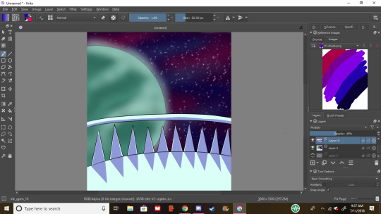
Next, let’s lay out some background colors. Try not to make them too overpowering compared to the character, or you’ll the character as the focal point. I’ve chosen my main galaxy colors, and my color for the planet. The balcony will be a sleek white. I’ve been taught not to use pure white or pure blacks and greys, but you do whatever makes you happy, don’t let anyone boss you around unless you’re paying them to teach you, or they’re paying you. I use pure black for lines, and pure white for eye shines, but it’s important that you work out what makes you happiest. Art isn’t about what’s the standard of the time, it’s about what makes you happy. If neon ponies is what makes your heart soar, then make all the neon ponies you could ever dream of, you beautiful soul.
Next, fill in the bg’s most prominent color with either the fill bucket or a large brush, this is my galaxy base.
I like to airbrush the other colors, but sometimes it’s too sharp, so let’s
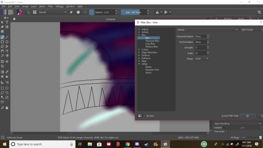
b l u r i t o u t. I used the 99 x 99 radius to get it absolutely dreamy
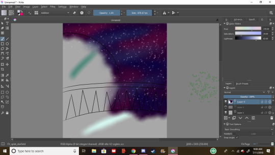
star it up baby, bc you’re a star. my favorite brush for sparkles and stars is FX_splat_starfield, it’s lovely
next the planet, I airbrushed some darker and lighter teals for detail, as well as gave it a haze around the edge for because.
Then we’re all colored!
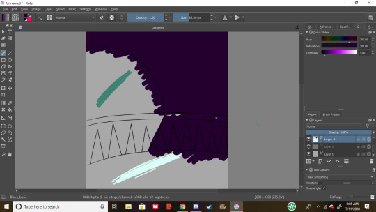
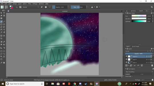
shade it up, babey. In this piece’s case, our light source is the planet, so we shade accordingly. the shades in the ref docker are my go-to’s. Good rule of thumb is the warmer the light, the warmer the shade, but my default is the purple-ish blue color, i set it to multiply and the opacity to 40%
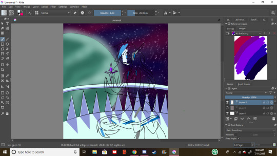
Next I block in the character’s colors, I only do this if this is my first time drawing them, if not, i use the previous image or the character’s ref sheet

flats are done, and she looks spiffy, let’s shade her
cool
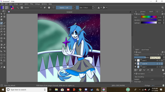
close up of the hair shading. i always take my lining brush, and make it thinner for hair shading, it looks fluffy, and nice. this is also the beginning of the eye shining process, for fancy eyes like hers, i take white and lower the opacity, that way no detail is lost, and it’s still nice and shiny, for plain eyes, i just up the saturation and lightness
next, over the lineart, put pure white like this, it make the eyes have lots of depth. and an option if you have a light source that’s a different color, a shine of that will really tie it together.
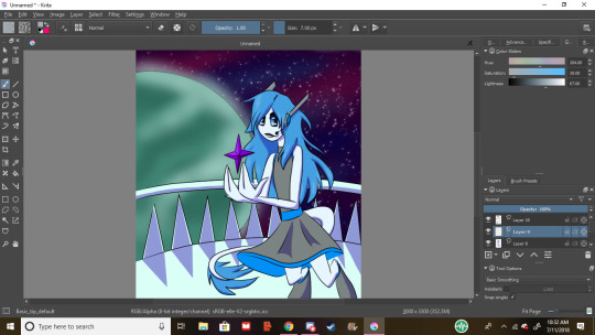
nice, she’s shaded and highlighting. but now we need some… glowies
much better. if your light is especially bright or your character is pale, some reflection goes a long way. i use the airbrush for glowy stuff and these reflections on matte surfaces
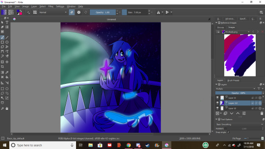
Now we shade in a way that effects bg and character, i call envo shade. I went ahead and took my airbrush set to erase where stuff glows, but now it looks too sharps, so…
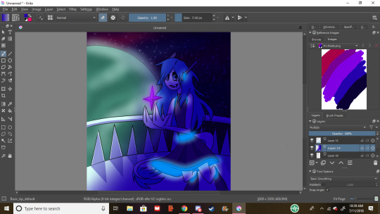
We blur it up again. Perfect.
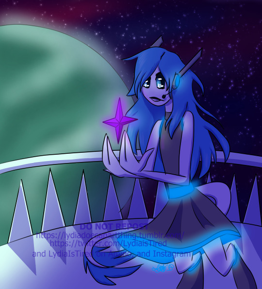
Never forget to sign and date your work. Dating is so you can look back and see how much you’ve improved, and signing is just good practice, but i won’t get into it. i tend to watermark my stuff after it being reposted so many times, but that’s something you can decide on. Again, please keep experimenting and trying different things to develop how you draw, and if you ever use these methods, feel free to send me the link so I can see ^^, have a lovely day, and if you need me to explain anything further, shoot me another ask.
Commission info
#lydiaistired#lydia does an art thing#art process#art tutorial#ish#digital art#artists on tumblr#autistic artists
34 notes
·
View notes