#u can also tell that i like the lineart version more
Explore tagged Tumblr posts
Text

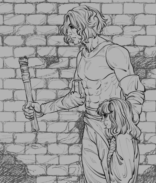
s̴̡̤͐u̵̳͓̰͜͝r̸̩̳̹̈́͐͆v̸͓̙͙́̊̊̑i̴͔̖̺̽̐͆v̵̢̤̀̀̄è̴̡͇̰͕̐ ̸̨̡̖͚̄̋̉̅t̷̟͉̹͒̾h̵̛͓͇͈̱̐e̶͔̾̀̀̓ ̶̢̼͌̽̈́͝h̴̠͍̪͎̽̋͊o̵̥̺͋́ͅr̵̡̫̆̐ŕ̶͍ơ̷̧̯͈̘̆̄͝ŕ̵̯̀͝s̵̰͖̺̐
treat break
ş̸̨̢̨̭͖̫͍̝͉̬̙͇͔̣͉͚̲̠͎̼̥͕̰͍͖̟̜̰̤͎̫͍̼̭̟̯̲̭̙̖̗̭̹͒̔͂̃̍̋̎̀̎̔́͗͋̀̃̀̏̌̌͘͘͘̚͝ų̴̨̛̰̖̙̟̥͇͓̰̖̣̖̲̩̫̦̦̯̥̯̬̮͍͉͇̦̼̣̫̬͇̲̺̼͈͔͎͔̥͓̃̃̓̈͌̓̄̈͊̓̾̓͑̊̒̆̔̇̔̇̊̾͌̔̏̅̋̔͛̃̇̋̈́̂̐͒͋̏̕͜͜͜͝͝ŗ̷̢̨̧̬̯̭̜̬̹̺͔͇̙̪͍̝̥̲̙̤͍̖̥̏́̀̾̌͒͑̄̌̔̆͆̚̚͜͜͠͠v̵̡̞̝̏͊̆̅̊͌̑̾̆̊̍͆͛̇̈̈́̽͗̎̀̚i̴͙̫̝̪̪̟̒̆̊̋͆͒̓̎̿̀̋͋͒̓͂̽͗̔͊̂͘͠v̵̢̨̡̢̨̺͔͕͚̞̥̻͚̼̫̥̰͉̮̪͎̜̦̖̼̣͍̲̙̺̪̬̤̖̲͔͍̮͂̌̀̈̑͛͑̓̄́̏́͛̂́̔̿̈̑͊̊͐̆͑́̈́̀̈́̀̓̽͂͗̚͘̕͜͠͝ͅe̶̢̧̛̗͍̖̳͚̦̮͕̠͙̜̗͙͉̖͚͉͖̜̗̥̪͙̲̦̓̒́̑̏͐̈̌͂͑̂̍̊͌̅̎͛̿̓̆̾̒͛̇̎̎͗͗̔̓̔̍̉́͘̚͘͜͝͠͠ͅ ̶̢̨̡̡̛̙̤͈͉̖̰̹͔͖̤̻̗̺͍͖̞̪̰̜̹̲̝̟̳͕̲̐̎̿̾̓̊̏̇̐̾̉͑̽̈́̌̾̎̑́͐͘̕͜͠͝t̶̜͍͇̞͖̣̼̤͗̆͂͌̕͝h̷̡̭̰́͐̿̂͆̊̾̿̎̾̒̄̈́̓͒̅͂̋͌̉̉͐͐̋͆̀̑̆͊͂͋̚̕̕͝͝͝͝͠ȩ̵̨̡̨͉̙̞̠̜̣̱͉̱̰̯̫̜͍̞͖̰̮̯͕͔̻͉̻̤̜̭̘̱̯̫͚͎̠̝̈́͊̾͗̚ͅ ̷̢̡̨̧̱̞̬̭̯͉͖̣̥͎̗̠̹̞͎͓̤̖̘̲̘̲̳͕̝͎̗̝̳̣̤̞̥̜̣̬̫̝̉̈̄̐̑̾͜ͅh̷̢͇͇̼̺̟͓̓͋͑͆̋̌͛̔̎́̋͗̍͊̃͌̍ͅͅơ̸̰̗̼̠̊̉̍̉̈́͑̈́̽̾́͑̈́͗͐͂̓̅r̵̡̨̨̰̖̬̙̹̗̤̹̭̱̝̮̭̝̪̩̮͍̦̲̦̞̹͊̐̃̊̀̂̿̌̆́̇͂͛͌͠ŕ̶̨̢̧̨̡̧̨̧̢̜̼͙͈̤̘̮̝̲͈͇͙͍̦̦̱͇͓̫͕̩̳͓͉̦̝̖̼̺͍̦͍̖̪̏̈́̓̊̈́̑̓̀̑̄̒̾̈́̽̉͐͌̒̐̌́͒̕̕͘͘͠͝͝͝͝ơ̴̓̄̀͋̎̾̑̀̔̐̏̽̚͝͝͝��̛͉̣͖̤̬̟̮̙̟̱̦̤̇̂̂́͋̐́͒̎̾̽͗̾̒̋͆̐͘̚ȑ̷̨͖̗̰͔̟͇̥̺͓̰͕̣͔̐̎̆͋͊͊̆̀͂͒̕͜ş̸͖̩͍̲̩͈̥̬̬͂͒̐̉͑̈́̓̓̎̾͛̃͘̕͜͝ͅͅ
#artwork#illustration#my art#u can tell who is my favorite girl in the game#haha#time to burn in hellllll again oh no#cahara fear and hunger#girl fear and hunger#fanart#u can also tell that i like the lineart version more#honey its 3am please you havent slept for two days#booba cahara because i can#gotta go nap#found family is my fav trope
61 notes
·
View notes
Text

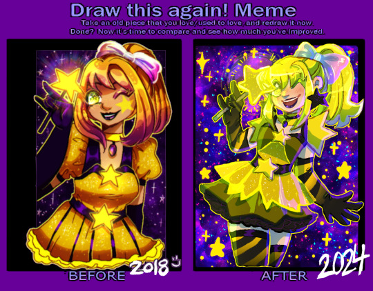
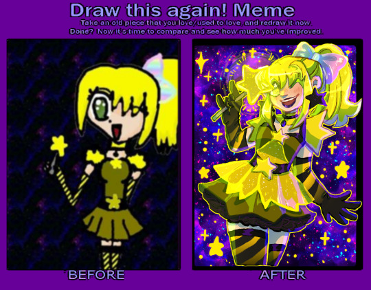
a redraw meme! I'm a little mad at myself for not doing this for a few years (I've done a few other redraws in the meantime, but...it wouldve been cool to have a bunch of years in a row! TwT)
2007 was the earliest made on gimp, a touchpad and NO pressure (obvious with the THICK CHUNKY LINES. im 90% sure I did lineart, colored over them, then lined over them again all on 1 layer...) plus the pattern fills gimp had (the stripes and rainbows, plus the repeating space background that needed a desperate scale-up...)
2015 might be the most obviously tmm inspired style wise ( and I think...this character WAS a tmm oc, actually, so this tracks. her name was star hoshiko (yes. star star.) and she was infused with star power instead of an animal. whatever that means. in my defense I was Ten 👍) and was when I was still using sai!!
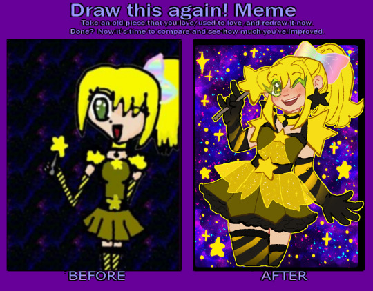
2016&17 were me trying to sort of push into semi-realism, the smaller eyes, the more realistic skirt in the '16 version and more realistic hair in the '17 version, and also the first ones done in clip studio which is still my mvp program.
2018 was the furthest from the original, me REALLY pushing orangey yellows for some reason (the darker oranges let the yellow glowy parts stand out more was probably my logic at the time?) it's also funny to see that I went back to a more cartoony/anime style between 2017! the eyes got bigger again, the hair more stylized (esp with the shading/highlighting!) yet the clothes got more detailed....
2024- this time around I wanted to try and capture elements of the original design, since it seemed I was drifting further and further away from it... those very bright lemony yellows that scare me to work with sometimes, the original stripes, that BAD dark yellow for the base of the dress... I know a lot of people will prefer the semi-realism of the earlier years but I feel like the very anime style is more FUN. and I feel a lot more confident in my posing, expressions, and I just. focus more on having fun than making her pretty. that being said I did try to add little details from the previous years designs :3 doing redraws is always so nice to reflect on style and improvement!! I totally recommend doing one if you want to, a blank version is here!
also for funsies, heres how gross the flats look. man i HATE that weird base dress shade T_T u can tell I did shift it to be SLIGHTLY warmer, just a bit....the cool-toned shading pushes it back to the lemony again tho, lol
#redraw meme#improvement meme#magical girls#original#hmmm wait a star themed mew with green eyes. ....oh. a beta cara LMAO#i mean this character is not a mew anymore bc i wanted to push her star theming BUT. CMON. thats funny#also huge shoutout to past me for deciding to interprete that chunky lineart around the lips into black lipstick? thats awesome#also no dots on my shading like i do a lot lately aaaa bc the canvas was SO small it looked weird :") next year....#or ill do another redraw. not of this but i have a few other i could do :thinking:#no new stuff only remakes im just like hollywood fr. sorry 😔#also yes art just a day apart insead of queueing it like a smart person might. no patience found
20 notes
·
View notes
Note
JUST FOUND YOUR BLOG AND I LOVE YOUR ART!!!!
Your line art is so smooth and the colors too! How are u underrated
Thanks :]]
Actually I remember doing thick linearts before to make it look like y2k bubbly styled and I was thinking of going back again since I wanted to make logos or icons like this one:
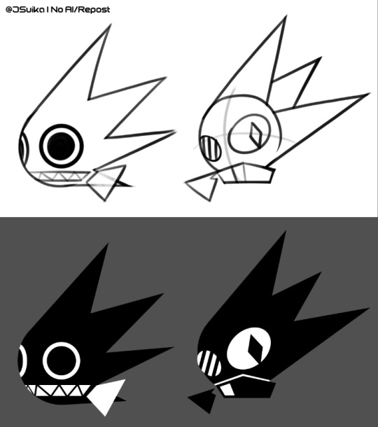
These ig were just a lil practice if someday I'll be making one (or more of these). Also this is just an example btw, these are artist-made game icons. Imo, if it were me to be commissioned to design one or if I was assigned by a game dev, then most likely its gonna look like something that y'all won't know who did that thing lol.
Besides, I'm pretty sure a lot of people were inspired by my artstyle. 😭 Also in case you guys don't know what these are, I'll show you guys mine. (NOTE: You can still check on archive, I don't mind though-)
Examples of my artworks with thick lineart:

The first one was Hatsune Miku fanart
I kinda remember drawing this back in the day since 2023, the sketch version (on my other sketchpad) was discontinued. Supposed to finish it but, sadly I gave up because the hair was something that reminded me of an Inkling from Splatoon (rarely I noticed the first miku fanart also reminded me too lmao).
I wish I'd do this again hopefully if I could use my artstyle, then yeah. Watch here if you want to see the speedpaint :3 : https://youtu.be/sRE3-snDGkM?si=op3tISbGFTjLCcdB

Next one is Bomb Rush Cyberfunk fanart
Okay LISTEN, I may not be good at anatomy but might as well tried especially RED's head. For the BG, I only duplicated the character + added a screenshot/fakescreenshot/whatever, to make it look related to both y2k & frutiger aero (same applies to Hatsune Miku).
Nothing to say much but I've been thinking of making more character concept arts in the future & maybe work on shoes since they look a bit too complicated much.
Overall, I'd say it isn't bad. I'll just leave as it is for now (until some BRC fan shows up and sees this).
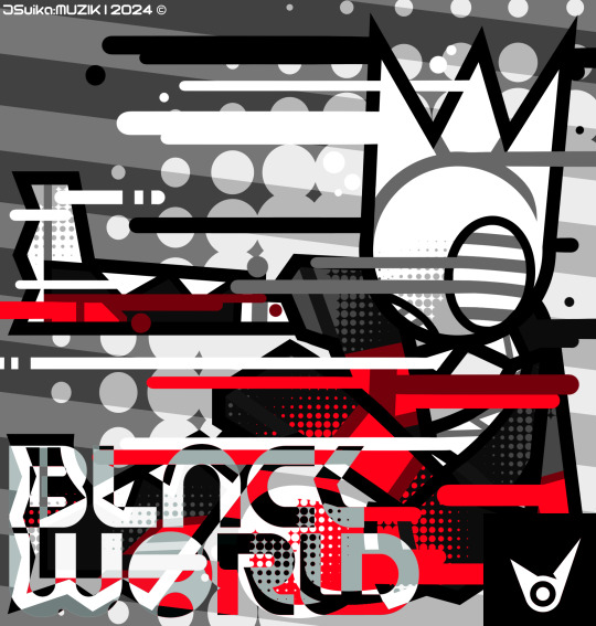
Last but not the least, my very first artist-made album cover
I remembered drawing this for future use if I ever find a music composer either if they can do DnB, game soundtrack or whatever but it slightly depends on them. Also shout out to Lxchee Music! They're the ones who compose music like these. They even commented on my speedpaint video!!! (after using their songs lol).
Such a shame that I am limited to drawing only however, I wish I also was a composer of this whooooooole album then everyone's gonna listen to my bangers. One time I used to make music in Beepbox.co (a website where you can compose there).
There are some music-composing softwares that most people use for their game making & also songs. I wish I'd even use FL studio or other music-composing. Reminds me, I also have one friend who makes music (unrelated to dnb or any genre) using accordian & any other instruments that he uses. I swear, he is so good in composing Nintendo Orchestra-music related I can tell.
Conclusion
No worries though, I didn't say I hate using thick lineart but its sometimes too much for the anatomy still and might not fit pretty well. I can still do another one hopefully just to focus on more y2k aesthetic. But if it were me to learn anatomy, might as well use thin lineart and just increase to make it look like there is perspective on it.
Anyways, ig this might be a long one but I do hope you understand what I mean-
11 notes
·
View notes
Text
I thought the Two Slow Dancers comic would be a fun opportunity to break down my process a lil bit cause this was a lot of undoing and redoing and adding so for any ppl curious it will be under the cut!!
So to start off I actually only thumbnailed what is now page five and six, the original image in my mind was them reaching out to each other in different seasons clothing, I considered just making an animated version of that but then I connected it to the two slow dancers scene I had imagined in my head a month or so back and wanted to make it part of a small narrative:

(I actually did page six first - u can tell by the way my writing is nearly incomprehensible that this idea came to me like a vision in the night)
But then looking at that i said - well surely that doesn’t tell the story enough. I need more. And then I played two slow dancers on repeat for probably an hour while I thumbnailed a surrounding narrative for those two pages and ended up with this mess:
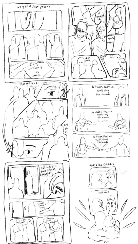
And from there I actually started working on the lineart two pages at a time - I like working on freakishly large two page spreads because to me it helps the flow feel more cohesive, I don’t look at them as isolated pages until I get to the shading part of the process.

But once I sent it to some ppl for feedback and reread it myself a million times I felt like the story still wasn’t reading the way I wanted it to - two out of six pages were “flashbacks/memories” pages and that ratio didn’t really allow for the other four pages to read as a cohesive story in my opinion so I kept trying to workshop two more pages for the front and I went through a few iterations:
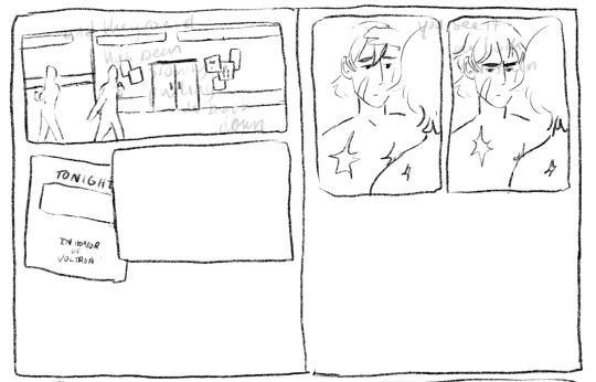
I thought at first I would show the outside of the garrison, give the audience more of a setting, and then show the flyer so we know Keith is getting ready for this celebration. But it was too literal for me (even though what I ended up doing was still pretty literal lmao). So then I started with the phone/text messages as a story telling device:
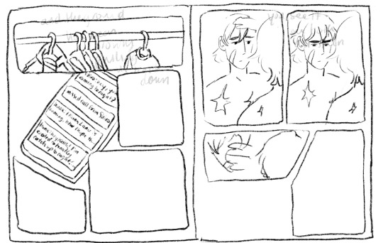
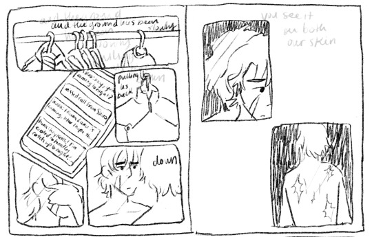
Also this is an example of how I almost always draw the comic panels before I decide what goes in them haha, unless I’m really sure what images I plan on focusing in on the panels almost always end up informing what goes inside if that makes sense. But I finally ended up here when I decided “that’s good enough”
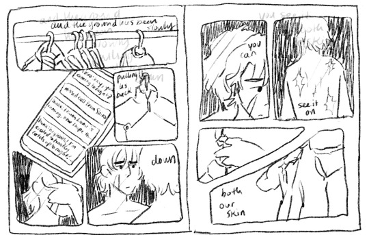
I even did most of the lineart for this composition before I decided the imagery of the jacket was just too repetitive, like we don’t need THREE PAGES of keith putting on a jacket.
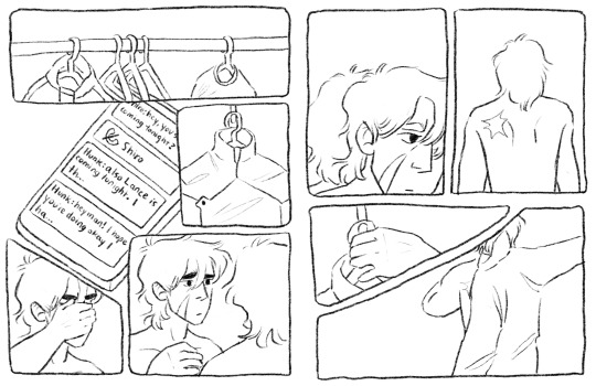
So i kind of just moved the left page over to the right, and left the right page blank for most of the rest of the comic process. I finished most of the lineart on the rest of it before I finally circled back and decided to go with a tweak of what I originally thought was a lame idea (I had this image in my head of the lions silhouette against the glow of the Earth for the first page, but with the lyrics “the ground has been slowly pulling us back down” I thought it was just too cheesy, especially because that’s not what the lyrics mean either in the song or in the context of this comic and I didn’t want them to be perceived as so literal)

So this is the thumbnail I landed on for that which eventually turned into the actual final page.
Once I had all of the thumbnailing done the rest was pretty fun work! Just lots of going back in and detailing out the scribbles I had first put down. Now in terms of color, I actually have a secret. Most times I don’t color much at all? It depends on the piece but for most of my comics what I do is this -
I flat greyscale color everything and then use a color curve adjuster inside of procreate to pick a color pallet:
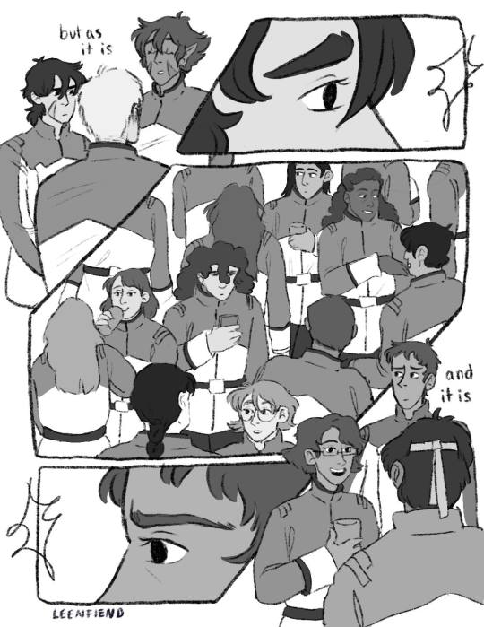
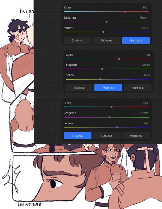
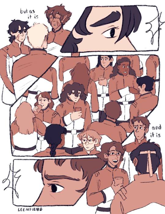
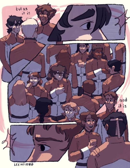
color adjusters are ur friend for picking color pallets i'm TELLING YOU!! I used to have a lot of trouble with cohesive color comps but it's a lot easier for me even without using this method now. Anyway I usually leave it here, in my other comics I don't have any shading or background elements outside of the panels but I figured since I was working so much on this comic anyway, I might as well light it a bit. So I basically just scribbled over the whole composition with a purple marker set on a multiply layer and then erased out the places I wanted light to hit, and then added a soft light layer with colored lights to give it more of a party look:
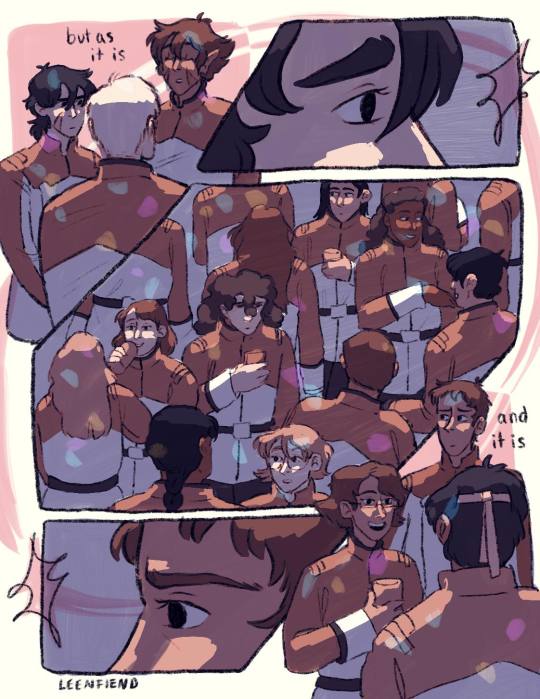
The only hang up I had during the coloring process of all this was how to color the "memory" pages. I originally just wanted them to be more pastel/blue, I thought that would make them look distinct enough. So I painted/shaded this whole page before looking at it within the rest of the composition and deciding it didn't read well at all and ended up sliding the saturation down to zero and calling it a day:
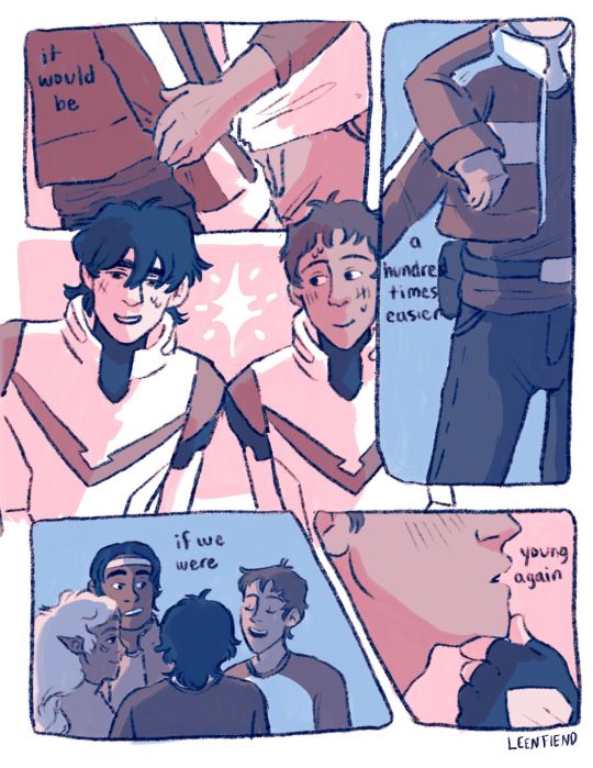
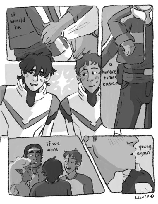
But I'm happy with that decision because it allowed for the "coming into color" moment with the other memory page and I think it connects better to the rest of the comic visually that way. And that was the whole process! There were tons of other little adjustments I made along the way and other composition things I tried out but I do tend to erase instead of iterate in layers so this is the process I have to show you! As a little bonus behind the scenes, here's the time lapse replay of that initial thumbnail for all eight pages! (it is sideways just because it's so large so if you're on a phone/tablet/laptop just turn ur screen sideways otherwise I'm so sorry lmao)
#my art#this is so long but i like 2 talk about process stuff lol#i also would love to see anyone else do a breakdown like this i LOOOVEEE seeing how other people work.#and feel free to steal any way I do anything ever (it is not stealing it's simply learning and using artistic practices that u are drawn to#colleen thoughts#also i use the 6B pencil in procreate for all of my linework ever and all of my thumbnailing im a one brush type of person#and it's like a default brush too lmao
24 notes
·
View notes
Text
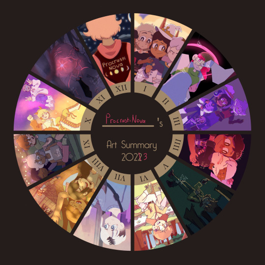
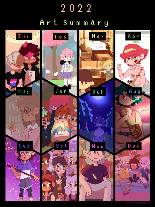
art summary 2022 vs art summary 2023
individual 2023 artworks below (plus some thoughts on them because why not. Said thoughts will include me critiquing some of the pieces, especially the ones from earlier in the year.)
also here's a link to all the artworks from my 2022 one if anyone wants to see them
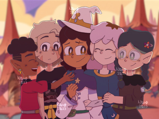
JANUARY - Art piece i did right before For the Future aired of Luz and the rest of the hexsquad having a much-needed group hug. I didn't really look at any references for this one (apart from for the character's designs) so the poses look really awkward and stiff tbh 😭. That being said, I'm still glad I gave it a shot, and it looks a lot better than the one I did before Thanks to Them's release, since I was more used to drawing the characters.
I'm not going to go too much into some of the... questionable... anatomy choices I made, since they aren't exclusive to this artwork in particular, nor is this the worst example of them (*cough cough* my old King's Tide screenshot redraw).
Overall I think this is an okay art piece. Definitely could have been improved by actually using references for the pose though.

FEBRUARY - This one is actually another redraw of a REALLY old piece I drew in 2021. With my finger. Not a good combination to say the least. This one is miles better especially in terms of anatomy, facial expressions and composition.
That's not to say that it's without it's flaws. I do think that lining up Betty and Amber's poses better would have improved the overall look of the piece. Another thing that I did end up changing a little while after I drew this was removing the shine from the black parts of the mirror to make it look like it was actually cracked, which I didn't do in the original version (that one's on my scratch account if you want to see it). It's a subtle difference, but I think it makes the piece look a lot better.
Again, I think this is an okay piece overall. Looks like the mona lisa compared to the 2021 version, but honestly I think anything would.
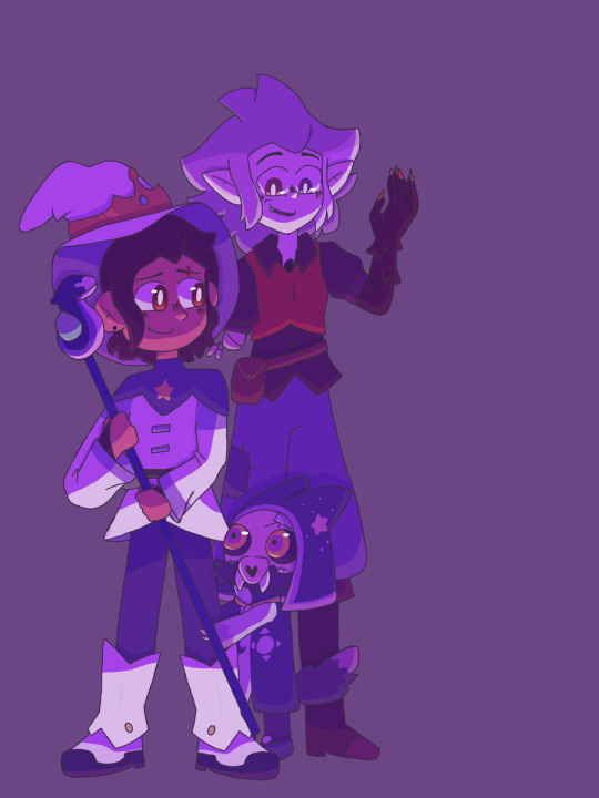
MARCH - Yet another Owl House artwork (bet u guys cant guess what my favourite tv show is). This one I created for a zine which I was working on for my multimedia class (this artwork in particular was supposed to be an advertisement for the finale). You can kinda tell I still wasn't that confident in drawing King, since his pose is pretty stiff (I don't think I ever really got used to drawing him tbh).
I do think this piece would have benefited from some more shading and lighting that wasn't the singular multiply layer I placed over the characters then erased some parts of. (There is some other shading but there's no other lighting).
Most of the other issues I have with this pieces are just issues I have with my old art in general so I'll leave it there.

APRIL - This is the last Owl House artwork I promise. I made this one for Zeez Vov Gee 2's watching and dreaming art contest. I actually do still quite like this one, which might partly be to do with the fact that I really like all of the character's timeskip designs, but whatever.
Some of the proportions on the hands are a bit weird, and I REALLY wish I put the shading on the lineart as well, considering how light of a colour it is.
One thing I do really like which I didn't notice while I was drawing it, is the pose Luz and Amity are in forms a sort of heart shape, which is really adorable akdjfhskhdf ;w;
Anyway, overall a pretty good piece, might remake it later. Who knows 👀
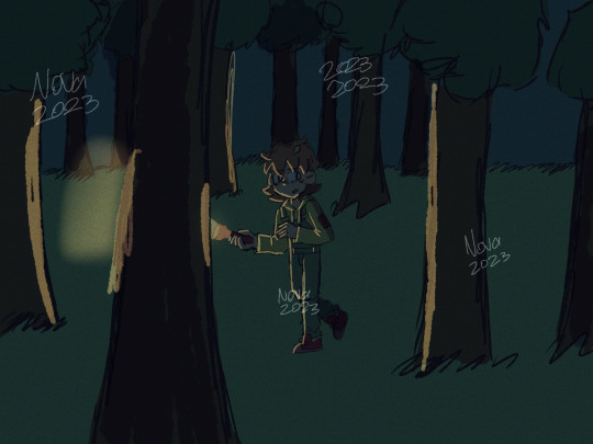
MAY - as you may immediately be able to tell, I did not make that much art in May (I might've had a few tests on at the time. Or I was just lazy). This one is actually OC art for once (wow shocking never seen before).
It's kinda just a doodle/a more doodley art piece, but it's pretty alright. I actually really like the pose that Robyn (the OC in the drawing) is in. This is also kinda the first time I drew their design, so yeah. The background isn't great, but I can't really expect that much from a doodle -v-
overall, pretty decent doodle. (for anyone wondering if I'll ever post more about Robyn... maybe? I'm mainly using their story for writing practice, but I think I posted something from it on here)

JUNE - June was literally the polar opposite of May. I'm not kidding, there were like 3 artworks that I was debating putting for June (this one, some deltarune fanart and a TOH screenshot redraw). I eventually went with this one because HOLY CRAP am I proud of that background.
This one was really heavily influenced by cartoon backgrounds (in particular ones from Gravity Falls and Hilda), and while I do think there are a few things that could be improved (like some of the trees), this was the first time in a while that i'd tried drawing a background that wasn't grass and a couple of trees (and i think the first time ever that i'd done something this complex).
I think another reason that this one turned out so good is that it was a birthday card for a friend. And if there is anything that I am constantly trying to do better at every time I redraw it, it's birthday cards (probably bc they're for my friends, love you guys sm /p).
anyways, overall a really good piece, 11/10 background.
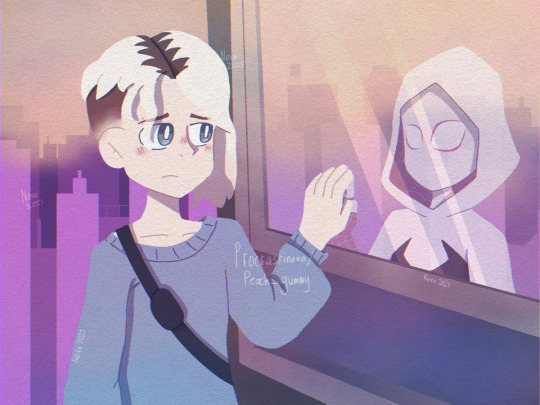
JULY - behold... the first artwork I posted on Tumblr! I drew this shortly after seeing Across the Spiderverse in cinemas (which I have to say was one of the greatest experiences of my life).
I wanted to mess around with lineless art a bit on this one, as well as sort of try to give it a watercolour feel like earth-65. And I gotta say, I think it turned out pretty good. Though I did spend a good 15 minutes looking for references because ATSV wasn't out digitally yet ;w;
overall, I like this piece, I tried something new and I made fanart for the greatest movie of all time (in my opinion)
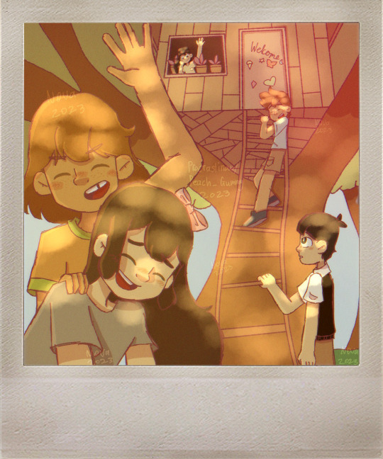
AUGUST - I don't think I drew nearly enough Omori fanart when I was super into the game, so I'm making up for it now. I wanted to redraw one of my favourite photos from the photo album for this one.
I probably could have put a bit more detail into the background for this one, but I really like the warm lighting, and the dappled light effect that I used for the characters. The lineart is also a bit sketchy, but I was (and sort of still am) in the process of figuring out how I actually want my lineart to look.
overall, I really like this one, nice colours, nice lighting, has the omori characters being happy in it :]

SEPTEMBER - like in May, I didn't get as much Art Stuff TM done, so it's just a doodle of some of my OCS (except this time it's Copper, Lapis and Peg, who I have posted about before).
I kinda just wanted to draw something cozy, so I didn't put too much effort into the background and stuff. One thing I will say, is that I wish I drew them looking a bit older, since they are all 16-17 lol.
overall, this one's ok. Could be better, but it's just a doodle.
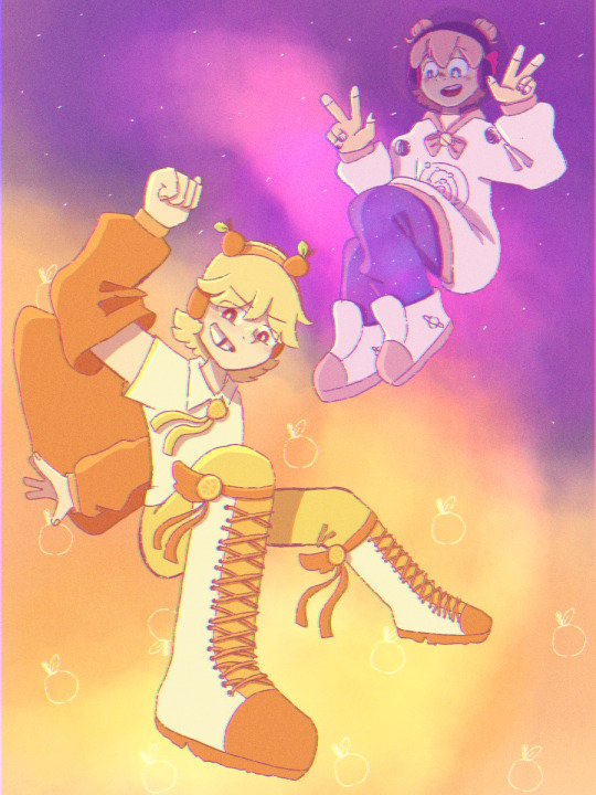
OCTOBER - ohohohohoho we are SO back. Yet another birthday card. I love the perspective and poses on this one (because, you guessed it, I used references for them). Everything about this artwork was really fun to draw (especially the characters).
Overall, really good artwork, 11/10
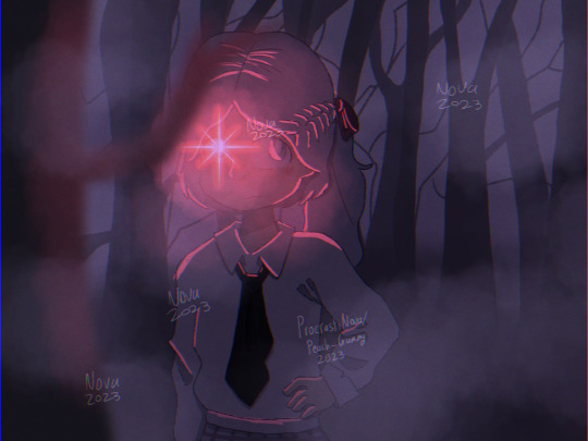
NOVEMBER - redraw of an artwork from 2021 part 2: electric boogaloo. I remember being so proud of the original artwork, so I wanted to make this one an artwork I was proud of too (which was a success).
One of the main things I wanted to do for this one was to actually draw a background, instead of getting one off google. The one I drew was simple, but I think it really works, because I wanted the focus to be on the character, not the background. I also added some slight perspective to the drawing to make it look a bit more interesting.
Overall, amazing, especially compared to the original
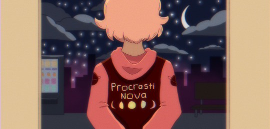
DECEMBER - and finally... December's artwork! Aka my banner. I wanted to do something kinda simple for this, because I'm probably going to redraw it or make a new one later. I really like the contrast between the colours in the foreground (which is supposed to be inside a train, but it's kinda hard to tell), and the background.
Also something I've started doing for a few artworks is making a duplicate of the artwork, blurring it slightly and lowering the opacity, which makes it look a lot more visually interesting :0
overall, love this one, good artwork to end the year off with :] (i'll prolly still draw more stuff tho)
(fun fact - I was going to put the redraw I did of the 'get in loser we're going shopping' scene with the characters from TMC for December because it's the highest quality meme i've ever made but it looked weird next to the other ones bc it was in black and white 😭)
#art evolution#art improvement#my art#nova.txt#long post#like seriously long post i should not be allowed to ramble about this much stuff sorry guys
2 notes
·
View notes
Note
Hello!
I see that you have an enstars oc and I'm curious about him
Perhaps you could tell me more about Kichiro?
I attempted to draw him bc he looks super cool!
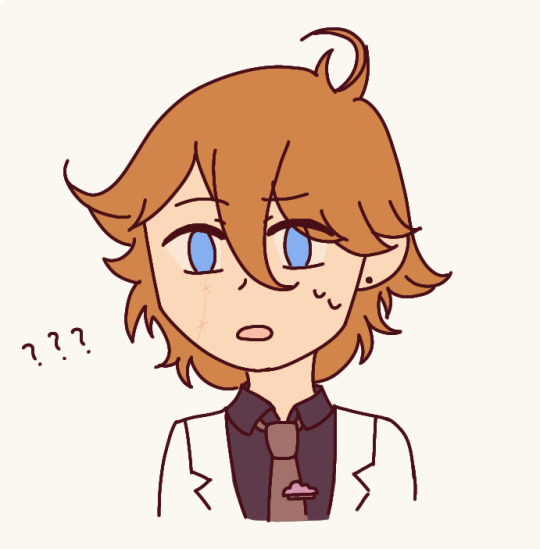
I tried to color drop but idk if the colors are right :')
If the colors are completely off, my apologies, pls have the lineart version instead
I can also fix the colors!

Also do you have a fave Ryuseitai member or do you equally like them all?
Perhaps you could tell me your thoughts on each member? My fave is Tetora :D
OH MY GOOOOOOOOOOOOOOOOOOOOOOD THIS IS SO CUTE,,,,, the colors sre not rifhr but rhats my fault for putting like 50 color layers over it LOL. either way u drew him so well and ik so happy with this !!!!
kichiro is a 2nd year and a member of DREAM•WEAVER, an idol group thats based more around weirdcore and whatever the idols are feeling on any given day. hes like the voice of reason of the group and while not being the leader, keeps hiroki (3rd year, big soft fun older brother type) and minori (1st year, aloof, weird, shy, awkward) in one place emotionally !!! hes also the captain of the robotics club and i love him dearly
also yes !!!! i love everyone in ryuseitai a LOOOOOT but generally i pull towards Tetora and Chiaki (in that order. i have a big soft spot for super passionate leaders who are super open about pursuing their dreams !!! chiaki is such an amazing big bro shonen protagonist archetype and tetora is the manliest man to ever man and i absolutely love them both for it.
kanatas probably my third favorite because hes a weird little guy and im obsessed with just his vibes.
midori and shinobi are both so utterly cute. shinobu ranks higher than midori bc one of ym bffs is a hardcore shinobuP but i love both of their sort of meditations on being unsociable in ways and how they grapple with being part of a group that not only interacts with the public but does so EXTREMELY frequently
5 notes
·
View notes
Note
Do you have any tips for small artists?
i have no idea what level of technical skill u have so these are some pretty general tips but here u go! these are also mostly focused on fanart lol cuz that's what i like to make.
number 1 rule of art is that people like art that is interesting!!! it's gotta make them feel something or they will ignore it!! i used to draw so much art that was just like, a character standing there doing nothing. and i would try very hard to have nice lineart and pretty shading and all that good stuff but in the end a character standing there doing nothing is boring. if you have really good technical skills, then some people will still be like "wow pretty art!!" or "so photorealistic! how cool!" but generally speaking it's gonna take soooooo long to actually reach that level of technical skill if every drawing u make looks like this 🧍. if you wanna improve fast, you're much better off experimenting with all sorts of types of art.
so, what do people find interesting? lots of things!
ship art is an easy way to make an "interesting" drawing, b/c people like ships and b/c you've got a character interaction happening there. even if they're just leaning on each other or holding hands or something, there's personality in that. even when i was really shitty at art i always noticed that my ship art got more notes than art of just 1 character.
in general, character interactions always make things more interesting. u certainly don't have to only draw romantic ships--draw some characters who are friends hanging out and having fun, or draw characters who are family hugging each other, or something. or draw people fighting!!! if you're not yet used to drawing characters interacting, it can be a bit of a pain at first, but it opens up so many fun possibilities (and reference photos can always help you!! google images is honestly the best of all resources for that lmao although more specific stuff like adorkastock is great too).
even without character interactions, u can make drawings that try to evoke an emotion of some sort. dark and angsty? lonely? happy and cute? this is one of my favorite drawings ever and i think it's super, super visually interesting and tells a story without the need for more than one character or any sort of words/dialogue, just from the pose and the background and the whole vibe of it. it feels so peaceful and lovely. of course, it makes a difference that this artist clearly has a lot of technical skill, but if this same artist drew a picture of aang looking like 🧍 on a boring white background i would definitely not love this art nearly as much lol.
screenshot redraws are also pretty popular!! personally i would strongly advise that if ur gonna redraw a screenshot, you should be adding something interesting to your version. if you colorpick the exact same colors from the drawing and try to copy the style as closely as possible, it's a little boring, right? why would i want to see the exact same picture twice? one artist who does screenshot redraws really well is viorie (who i think has removed/deactivated a lot of her stuff, thus the repost, sorry):
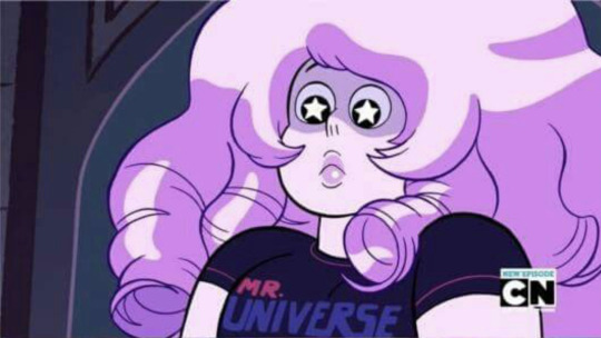
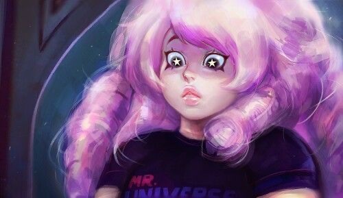
like this is very clearly an artist that had something of her own to bring to the screenshot she was redrawing!! that's what makes it cool, appealing art, even though it's "just" a redraw.
and of course my absolute favorite thing to make drawings "interesting" is to make comics. comics are the best!! u get to draw a whole story!!! lots of types of comics that you can make, too. a lot of the comics that i've made lately are my own writing and tend to be more serious, but if you're looking for something easy, fun, and simple, try drawing incorrect quotes or make art/comics that are based off of other people's posts, fics, or ideas that you thought were really cool (w/ appropriate credit obviously).
on that note, drawing fanart for other people is especially effective for putting yourself out there because it's often hard to get your foot in the door on social media when you literally have 0 followers and no one is seeing your stuff. you draw something for a popular fic writer or a humor blog, they're happy because they've gotten fanart and they reblog your art, you're happy because now all their followers are seeing ur stuff. lol this sounds so transactional but it's really a lot more fun than it sounds. make art for other ppl! make some friends! join discord servers, join group chats, comment nice things on other peoples' work, & check out fandom events, like big bangs or ship weeks or whatever. it's good stuff.
also, use different social media. it might seem like what tends to be popular in one corner of the internet is gonna be pretty well-received everywhere else but that's not always the case lol. tumblr, for example, usually puts a lot of emphasis on consuming content "from a fandom" rather than consuming content "from an artist"--it's hard to build an individual brand, people just want More Insert Popular Fandom Content and don't really care who it comes from so long as it fits a certain type of art; in my case, atla is a way more popular show than lok, so my atla art gets significantly more attention than my lok art does, despite the fact that i don't make that much of it. on the other hand, on instagram, people really like my lok/red lotus art because that's sort of my "brand" and my atla art tends to get less attention. (this works out for me because i like lok way better and i also have way more followers on instagram than i do here.)
& ofc when you talk about becoming a "popular" artist... i mean, i'm not gonna be the person who tells u "oh you should ONLY be doing this for yourself!! if you're doing it for attention you're doing it all wrong!" because obviously i love attention and i love making art that people like. i would not draw nearly as much if i didn't have fun sharing it! but if you let yourself get too sucked into the idea of making "popular" art, you're gonna feel super drained and fucked up and you eventually will burn out hard (ahaha.............). there's a balance to strike between "i'm making this art because it's fun" and "i'm making this art because i know people will like it." on tumblr, my atla art is way more popular than my lok art, but i don't care abt atla nearly as much as i care abt lok, so i'm never gonna like, make an in-depth comic about the atla main cast the way i have for the red lotus, the lok main cast, and kyoshi. what a waste of time! even when you're looking for advice about how to become a "big" artist, ultimately, you've gotta make the art that's fun for you, and with luck you'll eventually find an audience that also enjoys that type of art.
70 notes
·
View notes
Note
Heya! I really really like your style and saw the commission thing and was wondering how to, y'know, commission a tningy ^^' I haven't done it before
Glad you like my art and like it enough to consider commissioning! ^u^
My commission information page is here. I suggest looking through it. I explain how I work in that as well, at the very bottom. But, I’ll give ya a breakdown for the Never Commissioned Before. (since that version lowkey assumes at least slight familiarity)
It’s not too difficult or anything so don't stress it! If you want a general price-point before diving in or anything: for me, an average work tends to be around $35-50ish USD (usually mostly depending on color or number of characters) but some of the more complex stuff, which often includes multiple characters and background goes more up towards $200ish. If you’re tighter on cash, as I know a lot of people are, I suggest setting yourself a budget and telling me what it is! That way if you want something, but you can’t afford it, I can help make it something affordable! (ie I may suggest not using full color, or having a bust rather than a full character- etc)
For the actual process, I’ve put it under the cut. I go pretty in-depth and it got long.
Step One: Message me with what you want to commission me to do. Give a short description.
You can message me on tumblr or through my email [email protected]. I like it if you come in with a semi-solid idea of what you want. Hopefully you read through my commission page, but, I’m also happy to provide suggestions and ideas as well. I do fanart and original works! You should have a description of what you have in mind ready.
Here’s two examples on each extreme of what I can work with:
“A picture of my character, standing with their hands on their hips. They have long brown hair and eyes and wear a pirate-like costume”
“A picture of my character, standing with their hands on their hips, a little sassy in pose an expression. They have long brown hair that goes to their hips, and is parted to the left. They have brown eyes, and a small scar on their cheek. They’re a little stocky and they wear a v-cut loose black tunic, a purple vest and leather belt.”
I’d ask more questions for both of these! I’ve never had a commission where I don’t feel the need to ask for more information. If it’s an original character (or even au-versions of fanart or characters I’m not familiar with), I love hearing about who they are as a character, since that gives me a sense of what energy I’m trying to portray with the character. If you have references (doesn’t matter if it’s an amalgamation of references plucked off of google or something you drew yourself) that’s awesome! I don't require it, but, they’re always appreciated. I am totally open to helping you make decisions too! if you have the base idea, but you don’t know if you want them to have a coat or not, I can give you sketches with both options.
Step 2: Pricing.
If you don’t already mention it, I’ll ask you specifics of the things in my commission post- ie: if it’s full body or a half body, or if it’s full color or anything.
If anything on my commission post confuses you, you can always ask me for more examples or an explanation of the difference!
After determining exactly what you want me to do, I’ll usually give you an estimate for how much it would cost to complete. Sometimes, if you’re still deciding between things that determine the price, like how complex the pose is, I might do some sketches first and see which ones you like before giving you a price. I have a little leeway on pricing here, and if you think it’s too much, you’re welcome to ask me to explain why I priced it that way and if I can lower the price. That said, a lower price means lower complexity and detail.
If we’re confident in the price, I like if you pay me at this point, rather than later, as it’s easy to forget, and frankly, I’d rather not do all this work just for someone to take the image and not pay me at the end. I have some leeway, but I usually prefer if you pay me before I get to the last step before completion. If it’s a lineart work, that means after the sketch. If it’s a colored work, it means after the lineart.
Step 3: Sketches.
When I get started with sketches it usually takes me a day or 2 to get them done. I’ll give you several to choose from. I usually do about 4-6 individual sketches and label them by number (because I’m dyslexic and for the life of me never remember left vs right).
Once I send you a batch of sketches I’ll ask you for your opinion. I basically want to know: which sketch(es) fit your idea the best and if there’s anything I’m missing or need to get rid of. It’s going to be loose and messy, so if you want me to explain anything about how it looks, please feel free to ask. I can combine sketches if you like parts of one or two of them but as a whole they’re not perfect. If I’m totally off the mark, you can totally tell me so! That kinda means I didn’t do my job right in step 1, and I’ll ask more questions to understand which aspect I’m missing.
Once we have one sketch that works, I’ll ask you a few more questions about what you’d like to see on the lineart.
Step 4: Lineart
Depending on how complex it is and how busy my life is, this might take me a day or a whole week.
Using the sketch as my base I’ll use this time to make clean lines, get some details in (this is usually where expressions and clothes are defined beyond the general structure.)
I’ll send you the sketch after I’m finished and once again, ask you what you think and what might need adjustment. Your job is to nitpick here! Please, feel free to nitpick. Is the hair too short? Is the arm in a funky angle? Tell me! You’re buying it, you get to critique it. I’ll work with you to come to an agreeable look.
If you’re commissioning me for a colored work, I’ll also ask you for any clarification/changes from the original concept for the color.
Step 5: Color
This tends to take about 1-3 days.
If it’s flat color, it’ll be pretty simple, and shading or lighting will be done with kinda flat bold lines unless otherwise stated that you just want it Flat-Flat. It’s not my usual style, so most people tend to go for full color. Full color is my usual coloring style, and I use some pretty soft shading. It tends to reflect a midday-look, but if there’s a specific background I’m doing, I will match the color to it. Dynamic shading is a secondary layer of color. I usually do color and shading on one layer. Dynamic shading is where I work with really bold, dramatic lighting.
I usually work with a background at the same time as everything else, but, sometimes I don’t because I focused on one aspect or another, so that might be an additional step.
Once again, I’ll send the work to you and ask for your opinion.
Step 6: Finishing up
Once you’re happy with it, all that’s left is A) confirming you paid me (I’ll usually remember or write it down, so if you had, I won't ask.) B) signing the artwork and C) sending it to you via email. I usually send it as a .png but you’re welcome to request other filetypes. I’ll ask you for all these things too.
You’re also welcome to request that I record the process I can take screen-capture videos or I can screen-shot each step that I’m not screen-shotting already to send to get your opinion. (you’d have to ask me to do this at the beginning though.)
After all that, I’ll usually post it on my tumblr here, and you’ll have your commission!
5 notes
·
View notes
Note
thoughts on ur favorite drink? ur favorite art program? thoughts on keeping a sketchbook? on any pets you have?
HELL yeah thanks for the ask i hope u like tangents on tangents and run on sentences because just like my blog description says, I Do Not Shut Up!
favorite type of drink: crystal pepsi
every fucking year i email the Bepsi company and ask when this god damn drink is coming back. last year? literally spent almost all of 2019 moving house, and i got no crystal pepsi anywhere in that time. now it’s 2020. there’s a plague. and the world is burning. and there’s still no fucking crystal pepsi. the moral of the story here is, as soon as pepsi brings back The Good Shit, everything can be nice again. i am .3 seconds away from breaking into pepsi HQ in the midst of this Rioting Chaos just to steal the Crystal Pepsi recipe from their fat stupid noses and start making it myself. I will market it as... Creestöl Bepsi.
oh wait im supposed to talk about the drink, right, shit’s good yo. you know how all clear sodas taste vaguely the same? they all taste like Clear Drink? this is like Clear Drink in it’s purest form. it is the Clearest Drink. with the most Clearest Drink taste. and thanks to it’s (formerly) limited annual runs at the end of summer it literally tastes like nostalgia. I have left the house like twice in the last three months but if they brought back crystal pepsi i would march out of my house like its on fire (wearing a mask of course) and buy every fucking bottle i could find, life savings be damned
so anyway yeah crystal pepsi’s good i guess
favorite art program: begrudgingly, photoshop
adobe may be a greedy bitch baby company who doesnt actually let you buy their software outright but damn,,, photoshop Nice,,, hehehehe,,, i can do so Much with it it’s such a multitool of a program,,, i just upgraded to the 2020 version in february and there’s SOOOOOOOOOOOOOOOOOOOOOOOOOOOOOOOOOOOOOOOO many more brushes than there were in the 2014 version, and most of them are actually really useful!! i’m living for this guy’s brushes, uh, kyle?? yeah, kyle t. webster. now THAT guy knows how to make some brushes. i’ve been using the same ones for like six years but he’s got this GORGEOUS lineart brush i’ve been using and dear god i love it too much to ever go back. I Will Never Go Back. AND I JUST FOUND OUT ABOUT LIKE, BLEND BRUSHES?? there are ones that perfectly emulate real pencils thanks to how photoshop handles brushes, it even wears out and widens with use (you can choose how fast...) and you can TILT your STYLUS to USE THE BROADER SIDE OF THE “LEAD”??? LIKE?? A REAL PENCIL???? still blows my mind,, photoshop’s brush engine is fucking amazing,,
Thoughts on keeping a sketchbook?
sketchbooks are great and i envy people who have those really nice, blank-page sketchbooks with the little rounded corners on each page? and they always fill them with studies and life drawings,,, its so Aesthetic,,,
meanwhile im adamant for some damn reason to do most of my drawings on lined paper still. not the serious ones, but if im doodling, or just doing a sketch i intend to finish in photoshop? composition notebook. i have Dozens of Actual sketchbooks, but those are so nice... i don’t want to fill them with stupid meme drawings and things i wont finish and things i draw Badly and things that i Will finish but not There. i’m glad im not going to college cuz i always hear “oh you have to submit your sketchbooks” im like haha What cuz my sketchbooks,,,, are probably some of the most unprofessional, badly organized, unfinished messes out there,,, like i do studies but it’s all on lined notebook paper and half-destroyed composition notebooks because at the end of 8th grade everyone was throwing out their unused or slightly used school supplies and there was a WHOLE RECYCLING BIN FULL OF COMPOSITION NOTEBOOKS?? MOST OF WHICH ONLY HAD THE FIRST LIKE 15 PAGES FILLED OUT IF THAT???? SO I JUST KINDA. RAIDED IT?? i havent bought lined paper in 8 years and all the school supplies i looted out of the garbage that day carried me all the way through high school. i bought maybe one notebook in highschool, that was it. i think i literally trash picked a lifetime of lined paper,,,
,,, anyway i have a Nice Sketchbook (no lined paper!) ive been toting around since sophomore year of high school. it’s still got printouts taped to it from supernatural and doctor who and black rock shooter. this was seven years ago, i still use it when i want to use Nice Paper, and only now am i approaching the last pages. i also have a separate sketchbook i decided to start using for concept art and sketches for my webcomic i will never actually start working on! that one’s about as professional as i get, it’s full of robot designs and sketches of scenes. its fun.
i am not a real artist aslkdfkljdfskjldsfkjl
Thoughts on any pets you have?
i love me pets! they are not my pets they are my parents pets but i take care of them more so who cares. i love them. i love all three doggos even if Gigi is an old lazy fart that doesn’t care about anything that isn’t sleeping, food, going outside, or bellyrubs. she doesn’t even listen to you if you call her or tell her to do something. i dont know what her deal is. and gemma!! is a depressed muppet. she’s probably just getting old herself even though she’s only,,, seven. we got a third dog and she never got over it. she is still my favorite though, she’s adorable and i love her little under bite and her big goofy eyes that don’t have a single thought or braincell behind them. she floofy and snuggley and a big ol scardey cat who always comes into my room for hours when there’s a Loud Sound outside which is great because i cant sleep when something else is alive in my room and its not me but whatever i cant say no to her, especially now that we’re both on the same floor and i would probably take a bullet for this funky lil fuzzball.
speaking of the third dog that is kiwi i post more pictures of her than anyone else for some reason but she’s a cute lil goblin. i mean what is this thing. what is it!! im not even entirely convinced its a dog, i think its a weird lil alien that knows what a dog looks like and that’s it
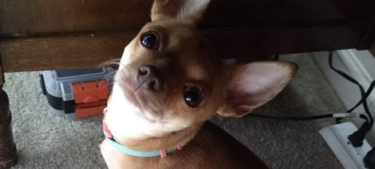
what is this thing!! dont know!! she’s plotting though!! i have never seen Thoughts happening in a dogs head before but she Knowes Things. she learned how to slap the other dogs. 80% of the time if you point a phone at her she stops moving because she somehow understands the concept of a “Camera.” she’s a little chaos bagel. a chaos bagel with a critical case of The Zoomies and a burning hatred of feet
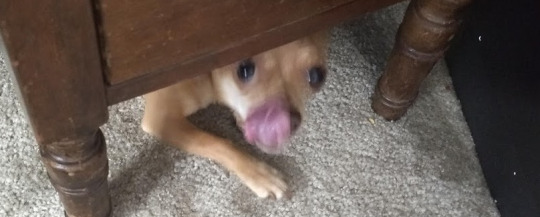
we also have a budgie named olive. he’s pretty, but quiet
#liz blogs#ask meme#ask#serialsharkgay#ty for the ask... i love to ramble..... and i have So Many Thoughts All Of The Time.......#dogs#my dogs#long post#one day im going to edit tiny flames into kiwi's eyes because its funny#just get a gif of fire and photoshop it in there
3 notes
·
View notes
Note
(Aphex) Mod shit can we straight up get a design shitting edition for InsaineMembrane's designs?? APHX-714, APHX-666, APHX-667, APHX-838, APHX-1263, APHX-843, APHX-1341, APHX-1032, APHX-1737, DPHX-1431. in order of how they have them on the website. Love u sorry for torturing u </3333. Tried not to grab any dupes that have been on the blog before but if I got some that have been featured before please roast me to death. Also hope I'm using pronouns they're comfy with but let me know if I'm not
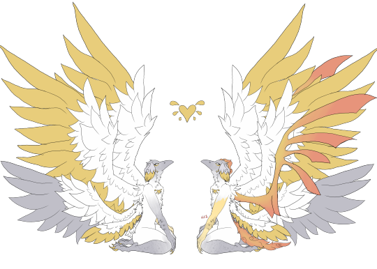
at first i was going to tell you to go fuck yourself because i dont want to but then the bus got delayed so here i am. this one has the faintest hints of a good design actually and that's probably because it's not a clusterfuck of shoddy textures and glaring colors. still not that impressive but considering who makes these it's almost passable. the spikes always look terrible and jut out from weird places, and it took me a second to realize the black clouds on the eyes are wisps but i have less to shit on this other than it's just a touch ugly instead of glaringly ugly
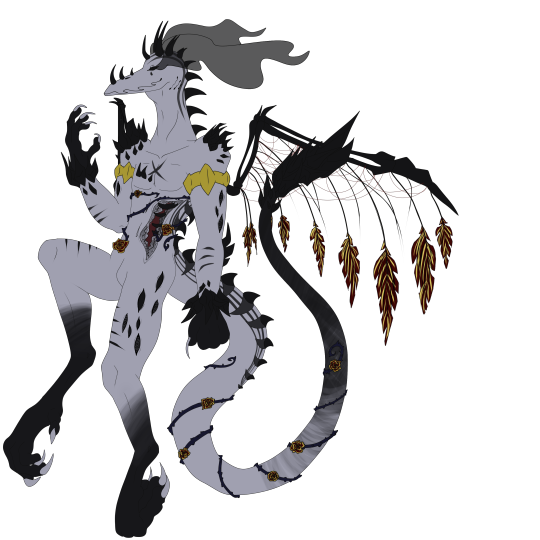
of course they have the 666 one and it's as needlessly edgy as it could be. not even that edgy either compared to the usual clusterfuck. the legs remind me of big bird and its hand behind it looking like it's trying to pull out a wedgie really decreases the edge factor. on the nose also looks like a nose clip for people who go swimming. most of it's just repeating patterns for the sake of filling space
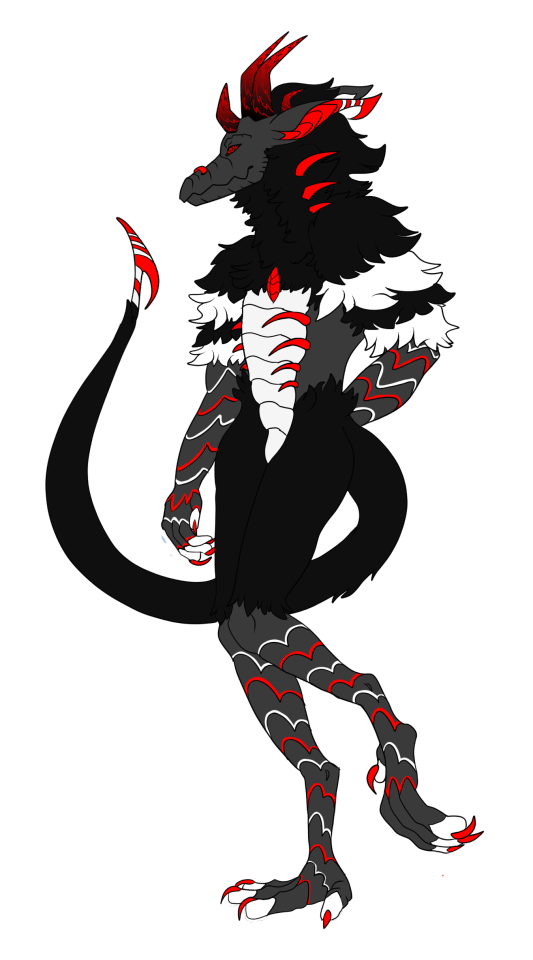
i might just have very low standards but this design is completely fine. the right version gets to the weird overcomplicated nonsense but the one on the left has nothing wrong with it. right looks like it got a disease
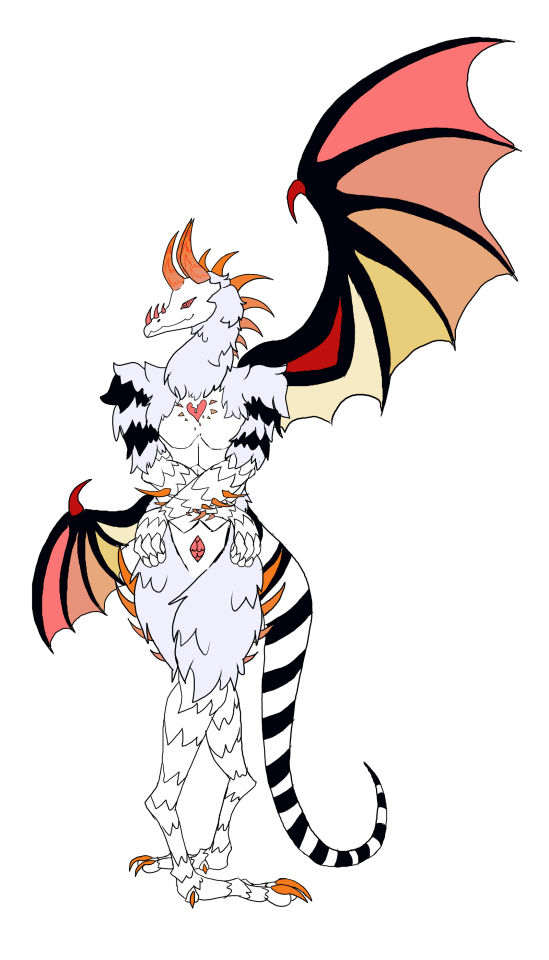
I kind of appreciate the various poses these are drawn in but this one's closer to what i expected. a shitton of spikes and zigzagging segments that is more confusing than anything, on a pose that is clearly either eyeballed or traced somewhat because anything that has to be drawn from scratch has incredibly low skill. they've gotten better at color placements though. idk i feel i just have to reward actual progress. this does not stop it from looking a lot like a chicken or the fuckugly hands though
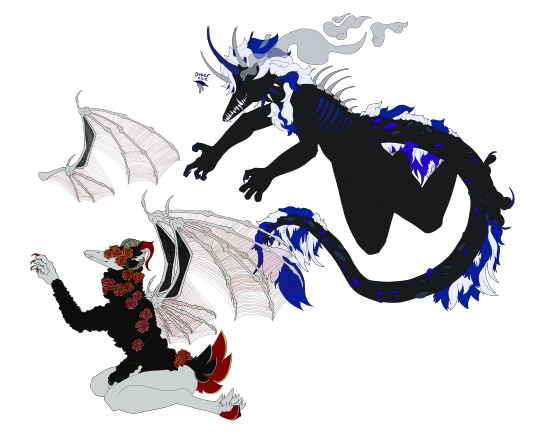
im glad you discovered the darken layer in procreate now can you learn some better things too. same spikes though im unsure if these are standards for the species or whatever. idek what the effect is trying to pull off or why the right wing looks broken. in fact both wings appear broken because they just out of the wrist when usually wing membranes are connected to the hand themselves. the eyes almost look like trypophobia and the amaazing stamp brush used for the circles

click on the link because this one couldn't be assed to be properly colored in at bits or even have the lineart connect. idk what the reference was but why is it doing a weird look over the shoulder. points i guess for trying to copy what a flail looks like even if it's incredibly obvious. the horns don't make a lick of sense and nothing is even which is almost a breath of fresh air compared to the over used symmetry ones. almost, it still looks bad.

idk which part of it lets it have two bodies with entirely different designs but sure let this person make more bad designs. these would actually look fine if anyone else was designing them, though right one is very hard to see because it's mostly black god forbid this be drawn with any shadows or you'd lose the bitch
this looks like a crook because of the mouth and limb situation. the lines aren't smooth at all do they do this with a mouse

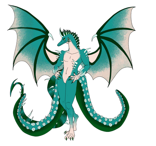
another common sign a person's a beginner is their overuse of a single interesting stamp brush. it works for the wings but does not work as well for the wrists or ankles. the tail is very hard to see past the two octopus tentacles in face they are covering it entirely. the webbing on the forearms make little sense
another attempt at a plague rat. the limbs are already jacked up but they couldn't even make them look attached or like they'd even bend properly. also apparently the mask is a trait too. the subtle tint of gross piss yellow adds a nice touch for infected sewer rat just fix the anatomy and this almost could be decent

0 notes
Note
So I read your FAQ and I didn't see this, but I was wondering what program/brushes you use? They have a nice texture to em.
hi! sure thing. firstly, the program that i mainly use for art is clip studio paint (also called manga studio i think) and as such all the brushes i use are made specifically for csp/ms.
secondly, the brushes that i have are basically a big compilation of singular files from brush packs that i find mostly on deviantart and gumroad but i’m gonna go ahead and provide the links to them below! also i’m putting this under a read more bc this is kinda long.
the brush that i currently use for lineart/sketches/sometimes shading is a modified version of the “ink angular” brush from this pack by typesprite on da! here’s an example of the difference between the two:

here are the mods if u want them!


(there aren’t any arrows on this one bc on the original brush there’s no texture setting. just click the drop down and select impasto.)
brushes i also use for shading are rough brushes 1 and 2 from this dry brush pack by roastedstix. i didn’t modify these bc i liked how they were! (u can probably tell by now that i fancy rough brushes lol)

those are pretty much the main ones i use right now.
OH and the brushes that i used for my bigger pieces are DAUB’s “fine pencil hard 2″ from this pack for lineart and the acrylic brush from armin nelsyn’s basic oil and acrylic brush set (which is free btw!) for blush (on nearly all my recent works actually) and shading.

i hope this is helpful to u! ill be adding this to my faq as well for future inquiries!
29 notes
·
View notes
Note
would ya give me a tip or tell wich drawing program is better for your/a drawing tablet. (also love you and your art -
Honestly, I don’t know what to tell you, so lemme just start off with my whole history of art programs.
When I first started drawing digitally, I was using Adobe elements, think of it as a watered down version of Photoshop. This program came in a package deal with a few other programs and what got me into drawing digitally. As I said, it’s a watered down photoshop, meaning that there are some functions in the program that are very similar with Photoshop but not all of them are in Elements. I would recommend this to anyone that’s interested in getting a start or have an interest in trying a drawing program and I feel that it’s a good buffer.
One of the programs that came in the bundle was called Painter, it was bascially a program that would digitally recreate traditional drawing tools and techniques like watercolor, oil painting, acrylics, ect. This one wasn’t my favorite cuz at the time I didn’t understand how to utilize all the tools properly, so I ended up uninstalling it.
Then I moved onto Photoshop. Yes it’ll cost a pretty penny, but you can download an older copy from anywhere and it’ll still work just the same. From when I was in high school to even today I’ve been using Photoshop for all my drawing purposes. If someone were to ask me how to do a certain function in the program, chances are I’ll know exactly what you need done and could just tell you, that’s how confident my knowledge is in this program. But I started to grow tired of using the same program and decided to look into other art programs in the end. Which is how I ended up finding Sai and Medibang.
Personally, my favorites to use are Paint tool Sai and Medibang Paint. It’s mostly due to the stabilizer that’s programed in there that makes drawing a bit more fun. With Sai, I feel that I can be a bit artistically creative and do certain things that I couldn’t do in Photoshop, such as having a sharper looking lineart. In Medibang paint, while I wouldn’t use it to draw a portrait painting like in Sai, I could play around with the manga tones and give my comics more depth and look a bit more professionally made. Also with Medibang paint, not only is it free to use but it makes drawing comics 40% better for me as there are ways to create borders, speech bubbles, and text so much easier.
I kinda wish that Sai 2 will hurry up soon so that I can use their guidelines for more intense drawings and scenes that I want to do.
As for my tablet, for a huge majority of my life I was stuck using an older wacom tablet, it’s old enough for me to be concerned with whether or not they’ll keep updating the drivers for it. So ultimately I decided on a cheaper but recommended Turcom tablet after finding a tumblr post about it and doing some research of my own.
Do the programs and my new tablet work together, kinda. I say this in that in order for me to use me tablet with Sai, I’d first have to plug it in and then open up Sai, otherwise I’d lose my tablet’s pressure sensitivity. It’s kinda the opposite with Medibang and I have to open the program first and then plug in my tablet.
So, that’s my experience with technology, hope you find this helpful.
5 notes
·
View notes