#typespotting
Explore tagged Tumblr posts
Photo

Motto © - Logotype concept. Contact me if you need a logo or a branding. . . I would really appreciate your support and your thoughts in the comments. . . . #typography #type #graphicdesign #fonts #lettering #logo #typespire #typographyinspired #typetopia #inspiration #monogram #calligritype #goodtype #typism #thedailytype #thedesigntip #showusyourtype #designspiration #typeverything #typespot #artoftype #typeworship #getinspired #hopemengdesign #logoplace #logoshare #tsaritsyndesign (at Poland) https://www.instagram.com/p/CqLKE78tMr8/?igshid=NGJjMDIxMWI=
#typography#type#graphicdesign#fonts#lettering#logo#typespire#typographyinspired#typetopia#inspiration#monogram#calligritype#goodtype#typism#thedailytype#thedesigntip#showusyourtype#designspiration#typeverything#typespot#artoftype#typeworship#getinspired#hopemengdesign#logoplace#logoshare#tsaritsyndesign
13 notes
·
View notes
Photo

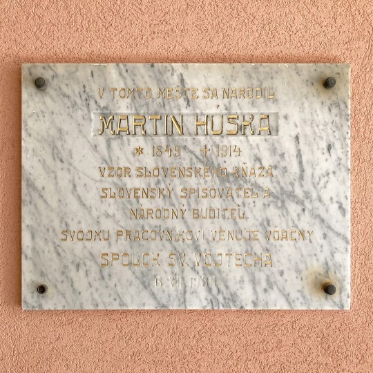
Martin Húska stone-carved gold-plated memorial plaque in Ružomberok, Slovakia. #Ruzomberok #Slovensko #Slovakia #stonecarving #gold #foundtype #street #type #streettype #streettypography #typespotting #letterspotting #typography #letters #lettering #design #graphicdesign #dailytype #inspiration #sign #signage — by Urtd (Also on Instagram and Flickr)
1 note
·
View note
Text
Week 1

For my personal organisation I created a folder system to effectively group and keep track of my progression week by week.
Project Details:


The key concepts I took from this brief:
- Consider interaction with publications
- Build on previous knowledge
- Acquire intermediate skills to utilise industry-standard software to design and produce a printed publication.
We were provided with a document outlining the information about typografika. This document contained many grammatical errors, which I assume was done purposefully for us to proof read and edit as part of showing out intermediate level design skills.
Documenting Process:
As a designer, I have my own way of organising, grouping and documenting my process in a way that is most effective for me. I personally use folders on my desktop and write my thoughts and feelings on notes. I find Tumblr in-effective for me to document processes, so I will use my own documenting processes, then update Tumblr at a later time.
I will be using this Tumblr blog to document process, experimentation, outcomes, learning etc. Each week I will populate and update the blog with new information relating to this project.
What is Typografika’24?
Typografika’24 is a typography conference and event. It brings together many talented creative mind to inform. There are workshops and talks where designers will share their knowledge.
The Speakers at TYPOGRAFIKA’24
There is not much space for too much information about the designers on the publication, so I have selected the designers I am most interested in, and done thorough research for my own knowledge and understanding.
Verena Gerlach
(source: https://www.oneclub.org/awards/adcawards/-judge/3273/verena-gerlach )
Verena Gerlach is a graphic/type designer. She specialises in typography and has been extremely successful in this industry.
She is most recognised for her fonts she created for global font companies such as:

http://www.identifont.com/show?18W ^^
She has created a vast range of fonts with varying styles and purposes. She has both formal and playful fonts, as a type designer she is versatile in her work.
Verena officially began her work in the design world in 1998 when she founded her studio for graphic design, type-design and typography in Berlin. She began lecturing in type design and typography in 2003 and now gives workshops and lectures globally.
To develop a better understanding of how Gerlach functions as a type designer I watched this lecture that she gave called “How to find the real (type) face of a city.” Video : https://artmuseum.pl/en/doc/video-wwb-tv-typespotting

In this presentation she speaks about her project of over 10 years which was to create a typeface that takes inspiration from, and represents Berlin. Below are some notes I took from the presentation about her project and her design processes.

Below are two images that Verena found that display the original “block” typefaces that were used in Berlin around the time of the Cold War along with the original images she took of real type she found in East Berlin.


And now below is how she used the theory of “ staying true but allowing change” in a recreation of the original fonts used in a new current way:

You can see the use of the pictures she took of the original typeface, but embedded into a “new era” of design for Berlin.
As someone who often struggles with the design process, this presentation gave me new ideas of ways to inspire my work. For example, if im feeling stuck, in can be as simple as going outside and taking pictures of areas/buildings/landscapes etc to help me broaden my thinking when designing. It can be easy to get into your own head when in a creative space, and stepping outside of your own head and allowing new ideas to come to you can be eye opening and inspiring.
Johnson Witehira
In design research in my first year I did a project on Witehira using his design principles and style to influence my own work, so this is a speaker that I am very familiar with. This is the research I had on him for this project:
- HIS LIFE
Born in Taumarunui, Witehira grew up in Gisborne and now lives in Fielding with his wife and two children. Reflecting on his childhood, he says it was bereft of Māori design: “When I was growing up as a kid the only thing in my home that was Māori was the people, and I think that's such a strange thing.” Now when he walks through his own home he looks at objects – like a chair or cutlery – and wonders what they would look like reimagined; what it would be like – and have been like – to grow up surrounded by practical Māori design. From a young age Johnson Witehira took notice to the lack of Maori influence in New Zealand. He recognised that Maori culture and tradition deserved more attention and recognition. “Before our Pākeha ancestors arrived we designed everything in our world. We designed our clothes, our tools, our vehicles, everything, and now for the most part what we’re often doing as Māori is decorating other things people have made to make them Māori.”
In Highschool Witehira decided in being a designer and went on to study graphic design. After this he studied a Doctorate in Māori visual arts at Massey University where he explored how to include Māori visual culture in a contemporary way. ”I went from Western design knowledge to learning about Māori design and practice. It’s been a long process – about 12 years.” “When people think Māori art or design they think patterns stuck on something and that's often what we do - put patterns on a thing and say that's a Māori design. People make Māori tools, but they do them as art objects - we should be using them. “I've got the same view of people making kete to go on walls in homes - you don't see Pākeha making bags and putting them on their walls.”
- WHAKARARE

One of Johnson Witehira’s biggest achievements as a designer would be his creation of the first offical Maori typeface “WHAKARARE“Māori designers have a responsibility to bring Māori visual culture back into the world they live in. For Witehira, typography is identified as an area of particular interest because it concerns both design and the written language. The wero (challenge) was to create the first by Māori for Māori typeface, a typeface that reaffirms Māori ideas about the world and stakes a claim to the printed page. The name of the typeface, Whakarare, is borrowed from a pattern in Māori carving which inspired part of the design. Meaning to confuse or distort, whakarare creates a distorted effect in carving by traversing the pākati notch and other elements. An example of the pattern in context and an illustration of the element can be seen in figure 2. Witehira was motivated to create a Māori typeface for three reasons. Firstly, as a Māori designer he wanted to use a typeface that connected to his culture and identity. As acclaimed typographer Jeffery Keedy (1994) points out, we need more voices in typeface design, voices that relate to who we are and our own experiences in life.
- DESIGN STYLE
Witehira’s work has a strong aesthetic that comes from combining traditional Maori form and pattern with ideas from graphic design and contemporary Western arts practice. Through his numerous projects he looks to develop indigenous and Maori design in the areas of typography, graphic, product, packaging and fashion design. He has also been involved in the development of Māori design education through teaching and the development of new Maori-centred design programmes.
Red is a staple colour in Johnson Wisterias work which is associated with energy, willpower, anger, leadership, courage, longing. Which are all things that relate to the purpose behind Johnson Witehira’s work. He is pushing Maori influence in the design world and is reverting the westernised design in current times back to indigenous influence.

This is his work displayed in Times Square.
Commissioned by the QT Hotel Wellington to create a wallpaper.

Nadine Chahine

Kouyifa Typeface:

I Love Typography:


More Fonts By Nadine Chahine:


Sources:
https://arabictype.com/about/
https://www.linotype.com/1185618/koufiya-family.html
https://www.myfonts.com/collections/nadine-chahine
Structure:
In class we discussed and attempted different types of folds for a 4x4 brochure with a poster on the other side. I experimented with an accordion/concertina style fold and a gateway fold.
*insert videos here
After experimentation I decided a portrait poster with a gateway fold would be a more interactive way of displaying typography as it requires more attention to unfold as well as being more unique in terms of regular brochures. However, I wanted to be sure that my brochure would be interacted with in the way that I was designing it to be. So I got someone who isnt involved with design and asked them to open the brochure the way they thought it was meant to be done. This was successful and gave me confidence in the interactive side of things.
*videos of Armani opening
INDESIGN SETUP
In class we were shown a tutorial on the format and set-up of our InDesign file for the brochure. There needs to be one page set-up as a poster and another page divided in 4X4 sections to construct the brochure side. We used grids in InDesign to create a functional template.


Learning Outcomes: TEXT
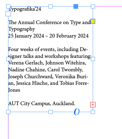
- I learnt how to continue text from one text box directly to another

InDesign will let you know of there is text that is running outside of the text frame. We know this because of the red box icon attached to the text frame.

By clicking this icon you can create another text box (whatever size and shape wanted) and the text will continue where you left off.


The by selecting “show text threads” you can see what order they are in and in what order there are meant to be read.

I really think this technique will benefit me in the brochure making process as it means you can ensure all text is included in the brochure, and using the “show text threads” option will allow me to keep my text organised and ensure it is read correctly by my audience.
Learning Outcomes: A-PARENT PAGES
On the pages panel there is an “A-Parent” option. This means the page I am working on is the template for the other pages in the space. This allows fluidity throughout while also saving time. It means you dont have to create grid guidelines on each page, instead just on one and InDesign will paste it across all pages.

0 notes
Link
Organic Long Sleeve Baby Bodysuit | MTCOM
.
#onlineshop #online #OnlineShopping #onlinemarketing #onlinebusiness #onlinestore #onlineboutique #OnlineCoach #onlinegaming #OnlineCoaching #onlineshopjakarta #onlineshopmurah #onlineshopindonesia #onlinetraining #onlineshopindo #onlinetrainer #onlineshopbandung #onlinedating
0 notes
Photo

#typespotting #reims #foundtype #french #janspotstype (at Reims, France) https://www.instagram.com/p/CQ4Fhz2hqdg/?utm_medium=tumblr
2 notes
·
View notes
Photo

#amsterdam #typeinamsterdam #amsterdamsigns #signsfromamsterdam #lsl_amsterdam #lettersigns #letterforms #signhunting #signhunters #foundtype #foundtypography #typespotting #typeinthecity #urbansigns #urbantype #streetfonts #lettereurbane #graficadellastrada #vintagesigns #typo #typematters #typography #tipografia #dailytype #typelove #goodtype #typoholic #typographyinspired #lettersignslove #nomadunicorn (at Amsterdam Centraal) https://www.instagram.com/lettersignslove/p/Bv8nWt8ldMw/?utm_source=ig_tumblr_share&igshid=zyr1x1yx37nz
#amsterdam#typeinamsterdam#amsterdamsigns#signsfromamsterdam#lsl_amsterdam#lettersigns#letterforms#signhunting#signhunters#foundtype#foundtypography#typespotting#typeinthecity#urbansigns#urbantype#streetfonts#lettereurbane#graficadellastrada#vintagesigns#typo#typematters#typography#tipografia#dailytype#typelove#goodtype#typoholic#typographyinspired#lettersignslove#nomadunicorn
3 notes
·
View notes
Photo

Sweetheart. . . Soundtrack: @loscobeats - Bae Bae. Alternatively: The Smiths - Bigmouth Strikes Again. . . #type #typography #typespotting #typeinthecity #oldtype #oldsigns #urbantype #urbantypography #urbantyping #urbanlettering #foundtype #foundtypography #streettypography #streetsigns #threshold #lettering #signs #signage #signhunting #ghostsign #ghostsigns #photofest_antwerp #belgiumspc #antwerpstreetcollective #lostonthestreet #sonyalphabelgium #sonyalphaphotography #sigmafotobenelux #canonbelgium (at Antwerp, Belgium) https://www.instagram.com/p/CHSJfPCHxKo/?igshid=1fs6gfocz82rg
#type#typography#typespotting#typeinthecity#oldtype#oldsigns#urbantype#urbantypography#urbantyping#urbanlettering#foundtype#foundtypography#streettypography#streetsigns#threshold#lettering#signs#signage#signhunting#ghostsign#ghostsigns#photofest_antwerp#belgiumspc#antwerpstreetcollective#lostonthestreet#sonyalphabelgium#sonyalphaphotography#sigmafotobenelux#canonbelgium
0 notes
Photo

Herramientas mínimas. Proyectar y diseñar un alfabeto, un libro, una historia con lo que hay. El relato que estas imágenes construyen las transforma en libro. Este alfabeto, diseñado durante (o a partir) del taller «Legible ilegible» de @lieve.cornil , era para el aniversario del lockdown, pero bueno, los tiempos del libro son diferentes ¶ Minimal tools, to project and design an alphabet, a book or a story with the materials that I have at home. The story that these images are telling transform them into a book. The alphabet was designed during the workshop Legible-ilegible (Lieve Cornil). It was intended for the lockdown’s anniversary, but the book’s times are different. #artistsketchbook #letteringsketchbook #artisprocess #handletter #womentype #womenoftype #grafikradar #tyxca_lettering #womenoflettering #femmetype #designbywomxn #letteringcommunity #letteringinspiration #thedailytype #typespot #typism #bookdesign #editorialdesign #carogiovagnoli (en Pankow, Berlin, Germany) https://www.instagram.com/p/CfECseZKY-2/?igshid=NGJjMDIxMWI=
#artistsketchbook#letteringsketchbook#artisprocess#handletter#womentype#womenoftype#grafikradar#tyxca_lettering#womenoflettering#femmetype#designbywomxn#letteringcommunity#letteringinspiration#thedailytype#typespot#typism#bookdesign#editorialdesign#carogiovagnoli
13 notes
·
View notes
Photo

Deepthink © - Logotype concept. Contact me if you need a logo or a branding. . . I would really appreciate your support and your thoughts in the comments. . . . #typography #type #graphicdesign #fonts #lettering #logo #typespire #typographyinspired #typetopia #inspiration #monogram #calligritype #goodtype #typism #thedailytype #thedesigntip #showusyourtype #designspiration #typeverything #typespot #artoftype #typeworship #getinspired #hopemengdesign #logoplace #logoshare #tsaritsyndesign (at Kyiv, Ukraine) https://www.instagram.com/p/Cp77CbgtNWt/?igshid=NGJjMDIxMWI=
#typography#type#graphicdesign#fonts#lettering#logo#typespire#typographyinspired#typetopia#inspiration#monogram#calligritype#goodtype#typism#thedailytype#thedesigntip#showusyourtype#designspiration#typeverything#typespot#artoftype#typeworship#getinspired#hopemengdesign#logoplace#logoshare#tsaritsyndesign
2 notes
·
View notes
Photo

Jozef Budaváry stone-carved gold-plated memorial plaque in Ružomberok, Slovakia. #Ruzomberok #Slovensko #Slovakia #stonecarving #gold #foundtype #street #type #streettype #streettypography #typespotting #letterspotting #typography #letters #lettering #design #graphicdesign #dailytype #inspiration #sign #signage — by Urtd (Also on Instagram and Flickr)
1 note
·
View note
Photo

Beautiful entry by @letteringsoup for today’s Goodtype Tuesday with @secretwalls! . . #goodtypetuesday @goodtype @secretwalls #goodtypexsecretwalls #support #letteringdesign . . . calligraphy #calligraffiti #moderncalligraphy #letteringco #50words#TypeSpot #typeyeah #typotopia#typematters #greattype #typostrate#typegang#bftype#letteringdaily #letters #typedesign#welovetype #letteringdesign#handwrittenfont #letteringlove#handletteringpractice #typeverything#handlettering #strengthinletters #type#brushlettering #typographie #letteringco https://www.instagram.com/p/B_i24xyJyS1/?igshid=vmzjykjgpzvh
#goodtypetuesday#goodtypexsecretwalls#support#letteringdesign#calligraffiti#moderncalligraphy#letteringco#50words#typespot#typeyeah#typotopia#typematters#greattype#typostrate#typegang#bftype#letteringdaily#letters#typedesign#welovetype#handwrittenfont#letteringlove#handletteringpractice#typeverything#handlettering#strengthinletters#type#brushlettering#typographie
11 notes
·
View notes
Photo

Before • After Trying out a new gloss varnish. Really enjoy the added saturation. #typography #lettering #calligraphy #handstyle #goodtype #type #typegang #typespot #handmadefont #calligraffiti #typographists #ligaturecollective #script #handlettering #modestone #gamvar #gloss #varnish https://www.instagram.com/p/B9fLiC_JVyd/?igshid=ncgkmgbvwhl5
#typography#lettering#calligraphy#handstyle#goodtype#type#typegang#typespot#handmadefont#calligraffiti#typographists#ligaturecollective#script#handlettering#modestone#gamvar#gloss#varnish
6 notes
·
View notes
Photo

Just another #typespotting #france #brittany #foundrype #streetsigns #janspotstype (at France) https://www.instagram.com/p/CSTih8tMGK-/?utm_medium=tumblr
0 notes
Photo

Oosterpark school. 's-Gravesandeplein 19A, Amsterdam. 📸 @coolpuk_amsterdam . . #amsterdam #typeinamsterdam #amsterdamsigns #signsfromamsterdam #lsl_amsterdam #lettersigns #letterforms #signhunting #signhunters #foundtype #foundtypography #typespotting #typeinthecity #urbansigns #urbantype #streetfonts #lettereurbane #graficadellastrada #vintagesigns #typo #typematters #typography #tipografia #dailytype #typelove #goodtype #typoholic #typographyinspired #lettersignslove #nomadunicorn (at Amsterdam, Netherlands) https://www.instagram.com/lettersignslove/p/BwokXuVBASN/?utm_source=ig_tumblr_share&igshid=12qggkjxccm1a
#amsterdam#typeinamsterdam#amsterdamsigns#signsfromamsterdam#lsl_amsterdam#lettersigns#letterforms#signhunting#signhunters#foundtype#foundtypography#typespotting#typeinthecity#urbansigns#urbantype#streetfonts#lettereurbane#graficadellastrada#vintagesigns#typo#typematters#typography#tipografia#dailytype#typelove#goodtype#typoholic#typographyinspired#lettersignslove#nomadunicorn
1 note
·
View note
Photo

Yeah they are, lovers gonna love, need more of that in the world these days, so passion for the good just as much as the stuff not as...good. . . . 43/100 #100daysoflettering #100tagelettering #100tagelettering2019 #berlinletters #lettering #handtype #thedailytype #typespot #typographyinspired #typegang #typism #goodtype #50words #designspiration #letteringco #welovetype #typematters #bftype #allthingsletters https://www.instagram.com/p/B58ppqTBuz9/?igshid=13evfhj2yzbqq
#100daysoflettering#100tagelettering#100tagelettering2019#berlinletters#lettering#handtype#thedailytype#typespot#typographyinspired#typegang#typism#goodtype#50words#designspiration#letteringco#welovetype#typematters#bftype#allthingsletters
10 notes
·
View notes
Photo

A new vintage display typeface on @ephemerafonts . . Started from the passion of collecting the old tin packaging with classic labels on it, the layout and composition make Ilham pretty inspired and the urge of crafting the letters is getting bigger since that day. . That's what comes first as a motivation in making this Ephemera Kingsford typeface. . Adapted and referencing from the real physical collectible old tins and cans to a single pack of digital fonts asset. . Packed up with 9 layered fonts, 1 font as a pair, and of course ornaments and vintage panels as a vector file. . Perfectly fit for display printing, handcrafted product, screen printing industry such as apparel, packaging, labels, and also sign painting, scrapbook, glass gilding, et cetera. . Not every visual can go vintage but if you want to, there's no other choice, oldsport. . #ephemerafonts #font #typeface #logotype #vintage #logo #lettering #goodtype #type #badges #typeeverything #texture #typography #typostrate #typographyporn #handlettering #vintagelabels #victoriantype #distressedunrest #typespot #typism #signpainter #signwriting #typespire #designinspiration #customtype #typejunkies https://www.instagram.com/p/B_2sweknmAD/?igshid=wfm8wdiubw0h
#ephemerafonts#font#typeface#logotype#vintage#logo#lettering#goodtype#type#badges#typeeverything#texture#typography#typostrate#typographyporn#handlettering#vintagelabels#victoriantype#distressedunrest#typespot#typism#signpainter#signwriting#typespire#designinspiration#customtype#typejunkies
1 note
·
View note