#tweets are described in image description
Explore tagged Tumblr posts
Text
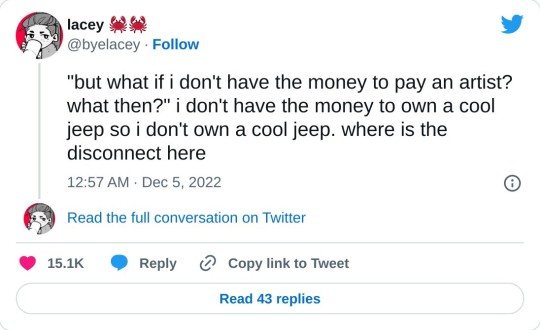
13K notes
·
View notes
Text

GO HARD OR GO HOME.
#fandom#creative writing#art inspiration#image described#image description in alt#in praise of OCs#writing encouragement#trigun#vash the stampede#yasuhiro nightow#also this is an excellent description of vash#holy shit#3k#4k#5k#6k#to the lovely souls waxing pedantic in the notes about which arm is actually the nuke‚ etc.:#i love y'all‚ but that's not the point of this tweet#it is meant as fuel for your own creativity
6K notes
·
View notes
Text

Image description:
A screenshot of a pair of tweets by Janel Comeau @ VeryBadLlama. They read,
“ ‘our great-grandmothers were so much happier staying home with no jobs’
congrats on the generational wealth, I hope you great-grandma waved at mine as she worked her full-time job at the factory
my great-great grandma did not spend the early 20th century sweating her buttons off in a British garment factory to have me sit in my air-conditioned office pining for the days of yore”
End of description.
#the last thing i ever screenshotted from our twitter feed#generational wealth#tradwife#trad wife#trad wives#fuck patriarchy#patriarchy#capitalism#classism#tweet#twitter#feminism#feminist#intersectional feminism#image described#image description included#image description#factory#history#janel comeau
33 notes
·
View notes
Text

#lmao#tweet#wlw#sapphic mood#sapphic memes#sapphic meme#lesblog#wlw blog#sapphic blog#wlw meme#tweets#twitter tweets#funny twitter#funny tweets#alt text in id#image description in alt#image described#wlw memes#gay meme#lgbt meme#meme#memes#funny memes#twitter tweet#twitter#wlw yearning#sapphic post
48 notes
·
View notes
Text
[ID: A tweet by @/notsofiacoppola that reads, "securing your desired username on a new app is the closest millennials and zoomers will get to owning land". /end ID]

67K notes
·
View notes
Text
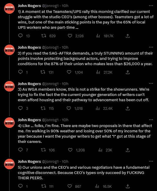
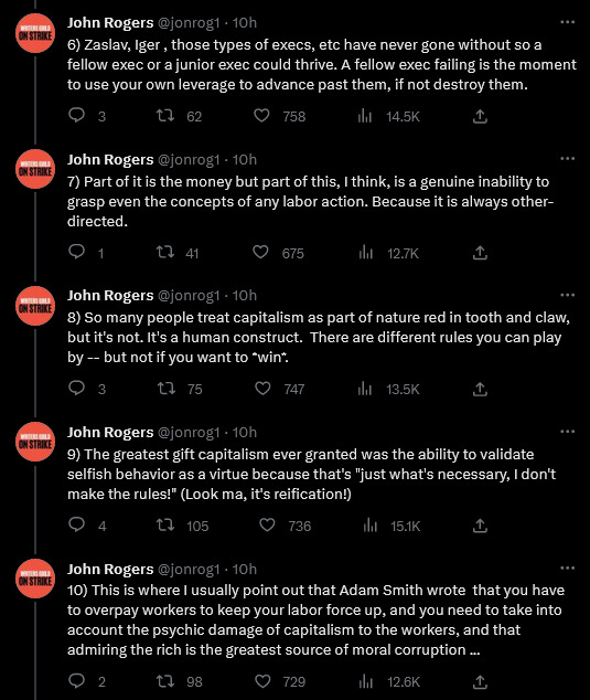
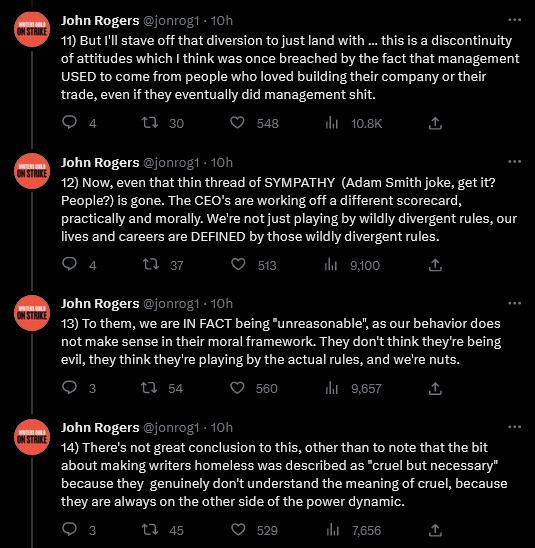
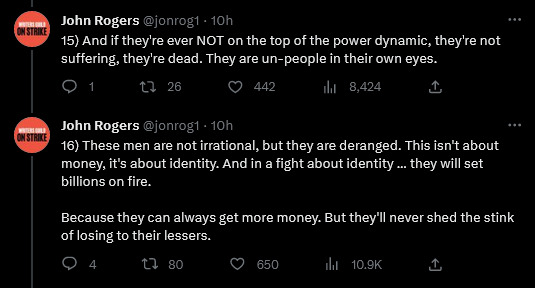
[Image Description: A series of sixteen tweets by John Rogers @jonrog1 that say:
1) A moment at the Teamsters/UPS rally this morning clarified our current struggle with the studio CEO's (among other bosses). Teamsters got a lot of wins, but one of the main sticking points is the pay for the 65% of local UPS workers who are part-time …
2) If you read the SAG-AFTRA demands, a truly STUNNING amount of their points involve protecting background actors, and trying to improve conditions for the 87% of their union who makes less than $26,000 a year.
3) As WGA members know, this is not a strike for the showrunners. We're trying to fix the fact the the current younger generation of writers can't even afford housing and their pathway to advancement has been cut off.
4) Like … folks, I'm fine. There are maybe two proposals in there that affect me. I'm walking in 90% weather and losing over 50% of my income for the year because I want the younger writers to get what I got at this stage of their careers.
5) Our unions and the CEO's and various negotiators have a fundamental cognitive disconnect. Because CEO's types only succeed by FUCKING THEIR PEERS.
6) Zaslav, Iger , those types of execs, etc have never gone without so a fellow exec or a junior exec could thrive. A fellow exec failing is the moment to use your own leverage to advance past them, if not destroy them.
7) Part of it is the money but part of this, I think, is a genuine inability to grasp even the concepts of any labor action. Because it is always other-directed.
8) So many people treat capitalism as part of nature red in tooth and claw, but it's not. It's a human construct. There are different rules you can play by -- but not if you want to win.
9) The greatest gift capitalism ever granted was the ability to validate selfish behavior as a virtue because that's "just what's necessary, I don't make the rules!" (Look ma, it's reification!)
10) This is where I usually point out that Adam Smith wrote that you have to overpay workers to keep your labor force up, and you need to take into account the psychic damage of capitalism to the workers, and that admiring the rich is the greatest source of moral corruption …
11) But I'll stave off that diversion to just land with … this is a discontinuity of attitudes which I think was once breached by the fact that management USED to come from people who loved building their company or their trade, even if they eventually did management shit.
12) Now, even that thin thread of SYMPATHY (Adam Smith joke, get it? People?) is gone. The CEO's are working off a different scorecard, practically and morally. We're not just playing by wildly divergent rules, our lives and careers are DEFINED by those wildly divergent rules.
13) To them, we are IN FACT being "unreasonable", as our behavior does not make sense in their moral framework. They don't think they're being evil, they think they're playing by the actual rules, and we're nuts.
14) There's not great conclusion to this, other than to note that the bit about making writers homeless was described as "cruel but necessary" because they genuinely don't understand the meaning of cruel, because they are always on the other side of the power dynamic.
15) And if they're ever NOT on the top of the power dynamic, they're not suffering, they're dead. They are un-people in their own eyes.
16) These men are not irrational, but they are deranged. This isn't about money, it's about identity. And in a fight about identity … they will set billions on fire.
Because they can always get more money. But they'll never shed the stink of losing to their lessers."
end of image description]
2K notes
·
View notes
Text
I'm seeing a huge uptick in fanart with artist-written alt text and IDs in my fandom circles recently, which is obviously great! But I can also tell that a lot of people, because they're just getting started, haven't quite figured out how to consider the screen reader experience while writing alt text/IDs.
The remedy to this, when in doubt, is to pull up a screen reader or TTS on your own device. That way, you can hear out how things sound. But in general, a couple things to keep in mind:
For multi-image posts: You don't have to repeat the same information in the description of every single image.
If you have a four-image comic, and a character — let's just say a young adult white woman, with brown hair and glasses — features in all those panels, you don't have to repeat that description in every ALT text. The images are going to be read in order, and in context. If a screen reader has to hear "a young adult white woman, with brown hair and glasses" four separate times in quick succession, to say nothing of other recurring characters, that's not a good listening experience!
Yes, if you were to share one of those panels on its own, in some other instance, it might be good to slightly edit the image description, and actually re-include that information. The description of an image is always going to be influenced by the purpose and context of an image — just like images being shared to appreciate the artistry will warrant more description than IDs for memes, where it's best to keep things brief. (And on that topic, this post puts it better than I could.)
And, secondly:
In-post image descriptions should go directly under the image. There should not be commentary in-between the image and the ID.
Imagine if every time you wanted to know what an image was, whether a piece of art or a screenshot of a tweet, you had to hear paragraphs of the artist's statement that presumed you'd seen the art already, or paragraphs of OP's commentary lampooning the tweeter. Imagine if every time anyone posted a graph, you had to read through a short essay presuming you'd seen the graph, but before you actually got to see what the graph was showing.
Yeah, that's the essence of the problem with putting IDs below commentary.
Also, after a point, people will just assume the post is undescribed and skip it! You described your post, you put in the effort to make your post accessible, but you want to make sure it'll have the impact you hope it will, right? Hiding the ID below commentary (or under a read more) is not going to let your effort have the maximum impact.
Here's a visual example of the formatting guideline I just described.
In general, there are many elements of writing IDs that are just subjective, and there are many ID beneficiaries whose preferences differ amongst each other, too. But if you start out by not including redundant information, by considering context, and by considering flow for screen readers? Then you're starting out totally fine.
210 notes
·
View notes
Text
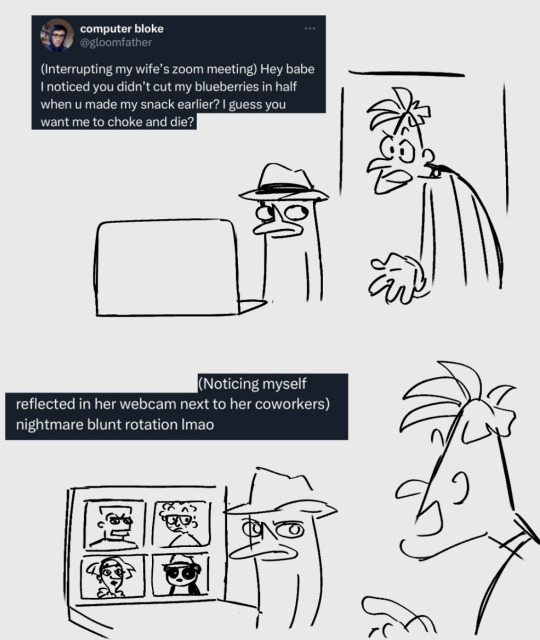
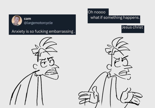
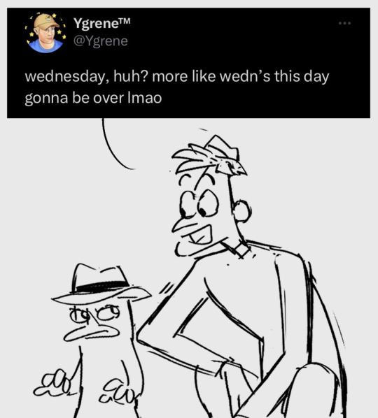
make him relatable facebook memes like minions pls
.
.
[Image description: 3 digital drawings of Perry the Platypus and Dr Doofenshmirtz.
The first image is a two-panel comic. Perry stands behind a laptop and looks at Doofenshmirtz as he walks into the room talking. On the top left is a tweet by @gloomFather showing what is happening in the drawing, it reads, “(Interrupting my wife's Zoom meeting) Hey babe I noticed you didn't cut my blueberries in half when u made my snack earlier? I guess you want me to choke and die?” The second panel shows the continuation of the tweet, it reads, “(Noticing myself reflected in her webcam next to her coworkers). Nightmare blunt rotation lmao.” The drawing under it shows Perry’s laptop, in a Zoom meeting with Major Monogram, Carl Karl, Admiral Wanda Acronym, and Peter the Panda. All of them look blankly at Doofenshmirtz. Perry looks at Doofenshmirtz irritated. Doofenshmirtz’s back is facing the viewer, he’s looking at the laptop screen and is slightly pointing at it.
The second Image is of Doofenshmirtz quoting a tweet. He looks annoyed and is talking, on top of him is a tweet by @largeMotorCycle, it says, “Anxiety is so fucking embarrassing.” He then waves his hands and looks top left even more annoyed, the tweet continues, “Oh noooo, what if something happens. Jesus Christ.”
The third image is of Doofenshmirtz and Perry from the OWCA Files. Doofenshmirtz is squatting and look’s over at Perry, smiling and quotes a tweet by @Ygrene, it says, “wednesday, huh? more like wedn's this day gonna be over Imao.” Perry looks at him with a serious expression. End ID]
- ID written by @/perryshmirtz-described! thanks again!
954 notes
·
View notes
Text
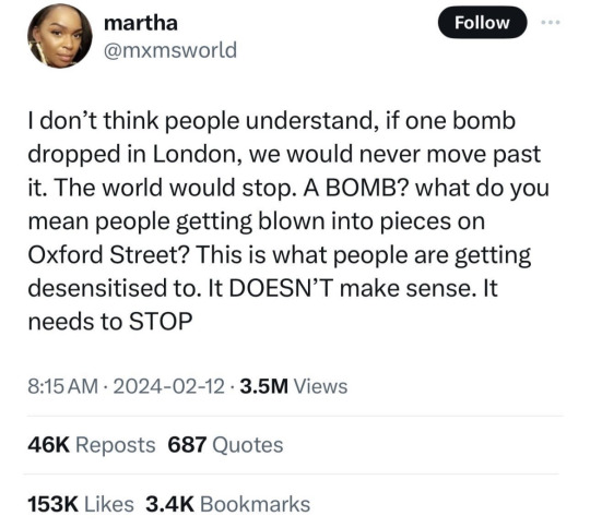
[Image ID: A tweet by "mxmsworld", posted on the twelfth of February 2024. It reads: "I don't think people understand, if one bomb dropped in London, we would never move past it. The world would stop. A BOMB? what do you mean people getting blown into pieces on Oxford Street? This is what people are getting desensitised to. It DOESN'T make sense. It needs to STOP". End ID]
76K notes
·
View notes
Note
Question: why are ids in alt text less accessible?
A few reasons.
#1 being that Tumblr is incredibly glitchy and unreliable, and change things all the time without telling anyone. ALT text can be randomly deleted while making a post, or might just disappear after a few reblogs. It's also usually in incredibly small text, and, up until recently, had a neon purple background with white text, which is the exact opposite of accessible.
People who don't have screenreaders can have a hard time reading it because it's so small or because of whatever colors they choose to use for it at the moment (which could change at any time without warning), and that's assuming tumblr doesn't glitch and remove it, which kept happening a lot. It seems to be working fine as of February 15 2024 (for people reading this post in the future), but as we all know, tumblr is a hellsite, and this time next year it might be an unusable mess.
Plain text on the other hand, is a lot less likely to glitch, can't easily be deleted once a post has been reblogged, and is much more accessible to everyone who needs it, including those with screenreader access and those without.
It's also unfortunately very common for the "Image descriptions" in alt text to either be completely wrong, or missing vital information.
A really blatant example off the top of my head is someone posting a cover for a Sherlock Holmes novel, with alt text available. If you don't need the ALT text or don't check, you're going to assume this post is accessible and fine to reblog...until you check the alt text and realize it's not a description of the book cover at all, it's a note about how the OP's father gave them the book for their x year birthday.
Another example is screenshots of tweets -- when you paste a link for a tweet into tumblr right now (February 2024), tumblr automatically converts it to an image and provdes automatic alt text transcribing the original tweet...
Except that alt text only transcribes the text in the tweet, it doesn't mention any images that are included, let alone describe them, and if you don't need alt text and don't check every time you reblog, you won't notice that half the information in this tweet is being outright hidden from people who can't see it.
Hope this helps explain it!
191 notes
·
View notes
Text
if you see a screenshot of a tweet that has ALT text, before you reblog thinking "Oh, great, it's already described!" check the ALT text.
If the tweet includes a picture, the picture is probably not included in the ALT text.
When you share a link to a tweet (as of December 7th 2023, who knows if/when Elon Musk is gonna break this feature), it automatically converts itself into a "screenshot", with ALT text automatically generated listing the poster and the text content.
It does not do anything for any images in the tweet, because it's literally just copying the text.
You have to manually describe the images that were in the original tweet.
And because most people don't need image descriptions, they will just see that the image has ALT text, not check to make sure it's accurate, and reblog without realizing they're reblogging an inaccessible post.
Please check that ALT text is correct before reblogging. Even if it's not automatically generated, some people are just using it completely wrong because they don't know what it's for.
If the ALT text is incorrect, create a plain text image description, explain the problem, and ask the OP to add the full ID to the original post.
#accessibility#image descriptions#Twitter#Tweets#ALT text#ableism#systemic ableism#image description tutorial
147 notes
·
View notes
Text
[ID: A tweet by @/cowboyenergy that reads, "only psychopaths buy a sticker and immediately put it somewhere, no u have to think about all the places u could stick it, get overwhelmed, and then put it in a drawer for three years". /end ID]

41K notes
·
View notes
Text
Want more described content on your dash? Check out these blogs:
@artdescriptioninthewoods (art)
@accessibleaesthetics
@accessible-art (non-fandom specific art)
@vld-described (Voltron)
@rq-described (Rusty Quill content)
@toh-described (the owl house)
@transcribed-described
@a-captions-blog
@to-transcribe
@readyset-id
@imagedescs
@idescribefrogsnthings (frogs)
@accessiblecore (aesthetic nature posts)
@plushiesdescribed (plushies and toys)
@dicedescriptions (dice)
@online-accessibility-sideblog
@fashion-described (fashion)
@catsdescribed (cats)
@arthistorydescribed (art history)
@creacher-captions
@stamp-it-to-me (Stamps)
@atladescribed (Avatar the Last Airbender and Legend of Korra)
@catcrumb-described (Comics drawn by catcrumb)
@imagedescriptionsquare
@imagedescriptions
@imagedescript
@transcribing-things
@can-i-make-image-descriptions
@accessibletweets (not exclusively tweets, despite the name)
@accessible-affirmations (affirmations)
@accessible-userboxes (userboxes)
And of course, myself: @hijab-described (hijab)
(Some of these are currently inactive, but have large archives of already described content.)
Feel free to reblog with more!
Update:
@mcytimagedescribed (Minecraft YouTube)
@describedmcr (My Chemical Romance)
@forwhomtheblindbellstoll
886 notes
·
View notes
Note
Hi
I just started writing image descriptions and i would like to know what to do if i can't describe a character's exact pose. Are there any websites/ guides i can check? Thanks for your time!
Sorry for taking so long to answer, and thank you for starting to write descriptions!
I’m getting the vibe you’re an artist who is adding descriptions to your artwork?
If so my main pieces of advice is pretend you’re describing the art to someone else. What’s important? What do you want to draw attention to? What are you proud of? (Added bonus, these types of descriptions will also help people who can see the art appreciate it better)
My second piece of advice is ‘any honest description is better than no description’, so it’s ok if you don’t know a character’s exact position.
Right now im mostly describing tweets and other text so I don’t know all the “meta” on describing artwork, so anyone feel free to jump in with more specific advice
63 notes
·
View notes
Text
You added an "image description" to my post - now what? (FAQ)
[Plain text: "You added an 'image description' to my post - now what? (FAQ)". End PT.]
While I'm literally always willing to answer (good faith) questions about image descriptions, alt text, and online accessibility writ large, I also know lots of people have social anxiety about sending DMs, doing IDs "wrong," or just not knowing what IDs are for in the first place. Hence, this FAQ.
If I added an ID to your post and/or asked you to do so, and you're confused about any aspect of that, this is where to start. You can absolutely still reach out to me, I just thought I should consolidate as many answers as possible.
"What is an ID and why does it matter?"
IDs are a description of the content of an image, and can range from a transcript of a screenshot of text, to a description of a detailed piece of art. They should be in plain text, and placed on the line immediately following the image (unless it's alt text, more on those pros and cons later).
IDs are primarily for blind and low vision people who use screen readers to navigate the internet — but help others too, including lots of neurodivergent people. Check out this post (link) and the notes for more examples (dyslexics, migraine sufferers, people who can't interpret expressions, people with slow internet...)
IDs are important because without them, the Internet really sucks for people who need them. You probably don't realize how many undescribed images circulate on tumblr every day, with no way for a lot of disabled people to engage with those posts.
A blind person talks in more detail about all of this here (link).
"I reblogged your ID, is that enough?"
It's not that I don't appreciate it, but editing it into the root post and then reblogging that is much more impactful, for a variety of reasons. It means people who need IDs don't have to dig through the notes for them, it means that Tumblr can't glitch by failing to load the notes and make the ID functionally disappear, and it means all people who find the post in the tags or on your blog will be sharing the accessible version.
To explain visually, the best thing to do is something like this:

[ID: two mock-up Tumblr posts to illustrate adding an ID from the notes to the root post. A blog named "your-blog" posts an image of text reading "something cool you posted" with the caption "check out this cool image I made!" In the notes, the blog "image-describer" reblogs with an ID, which is highlighted. This version of the post is labeled: "original post, reblogged via ID writer."
The second version of the post is from "your-blog" again, where they've added the ID directly under the image, with the same caption below the ID. This version is labeled "updated root post, with ID copy-pasted. End ID.]
"My caption/commentary first, or ID first?"
Include the ID right under the image, followed by your caption or commentary. Unless you're putting your commentary before the image itself, a sighted person will see "image, commentary" in that order, so to ensure the post flows the same way, use the order "image, ID, commentary."
Commentary frequently assumes that the reader has seen the image, after all! A person might not even realize the image is described if the ID is buried too deep, because they might lose patience and skip the post. Or, to explain visually:

[ID: two mock-up example posts with an ID, one formatted well and one poorly. They both start with an image, which is just the text "screenshot of a tweet or something." The first post includes the ID immediately under the image. Below, it continues: "commentary blah blah blah get a load of this guy can you believe it." The post is labeled "Like this!" in green with a check mark.
The second post includes the commentary first, then the ID after the commentary. It's labeled: "Reads awkwardly, deprives screen reader users of immediate context" in red with an X. End ID.]
"I want to make a change to the ID, is that okay?"
Yep! If you want me to change it on my blog too (whether it's characters' pronouns, some typo, etc), just message me.
"What if someone else adds an ID to my post? Would they also be okay with me editing it into the original post like you are?"
Almost certainly! I can't speak for everyone, but I've literally never met an ID writer who wouldn't be okay with it — because we all have the shared goal of maximizing accessibility. If you're unsure or nervous, you can always include credit, but most people are even fine with going uncredited.
"I put your ID in the alt text, is that enough?"
I will never tell you not to use alt text when the alternative is an undescribed post, but I really strongly suggest putting it in both the alt text and the post. Some people who use screen readers prefer the flow of alt text, for good reason — but it's also poorly implemented on Tumblr, and it can glitch and disappear on reblogs, in drafts, or just apropos of nothing.
Moreover, when a low-vision person or anyone else wants to read the alt text directly, Tumblr's display options aren't great. (Unless you use XKit Rewritten's AccessKit, which I will always plug, but that's not an option for mobile users.) Long alt text often extends off the page and gets cut off. Tumblr used to use a terrible eye-straining purple background for it, and could always do that again with no warning. It's just not ideal.
Here's a visually impaired person talking more about the pros and cons (link).
It seems we're in need of a compromise, so what can you do? One option is to include the same alt text as image description (placing the ID directly under the image as always, because remember, flow for screen readers is important). I like to lead with "ID from alt," in order to clarify to screen reader users that they can skip the ID, and help differentiate it from the other option I'm about to describe. This should be self-explanatory, but here's an example of a post I did in this style (link).
Option two is to include a short description in the alt text, and a more detailed explanation in-post. This can let screen reader users instantly know that the post is described, and decide whether they're interested enough in it to stick with it, but it maintains an in-post description for others to benefit from too.
Example of me doing this in a post about IDs (link)
Example of my mutual describing art like this (link)
Also, it's the style I follow throughout this exact post! Take a look!
As usual, the ID is directly below the image in all these cases. This means screen readers move immediately from the alt text to the full description, and the post flows the same way it would for a sighted person.
If you're here because I wrote an ID for you, it might be easier for you to put it in the alt text and the post body identically, and that's perfectly fine! But if you're confident writing one short sentence for the alt text and including my ID in the body, you can always go for that too!
"Do I need to keep the brackets or the words 'image description/ID' in the alt text?"
Nope, no need. Brackets are purely for the visual distinction, and most screen readers preface alt text with something like "Image" that fulfills the same purpose as the "ID" label. It's not the end of the world if they're there, but it's redundant, so feel free to remove them.
"Can I put the ID under a read more? Or in small text?"
Please don't. Read mores are glitchy, and oftentimes have to be opened in a new tab. Accessibility that requires jumping through extra hoops isn't accessibility. And worse, if you change your URL or get deactivated, that read more link is usually just gone for good, and the post is undescribed again.
Meanwhile, small text, italics, colored text, and so on aren't good for low vision people or others who read the IDs directly — such as with increased font size — for whatever reason. If you want the ID to stand out visually even more than with brackets, an indent is fine as far as I know. And remember, IDs always go immediately below the image!
"Why do you sometimes copy italics and stuff as plain text? Is that a screen reader thing too?"
Same reason IDs shouldn't be in small text, italics, etc — because of sight readers with low vision. Font in weird styles, or in a fixed size regardless of device settings (to my knowledge, this includes headings) isn't very accessible, so I try to provide an accessible transcript.
Colored text is sometimes even inaccessible to sighted people using certain Tumblr themes! If Tumblr gave individual users the option to disable small text and colors on their dash, then I'd tell you to use them to your heart's content, but as it stands, they're not very accessible.
"Okay, I want to make my blog more accessible, but I don't feel capable of writing IDs on my own. How can I get help?"
Good news, this is my absolute favorite question! I strongly recommend the People's Accessibility Discord (invite link here, please let me know if it breaks).
It was created for this exact purpose of crowdsourcing IDs (and answering questions about them). I talk about it more in this post (link), where I also describe an alternative if you're like me and have massive social anxieties about Discord servers.
TL;DR: ask in the post if someone can add an image description, and edit it in once someone does! If you've read this far in the post, you're clearly an expert on how to do that.
In that post, I also recommend OnlineOCR (link) and Google Lens to extract text from images and save you typing if it's just a twitter thread or something. I would always spot check the text, adjust formatting, and remove superfluous characters, but it usually saves you lots of time when you might not normally have the energy to describe something.
Lastly, a lot of description blogs take requests! I don't unless I specify otherwise, because I easily run out of spoons, but @accessible-art is a great example of a blog that does this for non-fandom art, and there are lots of fandom blogs out there that do similar.
"I want to learn how to write image descriptions for my posts! Do you have any resources?"
This is my image description masterpost (link). I get a little scared about linking it because it's long, and a lot of the linked posts are long, and I don't want to overwhelm people — so please, start with the first few links to get the broad strokes, and then feel free to treat the rest like a index. That is, peruse it if you're looking for answers or advice on a specific topic!
While learning, keep in mind that different ID users want different things out of IDs, and that's okay. Some people, including many blind people, care quite a bit about color, but others don't, and that doesn't mean either is wrong about the types of IDs they prefer versus ones they find unnecessary.
Blind people have a massive range of lived experiences, and all the other people who benefit from IDs broaden that range even more. Generally, no one involved wants huge walls of text, but some people prefer super-minimal IDs, while others prefer a nice handful of (relevant) details. It's stuff like the difference between "Two characters hugging in a cozy-looking house," versus "Two characters hugging with their eyes closed, both smiling. Their house looks cozy and cluttered, with warm lighting."
Neither of those is objectively wrong, and there will be people who prefer either. Nor is it wrong for you, the ID writer, to make a subjective judgement, such as on the "cozy" mood. You don't want to misrepresent things, but subjectivity is usually unavoidable on some level, and therefore fine. Likewise, you don't want to let the ID get so long it's a slog to get through (here's an example of what NOT to do), but if you're describing a complicated image like some art might be, it's okay to add some details. Just start with the important stuff and general idea first.
The purpose of an image also matters. With memes, shorter is almost always better, and excessive detail is annoying (post with examples). You don't need in-depth detail to appreciate most quick jokes. But on the other hand, art is often shared for the purpose of appreciating the details. This post goes into detail about how context matters, and how longer IDs make sense for art sometimes. It puts it better than I could, so I really suggest reading it if this is something you're wondering about! Key word: not length, not brevity, but "relevancy."
In my opinion, IDs are easiest to learn by doing, but also by starting small. If you want to build up your "description muscles" and confidence by just transcribing tweets, that's perfectly fine — and also, the path that myself and a lot of people I know have followed.
Lastly: follow some described blogs! Check out how other people do it! Writing IDs is an art, and though it has a few hard do's and don't's we've gone over, we've also gone over how it's subjective. Everyone brings a slightly different style, with a different level of lengthiness, and it's great to learn from multiple sources. Here's one list of blogs like those (link)!
"Why would this matter if I know I don't have any blind people following me?"
Consider the cycle of inaccessibility (link). If no one ever accommodates blind people, then of course you're not going to see them on Tumblr, in fandom, or in whatever internet circles! And blind people aren't the only people who need image descriptions — again, consider this post, especially this addition (link).
Worst case scenario, even if you have no one who can benefit from IDs either following you, and no people who need IDs would follow you even if you included them, you're still helping people who do maintain accessible blogs to do so — and moreover, normalizing image descriptions in general.
"I don't think blind people would be in this fandom. I mean, there's a huge visual component!"
Described comics and webcomics exist. Audio descriptions for TV shows and movies exist. Disabled people who find creative ways to play video games exist. People who watched a playthrough of a video game by a person who happened to read out the dialogue, and give descriptive commentary on the action, also exist. People who lose their vision over time, or gain other reasons to rely on IDs over time, also exist.
107 notes
·
View notes
Text
Since almost all the art and pictures I come across on Tumblr have no alt text, I figure maybe people don't understand what it's for or know how to use it. Here's an explanation!
What is alt text?
Some people (mostly blind people, but it can be useful for other disabilities too) use programs called screen readers to navigate the computer and read text aloud. That's why pictures need to have a text description (alt text), for the screen reader to read aloud. Alt text is usually hidden and just there for screen readers, though on this site, anyone can click the button in the bottom left corner to access it on any image that has it.
Why is it important?
Alt text makes the internet accessible for anyone using a screen reader. I used a screen reader for a while, so I can tell you how much it sucks to try and use social media only for every post to be like,
"This is the funniest thing I've ever seen!" (image with no alt text)
"This info is so important, everyone please read this!" (image with no alt text)
And then all the responses are agreeing and everyone is having fun and being social, but you can't join, you have no idea what's going on, you're left out of the fun, the cool stuff, the funny stuff, the important stuff, all of it.
How to add alt text?
On this site, when you upload an image, just click the three dots on the bottom right corner and click the option to update image description. You can also add it later by editing the post, if you forget when posting.
What to type?
I'm not the authority on alt text, so I can only give advice based on my experience as a sighted person and what people have told me.
One advice I've seen is to describe it like you're describing it to someone over the phone.
I think a good method is to start by stating the general, then moving onto details. I might start with, "Digital art of an octopus merman," and then go on to describe the pose, the emotion/facial expression, the body, the hair, the colors, the background.
Every screen reader user has different preferences, I've talked to people with completely opposing opinions. But usually someone can move on if they find there's too much description, whereas there's nothing they can do if there's not enough. So I lean toward over-describing.
Additionally, make sure you include anything referenced in your post. If you're just sharing a screenshot of a group of characters, you probably won't describe the shape of each of their noses. But if you say, "I love Bob's nose!" now you should still describe the overall picture but also include the shape of his nose in your description.
That also applies to things like, "This tree looks how I feel." If your alt text just says, "A leafy tree," that doesn't explain the feeling. "A leafy tree that appears to be hunched over with sagging branches, looking tired," is more helpful.
If there's text, include the text. I also like to give context (e.g. screenshot of a tweet). You can even use websites like this one to extract text for you.
Don't just put the word "image." Don't use alt text to credit artists/photographers. Don't use it for jokes, unless the joke is genuinely helping to describe the image.
And remember, trying is always better than not trying, even if your description isn't perfect!
#alt text#accessibility#tagging my fandoms because i want them to be more accessible#bg3#baldurs gate 3#sun haven#project zomboid#monster prom#booklr#artists on tumblr
19 notes
·
View notes