#tutoriels
Explore tagged Tumblr posts
Visit Tumblr Blog
Explore Tumblr blogs with no restrictions, modern design and the best experience.
Last Seen Tumblr Blogs


Fun Fact
The “We are the 99%” Tumblr blog became the slogan for the Occupy Wall Street movement.
Text
Buzz No Limit propose des vidéos de bricolage
Transformez un pot et une louche Dollar Tree en une pièce maîtresse printanière grâce à Buzz No Limit. Le site propose des vidéos de bricolage, des astuces et des tutoriels DIY. Accessible sur plusieurs appareils, Buzz No Limit vous guide dans vos créations originales.

0 notes
Text
UBERSUGGEST : Audit SEO et suggestion de Mots Clés
📌 Ubersuggest est un outil d’Analyse & de Rapports d’Audit SEO Gratuit idéal pour optimiser votre présence en ligne. Identifiez les erreurs SEO, améliorez votre vitesse de site, et gérez vos backlinks efficacement.

View On WordPress
#AMP#audit#bien#Conversion#Domaine#Extension#Facilité#Google#gratuit#liens#Marketing#Opportunités#outil#profil#rapports#recherche#réseaux#Score#SEO#site#tendances#tutoriels#URL#Vidéo#visibilité#web
0 notes
Text
Une maille à l’endroit, une maille à l’envers… au-delà de ces bases simples, le tricot regroupe un ensemble de savoirs-faire et de techniques impressionnant. Si la transmission se fait souvent de pair à pair, on peut être très vite perdu si l’on n’a pas de personne ressource à solliciter lorsqu’on est arrêté par une question technique.
Cette chaîne Youtube permettra aux plus débutan.t.e.s comme aux tricoteurs ou tricoteuses confirmé.e.s d’apprendre ou d’approfondir des connaissances et des techniques.
Toutes les petites (ou grandes) difficultés, que l’on oublie facilement, et qui sont bloquantes lorsqu’on se lance dans la réalisation d’un tricot, sont abordées de façon très pédagogique. Les explications sont claires, précises, la réalisation très soignée des vidéos permet de tout comprendre sans trop d’effort.
Bibliothèque des Côtes d'Armor
0 notes
Text
Profitez des tutos Excel de Trèfle Applications
Sur Trèfle Applications, vous pourrez en savoir plus sur le développement Office en accédant à plusieurs astuces. D’ailleurs, des tutoriels pour utiliser Excel sont actuellement disponibles en ligne.

0 notes

Text
Comment empêcher OpenAI et Google Bard d’accéder au contenu de votre site web ?
Dans le paysage numérique actuel, les IA de chat comme OpenAI et Google Bard sont devenues un outil populaire pour améliorer l’engagement des utilisateurs et fournir un support client transparent. Cependant, il peut arriver que vous souhaitiez empêcher les robots des moteurs de recherche et les outils d’indexation d’accéder au contenu généré par leur IA de chat. Dans cet article, nous allons explorer plusieurs techniques pour empêcher les robots et les outils d’indexation d’indexer le contenu du chatbot sur votre site web.
0 notes
Text
Undertale lore is hilarious because there'll be impossibly deep secrets about certain characters you can more or less only learn by datamining, but also the first major character is called "Toriel" because she gives you the tutorial.
6K notes
·
View notes
Link
[FR] Fiche d’activité HUE 1 – Le réchauffement climatique
#Fichesdactivité#Français#France#HUEAnimation#HUEAnimationStudio#Resources#Science#STEMandSTEAM#Tutoriels
0 notes
Text
#Tricot#crochet#modèle#tutoriels#créations#modèle unique#rare#pour femme#pour homme#chaussons#bob#gilet#cardigan#manteau#amigurumis#Barbie#robe Barbie#collection
0 notes
Text
Unleashing the Tengu: A Shibari Tutorial
youtube
7 notes
·
View notes
Text
Buzz No Limit : découvrez des tutoriels de recettes
Apprenez à préparer la pizza Mont d’Or au feu de cheminée grâce aux tutoriels disponibles sur Buzz No Limit. Le site propose des vidéos détaillées, idéales pour tous les âges, avec des étapes simples à suivre et tous les ingrédients nécessaires pour réussir cette recette originale.

0 notes
Text
HEXCORD : Facilitez la création de contenu vidéo
📌 HEXCORD est un outil simple à utiliser pour créer des présentations, des vidéos tutorielles et enregistrer des discours ou des conférences. Cette extension de navigateur offre une configuration minimale, rendant la création de contenu vidéo accessible
https://www.hexcord.com/ 📌 HEXCORD est un outil simple à utiliser pour créer des présentations, des vidéos tutorielles et enregistrer des discours ou des conférences. Cette extension de navigateur offre une configuration minimale, rendant la création de contenu vidéo accessible à tous.Enregistrez, partagez et collaborez en quelques clics ! Enregistrez en quelques clics Connectez-vous Ajoutez…
View On WordPress
#Chrome#Création#enregistrement#enregistrer#Extension#extensionChrome#Google#hashtags#Hexcord#Mail#navigateur#outil#Partage#Présentations#ScreenCasting#Simplicité#tutoriels#Vidéo#youtube
0 notes
Text
#beauté#makeup#tutoriels#conseils#inspiration#bienêtre#santé#mode de vie#nourriture saine#fitness#sport#voyage#chouchouter#communauté#beauté naturelle#produits de beauté#formations#prestations#bfacewm#bfacelove#healthybfacelove#maquillage#conseilsbeauté#tutorielsmaquillage#astucesbeauté#soinsdelapeau#tendances#produitsdequalité#harmonie#partage
0 notes
Text
Tuto : effet "poussière"
Version requise : Photoshop, pas besoin d'une version récente.
Durée de la video : 8.21min (effet poussière d'étoile + effet "grain texture/brûlé")
Infos : français et sous-titré. Ne pas hésiter à mettre en grand écran pour mieux voir, j'aurais dû zoomer dès le début.
Si vous avez des questions ou si ça manque de clarté, n'hésitez pas ! Ce tuto est sponsorisé par les "hop" et les "zoup" et les "euh".
Exemples de rendu (les effets de poussière d'étoile/ textures grains comme si brûlé) :

346 notes
·
View notes
Note
Hi Zuuuu! I love your art a lot, and I'm having some troubles! I cannot draw a mouth to save my life! They all come out as sad lines, and I don't know how to improve that without drawing lips, and since your drawings usually don't have them (kinda hard with skeletons lol) I was wondering if you had any tips :3
Hii!╰(*´︶`*)╯
You don't need to draw lips in order to show a mouth ☆ Use curves and forms, add dimples on the cheeks, choose teeth or fangs, — feel free to experiment ♡
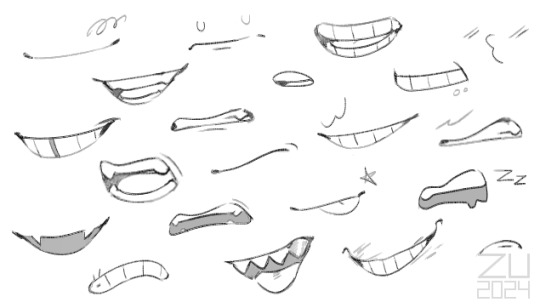
#thank youuu! <3#zu is happy#zu art#ask#tip#tutorial#zutorial#tutoriel#<– I'll never get over with these tags heh
281 notes
·
View notes
Note
Hello :D
I have been following you for the last year or so (a few days after I got my Tumblr lmao) and I absolutely love your art!
I have been wanting to study your art style for a while but don't really know where to start,,,
Could you please show me a small portion of your art process, if it isn't too much trouble of course. Thank you and have a nice day!
hello. oh my god. this took forever to find.
im sorry it took 2 WHOLE FUCKING MONTHS for me to respond to this but i wanted to put it off until i felt happy with my art process again, so here it is
my fall 2024 rendering tutorial!
(this will be very very long)

FLATS AND WHATEVER YOU WANNA DO WITH LINES GIRL. then make sure to recolor the lineart to better match your base. trust me it helps, bold dark lines are Not your best friend when rendering. wait for that post-rendering
i start off with a doodle or a sketch, and then filling it in with flats and other details such as blush

FIGURE OUT YOUR LIGHT SOURCE. FIGURE IT OUT GIRL YOU CAN DO IT you can make it as simple as possible, make it as big as possible, dont even THINK about the details.........just make it really fucking big so you at least know where the shadows and the light goes THEN add smaller shading details LISTEN TO ME. LISTEN TO ME OKAY!!!!!!!!
my key point with this is for you to learn lighting fundamentals.
it's SOOO ANNOYING but alas......they are all correct. it helps a lot.
one thing i also really want to point out is that i like creating a big shadow shape first before fixing up the little details (such as folds and whatever) because it helps me focus on the way the lighting actually works instead of tunnel vision-ing into making the shading make sense on the clothing.

contact shadows (i dont remember if thats what theyre called okay) theyre fucking ugly because im not actually thinking sorry 💔
okay so basically:
contact shadows (if that's what they're called) are the spots in shading and lighting where light will NEVER hit.
shadows are still influenced by the colors and lights around it (it's why a blue shadow and a yellow shadow feel completely different, despite both being shadows) so it's not always COMPLETELY dark.
BUT! there are small points in shadows where light never hits, and they're almost always super dark or pitch black.
it's hard to explain shadow and light so briefly for a tutorial, but you'll notice it when watching fundamental studies and when trying it out for yourself


YES i unclipped the multiply layer YES its ugly and terrifying but it makes coloring the multiply layer easier okay the colors merged w multiply so now it looks cool and has depth overlaying colors that actually make sense
so basically what i did was color the multiply layer that i used to shade the overall drawing
adding a band of red/orange/yellow around where the light hits, and blue where the shadows get big and wide, gives it a fake ambient occlusion effect in the way that a person would get if they stood under the sun with a clear blue sky
the colors don't have to make sense, especially because i never draw backgrounds, but coloring the shadows really help it give a sense of depth and extra subtle detail and effect that just helps make the painting look nicer
around the end, i also put in colors (in an overlay layer with a low opacity brush) that actually make sense in context of the drawing, which is the lit cigarette and the yellow eyelights
mostly because none of the colors were making sense and i needed to actually make use of the lighting that DOES exist in the drawing lol

adding a muddy golden yellow pin light layer (opacity turned down to like 40-50%) to make the light colors less ugly lol
i SWEAR by the fucking pin light layer style. it's so useful and so so underrated.
i used an almost brown-ish gold color on stop of all the layers, and with the pin light layer, it helped make the bright (almost blue-ish) white colors more warm and more yellow. it just helps make things more warm (something i prefer)
i could probably show what it looks like without adjusting the layer opacity to truly show off what i mean (like in the coming section) but i sadly forgot to do that lol


make a layer on top of your drawing with this color in these ranges YES the drawing is fully merged NO don't be afraid, the base was fucking ugly anyway 💔 make this layer into an exclude/exclusion layer style TRUST turn down your exclusion layer opacity from a range of 10% to 40% literally until you're happy with the contrast and the way the color over the drawing. use your eyeballs. i know you can do it im so proud of you
this is pretty self-explanatory instruction-wise, so i'll go into why i do this instead
i really like art that seems like it has low contrast, with almost mid-gray shading and lines. i don't personally use dark and bold lines and shading, unless i find it necessary for the tone of the piece, so using this method helps lower the contrast of the art and make it look "pleasantly muddy" in the way that it's easier and softer on the eyes.
the inverted blue color also helps makes things warmer!
the exclusion layer style is still a bit of a mystery to me but i really like the effect it gives, even if i don't completely get how it works lol
if you want an alternative method to this, and if you have access to it (because i primarily use sai and sai only),
i absolutely encourage you to play around and experiment with gradient maps.
there are so many out there you can make yourself or even get from others that just give the painting an extra amount of depth and color variation. they're SO fun.
personally, if sai2 gets a gradient map update, it's over for y'all it will literally be so over no one will be able to stop me


then i merged everything and actually adjusted the contrast back up because it was looking too muddy for me 💔 but the color adjustments are still there so all hope is not lost here's a comparison of the adjusted contrast in black and white (adjusted on the left) (newly merged layer without adjusting the contrast on the right)
as you can see, i actually turned the contrast back up (despite talking all about how i liked things with less contrast lol)
i wanted to demonstrate that doing adjustments should be done in moderation, and is why i adjust layer opacity often when making color effects
you are free to play around with colors to help your style, but don't lose your initial idea and colors along the way.
you still need to trust your own colors and intuition!
along with that, i just want to say that it's completely okay to change your mind mid-painting, and it's okay to make somewhat drastic changes.
don't be afraid to change things you don't like or change your mind about certain aspects way later on
that's basically the whole thing of this!!! don't be scared!!!

now im gonna hold your hand when i say this..........but you need to learn how to render by yourself. it seems like i can teach you but i literally can't, because rendering is different on every piece and depending on how clean your base is. i have to render A LOT because of how fucking ugly my sketches are LMAO to simplify it, think of it as obsessively cleaning up every detail you can see, but with a color picker and a clean, hard edged brush. if you have shit lineart, you don't have to redraw it cleanly over and over, just paint over it. that's basically what rendering is
THIS especially is where you need to be brave and stop being scared.
like i said, i can't teach you how to render, and it's something you have to discover yourself because rendering is something that will always be personal to every single piece you make. the way you render on every piece is different.
on one piece, you will barely need to render, and on another, rendering is more than half of your ENTIRE process.
don't be afraid to paint over your old art.
rendering is a process that's both very perfectionist yet also very careless.
find your balance and just go for it.

and then that's it……..u did it………..now yuo know how to paint and render. it's literally just layering shading and lighting knowledge until you think it makes sense and looks okay lol additional note: since i render in only one layer (you don't HAVE to do this, but it'll be harder for you…), i also made slight adjustments with the transform (and liquify, if you have it) tool to make things more proportionate. (i drew the head too big lol)

if you compare the finished piece to the final unrendered base, you can see that a LOT changed, including a bit of subtle proportion adjustment.
particularly, the sleeves changed A LOT (because i really didn't like them)
but it's also over all cleaner and more coherent, instead of having haphazard colors and shading just thrown about.
rendering is when you finally use all 100% of your brain to finalize and figure out where the shading should go, where to clean up your lines, where to ERASE or ADD BACK in lines, and make sure all your colors look coherent.
it's not as intimidating as it seems, i only use a hard edged brush with a little bit of color mixing and my color picker.
it's like dragging and dropping colors to cover up mistakes, it's really quite fun when you get used to it
i wish i could explain it clearer but it's hard to describe without visuals!
i hope this helped, and i hope all my yapping isn't annoying (art as a special interest beloved)
have fun studying and trying to render in my art style!
#long post#art tutorial#rendering tutorial#art help#art tips#tutorial#kia doodles shit#artxstic-scr1bbles#tutoriel
196 notes
·
View notes